Indicators and strategies

Opening-Range BreakoutNote: Default trading date range looks mediocre. Set date range to "Entire History" to see full effect of the strategy. 50.91% profitable trades, 1.178 profit factor, steady profits and limited drawdown. Total P&L: $154,141.18, Max Drawdown: $18,624.36. High R^2
█ Overview
The Opening-Range Breakout strategy is a mechanical, session‑based day‑trading system designed to capture the initial burst of directional momentum immediately following the market open. It defines a user‑configurable “opening range” window, measures its high and low boundaries, then places breakout stop orders at those levels once the range closes. Built‑in filters on minimum range width, reward‑to‑risk ratios, and optional reversal logic help refine entries and manage risk dynamically.
█ How It Works
Opening‑Range Formation
Between 9:30–10:15 AM ET (configurable), the script tracks the highest high and lowest low to form the day’s opening range box.
On the first bar after the range window closes, the range high (OR_high) and low (OR_low) are “locked in.”
Range‑Width Filter
To avoid false breakouts in low‑volatility mornings, the range must be at least X% of the current price (default 0.35%).
If the measured opening-range width < minimum threshold, no orders are placed that day.
Entry & Order Placement
Long: a stop‑buy order at the opening‑range high.
Short: a stop‑sell order at the opening‑range low.
Only one side can trigger (or both if reverse logic is enabled after a losing trade).
Risk Management
Once triggered, each trade uses an ATR‑style stop-loss defined as a percentage retracement of the range (default 50% of range width).
Profit target is set at a configurable Reward/Risk Ratio (default 1.1×).
Optional: Reverse on Stop‑Loss – if the initial breakout loses, immediately reverse into the opposite side on the same day.
Session Exit
Any open positions are closed at the end of the regular trading day (default 3:45 PM ET window end, with hard flat at session close).
Visual cues are provided via green (range high) and red (range low) step‑line plots directly on the chart, allowing you to see the range box and breakout triggers in real time.
█ Why It Works
Early Momentum Capture: The first 15 – 60 minutes of trading encapsulate overnight news digestion and institutional order flow, creating a well‑defined volatility “range.”
Mechanical Discipline: Clear, rule‑based entries and exits remove emotional guesswork, ensuring consistency.
Volatility Filtering: By requiring a minimum range width, the system avoids choppy, low‑range days where false breakouts are common.
Dynamic Sizing: Stops and targets scale with the opening range, adapting automatically to each day’s volatility environment.
█ How to Use
Set Your Instruments & Timeframe
-Apply to any futures contract on a 1‑ to 5‑minute chart.
-Ensure chart timezone is set to America/New_York.
Configure Inputs
-Opening‑Range Window: e.g. “0930-1015” for a 45‑minute range.
-Min. OR Width (%): e.g. 0.35 for 0.35% of current price.
-Reward/Risk Ratio: e.g. 1.1 for a modest profit target above your stop.
-Max OR Retracement %: e.g. 50 to set stop at 50% of range width.
-One Trade Per Day: toggle to limit to a single breakout.
-Reverse on Stop Loss: toggle to flip direction after a losing breakout.
Monitor the Chart
-Watch the green and red range boundaries form during the session open.
-Orders will automatically submit on the first bar after the range window closes, conditioned on your filters.
Review & Adjust
-Backtest across multiple months to validate performance on your preferred contract.
-Tweak range duration, minimum width, and R/R multiple to fit your risk tolerance and desired win‑rate vs. expectancy balance.
█ Settings Reference
Input Defaults
Opening‑Range Window - Time window to form OR (HHMM-HHMM) - 0930–1015
Regular Trading Day - Full session for EOD flat (HHMM-HHMM) - 0930–1545
Min. OR Width (%) - Minimum OR size as % of close to trigger orders - 0.35
Reward/Risk Ratio - Profit target multiple of stop‑loss distance - 1.1
Max OR Retracement (%) - % of OR width to use as stop‑loss distance - 50
One Trade Per Day - Limit to a single breakout order per day - false
Reverse on Stop Loss - Reverse direction immediately after a losing trade - true
Disclaimer
This strategy description and any accompanying code are provided for educational purposes only and do not constitute financial advice or a solicitation to trade. Futures trading involves substantial risk, including possible loss of capital. Past performance is not indicative of future results. Traders should assess their own risk tolerance and conduct thorough backtesting and forward-testing before committing real capital.


RSI and MACD Divergence IndicatorThe RSI and MACD Divergence Indicator is a custom Pine Script v6 indicator designed for TradingView that identifies and visualizes divergences between price movements and two technical indicators: the Relative Strength Index (RSI) and the Moving Average Convergence Divergence (MACD). Here's a brief explanation of its functionality:
Divergence Detection: The indicator detects both regular and hidden divergences for RSI, MACD (MACD Line), and Histogram. Regular bullish divergences occur when price makes a lower low but the indicator makes a higher low (suggesting a potential reversal upward), while regular bearish divergences occur when price makes a higher high but the indicator makes a lower high (suggesting a potential reversal downward). Hidden divergences indicate continuation patterns (e.g., higher low in price with a lower low in the indicator for bullish continuation).
Customizable Inputs:
Pivot Bars: Sets the number of bars used to confirm pivot highs and lows (default: 5).
RSI and MACD Parameters: Allows adjustment of RSI length (default: 14) and MACD settings (fast: 12, slow: 26, signal: 9).
Toggle Options: Enables/disables detection of regular and hidden divergences for RSI, MACD, and Histogram individually.
Confirmation: Option to wait for pivot confirmation (default: true), delaying divergence display until the pivot is fully formed.
Show Only Last Divergence: Toggles between showing only the most recent divergence (default: true) or all detected divergences (false), with previous lines and labels cleared when true.
Minimum Divergences: Sets the minimum number of divergence types required at a pivot to display (default: 1, max: 6).
Maximum Pivot Points: Limits the number of historical pivot points to check (default: 10).
Maximum Bars to Check: Restricts analysis to the last specified number of bars (default: 500).
Visualization:
Draws lines connecting the price pivot points where divergences are detected, with customizable colors, widths, and styles (solid, dashed, dotted) for RSI and MACD.
Displays a single label per pivot with vertically stacked text listing all detected divergence types (e.g., "RSI Bull Div MACD Bull Div"), using semi-transparent backgrounds (green for bullish, red for bearish) and white text.

Koala Trend HackWhat this indicator is
A minimal, “ tweet‑faithful ” trend read with just two visuals:
1. H4 EMA200 (white): the macro/regime line pulled onto any timeframe.
2. Trend Line (colored): the average of EMA‑8 and EMA‑21; its color shows the current state.
How it works (state → color)
Priority is macro first, then short‑term momentum—so it’s simple but still reactive above H4:
Below H4 200 → Red (Be Bearish).
Above H4 200 with wick into it → Yellow (Be Bullish & Pray / Watch the retest).
Above H4 200 and above both 8 & 21 → Green (Be Bullish).
Above H4 200 but below both 8 & 21 → Orange (Be Cautious).
If none of the above applies, it falls back to the 8/21 cluster (above both = green, below both = orange) or stays Yellow (Neutral/Watch).
How it aligns with the tweet’s 5 rules
1. Reclaim EMAs = Long → close > 8 & 21 → Green.
2. Close below EMAs = Be cautious* → close < 8 & 21 → Orange.
3. Retest of H4 EMA200 = Be bullish and pray → close > H4 and low ≤ H4 → Yellow.
4. Lose H4 EMA200 = Be bearish* → close < H4 → Red.
5. Reclaim H4 EMA200 = Be bullish again* → back above H4 (and ideally > 8/21) → Green.
How to use
Green favors longs; Orange means lighten up or wait; Yellow says “watch the level” after a retest; Red warns against longs until H4 200 is reclaimed.
Notes:
The H4 EMA200 is a higher‑timeframe value fetched with request.security; on sub‑H4 charts it updates during the current 4‑hour candle (responsive but can shift slightly until that candle closes).
EMAs 8 & 21 are used internally to color the line; they’re not plotted, keeping the chart clean.
What would make this better? Modify it and show me what you built!

ICT Macro Tracker° (Open-Source) by PesSpecific time indicator for order effectiveness when US market opens

Average True Range with MAATR + Smoothing (SMA or EMA)
Default :
- 9 SMA
What is it for ?
- change of ATR to check sideway or trend

First Trading Day of Week (Holiday Safe)Highlights the first Monday of each trading week to help visualize weekly trend shifts.

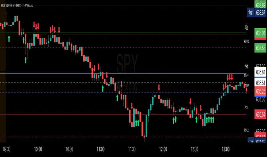
Key Session LevelsKey Session Levels - Indicator Guide
Created by: MecarderoAurum
Why This Indicator Exists: An Overview
The "Key Session Levels" indicator is a comprehensive tool for day traders that automatically plots the most critical price levels from the current premarket and the previous two full trading days. These levels are watched by countless traders and often act as significant areas of support and resistance.
This indicator provides a clear, objective map of these key zones, helping traders anticipate potential turning points, identify areas of confluence, and make more informed trading decisions without having to manually draw and manage these lines every day.
Features & How to Use Them
This indicator plots several types of important historical levels on your chart. Each one is fully customizable.
1. Premarket Levels (PMH / PML)
What they are: The highest (PMH) and lowest (PML) prices reached during the current day's premarket session (04:00 - 09:30 ET).
Why they matter: The premarket high and low are the first significant levels established for the trading day. They often act as initial support or resistance once the market opens.
How to use them: In the settings under "Premarket Levels," you can toggle the visibility of the PMH and PML, and customize their color, line style, and width.
2. Prior Day Levels (PDH / PDL / PDM / PDP)
What they are: The key price points from the previous full trading day.
PDH: Prior Day High
PDL: Prior Day Low
PDM: Prior Day Midpoint (the exact middle of the PDH and PDL)
PDP: Prior Day Pivot (a classic pivot point calculation)
Why they matter: These are often the most important levels for the current trading day. The market frequently tests the previous day's high and low.
How to use them: Under the "Prior Day" settings, you can enable or disable each of these four levels and customize their appearance.
3. 2-Day Prior Levels (PDH2 / PDL2 / etc.)
What they are: The same set of key levels (High, Low, Mid, Pivot) from two trading days ago.
Why they matter: These levels can still be highly relevant, especially if the market is trading within a multi-day range or returning to test a significant prior level.
How to use them: Under the "2-Day Prior" settings, you can customize the visibility and style of these levels. They are styled with more transparency by default to distinguish them from the more recent prior day's levels.
4. General Settings
Days of History: This setting allows you to control how many past days of historical lines are kept on your chart. This is excellent for back-testing strategies and seeing how price has reacted to these levels in the past.
Label Settings: You can customize the color and size of the on-chart labels (e.g., "PDH," "PML") for better visibility.
Sample Strategy: The Key Level Rejection
This strategy focuses on using the indicator's levels to identify potential reversals at key areas of support or resistance.
Identify a Key Level: Watch as the price approaches a significant level plotted by the indicator, such as the Prior Day High (PDH) or the Premarket Low (PML).
Look for Rejection: Do not trade simply because the price touches the level. Wait for a price action signal that confirms the level is holding. This could be a bearish engulfing candle or a shooting star pattern at a resistance level like PDH, or a bullish hammer or morning star pattern at a support level like PML.
Entry: Once you see a clear rejection candle, enter a trade in the direction of the rejection. For a bearish rejection at the PDH, you would enter a short position.
Stop-Loss: A logical place for a stop-loss is just above the high of the rejection candle (for a short trade) or just below the low of the rejection candle (for a long trade). This defines your risk clearly.
Profit Target: Your first profit target could be the next key level plotted by the indicator. For example, if you shorted a rejection at the PDH, your first target might be the Premarket High (PMH) or the day's opening price.
Candle Range Classifier Dots OnlyCandle Range Classifier (Dots Only)
This indicator analyzes the price range of each candle relative to its recent average range to classify market activity into three categories: wide range, narrow range, or normal range.
Wide Range Candles (red dots above bars) indicate significant price movement and strong market effort.
Narrow Range Candles (blue dots below bars) indicate low volatility and possible market absorption or consolidation.
Normal Range Candles are not marked, keeping the chart clean and focused on meaningful range extremes.

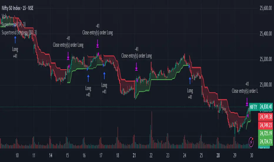
HMM Trend Strength Meter (3-State)Strong Up-Trend: p_up > 0.6–0.7 → look for BUY setups
Strong Down-Trend: p_dn > 0.6–0.7 → look for SELL setups
Range/Sideways: p_side > 0.6 → consider mean-reversion entries
Adjust your own threshold (e.g. 0.7–0.8) to control signal frequency.
✅ VMA Avg ATR + Days to Targets 🎯1) The trend filter: LazyBear VMA
You implement the well‑known “LazyBear” Variable Moving Average (VMA) from price directional movement (pdm/mdm).
Internally you:
Smooth positive/negative one‑bar moves (pdmS, mdmS),
Turn them into relative strengths (pdiS, mdiS),
Measure their difference/total (iS), and
Normalize that over a rolling window to get a scaling factor vI.
The VMA itself is then an adaptive EMA:
vma := (1 - k*vI) * vma + (k*vI) * close, where k = 1/vmaLen.
When vI is larger, VMA hugs price more; when smaller, it smooths more.
Coloring:
Green when vma > vma (rising),
Red when vma < vma (falling),
White when flat.
Candles are recolored to match.
Why this matters: The VMA color is your trend regime; everything else in the script keys off changes in this color.
2) What counts as a “valid” new trend?
A new trend is valid only when the previous bar was white and the current bar turns green or red:
validTrendStart := vmaColor != color.white and vmaColor == color.white.
When that happens, you start a trend segment:
Save entry price (startPrice = close) and baseline ATR (startATR = ATR(atrLen)).
Reset “extreme” trackers: extremeHigh = high, extremeLow = low.
Timestamp the start (trendStartTime = time).
Effect: You only study / trade transitions out of a flat VMA into a slope. This helps avoid chop and reduces false starts.
3) While the trend is active
On each new bar without a color change:
If green trend: update extremeHigh = max(extremeHigh, high).
If red trend: update extremeLow = min(extremeLow, low).
This tracks the best excursion from the entry during that single trend leg.
4) When the VMA color changes (trend ends)
When vmaColor flips (green→red or red→green), you close the prior segment only if it was a valid trend (started after white). Then you:
Compute how far price traveled in ATR units from the start:
Uptrend ended: (extremeHigh - startPrice) / startATR
Downtrend ended: (startPrice - extremeLow) / startATR
Add that result to a running sum and count for the direction:
totalUp / countUp, totalDown / countDown.
Target checks for the ended trend (no look‑ahead):
T1 uses the previous average ATR move before the just‑ended trend (prevAvgUp/prevAvgDown).
Up: t1Up = startPrice + prevAvgUp * startATR
Down: t1Down = startPrice - prevAvgDown * startATR
T2 is a fixed 6× ATR move from the start (up or down).
You increment hit counters and also accumulate time‑to‑hit (ms from trendStartTime) for any target that got reached during that ended leg.
If T1 wasn’t reached, it counts as a miss.
Immediately initialize the next potential trend segment with the current bar’s startPrice/startATR/extremes and set validTrendStart according to the “white → color” rule.
Important detail: Using prevAvgUp/Down to evaluate T1 for the just‑completed trend avoids look‑ahead bias. The current trend’s performance isn’t used to set its own T1.
5) Running statistics & targets (for the current live trend)
After closing/adding to totals:
avgUp = totalUp / countUp and avgDown = totalDown / countDown are the historical average ATR move per valid trend for each direction.
Current plotted targets (only visible while a valid trend is active and in that direction):
T1 Up: startPrice + avgUp * startATR
T2 Up: startPrice + 6 * startATR
T1 Down: startPrice - avgDown * startATR
T2 Down: startPrice - 6 * startATR
The entry line is also plotted at startPrice when a valid trend is live.
If there’s no history yet (e.g., first trend), avgUp/avgDown are na, so T1 is na until at least one valid trend has closed. T2 still shows (6× ATR).
6) Win rate & time metrics
Win % (per direction):
winUp = hitUpT1 / (hitUpT1 + missUp) and similarly for down.
(This is strictly based on T1 hits vs misses; T2 hits don’t affect Win% directly.)
Average days to hit T1/T2:
The script stores milliseconds from trend start to each target hit, then reports the average in days separately for Up/Down and for T1/T2.
7) The dashboard table (bottom‑right)
It shows, side‑by‑side for Up/Down:
Avg ATR: historical average ATR move per completed valid trend.
🎯 Target 1 / Target 2: the current trend’s price levels (T1 = avgATR×ATR; T2 = 6×ATR).
✅ Win %: T1 hit rate so far.
⏱ Days to T1/T2: average days (from valid trend start) for the targets that were reached.
8) Alerts
“New Trend Detected” when a valid trend starts (white → green/red).
Target hits for the active trend:
Uptrend: separate alerts for T1 and T2 (high >= target).
Downtrend: separate alerts for T1 and T2 (low <= target).
9) Inputs & defaults
vmaLen = 17: governs how adaptive/smooth the VMA is (larger = smoother, fewer trend flips).
atrLen = 14: ATR baseline for sizing targets and normalizing moves.
10) Practical read of the plots
When you see white → green: that bar is your valid entry (trend start).
An Entry Line appears at the start price.
Target lines appear only for the active direction. T1 scales with your historical average ATR move; T2 is a fixed stretch (6× ATR).
The table updates as more trends complete, refining:
The average ATR reach (which resets your T1 sizing),
The win rate to T1, and
The average days it typically takes to hit T1/T2.
Subtle points / edge cases
No look‑ahead: T1 for a finished trend is checked against the prior average (not including the trend itself).
First trends: Until at least one valid trend completes, T1 is na (no history). T2 still shows.
Only “valid” trends are counted: Segments must start after a white bar; flips that happen color→color without a white in between don’t start a new valid trend.
Time math: Uses bar timestamps in ms, converted to days; results reflect the chart’s timeframe/market session.
TL;DR
The VMA color defines the regime; entries only trigger when a flat (white) VMA turns green/red.
Each trend’s max excursion from entry is recorded in ATR units.
T1 for current trends = (historical average ATR move) × current ATR from entry; T2 = 6× ATR.
The table shows your evolving edge (avg ATR reach, T1 win%, and days to targets), and alerts fire on new trends and target hits.
If you want, I can add optional features like: per‑ticker persistence of stats, excluding very short trends, or making T2 a user input instead of a fixed 6× ATR.

Session Highs and Lows Indicator (DST + Editable Times)Previous session highs and lows labeled for NY, Asia, and London. Key component in swing strategies are finding levels for price to respect and to chase and a very strong level is the previous session's high or low. Adjustable settings to view specific time windows and customizable color settings for your own preference.

HMM Adaptive BB & Regime Signals1. Install the Indicator
Open TradingView and load the chart for your chosen symbol.
Click the Pine Editor tab at the bottom.
Delete any existing code, paste in the full Pine Script.
Click Save, give it a name (e.g. “HMM Adaptive BB”), then click Add to Chart.
If the script compiles correctly, you’ll immediately see:
An orange upper/lower Bollinger-style channel
A blue SMA basis line
Shaded background indicating the current regime

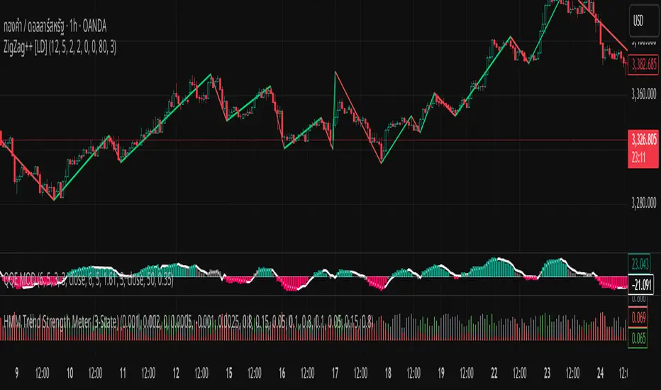
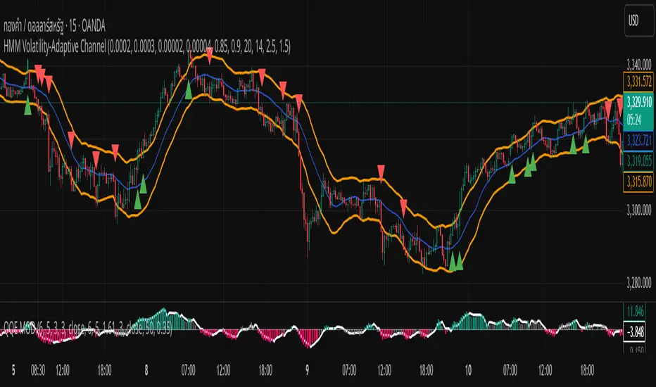
HMM Volatility-Adaptive ChannelChannel Lines (orange)
Upper = SMA + ATR × dynamic multiplier
Lower = SMA − ATR × dynamic multiplier
Background Shade
Light green = High-Volatility regime (pₕ > 0.5)
Light red = Low-Volatility regime (pₕ ≤ 0.5)
Breakout Signals
BUY marker (▲) when close crosses above the upper line
SELL marker (▼) when close crosses below the lower line
Simple H% Buy/Sell Signals//@version=5
indicator("Simple H% Buy/Sell Signals", overlay=true)
// === Calculate H% ===
h_percent = ((high - low) / low) * 100
// === Input thresholds ===
buyThreshold = input.float(0.3, title="Buy Signal H% Threshold")
sellThreshold = input.float(0.5, title="Sell Signal H% Threshold")
// === Buy/Sell Conditions ===
buySignal = h_percent > buyThreshold and close > open
sellSignal = h_percent > sellThreshold and close < open
// === Plot shapes ===
plotshape(buySignal, title="BUY Signal", location=location.belowbar, style=shape.labelup, text="BUY", color=color.green, textcolor=color.white, size=size.normal)
plotshape(sellSignal, title="SELL Signal", location=location.abovebar, style=shape.labeldown, text="SELL", color=color.red, textcolor=color.white, size=size.normal)
// === Optional: Plot H% for visual reference ===
plot(h_percent, title="H%", color=color.orange, linewidth=2, display=display.none)

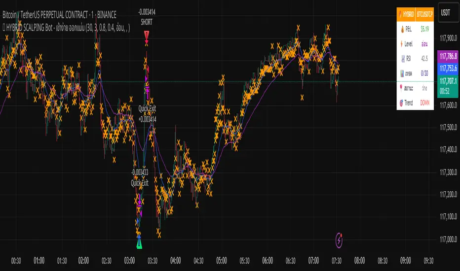
🔥 HYBRID SCALPING Bot - เข้าง่าย ออกแม่นA tool bot that helps analyze charts accurately, focusing on profits.
Harmonic BloomHarmonic Bloom - Advanced Geometric Analysis
Building upon my previous Fibonacci inspired indicator "TrendZone", Harmonic Bloom is a sophisticated geometric trading indicator inspired by W.D. Gann's legendary market geometry principles. It reveals market structure through three key pivot points and dynamic angular analysis, creating powerful harmonic intersections for precision trading.
🎯 Core Features:
📍 Three-Point Gann System:
Set 3 custom pivot points to define your analysis timeframe
Automatic trend detection (bullish/bearish) between pivots
Dynamic geometric box construction following Gann's square principles
📐 Gann-Style 45° Angle Projections:
Pivot 2 Line: Follows trend direction (up if bullish, down if bearish)
Pivot 3 Line: Creates opposition (opposite direction to Pivot 2)
Corner Line: Mirrors Pivot 2 from appropriate box corner
All angles project forward using Gann's 1x1 (45°) methodology for future price targets
⚡ POWER OF HARMONIC INTERSECTIONS:
Confluence Zones: Where multiple 45° angles intersect create the strongest support/resistance
Geometric Harmony: Intersections represent natural market turning points
Time-Price Balance: Following Gann's principle that time and price must be in harmony
Multiple Timeframe Resonance: Intersection points often align across different timeframes
High-Probability Reversals: Markets frequently respect these geometric intersection levels
📊 Customizable Retracement Levels:
8 fully configurable levels (default: 0.0, 0.25, 0.5, 0.75, 1.0, 1.25, 1.5, 1.75)
Choose between 25% or 50% trendline alignment
Individual style controls for each level
🔢 Advanced Gann Analytics:
Fibonacci sequence detection in bar counts (Gann studied natural number sequences)
Numerology sum analysis on pivot prices (Gann's mystical number approach)
Special highlighting for significant numbers
Optional on-chart labels for key metrics
📈 Trading Applications:
✅ Support/Resistance: Use retracement levels for entry/exit points
✅ Gann Angles: 45° lines show momentum direction and strength following Gann's time-price theory
✅ Intersection Trading: Most powerful signals occur at harmonic intersections where multiple angles converge
✅ Price Targets: Forward projections provide future price objectives using Gann's geometric principles
✅ Market Geometry: Identify harmonic patterns and geometric confluences
✅ Time Analysis: Fibonacci-based bar counting for timing decisions (Gann emphasized time cycles)
🌟 Why Harmonic Intersections Are So Powerful:
Gann believed that markets move in geometric harmony, and when multiple angles intersect, they create "magnetic price levels" where:
Maximum Energy Convergence: Multiple geometric forces meet at one point
Natural Turning Points: Markets respect these intersections as natural support/resistance
Time-Price Synchronicity: Intersections often coincide with significant time cycles
Multi-Dimensional Confirmation: Price, time, and geometry align simultaneously
⚙️ Highly Customizable:
All colors, widths, and styles adjustable
Toggle any feature on/off independently
Extend projections beyond the analysis box
Choose your preferred visual presentation
Perfect for traders who use Gann theory, geometric analysis, harmonic patterns, and mathematical market structure. The true power lies in trading the intersection points where multiple harmonic angles converge - these represent the market's most significant geometric turning points.

HMM-Style Market RegimeVisual outputs rendered by the script
Background color bands (bgcolor)
Green when regime == Bull
Red when regime == Bear
Gray when regime == Sideways (uncertain)
Labels (label.new)
“Bull” in the top-left corner when entering a Bull regime
“Bear” when entering a Bear regime
“Sideways” when entering a Sideways regime
Regime-change arrows (plotshape)
▲ Up arrow when the regime flips to Bull
▼ Down arrow when the regime flips to Bear
Optional metric plots
A chart of the return Z-score and volatility Z-score (when debug mode is enabled)
Opening Range v3 (Dynamic)Opening Range Signals v3 (Dynamic) - Indicator Guide
Created by: MecarderoAurum
Why This Indicator Exists: An Overview
The "Opening Range Signals" indicator is a sophisticated tool designed for day traders who focus their strategy on the price action that unfolds during the Regular Trading Hours (RTH) of the New York session (09:30 - 16:00 ET). The opening period of the market, often called the "initial balance," is a critical time where institutions and traders establish the early high and low for the day. Trading the breakout of this range is a classic and effective strategy, but it's often plagued by false moves and "head fakes."
This indicator was built to solve that problem. It not only identifies the initial range but also incorporates a powerful dynamic expansion feature. This allows the indicator to intelligently adapt to early session volatility, filter out false breakouts, and establish more reliable support and resistance levels for the rest of the trading day. It provides a clear, visual framework for executing opening range strategies with more confidence.
Key Features & How to Use Them
1. Customizable Opening Range
This is the foundation of the indicator. It draws the high and low of the initial trading period on your chart.
What it does: Establishes the initial support and resistance levels for the day.
How to use it: In the settings under "Time Settings," you can set the "Opening Range Duration" from 1 to 30 minutes. A shorter duration (e.g., 5 minutes) will be more sensitive and give earlier signals, while a longer duration (e.g., 30 minutes) will establish a wider, more robust range.
2. Dynamic Range Expansion
This is the indicator's most powerful and unique feature. It helps you avoid getting trapped in false breakouts.
What it does: If the price breaks out of the initial range but then quickly closes back inside, the indicator will automatically expand the range to include the full wick of the failed breakout. This tells you the market is still establishing its true range.
How to use it: In the settings under "Dynamic Range," you can:
"Enable Dynamic Range Expansion": This is on by default.
"Expansion Time Limit (Min)": Set how long the indicator should look for these failed breakouts. After this time, the range will be locked for the day.
3. Clear Visual Trading Signals
The indicator provides three distinct signals to help you interpret the price action around the opening range.
Breakout Body (Yellow plotshape):
What it means: The first confirmation that the price has decisively moved outside the established range. It appears when a candle's body closes entirely above the high or below the low.
How to use it: This is your alert that a potential breakout is underway. Do not enter yet; wait for confirmation.
Continuation (Green plotshape):
What it means: This signal appears on the candle immediately following a breakout if it shows momentum in the same direction. It confirms that the breakout has strength.
How to use it: This is a potential entry trigger. A continuation signal suggests the breakout is valid and may continue.
Failure (Red plotshape):
What it means: This signal appears if, after a breakout and continuation, the price quickly reverses and closes back inside the range. It's a strong indication of a false breakout.
How to use it: If you are in a breakout trade, a failure signal is a clear sign to exit. It can also be used as a setup for a reversal trade in the opposite direction.
Sample Strategy: The Breakout-Continuation Trade
This strategy uses the indicator's signals to trade a classic opening range breakout with added confirmation.
Setup:
Set the "Opening Range Duration" to your preferred time (e.g., 5 or 15 minutes).
Ensure the "Dynamic Range Expansion" is enabled to filter out early noise.
Entry Trigger:
Wait for a Breakout signal (yellow) to appear. This puts you on high alert.
Wait for a Continuation signal (green) on the very next candle. This is your entry trigger. Enter a long trade on a bullish continuation or a short trade on a bearish continuation.
Stop-Loss:
For a bullish (long) trade, a common stop-loss placement is just below the low of the continuation candle or, for a more conservative stop, just inside the opening range high.
For a bearish (short) trade, place your stop-loss just above the high of the continuation candle or just inside the opening range low.
Trade Management:
If a Failure signal (red) appears after you've entered, it indicates the breakout has failed. This is a strong signal to exit your trade immediately to protect your capital.
If the trade moves in your favor, you can manage it by taking profits at key levels or using a trailing stop.
lib_listaAtivos_PosseidonLibrary "lib_listaAtivos_Posseidon"
TODO: add library description here
ativos(loteSelected)
TODO: add function description here
Parameters:
loteSelected (simple int)
Returns: TODO: add what function returns
Liquidity Zones, EMAs, Market Cipher BAll In One, market cipher b, divergences, ema 12/21/50/200, and liquidity zones
