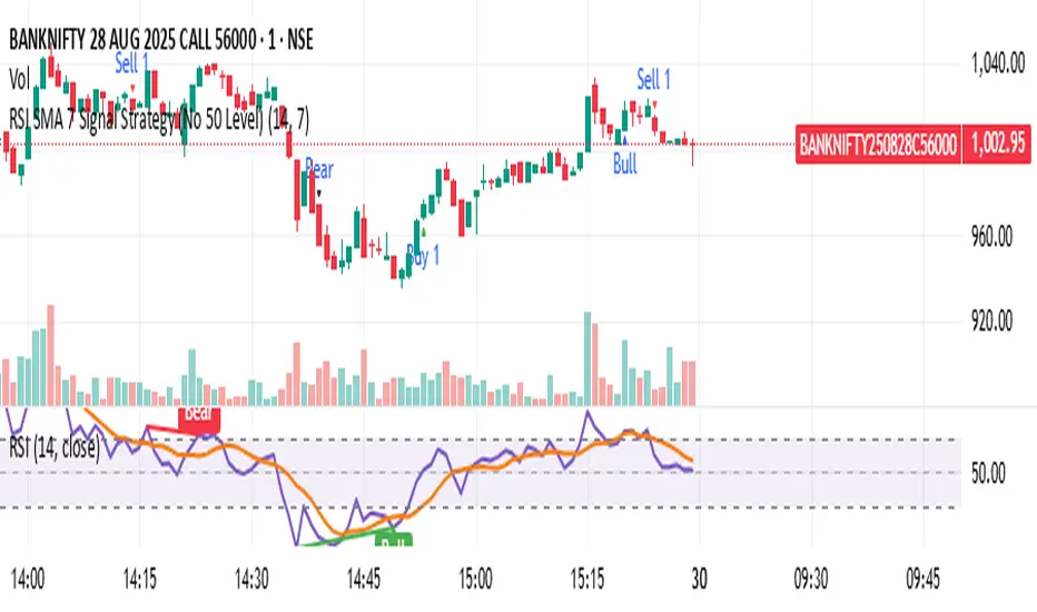
RSI SMA 7 Signal Strategy (No 50 Level)Script uses SMA 7 Perio and 14 Period RSI
If SMA crosses 40 RSI level from below consider it a buy zone or buy signal, if SMA crosses from below 60 RSI level, then super bullish, IF SMA crosses 60 RSI level from above its a profit taking time and Sell zone, if SMA crosses 40 level from above then super bearish sell signal.
Indicators and strategies
FRX_FORTUNE - EMA 9/15 Crossover Alert//@version=5
indicator("FRX_FORTUNE - EMA 9/15 Crossover Alert", overlay=true)
// === INPUTS ===
fastEmaLength = input.int(9, title="Fast EMA (9)")
slowEmaLength = input.int(15, title="Slow EMA (15)")
showArrows = input.bool(true, title="Show Buy/Sell Arrows")
enableAlerts = input.bool(true, title="Enable Alerts")
// === CALCULATIONS ===
fastEma = ta.ema(close, fastEmaLength)
slowEma = ta.ema(close, slowEmaLength)
bullishCross = ta.crossover(fastEma, slowEma)
bearishCross = ta.crossunder(fastEma, slowEma)
// === PLOT EMA ===
plot(fastEma, title="EMA 9", color=color.orange)
plot(slowEma, title="EMA 15", color=color.blue)
// === DRAW ARROWS ===
plotshape(bullishCross and showArrows, location=location.belowbar, color=color.green, style=shape.labelup, text="BUY", size=size.small)
plotshape(bearishCross and showArrows, location=location.abovebar, color=color.red, style=shape.labeldown, text="SELL", size=size.small)
// === ALERTS ===
alertcondition(bullishCross, title="Buy Alert", message="BUY: EMA 9 crossed above EMA 15")
alertcondition(bearishCross, title="Sell Alert", message="SELL: EMA 9 crossed below EMA 15")

LBB + RSI FX EditionLBB + RSI ForeX Edition (FX) — Version v6.4.8-fx
**Combine Log Bollinger Bands, multi-level RSI signals, optional trend & pin-bar filters, ATR-based optional TP/SL and a compact signal table — all in one overlay.**
### 1. Key Features
* **Logarithmic Bollinger Bands (LBB):**
* Uses log-price SMA and standard deviation to derive upper/lower bands
* Provides a more symmetrical response to percentage-based moves
* **RSI Multi-Level Entries:**
* Generates long signals when price closes below the lower LBB and RSI < 30 / 35 / 40
* Generates short signals when price closes above the upper LBB and RSI > 60 / 65 / 70
* Three “strength” tiers for both buys and sells
* **Signal Filters (optional):**
* **EMA Trend Filter:** only take longs above a 50-period EMA or shorts below it
* **Pin-Bar Filter:** require a clear wick-to-body ratio on the signal candle
* **Confirmed Candle:** wait for candle close before signaling
* **ATR Display (optional):** show current ATR on the signal table
* **Flexible TP/SL Settings:**
* **Static (pips) or Dynamic (ATR-based) TP/SL**
* Toggle between pips and ticks for FX precision
* Minimum pip/tick threshold to avoid overly tight stops
* Separate TP/SL controls for longs and shorts
* **Visuals & Alerts:**
* Color-coded shapes for each RSI tier (green/orange/yellow for buys; blue/purple/red for sells)
* Customizable display of Bollinger Bands, ATR, signal table and win-rate stats
* Built-in `alertcondition` for each tier with clear emoji & strength label
* **Compact Signal Table:**
* Shows 📈/📉 entry price, RSI, ATR (if enabled), pin-bar ✔/–, timestamp (with UTC offset) and win-rate placeholder
---
### 2. Inputs & Groups
| Group | Input | Default | Notes |
| ---------------------- | ------------------------------------------ | ------- | ------------------------------------- |
| **Indicator Settings** | LBB Period (`lbbLength`) | 20 | Length for log-price SMA |
| | LBB Multiplier (`lbbMult`) | 2.0 | Std dev multiplier |
| | RSI Period (`rsiLength`) | 14 | |
| | ATR Period (`atrLength`) | 14 | |
| | Show ATR (`showATR`) | true | Toggles ATR in table |
| | UTC Offset Hours (`timeOffsetHours`) | 0 | Adjust table time to your timezone |
| **Signal Filters** | Use EMA Trend Filter (`useTrendFilter`) | false | |
| | EMA Period (`emaPeriod`) | 50 | |
| | Use Pin-Bar Filter (`usePinBarFilter`) | false | |
| | Pin-Bar Ratio (`pinBarRatio`) | 2.0 | Wick-to-body minimum |
| | Only on Confirmed Candle (`onlyConfirmed`) | false | |
| **TP/SL Settings** | Show TP/SL for Long (`showLongTpSl`) | false | |
| | Show TP/SL for Short (`showShortTpSl`) | false | |
| | Use Dynamic TP/SL (`useDynamicTpSl`) | false | ATR × multiplier |
| | TP/SL in Ticks (`useTicks`) | false | Instead of pips |
| | Min TP/SL Threshold (`minTpSlThreshold`) | 10.0 | In pips |
| | TP Long (pips) (`tpLongPips`) | 20 | Static targets |
| | SL Long (pips) (`slLongPips`) | 10 | |
| | TP Short (pips) (`tpShortPips`) | 20 | |
| | SL Short (pips) (`slShortPips`) | 10 | |
| | ATR Multiplier for TP (`atrMultiplierTP`) | 1.5 | |
| | ATR Multiplier for SL (`atrMultiplierSL`) | 1.0 | |
| **Visual Settings** | Show Signal Shapes (`showShapes`) | true | |
| | Show Bollinger Bands (`showBands`) | true | |
| | Show Statistics (`showStats`) | true | Win-rate currently placeholder “NaN%” |
---
### 3. Calculation Overview
1. **Log Bollinger Bands**
```pinescript
logClose = math.log(close)
logBasis = ta.sma(logClose, lbbLength)
logDev = lbbMult * ta.stdev(logClose, lbbLength)
lowerBand = math.exp(logBasis - logDev)
upperBand = math.exp(logBasis + logDev)
basisBand = math.exp(logBasis)
```
2. **RSI & ATR**
```pinescript
rsi = ta.rsi(close, rsiLength)
atrVal = ta.atr(atrLength)
```
3. **Pin-Bar Detection**
```pinescript
body = math.abs(close - open)
upperWick = high - math.max(close, open)
lowerWick = math.min(close, open) - low
isPinBarBull = lowerWick > body * pinBarRatio and upperWick < body
isPinBarBear = upperWick > body * pinBarRatio and lowerWick < body
```
4. **Trend & Confirmation Filters**
```pinescript
emaTrend = ta.ema(close, emaPeriod)
trendLong = close > emaTrend
trendShort = close < emaTrend
trendOkLong = useTrendFilter ? trendLong : true
trendOkShort= useTrendFilter ? trendShort: true
signalOk = onlyConfirmed ? barstate.isconfirmed : true
```
5. **Entry Conditions**
* **Long**: `close < lowerBand` + RSI < {30, 35, 40} + filters
* **Short**: `close > upperBand` + RSI > {60, 65, 70} + filters
---
### 4. Signal Plotting & Alerts
* **Shapes on Chart**
* 📈 LONG signals plotted below bar in green/orange/yellow triangles, sized by strength
* 📉 SHORT signals plotted above bar in blue/purple/red inverted triangles
* **Alert Conditions**
```pinescript
alertcondition(cond_rsi30_long, title="LBB LONG RSI <30", message="📈 LONG signal | Strong Buy | {{ticker}} @ {{close}} | {{interval}}")
// … and similarly for other tiers
```
---
### 5. TP/SL Management
1. **Delta Calculation**
```pinescript
rawTP = atrVal * atrMultiplierTP * tfMultiplier
rawSL = atrVal * atrMultiplierSL * tfMultiplier
pip = syminfo.mintick
pipMult = pip == 0.00001 ? 10 : pip == 0.01 ? 1 : 100
unitMult = useTicks ? 1 : pipMult
minDelta = minTpSlThreshold * pip * tfMultiplier * unitMult
```
2. **Dynamic TP/SL Lines**
* Deletes old lines and draws new dashed lines at `entry ± max(rawΔ, minDelta)` when signaled and `useDynamicTpSl` is enabled.
3. **Manual TP/SL Labels**
* On each bar checks if price hit the TP or SL level and drops a permanent label “TP @ …” or “SL @ …”.
---
### 6. Compact Signal Table
Positioned in the top-right corner, updates on each new signal:
| Column | Content |
| ------ | ----------------------------------------- |
| 0 | 📈/📉 Entry price with color background |
| 1 | `RSI: XX` |
| 2 | `ATR: X.XXXXX` (if enabled) |
| 3 | `PinBar: ✔` or `–` |
| 4 | `Time: DD-MM-YY HH:mm` (with UTC offset) |
| 5 | `Win Rate: NaN%` (placeholder if enabled) |
---
### 7. Recommendations & Best Practices
* **Timeframe Selection:** works best on FX pairs; adjust `tfMultiplier` sensitivity by avoiding ultra-low minute charts unless needed.
* **Trend Filter:** enable `useTrendFilter` to align signals with broader trend, reducing noise.
* **Pin-Bar Filter:** turn on `usePinBarFilter` when you need higher-quality reversal candles.
* **Dynamic TP/SL:** use ATR-based exits (`useDynamicTpSl=true`) to adapt stop levels to changing volatility.
* **Ticks vs Pips:** for very tight markets (e.g. FX majors on low timeframes), switch to ticks.
* **Backtest Thoroughly:** before deploying alerts, test across multiple symbols/timeframes to tune multipliers and thresholds.
* **Alert Integration:** set up TradingView alerts using the built-in `alertcondition` names for fully automated notifications.

Pinbar DetectorPinbar Detector is original from Naked Candlestick Trading Method
Pinbar Definition: A candlestick where the dominant shadow exceeds 2/3 of the entire candle length
Key Features:
Bearish Pinbar: Red downward triangle when upper shadow exceeds 2/3 of total candle length
Bullish Pinbar: Green upward triangle when lower shadow exceeds 2/3 of total candle length
Background highlighting for easy identification
Alert conditions for both bullish and bearish pinbars
Original candlestick display preserved

Sadi's Pocket Pivot Buy Signal (PP-B)Can be used to identify early entries within a basing period or later on as the stock breaks out and heads higher (continuation buy signals).
Helps in identifying low risk entries where the investor can pyramid into the stock and hence manage risk better.
Makes sure you get in when the trade in working in your favor and avoid putting good money after bad.

ALFA ATC LondonThis indicator is a data indicator focused on the algorithmic opening prices of stock exchanges and shows these areas. Bias can be obtained from these areas. Trades can be executed by taking advantage of the price's ability to test and hold these areas. The indicator, AS ATC5, includes opening information for the CM New York, London, Frankfurt, and Tokyo stock exchanges. This indicator is designed solely for London and Frankfurt.

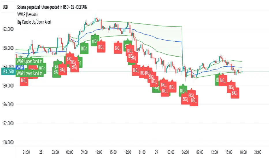
Big CandleBig Candles, most of the times, indicate actions by market makers . Also the candle high and low can be thought of as liquidity zones.
Weekly % Change Screener (5% Sell Threshold)This is a weekly screener for a 5% change in the stock value. If it increases by 5%, we sell and if it decreases by 5% we buy the stock. Good for stable high value stocks. Buy before testing.
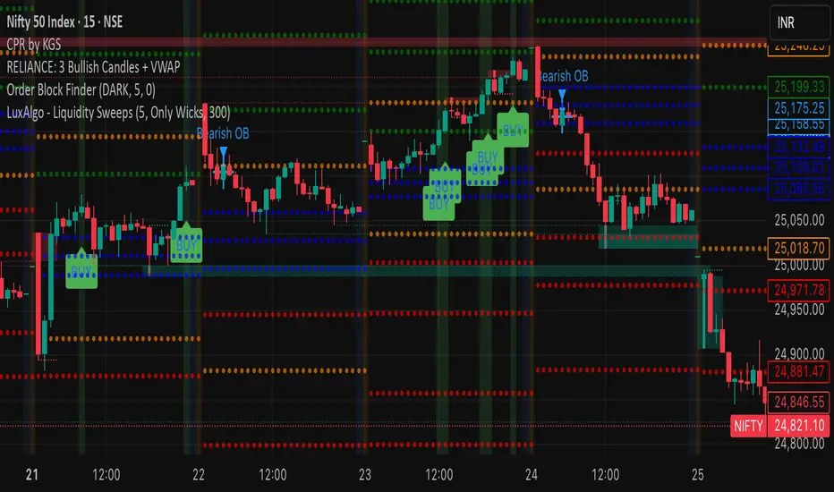
RELIANCE: 3 Bullish Candles + VWAPIts a script to track 3 consecutive candles of any stock. This helps understand the trends and makes up for buy signals. Please test before buying.
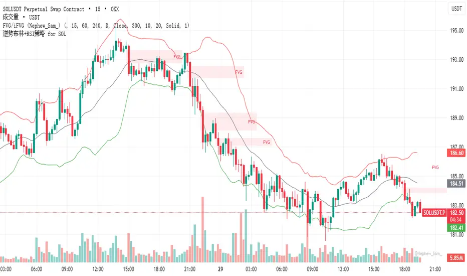
逆勢布林+RSI策略 for SOL可以直接套用到 SOLUSDT, SOLPERP, 或其他 SOL 合約。
在策略回測介面中選擇 5min 或 15min 看策略表現。
若要調整停利%或 RSI 數值,改變 rsi < 25 與 (shortEntryPrice - close) / shortEntryPrice >= 0.035 即可。
This can be directly applied to SOLUSDT, SOLPERP, or other SOL futures.
In the strategy backtesting interface, select 5-minute or 15-minute periods to view strategy performance.
To adjust the take-profit percentage or RSI value, set RSI < 25 and (shortEntryPrice - close) / shortEntryPrice >= 0.035.
Trend Flow Oscillator (CMF + MFI) + ADX## Trend Flow Oscillator (TFO + ADX) Indicator Description
The Trend Flow Oscillator (TFO+ADX) combines two volume-based indicators, Money Flow Index (MFI) and Chaikin Money Flow (CMF), along with the Average Directional Index (ADX) into one comprehensive oscillator. This indicator provides traders with insights into momentum, volume flow, and trend strength, clearly indicating bullish or bearish market conditions.
### How the Indicator Works:
1. **Money Flow Index (MFI)**:
* Measures buying and selling pressure based on price and volume.
* Scaled from -1 to +1 (where positive values indicate buying pressure, negative values indicate selling pressure).
2. **Chaikin Money Flow (CMF)**:
* Evaluates money flow volume over a set period, reflecting institutional buying or selling.
* Also scaled from -1 to +1 (positive values suggest bullish accumulation, negative values bearish distribution).
3. **Average Directional Index (ADX)**:
* Measures trend strength, indicating whether a market is trending or ranging.
* Scaled from -1 to +1, with values above 0 suggesting strong trends, and values near or below 0 indicating weak trends or sideways markets.
* Specifically, an ADX value of 0 means neutral trend strength; positive values indicate a strong trend.
### Indicator Levels and Interpretation:
* **Zero Line (0)**: Indicates neutral conditions. When the oscillator crosses above zero, it signals increasing bullish momentum; crossing below zero indicates bearish momentum.
* **Extreme Zones (+/- 0.75)**:
* Oscillator values above +0.75 are considered overbought or highly bullish.
* Oscillator values below -0.75 are considered oversold or highly bearish.
* The indicator features subtle background shading to visually highlight these extreme momentum areas for quick identification.
* Shading when values above or below the +/-1.0 level.
* **Color Coding**:
* Bright blue indicates strengthening bullish momentum.
* Dark blue signals weakening bullish momentum.
* Bright red indicates strengthening bearish momentum.
* Dark maroon signals weakening bearish momentum.
Bill Mensah - 10 / 30 / 50 Minute Open Lines Scientia maledictus sum.
Opening Macro lines extended, 10 / 30 / 50 Minute Open Lines
Anti Nyangkut – Indikator Karya Anak Bangsa Anti Nyangkut – Indikator Karya Anak Bangsa
Indikator ini khusus buat kamu yang sering beli di pucuk dan jual di support, lalu akhirnya jadi bahan backtest orang lain.
💡 Sinyal buy only - muncul kalau harga udah:
✅ Di atas MA5
✅ Di atas Bollinger Bands Upper
✅ Di atas VWAP (khusus 1H & 4H)
🟢 TP dan SL otomatis muncul — biar gak cuma "niat hold sampe hijau"
📊 Cocok buat scalping & swing di 1H / 4H / 1D
Gak ada sinyal jual. Exit di tangan masing-nasing, jangan lupa pasang SL.
—
100% gratis. Bayarnya pakai amal jariyah.
—
Anti Nyangkut – An Indicator by the People, for the People
This one's for you if you always buy the top, sell the bottom, and end up becoming someone else's backtest data.
💡 Buy-Only Signals — triggered when price is:
✅ Above MA5
✅ Above Bollinger Bands Upper
✅ Above VWAP (on 1H & 4H only)
🟢 Auto TP & SL lines — so you stop saying "I'll hold until it turns green"
📊 Perfect for scalping & swing trades on 1H / 4H / 1D
There’s no sell signal. Exits are your responsibility — just don’t skip the stop loss.
—
100% free. Just pay with good karma.

MJBFX VWAP WITH SIGNALSThe MJBFX VWAP Channel is a custom-built volume-weighted average price indicator designed around the MJBFX trading methodology.
This tool tracks multiple rolling VWAPs anchored to a user-defined timeframe (default: 1H), then calculates percentile levels (Max, Upper, Median, Lower, Min) to create a dynamic channel. These levels act as key support and resistance zones that adapt to market conditions.
🔶 Features:
Adjustable anchor period and VWAP count (up to 500 VWAPs)
Percentile-based VWAP levels (Max, Upper, Median, Lower, Min)
Customisable colours, widths, and line styles
Optional gradient channel fills
Anchor period highlights for session awareness
MJBFX Branded Signals:
🟠 Buy – Triggered when price crosses above the lower VWAP (MJBFX Orange)
⚪ Sell – Triggered when price crosses below the upper VWAP (MJBFX Grey)
Built-in alert conditions for automated trade notifications
🔶 How to Use:
The VWAP channel provides a dynamic structure for intraday trading.
Buy opportunities often occur when price sweeps below the lower band and reclaims it.
Sell opportunities often occur when price sweeps above the upper band and rejects.
Use in confluence with market structure, session timing, and your trading plan (e.g., MJB-FX Asian Sweep strategy).

Breakout Range Signal with Quality Analysis [Dova Lazarus]📌 Breakout Range Signal with Quality Analysis
🎓 Training-focused indicator for breakout logic, SL & TP behavior and signal quality assessment
🔷 PURPOSE
This tool identifies breakout candles from a calculated channel range and visually simulates entries, stop losses, and take profits, providing live and historical performance metrics.
⚙️ MAIN SETTINGS
1️⃣ Channel Setup
channel_length = 10 → how many candles are averaged to form channel boundaries
channel_multiplier = 0.0 → adds expansion above/below the base channel
channel_smoothing_type = SMA → smoothing method for high/low averaging
📊 The channel consists of two moving averages: one from highs, the other from lows. When expanded (via multiplier), it creates a buffer range for breakout validation.
2️⃣ Signal Detection
Body > Channel % = 50 → a breakout candle's body must exceed 150% of the channel width
Signal Mode:
• Weak → every valid breakout candle is highlighted
• Strong → only the first signal in a sequence is shown (helps reduce noise)
🟦 Bullish signals (blue):
• Candle opens inside the channel
• Closes above the channel
• Body is large enough
• Optional: confirms with trend (if enabled)
🟨 Bearish signals (yellow):
• Candle opens inside the channel
• Closes below the channel
• Body is large enough
• Optional: confirms with trend
3️⃣ Trend Filter (optional)
Enabled via checkbox
Uses a higher timeframe MA to filter signals
Bullish signals are allowed only if price is below the trend MA
Bearish signals only if price is above it
⏱️ trend_timeframe = 1D (typically set higher than the chart's timeframe)
🟢 Trend line is plotted if enabled
🎯 ENTRY, STOP LOSS & TAKE PROFIT LOGIC
SL and TP are based on channel width, not fixed pip/tick size:
📍 Entry Price = close of the breakout candle
🛑 Stop Loss:
• Bullish → below the lower channel border (minus offset)
• Bearish → above the upper channel border (plus offset)
🎯 Take Profit:
• Bullish → entry + channel width × profit multiplier
• Bearish → entry − channel width × profit multiplier
You can control:
Profit Target Multiplier (e.g., 1.0 → TP = 1×channel width)
Stop Loss Target Multiplier (e.g., 0.5 → SL = 0.5×channel width)
Signals to Show = how many historical SL/TP setups to display
📈 Lines and labels ("TP", "SL") are drawn on the chart for clarity.
🧪 QUALITY ANALYSIS MODULE
If enabled, the indicator will:
Track each new signal (entry, SL, TP)
Analyze outcomes:
• Win = TP hit before SL
• Loss = SL hit before TP
• Expired = signal unresolved after N bars
Display statistics in a table (top-right corner):
📋 Table fields:
✅ Overall win rate
📈 Bullish win rate
📉 Bearish win rate
🔢 Total signals
🕓 Pending (still active trades)
Maximum bars to wait for outcome is customizable (max_bars_to_analyze).
📐 VISUALIZATION TOOLS
TP / SL lines per signal
Labels “TP” and “SL”
Optional channel lines and trendline for better context
Colored bars for valid signals (blue/yellow)
📌 BEST USE CASES
Understand how breakout signals are formed
Learn SL/TP logic based on dynamic range
Test how volatility affects trade outcomes
Use as a visual simulation of trade behavior over time

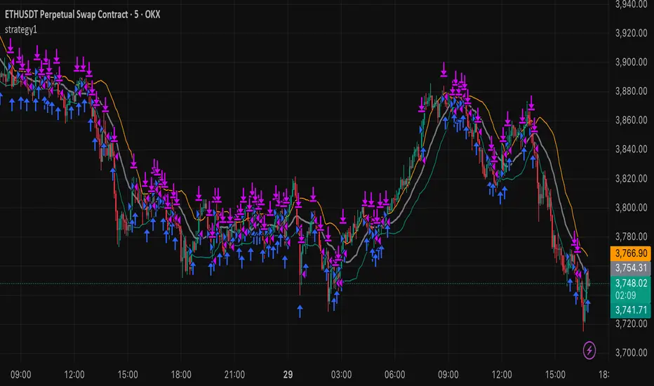
strategy15min bar, short-term and scalp strategy, eth, using stdev as trend line, long when price hits the lower line, short when price hits the upper line.

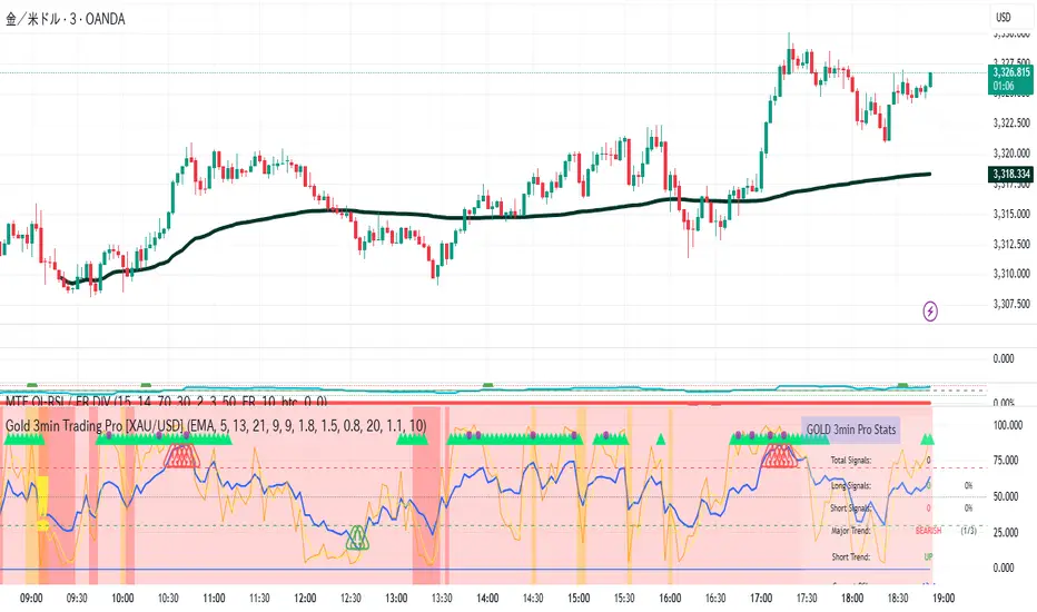
Gold 3min Trading Pro [XAU/USD]# Gold 3min Trading Pro - User Guide
## Overview
This is a professional scalping indicator specifically designed for Gold (XAU/USD) trading on 3-minute timeframes. It combines multiple technical analysis methods to provide high-probability entry signals for short-term trading.
## Key Features
### 1. Multi-Timeframe Trend Analysis
- **Major Trend**: Analyzes 15min, 1H, and 4H timeframes using moving averages
- **Short-term Trend**: Focuses on 3-minute price action and moving average alignment
- **Trend Strength**: Rated from 1-3 based on timeframe agreement
### 2. Core Indicators
- **RSI (9-period)**: Momentum oscillator for overbought/oversold conditions
- **Stochastic (9-period)**: %K and %D lines for entry timing
- **MACD**: Additional trend confirmation
- **Volume Analysis**: Detects volume spikes for signal validation
- **ATR-based Volatility Filter**: Ensures adequate market movement
### 3. Signal Types
- **Primary Signals**: Green triangles (LONG) and Red triangles (SHORT)
- **Enhanced Signals**: Stronger signals with multiple confirmations
- **Confirmation Signals**: Small circles for stochastic crossovers
## How to Use
### 1. Setup
- **Timeframe**: Use on 3-minute charts for Gold (XAU/USD)
- **Settings**: Default settings are optimized for Gold scalping
- **Session Filter**: Enable for London/New York sessions (recommended)
### 2. Entry Conditions
#### LONG Entry:
- Major trend is bullish (green background)
- Short-term trend is up or neutral
- RSI shows bullish momentum
- Stochastic indicates oversold recovery
- Volume spike confirmation
- Strong price action (bullish candle)
#### SHORT Entry:
- Major trend is bearish (red background)
- Short-term trend is down or neutral
- RSI shows bearish momentum
- Stochastic indicates overbought reversal
- Volume spike confirmation
- Strong price action (bearish candle)
### 3. Trade Management
- **Quick Target**: 50% of ATR-based calculation
- **Main Target**: Full ATR-based target
- **Stop Loss**: 60% of ATR below/above entry
- **Time Limit**: Exit if no progress within 20 bars (60 minutes)
### 4. Risk Management
- **Position Size**: Risk 1-2% of account per trade
- **Maximum Trades**: 3-5 trades per session
- **Avoid**: Low volatility periods and major news events
## Visual Elements
### Background Colors
- **Light Green**: Bullish major trend
- **Light Red**: Bearish major trend
- **Yellow**: Volume spike detected
- **Intense Colors**: Very strong trend alignment
### Chart Indicators
- **RSI Line (Blue)**: Main momentum indicator
- **Stochastic %K (Orange)**: Fast stochastic line
- **Stochastic %D (Yellow)**: Slow stochastic line
- **Horizontal Lines**: 70 (overbought), 30 (oversold), 50 (midline)
### Information Table (Top Right)
- Total signal count and performance statistics
- Current market conditions and trend strength
- RSI levels and volatility status
- Trading session information
- Last signal timing
## Alert System
### Standard Alerts
- **Scalp Long Signal**: Basic long entry signal
- **Scalp Short Signal**: Basic short entry signal
- **Premium Signals**: High-quality signals with strong confirmation
- **Trend Reversal**: Major trend change notifications
### Alert Setup
1. Right-click on chart → "Add Alert"
2. Select desired alert condition
3. Configure notification method (popup, email, webhook)
4. Set alert frequency to "Once Per Bar Close"
## Best Practices
### 1. Trading Sessions
- **Optimal**: London-NY overlap (3:00-5:00 PM EST)
- **Good**: London session (2:00-11:00 AM EST)
- **Avoid**: Asian session and major news releases
### 2. Market Conditions
- **Best**: Trending markets with normal to high volatility
- **Moderate**: Ranging markets during active sessions
- **Avoid**: Extremely low volatility or choppy conditions
### 3. Confirmation Rules
- Wait for signal triangle to appear
- Check that major trend aligns with signal direction
- Verify volume spike (yellow background)
- Ensure volatility is adequate (check info table)
### 4. Entry Timing
- Enter immediately after signal confirmation
- Use market orders for scalping speed
- Set stop loss and take profit levels immediately
## Settings Customization
### Essential Settings
- **MA Type**: EMA (recommended) or SMA
- **RSI Length**: 9 (default, can adjust 5-14)
- **Volume Threshold**: 1.8 (higher = fewer but stronger signals)
- **Volatility Filter**: Keep enabled for better signal quality
### Display Options
- **Show Scalping Signals**: Main entry signals
- **Show Performance Stats**: Information table
- **Show Trend Filter**: Background trend colors
- **Use Time Filter**: Session-based filtering
## Performance Optimization
### 1. Backtesting Tips
- Test on different market conditions
- Analyze win rate and average profit/loss
- Adjust settings based on historical performance
### 2. Signal Quality
- Higher trend strength (2-3) = better signals
- Volume confirmation improves success rate
- Enhanced signals have higher probability
### 3. Risk Control
- Never risk more than 2% per trade
- Use proper position sizing
- Stop trading after 3 consecutive losses
## Troubleshooting
### Common Issues
1. **No Signals**: Check volatility filter and session timing
2. **Too Many Signals**: Increase volume threshold or enable filters
3. **Poor Performance**: Verify timeframe (must be 3-minute) and symbol (XAU/USD)
### Support
- Ensure TradingView Pro+ subscription for multi-timeframe data
- Verify Gold symbol matches your broker's format
- Update to latest TradingView version
This indicator is designed for experienced traders familiar with scalping techniques and risk management. Always practice on demo accounts before live trading.
Sessions 13-Zones ValentijnJelteA simple indicator to display multiple sessions within sessions. For example, you can divide the New York session into different time slots of 3 hours, 1 hour, and 30 minutes, or whatever you need for your analysis.

EMA+ATR Band MTF Trend EntryThis is a Multi-Timeframe Trend Trading indicator strategy adapted from Sahil Rohmehtra’s Mentorship programme. The trading decision is made by first accessing the trend in higher timeframe (say Monthly) by using TWO EMAs. If the faster EMA (say 20 period) is above Slower EMA (say 50 period) and the price is above slower EMA then the trend is suitable for buyers. Similarly if faster EMA is below slow EMA and the price is below that then trend is suitable for sellers.
Once we access the trend in the higher timeframe we move to the lower timeframe (say Weekly) and access the 5-period RSI value. If RSI is below 30 then we can prepare for possible buy entry in lower (Daily) timeframe if entry conditions are met in daily timeframe. Similarly sell bias can be initiated when the higher timeframe EMA trend is down, daily RSI is above 70 and sell entry condition is met in daily timeframe. The RSI thresholds can be changed by the user.
Once we identified the RSI bias then wait for the confirmation candle in the lower timeframe (say 1 hour). In the entry timeframe we plot a band of 20 EMA of LOWs ± 1 ATR lines. Here,we wait for a candle to close above the 20 EMA of LOWs + 1 ATR for a buy signal with an increase in On Balance Volume (OBV) value. Similarly for sell signal we should get a candle close below the 20 EMA of LOWs - 1 ATR with corresponding change in OBV. This candle is the signal candle.
Once we get a Buy or Sell signal the corresponding stop loss is the nearest LOW - 1 ATR or HIGH + 1 ATR. The ATR scaling may be changed by the user. Now if another candle closes above the high of the buy signal candle then enter on buy. If the low of the buy signal candle is broken then it is a potential short-term sell entry. Similarly if another candle closes below the sell signal candle then enter short and if there is a close above high of the signal candle then it is a potential buy entry.

Indexrate Code BIndexrate Code B is an indicator and part of the Indexrate Code Set of Algorithm, which additionally includes the Indexrate Code A strategy.
The Indexrate Code Set of Algorithms can be used for any trading instruments and on any existing markets (Stock market, Forex, Cryptocurrency market, etc.).
Indexrate Code B consists of a set of indicators, oscillators and signals that are uniquely configured to interact with each other and allow traders to analyze the movement of an asset’s price:
- Momentum
This oscillator measures the amount of change in the price of an asset over a certain period of time. This is a great tool for understanding the strength of a trend and its potential sustainability. When the momentum oscillator is rising, it indicates that the price is moving up and vice versa.
Momentum is an advanced technical analysis tool that helps traders determine the rate of change or momentum of the market. It is typically used to determine the strength or rate at which the price of an asset increases or decreases for a set of returns. This oscillator is considered to be "fast moving" and "sensitive" as it reacts quickly to changes in price momentum. The fast-moving nature of this oscillator helps traders get early signals for potential market entry or exit points.
The Momentum Oscillator analyzes the current price compared to the previous price and adds two additional levels of analysis: Buy and Sell Movements and Extremes.
• Buying and Selling Movements: This oscillator layer helps identify the buying and selling pressure in the market. This can provide traders with valuable information about the possible direction of future price movements. When there is high buying pressure (demand), the price tends to rise, and when there is high selling pressure (supply), the price tends to fall.
• Extremes: This layer helps identify extreme overbought or oversold conditions. When the oscillator enters the overbought zone, it may indicate that price has peaked and could potentially reverse. Conversely, if the oscillator enters an oversold zone, it could indicate that the price is at a low and could potentially rebound.
Momentum usage example
Momentum is a sensitive and fast-moving oscillator that quickly adapts to price changes while tracking long-term momentum, making it easier to spot buying or selling opportunities in trends.
-Difference Momentum
The Momentum wave described above consists of two curves combined into a ribbon. Difference Momentum shows the intersection of these waves. Difference Momentum is an important component of the toolkit. It takes into account both the direction and dynamics of market trends. The waves within this system are fast and responsive, acting independently and offering the most relevant information at the most appropriate moments. Their fast response time ensures that traders receive timely information, which is very important in the fast-paced and dynamic world of trading.
An example of using Difference Momentum
Difference Momentum is able to identify trend reversals and pullbacks, allowing traders to enter or exit trades at optimal times.
Movement of the indicator curve from negative to positive values (from bottom to top) for Long and movement of the curve from positive to negative values (from top to bottom) for Short. As well as the intersection of the center line of the indicator channel (value “0”) in one direction or the other. The values can be observed in the status line.
-StochRSI
StochRSI is a type of momentum oscillator that is commonly used in technical analysis to predict price movements. As the name suggests, it is an enhanced form of the traditional Relative Strength Index (RSI) that provides traders with more timely signals to enter and exit the market.
StochRSI works on similar principles but is designed to provide signals ahead of traditional RSI. This is achieved through more complex mathematical modeling and calculations that aim to identify changes in market dynamics before they happen. It takes into account not only current price action, but also takes into account historical data in such a way that changes in trend directions can be anticipated.
Example of using StochRSI
StochRSI is an enhanced version of the traditional relative strength index, offering overbought or oversold market conditions.
The oscillator wave changes color from green to red. Where the green color serves as a priority for Long positions, and the red color serves as a priority for Short positions. Values in the “80” zone and above indicate the asset is overbought, and values in the “20” zone and below indicate the asset is oversold. The values can be observed in the status line.
-Money Flow Index (MFI)
Money Flow Index (MFI) or Money Flow Index is an indicator from the group of oscillators. It reflects the rate at which funds are invested in and withdrawn from a financial asset. Essentially, it measures the pressure of buyers and sellers. The oscillator calculates incoming and outgoing cash flows.
The Money Flow Index helps traders analyze positive and negative money flows and compare these data with price, which in turn allows them to better see trend strength and turning points.
Example of using Money Flow Index (MFI)
The transition of waves from gray to blue means that money is entering the asset, and vice versa from blue to gray means that money is leaving the asset. This leads to the conclusion that when money enters an asset, it becomes more expensive, and when money leaves an asset, it becomes cheaper. A hint of this movement gives the trader additional confirmation of the received signal. The bar at the top of the indicator duplicates the movement of Money Flow Index (MFI) waves for accurate visualization of these transitions. At the same time, when the wave is in blue color (Long), then purchases are considered a priority, and when the wave is in gray color (Short), then sales are considered a priority.
-Trend Score WMA
The Trend Score WMA indicator is an indicator that uses a weighted moving average (WMA). When calculating, each candle is assigned its own weight, which is calculated depending on the selected period. The indicator quickly reacts to market changes. Trend Score WMA is good for quick trading within a day or several days.
The indicator curve resembles a broken line directed up or down, into blue zones (Long) at the top and gray zones (Short) at the bottom. The maximum indicator values are 83 and -83.
Example of using Trend Score WMA
This is an indicator of trend direction. The movement of the indicator curve shows the movement of the trend in real time. The indicator curve moves from bottom to top, from the gray Short zone to the blue Long zone and from top to bottom, from the blue Long zone to the gray Short zone. It is also worth considering that finding a wave in the maximum values of both Long and Short zones may mean the continuation of stronger trend movements.
-Signals
Indexrate Code B(i), shows the direction of price movement, trend breaks, overbought and oversold zones of an asset and creates corresponding signals.
When the Momentum waves intersect, the Difference Momentum wave crosses the zero mark in the status line and the center of the channel boundary (white lines on the indicator having values of 60 and -60), a signal appears in the form of a column of the corresponding color (blue - Long, gray - Short), as well as a cross of the corresponding color appears.
When Momentum Waves intersect and simultaneously cross the channel boundary at a value of 60 or -60, a square of the corresponding color appears. This could mean stronger price movements.
If Momentum waves move from high peaks to lower ones, this also serves as signals for a change in price movement.
When working with the Indexrate Code B(i) indicator, it is necessary to take into account the totality of indicators of other indicators and oscillators to confirm the indicator signals, as shown in their examples.
The Indexrate Code Set of Algorithms is suitable for conservative traders who evaluate their success in the long term, and not in short-term excess profits.
IT IS IMPORTANT TO KNOW that no indicator is capable of 100% predicting a successful trade.
The market is a collection of people. It is thanks to human psychology that shapes the forces of supply and demand that financial markets exist (Charles Dow Theory).
Forecasting based on the analysis of mathematical algorithms (indicators) uses data from past trading - the price of the previous period of time and the volume of previous trading. It is these two indicators that are used by modern technical analysis.
The Indexrate Code Set of Algorithm is based on algorithms that evaluate trends, prices and volume indicators. Besides human psychology, which requires an assessment of the exact preceding periods for a specific timeframe, and not an assessment of the entire period from the moment of listing of a trading instrument on a specific exchange. Since market indicators completely change throughout the trading period and the exchange trading volume also changes.
All updates to the Indexrate Code Set of Algorithm will be free.
Trading is trading on probabilities. Investing is trading on opportunity. Nobody knows the future - Always protect your profits!
Russian translation
Indexrate Code В - это индикатор являющийся частью Комплекта алгоритмов Indexrate Code, включающего в себя дополнительно стратегию Indexrate Code А(s).
Комплект алгоритмов Indexrate Code, может быть использован для любых торговых инструментов и на любых существующих рынках (Фондовый рынок, Форекс, Криптовалютный рынок и тд).
Indexrate Code В состоит из совокупности индикаторов, осцилляторов и сигналов, настроенных уникальным образом для взаимодействия между собой и позволяющих трейдерам комплексно анализировать движение цены актива:
- Momentum
Этот осциллятор измеряет величину изменения цены актива за определенный промежуток времени. Это отличный инструмент для понимания силы тренда и его потенциальной устойчивости. Когда осциллятор импульса растет, это говорит о том, что цена движется вверх и наоборот.
Momentum - это продвинутый инструмент технического анализа, который помогает трейдерам определить скорость изменения или импульс рынка. Обычно он используется для определения силы или скорости, с которой цена актива увеличивается или уменьшается для набора доходностей. Этот осциллятор считается «быстродвижущимся» и «чувствительным», поскольку он быстро реагирует на изменения ценового импульса. Быстродвижущийся характер этого осциллятора помогает трейдерам получать ранние сигналы для потенциальных точек входа или выхода из рынка.
Осциллятор Momentum анализирует текущую цену по сравнению с предыдущей ценой и добавляет два дополнительных уровня анализа: «Движения покупки и продажи» и «Экстремумы».
Движения покупки и продажи: этот слой осциллятора помогает определить давление покупателей и продавцов на рынке. Это может предоставить трейдерам ценную информацию о возможном направлении будущих движений цен. Когда существует высокое давление покупателей (спрос), цена имеет тенденцию расти, а когда существует высокое давление продавцов (предложение), цена имеет тенденцию падать.
Экстремумы: этот слой помогает определить экстремальные условия перекупленности или перепроданности. Когда осциллятор входит в зону перекупленности, это может указывать на то, что цена достигла максимума и потенциально может развернуться. И наоборот, если осциллятор входит в зону перепроданности, это может указывать на то, что цена находится на минимуме и потенциально может отскочить.
Пример использования Momentum
Momentum — это чувствительный и быстро движущийся осциллятор, который быстро адаптируется к изменениям цен, отслеживая при этом долгосрочный импульс, что облегчает обнаружение возможностей покупки или продажи в трендах.
-Difference Momentum
Волна Momentum описанная выше, состоит из двух кривых объединенных в ленту. Difference Momentum, показывает пересечение этих волн. Difference Momentum является важным компонентом набора инструментов. Он учитывает как направление, так и динамику рыночных тенденций. Волны внутри этой системы быстрые и отзывчивые, действуют независимо и предлагают наиболее подходящую информацию в наиболее подходящие моменты. Их быстрое время реагирования гарантирует, что трейдеры получают своевременную информацию, что очень важно в быстро меняющемся и динамичном мире торговли.
Пример использования Difference Momentum.
Difference Momentum способен определять развороты и откаты тренда, позволяя трейдерам входить или выходить из сделок в оптимальные моменты.
Движение кривой индикатора с отрицательных значений в положительные (снизу вверх) для Long и движение кривой с положительных значений в отрицательные (сверху вниз) для Short. А также пересечение центральной линии канала индикатора (значение "0") в одну или в другую сторону. Значения можно наблюдать в строке статуса.
-StochRSI
StochRSI это тип осциллятора импульса, который обычно используется в техническом анализе для прогнозирования движения цен. Как следует из названия, это расширенная форма традиционного индекса относительной силы (RSI), которая предоставляет трейдерам более своевременные сигналы для входа и выхода из рынка.
StochRSI работает по аналогичным принципам, но предназначен для предоставления сигналов, опережающих традиционный RSI. Это достигается за счет более сложного математического моделирования и расчетов, целью которых является выявление изменений в динамике рынка до того, как они произойдут. Он учитывает не только текущее ценовое действие, но также учитывает исторические данные таким образом, чтобы можно было предвидеть изменения в направлениях тренда.
Пример использования StochRSI
StochRSI — это расширенная версия традиционного индекса относительной силы, предлагающая рыночные условия перекупленности или перепроданности.
Волна осциллятора меняет цвет с зеленого на красный. Где зеленый цвет служит приоритетом для позиций Long, а красный цвет приоритетом для позиций Short. Значение в зоне "80" и выше показывают перекупленность актива, а значение в зоне "20" и ниже, показывают перепроданность актива. Значения можно наблюдать в строке статуса.
-Money Flow Index (MFI)
Money Flow Index (MFI) или Индекс денежного потока, — индикатор из группы осцилляторов. Он отражает интенсивность, с которой денежные средства вкладываются в финансовый актив и выводятся из него. По сути, измеряет давление продавцов и покупателей. Осциллятор высчитывает входящие и выходящие денежные потоки.
Money Flow Index помогает трейдерам проанализировать положительные и отрицательные потоки денег и сравнить эти данные с ценой, что в свою очередь позволяет лучше видеть силу тренда и разворотные моменты.
Пример использования Money Flow Index (MFI)
Переход волн из серого цвета в голубой означает, что деньги входят в актив, а наоборот из голубого цвета в серый означает, что деньги из актива выходят. Отсюда следует вывод, что когда деньги входят в актив, он дорожает, а когда деньги выходят из актива, то он дешевеет. Намек на это движение, дает трейдеру дополнительное подтверждение полученного сигнала. Полоса в верхней части индикатора, дублирует движение волн Money Flow Index (MFI) для точности визуализации этих переходов. При этом, когда волна находится в голубом цвете (Long), то приоритетней считаются покупки, а когда волна находится в сером цвете (Short), то приоритетней считаются продажи.
-Trend Score WMA
Индикатор Trend Score WMA - это индикатор использующий взвешенную скользящую среднюю (WMA). При расчете каждой свече присваивается свой вес, который рассчитывается в зависимости от выбранного периода. Индикатор быстро реагирует на изменения рынка. Trend Score WMA хорошо подходит для быстрой торговли в течение дня или нескольких дней.
Кривая индикатора напоминает ломаную линию, направленную вверх или вниз, в зоны голубого цвета (Long) наверху и серого цвета (Short) внизу. Максимальными значениями индикатора являются 83 и -83.
Пример использования Trend Score WMA
Это индикатор направленности тренда. Движение кривой индикатора показывает движение тенденции в реальном времени. Кривая индикатора двигается снизу вверх, от серой зоны Short в голубую зону Long и сверху вниз, от голубой зоны Long до серой зоны Short. Стоит также учесть, что нахождение волны в максимальных значениях зон, как Long так и Short, может означать продолжение более сильных движений тенденции.
-Signals
Indexrate Code В(i), показывает направления движения цены, сломы тренда, зоны перекупленности и перепроданности актива и создает соответствующие сигналы.
Когда волны Momentum пересекаются, волна Difference Momentum пересекает нулевую отметку в строке статуса и центр границы канала (белые линии на индикаторе имеющие значение 60 и -60), появляется сигнал в виде столба соответствующего цвета (голубой - Long, серый - Short), а также появляется крест соответствующего цвета.
Когда Волны Momentum пересекаются и одновременно переходят границу канала в значении 60 или -60, появляется квадрат соответствующего цвета. Это может означать более сильные движения цены.
Если волны Momentum двигаются от высоких пиков к более низким, это тоже служит сигналам к изменению движения цены.
При этом работе с индикатором Indexrate Code В(i), необходимо учитывать совокупность показателей других индикаторов и осцилляторов для подтверждения сигналов индикатора, как показано в их примерах.
Комплект алгоритмов Indexrate Code, подходит консервативным трейдерам, оценивающим свой успех в долгосрочном перспективе, а не в краткосрочной сверх прибыли.
ВАЖНО ЗНАТЬ, что ни один индикатор не способен на 100% предсказать успешную сделку.
Рынок - это совокупность людей. Именно благодаря психологии людей, формирующей силы спроса и предложения, существуют финансовые рынки (Теория Чарльза Доу).
Прогнозирование на основе анализа математических алгоритмов (индикаторов), использует данные прошлых торгов - цену предыдущего периода времени и объем предыдущих торгов. Именно эти два показателя и используются современным техническим анализом.
В основе Комплекта алгоритмов Indexrate Code, лежат алгоритмы оценивающие тенденции, цены и показатели объема. А также психология людей, которая требует оценки точных предшествующих периодов для конкретного таймфрейма, а не оценка всего периода с момента листинга торгового инструмента на конкретной бирже. Так как показатели рынка полностью изменяются на всем торговом периоде и также меняется биржевой объем торгов.
Все обновления Комплекта алгоритмов Indexrate Code, будут бесплатны.
Трейдинг - это торговля на вероятностях. Инвестиции - это торговля на возможностях. Никто не знает будущего - Всегда защищайте свою прибыль.

Indexrate Code SMIndexrate Code SM is an indicator and part of the Indexrate Code Set of Algorithm, which additionally includes the Indexrate Code A strategy and Indexrate Code B indicator.
The Indexrate Code Set of Algorithms can be used for any trading instruments and on any existing markets (Stock market, Forex, Cryptocurrency market, etc.).
Getting access to the Indexrate Code A strategy, you gain access to the whole set of Indexrate Code algorithms.
Indexrate Code SM is an indicator, based on the Smart Money concept. Smart money is large market participants with sufficient volumes to influence the price. This is a small group that includes banks and large funds. Their every move is controlled down to the smallest detail. In the modern world, this is done with the help of artificial intelligence and other complex algorithms that move the price to certain values. Unique programs that lower and raise the price are effective because they know the behavior of people, which will invariably be based on fear and greed.
On the other side are the majority of traders, including us - this is uninformed money. This group includes retail traders and small funds. Residents of this group believe that due to their numbers, they move the market. But in fact, the retail sector cannot have any influence on the price. This is due to low volumes: a large group in monetary terms is not as large as it may seem. Large volumes that can do this are in a small group - smart money. Retail traders are too small and make up only a small percentage of the money in circulation on the market (~5%), so the main target for smart capital is always funds.
Smart Money is following large market participants. With the help of this concept and its tools, you can identify and track the actions of smart money. As long as there is liquidity in the market, the concept will be effective in application.
Indexrate Code SM consists of a set of signals displayed on the chart, configured in a unique way to interact with each other and allowing traders to comprehensively analyze the movement of the asset price.
The indicator displays the zones of interest of "bulls" and bears", which are highlighted with lines of the corresponding color. Where gray is the zone of "bears", and blue is the zone of "bulls". When these zones are broken, the indicator displays the corresponding signals to buy or sell.
The indicator also displays the zone of fair price, highlighting it in yellow. This zone acts as a conditional magnet in the event of a price rebound from the zones of interest.
In addition, the indicator displays the zone of the greatest local interest of buyers (storng high) and sellers (weak low). When the zone of fair price is broken, the asset often rushes to these local levels. From which a rebound often occurs, both during a reversal of movement and during a breakout.
The lines of the previous daily high (PDH) and the previous daily low (PDL) give traders an understanding of the intraday range of price movement.
The Indexrate Code SM integrates the Sequential and Trend HMA trend algorithms, known to us from the Indexrate Code A strategy. By default, these algorithms are not displayed on the chart (you can enable the display in the settings), since they are displayed in the strategy, but they continue to work inside the indicator to establish more accurate signals to buy or sell. The settings of these algorithms are identical to the settings displayed in the Indexrate Code A strategy.
The search for optimal signal settings includes the time structure, that is, the period for which the calculation and search for areas of interest are carried out. As well as the number of order blocks.
drive.google.com
The settings of the Sequential and Trend HMA trend algorithms are aimed at eliminating false signals as much as possible.
drive.google.com
The signals on the chart are displayed as green dots for buying and red dots for selling.
Provided that the Indexrate Code A strategy is configured most successfully, the appearance of a confirmation signal can provide the potential probability of the strongest price movement.
It is also worth considering that when working with the Heiken Ashi chart, for which the Indexrate Code Set of Algorithm works, you must install OHLC as shown in the screenshot below. Since this parameter allows you to take into account real exchange prices, without calculating average Heiken Ashi values, which can mislead the trader regarding the current state of the market. And also take into account the percentage of the exchange commission and the On bar close parameter.
telegra.ph
The Indexrate Code Set of Algorithms is suitable for conservative traders who evaluate their success in the long term, and not in short-term excess profits.
IT IS IMPORTANT TO KNOW that no indicator is capable of 100% predicting a successful trade.
The market is a collection of people. It is thanks to human psychology that shapes the forces of supply and demand that financial markets exist (Charles Dow Theory).
Forecasting based on the analysis of mathematical algorithms (indicators) uses data from past trading - the price of the previous period of time and the volume of previous trading. It is these two indicators that are used by modern technical analysis.
The Indexrate Code Set of Algorithm is based on algorithms that evaluate trends, prices and volume indicators. As well as human psychology, which requires an assessment of the exact preceding periods for a specific timeframe, and not an assessment of the entire period from the moment of listing of a trading instrument on a specific exchange. Since market indicators completely change throughout the trading period and the exchange trading volume also changes.
All updates to the Indexrate Code Set of Algorithm will be free.
Trading is trading on probabilities. Investing is trading on opportunity. Nobody knows the future - Always protect your profits!
Russian translation
Indexrate Code SM - это индикатор являющийся частью Комплекта алгоритмов Indexrate Code, включающего в себя дополнительно стратегию Indexrate Code А и индикатор Indexrate Code B.
Комплект алгоритмов Indexrate Code, может быть использован для любых торговых инструментов и на любых существующих рынках (Фондовый рынок, Форекс, Криптовалютный рынок и тд).
Получая доступ к индикатору Indexrate Code SM, вы получаете доступ ко всему комплекту алгоритмов Indexrate Code.
Indexrate Code SM это индикатор, основанный на концепции Smart Money. Умные деньги — это крупные участники рынка, имеющие достаточные объемы, чтобы оказывать влияние на цену. Это небольшая группа, в которую входят банки и крупные фонды. Каждое их движение, до мельчайших деталей контролируется. В современном мире это делается с помощью искусственного интеллекта и других сложных алгоритмов, которые двигают цену на определенные значения. Уникальные программы, которые опускают и поднимают цену, эффективны, потому что они знают поведение людей, которое неизменно будет основываться на страхе и жадности.
По другую сторону находится большинство трейдеров, включая нас – это не информированные деньги. В такую группу входят ритейл трейдеры и небольшие
фонды. Резиденты такой группы считают, что из-за их численности они двигают рынок. Но на самом деле розничный сектор не может оказывать никакого влияния на цену. Обуславливается это низкими объемами: большая группа в денежном эквиваленте не так уж велика, как может показаться. Крупные объемы, способные это делать, находятся в небольшой группе — умных денег. Ритейл трейдеры слишком малы и составляют только небольшой процент обращаемых денег на рынке (~5%), поэтому основной целью для умного капитала всегда выступают фонды.
Smart Money это следование за крупными участниками рынка. С помощью
этой концепции и ее инструментов, вы сможете идентифицировать и отслеживать действия умных денег. Пока на рынке будет ликвидность, до тех пор концепция будет эффективна в применении.
Indexrate Code SM состоит из совокупности отображаемых сигналов на графике, настроенных уникальным образом для взаимодействия между собой и позволяющих трейдерам комплексно анализировать движение цены актива.
Индикатор отображает зоны интереса «быков» и медведей», которые подсвечиваются линиями соответствующего цвета. Где серый это зона «медведей», а голубой это зона «быков». При прорыве этих зон, индикатор отображает соответствующие сигналы на покупку или на продажу.
Также индикатор отображает зону справедливой цены, подсвечивая ее желтым цветом. Данная зона выступает в качестве условного магнита, в случае отскока цены от зон интереса.
Дополнительно на индикаторе отображены зона наибольшего локального интереса покупателей (storng high) и продавцов (weak low). При прорыве зоны справедливой цены, актив чаще устремляется именно к этим локальным уровням. От которых зачастую происходит отскок, как и при развороте движения, так и при пробитии.
Линии предыдущего дневного хая (PDH) и предыдущего дневного лоя (PDL), дают трейдерам понимание внутридневного диапазона движения цены.
В Indexrate Code SM интегрированы трендовые алгоритмы Sequential и Trend HMA, известные нам по стратегии Indexrate Code A. По умолчанию данные алгоритмы не отображаются на графике (можно включит отображение в настройках), так как они отображены в стратегии, но продолжают работать внутри индикатора, для установления более точных сигналов на покупку или продажу. Настройки указанных алгоритмов идентичны, настройкам, отображаемым в стратегии Indexrate Code A.
Поиск оптимальных настроек сигналов, включает в себя структуру времени, то есть период, за который идет расчет и поиск зон интереса. А также количество ордер блоков.
drive.google.com
Настройки трендовых алгоритмов Sequential и Trend HMA, направлены для максимального исключения ложных сигналов.
drive.google.com
Сигналы на графике отображены точками зеленого цвета на покупку и красного цвета на продажу.
При условии наиболее удачной настройки стратегии Indexrate Code A, появление подтверждающего сигнала, может давать потенциальную вероятность наиболее сильного движения цены.
Стоит также учесть, что при работе с графиком Heiken Ashi, для которого работает Комплект алгоритмов Indexrate Code, необходимо устанавливать OHLC как показано ниже на скриншоте. Поскольку этот параметр позволяет учитывать реальные биржевые цены, без расчета усредненных значений Heiken Ashi, которые могут ввести трейдера в заблуждение относительно текущего состояния рынка. А также учитывать процент комиссии биржи и параметр On bar close.
telegra.ph
Комплект алгоритмов Indexrate Code, подходит консервативным трейдерам, оценивающим свой успех в долгосрочном перспективе, а не в краткосрочной сверх прибыли.
ВАЖНО ЗНАТЬ, что ни один индикатор не способен на 100% предсказать успешную сделку.
Рынок - это совокупность людей. Именно благодаря психологии людей, формирующей силы спроса и предложения, существуют финансовые рынки (Теория Чарльза Доу).
Прогнозирование на основе анализа математических алгоритмов (индикаторов), использует данные прошлых торгов - цену предыдущего периода времени и объем предыдущих торгов. Именно эти два показателя и используются современным техническим анализом.
В основе Комплекта алгоритмов Indexrate Code, лежат алгоритмы оценивающие тенденции, цены и показатели объема. А также психология людей, которая требует оценки точных предшествующих периодов для конкретного таймфрейма, а не оценка всего периода с момента листинга торгового инструмента на конкретной бирже. Так как показатели рынка полностью изменяются на всем торговом периоде и также меняется биржевой объем торгов.
Все обновления Комплекта алгоритмов Indexrate Code, будут бесплатны.
Трейдинг - это торговля на вероятностях. Инвестиции - это торговля на возможностях. Никто не знает будущего - Всегда защищайте свою прибыль.
