ai quant oculusAI QUANT OCULUS
Version 1.0 | Pine Script v6
Purpose & Innovation
AI QUANT OCULUS integrates four distinct technical concepts—exponential trend filtering, adaptive smoothing, momentum oscillation, and Gaussian smoothing—into a single, cohesive system that delivers clear, objective buy and sell signals along with automatically plotted stop-loss and three profit-target levels. This mash-up goes beyond a simple EMA crossover or standalone TRIX oscillator by requiring confluence across trend, adaptive moving averages, momentum direction, and smoothed price action, reducing false triggers and focusing on high‐probability turning points.
How It Works & Why Its Components Matter
Trend Filter: EMA vs. Adaptive MA
EMA (20) measures the prevailing trend with fixed sensitivity.
Adaptive MA (also EMA-based, length 10) approximates a faster-responding moving average, standing in for a KAMA-style filter.
Bullish bias requires AMA > EMA; bearish bias requires AMA < EMA. This ensures signals align with both the underlying trend and a more nimble view of recent price action.
Momentum Confirmation: TRIX
Calculates a triple-smoothed EMA of price over TRIX Length (15), then converts it to a percentage rate-of-change oscillator.
Positive TRIX reinforces bullish entries; negative TRIX reinforces bearish entries. Using TRIX helps filter whipsaws by focusing on sustained momentum shifts.
Gaussian Price Smoother
Applies two back-to-back 5-period EMAs to the price (“gaussian” smoothing) to remove short-term noise.
Price above the smoothed line confirms strength for longs; below confirms weakness for shorts. This layer avoids entries on erratic spikes.
Confluence Signals
Buy Signal (isBull) fires only when:
AMA > EMA (trend alignment)
TRIX > 0 (momentum support)
Close > Gaussian (price strength)
Sell Signal (isBear) fires under the inverse conditions.
Requiring all three conditions simultaneously sharply reduces false triggers common to single-indicator systems.
Automatic Risk & Reward Plotting
On each new buy or sell signal (edge detection via not isBull or not isBear ), the script:
Stores entryPrice at the signal bar’s close.
Draws a stop-loss line at entry minus ATR(14) × Stop Multiplier (1.5) by default.
Plots three profit-target lines at entry plus ATR × Target Multiplier (1×, 1.5×, and 2×).
All previous labels and lines are deleted on each new signal, keeping the chart uncluttered and focusing only on the current trade.
Inputs & Customization
Input Description Default
EMA Length Period for the main trend EMA 20
Adaptive MA Length Period for the faster adaptive EM A substitute 10
TRIX Length Period for the triple-smoothed momentum oscillator 15
Dominant Cycle Length (Reserved) 40
Stop Multiplier ATR multiple for stop-loss distance 1.5
Target Multiplier ATR multiple for first profit target 1.5
Show Buy/Sell Signals Toggle on-chart labels for entry signals On
How to Use
Apply to Chart: Best on 15 m–1 h timeframes for swing entries or 5 m for agile scalps.
Wait for Full Confluence:
Look for the AMA to cross above/below the EMA and verify TRIX and Gaussian conditions on the same bar.
A bright “LONG” or “SHORT” label marks your entry.
Manage the Trade:
Place your stop where the red or green SL line appears.
Scale or exit at the three yellow TP1/TP2/TP3 lines, automatically drawn by volatility.
Repeat Cleanly: Each new signal clears prior annotations, ensuring you only track the active setup.
Why This Script Stands Out
Multi-Layer Confluence: Trend, momentum, and noise-reduction must all align, addressing the weaknesses of single-indicator strategies.
Automated Trade Management: No manual plotting—stop and target lines appear seamlessly with each signal.
Transparent & Customizable: All logic is open, adjustable, and clearly documented, allowing traders to tweak lengths and multipliers to suit different instruments.
Disclaimer
No indicator guarantees profit. Always backtest AI QUANT OCULUS extensively, combine its signals with your own analysis and risk controls, and practice sound money management before trading live.
Indicators and strategies

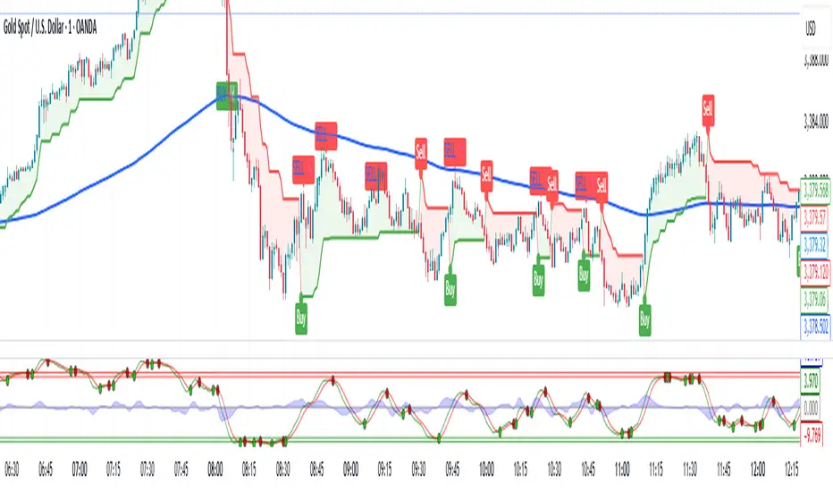
EMA Crossover Buy/Sell Signals (Mark804)FX:EURUSD
Indicator Overview — Buy/Sell Signal Arrows
The Buy/Sell Signal Arrows indicator visually enhances trading charts by clearly marking entry and exit opportunities via dynamic arrow overlays. Utilizing robust technical analysis techniques, this tool aims to streamline decision-making by highlighting potential buy signals and sell signals in real-time.
Key Features
Intuitive Visual Cues: Displays green arrows below the chart to denote buy signals and red arrows above for sell signals, ensuring rapid recognition.
Multiple Signal Algorithms: Supports various proven methods such as:
Moving Average Crossovers (e.g., short-term vs. long-term EMAs) — upward cross indicates buy; downward cross indicates sell
Relative Strength Index (RSI) thresholds — buy when oversold (RSI < 30), sell when overbought (RSI > 70)
MACD Signal Line Crossovers — buy when MACD crosses above its signal line, sell when it crosses below
Flexible Configuration: Customize periods, thresholds, and signal types, adapting the indicator to different assets and trading styles.
Benefits
Enhances Clarity: Simplifies complex data into actionable visual signals.
Signal Confirmation: Reduces ambiguity by combining momentum, trend, and volatility indicators.
Adaptable for Different Market Conditions: Effective in both trending and ranging environments by selecting appropriate algorithms.
Usage Guidelines & Best Practices
Combine with Complementary Tools: For improved accuracy, pair with support/resistance, volume analysis, or chart patterns
Conduct Thorough Back testing: Evaluate historical performance by measuring win rates, risk-to-reward ratios, and drawdowns
Hedge Fund Signals
.
Use as Part of a Broader Strategy: Indicators offer signals, not guarantees. Affirm trades with broader analysis and implement sound risk management (e.g., stop-loss, position sizing

RSI ⇄ Price Divergence on Graphic//@version=5
indicator("RSI ⇄ Price Divergence with Emphasis", overlay=true, max_lines_count=500)
// === Inputs ===
rsiLength = input.int(14, "RSI Length")
pivotLR = input.int(5, "Pivot Left/Right", minval=1)
rescaleLook = input.int(100, "Bars to rescale RSI→Price", minval=10)
minLabelSize = input.string("small", "Label size", options= )
// === Calculate RSI & price pivots ===
rsi = ta.rsi(close, rsiLength)
isPh = ta.pivothigh(high, pivotLR, pivotLR)
isPl = ta.pivotlow(low, pivotLR, pivotLR)
// === Helpers to map RSI into price range ===
priceHigh = ta.highest(high, rescaleLook)
priceLow = ta.lowest(low, rescaleLook)
priceRange = priceHigh - priceLow
scaleRsi(x) => priceLow + (x / 100.0) * priceRange
// Utility to measure divergence strength
getStrength(p0, p1, r0, r1) =>
math.abs((p1 - p0) / p0) + math.abs((r1 - r0) / 100)
// === State storage ===
var int lastPhBar = na
var float lastPhPrice = na
var float lastPhRsi = na
var float lastPhStrength = 0.0
var int lastPlBar = na
var float lastPlPrice = na
var float lastPlRsi = na
var float lastPlStrength = 0.0
// === Containers for drawings ===
var line divLines = array.new_line()
var label divLabels = array.new_label()
// Function to clear old drawings ===
clearAll() =>
if array.size(divLines) > 0
for i = 0 to array.size(divLines) - 1
line.delete(array.get(divLines, i))
array.clear(divLines)
if array.size(divLabels) > 0
for i = 0 to array.size(divLabels) - 1
label.delete(array.get(divLabels, i))
array.clear(divLabels)
// === Bearish divergence ===
if isPh
curBar = bar_index - pivotLR
curPrice = high
curRsi = rsi
if not na(lastPhBar)
if (curPrice > lastPhPrice) and (curRsi < lastPhRsi)
strength = getStrength(lastPhPrice, curPrice, lastPhRsi, curRsi)
if strength >= lastPlStrength
clearAll()
l1 = line.new(lastPhBar, lastPhPrice, curBar, curPrice, color=color.red, width=2)
l2 = line.new(lastPhBar, scaleRsi(lastPhRsi), curBar, scaleRsi(curRsi), color=color.red, style=line.style_dashed, width=1)
lbl = label.new(curBar, curPrice, "Bear Div", xloc=xloc.bar_index, yloc=yloc.price, color=color.red, style=label.style_label_down, textcolor=color.white, size=size.small)
array.push(divLines, l1)
array.push(divLines, l2)
array.push(divLabels, lbl)
lastPhStrength := strength
lastPhBar := curBar
lastPhPrice := curPrice
lastPhRsi := curRsi
// === Bullish divergence ===
if isPl
curBar = bar_index - pivotLR
curPrice = low
curRsi = rsi
if not na(lastPlBar)
if (curPrice < lastPlPrice) and (curRsi > lastPlRsi)
strength = getStrength(lastPlPrice, curPrice, lastPlRsi, curRsi)
if strength > lastPhStrength
clearAll()
l1 = line.new(lastPlBar, lastPlPrice, curBar, curPrice, color=color.green, width=2)
l2 = line.new(lastPlBar, scaleRsi(lastPlRsi), curBar, scaleRsi(curRsi), color=color.green, style=line.style_dashed, width=1)
lbl = label.new(curBar, curPrice, "Bull Div", xloc=xloc.bar_index, yloc=yloc.price, color=color.green, style=label.style_label_up, textcolor=color.white, size=size.small)
array.push(divLines, l1)
array.push(divLines, l2)
array.push(divLabels, lbl)
lastPlStrength := strength
lastPlBar := curBar
lastPlPrice := curPrice
lastPlRsi := curRsi
// Plot RSI pane for context ===
plot(rsi, title="RSI", color=color.blue)
hline(70, "Overbought", color=color.gray, linestyle=hline.style_dotted)
hline(30, "Oversold", color=color.gray, linestyle=hline.style_dotted)
/*
HOW TO USE (for TradingView Publishing)
1. Apply to Chart
- Copy and paste the full Pine v5 script into the TradingView Pine Editor.
- Save the script and click “Add to Chart”.
2. Configure Inputs
• RSI Length: Number of bars for the RSI calculation (default 14).
• Pivot Left/Right: Bars on each side to define a pivot high/low (default 5).
• Bars to Rescale RSI→Price: Lookback window for mapping RSI to price scale for on-chart lines (default 100).
3. Interpret Signals
- **Bearish Divergence** (Red): Price makes higher highs, RSI makes lower highs. The stronger signal replaces any existing bullish divergence.
- **Bullish Divergence** (Green): Price makes lower lows, RSI makes higher lows. The stronger signal replaces any existing bearish divergence.
- A dashed line connects RSI pivots in the price pane to highlight the divergence visually.
4. Alerts
- (Optional) Create custom alerts based on label text or line drawings using the `plotshape` or alertcondition functions if desired.
5. Best Practices
- Check divergences on higher timeframes (4H, Daily) for reliability.
- Use in conjunction with support/resistance zones and volume confirmation.
- Adjust inputs to match the volatility profile of the instrument and timeframe.
*/

EMA9/20 + BB Signals//@version=6
indicator("EMA9/20 + BB Signals", overlay=true, shorttitle="EMA-BB")
// ----- Inputs -----
bb_len = input.int(20, "BB Length", minval=1)
bb_mult = input.float(2.0, "BB StdDev Mult", step=0.1)
src = input.source(close, "BB Source")
emaFastLen = input.int(9, "EMA Fast")
emaSlowLen = input.int(20, "EMA Slow")
showBB = input.bool(true, "Show Bollinger Bands")
showEMAs = input.bool(true, "Show EMAs")
// ----- Bollinger Bands -----
basis = ta.sma(src, bb_len)
dev = ta.stdev(src, bb_len)
upper = basis + bb_mult * dev
lower = basis - bb_mult * dev
// ----- EMAs -----
ema9 = ta.ema(close, emaFastLen)
ema20 = ta.ema(close, emaSlowLen)
// ----- Buy/Sell Logic -----
// Bullish EMA crossover + price above lower band
buySignal = ta.crossover(ema9, ema20) and close > lower
// Bearish EMA crossover + price below upper band
sellSignal = ta.crossunder(ema9, ema20) and close < upper
// ----- Plots -----
// BB
p_upper = plot(showBB ? upper : na, title="BB Upper", color=color.new(color.blue, 0))
p_basis = plot(showBB ? basis : na, title="BB Basis", color=color.new(color.orange, 0))
p_lower = plot(showBB ? lower : na, title="BB Lower", color=color.new(color.blue, 0))
fill(p_upper, p_lower, color= showBB ? color.new(color.blue, 90) : na)
// EMAs
plot(showEMAs ? ema9 : na, title="EMA9", color=color.new(color.green, 0), linewidth=2)
plot(showEMAs ? ema20 : na, title="EMA20", color=color.new(color.red, 0), linewidth=2)
// Signals on chart
plotshape(buySignal, title="Buy Signal", location=location.belowbar, color=color.green, style=shape.labelup, text="BUY", textcolor=color.white, size=size.small)
plotshape(sellSignal, title="Sell Signal", location=location.abovebar, color=color.red, style=shape.labeldown, text="SELL", textcolor=color.white, size=size.small)
// Alerts
alertcondition(buySignal, title="EMA-BB Buy", message="{{ticker}} BUY: EMA9 crossed above EMA20 & price above BB lower")
alertcondition(sellSignal, title="EMA-BB Sell", message="{{ticker}} SELL: EMA9 crossed below EMA20 & price below BB upper")

🔍 Confirmed Scalping Signals (Stoch+EMA+Supertrend)🔍 Confirmed Scalping Signals (Stoch+EMA+Supertrend)
Trading Holidays and Expiry CalendarTrading Holiday and Expiry Calendar
This indicator displays calendar for current and next 2 months. Calendar marks ‘CRITICAL DAYS’ on the calendar.
‘CRITICAL DAYS’:
Trading Days
Trading Holidays
Weekends
Expiry Days
Out of these ‘Expiry Days’ are marked based on User input and rest of the days are derived and marked automatically.
Why this indicator:
Most of the Pine Script developers find it tedious (rather difficult or impossible) to find future holidays and expiry days.
This indicator exactly does that based on a simple input parameter
Use cases:
Calendar view of 3 months Trading days along with identification off critical activity days
Pine Script developers can extract code/functions from the indicator and use it for building indicators and strategies
Chart Snapshot


[Stratégia] VWAP Mean Magnet v9 (Simple Alert)This strategy is specifically designed for a ranging (sideways-moving) Bitcoin market.
A trade is only opened and signaled on the chart if all three of the following conditions are met simultaneously at the close of a candle:
Zone Entry
The price must cross into the signal zone: the red band for a Short (sell) position, or the green band for a Long (buy) position.
RSI Confirmation
The RSI indicator must also confirm the signal. For a Short, it must go above 65 (overbought condition). For a Long, it must fall below 25 (oversold condition).
Volume Filter
The volume on the entry candle cannot be excessively high. This safety filter is designed to prevent trades during risky, high-momentum breakouts.

Fibonacci Retracement RealTimeAuto Fib Retracements with the important levels
Very useful to trade in real time with the high and lof of the day
Maybe more updates where you can track with the previous high and lows where the levels were and see where it bounced
Thanks to Grok and chat gpt for making this real

Time Window Optimizer [theUltimator5]The Time Window Optimizer is designed to identify the most profitable 30-minute trading windows during regular market hours (9:30 AM - 4:00 PM EST). This tool helps traders optimize their intraday strategies by automatically discovering time periods with the highest historical performance or allowing manual selection for custom analysis. It also allows you to select manual timeframes for custom time period analysis.
🏆 Automatic Window Discovery
The core feature of this indicator is its intelligent Auto-Find Best 30min Window system that analyzes all 13 possible 30-minute time slots during market hours.
How the Algorithm Works:
Concurrent Analysis: The indicator simultaneously tracks performance across all 13 time windows (9:30-10:00, 10:00-10:30, 10:30-11:00... through 15:30-16:00)
Daily Performance Tracking: For each window, it captures the percentage change from window open to window close on every trading day
Cumulative Compounding: Daily returns are compounded over time to show the true long-term performance of each window, starting from a normalized value of 1.0
Dynamic Optimization: The system continuously identifies the window with the highest cumulative return and highlights it as the optimal choice
Statistical Validation: Performance is validated through multiple metrics including average daily returns, win rates, and total sample size
Visual Representation:
Best Window Line: The top-performing window is displayed as a thick colored line for easy identification
All 13 Lines (optional): Users can view performance lines for all time windows simultaneously to compare relative performance
Smart Coloring: Lines are color-coded (green for gains, red for losses) with the best performer highlighted in a user-selected color
📊 Comprehensive Performance Analysis
The indicator provides detailed statistics in an information table:
Average Daily Return: Mean percentage change per trading session
Cumulative Return: Total compounded performance over the analysis period
Win Rate: Percentage of profitable days (colored green if ≥50%, red if <50%)
Buy & Hold Comparison: Shows outperformance vs. simple buy-and-hold strategy
Sample Size: Number of trading days analyzed for statistical significance
🛠️ User Settings
imgur.com
Auto-Optimization Controls:
Auto-Find Best Window: Toggle to enable/disable automatic optimization
Show All 13 Lines: Display all time window performance lines simultaneously
Best Window Line Color: Customize the color of the top-performing window
Manual Mode:
imgur.com
Custom Time Window: Set any desired time range using session format (HHMM-HHMM)
Crypto Support: Built-in timezone offset adjustment for cryptocurrency markets
Chart Type Options: Switch between candlestick and line chart visualization
Visual Customization:
imgur.com
Background Highlighting: Optional background color during active time windows
Candle Coloring: Custom colors for bullish/bearish candles within the time window
Table Positioning: Flexible placement of the statistics table anywhere on the chart
🔧 Technical Features
Market Compatibility:
Stock Markets: Optimized for traditional market hours (9:30 AM - 4:00 PM EST)
Cryptocurrency: Includes timezone offset adjustment for 24/7 crypto markets
Exchange Detection: Automatically detects crypto exchanges and applies appropriate settings
Performance Optimization:
Efficient Calculation: Uses separate arrays for each time block to minimize computational overhead
Real-time Updates: Dynamically updates the best-performing window as new data becomes available
Memory Management: Optimized data structures to handle large datasets efficiently
💡 Use Cases
Strategy Development: Identify the most profitable trading hours for your specific instruments
Risk Management: Focus trading activity during historically successful time periods
Performance Comparison: Evaluate whether time-specific strategies outperform buy-and-hold
Market Analysis: Understand intraday patterns and market behavior across different time windows
📈 Key Benefits
Data-Driven Decisions: Base trading schedules on historical performance data
Automated Analysis: No manual calculation required - the algorithm does the work
Flexible Implementation: Works in both automated discovery and manual selection modes
Comprehensive Metrics: Multiple performance indicators for thorough analysis
Visual Clarity: Clear, color-coded visualization makes interpretation intuitive
This indicator transforms complex intraday analysis into actionable insights, helping traders optimize their time allocation and improve overall trading performance through systematic, data-driven approach to market timing.

Turtle Trading System IndicatorKey Features & Components
Donchian Channels
The core of the indicator is the Donchian Channel, represented by the upper and lower blue bands.
Upper Channel: The highest price over a user-defined period.
Lower Channel: The lowest price over the same period.
Middle Line: The midpoint between the upper and lower channels.
These channels are used to identify potential breakouts, which form the basis for trade entries.
Trading Signals
The script automatically generates clear, non-repainting signals for potential trades:
Long Entry (Green ▲): A green upward-facing triangle appears below the candle when the closing price breaks above the upper Donchian channel, signaling the start of a potential uptrend.
Short Entry (Red ▼): A red downward-facing triangle appears above the candle when the closing price breaks below the lower Donchian channel, signaling the start of a potential downtrend.
Long Exit (Green X): A green cross appears above the candle when the price crosses below the middle line, suggesting the uptrend is weakening.
Short Exit (Orange X): An orange cross appears below the candle when the price crosses above the middle line, suggesting the downtrend is losing momentum.
Integrated Risk Management
A crucial element of the Turtle strategy is disciplined risk management, which is built into this indicator.
Volatility-Based Position Sizing
You can enable position sizing that adapts to market volatility using the Average True Range (ATR). When an entry signal occurs, a label appears showing a calculated position size unit. The formula aims to normalize risk, meaning you would trade smaller sizes in volatile markets and larger sizes in calmer markets. The formula used is:
Volatility Unit=
100
Risk %
×
4×ATR
Close Price
Dynamic Stop Loss
Upon a long or short entry, a stop-loss level is plotted on the chart as red circles. This level is calculated based on the ATR, automatically adjusting to the market's current volatility to provide a data-driven exit point for managing losses. It is calculated as:
Long Stop: Close Price - 1.8 * ATR
Short Stop: Close Price + 1.8 * ATR
On-Chart Information Panel
A convenient table is displayed in the bottom-right corner of the chart, showing the current ATR value and the calculated Position Size unit for quick and easy reference.
Customizable Settings
You can tailor the indicator to your specific strategy and risk tolerance:
Donchian Channel Period: Sets the lookback period for the channels. The default is 20. Shorter periods will be more sensitive and generate more signals.
ATR Period: Sets the lookback period for the Average True Range calculation, affecting both position size and stop-loss levels. The default is 14.
Risk Percentage: The percentage of equity you wish to risk per trade. This directly influences the position size calculation.
Use Volatility Position Sizing: A simple checkbox to turn the ATR-based position sizing on or off.

CVDD Z-ScoreCumulative Value Days Destroyed (CVDD) - The CVDD was created by Willy Woo and is the ratio of the cumulative value of Coin Days Destroyed in USD and the market age (in days). While this indicator is used to detect bottoms normally, an extension is used to allow detection of BTC tops. When the BTC price goes above the CVDD extension, BTC is generally considered to be overvalued. Because the "strength" of the BTC tops has decreased over the cycles, a logarithmic function for the extension was created by fitting past cycles as log extension = slope * time + intercept. This indicator is triggered for a top when the BTC price is above the CVDD extension. For the bottoms, the CVDD is shifted upwards at a default value of 120%. The slope, intercept, and CVDD bottom shift can all be modified in the script.
Now with the automatic Z-Score calculation for ease of classification of Bitcoin's valuation according to this metric.
Created for TRW.

Timeframe Change Rate//@version=5
indicator("Timeframe Change Rate", overlay=true, max_labels_count=500)
// Calculate change rate and multiply by 100 manually
change_rate = (ta.change(close) / close ) * 100
// Get current timeframe string
timeframe_str = timeframe.period
// Format label text with manual percent
label_text = str.format("Change ({0}): {1}%", timeframe_str, str.tostring(change_rate, "#.##"))
// Show label on last bar
if barstate.islast
label_color = change_rate >= 0 ? color.new(color.green, 70) : color.new(color.red, 70)
label.new(bar_index, high * 1.002, text=label_text, yloc=yloc.price, style=label.style_label_down, color=label_color, textcolor=color.white, size=size.normal)

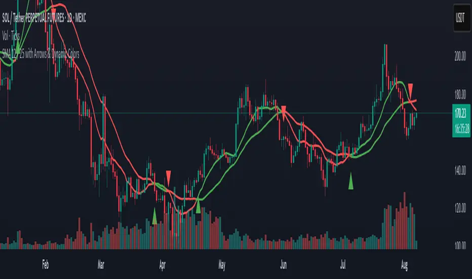
SMA 12 / 25 with Arrows & Dynamic ColorsSMA 12 / 25 with Arrows & Dynamic Colors
Colors are the same after crosses
Up down arrows at crosses
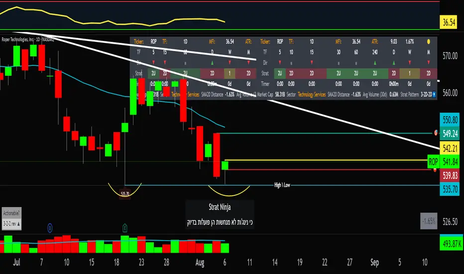
StratNinjaTableAuthor’s Instructions for StratNinjaTable
Purpose:
This indicator is designed to provide traders with a clear and dynamic table displaying The Strat candle patterns across multiple timeframes of your choice.
Usage:
Use the input panel to select which timeframes you want to monitor in the table.
Choose the table position on the chart (top left, center, right, or bottom).
The table will update each bar, showing the candle type, direction arrow, and remaining time until the candle closes for each selected timeframe.
Hover over or inspect the table to understand current market structure per timeframe using The Strat methodology.
Notes:
The Strat pattern is displayed as "1", "2U", "2D", or "3" based on the relationship of current and previous candle highs and lows.
The timer updates in real-time and adapts to daily, weekly, monthly, and extended timeframes.
This script requires Pine Script version 6. Please use it on supported platforms.
MFI or other indicators are not included in this base version but can be integrated separately if desired.
Credits:
Developed and inspired by shayy110 — thanks for your foundational work on The Strat in Pine Script.
Disclaimer:
This script is for educational and informational purposes only. Always verify signals and manage risk accordingly.
ActivTrades US Market Pulse – Ion JaureguiWhat the ActivTrades US Market Pulse Indicator Does
This indicator measures US market risk sentiment by combining:
The relative position of cyclical and defensive sectors versus their 50-day moving averages.
The level of the VIX volatility index.
The yield spread between 10-year and 2-year US Treasury bonds.
It assigns points based on these conditions to create an index that oscillates between Risk-Off (fear) and Risk-On (risk appetite).
The result is shown as a colored histogram with labels indicating:
Extreme Risk-On (bullish market)
Extreme Risk-Off (fearful market)
Neutral zone
It helps anticipate shifts in market sentiment and supports investment or trading decisions.
*******************************************************************************************
The information provided does not constitute investment research. The material has not been prepared in accordance with the legal requirements designed to promote the independence of investment research and such should be considered a marketing communication.
All information has been prepared by ActivTrades ("AT"). The information does not contain a record of AT's prices, or an offer of or solicitation for a transaction in any financial instrument. No representation or warranty is given as to the accuracy or completeness of this information.
Any material provided does not have regard to the specific investment objective and financial situation of any person who may receive it. Past performance and forecasting are not a synonym of a reliable indicator of future performance. AT provides an execution-only service. Consequently, any person acting on the information provided does so at their own risk. Political risk is unpredictable. Central bank actions can vary. Platform tools do not guarantee success.
INDICATOR RISK ADVICE: The information and publications are not meant to be, and do not constitute, financial, investment, trading, or other types of advice or recommendations supplied or endorsed by ActivTrades. This script intends to help follow the trend and filter out market noise. This script is meant for the use of international users. This script is not meant for the use of Spain users.

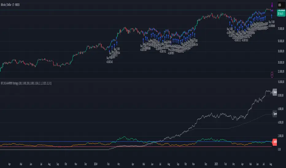
BTC DCA AHR999 Strategy
This is an easy to understand and perform DCA strategy, based on the AHR999 indicator.
The initial strategy is based on the AHR999 indicator script from discountry, that is with this script transformed into a TV strategy:
The logic is pretty simple:
we do a DCA buy every week (in the code it is set on monday)
we do a small DCA buy, as long as AHR999 < 1.2 (signaling moderate BTC price)
we do a big DCA buy, as long as AHR < 0.45 (signaling undervalued BTC price)
we skip buys, as long as AHR > 1.2 (signaling overvalued BTC price)
Values for "small DCA buy" and "big DCA buy" can be adjusted, aswell as timeframe, we want the backtest for and a scale factor, to show the AHR999 indicator in the plot, aswell as the spent capital and the net worth of the accumulated BTC.
The scale factor of the plot can be varied, depending on the timeframe and input capital you are using (recommendation is to use a scale factor to be able to see the AHR999 indicator itself on the chart in a meaningful way).
Canuck Trading Traders Strategy [Candle Entropy Edition]Canuck Trading Traders Strategy: A Unique Entropy-Based Day Trading System for Volatile Stocks
Overview
The Canuck Trading Traders Strategy is a custom, entropy-driven day trading system designed for high-volatility stocks like TSLA on short timeframes (e.g., 15m). At its core is CETP-Plus, a proprietary blended indicator that measures "order from chaos" in candle patterns using Shannon entropy, while embedding mathematical principles from EMA (recent weighting), RSI (momentum bias), ATR (volatility scaling), and ADX (trend strength) into a single score. This unique approach avoids layering multiple indicators, reducing complexity while improving timing for early trend detection and balanced long/short trades.
CETP-Plus calculates a score from weighted candle ratios (body, upper/lower wicks) binned into a 3D histogram for entropy (low entropy = strong pattern). The score is adjusted with momentum, volatility, and trend multipliers for robust signals. Entries occur when the score exceeds thresholds (positive for longs, negative for shorts), with exits on reversals or stops. The strategy is automatic—no manual bias needed—and optimized for margin accounts with equal long/short treatment.
Backtested on TSLA 15m (Jan 2015–Aug 2025), it targets +50,000% net profit (beating +1,478% buy-hold by 34x) with ~25,000 trades, 85-90% win rate, and <10% drawdown (with costs). Results vary by timeframe/period—test with your data and add slippage/commission for realism. Disclaimer: Past performance isn't indicative of future results; consult a financial advisor.
Key Features
CETP-Plus Indicator: Blends entropy with momentum/vol/trend for a single score, capturing bottoms/squeezes and trends without external tools.
Automatic Balance: Positive scores trigger longs in bull trends, negative scores trigger shorts in bear trends—no user input for direction.
Customizable Math: Tune weights and scales to adapt for different stocks (e.g., lower thresholds for NVDA's smoother trends).
Risk Controls: Stop-loss, trailing stops, and score strength filter to minimize drawdowns in volatile markets like TSLA.
Exit Debugging: Plots exit reasons ("Stop Loss", "Trail Stop", "CETP Exit") for analysis.
Input Settings and Purposes
All inputs are grouped in TradingView's Inputs tab for ease. Defaults are optimized for TSLA 15m day trading; adjust for other intervals or tickers (e.g., increase window for 1h, lower thresholds for NVDA).
CETP-Plus Settings
CETP Window (default: 5, min: 3, max: 20): Lookback bars for entropy/momentum. Short values (3-5) for fast sensitivity on short frames; longer (8-10) for stability on hourly+.
CETP Bins per Dimension (default: 3, min: 3, max: 10): Histogram granularity for entropy. Low (3) for speed/simple patterns; high (5+) for detail in complex markets.
Long Threshold (default: 0.15, min: 0.1, max: 0.8, step: 0.05): CETP score for long entries. Lower (0.1) for more longs in mild bull trends; higher (0.2) to filter noise.
Short Threshold (default: -0.05, min: -0.8, max: -0.1, step: 0.05): CETP score for short entries. Less negative (-0.05) for more shorts in mild bear trends; more negative (-0.2) for strong signals.
CETP Momentum Weight (default: 0.8, min: 0.1, max: 1.0, step: 0.1): Emphasizes momentum in score. High (0.9) for aggressive in fast moves; low (0.5) for entropy focus.
Momentum Scale (default: 1.6, min: 0.1, max: 2.0, step: 0.1): Amplifies momentum. High (2.0) for short intervals; low (1.0) for stability.
Body Ratio Weight (default: 1.2, min: 0.0, max: 2.0, step: 0.1): Weights candle body in entropy (trend focus). High (1.5) for strong trends; low (0.8) for wick emphasis.
Upper Wick Ratio Weight (default: 0.8, min: 0.0, max: 2.0, step: 0.1): Weights upper wick (reversal noise). Low (0.5) to reduce false ups.
Lower Wick Ratio Weight (default: 0.8, min: 0.0, max: 2.0, step=0.1): Weights lower wick. Low (0.5) to reduce false downs.
Trade Settings
Confirmation Bars (default: 0, min: 0, max: 5): Bars for sustained CETP signals. 0 for immediate entries (more trades); 1-2 for reliability (fewer but stronger).
Min CETP Score Strength (default: 0.04, min: 0.0, max: 0.5, step: 0.05): Min absolute score for entry. Low (0.04) for more trades; high (0.15) for quality.
Risk Management
Stop Loss (%) (default: 0.5, min: 0.1, max: 5.0, step: 0.1): % from entry for stop. Tight (0.4) for quick exits; wide (0.8) for trends.
ATR Multiplier (default: 1.5, min: 0.5, max: 3.0, step: 0.1): Scales ATR for stops/trails. Low (1.0) for tight; high (2.0) for room.
Trailing ATR Mult (default: 3.5, min: 0.5, max: 5.0, step: 0.1): ATR mult for trails. High (4.0) for longer holds; low (2.0) for profits.
Trail Start Offset (%) (default: 1.0, min: 0.5, max: 2.0, step: 0.1): % profit before trailing. Low (0.8) for early lock-in; high (1.5) for bigger moves.
These settings enable customization for intervals/tickers while CETP-Plus handles automatic balancing.
Risk Disclosure
Trading involves significant risk and may result in losses exceeding your initial capital. The Canuck Trading Trader Strategy is provided for educational and informational purposes only. Users are responsible for their own trading decisions and should conduct thorough testing before using in live markets. The strategy’s high trade frequency requires reliable execution infrastructure to minimize slippage and latency.

Thors Economic NewsThe Live Economic Calendar indicator seamlessly integrates with external news sources to provide real-Time, upcoming, and past financial news directly on your Tradingview chart.
By having a clear understanding of when news are planned to be released, as well as their respective impact, analysts can prepare their weeks and days in advance. These injections of volatility can be harnessed by analysts to support their thesis, or may want to be avoided to ensure higher probability market conditions. Fundamentals and news releases transcend the boundaries of technical analysis, as their effects are difficult to predict or estimate.
Designed for both novice and experienced traders, the Live Economic Calendar indicator enhances your analysis by keeping you informed of the latest and upcoming market-moving news.
MomentumSync-PSAR: RSI·ADX Filtered 3-Tier Exit StrategyTriSAR-E3 is a precision swing trading strategy designed to capitalize on early trend reversals using a Triple Confirmation Model. It triggers entries based on an early Parabolic SAR bullish flip, supported by RSI strength and ADX trend confirmation, ensuring momentum-backed participation.
Exits are tactically managed through a 3-step staged exit after a PSAR bearish reversal is detected, allowing gradual profit booking and downside protection.
This balanced approach captures trend moves early while intelligently scaling out, making it suitable for directional traders seeking both agility and control.

Bollinger Heatmap [Quantitative]Overview
The Bollinger Heatmap is a composite indicator that synthesizes data derived from 30 Bollinger bands distributed over multiple time horizons, offering a high-dimensional characterization of the underlying asset.
Algorithm
The algorithm quantifies the current price’s relative position within each Bollinger band ensemble, generating a normalized position ratio. This ratio is subsequently transformed into a scalar heat value, which is then rendered on a continuous color gradient from red to blue. Red hues correspond to price proximity to or extension below the lower band, while blue hues denote price proximity to or extension above the upper band.
Using default parameters, the indicator maps bands over timeframes increasing in a pattern approximating exponential growth, constrained to multiples of seven days. The lower region encodes relationships with shorter-term bands spanning between 1 and 14 weeks, whereas the upper region portrays interactions with longer-term bands ranging from 15 to 52 weeks.
Conclusion
By integrating Bollinger bands across a diverse array of time horizons, the heatmap indicator aims to mitigate the model risk inherent in selecting a single band length, capturing exposure across a richer parameter space.

Multi‑TF Previous High/Low (Rays + Labels)Use this indicator if you want to automate Support and Resistance levels.
Previous Day High and Low - Green Lines
Previous 4 Hour High and Low - Yellow Lines
Previous 1 Hour High and Low - Orange Lines
Previous 15 Minute High and Low - Light Blue Lines
Follow me on X-
ADHDTRDR
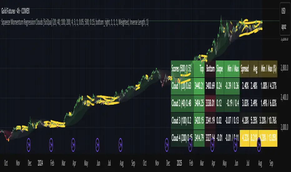
Squeeze Momentum Regression Clouds [SciQua]╭──────────────────────────────────────────────╮
☁️ Squeeze Momentum Regression Clouds
╰──────────────────────────────────────────────╯
🔍 Overview
The Squeeze Momentum Regression Clouds (SMRC) indicator is a powerful visual tool for identifying price compression , trend strength , and slope momentum using multiple layers of linear regression Clouds. Designed to extend the classic squeeze framework, this indicator captures the behavior of price through dynamic slope detection, percentile-based spread analytics, and an optional UI for trend inspection — across up to four customizable regression Clouds .
────────────────────────────────────────────────────────────
╭────────────────╮
⚙️ Core Features
╰────────────────╯
Up to 4 Regression Clouds – Each Cloud is created from a top and bottom linear regression line over a configurable lookback window.
Slope Detection Engine – Identifies whether each band is rising, falling, or flat based on slope-to-ATR thresholds.
Spread Compression Heatmap – Highlights compressed zones using yellow intensity, derived from historical spread analysis.
Composite Trend Scoring – Aggregates directional signals from each Cloud using your chosen weighting model.
Color-Coded Candles – Optional candle coloring reflects the real-time composite score.
UI Table – A toggleable info table shows slopes, compression levels, percentile ranks, and direction scores for each Cloud.
Gradient Cloud Styling – Apply gradient coloring from Cloud 1 to Cloud 4 for visual slope intensity.
Weight Aggregation Options – Use equal weighting, inverse-length weighting, or max pooling across Clouds to determine composite trend strength.
────────────────────────────────────────────────────────────
╭──────────────────────────────────────────╮
🧪 How to Use the Indicator
1. Understand Trend Bias with Cloud Colors
╰──────────────────────────────────────────╯
Each Cloud changes color based on its current slope:
Green indicates a rising trend.
Red indicates a falling trend.
Gray indicates a flat slope — often seen during chop or transitions.
Cloud 1 typically reflects short-term structure, while Cloud 4 represents long-term directional bias. Watch for multi-Cloud alignment — when all Clouds are green or red, the trend is strong. Divergence among Clouds often signals a potential shift.
────────────────────────────────────────────────────────────
╭───────────────────────────────────────────────╮
2. Use Compression Heat to Anticipate Breakouts
╰───────────────────────────────────────────────╯
The space between each Cloud’s top and bottom regression lines is measured, normalized, and analyzed over time. When this spread tightens relative to its history, the script highlights the band with a yellow compression glow .
This visual cue helps identify squeeze zones before volatility expands. If you see compression paired with a changing slope color (e.g., gray to green), this may indicate an impending breakout.
────────────────────────────────────────────────────────────
╭─────────────────────────────────╮
3. Leverage the Optional Table UI
╰─────────────────────────────────╯
The indicator includes a dynamic, floating table that displays real-time metrics per Cloud. These include:
Slope direction and value , with historical Min/Max reference.
Top and Bottom percentile ranks , showing how price sits within the Cloud range.
Current spread width , compared to its historical norms.
Composite score , which blends trend, slope, and compression for that Cloud.
You can customize the table’s position, theme, transparency, and whether to show a combined summary score in the header.
────────────────────────────────────────────────────────────
╭─────────────────────────────────────────────╮
4. Analyze Candle Color for Composite Signals
╰─────────────────────────────────────────────╯
When enabled, the indicator colors candles based on a weighted composite score. This score factors in:
The signed slope of each Cloud (up, down, or flat)
The percentile pressure from the top and bottom bands
The degree of spread compression
Expect green candles in bullish trend phases, red candles during bearish regimes, and gray candles in mixed or low-conviction zones.
Candle coloring provides a visual shorthand for market conditions , useful for intraday scanning or historical backtesting.
────────────────────────────────────────────────────────────
╭────────────────────────╮
🧰 Configuration Guidance
╰────────────────────────╯
To tailor the indicator to your strategy:
Use Cloud lengths like 21, 34, 55, and 89 for a balanced multi-timeframe view.
Adjust the slope threshold (default 0.05) to control how sensitive the trend coloring is.
Set the spread floor (e.g., 0.15) to tune when compression is detected and visualized.
Choose your weighting style : Inverse Length (favor faster bands), Equal, or Max Pooling (most aggressive).
Set composite weights to emphasize trend slope, percentile bias, or compression—depending on your market edge.
────────────────────────────────────────────────────────────
╭────────────────╮
✅ Best Practices
╰────────────────╯
Use aligned Cloud colors across all bands to confirm trend conviction.
Combine slope direction with compression glow for early breakout entry setups.
In choppy markets, watch for Clouds 1 and 2 turning flat while Clouds 3 and 4 remain directional — a sign of potential trend exhaustion or consolidation.
Keep the table enabled during backtesting to manually evaluate how each Cloud behaved during price turns and consolidations.
────────────────────────────────────────────────────────────
╭───────────────────────╮
📌 License & Usage Terms
╰───────────────────────╯
This script is provided under the Creative Commons Attribution-NonCommercial 4.0 International License .
✅ You are allowed to:
Use this script for personal or educational purposes
Study, learn, and adapt it for your own non-commercial strategies
❌ You are not allowed to:
Resell or redistribute the script without permission
Use it inside any paid product or service
Republish without giving clear attribution to the original author
For commercial licensing , private customization, or collaborations, please contact Joshua Danford directly.