🧠 Aggressive RSI + EMA Strategy with TP/SL⚙️ How It Works
RSI-Based Entries:
Buys when RSI is below 40 (oversold) and trend is up (fast EMA > slow EMA).
Sells when RSI is above 60 (overbought) and trend is down (fast EMA < slow EMA).
Trend Filter:
Uses two EMAs (short/long) to filter signals and avoid trading against momentum.
Risk Management:
Default Take Profit: +1%
Default Stop Loss: -0.5%
This creates a 2:1 reward-to-risk setup.
📊 Backtest Settings
Initial Capital: $10,000
Order Size: 10% of equity per trade (adjustable)
Commission: 0.04% per trade (Binance spot-style)
Slippage: 2 ticks
Tested on: BTC/USDT – 15min timeframe (suitable for high-frequency scalping)
Trade Sample: (Adjust this based on your actual results.)
🔔 Features
Built-in alerts for buy/sell signals
Visual chart plots for entry/exit, RSI, EMAs
Customizable inputs for RSI thresholds, TP/SL %, EMA lengths
💡 Why It’s Unique
Unlike many RSI systems that trade blindly at 70/30 levels, this strategy adds a trend filter to boost signal quality.
The tight TP/SL configuration is tailored for scalpers and intraday momentum traders who prefer quick, consistent trades over long holds.
Indicators and strategies

MA Deviation Indicator# MA Deviation Indicator (MADI)
A TradingView indicator designed to visualize price deviation from moving averages and help identify optimal entry and exit points.
## Overview
This indicator measures how much the current price deviates from its moving average and provides the following features:
- Moving average line display
- Configurable deviation rate levels
- Signal display based on deviation rates
- Real-time deviation rate calculation
## Key Features
### 1. Moving Average Display
- Choose between **EMA (Exponential Moving Average)** or **SMA (Simple Moving Average)**
- Default period: 21
- Displayed as an aqua-colored line
### 2. Deviation Rate Levels
- **Level 1 (Default 0.7%)**: Light gray lines
- **Level 2 (Default 2.0%)**: Dark gray lines
- Displayed symmetrically above and below the moving average
### 3. Deviation Rate Signals
- **Red triangles**: Within 0.7% deviation (optimal range)
- **Orange triangles**: 0.7%-2.0% deviation (caution range)
- Displayed as small triangles at the top of the chart
## Configuration Parameters
### Moving Average Settings
| Parameter | Default Value | Description |
|-----------|---------------|-------------|
| Moving Average Period | 21 | Calculation period for moving average (1-200) |
| Moving Average Type | EMA | Type of moving average (EMA/SMA) |
### Deviation Rate Settings
| Parameter | Default Value | Description |
|-----------|---------------|-------------|
| Deviation Rate 1 (%) | 0.7 | First deviation rate level (0.1-10.0%) |
| Deviation Rate 2 (%) | 2.0 | Second deviation rate level (0.1-10.0%) |
### Display Settings
| Parameter | Default Value | Description |
|-----------|---------------|-------------|
| Show Moving Average Line | true | Show/hide moving average line |
| Show Deviation Rate Signals | false | Show/hide deviation rate signals |
| Show Deviation Rate Levels | true | Show/hide deviation rate level lines |
---
**Disclaimer**: This indicator is not investment advice. In actual trading, combine multiple indicators and implement proper risk management.

Market Structure🏗️ Market Structure Indicator for TradingView (Pine Script v6)
Overview:
The Market Structure indicator is a robust tool for identifying swing highs and swing lows across multiple structural levels:
🟤 Short-Term Swings
🟠 Intermediate-Term Swings
🟢 Long-Term Swings
It helps traders visually interpret market structure by detecting confirmed pivot points and promoting them through a hierarchical system. This provides a clear picture of trend direction, breakouts, and reversals.
⚙️ Features and Functionality:
✅ Multi-level Swing Detection:
The indicator promotes confirmed swing points from short-term to intermediate and long-term levels using a structured algorithm.
✅ Full Customization:
Toggle visibility of each swing level independently.
Choose custom colors for short, intermediate, and long-term swings.
✅ Transparent and Commented Logic:
The code contains well-structured functions for identifying and confirming swing highs and lows.
Label arrays are used for precise control over swing detection and display.
✅ Detailed and Open Source Code:
Every function is thoroughly explained with inline comments.
Designed to be easy to understand, modify, and extend — perfect for learning or integrating into more advanced systems.
📜 Open and Documented Source Code
The script is entirely open-source, written in Pine Script v6, and includes full documentation inside the code itself. Key sections include:
🔧 Input settings and visual configuration
🧠 Swing detection and confirmation methods
🔁 Promotion logic between structure levels
📈 Real-time label drawing on each bar
Everything is fully accessible and explained — no obfuscation, no hidden logic.

MA Crossover with Dots📘 Strategy Description – Moving Average Crossover with Dot Signals
This indicator is based on a Simple Moving Average (SMA) crossover strategy, which is a classic method to identify trend changes and potential buy/sell signals in the market.
📊 Core Logic:
It calculates two SMAs:
Fast SMA: 20-period moving average (short-term trend)
Slow SMA: 50-period moving average (longer-term trend)
✅ Buy Signal (Green Dot):
When the Fast SMA crosses above the Slow SMA, a Buy signal is generated.
This suggests bullish momentum or the start of an uptrend.
❌ Sell Signal (Red Dot):
When the Fast SMA crosses below the Slow SMA, a Sell signal is generated.
This suggests bearish momentum or the start of a downtrend.
📍 Visual Representation:
The Buy and Sell signals are plotted as colored dots at different levels:
Green dot = Buy
Red dot = Sell
The dots are plotted at fixed vertical positions in a separate panel below the chart for better clarity and to avoid overlap.

Time CyclesThese are ICT market time cycles based on the idea that London starts at 3:30am (EST) and continues until 7am. NYAM is then from 7am-11:30am. NYPM from 11:30-4pm. Each of these sessions is broken into 90minute cycles which are also broken into 30minute cycles.

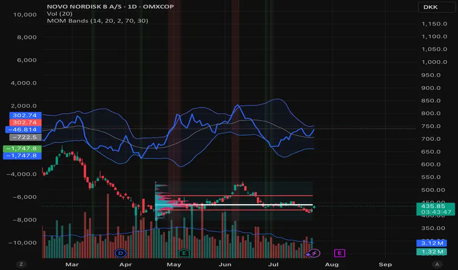
Momentum BandsMomentum Bands indicator-->technical tool that measures the rate of price change and surrounds this momentum with adaptive bands to highlight overbought and oversold zones. Unlike Bollinger Bands, which track price, these bands track momentum itself, offering a unique view of market strength and exhaustion points. At its core, it features a blue momentum line that calculates the rate of change over a set period, an upper red band marking dynamic resistance created by adding standard deviations to the momentum average, a lower green band marking dynamic support by subtracting standard deviations, and a gray middle line representing the average of momentum as a central anchor. When the momentum line touches or moves beyond the upper red band, it often signals that the market may be overbought and a pullback or reversal could follow; traders might lock in profits or watch for short setups. Conversely, when it drops below the lower green band, it can suggest an oversold market primed for a bounce, prompting traders to look for buying opportunities. If momentum remains between the bands, it typically indicates balanced conditions where waiting for stronger signals at the extremes is wise. The indicator can be used in contrarian strategies—buying near the lower band and selling near the upper—or in trend-following setups by waiting for momentum to return toward the centerline before entering trades. For stronger confirmation, traders often combine it with volume spikes, support and resistance analysis, or other trend tools, and it’s useful to check multiple timeframes to spot consistent patterns. Recommended settings vary: short-term traders might use a 7–10 period momentum with 14-period bands; medium-term traders might keep the default 14-period momentum and 20-period bands; while long-term analysis might use 21-period momentum and 50-period bands. Visually, background colors help spot extremes: red for strong overbought, green for strong oversold, and no color for normal markets, alongside reference lines at 70, 30, and 0 to guide traditional overbought, oversold, and neutral zones. Typical bullish signals include momentum rebounding from the lower band, crossing back above the middle after being oversold, or showing divergence where price makes new lows but momentum doesn’t. Bearish signals might appear when momentum hits the upper band and weakens, drops below the middle after being overbought, or price makes new highs while momentum fails to follow. The indicator tends to work best in mean-reverting or sideways markets rather than strong trends, where overbought and oversold conditions tend to repeat.
Zone Levels (Final 888)📌 Zone Levels Indicator – Buy & Sell Zones with Alerts
This script plots clearly defined buy and sell zones on the chart, with custom top/bottom price inputs for each zone. Ideal for traders who want to visually track high-probability reversal or entry areas.
✅ Key Features:
🔧 Fully customizable zones via settings
📏 Extends zones 240 bars to the left and 40 bars to the right
🏷️ Auto-labeled zones with proper price formatting (e.g. 3385–3390)
🔔 Built-in alerts when price enters any zone
🎯 Mid-zone line for key reference level
🟢 Buy Zones:
Buy Z1: 3415–3412
Buy Z2: 3405–3402
Buy Z3: 3400–3397
Buy Z4: 3390–3385
🔴 Sell Zones:
Sell Z1: 3430–3431
Sell Z2: 3434–3436
Sell Z3: 3439–3441
Sell Z4: 3445–3450
This indicator helps discretionary traders who rely on clean visual zones and precise price levels to act confidently without clutter.
Feel free to modify zone values in the settings to match your own strategy or market conditions.
Remark: This script created by AI

EMA/MA Unified with Pivot S/RTitle: Moving Average Combined with Pivot Point Support and Resistance Strategy
Description: This indicator combines two powerful trading concepts: 1. Moving Average Crossover; 2. Pivot Point Support and Resistance. It provides traders with a versatile tool.
Features:
Moving Average Crossover: Use moving average groups to identify trend trends. Contains multiple EMAs and one SMA to highlight short-term, medium-term and long-term market trends.
Detection of Golden Cross and Dead Cross: to predict market trends.
Support and Resistance: Dynamically identify key support and resistance levels based on pivot points. Configurable lookback period for left and right pivot points to suit different trading styles and time frames. Fast right pivot point option captures recent market volatility and optimizes support and resistance areas.
Customization:
Traders can adjust the length of the moving average according to their trading strategy. The support and resistance display can be toggled to get a clearer chart as needed.
Trend Analysis:
When EMA240S crosses EMA1440, a weak golden cross (X symbol) is drawn, suggesting that the main trend may turn to a bullish trend; when EMA720 crosses EMA1440, a strong golden cross (upward triangle) is drawn, suggesting that the main trend is likely to turn to a bullish trend.
When EMA240S crosses EMA1440, a weak death cross (X symbol) is drawn, suggesting that the main trend may turn to a bearish trend; when EMA720 crosses EMA1440, a strong death cross (downward triangle) is drawn, suggesting that the main trend is likely to turn to a bearish trend.
Visualization:
Moving averages are displayed in different color to depict the strength and direction of the trend.
Support and resistance levels are drawn in different color, enhancing the visual appeal and readability of key price levels.
This comprehensive indicator is designed for traders who seek to combine the accuracy of support and resistance analysis with the trend-following ability of moving average crossovers, providing a powerful basis for making informed trading decisions.
——————————————————————————————————————————————————————————
标题:
移动平均线结合轴枢点支阻位策略
描述:
该指标融合了两个强大的交易概念:1. 移动平均线交叉;2. 轴枢点支撑压力位。为交易者提供了一个多功能工具。
特点:
移动平均线交叉: 利用均线组识别趋势走势。包含多条EMA和一条SMA,以突出显示短期、中期和长期的市场趋势。
检测金叉和死叉:以预示市场趋势。
支撑位和阻力位: 基于枢轴点动态识别关键支撑位和阻力位。 可配置左右枢轴点的回溯期,以适应不同的交易风格和时间框架。 快速右轴点选项可捕捉近期市场波动并优化支撑位和阻力位区域。
自定义:
交易者可以根据自己的交易策略调整移动平均线的长度。 支撑位和阻力位显示可以切换,以便根据需要获得更清晰的图表。
趋势研判:
当EMA240S上穿EMA1440时,绘制弱金叉(X符号),暗示主趋势可能转为多头趋势;当EMA720上穿EMA1440时,绘制强金叉(向上三角),暗示主趋势大概率转为多头。
当EMA240S下穿EMA1440时,绘制弱死叉(X符号),暗示主趋势可能转为空头趋势;当EMA720下穿EMA1440时,绘制强死叉(向下三角),暗示主趋势大概率转为空头。
可视化:
移动平均线以不同的颜色显示,以描绘趋势的强度和方向。
支撑位和阻力位以不同的颜色绘制,增强了关键价格水平的视觉吸引力和可读性。
这款综合指标专为寻求将支撑位和阻力位分析的精准性与移动平均线交叉的趋势跟踪能力相结合的交易者而设计,为做出明智的交易决策提供了一个强大的判断依据。

Candele Heikin Ashi Calculate Heikin Ashi Body (HKAB) and SMA Delta and send to the Graph the Heikin Ashi Body value if SMA Delta and HKAB are positive

US Macro Indicators (CPI YoY, PPI YoY, Interest Rate)US Macro Indicators (CPI YoY, PPI YoY, Interest Rate)
This indicator overlays the most important US macroeconomic trends for professional traders and analysts:
CPI YoY (%): Tracks year-over-year change in the Consumer Price Index, the main measure of consumer inflation, and a core focus for Federal Reserve policy.
PPI YoY (%): Shows year-over-year change in the Producer Price Index, often a leading indicator for future consumer inflation and margin pressures.
Fed Funds Rate (%): Plots the US benchmark interest rate, reflecting the real-time stance of US monetary policy.
Additional Features:
Key policy thresholds highlighted:
2% (Fed’s formal inflation target)
1.5% (comfort floor)
3% and 4% (upper risk/watch zones for inflation)
Transparent background shading signals elevated inflation zones for quick visual risk assessment.
Works on all asset charts and timeframes (macro data is monthly).
Why use it?
This tool lets you instantly visualize inflation trends versus policy and spot key macro inflection points for equities, FX, and rates. Perfect for anyone applying macro fundamentals to tactical trading and investment decisions.

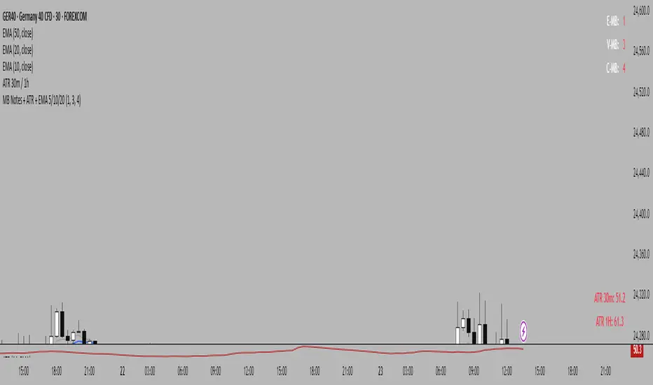
MB Notes + ATR + EMA 5/10/20This custom indicator combines essential trading tools in a single overlay:
✅ MB Notes Panel (Top-Right):
A static display for manual input values labeled E-MB, V-MB, and C-MB. Ideal for tracking personal bias, setups, or trade context directly on the chart. Inputs are fully editable.
✅ ATR Table (Bottom-Right):
Automatically displays 14-period Average True Range on the 30-minute and 1-hour timeframes. Helps assess short-term volatility and manage stop-loss or position sizing more effectively.
✅ EMA Overlay:
Plots Exponential Moving Averages for periods 5, 10, and 20. These dynamic support/resistance levels help traders identify short-term trend direction and momentum shifts.
📌 Designed for intraday and swing traders who want a clean, customizable, and multi-purpose utility indicator.
Buy Price Marker
This indicator allows you to set a custom buy price level on the chart. It draws a green horizontal line at the specified buy price and places a label showing the exact buy price value. The line extends to the right, providing a clear visual reference for your entry price as the chart progresses. The label dynamically updates with the current bar index, ensuring the buy price annotation stays aligned with the latest data.

ATR: Тело % + Диапазоны и АномалииEssentially, this combined indicator is a powerful tool for:
Analyzing candlestick anatomy: Quickly understanding how much of a candlestick’s overall range is in its body, indicating the strength of buying or selling pressure versus uncertainty.
Volatility estimates: Understanding the typical pip range of bars, adjusted for the tick size of the instrument.
Identifying anomalies: Highlighting unusually small or large bar ranges that may signal changes in market momentum or significant events.
Average range filtering: Providing a clearer picture of average market volatility by excluding extreme outliers from the calculation.
This comprehensive approach can help traders make more informed decisions by gaining a deeper understanding of the nuances of price action and market volatility.

庄家入场基础指标//@version=5
indicator("庄家入场基础指标", overlay=true)
length = input.int(20, "低点周期")
volMultiplier = input.float(1.5, "成交量放大倍数")
lowestLow = ta.lowest(low, length)
avgVol = ta.sma(volume, length)
volumeSignal = volume > avgVol * volMultiplier
priceSignal = low <= lowestLow
entrySignal = priceSignal and volumeSignal
plotshape(entrySignal, title="庄家入场", location=location.belowbar, color=color.green, style=shape.labelup, text="庄", size=size.small)

PSX OBV Divergence Labels (1D)PSX OBV Divergence Labels (1H/4H/1D/1W, Enhanced)
Description:
This indicator marks bullish and bearish OBV divergences on the price chart for PSX and other markets. Designed specifically for swing traders who operate on 1H, 4H, 1D, and 1W timeframes, it enhances basic divergence detection by incorporating volume spikes and OBV slope confirmation — improving signal reliability and reducing noise.
Key Features:
📈 Bullish Divergence: Marks potential buy zones when price hits a local low while OBV shows upward momentum with volume spike confirmation.
📉 Bearish Divergence: Flags potential sell zones when price hits a local high while OBV trends lower with volume weakness.
✅ Slope Confirmation: Filters signals based on sustained OBV direction over a user-defined number of bars.
🔊 Volume Filter: Detects divergence only when volume exceeds the average by a customizable multiplier (default 1.0).
🔍 Clean Visualization: Green “BUY” and red “SELL” labels show clearly on the chart, synced with candle price movement.
Best Timeframes to Use:
1H, 4H, 1D, and 1W (optimized for PSX stocks, KSE100, and KMI30)
Swing traders aiming for 2–4 week holding windows will find the most utility.
Recommended Settings:
OBV Lookback: 20
Volume Smoothing: 20
Spike Multiplier: 1.0
Slope Confirmation: 3 bars
Strategy Tip:
Use divergences in confluence with key support/resistance levels, price action traps, and market structure for high-probability setups. This tool is best used for trend exhaustion detection and reversal signals.

Log Return DistributionThis indicator calculates the statistical distribution of logarithmic returns over a user-defined lookback period and visualizes it as a horizontal profile anchored to the most recent opening price.
Lookback Length: The number of recent bars to include in the distribution analysis. A larger value (e.g., 252) provides a long-term statistical view, while a smaller value (e.g., 20) focuses on recent, short-term volatility.
Bins Count: The number of price levels to divide the distribution into. An odd number is recommended (e.g., 31, 51) to ensure a dedicated central line for the 0% return.
Max Line Length: The horizontal length (in bars) of the line representing the most frequent return bin (the mode). This setting scales the entire profile, allowing you to make differences in frequency more or less pronounced visually.

PSX OBV Divergence Labels (1D)PSX OBV Divergence Labels (1D)
This indicator highlights bullish and bearish OBV (On-Balance Volume) divergences on the price chart, specifically designed for daily timeframe swing trading in PSX (Pakistan Stock Exchange) stocks.
🟢 Green triangle (Bullish Divergence) appears when price makes a new low but OBV does not — suggesting accumulation and potential reversal.
🔴 Red triangle (Bearish Divergence) appears when price makes a new high but OBV does not — indicating weakening momentum and possible distribution.
Volume spike filtering is included to increase reliability. No trade signals or exits — this is a pure visual divergence tool to support manual decision-making. Ideal for spotting shifts in volume pressure ahead of price reversals.

Weekly Range ProjectionsWeekly Range Projections
Inspired by toodegrees' excellent "ICT Friday's Asian Range" indicator
This indicator is a modified and enhanced version of the original Friday's Asian Range indicator created by toodegrees. While studying their brilliant work, I realized the concept could be expanded beyond just Friday's Asian session to create a more versatile tool for weekly price projections.
What's New?
I've transformed the original concept into a fully customizable range projection tool that allows traders to:
Select Any Day of the Week - Not limited to just Fridays anymore
Define Custom Time Ranges - Set your own start and end times to capture any session (Asian, London, New York, or custom ranges)
Flexible Deviation Levels - Choose between 1-9 standard deviations instead of the fixed 5
Toggle Body/Wick Ranges - Show or hide body and wick projections independently
Updated to Pine Script v6 - Taking advantage of the latest Pine Script features
How It Works
The indicator captures the price range (body and/or wick) during your specified time window on your chosen day, then projects standard deviation levels from that range. These levels often act as significant support/resistance throughout the week.
Use Cases
Weekly Opening Range - Capture Monday's opening range for week-long projections
Session-Based Analysis - Define any session on any day for targeted analysis
Multi-Timeframe Projections - Create different instances for various time ranges
ICT Concepts - Perfect for traders following ICT methodologies with customizable ranges
Credits
Huge thanks to toodegrees for creating the original Friday's Asian Range indicator and sharing it with the community. Their clean code structure and innovative approach to range projections inspired this modification. The core logic and visual presentation style remain true to their original vision, with added flexibility for broader applications.
If you find this useful, please also check out toodegrees' original indicators - they create fantastic tools for the TradingView community!
Settings Guide
Range Settings - Choose your day and define start/end times
Range Type - Toggle body and/or wick ranges
Deviations - Select how many standard deviation levels to display
Styling - Customize colors and line styles for both range types
Alerts - Set up alerts for price crossing specific deviation levels
Remember to use this on 5-minute or 15-minute charts as intended by the original design.
Note: This indicator follows the Mozilla Public License 2.0


SessionsSession 10-12 12-16 1630-1830
Including HOD/LOD for different sessions.
Session 10:00 - 12: 00
Session 12:00 - 16:00
Session 16:30 - 18:30

1H LONG Setup CheckerThis TradingView script identifies high-probability long setups on the 1-hour chart by evaluating five key technical conditions: price above the 200 MA, a higher low structure, RSI above 50 and rising, a bullish MACD crossover, and a breakout above recent resistance. When at least four of these are met, it signals a potential long opportunity with a visual label and background highlight. This tool is useful for traders seeking objective, rule-based entries in trending markets like SOL/USDC and PEPE/USDC.

EMA200 HUD + ATR + Live WickThis indicator displays:
• EMA200 deviation in USD and %
• ATR (Average True Range) and ATR multiples
• Live wick % (up/down) with alerts if wick > 2%
