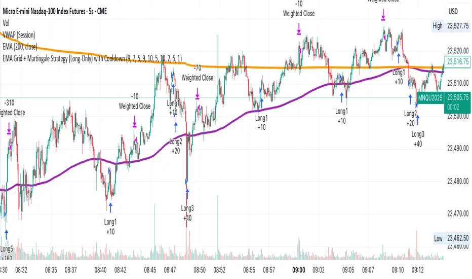
EMA Grid + Martingale Strategy (Long-Only) with CooldownTitle:
EMA Grid + Martingale Strategy (Long-Only) with Cooldown
Short Summary:
A long-only strategy combining EMA trend filters, grid-based entries, optional martingale sizing, and a cooldown feature to manage position timing and exits.
Full Description:
This strategy uses a 4-EMA trend confirmation system to detect bullish momentum, then deploys a grid-style entry method with optional martingale position sizing. It includes a cooldown mechanism to prevent reentry too soon after a completed trade cycle.
How It Works
1. Trend Confirmation: Two EMA groups (fast/slow) determine whether market conditions are bullish.
2. Initial Entry: A new position is entered when both EMA groups confirm an uptrend and no position is currently active.
3. Grid Entries: Additional long entries are placed when price drops by a defined pip distance from the last entry, respecting the maximum number of entries.
4. Martingale Sizing (Optional): Grid orders can increase in size with each level using a customizable multiplier.
5. Weighted-Average Exit: All positions close once price reaches or exceeds the average entry price plus a buffer.
6. Cooldown Timer: After closing a position set, the strategy waits a defined number of bars before opening a new grid.
Key Features
• 4 customizable EMAs for trend confirmation.
• Dynamic grid-style long entries based on pip intervals.
• Optional martingale-style position sizing.
• Weighted-average price exit logic with buffer control.
• Cooldown bar period to limit overtrading.
• Suitable for optimization and backtesting with full control over inputs.
Use Cases
• Designed for trending markets where pullbacks present entry opportunities.
• Helps manage staged entries while avoiding premature reentry.
• Ideal for testing martingale and grid-based strategies with exit precision.
Note: This strategy is for testing and educational purposes only. It does not guarantee profits and is not financial advice.
Indicators and strategies
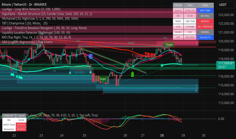
Market DashboardMarket Dashboard — All-in-One Technical Indicator Panel
The Market Dashboard is a powerful visual tool that consolidates key technical indicators into a single on-chart table, helping traders make faster and more informed decisions. This script includes:
RSI — Detects overbought and oversold market conditions
MACD — Shows trend momentum and crossover signals
CVD (Cumulative Volume Delta) — Highlights buyer vs. seller pressure
Volume Analysis — Flags unusually high volume
ATR (Average True Range) — Displays current market volatility
Session Detector — Automatically identifies ASIAN, LONDON, or NEW YORK sessions based on UTC time
Fully Customizable — Adjust table position and text size to fit your chart layout
Designed for traders who want a clean, real-time snapshot of market dynamics, directly on the chart.

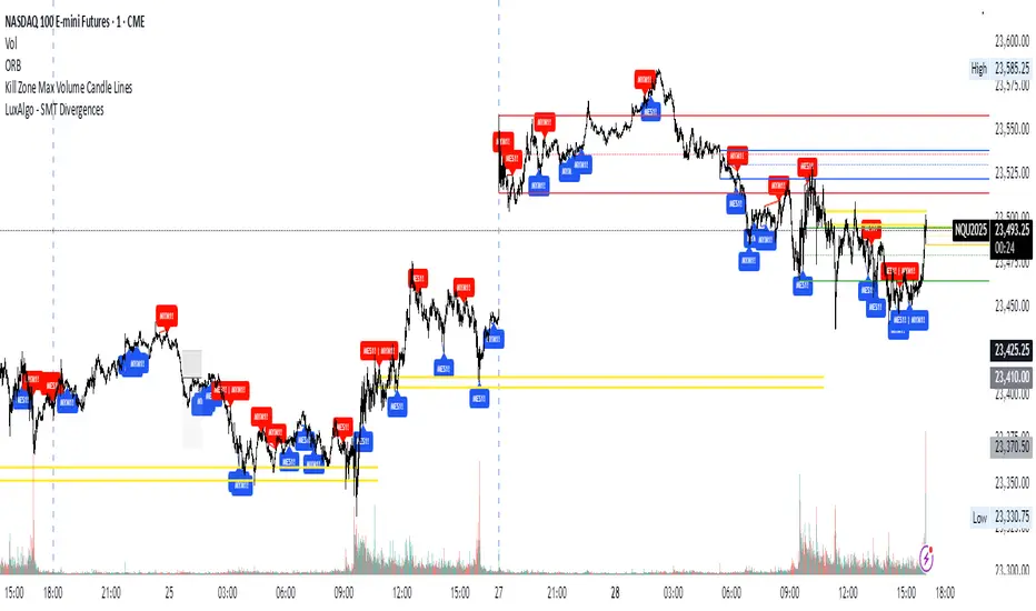
Kill Zone Max Volume Candle LinesThe Kill Zone Max Volume Lines indicator identifies the highest-volume candle within four key market sessions (Asia, London, NY AM, NY PM) and plots horizontal lines at its high, low, and midpoint levels, extended to the right.
Designed for traders targeting zones of heightened activity, this indicator highlights dynamic support and resistance levels based on volume—ideal for breakout or bounce strategies during highly volatile periods known as “kill zones.”
Perfect for indices such as Nasdaq (NQ), S&P 500 (SP), and Dow Jones (YM) on 15-minute or higher timeframes.
SMA 9 vs SMA 20 Highlight CrossoverHighlight in green the area in between the two SMA do that when the SMA cross above the SMA 20 periods the area is colored in green and when the SMA cross below the SMA 20 periods the area is colored in red
Ultimate Global Trading Hours📊 Global Markets Pro - Summary
What it does:
Shows real-time trading hours for 11 major stock markets worldwide
Displays countdown timers for when each market opens/closes
Includes Forex sessions and US extended hours (pre-market/after-hours)
Features advanced market sentiment analysis with Fear/Greed indicators
Key Features:
✅ Chronological market order (Sydney → Tokyo → London → NYSE, etc.)
✅ Customisable times for each market in HH:MM format
✅ Multi-factor sentiment (VIX, Bonds vs Stocks, Weekly trends, Volume)
✅ Clean interface with emoji indicators and colour coding
✅ Your timezone display with GMT+/- options
Perfect for:
Day traders tracking global market sessions
Swing traders gauging market sentiment
Anyone wanting to know when major markets are active
Result: One comprehensive dashboard showing when to trade and market mood across all time zones!

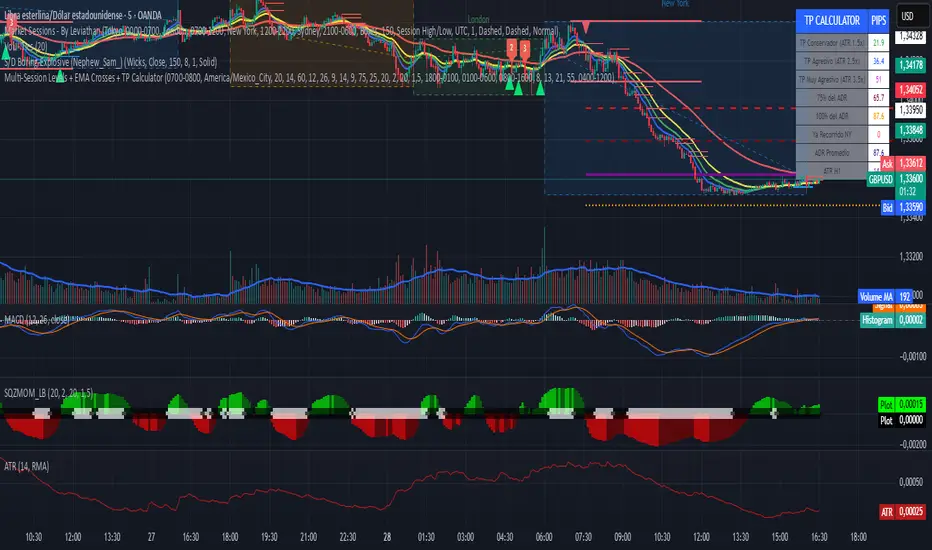
Multi-Session Levels + EMA Crosses + TP Calculator (GBP/USD)# Multi-Session Levels + EMA Crosses + TP Calculator
## 📋 Description
**Advanced trading indicator combining multi-session analysis, EMA cross validation, and automated Take Profit calculations for Forex markets.**
This comprehensive tool integrates session-based level analysis with validated EMA crossovers and intelligent TP calculations, designed specifically for serious traders who need precise entry signals with calculated exit strategies.
## 🎯 Key Features
### 📊 **Multi-Session Analysis**
- **Asian Session (6PM-1AM Mexico)**: Generates key support/resistance levels
- **London Session (1AM-6AM Mexico)**: Analyzes manipulation patterns
- **New York Session (8AM-4PM Mexico)**: Dynamic levels with trend confirmation
- **AMD Setup Detection**: Combines all sessions for high-probability setups
### 📈 **Advanced EMA System**
- **4 EMAs**: 8, 13, 21, and 55 periods with visual display
- **Validated Crossovers**: EMA 8 vs EMA 13 with multiple confirmations
- **Smart Filtering**: Only shows signals during optimal trading hours (6AM-12PM Mexico)
### ✅ **Triple Validation System**
- **MACD Confirmation**: Histogram strength + signal line position + momentum direction
- **RSI Filter**: Overbought/oversold levels with moving average confirmation
- **Squeeze Momentum**: Bollinger Bands vs Keltner Channels compression detection
### 💰 **Intelligent TP Calculator**
- **ADR-Based Targets**: Uses Average Daily Range for realistic profit expectations
- **ATR Multipliers**: Conservative (1.5x), Aggressive (2.5x), Very Aggressive (3.5x)
- **Session-Aware**: Considers already-traveled distance in NY session
- **Real-Time Table**: Live pip calculations for all TP levels
- **Visual Levels**: Automatic TP lines drawn on chart with color coding
### 🚨 **Smart Alert System**
- **Validated Signals Only**: Alerts trigger only when ALL confirmations align
- **TP Integration**: Alerts include suggested take profit levels
- **Non-Validated Tracking**: Shows basic crosses that don't meet full criteria
## 📐 **Technical Calculations**
### **ADR (Average Daily Range)**
- 20-period average of daily high-low ranges
- Converted to pips for easy interpretation
- Used for percentage-based TP targets (50%, 75%, 100% of ADR)
### **ATR (Average True Range)**
- 14-period ATR from H1 timeframe (configurable)
- Accounts for gaps and volatility
- Base for multiplier-based TP levels
### **Session Tracking**
- Real-time monitoring of NY session range
- Calculates remaining potential movement
- Optimizes TP placement based on session progress
## 🎨 **Visual Elements**
### **Chart Levels**
- **Orange Lines**: Asian and London session levels
- **White/Green/Red Lines**: NY session levels (color changes with trend direction)
- **TP Lines**: Color-coded take profit levels with different styles
### **EMA Display**
- **Blue**: EMA 8 (fastest)
- **Green**: EMA 13 (signal line)
- **Yellow**: EMA 21 (trend filter)
- **Red**: EMA 55 (major trend)
### **Signal Shapes**
- **Bright Triangles**: Fully validated signals
- **Faded Triangles**: Non-validated basic crosses
- **Size Variation**: Signal strength indication
## 📊 **Information Table**
Real-time display showing:
- **TP Levels**: All calculated take profit targets in pips
- **Session Data**: NY range already traveled vs average
- **Volatility Metrics**: Current ATR and ADR values
- **Clean Design**: Easy-to-read format with color coding
## ⚙️ **Customization Options**
### **Session Times**
- Fully configurable session times
- Mexico City timezone support
- Enable/disable individual session analysis
### **Validation Controls**
- Toggle MACD, RSI, Squeeze validation independently
- Adjust RSI overbought/oversold levels
- Customize MACD and Squeeze parameters
### **Display Options**
- Show/hide EMAs, crosses, TP levels, table
- Customize TP calculation periods (ADR, ATR)
- Choose ATR timeframe for calculations
## 🎯 **Ideal For**
- **Forex Day Traders**: Especially USD pairs during NY session
- **Session-Based Strategies**: Traders who respect market sessions
- **Risk Management Focus**: Those who need calculated exit strategies
- **Multi-Timeframe Analysis**: Traders using H1-H4 charts
## 📈 **Best Practices**
1. **Use during high-volume sessions** (London-NY overlap)
2. **Wait for full validation** before entering trades
3. **Consider session context** when setting TPs
4. **Combine with proper risk management** (1-2% per trade)
5. **Backtest thoroughly** before live trading
## ⚠️ **Important Notes**
- **Signals work best** during trending market conditions
- **AMD setups** provide highest probability entries
- **TP levels are suggestions** - adjust based on market context
- **Always use stop losses** (not included in this indicator)
- **Designed for Forex markets** - may need adjustment for other instruments
---
*This indicator combines proven technical analysis concepts with modern session-based trading approaches, providing both entry timing and exit planning in one comprehensive tool.*
SExI - Super Exhaustion Indicator [Da_Prof]As we know, the RSI can remain at "overbought" or "oversold" levels for long periods of time while the price continues in that direction. The SExI (Super Exhaustion Indicator) is an indicator designed to help detect exhaustion of strong moves.
The SExI is a combination of the RSI and "upper" Aroon. For the indicator to trigger, the RSI has to be above or below a top/bottom trigger line when the Aroon has had a set number of drives up or down correspondingly. An Aroon top drive is defined as the Aroon hitting 100% on the current candle when the previous candle was below 100%. An Aroon bottom drive is defined as the Aroon hitting 0% on the current candle when the previous candle was above 0%. Consecutive top or bottom drives are counted and exhaustion triggers when these drives hit a setpoint (default is 5 drives = the Aroon exhaustion trigger). When Aroon exhaustion is triggered and the RSI is correspondingly above/below a trigger line, the overall indicator signals exhaustion.
The Aroon drives are visualized at the top and bottom of the indicator. The RSI is plotted as a line that crosses top and bottom trigger lines. There are extreme trigger values for both the bottom and top exhaustion triggers.
This indicator can be used with any asset on any timeframe. It nicely pairs with the Super Strength Indicator (invite-only).

Flying Submarine SincOrange Glowing Flying Submarine at Area 51. For Call Puts. Safety in SpaceForce.

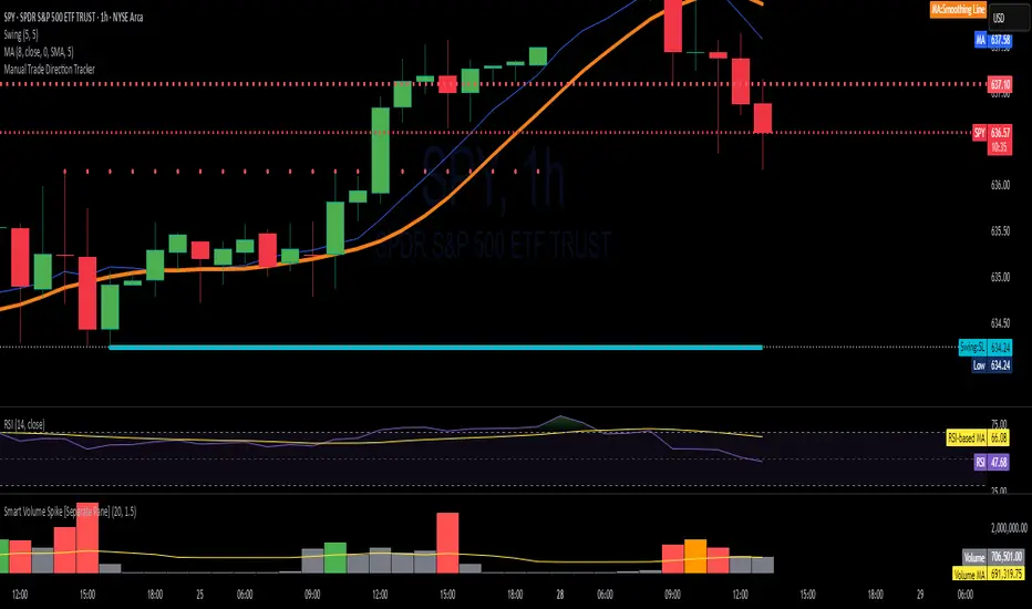
Advanced Swing Breakout + RSI + EMA + Smart Volume SpikeThis indicator is designed to identify high-probability swing trade setups using a confluence of:
Swing High/Low Breakouts
RSI Trend Strength
EMA Directional Bias
Smart Volume Spike Confirmation
It combines key price action levels with volume and momentum filters to generate clean, actionable breakout alerts. It’s perfect for both intraday and swing traders looking to trade breakouts with confirmation from multiple technical layers.
⚙️ How It Works:
✅ Swing Detection:
Plots Swing Highs and Swing Lows based on the past N candles.
Highlights breakouts above highs or breakdowns below lows.
💪 RSI Filter:
Confirms whether the breakout is supported by RSI momentum.
Bullish breakout requires RSI > 50 and price above EMA.
Bearish breakdown requires RSI < 50 and price below EMA.
📈 EMA Trend Bias:
EMA (default 20-period) shows directional bias.
Used as a filter to confirm trade direction.
🔊 Smart Volume Spike:
Detects significant volume spikes above a moving average threshold.
Color-coded bars show whether volume is bullish, bearish, or neutral.
Ensures breakout is not on weak or average volume.
🚨 Alerts Included:
✅ Break Above Swing High: Only triggers when RSI, EMA, and Volume all confirm the move.
⚠️ Break Below Swing Low: Triggered only when bearish conditions are met.
📊 Visual Output:
Swing Highs: 🔴 Red Dots
Swing Lows: 🟢 Green Dots
EMA Line: 🟠 Orange Line
Volume Spike Bars: Appears in separate pane with dynamic color logic.
🧠 Best Use Cases:
Intraday Scalping (5m–15m timeframes)
Swing Trading (1H–4H)
Breakout Confirmation
Volume-Supported Entry Filtering
3 EMA Pullback Strategy with ATRThis script will not only plot the moving averages but also identify potential trade setups by highlighting trend conditions, marking entry points, and dynamically plotting the corresponding Stop Loss and Take Profit levels directly on your chart.
Here is the Pine Script code for your strategy.

PulseLogicLibPulseLogicLib v3.6.1
PulseLogic breath-strength & momentum-structure calculator
Exports:
• getBreathScore() → int (0–100)
• hasGreenDot() → bool
• getTriangleColor() → string (“green”/“red”/“none”)

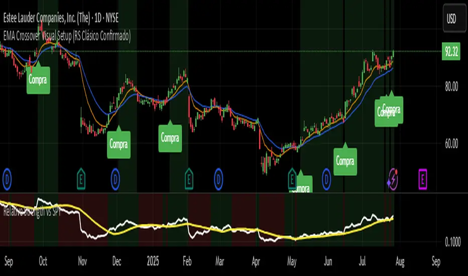
EMA Crossover Visual Setup (RS Clásico Confirmado)Overview
This script is designed to visually highlight classic swing trading setups based on the crossover of exponential moving averages (EMAs), with additional confirmation using Relative Strength (RS) compared to a benchmark asset (e.g., SPY).
The goal is to identify bullish momentum shifts that align both with technical structure (EMA crossover) and relative outperformance, helping traders focus on strong stocks in strong markets.
Logic
A signal is triggered when the following conditions are met:
The fast EMA (e.g., 10) crosses above the slow EMA (e.g., 20).
The closing price is above a third EMA (e.g., 50) to confirm bullish structure.
The asset's Relative Strength (RS) versus a benchmark is confirmed manually, based on an RSI comparison (not calculated inside the script).
The script is meant to be used alongside manual RS confirmation, using a secondary chart or overlay of the RS ratio.
Features
Visual labels and markers for clean charting of valid entry setups
Fully customizable EMA lengths
Optional highlighting of candle patterns near entry
Ideal for use with top-down analysis and watchlist filtering
Suggested Use
Works best on daily and 4H charts for swing trading setups
Combine with volume and price action analysis for higher probability trades
Use manual RS validation: confirm that the RSI of the selected stock is stronger than the RSI of SPY (or any benchmark of your choice)
Notes
This script does not execute trades or include stop loss/take profit logic, as it is intended for discretionary traders who want to visually scan for opportunities.
It also does not calculate RS internally, allowing flexibility in how you define strength (RS line, RSI comparison, or price ratio).
[DIP] Inverse BB HighlightThis indicator allows you to highlight the area outside of the Bollinger Bands in order to draw more attention to it. This is especially useful for those who only trade when we are outside of the bands.
Keep in mind this indicator only works on bars, not on candles.

Spot vs. Derivatives BasisThis indicator calculates the basis between average spot and average perpetual futures prices across selected exchanges. It helps identify deviations between spot and perp markets — a key signal for funding pressure, arbitrage, or market dislocation.
Key Features:
Manual Pair Control – Enable or disable specific trading pairs as needed
Flexible Basis Smoothing – Apply SMA, EMA, WMA, or VWMA to filter noise
Anomaly Highlighting – Automatically flags basis deviations beyond ±0.1%

Level Master Pro+ [MMT]Level Master Pro+ Indicator
The Level Master Pro+ is a highly customizable Pine Script indicator designed for TradingView, built to plot key pivot point levels, support and resistance zones, and additional price levels such as previous close, bottom central (BC), and top central (TC) on a chart. This indicator is tailored for traders who rely on pivot-based strategies, offering flexibility in timeframe selection, visual styling, and level visibility to suit various trading styles.
Key Features:
- Pivot Point Levels:
Plots traditional pivot points (P), up to six levels of support (S1–S6) and resistance (R1–R6), previous close (PC), base control (BC), and top control (TC).
Automatically calculates R6 and S6 using the pivot range (high - low) for extended analysis.
Supports customizable timeframes for pivot calculations (default: 1D).
- Customization Options:
Pivot History : Adjust the number of historical pivots displayed (1–200).
Line Styling : Choose line width (1–10), style (solid, dashed, dotted), and transparency (0–100%).
Label Styling : Toggle labels and price values, set label position (left or right), size (tiny to huge), and background transparency.
Color Customization : Assign unique colors to each level (P, S1–S6, R1–R6, PC, BC, TC) with default settings like green for support, red for resistance, and purple for BC/TC.
Extend to Current Bar : Optionally extend pivot lines to the current bar for real-time tracking.
- Visual and Performance Optimization :
Uses an overlay to plot levels directly on the price chart.
Supports up to 500 lines and labels to prevent performance issues.
Efficiently manages historical pivot data by removing outdated graphics when the maximum pivot count is exceeded.
- Dynamic Updates :
Automatically updates pivot lines and labels when a new timeframe period begins (e.g., new day for daily pivots).
Ensures smooth rendering with real-time adjustments for extended lines and label positions.
Use Case:
The Level Master Pro+ is ideal for traders employing pivot point strategies to identify potential support and resistance zones, reversal points, or breakout levels. Its extensive customization options make it suitable for day trading, swing trading, or long-term analysis across various markets (stocks, forex, crypto, etc.).
How It Works:
Data Source : Uses request.security to fetch pivot data based on the selected timeframe.
Level Calculations: Computes traditional pivot points and derives additional levels (R6, S6, BC, TC) using high, low, and close prices from the previous period.
Rendering : Draws lines and labels for each enabled level, with options to extend lines to the current bar or anchor them to the timeframe’s end.
Memory Management : Stores pivot graphics in a matrix and removes older pivots to stay within the user-defined historical limit.
Settings Overview :
Pivot Timeframe : Set the timeframe for pivot calculations (e.g., daily, weekly).
Show Labels/Prices : Enable or disable level labels and price values.
Line Style : Customize line appearance and transparency.
Label Style : Adjust label size and background transparency.
Level Visibility : Toggle visibility for each level (P, S1–S6, R1–R6, PC, BC, TC) and customize their colors.
This indicator empowers traders with a robust tool to visualize critical price levels with precision and flexibility, enhancing technical analysis and decision-making.

Elliott Wave Probability System Pro v2🎯 Major Improvements Made to Elliott Wave Script
Key Changes:
1. Advanced Trend Detection (Lines 55-82)
Uses 5 different methods to determine trend over last 75 bars:
Price position in range
Linear regression slope
Moving average alignment
Higher highs/lows pattern
Up vs down bar count
Combines all methods into a trendScore for accurate direction
2. Adaptive Target Direction
New input: adaptiveTargets (line 28) - can toggle on/off
When ON: Targets follow the 75-bar trend regardless of short-term indicators
When OFF: Works like original (based on current momentum)
3. Improved Target Calculation
Bullish targets use extensions from current price to recent high
Bearish targets use retracements from current price to recent low
More realistic price levels based on actual market structure
4. Enhanced Status Display
Added "Trend (75 bars)" row showing BULLISH/BEARISH/NEUTRAL
Helps you see why targets are pointing a certain direction
5. Better Probability Calculation
Base probability adjusts with trend strength (70% if strong trend, 50% if not)
Gradual probability decay with distance
Minimum 15% probability (more realistic than 10%)
New Features:
Trend-Based Alerts
Alerts when 75-bar trend changes from bullish to bearish (or vice versa)
Trend Weight in Scoring
Added trendWeight to the total score calculation
Makes signals more aligned with larger trend
Visual Improvements
Projection lines now show at 40% probability (was 50%)
Better visibility of likely targets
How It Works Now:
If last 75 bars show a downtrend , targets will be bearish (even if RSI is oversold)
If last 75 bars show an uptrend , targets will be bullish (even if RSI is overbought)
The probability adjusts based on trend strength
This solves the issue where the script was showing bullish targets in a clear downtrend. Now it properly reflects the dominant trend direction while still considering short-term indicators for probability calculations.

Setup: Smooth Gaussian + Adaptive Supertrend (Manual Vol)Overview
This strategy combines two powerful trend-based tools originally developed by Algo Alpha: the Smooth Gaussian Trend (simulated) and the Adaptive Supertrend. The objective is to capture sustained bullish movements in periods of controlled volatility by filtering for high-probability entries.
Entry Logic
Long Entry Conditions:
The closing price is above the Smooth Gaussian Trend line (with length = 75), and
The volatility setting from the Adaptive Supertrend is manually defined as either 2 or 3
Exit Condition:
The closing price falls below the Smooth Gaussian Trend line
This script uses a simulated version of the Gaussian Trend line via double-smoothed SMA, as the original Algo Alpha indicator is protected and cannot be accessed directly in code.
Features
Plots entry and exit signals directly on the chart
Manual toggle to enable or disable the volatility filter
Lightweight design to allow flexible backtesting even without access to proprietary indicators
Important Note
This strategy does not connect to the actual Adaptive Supertrend from Algo Alpha. Users must manually input the volatility level based on what they observe on the chart when the original indicator is also applied. The Smooth Gaussian Trend is approximated and may differ slightly from the original.
Suggested Use
Recommended timeframes: 1H, 4H, or Daily
Best used alongside the original indicators displayed on the chart
Consider incorporating additional structure, momentum, or volume filters to enhance performance
If you have suggestions or would like to contribute improvements, feel free to reach out or fork the script.

Multi-Timeframe TrendBelow is a PineScript that calculates the trend for multiple timeframes (5 minutes, 15 minutes, 1 hour, 4 hours, and daily) using the Relative Strength Index (RSI) and Moving Averages (MA) to determine bullish, bearish, or neutral trends. The script displays the trend information on the TradingView chart using a table.
PulseLinesLibPulseLinesLib v1.3.1
PulseLines morphic-level calculator (support & resistance)
Exports:
• getLevels(lookback:int, wickRatioThresh:float, flatCandles:int, tolerancePips:float, atrMult:float) → float

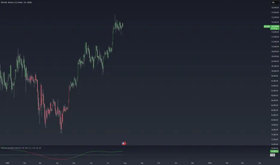
Gaussian Volatility Adjusted Gaussian Volatility Adjusted Indicator
The Gaussian Volatility Adjusted indicator is a powerful tool designed to identify trend direction and momentum by combining a Gaussian-filtered moving average with volatility-based thresholds. By smoothing price data with a Gaussian filter and adjusting for market volatility using Average True Range (ATR) and Standard Deviation (SD), this indicator generates clear bullish and bearish signals. The Exponential Moving Average (EMA) of the momentum difference and price bars are dynamically colored to highlight trend strength, making it easier for traders to identify potential entry and exit points in various market conditions.
How It Works
Gaussian Filter Calculations
Gaussian Filter: Applies a Gaussian smoothing filter to a user-defined price source, typically an EMA of the closing price, over a configurable length (default: 70) with a specified sigma (default: 12). The Gaussian filter uses a weighted sum based on a Gaussian distribution to reduce noise while preserving significant price trends. Weights are calculated using the Gaussian formula and normalized to ensure accurate smoothing.
Base Moving Average: Optionally applies an EMA (default: enabled, length: 45) to the closing price before Gaussian filtering, providing a smoother input for the Gaussian calculation to enhance signal reliability.
Volatility Adjustments
ATR-Based Bands: Calculates the Average True Range (ATR) over a user-defined period (default: 24), scaled by a sensitivity factor (default: 1) and an ATR factor (default: 0.85). These form volatility-adjusted bands around the Gaussian-filtered value:
Upper Band: Gaussian value + (ATR × ATR Factor).
Lower Band: Gaussian value - (ATR × ATR Factor).
Standard Deviation Bands: Computes the Standard Deviation (SD) of the closing price over a user-defined period (default: 27), scaled by the sensitivity factor. These form additional bands:
Upper SD Band: Gaussian value + SD.
Lower SD Band: Gaussian value - SD.
Trend and Momentum SignalsTrend
Detection:Bullish Trend: Triggered when the closing price exceeds the upper SD band, setting the trend to +1.
Bearish Trend: Triggered when the closing price falls below the upper ATR-based band, setting the trend to -1.
Momentum Calculation: Computes a momentum difference (Diff) based on the trend:
For a bullish trend (+1), Diff = Close - Upper ATR Band.
For a bearish trend (-1), Diff = Close - (Gaussian + SD).
EMA of Momentum: Applies an EMA (default length: 45) to the momentum difference to smooth the momentum signal.
Final Trend with EMA Confluences:
If EMA confluence is enabled (default: true), a bullish signal (+1) is confirmed when the trend is +1 and Diff exceeds the EMA of Diff. A bearish signal (-1) is confirmed when the trend is -1 and Diff is below the EMA of Diff.
If EMA confluence is disabled, the final trend follows the initial trend direction (±1).
Visual Representation
The indicator provides a clear and intuitive visual interface:
EMA Line: Plots the EMA of the momentum difference, colored based on the final trend:
Green: Bullish trend (Final_Trend = +1).
Red: Bearish trend (Final_Trend = -1).
Gray: Neutral or no trend.
Zero Line: A dashed line at zero (semi-transparent) serves as a reference for the EMA plot.
Bar Coloring: Price bars are colored to reflect the trend:
Green: Bullish trend (Final_Trend = +1).
Red: Bearish trend (Final_Trend = -1).
No Color: Neutral or no trend.
Volatility Bands: While not plotted in the provided script, the ATR and SD bands are calculated and could be plotted for additional context, marking key levels for trend detection.
Customization & Parameters
The Gaussian Volatility Adjusted indicator offers flexible parameters to suit various trading styles:
Volatility Parameters:
ATR Length: Period for ATR calculation (default: 24).
ATR Factor: Multiplier for ATR-based bands (default: 0.85).
SD Length: Period for Standard Deviation calculation (default: 27).
Sensitivity: Scales ATR and SD for band sensitivity (default: 1).
Moving Average Parameters:
Use EMA Confluence: Enable/disable EMA confluence for trend confirmation (default: true).
EMA Length: Period for EMA calculations (default: 45).
Gaussian Parameter:
Gaussian Length: Period for Gaussian filter (default: 70).
Sigma: Controls the Gaussian filter’s smoothness (default: 12).
Color Settings: EMA line and bars use green for bullish signals, red for bearish signals, and gray for neutral states, with customizable transparency for the zero line.
Trading Applications
This indicator is versatile and can be applied across various markets and strategies:
Trend Following:
Use the final trend signals and bar coloring to identify and follow bullish or bearish trends, with the Gaussian filter reducing noise for clearer trend detection.
Momentum Trading: The EMA of the momentum difference highlights strong momentum shifts, ideal for entering or exiting trades based on trend strength.
Reversal Detection: Monitor price crossings of the ATR and SD bands to identify potential trend reversals, especially when confirmed by the EMA confluence.
Scalping and Swing Trading: Adjust parameters (e.g., ATR length, Gaussian length, or sensitivity) to suit short-term scalping or longer-term swing trading strategies.
Final Note
The Gaussian Volatility Adjusted indicator is a robust tool for traders seeking to leverage smoothed price data and volatility-adjusted thresholds for trend and momentum analysis. Its combination of Gaussian filtering, ATR and SD-based bands, and EMA confluence provides a comprehensive framework for identifying trading opportunities. The dynamic coloring of the EMA line and price bars enhances visual clarity, making it easier to act on signals. As with all indicators, backtest thoroughly and integrate into a comprehensive trading strategy for optimal results.