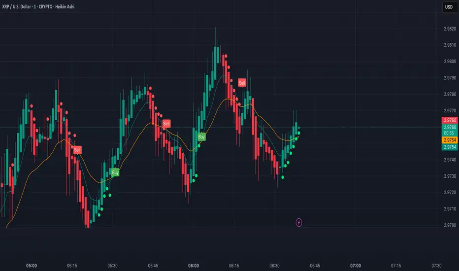
XRP Scalping with EMA Crossover Anticipation This script is designed to detect scalping opportunities on XRP by anticipating EMA crossovers, reinforced with technical confirmation filters.
Methodology
- The core signal is based on the crossover between a fast EMA (9) and a slow EMA (21).
- RSI (14) conditions are applied to avoid weak setups: RSI must be above 40 for buy signals and below 70 for sell signals.
- Before any crossover is validated, the script requires at least two consecutive “pre-crossover” signals. These indicate favorable momentum and convergence conditions before the crossover occurs.
- Final signals are only displayed if this minimum number of preconditions is met.
Application
This system is optimized for scalping on the 1-minute to 5-minute timeframes but can be adapted for longer-term setups by adjusting parameters. The anticipation logic helps reduce lagging entries and improves signal selectivity during volatile conditions.
Both pre-crossover and confirmed crossover conditions include alert options. The code is fully editable and customizable.
Pine utilities
Modular Range-Trading Strategy (V9.2)# 模块化震荡行情策略 (V9.2)
# Modular Range-Trading Strategy (V9.2)
## 策略简介 | Strategy Overview
该策略基于布林带 (Bollinger Bands)、RSI、MACD、ADX 等经典指标的组合,通过多逻辑模块化结构识别震荡区间的价格反转机会,支持多空双向操作,并在相同逻辑下允许智能加仓,适用于震荡市场的回测和研究。
This strategy combines classic indicators such as Bollinger Bands, RSI, MACD, and ADX to identify price reversal opportunities within ranging markets. It features a modular multi-logic structure, allowing both long and short trades with intelligent pyramiding under the same logic. It is designed for backtesting and research in range-bound conditions.
---
## 功能特点 | Key Features
- **多逻辑结构**:支持多套震荡逻辑(动能确认均值回归、布林带极限反转等)。
- **加仓与仓位互斥**:同逻辑下可智能加仓,不同逻辑间自动互斥,避免冲突。
- **回测可调时间范围**:可自定义回测起止时间,精准评估策略表现。
- **指标可视化**:布林带、RSI、MACD 及动态 ATR 止损线实时绘图。
- **K线收盘确认信号**:通过 `barstate.isconfirmed` 控制信号,避免未收盘的虚假信号。
- **Multi-logic structure**: Supports multiple range-trading logics (e.g., momentum-based mean reversion, Bollinger Band reversals).
- **Pyramiding with mutual exclusion**: Allows intelligent pyramiding within the same logic while preventing conflicts between different logics.
- **Adjustable backtesting range**: Customizable start and end dates for accurate performance evaluation.
- **Visual indicators**: Real-time plotting of Bollinger Bands, RSI, MACD, and dynamic ATR stop lines.
- **Close-bar confirmation**: Uses `barstate.isconfirmed` to avoid false signals before bar close.
---
## 使用说明 | Usage
1. 将该脚本添加到 TradingView 图表。
2. 在参数中设置回测时间段和指标参数。
3. 仅用于学习与策略研究,请勿直接用于实盘交易。
1. Add this script to your TradingView chart.
2. Configure backtesting dates and indicator parameters as needed.
3. For educational and research purposes only. **Not for live trading.**
---
## ⚠️ 免责声明 | Disclaimer
本策略仅供学习和研究使用,不构成任何形式的投资建议。
作者不参与任何实盘交易、资金管理或收益分成,也不保证策略盈利能力。
严禁将本脚本用于任何非法集资、私募募资或与虚拟货币相关的金融违法活动。
使用本策略即表示您自行承担所有风险与法律责任。
This strategy is for educational and research purposes only and does not constitute investment advice.
The author does not participate in live trading, asset management, or profit sharing, nor guarantee profitability.
The use of this script in illegal fundraising, private placements, or cryptocurrency-related financial activities is strictly prohibited.
By using this strategy, you accept all risks and legal responsibilities.
---
TSD Quantum | mrmoeinudinThis indicator, **TSD Quantum**, has been developed by **Moeinudin Montazerfaraj**, exclusively for the students of the **TSD Intraday Trading Course**.
TSD Quantum is an intelligent and proprietary tool designed to accurately identify **valid supply and demand zones** and distinguish them from weak or linear bases. The algorithm is fully customized to align with the advanced concepts taught in the TSD methodology, empowering traders to make more confident and data-driven decisions.
### Key Features:
- Smart zone detection tailored to TSD methodology
- Floating risk management panel
- Integrated checklist for trade validation
- Real-time display of ATR, spread, and other essential metrics
- Optimized for intraday traders who follow price action and zone-based decision making strategies.
To join our exclusive educational programs, visit our official website:
🌐 (mrmoeinudin.com)
Stay connected and follow us for insights, updates, and free educational content:
📌 Telegram: (t.me)
📌 YouTube:
📌 Instagram:
Wishing all Persian-speaking traders around the world continued success and growth in their trading journey. 🚀📈

Oops ReversalThis indicator identifies bullish Oops reversal days — a classic setup refined for stronger confirmation and early detection.
✅ Criteria for Signal (on current day):
Gap Down Open:
The stock opens below the previous day's low, suggesting initial weakness.
Shallow Intraday Dip:
Price doesn't fall more than 1% below the open, indicating the sell-off lacks follow-through.
Strong Reversal:
During the same day, the stock rallies and crosses the previous day's low by at least 1%, confirming strength and buyer control.

MPBA checklist indicator in TradingView is a customizable tool designed to help traders maintain discipline and follow their trading strategy by providing a visual checklist directly on their chart. It allows users to define their own criteria and mark them as confirmed or not, helping to avoid overtrading and impulsive decisions.
Yo can edit in pine editor and creat your privet checklist.

MTF EMA Pane with Diagnostics30 sec chart, 1 min EMA goes flat, I buy, 1 min EMA stays inside the group, I stay in the trade.
Not financial advice. I am working on an Algo killer, stay tuned. I am dedicating the rest of my life, as short as it my be, to beating the Men behind the Algo's. Buy me some coffee.
Send USDT thru ETH or Base to BYDFi 0x20391e32afd61dc9e1ec027651391b56ceade4e0
Join BYDFi
Referral Link: Spin for a possible $100
partner.bydfi.com
Deposit: USDT via;
ETH (ERC20) 0x20391e32afd61dc9e1ec027651391b56ceade4e0
Tron (TRC20)
TUs5u2YxtQrQfRwYK2CsMmSDGvND6Uopdj
BNB/Base (BEP20)
0x20391e32afd61dc9e1ec027651391b56ceade4e0
Solana
696LAngiQBbdk4m6k1ZBiKZrFtjTJo6dxCnVXMEePQea


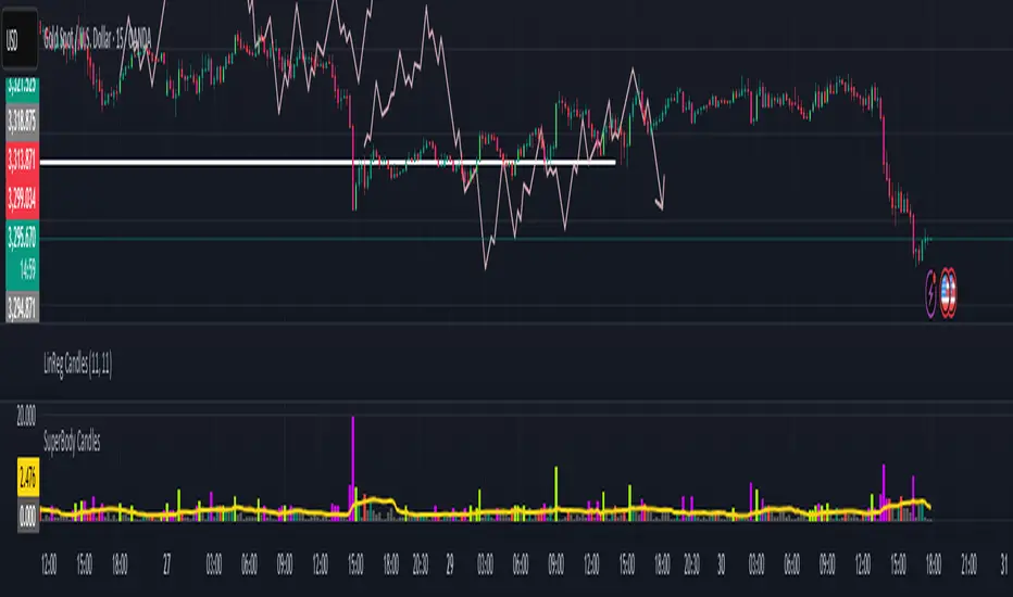
SuperBody CandlesInspired by the original script by Gautam_Dixit.
Updated to the latest Pine Script v6, now featuring fully customizable color settings so users can tailor hues to their preference.
Description:
The Momentum Candle indicator highlights bars whose real body significantly exceeds the 15-period average. 'Super' bullish and bearish candles (body ≥ 1.5× avg) receive standout colors, while above-average and below-average bars are tinted differently to reflect momentum strength.
Casper SMC 5min ORB - Roboquant AI🚀 Key Features:
Opening Range (09:30–09:35 EST) breakout detection
Configurable entry type: Instant or Retracement
Adjustable Risk:Reward multiplier and contract sizing
Optional Trailing Stop Loss using ATR
Second-Chance trades if the first breakout fails
Visual markers for entries, SL/TP, trade status, and breakout validation
Day filter: Trade only on selected weekdays
Session management with configurable close time
Breakout validation using:
Wick percentage filters
Distance filters based on OR range size
🧠 AI-Style Logic Enhancements:
Smart filters for avoiding overextended or noisy breakouts
Full support for lookahead-safe logic via barstate.isconfirmed
Clean box-style trade visualization (entry, SL, TP zones)
Custom alerts for long and short entries
⚙️ Recommended Settings:
Use on 5-minute chart
Best for US indices/ Futures
📌 Note:
This script is for educational purposes only.
Performance preview on Tradingview is not accurate
Yoou need to adjust the settings and run a 1 year report
Always backtest thoroughly and consult your financial advisor before live trading.

QQQ Bullish Order Block - July 2, 2025//@version=6
indicator("QQQ Bullish Order Block - July 2, 2025", overlay=true)
// Define the OB candle manually (July 2, 2025)
ob_date = timestamp("2025-07-02T00:00:00")
// Conditions: Bullish order block from last bearish candle before rally
is_ob_candle = time == ob_date
// Get OB candle open and close
ob_open = request.security(syminfo.tickerid, "D", open, lookahead=barmerge.lookahead_on)
ob_close = request.security(syminfo.tickerid, "D", close, lookahead=barmerge.lookahead_on)
// Use min/max to draw OB zone correctly (in case of red candle)
ob_high = math.max(ob_open, ob_close)
ob_low = math.min(ob_open, ob_close)
// Only show zone if price is at or above it (optional filter)
show_zone = close >= ob_high
// Draw the OB zone as a filled box
if is_ob_candle and show_zone
var box ob_box = box.new(left = bar_index, right = bar_index + 30, top = ob_high, bottom = ob_low,
border_color = color.green, bgcolor = color.new(color.green, 85))
box.set_extend(ob_box, extend = extend.right)

Trading Report Generator from CSVMany people use the Trading Panel. Unfortunately, it doesn't have a Performance Report. However, TradingView has strategies, and they have a Performance Report :-D
What if we combine the first and second? It's easy!
This script is a special strategy that parses transactions in csv format from Paper Trading (and it will also work for other brokers) and “plays” them. As a result, we get a Performance Report for a specific instrument based on our real trades in Paper or another broker.
How to use it :
First, we need to get a CSV file with transactions. To do this, go to the Trading Panel and connect the desired broker. Select the History tab, then the Filled sub-tab, and configure the columns there, leaving only: Side, Qty, Fill Price, Closing Time. After that, open the Export data dialog, select History, and click Export. Open the downloaded CSV file in a regular text editor (Notepad or similar). It will contain a text like this:
Symbol,Side,Qty,Fill Price,Closing Time
FX:EURUSD,Buy,1000,1.0938700000000001,2023-04-05 14:29:23
COINBASE:ETHUSD,Sell,1,1332.05,2023-01-11 17:41:33
CME_MINI:ESH2023,Sell,1,3961.75,2023-01-11 17:30:40
CME_MINI:ESH2023,Buy,1,3956.75,2023-01-11 17:08:53
Next select all the text (Ctrl+A) and copy it to the clipboard.
Now apply the "Trading Report Generator from CSV" strategy to the chart with the desired symbol and TF, open the settings/input dialog, paste the contents of the clipboard into the single text input field of the strategy, and click Ok.
That's it.
In the Strategy Tester, we see a detailed Performance Report based on our real transactions.
P.S. The CSV file may contain transactions for different instruments, for example, you may have transactions for CRYPTO:BTCUSD and NASDAQ:AAPL. To view the report is based on CRYPTO:BTCUSD trades, simply change the symbol on the chart to CRYPTO:BTCUSD. To view the report is based on NASDAQ:AAPL trades, simply change the symbol on the chart to NASDAQ:AAPL. No changes to the strategy are required.
How it works :
At the beginning of the calculation, we parse the csv once, create trade objects (Trade) and sort them in chronological order. Next, on each bar, we check whether we have trades for the time period of the next bar. If there are, we place a limit order for each trade, with limit price == Fill Price of the trade. Here, we assume that if the trade is real, its execution price will be within the bar range, and the Pine strategy engine will execute this order at the specified limit price.

Ultimate Global Trading Hours📊 Global Markets Pro - Summary
What it does:
Shows real-time trading hours for 11 major stock markets worldwide
Displays countdown timers for when each market opens/closes
Includes Forex sessions and US extended hours (pre-market/after-hours)
Features advanced market sentiment analysis with Fear/Greed indicators
Key Features:
✅ Chronological market order (Sydney → Tokyo → London → NYSE, etc.)
✅ Customisable times for each market in HH:MM format
✅ Multi-factor sentiment (VIX, Bonds vs Stocks, Weekly trends, Volume)
✅ Clean interface with emoji indicators and colour coding
✅ Your timezone display with GMT+/- options
Perfect for:
Day traders tracking global market sessions
Swing traders gauging market sentiment
Anyone wanting to know when major markets are active
Result: One comprehensive dashboard showing when to trade and market mood across all time zones!

Sessions with timeframe filter🕒 Smart Timeframe Filtering
This session indicator includes an automatic filter that disables all session boxes when the chart timeframe is greater than the user-defined input. This helps keep higher-timeframe charts clean and focused by hiding intraday sessions when they’re no longer relevant — especially helpful for multi-timeframe traders.
🔍 Features:
📦 Draws up to 3 customizable session boxes with dynamic high/low tracking.
⏱️ Auto-disables on higher timeframes (Smart Timeframe Filter).
🌍 Fully customizable session times, box colors, and time zone (GMT-based).
⚡ Optimized for performance using lightweight, non-overlapping box logic.
👨🍳 UI is organized like a chef’s kitchen: clean, intuitive, and easy to navigate. Settings are grouped and filtered to avoid clutter.
✅ Best Use:
This indicator is most useful for intraday traders on 1m–15m charts.
It’s designed to keep your workspace clean on 30m+ charts or whatever threshold you define.

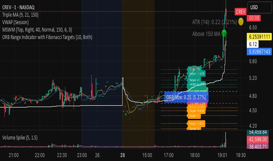
ORB Range Indicator with Fibonacci Targets
This script plots the Opening Range (ORB) high and low based on a configurable time window (5–45 minutes from the U.S. session open at 9:30 AM EST).
Once the ORB window closes, the indicator draws horizontal lines marking:
ORB High and Low
The size of the range in price and %
Fibonacci-based price targets above and below the range (0.382, 0.618, 1.000, 1.618, 2.000)
You can control:
Which Fibonacci levels to display
Whether to show long targets, short targets, or both
All drawings are automatically cleared at the start of each trading day.
Ideal for breakout traders using ORB and Fibonacci extensions for target planning.
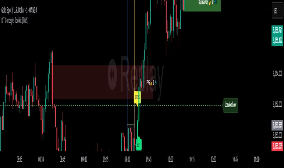
ICT Concepts Toolkit [TWS]
ICT Concepts Toolkit – by Trade With Stevie
Unlock the full power of Inner Circle Trader (ICT) concepts with this all-in-one indicator built for serious traders.
The ICT Concepts Toolkit combines the most powerful price action tools into one clean, efficient, and highly customizable interface — perfect for mastering market structure and timing precision entries.
✅ Features Included:
🟩 Order Blocks – Automatically detect key institutional levels for potential reversals and entries.
📉 Fair Value Gaps (FVGs) – Visualize imbalances in price action to spot high-probability targets and mitigation zones.
📊 Support & Resistance – Dynamically plotted levels to track market structure and trend shifts in real-time.
📅 Previous Daily Highs/Lows – Key liquidity zones marked for precision scalping and swing setups.
🕒 Session Zones – Clearly defined Asian, London, and New York sessions with customizable times and colors.
📌 Extension Lines – Extends each session’s high and low to the current candle for ongoing bias and liquidity mapping.
🚦ICT Morning Signal – Your personal directional bias assistant: smart signals showing when to Buy or Sell based on ICT’s powerful Morning Model logic.
Whether you're trading Forex, Futures, or Crypto — this toolkit gives you a cleaner chart, clearer bias, and more confidence in your setups.
💡 Created by Trade With Stevie — follow for more smart tools and signal insights.
RSI with Williams %R Coloringsimple fusion of RSI to seek divergence and williams % R coloring to see overbought/oversold price.
not my own work, just merely took two standard indicators and infused them.
Timed Trade Close AlertEnables you to set up alerts that can be used to close all trades when used in conjunction with web hooks.
Firstly, you can enable a daily alert at a regular time to avoid spread blow outs during roll overs. ie: This will alert at the same time each day
Additionally, you can enable and program up to 8 individual alerts to address news events or any other situations that you would want to halt your trading. The day, hour and minute can be adjusted according

Previous Day High/Low/Close - Static Daily Lines (Custom Colors)previous day high low closing
statick line can be change with tihe time frame 5 to 15

Custom EMA 9/21/50/200Chart Screenshots: Include a chart screenshot showing the EMAs with different colors and line styles (e.g., EMA 9 dashed, EMA 21 dotted, EMA 50 solid, EMA 200 solid) to demonstrate the visual output.
Backtest Results: If you want to add credibility, you can mention that the indicator is designed for visual analysis but can be integrated into strategies (though no trading logic is included here).
TradingView Guidelines: Ensure compliance with TradingView’s publishing rules (e.g., original content, no misleading claims).
This description is concise yet comprehensive, highlighting the indicator’s features and usability to attract traders on TradingView. Let me know if you need help with additional publishing steps or want to tweak the description further!
✅ TrendSniper Pro✅ SPNIPER ENTRY – Precision Trend Reversal Signals
The SPNIPER ENTRY is a smart trend-following and reversal indicator designed for traders who want timely entries, clear trend confirmation, and clean visuals.
Key Features:
✅ Triple TEMA Trend Confirmation (21, 50, 200): Ensures you're entering only when all moving averages agree on direction.
🎯 Dip/Top Detection: Uses pivot analysis and ATR proximity to detect ideal pullback entries in the prevailing trend.
📉 Stop Loss & Take Profit Zones: ATR-based dynamic SL/TP levels plotted automatically.
📛 False Signal Filter: Avoids multiple entries by maintaining a position until an opposite signal occurs.
📊 Clean Chart Coloring: Candles turn green for confirmed uptrend and red for downtrend—easy to follow.
🔔 Built-in Alerts: Be notified when conditions align perfectly for a high-probability trade.
👁️ Optional TEMA Display: Toggle visibility of trend components for deeper insight.
How it Works:
A buy signal occurs only when:
All 3 TEMA slopes are positive
Price pulls back near a recent pivot low (dip)
A valid uptrend is in place
A sell signal occurs only when:
All 3 TEMA slopes are negative
Price nears a recent pivot high (top)
A confirmed downtrend is active
This indicator is ideal for swing traders, intraday traders, and scalpers who want precise entries based on structure, slope, and volatility.

Macros, Sessions, and Quarters - psyploThis script was developed for my personal trading workflow, where I rely heavily on macro time windows and session-based timing to guide my strategy. I designed this tool to help visualize important time-based zones that are crucial in my trading approach, and I believe other traders might find it useful as well.
Features
Macro Time Window Boxes: Visual representation of price range within a configurable time window around the top of every hour.
Session Ribbon Boxes: Clearly marks the Asia, London, and New York trading sessions, labeled distinctly for better visual separation.
Session Quarters: Each session is automatically divided into four quarters, providing more granular time segmentation within sessions.
Time Zone: All session calculations are based on UTC +8 (Asia/Singapore) timezone.
This tool helps traders:
Identify volatility zones around hourly opens.
Track session-specific market dynamics.
Recognize shifts in momentum or liquidity during each session quarter.
I created this for my own strategies, but it can serve any trader who benefits from time-based market segmentation.
Feel free to adjust the colors and time window settings to suit your preferences!

Apex Edge - RSI Trend LinesThe Apex Edge - RSI Trend Lines indicator is a precision tool that automatically draws real-time trendlines on the RSI oscillator using confirmed pivot highs and lows. These dynamic trendlines track RSI structure in motion, helping you anticipate breakout zones, reversals, and hidden divergences.
Every time a new pivot forms, the indicator automatically re-draws the RSI trendline between the two most recent pivots — giving you an always-current view of momentum structure. You’ll instantly see when RSI begins compressing or expanding, long before price reacts.
Key Features: • Dynamic RSI trendlines drawn from the last 2 pivots
• Auto re-draws in real-time as new pivots form
• Optional "Full Extend" or "Pivot Only" modes
• Slope color-coded: green = support, red = resistance
• Built-in dotted RSI levels (30/70 default)
• Alert conditions for RSI trendline breakout signals
• Ideal for spotting divergence, compression, and early SMC confluence
This is not your average RSI — it’s a fully reactive momentum edge overlay designed to give you clarity, structure, and timing from within the oscillator itself. Perfect for traders using Smart Money Concepts, divergence setups, or algorithmic trend tracking.
⚔️ Built for precision. Built for edge. Built for Apex.
