Custom Screener with Alerts @RAMLAKSHMANDASScan the Nifty 50 directly on TradingView!
This script provides a real-time screener for the top 40 Nifty 50 stocks ranked by current index weightage (starting from RELIANCE, HDFCBANK, ICICIBANK, etc.), offering rapid on-chart multi-symbol analysis.
Features
Multi-symbol screener: Monitors the leading 40 Nifty constituents (NSE equities) in one view.
Full indicator table: Get snapshot values for Price, RSI, TSI, ADX, and SuperTrend for every symbol.
Dynamic filtering: Instantly filter results by any indicator value (e.g., highlight all stocks with RSI below 30).
Customizable symbols: Easily edit the symbol list to match updated Nifty composition or your stocks of interest.
Multi-timeframe support: Table values will update for any chosen chart timeframe.
Real-time alerts: Set up alerts for filtered stocks matching your strategy.
Sentiment

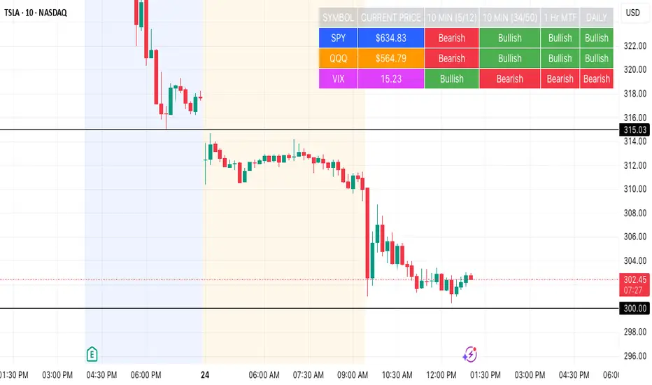
SPY, QQQ, VIX Status TableBased on Ripster EMA and 1 hour MTF Clouds, this custom TradingView indicator displays a visual trend status table for SPY, QQQ, and VIX using multiple timeframes and EMA-based logic to be used on any stock ticker.
🔍 Key Features:
✅ Tracks 3 symbols: SPY, QQQ, and VIX
✅ Multiple trend conditions:
10-min (5/12 EMA) Ripster cloud trend
10-min (34/50 EMA) Ripster cloud trend
1-Hour Multi-Timeframe Ripster EMA trend
Daily open/close trend
✅ Color-coded trend strength:
🟩 Green = Bullish
🟥 Red = Bearish
🟨 Yellow = Sideways
✅ TO save screen space, customizations available:
Show/hide individual rows (SPY, QQQ, VIX)
Show/hide any trend column (10m, 1H MTF, Daily)
Change header/background colors and font color
Bold white top row for readability
✅ Auto-updating table appears on your chart, top-right
This tool is great for active traders looking to quickly scan short-term and longer-term momentum in key market instruments without having to go back and forth market charts.
💀🐔 PANICAN ALERT🧨 PANICAN ALERT
For traders who:
Enter every position “just to see what happens”
Panic-exit green trades for a $12 profit
Re-enter 30 seconds later at a worse price
Can’t tell the difference between a pullback and personal betrayal
Have 19 open indicators and trust none of them
No strategy. No plan. Just nerves, caffeine, and poor impulse control.
PANICAN ALERT doesn’t help — it reflects.
It won’t save you. But at least now your chart screams like you do.

EMA Strength V2This indicator plots a single Exponential Moving Average (EMA) line whose color changes based on a comparison with a second EMA. The user can customize both EMA lengths and choose separate price sources (like close, hlc3, etc.) for each EMA.
The line turns green when EMA 1 is greater than EMA 2, indicating bullish momentum, and red when EMA 1 is less than EMA 2, signaling potential bearishness. This dynamic coloring helps traders visually track trend strength and possible reversals.

EMA StrengthThis indicator plots a single Exponential Moving Average (EMA) line whose color changes based on a comparison with a second EMA. The user can customize both EMA lengths and choose separate price sources (like close, hlc3, etc.) for each EMA.
The line turns green when EMA 1 is greater than EMA 2, indicating bullish momentum, and red when EMA 1 is less than EMA 2, signaling potential bearishness. This dynamic coloring helps traders visually track trend strength and possible reversals.


NACHO_MC/KAS_MCThis indicator allow to see the Nacho dominance % vs KAS, based on the real circulating supply.

Trinity Multi Time Frame Trend DashboardNote: This is based on trading view indicator but I am unsure the original name or author to give recognition. If you know the name of the indicator or author then please let me know and I can update this script to give recognition.
Below is a list of the changes this code has gone through and all settings are editable.
Changes:
Changed: timeline from 5 to 3 mins for faster scalping, changed the RSI, CCI and MACD values for faster signals as well as the below to update the code to latest pine script and for optimizations.
Structure and Optimization: The original script used individual variables for each timeframe (e.g., emaFast_3min, emaFast_15min), leading to repetitive code. The latest version uses arrays (e.g., emaFast as array.new_float(7, na)) to store values for all timeframes, making the code more compact and maintainable. However, due to Pine Script limitations with loops and request.security, the calculations are unrolled (explicitly computed for each timeframe i=0 to 6) instead of using a loop for security calls.
Timeframe Handling: Removed the timeframes array in the final version (as loops couldn't be used with variable timeframes in request.security due to requiring 'simple string' arguments). Instead, hardcoded the timeframe strings ("3", "15", etc.) directly in each block. Kept timeframe_labels array for display purposes.
Volume Calculation: Precomputed volume3 for the 3M timeframe outside the blocks. For 15M and 30M, used ta.sma(volume3, 3) and ta.sma(volume3, 6) respectively, as in the original, but integrated into unrolled blocks. Renamed volume arrays to tfVolume and tfVma to avoid conflicts with built-in volume.
MACD Calculation: In the original, used to ignore the histogram. The latest version does the same but assigns to temporary variables like macd0, signal0 for each timeframe to avoid tuple assignment issues.
Trend Determination: Used arrays for all boolean conditions (e.g., isBullish as array.new_bool(7, false)). Set values in a loop, which works since no security calls are involved here.
Added Signal Row: Introduced a new row in the table labeled "Signal". For each timeframe, it shows:
"Buy" (green) if EMA, MACD, RSI, and CCI are all bullish.
"Sell" (red) if all are bearish.
"⚠" (yellow) if not fully aligned
Table Dimensions: Updated the table to 9, 8 (columns, rows) to accommodate the new "Signal" row.
Color for Signal: In the table cell for signal, added coloring: green for "Buy", red for "Sell", yellow for "⚠".
Array Declarations: Used array.new_float, array.new_bool, etc., without qualifiers to fix template errors. Initialized with na for floats/colors, false for bools, "" for strings.
Error Fixes: Resolved various syntax/type issues, such as avoiding series in array templates, ensuring 'simple string' for timeframes in request.security, and proper tuple unpacking for MACD.
Overall Code Length: The latest version is longer due to unrolled calculations but more robust and error-free.

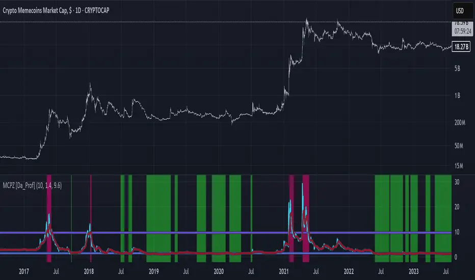
MCPZ - Meme Coin Price Z-Score [Da_Prof]Meme Coin Price Z-score (MCPZ). Investor preference for meme coin trading may signal irrational exuberance in the crypto market. If a large spike in meme coin price is observed, a top may be near. Similarly, if a long price depression is observed, versus historical prices, that generally corresponds to investor apathy, leading to higher prices. The MEME.C symbol allows us to evaluate the sentiment of meme coin traders. Paired with the Meme Coin Volume (MCV) and Meme Coin Gains (MCG) indicators, the MCPZ helps to identify tops and bottoms in the overall meme coin market. The MCPZ indicator helps identify potential mania phases, which may signal nearing of a top and apathy phases, which may signal nearing a bottom. A moving average of the Z-score is used to smooth the data and help visualize changes in trend. In back testing, I found a 10-day sma of the MCPZ works well to signal tops and bottoms when extreme values of this indicator are reached. The MCPZ seems to spend a large amount of time near the low trigger line and short periods fast increase into mania phases.
Meme coins were not traded heavily prior to 2020, but the indicator still picks a couple of tops prior to 2020. Be aware that the meme coin space also increased massively in 2020, so mania phases may not spike quite as high moving forward and the indicator may need adjusting to catch tops. It is recommended to pair this indicator with the MCG and MCV indicators to create an overall picture.
The indicator grabs data from the MEME.C symbol on the daily such that it can be viewed on other symbols.
Use this indicator at your own risk. I make no claims as to its accuracy in forecasting future trend changes of memes or any other asset.
Hope this is helpful to you.
--Da_Prof
Binance Spot vs Perpetual Price index by BIGTAKER📌 Overview
This indicator calculates the premium (%) between Binance Perpetual Futures and Spot prices in real time and visualizes it as a column-style chart.
It automatically detects numeric prefixes in futures symbols—such as `1000PEPE`, `1MFLUX`, etc.—and applies the appropriate scaling factor to ensure accurate 1:1 price comparisons with corresponding spot pairs, without requiring manual configuration.
Rather than simply showing raw price differences, this tool highlights potential imbalances in supply and demand, helping to identify phases of market overheating or panic selling.
🔧 Component Breakdown
1. ✅ Auto Symbol Mapping & Prefix Scaling
Automatically identifies and processes common numeric prefixes (`1000`, `1M`, etc.) used in Binance perpetual futures symbols.
Example:
`1000PEPEUSDT.P` → Spot symbol: `PEPEUSDT`, Scaling factor: `1000`
This ensures precise alignment between futures and spot prices by adjusting the scale appropriately.
2. 📈 Premium Calculation Logic
Formula:
(Scaled Futures Price − Spot Price) / Spot Price × 100
Interpretation:
* Positive (+) → Futures are priced higher than spot: indicates possible long-side euphoria
* Negative (−) → Futures are priced lower than spot: indicates possible panic selling or oversold conditions
* Zero → Equilibrium between futures and spot pricing
3. 🎨 Visualization Style
* Rendered as column plots (bar chart) on each candle
* Color-coded based on premium polarity:
* 🟩 Positive premium: Light green (`#52ff7d`)
* 🟥 Negative premium: Light red (`#f56464`)
* ⬜ Neutral / NA: Gray
* A dashed horizontal line at 0% is included to indicate the neutral zone for quick visual reference
💡 Strategic Use Cases
| Market Behavior | Strategy / Interpretation |
| ----------------------------------------- | ------------------------------------------------------------------------ |
| 📈 Premium surging | Strong futures demand → Overheated longs (short setup) |
| 📉 Premium dropping | Aggressive selling in futures → Oversold signal (long setup) |
| 🔄 Near-zero premium | Balanced market → Wait and observe or reassess |
| 🧩 Combined with funding rate or OI delta | Enables multi-factor confirmation for short-term or mid-term signals |
🧠 Technical Advantages
* Fully automated scaling for prefixes like `1000`, `1M`, etc.
* Built-in error handling for inactive or missing symbols (`ignore_invalid_symbol=true`)
* Broad compatibility with Binance USDT Spot & Perpetual Futures markets
🔍 Target Use Cases & Examples
Compatible symbols:
`1000PEPEUSDT.P`, `DOGEUSDT.P`, `1MFLUXUSDT.P`, `ETHUSDT.P`, and most other Binance USDT-margined perpetual futures
Works seamlessly with:
* Binance Spot Market
* Binance Perpetual Futures Market

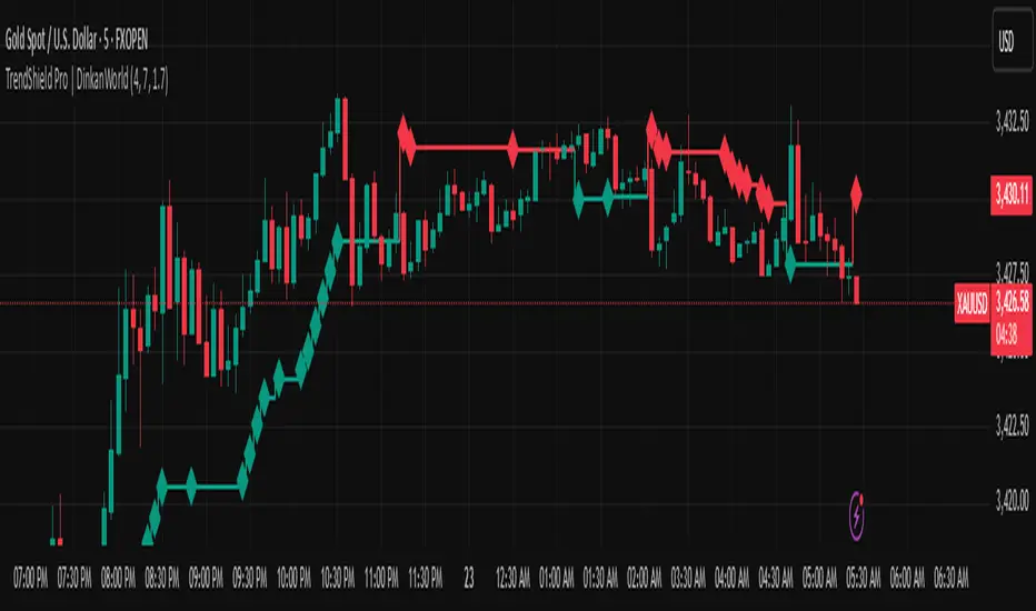
TrendShield Pro | DinkanWorldTrendShield Pro is a powerful price action tool that combines momentum-based trend detection with an ATR-powered trailing stop system. Built using EMA and ATR logic, this indicator helps traders identify real trends, manage dynamic stop-loss levels, and react faster to momentum shifts — all with visual clarity.
🔍 Key Features:
✅ Momentum + Price Action Based Trend Detection
✅ Dynamic ATR Trailing Stop Line
✅ Real-Time Reversal Arrows and Diamond Alerts
✅ Optimized CandleTrack color theme (Green = Demand, Red = Supply)
✅ Fully customizable inputs
🧠 Why Use It?
Capture trends early with momentum-driven logic
Use trailing stops for exit strategy or re-entry zones
Stay on the right side of the market with visual confirmation
⚙️ Inputs:
EMA Period (for directional bias)
ATR Period (for volatility-based trailing stops)
Factor (stop distance control)
⚠️ Disclaimer:
This indicator is for educational and informational purposes only and should not be considered financial advice. Trading involves risk, and past performance does not guarantee future results. Always do your own research and consult with a licensed financial advisor before making any trading decisions. The creator of this script is not responsible for any financial losses incurred through the use of this tool.
CandleTrack Pro | Pure Price Action Trend Detection CandleTrack Pro | Pure Price Action Trend Detection with Smart Candle Coloring
📝 Description:
CandleTrack Pro is a clean, lightweight trend-detection tool that uses only candle structure and ATR-based logic to determine market direction — no indicators, no overlays, just pure price action.
🔍 Features:
✅ Smart Candle-Based Trend Detection
Uses dynamic ATR thresholds to identify trend shifts with precision.
✅ Doji Protection Logic
Automatically filters indecision candles to avoid whipsaws and false signals.
✅ Dynamic Bull/Bear Color Coding
Bullish candles are colored green, bearish candles are colored red — see the trend instantly.
✅ No Noise, No Lag
No moving averages, no smoothing — just real-time decision-making power based on price itself.
📈 Ideal For:
Price action purists
Scalpers and intraday traders
Swing traders looking for clear visual bias
─────────────────────────────────────────────────────────────
Disclaimer:
This indicator is provided for educational and informational purposes only and should not be considered as financial or investment advice. The tool is designed to assist with technical analysis, but it does not guarantee any specific results or outcomes. All trading and investment decisions are made at your own risk. Past performance is not indicative of future results. Always do your own research and consult with a qualified financial advisor before making any trading decisions. The author accepts no liability for any losses or damages resulting from the use of this script. By using this indicator, you acknowledge and accept these terms.
───────────────────────────────────────────────────

Makki MultiEdge Analyzer 2000This script combines Bollinger Band interactions, RSI momentum confirmation, EMA crossovers, and divergence detection to generate filtered BUY signals. It uses 5-minute and 15-minute timeframe logic to improve timing and reduce false entries.
### 🔹 BUY signal logic:
A BUY label will only appear when:
• Price is near the lower Bollinger Band
• RSI shows a rebound or is climbing from oversold zones
• There is a strong bullish candle, a golden cross (EMA), or a positive divergence
• AND no overbought/exit filter is active
### 💎 Entry filter (diamond):
Appears when a clean bounce is detected on the 5-minute chart.
This is **not a BUY** but a preparation signal — useful to monitor for an upcoming opportunity.
### ⛔ Exit filter:
Triggers when 15m RSI is overbought (>68), price touches the 15m upper Bollinger Band, and 5m momentum weakens.
Blocks BUY signals and helps avoid entries during overextended moves.
### 🔺/🔻 Mild Support/Resistance markers:
- **🔺 Green upward triangle:** appears when RSI rebound or mild support conditions exist, but not enough for a BUY
- **🔻 Red downward triangle:** appears when bearish momentum, EMA crossdown, overbought RSI, or negative divergence is detected
### ❌ RSI Warnings:
- **Orange X above the bar:** RSI > 75 (overbought warning)
- **Orange X below the bar:** RSI < 25 (oversold warning)
### 🧠 Usage recommendation:
- Wait for a 💎 as early preparation
- Enter only if a BUY signal follows with no ⛔ warning present
- Avoid BUYs that appear after ⛔ or during RSI > 75 (orange X) unless very strong reversal confirmation exists
- 🔺 triangles can help monitor early support but are not sufficient alone
### 🕒 Timeframe:
- Best used on 5-minute chart
- Filtering logic pulls RSI and Bollinger data from 5m and 15m timeframes
- Higher timeframes (15m–1H) can be used for overall trend direction
All alerts are included for: BUY, entry filter (💎), exit warning (⛔), RSI warnings (❌), and support/resistance markers (🔺/🔻).
This script is for educational purposes only and does not constitute financial advice.

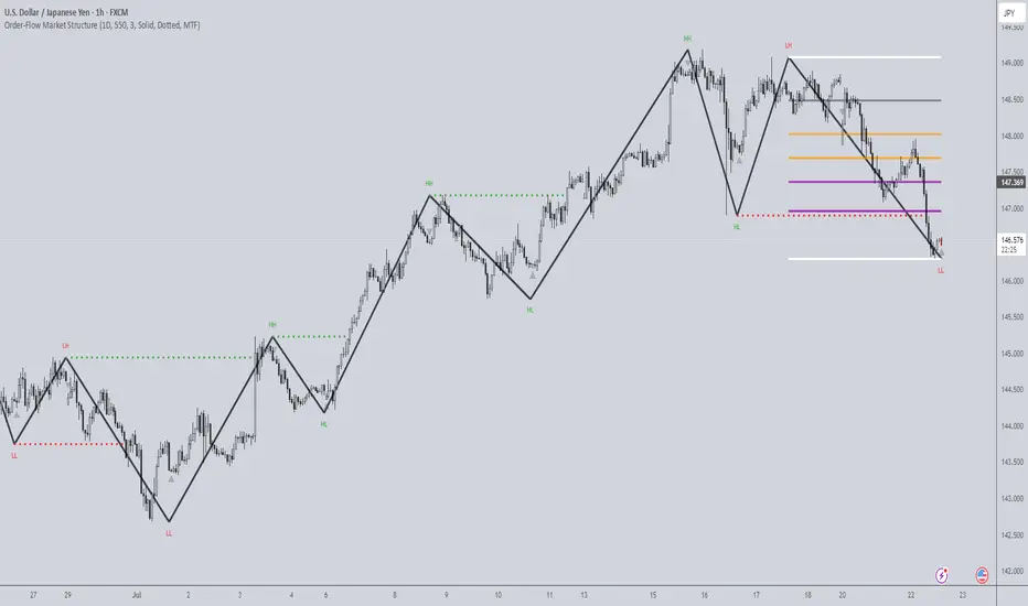
Order-Flow Market StructureOrder-Flow Market Structure by The_Forex_Steward
A precision tool for visualizing internal shifts, swing structure, BOS events, Fibonacci levels, and multi-timeframe alerts.
What It Does
The Order-Flow Market Structure indicator intelligently tracks and visualizes price structure using higher timeframe candles. It automatically detects:
• Internal bullish and bearish structure shifts
• Swing highs and lows (HH, HL, LH, LL)
• Break of Structure (BoS) confirmations
• Fibonacci retracement levels from recent swing moves
• Real-time alerts across LTF, MTF, and HTF modes
It’s a complete tool for traders who follow Smart Money Concepts, ICT, or institutional price action strategies.
How It Works
• You select a Higher Timeframe (HTF) to set the structural context
• Internal shifts are identified using HTF candle closes
• The indicator scans for swing highs/lows after each internal shift
• Breaks of previous swing points confirm BoS and plot horizontal lines
• Zigzag lines visually connect structural points (swings and BoS)
• Fibonacci levels are drawn between the latest swings
• Alerts can be configured for structure shifts, BoS events, and fib level breaks
How to Use It
Set your preferred HTF (e.g., 1H while trading on 5-minute)
Enable Fibonacci levels to visualize retracement zones
Watch for:
• Bullish internal shifts → HL to HH
• Bearish internal shifts → LH to LL
• BOS → Breakout confirmation
Enable alerts to catch structural events in real-time
Adjust the "Safe History Offset" if working with long lookbacks or volatile assets
Who It's For
• Traders using Smart Money, ICT, or market structure-based systems
• Scalpers, day traders, and swing traders
• Anyone needing precise structural insight across multiple timeframes
Features
• BoS detection with custom line styles and width
• HH, HL, LH, LL label plotting
• Optional Fibonacci retracement zones
• Custom alerts for swing shifts and fib level breaks
• LTF, MTF, and HTF alert modes
Stay aligned with structure, trade with precision, and get alerted to key shifts in real time.
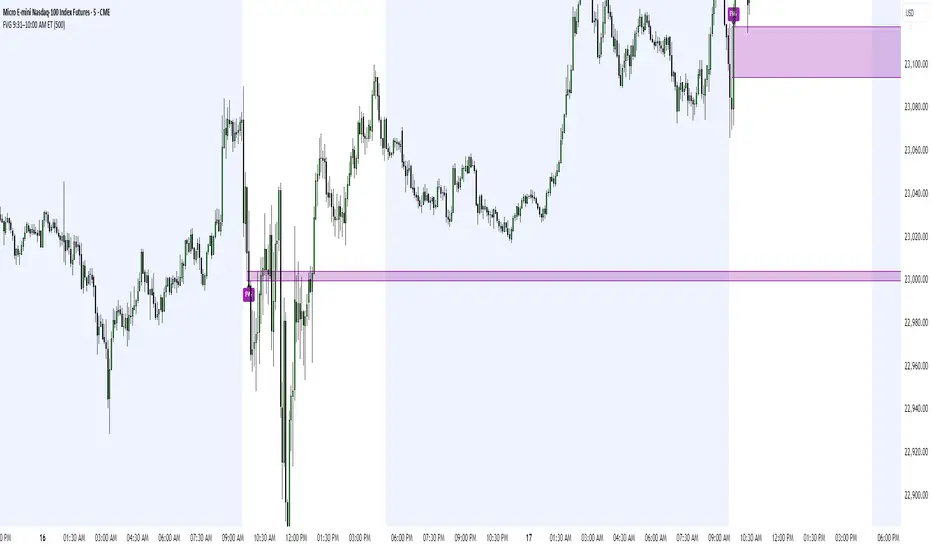
FVG 9:31–10:00 AM ETFVG 9:31–10:00 AM ET - Script Description
What This Script Does
This indicator finds **Fair Value Gaps (FVGs)** that form during the first 29 minutes of the U.S. stock market (9:31 AM to 10:00 AM Eastern Time). A Fair Value Gap is a price imbalance where there's a gap between candles that often becomes an important support or resistance level.
Key Features:
- **Time Window**: Only looks for FVGs between 9:31-10:00 AM ET (most important opening period)
- **One Per Day**: Finds only the first FVG that forms in this time window each day
- **Visual Display**: Draws a purple box around the gap with a clear "FVG" label
- **Price Tracking**: Monitors when price comes back to test the gap level
- **Alert System**: Sends notifications when price returns to the FVG zone
How FVGs Are Detected:
- **Bullish FVG**: When there's a gap up (low of middle candle is above high of 3rd candle back)
- **Bearish FVG**: When there's a gap down (high of middle candle is below low of 3rd candle back)
The 9:31-10:00 AM window is chosen because this is when institutions and algorithms create their biggest price moves right after market open, making these gaps very reliable.
Customization Options
User Settings
Extend FVG Box (Bars)
- **What it does**: Makes the purple box longer to the right
- **Default**: 0 (box ends right after the gap forms)
- **Options**: Any number from 0 to 100+
- **When to use**:
- Keep at 0 for clean historical view
- Set to 10-20 to track the gap during the current session
- Set higher for longer reference
Code Settings (Can Be Changed)
Time Window
- **Start**: 9:31 AM Eastern Time
- **End**: 10:00 AM Eastern Time
- **Can modify**: Change the hour/minute numbers in the code
Visual Style
- **Color**: Purple with see-through background
- **Label**: Shows "FVG" text in white
- **Can modify**: Change colors and transparency in the code
How to Use:
Setup
Chart Settings
1. Use 1-minute, 5-minute, or 15-minute charts (works best on these timeframes)
2. Apply to liquid markets like ES, NQ, major stocks, or forex pairs
3. Set the "Extend FVG Box" to your preference (start with 0 or 10)
What You'll See
- A purple box appears when an FVG forms during 9:31-10:00 AM
- Box shows the exact price levels of the gap
- "FVG" label appears on the box
- Only one FVG per day will be marked
Trading Strategies
Basic FVG Trading
1. **Wait for Formation**: Let the purple box appear during 9:31-10:00 AM
2. **Watch Price Movement**: See if price moves away from the gap
3. **Enter on Retest**: When price comes back to the purple box area, consider entering
4. **Trade Direction**:
- Bullish FVG = look for long opportunities when price retests
- Bearish FVG = look for short opportunities when price retests
Entry Methods
- **Bounce Play**: Enter when price touches the FVG box and bounces away
- **Break Play**: Enter if price strongly breaks through the FVG box
- **Rejection Play**: Enter opposite direction if price gets rejected at the FVG
Risk Management
Stop Losses
- Place stops just outside the FVG box (a few ticks beyond the gap)
- If trading a bounce, stop goes on opposite side of the gap
- If trading a break, stop goes back inside the gap
Position Sizing
- Start small until you understand how FVGs work in your market
- Bigger gaps = smaller position size (more risk)
- Smaller gaps = can use larger position size
Profit Targets
- Take profits at obvious levels like round numbers, previous highs/lows
- Consider taking half profits at 1:1 risk/reward ratio
- Let some position run if the move is strong
Best Practices
When It Works Best
- High-volume stocks and futures (ES, NQ work great)
- Normal market days without major news during the 9:31-10:00 window
- When there's clear institutional activity in the opening period
When to Be Careful
- Low-volume stocks or markets
- Major economic news releases during the time window
- Market holidays when volume is low
- Very choppy or sideways days
Alert Usage
- The script will alert you when price comes back to test the FVG
- Don't trade the alert blindly - always check the current market situation
- Use the alert as a heads-up to start watching the setup more closely
Tips for Success
- The earlier the FVG forms in the 9:31-10:00 window, often the more significant it is
- FVGs that form with high volume are usually more reliable
- Always consider the overall market direction - don't fight the main trend
- Practice on paper first to understand how FVGs behave in your chosen market
🔗 Works Best With:
✅ Liquidity Levels — Smart Swing Lows: Spot key structural lows that can fuel stop hunts and reversals.
✅ ICT Turtle Soup — Liquidity Reversal: Add a classic reversal pattern to your toolkit to catch fakeouts cleanly.
✅ ICT SMC Liquidity Grabs and OBs- Liquidity Grabs, Order Block Zones, and Fibonacci OTE Levels, allowing traders to identify institutional entry models with clean, rule-based visual signals.
This script is most valuable for day traders who want to catch institutional moves right after market open, but it can also help swing traders identify important intraday levels.
✅ ICT Macro Zones (Grey Box Version)- It tracks real-time highs and lows for each Silver Bullet session.
✅ Weekly Opening Gap (cryptonnnite)
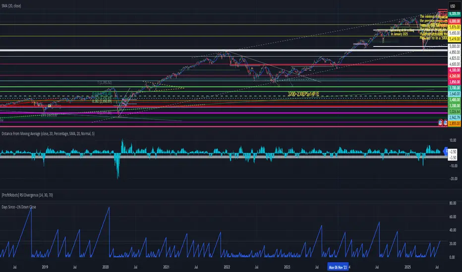
Days Since –1% Down Close“Days since last down 1% close” indicator
This is a useful tool for investors and analysts to gauge market momentum, volatility, and potential risk:
1. Measuring Market Stability and Momentum
2. Identifying Potential Overbought Conditions
3. Volatility Assessment
4. Contextualizing Seasonal or External Factors
5. Risk Management and Timing
Actionable Insight: Combine this with real-time data (e.g., VIX levels or economic releases like tomorrow’s potential market-moving news)
In summary, the "Days since last down 1% close" indicator helps investors monitor market health, spot overextension, and manage risk by providing a historical benchmark for volatility.
🌀 STD-Torque Wave Map v1.0🔍 Overview
The STD-Torque Wave Map v1.0 is a multi-timeframe market pressure visualizer that uses the slope of standard deviation (STD) to measure torque—i.e., the acceleration or deceleration of volatility. By combining short, medium, and long-term torque across timeframes (1H, 4H, and 1D by default), this tool helps traders spot confluence zones of high energy. It also detects key signals from RSI divergence and volume spikes to confirm potential breakout or reversal moments.
⚙️ Inputs
Short-Term TF (1H): Select your short timeframe (e.g., 15m, 1H).
Mid-Term TF (4H): Select your medium timeframe.
Long-Term TF (1D): Choose a higher timeframe for macro alignment.
STD Length: Length used for calculating standard deviation.
RSI Length: Length for Relative Strength Index calculation.
Volume Smoothing: Period used to smooth volume for pressure analysis.
Torque Spike Threshold: Sensitivity threshold for torque spike detection.
📊 How to Use
Read the Torque Histograms:
Three color-coded histograms represent torque (slope of STD) at different timeframes:
🟩 Lime: Short-Term Torque
🟧 Orange: Mid-Term Torque
🟪 Purple: Long-Term Torque
Watch for Yellow Confluence Zones:
A yellow background signals that torque is spiking across all three timeframes — a strong confluence zone indicating possible momentum ignition.
Breakout Watch Labels:
A ⚡ red label appears on the main chart (top location) when:
All torque values exceed the threshold AND
Either an RSI divergence or a volume spike is detected.
This is your cue to monitor for explosive breakouts or fakeouts.
Use Alerts:
Set alerts for:
✅ Torque Confluence
✅ Torque + RSI Divergence
✅ Torque + Volume Spike
Get real-time heads-up when pressure is building beneath the surface.
🧠 Interpretation Tips
Torque is Pressure, Not Direction: This tool measures energy building in the market. Combine it with your directional bias, price action, or trend tools.
Ideal for Pre-Breakout Contexts: Use in sideways, low-volatility zones to anticipate the breakout direction using RSI or volume confirmation.
Great Add-On: Pairs well with structure-based tools (e.g., support/resistance, order blocks) or liquidity mapping indicators.
📌 Designed for active traders who want to visually map hidden energy across timeframes before it erupts on the chart.

Fair Value MSThis indicator introduces rigid rules to familiar concepts to better capture and visualize Market Structure and Areas of Support and Resistance in a way that is both rule-based and reactive to market movements.
Typical "Market Structure" or "Zig-Zag" methods determine swing points based on fixed thresholds (length or percentage). While this does provide rigid structure, the results may be lagging or confusing due to the timing, since it is fixed to static parameters.
I believe the concept of Fair Value Gaps can solve this problem.
As you will notice, there are no length settings in this indicator.
> FVG Market Structure
Fair Value Gaps are a well known concept used to indicate directional intent, forming when price moves aggressively in one direction, leaving behind an imbalance between buyers and sellers. While the term FVG was popularized by ICT, the underlying concept predates them, known historically as imbalances, inefficiencies, or liquidity voids in institutional trading.
Note: For simplicity, in this indicator they'll be called FVGs.
By reading into this, we are able to clearly and rigidly define market structure simply by "looking" at the chart, using objective price events rather than subjective interpretation, or lengths.
By using FVGs to determine structure direction, the length, and speed of identification lies entirely on the market. If an FVG Down occurs immediately after a New Higher High forms, it is reasonable to assume there was a seller at that point, so the script would indicate a New Swing High.
The script is NOT stuck, waiting for a % retrace, or # bars to pass to identify it as such.
Sometimes the market is in a steady trend in a single direction and no FVGs form; therefore, no structure forms. -> Why would we try to impose structure on a clear trend?
Ultimately, the FVG Structure Method uses real reactions from the market to determine Market structure, and is not fixed to specific parameters.
As with other market structure indicators, "Market Structure Breaks" are still identifiable when price moves outside the most recent swing points.
These are helpful to indicate larger direction. In the following section you will see how these help us determine when we should start the search for an "Area of Interest (AOI)".
> Areas of Interest (AOIs)
"Area of Interest (AOI)" is a generalized term, and could refer to many types of zones you might recognize under different names. While the AOIs in this indicator are specialized in their own way, I have chosen to simply use the term "Area of Interest" because it’s more important to understand how they behave and why they exist than to focus on what they’re called.
The goal of an AOI is to point out reasonable areas where buyers or sellers may be staging, as is typical with support and resistance.
In order to reasonably identify these areas, we look for cause and effect relationships. When considering these relationships, it's easier to understand the placement of the points to define each zone.
(Buyer Examples)
Cause: Strong Buyers step in at Swing Low
Effect: Fair Value Gap Forms
Cause: Sustained Buying Pressure
Effect: Market Structure Breaks
In this example, The zone is drawn from the Swing Low, to the Bottom of the FVG closest to the swing point.
In theory, the participation at the swing point was strong and aggressive enough to create the FVG imbalance. Which then found acceptance and continued into a Market Structure Break. So with these AOIs, we are trying to locate the aggressive Buyers or Sellers which were positioned BEFORE the FVG.
These Zones are intended to act as areas to look for reactions from market participants, to judge where price may be going. When revisiting these zones, we look for a reaction or a break, to further provide us information to if the buyers or sellers are still there.
As seen in the screenshot above, The information we gain is not from the creation of these zones, but from the behavior we witness when these zones are revisited.
Technical Note: In this indicator, Market Structure Breaks are only considered when price closes outside the recent swing points. Wicks are not considered as confirmation, therefore are not used to detect structural breaks.
Inside each AOI you can optionally display a readout of the volume which accumulated during the time starting at the swing point and going until the closing bar of the FVG.
Note: We are counting volume until the closing bar of the FVG since the FVG is a 3 bar formation, and aggressive volume is required throughout to create the imbalance.
There are multiple FVGs that typically occur in a single direction, but we do not look to every single one to be indicative of structure, only the first FVG in the opposite direction of the previous direction (which is determined by previous FVGs)
You will probably notice, the AOIs do not form from the closest swing or FVG to the break, this is because we are targeting larger directional changes to draw these AOIs from.
Since they do not always happen perfectly every time, the AOI formation waits for an FVG to occur AND a Market structure break to happen. One without the other will result in no Zone displaying.
> Reflection Lines
While they may seem slightly redundant, Reflection Lines serve as reminders of previous support and resistance pivots. They are drawn at the same Pivots where and AOI is formed, and extend beyond the mitigation of the AOI.
These lines are often points of price to look for "Support Flips", a re-test pattern where price trades through previous support (or resistance) then returns to it and rejects, continuing into a larger move or trend.
Their namesake is based on the behavior of price, "reflecting" at these levels.
The Reflection lines are simple and change color based on price's location.
If price is above, we would typically look to a reflection line in with support in mind.
As a basic filter, these lines use an average price to determine their color, this way they will not change their color as frequently in choppy situations.
> Session Start/End Lines
For analysis purposes and trade review, it is helpful to analyze with context.
For that reason, I have implemented start and end session lines into the indicator, these are helpful when reviewing historical charts to not provide additional context.
By default, they are set to the NYSE Session, but can be changed to fit any needs.
These lines are not advanced, and simply draw a line as the chart passes the start and end of the sessions. It's very likely that you may need to adjust the session for your specific needs.
Note: The Timezone can be adjusted within the code if needed. By Default, the indicator uses "America/New_York" Timezone.
> Conclusion
If you’ve ever felt like your structure tools were confusing or lagging, drawing zones too late, or zones that simply don't make sense, this should feel like a breath of fresh air.
By removing arbitrary length settings and instead using FVGs to define structure and as a basis for AOIs, you're getting a more accurate look at what price is doing and where it's reacting from.
This indicator is rule-based, reactive, and aims to keep things logical without fluff or false confidence.
Enjoy!

CRS by TQCRS by TradeQUO
Comparative Relative Strength Indicator
What it does
Computes the percentage difference in performance between your current chart symbol (e.g. GC1!) and a chosen benchmark (e.g. ES1!, DXY, NQ1!).
Smooths that “CRS” line with a configurable moving average (SMA, EMA, WMA) — default length is 63 bars.
Key Plots
CRS (%) (aqua) — how your symbol has held up relative to the benchmark since the chart loaded.
CRS MA (%) (fuchsia) — smoothed trend of that relative strength.
How to Interpret
Trend-Following
Long when CRS crosses above its MA and is above 0 → your symbol is outperforming.
Short (or reverse) when CRS crosses below its MA and is below 0 → underperformance.
Regime Filter
CRS > 0 → Risk-On environment for your symbol vs. benchmark.
CRS < 0 → Risk-Off relative to the benchmark.
Divergence Signals
Bearish Divergence: Price makes a higher high, but CRS makes a lower high → potential sell-off incoming.
Bullish Divergence: Price makes a lower low, but CRS makes a higher low → look for rebound opportunity.
Pairs Trading
Outperformance: Long your symbol + Short benchmark when CRS > MA.
Underperformance: Short your symbol + Long benchmark when CRS < MA.
Why it matters
Reveals relative market leadership early, not just absolute price moves.
Helps you allocate risk dynamically, spot rotations and catch reversals before they show in price alone.

Overheat Oscillator with DivergenceIndicator Description
The Overheat Oscillator with Divergence is an advanced technical indicator designed for the TradingView platform, assisting traders in identifying potential market reversal points by analyzing price momentum and volume, as well as detecting divergences. The indicator combines trend strength assessment with signal smoothing to provide clear indications of market overheat or oversold conditions. An optional divergence detection feature allows for the identification of discrepancies between price movement and the oscillator's value, which may signal upcoming trend changes.
The indicator is displayed in a separate panel below the price chart and offers visual cues through a color gradient, horizontal reference lines, and a dynamic market sentiment table. Users can customize numerous parameters, such as calculation periods, sentiment thresholds, line colors, and visualization styles, making the indicator a versatile tool for various trading strategies.
How the Indicator Works
The indicator is based on the following key components:
Oscillator Calculations
The indicator analyzes price candles, assigning a score based on their nature. A bullish candle (when the closing price is higher than the opening price) receives a score of +1.0, while a bearish candle (when the closing price is lower than the opening price) receives a score of -1.0. This scoring reflects the strength of price movement over a given period.
The score is modified by a volume multiplier (default: 2.0) if the candle's volume exceeds the volume's simple moving average (SMA, default: calculated over 20 candles). This ensures that candles with higher volume have a greater impact on the oscillator's value, better capturing significant market movements driven by increased trading activity. For example, a bullish candle with high volume may receive a score of +2.0 instead of +1.0, amplifying the bullish signal.
The scores are summed over a specified number of candles (default: 20), normalized to a 0–100 range, and then smoothed using a simple moving average (SMA, default: 5 periods) to reduce noise and improve signal clarity.
Color Gradient
The oscillator's values are visualized using a color gradient that changes based on the oscillator's level:
Green: Market cooldown (values below the Gradient Min threshold).
Yellow: Neutral sentiment (values between Gradient Min and Gradient Yellow).
Orange: Elevated activity (values between Gradient Yellow and Gradient Orange).
Red: Market overheat (values above Gradient Orange).
The color gradient is applied as the background in the oscillator panel, facilitating quick assessment of market sentiment.
Reference Levels
The indicator displays customizable horizontal lines for key thresholds (e.g., Overheat Threshold, Oversold Threshold, Gradient Min, Yellow, Orange, Max). These lines are visible only at the height of the last few oscillator candles, preventing chart clutter and helping users focus on current values.
Users can also define three custom horizontal lines with selectable styles (solid, dotted, dashed) and colors. These lines serve as auxiliary tools, e.g., for marking personal support/resistance levels, but do not affect the oscillator's signals or background colors.
Market Sentiment
The indicator displays sentiment labels in a table located in the top-right corner of the panel, dynamically updating based on the oscillator's value:
Cooled: Values below Gradient Yellow (default: 35).
Neutral: Values between Gradient Yellow and Gradient Orange (default: 60).
Excited: Values between Gradient Orange and Overheat Threshold (default: 70).
Overheated: Values above Overheat Threshold (default: 70).
The Overheat Threshold and Oversold Threshold are critical for displaying the "Overheated" and "Cooled" labels in the sentiment table, enabling users to quickly identify extreme market conditions. The labels update when key thresholds are crossed, and their colors match the oscillator's gradient.
Divergence Detection
The indicator offers optional detection of regular bullish and bearish divergences:
Bullish Divergence: Occurs when the price forms a lower low, but the oscillator forms a higher low, suggesting a weakening downtrend.
Bearish Divergence: Occurs when the price forms a higher high, but the oscillator forms a lower high, suggesting a weakening uptrend.
Divergences are marked on the chart with labels ("Bull" for bullish, "Bear" for bearish) and lines indicating pivot points. They are calculated with a delay equal to the Lookback Right setting (default: 5 candles), meaning signals appear after pivot confirmation in the specified lookback period. The indicator also generates alerts for users when a divergence is detected.
Indicator Settings
Main Settings (SETTINGS)
Period Length: Specifies the number of candles used for oscillator calculations (default: 20).
Volume SMA Period: The period for the volume's simple moving average (default: 20).
Volume Multiplier: Multiplier applied to candle scores when volume exceeds the average (default: 2.0).
SMA Length: The period for smoothing the oscillator with a simple moving average (default: 5).
Thresholds (THRESHOLDS)
Overheat Threshold: Level indicating market overheat (default: 70). This value determines when the sentiment table displays the "Overheated" label, signaling a potential peak in an uptrend.
Oversold Threshold: Level indicating market cooldown (default: 30). This value determines when the sentiment table displays the "Cooled" label, signaling a potential bottom in a downtrend.
Gradient Min (Green): Lower threshold for the green gradient (default: 20).
Gradient Yellow Threshold: Threshold for the yellow gradient (default: 35).
Gradient Orange Threshold: Threshold for the orange gradient (default: 60).
Gradient Max (Red): Upper threshold for the red gradient (default: 70).
Visualization (VISUALIZATION)
Signal Line Color: Color of the oscillator line (default: dark red, RGB(5, 0, 0)).
Show Reference Lines: Enables/disables the display of threshold lines (default: enabled).
Divergence Settings (DIVERGENCE SETTINGS)
Calculate Divergence: Enables/disables divergence detection (default: disabled).
Lookback Right: Number of candles back for pivot analysis (default: 5).
Lookback Left: Number of candles to the left for pivot analysis (default: 5).
Line Style (STYLE)
Custom Line 1, 2, 3 Value: Levels for custom horizontal lines (default: 70, 50, 30).
Custom Line 1, 2, 3 Color: Colors for custom lines (default: black, RGB(0, 0, 0)).
Custom Line 1, 2, 3 Style: Line styles (solid, dotted, dashed; default: dashed, dotted, dashed).
How to Use the Indicator
Adding to the Chart
Add the indicator to your TradingView chart by searching for "Overheat Oscillator with Divergence."
Configure the settings according to your trading strategy.
Signal Interpretation
Overheated: Values above the Overheat Threshold (default: 70) in the sentiment table may indicate a potential uptrend peak.
Cooled: Values below the Oversold Threshold (default: 30) in the sentiment table may suggest a potential downtrend bottom.
Divergences:
Bullish: Look for "Bull" labels on the chart, indicating potential upward reversals (calculated with a Lookback Right delay).
Bearish: Look for "Bear" labels, indicating potential downward reversals (calculated with a Lookback Right delay).
Customization
Experiment with settings such as period length, volume multiplier, or gradient thresholds to tailor the indicator to your trading style (e.g., scalping, medium-term trading).
Usage Examples
Scalping: Set a shorter period (e.g., Period Length = 10, SMA Length = 3) and monitor rapid sentiment changes and divergences on lower timeframes (e.g., 5-minute charts).
Medium-Term Trading: Use default settings or increase Period Length (e.g., 30) and SMA Length (e.g., 7) for more stable signals on hourly or daily charts.
Reversal Detection: Enable divergence detection and observe "Bull" or "Bear" labels in conjunction with overheat/cooled levels in the sentiment table.
Notes
The indicator performs best when used in conjunction with other technical analysis tools, such as support/resistance lines, moving averages, or Fibonacci levels.
Divergences may serve as early signals but do not always guarantee immediate trend reversals—confirmation with other indicators is recommended.
Test different settings on historical data to find the optimal configuration for your chosen market and timeframe.

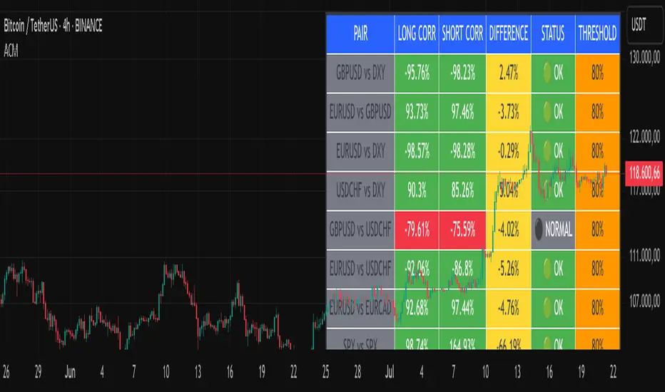
Advanced Correlation Monitor📊 Advanced Correlation Monitor - Pine Script v6
🎯 What does this indicator do?
Monitors real-time correlations between 13 different asset pairs and alerts you when historically strong correlations break, indicating potential trading opportunities or changes in market dynamics.
🚀 Key Features
✨ Multi-Market Monitoring
7 Forex Pairs (GBPUSD/DXY, EURUSD/GBPUSD, etc.)
6 Index/Stock Pairs (SPY/S&P500, DAX/NASDAQ, TSLA/NVDA, etc.)
Fully configurable - change any pair from inputs
📈 Dual Correlation Analysis
Long Period (90 bars): Identifies historically strong correlations
Short Period (6 bars): Detects recent breakdowns
Pearson Correlation using Pine Script v6 native functions
🎨 Intuitive Visualization
Real-time table with 6 information columns
Color coding: Green (correlated), Red (broken), Gray (normal)
Visual states: 🟢 OK, 🔴 BROKEN, ⚫ NORMAL
🚨 Smart Alert System
Only alerts previously correlated pairs (>80% historical)
Detects breakdowns when short correlation <80%
Consolidated alert with all affected pairs
🛠️ Flexible Configuration
Adjustable Parameters:
📅 Periods: Long (30-500), Short (2-50)
🎯 Threshold: 50%-99% (default 80%)
🎨 Table: Configurable position and size
📊 Symbols: All pairs are configurable
Default Pairs:
FOREX: INDICES/STOCKS:
- GBPUSD vs DXY • SPY vs S&P500
- EURUSD vs GBPUSD • DAX vs S&P500
- EURUSD vs DXY • DAX vs NASDAQ
- USDCHF vs DXY • TSLA vs NVDA
- GBPUSD vs USDCHF • MSFT vs NVDA
- EURUSD vs USDCHF • AAPL vs NVDA
- EURUSD vs EURCAD
💡 Practical Use Cases
🔄 Pairs Trading
Detects when strong correlations break for:
Statistical arbitrage
Mean reversion trading
Divergence opportunities
🛡️ Risk Management
Identifies when "safe" assets start moving independently:
Portfolio diversification
Smart hedging
Regime change detection
📊 Market Analysis
Understand underlying market structure:
Forex/DXY correlations
Tech sector rotation
Regional market disconnection
🎓 Results Interpretation
Reading Example:
EURUSD vs DXY: -98.57% → -98.27% | 🟢 OK
└─ Perfect negative correlation maintained (EUR rises when DXY falls)
TSLA vs NVDA: 78.12% → 0% | ⚫ NORMAL
└─ Lost tech correlation (divergence opportunity)
Trading Signals:
🟢 → 🔴: Broken correlation = Possible opportunity
Large difference: Indicates correlation tension
Multiple breaks: Market regime change
Midnight Open Line (Auto)This script plots the Midnight Open Line on the chart automatically based on GMT 00:00 Open.
Helps in setting daily bias according to ICT concepts.
Works on Forex, Indices & Crypto.

Clarix Trend Filter Purpose
This indicator helps traders quickly identify strong bullish or bearish market conditions by combining a moving average and directional strength.
How It Works
SMMA (200): Smooths price to detect overall trend direction.
ADX (14): Measures trend strength, filtering out weak/noisy moves.
+DI / -DI: Directional movement indicators help confirm the dominant side.
Trend Logic
Bullish Trend: Price is above SMMA, ADX > threshold, and +DI > -DI
Bearish Trend: Price is below SMMA, ADX > threshold, and -DI > +DI
Otherwise, the trend is considered weak or unclear.
Features
Background shading for trend clarity
Optional buy/sell arrows based on trend confirmation
Configurable SMMA length and ADX threshold
Designed for 1-minute timeframes, but can be adjusted
Tips
Best used as a trend filter with your existing entry/exit strategy
Avoid trading signals when ADX is low (flat or ranging conditions)
Works well when combined with volume or momentum indicators
