TradeCrafted – Custom Lines with Dynamic Trend Flow📌 TradeCrafted – Custom Lines with Dynamic Trend Flow
Smart Trend Mapping with Signal Precision
This indicator is crafted for traders who seek clarity, structure, and precision in their trend-following strategy. It dynamically maps price behavior using multiple custom-calculated trend lines that reset daily, extend into the future, and adapt live to market conditions.
🔍 Key Highlights:
⚡ Instant Buy/Sell Labels at critical moments of trend momentum shifts — ideal for intraday entries or swing confirmations.
📐 Three smooth trend lines, updated live and extended ahead, help visualize short- and mid-term directional flow.
🎨 Auto-colored candles based on unique momentum criteria make it easy to scan for strength or weakness.
🕛 Daily resetting logic ensures every session starts with fresh, unbiased trend evaluation — no carryover noise.
✅ Perfect For:
Traders who appreciate minimalist, structure-focused visual guidance.
Those who want an edge without relying on standard indicators.
Anyone looking for clean breakout signals that combine momentum and price action intelligence.
Add it to your chart and let it guide your decisions with elegant, real-time structure and high-probability signals.
Sentiment

TradeCrafted - Gaps in Candles Live🚀 TradeCrafted – Gaps in Candles Live
Instant Gap Detection. Real-Time Signals.
The TradeCrafted – Gaps in Candles Live indicator is a precision tool that scans your chart for true gap formations — those moments when price completely jumps above or below the previous candle, often signaling strong institutional activity or momentum shifts.
🔍 Key Features:
📈 Gap Up Alerts: Highlights when the current candle opens entirely above the previous high — a potential bullish breakout signal.
📉 Gap Down Alerts: Marks when the current candle opens entirely below the previous low — a possible bearish momentum signal.
✅ Real-Time Plotting: Gaps are detected and displayed live, with bold green and red labels for instant visibility.
🎯 Designed for all assets — stocks, indices, crypto, and forex — on any timeframe.
🧠 Why Use It?
Great for spotting momentum ignition points.
Helps identify institutional buying or selling footprints.
Ideal for gap trading strategies or opening range analysis.
Just add it to your chart and let the gaps speak for themselves — no settings, no confusion, just clarity.

TradeCrafted Buy And Sell Volume📊 TradeCrafted Buy And Sell Volume — Volume Strength with Directional Clarity
The TradeCrafted Buy And Sell Volume indicator brings smart volume analysis to your chart by breaking down total volume into buying vs. selling pressure, helping you gauge which side is in control.
🔍 What It Does:
Splits each candle’s volume into Buy Volume and Sell Volume based on where the close occurs within the candle.
Highlights strong Buy or Sell signals when volume exceeds a defined threshold and one side dominates.
Includes a Volume Moving Average for trend context.
📈 Visual Insights:
Teal bars represent Buy Volume.
Red bars represent Sell Volume.
Fuchsia line shows the smoothed Volume MA to help you compare with current volume.
✅ Ideal For:
Traders wanting directional volume clarity.
Volume-based scalpers and breakout traders.
Anyone looking to understand who's driving the market: buyers or sellers.

TradeCrafted live Zigzag Trend Lines🧠 TradeCrafted live Zigzag Trend Lines — Trend Shift Detection with Supertrend Logic
The TradeCrafted live Zigzag Trend Lines is a powerful visual indicator that connects key trend reversal points using bold, color-coded lines. It's designed to help you spot trend changes clearly and act with confidence.
🔹 Blue lines connect significant bearish-to-bullish reversals, helping you identify new uptrends.
🔸 White lines connect bullish-to-bearish reversals, signaling potential downtrends.
📈 Features:
Highlights Buy and Sell signals directly on the chart using real-time crossover
logic.
Automatically draws trend lines at key turning points — visually mapping out price structure.
Simple, no-setup interface with hardcoded settings for consistent and clean results.
Built for scalpers and swing traders looking for early trend confirmation.
✅ Great For:
Traders who love clean visuals and want to reduce noise.
Price action traders who value structure over indicators.
Anyone looking to visually follow trend shifts with minimal delay.

Economic Event Timer & Alerts [AlgoXcalibur]Stay ahead of market-moving news with this real-time event tracker and countdown alert system.
This essential algorithm displays critical scheduled events that may influence sudden spikes in market volatility, helping you stay aware and reduce exposure to unpredictable moves before they even happen. Featuring a captivating on-chart display with event titles, adjustable time zone, real-time countdowns, and live alert notifications — you’ll always know what’s ahead — so you can prepare, not react.
🧠 Algorithm Logic
The Economic Event Timer & Alerts system delivers critical market awareness through an array of integrated functions. At its core, a live countdown table provides real-time updates on the day’s scheduled economic events, with dynamic, color-coded countdowns that ensure fast and easy interpretation at a glance. Complementing the table, Countdown Alerts notify you 30 minutes, 10 minutes, and 1 minute prior to each event—giving you clear, timely reminders without the need to constantly monitor your chart. The adjustable time zone input supports ET, CT, MT, PT, or UTC, so the displayed time-of-event aligns with your trading session. Rigorously refined, the algorithm updates the table daily—and clearly displays No Scheduled Events Today to provide certainty and reassurance on days without scheduled events. Packaged in a minimalist, unobtrusive design, the tool remains visually clean and focused for serious traders.
Updated automatically for hassle-free peace of mind.
⚙️ Features
• Time Zone Selector: Easily toggle between time zones to match your trading session.
• Countdown Alerts: Enable real-time notifications to keep you informed and aware of events without having to monitor the chart.
• Update & Expiration Awareness Feature:
This innovative feature includes a simple visual and alert system that prompts you when it’s time to reload the indicator & recreate alerts — ensuring your alerts are always tied to the latest data update.
🔄 Update Available
On the final day of current event data, the indicator will:
• Display Update Available on the indicator’s table
• Send an alert at 4:00 PM ET reminding you to reload & recreate alerts
You can load the updated version anytime that day.
⛔ Expired
If not reloaded, the next day the indicator will:
• Display an EXPIRED banner on the indicator’s table
• Send a Data Expired alert every day at 8:30 AM ET that prompts you to recreate alerts, until you do or disable the alert.
This prevents missing event alerts unknowingly.
Why is this feature necessary?
Even though the indicator is updated when necessary (typically every 2–4 weeks) to provide upcoming event data automatically, TradingView alerts do not auto-update —they stay tied to the version of the script that was active when the alert was created.
This thoughtful refinement is designed to ensure your alerts remain synced to current events and ready for when it matters most.
🚨 Protect Your Capital
At AlgoXcalibur, we understand that the best way to be profitable is to avoid unnecessary risk.
Dedicated to empowering traders with insight that matters, we designed this tool to transform inconvenient economic calendars into effortless, essential information—displayed directly on your chart. Whether you’re managing open positions or timing new trades, knowing when impactful events are about to hit is crucial to being proactive, protecting capital, and trading with confidence. This is not a technical analysis indicator—this is a risk management tool that provides traders with a fundamental edge.
Built for traders who value risk management, market awareness, and algorithm automation.
🔐 To get access or learn more, visit the Author’s Instructions section.

Trend Reversal Trading Indicator🔍 What It Does
The TRTI indicator is a custom-built tool designed to identify potential trend reversals and plot buy/sell signals on the chart using adaptive volatility-based logic. Unlike basic trend indicators, TRTI recalculates dynamic upper and lower thresholds based on price action and volatility, allowing more precise signal generation.
⚙️ How It Works
Uses a custom trend reversal engine built on median price and ATR-based ranges
Tracks evolving high/low thresholds (TUp / TDown) to define trend direction
Generates 'Long' and 'Short' labels when a clean trend change is confirmed
No reliance on Pine Script’s built-in indicators - this logic is manually developed
Inputs like TRTI Trend and TRTI Swift allow users to control the signal sensitivity
✅ Why It’s Unique
Fully custom-coded trend logic - not a wrapper around built-in indicators
Designed to reduce false breakouts by confirming conditions before flipping trend
Lightweight and effective for intraday, swing, and positional strategies
Offers clean visual entries, especially useful for traders focusing on price action-based trading
⚠️ Note
No indicator is perfect or predictive. TRTI is meant to support decision-making, not replace your analysis. It helps identify potential high-probability reversal zones based on structure and volatility behavior.

ParthFintech SMART Indicator V1.0A powerful, all-in-one SMART indicator designed to identify high-probability trade setups across any timeframe. By combining break-of-structure entries with multi-timeframe trend confirmation, dynamic support & resistance, Order Block (OB) and Fair Value Gaps (FVG ) Detection, it automatically plots your entry, stop loss, and three tiered take-profit levels—and even marks them with arrows and labels so you can act at a glance.
---
A. 🔑 Key Features
1. Break of Structure (BOS) based entries: Detects fresh bullish or bearish structure breaks for precise timing.
2. Multi-Timeframe Trend Filter: Confirms 4 hour and Daily trend alignment via EMA crossover to avoid counter-trend signals.
3. Dynamic Support & Resistance Zones: Automatically captures the most recent swing highs/lows as S/R levels in the chart.
4. Multiple confluence Detection: Marks recent bullish/bearish order blocks with tiny colored squares.
5. Fair Value Gap (FVG) Zones: Highlights potential liquidity imbalance areas where price often returns.
6. Automated Risk/Reward Levels:
- Entry at the BOS candle high/low
- Stop Loss at the most recent swing low (for longs) or swing high (for shorts)
- TP1, TP2, TP3 calculated as configurable RR multiples (default 1.5×, 2×, 3×)
B. Visual Cues:
- Green arrow below the bar for long entries
- Red arrow above the bar for short entries
- Labels “ENTRY”, “SL”, “TP1”, “TP2”, “TP3” plotted at their respective price levels
- Alert-Ready: Built-in alert conditions for Entry, all three TPs and SL hits—perfect for pop-ups, emails, or webhooks (Telegram integration).
C. ⚙️ Inputs & Customization
Input Default Description
- TP1 RR 1.5 First take-profit as a multiple of risk
- TP2 RR 2.0 Second take-profit multiple
- TP3 RR 3.0 Third take-profit multiple
- Lookback S/R 20 Bars to use when calculating swing highs/lows
- Arrow Offset (pips) 10 Vertical offset for the entry arrows
- HTF 1 240 Higher timeframe #1 (4 hour)
- HTF 2 D Higher timeframe #2 (Daily)
- Customize RR targets, lookback period, arrow offset, or HF trend timeframes to match your trading style.
---
D. 🎯 How It Works
1. Trend Check – Uses 50/200 EMA on 4H & Daily to ensure you trade with the dominant market direction.
2. Structure Break – Alerts when price closes beyond the most recent swing high (bullish) or low (bearish).
3. Zone Confirmation – Plots S/R, OB, and FVG zones to help you visualize confluence.
4. Level Calculation – Automatically computes entry, stop, and three target levels based on your RR settings.
5. Visual Signals & Alerts – Draws arrows/labels on the chart and triggers alerts so you never miss a setup.
---
E. 🚀 Getting Started
To get exclusive access to ParthFintech SMART-MOVE Indicator on your Tradingview Account, text us your full Name & your Tradingview email address to: support@parth-fintech.com or telegram: @ParthFintech
visit: parth-fintech.com to learn more about our many trading tools, Automated trading bots, high probability signals , mentorship program and more.
-----
> Disclaimer: This indicator is provided for educational purposes and should be tested thoroughly in a demo environment before deploying with real capital. Always manage your risk appropriately.
ParthFintech
Also on:
Disclaimer
The information and publications are not meant to be, and do not constitute, financial, investment, trading, or other types of advice or recommendations supplied or endorsed by

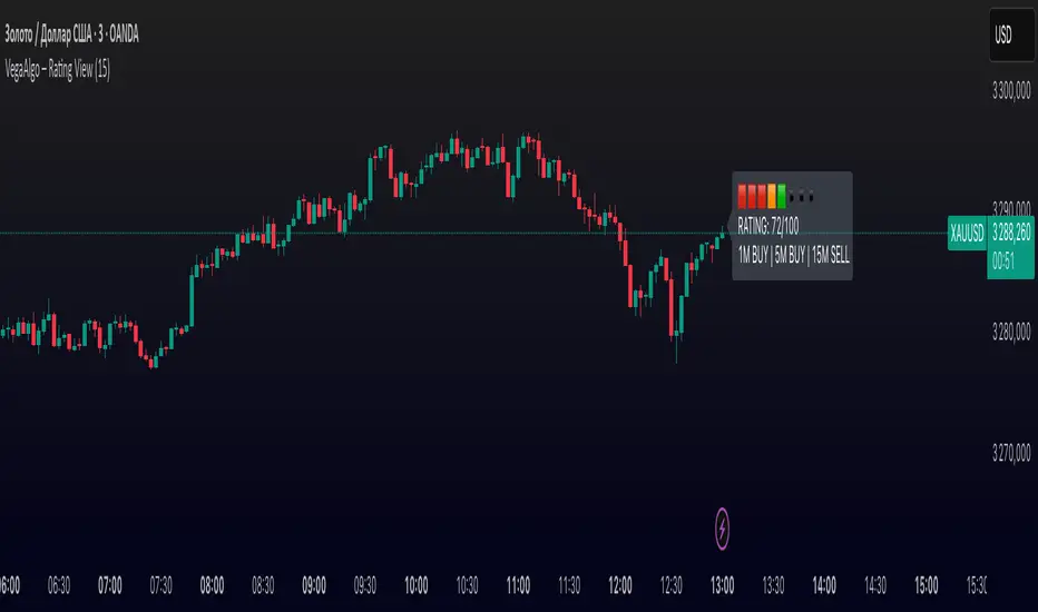
VegaAlgo – Rating ViewVegaAlgo – Rating View is a market condition analysis tool designed to evaluate the current price structure.
The indicator calculates a RATING (from 0 to 100) that reflects how clean, directional, and structured the recent price movement is. The rating is based on the number of price direction changes (from bullish to bearish candles and vice versa) within a selected period. Fewer direction changes indicate a clearer trend and result in a higher rating, while a choppy or highly volatile market leads to a lower score.
Additionally, the indicator provides directional signals on three key timeframes — 1M, 5M, and 15M, using a comparison of fast and slow moving averages. This allows traders to quickly assess the dominant trend both locally and across higher timeframes.
This script is intended for visual market analysis only and should not be considered financial advice.
Capitulation Candle Color✅ What It Does:
Candles turn bright green when the score ≥4 (i.e., multiple capitulation signals active).
Otherwise, candles keep their default coloring.
You can visually confirm extreme oversold conditions by seeing these green bars.
Moving averages and the lower Bollinger Band are displayed for context.
✅ How to Customize:
Adjust thresholds (e.g., make ATR threshold less strict).
Change the minimum score to trigger coloring (e.g., ≥3).
Use a different color (color.rgb(0,255,0) for neon green).

Volume Divergence & Heatmap [xdecow + MM]Usage Tips:
Use shorter MA lengths (5-10) for day trading
Increase lookback ranges (30-60) for swing trading
Combine bullish divergences with oversold conditions
Watch for bearish divergences during overbought rallies
Use heatmap colors to identify volume climaxes

Trend Reversal Strength IndicatorThis is a trend reversal strength indicator for traders who target entries at the beginning of a trend. This is was designed by a scalper for use by scalpers.

ADX > 20 and Price Rejection from 50 SMAindicator to show price rejections at 50 SMA with adx above 20

Multi SMA AnalyzerMulti SMA Analyzer with Custom SMA Table
Overview
A comprehensive Simple Moving Average (SMA) analysis tool that provides visual chart overlays, detailed data tables, and automated signal detection. Perfect for traders who rely on multiple moving averages for trend analysis and market timing.
Key Features
📊 Multiple SMA Support
7 Configurable SMAs (A through G) with default periods: 5, 20, 50, 100, 200, 21, 34
Individual show/hide toggles for each SMA
Customizable colors, line styles (solid, stepline, circles), and sources
Dynamic color coding: full opacity when price is above SMA, reduced opacity when below
⏰ Multi-Timeframe Analysis
Option to use custom timeframe for SMA calculations in the table
Chart SMAs always display on current timeframe for clean visualization
Perfect for analyzing higher timeframe trends while trading on lower timeframes
📋 Smart Data Table
Real-time SMA values and percentage distance from current price
Trend arrows (↑↓→) showing price direction relative to each SMA
Color-coded trend indicators (green/red/orange)
Bull/Bear/Sideways trend classification
Customizable position, size, colors, and transparency
🎯 Golden/Death Cross Detection
Configurable fast and slow SMA pairs
Visual alerts with customizable symbols (★ for Golden Cross, 💀 for Death Cross)
Crossover labels with adjustable size and colors
🏷️ SMA Labels
Optional labels showing SMA periods
Adjustable position (above/below/on the line)
Customizable offset, size, and colors
Only displays labels for visible SMAs
🚨 Advanced Signal Detection
Trend Analysis: Bull/Bear/Sideways classification based on price position relative to key SMAs
Volume Spike Detection: Identifies when volume exceeds 2x the 20-period average
Engulfing Pattern Recognition: Detects bullish engulfing candlestick patterns
All signals respect the custom timeframe setting
🎨 Background Color Coding
Optional background coloring based on overall trend
Bullish (green), Bearish (red), or Neutral (gray) backgrounds
Can use either chart timeframe or custom timeframe data
🔔 Built-in Alerts
SMA20/SMA50 crossovers
Golden/Death Cross events
Bull trend detection
Volume spikes
Engulfing patterns
Perfect For
Multi-timeframe traders who need to see both chart and higher timeframe SMA data
Trend followers using multiple moving averages for confirmation
Swing traders looking for comprehensive market analysis in one indicator
Position traders who want clean visual representation of long-term trends
Customization Options
Every aspect is customizable including colors, transparency, table position, label styles, signal detection toggles, and timeframe settings. The indicator is designed to work seamlessly across all markets and timeframes.
Clean, professional, and feature-rich - this indicator combines the power of multiple SMAs with modern trading analysis tools.
Enjoy!

Relative Strength Multi-Period
🔷 Relative Strength Multi-Period (vs Benchmark)
This indicator offers a powerful, customizable view of **relative strength (RS)** between the charted symbol and a benchmark (default: `NSE:NIFTY`). It's designed to help traders and analysts visually identify consistent outperformance or underperformance over multiple timeframes.
🧭 Key Features:
* 📈 **Multi-Timeframe RS Analysis**: Plots RS lines for three configurable periods (default: 21, 55, 123).
* ⚖️ **Benchmark Comparison**: Compare any symbol to a benchmark such as `NSE:NIFTY`, `SPX`, `BTCUSD`, or `BANKNIFTY`.
* 🟰 **Zero Line Reference**:
* RS > 0 → Symbol is outperforming the benchmark.
* RS < 0 → Underperforming.
* 🎨 **Smart Color Logic**:
* RS lines turn red when below zero and stay red until they cross back above — helping highlight persistent weakness.
🛠 Customization Options:
* ✅ Enable/disable RS lines individually.
* ✅ Select any benchmark symbol for comparison.
* ✅ Optional Moving Average on RS(21) to reduce noise.
* 🎛 MA period customizable (default: 10).
📊 Ideal Use Cases:
* Identifying **relative outperformers or laggards**.
* Supporting **sector rotation**, **momentum-based strategies**, or **trend confirmation**.
* Works across stocks, indices, cryptocurrencies, or forex pairs.
📌 Notes:
* This script is intended for use in the **indicator pane**, not on the main price chart.
* A separate overlay version can be used for candle-based visuals like EMA crossovers or signal markers.
⚠️ Disclaimer:
This script is for **educational and informational purposes only**. It does **not constitute financial advice or a buy/sell recommendation**. Always perform your own research and consult a licensed financial advisor before making trading decisions.

💰 Volume Spike Detector - by TenAMTrader💰 Volume Spike Detector – by TenAMTrader
Overview
This indicator helps you spot potential trading opportunities by identifying volume spikes—a common precursor to strong market moves. When a candle's volume exceeds the average volume of the past sessions by a defined percentage (default 25%), a 💰 emoji will appear beneath the bar on your chart.
How to Use It:
Look for the 💰 money sign plotted below candles—these mark when the current volume is significantly higher than usual.
Use these signals to confirm price action setups, trend reversals, or breakout entries.
Combine with support/resistance or other indicators for higher conviction.
Settings & Customization
Spike Ratio %: The percentage above average volume required to trigger a signal (default: 25%).
Trading Period: The number of past bars used to calculate average volume (default: 21).
Enable Alert: Toggle on/off if you want to be alerted when a spike happens.
How to Set Up Alerts
After adding the script to your chart, click the "Alerts" icon.
Choose the condition: Volume Spike Alert.
Set frequency: Once per bar close or Once per bar.
Save and activate to be notified of incoming volume surges.
⚠️ Disclaimer
This indicator is for educational and informational purposes only. It does not constitute financial advice or a recommendation to buy or sell any security. Always perform your own due diligence and risk management. The creator of this script, TenAMTrader, is not liable for any losses incurred from using this tool.

Entry DOTs (Stoch RSI)Entry DOTs (Stoch RSI) Indicator Manual
Overview
The Entry DOTs (Stoch RSI) indicator is a multi-timeframe Stochastic RSI visualization tool designed to provide quick visual analysis of market momentum across 8 different timeframes simultaneously. The indicator displays two rows of colored dots in the bottom-right corner of your TradingView chart, with each dot representing the Stochastic RSI value for a specific timeframe.
Visual Layout
The indicator displays 8 dots arranged in 2 rows of 4 dots each:
First Row (Top):
•
Dot 1: 1-minute timeframe
•
Dot 2: 3-minute timeframe
•
Dot 3: 5-minute timeframe
•
Dot 4: 15-minute timeframe
Second Row (Bottom):
•
Dot 5: 1-hour timeframe
•
Dot 6: 2-hour timeframe
•
Dot 7: 4-hour timeframe
•
Dot 8: 1-day timeframe
Color System
The dot colors represent the Stochastic RSI value using a gradient system:
•
Black (0%): Extremely oversold condition
•
Red (25%): Oversold condition
•
Orange (50%): Neutral/middle range
•
Yellow (75%): Overbought condition
•
Green (100%): Extremely overbought condition
Colors between these points are automatically interpolated using RGB color mixing, providing smooth transitions that accurately represent intermediate values.
Installation Instructions
1.
Open TradingView and navigate to your desired chart
2.
Click on the "Pine Editor" tab at the bottom of the screen
3.
Delete any existing code in the editor
4.
Copy and paste the provided Pine Script code
5.
Click "Add to Chart" button
6.
The indicator will appear in the bottom-right corner of your chart
Settings Configuration
Access the indicator settings by right-clicking on the indicator and selecting "Settings".
Display Settings
Display Option: Choose between two display modes:
•
"Dots Only": Shows only the colored dots
•
"Dots and Values": Shows dots with numerical Stochastic RSI values below each dot
Colors Group
Customize the color scheme for different Stochastic RSI levels:
•
Stochastic RSI 0% Color: Default black
•
Stochastic RSI 25% Color: Default red
•
Stochastic RSI 50% Color: Default orange
•
Stochastic RSI 75% Color: Default yellow
•
Stochastic RSI 100% Color: Default green
Stoch RSI Values Group
Adjust the value points that correspond to each color:
•
Value for 0% Color: Default 0.0
•
Value for 25% Color: Default 25.0
•
Value for 50% Color: Default 50.0
•
Value for 75% Color: Default 75.0
•
Value for 100% Color: Default 100.0
Stoch RSI Parameters Group
Fine-tune the Stochastic RSI calculation:
•
Stochastic Length: Default 14 (period for Stochastic calculation)
•
RSI Length: Default 14 (period for RSI calculation)
•
Stochastic %K: Default 3 (smoothing for %K line)
•
Stochastic %D: Default 3 (smoothing for %D line)
Trading Interpretation
Momentum Analysis
Strong Bullish Momentum: Multiple dots showing green/yellow colors across timeframes
Strong Bearish Momentum: Multiple dots showing black/red colors across timeframes
Mixed Signals: Dots showing different colors across timeframes (proceed with caution)
Entry Signals
Potential Long Entry:
•
Lower timeframes (1m, 3m, 5m) showing black/red (oversold)
•
Higher timeframes (1h, 4h, 1D) showing neutral to bullish colors
•
Look for reversal confirmation on price action
Potential Short Entry:
•
Lower timeframes showing green/yellow (overbought)
•
Higher timeframes showing neutral to bearish colors
•
Look for reversal confirmation on price action
Timeframe Confluence
High Probability Setups: When multiple timeframes align in the same direction
Divergence Opportunities: When short-term and long-term timeframes show opposite conditions
Best Practices
1. Multi-Timeframe Analysis
•
Use the indicator to identify alignment across different timeframes
•
Higher timeframes provide trend direction
•
Lower timeframes provide entry timing
2. Confirmation Required
•
Never trade based solely on the dots
•
Always confirm with price action, support/resistance levels, and other indicators
•
Look for confluence with volume and market structure
3. Risk Management
•
Set appropriate stop losses
•
Consider position sizing based on timeframe alignment
•
Be cautious when timeframes show conflicting signals
4. Market Conditions
•
The indicator works best in trending markets
•
Be cautious during low volatility or sideways markets
•
Adjust parameters for different market conditions if needed
Customization Tips
Color Schemes
•
Conservative Traders: Use more distinct colors with wider value ranges
•
Aggressive Traders: Use tighter value ranges for more sensitive signals
•
Dark Theme Users: Ensure colors are visible against dark backgrounds
Value Adjustments
•
Volatile Markets: Consider adjusting the 25% and 75% levels to 20% and 80%
•
Stable Markets: Consider tighter ranges like 30% and 70%
Parameter Tuning
•
Faster Signals: Reduce RSI Length and Stochastic Length
•
Smoother Signals: Increase smoothing parameters (%K and %D)
Troubleshooting
Common Issues
Dots Not Appearing:
•
Ensure the indicator is added to the chart
•
Check that the chart timeframe allows for the requested timeframes
Incorrect Colors:
•
Verify color settings in the indicator configuration
•
Ensure value ranges are properly set (0-100)
Missing Values:
•
Some timeframes may not have enough data on certain symbols
•
Gray dots indicate unavailable data (na values)
Performance Optimization
•
The indicator uses request.security() which may cause slight delays
•
Performance is optimized for real-time trading
•
Historical data may take a moment to fully load
Advanced Usage
Scalping Strategy
Focus on 1m, 3m, and 5m dots for quick entries with 15m confirmation
Swing Trading Strategy
Use 1h, 4h, and 1D dots for trend direction with lower timeframes for entry timing
Position Trading Strategy
Primarily focus on 4h and 1D dots with other timeframes for fine-tuning entries
Disclaimer
This indicator is a technical analysis tool and should not be used as the sole basis for trading decisions. Always combine with proper risk management, fundamental analysis, and other technical indicators. Past performance does not guarantee future results.
Support and Updates
For questions, suggestions, or issues with the indicator, please refer to the Pine Script code comments or consult TradingView's Pine Script documentation for advanced customizations.

Signalgo XThis script delivers a multi-layered approach to real-time news, hype, and institutional activity detection across different timeframes. Unlike traditional indicators or simple news overlays, this tool uses multiple and different analytics with a proprietary anti-hype filter and institutional tracking system.
The indicator does not use external news headlines or economic calendar events. Instead, it generates "news" signals in real time by analyzing price, volume, volatility, and sentiment data across multiple timeframes. These signals are algorithmically classified as "bullish news," "bearish news," "strong, or "hype" events, and are displayed as chart labels. The script also includes a proprietary anti-hype filter that suppresses signals during periods of abnormal or unreliable market conditions.

OI Bahavior MapThis indicator visualizes Open Interest (OI) changes for Binance Futures and highlights the behavior of market participants — whether takers or makers are opening or closing positions.
📊 Supported display modes:
• Taker or Maker
• Longs or Shorts
• Cumulative or Per-Bar
• Displayed in USD or Coins
💡 Each candle color reflects the dominant trade direction (delta):
🟢 Green = Aggressive buying (Delta Buy)
🔴 Red = Aggressive selling (Delta Sell)
OI direction (↑/↓) determines whether positions are being opened or closed.
🛠️ Optional metrics:
• Moving average of OI (SMA, EMA, WMA, VWMA, LSMA)
• Volatility channels (Bollinger Bands or Extremums)
⚙️ How it works:
• Fetches OI data from the SYMBOL_OI ticker (e.g., BTCUSDT_OI)
• Compares current OI with the previous bar
• Uses signed volume delta (close - open) to infer intent
• Classifies bar as open/close, long/short, taker/maker
• Displays the net effect as a colored candle on a secondary chart
🤔 How to interpret Taker and Maker?
• Taker: The aggressive participant who removes liquidity (initiates the trade)
• Maker: The passive participant who provides liquidity (places resting orders)
You can choose to display the same event from either the Taker or Maker perspective — the chart will look the same, but the interpretation changes.
🧠 Core Logic Mapping
```
🟢 Green: Taker Longs (Buy, OI↑) | Maker Shorts (Buy, OI↓)
🔴 Red: Taker Shorts (Sell, OI↑) | Maker Longs (Sell, OI↓)
```
⚠️ Limitations:
• Works only for Binance Futures
• Requires existence of SYMBOL_OI ticker on TradingView
• Represents approximate intent based on OI + volume behavior
💬 Open Source
The script is open for the community. Suggestions and feedback are welcome in the comments!
__________________________________________________________________________________
Этот индикатор визуализирует изменения открытого интереса (OI) для Binance Futures и показывает поведение участников рынка — открывают или закрывают позиции тейкеры или мейкеры.
📊 Доступные режимы отображения:
• Taker или Maker
• Longs или Shorts
• Кумулятивный или по бару
• В USD или в монетах
💡 Каждый цвет свечи отражает преобладающее направление сделок (дельта):
🟢 Зеленый = Агрессивные покупки (Delta Buy)
🔴 Красный = Агрессивные продажи (Delta Sell)
Направление OI (↑/↓) показывает, открываются или закрываются позиции.
🛠️ Дополнительные метрики:
• Скользящая средняя OI (SMA, EMA, WMA, VWMA, LSMA)
• Волатильностные каналы (Bollinger Bands или экстремумы)
⚙️ Как работает:
• Получает данные OI из тикера SYMBOL_OI (например, BTCUSDT_OI)
• Сравнивает текущий OI с предыдущим баром
• Использует направленную дельту объема (close - open) для определения намерения
• Классифицирует бар как открытие/закрытие, лонг/шорт, тейкер/мейкер
• Отображает итог в виде цветной свечи на дополнительном графике
🤔 Как интерпретировать Taker и Maker?
• Taker: Агрессивный участник, который изымает ликвидность (инициирует сделку)
• Maker: Пассивный участник, который создает ликвидность (выставляет лимитные заявки)
Вы можете выбрать отображение события с позиции тейкера или мейкера — график будет одинаковым, но смысл меняется.
🧠 Схема логики
```
🟢 Зеленый: Taker Longs (Покупка, OI↑) | Maker Shorts (Покупка, OI↓)
🔴 Красный: Taker Shorts (Продажа, OI↑) | Maker Longs (Продажа, OI↓)
```
⚠️ Ограничения:
• Работает только для Binance Futures
• Требуется наличие тикера SYMBOL_OI на TradingView
• Показывает приблизительное намерение на основе OI и дельты объема
💬 Open Source
Скрипт открыт для сообщества. Предложения и обратная связь приветствуются в комментариях!

P3 Malaysian SNR This is a premium invite indicator now for those who have used it before!
Malaysian Support and Resistance (SNR) zones are defined by precise horizontal levels on a line chart corresponding to local price peaks, valleys, and inter-candle gaps rather than broad price ranges
A-Levels at peaks shaped like the letter “A.”
V-Levels at valleys shaped like the letter “V.”
Fresh levels—those never retested by a wick after origin or retested only by a candle body—carry higher significance and are more likely to prompt price reactions than unfresh (tested) levels
This Malaysian SNR zones offer traders precise, dynamically maintained support and resistance levels that enhance entry and exit timing across multiple timeframes

Market Strength Dashboard🚀 What It Does:
The indicator gives you a real-time dashboard showing three things:
✅ Trend Direction
Uses EMA 50 vs EMA 200.
Bullish: EMA 50 is above EMA 200 → Price favors upside swing.
Bearish: EMA 50 is below EMA 200 → Price favors downside swing.
Neutral: EMAs are equal → No clear trend.
✅ Momentum Strength
Uses RSI (Relative Strength Index).
Strong Bullish: RSI > 55 → Buyers in control.
Strong Bearish: RSI < 45 → Sellers in control.
Neutral: RSI between 45–55 → No strong momentum, usually sideways or uncertain.
✅ Volatility State (Expansion/Consolidation)
Uses Bollinger Band Width.
Measures if price is:
Expanding: BB Width increasing → Market opening up, volatility rising, often precedes large moves or breakouts.
Contracting: BB Width shrinking → Market compressing, often leads to tight ranges or consolidation.
Stable: No change in BB Width → Range behavior or calm trend.
🔥 How It Works Behind the Scenes:
EMA Cross Check:
→ Looks at whether the faster EMA (50) is above or below the slower EMA (200).
RSI Scan:
→ Reads current RSI level to determine momentum strength.
Bollinger Band Width Scan:
→ Calculates the distance between the upper and lower Bollinger Bands to detect if price is expanding or compressing.
Dashboard Output:
→ Combines all this into a floating label on the chart like:
“Trend: Bullish | Momentum: Strong Bullish | Volatility: Expanding”
🏆 How to Use It — Simple Rules for Swing or Day Trading:
🔥 Ideal Swing Trade Setup:
→ ✅ Trend: Bullish
→ ✅ Momentum: Strong Bullish
→ ✅ Volatility: Expanding
→ → Take long setups → pullbacks to EMA50 or previous highs → ride the trend.
→ ❌ If Trend is Neutral or Volatility is Contracting, skip the trade — market is chopping.
🔥 Ideal Day Trade Setup:
Look for Volatility Expanding → confirms active session/move.
Pair it with either Trend Bullish + Momentum Bullish for longs
→ Or Trend Bearish + Momentum Bearish for shorts.
🔥 When Not to Trade:
Trend Neutral + Momentum Neutral + Contracting Volatility → Sideways chop → No trade zone.
🔥 Breakout Watch Strategy:
When volatility shifts from Contracting → Expanding, expect a breakout.
→ Look for the first candle that pushes away from the Bollinger squeeze.
📊 How To Combine With Other Setups:
→ ✅ Add this dashboard to any chart to instantly know:
Should I be thinking up, down, or neither?
Is this market about to move big or stay stuck?
Pair it with:
Your price action entries.
Support/resistance levels.
Candle patterns.
Trendline or liquidity breaks.
🧠 Bottom Line:
→ This is a market condition scanner, not a signal generator.
→ It tells you: “Should I trade? What’s the direction? Is the market moving or stuck?”
→ You still choose the entry — this tool tells you when conditions are ideal or not.

[DEM] % Off High % Off High calculates and plots the percentage difference between the current closing price and the all-time high of the given ticker observed since the indicator started calculating. It is displayed as a percentage, formatted with two decimal places.

Key Metrics Dashboard (Float, MCap, ATR) (ValueRay)This dashboard displays critical fundamental and volatility data, saving you from switching screens. It’s perfect for traders who need to quickly assess a stock's character, risk profile, and potential before making a move.
📊 Metrics Included
- Market Cap (MCap): Quickly gauge company size.
- Float: See tradable shares (color-coded for low-float stocks).
- Short %: Measure bearish sentiment and short-squeeze potential (color-coded).
- ATR % & ADR %: Understand true volatility to manage risk.
🚀 Key Features
- Fully Customizable: Toggle any metric on/off to create your ideal view.
- Flexible Layout: Choose your preferred on-chart position, size, and layout (horizontal or vertical).
- Lightweight & Clean: Get essential data without cluttering your chart.
If you find this indicator useful, please give it a Boost (🚀)!
Happy Trading

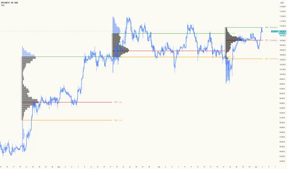
TPO[Fixed Range, Anchored, Bars Back]TPO Bars Back, Fixed Range and Anchored
Overview
The TPO Profile (Time Price Opportunity Profile) is a powerful market profile indicator that displays the amount of time price spent at different levels during a specified period. Unlike traditional volume profile indicators that show volume distribution, TPO Profile shows time distribution , providing insights into where price has spent the most time and identifying key support and resistance levels.
Key Advantages Over TradingView's Built-in TPO
Simplified Composite Creation : Automatically creates TPO profiles for any time range without manual split/merge operations
Instant Value Area Calculation : Immediately shows Value Area, POC, VAH, and VAL for your selected period
No Manual Assembly Required : TradingView's native TPO requires you to manually split sessions and merge them to create composites - this indicator does it automatically
Flexible Time Ranges : Create composites for any custom time period (multiple days, weeks, specific events) with a few clicks
Real-time Composite Updates : Anchor mode creates live composites that update as new data arrives
Multiple Composite Analysis : Easily compare different time periods without the tedious manual process
Key Features
Core Functionality
Time-Based Analysis : Shows time spent at each price level rather than volume
Configurable Time Blocks : Use any timeframe for TPO counting (30min, 1H, 4H, etc.)
Multiple Price Levels : Adjustable from 5 to 200 levels for granular analysis
Point of Control (POC) : Automatically identifies the price level with highest time activity
Value Area Calculation : Shows the price range containing 70% (configurable) of time activity
Automatic Composite Generation : Creates multi-session composites without manual intervention
Three Operating Modes
1. Bars Back Mode
Analyzes the last N bars from the current bar
Perfect for recent market activity analysis
Range: 10-500 bars
Use Case : Intraday analysis, recent session review
2. Fixed Range Mode
Analyzes a specific time period between start and end times
Ideal for historical analysis of specific events
Creates perfect composites for multi-day periods
Use Case : Earnings periods, news events, specific trading sessions, weekly/monthly composites
3. Anchor Mode (NEW)
Starts from a specific time and extends to the current bar
Dynamically updates as new bars form
Perfect for building live composites from any starting point
Use Case : Live session monitoring, event-based analysis from a specific point, growing composites
Visual Elements
TPO Bars
Horizontal bars showing time distribution at each price level
Longer bars = more time spent at that level
Color-coded to distinguish Value Area from outlying levels
Point of Control (POC)
Red line marking the price level with highest time activity
Most significant support/resistance level
Configurable line style (Solid/Dashed/Dotted) and width
Value Area High/Low (VAH/VAL)
Green and Orange lines marking the boundaries of the Value Area
Shows the price range containing the specified percentage of time activity
Optional display with customizable line styles
Single Print Detection
Identifies price levels touched by only one time block
Display options: Lines or Boxes
Purple color highlighting these significant levels
Often act as strong support/resistance in future trading
Customization Options
Time Block Configuration
Block Time : Choose timeframe for TPO counting (30min, 1H, 4H, etc.)
Allows analysis at different time granularities
Higher timeframes = broader perspective, Lower timeframes = finer detail
Visual Styling
Line Styles : Solid, Dashed, or Dotted for all line elements
Line Widths : 1-5 pixels for POC, VAH, and VAL lines
Colors : Fully customizable colors for all elements
Transparency : Adjustable transparency for better chart readability
Label Management
Show/Hide Labels : Toggle POC, VAH, VAL labels
Font Sizes : Tiny, Small, Normal, Large, Huge
Label Positioning : 8 different position options relative to lines
Offset Controls : Fine-tune label positioning
Line Extension
Level Offset Right : Controls how far lines extend
Smart extension logic:
Value ≤ 0: Infinite extension (extend.right)
Value ≥ 1: Extends exactly N bars ahead
Trading Applications
Support & Resistance
POC often acts as strong support/resistance
Value Area boundaries provide key levels
Single prints frequently become significant levels
Market Structure Analysis
Identify areas of price acceptance (thick TPO bars)
Spot areas of price rejection (thin TPO bars)
Understand where market participants are comfortable trading
Composite Profile Analysis
Create multi-day, weekly, or monthly composites instantly
Compare different composite periods without manual work
Analyze longer-term price acceptance levels
Build composites around specific events or announcements
Session Analysis
Monitor intraday session development in real-time
Compare different sessions (London, New York, Asia)
Track how profiles change throughout the trading day
Build live composites across multiple sessions
Event Analysis
Use Fixed Range mode for earnings, news events
Use Anchor mode to track price development from specific events
Compare pre/post event price acceptance levels
Create event-based composites automatically
Input Parameters
Mode Selection
Mode : Bars Back | Fixed Range | Anchor
Bars Back : Number of bars to analyze (10-500)
Start Time : Beginning time for Fixed Range and Anchor modes
End Time : Ending time for Fixed Range mode only
Analysis Configuration
Block Time : Timeframe for TPO blocks (e.g., "30" for 30-minute blocks)
TPO Levels : Number of price levels (5-200)
Value Area % : Percentage for Value Area calculation (50-95%)
Display Options
Show POC : Display Point of Control line
Show Value Area : Display Value Area box
Show VAH/VAL Lines : Display Value Area boundary lines
Show Single Prints : Display single print detection
Single Print Style : Lines or Boxes
Styling Controls
Colors : TPO, POC, Value Area, VAH, VAL, Single Print colors
Line Styles : POC, VAH, VAL line styles
Line Widths : POC, VAH, VAL line widths
Labels : Show/hide, font size, position, offset controls
Technical Details
Calculation Method
Divides the price range into equal levels based on TPO Levels setting
For each time block, determines which price levels it crosses
Adds +1 count to each crossed level
Identifies POC as the level with highest count
Calculates Value Area by expanding from POC until target percentage is reached
Performance Considerations
Historical data limited to prevent buffer overflow errors
Smart bounds checking for different timeframes
Optimized cleanup routines to prevent drawing object accumulation
Pine Script Version
Built on Pine Script v6
Uses modern Pine Script best practices
Efficient array handling and drawing object management
Best Practices
Timeframe Selection
Block Time = Chart Timeframe : Traditional TPO approach
Block Time > Chart Timeframe : Smoother, broader perspective
Block Time < Chart Timeframe : More granular, detailed analysis
Level Count Guidelines
Low levels (10-20) : Better for swing trading, major levels
High levels (50-100) : Better for scalping, precise entries
Very high levels (100+) : For very detailed analysis
Mode Selection
Bars Back : Daily analysis, recent activity
Fixed Range : Historical events, specific periods, manual composites
Anchor : Live monitoring, event-based analysis, growing composites
Composite Creation Workflow
Select Fixed Range or Anchor mode
Set your desired start time (and end time for Fixed Range)
Adjust TPO Levels for desired granularity
Enable VAH/VAL lines to see Value Area boundaries
The composite profile generates automatically with all key levels
This indicator eliminates the tedious manual process of creating composite TPO profiles in TradingView. Instead of splitting sessions and manually merging them, you get instant composite analysis with automatic Value Area calculation, POC identification, and single print detection. The combination of time-based analysis, multiple operating modes, and extensive customization options makes it a powerful tool for understanding market structure and price acceptance levels across any time period.