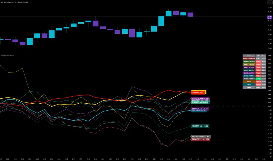
ZenAlgo - DominatorThis indicator provides a structured multi-ticker overview of market momentum and relative strength by analyzing short-term price behavior across selected assets in comparison with broader crypto dominance and Bitcoin/ETH performance.
Ticker and Market Data Handling
The script accepts up to 9 user-defined symbols (tickers) along with BTCUSD and ETHUSD. For each symbol:
It retrieves the current price.
It also requests the daily opening price from the "D" timeframe to compute intraday percentage change.
For BTC, ETH, and dominance (sum of BTC, USDT, and USDC dominance), daily change is calculated using this same method.
This comparison enables tracking relative performance from the daily open, which provides meaningful insight into intraday strength or weakness among different assets.
Dominance Logic
The indicator aggregates dominance data from BTC , USDT , and USDC using TradingView’s CRYPTOCAP indices. This combined dominance is used as a reference in directional and status calculations. ETH dominance is also analyzed independently.
Changes in dominance are used to infer whether market attention is shifting toward Bitcoin/stablecoins (typically indicating risk-off sentiment) or away from them (typically risk-on behavior, benefiting altcoins).
Price Direction Estimation
The script estimates directional bias using an EMA-based deviation technique:
A short EMA (user-defined lookback , default 4 bars) is calculated.
The current close is compared to the EMA to assess directional bias.
Recent candle changes are also inspected to confirm a consistent short-term trend (e.g., 3 consecutive higher closes for "up").
A small threshold is used to avoid classifying flat movements as trends.
This directionality logic is applied separately to:
The selected ticker's price
BTC price
Combined dominance
This allows the script to contextualize the movement of each asset within broader market conditions.
Market Status Evaluation
A custom function analyzes ETH and BTC dominance trends along with their relative strength to define the overall market regime:
Altseason is identified when BTC dominance is declining, ETH dominance rising, and ETH outperforms BTC.
BTC Season occurs when BTC dominance is rising, ETH dominance falling, and BTC outperforms ETH.
If neither condition is met, the state is Neutral .
This classification is shown alongside each ticker's row in the table and helps traders assess whether market conditions favor Bitcoin, Ethereum, or altcoins in general.
Ticker Status Classification
Each ticker is analyzed independently using the earlier directional logic. Its status is then determined as follows:
Full Bull : Ticker is trending up while dominance is declining or BTC is also rising.
Bullish : Ticker is trending up but not supported by broader bullish context.
Bearish : Ticker is trending down but without broader confirmation.
Full Bear : Ticker is trending down while dominance rises or BTC falls.
Neutral : No strong directional bias or conflicting context.
This classification reflects short-term momentum and macro alignment and is color-coded in the results table.
Table Display and Plotting
A configurable table is shown on the chart, which:
Displays the name and status of each selected ticker.
Optionally includes BTC, ETH, and market state.
Uses color-coding for intuitive interpretation.
Additionally, price changes from the daily open are plotted for each selected ticker, BTC, ETH, and combined dominance. These values are also labeled directly on the chart.
Labeling and UX Enhancements
Labels next to the current candle display price and percent change for each active ticker and for BTC, ETH, and combined dominance.
Labels update each bar, and old labels are deleted to avoid clutter.
Ticker names are dynamically shortened by stripping exchange prefixes.
How to Use This Indicator
This tool helps traders:
Spot early rotations between Bitcoin and altcoins.
Identify intraday momentum leaders or laggards.
Monitor which tickers align with or diverge from broader market trends.
Detect possible sentiment shifts based on dominance trends.
It is best used on lower to mid timeframes (15m–4h) to capture intraday to short-term shifts. Users should cross-reference with longer-term trend tools or structural indicators when making directional decisions.
Interpretation of Values
% Change : Measures intraday move from daily open. Strong positive/negative values may indicate breakouts or reversals.
Status : Describes directional strength relative to market conditions.
Market State : Gives a general bias toward BTC dominance, ETH strength, or altcoin momentum.
Limitations & Considerations
The indicator does not analyze liquidity or volume directly.
All logic is based on short-term movements and may produce false signals in ranging or low-volume environments.
Dominance calculations rely on external CRYPTOCAP indices, which may differ from exchange-specific flows.
Added Value Over Other Free Tools
Unlike basic % change tables or price overlays, this indicator:
Integrates dominance-based macro context into ticker evaluation.
Dynamically classifies market regimes (BTC season / Altseason).
Uses multi-factor logic to determine ticker bias, avoiding single-metric interpretation.
Displays consolidated information in a table and chart overlays for rapid assessment.
Sentiment
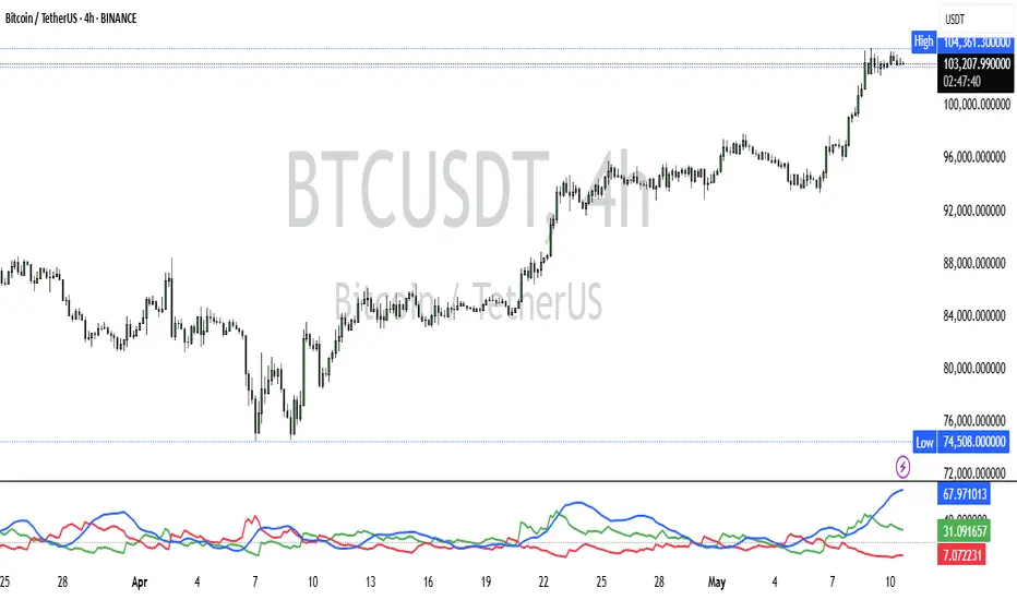
BS with PeriodThe “BS with Period” indicator visualizes the balance between buying and selling volume within each candle, and also tracks those volumes accumulated over a specified number of bars.
It first splits a candle’s total volume into two parts based on where the close sits: the closer the close is to the high, the larger the “buying” portion; the closer it is to the low, the larger the “selling” portion. This means that for any given volume you can see whether buyers or sellers were more active.
On the chart you see three column plots:
Gray for total volume
Red for the portion attributed to selling
Teal for the portion attributed to buying
Optionally, it also sums those buying and selling volumes over the last N bars and plots them as two lines. This gives you a medium-term view of which side is dominating: if the buying-volume line stays well above the selling-volume line, buyers are in control, and vice versa.
Traders use it to:
Spot sustained buying or selling pressure when one accumulated-volume line pulls ahead of the other.
Confirm trend accelerations or potential reversals when the balance shifts.
Adjust sensitivity by choosing a shorter period (more responsive, but noisier) or a longer period (smoother, but slower).
Overall, the indicator helps quantify the internal volume structure and the tug-of-war between buyers and sellers both within each candle and over your chosen look-back period.

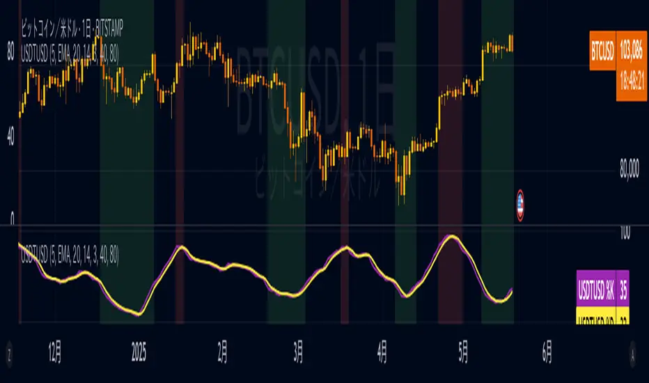
USDTUSD Stochastic RSI [SAKANE]Release Note
■ Overview
The USDTUSD Stochastic RSI indicator visualizes shifts in market sentiment and liquidity by applying the Stochastic RSI to the USDT/USD price pair.
Rather than tracking the price of Bitcoin directly, this tool observes the momentum of USDT, a key intermediary in most crypto transactions, to detect early signals of trend reversals.
■ Background & Motivation
USDT exhibits two distinct characteristics:
Its credibility as a long-term store of value is limited.
Yet, it serves as one of the most liquid assets in the crypto space and is widely used as a trading base pair.
Because most BTC trades involve converting fiat into USDT and vice versa, USDT/USD frequently deviates slightly from its peg to USD.
These deviations—though subtle—often occur just before major shifts in the broader crypto market.
This indicator is designed to detect such moments of structural imbalance by applying momentum analysis to USDT itself.
■ Feature Highlights
Calculates RSI and Stochastic RSI on the USDT/USD closing price
Supports customizable smoothing via SMA or EMA
Background shading dynamically visualizes overheated or cooled market states (thresholds are adjustable)
Displayed in a separate pane, keeping it visually distinct from the price chart
■ Usage Insights
This indicator is based on an observable pattern:
When the Stochastic RSI bottoms out, Bitcoin tends to form a price bottom shortly afterward
Conversely, when the indicator peaks, Bitcoin tends to top out with a slight delay
Since USDT acts as a gateway for capital in and out of the market, changes in its momentum often foreshadow turning points in BTC.
This allows traders to anticipate shifts in sentiment rather than merely reacting to them.
■ Unique Value Proposition
Unlike conventional price-based indicators, this tool offers a structural perspective.
It focuses on USDT as a mechanism of liquidity flow, making it possible to detect the "hidden rhythm" of the crypto market.
In that sense, this is not just a technical tool, but an entry point into market microstructure analysis—allowing users to read the market’s intentions rather than just its movements.
■ Practical Tips
Look for reversals in momentum as potential BTC entry or exit points.
Overlay this indicator with the BTC chart to compare timing and divergence.
Combine with other tools such as on-chain data or macro indicators for comprehensive analysis.
■ Final Thoughts
USDTUSD Stochastic RSI is designed with the belief that the most important market signals often come from what drives the price, not the price itself.
By tuning into the “heartbeat” of capital flow, this indicator sheds light on market dynamics that would otherwise remain unseen.
We hope it proves useful in your trading and research.
[TehThomas] - Fair Value GapsThis script is designed to automatically detect and visualize Fair Value Gaps (FVGs) on your chart in a clean, intuitive, and highly responsive way. It’s built with active traders in mind, offering both dynamic updates and customization options that help you stay focused on price action without being distracted by outdated or irrelevant information.
What Are Fair Value Gaps?
Fair Value Gaps are areas on a chart where there’s an inefficiency in price, typically formed when price moves aggressively in one direction, leaving a gap between the wicks of consecutive candles. These gaps represent imbalanced price action where not all buy or sell orders were efficiently matched. As a result, they often become magnet zones where price returns later to "fill" the imbalance before continuing in its intended direction. Many traders use them as points of interest for entries, re-entries, or anticipating reversals and consolidations.
This concept is frequently used in Smart Money and ICT-based trading models, where understanding how price seeks efficiency is crucial to anticipating future moves. When combined with concepts like liquidity, displacement, and market structure, FVGs become powerful tools for technical decision-making.
Script Features & Functionality
1. Live Updating Gaps (Dynamic Shrinking)
One of the core features of this script is its ability to track and dynamically shrink Fair Value Gaps as price trades into them. Instead of leaving a static zone on your chart, the gap will adjust in real-time, reflecting the portion that has been filled. This gives you a much more accurate picture of remaining imbalance and avoids misleading zones.
2. Automatic Cleanup After Fill
Once price fully fills an FVG, the script automatically removes it from the chart. This helps keep your workspace clean and focused only on relevant price zones. There’s no need to manually manage your gaps, everything is handled behind the scenes to reduce clutter and distraction.
3. Static Mode Option
While dynamic updating is the default, some traders may prefer to keep the original size of the gap visible even after partial fills. For that reason, the script includes a toggle to switch from live-updating (shrinking) mode to static mode. In static mode, FVGs stay fixed from the moment they are drawn, giving you a more traditional visual reference point.
4. Multi-Timeframe Support (MTF)
You can now view higher timeframe FVGs, such as those from the 1H or 4H chart, while analyzing lower timeframes like the 5-minute. This allows you to see key imbalances from broader market context without having to flip between charts. FVGs from higher timeframes will be drawn distinctly so you can differentiate them at a glance.
5. Cleaner Visualization
The script is designed with clarity in mind. All drawings are streamlined, and filled gaps are removed to maintain a minimal, distraction-free chart. This makes it easier to combine this tool with other indicators or price-action-based strategies without overloading your workspace.
6. Suitable for All Market Types
This script can be used on any asset that displays candlestick-based price action — including crypto, forex, indices, and stocks. Whether you're scalping low-timeframe setups or swing trading with a higher timeframe bias, FVGs remain a useful concept and this script adapts to your trading style.
Use Case Examples
On a 5-minute chart, display 1-hour FVGs to catch major imbalance zones during intraday trading.
Combine the FVGs with liquidity levels and inducement patterns to build ICT-style trade setups.
Use live-updating gaps to monitor in-progress fills and evaluate whether a zone still holds validity.
Set the script to static mode to perform backtesting or visual replay with historical setups.
Final Notes
Fair Value Gaps are not a standalone trading signal, but when used with market structure, liquidity, displacement, and order flow concepts, they provide high-probability trade locations that align with institutional-style trading models. This script simplifies the visualization of those zones so you can react faster, stay focused on clean setups, and eliminate unnecessary distractions.
Whether you’re trading high volatility breakouts or patiently waiting for retracements into unfilled imbalances, this tool is designed to support your edge with precision and flexibility.

(OFPI) Order Flow Polarity Index - Momentum Gauge (DAFE) (OFPI) Order Flow Polarity Index - Momentum Gauge: Decode Market Aggression
The (OFPI) Gauge Bar is your front-row seat to the battle between buyers and sellers. This isn’t just another indicator—it’s a momentum tracker that reveals market aggression through a sleek, centered gauge bar and a smart dashboard. Built for traders who want clarity without clutter, it’s your edge for spotting who’s driving price, bar by bar.
What Makes It Unique?
Order Flow Pressure Index (OFPI): Splits volume into buy vs. sell pressure based on candle body position. It’s not just volume—it’s intent, showing who’s got the upper hand.
T3 Smoothing Magic: Uses a Tilson T3 moving average to keep signals smooth yet responsive. No laggy SMA nonsense here.
Centered Gauge Bar: A 20-segment bar splits bullish (lime) and bearish (red) momentum around a neutral center. Empty segments scream indecision—it’s like a visual heartbeat of the market.
Momentum Shift Alerts: Catches reversals with “Momentum Shift” flags when the OFPI crests, so you’re not caught off guard.
Clean Dashboard: A compact, bottom-left table shows momentum status, the gauge bar, and the OFPI value. Color-coded, transparent, and no chart clutter.
Inputs & Customization
Lookback Length (default 10): Set the window for pressure calculations. Short for scalps, long for trends.
T3 Smoothing Length (default 5): Tune the smoothness. Tight for fast markets, relaxed for chill ones.
T3 Volume Factor (default 0.7): Crank it up for snappy signals or down for silky trends.
Toggle the dashboard for minimalist setups or mobile trading.
How to Use It
Bullish Momentum (Lime, Right-Filled): Buyers are flexing. Look for breakouts or trend continuations. Pair with support levels.
Bearish Momentum (Red, Left-Filled): Sellers are in charge. Scout for breakdowns or shorts. Check resistance zones.
Neutral (Orange, Near Center): Market’s chilling. Avoid big bets—wait for a breakout or play the range.
Momentum Shift: A reversal might be brewing. Confirm with price action before jumping in.
Not a Solo Act: Combine with your strategy—trendlines, RSI, whatever. It’s a momentum lens, not a buy/sell bot.
Why Use the OFPI Gauge?
See the Fight: Most tools just count volume. OFPI shows who’s winning with a visual that slaps.
Works Anywhere: Crypto, stocks, forex, any timeframe. Tune it to your style.
Clean & Pro: No chart spam, just a sharp gauge and a dashboard that delivers.
Unique Edge: No other indicator blends body-based pressure, T3 smoothing, and a centered gauge like this.
The OFPI Gauge catches the market’s pulse so you can trade with confidence. It’s not about predicting the future—it’s about knowing who’s in control right now.
For educational purposes only. Not financial advice. Always use proper risk management.
Use with discipline. Trade your edge.
— Dskyz , for DAFE Trading Systems

Index Futures vs Cash ArbitrageThis indicator measures the statistical spread between major stock index futures and their corresponding cash indices (e.g., ES vs SPX, NQ vs NDX) using Z-score normalization. It automatically detects commonly traded index pairs (S&P 500, Nasdaq, Dow Jones, Russell 2000) and calculates a smoothed spread between futures and spot prices. A Z-score is then derived from this spread to highlight potential overpricing or underpricing conditions.
Traders can use customizable thresholds to identify mean-reversion opportunities where the futures contract may be temporarily overvalued or undervalued relative to the index. The histogram highlights the direction of the Z-score (green = futures > index, red = futures < index), while built-in alerts notify users of key threshold breaches or zero-line crosses.
This tool is designed for discretionary traders, pairs traders, or anyone exploring statistical arbitrage strategies between futures and spot markets. It is not a buy/sell signal by itself and should be used with additional confluence or risk management techniques.

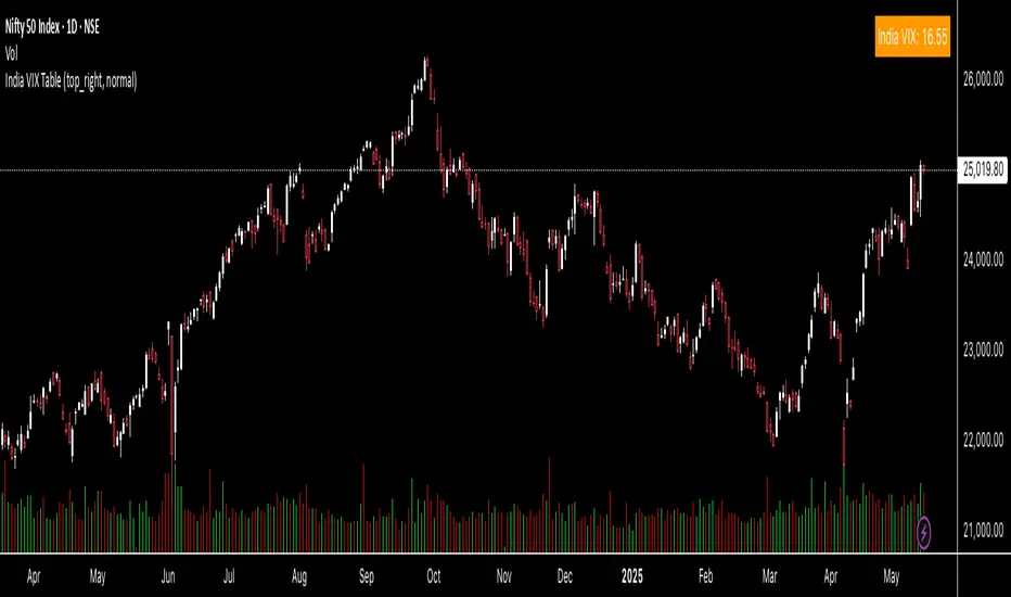
India VIX TableThis indicator gives you the India Vix value in real time on your chart. You can change the position on the chart as per your preference.
DXY Z-ScoreThe "DXY Z-Score" indicator measures the US Dollar Index’s (DXY) current price relative to its recent average, normalized by its standard deviation.
It calculates a standardized Z-Score that oscillates around zero, highlighting when the DXY is significantly overbought or oversold.
Key features include:
- The Z-Score line oscillating between fixed upper (+2) and lower (-2) horizontal levels
- A shaded background to emphasize the Z-Score range between these bands
- A dynamic table showing the current Z-Score value linked linearly to the Z-Score plot
This indicator is useful for assessing the strength or weakness of the US Dollar relative to its recent history, providing insights into potential market reversals or trend continuations.
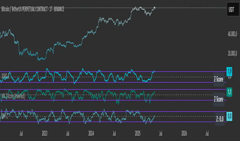
VIX Z-Score (Inverted)📘 Indicator: VIX Z-Score (Inverted) + Table
🔍 Overview
This indicator calculates the Z-Score of the VIX (Volatility Index) and inverts it to identify potential buying opportunities during periods of fear and caution during periods of extreme optimism. The Z-Score is smoothed and visually displayed alongside a dynamic info table.
⚙️ How It Works
VIX Data: The VIX (ticker: CBOE:VIX) is pulled in real time.
Z-Score Calculation:
𝑍
=
(
𝑉
𝐼
𝑋
−
mean
)
standard deviation
Z=
standard deviation
(VIX−mean)
Over a customizable lookback period (default: 50).
Inversion:
Since high VIX usually means fear (often a contrarian buying signal), we invert the Z-Score:
𝑍
inv
=
−
𝑍
Z
inv
=−Z
Smoothing:
An EMA is applied to reduce noise and false signals.
Clamping:
The Z-Score is linearly scaled and capped between +2 and -2 for easy visualization in the info table.
📊 Z-Score Table (Top-Right)
Range Interpretation Table Color
+1.5 to +2 Extreme fear → Buy zone 🟩 Green
+0.5 to +1.5 Moderate fear 🟨 Lime
–0.5 to +0.5 Neutral ⬜ Gray
–0.5 to –1.5 Growing complacency 🟧 Orange
–1.5 to –2 Extreme optimism → Caution 🟥 Red
The current Z-Score (clamped version) is shown in real time on the right-hand info panel.
🧠 How to Use It
+2 Zone (Table: Green):
Market fear is at an extreme. Historically, such conditions are contrarian bullish—possible entry zones.
–2 Zone (Table: Red):
Indicates extreme optimism and low fear. Often a signal to be cautious or take profits.
Middle range (±0.5):
Market is neutral. Avoid major decisions based solely on sentiment here.
🧪 Best Practices
Combine with price action, volume, or trend filters.
Works well on daily or 4H timeframes.
Not a standalone signal—best used to confirm or fade sentiment extremes.

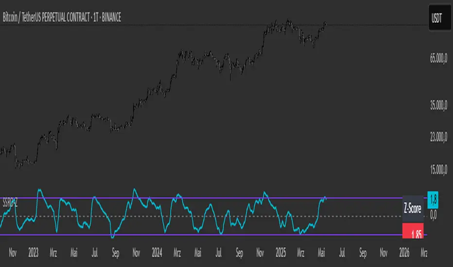
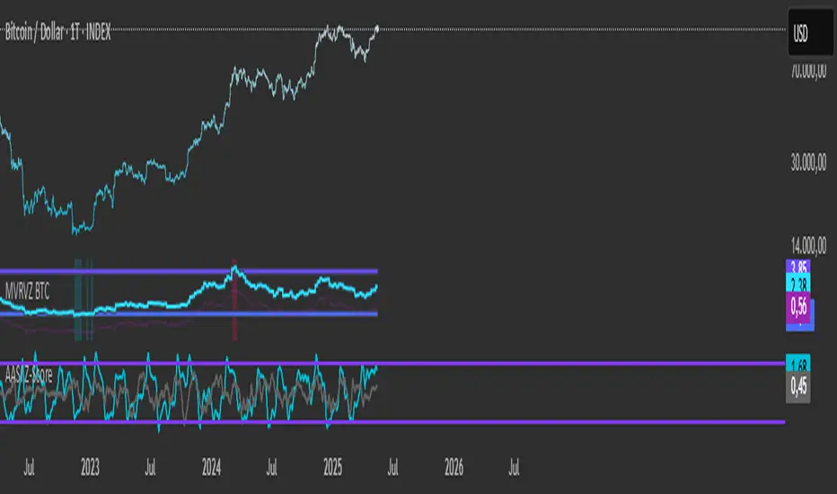
SSRO Z-ScoreSSRO Z-Score Indicator — Description
What it does:
This indicator measures the Stablecoin Supply Ratio (SSR) relative to Bitcoin’s market cap and calculates a normalized Z-Score of this ratio to help identify potential market tops and bottoms in the crypto market.
How it works:
The Stablecoin Supply Ratio (SSR) is calculated by dividing Bitcoin’s market capitalization by the combined market capitalization of major stablecoins (USDT, USDC, TUSD, DAI, FRAX).
The SSR is then smoothed over a user-defined lookback period to reduce noise.
A Z-Score is computed by normalizing the SSR over a specified moving window, which shows how far the current SSR deviates from its historical average in terms of standard deviations.
This Z-Score is further smoothed using an exponential moving average (EMA) to filter short-term volatility.
How to read the Z-Score:
Z-Score = 0: SSR is at its historical average.
Z-Score > 0: SSR is above average, indicating Bitcoin’s market cap is relatively high compared to stablecoin supply, potentially signaling bullish market conditions.
Z-Score < 0: SSR is below average, indicating stablecoin supply is high relative to Bitcoin’s market cap, possibly signaling bearish pressure or increased liquidity waiting to enter the market.
Upper and Lower Bands: These user-defined levels (e.g., +2 and -2) represent thresholds for extreme conditions. Values above the upper band may indicate overbought or overheated market conditions, while values below the lower band may indicate oversold or undervalued conditions.
Additional Features:
A dynamic table displays a linear scaled Z-Score alongside the main plot, clamped between -2 and +2 relative to the upper and lower bands for intuitive interpretation.
Usage Tips:
Combine the SSRO Z-Score with other technical indicators or volume analysis for more reliable signals.
Look for divergence between price and Z-Score extremes as potential reversal signals.
Trader’s One-Liner Reminder⚠️ このインジケーターは日本語でのメッセージ表示に特化しています。英語でのリマインドは含まれていません。
This script displays reminders only in Japanese.
【日本語説明】
本インジケーターは、日本時間(JST)8:00〜翌1:00までの時間帯に合わせて、15分刻みで一言メッセージを表示します。
トレード中の焦りや過信を防ぐための心理的リマインダーとして設計されています。
- 「Frankモード」では、関西弁風のユーモアあるメッセージを自動表示
- 「Customモード」では、全時間帯のメッセージを自分で自由に設定可能
- メッセージはチャート上部中央に、大きな文字・黄色背景で表示され、視認性にも配慮
💡ポジポジ病対策、メンタル強化、時間管理などに最適です。
---
【English Description】
This indicator displays motivational reminders in Japanese every 15 minutes from 8:00 JST to 1:00 JST (the next day).
It is designed to support traders mentally during market hours.
- “Frank mode” automatically shows prewritten humorous messages (in Kansai dialect tone)
- “Custom mode” lets users input their own message for each 15-minute time block
- Messages are shown in large text at the top-center of the chart with a yellow background for clear visibility
💡 Ideal for discipline, overtrading prevention, and improving trading psychology.
---
🔔 This indicator is intended for Japanese-speaking users. If you'd like an English version, feel free to fork and customize it!
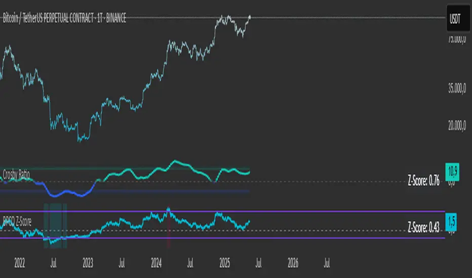
BPCO Z-ScoreBPCO Z-Score with Scaled Z-Value and Table
Description:
This custom indicator calculates the Z-Score of a specified financial instrument (using the closing price as a placeholder for the BPCO value), scales the Z-Score between -2 and +2 based on user-defined thresholds, and displays it in a table for easy reference.
The indicator uses a simple moving average (SMA) and standard deviation to calculate the original Z-Score, and then scales the Z-Score within a specified range (from -2 to +2) based on the upper and lower thresholds set by the user.
Additionally, the scaled Z-Score is displayed in a separate table on the right side of the chart, providing a clear, numerical value for users to track and interpret.
Key Features:
BPCO Z-Score: Calculates the Z-Score using a simple moving average and standard deviation over a user-defined window (default: 365 days). This provides a measure of how far the current price is from its historical average in terms of standard deviations.
Scaled Z-Score: The original Z-Score is then scaled between -2 and +2, based on the user-specified upper and lower thresholds. The thresholds default to 3.5 (upper) and -1.5 (lower), and can be adjusted as needed.
Threshold Bands: Horizontal lines are plotted on the chart to represent the upper and lower thresholds. These help visualize when the Z-Score crosses critical levels, indicating potential market overbought or oversold conditions.
Dynamic Table Display: The scaled Z-Score is shown in a dynamic table at the top-right of the chart, providing a convenient reference for traders. The table updates automatically as the Z-Score fluctuates.
How to Use:
Adjust Time Window: The "Z-Score Period (Days)" input allows you to adjust the time period used for calculating the moving average and standard deviation. By default, this is set to 365 days (1 year), but you can adjust this depending on your analysis needs.
Set Upper and Lower Thresholds: Use the "BPCO Upper Threshold" and "BPCO Lower Threshold" inputs to define the bands for your Z-Score. The default values are 3.5 for the upper band and -1.5 for the lower band, but you can adjust them based on your strategy.
Interpret the Z-Score: The Z-Score provides a standardized measure of how far the current price (or BPCO value) is from its historical mean, relative to the volatility. A value above the upper threshold (e.g., 3.5) may indicate overbought conditions, while a value below the lower threshold (e.g., -1.5) may indicate oversold conditions.
Use the Scaled Z-Score: The scaled Z-Score is calculated based on the original Z-Score, but it is constrained to a range between -2 and +2. When the BPCO value hits the upper threshold (3.5), the scaled Z-Score will be +2, and when it hits the lower threshold (-1.5), the scaled Z-Score will be -2. This gives you a clear, easy-to-read value to interpret the market's condition.
Data Sources:
BPCO Data: In this indicator, the BPCO value is represented by the closing price of the asset. The calculation of the Z-Score and scaled Z-Score is based on this price data, but you can modify it to incorporate other data streams as needed (e.g., specific economic indicators or custom metrics).
Indicator Calculation: The Z-Score is calculated using the following formulas:
Mean (SMA): A simple moving average of the BPCO (close price) over the selected period (365 days by default).
Standard Deviation (Std): The standard deviation of the BPCO (close price) over the same period.
Z-Score: (Current BPCO - Mean) / Standard Deviation
Scaled Z-Score: The Z-Score is normalized to fall within a specified range (from -2 to +2), based on the upper and lower threshold inputs.
Important Notes:
Customization: The indicator allows users to adjust the period (window) for calculating the Z-Score, as well as the upper and lower thresholds to suit different timeframes and trading strategies.
Visual Aids: Horizontal lines are drawn to represent the upper and lower threshold levels, making it easy to visualize when the Z-Score crosses critical levels.
Limitations: This indicator relies on historical price data (or BPCO) and assumes that the standard deviation and mean are representative of future price behavior. It does not account for potential market shifts or extreme events that may fall outside historical norms.
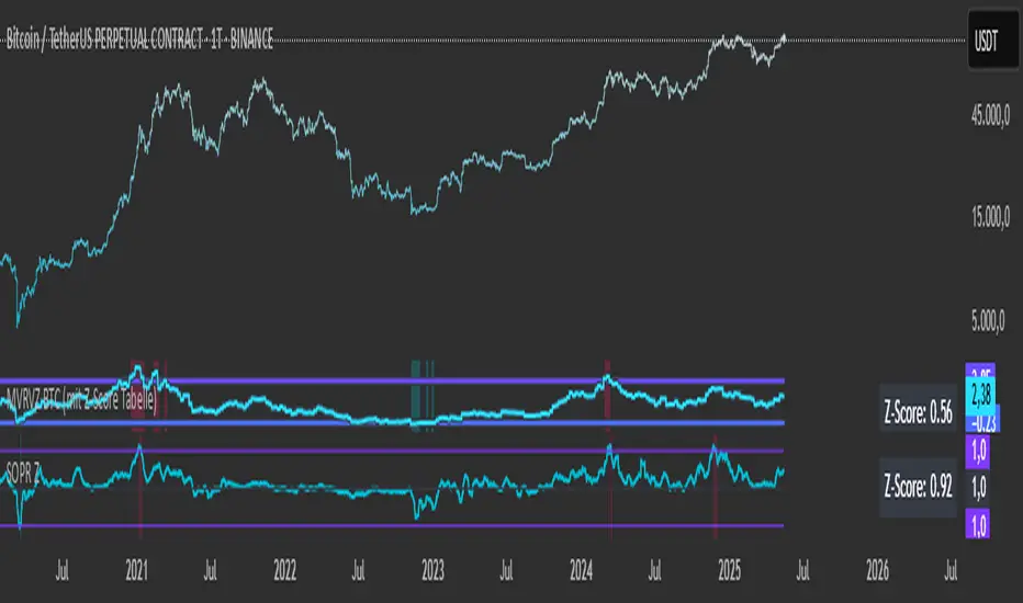
SOPR with Z-Score Table📊 Glassnode SOPR with Dynamic Z-Score Table
ℹ️ Powered by Glassnode On-Chain Metrics
📈 Description:
This indicator visualizes the Spent Output Profit Ratio (SOPR) for major cryptocurrencies — Bitcoin, Ethereum, and Litecoin — along with a dynamically normalized Z-Score. SOPR is a key on-chain metric that reflects whether coins moved on-chain are being sold at a profit or a loss.
🔍 SOPR is calculated using Glassnode’s entity-adjusted SOPR feed, and a custom SMA is applied to smooth the signal. The normalized Z-Score helps identify market sentiment extremes by scaling SOPR relative to its historical context.
📊 Features:
Selectable cryptocurrency: Bitcoin, Ethereum, or Litecoin
SOPR smoothed by user-defined SMA (default: 10 periods)
Upper & lower bounds (±4%) for SOPR, shown as red/green lines
Background highlighting when SOPR moves outside normal range
Normalized Z-Score scaled between –2 and +2
Live Z-Score display in a compact top-right table
🧮 Calculations:
SOPR data is sourced daily from Glassnode:
Bitcoin: XTVCBTC_SOPR
Ethereum: XTVCETH_SOPR
Litecoin: XTVCLTC_SOPR
Z-Score is calculated as:
SMA of SOPR over zscore_length periods
Standard deviation of SOPR
Z-Score = (SOPR – mean) / standard deviation
Z-Score is clamped between –2 and +2 for visual consistency
🎯 Interpretation:
SOPR > 1 implies coins are sold in profit
SOPR < 1 suggests coins are sold at a loss
When SOPR is significantly above or below its recent range (e.g., +4% or –4%), it may signal overheating or capitulation
The Z-Score contextualizes how extreme the current SOPR is relative to history
📌 Notes:
Best viewed on daily charts
Works across selected assets (BTC, ETH, LTC)
Active Addresses Z-ScoreActive Addresses Z-Score Indicator
The Active Addresses Z-Score Indicator is a fundamental analysis tool designed to evaluate the relationship between Bitcoin network activity and its price movements over a specified period. This indicator aims to provide insights into whether the market is showing signs of increasing or decreasing interest in Bitcoin, based on its network usage and activity.
How to Read the Indicator
Orange Line (Price Z-Score):
This line represents the Z-Score of the price change over a defined period (e.g., 28 days). The Z-Score normalizes the price change by comparing it to the historical mean and standard deviation, essentially measuring how far the current price change is from the average.
A positive Z-Score indicates that the price change is above the historical average (a bullish signal), while a negative Z-Score means the price change is below the historical average (a bearish signal).
Gray Line (Active Addresses Z-Score):
This line represents the Z-Score of the change in active addresses over the same period. The Z-Score here normalizes the change in the number of active Bitcoin addresses by comparing it to historical data.
A positive Z-Score suggests that the number of active addresses is increasing more than usual, which can be a sign of increased market activity and potential interest in Bitcoin.
A negative Z-Score suggests that active addresses are decreasing more than usual, which may indicate reduced interest or usage of Bitcoin.
Upper and Lower Threshold Lines:
The upper and lower threshold lines (set by the user) act as Z-Score boundaries. If either the price Z-Score or the active address Z-Score exceeds the upper threshold, it can signal an overbought or overactive condition. Similarly, if the Z-Score falls below the lower threshold, it could indicate an oversold or underactive condition.
These thresholds are customizable by the user, allowing for flexible interpretation based on market conditions.
Indicator Calculation
Price Change Calculation:
The percentage change in the Bitcoin price over a specified lookback period (e.g., 28 days) is calculated as:
Price Change
=
Close
−
Close
Close
Price Change=
Close
Close−Close
This shows the relative price movement during the specified period.
Active Address Change Calculation:
Similarly, the percentage change in active addresses is calculated as:
Active Address Change
=
Active Addresses
−
Active Addresses
Active Addresses
Active Address Change=
Active Addresses
Active Addresses−Active Addresses
This shows the relative change in the number of active Bitcoin addresses over the same period.
Z-Score Calculation:
The Z-Score for both the price and active address changes is calculated as:
𝑍
=
X
−
𝜇
𝜎
Z=
σ
X−μ
Where:
X is the current change (price or active addresses),
μ (mu) is the mean (average) of the historical data over the lookback period,
σ (sigma) is the standard deviation of the historical data.
This Z-Score tells you how far the current value deviates from its historical average, normalized by the volatility (standard deviation).
Smoothing (Optional):
A simple moving average (SMA) is applied to smooth out the Z-Score values to reduce noise and provide a clearer trend.
What the Indicator Does
Signals of Bullish or Bearish Market Behavior:
The Z-Score of Price tells you how strong or weak the price movement is relative to its past performance.
The Z-Score of Active Addresses reveals whether more users are interacting with the Bitcoin network, which can be an indication of growing interest or market activity.
When both the price and active address Z-Scores are high, it may indicate a strong bull market, while low Z-Scores may point to a bear market or decreasing interest.
Overbought/Oversold Conditions:
The upper and lower threshold lines help you visualize when the Z-Scores for either price or active addresses have reached extreme values, signaling potential overbought or oversold conditions.
For example, if the Price Z-Score exceeds the upper threshold (e.g., +2), it might indicate that the price has risen too quickly, and a correction may be due. Conversely, if it falls below the lower threshold (e.g., -2), it may indicate a potential buying opportunity.
Important Note on Activity and Price Movements:
After Rapid Price Increases:
A sharp increase in Bitcoin’s price followed by a spike in active addresses can be interpreted as a bearish signal. High network activity after a rapid price surge might indicate that investors are taking profits or that speculative interest is peaking, potentially signaling an upcoming correction or reversal.
After Extreme Price Declines:
Conversely, high network activity after a significant price drop may indicate a bottoming signal. A surge in active addresses during a price decline could suggest increased buying interest and potential accumulation, signaling that the market may be finding support and a reversal may be imminent.
Customization and Flexibility
The lookback period (default: 28 days) can be adjusted to suit different trading strategies or time horizons.
The smoothing length (default: 7 periods) allows for smoothing the Z-Score, making it easier to detect longer-term trends and reduce noise.
The upper and lower threshold values are fully customizable to adjust the indicator’s sensitivity to market conditions.
Conclusion
The Active Addresses Z-Score Indicator combines network activity with price data to give you a deeper understanding of the Bitcoin market. By analyzing the relationship between price changes and active address changes, this indicator helps you assess whether the market is experiencing unusual activity or if Bitcoin is trending in an extreme overbought or oversold condition.
It is a powerful tool for fundamental analysis and can complement traditional technical indicators for a more comprehensive trading strategy.
15-Min Opening Range Breakout STEP-BY-STEP RULES
1. Define the Opening Range (OR)
Mark the high and low of the first 15-minute candle of the session.
This creates your Opening Range.
Example: London session opens at 08:00 GMT. Use the 08:00–08:15 candle.
2. Set Entry Triggers
Buy Breakout: Place a Buy Stop order 1 pip above the Opening Range high.
Sell Breakout: Place a Sell Stop order 1 pip below the Opening Range low.
⚠️ Only one side should be triggered. Cancel the opposite order once one is active.
3. Set Stop Loss (SL)
For Buy trades:
SL = Opening Range Low - 2 pips
For Sell trades:
SL = Opening Range High + 2 pips
This ensures you give the price enough space, while keeping risk controlled.
4. Set Take Profit (TP)
Use either of these two approaches:
✅ Fixed Risk-Reward (Preferred)
Target 1: TP = 2R (i.e., 2 × SL distance)
Target 2 (optional): Leave runner for 3R or trail stop behind minor S/R
✅ Fixed Pip Target (alternative)
TP = +50 pips
SL = -20 pips
Matches your preferred risk model of 20 SL / 50 TP
5. Trade Management
If no breakout occurs within 1 hour, cancel the pending orders. No trade that day.
If trade triggers but fails to move, consider time-based exit after 2 hours.
Optional: Move SL to breakeven once price moves 1R in your favor.

TrueDelta Candles📖 Description:
TrueDelta Candles is a precision tool for traders who want deeper insight into market sentiment through real-time volume delta analysis. Rather than using traditional volume bars, this indicator colors each chart candle based on the net volume delta—the difference between buying and selling volume—fetched from a lower timeframe.
🚀 Key Features:
🎯 Real Candle Coloring: Colors actual price candles based on delta volume—green (buying pressure), red (selling pressure).
⏱️ Multi-Timeframe Volume Analysis: Automatically selects the appropriate lower timeframe for better delta approximation, or lets you set a custom one.
🔬 Order Flow Insight: Visualizes the tug-of-war between buyers and sellers within each candle.
⚡ Lightweight & Non-Intrusive: No clutter—just clean color overlays on your chart candles.
🔄 Live Updating: Responds instantly as new data arrives.
🧠 Ideal For:
Intraday and scalping strategies.
Momentum and breakout traders.
Order flow enthusiasts looking for a visual edge.
🛠️ How It Works:
Behind the scenes, the script uses ta.requestVolumeDelta() to retrieve granular buy/sell volume data from a lower timeframe. The net delta volume then determines whether the candle is colored green (positive delta) or red (negative delta). This makes it easy to spot when market pressure aligns or diverges from price action.
⚙️ Settings:
Use Custom Timeframe: Manually select the lower timeframe used for delta calculation (e.g., "1", "5").
Default Auto Mode: Automatically adapts to your current chart resolution for optimal data balance.
If you're serious about understanding the real dynamics behind every candle, TrueDelta Candles adds an essential layer of volume-based context that price alone can't offer.

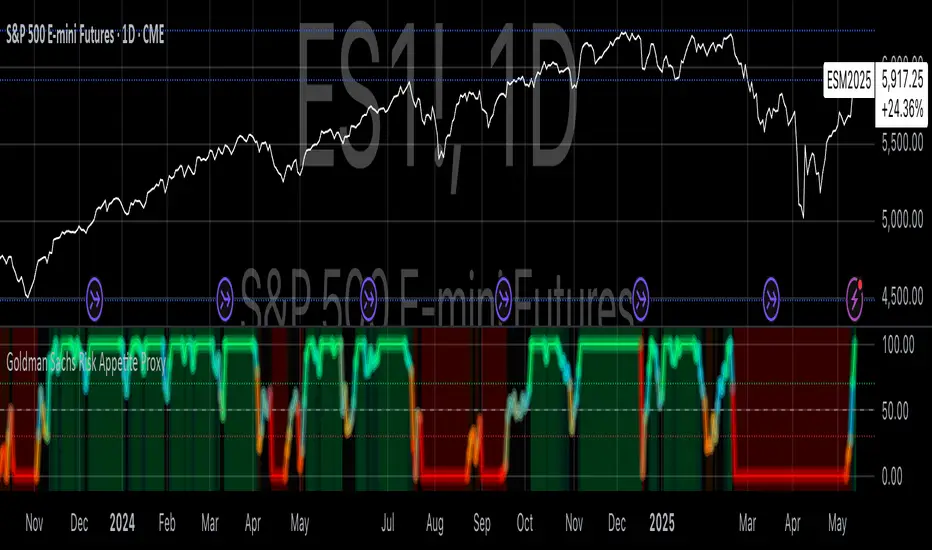
Goldman Sachs Risk Appetite ProxyRisk appetite indicators serve as barometers of market psychology, measuring investors' collective willingness to engage in risk-taking behavior. According to Mosley & Singer (2008), "cross-asset risk sentiment indicators provide valuable leading signals for market direction by capturing the underlying psychological state of market participants before it fully manifests in price action."
The GSRAI methodology aligns with modern portfolio theory, which emphasizes the importance of cross-asset correlations during different market regimes. As noted by Ang & Bekaert (2002), "asset correlations tend to increase during market stress, exhibiting asymmetric patterns that can be captured through multi-asset sentiment indicators."
Implementation Methodology
Component Selection
Our implementation follows the core framework outlined by Goldman Sachs research, focusing on four key components:
Credit Spreads (High Yield Credit Spread)
As noted by Duca et al. (2016), "credit spreads provide a market-based assessment of default risk and function as an effective barometer of economic uncertainty." Higher spreads generally indicate deteriorating risk appetite.
Volatility Measures (VIX)
Baker & Wurgler (2006) established that "implied volatility serves as a direct measure of market fear and uncertainty." The VIX, often called the "fear gauge," maintains an inverse relationship with risk appetite.
Equity/Bond Performance Ratio (SPY/IEF)
According to Connolly et al. (2005), "the relative performance of stocks versus bonds offers significant insight into market participants' risk preferences and flight-to-safety behavior."
Commodity Ratio (Oil/Gold)
Baur & McDermott (2010) demonstrated that "gold often functions as a safe haven during market turbulence, while oil typically performs better during risk-on environments, making their ratio an effective risk sentiment indicator."
Standardization Process
Each component undergoes z-score normalization to enable cross-asset comparisons, following the statistical approach advocated by Burdekin & Siklos (2012). The z-score transformation standardizes each variable by subtracting its mean and dividing by its standard deviation: Z = (X - μ) / σ
This approach allows for meaningful aggregation of different market signals regardless of their native scales or volatility characteristics.
Signal Integration
The four standardized components are equally weighted and combined to form a composite score. This democratic weighting approach is supported by Rapach et al. (2010), who found that "simple averaging often outperforms more complex weighting schemes in financial applications due to estimation error in the optimization process."
The final index is scaled to a 0-100 range, with:
Values above 70 indicating "Risk-On" market conditions
Values below 30 indicating "Risk-Off" market conditions
Values between 30-70 representing neutral risk sentiment
Limitations and Differences from Original Implementation
Proprietary Components
The original Goldman Sachs indicator incorporates additional proprietary elements not publicly disclosed. As Goldman Sachs Global Investment Research (2019) notes, "our comprehensive risk appetite framework incorporates proprietary positioning data and internal liquidity metrics that enhance predictive capability."
Technical Limitations
Pine Script v6 imposes certain constraints that prevent full replication:
Structural Limitations: Functions like plot, hline, and bgcolor must be defined in the global scope rather than conditionally, requiring workarounds for dynamic visualization.
Statistical Processing: Advanced statistical methods used in the original model, such as Kalman filtering or regime-switching models described by Ang & Timmermann (2012), cannot be fully implemented within Pine Script's constraints.
Data Availability: As noted by Kilian & Park (2009), "the quality and frequency of market data significantly impacts the effectiveness of sentiment indicators." Our implementation relies on publicly available data sources that may differ from Goldman Sachs' institutional data feeds.
Empirical Performance
While a formal backtest comparison with the original GSRAI is beyond the scope of this implementation, research by Froot & Ramadorai (2005) suggests that "publicly accessible proxies of proprietary sentiment indicators can capture a significant portion of their predictive power, particularly during major market turning points."
References
Ang, A., & Bekaert, G. (2002). "International Asset Allocation with Regime Shifts." Review of Financial Studies, 15(4), 1137-1187.
Ang, A., & Timmermann, A. (2012). "Regime Changes and Financial Markets." Annual Review of Financial Economics, 4(1), 313-337.
Baker, M., & Wurgler, J. (2006). "Investor Sentiment and the Cross-Section of Stock Returns." Journal of Finance, 61(4), 1645-1680.
Baur, D. G., & McDermott, T. K. (2010). "Is Gold a Safe Haven? International Evidence." Journal of Banking & Finance, 34(8), 1886-1898.
Burdekin, R. C., & Siklos, P. L. (2012). "Enter the Dragon: Interactions between Chinese, US and Asia-Pacific Equity Markets, 1995-2010." Pacific-Basin Finance Journal, 20(3), 521-541.
Connolly, R., Stivers, C., & Sun, L. (2005). "Stock Market Uncertainty and the Stock-Bond Return Relation." Journal of Financial and Quantitative Analysis, 40(1), 161-194.
Duca, M. L., Nicoletti, G., & Martinez, A. V. (2016). "Global Corporate Bond Issuance: What Role for US Quantitative Easing?" Journal of International Money and Finance, 60, 114-150.
Froot, K. A., & Ramadorai, T. (2005). "Currency Returns, Intrinsic Value, and Institutional-Investor Flows." Journal of Finance, 60(3), 1535-1566.
Goldman Sachs Global Investment Research (2019). "Risk Appetite Framework: A Practitioner's Guide."
Kilian, L., & Park, C. (2009). "The Impact of Oil Price Shocks on the U.S. Stock Market." International Economic Review, 50(4), 1267-1287.
Mosley, L., & Singer, D. A. (2008). "Taking Stock Seriously: Equity Market Performance, Government Policy, and Financial Globalization." International Studies Quarterly, 52(2), 405-425.
Oppenheimer, P. (2007). "A Framework for Financial Market Risk Appetite." Goldman Sachs Global Economics Paper.
Rapach, D. E., Strauss, J. K., & Zhou, G. (2010). "Out-of-Sample Equity Premium Prediction: Combination Forecasts and Links to the Real Economy." Review of Financial Studies, 23(2), 821-862.
Market Structure- ZigZag, Break of Structure & Order BlocksDescription:
This script is an all-in-one market structure tool designed for traders who follow price action, Smart Money Concepts (SMC), or institutional order flow. It combines Order Block detection , Break of Structure (BOS) , Internal Structure Shifts (CHoCH) , and a ZigZag swing framework to provide a clear and actionable view of market behavior.
Key Features:
Order Blocks (OB) :
-Detects Bullish (Green) and Bearish (Red) order blocks upon valid market structure shifts.
-Optional deletion of mitigated (touched) blocks to keep charts clean.
-Customizable block duration, fill color, and border color.
Break of Structure (BOS) :
-Marks BOS with horizontal dotted lines when price breaks previous swing highs/lows.
-Confirms new trends and structural shifts.
Internal Structure Shifts (CHoCH-like) :
-Detects early internal changes in direction before BOS.
-User-selectable logic: based on candle Open or High/Low.
-Plotted as small black triangle markers.
ZigZag Swings :
-Connects confirmed internal shifts with black zigzag lines.
-Visually simplifies trend structure and major swing points.
-Tracks last swing highs/lows for BOS validation.
Alerts :
-Bullish/Bearish Engulfments (OB signals)
-Internal Structure Shifts
-Bullish/Bearish Break of Structure
-OB Mitigation Events
Inputs & Settings :
-Show/Hide Bullish or Bearish Order Blocks
-Calculate internal shifts by: Open or High/Low
-Set order block fill and border colors
-Enable or disable automatic deletion of mitigated blocks
-Set duration for order block display
This tool is designed to support price action trading by visually mapping key structural changes and zones of interest directly on your chart. It is not intended to function as a standalone trading strategy , but rather as a supplementary tool to inform your own analysis and discretion.

BTC Mining Income Oscillator Z-ScoreBTC Mining Income Oscillator (Z-Score)
Overview
The BTC Mining Income Oscillator (Z-Score) is a custom technical indicator that analyzes Bitcoin mining income to help traders identify overbought and oversold conditions. The indicator uses a Z-Score to track deviations in mining income, highlighting periods of high or low mining profitability.
This indicator is made up of:
Z-Score Line (Blue): Measures how far the current mining income deviates from its historical mean.
Mining Income Oscillator (Orange): A scaled value of mining income that oscillates within a specific range to indicate overbought and oversold conditions.
How the Indicator Works
1. Mining Income Calculation
The BTC Mining Income is determined using two main factors:
Block Reward: The number of BTC miners earn for each block mined (currently 3.125 BTC, adjustable in settings).
Transaction Fees: The average transaction fees per block (default is 0.3 BTC).
Blocks per Day: The number of blocks mined per day (default is 144).
The daily mining income in BTC is calculated as:
Mining Income
=
(
Block Reward
+
Transaction Fees
)
×
Blocks per Day
Mining Income=(Block Reward+Transaction Fees)×Blocks per Day
This value is then converted to USD by multiplying it by the current Bitcoin price.
2. Z-Score Calculation
The Z-Score measures how far the current mining income deviates from its mean over a set period (default is 90 days). The Z-Score helps identify when mining income is unusually high or low:
A high Z-Score indicates that the mining income is significantly above the historical mean, signaling overbought conditions.
A low Z-Score indicates that the mining income is significantly below the historical mean, signaling oversold conditions.
The Z-Score is calculated as follows:
Z-Score
=
(
Current Mining Income
−
Mean Income
)
Standard Deviation
Z-Score=
Standard Deviation
(Current Mining Income−Mean Income)
The result is then smoothed over a period (default is 5) to reduce noise and provide a more stable value.
3. Mining Income Oscillator
The mining income is scaled to oscillate between +20 and +90. This oscillation makes it easy to track overbought and oversold conditions in the market:
Values between 85 and 90 indicate overbought conditions (high mining profitability).
Values between 20 and 22 indicate oversold conditions (low mining profitability).
Values between 22 and 85 indicate neutral conditions, where mining profitability is normal.
The mining income oscillator helps traders spot extreme conditions (overbought or oversold) in mining profitability.
How to Read the Indicator
1. Z-Score Line (Blue)
The Z-Score represents how far current mining income is from the historical average.
Above +2: The mining income is unusually high, indicating an overbought market.
Below -2: The mining income is unusually low, indicating an oversold market.
Between -2 and +2: This range is neutral, where the mining income is within the average historical range.
2. Mining Income Oscillator (Orange)
The Mining Income Oscillator is scaled between 20 and 90.
85–90: Overbought conditions, indicating high mining profitability.
20–22: Oversold conditions, indicating low mining profitability.
22–85: Neutral conditions, indicating moderate mining profitability.
3. Background Shading
Red Shading (85–90): Indicates overbought conditions (mining income is unusually high).
Green Shading (20–22): Indicates oversold conditions (mining income is unusually low).
The shaded regions provide a visual guide to spot periods when the market is overbought or oversold.
4. Key Horizontal Lines
0 Line: Represents the neutral level for the Z-Score, where the mining income is at the historical mean.
+2 and -2 Lines: Indicate overbought and oversold conditions for the Z-Score.
90 and 20 Lines: Indicate the upper and lower bounds for the mining income oscillator.
Where the Data Comes From
Bitcoin Price: The current Bitcoin price is pulled directly from the chart.
Block Reward and Transaction Fees: These values are set manually by the user or can be updated dynamically.
Mining Income: Calculated based on the block reward, transaction fees, and current Bitcoin price.
Z-Score and Oscillator Calculations: Both are calculated based on mining income in USD over a defined look-back period.
Best Timeframe for This Indicator
This indicator is designed to work best on the 2-day chart (2D) timeframe. On the 2-day chart, the mining income data, Z-Score, and the oscillator are less sensitive to noise and short-term volatility, providing more reliable signals. While it can be used on other timeframes, the 2-day chart offers the clearest and most stable analysis.

VWAP Indicator Channel | Multi Timeframe by Osbrah📊 Multi-Timeframe VWAP Indicator (Session / Weekly / Monthly)
This powerful indicator plots the Volume Weighted Average Price (VWAP) across multiple timeframes: intraday session, weekly, and monthly. It's designed to give traders a clear understanding of the market’s fair value over different horizons.
Key Features:
* Display Session VWAP (resets daily)
* Enable Weekly and Monthly VWAPs for broader market context
* Customize colors, styles, and visibility for each VWAP
* Toggle between standard VWAP or anchored to session opens
Use Cases:
* Identify value zones where price tends to gravitate
* Spot institutional levels of interest and potential reversal points
* Align entries with VWAP bounces or breaks
* Combine with EMAs or price action for high-probability setups
Perfect for day traders, swing traders, and institutional-style strategies, this VWAP tool helps you stay aligned with volume-based price dynamics across all market phases.

ADX and DI - Trader FelipeADX and DI - Trader Felipe
This indicator combines the Average Directional Index (ADX) and the Directional Indicators (DI+ and DI-) to help traders assess market trends and their strength. It is designed to provide a clear view of whether the market is in a trending phase (either bullish or bearish) and helps identify potential entry and exit points.
What is ADX and DI?
DI+ (Green Line):
DI+ measures the strength of upward (bullish) price movements. When DI+ is above DI-, it signals that the market is experiencing upward momentum.
DI- (Red Line):
DI- measures the strength of downward (bearish) price movements. When DI- is above DI+, it suggests that the market is in a bearish phase, with downward momentum.
ADX (Blue Line):
ADX quantifies the strength of the trend, irrespective of whether it is bullish or bearish. The higher the ADX, the stronger the trend:
ADX > 20: Indicates a trending market (either up or down).
ADX < 20: Indicates a weak or sideways market with no clear trend.
Threshold Line (Gray Line):
This horizontal line, typically set at 20, represents the threshold for identifying whether the market is trending or not. If ADX is above 20, the market is considered to be in a trend. If ADX is below 20, it suggests that the market is not trending and is likely in a consolidation phase.
Summary of How to Use the Indicator:
Trend Confirmation: Use ADX > 20 to confirm a trending market. If ADX is below 20, avoid trading.
Long Entry: Enter a long position when DI+ > DI- and ADX > 20.
Short Entry: Enter a short position when DI- > DI+ and ADX > 20.
Avoid Sideways Markets: Do not trade when ADX is below 20. Look for other strategies for consolidation phases.
Exit Strategy: Exit the trade if ADX starts to decline or if the DI lines cross in the opposite direction.
Combine with Other Indicators: Use additional indicators like RSI, moving averages, or support/resistance to filter and confirm signals.
US Growth Momentum Index (UGMI)US Growth Momentum Index (UGMI) is a macroeconomic indicator designed to reflect the current economic health of the United States. The index combines four key economic factors—Industrial Production (INDPRO), Retail Sales (RSAFS), Unemployment Rate (UNRATE), and the 10Y-2Y Yield Curve Spread—and aggregates them into a single line representing overall growth momentum.
The UGMI is based on Z-Score calculations for each of these components, helping to identify whether the U.S. economy is in an expansionary growth phase or a contractionary recession phase.
How to Read the UGMI:
Core Growth Line (Blue): This is the main line representing the aggregated growth momentum. It is calculated using the Z-scores of the key economic indicators.
0 Line: The 0 line represents the neutral zone. If the UGMI is above the 0 line, it suggests that the economy is expanding. Below the 0 line indicates contraction or a potential recession.
Zones Above 1: When the UGMI is above 1, it represents a strong expansionary phase or boom, possibly signaling the top of a bull market or local peak.
Zones Below -1: When the UGMI falls below -1, it indicates a severe recession or significant contraction in the economy.
Color Coding:
Green: When the UGMI is above the 1 line, the background turns green, indicating a strong growth phase.
Red: When the UGMI is below -1, the background turns red, representing a recession or significant economic downturn.
This indicator helps traders and investors to understand whether the economy is growing or contracting, and is especially useful for identifying potential market tops or turning points.

Market Sentiment Index US Top 40 [Pt]▮Overview
Market Sentiment Index US Top 40 [Pt} shows how the largest US stocks behave together. You pick one simple measure—High Low breakouts, Above Below moving average, or RSI overbought/oversold—and see how many of your chosen top 10/20/30/40 NYSE or NASDAQ names are bullish, neutral, or bearish.
This tool gives you a quick view of broad-market strength or weakness so you can time trades, confirm trends, and spot hidden shifts in market sentiment.
▮Key Features
► Three Simple Modes
High Low Index: counts stocks making new highs or lows over your lookback period
Above Below MA: flags stocks trading above or below their moving average
RSI Sentiment: marks overbought or oversold stocks and plots a small histogram
► Universe Selection
Top 10, 20, 30, or 40 symbols from NYSE or NASDAQ
Option to weight by market cap or treat all symbols equally
► Timeframe Choice
Use your chart’s timeframe or any intraday, daily, weekly, or monthly resolution
► Histogram Smoothing
Two optional moving averages on the sentiment bars
Markers show when the faster average crosses above or below the slower one
► Ticker Table
Optional on-chart table showing each ticker’s state in color
Grid or single-row layout with adjustable text size and color settings
▮Inputs
► Mode and Lookback
Pick High Low, Above Below MA, or RSI Sentiment
Set lookback length (for example 10 bars)
If using Above Below MA, choose the moving average type (EMA, SMA, etc.)
► Universe Setup
Market: NYSE or NASDAQ
Number of symbols: 10, 20, 30, or 40
Weights: on or off
Timeframe: blank to match chart or pick any other
► Moving Averages on Histogram
Enable fast and slow averages
Set their lengths and types
Choose colors for averages and markers
► Table Options
Show or hide the symbol table
Select text size: tiny, small, or normal
Choose layout: grid or one-row
Pick colors for bullish, neutral, and bearish cells
Show or hide exchange prefixes
▮How to Read It
► Sentiment Bars
Green means bullish
Red means bearish
Near zero means neutral
► Zero Line
Separates bullish from bearish readings
► High Low Line (High Low mode only)
Smooth ratio of highs versus lows over your lookback
► MA Crosses
Fast MA above slow MA hints rising breadth
Fast MA below slow MA hints falling breadth
► Ticker Table
Each cell colored green, gray, or red for bull, neutral, or bear
▮Use Cases
► Confirm Market Trends
Early warning when price makes highs but breadth is weak
Catch rallies when breadth turns strong while price is flat
► Spot Sector Rotation
Switch between NYSE and NASDAQ to see which group leads
Watch tech versus industrial breadth to track money flow
► Filter Trade Signals
Enter longs only when breadth is bullish
Consider shorts when breadth turns negative
► Combine with Other Indicators
Use RSI Sentiment with trend tools to spot overextended moves
Add volume indicators in High Low mode for breakout confirmation
► Timeframe Analysis
Daily for big-picture bias
Intraday (15-min) for precise entries and exits
