TradeSmart Morning GloryThe Morning Glory Indicator by TradeSmart University is a pre-market volume visualization tool designed to help traders quickly assess the quality of a morning gap. By highlighting volume levels before the market opens, this indicator helps distinguish between a professional gap (likely to continue running) and a retail/news-driven gap (likely to fade or reverse).
💡 What It Does:
This indicator plots color-coded volume bars in the pre-market session and highlights when volume crosses two key thresholds:
Teal Bars – Low institutional interest
Yellow Bars – Medium institutional interest (100K+ volume)
Red Bars – High institutional interest (400K+ volume)
These thresholds are most effective on AMEX:SPY and other high-volume ETFs or stocks, but may be customized to fit your trading style. Consider using a 15-minute chart for the above settings.
🧠 How to Use It:
This indicator works best in conjunction with the Morning Glory Strategy and Qualified Trade Setup . On its own, the indicator gives a real-time read on pre-market strength , helping you:
Confirm gap-and-go setups (gap + high volume = likely continuation)
Fade the gap (gap + low volume = higher likelihood of reversal)
While the indicator focuses exclusively on volume, the full Morning Glory strategy adds an important price gap size filter to create powerful trade signals.
📊 Probabilities of Success (Based on Full Strategy):
When used as part of the Morning Glory Qualified Trade Setup, here are the historical win rates by day of the week:
Monday: 65%
Tuesday: 77%
Wednesday: 79%
Thursday: 82%
Friday: 78%
If used in conjunction with an artificial intelligence like the Deep Sky Trading Assistant™, win-loss ratios improve to 89% or better across all days of the week.
🔔 Note: For best results, activate premium ARCA data on your TradingView account. This ensures the most accurate and complete pre-market volume data.
Sentiment

[Tradevietstock] Market Cycle Detector_Quantum Flux Best technical indicator to detect market cycles - Quantum Flux
Hello folks, it's Tradevietstock again! Today, I will introduce you to Quantum Flux Indicator, which can help you identify market cycle and find your best entry/exit effectively.
i. Overview
1. What is Market Cycle Detector_Quantum Flux?
The Quantum Flux Indicator is developed specifically to analyze and detect market cycles across a variety of asset classes. Whether you trade stocks, crypto, forex, or commodities, this indicator provides a consistent framework to track trends and time your positions.
2. Supported Markets:
Stock Market
Crypto Market
Commodities
Forex
You can apply the same cycle-based strategy across all these markets using QFI.
Depending on the platform you're using, here’s how you can start using Quantum Flux:
TradingView Users:
Once your invite is approved, the indicator will be added to your TradingView account. You can access it directly through the Indicators tab.
MT5 / Amibroker Users:
After your payment is completed, we will send you the QFI script. You can then import it manually into your MT5 or Amibroker trading platform.
ii. Setting Up the Indicator
1. Choose Your Setup
There are two ways to configure the Quantum Flux - The best indicator to detect market cycles
Default Setup (Recommended)
This includes both the Quantum Aroon and some of the Premium MACD signals. This full setup is ideal for traders who want a complete view of the market cycle with detailed signals. You just need to turn off the Premium MACD_Components as the image below
MACD-Only Setup
In this mode, the Quantum Aroon module is disabled. The indicator will rely solely on the Premium MACD Setting to generate signals. While this option is available, we recommend using the full setup for the most accurate performance.
2. Recognize the Market Cycle Phases
According to Tradevietstock’s theory , every trading asset typically moves through four distinct phases in a complete cycle:
Bearish Phase - Bear Market
First Bullish Wave - The Recovery
Strong Correction Phase
Final Bullish Wave
Quantum Flux generates visual and data-driven signals to help you time your trades accurately.
Green Dots: MACD crossover → Potential buy signal
Red Dots: MACD crossunder → Potential sell signal
Quantum Aroon Crossover: Confirms bullish trend or Buy Signals
Quantum Aroon Crossunder: Confirms bearish trend or Exit Signals
Green background: Extreme Bullish Phase
Red background: Extreme Bearish Phase
The Extreme Bullish/Bearish Phase is a unique feature of our system that enhances trading signals by capturing moments when the market moves aggressively—either in a strong uptrend or downtrend. This phase often represents the peak of Greed in bullish markets and Fear in bearish ones, offering a way to gauge market sentiment visually. The intensity of the background color helps interpret this: a bolder green indicates a more extreme bull market, while a deeper red signals an extreme bear market.
It's important to note that the Extreme Bullish/Bearish Phases are not direct entry or exit signals. Instead, they serve as enhancement signals that help traders make more informed decisions. These phases provide insight into whether it's wise to wait for additional confirmation before entering a trade, or to hold existing positions longer until clearer exit signals—like red dots or crosses—appear. By identifying the market's most intense emotional points, these signals help traders better align with momentum rather than react prematurely.
=> In summary, the Extreme Bullish/Bearish Phase provides valuable insight into market sentiment by highlighting emotional extremes, helping traders navigate aggressive trends with greater confidence. However, like all features in the indicator, its purpose is to complement, not replace, the core entry and exit signals—which are still based on crosses and dots. As always, green indicates bullish conditions, and red indicates bearish, but sentiment alone doesn't drive the trades—signals do.
3. The logic of the indicator and its trading strategy
Many traders are familiar with Wyckoff's theory, which, while foundational, can feel outdated and inefficient for real-life trading in today's fast-paced markets. It takes time to apply and may not be the most practical approach. That’s why many turn to day trading, but without the right tools and strategy, it can lead to account blow-ups.
The traditional market cycle consists of four stages: accumulation, markup, distribution, and markdown. While this is accurate, it's not always sufficient for modern trading. We need something more practical.
According to Tradevietstock's theory, the market cycle can be broken into four stages: a bear market, recovery, correction wave, and a bull market (the strongest uptrend). This new approach offers a shorter and more efficient timeline compared to Wyckoff's or other older cycle theories, making it a safer and more practical alternative to intraday trading.
To trade with market cycles, you need to remember these four stages:
Bearish Phase - Bear Market
First Bullish Wave - The Recovery
Strong Correction Phase
Final Bullish Wave
The logic for BUY/SELL (Entry/Exit) signals is built on a combination of crossover and crossunder events from the Quantum Aroon and Premium MACD indicators. Our Quantum Aroon is an enhanced version that applies a custom zero-lag smoothing function, making its trend signals more responsive and accurate than the traditional Aroon. It also includes a signal line for crossover alerts, along with visual enhancements like color-coded backgrounds, arrows, and gradient fills to highlight different market phases. Integrated with normalized MACD and RSI, it helps confirm signals and identify overbought or oversold conditions. Most importantly, it's aligned with Tradevietstock’s 4-phase market cycle—Bear Market, Recovery, Correction, and Bull Market—making it especially practical for real-world trading.
The Premium MACD differs from the standard version by introducing several key improvements. It normalizes the MACD line, signal line, and histogram for consistent interpretation across assets and timeframes, improving visual clarity. It also supports multi-timeframe analysis, allowing users to choose between the current chart resolution or a custom timeframe. The indicator includes color-coded histogram bars to show momentum changes and uses large dynamic circles to highlight crossover points.
=> These enhancements improve signal accuracy and make trend reversals easier to spot. Paired with the Quantum Aroon, it serves as a powerful confirmation tool within the Tradevietstock cycle framework.
4. Get to practice
In the example of NVDA, you can observe all four phases in action. For medium- to long-term traders, Phase 2 and Phase 4 usually present the strongest buying opportunities. Phase 1 and Phase 3 are accumulation phases — where prices are lower and preparations are made for the next bullish leg.
We can examine the following example to better understand Phase 1: The Bear Market . This phase only begins after a prior uptrend in the stock price . It’s crucial to remember that Phase 1 is not the start of the overall trend—it marks the reversal following a bullish run.
For instance, take the LMT stock: after a 50% rise, Quantum Flux displays a green background, indicating an 'Extreme Bullish Phase.' Once this bullish phase concludes, it sets the stage for a valid Phase 1—the beginning of the Bear Market.
The stock price declines sharply, triggering Quantum Flux to display a red background as the Aroon line crosses below the signal line.
Phase 1 concludes when we observe multiple crossover signals—most notably when the Aroon line crosses above the Signal line—and the red background, which signifies the Extreme Bearish Phase, disappears. Let's take a look at the image below:
Let’s move on to Phase 2: The Recovery. This phase follows the Bear Market—Phase 1. After a significant decline in the stock price, a recovery or pullback is expected.
Our signals for this phase include green dots and crosses, along with the confirmation signals that mark the end of Phase 1. This combination provides valid Buy signals and presents opportunities for mid-term investment strategies.
Phase 3 is a correction wave after the recovery . We also incorporate the cross and dot signals during this phase. In Phase 2, the strategy involves preparing to sell or take profits once the recovery phase matures. Whenever red dots or red crosses appear, they serve as indicators to consider taking profits, signaling the potential end of the upward move.
In Phase 3, known as the correction wave, the key objective is to take profits before the price begins to decline. This phase represents a temporary pullback following the recovery. Importantly, the end of Phase 3 often presents a strong buying opportunity—just before the onset of Phase 4, which is the strongest bullish wave. Whenever green dots and crosses appear at this stage, they serve as clear Buy signals, allowing us to position early for the upcoming bullish momentum.
Phase 4 is the strongest bullish wave—one that investors definitely don’t want to miss. Having entered at the end of Phase 3, the goal in Phase 4 is to maximize gains by targeting the highest highs.
During this phase, we closely monitor our exit signals, which include the appearance of red dots and red crosses, as well as the disappearance of the Extreme Bullish Phase indicator (green background). These signals help us lock in profits at the peak of the bullish momentum.
iii. Brief Conclusion on the Signals
End of Phase 1:
As Phase 1 nears completion, green dots start to appear. These serve as early entry signals, offering an opportunity to buy at lower prices before the trend reversal begins.
Phase 2 – Recovery:
Momentum begins to build during this phase. As it approaches its peak, red dots and Aroon line crossunders emerge—signaling that it's time to exit or reduce exposure in anticipation of a correction.
Phase 3 – Correction:
The indicator typically shows a red background, reflecting a bearish environment. This is a waiting phase—traders should remain cautious and avoid entering until green signals reappear.
Phase 4 – Strong Bullish Wave:
With the return of bullish signals (green dots, crosses, and green background), Phase 4 begins. After entering, the position is held to ride the strong momentum. Profit-taking signals include the appearance of red dots, red crosses, and the disappearance of the green background.
iv. Optimal Use by Market Type
Here’s how we suggest using QFI depending on what you trade:
Stocks: Best used on the Daily or Weekly chart for swing trades.
Cryptocurrency: Works well on BTC, ETH, or major altcoins using Daily and Weekly charts. Great for catching larger trend reversals.
CFDs and Forex: QFI is built for higher timeframes (H4, D1, W1), where it produces cleaner and more reliable signals.
Best Ways to Use It
🟢 Stocks
Works well on Weekly and Daily charts for swing entries
🟡 Crypto
Works best on Weekly and Daily charts
Good for trend-catching on BTC, ETH, or altcoins
🔴 CFDs
Designed with precision in mind — works on bigger timeframes, like H4, D1, and W1
The Quantum Flux Indicator is a flexible and powerful tool for anyone looking to navigate the full market cycle — from bottom to top and back again. With its ability to highlight key phases and generate timely signals, it becomes easier to plan your entries, hold through trends, and exit with confidence.
If you're serious about understanding market structure and improving your timing, Quantum Flux, the best Indicator to detect market cycles, can become a central part of your strategy — no matter what market you're in.

30-Day Rolling VWAP30-Day Rolling VWAP (30-RVWAP)
Overview:
The 30-Day Rolling VWAP is an advanced technical analysis tool designed for crypto traders that combines Volume Weighted Average Price over a 30-day rolling window with sophisticated volume analysis to generate high-probability trading signals.
Key Features:
1. Dynamic Color-Coded VWAP Line
Green glow = Strong bullish pressure
Red glow = Strong bearish pressure
Gray = Neutral/balanced market
The line changes color based on volume-weighted directional pressure
2. Volume Pressure Zones
Multi-layered glowing fill effect around VWAP
Expands/contracts based on volatility and volume
Shows potential support/resistance zones
3. Smart Alert System
Buy/Sell alerts based on VWAP color change
Cross above/below VWAP alerts
Confidence levels based on pressure strength
How to Use:
1. Color Signals
When VWAP turns green: Consider buying (bullish pressure)
When VWAP turns red: Consider selling (bearish pressure)
Gray color indicates consolidation/neutral market
2. Alert Structure
Buy/Sell alerts include confidence percentage (0-100%)
Higher confidence = stronger directional pressure
Cross alerts notify when price crosses VWAP with distance
3. Volume Pressure Zones
Wider zones = higher volatility/volume
Use zones as dynamic support/resistance levels
Watch for price reactions at zone boundaries
4. Trading Strategy
Enter long when VWAP turns green with high confidence (60%+)
Enter short when VWAP turns red with high confidence
Use VWAP as trailing stop (exit when cross alerts trigger)
Use pressure zones for profit targets
5. Alert Messages
Buy Signal: "BTCUSDT | 15m | BUY Signal | Price: 42380.00 | VWAP: 42350.00 | Distance: 0.07% | Confidence: 78% due to strong bullish pressure"
Cross Alert: "BTCUSDT | 15m | CROSS ABOVE VWAP | Price: 42360.00 | VWAP: 42350.00 | Distance: 0.02%"
Best Practices:
Use higher timeframes (4H+) for trend direction; preferably **daily timeframe**
Combine with other indicators for confirmation
Monitor volume for signal validation
Consider market context when entering trades
The indicator combines multiple volume metrics to filter out false signals and provides clear visual and alert-based trading signals.

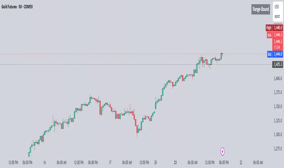
Trend vs Range DetectorMarkets often oscillate between trend phases and range-bound consolidations. Accurately identifying which environment you're in can dramatically improve your strategy's performance — whether you're a breakout trader, trend follower, or mean reversion specialist.
This Pine Script helps do exactly that — with zero clutter, no chart overlays, and a simple, clean table at the top-right corner telling you one thing:
👉 Is the market trending or range-bound?
⚙️ How It Works
The script uses two core metrics to classify the market environment:
1. Slope Sensitivity of Moving Average
A simple moving average (default: 50-period) is used.
The absolute slope of the moving average is calculated.
If the slope exceeds a user-defined sensitivity value, it indicates directional momentum.
2. ATR-to-Price Range Ratio
Measures volatility by comparing Average True Range (ATR) to the total high-low price range over the same period.
A higher ATR relative to the range indicates directional volatility — a trending behavior.
A low ratio signals a choppy or sideways market.
If both conditions are met, the table displays "Trending." If either condition fails, it shows "Range-Bound."
🧠 Why This Matters
Trend Traders: Know when to lean into momentum plays.
Mean Reversion Traders: Avoid whipsaw conditions or capitalize on sideways action.
Volatility Filters: Use this signal to apply different strategies to different market types.
🛠️ User Controls
Moving Average Length: Adjust trend sensitivity by length (default: 50)
Slope Sensitivity: Tune how steep a trend needs to be to qualify
ATR/Range Threshold: Calibrate what defines a volatile enough trend move
Toggle Table On/Off: Keep the chart clean if needed
🧼 Clean Visuals
No lines, no bands, no background colors.
Just a concise table in the top-right corner.
Perfect for scalpers, swing traders, or overlaying on busy strategies.
🔄 Real-Time + Historical
The script dynamically updates with every bar, so it works in real time and shows accurate historical context across any symbol or timeframe.
If you’re someone who wants a minimalist yet powerful insight into market context, this tool can be a game-changer.
Sentiment Bias Gauge📌 Overview
The Sentiment Bias Gauge (SBG) is a unique overlay-style indicator that visually maps a sentiment value—such as market bullishness or bearishness—onto your price chart. It converts sentiment data (in this case, RSI-based) into a floating line that moves between defined price zones, allowing users to quickly understand the current market mood in the context of price.
⚙️ How It Works
• The indicator uses RSI (Relative Strength Index) as a proxy for market sentiment (0 to 100 scale).
• This sentiment value is then mapped to a vertical price range on your chart using a configurable zone (via top and bottom percent of chart range).
• The line floats up or down within the price chart, reflecting how bullish or bearish the sentiment is.
• It includes background shading to represent the sentiment level:
• 🔴 Red (Bearish): sentiment < 30
• 🟡 Yellow (Neutral): 30 ≤ sentiment ≤ 70
• 🟢 Green (Bullish): sentiment > 70
• A floating label shows the current sentiment score.
🌟 Key Features
• 📈 Overlay-Based Sentiment Line: Plots sentiment as a price-level line, giving intuitive spatial reference.
• 🔧 Configurable Range Placement: Adjust where the sentiment line appears within the chart’s high-low range.
• 🖌️ Color-Coded Background: Visually distinguish bullish, bearish, and neutral conditions.
• 🏷️ Real-Time Sentiment Label: Displays updated sentiment score on the most recent bar.
🧠 How to Use
• Use this indicator alongside your price action or technical strategy to gauge market mood.
• Combine with other sentiment indicators (e.g., fear/greed, delta volume, news sentiment).
• Especially helpful in sideways markets to identify potential shifts in bias before price reacts.
Why This Combination?
• RSI offers a reliable and intuitive proxy for market sentiment.
• Mapping the value directly onto the chart helps avoid constantly looking at a separate panel.
• The customizable chart range lets traders fit sentiment visuals within any market structure.
🎯 Why It’s Worth Using
• Makes sentiment visually accessible directly on the chart.
• Helps detect bullish/bearish bias shifts earlier than traditional indicators.
• A great tool for sentiment-aware discretionary trading or contextual overlays in algo strategies.

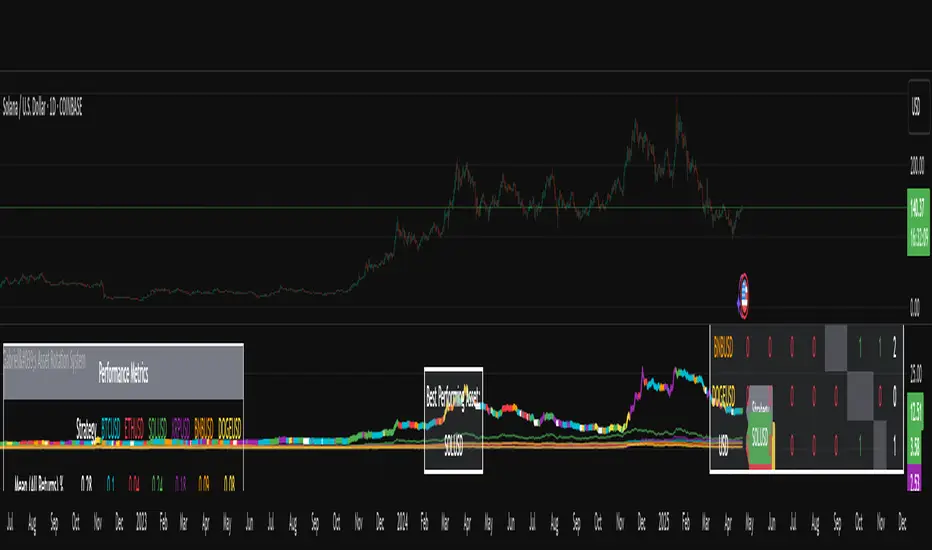
Gabriel's Asset Rotation System📈 Gabriel's Asset Rotation System
Overview
Gabriel’s Asset Rotation System is an advanced multi-asset trend-following tool that dynamically ranks and rotates up to 6 assets (plus USD) based on a customizable trend scoring matrix. Using enhanced signal detection techniques like Cauchy-weighted Supertrend, Jurík RSX, Fisherized CCI, Kalman-filtered PSAR, and Dynamic DMI Smoothing, the system identifies the most dominant asset and simulates strategy equity performance compared to buy-and-hold benchmarks.
🔍 Key Features
✅ Multi-Asset Rotation: Analyze up to 6 symbols and USD simultaneously.
✅ Relative Strength Matrix: Compares every asset against each other to find outperformers.
✅ Custom Trend Engine:
Jurik RSX with advanced RSX logic
Fisherized CCI for momentum confirmation
Kalman-smoothed PSAR for trend bias
SuperTrend using a Cauchy Moving Average
Smoothed DMI signal across looped periods (10–17)
✅ Dynamic Best Asset Detection: Identifies and tracks the asset with the highest trend score over time.
✅ Performance Table: Displays Sharpe, Sortino, and Omega Ratios along with drawdowns and means for both strategy and each asset.
✅ Visual Trend Matrix: Tabular view of asset strength comparisons against each other + final scoring.
✅ Realistic Strategy Equity Curve: Tracks performance assuming full capital rotation into the best asset.
✅ Alerts: Get notified when the top-performing asset changes.
⚙️ Inputs
🔹 Assets: Customize 6 tickers (crypto, stocks, ETFs, etc.)
🔹 Trend Classification Method:
RSI
CCI
SuperTrend
DMI
PSAR
or use all together
🔹 Jurik RSX Length
🔹 Fisherized CCI Length
🔹 Cauchy MA Gamma and ATR Settings
🔹 DMI Range and MA Type (SMA, EMA, HMA, etc.)
🔹 PSAR Parameters with Kalman smoothing
🔹 Custom Backtest Start Date
📊 Outputs
Plot 1: Best Asset Equity (colored dynamically)
Plot 2–7: Buy & Hold Curves for each asset (with labels)
Tables:
Rotation Matrix (bottom-right)
Best Performing Asset (bottom-center)
Performance Metrics Table (optional toggle)
🧠 Use Case Ideas
🔁 Dynamic Portfolio Rebalancing
⚖️ Compare Risk-Adjusted Returns Across Crypto or Stocks
🧪 Backtest Rotation Hypotheses
🚀 Identify Strongest Breakout Assets in Trend Environments
📉 Avoid Weakening Assets with Rising Drawdowns
🚨 Alerts
🔔 "New Optimal Asset": Triggers when a new top-ranking asset replaces the current one.
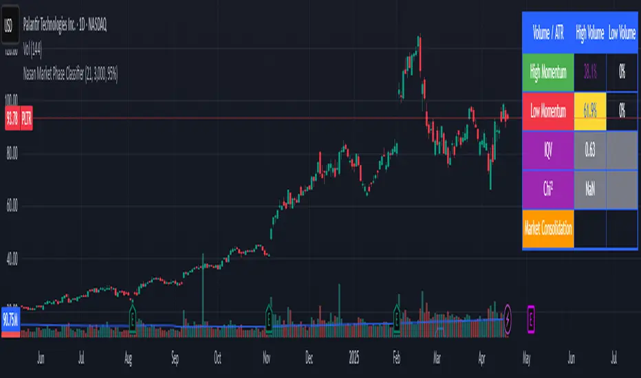
Nasan Market Phase ClassifierThe Nasan Market Phase Classifier indicator designed to classify market phases using volume, volatility (or momentum), and statistical analysis. Here's a summary of how it works and what it does:
🔍 Core Concept
This indicator classifies the market into four phases based on volume and ATR (or optionally momentum):
High Volume / High ATR or Momentum (HV/HATR): Strong Trend
Low Volume / High ATR or Momentum (LV/HATR): False Breakout / Exhaustion
High Volume / Low ATR or Momentum (HV/LATR): Consolidation
Low Volume / Low ATR or Momentum (LV/LATR): Stagnation
⚙️ Key Settings
Short-Term Length: Used for the active market phase.
Long-Term Length: Used as the expected/benchmark distribution.
Use Momentum: Replaces volatility (ATR) with momentum (custom ROC-based formula).
Use Fixed Alpha: Toggles adaptive vs. fixed weighting in scoring (this is based on variation of the volatility - standard deviation of true range).
📊 How It Works
Volatility or Momentum Scoring:
Uses ATR-based or Momentum-based score depending on the setting.
Applies weighing (alpha) which is based on variability of the volatility itself.
Market Phase Count:
Measures how often each of the 4 volume/volatility combinations occur in:
Short-term window (observed phase)
Long-term window (expected distribution)
Category Proportions:
Calculates percentage share of each category (e.g., % time in HV/HATR).
Plots these on chart to visually see market phase dominance (can be used for screening of pine screener).
Statistical Testing:
IQV (Index of Qualitative Variation): Measures phase diversity (0 = focused, 1 = mixed).
Chi-Squared Test: Compares current vs. historical phase distribution.
Z-Test: Tests if current phase dominance is statistically significant.
📋 Outputs
On-Chart Plots and Tabels:
Strong Trend, False Breakout/Exhaustion, Consolidation, Stagnation
Strength Quality Plot: Trend strength normalized by IQV.
Dynamic Table (Top Right):
Shows each phase’s proportion (the current phase cell is highlighted in yellow), IQV, Chi² value, and current dominant phase. The current candle classification (text) is in purple.
Highlights the dominant phase classification and color-codes significance (the cell highlighted in green highly confident about the classification, orange intermediate confidence and red low confidence). This color coding is not just based on statistical significance it is based on IQV which takes into account how spread the proportions are.
🧠 Interpretation
A dominant HV/HATR phase with low IQV and high Z-Score indicates a strong and statistically significant trend.
High IQV suggests uncertainty or mixed market behavior.
Chi² spike indicates a shift from historical behavior can be used to see is the market behavior changing by changing the long term length say to 252 and short term length to 21 this will tell if the short term behavior is different from the past 252 day behavior.
First FVG Custom Time RangeFirst FVG — Opening Range Fair Value Gap Detector
Smart Money Opening Imbalance Strategy Tool
This script automatically detects and highlights the first Fair Value Gap (FVG) that forms between 9:30 and 10:00 AM Eastern Time (New York session open) — a critical period often referred to as the Opening Range. It’s designed for Smart Money traders looking to isolate early-morning inefficiencies that may influence market behavior throughout the trading day.
🔍 What This Script Does:
Automatically Detects the First FVG in the Opening Range
Scans price action between 9:30 and 10:00 AM ET and identifies the first valid bullish or bearish FVG that forms.
Only one FVG is shown per day — ensuring a clean, focused view.
Draws a Visual Zone
Once detected, the FVG zone is extended forward on the chart (customizable duration).
A labeled zone helps users track how price reacts to it throughout the session.
Optional Retest Alerts
Alerts you when price re-enters the zone — a potential reaction point used by SMC traders.
Customization Options
Set your preferred session time window
Adjust zone duration (in bars)
Customize label font size, colors, and visibility
Enable/disable alert on retest
📈 Why the First FVG Matters:
Time-Sensitive Setup: The first FVG typically forms no earlier than 9:31 AM ET and represents a potential “time distortion” or imbalance zone created by aggressive market participants during the open.
Behavioral Study: Many traders journal how price behaves around this zone each day — whether it acts as support, resistance, or gets traded through later in the session.
Predictive Value: Observing how this zone is respected or broken can provide anticipatory insight into intraday price action, rather than reactive analysis.
Great for New Traders: This opening FVG is often recommended as a starting reference point for building trade models and understanding how institutional imbalances unfold.
🚀 What Makes It Unique:
This tool doesn’t spam your chart with every FVG. It laser-focuses on a single, time-bound zone backed by institutional logic — the first presented imbalance of the day during the opening range.
Use it to:
Monitor price behavior around early inefficiencies
Plan journal entries and pattern recognition
Align intraday setups with a high-probability SMC model
Whether you’re scalping, journaling market structure, or refining entries based on liquidity behavior — this script helps you make the first 30 minutes count.

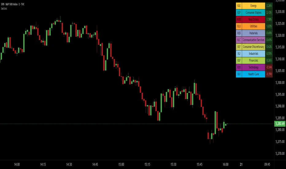
SPDR Sectors TableThis script generates an interactive and customizable SPDR Sectors Table designed to monitor and analyze the performance of the 11 main sectors of the S&P 500 via sector-specific ETFs. It offers a dynamic overview of daily or periodic sector movements, making it a valuable tool for traders, analysts, and investors implementing sector rotation strategies.
█ DEFINITIONS
SPDR Sectors ETFs are exchange-traded funds managed by State Street Global Advisors, which divide the S&P 500 into the following 11 sectors:
- Communication Services (XLC)
- Consumer Discretionary (XLY)
- Consumer Staples (XLP)
- Energy (XLE)
- Financials (XLF)
- Health Care (XLV)
- Industrials (XLI)
- Materials (XLB)
- Real Estate (XLRE)
- Technology (XLK)
- Utilities (XLU)
These ETFs aim to replicate the performance of their respective sectors as defined by the Global Industry Classification Standard (GICS). The funds are periodically rebalanced to match changes in the S&P 500 composition, offering an accurate snapshot of sectoral trends.
█ INDICATOR
The table displays each sector's ticker and full name, following official GICS terminology and SPDR color coding. It also shows percentage performance, calculated daily on intraday charts or based on the selected time frame.
Users can sort the table by either percentage performance or the relative weight of each ETF in the S&P 500. The default weight values reflect data updated as of 17 April 2025, and can be manually adjusted based on the most recent sector weightings available on the official SPDR website.
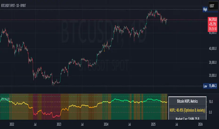
Bitcoin NUPL IndicatorThe Bitcoin NUPL (Net Unrealized Profit/Loss) Indicator is a powerful metric that shows the difference between Bitcoin's market cap and realized cap as a percentage of market cap. This indicator helps identify different market cycle phases, from capitulation to euphoria.
// How It Works
NUPL measures the aggregate profit or loss held by Bitcoin investors, calculated as:
```
NUPL = ((Market Cap - Realized Cap) / Market Cap) * 100
```
// Market Cycle Phases
The indicator automatically color-codes different market phases:
• **Deep Red (< 0%)**: Capitulation Phase - Most coins held at a loss, historically excellent buying opportunities
• **Orange (0-25%)**: Hope & Fear Phase - Early accumulation, price uncertainty and consolidation
• **Yellow (25-50%)**: Optimism & Anxiety Phase - Emerging bull market, increasing confidence
• **Light Green (50-75%)**: Belief & Denial Phase - Strong bull market, high conviction
• **Bright Green (> 75%)**: Euphoria & Greed Phase - Potential market top, historically good profit-taking zone
// Features
• Real-time NUPL calculation with customizable smoothing
• RSI indicator for additional momentum confirmation
• Color-coded background reflecting current market phase
• Reference lines marking key transition zones
• Detailed metrics table showing NUPL value, market sentiment, market cap, realized cap, and RSI
// Strategy Applications
• **Long-term investors**: Use extreme negative NUPL values (deep red) to identify potential bottoms for accumulation
• **Swing traders**: Look for transitions between phases for potential trend changes
• **Risk management**: Consider taking profits when entering the "Euphoria & Greed" phase (bright green)
• **Mean reversion**: Watch for overbought/oversold conditions when NUPL reaches historical extremes
// Settings
• **RSI Length**: Adjusts the period for RSI calculation
• **NUPL Smoothing Length**: Applies moving average smoothing to reduce noise
// Notes
• Premium TradingView subscription required for Glassnode and Coin Metrics data
• Best viewed on daily timeframes for macro analysis
• Historical NUPL extremes have often marked cycle bottoms and tops
• Use in conjunction with other indicators for confirmation
Volume Range Profile with Fair Value (Zeiierman)█ Overview
The Volume Range Profile with Fair Value (Zeiierman) is a precision-built volume-mapping tool designed to help traders visualize where institutional-level activity is occurring within the price range — and how that volume behavior shifts over time.
Unlike traditional volume profiles that rely on fixed session boundaries or static anchors, this tool dynamically calculates and displays volume zones across both the upper and lower ends of a price range, revealing point-of-control (POC) levels, directional volume flow, and a fair value drift line that updates live with each candle.
You’re not just looking at volume anymore. You’re dissecting who’s in control — and at what price.
⚪ In simple terms:
Upper Zone = The upper portion of the price range, showing concentrated volume activity — typically where selling or distribution may occur
Lower Zone = The lower portion of the price range, highlighting areas of high volume — often associated with buying or accumulation
POC Bin = The bin (price level) with the highest traded volume in the zone — considered the most accepted price by the market
Fair Value Trend = A dynamic trend line tracking the average POC price over time — visualizing the evolving fair value
Zone Labels = Display real-time breakdown of buy/sell volume within each zone and inside the POC — revealing who’s in control
█ How It Works
⚪ Volume Zones
Upper Zone: Anchored at the highest high in the lookback period
Lower Zone: Anchored at the lowest low in the lookback period
Width is user-defined via % of range
Each zone is divided into a series of volume bins
⚪ Volume Bins (Histograms)
Each zone is split into N bins that show how much volume occurred at each level:
Taller = More volume
The POC bin (Point of Control) is highlighted
Labels show % of volume in the POC relative to the whole zone
⚪ Buy vs Sell Breakdown
Each volume bin is split by:
Buy Volume = Close ≥ Open
Sell Volume = Close < Open
The script accumulates these and displays total Buy/Sell volume per zone.
⚪ Fair Value Drift Line
A POC trend is plotted over time:
Represents where volume was most active across each range
Color changes dynamically — green for rising, red for falling
Serves as a real-time fair value anchor across changing market structure
█ How to Use
⚪ Identify Key Control Zones
Use Upper/Lower Zone structures to understand where supply and demand is building.
Zones automatically adapt to recent highs/lows and re-center volume accordingly.
⚪ Follow Institutional Activity
Watch for POC clustering near price tops or bottoms.
Large volumes near extremes may indicate accumulation or distribution.
⚪ Spot Fair Value Drift
The fair value trend line (average POC price) gives insight into market equilibrium.
One strategy can be to trade a re-test of the fair value trend, trades are taken in the direction of the current trend.
█ Understanding Buy & Sell Volume Labels (Zone Totals)
These labels show the total buy and sell volume accumulated within each zone over the selected lookback period:
Buy Vol (green label) → Total volume where candles closed bullish
Sell Vol (red label) → Total volume where candles closed bearish
Together, they tell you which side dominated:
Higher Buy Vol → Bullish accumulation zone
Higher Sell Vol → Bearish distribution zone
This gives a quick visual insight into who controlled the zone, helping you spot areas of demand or supply imbalance.
█ Understanding POC Volume Labels
The POC (Point of Control) represents the price level where the most volume occurred within the zone. These labels break down that volume into:
Buy % – How much of the volume was buying (price closed up)
Sell % – How much was selling (price closed down)
Total % – How much of the entire zone’s volume happened at the POC
Use it to spot strong demand or supply zones:
High Buy % + High Total % → Strong buying interest = likely support
High Sell % + High Total % → Strong selling pressure = likely resistance
It gives a deeper look into who was in control at the most important price level.
█ Why It’s Useful
Track where fair value is truly forming
Detect aggressive volume accumulation or dumping
Visually split buyer/seller control at the most relevant price levels
Adapt volume structures to current trend direction
█ Settings Explained
Lookback Period: Number of bars to scan for highs/lows. Higher = smoother zones, Lower = reactive.
Zone Width (% of Range): Controls how much of the range is used to define each zone. Higher = broader zones.
Bins per Zone: Number of volume slices per zone. Higher = more detail, but heavier on resources.
-----------------
Disclaimer
The content provided in my scripts, indicators, ideas, algorithms, and systems is for educational and informational purposes only. It does not constitute financial advice, investment recommendations, or a solicitation to buy or sell any financial instruments. I will not accept liability for any loss or damage, including without limitation any loss of profit, which may arise directly or indirectly from the use of or reliance on such information.
All investments involve risk, and the past performance of a security, industry, sector, market, financial product, trading strategy, backtest, or individual's trading does not guarantee future results or returns. Investors are fully responsible for any investment decisions they make. Such decisions should be based solely on an evaluation of their financial circumstances, investment objectives, risk tolerance, and liquidity needs.

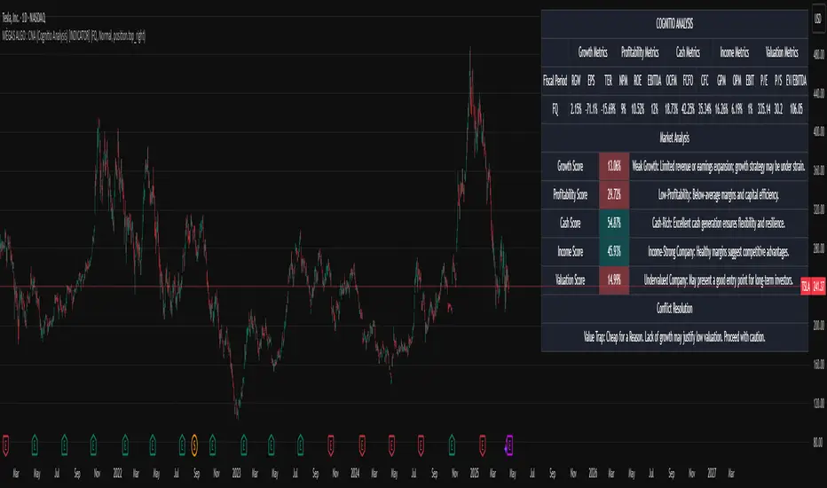
MÈGAS ALGO : CNA (Cognitio Analysis) [INDICATOR]Overview
The CNA (Cognitio Analysis) is a comprehensive financial analysis tool designed to evaluate the overall health and potential of a market or company based on fundamental metrics. It aggregates data across five key metric groups—**Growth**, **Profitability**, **Cash Flow**, **Income**, and **Valuation**—to provide a final interpretation of market conditions. The indicator dynamically adapts to the selected fiscal period (Quarter, Year, or Trailing Twelve Months) and delivers insights into dominant trends and conflicting signals.
Key Features
1. Customizable Fiscal Period:
- Users can select between "Quarter", "Year", or "Trailing Twelve Months" (TTM) to analyze data for their desired timeframe.
2. Dynamic Table Visualization:
- Displays raw metric values, aggregated scores, and the final interpretation in an intuitive
table.
- Highlights the final interpretation with dynamic background colors (`color.teal` for bullish,
`color.red` for bearish, etc.).
3. Comprehensive Data Integration:
- Pulls financial data using TradingView's `request.financial()` function for metrics like
revenue, earnings, margins, and valuation ratios.
4. Normalization and Scoring:
- Normalizes data to create a consistent scoring system, ensuring accurate comparisons across
metrics.
How It Works
1. Metric Group Analysis
- Growth Metrics: Measures revenue growth, earnings per share (EPS) growth, and tax
efficiency.
- Profitability Metrics: Analyzes net profit margin, return on equity (ROE), and EBITDA margin.
- Cash Metrics: Assesses operating cash flow margin, free cash flow to operating cash flow
ratio, and cash flow coverage.
- Income Metrics: Examines gross profit margin, operating profit margin, and EBIT margin.
- Valuation Metrics: Evaluates price-to-earnings (P/E), price-to-sales (P/S), and enterprise
value-to-EBITDA (EV/EBITDA).
2. Dynamic Scoring System
- Metrics are normalized to ensure consistency across different scales.
- A geometric mean is used to calculate scores for each metric group, ensuring that all metrics
within a group contribute equally to the final score.
3. Dominant Trend Identification
- Scores from all five metric groups are aggregated to determine the **dominant trend** of the
market.
- The dominant trend is categorized as:
- Bullish: Strong fundamentals across most metrics.
- Bearish: Weak fundamentals across most metrics.
- Neutral: Balanced conditions with no clear direction.
- Unclear: Mixed signals dominate, requiring further monitoring.
4. Conflicting Signals Interpretation
- The indicator identifies scenarios where metrics conflict (e.g., high growth but low valuation).
- These conflicting signals provide nuanced insights into market conditions, highlighting rare opportunities or potential risks.
How to Use the Indicator
1. Select Fiscal Period:
- Choose between "FQ", "FY", or "TTM" to analyze data for the desired timeframe.
2. Review Metric Scores:
- Examine the scores for each metric group (Growth, Profitability, Cash, Income, Valuation) to
understand the underlying performance.
3. Interpret Final Output:
- The final interpretation provides a summary of the dominant trend and conflicting signals,
helping users make informed decisions.
4. Dynamic Coloring:
- Use the dynamic background colors in the table to quickly identify market sentiment
(bullish, bearish, neutral, or mixed).
Applications
- Identifying Opportunities:
- Look for bullish dominant trends combined with undervalued growth opportunities for
potential long positions.
- Avoiding Risks:
- Watch out for bearish dominant trends with overvaluation alerts to avoid potential losses.
- Monitoring Neutral Markets:
- Use the indicator to identify neutral markets and wait for clearer signals before making
decisions.
Conclusion
The CNA (Cognitio Analysis) is a powerful tool for traders and investors seeking to make informed decisions based on fundamental analysis. By combining detailed metric evaluations, dynamic scoring, and sentiment-based interpretations, this indicator provides a comprehensive view of market conditions. Whether you're identifying undervalued opportunities, avoiding overvalued risks, or monitoring neutral markets, this indicator equips you with the insights needed to navigate complex financial landscapes.
Please Note:
This indicator is provided for informational and educational purposes only. It is not financial advice, and it should not be considered a recommendation to buy, sell, or trade any financial instrument. Trading involves significant risks, including the potential loss of your entire investment. Always conduct your own research and consult with a licensed financial advisor before making any trading decisions.
The results and images provided are based on algorithms and historical/paid real-time market data but do not guarantee future results or accuracy. Use this tool at your own risk, and understand that past performance is not indicative of future outc
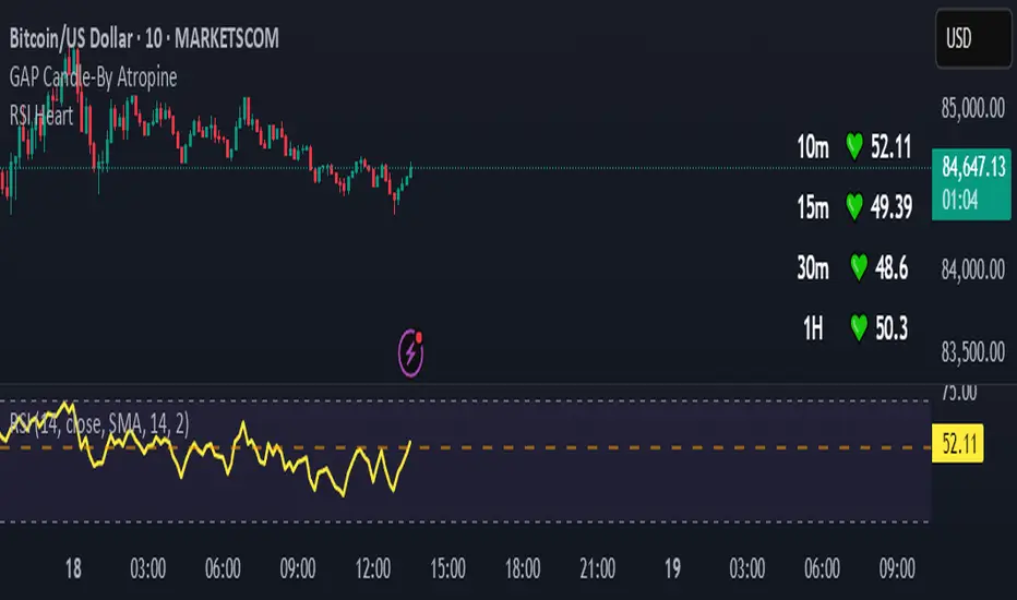
RSI HeartHere's an introduction you can use for your RSI Heart indicator:
---
### RSI Heart Indicator
The **RSI Heart Indicator** provides a visually engaging way to monitor and track the **Relative Strength Index (RSI)** across multiple timeframes (10m, 15m, 30m, and 1H). It not only shows the RSI value but also uses heart-shaped symbols to reflect the current market condition based on RSI levels, making it easier to understand the strength and momentum of a given asset at a glance.
### Key Features:
- **Multi-Timeframe Support**: The indicator pulls the RSI values from multiple timeframes (10 minutes, 15 minutes, 30 minutes, and 1 hour) so you can analyze market strength at different intervals in one view.
- **Heart Symbols**: RSI values are displayed alongside heart emojis (❤️, 💛, 💚) that provide a visual cue for the market condition:
- **❤️ (Overbought or Oversold)**: When RSI is below 27 or above 73.
- **💛 (Near Oversold/Overbought)**: When RSI is between 27-30 or 70-73.
- **💚 (Neutral)**: When RSI is between 30 and 70.
- **Customizable Visibility**: Toggle visibility for each timeframe's RSI using simple on/off settings, giving you control over which timeframes are displayed in your chart.
### How it Can Help:
- **Quick Market Sentiment Analysis**: The heart symbols and RSI values allow you to quickly assess whether an asset is in an overbought or oversold condition.
- **Multi-Timeframe RSI**: By viewing RSI across multiple timeframes, you can gain a more comprehensive understanding of market momentum and strength.
- **Personalized to Your Preferences**: Adjust the settings to only show the timeframes that matter most to you, creating a customized and clean chart view.
This indicator helps traders make more informed decisions by providing a clear, easy-to-read representation of market conditions across various timeframes, all within one indicator.
---
This introduction explains what the indicator does, its features, and how it can benefit traders in a concise and easy-to-understand way.
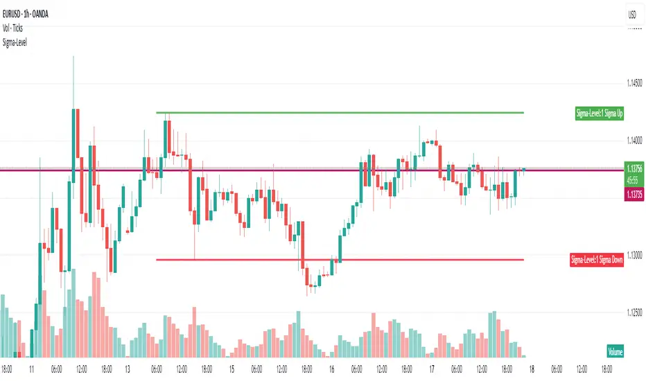
Sigma-Level1-Sigma-Level Indicator (for 28 FX Pairs)
This TradingView indicator calculates and visualizes the 1-sigma price projection range for the current FX pair, based on implied volatility (IV) and a user-defined reference price.
🔧 User Inputs
1. Implied Volatility (IV) Selection
You can choose which volatility term to apply:
ON (Overnight)
1W (1 Week)
1M (1 Month)
Each currency pair uses manually entered IV values (in %), grouped by base currency (USD, EUR, GBP, etc.).
www.investing.com
2. Base Price Selection
You can define the price level used as the anchor for the sigma projection:
CurrentPrice — live market price
YesterdayClose — close of the previous day
LastHourClose — close of the last 1-hour candle
LastFriday — weekly close from last Friday
LastMonthClose — close of the previous monthly candle
LastYearClose — close of the previous yearly candle
These values are retrieved using the appropriate timeframe (D, W, M, 12M, or 60 for hourly).
📐 How the Calculation Works
The indicator calculates the 1σ range using this formula:
1σ Range = basePrice × (IV / √N) / 100
Where:
basePrice is the selected anchor price.
IV is the selected implied volatility for the current pair.
N is the number of periods per year, depending on the IV term:
√252 for ON (trading days)
√52 for 1W (weeks)
√12 for 1M (months)
The upper and lower bands are then:
1σ Up = basePrice + range
1σ Down = basePrice - range
These bands are plotted only during the current calendar week.
🖼️ Visual Output
Green Line: 1σ Upper Boundary
Red Line: 1σ Lower Boundary
Labels show the exact 1σ values at the most recent bar
⚠️ Disclaimer
This indicator is for informational and analytical purposes only. It does not constitute financial advice, a trading signal, or a guarantee of future performance. Always perform your own research and consult with a qualified financial advisor before making trading decisions.
Filtered Stochastic MA🔴 Filtered Stochastic MA (FSM) 🔴
Filtered Stochastic MA (FSM) is an all‑in‑one overlay that combines an adaptive moving average, momentum analysis, and dual volatility bands to give you clear, actionable levels on any chart.
🔧 Core Components
Center MA with “Custom” Filters
Choose from familiar SMAs, EMAs, WMAs, HMAs, RMAs … or select “Custom 1” and “Custom 2” for two proprietary smoothing methods that react gracefully in both trends and chop.
Tune the length to match your style—from fast scalp MAs (10–20) to smoother swing MAs (50+).
Hidden Stochastic Momentum
A built‑in %K/%D oscillator runs quietly under the hood, helping the bands adapt to shifting momentum without cluttering your chart.
Dual SuperTrend‑Style Bands
Band 1 (standard multipliers) hugs the Center MA to mark early support/resistance.
Band 2 (double multipliers) creates a wider envelope for breakout thresholds and over‑extension signals.
Both fade or highlight based on market direction for instant visual cues.
⚙️ Key Settings
Setting Description
MA Type & Length Pick your smoothing style and period.
Stochastic Length Controls momentum sensitivity.
Band Multipliers ATR & StdDev factors for Band 1 (and ×2 for Band 2).
Color Controls Customize colors and opacity for each band and the MA.
Non‑Repainting Lock signals to the previous bar for extra safety.
📈 How to Trade with FSM
1. Trend‑Following Entries
Long when price pulls back toward Support Band 1 in an uptrend (price > Center MA and Support Band 1 is rising).
Short when price rallies into Resistance Band 1 in a downtrend (price < Center MA and Resistance Band 1 is falling).
Example: On a 15 min chart of EUR/USD, set MA = 20 EMA, ATR = 1, StdDev = 1. When price dips to the green Band 1 and then closes back above it, risk a long with stop just below the band.
2. Breakout & Exhaustion Plays
A decisive close above Resistance Band 2 signals a strong breakout. Look to ride the impulse or wait for a retest of Band 2 as support.
Conversely, a break below Support Band 2 can mark trend exhaustion or a reversal opportunity.
Example: On a 1 hour BTCUSD chart with MA = 50 (Custom 1), watch for candle closes beyond the outer fuchsia band—enter on a successful retest for better risk/reward.
3. Mean‑Reversion Scalp Setups
In range or low‑volatility conditions, price swings outside Band 1 often snap back toward the Center MA. Fade these extremes on fast timeframes (1–5 min).
Example: On a 5 min Apple stock chart, when the price spikes above Resistance Band 1 and fails to hold, short toward the Center MA for a quick scalp.
4. Momentum Confirmation
Use the hidden stochastic readings (via the Data Window or your own alerts) to confirm entries:
Favor long setups when momentum is rising.
Avoid shorts when momentum remains strong above 50, even if bands are touched.
FSM brings together smoothing, momentum, and volatility in a single, clean overlay. Adjust the “Custom” filters and band widths to match your market and timeframe, and use the examples above as a starting point to build your own high‑probability setups.
Add “Filtered Stochastic MA (FSM)” to your TradingView chart today and turn noisy data into precision entry and exit zones!
Caution:
This is an educational idea, past performance or what you see on a chart may not be repeatable behavior. Trade at your own risk.
Regards!
Crosby Ratio | QuantumResearch ⚖️ Crosby Ratio | QuantumResearch
A Heikin-Ashi Smoothed Momentum Oscillator for Trend Strength & Market Rotation
Inspired by the Original Work of Bitcoin Magazine Pro
🔗 www.bitcoinmagazinepro.com
📘 Overview
The Crosby Ratio, as originally conceptualized by Bitcoin Magazine Pro, is a powerful tool used to evaluate the momentum and directional strength of price movement by analyzing the slope of market trends in degrees.
This enhanced implementation by QuantumResearch builds on the original concept with a Pine Script version tailored for trading charts, integrating Heikin-Ashi smoothing, ATR scaling, and customizable visual modes to fit traders' unique styles.
🧠 What Is the Crosby Ratio?
At its core, the Crosby Ratio uses angular measurement to quantify price movement — translating price trend strength into degrees. This approach allows traders to:
📈 Identify when the market is exhibiting strong upward or downward pressure
🚨 Spot overextended or overheated trend conditions
⚖ Filter out short-term noise and focus on macro momentum
🔍 1. Key Innovations by QuantumResearch
✅ Heikin-Ashi Smoothing: Reduces noise and stabilizes price action before computing momentum angles
✅ Custom atan2() Angular Function: Measures the directional angle between smoothed price changes and ATR-based scaling
✅ Dynamic Threshold Bands: Color-coded zones highlight overbought/oversold momentum regions
✅ Fully Customizable Palette: Choose from 8 visual themes with automatic color adaptation
📊 2. Interpretation Guide
Crosby Value Interpretation
> +18° 🚀 Strong bullish trend acceleration
+13° to +18° 📈 Moderate upward momentum
-9° to +13° ⚖ Neutral/transition phase
-15° to -9° 📉 Moderate bearish pressure
< -15° 🛑 Strong bearish acceleration
The indicator also features background shading when values exceed key thresholds, improving visual clarity during trend inflection points.
📌 Ideal Use Cases
🔄 Rotational Momentum Strategies: Spot the strongest assets during rapid shifts
⚡ Breakout Filtering: Confirm whether breakouts have directional strength
🧘 Noise Reduction: Heikin-Ashi smoothing filters chaotic wicks, especially in crypto
📉 Bearish Exhaustion Detection: Quickly identify when bearish momentum might be overdone
🔗 Original Inspiration & Acknowledgment
This indicator draws its core idea and naming convention from the original Crosby Ratio developed and introduced by Bitcoin Magazine Pro in their excellent write-up:
🔗 The Crosby Ratio – Bitcoin Magazine Pro
Their work on quantifying market sentiment via angle-based momentum inspired this script adaptation for TradingView with added visual features, smoothing techniques, and alerts.
⚠️ Disclaimer
This indicator is a momentum oscillator and should be used in conjunction with other confirmation tools. Market dynamics can vary, and no single metric ensures profitable trades. Always apply proper risk management.

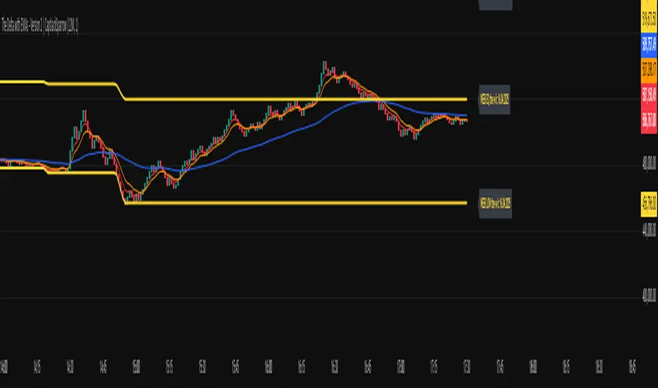
The Delta with EMAs - Version 2 | CaptJackSparrow📊 The Delta with EMAs - Version 2 16th April 25 working copy it is not finished yet!!!!!!!| CaptJackSparrow
This updated script takes your trading to the next level by merging dynamic volume delta with customizable EMAs and Fibonacci levels, all enhanced with session-based background highlights.
🧩 Cumulative Volume Delta (CVD):
Visualize market sentiment and volume flow with step-line candles, showing the tug-of-war between buyers and sellers.
Real-time tracking of volume dynamics with customizable timeframes and session-specific calculations.
📈 Exponential Moving Averages (EMAs):
EMAs (3, 5, 8, 9, 15, 24, 30, 60, 90) plotted on CVD to reveal trend direction and momentum shifts.
Customizable visibility settings for each EMA, with background coloring when the EMAs align to highlight momentum zones.
📊 Fibonacci Levels:
Overnight and New York sessions: Track the high, low, and midpoint (equilibrium) for each session to gauge market sentiment.
Weekly Fibonacci: See the high, low, and midpoint for the week, with dynamic labels updating as the week progresses.
🌍 Session Highlights:
Display colored backgrounds for New York, Overnight, Europe, Asia, and After Hours sessions, helping you identify active market periods.
Customizable start/end times for each session with visual color options.
🔔 Alerts & Visuals:
EMA crossovers and background colors help spot key momentum shifts.
Tailored alerts based on the crossover of the EMAs, helping you track potential entries or exits.
🧠 Ideal for traders who love:
Understanding market structure through volume analysis.
Using multiple session contexts for more precise trading decisions.
Anticipating breakouts or divergences with dynamic Fibonacci and EMA support.
🏴☠️ Disclaimer: This script is for educational purposes only and is not financial advice. Always trade responsibly and consider market risks.
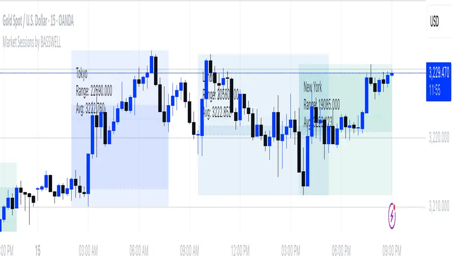
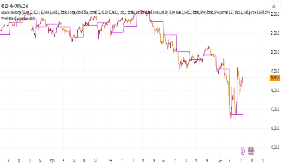
Market Sessions by BASSWELLThis TradingView indicator visually highlights major global trading sessions (Tokyo, London, New York) directly on intraday charts. It provides a clear, color-coded display of session activity and key statistics to help traders better understand session dynamics and overlaps.
✅ Key Features:
Visual Session Boxes: Draws background boxes for each session with configurable colors.
Session Names: Displays the name of each session as a label above the session box.
Open/Close Lines: Optionally shows dashed lines at session open and close prices.
Average Price Line: Plots the average session price as a dotted line.
Tick Range Display: Calculates and shows the high-low range in ticks.
Time Zone Support: Fully timezone-aware via IANA definitions (e.g. "Europe/London").
Overlap Handling: Automatically dims older sessions when a new one starts for visual clarity.
🔧 Configurable Parameters:
Show/hide each session individually.
Set session times and timezones.
Customize label visibility and box contents.
Adjust session colors with transparency.
Includes basic visual styling for better chart readability.
⚠️ Note: Works only on intraday timeframes. Daily/weekly/monthly charts are not supported.
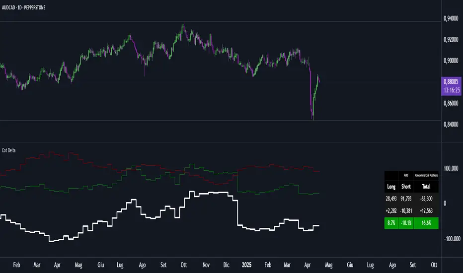
Cot DeltaCOT Delta by Jacopo
Designed to visualize and analyze data related to the Commitment of Traders (COT) report, which is published by the Commodity Futures Trading Commission (CFTC) in the United States. Its primary purpose is to display the long and short positions of traders on futures contracts, divided by categories like Commercial, Noncommercial, and Nonreportable.
Main Features:
Selection Mode: The user can choose from several modes to display COT data, such as "Auto", "Root", "Base currency", or "Currency". This determines which currency will be shown on the chart.
Contract Type: It is possible to select whether to display data for Futures, Options, or both (Futures + Options).
COT Category: The user can choose one of the trader categories like Commercial Positions, Noncommercial Positions, or Nonreportable Positions to analyze positions based on the type of market participant.
Data Visualization: The chart shows long, short, and net positions (long - short) with separate lines, using different colors for each type of position:
Long positions in green.
Short positions in red.
Net difference (long - short) in white.
Data Table: A table is displayed to present the data clearly, with the following columns:
Long: Long positions.
Short: Short positions.
Total: The net sum of positions (long - short).
Changes: The difference between current and previous data (delta) in both absolute and percentage terms.
Variation Visualization: The table also shows the variations from the previous period (both in absolute and percentage terms), with conditional background colors to highlight positive or negative changes.
Optional CFTC Code: The user can input a custom CFTC code to analyze specific data, if necessary.
In Summary:
This indicator provides a clear and precise visualization of trader positions (long and short) on futures and options contracts, making it easier to analyze market dynamics related to commercial and non-commercial traders. The combination of a chart and table allows for real-time tracking of position changes.
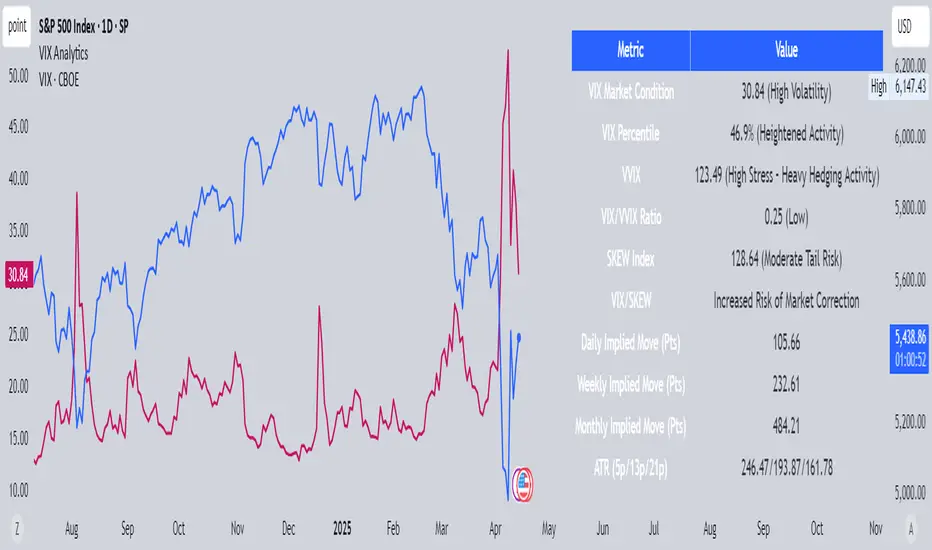
VIX AnalyticsThis script is designed to serve traders, analysts, and investors who want a real-time, comprehensive view of market volatility, risk sentiment, and implied movements. It combines multiple institutional-grade volatility indices into one clear dashboard and interprets them with actionable insights — directly on your chart.
🔍 Features Included
🟦VIX (CBOE Volatility Index)
Measures market expectation of 30-day S&P 500 volatility.
Color-coded interpretation ranges:
Under 13: Extreme Complacency
15–20: Stable Market
20–30: Moderate Risk
30–40: High Volatility
Over 40: Panic
🟪 VVIX (Volatility of Volatility Index)
Tracks the volatility of VIX itself.
Interpreted as a risk gauge of how aggressively traders are hedging volatility exposure.
Under 80: Market Complacency
80–100: Normal Environment
100–120: Caution — Rising Volatility of Volatility
Over 120: High Stress — Elevated Hedging Activity
🟨 SKEW Index
Measures the perceived tail risk of the S&P 500 — i.e., the probability of a black swan event.
Below 110: Potential Complacency
120–140: Moderate Tail Risk
Above 140: High Tail Risk
🧮 VIX/VVIX Ratio
Gauges relative fear levels between expected volatility and the volatility of volatility.
Under 0.5: Low Ratio — VVIX Overextended
Over 0.9: High Ratio — VIX Leading
📈 VIX Percentile (1-Year Range)
Shows where the current VIX sits relative to its 1-year high/low.
Under 20%: Volatility is Cheap
Over 70%: Fear is Elevated — Reversal Possible
📉 SPX Implied Point Moves
Projects expected moves in SPX using VIX-derived volatility:
Daily
Weekly
Monthly
Helps size positions or define expected price ranges based on volatility regime.
📊 ATR Values (5, 13, 21 periods)
Traditional volatility using historical prices.
Provided alongside implied data for comparison.
🧠 Unique Logic & Interpretation Layer
This script doesn’t just show raw data — it interprets it. It reads the relationship between VIX, VVIX, and SKEW to highlight:
When market volatility may be underpriced
When hidden tail risks are forming
When to be cautious of volatility expansions
How current implied movement compares to past realized volatility
✅ Use Cases
Day traders: Know when volatility is low or expanding before scalping or swinging.
Options traders: Identify whether implied volatility is cheap or expensive.
Portfolio managers: Gauge when hedging is in demand and adjust exposure.
Risk managers: Crosscheck if current volatility aligns with macro risk events.
⚙️ Settings
Customizable table placement: Move the dashboard to any corner of your chart.
No repainting or lag: Data updates in real-time using official CBOE and SPX feeds.
Weekly Open (Current Week Only)📘 Indicator Name: Weekly Open (Current Week Only)
📝 Description:
This indicator plots a horizontal line representing the weekly open price, visible only during the current trading week. At the beginning of each new week (based on TradingView’s weekly time segmentation), the indicator captures the open price of the first candle and draws a constant line across the chart until the week ends. Once the new week begins, the line resets and updates with the new weekly open.
🎯 How to Use – ICT Concepts Integration (Weekly Profile):
This tool is designed to complement ICT (Inner Circle Trader) trading strategies, particularly within the weekly profile framework, by offering a clear and persistent visual of the weekly open, which is a critical reference point in ICT’s market structure theory.
✅ Use Cases:
Directional Bias:
According to ICT concepts, price trading above the weekly open suggests a bullish bias for the week, while trading below it implies bearish conditions.
Traders can use the weekly open line to align their intraweek trades with higher timeframe directional bias.
Dealing Ranges:
Weekly open helps frame the weekly dealing range, especially when combined with other levels like weekly high/low or previous week’s range.
It allows traders to identify potential liquidity pools or areas where price may seek to rebalance.
Mean Reversion Entries:
Price often reverts to or reacts from the weekly open. Traders may use this as a target or entry level, particularly during Monday/Tuesday setups.
Works well in conjunction with concepts like OTE (Optimal Trade Entry) and Judas Swings.
Risk Management:
Acts as a clean and visual anchor to structure stop losses or take-profits based on weekly bias shifts.
SR Intensity CandleThis is a very simple script intended to find just what the title says, "Intensity Candles" is what i am calling them. A bullish intensity candle is taking the low of the previous candle and the close is above the previous candle high. Bearish intensity candle is the opposite, a candle that takes the high of the previous candle and the close is below the low of the previous candle.
Alternatively, if a "bullish" intensity candle is the mitigated and price pushes below, you can expect a back test short of the "bullish" intensity candle. They will act as SR zones for the future price action.
The BEST and most ideal spot for the intensity candles to happen is the see a bullish candle at the low of a move and a bearish candle at the highs indicating strong movement for reversal.
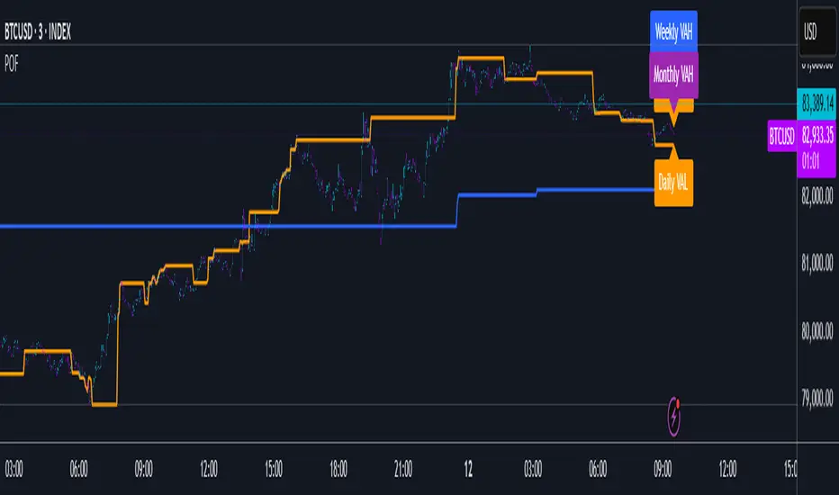
POF🔶 Smoothed POF Profile – Multi-Session Market Structure Tool 🔶
The Smoothed POF Profile is a precision-engineered market structure indicator that identifies the Point of Focus (POF) — the price level where market participation was most active — across Daily, Weekly, and Monthly sessions and plots them with smoothed over form to avoid whipsaws.
🔍 Powered by a custom-built algorithm for session profiling, this tool highlights:
🔶 POF: The most frequently traded or accepted price during a session
🟩 VAH / VAL: Dynamic Value Area High and Low markers (no cluttered lines — clean label-only display)
📐 The core logic utilizes a proprietary data refinement method that adapts to session volatility and filters out insignificant noise to avoid false shifts in structure. This results in smoothed POF readings that remain stable and meaningful — even during high-volatility periods.
🧠 Designed for traders who want to track evolving value, this tool provides a high-level view of where the market is finding agreement — and where price is likely to revert or expand from.
✅ Key Features:
Fully automated: Tracks Daily, Weekly, and Monthly sessions in real-time
Session-aware calculation of key structure levels
Elegant, non-obtrusive chart visuals (no histogram or volume bars)
Fully configurable Value Area % and display toggles
Multi-session color-coding (🟧 Daily, 🔵 Weekly, 🟣 Monthly)
🧭 Trading Applications:
POF Bias: Use POF as an evolving balance point. Price above = bullish lean, price below = bearish tilt
VAH/VAL Zones: Anticipate rejection or consolidation when price re-enters the value area. Use breakouts for continuation bias
Session Stack Confluence: When Daily, Weekly, and Monthly POFs cluster, it often signals strong interest zones and potential turning points
🧩 Use alongside your preferred price action, volume, or trend confirmation tools. This is not a signal-based system — it’s a contextual framework to help you align with market intent and structure.
⚠️ Disclaimer: This tool is intended for educational and informational purposes only. It is not financial advice. Use with proper risk management and your own due diligence.