Weighted Multi-Mode Oscillator [BackQuant]Weighted Multi‑Mode Oscillator
1. What Is It?
The Weighted Multi‑Mode Oscillator (WMMO) is a next‑generation momentum tool that turns a dynamically‑weighted moving average into a 0‑100 bounded oscillator.
It lets you decide how each bar is weighted (by volume, volatility, momentum or a hybrid blend) and how the result is normalised (Percentile, Z‑Score or Min‑Max).
The outcome is a self‑adapting gauge that delivers crystal‑clear overbought / oversold zones, divergence clues and regime shifts on any market or timeframe.
2. How It Works
• Dynamic Weight Engine
▪ Volume – emphasises bars with exceptional participation.
▪ Volatility – inverse ATR weighting filters noisy spikes.
▪ Momentum – amplifies strong directional ROC bursts.
▪ Hybrid – equal‑weight blend of the three dimensions.
• Multi‑Mode Smoothing
Choose from 8 MA types (EMA, DEMA, HMA, LINREG, TEMA, RMA, SMA, WMA) plus a secondary smoothing factor to fine‑tune lag vs. responsiveness.
• Normalization Suite
▪ Percentile – rank vs. recent history (context aware).
▪ Z‑Score – standard deviations from mean (statistical extremes).
▪ Min‑Max – scale between rolling high/low (trend friendly).
3. Reading the Oscillator
Zone Default Level Interpretation
Bull > 80 Acceleration; momentum buyers in control
Neutral 20 – 80 Consolidation / no edge
Bear < 20 Exhaustion; sellers dominate
Gradient line/area automatically shades from bright green (strong bull) to deep red (strong bear).
Optional bar‑painting colours price bars the same way for rapid chart scanning.
4. Typical Use‑Cases
Trend Confirmation – Set Weight = Hybrid, Smoothing = EMA. Enter pullbacks only when WMMO > 50 and rising.
Mean Reversion – Weight = Volatility, reduce upper / lower bands to 70 / 30 and fade extremes.
Volume Pulse – Intraday futures: Weight = Volume to catch participation surges before breakout candles.
Divergence Spotting – Compare price highs/lows to WMMO peaks for early reversal clues.
5. Inputs & Styling
Calculation: Source, MA Length, MA Type, Smoothing
Weighting: Volume period & factor, Volatility length, Momentum period
Normalisation: Method, Look‑back, Upper / Lower thresholds
Display: Gradient fills, Threshold lines, Bar‑colouring toggle, Line width & colours
All thresholds, colours and fills are fully customisable inside the settings panel.
6. Built‑In Alerts
WMMO Long – oscillator crosses up through upper threshold.
WMMO Short – oscillator crosses down through lower threshold.
Attach them once and receive push / e‑mail notifications the moment momentum flips.
7. Best Practices
Percentile mode is self‑adaptive and works well across assets; Z‑Score excels in ranges; Min‑Max shines in persistent trends.
Very short MA lengths (< 10) may produce jitter; compensate with higher “Smoothing” or longer look‑backs.
Pair WMMO with structure‑based tools (S/R, trend lines) for higher‑probability trade confluence.
Disclaimer
This script is provided for educational purposes only. It is not financial advice. Always back‑test thoroughly and manage risk before trading live capital.
Statistics

Previous high/low leverage conversionCapture the past 48 K bars, high represents the percentage of the high point, low represents the percentage of the low point, leverage calculation method: 100/%=leverage number

MTF Trend Heatmap (EMA + MACD) by PierreKMTF Trend Heatmap (EMA + MACD) by PierreK
This indicator offers a compact and clear heatmap that visualizes the current trend status of an instrument across multiple key timeframes. Based on the combination of the EMA 50 and EMA 200, as well as the MACD indicator, the heatmap shows whether the trend is bullish (green dot) or bearish (red dot) on the 1-minute, 5-minute, 15-minute, 1-hour, 4-hour, and 1-day timeframes.
Highlights:
• Multi-timeframe analysis at a glance - perfect for traders who want to keep an eye on multiple timeframes.
• Clearly defined trend logic: EMA 50 > EMA 200 and MACD above signal and zero line.
‣ Simple color scheme for quick trend decisions.
Optimized for all markets and assets (forex, stocks, cryptocurrencies, etc.).
• Chart overload - heatmap as a separate, clearly positioned table.
Ideal for day traders, swing traders, and anyone who needs quick trend overviews for their trading.
FAQ
Q. Which markets is the indicator suitable for?
A: The indicator works universally on forex, stocks, cryptocurrencies, and other TradingView symbols.
Q: Can I add additional timeframes?
A: Currently, 1m, 5m, 15m, 1h, 4h, and 1d are preset. Adjustments are possible in the code if you are familiar with Pine Script.
Q: How accurate is the trend determination?
A: The trend is determined very reliably using the combination of the EMA 50/200 and MACD (via the signal line and the zero line).
Q: Can I use alerts with this indicator?
A: Alerts are not included in the standard script, but can be added individually.

TheWealthSaarthiRSThis is custom Code Indicator which gives following data
- compares stock strength vs the indices which can be selected in indicator
- Rvol
- 20 day Moving avera
- how much is stock up in last 66 days

📊 52-Week Price % Distance (Advanced Table)This TradingView Pine Script displays a compact, informative table showing how far the current price is from the 52-week high and low, expressed as percentages.


10kaDum by NAVHere's a comprehensive description for publishing your "10kaDum by NAV" script on TradingView:
---
# 🎯 10kaDum by NAV - Advanced SMA Alignment Trading System
**A comprehensive trading strategy that combines SMA alignment signals with intelligent dip-buying and automated profit-taking mechanisms.**
## 📊 Strategy Overview
The 10kaDum system identifies optimal entry and exit points using Simple Moving Average (SMA) alignment patterns, while providing additional opportunities through systematic dip buying and profit taking.
### Core Signals:
🟢 **MAIN BUY**: Triggers when Close < SMA20 < SMA50 < SMA200 (bearish alignment - potential reversal)
🟡 **10kaDum BUY**: Secondary buy signal when price drops 10% after main buy (dollar-cost averaging)
🟠 **10kaDum SELL**: Exit signal when price rises 10% from 10kaDum buy (quick profit taking)
🔴 **MAIN SELL**: Exit signal when Close > SMA20 > SMA50 > SMA200 (bullish alignment - trend reversal)
## 🔥 Key Features
### Smart Signal Management
- **One-time signals**: Each signal triggers only once until the opposite condition occurs
- **No signal spam**: Clean, actionable entries without repetitive alerts
- **Cycle-based logic**: Complete trading cycles from entry to exit
### Performance Analytics
- **Real-time statistics table** with configurable position and styling
- **Closed Trades**: Total number of completed 10kaDum cycles
- **Average Days**: Mean holding period for 10kaDum positions
- **Minimum Days**: Fastest trade completion time
- **Min Days Date**: When the fastest trade occurred
### Advanced Label System
- **Performance metrics**: Days held, gain percentage, and CAGR on exit signals
- **Calendar days calculation**: Accurate time-based performance (not just bars)
- **Anti-overlap positioning**: Smart label placement to avoid chart clutter
- **Fully customizable**: Colors, sizes, and text styling
### Professional Customization
- **Label colors**: Separate color controls for each signal type
- **Table styling**: Full control over fonts, colors, and positioning
- **Position controls**: Precise offset adjustments for optimal visibility
- **Alert system**: Built-in alerts for all signal types
## 📈 Trading Logic
**Entry Strategy:**
1. Wait for bearish SMA alignment (potential bottom)
2. Enter initial position on MAIN BUY
3. Add to position on 10% dips (10kaDum BUY)
**Exit Strategy:**
1. Take quick profits on 10kaDum positions (+10% gain)
2. Hold main position until bullish SMA alignment
3. Full exit on MAIN SELL signal
## 🎨 Visual Elements
- **SMA Lines**: 20, 50, and 200-period moving averages
- **Colored Labels**: Distinct visual signals for each action
- **Statistics Table**: Live performance tracking
- **Clean Design**: Minimal chart clutter with maximum information
## ⚡ Best Practices
- Use on daily or higher timeframes for best results
- Combine with volume analysis for confirmation
- Monitor the statistics table for strategy performance
- Adjust position sizes based on signal type
- Set alerts for hands-free trading
## 🔧 Customization Options
- **9 table positions** (top, middle, bottom × left, center, right)
- **5 font sizes** (tiny to huge)
- **Full color customization** for all elements
- **Adjustable label spacing** for different chart scales
- **Toggle statistics display** on/off
---
**Disclaimer**: This indicator is for educational purposes. Past performance doesn't guarantee future results. Always practice proper risk management and consider your financial situation before trading.
**Created by**: NAV
**Version**: 1.0
**Category**: Strategy / Trend Analysis
---
This description highlights the key features, provides clear usage instructions, and maintains a professional tone suitable for TradingView's marketplace.

PC–BC Trap Detector (Strict A+ Setup)TP/SL zones to be drawn as boxes
Multi-timeframe PC filtering
PC volume divergence check
PC–BC backtest system


AnnualizedReturnCalculatorLibrary "AnnualizedReturnCalculator"
TODO: add library description here
calculateAnnualizedReturn(isStartTime, enableLog)
Parameters:
isStartTime (bool) : 开始时间的BOOL值变量(用于标记策略开始时间)
enableLog (bool) : 是否输出日志
Returns:
返回持仓基准年化收益率、资金基准年化收益率、总收益、平均资金占用

مقارنة السعر مع تاريخ محدد + Table محمد الشمري✅ الهدف الأساسي من المؤشر:
عرض نسبة التغير في السعر بين:
السعر الحالي
وسعر سهم معين في تاريخ تحدده بنفسك داخل إعدادات المؤشر
ويتم عرض هذه النسبة في شكل مربع ثابت (Table) في أعلى يمين الشارت، بلون يعبر عن اتجاه التغير.
✅ Main Purpose of the Indicator:
The indicator titled:
"Price Change Compared to Specific Date + Table – Mohammad Al-Shammari"
Is designed to:
Display the percentage change in price between:
The current price.
And the price on a specific date you choose in the indicator settings.
This percentage is shown as a fixed table (box) in the top-right corner of the chart with a color that reflects the price movement direction.

Max Drawdown (Asset-Based Lookback)Max Drawdown (Long-Term Trading)
🟦 Majors BTC, ETH, BNB, LTC 180 – 365
Captures full correction cycles and recovery patterns (6–12 months).
🟩 Altcoins SOL, ADA, DOT, LINK, AVAX 90 – 180
Alts move faster than majors; 3–6 months catches most large swings.
🟥 Meme coins DOGE, SHIB, PEPE, FLOKI 60 – 120
Volatile with quick trend reversals; 2–4 months captures parabolic runs + drawdowns.
📅 Chart Timeframe:
Use Daily (1D) timeframe for all these.
For extra macro insight, try Weekly (1W) with 52 bars (≈ 1 year).
Compare multiple assets using the same period to assess relative risk.
If you're building a long-term portfolio, combine this with:
200-day SMA or EMA for trend context.
Sharpe Ratio or Sortino Ratio if you're looking for risk-adjusted return metrics.

PCR tableOverview
This indicator displays a multi-period table of forward-looking price projections. It combines normalized directional momentum (Positive Change Ratio, PCR) with volatility (ATR) and presents a forecast for upcoming time intervals, adjusted for your local UTC offset.
Concepts & Calculations
Positive Change Ratio (PCR):
((total positive change)/(total change)-0.5)*2, producing a value between –100 and +100.
Synthetic ATR: Calculates average true range over the same lookbacks to capture volatility.
PCR × ATR: Forms a volatility-weighted directional forecast, indicating expected move magnitude.
Future Price Projection: Adds PCR × ATR value to current close to estimate future price at each lookahead interval.
Table Layout
There are 12 forecast horizons—1× to 12× the chart timeframe (e.g., minutes, hours, days). Each row displays:
1. Future Time: Timestamp of each projection (adjustable via UTC offset)
2. PCR: Directional bias per period (–1 to +1)
3. PCR × ATR: E xpected move magnitude
4. Future Price: Close + (PCR × ATR)
High and low PCR×ATR rows are highlighted green for minimum value in the price forecast (buy signal) or red for maximum value in the price forecast (sell signal).
How to Use
1. Set UTC offset to your time zone for accurate future timestamps.
2. View PCR to assess bullish (positive) or bearish (negative) momentum.
3. Use PCR × ATR to estimate move strength and direction.
4. Reference Future Price for potential levels over upcoming intervals, and for buy and sell signals.
Limitations & Disclaimers
* This model uses linear extrapolation based on recent price behavior. It does not guarantee future prices.
* It uses only current bar data and no lookahead logic—compliant with Pine Script rules.
* Designed for analytical insight, not as an automated signal or trade executor.
* Best used on standard bar/candle charts (avoid non-standard types like Heikin‑Ashi or Renko).


8 AM & 9 AM NY Candle HighlighterThis indicator helps me to know when the 9am NY candle has closed above or below the previous candle.

SOL Smart Alert SystemITECS built this to work alongside my AI agent and scripts to provide a robust notification/alert system that can be configured to best work with the current market conditions.

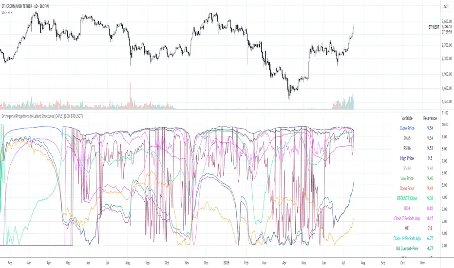
Orthogonal Projections to Latent Structures (O-PLS)Version 0.1
Orthogonal Projections to Latent Structures (O-PLS) Indicator for TradingView
This indicator, named "Orthogonal Projections to Latent Structures (O-PLS)", is designed to help traders understand the relevance or predictive power of various market variables on the future close price of the asset it's applied to. Unlike standard correlation coefficients that show a simple linear relationship, O-PLS aims to separate variables into "predictive" (relevant to Y) and "orthogonal" (irrelevant noise) components. This Pine Script indicator provides a simplified proxy of the relevance score derived from O-PLS principles.
Purpose of the Indicator
The primary purpose of this indicator is to identify which technical factors (such as price, volume, and other indicators) have the strongest relationship with the future price movement of the current trading instrument. By providing a "relevance score" for each input variable, it helps traders focus on the most influential data points, potentially leading to more informed trading decisions.
Inputs
The indicator offers the following user-definable inputs:
* **Lookback Period:** This integer input (default: 100, min: 10, max: 500) determines the number of past bars used to calculate the relevance scores for each variable. A longer lookback period considers more historical data, which can lead to smoother, less reactive scores but might miss recent shifts in variable importance.
* **External Asset Symbol:** This symbol input (default: `BINANCE:BTCUSDT`) allows you to specify an external asset (e.g., `BINANCE:ETHUSDT`, `NASDAQ:TSLA`) whose close price will be included in the analysis as an additional variable. This is useful for cross-market analysis to see how other assets influence the current chart.
* **Plot Visibility Checkboxes (e.g., "Plot: Open Price Relevance", "Plot: Volume Relevance", etc.):** These boolean checkboxes allow you to toggle the visibility of individual relevance score plots on the chart, helping to declutter the display and focus on specific variables.
Outputs
The indicator provides two main types of output:
Relevance Score Plots: These are lines plotted in a separate pane below the main price chart. Each line corresponds to a specific market variable (Open Price, Close Price, High Price, Low Price, Volume, various RSIs, SMAs, MFI, and the External Asset Close). The value of each line represents the calculated "relevance score" for that variable, typically scaled between 0 and 10. A higher score indicates a stronger predictive relationship with the future close price.
Sorted Relevance Table : A table displayed in the top-right corner of the chart provides a clear, sorted list of all analyzed variables and their corresponding relevance scores. The table is sorted in descending order of relevance, making it easy to identify the most influential factors at a glance. Each variable name in the table is colored according to its plot color, and the external asset's name is dynamically displayed without the "BINANCE:" prefix.
How to Use the Indicator
1. **Add to Chart:** Apply the "Orthogonal Projections to Latent Structures (O-PLS)" indicator to your desired trading chart (e.g., ETH/USDT).
2. **Adjust Inputs:**
* **Lookback Period:** Experiment with different lookback periods to see how the relevance scores change. A shorter period might highlight recent correlations, while a longer one might show more fundamental relationships.
* **External Asset Symbol:** If you trade BTC/USDT, you might add ETH/USDT or SPX as an external asset to see its influence.
3. **Analyze Relevance Scores:**
* **Plots:** Observe the individual relevance score plots over time. Are certain variables consistently high? Do scores change before significant price moves?
* **Table:** Refer to the sorted table on the latest confirmed bar to quickly identify the top-ranked variables.
4. **Incorporate into Strategy:** Use the insights from the relevance scores to:
* Prioritize certain indicators or price actions in your trading strategy. For example, if "Volume" has a high relevance score, it suggests volume confirmation is critical for future price moves.
* Understand the influence of inter-market relationships (via the External Asset Close).
How the Indicator Works
The indicator works by performing the following steps on each bar:
1. **Data Fetching:** It gathers historical data for various price components (open, high, low, close), volume, and calculated technical indicators (SMA, RSI, MFI) for the specified `lookback` period. It also fetches the close price of an `External Asset Symbol` .
2. **Standardization (Z-scoring):** All collected raw data series are standardized by converting them into Z-scores. This involves subtracting the mean of each series and dividing by its standard deviation . Standardization is crucial because it brings all variables to a common scale, preventing variables with larger absolute values from disproportionately influencing the correlation calculations.
3. **Correlation Calculation (Proxy for O-PLS Relevance):** The indicator then calculates a simplified form of correlation between each standardized input variable and the standardized future close price (Y variable) . This correlation is a proxy for the relevance that O-PLS would identify. A high absolute correlation indicates a strong linear relationship.
4. **Relevance Scaling:** The calculated correlation values are then scaled to a range of 0 to 10 to provide an easily interpretable "relevance score" .
5. **Output Display:** The relevance scores are presented both as time-series plots (allowing observation of changes over time) and in a real-time sorted table (for quick identification of top factors on the current bar) .
How it Differs from Full O-PLS
This indicator provides a *simplified proxy* of O-PLS principles rather than a full, mathematically rigorous O-PLS model. Here's why and how it differs:
* **Dimensionality Reduction:** A full O-PLS model would involve complex matrix factorization techniques to decompose the independent variables (X) into components that are predictive of Y and components that are orthogonal (unrelated) to Y but still describe X's variance. Pine Script's array capabilities and computational limits make direct implementation of these matrix operations challenging.
* **Orthogonal Components:** A true O-PLS model explicitly identifies and removes orthogonal components (noise) from the X data that are unrelated to Y. This indicator, in its simplified form, primarily focuses on the direct correlation (relevance) between each X variable and Y after standardization, without explicitly modeling and separating these orthogonal variations.
* **Predictive Model:** A full O-PLS model is ultimately a predictive model that can be used for regression (predicting Y). This indicator, however, focuses solely on **identifying the relevance/correlation of inputs to Y**, rather than building a predictive model for Y itself. It's more of an analytical tool for feature importance than a direct prediction engine.
* **Computational Intensity:** Full O-PLS involves Singular Value Decomposition (SVD) or Partial Least Squares (PLS) algorithms, which are computationally intensive. The indicator uses simpler statistical measures (mean, standard deviation, and direct correlation calculation over a lookback window) that are feasible within Pine Script's execution limits.
In essence, this Pine Script indicator serves as a practical tool for gaining insights into variable relevance, inspired by the spirit of O-PLS, but adapted for the constraints and common use cases of a TradingView environment.
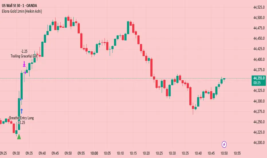
Eliora Gold 1min (Heikin Ashi)Eliora -focused trading strategy designed for anything on the 1-minute timeframe using Heikin Ashi candles. This mode combines advanced market logic with structured risk management to deliver smooth, disciplined trade execution.
Key Features:
✅ Trend Confirmation – Aligns with dominant market direction for higher accuracy.
✅ ATR-Based Volatility Filter – Avoids high-risk conditions and chaotic price action.
✅ Candle Strength Logic – Filters weak setups, focusing on strong momentum.
✅ Balanced Risk/Reward – Calculates stop-loss and take-profit dynamically for consistent results.
✅ Cooldown & Overtrade Protection – Limits frequency to maintain trade quality.
This version of Eliora is built for scalpers and intraday traders seeking high-probability entries with graceful exits.
LiliALHUNTERSystem_v2📚 **Library: LiliALHUNTERSystem_v2**
This library provides a powerful target management system for Pine Script developers.
It includes advanced calculators for EMA, RMA, and Supertrend, and introduces a central `createTargets()` function to dynamically render target lines and labels based on long/short trade logic.
🛠️ **Main Features:**
– Dynamic horizontal & vertical target lines
– Dual target configuration (Target 1 & Target 2)
– Directional logic via `isLong1`, `isLong2`
– Integrated Supertrend validation
– Visual dashboard and label display
– Works seamlessly with custom indicators
🎯 **Purpose:**
The `LiliALHUNTERSystem_v2` Library enables Pine coders to manage and visualize targets consistently across all trading strategies and indicators. It simplifies target logic while maintaining visual clarity and modular usage.
⚠️ **Disclaimer:**
This script is intended for educational and analytical purposes only. It does not constitute financial advice.
Library "LiliALHUNTERSystem_v2"
ema_calc(len, source)
Parameters:
len (simple int)
source (float)
rma_calc(len, source)
Parameters:
len (simple int)
source (float)
supertrend_calc(length, factor)
Parameters:
length (simple int)
factor (float)
createTargets(config, state, source1A, source1B, source2A, source2B)
Parameters:
config (TargetConfig)
state (TargetState)
source1A (float)
source1B (float)
source2A (float)
source2B (float)
showDashboard(state, dashLoc, textSize)
Parameters:
state (TargetState)
dashLoc (string)
textSize (string)
TargetConfig
Fields:
enableTarget1 (series bool)
enableTarget2 (series bool)
isLong1 (series bool)
isLong2 (series bool)
target1Condition (series string)
target2Condition (series string)
target1Color (series color)
target2Color (series color)
target1Style (series string)
target2Style (series string)
distTarget1 (series float)
distTarget2 (series float)
distOptions1 (series string)
distOptions2 (series string)
showLabels (series bool)
showDash (series bool)
TargetState
Fields:
target1LineV (series line)
target1LineH (series line)
target2LineV (series line)
target2LineH (series line)
target1Lbl (series label)
target2Lbl (series label)
target1Active (series bool)
target2Active (series bool)
target1Value (series float)
target2Value (series float)
countTargets1 (series int)
countTgReached1 (series int)
countTargets2 (series int)
countTgReached2 (series int)

IU Martingale StrategyDESCRIPTION
This strategy is a Martingale-based trading system that enters a long position based on simple candle patterns and doubles the position size after each loss. It tracks the worst-case drawdown using a live risk matrix table to help traders visualize the downside. With clear profit and loss points, auto position sizing, and a risk visualization table, it’s perfect for backtesting the Martingale concept directly on charts.
WHAT IS MARTINGALE SYSTEM?
The Martingale system is a position-sizing strategy where you double your trade size after every loss, aiming to recover all previous losses with a single profitable trade. It assumes that a winning trade will eventually occur. While it can be high-risk, it’s often used in controlled environments or with high probability setups.
USER INPUTS
📦 Starting Position: Initial position size for the first trade
📈 Profit Points: Target profit in price points
📉 Loss Points: Stop loss in price points
📊 Show Risk Matrix Table: Enable or disable a live table showing current streak and risk stats
LONG CONDITION
A long trade is triggered when the current candle closes higher than it opened, and no open position exists. The condition is simple and used to simulate market entry for testing the Martingale logic.
// Entry Condition:
close > open and no existing position
LONG EXIT
Each trade has a fixed stop-loss and take-profit, based on the user's input:
Stop Loss = Entry Price − Loss Points
Take Profit = Entry Price + Profit Points
The exit is handled using strategy.exit() with these dynamic values.
WHY IT IS UNIQUE
🔁 Implements a dynamic Martingale position sizing system
📊 Includes a visual Risk Matrix Table tracking losing streaks, max size, and risk
📈 Automatically resets position size after a win
🧠 Smart use of array to manage loss history and control logic
🎯 Customizable SL and TP for each entry
🎨 Beautiful chart visuals for entry, stop loss, and target levels
HOW USER CAN BENEFIT FROM IT
🧪 Test the sustainability of a Martingale system with real chart data
👁️ Visualize the risks and impact of consecutive losses
📈 Explore risk vs. reward scenarios before deploying in real markets
🧰 Use it as a base template to build more advanced Martingale or grid-based systems
📚 Great for educational purposes to understand the mathematical drawdowns involved in doubling strategies
Disclaimer :
This Video is not financial advice, it's for educational purposes only highlighting the power of coding( pine script) in TradingView, I am not a SEBI-registered advisor. Trading and investing involve risk, and you should consult with a qualified financial advisor before making any trading decisions. I do not guarantee profits or take responsibility for any losses you may incur.

Entry Signal Paint (RSI + DMI + Stoch + MACD)RSI above 60
Stoch - cross overslod
DMI - Ungli
// === RSI Condition ===
rsi = ta.rsi(rsiSource, rsiPeriod)
rsiCondition = rsi > 60
// === ADX and DI Condition ===
adx = ta.adx(adxPeriod)
plusDI = ta.plus_di(adxPeriod)
minusDI = ta.minus_di(adxPeriod)
adxCondition = adx > 15 and plusDI > minusDI
// === Stochastic Condition ===
k = ta.stoch(close, high, low, stochK)
d = ta.sma(k, stochD)
stochOversoldCross = ta.crossover(k, d) and k < 20

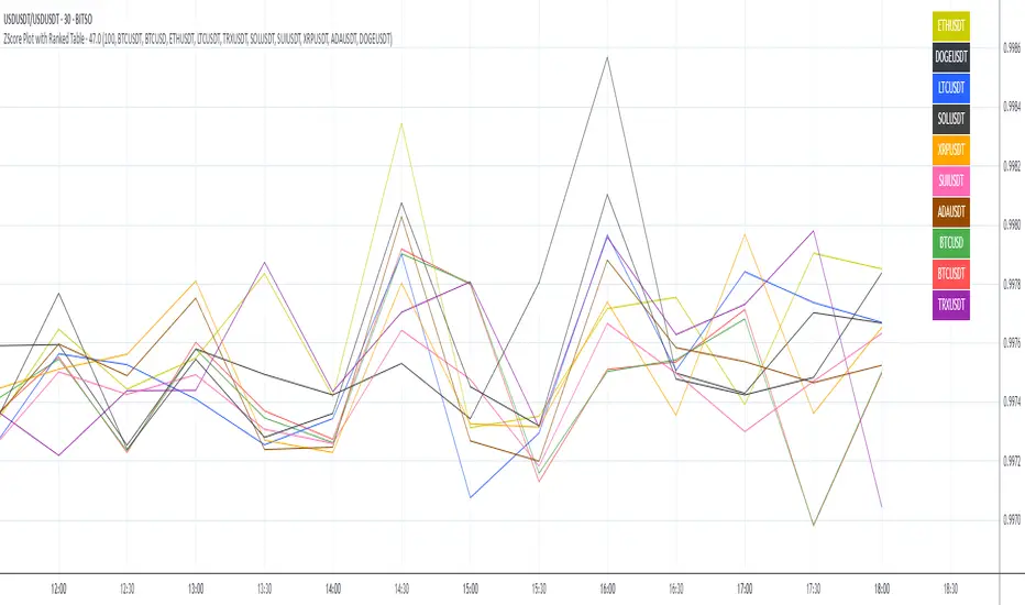
ZScore Plot with Ranked TableVersion 0.1
ZScore Plot with Ranked Table — Overview
This indicator visualizes the rolling ZScores of up to 10 crypto assets, giving traders a normalized view of log return deviations over time. It's designed for volatility analysis, anomaly detection, and clustering of asset behavior.
🎯 Purpose
• Show how each asset's performance deviates from its historical mean
• Identify potential overbought/oversold conditions across assets
• Provide a ranked leaderboard to compare asset behavior instantly
⚙️ Inputs
• Lookback: Number of bars to calculate mean and standard deviation
• Asset 1–10: Choose up to 10 symbols (e.g. BTCUSDT, ETHUSDT)
📈 Outputs
• ZScore Lines: Each asset plotted on a normalized scale (mean = 0, SD = 1)
• End-of-Line Labels: Asset names displayed at latest bar
• Leaderboard Table: Ranked list (top-right) showing:
◦ Asset name (color-matched)
◦ Final ZScore (rounded to 3 decimals)
🧠 Use Cases
• Quantitative traders seeking cross-asset momentum snapshots
• Signal engineers tracking volatility clusters
• Risk managers monitoring outliers and systemic shifts
Z-Score Multi-Model ClusteringA price/volume clustering framework combining three market behavior models into a single indicator. Designed to help identify emerging trend strength, turning points, and volatility-driven entries or exits.
🔍 How It Works
This indicator classifies market states by comparing normalized price/volume behavior (via Z-Score) to different types of statistical or geometric "cluster centers." You can choose from three clustering approaches:
🧠 Clustering Models
1. Percentile (Z+CVD) – Trend Momentum Bias
Uses volume Z-Score + Cumulative Volume Delta (CVD).
Detects institutional pressure by clustering volume surges with directional delta.
Best for: Breakouts, momentum trades, volume-led reversals.
Cluster Colors:
🔹 Green triangle = Strong bullish confluence
🔻 Red triangle = Bearish divergence (bull trap risk)
⚪ Gray = Neutral/low conviction
2. Euclidean (Z+Slope) – Swing Mean-Reversion
Measures the angle of recent Z-score slope and compares it to directional cluster centers.
Helps detect early directional shifts or exhaustion.
Best for: Swing entries, pullback setups, exit timing
3. Hilbert Phase – Turn Detection via Signal Phase
Applies Hilbert Transform to the Z-Score, measuring the phase difference between trend and oscillator components.
Ideal for anticipating turns or detecting cyclical inflection points.
Useful for: Scalping, top/bottom spotting, volatility fades
✅ Features
Auto-updating cluster logic based on current data
Tooltips and clean user interface
Optional cluster bar coloring (can be toggled off)
Signal-only plotting keeps candlesticks readable
Clear entry/exit logic with triangle markers
Supports trend, swing, and oscillation-based systems
🛠️ Suggested Use Cases
Combine with VWAP, Session High/Low, or Liquidity Zones to confirm entry conditions.
Use Cluster 2 (strong bullish) on pullbacks to trend structure for add-on entries.
Use Cluster 1 in strong trends to watch for potential traps or exits.
Toggle models based on your strategy: e.g., Hilbert for scalping, Percentile for macro trend breaks.
🧪 Best Timeframes
Works across all markets and timeframes
For Percentile (Z+CVD), use intraday TF with 1m–5m CVD source
Hilbert and Euclidean preferred on 5m–1h for accurate slope/phase signals
⚠️ Notes
Clusters do not generate trade signals alone; use them in context with structure, VWAP, or trend filters.
Marker signals are filtered with a magnitude threshold to reduce noise.
