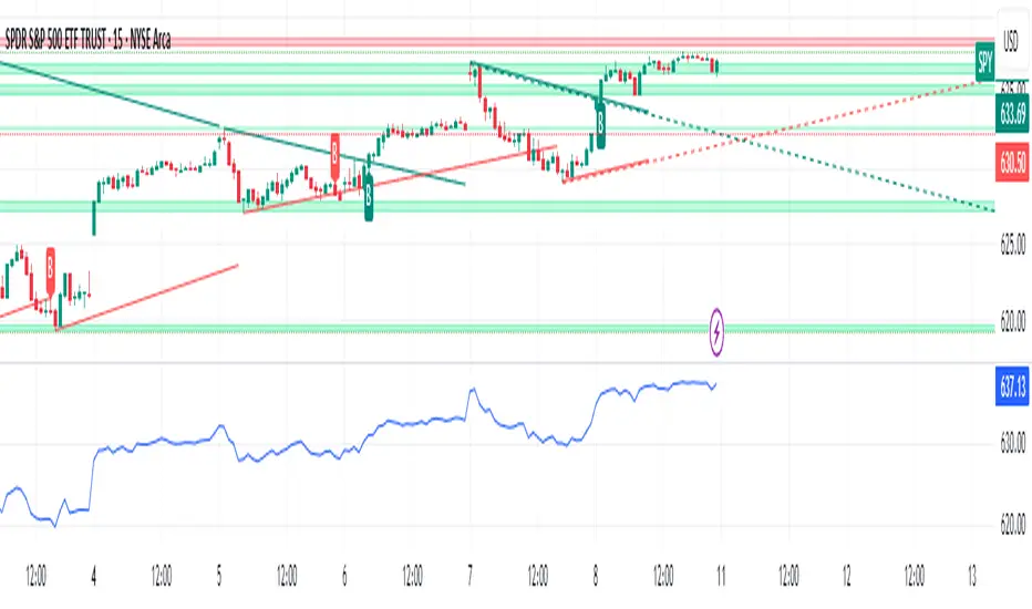
Angle Market Structure [BigBeluga]🔵 OVERVIEW
Angle Market Structure is a smart pivot-based tool that dynamically adapts to price action by accelerating breakout and breakdown detection. It draws market structure levels based on pivot highs/lows and gradually adjusts those levels closer to price using an angle threshold. Upon breakout, the indicator projects deviation zones with labeled levels (+1, +2, +3 or −1, −2, −3) to track price extension beyond structure.
🔵 CONCEPTS
Adaptive Market Structure: Uses pivots to define structure levels, which dynamically angle closer to price over time to capture breakouts sooner.
Breakout Acceleration: Pivot high levels decrease and pivot low levels increase each bar using a user-defined angle (based on ATR), improving reactivity.
Deviation Zones: Once a breakout or breakdown occurs, 3 deviation levels are projected to show how far price extends beyond the breakout point.
Count Labels: Each successful structure break is numbered sequentially, giving traders insight into momentum and trend persistence.
Visual Clarity: The script uses colored pivot points, trend lines, and extension labels for easy structural interpretation.
🔵 FEATURES
Calculates pivot highs and lows using a customizable length.
Applies an angle modifier (ATR-based) to gradually pull levels closer to price.
Plots breakout and breakdown lines in distinct colors with automatic extension.
Shows deviation zones (+1, +2, +3 or −1, −2, −3) after breakout with customizable size.
Color-coded labels for trend break count (bullish or bearish).
Dynamic label sizing and theme-aware colors.
Smart label positioning to avoid chart clutter.
Built-in limit for deviation zones to maintain clarity and performance.
🔵 HOW TO USE
Use pivot-based market structure to identify breakout and breakdown zones.
Watch for crossover (up) or crossunder (down) events as trend continuation or reversal signals.
Observe +1/+2/+3 or -1/-2/-3 levels for overextension opportunities or trailing stop ideas.
Use breakout count as a proxy for trend strength—multiple counts suggest momentum.
Combine with volume or order flow tools for higher confidence entries at breakout points.
Adjust the angle setting to fine-tune sensitivity based on market volatility.
🔵 CONCLUSION
Angle Market Structure enhances traditional pivot-based analysis by introducing breakout acceleration and structured deviation tracking. It’s a powerful tool for traders seeking a cleaner, faster read on market structure and momentum strength—especially during impulsive price moves or structural transitions.
Trend Analysis

Dip Hunter [BackQuant]Dip Hunter
What this tool does in plain language
Dip Hunter is a pullback detector designed to find high quality buy-the-dip opportunities inside healthy trends and to avoid random knife catches. It watches for a quick drop from a recent high, checks that the drop happened with meaningful participation and volatility, verifies short-term weakness inside a larger uptrend, then scores the setup and paints the chart so you can act with confidence. It also draws clean entry lines, provides a meter that shows dip strength at a glance, and ships with alerts that match common execution workflows.
How Dip Hunter thinks
It defines a recent swing reference, measures how far price has dipped off that high, and only looks at candidates that meet your minimum percentage drop.
It confirms the dip with real activity by requiring a volume spike and a volatility spike.
It checks structure with two EMAs. Price should be weak in the short term while the larger context remains constructive.
It optionally requires a higher-timeframe trend to be up so you focus on pullbacks in trending markets.
It bundles those checks into a score and shows you the score on the candles and on a gradient meter.
When everything lines up it paints a green triangle below the bar, shades the background, and (if you wish) draws a horizontal entry line at your chosen level.
Inputs and what they mean
Dip Hunter Settings
• Vol Lookback and Vol Spike : The script computes an average volume over the lookback window and flags a spike when current volume is a multiple of that average. A multiplier of 2.0 means today’s volume must be at least double the average. This helps filter noise and focuses on dips that other traders actually traded.
• Fast EMA and Slow EMA : Short-term and medium-term structure references. A dip is more credible if price closes below the fast EMA while the fast EMA is still below the slow EMA during the pullback. That is classic corrective behavior inside a larger trend.
• Price Smooth : Optional smoothing length for price-derived series. Use this if you trade very noisy assets or low timeframes.
• Volatility Len and Vol Spike (volatility) : The script checks both standard deviation and true range against their own averages. If either expands beyond your multiplier the market confirms the move with range.
• Dip % and Lookback Bars : The engine finds the highest high over the lookback window, then computes the percentage drawdown from that high to the current close. Only dips larger than your threshold qualify.
Trend Filter
• Enable Trend Filter : When on, Dip Hunter will only trigger if the market is in an uptrend.
• Trend EMA Period : The longer EMA that defines the session’s backbone trend.
• Minimum Trend Strength : A small positive slope requirement. In practice this means the trend EMA should be rising, and price should be above it. You can raise the value to be more selective.
Entries
• Show Entry Lines : Draws a horizontal guide from the signal bar for a fixed number of bars. Great for limit orders, scaling, or re-tests.
• Line Length (bars) : How far the entry guide extends.
• Min Gap (bars) : Suppresses new entry lines if another dip fired recently. Prevents clutter during choppy sequences.
• Entry Price : Choose the line level. “Low” anchors at the signal candle’s low. “Close” anchors at the signal close. “Dip % Level” anchors at the theoretical level defined by recent_high × (1 − dip%). This lets you work resting orders at a consistent discount.
Heat / Meter
• Color Bars by Score : Colors each candle using a red→white→green gradient. Red is overheated, green is prime dip territory, white is neutral.
• Show Meter Table : Adds a compact gradient strip with a pointer that tracks the current score.
• Meter Cells and Meter Position : Resolution and placement of the meter.
UI Settings
• Show Dip Signals : Plots green triangles under qualifying bars and tints the background very lightly.
• Show EMAs : Plots fast, slow, and the trend EMA (if the trend filter is enabled).
• Bullish, Bearish, Neutral colors : Theme controls for shapes, fills, and bar painting.
Core calculations explained simply
Recent high and dip percent
The script finds the highest high over Lookback Bars , calls it “recent high,” then calculates:
dip% = (recent_high − close) ÷ recent_high × 100.
If dip% is larger than Dip % , condition one passes.
Volume confirmation
It computes a simple moving average of volume over Vol Lookback . If current volume ÷ average volume > Vol Spike , we have a participation spike. It also checks 5-bar ROC of volume. If ROC > 50 the spike is forceful. This gets an extra score point.
Volatility confirmation
Two independent checks:
• Standard deviation of closes vs its own average.
• True range vs ATR.
If either expands beyond Vol Spike (volatility) the move has range. This prevents false triggers from quiet drifts.
Short-term structure
Price should close below the Fast EMA and the fast EMA should be below the Slow EMA at the moment of the dip. That is the anatomy of a pullback rather than a full breakdown.
Macro trend context (optional)
When Enable Trend Filter is on, the Trend EMA must be rising and price must be above it. The logic prefers “micro weakness inside macro strength” which is the highest probability pattern for buying dips.
Signal formation
A valid dip requires:
• dip% > threshold
• volume spike true
• volatility spike true
• close below fast EMA
• fast EMA below slow EMA
If the trend filter is enabled, a rising trend EMA with price above it is also required. When all true, the triangle prints, the background tints, and optional entry lines are drawn.
Scoring and visuals
Binary checks into a continuous score
Each component contributes to a score between 0 and 1. The script then rescales to a centered range (−50 to +50).
• Low or negative scores imply “overheated” conditions and are shaded toward red.
• High positive scores imply “ripe for a dip buy” conditions and are shaded toward green.
• The gradient meter repeats the same logic, with a pointer so you can read the state quickly.
Bar coloring
If you enable “Color Bars by Score,” each candle inherits the gradient. This makes sequences obvious. Red clusters warn you not to buy. White means neutral. Increasing green suggests the pullback is maturing.
EMAs and the trend EMA
• Fast EMA turns down relative to the slow EMA inside the pullback.
• Trend EMA stays rising and above price once the dip exhausts, which is your cue to focus on long setups rather than bottom fishing in downtrends.
Entry lines
When a fresh signal fires and no other signal happened within Min Gap (bars) , the indicator draws a horizontal level for Line Length bars. Use these lines for limit entries at the low, at the close, or at the defined dip-percent level. This keeps your plan consistent across instruments.
Alerts and what they mean
• Market Overheated : Score is deeply negative. Do not chase. Wait for green.
• Close To A Dip : Score has reached a healthy level but the full signal did not trigger yet. Prepare orders.
• Dip Confirmed : First bar of a fresh validated dip. This is the most direct entry alert.
• Dip Active : The dip condition remains valid. You can scale in on re-tests.
• Dip Fading : Score crosses below 0.5 from above. Momentum of the setup is fading. Tighten stops or take partials.
• Trend Blocked Signal : All dip conditions passed but the trend filter is offside. Either reduce risk or skip, depending on your plan.
How to trade with Dip Hunter
Classic pullback in uptrend
Turn on the trend filter.
Watch for a Dip Confirmed alert with green triangle.
Use the entry line at “Dip % Level” to stage a limit order. This keeps your entries consistent across assets and timeframes.
Initial stop under the signal bar’s low or under the next lower EMA band.
First target at prior swing high, second target at a multiple of risk.
If you use partials, trail the remainder under the fast EMA once price reclaims it.
Aggressive intraday scalps
Lower Dip % and Lookback Bars so you catch shallow flags.
Keep Vol Spike meaningful so you only trade when participation appears.
Take quick partials when price reclaims the fast EMA, then exit on Dip Fading if momentum stalls.
Counter-trend probes
Disable the trend filter if you intentionally hunt reflex bounces in downtrends.
Require strong volume and volatility confirmation.
Use smaller size and faster targets. The meter should move quickly from red toward white and then green. If it does not, step aside.
Risk management templates
Stops
• Conservative: below the entry line minus a small buffer or below the signal bar’s low.
• Structural: below the slow EMA if you aim for swing continuation.
• Time stop: if price does not reclaim the fast EMA within N bars, exit.
Position sizing
Use the distance between the entry line and your structural stop to size consistently. The script’s entry lines make this distance obvious.
Scaling
• Scale at the entry line first touch.
• Add only if the meter stays green and price reclaims the fast EMA.
• Stop adding on a Dip Fading alert.
Tuning guide by market and timeframe
Equities daily
• Dip %: 1.5 to 3.0
• Lookback Bars: 5 to 10
• Vol Spike: 1.5 to 2.5
• Volatility Len: 14 to 20
• Trend EMA: 100 or 200
• Keep trend filter on for a cleaner list.
Futures and FX intraday
• Dip %: 0.4 to 1.2
• Lookback Bars: 3 to 7
• Vol Spike: 1.8 to 3.0
• Volatility Len: 10 to 14
• Use Min Gap to avoid clusters during news.
Crypto
• Dip %: 3.0 to 6.0 for majors on higher timeframes, lower on 15m to 1h
• Lookback Bars: 5 to 12
• Vol Spike: 1.8 to 3.0
• ATR and stdev checks help in erratic sessions.
Reading the chart at a glance
• Green triangle below the bar: a validated dip.
• Light green background: the current bar meets the full condition.
• Bar gradient: red is overheated, white is neutral, green is dip-friendly.
• EMAs: fast below slow during the pullback, then reclaim fast EMA on the bounce for quality continuation.
• Trend EMA: a rising spine when the filter is on.
• Entry line: a fixed level to anchor orders and risk.
• Meter pointer: right side toward “Dip” means conditions are maturing.
Why this combination reduces false positives
Any single criterion will trigger too often. Dip Hunter demands a dip off a recent high plus a volume surge plus a volatility expansion plus corrective EMA structure. Optional trend alignment pushes odds further in your favor. The score and meter visualize how many of these boxes you are actually ticking, which is more reliable than a binary dot.
Limitations and practical tips
• Thin or illiquid symbols can spoof volume spikes. Use larger Vol Lookback or raise Vol Spike .
• Sideways markets will show frequent small dips. Increase Dip % or keep the trend filter on.
• News candles can blow through entry lines. Widen stops or skip around known events.
• If you see many back-to-back triangles, raise Min Gap to keep only the best setups.
Quick setup recipes
• Clean swing trader: Trend filter on, Dip % 2.0 to 3.0, Vol Spike 2.0, Volatility Len 14, Fast 20 EMA, Slow 50 EMA, Trend 100 EMA.
• Fast intraday scalper: Trend filter off, Dip % 0.7 to 1.0, Vol Spike 2.5, Volatility Len 10, Fast 9 EMA, Slow 21 EMA, Min Gap 10 bars.
• Crypto swing: Trend filter on, Dip % 4.0, Vol Spike 2.0, Volatility Len 14, Fast 20 EMA, Slow 50 EMA, Trend 200 EMA.
Summary
Dip Hunter is a focused pullback engine. It quantifies a real dip off a recent high, validates it with volume and volatility expansion, enforces corrective structure with EMAs, and optionally restricts signals to an uptrend. The score, bar gradient, and meter make reading conditions instant. Entry lines and alerts turn that read into an executable plan. Tune the thresholds to your market and timeframe, then let the tool keep you patient in red, selective in white, and decisive in green.

Support & Resistance Breakouts with TPThis indicator identifies key support and resistance levels based on recent highs and lows over a customizable lookback period. It visually marks breakout signals when price crosses these levels and optionally displays take profit (TP) points after a set number of bars following a breakout.
Features:
Dynamic calculation of support and resistance with adjustable length
ATR-based buffer zones with gradient fills for clear visualization
Multiple line thickness options for personal preference
Breakout signals indicated by arrows on the chart
Optional TP labels to highlight exit points
Alert conditions for breakout and TP events for automated trading alerts

Engulfing + Sweep (Confirmed Only) v6 — bars onlyMarks bullish/bearish engulfing candles with liquidity sweeps and confirms them on the next candle — no repaint.
✳️ Features:
• 🟩 Bullish Engulfing + Low Sweep
• 🟥 Bearish Engulfing + High Sweep
• 🎛 Require opposite-color previous candle (optional)
• 📏 Min body-to-range filter
• 🔔 Alerts on confirmation candle
🎯 Best for:
• Price action & reversal traders
• Liquidity sweep confluence setups

SulLaLuna — HTF M2 x Ultimate BB (Fusion) 🌕 **SulLaLuna — HTF M2 x Ultimate BB (Fusion)** 🚀💵
**By SulLaLuna Trading**
(Portions of the Bollinger Band logic adapted with permission/credit from the *Ultimate Buy & Sell Indicator* by its original author — thank you for the brilliance!)
---
🧭 **What This Is**
This is not just another price-following tool.
This is **a macro liquidity detector** — a **Daily Higher Timeframe Hull Moving Average of the Global M2 Money Supply**, smoothed via lower timeframe candles (default 5m, 48 Hull length), overlaid with **Ultimate-style double Bollinger Bands** to reveal *over-extension & mean reversion zones*.
It doesn’t chase candles.
It watches the tides beneath the market — the **money supply currents** that have a **direct correlation** to asset price behavior.
When liquidity expands → risk-on assets tend to rise.
When liquidity contracts → risk-off waves hit.
We ride those waves.
---
🔍 **What It Does**
* **Tracks Global M2** across major economies, FX-adjusted, and scales it to your chart’s price.
* **HTF Hull MA** (Daily, smoothed via 5m base) → gives you the macro liquidity trend.
* **Ultimate BB logic** applied to the HTF M2 Hull → inner/outer bands for volatility envelopes.
* **Pivot Labels** → ideal entry/exit zones on macro turns.
* **Over-Extension Alerts** → when HTF M2 Hull pushes outside the outer bands.
* **Re-Entry Alerts** → mean reversion triggers when liquidity moves back inside the range.
* **Background Paint** from chart TF M2 slope → for confluence on your entry timeframe.
---
📜 **Suggested How-To**
1. **Choose your execution chart** — e.g., 1–15m for scalps, 1H–4H for swings.
2. **Use the background paint** as your *local tide check* (chart TF M2 slope).
3. **Trade in the direction of the HTF M2 Hull** — green line = liquidity rising, red line = liquidity falling.
4. **Watch pivot labels** — these are potential “macro inflection” points.
5. **Confluence stack** — pair with ZLSMA, WaveTrend divergences, VWAP volume, or your favorite price-action setups.
6. **Size down** when HTF M2 Hull is flat/gray (chop zone).
7. **Scale in/out** on over-extension + re-entry alerts for higher probability swings.
---
⚠️ **Important Note**
This indicator **does not predict price** — it tracks macro liquidity flows that *influence* price.
Think of it as your market’s **tide chart**: when the water’s coming in, you can swim out; when it’s going out, you’d better be ready for the undertow.
---
📢 **Alerts Available**
* HTF Pivot HIGH / LOW
* Over-Extension (HTF Hull outside outer BB)
* Re-Entry (return from overbought/oversold)
---
🤝 **Join the SulLaLuna Tribe**
If this indicator helps you capture better entries, follow & share so more traders can learn to trade *math, not emotion*.
We rise together — **and we’ll meet you on the Moon** 🌕🚀💵.

Quant Signals: Econophysics-based MomentumPhysical Momentum Switcher (p0 / p1 / p2 / p3)
This indicator implements a “physical momentum” concept from quantitative finance research, where momentum is defined similarly to physics:
Momentum (p) = Mass × Velocity
Instead of using only the standard cumulative return (classic momentum), it lets you switch between multiple definitions:
p0: Cumulative return over the lookback period (no mass, just price change).
p1: Sum of (mass × velocity) over the lookback period.
p2: Weighted average velocity = (Σ mass×velocity) ÷ (Σ mass).
p3: Sharpe-like momentum = average velocity ÷ volatility (massless).
Velocity can be measured as:
Log return: ln(Pt / Pt-1)
Normal return: (Pt / Pt-1 – 1)
Mass (for p1/p2) can be defined as:
Unit mass (1) — equal weighting, equivalent to traditional momentum.
Turnover proxy — Volume ÷ average volume over k bars.
Value turnover proxy — Dollar volume ÷ average dollar volume.
Inverse volatility — 1 ÷ return volatility over a specified period.
Features:
Switchable momentum definition, velocity type, and mass type.
Adjustable lookback (k) and smoothing period for the signal line.
Optional ±1σ display bands for quick overbought/oversold visual cues.
Alerts for crosses above/below zero or the signal line.
Table display summarizing current settings and values.
Typical uses:
Momentum trading: Buy when PM > 0 (or crosses above the signal), sell/short when PM < 0 (or crosses below).
Contrarian strategies: Reverse the logic when testing mean-reversion effects.
Cross-asset testing: Apply to different instruments to see which PM definition works best.

Volume Profile, Pivot Anchored by [MARK804]Unlock Hidden Market Zones: Volume Profile Anchored to Dynamic Pivot Points (by Mark804)
Elevate Your Trading with Precision:
Discover the power of Volume Profile, Pivot Anchored by Mark804—an advanced TradingView tool that merges horizontal volume histograms with pivot-anchored price levels. See exactly where trading interest peaks and how those zones intersect with pivot points to identify meaningful support, resistance, and breakout zones—all on one clean chart. Crafted for traders who want clarity, speed, and a strategic edge.
Why This Indicator Stands Out:
Dual-Mode Insight: Combines volume-based price distribution with pivot point anchoring for sharper decision-making.
Actionable Alerts: Includes built-in alerts for touches on Point of Control (PoC), Value Area High (VAH), and Value Area Low (VAL), plus high-volume zone notifications.
Rich Context Display: Shows cumulative volume, percentage changes, VA width, bar counts, and more—directly on your chart.
Perfect For:
Day traders, swing traders, algorithmic designers—anyone who benefits from integrating volume-based levels with smart pivot overlays.

Gold Scalping Grid Zones [CongTrader]📜 Overview
Gold Scalping Grid Zones is a professional trading tool designed for XAUUSD scalpers & day traders.
It automatically detects key Buy/Sell zones based on pivot points and projects future breakout targets using ATR.
This all-in-one indicator combines:
Dynamic Grid Trading Zones from recent highs/lows
Future Price Forecast Zones for breakout targeting
EMA + RSI filtering for higher signal accuracy
Unified Buy/Sell alert system optimized for fast execution
✨ Key Features
Automatic Buy/Sell grid zones based on recent pivots
Breakout target forecasting using ATR multipliers
Smart signal filtering
BUY: Price above EMA 200 + RSI oversold
SELL: Price below EMA 200 + RSI overbought
Unified single alert for both BUY and SELL triggers
Auto-clean chart – keeps only the latest signal label
Fully customizable: grid step, zone thickness, ATR multiplier, EMA, RSI...
📈 How to Use
Add to Chart
Apply to XAUUSD chart (best performance on M5 – H1).
Adjust Parameters
Grid Step: Distance between zones (default: $2.0)
Zone Thickness: Visual width of zones
ATR Multiplier: Distance for forecast zones
EMA Length & RSI Levels: Fine-tune signal filtering
Read the Zones & Signals
Green Zones → Demand areas (Buy)
Red Zones → Supply areas (Sell)
Forecast BUY/SELL labels → Next breakout target
BUY/SELL signal labels → Confirmed trade setups based on EMA + RSI filters
Set Alerts
Click the Alert (🔔) icon in TradingView
Condition: "Gold Trade Signal"
Choose “Once per bar close” (fewer alerts) or “Once per bar” (scalping mode)
Phone alert example:
Gold Trade Signal: BUY or SELL triggered
⚠️ Disclaimer
This is NOT financial advice.
Always combine with your own analysis, risk management, and stop loss.
Past performance does not guarantee future results.
Trading gold with leverage carries high risk.
💡 Pro Tip:
Combine this indicator with candlestick patterns, volume analysis, and higher timeframe trend confirmation to maximize accuracy.
Fewer resistance/support zones ahead = stronger breakout potential.
🙏 Thank You
Thank you for using Gold Scalping Grid Zones .
If you find this indicator helpful, please Follow the author and Share it with your trading community so more traders can benefit.
Every follow and share is motivation to keep building more high-quality trading tools. 🚀 . #gold #XAUUSD #scalping #gridtrading #zones #supplydemand #ATR #EMA #RSI #pivot

Source-indicatorsSource Indicators – A premium TradingView tool combining automated support/resistance levels, dynamic trendlines, and breakout alerts.
Perfect for spotting key market zones and trend shifts in real-time.
☑️VMA Win % Dashboard for Different LengthsVMA Win % Dashboard for Different Lengths
Overview
This Pine Script indicator evaluates the performance of a Variable Moving Average (VMA) for lengths 13 to 17. It tracks the success rate of price hitting target levels during bullish or bearish trends and displays results in a table. It is part of a combination that includes two other indicators: ✅ VMA Avg ATR + Days to Targets Total Improved 🎯 and 📊 Visual MTF VMA Dashboard🔄️.
How It Works
1. Inputs:
- ATR Length: 14 periods (for volatility).
- VMA Lengths: 13, 14, 15, 16, 17.
2. VMA Calculation:
- Uses closing price.
- Measures price increases (pdm) and decreases (mdm).
- Smooths data to calculate a Directional Movement Index (DMI).
- Adjusts VMA based on momentum and volatility.
3. Trend Detection:
- Bullish: VMA rises (green).
- Bearish: VMA falls (red).
- Neutral: No direction (white).
- Confirms trends align with daily and 195-minute timeframes.
4. Performance Tracking:
- Trend Start: Records price, ATR, and time when a trend begins.
- Price Movement: Tracks highest (bullish) or lowest (bearish) price.
- Targets:
---- T1: Starting price ± historical average movement (ATR-based).
---- T2: Starting price ± 6x ATR.
- Statistics:
---- Counts hits (reached T1/T2) and misses (didn’t reach T1).
---- Calculates win percentages: % of trends hitting T1.
5. Dashboard:
- Table with columns: VMA Length, Win % Up, Win % Down.
- Shows win percentages for each length (e.g., 75.23%).
Use Cases
- Trend Trading: Confirms trend direction and success rate.
- Optimization: Finds the best VMA length.
- Risk Management: Sets ATR-based trade targets.
- Combination: Complements ✅ VMA Avg ATR + Days to Targets Total Improved 🎯 and 📊 Visual MTF VMA Dashboard🔄️ for a complete strategy.
Example
- VMA 15: 80% Win Up, 55% Win Down → Best for bullish trades.
- VMA 13: 75% Win Up, 60% Win Down → More balanced.
Limitations
- Based on historical data, not future predictions.
- Only analyzes trends aligned with higher timeframes.
- No VMA lines or signals plotted on the chart.

QUANTUM MARKET ANALYZER X7QUANTUM MARKET ANALYZER X7 — Study Material (Learning & Teaching Guide)
What this tool is (and isn’t)
QUANTUM MARKET ANALYZER X7 is a multi-factor TradingView indicator that summarizes many classic signals into one dashboard. It does not predict the future or guarantee profits. It simply scores what is happening now using oscillators, moving averages, order-block behavior, trendline/channel context, Supertrend bias, and volume/flow clues—so you can make structured, risk-aware decisions.
________________________________________
Quick start (for brand-new traders)
1. Add the indicator to a chart.
2. Pick an Analysis Timeframe (e.g., 60-min for day trading, 4-hour for swing).
3. Read the Summary tile first; then check Oscillators → MAs → OB/Trendline/Supertrend → Volume.
4. Take trades only when multiple sections agree, and always plan stop loss and size before entry.
________________________________________
How the dashboard is built (section by section)
Below you’ll learn what each section measures, how the numbers are produced, and how to interpret them. The script converts each sub-signal into a small integer (e.g., +2, +1, 0, −1, −2). These are summed into section totals and then into a Summary score.
1) Summary (the combined score)
• What it is: The grand total of all sections (Oscillators + Moving Averages + Advanced: OB, Trendline/Channel, Supertrend, Volume).
• How it’s labeled:
o Large positive total → BUY / STRONG BUY
o Around zero → NEUTRAL
o Large negative total → SELL / STRONG SELL
• How to use: Treat it as a headline, not a trigger. Confirm with the sections below and price action.
________________________________________
2) Oscillators (momentum / overbought–oversold)
Inputs used on your chosen timeframe:
• RSI(14):
o 70 → bearish pressure (−)
o <30 → bullish pressure (+)
• Stochastic (14):
o 80 overbought (−), <20 oversold (+)
• CCI(20):
o +100 (−), <−100 (+)
• Williams %R(14):
o −20 overbought (−), <−80 oversold (+)
• MACD(12,26,9):
o MACD line > Signal → (+), below → (−)
• Momentum(10): >0 → (+), <0 → (−)
• ROC(9): >+2% → (+), <−2% → (−)
• Bollinger Bands(20,2):
o Price > Upper band → (−), < Lower band → (+)
How it scores: Each item contributes between −2 and +2 (or −1/+1 for some). The Oscillator total is their sum.
How to use: Oscillators excel for timing. Favor longs when the total is clearly positive and exiting or avoiding when clearly negative.
________________________________________
3) Moving Averages (trend/structure)
MAs used: SMA(10/20/50/100/200) and EMA(10/20/50).
Scoring logic: Compares price vs each MA:
• Price > MA by >2% → +2 (strongly bullish)
• Price > MA by 0–2% → +1
• Price < MA by 0–2% → −1
• Price < MA by >2% → −2
How to use: A clearly positive MA total suggests trend alignment for longs; clearly negative favors shorts or flat. Mixed readings → treat as range/transition.
________________________________________
4) Order-Block (OB) breakout analysis (support/resistance from clustered reactions)
What it approximates: The script searches a lookback window for pivot-like candles and counts repeated “touches” near that level (within ±0.2%) to infer support (bullish OB) or resistance (bearish OB).
Settings you can tune
• OB Lookback Period: how far back to search.
• Min OB Touches: more touches = stronger level.
Signals produced
• BULLISH BRK: Price crosses above the most recent bearish OB (resistance → breakout).
• BEARISH BRK: Price crosses below the most recent bullish OB (support → breakdown).
• ABOVE SUP / BELOW RES: Price position relative to the latest OB levels.
How to use: Use OB with MAs and Volume. Best when a breakout comes with trend alignment and volume expansion.
________________________________________
5) Trendline / Channel analysis (context envelope)
Rather than a single diagonal line, this module forms a dynamic channel:
• Finds highest high and lowest low over your Trendline Lookback.
• Builds a midline = (highest + lowest)/2.
• Creates an upper/lower channel by multiplying the range with Channel Width Multiplier.
Signals produced
• UPPER BRK: Price > upper channel (bullish expansion)
• LOWER BRK: Price < lower channel (bearish expansion)
• ABOVE MID / BELOW MID: Bias zone inside channel
How to use: Treat UPPER/LOWER breaks as momentum context. Confirm with MAs and Volume before acting.
________________________________________
6) Supertrend (ATR-based bias)
• Uses ta.supertrend(ATR Multiplier, ATR Period) on your analysis timeframe.
• Signal:
o BULLISH when Supertrend flips to trend-up state
o BEARISH when it flips to trend-down
Tuning tips:
• Higher ATR Multiplier (e.g., 6) → fewer, higher-quality flips.
• Lower multiplier → more responsive, more noise.
How to use: Use Supertrend as a trend filter. Avoid fighting it unless higher-timeframe context disagrees and you have strong confluence.
________________________________________
7) Volume/Flow analysis (participation & pressure)
This section combines several volume-based tools:
1. Volume Spike vs MA
o Volume MA Period (default 20)
o Volume Spike Threshold (e.g., 1.5×)
o If current volume / MA > threshold → spike.
2. OBV vs OBV-MA → Accumulation (+) / Distribution (−)
3. VPT vs VPT-MA → Price-volume trend alignment (+/−)
4. MFI(14): >70 (−), <30 (+)
5. Accumulation/Distribution vs its MA → (+/−)
Scoring:
• Big spike with up bar → +2; with down bar → −2
• Each of OBV, VPT, MFI, A/D adds +1 or −1
Interpretation labels:
• HIGH ACC / ACCUM → constructive flow
• HIGH DIST / DISTRIB → selling pressure
• NEUTRAL → no edge
How to use: Favor setups where directional signals + trend + volume point the same way.
________________________________________
Putting it together — a repeatable reading order
1. Summary: What’s the combined bias?
2. Oscillators: Is momentum supportive or stretched?
3. MAs: Is price aligned with the trend structure?
4. OB & Trendline/Channel: Are we breaking key levels/zones?
5. Supertrend: Is the higher-level bias with you or against you?
6. Volume: Is there participation to confirm the move?
Only act when at least 3–4 sections agree and you can define a logical stop and position size.
________________________________________
Parameter tuning (step-by-step)
1. Choose timeframe:
o 15–60m for active trading; 4h–1D for swing.
2. Oscillators:
o Keep defaults first; later tighten or loosen thresholds only if you’ve tested.
3. Moving Averages:
o The script’s built-in 0–2% bands around each MA are sensible.
o If your market is very volatile, you can consider widening the 2% threshold to reduce whipsaws (requires code edit).
4. Order Blocks:
o Start with OB Lookback ~50 and Min Touches = 2.
o Increase touches for fewer, stronger zones.
5. Trendline/Channel:
o Longer Trendline Lookback and smaller Channel Width → tighter channel (more breaks).
o Shorter lookback and larger width → fewer breaks.
6. Supertrend:
o If you get too many flips, raise ATR Multiplier.
o If it’s lagging, lower it slightly.
7. Volume:
o For quieter instruments, reduce the Threshold (e.g., 1.2×).
o For very liquid/active markets, 1.5–2.0× works well.
________________________________________
Example playbooks (for practice)
A) Pro-trend long continuation
• Summary: BUY or STRONG BUY
• MAs: clearly positive
• Supertrend: BULLISH
• OB/Trendline: ABOVE MID or UPPER BRK
• Volume: ACCUM or HIGH ACC
Plan: Enter on a minor pullback; stop below recent structure; scale out at logical resistance.
B) Mean-reversion short (cautious)
• Oscillators: multiple overbought readings (RSI>70, price > BB upper)
• MAs: still positive (trend up), so this is countertrend
• Volume: no spike
Plan: If you must, take smaller size, tighter stop, faster targets. Prefer waiting for alignment instead.
C) Breakout with confirmation
• OB: BULLISH BRK of a known resistance
• Trendline/Channel: UPPER BRK
• Volume: spike with up bar
• Supertrend: recently flipped up
Plan: Enter on retest or structured continuation; define stop under breakout level.
________________________________________
Common pitfalls to avoid
• Acting on one section alone. Confluence matters.
• Chasing after long candles without volume follow-through.
• Ignoring timeframe alignment. Check the next higher timeframe.
• Oversizing trades just because “Summary = Strong Buy/Sell.”
• Moving stops farther instead of accepting a planned loss.
________________________________________
Practice & evaluation routine
1. Replay mode (TradingView Bar Replay) to practice reading the tiles in order.
2. Journal each trade: which sections agreed, where stop/target were, outcome.
3. Weekly review: Were losing trades missing confirmation? Did you respect size rules?
4. Iterate cautiously: Change one setting at a time and observe for a week.
________________________________________
Frequently asked questions
Q: Is the Summary score weighted?
A: Each sub-signal contributes small integers; totals from Oscillators, MAs, and Advanced sections are added without fancy weighting, keeping it transparent.
Q: Can I use this as a standalone system?
A: It’s best used as a decision support layer with your own risk rules, not as a mechanical “buy/sell” machine.
Q: Which timeframe is best?
A: The one that matches your holding period. Always confirm with at least one higher timeframe.
________________________________________
Suggested classroom flow (for teaching)
1. Session 1: Oscillators only → identify good vs stretched momentum.
2. Session 2: Moving Averages → trend structure and bias.
3. Session 3: OB + Trendline/Channel → location and breakouts.
4. Session 4: Supertrend + Volume → confirmation and participation.
5. Session 5: Confluence building → case studies and journaling.
6. Session 6: Risk management, sizing, and review habits.
________________________________________
Disclaimer aiTrendview (please read)
This indicator and study material are provided for educational and research purposes only. They do not constitute financial advice, investment recommendations, or a promise of performance. Trading involves substantial risk and may result in losses. Past performance of any method or indicator does not guarantee future results. You are solely responsible for your trading decisions, including risk management, position sizing, and due diligence. Always test ideas in a demo environment before using real capital, and consider consulting a licensed financial advisor.

Range Trends Enhanced (eleven11)This indicator automatically draws your Range Trend lines based upon your timeframe. When you select a timeframe, in the options, those lines will be locked in, whenever you switch timeframes on the chart. This allows you to "lock in" a timeframe's trendlines and then view it on different timeframes. But if you want to view the current trendlines for a timeframe then you need to select that "lockdown" timeframe in the settings. The original code was created by eleven11

Recent Range DetectorOverview
The Recent Range Detector is a specialized indicator designed to identify when an asset is currently range-bound, providing traders with clear support and resistance levels for range trading strategies. Unlike traditional indicators that focus on trend detection, this tool specifically answers the question: "Is the price range-bound right now, and what are the exact trading levels?"
Key Features
✅ Smart Range Detection - Uses a multi-factor scoring system to identify legitimate ranges
✅ Dynamic Support/Resistance Levels - Automatically calculates and displays key trading levels
✅ Range Quality Scoring - Provides confidence levels (Strong/Moderate/Weak Range)
✅ Touch Validation - Counts actual price touches to confirm range reliability
✅ Breakout Detection - Alerts when price exits the established range
✅ Visual Clarity - Clean boxes, lines, and labels for easy interpretation
How It Works
The indicator analyses recent price action using three core metrics:
Touch Quality (40%) - How many times price has respected support/resistance levels
Containment Quality (40%) - What percentage of recent bars stayed within the range
Recent Respect (20%) - Whether the latest price action confirms the range
These combine into a Range Score (0-1) that determines range strength and reliability.
Settings & Parameters
Range Lookback Period (Default: 15)
Number of bars to analyse for range detection
Shorter periods = more responsive to recent ranges
Longer periods = more stable, fewer false signals
Range Tolerance (Default: 2.0%)
Tolerance for price touches around exact highs/lows
Lower values = stricter range requirements
Higher values = more flexible range detection
Minimum Touches (Default: 3)
Required number of support/resistance touches for valid range
Higher values = more confirmed ranges, fewer signals
Lower values = more sensitive, earlier detection
Visual Options
Show Range Box: Displays the range boundaries
Show Support/Resistance Lines: Extends levels into the future
Understanding the Output
Range Score (0.000 - 1.000)
0.7+ = Strong Range (Green) - High confidence range trading setup
0.5-0.7 = Moderate Range (Yellow) - Decent range with some caution
0.3-0.5 = Weak Range (Orange) - Low confidence, be careful
<0.3 = Not Ranging - Avoid range trading strategies
Range Status Classifications
Strong Range - Perfect for range trading strategies
Moderate Range - Good range with normal risk
Weak Range - Marginal range, use smaller positions
Not Ranging - Price is trending or too choppy for range trading
Key Metrics in Info Table
Range Size (%) - Size of the range relative to price level
5-15% = Ideal range size for most strategies
<5% = Tight range, lower profit potential
>15% = Wide range, higher profit potential but more risk
Support/Resistance Levels - Exact price levels for entries/exits
Use these as your key trading levels
Support = potential buy zone
Resistance = potential sell zone
Total Touches - Number of times price respected the levels
3-5 touches = Newly formed range
6-10 touches = Well-established range
10+ touches = Very strong, reliable range
Price Position (%) - Current location within the range
0-20% = Near support (potential long opportunity)
80-100% = Near resistance (potential short opportunity)
40-60% = Middle of range (wait for better entry)
Visual Elements
Range Box
Green Box = Strong Range (Score ≥ 0.7)
Yellow Box = Moderate Range (Score 0.5-0.7)
Orange Box = Weak Range (Score 0.3-0.5)
Support/Resistance Lines
- Horizontal lines showing exact trading levels
- Extend into the future for forward guidance
- Colour matches the range strength
Background Colouring
- Subtle background tint during range periods
- Helps quickly identify ranging vs trending markets
Breakout Signals
- 📈 RANGE BREAK UP - Price breaks above resistance
- 📉 RANGE BREAK DOWN - Price breaks below support
- Only appears for confirmed ranges (Score ≥ 0.5)
Trading Applications
Range Trading Strategy
1. Look for Range Score ≥ 0.5
2. Buy near support (Price Position 0-20%)
3. Sell near resistance (Price Position 80-100%)
4. Set stops just outside the range
5. Exit on breakout signals
Breakout Strategy
1. Identify strong ranges (Score ≥ 0.7)
2. Wait for volume-confirmed breakout
3. Enter in breakout direction
4. Use previous resistance as support (or vice versa)
Market Context
- Strong ranges often occur after trending moves
- Use higher timeframes to confirm overall market structure
- Combine with volume analysis for better entries/exits
Best Practices
What to Look For
✅ Range Score ≥ 0.5 for trading consideration
✅ Multiple touches (5+) for confirmation
✅ Clear price rejection at levels
✅ Reasonable range size (5-15% for most assets)
✅ Recent price respect of boundaries
What to Avoid
❌ Trading ranges with Score < 0.3
❌ Very tight ranges (<3% size) - low profit potential
❌ Ranges with only 1-2 touches - not confirmed
❌ Ignoring breakout signals
❌ Trading against the higher timeframe trend
Alerts Available
- Range Detected - New range formation
- Range Break Up - Upward breakout
- Range Break Down - Downward breakout
- Range Ended - Range condition ended
Timeframe Recommendations
- Daily Charts - Best for swing trading ranges
- 4H Charts - Good for intermediate-term ranges
- 1H Charts - Suitable for day trading ranges
- Lower Timeframes - May produce more noise
Conclusion
The Recent Range Detector eliminates guesswork in range identification by providing objective, quantified range analysis. It's particularly valuable for traders who prefer range-bound strategies or need to identify when trending strategies should be avoided.
Remember: No indicator is perfect. Always combine with proper risk management, volume analysis, and broader market context for best results.
Disclaimer
This indicator is for educational purposes only and should not be considered as financial advice. Trading involves risk, and past performance does not guarantee future results. Always conduct your own research and consider your risk tolerance before making any trading decisions.

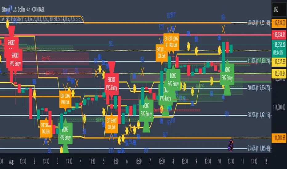
SKI FVG IndicatorIt uses ICT concepts and takes entries and exits. Identifies good FVG and shows an entry to buy or short and also exits at swing high or low , discount areas, primary areas, DOL (draw on liquidity)
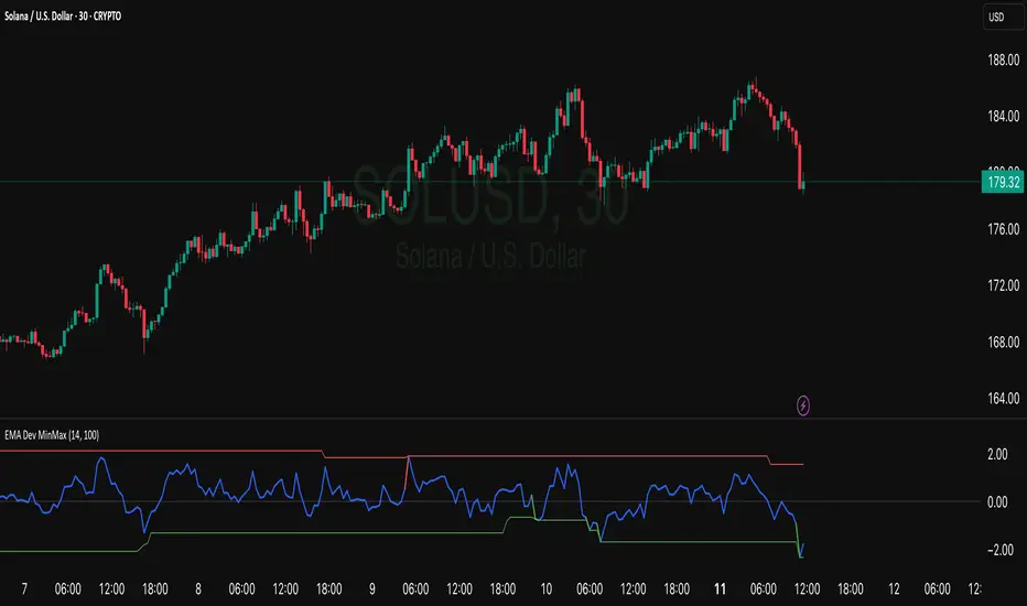
EMA Deviation with Min/Max Levelshis indicator visualizes the percentage deviation of the closing price from its Exponential Moving Average (EMA), helping traders identify overbought and oversold conditions. It dynamically tracks the minimum and maximum deviation levels over a user-defined lookback period, highlighting extreme zones with color-coded signals:
• 🔵 Normal deviation range
• 🔴 Near historical maximum — potential sell zone
• 🟢 Near historical minimum — potential buy zone
Use it to spot price extremes relative to trend and anticipate possible reversals or mean reversion setups.
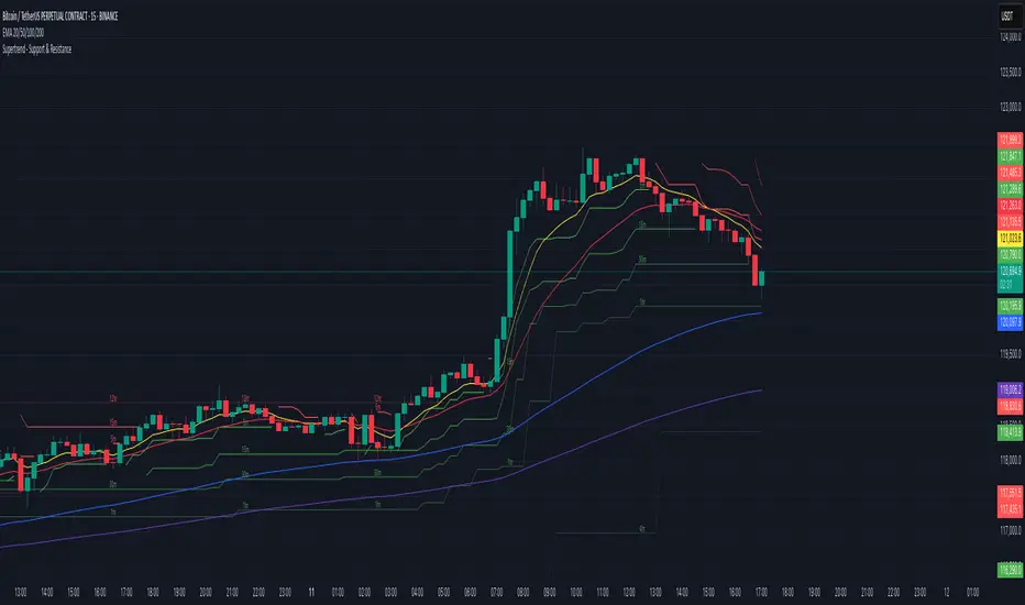
Supertrend - Support & ResistanceSupertrend – Multi-Timeframe Support & Resistance
This script overlays multiple Supertrend bands from higher timeframes on a single chart and treats them as dynamic support and resistance. The goal is simple: see the bigger picture without leaving your current timeframe.
What it does
• Calculates Supertrend using the same ATR Length and Factor across 5m, 15m, 30m, 1h, 4h, 8h, 12h, and 1D.
• Pulls each timeframe via request.security(..., lookahead_off) so values only update on candle close. No look-ahead, no “teleporting” lines.
• Plots each timeframe’s Supertrend as an on-chart band with increasing transparency the higher you go, so you can visually separate short-term vs higher-timeframe structure.
• Colors indicate direction:
• Green = bearish band above price (acting as resistance)
• Red = bullish band below price (acting as support)
• Drops compact labels (5m, 15m, 30m, etc.) every 20 bars right on the corresponding Supertrend level, so you can quickly identify which line belongs to which timeframe.
Why this helps
Supertrend is great for trend definition and trailing stops. But one timeframe alone can whipsaw you. By stacking multiple timeframes:
• Confluence stands out. When several higher-TF bands cluster, price often reacts.
• You see where intraday pullbacks are likely to pause (lower TF bands) and where trend reversals are more meaningful (higher TF bands).
• It’s easier to align entries with the dominant trend while still timing them on your working timeframe.
How it works (quick refresher)
Supertrend uses ATR to offset a median price with a multiplier (Factor). When price crosses the band, direction flips and the trailing line switches sides. This script exposes:
• ATR Length (default 10): sensitivity of the ATR. Smaller = tighter band, more flips. Larger = smoother, fewer flips.
• Factor (default 3.0): multiplier applied to ATR. Larger = wider band, more conservative.
The same settings are used for all timeframes for clean, apples-to-apples comparisons.
How to use it
• Trend alignment: Prefer longs when most higher-TF lines are below price (red support). Prefer shorts when most are above price (green resistance).
• Pullback entries: In an uptrend, look for pullbacks into a lower-TF red band that lines up near a higher-TF red band. That overlap is your “zone.”
• Breakout confirmation: A strong break and close beyond a higher-TF band carries more weight than a lower-TF poke.
• Stops and targets: Use the nearest opposing band as a logic point. For example, in a long, if price loses the lower-TF red band and the next higher-TF band is close overhead, trim or tighten.
Signals you can read at a glance
• Stacking: Multiple red bands beneath price = strong bullish structure. Multiple green bands above price = strong bearish structure.
• Compression: Bands from different TFs squeezing together often precede expansion.
• Flip zones: When a higher-TF band flips side, treat that level as newly minted support/resistance.
Design choices in the code
• lookahead_off on all request.security calls avoids repainting from future data.
• Increasing transparency as the timeframe rises makes lower-TF context visible without drowning the chart.
• Labels every 20 bars keep the chart readable while still giving you frequent anchors.
Good to know (limits and tips)
• This is an overlay of closed-bar Supertrend values from higher TFs. Intrabar moves can still exceed a band before close; final signal prints at candle close of that timeframe.
• Using the same ATR/factor across TFs makes confluence easier to judge. If you need independent tuning per TF, you can clone the security calls and add separate inputs.
• On very low timeframes with many symbols, multiple request.security calls can be heavy. If performance drops, hide one or two higher TFs or increase the label spacing.
Risk note
This is a context tool, not an auto-trader. Combine it with structure (HH/HL vs LH/LL), volume, and your execution rules. Always test on your market and timeframe before committing real capital.
Prev D/W/M + Asia & London Levels [Oeditrades]Prev D/W/M + Asia & London Levels
Author: Oeditrades
Platform: Pine Script® v6
What it does
Plots only the most recent, fully completed:
Previous Day / Week / Month highs & lows
Asia and London session highs & lows
Levels are drawn as true horizontal lines from the period/session start and extended to the right for easy confluence reading. The script is non-repainting.
How it works
Prev Day/Week/Month: Uses completed HTF candles (high / low ) so values are fixed for the entire next period.
Sessions (NY time): Asia (default 20:00–03:00) and London (default 03:00–08:00) are tracked in America/New_York time. High/low are locked when the session ends, and the line is anchored at that session’s start.
Inputs & customization
Visibility: toggle Previous Day/Week/Month, Asia, London, and labels.
Colors: highs default red; lows default green (user-configurable). Session highs default pink, lows aqua (also editable).
Style: line style (solid/dotted/dashed) and width.
Sessions: editable time windows for Asia and London (still interpreted in New York time).
Disclaimer: optional on-chart disclaimer panel with editable text.
Notes
Works on any timeframe. For intraday charts, the HTF values remain constant until the next HTF bar completes.
If your market’s overnight hours differ, simply adjust the session windows in Inputs.
Lines intentionally show only the latest completed period/session to keep charts clean.
Use cases
Quick view of PDH/PDL, PWH/PWL, PMH/PML for bias and liquidity.
Intraday planning around Asia/London range breaks, retests, and overlaps with prior levels.
Disclaimer
This tool is for educational purposes only and is not financial advice. Markets involve risk; past performance does not guarantee future results.

Angle Market Structure [Mark804]Got it! Since I couldn’t find any existing public references to Angle Market Structure \ I’ll proceed based on the description you provided—rewriting it with improved clarity, flow, and impact. Let me know if you’d like to tweak anything further!
Angle Market Structure (Mark804) — Refined Overview
Angle Market Structure (Mark804) is an intelligent pivot-based indicator tailored for traders seeking early detection of breakouts and breakdowns. By dynamically angling its pivot levels toward current price action, it not only sharpens structural clarity but also accelerates signals for price movement.
Core Concepts
Adaptive Market Structure
Highlights pivot highs and lows as evolving support and resistance levels. These levels gradually converge toward price action using an angle derived from ATR (Average True Range), giving you faster, more responsive structure cues.
Breakout Acceleration
Each bar subtly shifts pivot-high levels downward and pivot-low levels upward—accelerating breakout detection and helping you act more decisively on emerging trends.
Deviation Zones
Upon a confirmed breakout or breakdown, the indicator projects three extension levels on either side (+1, +2, +3 or –1, –2, –3) to visually map price overextension and guide potential exit or trail-stop levels.
Sequential Break Count
Each structural break is numbered in sequence—providing real-time insight into trend strength and continuity.
Visual Intelligence
Utilizes color-coded pivot points, angling trend lines, and labeled deviation zones to ensure structure is intuitive and immediately actionable.
Feature Set
Pivot detection with customizable lookback length.
ATR-based “angle modifier” that dynamically tilts levels toward price.
Distinct breakout and breakdown line plotting with smooth visual extension.
Deviation level customization (+1 to +3 or –1 to –3).
Color-coded trend-break count labels (bullish or bearish).
Adaptive label sizing with theme awareness for light/dark modes.
Smart label placement to minimize visual clutter.
Cap on deviation layers to preserve performance and chart clarity.
Trading Guide
1. Use pivot-aligned structure levels to identify potential breakout/breakdown zones.
2. Monitor crossovers (for bullish continuation) or crossunders (for bearish) as potential entry signals.
3. Reference deviation levels for assessing overextension—use them to plan exits or trailing stops.
4. Watch the breakout sequence count—higher counts often correlate with stronger price momentum.
5. For validated entries, pair with volume or order-flow analysis during breakouts.
6. Adjust the ATR-based angle sensitivity based on market volatility to filter for ideal signal timing.
Final Thoughts
Angle Market Structure (Mark804) upgrades classic pivot analysis with angle-driven responsiveness and structured extension tracking. Whether scanning for impulsive moves or structural shifts, this tool brings precision, clarity, and momentum awareness to your charts—making it a go-to for proactive traders who value speed and structural insight.

RSI by Tamil harmonic trader rajThis indicator will show RSI value in candle chart.
telegram channel link tamilharmonictraderraj


RSI-Adaptive T3 [ChartPrime] — Strategy (Long Only, 1D)This trade has been successfully converted from an individual setup to a full strategy, and the results are truly outstanding. I’m currently testing this for Tesla options trading on the 1-day chart, and it appears to be working extremely well.
A special thanks to ChartPrime for creating such a beautifully designed indicator — it’s performing impressively in these tests.
If anyone would like to try it out, feel free to download and see the results for yourself. Thank you!

True OHLC - [CrossTrade] True OHLC Data Indicator
This indicator displays the actual open, high, low, and close prices when viewing Heikin Ashi charts.
Heikin Ashi candles use modified price calculations that smooth out price action, but this means you can't see the real price levels where trades actually occurred. This indicator pulls the genuine OHLC data and plots it on top of your Heikin Ashi chart.
The indicator includes alert conditions that reference these real price values, making it useful for strategies and alert systems that need accurate price data instead of the modified Heikin Ashi values.
Customize the colors, line thickness, and plot style (circles, lines, or crosses) to fit your chart preferences.

連騰カウントCount arbitrary winning streaks and calculate their occurrence probability over a specified period.
For example, if a 5-day winning streak occurs only 0.3% of the time, it indicates that the price movement is not random, but rather a clear sign of capital inflows — making it a useful metric for analysis.
