Buy sell Trend VolumeThis indicator analyzes the flow of volume and price changes to identify potential trends.
Understanding Volume Indicator: A Comprehensive Guide
Introduction. The volume indicator is a vital tool investors and traders use to understand the liquidity and market activity in trading.
Trend Analysis


Turtle Trading System + ATRTurtle Trading System + ATR
This Pine Script v5 indicator implements a Turtle Trading System with ATR integration.
It plots a 20-day high (red), 20-day low (blue), and an ATR-based level (orange) shifted upward by a user-defined percentage (default 5%).
Customizable inputs include lookback period (default 20), ATR period (default 14), and ATR offset.
Dynamic labels show the 20-day high, low, and ATR values at the current bar, updating with price.
Suitable for trend-following strategies, it highlights breakout and volatility levels.

RSI Cross Alert (Overbought/Oversold)Alerts when RSI breaks below 70 and when RSI breach 30 and above

EMA Cross by RA4 ema indicator, shows buy sell signal on the cross of ema 1 and ema 2, ema 3 and ema 4 are optional to add, and may be of any length/period.

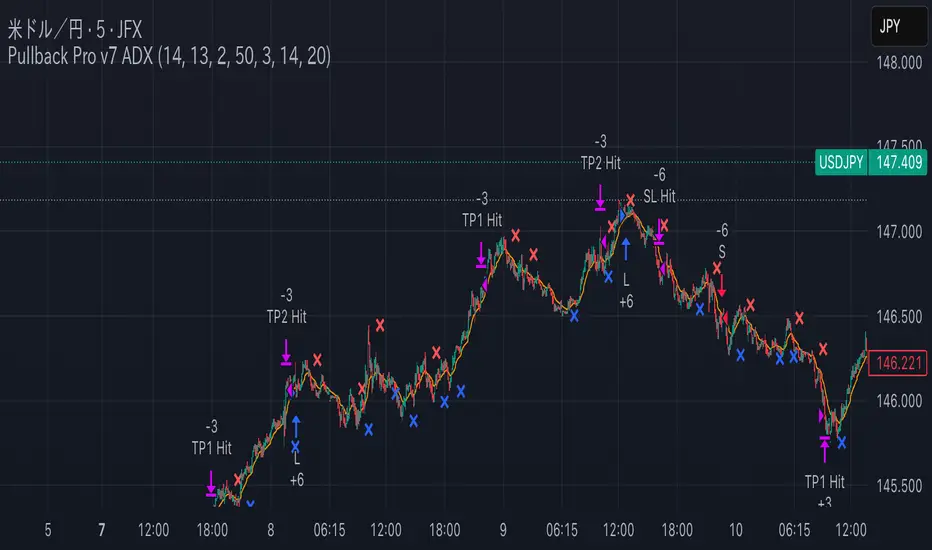
Pullback Pro Dow Strategy v7 (ADX Filter)
### **Strategy Description (For TradingView)**
#### **Title:** Pullback Pro: Dow Theory & ADX Strategy
---
#### **1. Summary**
This strategy is designed to identify and trade pullbacks within an established trend, based on the core principles of Dow Theory. It uses market structure (pivot highs and lows) to determine the trend direction and an Exponential Moving Average (EMA) to pinpoint pullback entry opportunities.
To enhance trade quality and avoid ranging markets, an ADX (Average Directional Index) filter is integrated to ensure that entries are only taken when the trend has sufficient momentum.
---
#### **2. Core Logic: How It Works**
The strategy's logic is broken down into three main steps:
**Step 1: Trend Determination (Dow Theory)**
* The primary trend is identified by analyzing recent pivot points.
* An **Uptrend** is confirmed when the script detects a pattern of higher highs and higher lows (HH/HL).
* A **Downtrend** is confirmed by a pattern of lower highs and lower lows (LH/LL).
* If neither pattern is present, the strategy considers the market to be in a range and will not seek trades.
**Step 2: Entry Signal (Pullback to EMA)**
* Once a clear trend is established, the strategy waits for a price correction.
* **Long Entry:** In a confirmed uptrend, a long position is initiated when the price pulls back and crosses *under* the specified EMA.
* **Short Entry:** In a confirmed downtrend, a short position is initiated when the price rallies and crosses *over* the EMA.
**Step 3: Confirmation & Risk Management**
* **ADX Filter:** To ensure the trend is strong enough to trade, an entry signal is only validated if the ADX value is above a user-defined threshold (e.g., 25). This helps filter out weak signals during choppy or consolidating markets.
* **Stop Loss:** The initial Stop Loss is automatically and logically placed at the last market structure point:
* For long trades, it's placed at the `lastPivotLow`.
* For short trades, it's placed at the `lastPivotHigh`.
* **Take Profit:** Two Take Profit levels are calculated based on user-defined Risk-to-Reward (R:R) ratios. The strategy allows for partial profit-taking at the first target (TP1), moving the remainder of the position to the second target (TP2).
---
#### **3. Input Settings Explained**
**① Dow Theory Settings**
* **Pivot Lookback Period:** Determines the sensitivity for detecting pivot highs and lows. A smaller number makes it more sensitive to recent price swings; a larger number focuses on more significant, longer-term pivots.
**② Entry Logic (Pullback)**
* **Pullback EMA Length:** Sets the period for the Exponential Moving Average used to identify pullback entries.
**③ Risk & Exit Management**
* **Take Profit 1 R:R:** Sets the Risk-to-Reward ratio for the first take-profit target.
* **Take Profit 1 (%):** The percentage of the position to be closed when TP1 is hit.
* **Take Profit 2 R:R:** Sets the Risk-to-Reward ratio for the final take-profit target.
**④ Filters**
* **Use ADX Trend Filter:** A master switch to enable or disable the ADX filter.
* **ADX Length:** The lookback period for the ADX calculation.
* **ADX Threshold:** The minimum ADX value required to confirm a trade signal. Trades will only be placed if the ADX is above this level.
---
#### **4. Best Practices & Recommendations**
* This is a trend-following system. It is designed to perform best in markets that exhibit clear, sustained trending behavior.
* It may underperform in choppy, sideways, or strongly ranging markets. The ADX filter is designed to help mitigate this, but no filter is perfect.
* **Crucially, you must backtest this strategy thoroughly** on your preferred financial instrument and timeframe before considering any live application.
* Experiment with the `Pivot Lookback Period`, `Pullback EMA Length`, and `ADX Threshold` to optimize performance for a specific market's characteristics.
---
#### **DISCLAIMER**
This script is provided for educational and informational purposes only. It does not constitute financial advice. All trading involves a high level of risk, and past performance is not indicative of future results. You are solely responsible for your own trading decisions. The author assumes no liability for any financial losses you may incur from using this strategy. Always conduct your own research and due diligence.
The Price ModelOpening Range Breakout
Focuses on taking advantage of the New York Opening High volatility
Main goal is to catch simple and straight forward trades with Strict rules
Recommend Targeting 1:1 first, and then setting stop to breakeven after 1:1 is hit
Can use 5 Min ORB 1:1 as a second TP after entering on the prior 1min ORB.

Momentum Trading StrategyThis is a Trend Following Momentum Strategy, where i used EMA, ADX, RSI, VWAP to take trade with Trend and initiate trade when Momentum builds up.
The Default target is 1:2

RSI Bullish Divergence TraderThis RSI Divergence Buy strategy identifies bullish divergence by detecting confirmed swing lows where the price forms a lower low compared to the previous swing low, but the RSI indicator shows a higher low, signaling weakening downward momentum often in oversold conditions. It enters a long position upon confirmation of these criteria, with the entry visualized by a green upward triangle below the pivot bar. Positions are exited either when the RSI crosses above a specified mean-reversion level (like 55) for profit-taking or hits a dynamic stop-loss set a percentage below the pivot low to manage risk.

RSI Divergence Buy v4 - More TradesThis RSI Divergence Buy strategy identifies bullish divergence by detecting confirmed swing lows where the price forms a lower low compared to the previous swing low, but the RSI indicator shows a higher low, signaling weakening downward momentum often in oversold conditions. It enters a long position upon confirmation of these criteria, with the entry visualized by a green upward triangle below the pivot bar. Positions are exited either when the RSI crosses above a specified mean-reversion level (like 55) for profit-taking or hits a dynamic stop-loss set a percentage below the pivot low to manage risk.

Monday Range +Monday Range+
A precision tool for early-week price action traders.
🔧 Features:
- Auto-draws Monday High, Low & Midrange
- Clear LONG/SHORT signal labels
- Midrange Reset (reloads trade logic)
- Ex-Line Protection (sweep filter)
- ½ Risk to Reward extension option
- Multi-Timeframe (MTF) support
📈 Trade Setup Logic:
LONG Setup:
- Valid only after Monday
- Price breaks below Monday Low
- Closes back above the Low and under the Midrange
- Candle must close higher than previous candle
- If Ex-Line Protection is on, trade is blocked if price swept below extension
- Enter at the Low of the range, target the High
SHORT Setup:
- Valid only after Monday
- Price breaks above Monday High
- Closes back below the High and above the Midrange
- Candle must close lower than previous candle
- If Ex-Line Protection is on, trade is blocked if price swept above extension
- Enter at the High of the range, target the Low
🎯 Ideal for liquidity fades and range reversal setups.

Trend Strength Oscillator📌 Trend Strength Oscillator
📄 Description
Trend Strength Oscillator measures the directional strength of price relative to an adaptive dynamic trend band. It evaluates how far the current price is from the midpoint of a trend channel and normalizes this value by recent volatility range, allowing traders to detect trend strength, direction, and potential exhaustion in any market condition.
📌 Features
🔹 Adaptive Trend Band Logic: Uses a modified ATR and time-dependent spread formula to dynamically adjust upper and lower trend bands.
🔹 Trendline Midpoint Calculation: The central trendline is defined as the average between upper and lower bands.
🔹 Relative Positioning: Measures how far the close is from the center of the band as a percentage.
🔹 Range Normalization: Uses a normalized range to account for recent volatility, reducing noise in the oscillator reading.
🔹 Oscillator Output (±100 scale):
+100 indicates strong bullish momentum
-100 indicates strong bearish momentum
0 is the neutral centerline
🛠️ How to Use
✅ Trend Strength > +50: Indicates a strong bullish phase.
✅ Trend Strength < -50: Indicates a strong bearish phase.
⚠️ Crossing above 0: Potential bullish trend initiation.
⚠️ Crossing below 0: Potential bearish trend initiation.
📉 Values near 0: Suggest trend weakness or ranging conditions.
Best suited timeframes: 1H, 4H, Daily
Ideal combination with: RSI, MACD, volume-based oscillators, moving average crosses
✅ TradingView House Rules Compliance
This indicator is written in Pine Script v5 and fully open-source.
The script does not repaint, does not generate false alerts, and does not access external or private data.
It is intended strictly as a technical analysis tool, and not a buy/sell signal generator.
Users are encouraged to combine this tool with other confirmations and independent judgment in trading decisions.
=========================================================
📌 Trend Strength Oscillator
📄 설명 (Description)
Trend Strength Oscillator는 가격이 동적 추세 밴드 내 어디에 위치해 있는지를 정량적으로 분석하여, 추세의 방향성과 강도를 시각적으로 보여주는 오실레이터 지표입니다. 최근 변동성을 반영한 밴드를 기반으로 가격 위치를 정규화하여, 과매수·과매도 상태나 추세의 소멸 가능성까지 탐지할 수 있도록 설계되었습니다.
📌 주요 특징 (Features)
🔹 적응형 추세 밴드 계산: ATR과 시간 경과를 기반으로 상단/하단 밴드를 동적으로 조정
🔹 중심 추세선 산출: 상단과 하단 밴드의 평균값을 중심선으로 활용하여 기준 축 제공
🔹 상대 위치 계산: 현재 종가가 중심선에서 얼마나 떨어져 있는지를 정규화하여 추세 강도 계산
🔹 변동성 기반 정규화: 최근 밴드 범위를 기준으로 상대 거리를 0~100 사이 값으로 변환
🔹 오실레이터 출력 (범위: ±100):
+100에 가까울수록 강한 상승 추세
-100에 가까울수록 강한 하락 추세
0에 가까울수록 횡보 구간 가능성
🛠️ 사용법 (How to Use)
✅ +50 이상: 강한 상승 추세 지속 중
✅ -50 이하: 강한 하락 추세 지속 중
⚠️ 0선 돌파 상향: 상승 추세 시작 가능성
⚠️ 0선 돌파 하향: 하락 추세 시작 가능성
🟡 0 근처 유지: 추세 약화 또는 횡보장 가능성
추천 시간대: 1시간봉, 4시간봉, 일봉
보조 지표로 추천: RSI, MACD, OBV, 이동평균 크로스 등과 함께 활용 시 효과적
✅ 트레이딩뷰 하우스룰 준수사항 (TradingView House Rules Compliance)
본 지표는 Pine Script v5로 작성된 오픈소스 공개용 스크립트입니다.
리페인트(Repaint) 현상이 없으며, **허위 경고(Spam Alerts)**나 성능 저하 요소도 없습니다.
외부 데이터 접근 없이 완전히 자체 계산으로 동작합니다.
이 지표는 투자 판단을 돕기 위한 분석용 도구이며, 직접적인 매수·매도 신호로 사용해서는 안 됩니다.
모든 트레이딩은 사용자의 독립적인 판단과 책임 하에 이루어져야 합니다.

Key Levels Cheat Sheet🎯 Overview
The Key Levels Cheat Sheet is a comprehensive TradingView indicator that displays 25+ critical price levels in a clean, organized table format. Inspired by professional trading platforms, this indicator eliminates chart clutter by
consolidating all essential support and resistance levels into a single, real-time updating reference table.
Perfect for day traders, swing traders, and scalpers who need instant visibility of key levels without drawing multiple lines on their charts.
📊 Features
Volume-Based Levels
- Session VWAP - Current day's volume weighted average price
- Weekly VWAP - Longer-term institutional trading level
- VWAP Bands (1σ, 2σ, 3σ) - Standard deviation bands showing price extension levels
Session-Based Levels (ICT Concepts)
- True Day Open - Midnight EST opening (ICT methodology)
- Futures Session Open - 6 PM EST futures market open
- Asia Session (9 PM - 1 AM EST) - Asian market high/low
- London Session (3 AM - 6 AM EST) - European market high/low
- NY AM Session (9:30 AM - 11 AM EST) - New York morning high/low
- NY PM Session (1:30 PM - 4 PM EST) - New York afternoon high/low
- Opening Range - Customizable 5/15/30-minute opening range
Historical Levels
- Prior Day/Week/Month - Previous period high/low levels
- 52-Week High/Low - Yearly extremes
- All-Time High/Low - Historical extremes
- Current Day High/Low - Today's range
Smart Money Structure
- Advanced Swing Detection - Market structure-based swing highs/lows
- Swept Range Detection - Automatically hides mitigated levels
- Real-Time Updates - Dynamic level detection
Technical Indicators
- EMAs (9, 21, 50) - Exponential moving averages
- SMAs (20, 50, 200) - Simple moving averages
Expected Move Calculation
- VIX-Based Range - Live VIX data integration
- Multiple Anchors - Calculate from True Day Open, NY Open, or Session Start
- Options Trading - Perfect for probability-based strategies
🎨 Display Features
Smart Table Design
- Auto-Sorting - Levels sorted from highest to lowest
- Color Coding - Green above price, red below price
- Distance Display - Shows percentage or points from current price
- 9 Position Options - Place table anywhere on chart
- Customizable Size - Adjustable text and opacity
Intelligent Filtering
- Hide Swept Ranges - Automatically removes broken levels
- Toggle Individual Levels - Show only what you need
- Clean Interface - No chart clutter
💡 Use Cases
Day Trading
- Track key intraday levels without cluttering charts
- Monitor session highs/lows for breakout trades
- Use VWAP and bands for mean reversion
- Opening range breakout strategies
Swing Trading
- Monitor weekly/monthly levels for position entries
- Track 52-week highs/lows for momentum plays
- Use prior period levels for support/resistance
Options Trading
- VIX-based expected move for strike selection
- Probability zones for credit spreads
- Key levels for pin risk assessment
Scalping
- Quick reference for immediate support/resistance
- VWAP bands for quick reversals
- Session levels for range trading
📚 Educational Value
Every setting includes detailed tooltips explaining:
- ICT (Inner Circle Trader) concepts
- Session trading strategies
- VWAP and standard deviation usage
- Expected move calculations
- Smart money structure
Perfect for traders learning advanced concepts while getting practical trading levels.
⚙️ Customization
Smart Defaults
- Essential levels enabled by default
- Less common levels disabled to reduce clutter
- Swept range hiding enabled for clean display
Full Control
- Toggle any level on/off
- Choose percentage or points display
- Adjust table position and appearance
- Customize for your trading style
🚀 Getting Started
1. Add to Chart - Works on any timeframe and instrument
2. Position Table - Choose from 9 positions
3. Enable Levels - Turn on levels relevant to your strategy
4. Start Trading - All levels update in real-time
📈 Why Use This Indicator?
- Save Time - No more drawing levels manually
- Stay Organized - All levels in one place
- Trade Better - Never miss a key level
- Learn Concepts - Educational tooltips included
- Professional Tool - Institutional-grade level tracking
🎓 Tips for Best Results
- Use on 1-15 minute charts for day trading
- Enable session levels for futures/forex trading
- Use expected move for options strategies
- Combine with your existing strategy for confluence
- Hide swept ranges to focus on active levels
---
The Key Levels Cheat Sheet transforms how you view and use support/resistance levels. Stop cluttering your charts with lines and start trading with clarity.
Tags: #levels #support #resistance #vwap #sessions #daytrading #scalping #options #expectedmove #smartmoney #ict #tradingview

Market Entropy Strategy V2.5This strategy is an updated version of a market entropy-based trading system. It removes EMA dependencies and introduces two indicators:
1. **Volatility Momentum Index (VMI)**: Measures volatility acceleration for timing entries (from calm to active phases) and exits (at peak chaos).
2. **Volume-Weighted Price Center (VWPC)**: A volume-weighted trend filter using typical price to determine overall market direction.
The strategy enters trades on transitions from low volatility ("calm") to increasing activity, filtered by trend direction. Exits occur when volatility reaches a high "chaos" threshold. It supports long, short, or both directions, with configurable parameters for optimization.
Backtest results depend on market conditions; use with caution and combine with your own analysis. No guarantees of performance.

Mongoose Capital: BTC ETF DriftScope ProMongoose Capital: BTC ETF DriftScope Pro
A proprietary indicator for monitoring drift between Bitcoin Spot (BTCUSD) and Bitcoin Spot ETFs (such as IBIT). Designed to detect ETF premium/discount zones and generate actionable Fade or Long bias signals.
What it Does
Tracks IBIT and BTCUSD spread to highlight ETF price deviations.
Calculates correlation Z-Score for ETF/Spot alignment.
Outputs numeric bias signals: Fade (1), Long (1), Neutral (1).
How to Use
Apply to a BTCUSD chart (4H, 1D, or higher recommended).
Open the Data Window to view:
IBIT Spread %
Correlation Z-Score
Correlation %
Bias Flags (Fade, Long, Neutral)
Configure alerts for Fade and Long Bias conditions.
Confirm all signals with your trade plan and risk management.
Methodology
This tool calculates the percentage spread between IBIT and BTC Spot. A rolling Z-Score of the correlation is used to detect periods of significant divergence.
Fade Bias suggests potential short setups in premium zones with high Z-Scores.
Long Bias suggests potential long setups in discount zones with low Z-Scores.
Disclaimer
This indicator is for educational purposes only. It is not financial advice. Use at your own risk and verify signals independently.

UT Bot Strategy with EMA Trend FilterUT Bot Strategy with EMA 20/50/100/200 acting as a trend filter.

Ultra Supply & DemandUltra Supply and Demand fixed.
Order Block Detection: Identifies potential order blocks (demand/supply zones)

RSI PotentialRSI Potential
This indicator does more than just track RSI; it measures the "energy" or "fuel" left in a trend. It answers a critical question: how much further can the price move before momentum is exhausted?
The key insight is that high momentum often means low potential, and vice versa. This inverse relationship is what allows the indicator to provide powerful, forward-looking signals about trend health and potential reversals.
Think of it like a race car:
Momentum is the car's current speed.
Potential is the amount of fuel left in the tank.
A car at top speed (high momentum) is burning fuel rapidly (potential is decreasing). A car just starting (low momentum) has a full tank of fuel (high potential). This indicator helps you see the fuel gauge, not just the speedometer.
This indicator plots three distinct components in a separate pane below your chart:
1. Upside Potential (Green Line)
What it shows: The percentage price increase required to hit the Overbought RSI Level. In other words, how much "fuel" is left for the upward trend.
How to interpret it:
Low Value (Approaching Zero): This is a warning sign. It means the price is already in high gear, and there is very little room left to run before hitting overbought exhaustion. Even if the price is rocketing up (high momentum), low potential signals the rally is likely on its last legs.
High Value: This indicates the market has a full tank of fuel for a rally. Even if the price is moving sideways or slowly (low momentum), the high potential suggests that if a new uptrend starts, it has the energy to be sustainable and significant.
2. Downside Potential (Red Line)
What it shows: The percentage price decrease required to hit the Oversold RSI Level—the "fuel" for a downtrend.
How to interpret it:
Low Value (Approaching Zero): A warning for bears. The price may be dropping fast (high momentum), but it's running out of energy to fall further. This signals seller exhaustion and increases the probability of a bounce or reversal.
High Value: The market has significant room to fall before becoming oversold. This can confirm the health of a new downtrend or suggest that a current downtrend has more to go.
3. Net Potential (Columns / Histogram)
What it shows: The net balance of energy: Upside Potential - Downside Potential. It answers, "Which side has more fuel in the tank?"

Volume-Confirmed Price Momentum# **Volume-Confirmed Price Momentum (VCPM) Indicator**
## **🔍 Overview**
Introducing the **Volume-Confirmed Price Momentum (VCPM)**, a sophisticated dual-metric indicator designed to identify high-probability momentum moves by analyzing the relationship between price action and volume dynamics. This indicator combines correlation analysis with volume strength validation to filter out weak signals and highlight institutional-backed movements.
---
## **⚙️ Core Mechanics**
**Price-Volume Correlation Engine:**
- Calculates real-time correlation between price movements and volume
- Configurable lookback period (default: 8 bars)
- Option to use price changes or absolute values
- Correlation range: -1.0 (perfect negative) to +1.0 (perfect positive)
**Volume Strength Analyzer:**
- Compares current volume against its moving average (default: 128 periods)
- Normalizes volume ratio to 0-1 scale for consistent interpretation
- Identifies when volume significantly exceeds historical norms
---
## **📊 Signal Generation**
### **🟢 Bullish Confirmation Signal**
**Trigger:** Positive correlation > 0.6 + Volume ratio > 0.5
- Price and volume moving in harmony upward
- Above-average volume confirms the move
- Indicates strong institutional buying interest
### **🔴 Bearish Confirmation Signal**
**Trigger:** Negative correlation < -0.6 + Volume ratio > 0.5
- Price declining with increasing volume
- Suggests distribution or institutional selling
- High-confidence bearish momentum
---
## **🎯 Trading Applications**
**Breakout Validation:**
Filter false breakouts by requiring volume confirmation before entering positions.
**Trend Continuation:**
Identify when existing trends have strong volume backing for continuation plays.
**Distribution Detection:**
Spot potential tops when price struggles despite high volume (negative correlation).
**Entry Timing:**
Built-in alert system notifies when both conditions align for optimal entry points.
---
## **🔧 Customization Features**
- **Correlation Period:** Adjust sensitivity (2-500 bars)
- **Volume Averaging:** Modify volume comparison timeframe
- **Alert Thresholds:** Fine-tune correlation and volume ratio triggers
- **Visual Options:** Toggle volume histogram display
- **Price Source:** Choose from OHLC or custom sources
---
## **💡 Why VCPM Works**
Traditional momentum indicators often generate false signals during low-volume periods. VCPM solves this by requiring **dual confirmation**: price momentum must be supported by corresponding volume activity. This approach:
- Reduces whipsaws and false breakouts
- Identifies institutional participation
- Provides higher conviction trade setups
- Works across all timeframes and markets
---
## **📈 Best Use Cases**
✅ **Crypto markets** (high volatility, volume-driven)
✅ **Stock breakouts** (earnings, news events)
✅ **Forex majors** (during high-impact news)
✅ **Futures trading** (momentum confirmation)
---
## **⚠️ Important Notes**
- Works best in liquid markets with consistent volume data
- Combine with support/resistance levels for enhanced accuracy
- Consider market context (trending vs. ranging conditions)
- Not recommended for extremely low-volume periods
---
## **🚀 Getting Started**
1. Add VCPM to your chart as a sub-panel indicator
2. Configure correlation threshold (start with 0.6)
3. Set volume ratio threshold (start with 0.5)
4. Enable alerts for automated signal detection
5. Backtest on your preferred timeframe and instrument
---
**Ready to enhance your momentum trading with volume confirmation? Try VCPM and experience the difference institutional-backed signals can make in your trading results.**
*Available in Pine Script v6 - Compatible with all TradingView accounts*

SMA - ATR with Dual SMAs + Candle Body Inside SignalsSMA - ATR with Dual SMAs + Candle Body Inside Signals

Intelligent Top & Bottom Finder v9.8 Keyvankh📈 Intelligent Top & Bottom Finder v9.8 Keyvankh
A next-generation all-in-one trading system for precise tops, bottoms, and reversals across all timeframes.
---
🟢 Overview
This indicator is a powerful and intelligent solution for detecting market tops and bottoms, key reversals, and S/R zones with institutional-grade accuracy. Designed for traders seeking an edge in any market (crypto, forex, stocks), it combines advanced candlestick recognition, multi-indicator confirmation, smart support/resistance clustering, and strict signal filtering into one seamless tool.
---
🔎 How Does It Work?
1. Advanced Support & Resistance Clustering
Automatically detects and draws high-probability support and resistance zones using dynamic ATR-based pivot clustering.
Highlights breakouts and retest (flip) zones in real-time, adapting to changing market structure.
2. Full Candlestick Pattern Recognition
Scans for 15+ classic and advanced patterns: Engulfing, Pin Bar, Doji, Three Bar, Marubozu, Hammer, Shooting Star, Three White Soldiers, Three Black Crows, Tweezer, Morning/Evening Star, Kicker, Belt Hold, and more.
Scores each pattern’s strength based on location (S/R zone, retest, breakout), volume context, and confirmation signals.
3. Multi-Indicator Confirmation Engine**
Integrates and scores confirmation from up to five additional sources:
RSI Games 1.2** (smoothed LTF momentum shifts)
MACD Divergence** (bullish/bearish momentum reversal)
QQE+ v7 Advanced** (dynamic volatility filter)
OBV Trend Filter** (volume-backed trend validation)
Volume Game** (net volume spike and reversal detection)
Each module can be enabled or disabled to fit your personal trading style.
4. Institutional S/R and Retest Logic
Real-time recognition of major trendline breaks, retest zones, and price flips.
Automatic labeling and coloring of S/R zones, retest boxes, and confirmation candles.
5. Smart Buy & Sell Signal Generation**
Combines all scoring modules with strict logical filters and “failsafe override” logic (guaranteeing signal on confirmed hammers, engulfings, etc. even if other filters disagree).
Plots clear “BUY” and “SELL” labels only when a strong, multi-factor signal appears—minimizing noise and maximizing reliability.
Built-in fallback logic (optional) for edge cases.
6. Alerts & Automation Ready
TradingView alerts for all BUY, SELL, or ANY signal conditions—perfect for auto-trading or notification setups.
---
*⚙️ Customizable Inputs
Enable/Disable any module (RSI Games, MACD, OBV, QQE+, Candlestick Scanner, Volume Game)
Minimum Confirmations** required for a signal (1–10)
Pivot/Zone Sensitivity:** ATR multiplier, pivots per cluster, retest bar duration
LTF (Lower Timeframe) Confirmation:** Fully configurable
---
📊 How To Use**
Apply on any timeframe and symbol**—crypto, stocks, forex, indices.
Use as a **standalone reversal/entry tool** or to confirm your own technical setups.
Combine with your favorite momentum, trend, or volume indicators for advanced confluence.
Set up **TradingView alerts** for auto-trading, Telegram/email notifications, or trade journaling.
---
🟢 What Makes This Unique?
All-in-one multi-indicator fusion:** No more juggling a dozen scripts.
Institutional logic:** Goes beyond basic signals with true S/R, retest, and volume logic.
Full transparency:** Source code is clear and commented (if published open-source).
Fast and reliable:** Optimized for minimal lag and maximum accuracy.
---
⚠️ Disclaimer**
This indicator is a tool to assist with trade timing and risk management. **No system is 100% accurate.** Always use in conjunction with your own analysis and risk management practices.
---
📚 Credits & License**
Created by Keyvan Khodakhah.
You may use, modify, or share this script under the (mozilla.org).
Please credit the original author if you fork or reuse in public.
---
Questions, feedback, or collaboration? Contact: Keyvankh
---
Precision in technical analysis comes from layers of confluence and discipline. This tool brings that precision to your chart.

Neuracap Gap AnalysisThe Neuracap Gap Analysis indicator is a comprehensive tool designed to identify and track price gaps, special candlestick patterns, and high-volume breakout signals. It combines multiple trading strategies into one powerful indicator for gap trading, pattern recognition, and momentum analysis.
🎯 What This Indicator Does
1. Gap Detection & Tracking
Automatically identifies price gaps (up and down)
Tracks gap fills with visual boxes that extend until closed
Manages gap history with customizable limits
Color-coded visualization (Green = Gap Up, Red = Gap Down)
2. Upside Tasuki Gap Pattern
Identifies the bullish continuation pattern
Colors candles yellow when pattern is detected
Confirms trend continuation signals
3. Episodic Pivot Detection
High-volume breakout identification
EMA filter ensures signals only in uptrends
Strong momentum confirmation
Fuchsia-colored candles with arrow markers
🔍 How to Use for Trading
📈 Gap Trading Strategy
Gap Up Trading:
Wait for gap up (green box appears)
Check volume - Higher volume = stronger signal
Entry options:
Aggressive: Enter at market open
Conservative: Wait for pullback to gap level
Stop loss: Below the gap fill level
Target: Previous resistance or 2:1 risk/reward
Gap Down Trading:
Identify gap down (red box appears)
Look for bounce opportunities
Entry: When price shows reversal signs
Stop: Below recent lows
Target: Gap fill level
💫 Tasuki Gap Strategy
Yellow candle indicates bullish continuation
Confirms uptrend is likely to continue
Entry: On next candle after pattern
Stop: Below the gap low
Target: Next resistance level
🚀 Episodic Pivot Strategy
Fuchsia candle + arrow = High probability breakout
All conditions met:
Price above EMA 20, 50, 200
High volume (2x+ average)
Strong price move (4%+)
Entry: At close or next open
Stop: Below EMA 20 or recent swing low
Target: Measured move or next resistance
📊 Reading the Visual Signals
Gap Boxes
🟢 Green Box: Gap up - potential bullish continuation
🔴 Red Box: Gap down - potential bounce or bearish continuation
Box extends until gap is filled
Box disappears when gap closes
Candle Colors
🟡 Yellow: Tasuki gap pattern (bullish continuation)
🟪 Fuchsia: Episodic pivot (high-volume breakout)
⬜ Normal: No special pattern detected
Arrows & Markers
⬆️ Triangle Arrow: Episodic pivot confirmation
💡 Trading Tips & Best Practices
✅ Do's
Combine with trend analysis - Trade gaps in direction of trend
Check volume - Higher volume = more reliable signals
Use multiple timeframes - Confirm on higher timeframes
Risk management - Always set stop losses
Wait for confirmation - Don't chase, let signals develop
❌ Don'ts
Don't trade all gaps - Focus on high-quality setups
Avoid low volume - Weak volume = unreliable signals
Don't ignore trend - Counter-trend trading is risky
Don't overtrade - Quality over quantity
Don't ignore context - Consider market conditions
⚠️ Risk Management
Position sizing: Risk 1-2% per trade
Stop losses: Always define before entry
Target levels: Set realistic profit targets
Market conditions: Avoid trading in choppy markets
📈 Performance Optimization
For Conservative Traders:
Increase minimum gap size to 1%
Set volume multiplier to 3.0x
Only trade episodic pivots in strong uptrends
Wait for gap fill confirmation
For Aggressive Traders:
Decrease minimum gap size to 0.3%
Set volume multiplier to 1.5x
Trade both gap types
Enter on pattern confirmation
🚨 Alert Setup
The indicator provides alerts for:
Gap Up Detected
Gap Down Detected
Upside Tasuki Gap
Episodic Pivot
Recommended: Enable all alerts and filter manually based on your strategy.
📝 Summary
This indicator excels at identifying high-probability trading opportunities through gap analysis, pattern recognition, and momentum confirmation. Use it as part of a complete trading system with proper risk management for best results.

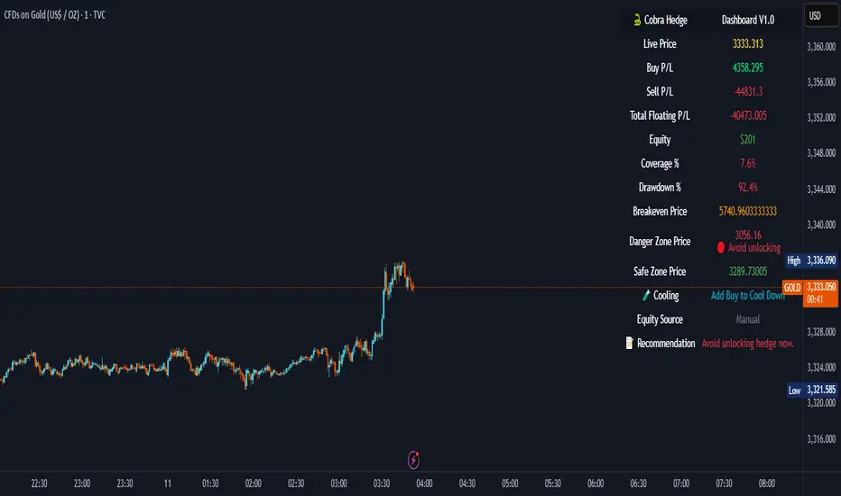
Cobra Hedge Dashboard – V1.0 Final Master🧠 Cobra Hedge Dashboard – V1.0 Final Master
V1.0 | Smart Risk Filter for Open Hedge Positions
📝 (Description):
Cobra Hedge Dashboard is built specifically for traders managing open hedge positions. It provides a real-time view of directional pressure, smart zones, and price behavior to help make informed decisions such as:
When to partially close hedge orders
When to reverse positions based on flow & exhaustion
Which side (Buy or Sell) currently has momentum
Detecting price reaching critical zones (Supply/Demand)
Measuring volume strength to avoid fake exits
🔍 Ideal for traders already in the market — this dashboard is not an entry signal system, but a tool to manage hedge exits and exposure.
Built-in calculations include:
VWAP and EMA cross-pressure
Directional flow meter
Auto Supply & Demand Zones
Volume spikes and breakout strength
Best used on 1m–15m charts.
Open-source for transparency and improvement.