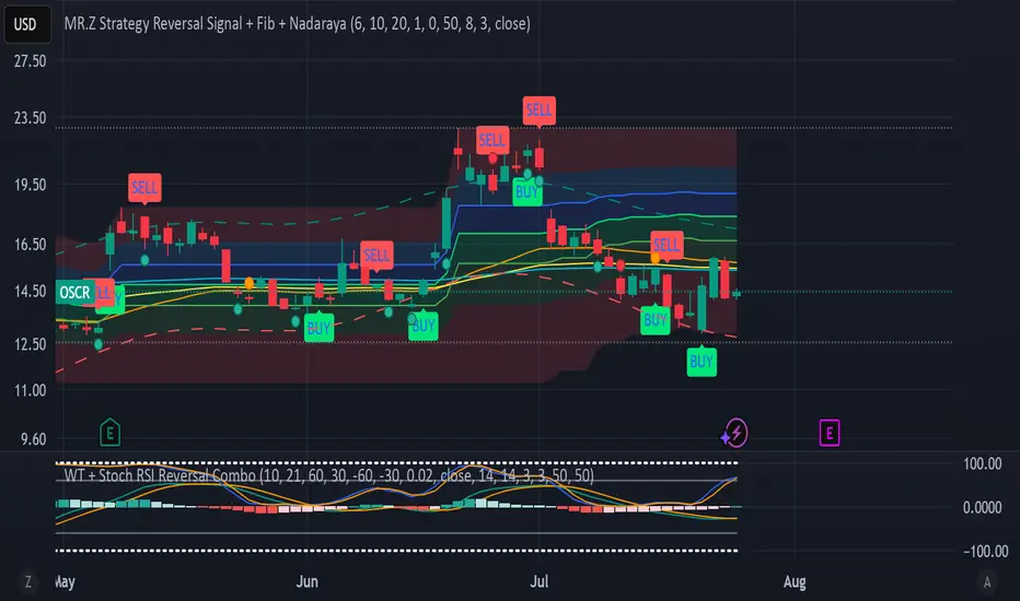
WT + Stoch RSI Reversal Combo📊MR.Z RSI : WT + Stochastic RSI Reversal Combo
This custom indicator combines WaveTrend oscillator and Stochastic RSI to detect high-confidence market reversal points, filtering signals so they only appear when both indicators align.
🔍 Core Components:
✅ WaveTrend Oscillator
Based on smoothed deviation from EMA (similar to TCI logic)
Plots:
WT1 (main line)
WT2 (signal line = SMA of WT1)
Uses overbought/oversold thresholds (default: ±53) to filter signals
✅ Stochastic RSI
Momentum oscillator based on RSI's stochastic value
Plots:
%K: smoothed Stoch of RSI
%D: smoothed version of %K
Adjustable oversold/overbought thresholds (default: 20/80)
🔁 Combined Reversal Signal Logic:
🔼 Buy Signal
WT1 crosses above WT2 below WT oversold level (e.g., -53)
%K crosses above %D below Stoch RSI oversold level (e.g., 20)
🔽 Sell Signal
WT1 crosses below WT2 above WT overbought level (e.g., 53)
%K crosses below %D above Stoch RSI overbought level (e.g., 80)
🔔 Signals are only plotted and alerted if both conditions are true.
📌 Features:
Toggle on/off:
WaveTrend lines and histogram
Stochastic RSI
Combined Buy/Sell signals
Horizontal reference lines (±100, OB/OS)
Fully customizable smoothing lengths and thresholds
Signal plots:
✅ Green up-triangle = Combo Buy
✅ Red down-triangle = Combo Sell
Optional: Circle/cross markers for WT-only and Stoch-only signals
🔔 Built-in alerts for Buy/Sell signals
📈 Use Cases:
Reversal Trading: Wait for both indicators to confirm momentum shift
Entry Filter: Use in combination with trend indicators (like EMA)
Scalping or Swing: Works on intraday and higher timeframes
Trend Analysis
CandleSensei – EMA200, Wick & Pattern Alerts)CandleSensei is an advanced Pine Script designed for traders who need real-time alerts on key price action signals and candlestick patterns. It combines EMA200 analysis, volatility (ATR), wick/body detection, and classical candlestick pattern recognition (Engulfing, Pin Bar, Doji, Marubozu) – all in a single tool.
Key Features:
EMA200 HUD – Displays price deviation from EMA200 with directional arrows (▲ / ▼) and percentage values.
Wick Alerts – Alerts for significant wicks:
WICK ALERT: ↓🐂 3.5% (long lower wick – bullish signal).
WICK ALERT: ↑🐻 4.2% (long upper wick – bearish signal).
Big Body Alerts – Detects strong candle bodies exceeding a customizable threshold.
BIG BODY ALERT: ↑ 5.8%
BIG BODY ALERT: ↓ 4.7%
Candlestick Patterns – Automatic alerts for:
Engulfing (🟢🐂 or 🔴🐻).
Pin Bar (🟢🔨 Hammer, 🔴☄️ Shooting Star).
Doji (⚪ Doji 🟢↑ / 🔴↓).
Marubozu (📏 Marubozu 🟢↑ / 🔴↓).
On-Chart HUD – Shows ATR, price vs EMA200, wick size, and full body % in a compact table.
Why use CandleSensei?
Perfect for swing traders (Daily/Weekly analysis) and intraday traders (1H).
Combines trend direction, volatility, and price action patterns in a single dashboard.
Fully customizable thresholds for wick and body alerts.

Days Since ±1% Move on CloseInterpretation & Use‑Case
The “Days Since ±1% Move” indicator simply tells you how many trading days have passed since the last daily close that moved at least 1% in either direction. Here’s how to put it to work:
Complacency Gauge
A long stretch without a ≥1% move often signals that realized volatility has collapsed and market participants may be under‑positioned for a sudden swing.
Positioning Insight
When institutional hedges and systematic strategies see low recent volatility, they tend to scale back protection (fewer options hedges, tighter risk limits), which can amplify the impact of any eventual volatility pickup.
Mean‑Reversion Signal
After an extended streak (e.g. 20–30 days), a fresh ≥1% move is more likely—and often more violent—because pent‑up positioning flows rush to adjust.
Trend Confirmation
Conversely, a reset in the count (i.e., a new ≥1% move) that coincides with strong volume and follow‑through suggests genuine directional conviction rather than just a volatility “blip.”

The Kyber Cell's – TTM Wave CThe Kyber Cell’s Wave C – TTM Squeeze Macro Bias & Structural Filter
⸻
1. Introduction
Wave C is the strategic compass in the TTM Squeeze Wave system — the final layer that helps you align with the larger trend or macro context. While Wave A delivers momentum bursts and Wave B confirms active trend direction, Wave C filters trades through a broader lens, helping you avoid taking strong intraday setups that go against the dominant structure.
Wave C is designed to act as your macro bias validator — filtering out trades that contradict higher-timeframe flows or major moving average slopes. When all three waves line up, you’re no longer just reacting to signals — you’re trading with intention and structure. When in doubt, zoom out and that is what Wave C gives you.
⸻
2. Core Concept and Calculation
Wave C is built to measure high-level trend bias, either on the current chart timeframe or derived from a higher timeframe (HTF). Its logic is based on one or more of the following structural tools:
• Long-term EMA slope (e.g., 55, 89, or 200 EMA)
• HTF VWAP positioning (price above or below)
• Long-period HMA slope (e.g., HMA 144 or HMA 233)
• Directional bias from HTF TTM Squeeze or MTF trend engine
Unlike Wave A and B, which may fluctuate during normal price swings, Wave C changes more slowly. That’s the point — it gives a “big picture” backdrop against which all lower-level signals should be evaluated. It reduces false positives and helps you wait for trades in the direction of the broader trend.
⸻
3. Visual Output and Color Logic
Wave C uses a simple and deliberate color scheme to communicate macro alignment:
• Green: Bullish macro structure
• Red: Bearish macro structure
• Gray: Neutral, indecisive, or flat macro trend
This muted but firm logic encourages patient, structured trading. The goal isn’t to trigger trades directly from Wave C, but to filter out trades that contradict market posture.
• When Wave C is Green, you ideally want Wave B to be blue and Wave A to turn cyan before going long.
• When Wave C is Red, you look for Wave B to be red and Wave A to turn bright red before shorting.
• If Wave C is Gray, it may signal choppy, indecisive structure — use caution or reduce trade size.
⸻
4. Ideal Use Case
Wave C functions as your global bias filter:
1. Set your directional bias for the session or week.
2. Only take trades that agree with Wave C direction.
3. When all waves align, trade with size and confidence.
4. When Wave C disagrees, wait or downshift your trade plan.
This makes Wave C especially valuable for swing traders, position traders, or intraday traders who want to anchor their entries within a broader trend.
⸻
5. Configuration and Customization
Wave C is built with advanced users in mind, and its configuration allows multiple structural methods:
• EMA Slope Method: Set EMA length and threshold angle
• HTF Source Method: Request HTF data for squeeze trend, VWAP, or Wave B analog
• HMA Trend Filter: Longer-term smoothing to detect sustained directional flow
• Color Preferences: Customize green/red/gray scheme as needed
This flexibility allows you to tailor Wave C to your strategy — whether you’re anchoring to a Daily EMA while scalping the 5-minute chart, or aligning swing entries with the Weekly VWAP.
⸻
6. Alerts and Add-ons
Although Wave C isn’t typically used for alerts, it can be incorporated into confluence-based alert stacks. For example:
• Alert only when Wave C = Green, Wave B = Blue, and Wave A = Rising
• Alert on macro flip (e.g., Green → Red) as a possible regime change
• Alert when macro bias agrees with MTF Squeeze Panel bias
These setups are more advanced but help automate disciplined trade selection.
⸻
7. Disclaimer
This indicator is for educational and research purposes only. It is not trading advice. Wave C is most effective when used in conjunction with Wave A, Wave B, and other structural context. All trades should be executed with proper risk management and backtested methodology.

3 EMA Signal with Cleaned Dual Entry Logic3-EMA Trend Following Indicator with Buy/Sell Signals
EMA1 = Slow EMA (default 100)
EMA2 = Fast EMA (default 10)
EMA3 = Medium EMA (default 20)
Trend is bullish when EMA2 and EMA3 are above EMA1
Buy when EMA2 crosses above EMA3 in bullish trend
Sell when EMA2 crosses below EMA3 in bearish trend
Entry and exit points are plotted on chart

Reversal Point Dynamics⇋ Reversal Point Dynamics (RPD)
This is not an indicator; it is a complete system for deconstructing the mechanics of a market reversal. Reversal Point Dynamics (RPD) moves far beyond simplistic pattern recognition, venturing into a deep analysis of the underlying forces that cause trends to exhaust, pause, and turn. It is engineered from the ground up to identify high-probability reversal points by quantifying the confluence of market dynamics in real-time.
Where other tools provide a static signal, RPD delivers a dynamic probability. It understands that a true market turning point is not a single event, but a cascade of failing momentum, structural breakdown, and a shift in market order. RPD's core engine meticulously analyzes each of these dynamic components—the market's underlying state, its velocity and acceleration, its degree of chaos (entropy), and its structural framework. These forces are synthesized into a single, unified Probability Score, offering you an unprecedented, transparent view into the conviction behind every potential reversal.
This is not a "black box" system. It is an open-architecture engine designed to empower the discerning trader. Featuring real-time signal projection, an integrated Fibonacci R2R Target Engine, and a comprehensive dashboard that acts as your Dynamics Control Center , RPD gives you a complete, holistic view of the market's state.
The Theoretical Core: Deconstructing Market Dynamics
RPD's analytical power is born from the intelligent synthesis of multiple, distinct theoretical models. Each pillar of the engine analyzes a different facet of market behavior. The convergence of these analyses—the "Singularity" event referenced in the dashboard—is what generates the final, high-conviction probability score.
1. Pillar One: Quantum State Analysis (QSA)
This is the foundational analysis of the market's current state within its recent context. Instead of treating price as a random walk, QSA quantizes it into a finite number of discrete "states."
Formulaic Concept: The engine establishes a price range using the highest high and lowest low over the Adaptive Analysis Period. This range is then divided into a user-defined number of Analysis Levels. The current price is mapped to one of these states (e.g., in a 9-level system, State 0 is the absolute low, and State 8 is the absolute high).
Analytical Edge: This acts as a powerful foundational filter. The engine will only begin searching for reversal signals when the market has reached a statistically stretched, extreme state (e.g., State 0 or 8). The Edge Sensitivity input allows you to control exactly how close to this extreme edge the price must be, ensuring you are trading from points of maximum potential exhaustion.
2. Pillar Two: Price State Roc (PSR) - The Dynamics of Momentum
This pillar analyzes the kinetic forces of the market: its velocity and acceleration. It understands that it’s not just where the price is, but how it got there that matters.
Formulaic Concept: The psr function calculates two derivatives of price.
Velocity: (price - price ). This measures the speed and direction of the current move.
Acceleration: (velocity - velocity ). This measures the rate of change in that speed. A negative acceleration (deceleration) during a strong rally is a critical pre-reversal warning, indicating momentum is fading even as price may be pushing higher.
Analytical Edge: The engine specifically hunts for exhaustion patterns where momentum is clearly decelerating as price reaches an extreme state. This is the mechanical signature of a weakening trend.
3. Pillar Three: Market Entropy Analysis - The Dynamics of Order & Chaos
This is RPD's chaos filter, a concept borrowed from information theory. Entropy measures the degree of randomness or disorder in the market's price action.
Formulaic Concept: The calculateEntropy function analyzes recent price changes. A market moving directionally and smoothly has low entropy (high order). A market chopping back and forth without direction has high entropy (high chaos). The value is normalized between 0 and 1.
Analytical Edge: The most reliable trades occur in low-entropy, ordered environments. RPD uses the Entropy Threshold to disqualify signals that attempt to form in chaotic, unpredictable conditions, providing a powerful shield against whipsaw markets.
4. Pillar Four: The Synthesis Engine & Probability Calculation
This is where all the dynamic forces converge. The final probability score is a weighted calculation that heavily rewards confluence.
Formulaic Concept: The calculateProbability function intelligently assembles the final score:
A Base Score is established from trend strength and entropy.
An Entropy Score adds points for low entropy (order) and subtracts for high entropy (chaos).
A significant Divergence Bonus is awarded for a classic momentum divergence.
RSI & Volume Bonuses are added if momentum oscillators are in extreme territory or a volume spike confirms institutional interest.
MTF & Adaptive Bonuses add further weight for alignment with higher timeframe structure.
Analytical Edge: A signal backed by multiple dynamic forces (e.g., extreme state + decelerating momentum + low entropy + volume spike) will receive an exponentially higher probability score. This is the very essence of analyzing reversal point dynamics.
The Command Center: Mastering the Inputs
Every input is a precise lever of control, allowing you to fine-tune the RPD engine to your exact trading style, market, and timeframe.
🧠 Core Algorithm
Predictive Mode (Early Detection):
What It Is: Enables the engine to search for potential reversals on the current, unclosed bar.
How It Works: Analyzes intra-bar acceleration and state to identify developing exhaustion. These signals are marked with a ' ? ' and are tentative.
How To Use It: Enable for scalping or very aggressive day trading to get the earliest possible indication. Disable for swing trading or a more conservative approach that waits for full bar confirmation.
Live Signal Mode (Current Bar):
What It Is: A highly aggressive mode that plots tentative signals with a ' ! ' on the live bar based on projected price and momentum. These signals repaint intra-bar.
How It Works: Uses a linear regression projection of the close to anticipate a reversal.
How To Use It: For advanced users who use intra-bar dynamics for execution and understand the nature of repainting signals.
Adaptive Analysis Period:
What It Is: The main lookback period for the QSA, PSR, and Entropy calculations. This is the engine's "memory."
How It Works: A shorter period makes the engine highly sensitive to local price swings. A longer period makes it focus only on major, significant market structure.
How To Use It: Scalping (1-5m): 15-25. Day Trading (15m-1H): 25-40. Swing Trading (4H+): 40-60.
Fractal Strength (Bars):
What It Is: Defines the strength of the pivot detection used for confirming reversal events.
How It Works: A value of '2' requires a candle's high/low to be more extreme than the two bars to its left and right.
How To Use It: '2' is a robust standard. Increase to '3' for an even stricter definition of a structural pivot, which will result in fewer signals.
MTF Multiplier:
What It Is: Integrates pivot data from a higher timeframe for confluence.
How It Works: A multiplier of '4' on a 15-minute chart will pull pivot data from the 1-hour chart (15 * 4 = 60m).
How To Use It: Set to a multiple that corresponds to your preferred higher timeframe for contextual analysis.
🎯 Signal Settings
Min Probability %:
What It Is: Your master quality filter. A signal is only plotted if its score exceeds this threshold.
How It Works: Directly filters the output of the final probability calculation.
How To Use It: High-Quality (80-95): For A+ setups only. Balanced (65-75): For day trading. Aggressive (50-60): For scalping.
Min Signal Distance (Bars):
What It Is: A noise filter that prevents signals from clustering in choppy conditions.
How It Works: Enforces a "cooldown" period of N bars after a signal.
How To Use It: Increase in ranging markets to focus on major swings. Decrease on lower timeframes.
Entropy Threshold:
What It Is: Your "chaos shield." Sets the maximum allowable market randomness for a signal.
How It Works: If calculated entropy is above this value, the signal is invalidated.
How To Use It: Lower values (0.1-0.5): Extremely strict. Higher values (0.7-1.0): More lenient. 0.85 is a good balance.
Adaptive Entropy & Aggressive Mode:
What It Is: Toggles for dynamically adjusting the engine's core parameters.
How It Works: Adaptive Entropy can slightly lower the required probability in strong trends. Aggressive Mode uses more lenient settings across the board.
How To Use It: Keep Adaptive on. Use Aggressive Mode sparingly, primarily for scalping highly volatile assets.
📊 State Analysis
Analysis Levels:
What It Is: The number of discrete "states" for the QSA.
How It Works: More levels create a finer-grained analysis of price location.
How To Use It: 6-7 levels are ideal. Increasing to 9 can provide more precision on very volatile assets.
Edge Sensitivity:
What It Is: Defines how close to the absolute top/bottom of the range price must be.
How It Works: '0' means price must be in the absolute highest/lowest state. '3' allows a signal within the top/bottom 3 states.
How To Use It: '3' provides a good balance. Lower it to '1' or '0' if you only want to trade extreme exhaustion.
The Dashboard: Your Dynamics Control Center
The dashboard provides a transparent, real-time view into the engine's brain. Use it to understand the context behind every signal and to gauge the current market environment at a glance.
🎯 UNIFIED PROB SCORE
TOTAL SCORE: The highest probability score (either Peak or Valley) the engine is currently calculating. This is your main at-a-glance conviction metric. The "Singularity" header refers to the event where market dynamics align—the event RPD is built to detect.
Quality: A human-readable interpretation of the Total Score. "EXCEPTIONAL" (🌟) is a rare, A+ confluence event. "STRONG" (💪) is a high-quality, tradable setup.
📊 ORDER FLOW & COMPONENT ANALYSIS
Volume Spike: Shows if the current volume is significantly higher than average (YES/NO). A 'YES' adds major confirmation.
Peak/Valley Conf: This breaks down the probability score into its directional components, showing you the separate confidence levels for a potential top (Peak) versus a bottom (Valley).
🌌 MARKET STRUCTURE
HTF Trend: Shows the direction of the underlying trend based on a Supertrend calculation.
Entropy: The current market chaos reading. "🔥 LOW" is an ideal, ordered state for trading. "😴 HIGH" is a warning of choppy, unpredictable conditions.
🔮 FIB & R2R ZONE (Large Dashboard)
This section gives you the status of the Fibonacci Target Engine. It shows if an Active Channel (entry zone) or Stop Zone (invalidation zone) is active and displays the precise price levels for the static entry, target, and stop calculated at the time of the signal.
🛡️ FILTERS & PREDICTIVES (Large Dashboard)
This panel provides a status check on all the bonus filters. It shows the current RSI Status, whether a Divergence is present, and if a Live Pending signal is forming.
The Visual Interface: A Symphony of Data
Every visual element is designed for instant, intuitive interpretation of market dynamics.
Signal Markers: These are the primary outputs of the engine.
▼/▲ b: A fully confirmed signal that has passed all filters.
? b: A tentative signal generated in Predictive Mode, indicating developing dynamics.
◈ b: This diamond icon replaces the standard triangle when the signal is confirmed by a strong momentum divergence, highlighting it as a superior setup where dynamics are misaligned with price.
Harmonic Wave: The flowing, colored wave around the price.
What It Represents: The market's "flow dynamic" and volatility.
How to Interpret It: Expanding waves show increasing volatility. The color is tied to the "Quantum Color" in your theme, representing the underlying energy field of the market.
Entropy Particles: The small dots appearing above/below price.
What They Represent: A direct visualization of the "order dynamic."
How to Interpret Them: Their presence signifies a low-entropy, ordered state ideal for trading. Their color indicates the direction of momentum (PSR velocity). Their absence means the market is too chaotic (high entropy).
The Fibonacci Target Engine: The dynamic R2R system appearing post-signal.
Static Fib Levels: Colored horizontal lines representing the market's "structural dynamic."
The Green "Active Channel" Box: Your zone of consideration. An area to manage a potential entry.
Development Philosophy
Reversal Point Dynamics was engineered to answer a fundamental question: can we objectively measure the forces behind a market turn? It is a synthesis of concepts from market microstructure, statistics, and information theory. The objective was never to create a "perfect" system, but to build a robust decision-support tool that provides a measurable, statistical edge by focusing on the principle of confluence.
By demanding that multiple, independent market dynamics align simultaneously, RPD filters out the vast majority of market noise. It is designed for the trader who thinks in terms of probability and risk management, not in terms of certainties. It is a tool to help you discount the obvious and bet on the unexpected alignment of market forces.
"Markets are constantly in a state of uncertainty and flux and money is made by discounting the obvious and betting on the unexpected."
— George Soros
Trade with insight. Trade with anticipation.
— Dskyz, for DAFE Trading Systems

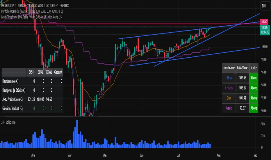
Multi-Timeframe EMA Table (Woche, Tag, 4h, 1h)Title: Multi-Timeframe EMA Table (Weekly, Daily, 4h, 1h)
Description:
This Pine Script indicator provides a concise and clear Multi-Timeframe (MTF) Exponential Moving Average (EMA) analysis directly on your TradingView chart. It displays the EMA values for the 1-hour, 4-hour, 1-day, and 1-week timeframes in a customizable table.
Features:
Clear Table Display: Shows the current EMA values for predefined higher timeframes (1h, 4h, Day, Week).
Dynamic Status: The status column immediately visualizes whether the current price of your chart is above (Green) or below (Red) its respective Multi-Timeframe EMA.
Customizable EMA Length: The length of the EMA can be easily adjusted via the indicator settings, allowing you to tailor it to your preferred analysis.
Visual Confirmation: The corresponding Multi-Timeframe EMA lines are optionally plotted directly on the chart to visually confirm the table values.
Non-Repainting: The displayed EMA values and lines are programmed to be non-repainting, meaning their values do not change on already closed candles.
This indicator is a useful tool for traders who want to quickly get an overview of the EMA's position across different timeframes without constantly switching their chart timeframe. It's ideal for confirming trends and identifying support and resistance levels from a higher perspective.
xGhozt Percentage Price ChangeDisplays two dynamic horizontal lines at ±X% from the current price, with customizable colors and labels. Useful for visualizing profit targets, stop loss zones, or expected volatility ranges. Labels show both the percentage and the corresponding price.

HSI First 30m Candle Strategy (5m Chart)## HSI First Candle Breakout Strategy
USE on 10m TF for max profit rate.
**The HSI First Candle Breakout Strategy** is a systematic trading approach tailored for Hang Seng Index Futures during the main Hong Kong day session. The strategy is designed to capture early market momentum by reacting to the first significant move of the day.
### How It Works
- **Reference Candle:** At the start of each day session (09:00), the high and low of the first 15-minute candle are recorded.
- **Breakout Trigger:**
- A **buy (long) trade** is initiated if price breaks above the first candle’s high.
- A **sell (short) trade** is initiated if price breaks below the first candle’s low.
- **Stop Loss & Take Profit:**
- Stop-loss is placed on the opposite side of the reference candle.
- Take-profit target is set at a distance equal to the size of the reference candle (1R).
- **Filters:**
- Skip the day if the first candle’s range exceeds 200 index points.
- Only the first triggered direction is traded per session.
- All trades are closed before the market closes if neither target nor stop is hit.
- **Execution:** The strategy works best on intraday charts (5m or 15m) and is ideal for traders seeking disciplined, systematic intraday setups.
### Key Features
- Captures the day’s initial momentum burst.
- Strict risk management with predefined stops and targets.
- One trade per day, reducing overtrading and noise.
- Clear-cut, rule-based, and objective system—no discretion required.
**This strategy offers a transparent and robust framework for traders to systematically capture high-probability breakouts in the Hang Seng Index Futures market.**

Smart MTF S/R Levels[BullByte]
Smart MTF S/R Levels
Introduction & Motivation
Support and Resistance (S/R) levels are the backbone of technical analysis. However, most traders face two major challenges:
Manual S/R Marking: Drawing S/R levels by hand is time-consuming, subjective, and often inconsistent.
Multi-Timeframe Blind Spots: Key S/R levels from higher or lower timeframes are often missed, leading to surprise reversals or missed opportunities.
Smart MTF S/R Levels was created to solve these problems. It is a fully automated, multi-timeframe, multi-method S/R detection and visualization tool, designed to give traders a complete, objective, and actionable view of the market’s most important price zones.
What Makes This Indicator Unique?
Multi-Timeframe Analysis: Simultaneously analyzes up to three user-selected timeframes, ensuring you never miss a critical S/R level from any timeframe.
Multi-Method Confluence: Integrates several respected S/R detection methods—Swings, Pivots, Fibonacci, Order Blocks, and Volume Profile—into a single, unified system.
Zone Clustering: Automatically merges nearby levels into “zones” to reduce clutter and highlight areas of true market consensus.
Confluence Scoring: Each zone is scored by the number of methods and timeframes in agreement, helping you instantly spot the most significant S/R areas.
Reaction Counting: Tracks how many times price has recently interacted with each zone, providing a real-world measure of its importance.
Customizable Dashboard: A real-time, on-chart table summarizes all key S/R zones, their origins, confluence, and proximity to price.
Smart Alerts: Get notified when price approaches high-confluence zones, so you never miss a critical trading opportunity.
Why Should a Trader Use This?
Objectivity: Removes subjectivity from S/R analysis by using algorithmic detection and clustering.
Efficiency: Saves hours of manual charting and reduces analysis fatigue.
Comprehensiveness: Ensures you are always aware of the most relevant S/R zones, regardless of your trading timeframe.
Actionability: The dashboard and alerts make it easy to act on the most important levels, improving trade timing and risk management.
Adaptability: Works for all asset classes (stocks, forex, crypto, futures) and all trading styles (scalping, swing, position).
The Gap This Indicator Fills
Most S/R indicators focus on a single method or timeframe, leading to incomplete analysis. Manual S/R marking is error-prone and inconsistent. This indicator fills the gap by:
Automating S/R detection across multiple timeframes and methods
Objectively scoring and ranking zones by confluence and reaction
Presenting all this information in a clear, actionable dashboard
How Does It Work? (Technical Logic)
1. Level Detection
For each selected timeframe, the script detects S/R levels using:
SW (Swing High/Low): Recent price pivots where reversals occurred.
Pivot: Classic floor trader pivots (P, S1, R1).
Fib (Fibonacci): Key retracement levels (0.236, 0.382, 0.5, 0.618, 0.786) over the last 50 bars.
Bull OB / Bear OB: Institutional price zones based on bullish/bearish engulfing patterns.
VWAP / POC: Volume Weighted Average Price and Point of Control over the last 50 bars.
2. Level Clustering
Levels within a user-defined % distance are merged into a single “zone.”
Each zone records which methods and timeframes contributed to it.
3. Confluence & Reaction Scoring
Confluence: The number of unique methods/timeframes in agreement for a zone.
Reactions: The number of times price has touched or reversed at the zone in the recent past (user-defined lookback).
4. Filtering & Sorting
Only zones within a user-defined % of the current price are shown (to focus on actionable areas).
Zones can be sorted by confluence, reaction count, or proximity to price.
5. Visualization
Zones: Shaded boxes on the chart (green for support, red for resistance, blue for mixed).
Lines: Mark the exact level of each zone.
Labels: Show level, methods by timeframe (e.g., 15m (3 SW), 30m (1 VWAP)), and (if applicable) Fibonacci ratios.
Dashboard Table: Lists all nearby zones with full details.
6. Alerts
Optional alerts trigger when price approaches a zone with confluence above a user-set threshold.
Inputs & Customization (Explained for All Users)
Show Timeframe 1/2/3: Enable/disable analysis for each timeframe (e.g., 15m, 30m, 1h).
Show Swings/Pivots/Fibonacci/Order Blocks/Volume Profile: Select which S/R methods to include.
Show levels within X% of price: Only display zones near the current price (default: 3%).
How many swing highs/lows to show: Number of recent swings to include (default: 3).
Cluster levels within X%: Merge levels close together into a single zone (default: 0.25%).
Show Top N Zones: Limit the number of zones displayed (default: 8).
Bars to check for reactions: How far back to count price reactions (default: 100).
Sort Zones By: Choose how to rank zones in the dashboard (Confluence, Reactions, Distance).
Alert if Confluence >=: Set the minimum confluence score for alerts (default: 3).
Zone Box Width/Line Length/Label Offset: Control the appearance of zones and labels.
Dashboard Size/Location: Customize the dashboard table.
How to Read the Output
Shaded Boxes: Represent S/R zones. The color indicates type (green = support, red = resistance, blue = mixed).
Lines: Mark the precise level of each zone.
Labels: Show the level, methods by timeframe (e.g., 15m (3 SW), 30m (1 VWAP)), and (if applicable) Fibonacci ratios.
Dashboard Table: Columns include:
Level: Price of the zone
Methods (by TF): Which S/R methods and how many, per timeframe (see abbreviation key below)
Type: Support, Resistance, or Mixed
Confl.: Confluence score (higher = more significant)
React.: Number of recent price reactions
Dist %: Distance from current price (in %)
Abbreviations Used
SW = Swing High/Low (recent price pivots where reversals occurred)
Fib = Fibonacci Level (key retracement levels such as 0.236, 0.382, 0.5, 0.618, 0.786)
VWAP = Volume Weighted Average Price (price level weighted by volume)
POC = Point of Control (price level with the highest traded volume)
Bull OB = Bullish Order Block (institutional support zone from bullish price action)
Bear OB = Bearish Order Block (institutional resistance zone from bearish price action)
Pivot = Pivot Point (classic floor trader pivots: P, S1, R1)
These abbreviations appear in the dashboard and chart labels for clarity.
Example: How to Read the Dashboard and Labels (from the chart above)
Suppose you are trading BTCUSDT on a 15-minute chart. The dashboard at the top right shows several S/R zones, each with a breakdown of which timeframes and methods contributed to their detection:
Resistance zone at 119257.11:
The dashboard shows:
5m (1 SW), 15m (2 SW), 1h (3 SW)
This means the level 119257.11 was identified as a resistance zone by one swing high (SW) on the 5-minute timeframe, two swing highs on the 15-minute timeframe, and three swing highs on the 1-hour timeframe. The confluence score is 6 (total number of method/timeframe hits), and there has been 1 recent price reaction at this level. This suggests 119257.11 is a strong resistance zone, confirmed by multiple swing highs across all selected timeframes.
Mixed zone at 118767.97:
The dashboard shows:
5m (2 SW), 15m (2 SW)
This means the level 118767.97 was identified by two swing points on both the 5-minute and 15-minute timeframes. The confluence score is 4, and there have been 19 recent price reactions at this level, indicating it is a highly reactive zone.
Support zone at 117411.35:
The dashboard shows:
5m (2 SW), 1h (2 SW)
This means the level 117411.35 was identified as a support zone by two swing lows on the 5-minute timeframe and two swing lows on the 1-hour timeframe. The confluence score is 4, and there have been 2 recent price reactions at this level.
Mixed zone at 118291.45:
The dashboard shows:
15m (1 SW, 1 VWAP), 5m (1 VWAP), 1h (1 VWAP)
This means the level 118291.45 was identified by a swing and VWAP on the 15-minute timeframe, and by VWAP on both the 5-minute and 1-hour timeframes. The confluence score is 4, and there have been 12 recent price reactions at this level.
Support zone at 117103.10:
The dashboard shows:
15m (1 SW), 1h (1 SW)
This means the level 117103.10 was identified by a single swing low on both the 15-minute and 1-hour timeframes. The confluence score is 2, and there have been no recent price reactions at this level.
Resistance zone at 117899.33:
The dashboard shows:
5m (1 SW)
This means the level 117899.33 was identified by a single swing high on the 5-minute timeframe. The confluence score is 1, and there have been no recent price reactions at this level.
How to use this:
Zones with higher confluence (more methods and timeframes in agreement) and more recent reactions are generally more significant. For example, the resistance at 119257.11 is much stronger than the resistance at 117899.33, and the mixed zone at 118767.97 has shown the most recent price reactions, making it a key area to watch for potential reversals or breakouts.
Tip:
“SW” stands for Swing High/Low, and “VWAP” stands for Volume Weighted Average Price.
The format 15m (2 SW) means two swing points were detected on the 15-minute timeframe.
Best Practices & Recommendations
Use with Other Tools: This indicator is most powerful when combined with your own price action analysis and risk management.
Adjust Settings: Experiment with timeframes, clustering, and methods to suit your trading style and the asset’s volatility.
Watch for High Confluence: Zones with higher confluence and more reactions are generally more significant.
Limitations
No Future Prediction: The indicator does not predict future price movement; it highlights areas where price is statistically more likely to react.
Not a Standalone System: Should be used as part of a broader trading plan.
Historical Data: Reaction counts are based on historical price action and may not always repeat.
Disclaimer
This indicator is a technical analysis tool and does not constitute financial advice or a recommendation to buy or sell any asset. Trading involves risk, and past performance is not indicative of future results. Always use proper risk management and consult a financial advisor if needed.

🔍 Candle Scanner (75m/D/W/M) + Volume + EMA + Trend//@version=5
indicator("🔍 Candle Scanner (75m/D/W/M) + Volume + EMA + Trend", overlay=true)
is75min = timeframe.period == "75"
// Time Slot Logic for 75-min only
startTime = timestamp("Asia/Kolkata", year, month, dayofmonth, 9, 15)
candle75 = math.floor((time - startTime) / (75 * 60 * 1000)) + 1
candleNo = is75min and candle75 >= 1 and candle75 <= 5 ? candle75 : na
getTimeSlot(n) =>
slot = ""
if n == 1
slot := "09:15–10:30"
else if n == 2
slot := "10:30–11:45"
else if n == 3
slot := "11:45–13:00"
else if n == 4
slot := "13:00–14:15"
else if n == 5
slot := "14:15–15:30"
slot
// EMA Filters
ema20 = ta.ema(close, 20)
ema50 = ta.ema(close, 50)
aboveEMA20 = close > ema20
aboveEMA50 = close > ema50
// Volume Strength
avgVol = ta.sma(volume, 20)
volStrength = volume > avgVol ? "High Volume" : "Low Volume"
// Candle Body Strength
bodySize = math.abs(close - open)
fullSize = high - low
bodyStrength = fullSize > 0 ? (bodySize / fullSize > 0.6 ? "Strong Body" : "Small Body") : "Small Body"
// Prior Trend
priorTrend = close < close and close < close ? "Downtrend" :
close > close and close > close ? "Uptrend" : "Sideways"
// Patterns
bullishEngulfing = close > open and close < open and close > open and open < close
bearishEngulfing = close < open and close > open and close < open and open > close
hammer = (high - low) > 3 * bodySize and (close - low) / (0.001 + high - low) > 0.6 and (open - low) / (0.001 + high - low) > 0.6
shootingStar = (high - low) > 3 * bodySize and (high - close) / (0.001 + high - low) > 0.6 and (high - open) / (0.001 + high - low) > 0.6
doji = bodySize <= fullSize * 0.1
morningStar = close < open and bodySize < (high - low ) * 0.3 and close > (open + close ) / 2
eveningStar = close > open and bodySize < (high - low ) * 0.3 and close < (open + close ) / 2
// Pattern Selection
pattern = ""
sentiment = ""
colorBox = color.gray
yOffset = 15
if bullishEngulfing
pattern := "Bull Engulfing"
sentiment := "Bullish"
colorBox := color.green
yOffset := -15
else if bearishEngulfing
pattern := "Bear Engulfing"
sentiment := "Bearish"
colorBox := color.red
yOffset := 15
else if hammer
pattern := "Hammer"
sentiment := "Bullish"
colorBox := color.green
yOffset := -15
else if shootingStar
pattern := "Shooting Star"
sentiment := "Bearish"
colorBox := color.red
yOffset := 15
else if doji
pattern := "Doji"
sentiment := "Neutral"
colorBox := color.gray
yOffset := 15
else if morningStar
pattern := "Morning Star"
sentiment := "Bullish"
colorBox := color.green
yOffset := -15
else if eveningStar
pattern := "Evening Star"
sentiment := "Bearish"
colorBox := color.red
yOffset := 15
timeSlot = is75min and not na(candleNo) ? getTimeSlot(candleNo) : ""
info = pattern != "" ? "🕒 " + (is75min ? timeSlot + " | " : "") + pattern + " (" + sentiment + ") | " + volStrength + " | " + bodyStrength + " | Trend: " + priorTrend + " | EMA20: " + (aboveEMA20 ? "Above" : "Below") + " | EMA50: " + (aboveEMA50 ? "Above" : "Below") : ""
// Label Draw
var label lb = na
if info != ""
lb := label.new(bar_index, high + yOffset, text=info, style=label.style_label_down, textcolor=color.white, size=size.small, color=colorBox)
label.delete(lb )
// Smart Alert
validAlert = pattern != "" and (volStrength == "High Volume") and bodyStrength == "Strong Body" and (aboveEMA20 or aboveEMA50)
alertcondition(validAlert, title="📢 Smart Candle Alert", message="Smart Alert: Candle with Volume + EMA + Trend + Pattern Filtered")

CM Donchian Channel Pro Mod V3// ==============================================================================
// CM Donchian Channel Pro Mod V3
//
// 🔹 Original Author: ChrisMoody
// 🔹 Modified By: Markking77
// 🔹 License: Mozilla Public License 2.0
// 🔹 License Link: mozilla.org
//
// ------------------------------------------------------------------------------
// Description:
// This is an enhanced version of the original Donchian Channel by ChrisMoody,
// modified under the MPL 2.0 license by Markking77.
//
// This indicator plots upper and lower Donchian Channels with added options
// for mid-line, breakout highlights, arrows, and channel fill.
// It helps traders identify breakout zones and trend reversals.
//
// ------------------------------------------------------------------------------
// ✨ Features:
// ✅ Adjustable Upper & Lower Channel Lengths
// ✅ Optional Mid-Line for trend confirmation
// ✅ Highlight breakout bars on channel breaks
// ✅ Optional breakout entry arrows
// ✅ Channel fill for better zone visibility
// ✅ Built-in alerts for breakout above/below
//
// ------------------------------------------------------------------------------
// Disclaimer:
// This Pine Script® code is for educational purposes only and does not provide
// financial advice. Use it at your own risk. Always manage your risk properly.
//
// ------------------------------------------------------------------------------
// Tip:
// You can adjust lengths, colors and display options to suit your trading style.
//
// ==============================================================================

Stock Table📊 Professional Stock Market Table - Pine Script v5
🎯 Overview
This is a comprehensive, real-time stock monitoring table designed for TradingView that transforms your chart into a professional trading dashboard. Built with Pine Script v5, it displays live market data for up to 10 customizable securities in an organized, color-coded table format.
________________________________________
🚀 Core Capabilities
📈 Real-Time Data Processing
• Live Price Feeds: Direct integration with TradingView's request.security() function
• Multi-Timeframe Support: Adapts to any chart timeframe automatically
• Instant Updates: Refreshes on every bar close with current market data
• Cross-Market Coverage: Supports stocks, forex, crypto, indices, commodities
• Data Accuracy: Uses lookahead=barmerge.lookahead_off for historical accuracy
🎨 Advanced Visual Customization
• 9 Strategic Positions: Place anywhere on chart (all corners, centers, middle positions)
• Dynamic Layout: 1-5 column configurations with auto-calculating rows
• 4 Size Options: Tiny, Small, Normal, Large text sizing
• Professional Color Scheme: Customizable background, headers, text colors
• Smart Color Coding: Green/red price change indicators with neutral states
📊 Intelligent Table Structure
• Auto-Responsive Design: Table dimensions adjust based on column count
• Professional Headers: Optional Symbol | Price | Change column headers
• Compact Data Display: Symbol name, current price, absolute & percentage change
• Clean Formatting: Precise decimal places, proper alignment, readable layout
• Error Handling: Handles null data, division by zero, invalid symbols gracefully
________________________________________
🔧 Technical Specifications
Data Architecture
- Stock Data Arrays: Dynamic string and float arrays for efficient data management
- Security Requests: Individual request.security() calls for each symbol
- Real-time Processing: Uses barstate.islast for optimal performance
- Memory Management: Efficient array operations with proper cleanup
Performance Optimizations
• Conditional Rendering: Only processes data on the latest bar
• Efficient Memory Usage: Clears and rebuilds table data on each update
• Minimal Resource Impact: Lightweight code structure with no unnecessary loops
• Fast Execution: Direct data access without complex calculations
Symbol Processing
• Exchange Extraction: Automatically removes exchange prefixes (NASDAQ:, NYSE:)
• Clean Display Names: Shows only ticker symbols (AAPL, GOOGL, etc.)
• Flexible Input: Accepts any TradingView-supported symbol format
• Error Resilience: Continues operation even if some symbols fail
________________________________________
🎛️ User Controls & Settings
Securities Configuration
• 10 Customizable Slots: Input any combination of stocks, ETFs, crypto, forex
• Global Market Support: Works with any TradingView-supported instrument
• Easy Symbol Changes: Simple dropdown interface for quick modifications
• Default Professional Portfolio: Pre-loaded with major tech and financial stocks
Layout Customization
Position Options:
├── Top: Left, Center, Right
├── Middle: Left, Center, Right
└── Bottom: Left, Center, Right
Column Configurations:
├── 1 Column: 10 rows (vertical list)
├── 2 Columns: 5 rows (balanced view)
├── 3 Columns: 4 rows (compact display)
├── 4 Columns: 3 rows (wide format)
└── 5 Columns: 2 rows (ultra-wide)
Visual Customization
• Background Control: Transparency settings (0-90%)
• Header Styling: Toggle headers with custom colors
• Text Appearance: Four size options with color controls
• Change Indicators: Separate colors for up/down movements
• Professional Theming: Dark theme optimized for trading environments
________________________________________
💼 Professional Trading Advantages
Market Monitoring
✅ Multi-Asset Oversight: Monitor diverse portfolios in one view
✅ Quick Performance Scan: Instant visual identification of winners/losers
✅ Real-Time Alerts: Color changes provide immediate market feedback
✅ Space Efficient: Minimal chart real estate usage
✅ Always Visible: Persistent display regardless of chart zooming
Decision Making Support
✅ Comparative Analysis: Side-by-side performance comparison
✅ Trend Recognition: Immediate color-coded trend identification
✅ Portfolio Balance: Quick assessment of position performance
✅ Market Correlation: Observe sector movements simultaneously
✅ Risk Management: Rapid identification of adverse movements
Workflow Integration
✅ Chart Integration: Seamlessly blends with existing chart analysis
✅ Non-Intrusive: Doesn't interfere with technical analysis
✅ Customizable Placement: Adapts to any chart layout preference
✅ Professional Appearance: Suitable for client presentations
✅ Multi-Monitor Setup: Works perfectly on secondary displays
________________________________________
🔬 Technical Implementation Details
Pine Script Architecture
Data Flow:
Input Symbols → Security Requests → Data Processing → Table Creation → Visual Rendering
Key Functions:
├── get_name(): Symbol parsing and cleaning
├── get_table_position(): Dynamic positioning system
├── get_table_size(): Responsive sizing control
├── Array Management: Efficient data storage and retrieval
└── Table Operations: Creation, clearing, and population
Security & Reliability
• Error Handling: Comprehensive null checks and data validation
• Fallback Systems: Graceful degradation for missing data
• Performance Monitoring: Optimized for minimal CPU usage
• Memory Safety: Proper array cleanup and resource management
• Version Compatibility: Built for Pine Script v5 standards
Advanced Features
• Dynamic Calculations: Real-time percentage and absolute change computation
• Conditional Formatting: Context-aware color application
• Responsive Design: Auto-adjusting layout based on configuration
• Professional Typography: Optimized text sizing and spacing
• Cross-Platform Compatibility: Works on all TradingView platforms
________________________________________
📱 Use Cases & Applications
Day Trading
• Monitor watchlist stocks during active trading sessions
• Quick identification of breakout opportunities
• Real-time portfolio performance tracking
• Sector rotation analysis
Portfolio Management
• Long-term investment monitoring
• Diversification balance assessment
• Performance comparison across holdings
• Risk exposure evaluation
Market Analysis
• Sector strength comparison
• Market correlation studies
• Index component analysis
• Cross-asset performance review
Professional Trading
• Client portfolio dashboards
• Trading room displays
• Educational presentations
• Research and analysis support
________________________________________
🎯 Competitive Advantages
Versus Standard Watchlists
✅ Visual Integration: Embedded directly in charts
✅ Customizable Layout: Flexible positioning and sizing
✅ Professional Appearance: Trading-room quality display
✅ Real-Time Updates: Immediate price and change updates
Versus External Tools
✅ No Additional Software: Built into TradingView platform
✅ Synchronized Data: Uses same data source as charts
✅ Customizable Symbols: Not limited to pre-defined lists
✅ Cost Effective: No additional subscription fees
Versus Basic Pine Scripts
✅ Professional Quality: Production-ready code standards
✅ Error Resilience: Comprehensive error handling
✅ User-Friendly: Intuitive settings and controls
✅ Performance Optimized: Minimal resource consumption
________________________________________
🔧 Installation & Setup
Quick Start
1. Copy Pine Script code to TradingView Pine Editor
2. Add to chart - table appears with default settings
3. Customize symbols through indicator settings
4. Adjust position and appearance as needed
Optimization Tips
• Position table to avoid interfering with chart analysis
• Use 2-3 columns for optimal readability
• Choose contrasting colors for better visibility
• Regular symbol updates for current market focus
________________________________________
This Professional Stock Market Table represents a complete solution for serious traders and investors who demand real-time, customizable, and visually integrated market monitoring directly within their chart analysis workflow. 📊🚀

Capitalizedmoney HTF Structure + Trend// === How It Works ===
// This script detects swing highs and lows on a higher timeframe (HTF),
// draws trendlines between recent swing points,
// and identifies the overall HTF trend as Bullish, Bearish, or Neutral.
// A label updates every 10 bars, showing the current HTF trend direction.
// Useful for aligning lower timeframe trades with higher timeframe structure.

Impulse Alert - Demand (Buy) [Fixed]🔵 Impulse Alert – Demand (Buy)
This indicator is designed to detect high-probability Demand Zones based on impulsive bullish price action, helping traders get alerted only when it matters most.
🧠 Core Logic:
Scans the chart for 2 consecutive bullish impulsive candles with significant range (body size)
Also captures single large bullish impulse candles that often mark institutional buying
Marks the origin of the move as a potential Demand Zone
Sends alerts when such bullish setups form, allowing you to monitor charts passively
⚙️ Features:
✅ Alerts on impulsive move formations
✅ Detects both 2-candle and single-candle impulses
✅ Custom zone detection logic based on pip size and momentum
✅ Cleaner & smarter: removes distractions and avoids false signals
📌 Best Used For:
Smart Money / Supply & Demand traders
Identifying potential institutional buy zones
Executing trades with HTF confluence
Traders who want to get alerted without screen-watching
🔁 Suggested Strategy:
Set HTF directional bias (H1, H4, D1)
Use this indicator on LTF (1M–15M) for impulsive bullish entries
Wait for price to return to the marked zone for low-risk entries
💡 Pro Tip: Combine with your Supply Zone (Sell) indicator to track both sides of market structure and increase R:R
👤 Created by: Rohit Jadhav | YT/Insta/X - @GrowthByTrading
📬 Want updates, enhancements, or personal versions? Leave feedback or reach out through profile!
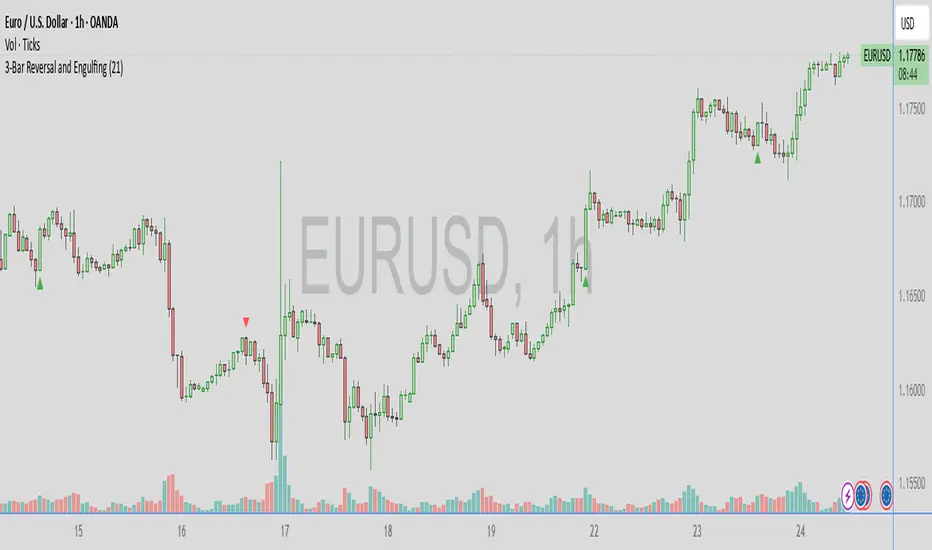
3-Bar Reversal and Engulfing3-bar reversal and engulfing candle signals, and a trendline filter.
It should be used to identify consolidation breakouts in a trending market.
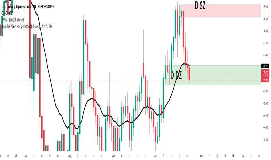
Impulse Alert - Supply (Sell) [Fixed]🟥 Supply Zone (Sell) – Institutional Order Block Detector
This custom indicator automatically detects valid Supply Zones (Sell Zones) based on Smart Money Concepts and institutional trading behavior.
🔍 How It Works:
Identifies strong bearish impulsive moves after price forms a potential Order Block
Valid supply zones are plotted after:
A valid rally–base–drop or drop–base–drop structure
A shift in structure or clear imbalance is detected
The zone is created from the last bullish candle before a strong bearish engulfing move
Zones remain on chart until price revisits and reacts
📊 Use Case:
Ideal for traders using Smart Money Concepts (SMC), Supply & Demand, or ICT-inspired strategies
Perfect for scalping, day trading, or swing setups
Designed for confluence with HTF bias and LTF execution
⚙️ Features:
Supply Zone auto-plotting
Customizable zone color and opacity
Alerts when price returns to the zone (retest entry opportunity)
🧠 Tip for Best Use:
Use in confluence with:
HTF Supply zones (manual or other indicator)
Market Structure breaks
Fair Value Gaps or Imbalance zones
Strong impulsive moves from HTF to LTF
🔁 Future Additions (Coming Soon):
Demand Zone detection
Zone strength rating system
Refined zone filters (volume, candle size, etc.)
Alerts for mitigation or invalidation
📌 Created by: Rohit Jadhav | Real-time market trader | YT/Insta - @GrowthByTrading
💬 Feedback? Drop a comment or connect via profile for updates and tutorials!
Average Daily Range in TicksPurpose: The ADR Ticks Indicator calculates and displays the average daily price range of a financial instrument, expressed in ticks, over a user-specified number of days. It provides traders with a measure of average daily volatility, which can be used for position sizing, setting stop-loss/take-profit levels, or assessing market activity.
Calculation: Computes the average daily range by taking the difference between the daily high and low prices, averaging this range over a customizable number of days, and converting the result into ticks (using the instrument's minimum tick size).
Customization: Includes a user input to adjust the number of days for the average calculation and a toggle to show/hide the ADR Ticks value in the table.
Risk Management: Helps traders estimate typical daily price movement to set appropriate stop-loss or take-profit levels.
Market Analysis: Offers insight into average daily volatility, useful for day traders or swing traders assessing whether a market is trending or ranging.
Technical Notes:
The indicator uses barstate.islast to update the table only on the last bar, reducing computational load and preventing overlap.
The script handles different chart timeframes by pulling daily data via request.security, making it robust across various instruments and timeframes.

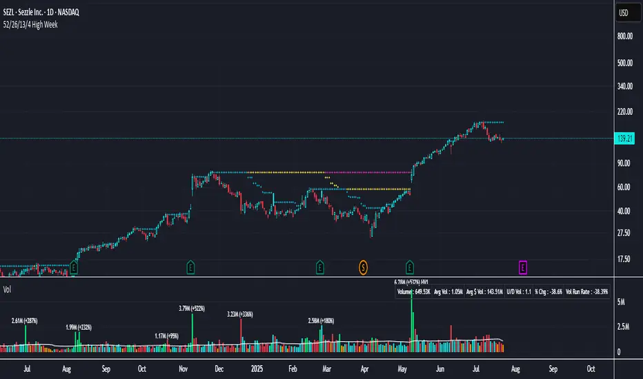
52/26/13/4 High WeekThis is a tool to identify the 52-week high of a candlestick for use in breakout strategies. It can be used in conjunction with Pocket Pivot and EMA or Volume.
It is ideal for studying price behavior and trend following.
Trinity Multi Time Frame Trend Dashboard and SignalsUpdated the logic behind the buy and sell signals to them for more responsiveness and also included an ADX filter.

Indicator TesterIndicator Tester
Designed to evaluate and backtest a composite trading signal based on multiple technical indicators across volatility, volume, momentum, and moving average categories. It is suitable for assets like Bitcoin, on all timeframes.
Key Features:
Indicator Selection: Allows users to enable/disable indicators such as CCI, Bollinger Bands, RVI, MFI, VZO, EFI, KVO, VPT, COPP, RSI, StochRSI, MOM, TRIX, SMI, MA Cross, RTI, and Simple MA, with customizable parameters.
Customizable Inputs:
Individual indicator settings (e.g., lengths, thresholds).
Flip threshold to adjust the signal activation point.
Backtest settings including custom start date, signal type (Long & Short, Long Only, Short Only), and fees.
Table positions for performance and settings display.
Visualization:
Plots an equity curve (orange for positive signals, white otherwise) and a buy-and-hold equity curve (blue).
Displays a performance table comparing indicator equity, drawdown, standard deviation, Sharpe, Sortino, and Omega ratios with buy-and-hold metrics.
A settings table shows backtest start date, fees, number of indicators used, and flip threshold.
Usage:
Enables traders to test and optimize a strategy by combining selected indicators, with performance metrics calculated from the equity curve.
The equity curve and backtest tables help compare the strategy against a buy-and-hold approach.
Ideal for overlay on a 1-day chart to analyze historical performance, as depicted in the Bitcoin/USD chart.

RSI Shift Zone [ChartPrime] with MAThis is a modified version of the original *RSI Shift Zone * script.
What’s new?
➤ Added a customizable Moving Average (SMA/EMA) plotted on top of the RSI for better trend confirmation.
➤ Keeps the original RSI zone detection logic and highlights possible reversal or shift areas.
➤ Clean visual style with clear zone fills, labels, and optional RSI value display.
Settings:
- RSI Length and Levels
- Minimum Channel Length
- Display RSI Value Toggle
- Moving Average Length & Type (SMA or EMA)
License: This script is shared under the Mozilla Public License 2.0 and retains © ChartPrime as the original author.
I hope this helps traders get a better visual on trend shifts and confirmations.
Feel free to share feedback or suggestions!

