Triangle Breakout Strategy for BTC —[MARK804]Triangle Breakout Strategy for BTC —
Overview
The \ strategy targets high-probability breakout trades on **Bitcoin (BTC)** by leveraging triangle chart patterns—symmetrical, ascending, or descending. These formations reflect periods of consolidation where neither bulls nor bears dominate, often preceding strong directional moves.
Key Components
Pattern Recognition
Triangle patterns form when BTC price action consolidates within two converging trendlines—either sloping or horizontal. At least two swing highs and two swing lows are needed to construct reliable trendlines. Volume typically contracts during formation, highlighting reduced volatility before a breakout.
Breakout Confirmation
A breakout occurs when BTC closes outside the triangle’s boundaries, preferably accompanied by a volume surge for validation.
Entry & Targets
Entry: Go long if price breaks above; go short if price breaks below the triangle.
Target: Estimate by measuring the triangle’s maximum height and projecting that distance from the breakout point.
Stops & Risk Management
Position stop-loss just beyond the opposite trendline to limit losses from false breakouts.
Additional Confirmation Tools
Supplement the pattern with RSI, MACD, or other indicators to reduce false signals and fortify your analysis.
Applying to BTC
Bitcoin frequently forms triangle patterns around key psychological levels, with trader discussions often noting tightening ranges and imminent moves. For instance:
> “Bitcoin is coiling up. Big move coming in the next 72 hours. Symmetric triangle is a classic setup before a breakout.”
Why MARK804 Works for BTC
| Feature | Benefit for BTC Traders |
| ----------------------------- | ------------------------------------------------------------- |
| Structured pattern | Clear entry/exit rules improve consistency |
| Measured targets | Offers realistic profit projections |
| Risk discipline | Tight stop-loss controls losses from erratic moves |
| Enhanced reliability | Volume and indicator filters reduce false breakouts |
Ready to customize this strategy with specific entry timeframes, indicator thresholds, or live chart references? Just say the word—I can tailor it further for BTC trading.
Trend Analysis

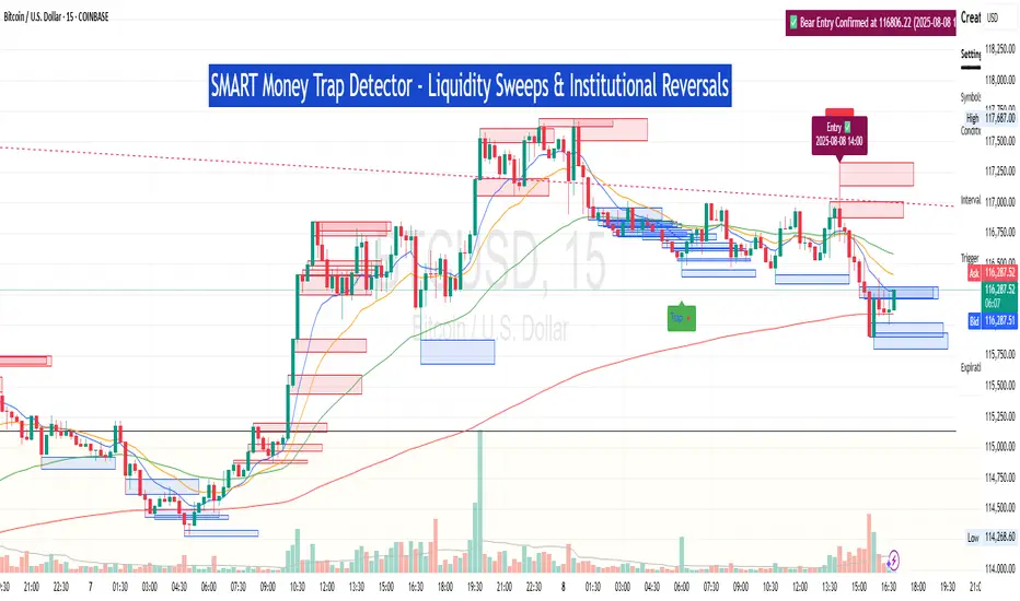
SM Trap Detector – Liquidity Sweeps & Institutional ReversalsOverview:
This script is designed to help traders detect Smart Money traps, liquidity grabs, and false breakouts with high precision.
Inspired by institutional trading logic (SMC, ICT, Wyckoff), this tool combines:
🟦 Liquidity Zone Mapping – Detects stop hunt targets near highs/lows
🚨 Trap Candle Detection – Identifies fakeouts using wick + volume logic
✅ Reversal Confirmation – Entry signals based on real market structure
🧭 Dashboard Panel – Always see the last trap type, price, and confirmation
🔔 Real-Time Alerts – Stay notified of traps and entry points
🧠 Logic Breakdown:
Trap Candle = Large wick, small body, volume spike, and sweep of a liquidity zone
Confirmed Entry = Reversal price action following the trap (engulfing-style)
📈 Best Used On:
Markets: Crypto, Forex, Stocks
Timeframes: No limitation but works best on 1H, 4H, Daily
🛠 Suggested Use:
Trade only confirmed entries for best results
Place stops beyond wick highs/lows
Target previous structure or use RR-based exits
📊 Backtest Tip:
Use alerts + replay mode to manually validate past traps.
Note: Please backtest before using it for entry.
Buy/Sell Signal - RSI + EMA + MACD + VWAPdisplays buy/sell along with ema, vwap combined.. so it can be used as one indicator instead of 2 indicators on trading view..

MacD Alerts MACD Triggers (MTF) — Buy/Sell Alerts
What it is
A clean, multi-timeframe MACD indicator that gives you separate, ready-to-use alerts for:
• MACD Buy – MACD line crosses above the Signal line
• MACD Sell – MACD line crosses below the Signal line
It keeps the familiar MACD lines + histogram, adds optional 4-color histogram logic, and marks crossovers with green/red dots. Works on any symbol and any timeframe.
How signals are generated
• MACD = EMA(fast) − EMA(slow)
• Signal = SMA(MACD, length)
• Buy when crossover(MACD, Signal)
• Sell when crossunder(MACD, Signal)
• You can compute MACD on the chart timeframe or lock it to another timeframe (e.g., 1h MACD on a 4h chart).
Key features
• MTF engine: choose Use Current Chart Resolution or a custom timeframe.
• Separate alert conditions: publish two alerts (“MACD Buy” and “MACD Sell”)—ideal for different notifications or webhooks.
• Visuals: MACD/Signal lines, optional 4-color histogram (trend & above/below zero), and crossover dots.
• Heikin Ashi friendly: runs on whatever candle type your chart uses. (Tip below if you want “regular” candles while viewing HA.)
Settings (Inputs)
• Use Current Chart Resolution (on/off)
• Custom Timeframe (when the above is off)
• Show MACD & Signal / Show Histogram / Show Dots
• Color MACD on Signal Cross
• Use 4-color Histogram
• Lengths: Fast EMA (12), Slow EMA (26), Signal SMA (9)
How to set alerts (2 minutes)
1. Add the script to your chart.
2. Click ⏰ Alerts → + Create Alert.
3. Condition: choose this indicator → MACD Buy.
4. Options: Once per bar close (recommended).
5. Set your notification method (popup/email/webhook) → Create.
6. Repeat for MACD Sell.
Webhook tip: send JSON like
{"symbol":"{{ticker}}","time":"{{timenow}}","signal":"BUY","price":"{{close}}"}
(and “SELL” for the sell alert).
Good to know
• Symbol-agnostic: use it on crypto, stocks, indices—no symbol is hard-coded.
• Timeframe behavior: alerts are evaluated on bar close of the MACD timeframe you pick. Using a higher TF on a lower-TF chart is supported.
• Heikin Ashi note: if your chart uses HA, the calculations use HA by default. To force “regular” candles while viewing HA, tweak the code to use ticker.heikinashi() only when you want it.
• No repainting on close: crossover signals are confirmed at bar close; choose Once per bar close to avoid intra-bar noise.
Disclaimer
This is a tool, not advice. Test across timeframes/markets and combine with risk management (position sizing, SL/TP). Past performance ≠ future results.
Key Session Levels (KUUUMZ)
📜 Summary
Tired of manually drawing the same key levels every single trading day? The KUUMZ-Key Session Levels indicator automates this entire process, plotting the most critical intraday and previous day levels directly on your chart. This tool provides a clean, dynamic framework of potential support and resistance zones, allowing you to focus on your trading strategy, not on chart setup.
Built for day traders and scalpers of US equities, this indicator helps you instantly visualize the market's structure from the moment the session begins.
🎯 Key Levels Plotted
This indicator automatically identifies and draws horizontal lines for the following session levels:
Previous Day High (PDH) & Low (PDL): The highest and lowest points of the prior trading day, which often act as major psychological support and resistance magnets.
Pre-Market High & Low (PMH/PML): The range established during the pre-market session (4:00 - 9:30 AM ET). A breakout from this range can often signal the initial directional bias.
5-Minute Opening Range High & Low (OR5): The high and low of the first 5 minutes of the regular session (9:30 - 9:35 AM ET). A crucial level for opening range breakout (ORB) strategies.
15-Minute Opening Range High & Low (OR15): The high and low of the first 15 minutes (9:30 - 9:45 AM ET), providing a slightly broader view of the initial balance area.
📈 How to Use This Indicator
These levels are fundamental to many intraday trading strategies:
Support & Resistance: Watch how price reacts as it approaches these levels. A bounce or rejection can signal a potential reversal, while a clean break can indicate continuation.
Breakout Trading: A strong, high-volume move through one of these levels (e.g., breaking above the Pre-Market High) can be an entry signal for a breakout trade.
Market Context: Quickly gauge market sentiment. Is the price trading above or below the previous day's range? Is it trapped within the opening range? These levels provide immediate context to the current price action.
Setting Targets & Stops: Use these levels to set logical profit targets or place stop-loss orders. For example, if you go long on a breakout of the 5-min OR, the Pre-Market High or Previous Day High could be your first target.
⚙️ Features & Customization
The script is designed to be flexible and clean, allowing you to tailor it to your specific charting style.
Toggle Any Level: Enable or disable any set of levels (Previous Day, Pre-Market, etc.) to reduce clutter.
Full Style Control: Customize the Color, Width, and Style (Solid, Dotted, Dashed) for each pair of high/low lines independently.
Optional Labels: A master switch allows you to show or hide all price labels (like "PDH", "PM Low", etc.) with a single click.
Automatic & Dynamic: Levels are calculated and drawn in real-time as each session concludes and are automatically cleared and reset for the next trading day.

Inverted Hammer w/ Buy Signal This indicator will identify inverted hammer candles in a downtrend and also provide a buy signal when the following candle closes above the top wick of the previous inverted hammer candle.
Position Sizing Risk TablePosition Sizing Risk Table - swing trading. Allowing for a 0,25; 0,5 and 1% risk based on NAV

SuperTrend (5,1,5) By satish SWhy 3 Supertrends?
Short-term Supertrend (7, 1, 3) → reacts quickly, catches early trend changes but can give more false signals.
Medium-term Supertrend (14, 1, 2) → smoother, filters out noise.
Long-term Supertrend (21, 1, 3) → confirms major trend direction, fewer whipsaws.
How it Works
Trend Reversal Detection
If all three flip in the same direction → strong confirmation of trend change.
If only the short-term flips but others don’t → possible false signal, wait for confirmation.
Entry Signal Example
Buy when all three turn green (Supertrend below price).
Sell/short when all three turn red (Supertrend above price).
Exit / Partial Profit
Exit when the shortest one (7, 1, 3) flips against your position — protects profits in choppy markets.
TradingView Setup
You can do this by:
Adding Supertrend three times.
Setting their (Period, Multiplier, ATR Type) to:
ST1: 7, 1, 3
ST2: 14, 1, 2
ST3: 21, 1, 3
Use different colors or line styles for each so you can spot alignment quickly.
SuperTrend (5,1,5) BY Satish SWhy 3 Supertrends?
Short-term Supertrend (7, 1, 3) → reacts quickly, catches early trend changes but can give more false signals.
Medium-term Supertrend (14, 1, 2) → smoother, filters out noise.
Long-term Supertrend (21, 1, 3) → confirms major trend direction, fewer whipsaws.
How it Works
Trend Reversal Detection
If all three flip in the same direction → strong confirmation of trend change.
If only the short-term flips but others don’t → possible false signal, wait for confirmation.
Entry Signal Example
Buy when all three turn green (Supertrend below price).
Sell/short when all three turn red (Supertrend above price).
Exit / Partial Profit
Exit when the shortest one (7, 1, 3) flips against your position — protects profits in choppy markets.
TradingView Setup
You can do this by:
Adding Supertrend three times.
Setting their (Period, Multiplier, ATR Type) to:
ST1: 7, 1, 3
ST2: 14, 1, 2
ST3: 21, 1, 3
Use different colors or line styles for each so you can spot alignment quickly.

SuperTrend with 3 Inputs SatishWhy 3 Supertrends?
Short-term Supertrend (7, 1, 3) → reacts quickly, catches early trend changes but can give more false signals.
Medium-term Supertrend (14, 1, 2) → smoother, filters out noise.
Long-term Supertrend (21, 1, 3) → confirms major trend direction, fewer whipsaws.
How it Works
Trend Reversal Detection
If all three flip in the same direction → strong confirmation of trend change.
If only the short-term flips but others don’t → possible false signal, wait for confirmation.
Entry Signal Example
Buy when all three turn green (Supertrend below price).
Sell/short when all three turn red (Supertrend above price).
Exit / Partial Profit
Exit when the shortest one (7, 1, 3) flips against your position — protects profits in choppy markets.
TradingView Setup
You can do this by:
Adding Supertrend three times.
Setting their (Period, Multiplier, ATR Type) to:
ST1: 7, 1, 3
ST2: 14, 1, 2
ST3: 21, 1, 3
Use different colors or line styles for each so you can spot alignment quickly.

Swing Anchored Vwap [BigBeluga]🔵 OVERVIEW
Swing Anchored Vwap tracks the market’s directional behavior by anchoring VWAPs (Volume Weighted Average Price) to dynamically detected swing highs and lows. It visually distinguishes the active swing VWAP from historical ones—offering traders a clean view of trend-aligned value zones with clearly marked inflection points.
🔵 CONCEPTS
Swing Anchored VWAPs: VWAPs are initiated from recent swing highs during downtrends and swing lows during uptrends.
Trend Detection: The indicator identifies trend shifts based on the breaking of recent highest or lowest price value.
Trend-Based Coloring:
• Green VWAPs: are drawn from swing lows in uptrends.
• Blue VWAPs: are drawn from swing highs in downtrends.
Sensitivity Control: The Length input defines how far back the script looks to determine swing points—shorter lengths make it more reactive.
🔵 FEATURES
Real-time VWAP projection from the current swing point, updated live.
Historical VWAP traces with slightly faded color to emphasize the current active one.
Swing markers automatically placed on highs/lows where VWAPs are anchored.
Label with price value at the end of each active VWAP line for clarity.
Adaptive color scheme that visually separates uptrend/downtrend zones.
🔵 HOW TO USE
Use active VWAP as a dynamic support/resistance guide during ongoing trends.
Observe breaks or rejections around these VWAPs for trend continuation or reversal clues .
Compare current price position relative to swing VWAPs to assess trend maturity and extension .
Combine with volume analysis or structure to increase conviction at swing points.
🔵 CONCLUSION
Swing Anchored Vwap merges the logic of anchored VWAPs and swing structure into a responsive visual tool. It helps traders stay aligned with the current trend while offering historical context via previous value anchors—ideal for intraday to swing-level analysis.

Confidence Score – DAX & BUND (Auto) by G.I.N.e TradingConfidence Score – DAX & BUND (Auto)
This indicator calculates a confidence score (0–5) to filter trade signals based on market conditions, adapting its parameters automatically for the DAX and the German Bund futures.
The score is built from five independent conditions:
ADX Strength – Measures trend directionality. Score point if ADX is above a defined threshold.
RSI Position – Avoids the neutral “no-trade zone” between two RSI levels. Score point if RSI is outside this range.
Price Range Expansion – Checks whether the recent price range (over N bars) is large enough relative to current price.
Candle Body Size – Ensures the current candle body is significant compared to the total high–low range (avoiding very small-bodied candles).
Volume Confirmation – Requires current volume to be above its moving average and higher than the previous bar.
Score Interpretation:
4–5 points → Green: strong, clear market conditions (high confidence).
2–3 points → Orange: moderate conditions (trade with caution).
0–1 points → Red: weak, choppy market (high noise).
DAX Logic:
Used for trend-following entries only.
Trades are allowed only if the score is above the DAX threshold and the price is aligned with the main trend (defined by HMA).
BUND Logic:
Used for trend-reversal entries only.
Trades are allowed only if the score is above the Bund threshold and the price is against the main trend, confirming a potential reversal setup.
Key Features:
Automatic instrument detection (DAX vs. BUND) with parameter adjustment.
Separate score thresholds for DAX (trend continuation) and Bund (reversals).
Visual columns showing score levels and optional bar coloring when score ≥ 4.
Context windows plotted as small markers to indicate when trade setups are allowed according to the instrument-specific rules.
This indicator should be used as a filter in combination with your core entry strategy (e.g., HARSI Cross, MACD, VSA) to avoid taking trades in low-confidence, noisy market conditions.

Hull Suite Strategy – 1% Risk, No SL/TP (MARK804) Hull Suite Strategy – 1% Risk, No SL/TP (MARK804): Pro-Level Overview
Strategic Philosophy
The Hull Suite Strategy MARK804 is a high-conviction trend-following model tailored for dynamic markets. By deploying three distinct Hull-based moving averages—**HMA**, **EHMA**, and **THMA**—it seeks to balance responsiveness, smoothness, and trend fidelity. The logic is elegantly simple yet potent: a trending edge is detected when the Hull average surpasses its value two bars prior, triggering directional entries and position reversals. Positioned at 1% of equity per trade, this strategy prioritizes controlled exposure while avoiding premature exits—no stop-loss or profit targets cloud the trend’s natural flow.
Core Differentiators
1. **Hull Variation Triage**
MARK804 allows selection among three Hull derivative calculations:
* **HMA**: High reactivity with minimal lag.
* **EHMA**: Damps noise for smoother entries.
* **THMA**: Adds confirmation through layered smoothing.
This modularity lets traders calibrate sensitivity versus resilience, depending on timeframe or volatility.
2. **Trend Validation Over Signal Chasing**
Instead of chasing price crossovers, the strategy confirms a trend only when the Hull value decisively eclipses its two-bar history—a subtle yet powerful twist that filters out false moves and only enters on structural shifts.
3. **Visual Clarity**
Trend confirmation is visually reinforced via color-coded Hull overlays—green for bullish momentum, red for bearish. Optionally, candles can be shaded to mirror the trend, ensuring intuitive and immediate market interpretation.
4. **Capital Discipline Without Premature Exits**
Restricting risk to 1% per trade underscores a disciplined portfolio approach. By omitting SL/TP layers, the strategy avoids forced exits, leaning instead on the Hull's reversal signal as the natural trigger for position closure—ideal for trends that persist beyond expected thresholds.
Professional Trading Implications
* **Trend Continuity Bias**: By staying in trades until a reversal is clearly signaled, MARK804 maximizes participation in extended moves rather than getting chopped out early.
* **Simplified Execution**: With one clear trigger (Hull crossing), operational complexity decreases—excellent for traders valuing clean systems or those operating in volatile, fast-moving assets.
* **Behavioral Edge**: Absence of emotional stop-loss feels—since decisions are based on an algorithmic switch—can support disciplined trading psychology.
Tactical Considerations
While this approach sacrifices some flexibility by foregoing SL/TP, it’s well-suited to high-timeframe trend strategies or volatile environments where exit points are often ambiguous. However, practitioners should remain cognizant that intense reversals may impose sizable drawdowns before reversal triggers surface.
---
Final Thoughts
MARK804 embodies a refined trend-following philosophy: tactical use of Hull variants, disciplined risk sizing, and trust in structural reversal logic—without cluttering strategies with exit orders and arbitrary thresholds. It's crafted for traders confident in letting trends unfold and disciplined enough to commit capital selectively.
Would you like me to extend this with real-world performance insights, SL/TP variants for comparative backtesting, or integration into alerts and dynamic position sizing frameworks?

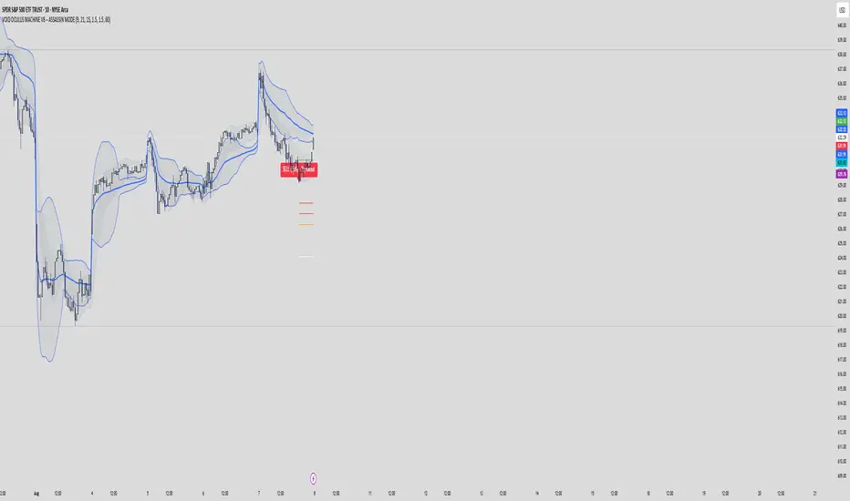
VOID OCULUS MACHINE V8 – ASSASSIN MODEVOID OCULUS MACHINE V8 – ASSASSIN MODE
Version 8.0 | Pine Script v6
Purpose & Originality
VOID OCULUS MACHINE V8 – ASSASSIN MODE brings together four advanced trading filters—EMA crossovers, TRIX momentum, VWAP band positioning, and a proprietary “Predictive Cloud”—into a single, high-precision entry system. Rather than relying on any one signal, it calculates a confidence score combining trend, momentum, volume, and volatility cues, then triggers only the highest-probability setups once a user-defined threshold is met. This multi-layer architecture offers traders laser-focused entries (“Assassin Mode”) with built-in risk (stop) and reward (targets) visualization.
How It Works & Component Rationale
EMA Trend Alignment
Fast EMA (9) vs. Slow EMA (21): Captures short-term versus medium-term trend. A bullish bias requires EMA9 > EMA21, bearish bias EMA9 < EMA21.
TRIX Momentum Filter
A triple-smoothed EMA oscillator over 15 bars, expressed as a percentage change. Positive TRIX confirms upward momentum; negative TRIX confirms downward momentum.
Gaussian Noise Reduction
Dual 5-period EMA smoothing of price removes short-term noise, creating a “cloud base.” Entries only fire when price interacts favorably with this smoothed baseline.
VWAP Band Confirmation (Optional)
Calculates session VWAP ± one standard deviation over 20 bars, plotting upper/lower bands. Traders can require price to sit above/below VWAP mid for trend confirmation.
Predictive Cloud Overlay
A dynamic band (Gaussian ± ATR) forecasts a near-term “value zone.” Pullback and reversal entries can occur as price re-enters or breaks out of this cloud.
Confidence Scoring
Starts at 0 and adds:
+30 for EMA trend alignment (bull or bear)
+20 for volume spike (>20-bar SMA)
+20 for non-zero TRIX slope
+20 for ATR expansion (volatility ramping)
+10 if price is above or below VWAP mid (if VWAP filter is enabled)
Only fires signals when confidence ≥ 60% (configurable), ensuring multi-factor confluence.
Entry Type Differentiation
Breakout: Price pierces prior 10-bar high/low on volume and ATR expansion.
Pullback: Trend bias plus a crossover of price with EMA9.
Reversal: Price crosses back into the Predictive Cloud from outside, confirmed by VWAP cross.
Automated Trade Visualization
On each signal, clears previous objects, plots a “BUY (xx%) – ” or “SELL (xx%) – ” label, four tiered ATR-based targets (1×, 1.5×, 2×, 3.5×), and a stop-loss (ATR × 1.5).
Inputs & Customization
Input Description Default
Fast EMA Length for short-term trend EMA 9
Slow EMA Length for medium-term trend EMA 21
TRIX Length Period for triple-smoothed momentum oscillator 15
Stop Multiplier ATR multiple for stop-loss distance 1.5
Target Multiplier ATR multiple for first profit target 1.5
Enable VWAP Filter Require price alignment above/below VWAP mid On
Minimum Confidence Confidence % threshold to trigger a signal 60
Show Predictive Cloud Toggle the Gaussian ± ATR cloud on/off On
How to Use
Apply to Chart: Suitable on 5 m–1 h timeframes for swing entries.
Adjust Confidence & Filters: Raise the Minimum Confidence to tighten setups; disable VWAP filter for pure price/momentum plays.
Read Signals:
“BUY (75%) – Breakout” label means 75% confluence across filters, triggered by a breakout entry type.
Four colored horizontal lines mark TP1–TP4; a red line marks your stop.
Manage the Trade:
Use the plotted stop-loss line; scale out at targets or trail behind the Predictive Cloud.
Unique Value
VOID OCULUS MACHINE V8 stands out by quantifying multi-dimensional market context into a single confidence score and providing automated trade object plotting—no more manual target calculations or cluttered charts. Its “Assassin Mode” ensures only the most compelling setups trigger, saving traders time and reducing noise.
Disclaimer
This indicator is for educational purposes. Past performance does not guarantee future results. Always backtest across symbols/timeframes, combine with personal discretion, and apply strict risk management before trading live.
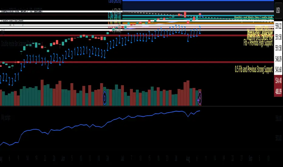
Double Inside Bar Scanner [Daily]Double Inside Bar Scanner . Captures Double Inside based on last 2 daily Bars
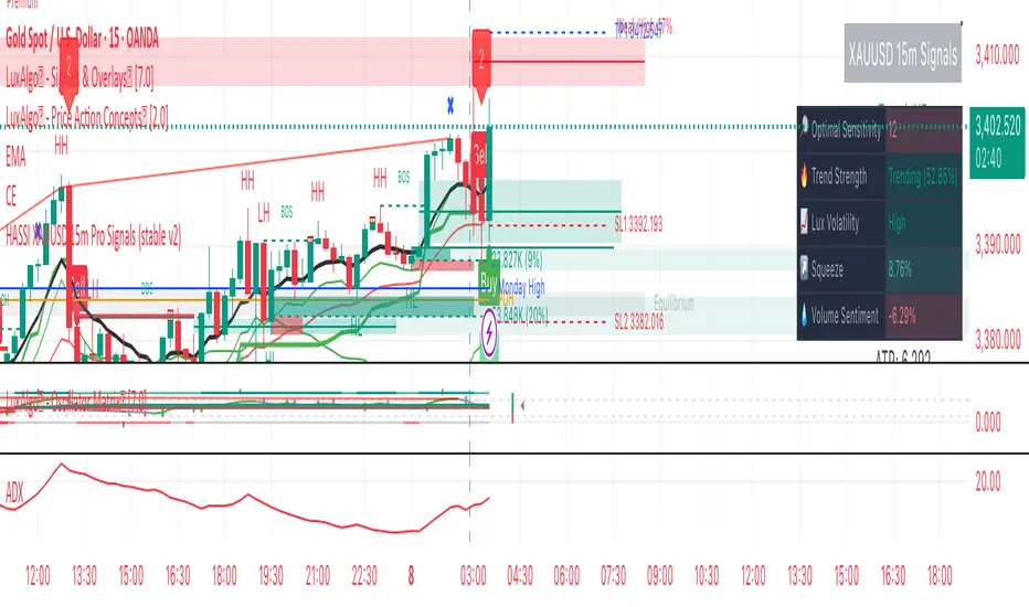
Hassi XAUUSD STRATEGY BOTGold (XAUUSD) 15m trend+momentum based signals with EMA(9/21/200), RSI, custom ADX, ATR-based SL/TP & alerts
Works on XAUUSD 15m.
Entry: EMA9/21 cross + price relative to EMA200 + RSI filter + custom ADX trend strength.
Risk: default SL=1.5×ATR, TP=2×ATR (editable).
Notes: No financial advice. Backtest before live use. Avoid high-impact news whipsaws.
Filtro Antirumore Ottimizzato by G.I.N.e TradingNoise Filter – Adaptive Version for Bund & DAX by G.I.N.e Trading
The Noise Filter is a market condition tool designed to help traders avoid false signals by identifying sideways or low-quality trading phases. This version has been specifically optimized to work effectively with both Bund and DAX price action behaviors.
⚙️ How It Works
The indicator analyzes four key components to determine if the market is in a "noise zone" (sideways, low volatility, or weak trend):
Bollinger Band Width – Detects price compression.
ADX – Measures the strength of the trend.
ATR – Captures recent volatility.
HMA Slope – Evaluates directional movement (trend or no trend).
A noise zone is triggered if at least two out of three core conditions are met:
Narrow Bollinger Bands
ADX below threshold
ATR below threshold
And it is confirmed only if there is no clear directional slope in price.
A strong directional slope overrides the noise signal, allowing valid trends with low volatility (common in instruments like the Bund).
🎯 Visual Output
Gray column → Noise zone: avoid signals in this phase (low quality environment).
Yellow column → Operational zone: conditions are more favorable for trend-following systems.
🛠️ Fully Customizable
You can adjust:
Bollinger Band period & width threshold
ADX length & threshold
ATR period & threshold
HMA slope sensitivity
💡 Best For
Filtering false signals in automated or manual trading strategies
Enhancing trend-following accuracy
Adapting behavior to both high-volatility instruments (DAX) and low-volatility instruments (Bund)

Filtro Universale Antirumore by G.I.N.e TradingNoise Filter Indicator by G.I.N.e Trading
The Noise Filter Indicator is designed to detect market conditions where price action is likely to generate false signals due to low volatility or lack of trend. These are typically sideways or congested phases that trend-following systems should avoid.
⚙️ How it works:
The indicator analyzes the current market structure using three components:
Bollinger Band Width
Measures price compression.
Narrow bands indicate a potential sideways phase.
Average Directional Index (ADX)
Measures the strength of the trend.
Low ADX values suggest absence of directional momentum.
Average True Range (ATR)
Measures recent price volatility.
When ATR is below its moving average, the market is likely ranging or losing energy.
A noise zone is identified when at least 2 out of 3 conditions are true:
Low volatility (Bollinger Band Width)
Weak trend (ADX < threshold)
ATR below reference value
🎯 Visual Output:
🟨 Yellow bar: Trend conditions favorable — signals are more reliable.
⬜️ Gray bar: Noise zone — high risk of false signals, avoid trading.

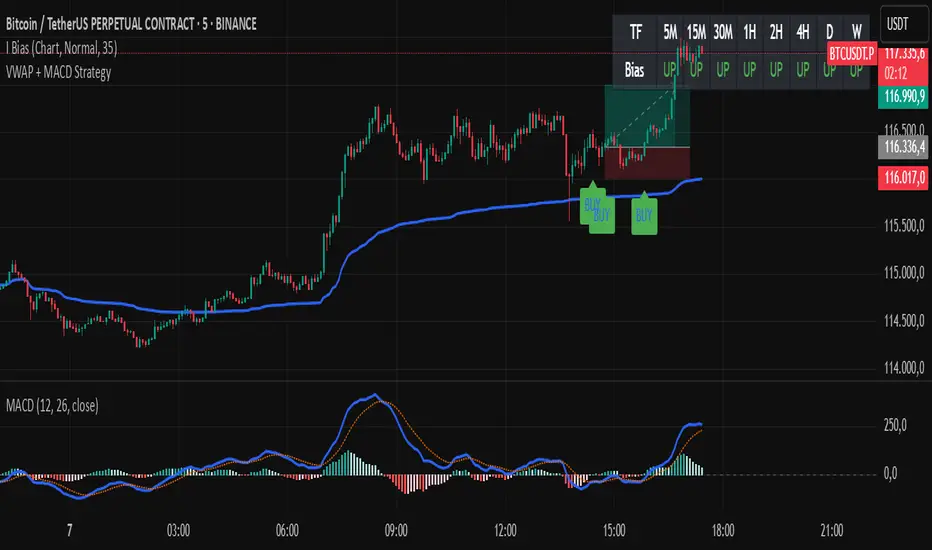
VWAP + MACD Estrategia MilloVWAP + MACD Strategy
This indicator combines the VWAP (Volume Weighted Average Price) with MACD (Moving Average Convergence Divergence) to create buy and sell signals. It helps traders identify potential market entry and exit points based on price action and momentum.
Conditions for Buy:
The price must be above the VWAP.
The MACD line crosses above the signal line (bullish crossover).
The MACD line is below the zero line.
Conditions for Sell:
The price must be below the VWAP.
The MACD line crosses below the signal line (bearish crossover).
The MACD line is above the zero line.
Features:
The VWAP line is plotted to represent the average price, weighted by volume, over a specified period.
Buy signals appear when all conditions are met for an upward price movement.
Sell signals appear when all conditions are met for a downward price movement.
MACD and Signal Line: The MACD helps to confirm momentum, while the signal line indicates possible trend reversals.
Customizable: You can modify the VWAP and MACD parameters to suit different trading strategies.
This strategy is designed for intraday traders and scalpers, aiming to catch quick movements while being aware of market momentum.
Feel free to share this description along with the code! Let me know if you need any adjustments or further explanations.
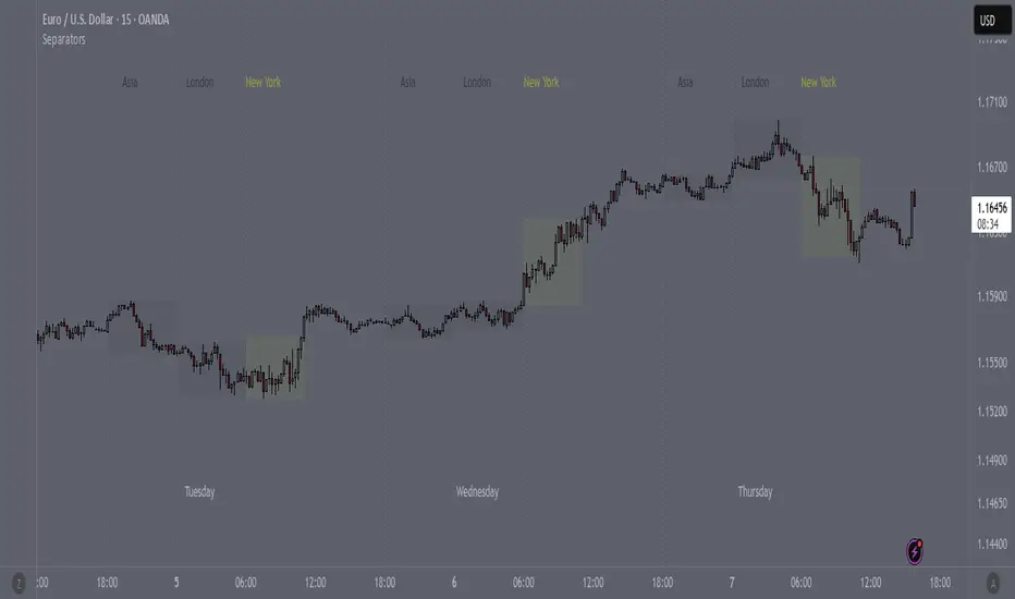
SeparatorsSession - H1 and below Time Frame
Day - H4 and below Time Frame
Month - D Time Frame
Quarter - W Time Frame
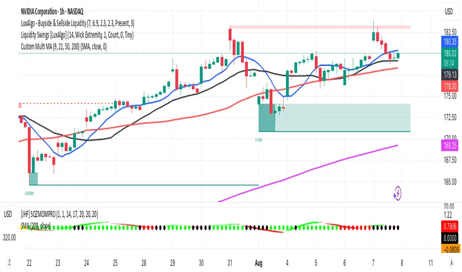
Multi MA (9, 21, 50, 200)This indicator plots four commonly used moving averages — 9, 21, 50, and 200 — with customizable smoothing methods and color-coded lines optimized for visibility on any chart background.
ShadowBlocks SMC indicator💼 SMC Indicator – Trade Like Smart Money
The SMC Indicator is a precision-engineered tool built around Smart Money Concepts, revealing how institutional players truly move the markets. Forget retail noise — SMC cuts through the fog to show the real structure, liquidity zones, and key manipulation points that big money uses to trap uninformed traders.
Key Features:
🔹 Market Structure Mapping: Real-time detection of Breaks of Structure (BOS) and Change of Character (CHoCH) for trend identification.
🔹 Liquidity Zones: Highlights internal and external liquidity pools where stop hunts are most likely to occur.
🔹 Order Blocks & Imbalances: Automatic marking of bullish/bearish order blocks, Fair Value Gaps (FVGs), and mitigation zones.
🔹 Premium/Discount Zones: Smart price equilibrium tracking using internal range Fibonacci logic.
🔹 Entry & Exit Clarity: Clearly defined high-probability entry zones, TP/SL levels, and confirmation-based signals.
Whether you're a price action purist or a strategic SMC trader, this indicator brings the invisible hand of institutions into full view — so you can follow smart money, not fight it.
⚠️ Disclaimer:
ShadowBlocks SMC Indicator is an educational and informational tool. It does not provide financial advice. Always do your own research and consult a licensed financial advisor before making trading decisions.
