Fractal Flow BandsFractal Flow Bands
A high-precision trend-following system combining HalfTrend logic with ALMA smoothing — built for clarity, speed, and smart alerts.
🔷 What is Fractal Flow Bands?
Fractal Flow Bands merges the best of both worlds:
HalfTrend for accurate trend detection
ALMA (Arnaud Legoux Moving Average) for smooth, low-lag confirmation
This unique synergy delivers clean, non-repainting Buy/Sell signals, filtering out market noise and keeping your chart crystal clear.
🔍 How It Works
Blue HalfTrend Line + Green ALMA Crossover → BUY
Red HalfTrend Line + Red ALMA Crossover → SELL
You get only ONE alert per trend change, eliminating spammy notifications. Perfect for swing traders, scalpers, and trend followers alike.
⚙️ Core Features
✅ Dual Confirmation Engine
ALMA must confirm HalfTrend — no single-line tricks here.
✅ One Alert per Trend Shift
Clean signals, no noise, no repeats.
✅ Visual Clarity
Color-coded trends. No channels, ribbons, or clutter.
✅ Customizable Settings
Tune HalfTrend amplitude and ALMA smoothness to your strategy.
🎯 Best For
Swing traders wanting confirmation before entries
Scalpers needing fast, accurate signal flow
Anyone who hates messy charts but loves sharp decisions
🛠 Settings Explained
Setting Description
HT Amplitude Controls HalfTrend sensitivity
ALMA Length / Offset / Sigma Adjusts the smoothness of ALMA
Source Choose price source (Close, Open, etc.)
Display Toggles Enable/disable arrows and ribbons
Colors Fully customizable trend color schemes
✅ Built-in Alerts — So you never miss a signal again.
⚡ Lag-free performance — Works on multiple timeframes.
📈 Real strategy-ready code — Not just another repainting overlay.
Trend Analysis

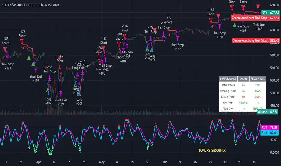
Strategy Chameleon [theUltimator5]Have you ever looked at an indicator and wondered to yourself "Is this indicator actually profitable?" Well now you can test it out for yourself with the Strategy Chameleon!
Strategy Chameleon is a versatile, signal-agnostic trading strategy designed to adapt to any external indicator or trading system. Like a chameleon changes colors to match its environment, this strategy adapts to match any buy/sell signals you provide, making it the ultimate backtesting and automation tool for traders who want to test multiple strategies without rewriting code.
🎯 Key Features
1) Connects ANY external indicator's buy/sell signals
Works with RSI, MACD, moving averages, custom indicators, or any Pine Script output
Simply connect your indicator's signal output to the strategy inputs
2) Multiple Stop Loss Types:
Percentage-based stops
ATR (Average True Range) dynamic stops
Fixed point stops
3) Advanced Trailing Stop System:
Percentage trailing
ATR-based trailing
Fixed point trailing
4) Flexible Take Profit Options:
Risk:Reward ratio targeting
Percentage-based profits
ATR-based profits
Fixed point profits
5) Trading Direction Control
Long Only - Bull market strategies
Short Only - Bear market strategies
Both - Full market strategies
6) Time-Based Filtering
Optional trading session restrictions
Customize active trading hours
Perfect for day trading strategies
📈 How It Works
Signal Detection: The strategy monitors your connected buy/sell signals
Entry Logic: Executes trades when signals trigger during valid time periods
Risk Management: Automatically applies your chosen stop loss and take profit levels
Trailing System: Dynamically adjusts stops to lock in profits
Performance Tracking: Real-time statistics table showing win rate and performance
⚙️ Setup Instructions
0) Add indicator you want to test, then add the Strategy to your chart
Connect Your Signals:
imgur.com
Go to strategy settings → Signal Sources
1) Set "Buy Signal Source" to your indicator's buy output
2) Set "Sell Signal Source" to your indicator's sell output
3) Choose table position - This simply changes the table location on the screen
4) Set trading direction preference - Buy only? Sell only? Both directions?
imgur.com
5) Set your preferred stop loss type and level
You can set the stop loss to be either percentage based or ATR and fully configurable.
6) Enable trailing stops if desired
imgur.com
7) Configure take profit settings
8) Toggle time filter to only consider specific time windows or trading sessions.
🚀 Use Cases
Test various indicators to determine feasibility and/or profitability.
Compare different signal sources quickly
Validate trading ideas with consistent risk management
Portfolio Management
Apply uniform risk management across different strategies
Standardize stop loss and take profit rules
Monitor performance consistently
Automation Ready
Built-in alert conditions for automated trading
Compatible with trading bots and webhooks
Easy integration with external systems
⚠️ Important Notes
This strategy requires external signals to function
Default settings use 10% of equity per trade
Pyramiding is disabled (one position at a time)
Strategy calculates on bar close, not every tick
🔗 Integration Examples
Works perfectly with:
RSI strategies (connect RSI > 70 for sells, RSI < 30 for buys)
Moving average crossovers
MACD signal line crosses
Bollinger Band strategies
Custom oscillators and indicators
Multi-timeframe strategies
📋 Default Settings
Position Size: 10% of equity
Stop Loss: 2% percentage-based
Trailing Stop: 1.5% percentage-based (enabled)
Take Profit: Disabled (optional)
Trade Direction: Both long and short
Time Filter: Disabled
Weighted Multi-Mode Oscillator [BackQuant]Weighted Multi‑Mode Oscillator
1. What Is It?
The Weighted Multi‑Mode Oscillator (WMMO) is a next‑generation momentum tool that turns a dynamically‑weighted moving average into a 0‑100 bounded oscillator.
It lets you decide how each bar is weighted (by volume, volatility, momentum or a hybrid blend) and how the result is normalised (Percentile, Z‑Score or Min‑Max).
The outcome is a self‑adapting gauge that delivers crystal‑clear overbought / oversold zones, divergence clues and regime shifts on any market or timeframe.
2. How It Works
• Dynamic Weight Engine
▪ Volume – emphasises bars with exceptional participation.
▪ Volatility – inverse ATR weighting filters noisy spikes.
▪ Momentum – amplifies strong directional ROC bursts.
▪ Hybrid – equal‑weight blend of the three dimensions.
• Multi‑Mode Smoothing
Choose from 8 MA types (EMA, DEMA, HMA, LINREG, TEMA, RMA, SMA, WMA) plus a secondary smoothing factor to fine‑tune lag vs. responsiveness.
• Normalization Suite
▪ Percentile – rank vs. recent history (context aware).
▪ Z‑Score – standard deviations from mean (statistical extremes).
▪ Min‑Max – scale between rolling high/low (trend friendly).
3. Reading the Oscillator
Zone Default Level Interpretation
Bull > 80 Acceleration; momentum buyers in control
Neutral 20 – 80 Consolidation / no edge
Bear < 20 Exhaustion; sellers dominate
Gradient line/area automatically shades from bright green (strong bull) to deep red (strong bear).
Optional bar‑painting colours price bars the same way for rapid chart scanning.
4. Typical Use‑Cases
Trend Confirmation – Set Weight = Hybrid, Smoothing = EMA. Enter pullbacks only when WMMO > 50 and rising.
Mean Reversion – Weight = Volatility, reduce upper / lower bands to 70 / 30 and fade extremes.
Volume Pulse – Intraday futures: Weight = Volume to catch participation surges before breakout candles.
Divergence Spotting – Compare price highs/lows to WMMO peaks for early reversal clues.
5. Inputs & Styling
Calculation: Source, MA Length, MA Type, Smoothing
Weighting: Volume period & factor, Volatility length, Momentum period
Normalisation: Method, Look‑back, Upper / Lower thresholds
Display: Gradient fills, Threshold lines, Bar‑colouring toggle, Line width & colours
All thresholds, colours and fills are fully customisable inside the settings panel.
6. Built‑In Alerts
WMMO Long – oscillator crosses up through upper threshold.
WMMO Short – oscillator crosses down through lower threshold.
Attach them once and receive push / e‑mail notifications the moment momentum flips.
7. Best Practices
Percentile mode is self‑adaptive and works well across assets; Z‑Score excels in ranges; Min‑Max shines in persistent trends.
Very short MA lengths (< 10) may produce jitter; compensate with higher “Smoothing” or longer look‑backs.
Pair WMMO with structure‑based tools (S/R, trend lines) for higher‑probability trade confluence.
Disclaimer
This script is provided for educational purposes only. It is not financial advice. Always back‑test thoroughly and manage risk before trading live capital.

Delorean EMAs NSYNC Bye, Bye, Bye# Delorean EMA Trend Alerts - Multi-Timeframe Edition
A Pine Script indicator for TradingView that tracks exponential moving averages (EMAs) across multiple timeframes and generates alerts only when both 1-hour and 4-hour charts agree on the trend direction. As NSYNC says, if the timeframes don't agree, your money will go "Bye, Bye, Bye!"
## Features
- Displays 5 EMAs (5, 13, 50, 200, 800 periods)
- **Multi-Timeframe Analysis**: Checks both 1H and 4H charts simultaneously
- **Trend Agreement Required**: Only signals when BOTH timeframes show the same trend
- Detects bullish trends: 50 EMA > 200 EMA > 800 EMA (on both 1H and 4H)
- Detects bearish trends: 50 EMA < 200 EMA < 800 EMA (on both 1H and 4H)
- **NSYNC Warning**: Orange warning when timeframes disagree
- Visual trend signals with up/down arrows (only when timeframes agree)
- Background coloring: Green (bullish), Red (bearish), Orange (no sync)
- **Status Table**: Shows trend status for each timeframe
- Customizable alert conditions
- Multiple alert types: Bullish, Bearish, NSYNC Warning, Alignment

Real-Time FTFC Dashboard (Styled)Full Time Frame Continuity. Real time change with the data presented. Can be used on all stocks to analyze if the stocks timeframe finished green or red.

Micro Trend Start Signal (Up & Down)Micro Trend Start Signal is a lightweight trend-following indicator , complimenting the binary mac d . Trend trading made simple

Micro Lion Trend Start Signal Micro Trend Start Signal is a lightweight trend-following indicator using EMA crossovers and RSI filters to catch early trend shifts. It shows clear Buy and Sell labels when momentum aligns with direction. Ideal for scalping or intraday trading. Clean, responsive, and designed for fast market entries.

Clarix Trend Filter Purpose
This indicator helps traders quickly identify strong bullish or bearish market conditions by combining a moving average and directional strength.
How It Works
SMMA (200): Smooths price to detect overall trend direction.
ADX (14): Measures trend strength, filtering out weak/noisy moves.
+DI / -DI: Directional movement indicators help confirm the dominant side.
Trend Logic
Bullish Trend: Price is above SMMA, ADX > threshold, and +DI > -DI
Bearish Trend: Price is below SMMA, ADX > threshold, and -DI > +DI
Otherwise, the trend is considered weak or unclear.
Features
Background shading for trend clarity
Optional buy/sell arrows based on trend confirmation
Configurable SMMA length and ADX threshold
Designed for 1-minute timeframes, but can be adjusted
Tips
Best used as a trend filter with your existing entry/exit strategy
Avoid trading signals when ADX is low (flat or ranging conditions)
Works well when combined with volume or momentum indicators

Twin Tower TP Levels – Hopi Method (from Demystifying ICT 2)📐 Twin Tower TP Levels – Hopi Method (from “Demystifying ICT 2”)
Description:
This indicator visualizes the Twin Tower TP Levels, a concept inspired by the work of the anonymous trader "Hopi", presented in the book "Demystifying ICT 2 (2025 Edition)".
It calculates a set of key take-profit levels based on:
A fixed reference price (typically VWAP at 16:00 EST)
The average daily range (ADR)
A symmetrical unit structure (ADR ÷ 100), projecting levels both above and below the fixed price.
The levels are calculated and labeled at ±7, ±13, ±20, ±30, ±37, ±43, and ±50 units from the Fix Price — providing traders with a balanced range of price action targets and reaction zones.
Key features:
Customizable Fix Price and ADR input
Automatically computes and plots 7 target levels above and below
Color-coded labels for easy reference (green for above, red for below)
Designed for precision take-profit targeting, as conceptualized in the “Twin Tower” method.
Disclaimer:
This script is a fan-made implementation for educational purposes and references concepts discussed in the book "Demystifying ICT 2 (2025 Edition)", attributed to the pseudonymous trader "Hopi".
All rights to the original intellectual property remain with the author.

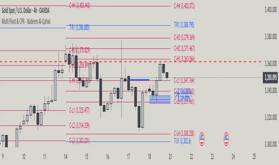
Multi Pivot Point & Central Pivot Range - Nadeem Al-QahwiThis indicator combines four advanced trading modules into one flexible and easy-to-use script:
Traditional Pivot Points:
Calculates classic support and resistance levels (PP, R1–R5, S1–S5) based on previous session data. Ideal for identifying key turning points and mapping out the daily, weekly, or monthly structure.
Camarilla Levels:
Provides six upper and lower pivot levels (H1–H6, L1–L6) derived from volatility and closing price formulas. Especially effective for intraday reversal, mean reversion, and finding overbought/oversold extremes.
Central Pivot Range (CPR):
Plots the median, top, and bottom of the value area each session. CPR width instantly highlights whether the market is likely to trend (narrow CPR) or remain range-bound (wide CPR).
Developing CPR projects the evolving range for the current period—essential for real-time analysis and pre-market planning.
Dynamic Zone Levels (DZL):
Automatically detects and highlights clusters of pivots to reveal high-probability support/resistance zones, filtering out market “noise.”
DZL alerts notify you whenever price breaks or retests these key areas, making it easier to spot momentum trades and avoid false signals.
Key Features:
Multi-timeframe flexibility: Use with daily, weekly, monthly, yearly, or custom timeframes—even rare ones like biyearly and decennial.
Modular design: Activate or hide any system (Traditional, Camarilla, CPR, DZL) as you need.
Bilingual interface: Every setting and label is shown in both English and Arabic.
Full customization: Control visibility, color, style, and placement for every level and label.
Historical depth: Plot up to 5,000 pivot/zones back for deep analysis and backtesting.
Smart alerts: Get instant notifications on true S/R breakouts or retests (from DZL).
How to Use:
Trend Trading:
Watch for a very narrow CPR to identify potential trending days—trade in the breakout direction above/below the CPR.
Range Trading:
When CPR is wide, expect sideways movement. Fade reversals at R1/S1 or within the CPR boundaries.
Breakouts:
Use DZL alerts to capture momentum as price breaks or retests dynamic support/resistance zones.
Multi-Timeframe Confluence:
Combine CPR and pivot levels from multiple timeframes for higher-probability entries and exits.
All calculations and logic are fully open.
Renko Brick Zone NeelBrick indicator is a brick zone indicator, plotted not in histogram style but instead with a moving average plotted along with it.
40 period is count of same color brick difference between green and red is always 40
40-period brick indicator line and 40-period moving average line of the brick indicator.

Indian Stocks Daily, Weekly, Monthly, All-Time High-LowDaily high, low, last week high low, current week high low, current month high low.

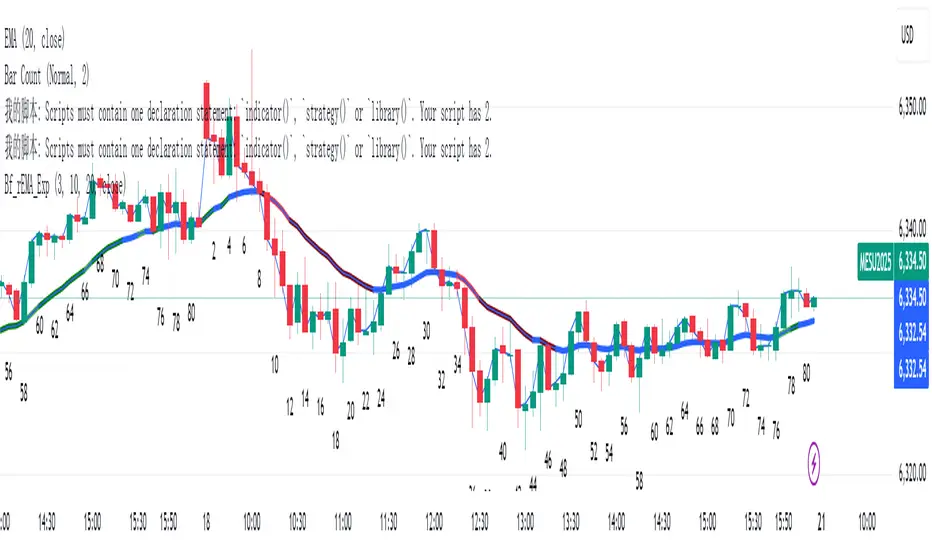
rEMAExpColor Moving Average Indicator This indicator can intuitively show the current state of market power
Suitable for price action traders
Multi-Timeframe Trend TableThis is an adaptation of the Multi-Timeframe Trend Table by feliperazeek . I have made it possible to change the time frames. I've messaged him to see if he wants to change it to include my amendments.

MTF Trend Heatmap (EMA + MACD) by PierreKMTF Trend Heatmap (EMA + MACD) by PierreK
This indicator offers a compact and clear heatmap that visualizes the current trend status of an instrument across multiple key timeframes. Based on the combination of the EMA 50 and EMA 200, as well as the MACD indicator, the heatmap shows whether the trend is bullish (green dot) or bearish (red dot) on the 1-minute, 5-minute, 15-minute, 1-hour, 4-hour, and 1-day timeframes.
Highlights:
• Multi-timeframe analysis at a glance - perfect for traders who want to keep an eye on multiple timeframes.
• Clearly defined trend logic: EMA 50 > EMA 200 and MACD above signal and zero line.
‣ Simple color scheme for quick trend decisions.
Optimized for all markets and assets (forex, stocks, cryptocurrencies, etc.).
• Chart overload - heatmap as a separate, clearly positioned table.
Ideal for day traders, swing traders, and anyone who needs quick trend overviews for their trading.
FAQ
Q. Which markets is the indicator suitable for?
A: The indicator works universally on forex, stocks, cryptocurrencies, and other TradingView symbols.
Q: Can I add additional timeframes?
A: Currently, 1m, 5m, 15m, 1h, 4h, and 1d are preset. Adjustments are possible in the code if you are familiar with Pine Script.
Q: How accurate is the trend determination?
A: The trend is determined very reliably using the combination of the EMA 50/200 and MACD (via the signal line and the zero line).
Q: Can I use alerts with this indicator?
A: Alerts are not included in the standard script, but can be added individually.

SQV Indicator Bridge# SQV Indicator Bridge - Quick Guide
## What is SQV Indicator Bridge?
A simple connector that validates your indicator's signals using SQV Lite before displaying them on the chart. Only high-quality signals pass through.
## How It Works
```
Your Indicator → Generates Signals → SQV Lite → Validates Quality → Bridge → Shows Only Valid Signals
```
## Quick Setup (3 Steps)
### Step 1: Prepare Your Indicator
Add these lines to export your signals:
```pinescript
// At the end of your indicator code
plot(longCondition ? 1 : 0, "Long Signal", display=display.none)
plot(shortCondition ? 1 : 0, "Short Signal", display=display.none)
```
### Step 2: Add to Chart (in order)
1. Your indicator
2. SQV Lite
3. SQV Indicator Bridge
### Step 3: Connect Sources
In Bridge settings:
- **Long Signal Source** → Select: YourIndicator: Long Signal
- **Short Signal Source** → Select: YourIndicator: Short Signal
- **SQV Long Valid** → Select: SQV Lite: SQV Long Valid
- **SQV Short Valid** → Select: SQV Lite: SQV Short Valid
- **SQV Score** → Select: SQV Lite: SQV Score
## Visual Settings
| Setting | Description | Default |
|---------|-------------|---------|
| Show Labels | Display BUY/SELL labels | On |
| Label Offset | Distance from candles (0-5 ATR) | 0 |
| Label Size | Tiny, Small, or Normal | Small |
| Long Color | Color for buy signals | Green |
| Short Color | Color for sell signals | Red |
## What You'll See
- **Green "LONG" labels** - When your buy signal passes SQV validation
- **Red "SHORT" labels** - When your sell signal passes SQV validation
- **No label** - When signal quality is too low
## Common Issues & Solutions
### No labels appearing?
1. Check "Use External Signals" is ON in SQV Lite
2. Verify source connections are correct
3. Lower minimum score in SQV Lite (try 60)
4. Test your indicator separately to ensure it generates signals
### Too many/few signals?
- Adjust "Minimum Quality Score" in SQV Lite
- Default is 65, lower for more signals, higher for fewer
### Wrong signals showing?
- Check Trading Mode in SQV Lite matches your strategy (Long Only/Short Only/Both)
## Example Integration
### Simple MA Cross Indicator
```pinescript
//@version=6
indicator("MA Cross with SQV", overlay=true)
// Your logic
fast = ta.sma(close, 20)
slow = ta.sma(close, 50)
longSignal = ta.crossover(fast, slow)
shortSignal = ta.crossunder(fast, slow)
// Plot MAs
plot(fast, color=color.blue)
plot(slow, color=color.red)
// Export for SQV Bridge (REQUIRED!)
plot(longSignal ? 1 : 0, "Long Signal", display=display.none)
plot(shortSignal ? 1 : 0, "Short Signal", display=display.none)
```
## Tips
✅ **DO**:
- Test in "Autonomous Mode" first (SQV Lite setting)
- Use clear signal names in your plots
- Keep signals binary (1 or 0)
❌ **DON'T**:
- Forget to add `display=display.none` to signal plots
- Use values other than 0 and 1 for signals
- Leave "Use External Signals" OFF in SQV Lite
## Alert Setup
1. Enable "Enable Alerts" in Bridge settings
2. Create alert on Bridge (not your indicator)
3. Alert message includes SQV score
Example alert: `"Long Signal Validated | Score: 85"`
## Complete Bridge Code
```pinescript
//@version=6
indicator("SQV Indicator Bridge", overlay=true)
// From your indicator
longSignal = input.source(close, "Long Signal Source", group="Signal Sources")
shortSignal = input.source(close, "Short Signal Source", group="Signal Sources")
// From SQV Lite
sqvLongValid = input.source(close, "SQV Long Valid", group="SQV Sources")
sqvShortValid = input.source(close, "SQV Short Valid", group="SQV Sources")
sqvScore = input.source(close, "SQV Score", group="SQV Sources")
// Settings
showLabels = input.bool(true, "Show Labels", group="Visual")
labelOffset = input.float(0.0, "Label Offset (ATR)", minval=0.0, maxval=5.0, step=0.5, group="Visual")
labelSize = input.string("small", "Label Size", options= , group="Visual")
longColor = input.color(color.green, "Long Color", group="Visual")
shortColor = input.color(color.red, "Short Color", group="Visual")
enableAlerts = input.bool(false, "Enable Alerts", group="Alerts")
// Logic
atr = ta.atr(14)
offset = labelOffset > 0 ? atr * labelOffset : 0
hasValidLong = longSignal > 0 and sqvLongValid > 0 and barstate.isconfirmed
hasValidShort = shortSignal > 0 and sqvShortValid > 0 and barstate.isconfirmed
// Show labels
if showLabels
if hasValidLong
label.new(bar_index, low - offset, "LONG",
style=label.style_label_up,
color=longColor,
textcolor=color.white,
size=labelSize == "tiny" ? size.tiny :
labelSize == "small" ? size.small : size.normal)
if hasValidShort
label.new(bar_index, high + offset, "SHORT",
style=label.style_label_down,
color=shortColor,
textcolor=color.white,
size=labelSize == "tiny" ? size.tiny :
labelSize == "small" ? size.small : size.normal)
// Alerts
if enableAlerts
if hasValidLong
alert("Long Signal Validated | Score: " + str.tostring(sqvScore, "#"), alert.freq_once_per_bar_close)
if hasValidShort
alert("Short Signal Validated | Score: " + str.tostring(sqvScore, "#"), alert.freq_once_per_bar_close)
```
---
**Need help?** Check the full SQV documentation or contact through TradingView messages.

[Top] Multi-Candle Pattern DetectorThe Multi-Candle Pattern Detector is a powerful tool that scans for a wide variety of high-probability candlestick formations directly on the chart. It highlights key multi-bar reversal and continuation patterns using intuitive emoji-based labels and descriptive tooltips, helping traders quickly assess market conditions and potential setups.
Supported patterns include:
Bullish & Bearish Engulfing
Morning Star / Evening Star
Three Line Strike
Rising / Falling Three Methods
Hammer / Inverted Hammer / Hanging Man / Gravestone Doji
To reduce false signals, this script includes a built-in trend filter using a custom LHAMA (Low-High Adaptive Moving Average) calculation. Patterns are only displayed when recent price action is not flat, helping traders avoid entries during consolidation.
Users can toggle each pattern type individually, making the script adaptable for various strategies and timeframes.
⸻
Potential Uses
Reversal Spotting: Identify key inflection points at the end of trends.
Continuation Confirmation: Confirm trend strength following brief pauses in momentum.
Price Action Training: Visually reinforce recognition of textbook candlestick patterns.
Strategy Integration: Combine with trend or volume filters for more advanced rule-based systems.
⸻
This indicator is suitable for traders who rely on price action and candlestick psychology, and is useful across all asset classes and chart intervals.

✅ TrendSniper Pro✅ SPNIPER ENTRY – Precision Trend Reversal Signals
The SPNIPER ENTRY is a smart trend-following and reversal indicator designed for traders who want timely entries, clear trend confirmation, and clean visuals.
Key Features:
✅ Triple TEMA Trend Confirmation (21, 50, 200): Ensures you're entering only when all moving averages agree on direction.
🎯 Dip/Top Detection: Uses pivot analysis and ATR proximity to detect ideal pullback entries in the prevailing trend.
📉 Stop Loss & Take Profit Zones: ATR-based dynamic SL/TP levels plotted automatically.
📛 False Signal Filter: Avoids multiple entries by maintaining a position until an opposite signal occurs.
📊 Clean Chart Coloring: Candles turn green for confirmed uptrend and red for downtrend—easy to follow.
🔔 Built-in Alerts: Be notified when conditions align perfectly for a high-probability trade.
👁️ Optional TEMA Display: Toggle visibility of trend components for deeper insight.
How it Works:
A buy signal occurs only when:
All 3 TEMA slopes are positive
Price pulls back near a recent pivot low (dip)
A valid uptrend is in place
A sell signal occurs only when:
All 3 TEMA slopes are negative
Price nears a recent pivot high (top)
A confirmed downtrend is active
This indicator is ideal for swing traders, intraday traders, and scalpers who want precise entries based on structure, slope, and volatility.

No Supply No Demand (NSND) – Volume Spread Analysis ToolThis indicator is designed for traders utilizing Volume Spread Analysis (VSA) techniques. It automatically detects potential No Demand (ND) and No Supply (NS) candles based on volume and price behavior, and confirms them using future price action within a user-defined number of lookahead bars.
Confirmed No Demand (ND): Detected when a bullish candle has volume lower than the previous two bars and is followed by weakness (next highs swept, close below).
Confirmed No Supply (NS): Detected when a bearish candle has volume lower than the previous two bars and is followed by strength (next lows swept, close above).
Adjustable lookahead bars parameter to control the confirmation window.
This tool helps identify potential distribution (ND) and accumulation (NS) areas, providing early signs of market turning points based on professional volume logic. The dot appears next to ND or NS.

Combined: Strat Dashboard + FVG + M&E StarsSTRAT MIX + VECTOR + SUPPORT
In financial markets, support and resistance are fundamental concepts in technical analysis used to identify price levels where an asset's price tends to pause or reverse. They are essentially areas on a chart where buying or selling pressure is expected to be strong enough to temporarily halt or reverse the prevailing price trend.
Here's a breakdown:
* Support: This is a price level where an asset's downward movement is expected to stop due to increased buying interest. Think of it as a "floor" where demand is strong enough to prevent the price from falling further. When the price approaches a support level, buyers tend to step in, leading to a potential bounce or reversal upwards. The more times a price level has held as support in the past, the stronger it's generally considered.
* Resistance: This is a price level where an asset's upward movement is expected to stop due to increased selling interest. It acts like a "ceiling" where supply is strong enough to prevent the price from rising higher. When the price approaches a resistance level, sellers tend to step in, leading to a potential pullback or reversal downwards. Similar to support, the more times a price level has acted as resistance, the more significant it's often seen.
Key characteristics:
* Supply and Demand: Support and resistance levels are a reflection of the continuous interplay between supply (sellers) and demand (buyers) in the market.
* Dynamic Nature: These levels are not fixed lines but rather zones. They can also "flip roles"; if a resistance level is broken and the price moves above it, that former resistance can then become a new support level, and vice-versa.
* Psychological Importance: These levels often derive their strength from collective market psychology, as many traders and investors recognize and react to the same price points.

TREV Candles - Range-Based Trend ReversalTREV Candles - Range-Based Trend Reversal Chart Implementation
What is a Trend Reversal (TREV) Chart?
A Trend Reversal chart, also known as a Point & Figure chart variation, is a unique charting method that focuses on price movement thresholds rather than time intervals. Unlike traditional candlestick charts where each candle represents a fixed time period, TREV candles form only when price moves by predefined amounts in ticks.
TREV charts eliminate time-based noise and focus purely on significant price movements, making them ideal for identifying genuine trend changes and continuation patterns.
How TREV Candles Work
This indicator implements true TREV logic with two critical thresholds:
Trend Size: The number of ticks price must move in the current direction to form a trend continuation candle
Reversal Size: The number of ticks price must move against the current direction to form a reversal candle and change the overall trend direction
Key TREV Rules Enforced:
Direction Changes Only Through Reversals: You cannot go from bullish trend directly to bearish trend - a reversal candle must occur first
Threshold-Based Formation: Candles form only when price thresholds are breached, not on time
Logical Wick Placement: Wicks only appear on the "open" side of candles where price temporarily moved against the formation direction
Multiple Candles Per Bar: When price moves significantly, several TREV candles can form within a single time-based bar
Four Distinct Candle Types
Bullish Trend (Green): Continues upward movement when trend threshold is hit
Bearish Trend (Red): Continues downward movement when trend threshold is hit
Bullish Reversal (Blue): Changes from bearish to bullish direction when reversal threshold is breached
Bearish Reversal (Orange): Changes from bullish to bearish direction when reversal threshold is breached
Practical Trading Applications
Trend Identification: Clear visual representation of when trends are continuing vs. reversing
Noise Reduction: Filters out insignificant price movements that don't meet threshold requirements
Support/Resistance: TREV levels often act as significant support and resistance zones
Breakout Confirmation: When price forms multiple trend candles in succession, it confirms strong directional movement
Reversal Signals: Reversal candles provide early warning of potential trend changes
Technical Implementation Features
Intelligent Price Path Processing: Analyzes the assumed price path within each bar (Low→High→Close for bullish bars, High→Low→Close for bearish bars)
Automatic Tick Size Detection: Works with any instrument by automatically detecting the correct tick size
Manual Override Option: Allows manual tick size specification for custom analysis
Impossible Scenario Prevention: Built-in logic prevents impossible wick configurations and direction changes
PineScript Optimization: Efficient state management and drawing limits handling for smooth performance
Comprehensive Styling Options
Each of the four candle types offers complete visual customization:
Body Colors: Independent color settings for each candle type's body
Border Colors: Separate border color customization
Border Styles: Choose from solid, dashed, or dotted borders
Wick Colors: Individual wick color settings for each candle type
Default Color Scheme:
🟢 Bullish Trend: Green body and wicks
🔵 Bullish Reversal: Blue body and wicks
🔴 Bearish Trend: Red body and wicks
🟠 Bearish Reversal: Orange body and wicks
Configuration Guidelines
Trend Size: Larger values create fewer, more significant trend candles. Smaller values increase sensitivity
Reversal Size: Should typically be smaller than trend size. Controls how easily the trend direction can change
Tick Size: Use "auto" for most instruments. Manual override useful for custom point values or backtesting
Ideal Use Cases
Swing Trading: Identify major trend changes and continuation patterns
Scalping: Use smaller thresholds to catch quick reversals and momentum shifts
Position Trading: Use larger thresholds to filter noise and focus on major trend moves
Multi-Timeframe Analysis: Compare TREV patterns across different threshold settings
Support/Resistance Trading: TREV close levels often become significant price zones
Why This Implementation is Superior
True TREV Logic: Enforces proper trend reversal rules that many implementations ignore
No Impossible Scenarios: Prevents wicks on both sides of candles and impossible direction changes
Professional Visualization: Clean, customizable appearance suitable for serious analysis
Performance Optimized: Handles large datasets without lag or drawing limit issues
Educational Value: Helps traders understand the difference between time-based and threshold-based charting
Perfect for traders who want to see beyond time-based noise and focus on what price is actually doing - moving in significant, measurable amounts that matter for trading decisions.

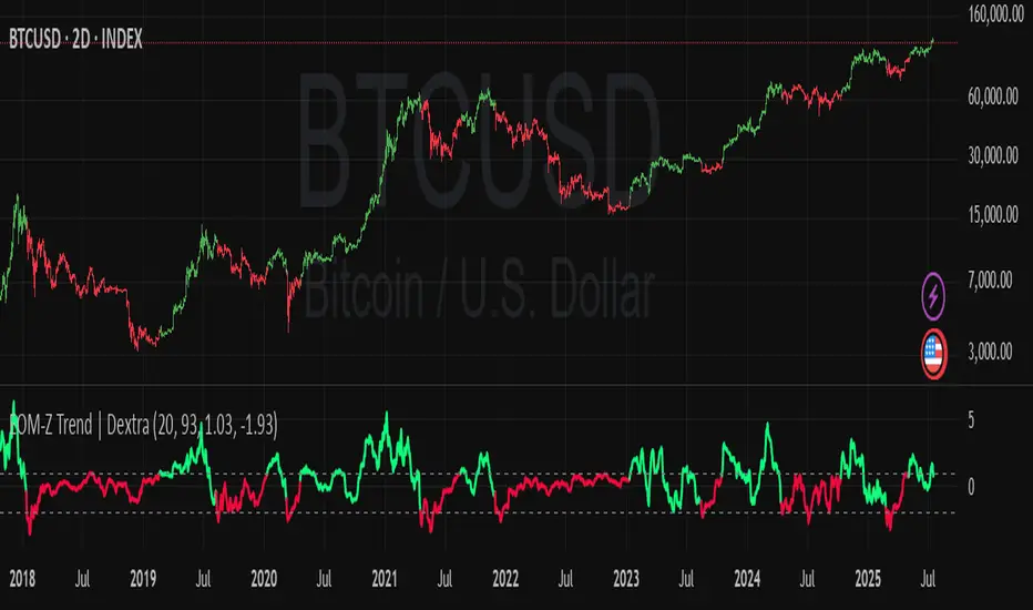
Ease of Movement Z-Score Trend | DextraGeneral Description:
The "Ease of Movement Z-Score Trend | Dextra" (EOM-Z Trend) is an innovative technical analysis tool that combines the Ease of Movement (EOM) concept with Z-Score to measure how easily price moves relative to volume, while identifying market trends with intuitive visualization. This indicator is designed to help traders detect uptrend and downtrend phases with precision, enhanced by candle coloring for direct trend representation on the chart.
Key Features
Ease of Movement (EOM): Measures how easily price moves based on the change in the midpoint price and volume, normalized with Z-Score for statistical analysis.
Z-Score Normalization: Provides an indication of deviations from the mean, enabling the identification of overbought or oversold conditions.
Adjustable Thresholds: Users can customize upper and lower thresholds to define trend boundaries.
Candle Coloring: Visual trend representation with green (uptrend), red (downtrend), and gray (neutral) candles.
Flexibility: Adjustable for different timeframes and assets.
How It Works
The indicator operates through the following steps:
EOM Calculation:
hl2 = (high + low) / 2: Calculates the average midpoint price per bar.
eom = ta.sma(10000 * ta.change(hl2) * (high - low) / volume, length): EOM is computed as the smoothed average of the price midpoint change multiplied by the price range per unit volume, scaled by 10,000, over length bars (default 20).
Z-Score Calculation:
mean_eom = ta.sma(eom, z_length): Average EOM over z_length bars (default 93).
std_dev_eom = ta.stdev(eom, z_length): Standard deviation of EOM.
z_score = (eom - mean_eom) / std_dev_eom: Z-Score indicating how far EOM deviates from its mean in standard deviation units.
Trend Detection:
upperthreshold (default 1.03) and lowerthreshold (default -1.63): Thresholds to classify uptrend (if Z-Score > upperthreshold) and downtrend (if Z-Score < lowerthreshold).
eom_is_up and eom_is_down: Logical variables for trend status.
Visualization:
plot(z_score, ...): Z-Score line plotted with green (uptrend), red (downtrend), or gray (neutral) coloring.
plotcandle(...): Candles colored green, red, or gray based on trend.
hline(...): Dashed lines marking the thresholds.
Input Settings
EOM Length (default 20): Period for calculating EOM, determining sensitivity to price changes.
Z-Score Lookback Period (default 93): Period for calculating the Z-Score mean and standard deviation.
Uptrend Threshold (default 1.03): Minimum Z-Score value to classify an uptrend.
Downtrend Threshold (default -1.93): Maximum Z-Score value to classify a downtrend.
How to Use
Installation: Add the indicator via the "Indicators" menu in TradingView and search for "EOM-Z Trend | Dextra".
Customization:
Adjust EOM Length and Z-Score Lookback Period based on the timeframe (e.g., 20 and 93 for daily timeframes).
Set Uptrend Threshold and Downtrend Threshold according to preference or asset characteristics (e.g., lower to 0.8 and -1.5 for volatile markets).
Interpretation:
Uptrend (Green): Z-Score above upperthreshold, indicating strong upward price movement.
Downtrend (Red): Z-Score below lowerthreshold, indicating significant downward movement.
Neutral (Gray): Conditions between thresholds, suggesting a sideways market.
Use candle coloring as the primary visual guide, combined with the Z-Score line for confirmation.
Advantages
Intuitive Visualization: Candle coloring simplifies trend identification without deep analysis.
Flexibility: Customizable parameters allow adaptation to various markets.
Statistical Analysis: Z-Score provides a robust perspective on price deviations from the norm.
No Repainting: The indicator uses historical data and does not alter values after a bar closes.
Limitations
Volume Dependency: Requires accurate volume data; an error occurs if volume is unavailable.
Market Context: Effectiveness depends on properly tuned thresholds for specific assets.
Lack of Additional Signals: No built-in alerts or supplementary confirmation indicators.
Recommendations
Ideal Timeframe: Daily (1D) or (2D) for stable trends.
Combination: Pair with others indicators for signal validation.
Optimization: Test thresholds on historical data of the traded asset for optimal results.
Important Notes
This indicator relies entirely on internal TradingView data (high, low, close, volume) and does not integrate on-chain data. Ensure your data provider supports volume to avoid errors. This version (1.0) is the initial release, with potential future updates including features like alerts or multi-timeframe analysis.
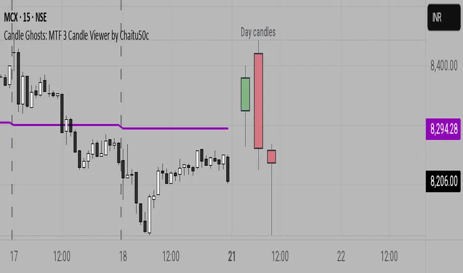
Candle Ghosts: MTF 3 Candle Viewer by Chaitu50cCandle Ghosts: MTF 3 Candle Viewer helps you see candles from other timeframes directly on your chart. It shows the last 3 candles from a selected timeframe as semi-transparent boxes, so you can compare different timeframes without switching charts.
You can choose to view candles from 30-minute, 1-hour, 4-hour, daily, or weekly timeframes. The candles are drawn with their full open, high, low, and close values, including the wicks, so you get a clear view of their actual shape and size.
The indicator lets you adjust the position of the candles using horizontal and vertical offset settings. You can also control the spacing between the candles for better visibility.
An optional EMA (Exponential Moving Average) from the selected timeframe is also included to help you understand the overall trend direction.
This tool is useful for:
Intraday traders who want to see higher timeframe candles for better decisions
Swing traders checking lower timeframe setups
Anyone doing top-down analysis using multiple timeframes on a single chart
This is a simple and visual way to study how candles from different timeframes behave together in one place.