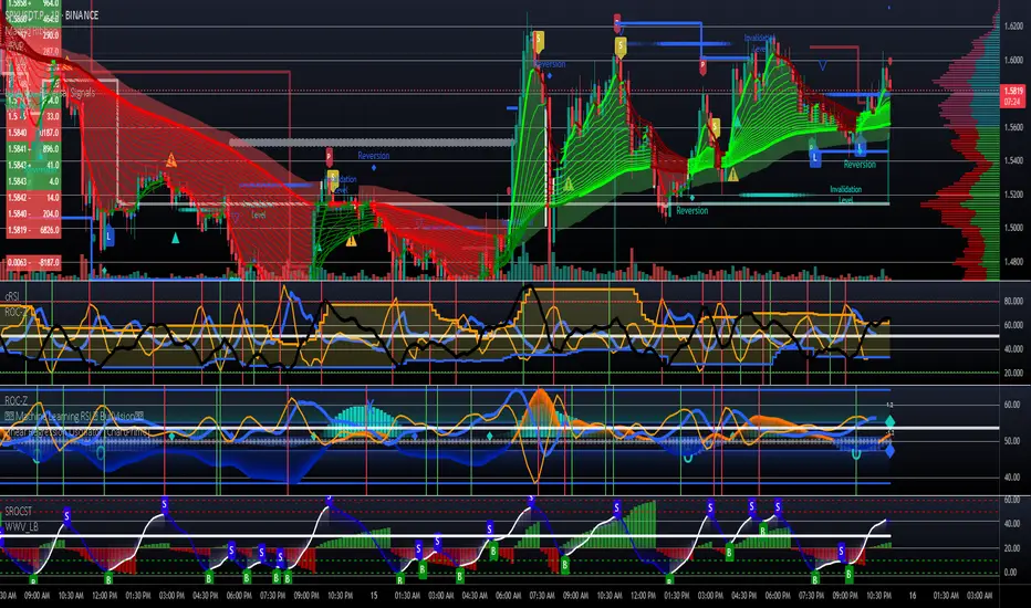
RSI Mansfield +RSI Mansfield+ – Adaptive Relative Strength Indicator with Divergences
Overview
RSI Mansfield+ is an advanced relative strength indicator that compares your instrument’s performance against a configurable benchmark index or asset (e.g., Bitcoin Dominance, S&P 500). It combines Mansfield normalization, adaptive smoothing techniques, and automatic detection of bullish and bearish divergences (regular and hidden), delivering a comprehensive tool for assessing relative strength across any market and timeframe.
Originality and Motivation
Unlike traditional relative strength scripts, this indicator introduces several distinctive improvements:
Mansfield Normalization: Scales the ratio between the asset and the benchmark relative to its moving average, transforming it into a normalized oscillator that fluctuates around zero, making it easier to spot outperformance or underperformance.
Adaptive Smoothing: Automatically selects whether to use EMA or SMA based on the market type (crypto or stocks) and timeframe (intraday, daily, weekly, monthly), avoiding manual configuration and providing more robust results under varying volatility conditions.
Divergence Detection: Identifies four types of divergences in the Mansfield oscillator to help anticipate potential reversal points or trend confirmations.
Multi-Market Support: Offers benchmark selection among major crypto and global stock indices from a single input.
These enhancements make RSI Mansfield+ more practical and powerful than conventional relative strength scripts with static benchmarks or without divergence capabilities.
Core Concepts
Relative Strength (RS): Compares price evolution between your asset and the selected benchmark.
Mansfield Normalization: Measures how much the RS deviates from its historical moving average, expressed as a scaled oscillator.
Divergences: Detects regular and hidden bullish or bearish divergences within the Mansfield oscillator.
Timeframe Adaptation: Dynamically adjusts moving average lengths based on timeframe and market type.
How It Works
Benchmark Selection
Choose among over 10 indices or market domains (BTC Dominance, ETH Dominance, S&P 500, European indices, etc.).
Ratio Calculation
Computes the price-to-benchmark ratio and smooths it with the adaptive moving average.
Normalization and Scaling
Transforms deviations into a Mansfield oscillator centered around zero.
Dynamic Coloring
Green indicates relative outperformance, red signals underperformance.
Divergence Detection
Automatically identifies bullish and bearish (regular and hidden) divergences by comparing oscillator pivots against price pivots.
Baseline Reference
A clear zero line helps interpret relative strength trends.
Usage Guidelines
Benchmark Comparison
Ideal for traders analyzing whether an asset is outperforming or lagging its sector or market.
Divergence Analysis
Helps detect potential reversal or continuation signals in relative strength.
Multi-Timeframe Compatibility
Can be applied to intraday, daily, weekly, or monthly charts.
Interpretation
Oscillator >0 and green: outperforming the benchmark.
Oscillator <0 and red: underperforming.
Bullish divergences: potential relative strength reversal to the upside.
Bearish divergences: possible loss of momentum or reversal to the downside.
Credits
The concept of Mansfield Relative Strength is based on Stan Weinstein’s original work on relative performance analysis. This script was built entirely from scratch in TradingView Pine Script v6, incorporating original logic for adaptive smoothing, normalized scaling, and divergence detection, without reusing any external open-source code.
Trend Analysis

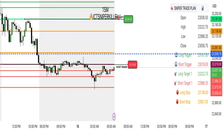
SNIPERKILLS NQ JULY 16 2025, GAMEPLAN📅 NQ Trade Plan: July 16, 2025
Previous Day Stats (July 15):
Open: 23036.50
High: 23222.75
Low: 22996.25
Close: 23056.75
📈 Bullish Scenario
✅ Long Trigger: 23181.50
Reclaiming high-value zone and pushing above PD close + midpoint.
🎯 Targets:
Target 1: 23222.75 → Previous Day High
Target 2: 23242.75 → +20 pts extension above PDH
Target 3: 23278.00 → Potential external liquidity run
🛑 Stop Loss: 23138.00
📉 Bearish Scenario
✅ Short Trigger: 23019.00
Break below PD open + low consolidation zone. Looks to tap sell-side liquidity.
🎯 Targets:
Target 1: 22996.25 → Previous Day Low
Target 2: 22975.00 → FVG fill or inefficiency target
Target 3: 22936.00 → Extended draw on liquidity below PD range
🛑 Stop Loss: 23061.00

Trend Breakout Description:
This Pine Script indicator identifies pivot high and pivot low points based on user-defined left and right candle legs, detecting breakouts to signal potential trend changes. It plots horizontal lines at pivot highs (lime) and pivot lows (red), marking breakout signals with labels ("Br") when the price crosses above a pivot high or below a pivot low. The indicator also changes the background color to reflect the trend (green for uptrend, red for downtrend) with adjustable transparency. The indicator primarily focuses on recognizing specific pivot patterns to define trends and generate trading signals.
How It Works
• Pivot Detection: Identifies pivot highs and lows using configurable left (Left side Pivot Candle) and right (Right side Pivot Candle) periods.
• Pivot Highs (PH): A pivot high is identified when a candle's high is greater than a specified number of preceding candles (left leg) and succeeding candles (right leg).
• Pivot Lows (PL): Similarly, a pivot low is identified when a candle's low is less than a specified number of preceding and succeeding candles.
The script then tracks the last three pivot highs and pivot lows.
Trend Detection and Breakouts
1. High Line (Resistance): When a middle pivot high (out of the three tracked) is higher than both the previous and the next pivot high, a lime green line is drawn from that pivot high. This line acts as a dynamic resistance level.
2. Low Line (Support): Conversely, when a middle pivot low is lower than both the previous and the next pivot low, a red line is drawn from that pivot low. This line acts as a dynamic support level.
________________________________________
Trading Signals : The indicator generates signals based on price crossing these dynamically drawn lines .
• Long Signal (Uptrend):
o A "Long" signal is triggered when the close price crosses above the current high line (resistance), and the indicator is not already in an uptrend.
o When a long signal occurs, the background turns green, and the high line becomes dotted and thinner. A "Br" (Breakout) label appears below the candle.
• Short Signal (Downtrend):
o A "Short" signal is triggered when the close price crosses below the current low line (support), and the indicator is not already in a downtrend.
o When a short signal occurs, the background turns red, and the low line becomes dotted and thinner. A "Br" (Breakout) label appears above the candle.
________________________________________
Customizable Settings
The indicator provides three user-adjustable inputs:
• Right Side Pivot Candle (fpivotLeg): This setting (default 10) determines the number of candles to the right that must have lower highs/higher lows for a pivot to be confirmed.
• Left Side Pivot Candle (bpivotLeg): This setting (default 15) determines the number of candles to the left that must have lower highs/higher lows for a pivot to be confirmed.
• Adjust Color Visualization (Colortrnp): This setting (default 85) controls the transparency of the background color changes, allowing you to adjust how prominently the green (uptrend) and red (downtrend) backgrounds are displayed.
________________________________________
How to Use It
This indicator can be used by traders to:
• Identify potential reversals: The formation of new pivot highs and lows can signal shifts in market direction.
• Spot breakout opportunities: Crossing above the high line or below the low line can indicate the start of a new trend or the continuation of an existing one.
• Confirm trend strength: The presence and extension of the high and low lines can provide visual cues about the prevailing trend.
• Ideal for swing traders or trend-following strategies.
• Use the breakout labels ("Br") and background color to confirm trend direction.
• Adjust pivot leg inputs to fine-tune sensitivity for different timeframes or assets.
• Customize transparency to suit chart readability.
Example:
On a breakout above a pivot high, a green "Br" label appears, the background turns green, and the pivot line becomes dotted. This signals a potential uptrend, helping traders identify entry points or trend confirmations.
Disclaimer: No indicator guarantees profits. Always use this indicator in conjunction with other analysis methods and proper risk management.

TeeLek-HedgingLineIf we are DCA some assets and it happens to be in a downtrend, sitting and waiting is the best way, but it is not easy to do. There are other ways that allow us to buy DCA and keep collecting more. While the market is falling, don't be depressed. The more you buy, the more it drops. Should you continue buying? Plus, if it goes back to an uptrend, you will also get extra profit. Let's go check it out.
ถ้าเรา DCA ทรัพย์สินอะไรซักอย่างนึงอยู่ แล้วมันดันเป็นขาลงพอดี จะนั่งรอเฉยๆ เป็นวิธีที่ดีที่สุด แต่ไม่ได้ทำกันได้ง่ายๆ นะ ยังมีวิธีอื่นอีก ที่ให้เราสามารถ ซื้อ DCA เก็บของเพิ่มได้เรื่อยๆ ระหว่างที่ตลาดร่วง ไม่จิตตก ยิ่งซื้อ ยิ่งลง จะซื้อต่อดีไหม? แถมถ้า กลับมาเป็นขาขึ้น ยังมีกำไรแถมให้ด้วยนะ ไปหาดูกัน

YM Round Numbers & Quarters (Toggle Edition)Traders often use whole numbers as psychological levels of support and resistance.
For example, 500 might be a support level, while 1000 could be a target or ceiling price where you take profit.
Closed CRT Rejection in LON/NY Kill-ZonesThis is a Timed CRT Indicator for lazy markups without lifting a finger.

Penny Stock Breakout ScreenerLive Conditions Your Script Is Monitoring:
🔵 Bullish (Green Background = Entry Opportunity):
Breakout Pivot High
✅ Trigger: Price is breaking above the highest close of the last 20 candles (shows momentum).
🔔 Alert: "Price breaking above recent pivot high!"
Price Above VWAP
✅ Trigger: Price is currently above the VWAP (shows buyers are in control).
🔔 Alert: "Price is above VWAP - bullish control!"
EMA 9 > EMA 20 Crossover
✅ Trigger: 9-period EMA crosses above 20 EMA (trend shifting bullish).
🔔 Alert: "EMA9 has crossed above EMA20"
RSI Recovery
✅ Trigger: RSI (14) crosses above 35, indicating a bounce from oversold.
🔔 Alert: "RSI is rising from oversold - bounce incoming"
Volume Spike
✅ Trigger: Current volume is 1.5x greater than 20-day average (buying interest).
🔔 Alert: "Volume > 1.5x 20-day avg - possible breakout"
YM Round Numbers & Quarters (Toggle Edition)This depicts whole numbers that helps me psychological levels

Candle close on high time frameOVERVIEW
This indicator plots persistent closing levels of higher time frame candles (H1, H4, and Daily) on the active intraday chart in real time. Unlike similar tools, it offers granular control over line projection length, fully independent toggles per timeframe, and a built-in mechanism that automatically limits the total number of historical levels to avoid chart clutter and performance issues.
CONCEPTS
Key levels from higher time frames often act as areas where price reacts or consolidates. By projecting each candle's exact closing price forward as a horizontal reference, traders can quickly identify dynamic support and resistance zones relevant to the current price action. This indicator enables seamless multi-timeframe analysis without the need to manually switch chart intervals or re-draw lines.
FEATURES
Independent Time Frame Selection: Enable or disable H1, H4, and Daily levels individually to tailor the analysis.
Custom Extension Length: Each timeframe's closing level can be projected forward for a user-defined number of bars.
Performance Optimization: The script maintains an internal limit (default: 100) on the number of active lines. When this threshold is exceeded, the oldest lines are removed automatically.
Visual Differentiation: Colors for each timeframe are fully customizable, enabling immediate recognition of level origin.
Immediate Update: New levels appear as soon as a higher timeframe candle closes, ensuring real-time reference.
USAGE
From the indicator inputs, select which timeframes you want to track.
Adjust the extension lengths to fit your trading style and time horizon.
Customize the line colors for clarity and personal preference.
Use these projected levels as part of your confluence criteria for entries, exits, or stop placement.
Combine with trend indicators or price action tools to enhance your multi-timeframe strategy.
ORIGINALITY AND ADDED VALUE
While similar scripts exist that plot higher timeframe levels, this implementation differs in:
Its efficient automatic cleanup of old lines to preserve chart performance.
The independent extension and color settings per timeframe.
Immediate reaction to new candle closes without repainting.
Simplicity of use combined with precise customization.
This combination makes it a practical and flexible tool for traders who rely on clear HTF level visualization without manual drawing or the limitations of built-in TradingView tools.
LICENSE
This script is published open-source under the Mozilla Public License 2.0.
CQ_MTF Target Price Lines [BITCOIN HOY]Comprehensive Indicator Script Overview
Intraday, Four Hour, Daily, and Weekly Price Target Lines—A Versatile Tool for Traders
Welcome to a powerful and flexible indicator script designed to enhance your trading experience across multiple timeframes. This script empowers users to interactively set, visualize, and manage price targets, entries, and objectives for both short-term and long-term trading strategies. Whether you are a day trader seeking to mark crucial intraday levels or a long-term investor planning strategic entries, this tool offers an all-encompassing solution.
Key Features
• Multi-Time Frame Price Target Lines: Effortlessly input and display calculated price targets for Intraday, Four Hour, Daily, and Weekly periods, ensuring you always have a clear view of the market objectives at every scale.
• X-Axis Price Control: Set precise x-axis price points for each timeframe, granting you granular control over how and where your target lines appear on the chart.
• Weekly Price Objectives: Enter your calculated price objectives for the current week to remain aligned with your trading plan and adapt to evolving market conditions.
• Long-Term Investment Entry Events: Document and display significant entry events for long-term investments, helping you maintain a strategic perspective while navigating short-term fluctuations.
• Long-Term Price Objectives: Input and track price objectives for your long-term trades, supporting your investment decisions with clearly visualized milestones.
• Customizable Labels and Lines: Each price target is accompanied by clearly labeled lines, making it easy to distinguish between timeframes and targets at a glance.
Optional Price Gauge for Intraday Dynamics
For users who wish to monitor real-time market sentiment, the script includes an optional price gauge. This dynamic feature tracks intraday price movement, providing visual cues to quickly assess whether the prevailing tendency is bullish or bearish. The intuitive gauge aids in confirming your intraday strategies or alerting you to potential reversals.
User Experience and Customization
• Interactive Inputs: All key parameters—price targets, x-axis prices, entry events, and objectives—are entered manually by the user. This approach ensures the script adapts to your personal analysis and trading methodology.
• Easy Visualization: The clear display of lines, labels, and the optional gauge streamlines your chart, making it easier to make informed decisions at a glance.
• Flexible Application: Whether you’re trading short-term swings or building positions for the long haul, the indicator integrates seamlessly into your workflow.
How to Use
• Input your calculated price targets for each timeframe (Intraday, Four Hour, Daily, and Weekly).
• Specify the exact x-axis price points where you’d like the lines to appear for each timeframe.
• For the current week, enter your weekly price objectives for quick reference and planning.
• If you’re a long-term investor, document your key entry events and set long-term price objectives to track their progression.
• To monitor current market momentum, activate the price gauge and follow the visual cues for bullish or bearish trends.
Benefits
• Comprehensive Market Overview: Simultaneously track multiple timeframes and objectives, keeping all critical information at your fingertips.
• Improved Decision Making: Visual clarity and strategic labeling support faster, more confident trading decisions.
• Customizable and Adaptable: Tailor the script to your unique trading style and analytical approach.
Enjoy using the indicator, and happy trading! Let this versatile tool be your companion in navigating the ever-changing tides of the market.

Multi-Timeframe Trend Analysis [Aaron Diaz]🧠 Indicator Review: Multi-Timeframe Trend Analysis
📌 What Does It Do?
The "Multi-Timeframe Trend Analysis" indicator by Aaron Diaz performs a trend assessment across multiple timeframes using Exponential Moving Averages (EMAs) as internal logic. Instead of plotting EMAs on the chart, this version only displays a clean dashboard that shows whether each EMA is trending up or down, keeping your chart clutter-free.
🧾 Based on the original indicator by BigBeluga, this version was modified by Aaron Diaz to remove the EMA plots and focus solely on actionable trend information via a table.
🔍 How It Works
It calculates 5 different EMAs (default: 20, 30, 40, 50, 60 periods).
For each EMA, it checks if it’s trending up (EMA > EMA 2 candles ago) or down.
These signals are then evaluated across 5 customizable timeframes (e.g., 1h, 2h, 3h, etc.).
A dashboard/table appears on the top-right corner of your screen, showing:
🢁 = Uptrend for that EMA and timeframe.
🢃 = Downtrend.
It uses color codes (green = bullish, purple = bearish) to make trend reading fast and intuitive.
🧱 Technical Foundations
Exponential Moving Averages (EMAs):
EMAs give more weight to recent prices, making them highly responsive to current trends.
Widely used to detect momentum and reversals.
Multi-Timeframe Analysis (MTF):
Helps confirm trend strength by analyzing multiple timeframes.
Reduces false signals and noise found in a single timeframe.
📈 Suggested Strategy: "MTF Trend Confluence"
🎯 Goal:
Only trade when multiple timeframes confirm the same directional bias.
✅ Long Entry Rules:
At least 3 out of 5 timeframes must show 🢁 on at least 4 of the 5 EMAs.
Confirm entry with:
A bullish candlestick pattern.
A breakout above recent resistance.
Optional filter: RSI or MACD not in overbought zone.
🔻 Short Entry Rules:
At least 3 timeframes must show 🢃 on at least 4 EMAs.
Confirm with:
A bearish candle or breakdown below support.
Optional filter: RSI or MACD not in oversold zone.
🛑 Exit Rules:
Take Profit at key support/resistance levels or at a 2:1 risk-reward ratio.
Stop Loss below/above the last swing or fixed % (e.g., 1.5–2%).
Exit early if the dashboard shows a shift in trend across key timeframes.
🧪 Example Use Case
You're trading on a 15-minute chart:
The dashboard shows 🢁 across 1h, 2h, and 3h timeframes for EMA20, EMA30, and EMA40.
Price breaks a local resistance level.
You enter long and target the next liquidity zone, placing your stop-loss below the most recent swing low.
⚠️ Important Notes
This is not a signal generator—it’s a trend confirmation tool.
Best used for swing or intraday trend trading.
Avoid using it in ranging or sideways markets.

NEPALI DASHBOARD NEPALI DASHBORAD - All-In-One Sentiment Dashboard
Overview
The NEPALI DASHBORAD is a comprehensive, all-in-one dashboard designed to give day traders a quick yet powerful overview of market sentiment. Instead of cluttering your chart with dozens of individual indicators, this tool consolidates the signals from 11 different technical indicators into a single, easy-to-read table. It calculates an overall bull/bear sentiment score and provides a trading recommendation based on the confluence of these signals, helping you make more informed decisions at a glance.
The dashboard is fully customizable, allowing you to adjust indicator settings, change the table size, and move it to any corner of your chart.
Key Features
Multi-Indicator Analysis: Gathers data from 11 essential indicators covering trend, momentum, volume, and volatility.
Sentiment Score: Calculates a simple "Bull vs. Bear" score to instantly gauge market sentiment.
Actionable Recommendations: Provides a clear trading recommendation (Strong Buy, Buy, Sell, Strong Sell, Hold) based on the strength of the confluence.
Higher Timeframe (HTF) Context: Includes an HTF trend analysis to ensure your trades align with the bigger picture.
Customizable Dashboard: Easily change the size and position of the dashboard to fit your workspace.
How to Use
Check the Market Sentiment: Look at the "Bull vs. Bear" score first. A high score (e.g., 8 vs. 3) indicates strong confluence in one direction.
Verify the HTF Trend: Ensure your intended trade direction aligns with the higher timeframe trend for better probability. For example, be cautious about taking "SELL" signals if the HTF Trend is strongly "BULL."
Use the Recommendation as a Guide: The "Recommendation" and "Confidence" % give you a summary of the indicator signals. A "STRONG BUY" or "STRONG SELL" means that a significant majority of the indicators are in agreement.
Drill Down into Indicators: Use the individual indicator statuses in the table to understand why the market sentiment is bullish or bearish. For example, you might see that momentum indicators (RSI, Stoch) are bullish, but trend indicators (MA, MACD) are still lagging.
Combine with Your Strategy: This dashboard is a powerful confirmation tool. Use its signals to confirm entries and exits for your existing trading strategy. Do not use it as a standalone signal provider.
Disclaimer
In simple terms: This is a tool for analysis, not a signal to trade. Your money is your responsibility.
This script is for educational and informational purposes only. I am not a financial advisor; I am just a learner sharing my work. The information and tools provided are not, and should not be construed as, financial advice, an offer, or a solicitation to buy or sell any securities.
Trading and investing in financial markets involve substantial risk of loss and is not suitable for every investor. I do not guarantee the accuracy, completeness, or profitability of this script. All trading decisions you make are your own, and you are solely responsible for any resulting profits or losses.
Always conduct your own research and seek advice from a qualified financial advisor before making any investment decisions. By using this script, you agree that I am not liable for any and all losses you may incur.

Fractal Pullback Market StructureFractal Pullback Market Structure
Author: The_Forex_Steward
License: Mozilla Public License 2.0
The Fractal Pullback Market Structure indicator is a sophisticated price action tool designed to visualize internal structure shifts and break-of-structure (BoS) events with high accuracy. It leverages fractal pullback logic to identify market swing points and confirm whether a directional change has occurred.
This indicator detects swing highs and lows based on fractal behavior, drawing zigzag lines to connect these key pivot points. It classifies and labels each structural point as either a Higher High (HH), Higher Low (HL), Lower High (LH), or Lower Low (LL). Internal shifts are marked using triangle symbols on the chart, distinguishing bullish from bearish developments.
Break of Structure events are confirmed when price closes beyond the most recent swing high or low, and a horizontal line is drawn at the breakout level. This helps traders validate when a structural trend change is underway.
Users can configure the lookback period that defines the sensitivity of the pullback detection, as well as a timeframe multiplier to align the logic with higher timeframes such as 4H or Daily. There are visual customization settings for the zigzag lines and BoS markers, including color, width, and style (solid, dotted, or dashed).
Alerts are available for each key structural label—HH, HL, LH, LL—as well as for BoS events. These alerts are filtered through a selectable alert mode that separates signals by timeframe category: Low Timeframe (LTF), Medium Timeframe (MTF), and High Timeframe (HTF). Each mode allows the user to receive alerts only when relevant to their strategy.
This indicator excels in trend confirmation and reversal detection. Traders can use it to identify developing structure, validate internal shifts, and anticipate breakout continuation or rejection. It is particularly useful for Smart Money Concept (SMC) traders, swing traders, and those looking to refine entries and exits based on price structure rather than lagging indicators.
Visual clarity, adaptable timeframe logic, and precise structural event detection make this tool a valuable addition to any price action trader’s toolkit.

Trend Weakness Detector via EMAShow Trend Weakness via how far price from EMA. Check avr distance from EMA and if it is less that std than Show as weekness

Average Daily % Change by Weekday📊 Average Daily % Change by Weekday
This script calculates and displays the average daily percentage change for each weekday (Monday through Sunday) based on historical price data. It helps traders analyze which days tend to be bullish or bearish over a selected backtest date range.
✅ Features:
Customizable date range (From Year/Month/Day to To Year/Month/Day)
Calculates average % change for each weekday (Mon–Sun)
Supports assets that trade 7 days (e.g., crypto)
Color-coded outputs (green = positive, red = negative)
Final results shown as a table in the bottom-right corner
Works only on the 1D timeframe (daily)
🧠 How it works:
For each day within the selected date range:
The script calculates the % change as: (Close - Open) / Open * 100
Then, it groups the data by weekday and averages the values
This gives you insight into how each day of the week behaves historically for the current asset.
⚠️ Notes:
This script only works on daily (1D) timeframes.
For most accurate results, use it on assets with long trading history (e.g., BTCUSD).
Designed for educational and statistical analysis purposes.

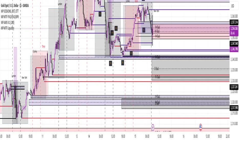
MP MTF LiquidityMP MTF Liquidity
Multi-Timeframe Liquidity Levels – Automatic High/Low Tracking
This indicator automatically tracks and draws liquidity levels (recent highs and lows) from up to 6 custom timeframes directly on your chart. It’s designed for advanced traders who want to visualize important swing points and liquidity pools across multiple timeframes—ideal for Smart Money Concepts (SMC), ICT, and price action trading.
Key Features:
Multi-Timeframe Support:
Select up to 6 different timeframes (ex: 1H, 4H, Daily, Weekly, etc.), each with separate color and visibility controls.
Real Liquidity (No Repaint):
Levels are only drawn from fully closed bars on each timeframe—no lines from currently forming candles, ensuring accuracy and no forward-looking bias.
Automatic Detection:
Highs and lows are detected automatically. Levels that get swept (price breaks through) are converted to dashed lines for easy visual distinction.
Customizable:
Choose line colors for highs/lows and set the maximum number of active levels per timeframe to keep charts clean.
Extended Lines:
All levels are extended to the right, helping you see how current price interacts with past liquidity.
How It Works:
On every new bar of your chosen higher timeframe(s), the indicator records the high and low of the previous (just-closed) candle.
These levels are extended as rays until price sweeps (crosses) them.
When a level is swept, it is redrawn as a dashed line to highlight liquidity grabs or stop hunts.
No lines are drawn for the “live” bar—only confirmed, closed levels are displayed.
Who is this for?
SMC, ICT, and price action traders seeking high-confidence liquidity zones.
Intraday, swing, and multi-timeframe traders who want an automated, visual edge.
Anyone wanting to avoid repainting or “fake” levels from unfinished candles.
Tip:
Combine this indicator with your favorite order block, fair value gap (FVG), or market structure tools for even greater context and confluence.
Disclaimer:
No indicator guarantees profits. Always use with proper risk management and in conjunction with your trading plan.
Essa - Market Structure & Fibonacci ToolkitOverview
The Essa Market Structure & Fibonacci Toolkit is a comprehensive trading indicator that combines advanced market structure analysis with customizable fibonacci levels and fair value gap detection. It identifies high-probability trading opportunities by detecting confluence zones where multiple technical factors align, providing traders with precise entry and exit points based on institutional trading concepts.
Key Features
📊Market Structure Analysis
Pattern Recognition: Automatically detects Higher Highs (HH), Higher Lows (HL), Lower Highs (LH), Lower Lows (LL)
Change of Character (CHoCH): Identifies trend changes and market structure breaks
Pattern Locking: Fibonacci levels lock to specific swing patterns (LH→LL for bearish, HL→HH for bullish)
Multi-Timeframe Analysis: Analyzes trend strength across multiple timeframes with scoring system
🧮 Custom Fibonacci System
Fully Configurable Levels: Set any percentage (e.g., 25%, 65%, 87.5%) - not limited to traditional levels
Dynamic Labels: Shows your actual percentages, not hardcoded values
Golden Zone Trading: Customizable optimal entry zones between any two fibonacci levels
Auto-Extension: Levels automatically extend as price moves
Distance Tables: Real-time pip distances to nearest fibonacci levels
📈 Fair Value Gap (FVG) Detection
Smart Detection: Identifies bullish and bearish fair value gaps with size filtering
Age Tracking: Shows how long each FVG has been active (bars or time format)
Confluence Highlighting: Enhanced colors when FVGs overlap with fibonacci golden zones
Width Filtering: ATR-based minimum width requirements to filter noise
🎯 Confluence Trading
Multi-Factor Analysis: Combines market structure + fibonacci + FVGs + golden zones
High-Probability Zones: Highlights areas where multiple factors converge
Trend Strength Scoring: 0-100% scoring system based on multiple confluence factors
Smart Alerts: Notifications for high-confluence setups only
⚡ Advanced Features
Trend Analysis Table: Real-time trend bias, strength score, and pattern identification
Adaptive Sensitivity: Automatically adjusts to market volatility using ATR
Professional Alerts: Customizable alerts for structure breaks, golden zone touches, and FVG confluence
Clean Interface: Basic/Advanced settings organization with inline controls
🎨 Visual Excellence
Professional Styling: Clean, institutional-grade visual presentation
Customizable Colors: Full color customization for all elements
Smart Labeling: Context-aware labels that don't overlap
Performance Optimized: Efficient rendering with visual element limits
Perfect for: Swing traders, day traders, and institutional-style traders who want to identify high-probability setups using confluence of market structure, fibonacci levels, and fair value gaps.

Tt • FVG CandlesAn FVG / Imbalance identifier.
Default color:
• Light grey - Bullish FVG
• Dark grey - Bearish FVG

Ultimate SuperTrend with Support and ResistanceModified ST with Support and resistance levels. This was developed by SAM team to provide a singular indicator to trade in NIFTY. It can also be used in other securities.
Based on the trading style, can be used for Sell and Buy trades. Provide your comments and guidance.

Universal Renko Bars by SiddWolfUniversal Renko Bars or UniRenko Bars is an overlay indicator that applies the logic of Renko charting directly onto a standard candlestick chart. It generates a sequence of price-driven bricks, where each new brick is formed only when the price moves a specific amount, regardless of time. This provides a clean, price-action-focused visualization of the market's trend.
WHAT IS UNIVERSAL RENKO BARS?
For years, traders have faced a stark choice: the clean, noise-free world of Renko charts, or the rich, time-based context of Candlesticks. Choosing Renko meant giving up your favorite moving averages, volume profiles, and the fundamental sense of time. Choosing Candlesticks meant enduring the market noise that often clouds true price action.
But what if you didn't have to choose?
Universal Renko Bars is a revolutionary indicator that ends this dilemma. It's not just another charting tool; it's a powerful synthesis that overlays the pure, price-driven logic of Renko bricks directly onto your standard candlestick chart. This hybrid approach gives you the best of both worlds:
❖ The Clarity of Renko: By filtering out the insignificant noise of time, Universal Renko reveals the underlying trend with unparalleled clarity. Up trends are clean successions of green bricks; down trends are clear red bricks. No more guesswork.
❖ The Context of Candlesticks: Because the Renko logic is an overlay, you retain your time axis, your volume data, and full compatibility with every other time-based indicator in your arsenal (RSI, MACD, Moving Averages, etc.).
The true magic, however, lies in its live, Unconfirmed Renko brick. This semi-transparent box is your window into the current bar's real-time struggle. It grows, shrinks, and changes color with every tick, showing you exactly how close the price is to confirming the trend or forcing a reversal. It’s no longer a lagging indicator; it’s a live look at the current battle between buyers and sellers.
Universal Renko Bars unifies these two powerful charting methods, transforming your chart into a more intelligent, noise-free, and predictive analytical canvas.
HOW TO USE
To get the most out of Universal Renko Bars, here are a few tips and a full breakdown of the settings.
Initial Setup for the Best Experience
For the cleanest possible view, it's highly recommended that you hide the body of your standard candlesticks, that shows only the skelton of the candle. This allows the Renko bricks to become the primary focus of your chart.
→ Double click on the candles and uncheck the body checkbox.
Settings Breakdown
The indicator is designed to be powerful yet intuitive. The settings are grouped to make customization easy.
First, What is a "Tick"?
Before we dive in, it's important to understand the concept of a "Tick." In Universal Renko, a Tick is not the same as a market tick. It's a fundamental unit of price movement that you define. For example, if you set the Tick Size to $0.50, then a price move of $1.00 is equal to 2 Ticks. This is the core building block for all Renko bricks. Tick size here is dynamically determined by the settings provided in the indicator.
❖ Calculation Method (The "Tick Size" Engine)
This section determines the monetary value of a single "Tick."
`Calculation Method` : Choose your preferred engine for defining the Tick Size.
`ATR Based` (Default): The Tick Size becomes dynamic, based on market volatility (Average True Range). Bricks will get larger in volatile markets and smaller in quiet ones. Use the `ATR 14 Multiplier` to control the sensitivity.
`Percentage` : The Tick Size is a simple percentage of the current asset price, controlled by the `Percent Size (%)` input.
`Auto` : The "set it and forget it" mode. The script intelligently calculates a Tick Size based on the asset's price. Use the `Auto Sensitivity` slider to make these automatically calculated bricks thicker (value > 1.0) or thinner (value < 1.0).
❖ Parameters (The Core Renko Engine)
This group controls how the bricks are constructed based on the Tick Size.
`Tick Trend` : The number of "Ticks" the price must move in the same direction to print a new continuation brick. A smaller value means bricks form more easily.
`Tick Reversal` : The number of "Ticks" the price must move in the opposite direction to print a new reversal brick. This is typically set higher than `Tick Trend` (e.g., double) to filter out minor pullbacks and market noise.
`Open Offset` : Controls the visual overlap of the bricks. A value of `0` creates gapless bricks that start where the last one ended. A value of `2` (with a `Tick Reversal` of 4) creates the classic 50% overlap look.
❖ Visuals (Controlling What You See)
This is where you tailor the chart to your visual preference.
`Show Confirmed Renko` : Toggles the solid-colored, historical bricks. These are finalized and will never change. They represent the confirmed past trend.
`Show Unconfirmed Renko` : This is the most powerful visual feature. It toggles the live, semi-transparent box that represents the developing brick. It shows you exactly where the price is right now in relation to the levels needed to form the next brick.
`Show Max/Min Levels` : Toggles the horizontal "finish lines" on your chart. The green line is the price target for a bullish brick, and the red line is the target for a bearish brick. These are excellent for spotting breakouts.
`Show Info Label` : Toggles the on-chart label that provides key real-time stats:
🧱 Bricks: The total count of confirmed bricks.
⏳ Live: How many chart bars the current live brick has been forming. These bars forms the Renko bricks that aren't confirmed yet. Live = 0 means the latest renko brick is confirmed.
🌲 Tick Size: The current calculated value of a single Tick.
Hover over the label for a tooltip with live RSI(14), MFI(14), and CCI(20) data for additional confirmation.
TRADING STRATEGIES & IDEAS
Universal Renko Bars isn't just a visual tool; it's a foundation for building robust trading strategies.
Trend Confirmation: The primary use is to instantly identify the trend. A series of green bricks indicates a strong uptrend; a series of red bricks indicates a strong downtrend. Use this to filter out trades that go against the primary momentum.
Reversal Spotting: Pay close attention to the Unconfirmed Brick . When a strong trend is in place and the live brick starts to fight against it—changing color and growing larger—it can be an early warning that a reversal is imminent. Wait for the brick to be confirmed for a higher probability entry.
Breakout Trading: The `Max/Min Levels` are your dynamic breakout zones. A long entry can be considered when the price breaks and closes above the green Max Level, confirming a new bullish brick. A short entry can be taken when price breaks below the red Min Level.
Confluence & Indicator Synergy: This is where Universal Renko truly shines. Overlay a moving average (e.g., 20 EMA). Only take long trades when the green bricks are forming above the EMA. Combine it with RSI or MACD; a bearish reversal brick forming while the RSI shows bearish divergence is a very powerful signal.
A FINAL WORD
Universal Renko Bars was designed to solve a fundamental problem in technical analysis. It brings together the best elements of two powerful methodologies to give you a clearer, more actionable view of the market. By filtering noise while retaining context, it empowers you to make decisions with greater confidence.
Add Universal Renko Bars to your chart today and elevate your analysis. We welcome your feedback and suggestions for future updates!
Follow me to get notified when I publish New Indicator.
~ SiddWolf

MACD parametrable kylian MACD analysis with indicator on the chart showing bullish and bearish crossover points based on configurable thresholds.
