Signal & Noise: Macro Tests: Italy, Japan, IndiaThis piece was meant to focus on the number of major equity indices that are near all time highs, or attempting to break out of long term ranges, and how their behaviors around those prior highs over coming months will likely offer significant insight into what comes next. It evolved to something else.
I am convinced that most market fluctuations are random, mostly untradable noise. And yet, most who work with markets for a living, are required to place meaningless behavior into a continuous narrative for clients and employers. Importantly, once a narrative is publicly expressed, the analyst/trader becomes entrapped in that narrative and all of the resultant behavioral biases that being identified with a view entail. Working in the institutional setting, my personal solution was to focus on longer time frames.
Part of the technicians evolution is finding the style that best suits their emotional and risk management tolerance. For me, it was a long and sometimes painful journey. One of my toughest challenges was finding a systematic approach to separating signal from noise. In other words, when is market behavior important and when is it not. And if it is, how do I subsequently fashion a trade to take advantage of the informational advantage.
Anyone who has traded for a living knows that market behaviors and patterns are often unreliable. This is particularly true if they are occurring in a trending market and well away from substantive support or resistance (the most obvious exception being early stage trends and climax/ending structures). Don't get me wrong, trading focused systematic entries to established trends can work very well. But, I prefer to enter initial positions into trends that are in their early stages, where I have tighter control over risk management and where my macro opinion, hopefully divergent with the dominant market narrative, is more likely to be a change catalyst.
When patterns occur at the proper position on the chart, they become far more valuable and actionable. To be fair, I don't completely ignore day to day fluctuations. Years of staring at tens of thousands of charts has given me a decent feel for the short term fluctuations. But I place far less emphasis on building trading plans or adjusting my positions around them, and I try to avoid labeling them as meaningful for anything more than a short term trade. In these cases my chart analysis typically consists of a cursory glance at the price-volume relationships and general view of the chart. On the other hand, solid confluences of support and resistance that have been well defined in the weekly and monthly perspectives are my personal wheelhouse. When I find these markets, I focus on them intently.
In my process, I actively scan for markets that are testing well defined price junctures in their weekly and monthly perspectives. At these junctures the price/volume behavior combinations in the daily, weekly and even hourly perspectives become meaningful and often produce actionable insight.
As a professional fixed-income trader I have always been envious of non-constrained traders who had thousands of global stocks, equity indices, currencies, commodities across multiple time perspectives to choose from. There is always a fat pitch setting up somewhere as long as you are dogged enough to go find them.
On to the charts: Multiple global equity markets are testing important prior highs, many in monthly perspectives others in weekly perspectives. These are precisely the situations in which signal quality is high and the price/volume relationships become more important and where often times new trends with quality risk reward tolerances set up from.
These are all charts that have recently moved onto my watch list.
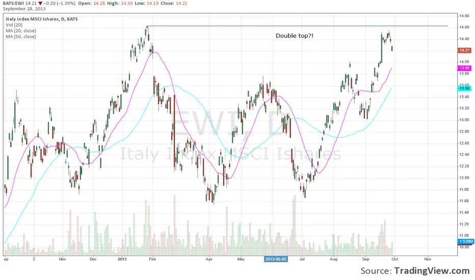
MSCI Italy:
The MSCI Italy represents a point in case. Italy recently moved modestly above the top of a two decade long trading range. From this position, even small daily perspective fluctuations generate meaningful information. Importantly, with the long trading range acting as potential cause, potential targets of a breakout are much-much-much higher and even a failure back toward the trading range lows would produce roughly a 40-45% return. It's pretty simple, either the market is A) Breaking out. B) Has washed out the top of the range, sucked in weak hands, and will soon fail back into the range leaving weak hands trapped.
My initial thought upon examining the chart was that it was indeed breaking out of its decade long trading range.
• The September 2022 low (B) was higher than the prior low (A).
• During the last decline toward the range lows (34.53 - 20.99) there were significant signs of accumulation.
• The market is clearly above the most immediate horizontal resistance( 34.45- 34.53) and just above the 36.88 resistance.
• Corrections since breaking out have mostly taken the form of bull flags or pennants.
However:
• Momentum is significantly over-extended in all time frames.
• The weekly slow stochastic is diverging and threatening to rollover.
• The monthly slow stochastic is attempting to rollover.
• Near the Top of the daily, weekly and monthly Bollinger Bands.
• Multiple price channel tops conflude in the 38.00 area of the chart.
• Volume has declined markedly as the market rallied over the last 19 months. This suggests a lack of selling pressure as opposed to strong demand.
• Since 2011 the peaks have been running in the mid 40 month range. Currently at 35 months.
• While above most recent resistance, the 2009 high @ 43.54 should offer strong resistance.
If the market is ready to pullback, the price-volume relationships, pattern, behavior relative to support and resistance zone and other traditional technical relationships should allow early entry into the next meaningful directional move.
For now, I suspect that the market may indeed be breaking out in the long term, but the long laundry list of concerns suggests that a pullback is likely to develop before the next strong trending phase begins. The behaviors on the pullback, and where the pullback holds (most likely the broken C-D resistance) will be key.
NIKKEI 225 Monthly:
Nikkei is another major market testing its all-time high. At all time highs and a channel top. Clearly a watch list chart.
MSCI India ETF:
India is interesting. There has been a very positive change in the reporting on India's economic outlook and the market recently moved to a new all time high. But note the swell in volume and the poor upside result generated by that volume. I suspect strong hands are selling the rally.
And finally, many of the topics and techniques discussed in this post are part of the CMT Associations Chartered Market Technician’s curriculum.
Good Trading:
Stewart Taylor, CMT
Chartered Market Technician
Shared content and posted charts are intended to be used for informational and educational purposes only. The CMT Association does not offer, and this information shall not be understood or construed as, financial advice or investment recommendations. The information provided is not a substitute for advice from an investment professional. The CMT Association does not accept liability for any financial loss or damage our audience may incur.
EWI trade ideas

iShares MSCI Italy (EWI) Monthly chart: Several country indices remain well below their multi-year highs, Italy being one of them. The ETF (in USD) is breaching an 11-year downward trend line. For long term equity portfolios, it may be time to be dig deeper in this region.

PrimoItalian economy looking realistic in terms of cost, historical comps & production. No position yet, watching daily to leg-in circa $30/share.

Bear Target: $26Number of coronavirus cases increases to 229. Europe's most affected country.
The uncertainty around this virus will adversely affect economic progress and alter growth projections in the short term.

EWI Short ITALY due to CoronavirusSource: Corriere della Sera
Over 150 cases of Coronavirus in Italy and 7 regions are blocked and many villages in quarantine. Austria blocked all trains coming from the regions ar risk. Risk on for Europe this week.
This present a potential short opportunity as the week starts. This idea provides two target levels and good buyback opportunity at Target 2 if reached.

EWI ShortEurope is on the edge of recession, market pumped with negative interest rates. At some point the charade has to end.
Jan EWI puts were too cheap to ignore, in for a small play.

EWI Exhaustion GapEuro markets all threw gravestone dojis this morning, I should have bought some Italy puts. Looks ike an exhaustion gap, but in reality it was a gravestone in the actual index. (Pattern difference is caused because the markets aren't open at the same time.)
I bought some EWW (Mexico) puts instead, because of better liquidity, but his would have been a good play as well.


April 18th in Italy marked recent TopMore than just Europe, April 18th marked the more aggressive top that Italy saw before their government situation unveiled a lot of issues.

Multiple bottom and ready for a break out?Looking for value in a overpriced market? This could be a trade with good risk/reward. I'm already in. If break out, high chances for hitting at least 45 or even 50.


Italy chart may hint about Euro next crisisIn June, Italy broke below the downtrend line its been following since mid 2013.
After a sharp decline where it broke also below the 16.5 support zone, $EWI used the last couple of week to made a small pullback (in a form of a bearish Flag) right back into the 16.5 zone (now resistance).
Since C point (16.5) was right at the 61.8 Fib level, we may see a possible bullish AB=CD pattern which will be complete near 14$. If that's the case, we are talking about another sharp decline coming real soon.
We already saw the first bearish signal as the ETF broke below the bear Flag pattern and it seems like that the only thing that can prevent Italy from completing the pattern is another "pump" from the Fed or the ECB.
16.5 is the critical level to watch. A close above it will violate this analysis.


EWII think Europe can surprise us with its stable growth. Despite good gain EWI still has great potential. This is my long term favorite!