Will Bitcoin Hit ATH Before Halving?I posted a Log Regression when #Bitcoin was 15k.
I publish now when it is 62k. So CRYPTOCAP:BTC has already done x4.
What now? Shall we break the ATH? Let's consider the pros and cons.
This is why yes:
➕Increasing global liquidity.
➕So far, positive flow from ETFs.
Here's why not:
➖Strong overbought
➖Previously, there was no ATH breakout before the halving. And immediately after, the "sell in May" season.
➖Strong sales began (in medium wallets), because many people consider ATH a good zone to sell the part.
💡Conclusion. If we do not break the ATH in the next 2 months, it will likely happen in the autumn. In the base case scenario, I only expect a test ATH unless ETF flows and liquidity increase significantly.
BLX trade ideas

BLX curves worth more than long speechesHistorically this indicator provided a good overview of the range of BTC price since its early days. Obviously, in the long term it will become depreciated. However, so far, it seems to be pretty accurate. This is the result of 2 curve lines on both ends.
Noting that tops are difficult to draw accurately and predict since we are on a logarithmic scale and fewer tops are touched (a small change puts the price to 195k$).
Yet, it provides a pretty accurate insight of what the bottom price could be.
For people who don't own BTC, a good strategy would be to be patient and start an aggressive DCA strategy close to the bottom curve.

Every time MSTR bought Bitcoin`Lines are single days where a puchase was made, rectangles are consecutive activity days

Facts about $BTC in coming months V.03here is just another perspective from a repeating cycle on Bitcoin chart. I've shared younger chart earlier but it worth sharing it again here.

BTC Long Term OutlookLooks pretty straight forward for me. Another bull run in horizon.
Below are my reasons for this belief:
Fundamentals
- Next halving is coming in just over a year - May 2, 2024
- There were a few black swan events in the past year and price of btc managed to keep very strong still.
- The black swan events occurred due to human fault, and the trust in the traditional systems are broken. People are realizing slowly that crypto is actually much more secure and people friendly compared to the centralised traditional systems.
- Price of everything has risen in the past year to all time highs; houses, cars, lands, even groceries. Inflation is real. And to be able to hedge against inflation you need to but assets which are scarce by design - Bitcoin and Ethereum. (I expect Ethereum to be better in terms of hedge against inflation in the long term tbh - due to the new token economics after the merge)
On-Chain Data
- On-chain data shows the wallet addresses with equal or more than 0.1 btc balance and 1 btc balance are at an all time high.
- Address with equal or more than 1000 btc are at Sep 2019 levels, I take this positively as there are 440 less whales to dump their btc - all time high on this data was on Feb-March 2021 which is the first top of the 2021 run.
We can easily see that a lot of whales decided to sell out and probably triggered the bear run down. People have been accumulating and it shows by the amount of smaller addresses (retail) popping up and hitting all time high.
Indicators
ACMF (money flow) - still under 0, which is ok considering we are in a bear market. On the weekly chart it shows the only times we have had this low was close to the bottom of the cycles.
TLL RSI - One of the longest oversold stays on this indicator. I expect this indicator to make a move up soon and that will be one of our serious que in the short-medium term to validate this idea.
Hope you enjoyed it, if you did, please boost and comment what you think about it.
Thanks

Bitcoin top around $125kIt might go to 130k but it'll lose strength and start going down soon after.
My timeline to DCA out is December to March.
By March I shouldn't have many coins left.

Bitcoin 2024-2025 TOPBitcoin’s market behavior follows a cyclical structure that revolves around the halving events. These halvings reduce the mining reward, creating a supply shock that typically leads to higher prices in subsequent bull runs.
Historical Patterns
Halving to Market Top (Bull Run):
Historically, market tops occur within 1-1.5 years after halvings.
Example:
2013 Halving → Peak in late 2013 (approx. 370 days post-halving).
2016 Halving → Peak in late 2017 (525 days post-halving).
2020 Halving → Double top in 2021 (343 days to the first top, 553 days to the second top).
Market Top to Bottom (Bear Market):
The bear market usually lasts around 364 days after the peak.
After this, Bitcoin enters a consolidation phase before starting a new uptrend.
Bottom to Top:
The time from a market bottom to the next top is remarkably consistent at 1057 days across multiple cycles.
Observations:
Bitcoin has shown a repetitive pattern of growth phases followed by corrections.
The length of each cycle (measured in weeks) shows that the timing between major events is relatively stable, making it possible to predict future milestones with some accuracy.
2. Predictions for 2024–2025
The chart provides specific projections for the current Bitcoin cycle based on historical data:
Next Potential Market Top:
First Peak:
Speculated for January 6, 2024, or March 24, 2024.
This mirrors the 2021 double-top cycle, where the first peak occurred ~343 days after the halving.
Second Peak (All-Time High):
Expected on September 15, 2024.
This corresponds to a potential double-top pattern, with the second peak occurring 539 days after the halving (similar to the 2021 cycle).
Price Targets:
While specific price targets aren’t marked on the chart, it seems to imply:
A potential move toward $100,000+ in the first peak (consistent with prior cycle growth rates).
A possible retracement before reaching the second peak (all-time high).
3. Key Timelines
The chart highlights several critical time intervals:
Top-to-Bottom: ~364 days.
Bottom-to-Top: ~1057 days.
Halving-to-Peak: 1–1.5 years (~343–525 days depending on the top).
Current Cycle Timelines:
Bottom: Marked in late 2022 (~$15,000).
Next Halving: Scheduled for April 2024.
Next Top (Bull Cycle Peak):
Estimated for late 2024.
4. Double-Top Scenario
The chart predicts a possible double-top structure in the next cycle:
First Top:
Occurs early in the cycle (Q1 2024).
Price may surge rapidly but face a correction before the second peak.
Second Top:
A new all-time high expected in Q3-Q4 2024.
This mirrors the 2021 cycle where Bitcoin hit ~$65,000 in April, corrected to ~$29,000, and reached ~$69,000 in November.
5. RSI Insights
The RSI (Relative Strength Index) at the bottom indicates Bitcoin’s current momentum:
An RSI above 70 suggests an overbought condition, implying potential short-term corrections.
However, in previous cycles, sustained RSI in the overbought zone often coincided with parabolic price movements during bull runs.
Expect significant pullbacks after major peaks, providing re-entry opportunities.
Conclusion
The chart uses historical consistency in Bitcoin’s price cycles to project future movements. While no prediction is guaranteed, Bitcoin’s cyclical nature and the reliability of its halving-driven supply dynamics provide strong reasoning for these forecasts. If the cycle plays out similarly, 2024-2025 could bring significant opportunities for long-term holders and traders alike.

BTC Bull RunBTC still got a long way to go. Top over the band is 120K and probably can go high before looking over heated. May take some time but 200K may be on the cards in 4 to 8 months

BTCUSD Bottom & Top IdeaWe will see if Bitcoin will find the bottom like on the past 2015/2018 & top as 2017/2021.....with a 80/85% pullback retracement from the top.

$btc Weekly Analysis Historically, price between these green lower level consolidation is a low risk buy for long term hodlers. But as you can clearly see, bitcoin is heading for lower and lower volatility until one day the trend breaks.
If you scroll right you can see the bull band and bear band come to a point.... what will happen then God only knows. If lower band breaks and we retouch the previous resistance at 7k, obviously my statement is void because my trend lines are broke.
Also the whole c0vid-crash is so weird to me, was it a red herring, does the support price achieved (around) 3/18/20 still hold value even though it could be a 'red herring'? I say absolutely it matters and we should incorporate that support price in our charting and calculations.
DISCLAIMER======= ' [ ]
My Log regression is not calculated with anything but the curve tool, please take it with a grain of salt, if i have any algebra friends with knowledge of logarithmic regression please feel free to reach out as your input would be greatly appreciated.

BTC Time Travel - Cyclical Market Peaks and RSI Analysistcoin follows a clear cyclical pattern after each halving. Historical data shows that an intermediate peak often occurs around 300 days post-halving, followed by the major peak 470–550 days after the halving.
With the halving in April 2024, this analysis anticipates:
-An intermediate peak around March 2025 (300 days post-halving).
-A major peak around August/September 2025 (500 days post-halving), coinciding with overbought RSI conditions in the upper green zone.
These predictable patterns provide a roadmap for anticipating key market moments and optimizing trading strategies.
Let’s see how it goes and if it will repeat the historical cycle.

Shiver in Ecstasy at the beauty of FibonacciIt speaks for itself, really.
Halvings, tops, bottoms, etc. can all roughly be located here, within reasonably accurate levels for price & time.
Forecasting:
>> 5.618 (time) - 4/20/2025
also shows next potential bottom fib-levels based on historic durations of bear markets...
Price level I have less certainty for....
>>>4.236 (price) - $245k
this level also coincides with breakout targets for the inverse H&S pattern formed during the 2022/2023 bear market.

BTC Elliot Wave Theory prediction for 2025Based on Elliot Wave Analysis and Fibonaci lvl-s in the past, this is the prediction for BTC till the end of the cycle.
Pesimistic : 220K is cycle top
Optimistic: 1 million
In case USA in 2025 starts money printing again like crazy, causing global inflation, or in case of a serious conflict escalation, the country can start panik buying to stop local currency devaluation, and in that case, BTC last wave (5th) can end up at 1 million per 1 BTC.
I'd rather preffere the pessimistic outcome because too much optimism for BTC means too many problems across the world.

Bitcoin has hit its bottomIt is very likely Bitcoin has already reached its lowest it will reach for this cycle. It is smart to start buying in these levels to take advantage of the consistent cyclical nature of Bitcoin.

Bitcoin pushing past 100K?Seems like when measuring with a fib extension to the 272 that Bitcoin is in range to break 100k soon.
I am very interested to see what this means once we get there...
All I see as of now is that the low end of the range we've had the past few years could end up as the future's support.
No way to know for sure, of course..
But still price seems to be pushing to break into the 100k+ range..

We are all Satoshi- BTC wasn't created to to make you more rich.
- BTC is here to give you more freedom.
- P2P ( peoples to peoples )
- Don't look always at trends and just believe in the method and the idea.
- we are so early.
Happy Tr4Ding !

Rally Not Started Yet- Everything in trend, i used MVRV indicator ( Google it if you don't know it).
- Not a price prediction, check my older analysis for some price prediction.
- Not a date prediction, Timeline surely wrong.
- So this a post just to give you an idea of the situation.
What to not do :
- Don't listen some twitter influencers pseudo maestros traders 😂.
- Some are spreading that BTC bull market is finished or won't even happen.
- Don't follow and listen too many peoples at the same time.
- Don't forget that influencers are not traders.
- Don't forget many followers on Twitter or TV mean NOTHING!.
What to do :
- Learn is practice, so practice again and again to learn more and more.
- Teach to your friends about trading, more you teach more you learn and master trading!
- Listen to yourself (don't even listen to me).
- Keep focused.
- Be confident.
Now :
- Real Bull Market not even started.
- Be ready and DCA what you can afford.
- Don't panic for dips, buy more instead, this is crypto.
Happy Tr4Ding !

Bitcoin Timeline- i always said that this bullrun looks much more as 2015 - 2018.
- 2019 - 2022 BearMarket was disrupted by Covid.
- Double top ATH (end 2021) was combined with a large divergence.
- Consider that the first 2021 ATH was the real one.
- this graphic is not a price prediction but you can consider it as almanac.
- if story repeats next ATH would be before end of 2025.
- 2026 BearMarket will back.
- Check Columns + dates.
- Compare.
- Deduct.
Happy Tr4Ding!

Retake the 200 day MA and explode up. Im looking for a retake of the 200 day MA here to confirm the pattern we saw in 2019. This could take awhile to play out, the bulk of the run may be 1st quarter 2025.
Supply squeeze and incoming rate cuts, lets go boys.

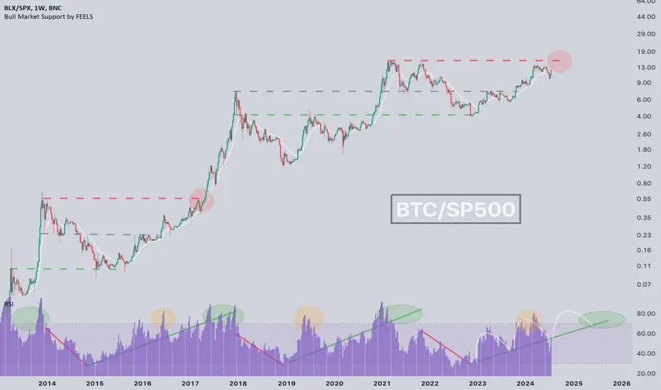
Bitcoin ATH hasn't happened yet !?CRYPTOCAP:BTC ATH hasn't happened yet ⁉️
If you don't count in fiat currency, we haven't seen the 2021 high exceeded yet (In relation to the stock market)
📝Everything is going according to plan, and by the end of this year, we will see a real ATH.
💡Also, it is clearly visible on the RSI that we will have a 3-wave cycle according to my 3-wave model, which I already talked about a long time ago.
BTC TO THE FUTURENo one is ready.
Here's a question...
When btc went from $1 to $10, it never went below $10
When btc went from $10 to $100, it never went below $100
When btc went from $100 to $1,000, it never went below $1,000
When btc went from $1,000 to $10,000, it never went below $10,000
When btc goes from $10,000 to $100,000, what will happen?
When btc goes from $100,000 to $1,000,000, what will happen?
When btc goes from $1,000,000 to $10,000,000, what will happen?
GL and HF

$BTC - Direct escalation scenarioBYBIT:BTCUSD.P | INDEX:BTCUSD | CRYPTOCAP:BTC | BNC:BLX
Traders don't judge. We prepare for scenarios with a reasonable probability.

BTC (SMA50 and FED rate)#Bitcoin distance from 50SMA 👀
This SMA has often acted as support during a bull market.
📝The rate was also lowered today by 50 basis points, more than planned, a sign that the FED sees that the economy needs more help from the regulator.
💡Such a radical step is an indicator that very soon additional liquidity will appear on the market and, as we know from previous posts, it will, of course, settle in CRYPTOCAP:BTC and gold.
