"ETH Bullish Heist: MA Breakout Confirmed! Next Stop 3600?"🔷🔹 "THE ETH HEIST: MASTERPLAN TO LOOT 3600!" 🚨💰 (Breakout + Pullback Strategy)
🌟 Yo, Fellow Market Robbers! 🌟 (Hola! Bonjour! Salaam!)
Listen up, Money Makers & Thieves! 🏴☠️💸
Based on the 🔥Thief Trading Style🔥, we’re about to pull off the ultimate ETH/USDT heist—Ethereum vs Tether is our target!
🔪 THE TRADE SETUP (LONG HEIST)
🎯 Entry Signal:
"The heist begins at MA Breakout (2900)! Wait for confirmation, then strike like a pro thief!"
Option 1: Buy Stop above MA (2900) for breakout momentum.
Option 2: Buy Limit on pullbacks (15-30min TF) for sneaky low-risk entries.
📌 ALERT! Set a breakout alarm—don’t miss the robbery!
🛑 Stop Loss (Thief’s Escape Route):
"Yo! If you’re entering on breakout, DO NOT set SL before it triggers! Place it at the nearest swing low (12H TF)—or risk getting caught by the bears! 🐻🔪"
🎯 Profit Target: 3600 (OR Escape Early!)
Scalpers: Only long scalps allowed! Use trailing SL to lock profits.
Swing Thieves: Ride the wave but exit before the cops (bears) arrive!
⚡ WHY THIS HEIST WILL WORK:
Bullish momentum + MA Breakout = Easy Loot!
Overbought? Trap? Reversal? Nah—we escape before the danger zone! (Yellow ATR = High Risk)
📢 THIEF’S WARNING:
🚨 News Alerts = Market Chaos!
Avoid new trades during high-impact news.
Trailing SL = Your Best Friend.
💥 BOOST THIS HEIST!
👉 Hit 👍 LIKE & 🔔 FOLLOW to strengthen our robbery squad! More heists = More profits! 🚀💰
Stay tuned, thieves… Next heist coming soon! 🏴☠️🔥
ETHUPUSDT trade ideas

ETHUSDTThe price is in the local area
If the price stabilizes above the volume range and the trend line and moving average 60
We can expect growth to the range of 2.90 and 3 and then 3.4 thousand dollars.
Don't forget risk management and always expect any movement from the market.
Ethereum Breakdown Ahead? Classic Head & Shoulders Pattern Hello Guys!
Ethereum looks like it’s setting up for a potential drop after forming a textbook Head & Shoulders pattern on the 4H chart.
This pattern (marked clearly with a left shoulder, head, and right shoulder) is often seen before a price reversal. Right now, ETH has already broken below the neckline (around $2,480), confirming the bearish pattern, and is currently retesting that level from below.
📉 What’s Next?
If the pattern plays out, we could see ETH drop toward the projected target zone around $2,200–$2,250, which is highlighted in blue on the chart. This zone also lines up with a previous area of interest and sits near a broken trendline, adding confluence to the setup.
✅ What I see:
Resistance: ~$2,500 (neckline retest)
Target: ~$2,200 support zone
Broken trendline adds downside pressure
Unless bulls reclaim the neckline quickly and push above the right shoulder (~$2,650), this looks like a bearish continuation setup.

ETHEREUM PRICEACTION TRADINGETHUSET have tested the broken demand floor and it looks like buyers are going for another .
if that level is broken ,it will be a wave of long which will hope to take profit on the supply zone .

ETH/USDT High winning scalping signals in 15 minutes are as foll- Signal: LONG
- Admission: 2,436 ~ 2,442
- Take Profit: 2,462, 2,478

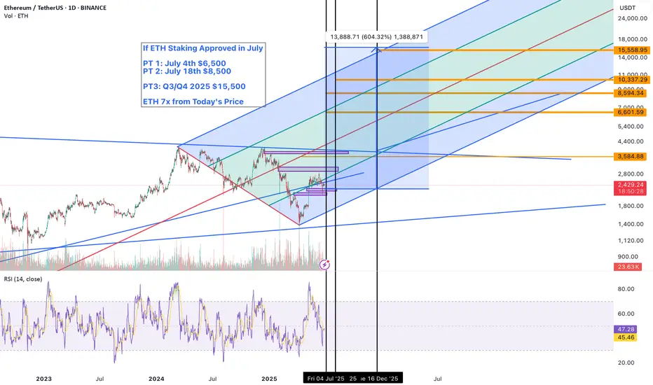
Ethereum’s $10K Breakout Is in Sight — BRock's Staking ETF July🚨 Ethereum’s $10K Breakout Is in Sight — BlackRock’s Staking ETF Could Trigger a Historic Supply Squeeze
All eyes are on the SEC’s pending decision regarding BlackRock’s Ethereum Staking ETF, and if approval lands in July 2025, it could trigger one of the most powerful supply-side shocks in Ethereum’s history.
This isn’t just about price speculation. It’s about structural demand meeting vanishing supply.
🟢 Why This ETF Is a Game-Changer
BlackRock isn’t just filing for an Ethereum ETF—it’s filing for a staking-enabled ETF. That’s a huge distinction. This means:
ETH held in the ETF will be staked, earning real yield
Staked ETH is locked and removed from circulation
Institutional capital gains exposure to yield + price upside
Ethereum becomes a yield-bearing digital commodity
It’s no longer just “digital oil.” It’s now digitized yield, and institutions are hungry for real yield in a low-rate environment.
📈 Technical Setup Is Bullish
ETH is coiling under its former ATH of ~$4,800
RSI shows no major bearish divergence
ETH/BTC ratio shows signs of breakout after long consolidation
Bitcoin dominance is peaking → altseason rotation imminent
Add a major ETF approval catalyst to this technical structure, and ETH could move explosively.
🔮 Ethereum Price Forecasts Post-Approval
Scenario Price Target Timeframe
Conservative $6,000–$7,000 2–4 weeks post-approval
Upside / Momentum $9,000–$10,000 Q3 2025
Supercycle Case $12K–$15K Q4 2025–Q1 2026
Why $10K ETH is Realistic:
Bitcoin’s ETF sparked $15B+ in inflows in <6 months
ETH has smaller market cap, so similar flows have outsized impact
Staking ETF removes ETH from float, making price reflexively bullish
TradFi gets exposure to yield + deflationary asset in one product
🔥 This Could Be Ethereum’s “GBTC Moment”
Remember how Grayscale’s GBTC product in 2020 created a reflexive premium and drove massive BTC inflows?
This is version 2.0, with yield attached. And instead of retail FOMO, we now have pension funds, RIAs, and endowments allocating via regulated ETF rails.
That’s not hype. That’s capital rotation—on-chain.
🛑 Risks to Watch
SEC delays or waters down staking component
Macro headwinds (rate volatility, geopolitical shock)
ETF approval gets front-run and sells the news
But even with these risks, the ETH supply structure is fundamentally stronger than during prior cycles. The burn is active. The float is tightening. And now TradFi wants in.
✅ Conclusion: July Could Be Ethereum’s Tipping Point
With a BlackRock staking ETF on deck, a macro environment ripe for a Fed rate cut, and Ethereum sitting under its ATH with rising momentum…
$10K ETH isn’t a moonshot—it’s the logical next leg.
If approved in July, Ethereum may never trade below $5,000 again.
🔔 Follow for updates on ETH ETF flows, ETH/BTC ratio breakouts, and altseason timing models.
📊 Comment below—what’s your Ethereum price target if the ETF is approved?
#Ethereum #ETHUSD #CryptoETF #BlackRock #Altseason #ETHAnalysis #CryptoNews #TradingView
ETHusdt soon above 3K$Two major weekly supports now are 2200$ and 2000$ and we can expect more pump and heavy rise to start from these area first target is near red trendline resistance and then after breaking that here we can expect new high and more rise.
DISCLAIMER: ((trade based on your own decision))
<<press like👍 if you enjoy💚

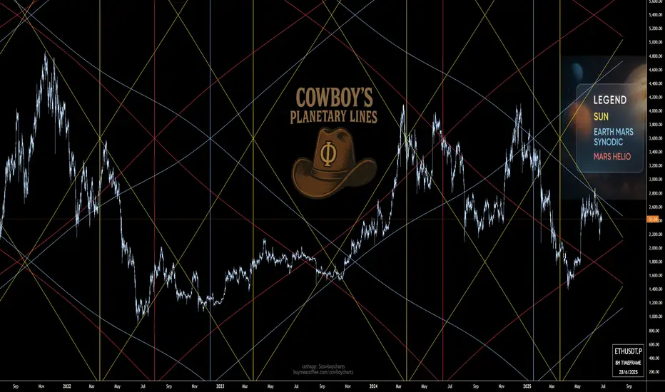
ETH - Intergalactic, Planetary, Intergalactic, PlanetarySun Lines (Gold Fences): These vertical yellow posts mark the high-noon moments when Solar power kicks off major stampedes. Note how the late-2021 Sun line lit the fuse for ETH’s first big buck, and the spring 2024 fence set the stage for that gallop up to nearly $4,800.
Earth-Mars Synodic Ropes (Blue Lassos): These sweeping blue arcs show us when Earth and Mars line up in the sky—and in price rhythm. Each blue lasso tends to corral momentum, either roping in a rally or reining in a sell-off. Early 2023’s synodic rope kept bears at bay, while the latest loop around June 2025 hints at a pick-me-up near $2,400.
Mars Heliocentric Rails (Red Corral Bars): The red lines are Mars’s own heliocentric fences—tough support and resistance levels that often drive price back toward the barn. When ETH bucked above a Mars line in mid-2022, it stalled for months; when it fell through a red rail in early 2025, it trailed off toward $1,500.
Trail Ahead: We’ve just passed another Sun post and are nearing a Mars corral bar around $2,200–2,300. If the blue synodic rope holds, expect a gentle trot back up toward $2,800; if ol’ Mars drags us off-trail, we might be bucked back toward $1,600. Keep your eyes on those planetary fences—the next cosmic roundup’s comin’ soon!
BYBIT:ETHUSDT.P
EthusdttHis asset has presented my expectation information, in which my my sell confident level is 90% for now, while the 10% left can be defined by FA.
the entry zone is valid. but if price kick my stoploss then , i will like to see price seek little higher price to the zone i point magnifier.

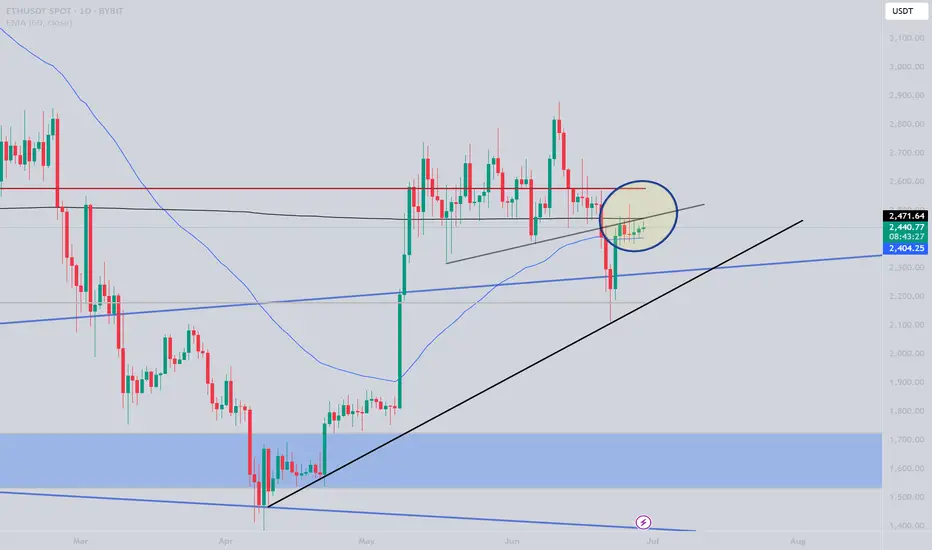
ETH 1D Analysis – Eyes on the 21EMAETH is currently hovering near $2,420, right above the key support at $2,415. Price is trying to reclaim the 21 EMA, which is crucial for bullish momentum.
🔹 Two Fair Value Gaps (FVGs) acting as demand zones
🔹 Daily close above 21 EMA = strong bounce expected
🔹 First major resistance at $2,740
🔹 Breakout could trigger a rally toward the $2,900+ zone
Bias: Bullish if reclaim confirmed
📌 Watch daily close – reaction from this level is key
NFA | DYOR
#ETH #Ethereum #Altcoins #Crypto #FVG #21EMA

$ETH is showing signs of a potential bullish move!CRYPTOCAP:ETH is showing signs of a potential bullish move.
The recent consolidation looks like it's building up for a strong breakout.
With market sentiment improving and growing interest in ETH-based projects, this could be a good time to accumulate before the next move up.
I’m watching the key resistance levels closely, if they break, we could see a fast rally.
#Ethereum
ETH.... You can do it. Get back into structure. ETH is struggling below resistance; however, an exchange of hands on lower timeframes can give the bulls a bit more wind. A break back into structure would be bullish. Don't mind me, I've been smoking that hopium.
Full TA: Link in the BIO

ETH-bias short Bullish indications:
Weekly : indicates IHS formation with the bullish indication.
MA 21 respected as well.
Bearish indications:
Daily :MA 21 respected.
Doji candle and yesterdays closing was respected and fallen .
Formation of head and shoulder pattern.
4 hr: Hanging man candle followed by the bearish candle indicates bearish
Bearish divergence in 4 hr:
Fib level 0.618 is at 2318 which has further room to fall.
Trade plan bias short @ 2413
SL:2450
TP1:2375
TP2:2341

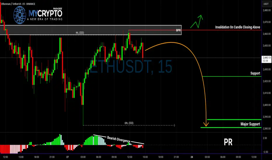
ETH in Trouble? This Breakdown Could Be Just the BeginningYello, Paradisers — are you spotting the same warning signs we did before the last major ETH correction? If not, now’s the time to pay close attention.
💎ETHUSDT is currently showing multiple bearish signals across both higher and lower timeframes. On the higher timeframe, we’ve confirmed a bearish Change of Character (CHoCH), which is often the first major clue that momentum is shifting from bullish to bearish. This shift suggests that ETH could be preparing for a deeper move down.
💎On the 15-minute timeframe, price has reacted directly from the BPR zone. What adds even more weight to this reaction is the clear bearish divergence we’re seeing on the MACD indicator. Together, these signs point to increased bearish pressure in the short term.
💎More importantly, ETH has already taken out Internal Range Liquidity (IRL), which often sets the stage for a move toward the External Range Liquidity (ERL). When IRL gets swept and momentum remains bearish, it’s typically a sign that the market is hunting for liquidity on the other side of the range—and that’s exactly where we believe ETH is headed next.
💎That said, to take this setup with high confidence, we’re waiting for a clean bearish candlestick pattern to form. Confirmation is key. A solid entry backed by strong price action improves the probability of success and allows for tighter, more efficient risk management.
💎However, if ETH breaks out and closes decisively above our invalidation zone, the entire bearish idea is off the table. In that scenario, patience will be our best tool—we’ll wait for price action to realign and only re-enter the market once a new high-probability setup presents itself.
🎖Strive for consistency, not quick profits. Treat the market as a businessman, not as a gambler. Patience and discipline are what separate the professionals from the herd. Stick to the process, trust the strategy, and you’ll stay ahead of 90% of the market.
MyCryptoParadise
iFeel the success🌴
ETH 1W IdeaLooks like Ethereum is forming inverse H&S pattern. Wait for the price to break out of the neckline and then re-test it and not close below this neckline. When this is confirmed you can enter a long trade. Target will be given under this idea later when re-test happens.

ETHUSDT.P I Daily CLS I KL OB I Model 1Yo Market Warriors ⚔️
Fresh outlook drop — if you’ve been riding with me, you already know:
🎯My system is 100% mechanical. No emotions. No trend lines. No subjective guessing. Just precision, structure, and sniper entries.
🧠 What’s CLS?
It’s the real smart money. The invisible hand behind $7T/day — banks, algos, central players.
📍Model 1:
HTF bias based on the daily and weekly candles closes,
Wait for CLS candle to be created and manipulated. Switch to correct LTF and spot CIOD. Enter and target 50% of the CLS candle.
For high probability include Dealing Ranges, Weekly Profiles and CLS Timing.
Trading is like a sport. If you consistently practice you can learn it.
“Adapt what is useful. Reject whats useless and add whats is specifically yours.”
David Perk aka Dave FX Hunter
💬 Don't hesitate to ask any questions or share your opinions

HolderStat┆ETHUSD trying to break through the resistanceBINANCE:ETHUSDT has confirmed a triangle breakout above the 2,312.67 level and is forming a bullish staircase structure. The chart shows a history of breakout rallies from similar formations, and this current setup targets 2,700+. Maintaining higher lows is essential for follow-through.

Another Bullish Hope… or a Bearish Setup!?🧠 Multi-Timeframe Analysis of ETH/USDT
Monthly Timeframe:
Since early 2023, Ethereum has been in a solid uptrend, managing to reach a key level (pink line).
After a strong move, it got rejected in May 2024, falling to around 2111.
Buyers made another aggressive attempt, pushing the price up to 4094, breaking the previous high — but this time, the rejection was much more intense.
Price quickly dropped all the way to 1385.
So, where are we now?
The market structure has clearly flipped to sell on the monthly timeframe.
We appear to be in a pullback/retrace phase, likely setting up for a deeper move down.
First downside target? Around 1957 — but remember:
Every level = a new decision point!
Weekly Timeframe:
After the rejection from 4093, buyers attempted a recovery. Maybe it was just profit-taking from bears.
The price briefly entered the "expensive zone" — but the momentum didn’t hold.
Last week, a strong bearish weekly candle confirmed the shift to a sell structure.
We might still see one more push to test the 2920 level, but honestly...
It smells like a bull trap. The market might lure buyers in just to drop the price again.
Right now, the bears are in control 🐻
Daily Timeframe:
Looking at the daily chart, the sell structure is clear.
Two likely scenarios:
1- The downtrend continues from here
2- A slight push upward to trap aggressive buyers before the next leg down
🌫️ The market may give a false sense of strength to the bulls, but the true momentum is still bearish.
Is this a bear trap? Maybe.
For now, I'm favoring sell setups — unless I see something that strongly shifts the structure.
Summary:
From monthly to daily, all signs currently point to bearish pressure dominating the market.
Until proven otherwise, the trend remains downward.
🎯 Possible targets if the drop continues:
1957
1793
1752
📌 Remember: every level is an opportunity to re-evaluate, not a fixed prediction.
📣
If you found this breakdown helpful, drop your thoughts in the comments
Have a question or a chart you'd like reviewed? Let me know!
Follow me to stay updated — especially if price action shifts and this scenario changes.
Save and share with fellow traders who appreciate deep, multi-timeframe analysis
⚠️ Disclaimer:
This content is intended for educational and informational purposes only and does not constitute financial advice or a trading signal.
Trading carries risk. Please do your own research, practice solid risk management, and never rely solely on external analysis.
You are solely responsible for your trading decisions.

Ethereum has been in bear market since 2021When the matter is in charts, I tend to speak less
I am not the best speaker, so the chart says it for me!
Ethereum is and has been in bear market since 2021
I think entry between 700/600 is a good point
I want to buy BTC, ETH, XMR

ETH Long.As we can see on the weekly timeframe, ETH made a breakdown after which it consolidated for a while and then made a false breakdown of the zone, now showing a reversal. One can plan to take the long position at the target of the higher trendline.

Inverse Head and Shoulders on Ethereum: Short Opportunity ETH?I'm currently watching Ethereum , and things are starting to look interesting.
We’re seeing early signs of a potential break in structure to the downside, and I’m closely monitoring a bearish inverse head and shoulders pattern. On the 30-minute timeframe, I’m waiting for a clear break of market structure within the current range before considering a short entry.
Stop loss would be placed above the range, with the target outlined in the video.
This is not financial advice—please trade responsibly and always manage your risk.

$ETHUSDT 1H Trade Setup CRYPTOCAP:ETH – 1H Trade Setup
- Entry: CMP
- SL: $2,410
- Target: $2,506
ETH broke above the falling trendline and retested it. Clean breakout setup, bullish continuation likely above $2,445.
DYRO, NFA

Bullish on ETHThis is my personal idea of what will happen in the near future for ETHUSDT. Lets see how this plays out.
