Asx short at highso a very special divergence has formed and from our top down analysis we can see a rejection creating a retracement which has led to a somewhat change in structure and the formation of a dropping wedge
Such a Textbook setup is always bound to betray u keep ur guard up
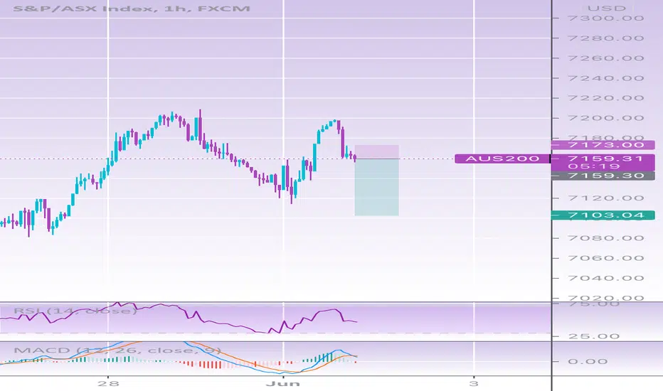
AUS200 trade ideas

AU200 OpportunitiesAU200 managed to reject the 50 percent very nicely. Structure remains bullish. As long as price does not break the level marked with the rectangle and closes below, the structure will remain bullish and long opportunities could be taken.


AUS200 SHORT and double channel AUS200 SHORT and double channel . stop abv last week high target 50-100dma

XJO - Technicals are saying a bearish move could be on the wayThe XJO chart has a bearish rising wedge formation that is coming to a cross roads. Looks like a break to the downside is highly probable leading into the end of the 20/21 financial year.

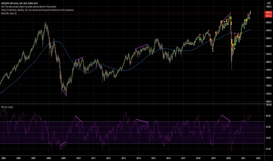
Australian stocks looking pretty goodAfter more than a decade of poor performance relative to other markets, the Australian stock market has clearly broken out. At least it has broken out in AUD terms, not USD terms (not yet). It's looking pretty strong and in my opinion it could continue much higher. Definitely one market that makes me have a more bullish outlook on stocks in general.
At some point it could return to 6300, but for now I can easily see it go to 10000 over the next 12-18 months.

LONG ASX - Rising Wedge and Bearish RSI Divergence RiskSUMMARY: Long, expect to see continued fiscal and monetary support pushing asset prices higher
ASX200 is highly correlated to the S&P500. Correction in the SPX will cause one in the ASX.
-- Technical --
It is a bearish and the price action is way above the EMAs , a correction is due.
--Fundamentals --
However, because of the government support, anticipate further upside.
Please HIT the --->>> "LIKE" and "FOLLOW" button. <<<----
*Not financial advice and is for educational purposes only. Always DYOR.
SO: What do you think, i? Let me know below.

AU200 No clear direction yet. Overall trend remains bullish.No clear direction yet for the Au200 although Higher time frame trend remains bullish but price is trapped into a consolidation phase. Needs to break to either side in order for a possible trade opportunity to be given.

AU200 H1 POSSIBLE H & S PatternAU200 H1 possible head and shoulders pattern forming where price may move downwards. keep an eye out for sell positions. apply necessary risk management.

200AUD Short Positions Target 7329.00i am shorting aussie index due to covid if you wanna make it simple


AU200 - 5 COUNT REVERSALAU200 has just completed a 5 count reversal on the daily.
Market has just taken out all new stops in June/July.
This is an indication to go Long
First target would be in the top third of the box
Thank you

Expected Breakout Higher in AUS200Disclaimer
The views expressed are mine and do not represent the views of my employers and business partners. Persons acting on these recommendations are doing so at their own risk. These recommendations are not a solicitation to buy or to sell but are for purely discussion purposes. At the time publishing, I have a position in AUS200.
Trend Analysis
The main view of this trade idea is on the 1-Hour chart. AUS200 has been in a rangebound move and is expected to breakout in the short to medium term. Based on the market profile, the range is between 7255 and 7325.
Technical Indicators
AUS200 recently crossed above its short (25-SMA), medium (75-SMA) and fractal moving averages and it is currently at the middle of the range. The RSI is above 50 and is heading higher. Moreover, the KST confirmed bullish move with a positive crossover.
Recommendation
The recommendation will be to go long at market. At the time of publishing AUS200 is trading around 7293. The medium-term target price is observed around the 7400 price level. A stop loss is set at 7200.

XJO in overbought territory but still tracking okI wonder if a sentiment change is coming. No indications yet.

Risk Management - Tom DeMark TD 9 Still in Play ASX200 $XJO Was 7406 the top for the short term?
Was the breakout this week a bull trap?
Technical indicators such as the MACD and RSI are still with the bears.
If we close below the 21 daily moving average, time to reduce position size and risk until we can close above 7406 again.

Short setup ASX200 XJO$XJO (ASX200) some points of potential confluence over the coming days, suggesting a SHORT set-up. Overhead resistance, head and shoulders, against a ticking clock for a daily cycle high to be printed. One final run into a cycle high before rolling over.
Tail risk is high, if going long on the ASX.
1. On a short timeframe, the ASX200 looks to be approaching a resistance level, which started 7 June.
2. We also have the RSI reaching oversold level at the same time, however a steeper push over the coming week would steepen the RSI's reach into deeply oversold territory.
3. This might coincide with a peak in the right shoulder of a possible head and shoulders pattern.
4. It should also be noted that this coincides with the timing band for a daily cycle high and a descent into a daily cycle low around early to mid July. The DCL was set 19 May. 30 June marks day 41 of this daily cycle. With the headwinds I have noted above, it makes it difficult for the ASX200 to breach the Half Cycle High set on 16 June.
So, watch for a breach of the resistance level, perhaps, albeit brief and weak, before it rolls over.

Still bearish on ASXXJO looking to tumble soon. Lagging diagonal in white is complete, married with decreasing momentum on RSI, tells me we are due for one. It is unclear for how long roughly though. Lagging diagonals usually herald an intense drop and a complex correction. We shall see, as we live in unprecedented times financially. Goals in purple.
None of the above is financial advice, please do your own research - your trades are your trades.

Total Market MadnessSo as you can see from the chart, the last time we were this far above the 200MA was March last year (27%). Before that it was 2008 (~50%). Today we are now around 40% away from the 200MA. We are at the top of the trend, under Resistance R3 on the daily, Stochastic doesnt have any more room to go up (computer will probably say no at some point), BB is overstretched. There is also indication that we are starting to form a head and shoulders pattern with left shoulder and head forming on the daily.
Yet the market is still in euphoria (VIX is 15, XVI is 12, US10Y bonds are 1.5%), it seems that everything is just fine.... Until it's not. These types of market movements have happened before, and as the monthly shows, the end result is usually the same.
“When investing, pessimism is your friend, euphoria the enemy.”
— Warren Buffett

Elliott Wave View: ASX 200 (XJO) Looking to Complete Wave 5Elliott Wave view in ASX 200 (XJO) suggests the rally from February 1, 2021 low is unfolding as a 5 waves impulse Elliott Wave structure. Up from February 1 low, wave 1 ended at 6938 and pullback in wave 2 ended at 6648.6. The Index resumes higher in wave 3 towards 7172.8 and pullback in wave 4 ended at 6919.4. Wave 5 is currently in progress and the internal subdivides into another 5 waves of lesser degree. Up from wave 4, wave (i) ended at 7056.4 and dips in wave (ii) ended at 6999.6. Wave (iii) ended at 7115.2, dips in wave (iv) ended at 7090.1 and final leg wave (v) of ((i)) ended at 7136.4.
Wave ((ii)) pullback then ended at 7082.4 and the Index resumes higher in wave ((iii)). Up from wave ((ii)) low, wave (i) ended at 7203.3 and wave (ii) pullback ended at 7131.9. Wave (iii) ended at 7309.4 and wave (iv) ended at 7267.6. Near term, Index can see 1 more leg higher to end wave (v) of ((iii)), then it should pullback in wave ((iv)) before turning higher 1 more time to complete wave ((v)) of 5. This should also end cycle from February 1, 2021 low and then Index can see larger pullback.

Review of strategies for equities vs futures Part 26.8.21 Review of strategies for equities vs futures Part 2 looking at more difficult patterns on Bitcoin and DOCEUSD; Follow up on AU200AUD expanding triangle. ( i made misstatements.... if you know what support and resistance is...you will catch my "slips of the tongue.

ASX 200 STRONG CASE FOR A PERFECT WYCKOFF METHOD SETUP
The ASX 200 has been setup and going through the perfect Wyckoff setup over the past month. Now that we have hit all time high's, its clear that the demand or the BULLS are in full control and that shakeouts will be shortlived. Now that we don't have any ceiling the sky is the limit in at least the short / medium term.
Just have a look at the explanation and leave comments whether you agree we are in phase E?
Phase A: Phase A marks the stopping of the prior downtrend. Up to this point, supply has been dominant. The approaching diminution of supply is evidenced in preliminary support (PS) and a selling climax ( SC ). These events are often very obvious on bar charts, where widening spread and heavy volume depict the transfer of huge numbers of shares from the public to large professional interests. Once these intense selling pressures have been relieved, an automatic rally (AR), consisting of both institutional demand for shares as well as short-covering, typically ensues. A successful secondary test (ST) in the area of the SC will show less selling than previously and a narrowing of spread and decreased volume , generally stopping at or above the same price level as the SC . If the ST goes lower than that of the SC , one can anticipate either new lows or prolonged consolidation. The lows of the SC and the ST and the high of the AR set the boundaries of the TR . Horizontal lines may be drawn to help focus attention on market behavior, as seen in the two Accumulation Schematics above.
Sometimes the downtrend may end less dramatically, without climactic price and volume action. In general, however, it is preferable to see the PS, SC , AR and ST, as these provide not only a more distinct charting landscape but a clear indication that large operators have definitively initiated accumulation.
In a re-accumulation TR (which occurs during a longer-term uptrend), the points representing PS, SC and ST are not evident in Phase A. Rather, in such cases, Phase A resembles that more typically seen in distribution (see below). Phases B-E generally have a shorter duration and smaller amplitude than, but are ultimately similar to, those in the primary accumulation base.
Phase B: In Wyckoffian analysis, Phase B serves the function of “building a cause” for a new uptrend (see Wyckoff Law #2 – “Cause and Effect”). In Phase B, institutions and large professional interests are accumulating relatively low-priced inventory in anticipation of the next markup. The process of institutional accumulation may take a long time (sometimes a year or more) and involves purchasing shares at lower prices and checking advances in price with short sales. There are usually multiple STs during Phase B, as well as upthrust-type actions at the upper end of the TR . Overall, the large interests are net buyers of shares as the TR evolves, with the goal of acquiring as much of the remaining floating supply as possible. Institutional buying and selling imparts the characteristic up-and-down price action of the trading range.
Early on in Phase B, the price swings tend to be wide and accompanied by high volume . As the professionals absorb the supply, however, the volume on downswings within the TR tends to diminish. When it appears that supply is likely to have been exhausted, the stock is ready for Phase C.
Phase C: It is in Phase C that the stock price goes through a decisive test of the remaining supply, allowing the “smart money” operators to ascertain whether the stock is ready to be marked up. As noted above, a spring is a price move below the support level of the TR (established in Phases A and B) that quickly reverses and moves back into the TR . It is an example of a bear trap because the drop below support appears to signal resumption of the downtrend. In reality, though, this marks the beginning of a new uptrend, trapping the late sellers (bears). In Wyckoff's method, a successful test of supply represented by a spring (or a shakeout) provides a high-probability trading opportunity. A low-volume spring (or a low-volume test of a shakeout) indicates that the stock is likely to be ready to move up, so this is a good time to initiate at least a partial long position.
The appearance of a SOS shortly after a spring or shakeout validates the analysis. As noted in Accumulation Schematic #2, however, the testing of supply can occur higher up in the TR without a spring or shakeout; when this occurs, the identification of Phase C can be challenging.
Phase D: If we are correct in our analysis, what should follow is the consistent dominance of demand over supply. This is evidenced by a pattern of advances (SOSs) on widening price spreads and increasing volume , as well as reactions (LPSs) on smaller spreads and diminished volumes. During Phase D, the price will move at least to the top of the TR . LPSs in this phase are generally excellent places to initiate or add to profitable long positions.
Phase E: In Phase E, the stock leaves the TR , demand is in full control and the markup is obvious to everyone. Setbacks, such as shakeouts and more typical reactions, are usually short-lived. New, higher-level TRs comprising both profit-taking and acquisition of additional shares (“re-accumulation”) by large operators can occur at any point in Phase E. These TRs are sometimes called “stepping stones” on the way to even higher price targets.