USDJPY shorts! It seems like Asia is winning the tariff war from my opinion. Not looking great for USA economy. USDJPY is a nice short for me.
JPYUSD trade ideas

Fundamental Market Analysis for June 25, 2025 USDJPYEvents to pay attention to today:
17:00 EET.USD - Fed Chair Jerome Powell will deliver a speech
17:30 EET.USD - Crude oil inventory data from the Department of Energy
USDJPY:
The Japanese yen (JPY) remains in the lead against the US dollar during Wednesday's Asian session and remains close to the weekly high reached the day before, amid a combination of favourable factors. The summary of opinions from participants at the Bank of Japan (BoJ) meeting in June showed that some policymakers called for interest rates to be kept unchanged due to uncertainty about the impact of US tariffs on the Japanese economy. In addition, the fragile truce between Israel and Iran and trade uncertainty are supporting the Japanese yen as a safe-haven currency.
Meanwhile, investors seem convinced that the Bank of Japan will raise interest rates again amid mounting inflationary pressure in Japan. These forecasts are confirmed by Japan's producer price index (PPI), which rose for the third consecutive month in May and remained above 3% year-on-year. In contrast, traders are factoring into their prices the likelihood that the Federal Reserve (Fed) will further lower the cost of borrowing this year. This, in turn, is causing US dollar (USD) bulls to tread cautiously and suggests that the path of least resistance for the lower-yielding Japanese yen remains upward.
Trading recommendation: SELL 144.900, SL 145.100, TP 144.000

Market next target ⚠️ Disruption Analysis – USD/JPY
1. Sideways/Flat Price Action
Price is consolidating in a tight range with small-bodied candles.
This indicates indecision and lack of momentum, not strength.
The upward arrows suggest bullish bias, but no strong signal confirms a breakout yet.
2. Bearish Momentum
The recent red candles dominate, showing a clear drop from above 146.000 earlier.
The overall trend (short-term) is down, and the support area could be tested again.
3. Decreasing Volume
Volume is fading out, especially the most recent bar (around 1.01K).
This suggests waning interest—any bullish breakout without volume support is likely to fail or reverse.
4. Resistance Area is Strong
The resistance zone near 145.800–146.000 is clearly tested before and held.
Without a significant catalyst, it's unlikely to break in the near term.
5. False Breakout Risk Above Target
The marked "target" just below resistance could trigger false bullish entries.

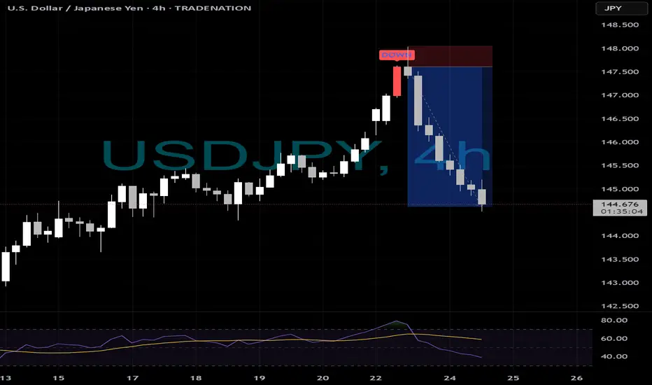
UJ - Perfect Shorts....📉 ELFIEDT - X-REVERSION | USDJPY SHORT CASE STUDY (4H)
🧠 Perfect reversal from our proprietary ELFIE 3SD Reversion Zone with a confirmed "DOWN" signal.
🔻 Entry: 147.575
🎯 Current Move: Over 290+ pips in profit and still running!
🕐 Indicator spotted the exhaustion perfectly after RSI divergence + 3SD extension.
💡 How to Trade It:
Wait for ELFIE DOWN signal in the red zone.
Enter at close of signal candle.
SL = high of signal candle.
Ride the move until opposite signal or reversion.
✅ Works across all major pairs.
🔥 Simple rules. Powerful results.
🔔 Want to catch these trades in real-time?
➡️ Follow us and DM to get access to the ELFIE system.
📈 Make your chart your edge.
#forex #tradingview #USDJPY #reversion #indicator #smartmoney #forexsignals #elfieDT #tradingsystem #pipcatcher #swingtrading #technicalanalysis
weekly analysis for use/jpy June 23 - June 27weekly profit target for June 23 - 27
(short) 143.60 - 143.80 range

use/jpy (Short term move) 6/24/2025 10:39AM western time zone Stop loss: 144.40
Take profit: 145.30
(Short term move)

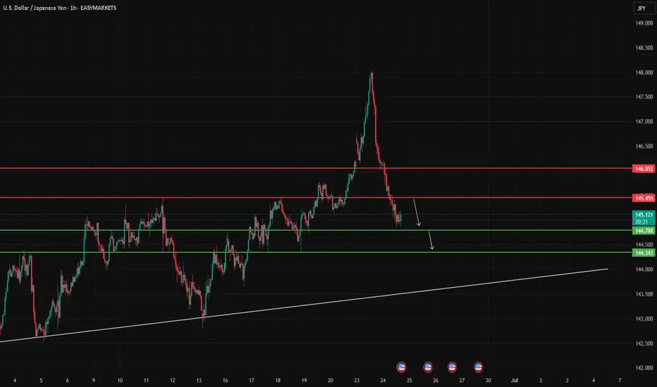
USD/JPY Bearish Correction in Progress – Key Supports in Focus
USD/JPY is showing signs of weakness after rejecting the 146.00 level. The pair has started a corrective move on the 1H timeframe, trading below the previous support at 145.455, which has now turned into resistance.
As long as the price remains below this level, the current momentum suggests a possible drop toward the next support zones at:
First target: 144.78
Second target: 144.343
Any bullish retracement toward 145.455 may serve as a retest before continuing lower. This idea reflects the current price structure and does not constitute financial advice.
USD/JPY Bull is back to push the price upHi All,
Firstly, I want to congrats to traders who short the market for the last few months. Well done!!!
Those who is waiting for LONG opportunity, let's get ready for sniper entry.
Here is my prediction and entry on USD/JPY. As you can see, the orange zone around $139-$140 is extremely strong zone. Prices reverse 3 times on this level. On 22 March 2025, the closed daily candle was formed a hammer candle and followed by a strong bullish candle next day which indicates potential reversal to upward.
The RSI indicator lines were crossed on 22 March 2025. Now, the indicator is showing upward momentum as the both lines are about cross 50%.
We also have bullish divergence on the volume indicator. As you can see, the volume was going to sideway where as the price was heading to the orange zone.
These confluence is supporting me to enter LONG. Therefore, I entered 3 entry at different price point which is $143.50, $142.996, $144.70.

Yen Rebounds as Ceasefire Calms MarketsThe Japanese yen recovered to around 145.5 per dollar on Tuesday, gaining strength after the ceasefire announcement. Although Iran launched missiles at a US base in Qatar, causing no casualties, the gesture was largely seen as symbolic. Tehran’s decision not to target the Strait of Hormuz further eased fears of major disruptions.
The key resistance is at $146.20 while the major support is at $144.85.
USDJPY Analysis🚀 We entered the buy trade from the bottom level (check the pinned idea)
Thanks to our trailing stop strategy, we locked in full profits ✅
For those who missed it — a new buy zone is now marked on the chart!
Be patient and don’t trade emotionally ✋

USDJPY InsightHello to all our subscribers.
Please share your personal opinions in the comments. Don't forget to boost and subscribe.
Key Points
- Iran launched a total of 14 missiles toward U.S. air bases, but most were intercepted. U.S. President Trump stated, "I want to thank Iran for giving advance notice and ensuring there were no casualties or injuries," and the market interpreted the event as a "staged confrontation" where Iran saved face.
- President Trump said on Truth Social, “Israel and Iran have fully agreed to a comprehensive and complete ceasefire.” Reuters, citing a senior Iranian official, reported that Iran accepted the ceasefire proposal mediated by Qatar and suggested by the United States.
- Iranian Deputy Foreign Minister Abbas Araghchi stated that "if Israel halts its 'illegal attacks' on Iran by 4 a.m. on the 24th (Tehran time), Iran has no intention to further respond." Israel has not yet made an official statement.
- Federal Reserve Vice Chair Bowman said, “If inflationary pressures continue to ease, I will support lowering the policy rate as early as the next meeting to bring it closer to a neutral level and to maintain a healthy labor market.”
Key Economic Events This Week
+ June 24: Testimony by Fed Chair Jerome Powell
+ June 25: Testimony by Fed Chair Jerome Powell
+ June 26: U.S. Q1 GDP
+ June 27: U.S. May PCE Price Index
USDJPY Chart Analysis
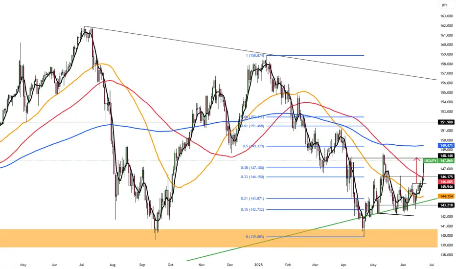
After breaking through the 145 level, the pair showed a sharp upward move and formed a peak around the 148 level before reversing downward. It is expected to form a bottom in the 144–145 range during this pullback and potentially rise to the 151 level. However, if it unexpectedly breaks below the 144 level, there is also a possibility it could fall to around 140.

USDJPY - BullishUSDJPY is in Bullish trend and currently testing its Fib level of 0.618. Buying at current levels with SL below last low.

USDJPY MULTI TIME FRAME POV + XAUUSD , GU RECAP Hello traders , here is the full multi time frame analysis for this pair, let me know in the comment section below if you have any questions , the entry will be taken only if all rules of the strategies will be satisfied. wait for more price action to develop before taking any position. I suggest you keep this pair on your watchlist and see if the rules of your strategy are satisfied.
🧠💡 Share your unique analysis, thoughts, and ideas in the comments section below. I'm excited to hear your perspective on this pair .
💭🔍 Don't hesitate to comment if you have any questions or queries regarding this analysis.

Quick Forex Market Overview | USDJPY, GBPUSD, CADJPY, EURUSD...In this video, I give an unstructured but insightful overview of the current market conditions across several major forex pairs. I walk through key price action and technical levels on USDJPY, GBPUSD, CADJPY, EURJPY, EURUSD, and EURAUD — sharing what I’m seeing in the moment and how the setups are developing.
Perfect if you're looking for a raw, real-time perspective without the fluff.

Yen Falls Despite Japan’s Manufacturing ReboundThe yen fell past 146 on Monday, its lowest in over five weeks, as the US dollar gained on safe-haven demand after US airstrikes on Iranian nuclear sites escalated Middle East tensions. Domestically, Japan’s manufacturing sector grew in June for the first time since May 2024, and services expanded for a third straight month, showing economic resilience.
The key resistance is at $148.15 meanwhile the major support is located at $146.15.
UJ: Could we see a bearish leg looking at the 4h?USD/JPY is currently trading at a key price level of 147.5. We've got a 4h order block about 75 pips to the downside at 146.75.
If we see some lower time frame confirmations, we could potentially see a bearish leg towards this 4h OB today.
- Aman

USDJPY 15m H&S CORRECTION Quick trade on this H&S formation (GOOD RISK REWARD)
Plant to buy back if plays out @ 146.742
LONG TERM STILL BULLISH,
This will be just quick earner if plays out
Holla

USDJPY BULLS DONT PLAY STILL LONG WAY TO GOOOWaiting for PULL BACK @ around 146.73 (that will be my buy entry)
This trade its straight forward, i have only 1 target @ 149.79
All the best TRADERS

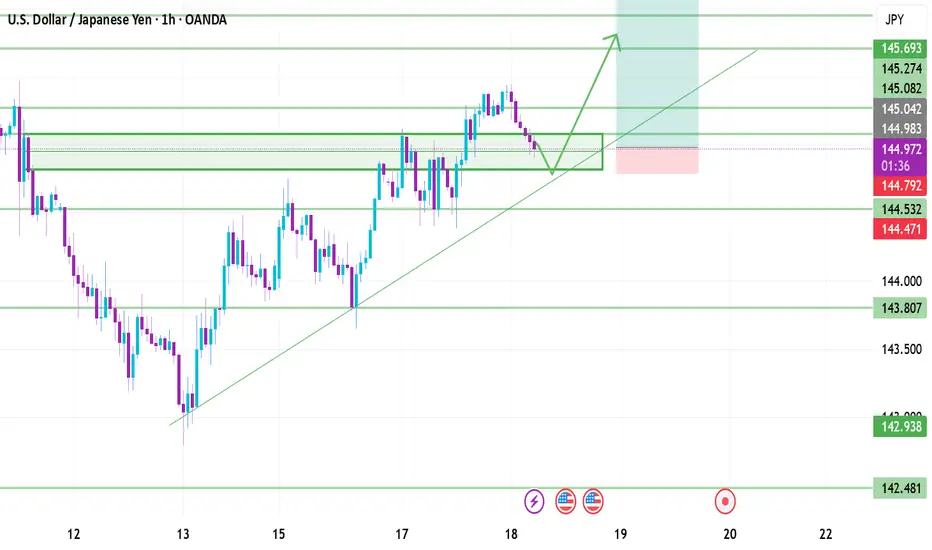
USD/JPYNow that USD/JPY has made a clear bullish move in price we can look for entries for long positions. At this point il wait for price to retest the zone its just broke out of - 445.000 and tp at the next resistance level - 145.693 & 146.000
Long - the final move up before moving to the downsideMy macro bias for USDJPY is bearish. However, I opened a long position today.
Reasons for a long trade:
Weekly chart:
1) Both MACD and RSI are in the bear territory, however, both MACD and RSI lines are starting to cross and move to the upside.
2) The price has been moving sideways for weeks, however, weekly candle has been forming higher low since late April (subtle move).
3) There is a major support line at 140.50 area and weekly EMA200 is also sitting right below it.
Although the price has been moving to the downside, it will require strong momentum to pierce through the major support zone that has been holding since July 2023.
Daily chart:
1) EMA9 > EMA14 > EMA 21 - bullish trend
2) Yesterday's daily candle retested EMA 9/14/21 and closed above all of them.
3) MACD has entered the bull zone.
4) RSI has entered the bull zone.
5) There is an unmitigated fair value gap in the Fib 0.618-0.786 area. (see blue rectangular box in the chart).
As I said above, it will take strong momentum for the price to break below the major support line. It makes sense for the price to retrace to the unmitigated fair value gap area to take out all the liquidity to fuel the momentum to the downside.
My trade setup is below:
Entry: 145 Stop/Loss: 144.25 (just under yesterday's candle wick)Target: 147.12
Risk:Rewards 1:1.78

Usdjpy SELL setup Selling usdjpy now because we have swept last week high and I anticipate price to drop off to H1 BB

USDJPY H4 AnalysisUSDJPY Showing a Bearish Flag. If it breaks this zone above, Most probably can fly up to 148.668 and higher to 150.538. If no, Can rally between 143.981 or even lower to 142.410. Trading Analysis from 23-06-25 to 27-06-25. Take your risk under control and wait for market to break support or resistance on smaller time frame. Best of luck everyone and happy trading.🤗

USDJPY TRADE SETUPWait for retest the entry level and bullish momentum then a trade for Buy otherwise skip this setup
