Ye chart kuch ketha hai - ACME SolarThe combination of a strong uptrend, bullish momentum indicators (RSI, ROC, Supertrend), price action above key moving averages, and positive analyst sentiment all point to a bullish outlook for Acme Solar over the next few months. These technical factors suggest that the stock is likely to continue its upward trajectory unless there is a significant reversal in trend or broader market conditions
Key Bullish Signals from Weekly Chart
Strong Uptrend and Momentum
The weekly chart of Acme Solar shows a sustained uptrend, with the stock delivering positive returns over the last 12 weeks and a 3-month gain of over 49%. This persistent upward movement is a classic sign of bullish momentum.
Technical Indicators Supporting Bullishness
RSI (Relative Strength Index): The weekly RSI is at 74.20, which is in the bullish-to-overbought zone. While high, this level often accompanies strong trends and suggests buyers are in control.
ROC (Rate of Change): The ROC stands at 18.71, indicating strong positive momentum and continued buying interest.
Supertrend: The Supertrend indicator is well above the current price, reinforcing the ongoing bullish trend.
MACD: The MACD is at 0, which is neutral, but other momentum indicators are positive, supporting the bullish outlook.
Stochastic Oscillator: At 45.59, this is in the neutral-to-bullish range, suggesting there is still room for further upside before overbought conditions dominate.
Moving Averages
The stock price is trading above key moving averages (such as 50 DMA and 200 DMA), which is a strong bullish signal and indicates that the medium- to long-term trend remains positive.
Analyst Sentiment
Multiple analysts have issued strong buy recommendations recently, with price targets above current levels, reflecting positive sentiment for the coming months.
ACMESOLAR trade ideas

Long ACMESOLARSuperTrend has turned positive on the weekly chart, with the recent closing price trading above the 10 EMA
BUY ACMESOLAR
Entry - 304
SL - 250

ACME SOLAR BREAKING ALL TIME HIGHAcme solar breaking its all time high for the first time also its IPO opening price.
one can go long with the stop of 275
target is 380 .
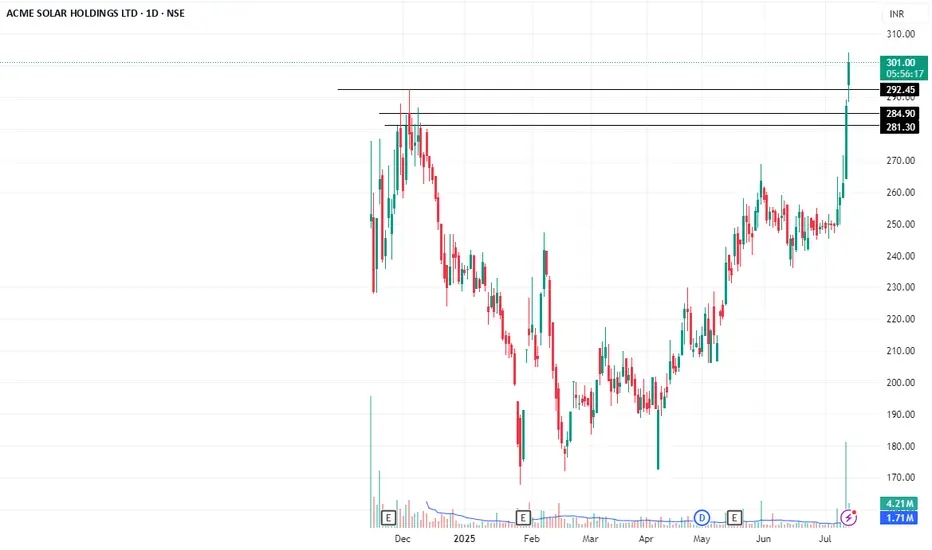
Positional trade setup for ACME Solar Holdings Ltd Technical Analysis (Daily Chart)
CMP: ₹287 approx
Pattern: Approaching major resistance zone at ₹290–295 (prior highs). Watch for a breakout or rejection.
EMA 5‑9‑20 Setup: EMAs are stacked bullish and trending upward, showing improved momentum.
Trade Entry: Wait for a decisive close above ₹295 (breakout confirmation).
Stop-Loss: Place below the breakout zone—daily close under ₹282.
Target Zones:
🎯 Target 1: ₹320 (next swing high)
🎯 Target 2: ₹360+ (momentum continuation zone)
🏭 Fundamental Snapshot
Metric Value
Market Cap ~₹17,000 Cr
P/E (TTM) ~60×
P/B Ratio ~3.3×
ROE (TTM) ~9.7%
ROCE ~7.5–7.8%
Dividend Yield ~0.1%
Debt to Equity ~2.3×
Altman Z‑Score ~1.1 (suggests financial stress)
Free Cash Flow Negative (investing-heavy)
Business Highlights:
One of India’s top 10 renewable IPPs with 1.8 GW operational capacity and 3.25 GW under construction.
Strong pipeline with big wins such as battery storage orders & FDRE (firm/dispatchable renewables) projects.
Recent growth: Revenue ~₹15,750 Cr (+19% YoY), Net Profit ₹2,520 Cr.
Backing industry push into energy storage—recent 3.1 GWh BESS order supports diversification.
Key Risks:
High leverage (Debt/Equity >2×), low Altman Z‑score indicates stress.
Negative free cash flow due to capex into expansion.
Valuation steep: P/E ~60×, limited dividend yield.
Amazing breakout on WEEKLY Timeframe - ACMESOLARCheckout an amazing breakout happened in the stock in Weekly timeframe, macroscopically seen in Daily timeframe. Having a great favor that the stock might be bullish expecting a staggering returns of minimum 25% TGT. IMPORTANT BREAKOUT LEVELS ARE ALWAYS RESPECTED!
NOTE for learners: Place the breakout levels as per the chart shared and track it yourself to get amazed!!
#No complicated chart patterns
#No big big indicators
#No Excel sheet or number magics
TRADE IDEA: WAIT FOR THE STOCK TO BREAKOUT IN WEEKLY TIMEFRAME ABOVE THIS LEVEL.
Checkout an amazing breakout happened in the stock in Weekly timeframe.
Breakouts happening in longer timeframe is way more powerful than the breakouts seen in Daily timeframe. You can blindly invest once the weekly candle closes above the breakout line and stay invested forever. Also these stocks breakouts are lifelong predictions, it means technically these breakouts happen giving more returns in the longer runs. Hence, even when the scrip makes a loss of 10% / 20% / 30% / 50%, the stock will regain and turn around. Once they again enter the same breakout level, they will flyyyyyyyyyyyy like a ROCKET if held in the portfolio in the longer run.
Time makes money, GREEDY & EGO will not make money.
Also, magically these breakouts tend to prove that the companies turn around and fundamentally becoming strong. Also the magic happens when more diversification is done in various sectors under various scripts with equal money invested in each N500 scripts.
The real deal is when to purchase and where to purchase the stock. That is where Breakout study comes into play.
Check this stock which has made an all time low and high chances that it makes a "V" shaped recovery.
> Taking support at last years support or breakout level
> High chances that it reverses from this point.
> Volume dried up badly in last few months / days.
> Very high suspicion based analysis and not based on chart patterns / candle patterns deeply.
> VALUABLE STOCK AVAILABLE AT A DISCOUNTED PRICE
> OPPURTUNITY TO ACCUMULATE ADEQUATE QUANTITY
> MARKET AFTER A CORRECTION / PANIC FALL TO MAKE GOOD INVESTMENT
DISCLAIMER : This is just for educational purpose. This type of analysis is equivalent to catching a falling knife. If you are a warrior, you throw all the knives back else you will be sorrow if it hits SL. Make sure to do your analysis well. This type of analysis only suits high risks investor and whose is willing to throw all the knives above irrespective of any sectoral rotation. BE VERY CAUTIOUS AS IT IS EXTREME BOTTOM FISHING.
HOWEVER, THIS IS HOW MULTIBAGGERS ARE CAUGHT !
STOCK IS AT RIGHT PE / RIGHT EVALUATION / MORE ROAD TO GROW / CORRECTED IV / EXCELLENT BOOKS / USING MARKET CRASH AS AN OPPURTUNITY / EPS AT SKY.
LET'S PUMP IN SOME MONEY AND REVOLUTIONIZE THE NATION'S ECONOMY!

ACME SOLAR HOLDINGS LTD S/RSupport and Resistance Levels:
Support Levels: These are price points (green line/shade) where a downward trend may be halted due to a concentration of buying interest. Imagine them as a safety net where buyers step in, preventing further decline.
Resistance Levels: Conversely, resistance levels (red line/shade) are where upward trends might stall due to increased selling interest. They act like a ceiling where sellers come in to push prices down.
Breakouts:
Bullish Breakout: When the price moves above resistance, it often indicates strong buying interest and the potential for a continued uptrend. Traders may view this as a signal to buy or hold.
Bearish Breakout: When the price falls below support, it can signal strong selling interest and the potential for a continued downtrend. Traders might see this as a cue to sell or avoid buying.
20 EMA (Exponential Moving Average):
Above 20 EMA(50 EMA): If the stock price is above the 20 EMA, it suggests a potential uptrend or bullish momentum.
Below 20 EMA: If the stock price is below the 20 EMA, it indicates a potential downtrend or bearish momentum.
Trendline: A trendline is a straight line drawn on a chart to represent the general direction of a data point set.
Uptrend Line: Drawn by connecting the lows in an upward trend. Indicates that the price is moving higher over time. Acts as a support level, where prices tend to bounce upward.
Downtrend Line: Drawn by connecting the highs in a downward trend. Indicates that the price is moving lower over time. It acts as a resistance level, where prices tend to drop.
Disclaimer:
I am not a SEBI registered. The information provided here is for learning purposes only and should not be interpreted as financial advice. Consider the broader market context and consult with a qualified financial advisor before making investment decisions.

ACME SolarACME Solar Holdings is one of India's largest renewable energy-independent power producers (“IPP”) and among India's top 10 renewable energy.
As there was no listing gains but now the stock is following the trend line and taking support from the level.
Once the stock tried to break the ath but failed now again going and there will be immense rally
