TCS – From Correction to Acceleration?TCS appears to have completed a textbook Zigzag correction (A-B-C) ending at ₹3056.05 — right at the long-term trendline support that has held since 2020.
From this base, the structure is now forming a clean impulsive sequence :
Wave 1 topped at ₹3630.50
Wave 2 retraced to ₹3451.30, holding between 0.236–0.382 retracement zones
The current rally may be the start of Wave 3, with fib projections targeting the ₹4025–4380 zone
Supporting evidence:
Strong RSI bullish divergence at the March low
Breakout above ₹3630.50 would confirm Wave 3 ignition
Invalidation:
Break below ₹3056.05 would invalidate this count and suggest a larger correction.
Tools Used : Elliott Wave, Fibonacci, RSI
Timeframe : Daily
Weekly timeframe view attached below for broader context:
This is a technical analysis for educational purposes only and not financial advice.
Part of the ongoing #WaveTracker series.
Documenting Elliott Wave progression across major stocks.
TCS trade ideas


TCS EASY CHARTI think this is one of the most easy chart of a stock io know what is and will happen in the stock. I will be posting details of smaller levels on this stock.

TCS📌 Trade Plan – BUY Setup
Parameter Value
Entry ₹3333
Stop Loss (SL) ₹3200
Risk ₹133
Target ₹4867
Reward ₹1534
Risk-Reward Ratio (RR) 11.5 ✅
Last High ₹4590
Last Low ₹3056
Key Trigger Daily Close above ₹3905 for trend momentum confirmation
🔎 Analysis & Interpretation
🔼 Uptrend Across All Timeframes: Solid confirmation of structural strength.
✅ Zone Confluence Around ₹3295–3349: Confirms a strong support base for long trades.
🔁 Improved SL at ₹3200: More logical buffer below Daily/Weekly demand zones, increasing probability of trade survival in noise.
📉 RR 11.5: Now a highly credible and high-probability swing trade.
🧠 Psychological Resistance Near ₹3905–4000: A breakout above this could catalyze strong upside momentum toward target ₹4867.
🟢 Verdict: Executable Trade Plan
📈 Setup Valid: Trend ✅, Zones ✅, RR ✅.
⚠️ Wait for Trigger: You may wait for momentum confirmation (Daily close > ₹3905) before full-size entry or scale-in gradually above ₹3400 with confirmation.
✅ TCS Updated Trade Setup Summary
🔍 Multi-Timeframe Demand Zone Analysis
Timeframe Trend Zone Type Proximal Distal Avg
Yearly UP RALLY-RALLY 2952 1506 2229
Half-Yearly UP RALLY-RALLY 2952 2879 2916
Quarterly UP BUFL 2952 2879 2916
HTF Average – – 2952 2421 2687
Timeframe Trend Zone Type Proximal Distal Avg
Monthly UP BUFL 2952 2879 2916
Weekly UP BUFL 3349 3056 3203
Daily UP DMIP 3347 3312 3330
MTF Average – – 3216 3082 3149
Timeframe Trend Zone Type Proximal Distal Avg
240M UP BUFL 3333 3295 3314
180M UP BUFL 3333 3295 3314
60M UP BUFL 3333 3295 3314
ITF Average – – 3333 3295 3314

TCS .. will the breakdown turns out to be springTCS 3440 has breakdown the trend channel. Based on valuation it is trading at 25.7 less than it 10 Years P/E of 26.7.
FII's has reduced their stake to the lowest in 3 years while DII has added their stake.
On Valuation base it is good for long term investment on technical basis and 32 P/E which is for target 4250 .

TCS is into Bearish zone, Could drop to 2800TCS is entered into Bearish zone on Monthly Chart and It could drop tp 2800 and below levels.
Note: This is not a buy/sell trade call. Trade at your own will and analysis. Use stop loss too.

Tata Consultancy Stock Chart Fibonacci Analysis 042825Trading Idea
1) Find a FIBO slingshot
2) Check FIBO 61.80% level
3) Entry Point > 3370/61.80%
Chart time frame:D
A) 15 min(1W-3M)
B) 1 hr(3M-6M)
C) 4 hr(6M-1year)
D) 1 day(1-3years)
Stock progress: A
A) Keep rising over 61.80% resistance
B) 61.80% resistance
C) 61.80% support
D) Hit the bottom
E) Hit the top
Stocks rise as they rise from support and fall from resistance. Our goal is to find a low support point and enter. It can be referred to as buying at the pullback point. The pullback point can be found with a Fibonacci extension of 61.80%. This is a step to find entry level. 1) Find a triangle (Fibonacci Speed Fan Line) that connects the high (resistance) and low (support) points of the stock in progress, where it is continuously expressed as a Slingshot, 2) and create a Fibonacci extension level for the first rising wave from the start point of slingshot pattern.
When the current price goes over 61.80% level , that can be a good entry point, especially if the SMA 100 and 200 curves are gathered together at 61.80%, it is a very good entry point.
As a great help, tradingview provides these Fibonacci speed fan lines and extension levels with ease. So if you use the Fibonacci fan line, the extension level, and the SMA 100/200 curve well, you can find an entry point for the stock market. At least you have to enter at this low point to avoid trading failure, and if you are skilled at entering this low point, with fibonacci6180 technique, your reading skill to chart will be greatly improved.
If you want to do day trading, please set the time frame to 5 minutes or 15 minutes, and you will see many of the low point of rising stocks.
If want to prefer long term range trading, you can set the time frame to 1 hr or 1 day.

TCS Ready for BounceTCS Ready for Bounce
Current Market Price (CMP): ₹3,647
Stop Loss (SL): ₹3,430
Target 1: ₹3,784
Target 2: ₹3,986
📊 Market Insight:
TCS is showing signs of a potential bounce, closely mirroring the NIFTY IT index. The stock has formed a base on the daily chart and recently breached a small resistance, suggesting bullish momentum may follow.
💡 Trade Setup:
With April’s quarterly results on the horizon, increased activity in TCS and the broader IT sector could present a short-term trading opportunity.
⚠️ Caution:
The market remains volatile—practice smart position sizing and maintain a strict stop-loss to protect your capital.
📌 Disclaimer: Not a SEBI-registered advisor. Always conduct your own research before making any investment decisions.
#TCS #NIFTYIT #StockMarket #TechnicalAnalysis #TradingOpportunity #MarketUpdate

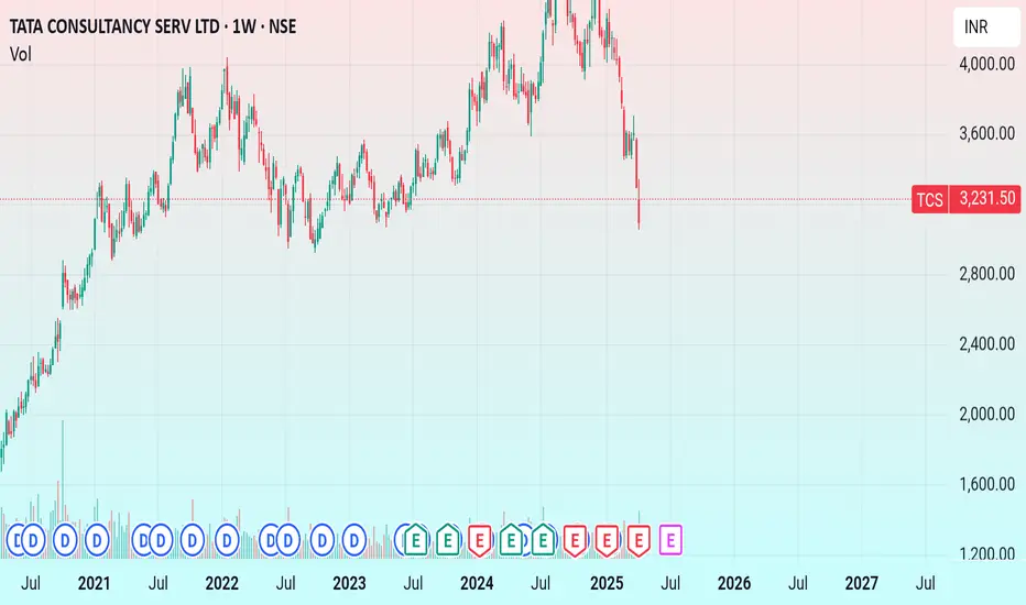
TCS: Rare Opportunity Below 200-Week Moving Average – Potential TCS has entered a historically significant zone. As visible in the weekly chart, the stock is currently trading below its 200-week moving average — a level that has only been breached during the 2008 global financial crisis.
📌 Key Observations:
Current price: ₹3,248.40
200-Week MA: ~₹3,626
MACD shows deep oversold territory – a typical sign of exhaustion in selling
Last time TCS traded this far below the 200W MA was during the 2008 crash — and the stock rebounded strongly afterward.
💡 What’s Supporting a Bullish Case?
US Tariff Pause: With Trump pausing tariff escalation, there's reduced uncertainty in global trade.
Rate Cut Prospects: The US Fed is expected to reduce interest rates soon, which could boost enterprise spending – a major tailwind for IT exporters like TCS.
📈 Growth Potential: If historical patterns repeat and macro factors align, TCS could see a 20–30% upside from current levels, targeting the ₹3,900–₹4,200 zone in the medium term.
🎯 Investment Rationale: This may be a rare opportunity to accumulate a quality stock like TCS at multi-year support levels, backed by strong fundamentals and favorable external cues.
🛒 Verdict: Good Buy Zone for Long-Term Investors
🔍 Disclaimer: I currently hold TCS in my portfolio. This post is for informational purposes only and not a recommendation to buy or sell. Please do your own research or consult a financial advisor before investing.

TCS CAN TOUCH 2930If 15 April whole market face a little bit selling then TCS can touch buying zone at 2930
TCS - Signs of financial stress?Here I am sharing my perspective on the technical chart.
The chart is self explanatory as always.
TCS Q4 Results – Net Profit Declines 2% YoY to ₹12,224 Crore, Misses Street Estimates.
Salary hikes for employees have been paused due to ongoing global uncertainties.
This is not a happy sign for sure.
IMHO, the 2890 - 3000 price range may be tested soon, which is a good support zone.
It may or may not turn out as expected, But it is always wise to have a plan just in case it does.
What do you think?
Disclaimer: This analysis is purely for educational purposes and does not constitute trading advice. I am not a SEBI-registered advisor, and trading involves significant risk. Please consult with a financial advisor before making any investment decisions.


TCS, Blue Chip IT Sector Stock around SupportTCS, a blue-chip stock, is currently trading at a support level.

tcsclassical double bottom formation in tcs
breakout and retest done
if any kind of bullishness shown on lower time frame. make good entry

Long TCS Ltd.According to the Revenue Grid indicator, stock is trading around the revenue per share of 5.5. It went above this valuation level around Oct, 2017, never to return back to it. It crossed it only at the time of market crash caused by Covid virus pandemic in 2020. So this is definite buy here.

TCSTata Consultancy Services Ltd. offers business solutions, consulting, and information technology (IT) services. The following segments comprise its operations: Manufacturing; Consumer Business; Banking, Financial Services, and Insurance; Life Sciences and Healthcare; and Others.
It was corrected by roughly 15–18% to this volatility, and I saw that it was attempting to take a bullish retracement from this level. I believe that if it is at the low 3790 level, it may attempt to reach the 4000, 4100, or 4200 levels in the days ahead.
The only goal here is education. Before investing, please speak with your financial advisor. I'm not a financial advisor.

H&S at the top of chartHead and shoulder pattern on the top of chart suggest that bearish trend is on the way. Confirmed with RSI negative crossover.Target 3250

TCS S/R for 30/1/25Support and Resistance Levels:
Support Levels: These are price points (green line/shade) where a downward trend may be halted due to a concentration of buying interest. Imagine them as a safety net where buyers step in, preventing further decline.
Resistance Levels: Conversely, resistance levels (red line/shade) are where upward trends might stall due to increased selling interest. They act like a ceiling where sellers come in to push prices down.
Breakouts:
Bullish Breakout: When the price moves above resistance, it often indicates strong buying interest and the potential for a continued uptrend. Traders may view this as a signal to buy or hold.
Bearish Breakout: When the price falls below support, it can signal strong selling interest and the potential for a continued downtrend. Traders might see this as a cue to sell or avoid buying.
20 EMA (Exponential Moving Average):
Above 20 EMA(50 EMA): If the stock price is above the 20 EMA, it suggests a potential uptrend or bullish momentum.
Below 20 EMA: If the stock price is below the 20 EMA, it indicates a potential downtrend or bearish momentum.
Trendline: A trendline is a straight line drawn on a chart to represent the general direction of a data point set.
Uptrend Line: Drawn by connecting the lows in an upward trend. Indicates that the price is moving higher over time. Acts as a support level, where prices tend to bounce upward.
Downtrend Line: Drawn by connecting the highs in a downward trend. Indicates that the price is moving lower over time. It acts as a resistance level, where prices tend to drop.
Disclaimer:
I am not a SEBI registered. The information provided here is for learning purposes only and should not be interpreted as financial advice. Consider the broader market context and consult with a qualified financial advisor before making investment decisions.

Tcs turn positive, tcs break before 2 weeks candles, Tcs positive, tcs trade 10,20, Day ema up ,
Tcs break before 2 weeks candle,
And weekly support 4000.

TCS S/R for 13/1/25Support and Resistance Levels:
Support Levels: These are price points (green line/shade) where a downward trend may be halted due to a concentration of buying interest. Imagine them as a safety net where buyers step in, preventing further decline.
Resistance Levels: Conversely, resistance levels (red line/shade) are where upward trends might stall due to increased selling interest. They act like a ceiling where sellers come in to push prices down.
Breakouts:
Bullish Breakout: When the price moves above resistance, it often indicates strong buying interest and the potential for a continued uptrend. Traders may view this as a signal to buy or hold.
Bearish Breakout: When the price falls below support, it can signal strong selling interest and the potential for a continued downtrend. Traders might see this as a cue to sell or avoid buying.
MA Ribbon (EMA 20, EMA 50, EMA 100, EMA 200) :
Above EMA: If the stock price is above the EMA, it suggests a potential uptrend or bullish momentum.
Below EMA: If the stock price is below the EMA, it indicates a potential downtrend or bearish momentum.
Trendline: A trendline is a straight line drawn on a chart to represent the general direction of a data point set.
Uptrend Line: Drawn by connecting the lows in an upward trend. Indicates that the price is moving higher over time. Acts as a support level, where prices tend to bounce upward.
Downtrend Line: Drawn by connecting the highs in a downward trend. Indicates that the price is moving lower over time. It acts as a resistance level, where prices tend to drop.
Disclaimer:
I am not a SEBI registered. The information provided here is for learning purposes only and should not be interpreted as financial advice. Consider the broader market context and consult with a qualified financial advisor before making investment decisions.

Trading Near Multiyear SupportTCS stock price follow a Mulityear uptrend channel and channel lower boundary act as a Multiyear Support .

TCSTCS Chart Analysis.......... 10/01/2025
TCS SELL : below 3900 lvl.
TCS BUY : 3700 lvl.
Add more quantity if price reaches 3450 level
Note : TCS Harmonic pattern active when closing below 3900 lvl.
Enjoy !

A BULLISH TRADE SETUP FOR TCS BASED ON RESULT IMPACT:A BULLISH TRADE SETUP FOR NSE:TCS BASED ON RESULT IMPACT:
If the price breaches the entry point (₹4,052.15): The trade becomes active, and the targets can be tracked.
If the price breaks below the stop loss (₹3,951.05): The trade should be exited to avoid further losses.
1. 🔵ENTRY: ₹4,052.15
2. 🔴STOP LOSS: ₹3,951.05 (PROTECTION AGAINST DOWNSIDE)
3. TARGETS:
🟢TP1: ₹4,171.95
🟢TP2: ₹4,248.20
🟢TP3: ₹4,429.95
ANTICIPATION OF POSITIVE EARNINGS IS DRIVING THE SETUP. THE RISK-REWARD RATIO IS FAVORABLE (~1:3.7). MONITOR PRICE ACTION AND VOLUME FOR CONFIRMATION BEFORE ENTERING.
Potential Actions:
🔴Disclaimer: I am not a SEBI-registered advisor. This analysis is for educational and informational purposes only and should not be considered as financial advice. Investments in the stock market are subject to market risks. Please do your own research or consult a SEBI-registered advisor before making any investment decisions.
