Commodities/DXY Intermarket AnalysisBoth charts look very similar, however in this instance commodities are acting as a leading market for both the dollar bottom (Jan 2021) and the dollar top (Sep 2022), with the commodity index bottoming in April 2020 and topping in March of 2022. Since the last significant declines in both markets, they have both been relatively flat, with commodities remaining slightly weaker than the dollar.
SPGSCI trade ideas

Commodities are a safe inflation bet.Embrace risk! Brace for the storm! Etc.
Weakening, last stage before arecession is commodities driven up to unfeasible prices slowing global economy. Nothing new. Just know it'll come down as fast as it went up.

Elliot Waves commoditiesgeopolitical supply disruptions.
a fading monetary policy
reduced industrial destocking will support demand and spot prices in 2024.

(Commodity Index) Crash is coming Hi there,
Commodities crash is coming. it is going to be similar like 2008. Get ready to short commodities accross the board.
Good Luck

SPGSCI(COMMODITY INDEX)Hi Guys look at that pretty surge up in all commodities like silver and gold .....SPGCI is commodity index.
based on my last analysis look at that how i sent you buying signal in commodities ....i have said you maybe 10Y yield and DXY is reaching resistance and we likely to see bounce in commodities here you are enjoy and please share and boost let them know what we are doing here ...
:https://www.tradingview.com/chart/US10Y/9PKF0Xs7-US10Y/
Good luck

US Inflation Hi guys look at this spike in commodity index and oil rising price i think inflation is comming back......be logical
good luck

Goldman Sachs Commodity index, WEEKLY TIME FRAMEIn review of Goldman Sachs commodity index on a weekly time frame, price action from the year 2000- 2008 is regarded as an impulse that is recognized on the chart as an A, followed by corrective price action resulting in a triangle formation (ABCDE) from the year 2008 to 2020, end of which is marked by B. As the principle of market structure highlights the significance of (impulse, correction, impulse) in completing a market cycle. 2020 onwards to a foreseeable future it is expected that an impulse is in formation resulting in C leg that is projected in the chart. It is noteworthy that an impulse should have at least 5 waves with 2 and 4 being corrective legs, and 3rd being the strongest out of 5 waves as indicated in A leg of the structure. The uptrend of an A leg is followed by a corrective price action, in this case the corrective structure put in place consisting of (ABCDE) came into play as a triangle. A fib retracement of A leg found corrective support at .786 which in my experience is often institutional way of taking out stop losses before continuation of the trend, as witnessed a strong upward price action that broke out of triangle to continue the c leg, it’s worth highlighting that traditional target of breaking out of a triangle structure in in confluence with C leg target of a bigger trend. As C leg is of an impulse, it means there should be a minimum of 5 waves inside it as projected on the chart. Although the upward trend is intact on higher time frames, I believe we are in 4th wave of c leg, meaning a correction is due before continuation of an uptrend to give us the finish of c leg. The analysis above on higher time frames compliments the price action on smaller time frames as evident below. A corrective structure of ABC is in play in the 4th leg before continuation of the uptrend. One of the characteristics of 4th leg is that it should not go below .38 fib level of the entire move. Therefore, more downside is projected to complete the ongoing structure. Ideally, we would like to see a strong bounce at the .38 fib zone followed by sideways movement as a confirmation of continuation of an uptrend.

GS Commodity Index ChartLooking at the Goldman Sachs Commodity Index and how the prices went up dramatically from the Covid lockdown, i would say that there is still room for a final rally, before a major correction in 2024.
The chart is self-explanatory.
Looking forward to read your opinion about this.

SPGSCI ForecastThe S&P GSCI Index looks bearish at the break of the low at 569.59 to potentially fall down to 550.87 for a bias of 543.00
So let's look at Oil...

Big Four Macro Update: CommoditiesThere are extensive fundamental comments, context, and observations in the prior commodities pieces linked below. The 2022 Midyear Conclusion was that commodities were making an important top and that I intended to be a better seller of weekly perspective strength over the last half of 2022.
For most of the last 20 years commodities have been trapped in a wide range between the pre and post great financial crisis extremes.
Primary Chart Features:
Macro lateral support and resistance zones are wide but well defined.
Last March, the appearance of supply across a wide variety of commodities and with the GSCI within 5% of the major resistance left suggested that the 2020-2022 rally has run its course. The show of weakness removed any doubt.
An overthrow of top of the trend channel, a near classic buying climax that occurred near macro resistance, the break of the channel uptrend drawn from the 218 Covid low and the rollover in the MACD oscillator are all consistent with a new bear.
Generally speaking, commodities tend to produce long trends as they move higher and lower with business cycles that typically last several years.
Recent weakness is consistent with a weakening of the business cycle. The fiscal stimulus related to the pandemic has ended and the lagged results of the Fed's rapid tightening campaign is becoming evident. Commodities weakness has alleviated some of the goods sector inflationary pressure but it will have little effect on service sector pressures.
Daily and weekly perspective rallies should become selling opportunities.
Weekly:
While monthly charts and macro both suggest weakness, the weekly chart has moved into a zone that may produce a counter trend rally. MACD is trying to turn higher and the market is holding over the midpoint of the channel. But a rally appears premature to me. Particularly since the low volume lateral movement over the last several months doesn't appear to be accumulation.
Not only are there few signs of demand in the shorter-term price volume relationships but the market isn't near compelling support, particularly the kind of support confluence strong enough to typically turn momentum. None the less, a weekly close above the downtrend A1-A2 would strongly suggest a near term momentum change.
A rally, while perhaps representing a trading opportunity, should ultimately provide a significant selling opportunity.
I think a much better opportunity for support is found at the 494 - 536 zone where I would be interested in taking a trading long on a bullish setup.
Commodities Triple Screen: The triple screen suggests a similar story. A trend reversal in the monthly with an initial decline that is becoming oversold in the weekly perspective. Rallies in the weekly perspective are likely corrective to the weakness in the monthly.
Bottom Line: I am a better seller of strength and bearish setups. I believe that this chart continues to support the idea of a weakening/topping business cycle.
Many of the topics and techniques discussed in this post are part of the CMT Associations Chartered Market Technician’s curriculum.
Good Trading:
Stewart Taylor, CMT
Chartered Market Technician
Shared content and posted charts are intended to be used for informational and educational purposes only. The CMT Association does not offer, and this information shall not be understood or construed as, financial advice or investment recommendations. The information provided is not a substitute for advice from an investment professional. The CMT Association does not accept liability for any financial loss or damage our audience may incur.

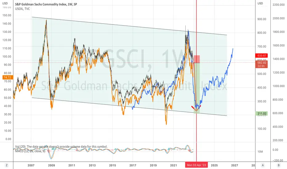
Deja Vue: Short ALL Commodities NOWLooks very much like 2008 Peak. Should see bottom in April 2023. Need to expect that PM Commodities will outperform afterwards but now staying on short side.
Visualizing Business and Market Cycles Through Momentum: 2In part one, we discussed using a market momentum matrix to anticipate the business cycle, the potential inflection in the macro environment and shared the final distillation of the current momentum matrix. In part 2 we discuss how the MACD oscillator is used to build the matrix.
Methodology: Individual markets and ratios are plotted in the quadrant that best describes their combination of momentum and price action. The precise point where the individual plots fall in the matrix is not nearly as important as the overall pattern of multiple plot points and the general weight of the evidence. It is important to realize that the momentum state is not always obvious. Accept that its messy and use your best judgement in deciding on quadrants. The idea is build a general view of the market and economic cycle.
What defines the momentum quadrant? The monthly perspective moving average convergence divergence oscillator (MACD). The individual quadrants reflect the relationship between the 13 and 26 month exponentially smoothed averages.
Quadrant One: Waning Bear: In this quadrant momentum is bearish with the shorter average below the longer average, but the difference between the two is becoming less. Momentum is still lower, but at a decreasing rate.
Quadrant Two: Strong Advance: In this quadrant momentum is bullish with the shorter average above the longer average and the difference between the two is becoming greater. Momentum is higher at an increasing rate.
Quadrant Three: Waning Bull: In this quadrant momentum is bullish with the shorter average above the longer average, but the difference between the two is becoming less. Momentum is still higher, but at a decreasing rate.
Quadrant Four: Strong Decline: In this quadrant momentum is bearish with the shorter average below the longer average and the difference between the two is becoming greater. Momentum is lower at an increasing rate.
Trading Ranges: A market in a trading range is removed from the matrix until it breaks from the range even if MACD momentum has been falling/rising for months.
Recycling: It is not unusual for auctions to become overbought or oversold, lose momentum, move into a neighboring quadrant for a few months and then cycle back. When this happens, use your judgment as to which quadrant to place the auction in. This pattern most typically occurs in an market that has reached a momentum extreme in the perspective of one lower degree and typically appears only once.
I think this is currently happening in equities. Bearish momentum is waning as weekly momentum became deeply oversold, but monthly price charts, in my estimation, don't support a change in trend.
In part 3 we will place individual auctions into the matrix and begin to outline market relationships to the business cycle.
And finally, many of the topics and techniques discussed in this post are part of the CMT Associations Chartered Market Technician’s curriculum.
Good Trading:
Stewart Taylor, CMT
Chartered Market Technician
Taylor Financial Communications
Shared content and posted charts are intended to be used for informational and educational purposes only. The CMT Association does not offer, and this information shall not be understood or construed as, financial advice or investment recommendations. The information provided is not a substitute for advice from an investment professional. The CMT Association does not accept liability for any financial loss or damage our audience may incur.

Using the Commodity Index to predict the next CPIIt's fairly simple to chart how the next 2 months are going to play out.
Dems flooded the market with strategic reserves just in time to save Midterm Elections.
Given OPEC+ decision to reduce supply, a monkey could have seen a bounce in OIL and commodities.
Conveniently a low was put in to end September which means this months CPI print will be lower.
It won't be until November after the elections and Oil has had a chance to run up will the fireworks start.
Dems probable going to tank midterms to a need for a conservative agenda.
I'm predicting FOMC and CPI in November will be bad.

Part 3: Commodities Mid-Year UpdateCommodities: In January I reviewed the long-term technical and fundamental positions of the big four: Bonds, Equities, Commodities, and the Dollar. Those pieces are extensive in terms of both fundamental and technical outlooks and are linked for your review.
January Conclusions: The trend from the pandemic low is higher, mirroring the economic recovery. But, while the trend higher is intact, it appears to be weakening. My sense of the economy is that the best growth has already occurred as the result of historically supportive fiscal and monetary. Now, both paths are turning restrictive and markets will likely reflect that reality. One of the expressions of that restriction will likely manifest in the form of weaker, particularly industrial, commodities.
-The most notable/useful current chart feature is the clear uptrend from the 2020 pandemic low. Until that uptrend is broken, the most immediate trend is to higher prices. In general, higher commodities suggest continued economic growth.
-A break of the uptrend would strongly suggest that economic demand was weakening or that supply constraints were loosening. I think economic demand is the strong story.
Where is the market now? Commodities continued to rally for three months before running into supply at the March- June 2022 high. The appearance of supply across a wide variety of commodities, and with the GSCI within 5% of the major resistance at the 2008 high, suggests that the cycle has likely run its course. Note that price exceeded the top of the channel to a significant degree. This overthrow of the supply line is consistent with a market in the blow-off phase of a trend. More broadly, the uptrend from the pandemic low remains intact and survived a test in July. Until either the uptrend falls or a secondary test of the high occurs, the monthly trend must be presumed to be neutral - higher but the evidence suggests to me that the commodities rally is over, at least for now, and that either a period of consolidation or distribution is likely.
Bloomberg Commodity Index Weekly: You can clearly see the footprint of supply (strong hands selling) across the March-June highs and the bearish engulfing/outside reversal pattern at the June high. However, volume was lower than I would have expected at a long-term buying climax. The character of the next rally will be important in assessing the vitality of the supply.
Commodities Triple Screen:
-Monthly momentum is still bullish, but overbought. This is a momentum position from which I typically monitor for ending action and the early stage of a trend change.
-With weekly momentum having turned bearishly and daily crossing over bullishly, the configuration suggests that daily perspective strength will likely fail. The big question, can the bearish weekly can pull the monthly low enough to generate a momentum sell signal?
Many other commodities have produced similar price behaviors. For instance, the big three of the AGGS, (beans, wheat and corn) have tested major overhead resistance, uncovered major supply and are now producing signs of weakness.
Conclusions: Its pretty clear that commodities have made an important inflection, but intact trends and the lack of a monthly perspective oscillator sell signal leaves at least some room for doubt. I believe that commodities are in the process of building an important top and I intend to be a better seller of weekly perspective strength over the last half of the year. The main caveat must be geopolitics, particularly in terms of energy. Demand destruction takes time, while geopolitical disruption is a jump function.
Good Trading:
Stewart Taylor, CMT
Chartered Market Technician
Shared content and posted charts are intended to be used for informational and educational purposes only. The CMT Association does not offer, and this information shall not be understood or construed as, financial advice or investment recommendations. The information provided is not a substitute for advice from an investment professional. The CMT Association does not accept liability for any financial loss or damage our audience may incur.

Triple Screen Method: Trading With The Trend: Commodities Note that this is not a trade recommendation but simply illustration of a particular approach. There are multiple reasons that I wouldn't execute this particular idea at this time, but those considerations are for another post.
Those of you who have followed my work for the last few months know that I prefer simple. The triple screen chart perspective is precisely that. A quick, down and dirty trade filtering system that can help traders with their decision process. Even after decades of active trading, it's not often that I take a meaningful trade without taking at least a quick glance, if not at the triple screen, then at least at the trend of higher degree. Happily, it only takes a moment in TradeView to set up a work space. Importantly the setup is fractal (robust across time frames), robust across markets, and it works with simple momentum oscillators and moving averages. Since my personal preference is to derive the trend through the tape, I only use the oscillators as a quick confirmation to the trend. Less experienced traders can default to the trend as defined by the oscillators.
· Trades are filtered by the trend of one higher degree. The monthly trend filters weekly perspective trades. Weekly trend filters daily, daily filters hourly, hourly filters 15 minute, and 15 minute filters 5 minute. Time periods are not sacrosanct. You should modify them to reflect your trading style.
· A daily perspective buy signal would generally be rejected if the weekly trend was bearish, but could be executed if the weekly trend was rising, flat or ranging. You may extend the same logic up and down the time scale.
· If the trend in the higher degree isn't in harmony, find a different market to trade. The beauty of being a multi asset trader is that you can always find a candidate somewhere.
· The very best trades often occur when all three perspectives are in harmony. For instance, a daily long trade setup has a much better potential when the weekly and monthly trends are in harmony.
· Finally, like everything else in trading, except for risk management, there is a time and a place to ignore the filters. If you have extreme conviction in a trade and you have a solid risk management plan, take the trade. Part of the journey is learning to recognize those nexus points when conditions and sentiment are right to enter counter trend trades.
Goldman Sachs Commodity Index:
After identifying a potential trade, load the symbol into the triple screen template. If the potential trade is in the daily perspective (as in this example) load daily, weekly and monthly charts. Begin with the longest time perspective and work your way lower to the perspective in which you are considering the trade. In this template I use a simple 14 period RSI and a 21 period exponentially smoothed moving average, but almost any momentum oscillator and moving average combination will work.
The daily chart appears to be under re-accumulation and may be setting up a bullish breakout. Each decline has been met with strong buying at consecutively higher levels, price volume behaviors are consistent with accumulation, price is attempting to clear the top of the consolidation pattern and there is reasonable upside potential before the next resistance. Assuming the market met the rest of my buying tests, including liquidity considerations (which I doubt this one does), and the risk reward potential fit my risk management framework, I would consider tactics that would allow me to build a long position.
However, before taking a deeper dive I would take a step back and load the symbol into the triple screen.
Monthly: The trend is undeniably higher and there are few signs that it is in immediate danger of ending.
· In a sign of strength, price moved above the top of the trend channel and stayed that way for the better part of four months.
· Dips to test the top of the channel have repeatedly uncovered demand.
· The oscillator, in this case a simple RSI, became overbought in September 2021, dipped slightly and then pushed to a new high.
· There are no momentum divergences.
· The moving average is also trending higher.
· While the trend appears somewhat overextended there are no overtly bearish behaviors evident.
Weekly: Another strong uptrend that appears to be on the verge of reestablishing momentum.
· The overbought condition that had accrued in late February has been relieved via lateral movement.
· The initial dip found support at a very high level.
· The higher supports and flat top across the consolidation suggests accumulation.
· This chart in in harmony with the chart of one higher degree.
With the monthly, weekly and charts in harmony I would begin working my way through the rest of my analytic and risk management tests and screens. Remember though, for a daily perspective trade the most important level of conformation is at the weekly level. The strength in the monthly chart is simply a bonus.
I also generally ask myself if the trade generally makes sense given my world view? But while having a fundamental underpinning for a trade is nice, it’s not a requirement. Sometimes it’s all about the pattern and momentum, particularly in the shorter time frames.
Notes: In the Trading View setup it’s easy to synchronize the symbol and the crosshair. My preference is to synchronize the symbol but not the drawings or time period.
Good Trading:
Stewart Taylor, CMT
Chartered Market Technician
Shared content and posted charts are intended to be used for informational and educational purposes only. The CMT Association does not offer, and this information shall not be understood or construed as, financial advice or investment recommendations. The information provided is not a substitute for advice from an investment professional. The CMT Association does not accept liability for any financial loss or damage our audience may incur.

The bigger picture & commodity prices.Now that the bear is awake, I am already looking ahead to when Central Bankers of the world will be forced to inflate currencies to keep their respective countries from defaulting and descending into chaos.
Naturally a fake bull market will kick back into gear, and -counterintuitively to the expansion of the money supply- that usually brings about a depreciation of commodities prices' because people would rather invest and borrow dollars to leverage on financial assets more than real assets.
This time, though, is quite different. The instability and unfairness of the system have translated to international tensions that cannot be resolved by simply printing more money. Cheap accounting tricks cannot repair a broken supply chain, wheat & corn scarcity, oil & gas scarcity provoked by active (and very political) sabotage from countries that are tired of being subject to the U.S. immense privilege and are seeking ways to reset the entire system.
As scarcity snaps peoples' minds into reality, the price of commodities will skyrocket even when the bull market kicks back in and possibly governments will shred that little resemblance of capitalism that the current economy has to impose price caps.
That's when things will reach the lowest lows and -in the worst case scenario- disorders will break out across many western countries.
After that, a new system will rise from the ashes of the current one and it will hopefully be a Bitcoin Standard.

Has commodities peaked yet?I take a look at SPGSCI (Goldman Sachs Commodities index)
Looks like a short term peak has taken place.

bullish long-term trend for commoditySP follows a steady trend in history, whereas commodities tends to be more volatile. We usually call it cycle.
If you followed more historical data, you would find a significant two sessions cycle made the equity/commodity curve inching up.
I believe this is the beginning not the end.
(I should publish this earlier, it would be more useful. Now I put it here just for monitoring the trend.)

Shorting CommoditiesFundamentals:
Central bank is raising rates, easy money is over, this should slow and change the commodity price trend we have been in for the last couple of years.
Quarterly:
- 8 consecutive up quarters as of right now.
- I think a healthy pullback to the trend line breakout area is in the cards.
Monthly:
- Approaching big potential resistance from the last big break low at these price levels.
- 120 period (10 year ma) still trending down, could drag price.
Weekly:
- Price still In a well defined ascending broadening wedge pattern with momentum at an extreme.
- I have Bulkowski's "Encyclopedia of Chart Patterns" open and from his statistical analysis, this pattern in the weekly, falling within the context of the downward trending range of the quarterly trend, has a high probability of going short.
Daily:
Keeping a close eye on this supply line I drew on the daily, looking to short when confirmed.

General Equity Market vs. Commodities MarketShould this play out, the Resource Sector should outperform the S&P by nearly 16 times.
Time to sell S&P and change to Commodities was the March lows of 2020!!

Commodities show we are bursting the Everything BubbleThe commodity basket to S&P ratio just formed a textbook double-bottom. The ratio also has a very similar momentum setup to the peak of the Dot.Com Bubble on both the RSI and 7 yr Rate of Change indicators. We look to be starting a true secular bull market in real assets that could be sustained throughout the decade.
The chart shows that financial assets have rarely been more overvalued compared to real assets. If looser monetary and fiscal policy is not maintained, equities do not have a rosy near-term outlook.

The Commodity SUPER CYCLE is upon us!Hello All!
This is a macro view of Commodities (Metal, Energy, Livestock & Meat and Agriculture). As you can see we have broken out of the falling wedge formation and we are pushing towards 4 main resistance levels. Commodities have not hit a new all time high since 2011 which was during the low of the housing market crash. These levels will be key economic indicators moving forwards into 2022 and beyond. Right now the upward trend has not broken, the levels to watch are posted on the chart.
1. Metals are forming long-term bullish patterns & recent high increase in inflation
2. Meat & Livestock prices have been rising (you can see this in the grocery store) due to Covid & other factors.
3. Gas & Coal have been rising bringing Electric higher. Energy crunch.
4. Energy & Fertilizer prices are increasing which in turn increases agriculture costs.
Economic factors have been driving these prices higher across the board.
This in-turn will increase the cost of living.

Big Four Macro Overview Part 3: Commodities: I begin each year reviewing the long term technical positions of the "Big Four." 10 Year rates, SPX, Commodities, and the US Dollar. This is the third of the series. Granted, macro doesn’t typically impact shorter term (swing, daily and weekly) trading, but developing a broad framework to build understanding of market context and to help recognize change in the environment is important.
I think of commodities, particularly industrial commodities, as an economic lens. Granted, economic demand isn't the only driver of the commodity cycle, but its an important one. Since the collapse of the commodities super cycle in 2008, the Goldman Sachs Commodities index has traded in a broad range, bounded essentially by the low set during the financial crisis and the resultant 2011 high. It is also worth considering that the pandemic may be somewhat distorting normal interpretation in that at least a portion of the strength may be due to logistic constraints.
1. Price is currently in the (approximate) center of a 14 year range.
2. Lows at points 1, 2 and 3 were created by the great financial crisis in 2008, The oil glut in 2016, and the pandemic in 2020. Clearly this zone, while wide, provides a substantive support floor.
3. The most notable/useful current chart feature is the clear uptrend from the 2020 pandemic low. Until that uptrend is broken, the most immediate trend is to higher prices. In general higher commodities suggest continued economic growth.
4. A break of the uptrend would strongly suggest that economic demand was weakening or that supply constraints were loosening. I think economic demand is the stronger story.
5. It is notable that the MACD momentum oscillator is close to rolling over.
a. I divide MACD into four trend states/quadrants (which I promise to will cover in future posts). MACD for this index is currently in the upper right quadrant. This is the quadrant where bullish momentum is weakening.
6. The combination of the uptrend and the lateral support from the October 2018 high and the December 2021 low (504) should act as support. A violation of the support confluence would strongly suggest that, at least for now, the uptrend was complete. Particularly if MACD moved onto a pure sell signal.
7. There is also a break of the trend-line labeled as A-B. We will cover the proper drawing and use in future posts but often, trend lines and what they mean are as much art as science. In this case, while interesting, I don't view it as particularly important.
8. Commodities deserve to be broken down into industrial and energy verses agriculture and softs. The GSCI is 54% energy, 13% Industrial metals, and 28% agricultural. I tend to watch energy and industrial commodities for economic insight.
9. I have also included a chart of JJM. This is a Total Return ETN of industrial metals. I have highlighted the buying climax that occurred in October. The climax behavior offers a strong clue that the uptrend is likely over, at least for now. In future posts I will cover ending action/climax action in depth.
Commodities Bottom Line: The uptrend from the pandemic lows represents the economic recovery. But, while the trend higher is intact, it appears to be weakening. My sense of the economy is that the best growth has already occurred as the result of historically supportive fiscal and monetary. Now, both paths are turning restrictive (see the second part of this series for a more in depth discussion) and markets will likely reflect that reality. One of the expressions of that restriction will likely manifest in the form of weaker, particularly industrial, commodities.
Good Trading:
Stewart Taylor, CMT
Chartered Market Technician
Shared content and posted charts are intended to be used for informational and educational purposes only. The CMT Association does not offer, and this information shall not be understood or construed as, financial advice or investment recommendations. The information provided is not a substitute for advice from an investment professional. The CMT Association does not accept liability for any financial loss or damage our audience may incur.
