Weekly Preview - SPX USOIL NAT GAS GOLD BTCfor SPX to have a good down move, 5900 has to break overnight tonight. 5700 is possible this week. Nat Gas still looks bullish, OIl as well. Gold may go to new highs but that wouldn't necessary be longer term bullish. BTC should continue to drop.
SPCUSD trade ideas

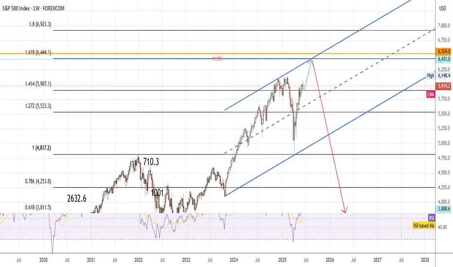
SPX tp 6440 then 3800In my view next month will be bullish for SPX, I expect a test of 6444 area (1.6 fibonacci extension from bullish trend started in 2020) then bearish market will start and push SPX to 3800 area.
Us500:What is going to happen?hello friends👋
This time we are here with the analysis of us500, an important and vital index in the market that is being talked about a lot these days.
Well, let's go to the analysis, you will see that with the drop we had, a lower floor was made and the price was quickly supported and pumped by buyers.
Now it is clear that an ascending pattern has been formed, which is a very strong support in the specified area and a good buying point that you can enter into a transaction with capital and risk management.
Note that if the floor is broken and the stop loss is placed, our bullish pattern becomes invalid and we have to wait for lower floors.
🔥Follow us for more signals🔥
*Trade safely with us*

Bull market for growth stocks (vs yields) ending...The Stock Market vs Yields is below the 10 year moving average.
Gold, silver, uranium, copper, oil & friends thrived in similar past setups.

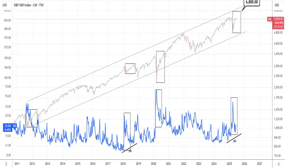
SPX vs VIX: Is this a sign of a bullish market?VIX has seen a strong decline in the past 2 months following the massive surge of Feb-March due to the Tariff War. In contrast, the S&P500 rose massively to almost its ATH, which is a natural response as the two assets are negatively correlated. This VIX pattern has been seen during every major market bottom in the past 15 years, the strongest of which was the 2020 COVID crash. This is a sign of a very bullish market, TP = 6,800 by the end of the year.
## If you like our free content follow our profile to get more daily ideas. ##
## Comments and likes are greatly appreciated. ##
MAJOR TOP IS NOW IN PLACE 5th wave up from 4835 has ended 6059The chart posted is that of the sp 500 and I now have counted 5 waves up as ending based on this wave structure I will look for two things to happen a rather deep ABC if there is a bull market intact and it should decline in 3 waves back to .236/382 area from 6059 - 4835 The 4th wave or A low This MUST HOLD at .382 or The cycle has ended the 5 wave sup from march 23 low 2020 I sold longs this morning based on NAAII exposure and Now have moved to a 100 % long VERY DEEP IN THE MONEY PUTS 2027 Best of trades The WAVETIMER

Big CorrectionThe S&P index.
The chart shows the potential end of the final rally from the 2009 low.
Currently, with this rally from the recent 4,800 low, we are still in a correction period that will end in late October (highs and lows are irrelevant), & We have a date coming up in August so let's see what happens there.
After this period, we will have a rally combined with uncertainty and unjustified speculative movements (bubble) that could take us to the final peak, which I expect in 2026.
This remains a possibility, but don't base your trades on it. However, caution is often good.

SOARING 20's are you ready for the Blowoff of the century#SPX v Currency in circulation
#Cup&Handle
1929 Echo bubble
AI will increase earnings and GDP
as ASI enters the workplace and Robotics grow us out of Debt
GDP = Number of people * Productivity
Now add an autonomous workforce to this.

SPX500As on NASDAQ100 Analysis, seeing a shorting position herein as well, for a fair drop to the recent demand zone and QML levels, sort of skewed Head and Shoulder pattern unfolding due to give the second bearing shoulder.

S&P 500: The Wedge, the Oil, and the Yen
The S&P 500 SP:SPX OANDA:SPX500USD CME_MINI:ES1! AMEX:SPY appears to have completed a rising ending diagonal — a classic reversal structure.
The 6050 zone stands out as strong resistance — notably, no monthly candle has ever closed above this level.
🧭 Minimum correction targets:
filling the weekly FVG
a retest of the 20-week moving average
retracement to the 0.382–0.5 Fibonacci zone from the recent leg
📌 Fundamentals support the downside:
Iran–Israel tensions are pushing oil prices higher → which fuels inflation expectations
Rising CPI in Japan may accelerate the carry trade unwind and lead to a stronger yen OANDA:USDJPY
Seasonality also leans bearish during the summer months
⚠️ Bottom line: momentum is fading. A cooling phase is likely next — time to focus on risk management.

S&P500: Channel Up targeting 6,170.S&P500 is bullish on its 1D technical outlook (RSI = 65.737, MACD = 75.400, ADX = 16.727), unfolding the new bullish wave of the 1 month Channel Up, after a bottom near the 4H MA200. The first bullish wave one reached +4.35%, we expect to repeat that so for a few more candles we will remain bullish, TP = 6,170.
## If you like our free content follow our profile to get more daily ideas. ##
## Comments and likes are greatly appreciated. ##

SPX short analysisLike I wrote in my EUR/USD analysis you never know what could happened.
USA bombed Iran!
This could have huge impact on the US market next week.
My guess is temporarily short... At least to close this gap in spot price of SPX.
Since we're still in bearish market, until we see new highs, and this could be catalyst for another sell off. So the jump could be even bigger and we could see new ATH this year.
For now, I'm seeking a position to short tomorrow after market is open.
This is my entry mark.
There will be higher volatility. However, I expect US market to open in the red, close the gap and to sell off again.
We shall see!
Trade safe this one :)

S&P500Current COT data supports a bearish or cautious outlook on the S&P 500. Current Bias: Bearish / Cautiously Negative

Double Top Or M Pattern On SPXTraders and Followers , we have another opportunity in SPX/USD .
2 hr chart shows me a M pattern or double top. Lot's of points can be made if one takes a short position if the break-line 6079.9 area gets taken out. I have a sell stop just below that area and looking for 6005.7 as a target area.
A good trader waits for price to setup before entering any trade .
Best of luck in all your trades $$$

Risk and Probability in Trading — Why Risk Assessment MattersRisk and Probability in Trading — Why Risk Assessment Matters More Than Chasing the “Holy Grail”
In trading, most participants and analysts are focused on finding the so-called “Holy Grail” — the perfect entry point where the price moves in the desired direction and yields profit. However, few actually assess the risks involved, as if success is possible without factoring them in. Market reviews are often filled with levels, forecasts, and price directions, but rarely include probability estimates or potential losses.
In my view, the real Holy Grail isn't a guaranteed profitable entry, but a scenario where the market offers a position with minimal risk relative to historical context. To identify such setups, we need a risk scale based on historical data — how favorable the current risk-to-reward ratio is compared to the past.
It’s also crucial to understand that no one can predict price direction with certainty. The key to opening a position is not hope, but evaluating all possible scenarios — upward, downward, or sideways — and knowing the outcome in each case. Risk management is more than just placing a stop-loss; it’s a structured approach that should be central to any trading strategy.
What Are Minimal Risks?
“Minimal risk” is a relative concept — it only makes sense when measured against a defined scale. Building such a scale requires historical statistics: what were the maximum and minimum losses and profits for similar positions in the past?
Profit-to-Loss Ratio
The idea behind the search for the “Holy Grail” is to find moments when the market offers the best possible profit-to-risk ratio. For example, if the current ratio is 10, and historically it has ranged from 0 (low risk) to 100 (high risk), then 10 may be a good entry point. If the ratio approaches 80–90, it signals that the position is extremely risky.
Why Are Probability and Risk Assessment Important?
Market reviews often talk about resistance levels, volatility, and price direction — but rarely address the risks of different scenarios. No expert can predict market movements with certainty — if they could, they’d be billionaires. Opening positions without accounting for risks and scenario probabilities is extremely dangerous.
How to Factor in Risks When Entering a Position
The key question is: what will the profit-to-loss ratio be after entering a position, depending on whether the price goes up, down, or stays flat? It’s important to understand the consequences of each case and make decisions based on risk assessment.
Risk Management Must Account for the Inability to React Instantly
Conventional tools like stop-losses and limit orders often fail to protect capital effectively during sudden price spikes. These tools are particularly vulnerable when market makers or high-frequency algorithms trigger stop levels en masse.
This highlights the need for more resilient risk management instruments — ones that can respond to volatility instantly and automatically. Options are one such tool, capable of limiting losses regardless of market dynamics.
Without robust risk management, long-term profitability becomes statistically unlikely. Sooner or later, the market will present a scenario that can wipe out your capital — unless you’re properly protected.
Important note: this is not an endorsement of options or any specific broker. It’s simply a conclusion based on the logic of building effective capital protection. If a broker only provides access to linear instruments (futures, spot, stocks) without the ability to hedge, it will inevitably lead to capital erosion — even for systematic traders.
And if this article gets more than 100 rockets, I’ll continue sharing specific examples of low-risk trading assessments.

THE END SNP MEGA DUMPThe chart speaks for itself brace yourself for a huge crash in the market either take advantage of options or trade via CFD or leverage play on other stocks either way make money from this epic crash 💥

SPX/USD Has A Double Top Pattern On The 1Hr Hey Traders and following gang!
Hope all are raking in profits on all your trades.
I spotted this double top setup on the 1hr SPX/USD.
A break below 5980.6 triggers a short down to target-1 5926.3
A break below 5943.8 triggers a short down to target-2 5842.1
A little scuffle in the Mid East helps this market fall so, short the ticker .
Best of luck in all your trades my friends and stay profitable $$$

The Market Sways and Trump sets a deadline ‼️ Hey hey, hope all is well, don't have too much time so just gonna keep this short and get at what we need right now, thanks for tuning in.
‼️ If you've been following the news then you understand that tensions are pretty high, the conflict in the Middle East is progressively getting worse and worse by the day with The United States now looking to play peacemaker between Iran and Israel.
‼️ Trump himself has given a two week deadline for him to decide on whether or not the United States will join the fight and bomb Iran which notably has the market shaken. Below I've added a link with a reference to an article which highlights the recent news and trumps deadline.
www.npr.org
‼️ Historically, we've seen trump do this before, he's no stranger to setting deadlines, especially when it comes to global conflicts. As the article also references, trump has done this before, take April 24th for example when a reporter asked Trump on his position with continuing military assistance for Ukraine: "You can ask that question in two weeks, and we'll see" responded Trump. It's become a tactic that Trump has used often throughout his term's prompting the question of whether or not we will really see him take action by the end of the two weeks or not. So we should take that understanding and take everything with a grain of salt.
‼️ The market itself is already use to the idea of war or joining a fight like we had to deal with when fighting started between Ukraine and Russia which shook the market before things ultimately got back to routine and the market was able to price in the war. I do have to note though that the global conflicts in Ukraine are much more different than those in the Middle East so that should be taken into consideration as well.
‼️ That being said on Saturday Trump made the announcement that the U.S had launched an attack on three of Iran's main nuclear sites signifying the U.S may be ready to join the fray. That or they have taken advantage of the high tensions to launch an attack of their own to beat at Iran's nuclear progress in order to delay, prevent them from acquiring a nuclear capability understandably.
‼️ I have to go but for technical analysis we'll be watching that 200 EMA for our bullish and bearish convergences, as well as news which will give us an idea of what way the market will head. Definitely one of those times to sit and watch how things play out, we've already come relatively close to retesting our all time high breaking above 6,000 so the market's definitely got some energy. We've dealt with this before but should the U.S really get itself involved with the war and bomb Iran then I would expect the global markets to react heavily. We've seen the U.S offer aid to countries such as Ukraine but when speaking about joining war that's a different matter entirely.
‼️ Definitely be mindful of the news the next few weeks as things progress and don't be to rash with your decision and choices, stick to what's worked and let's focus on what's worked. Paying mind to our indicators and strategies alongside much patience.
‼️ Thank you for tuning in with me as always, appreciate the constant support and wishing all the best. Feel free to keep tuned for more and thanks again.
Best regards,
~ Rock '

SPX Gap for BTC LongIf you want to long BTC, wait for SPX to fill its weekly gap :) as simple as that.

Another drop for SPX500USDHi traders,
Last week SPX500USD broke the low of the previous week just as I've said in my outlook. After that it went up again. This pair is still in a bigger correction down.
So next week it could drop again into the direction of the bullish Weekly FVG.
Let's see what the market does and react.
Trade idea: Wait for a small correction up on a lower timeframe to trade short term shorts to the previous Weekly lows.
If you want to learn more about trading FVG's & liquidity sweeps with Wave analysis, then please make sure to follow me.
This shared post is only my point of view on what could be the next move in this pair based on my technical analysis.
Don't be emotional, just trade your plan!
Eduwave

Weekly Red Candles Signal Potential PullbackOn the weekly chart, two clean red candles have formed. The price is struggling to move higher — every attempt to break above is being sold off.
An additional factor is geopolitical tension, which puts extra pressure on bullish momentum.
After such an exponential rally, I expect at least a pullback .
Could there be a new high and breakout above resistance? Yes, it's possible.
But the current setup offers a clear stop-loss just 1.60% below the current price — a small and comfortable risk.
This is not a quick trade. I plan to hold the position anywhere from 1 week to 1 month, depending on how the market develops. Therefore, I choose an optimal position size for my account, knowing that margin will be frozen.

SPX500 Technical Outlook: Balancing Risk and RewardPost Content:
🔍 SPX500 Analysis - 4H Timeframe
Our latest technical analysis showcases a detailed approach to the S&P 500 Index using Smart Money Concepts, Fibonacci tools, and volume dynamics. Here's the breakdown:
1️⃣ Trend Structure
The price has formed a wedge within the premium zone, indicating potential exhaustion.
BOS and ChOCH markers highlight key pivots, emphasizing a weak high and strong low.
2️⃣ Fibonacci Insights
We're observing equilibrium near 5,668.57, a critical area where price may consolidate or pivot.
Higher Fibonacci extensions suggest an upside target near 6,580.38, should momentum hold.
3️⃣ Risk-Adjusted Strategy
Short Opportunity: Bearish retracement expected toward equilibrium; target around 5,668.57.
Long Opportunity: Look for confirmations to buy at the discount zone or post-retracement breakout above the weak high.
4️⃣ Volume Dynamics
Spikes at key pivot points signal institutional activity, strengthening the validity of liquidity zones.
📊 Trade Setup Overview
Entry: Short near premium zone OR Long near equilibrium/discount zone.
Stop-Loss: Place below the strong low for longs or above weak highs for shorts.
Target: Extensions at 6,580.38 align with the broader bullish sentiment.
🎯 Key Takeaway: This model emphasizes patience, precision, and risk management. Be sure to monitor upcoming macro events and confirm entry triggers before committing to any position.
🌟 Follow WaverVanir International LLC for more actionable insights, technical breakdowns, and AI-driven strategies!
📈 Trade Safe,
Team WaverVanir International LLC

