SPCUSD trade ideas

Where will the market goes from here ?Gap or hole to be filled up reminds me of looking at your own wallet. How many times did you realise that you were low on cash (yes in SG, we still use a lot of physical cash) and needs to go to the ATM machine to withdraw money to fill it up.
Logically, from the chart, it appears that option 2 is more likely to happen first before we think a rally picks up thereafter, right ? Nobody can tells you for certain where the market is going and that is why it is easier to REACT to the market moves and follows the trend rather than oppose it and predicts how it should moves.
At any time, there can be short sellers, institutional buyers, government agencies, algo traders, etc that are in the market with tons of cash to move the market. How can you possibly knows as a retail trader ? That is why it is wiser and financially prudent to follow the market trend and not go against it.
If it breaks up to 6126 resistance level, I will add more for the 2nd leg bullish run. However, if it falls to the support at 5741 level, I will buy slightly more as it has becomes cheaper.
Either way, I am long term bullish on the market

SPX500 Market Outlook!We remain bullish on the SPX500.
🔍 Short-Term Expectation:
A potential bottom could form around 2 AM London time on the 4H chart.
📉 Key Support Levels:
• 5904.3
• 5865.1
• 5849.3
📅 Top Projection Dates:
• 25th June
• 4th July
Stay sharp. Structure still favours the bulls. 🐂📊

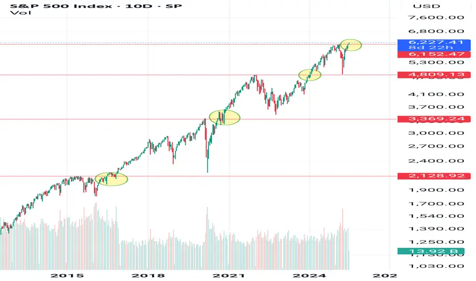
S&P500: Once it breaks the 1W MA50, it doesn't look back.S&P500 has turned overbought on its 1D technical outlook (RSI = 75.570, MACD = 96.940, ADX = 23.950) and rightly so as it is extending the rally after crossing above the 1W MA50. The Channel Up since late 2011 shows that when the index crosses above its 1W MA50, it tends to spend a notable time over it (and every contact is a buy opportunity), with the most recent example being the March 2023 - December 2024 period. The shortest such period has been in 2019, which was suddently disrupted by the black Swan event of COVID. We may have gotten out of a similar situation as Trump's tariffs disrupted the uptrend earlier this year with a huge, unexpected correction. There 1W MA200 supported and this brings us to a new 'above the 1W MA50 bullish phase', which even if it is as short as 2019, it can still target 7,000.
See how our prior idea has worked out:
## If you like our free content follow our profile to get more daily ideas. ##
## Comments and likes are greatly appreciated. ##

July Doesn't Disappoint - S&P Nasdaq Dow Russell All RunningS&P All Time Highs
Nasdaq All Time Highs
Dow Jones closing in on All-Time Highs (and outperforming both S&P and Nasdaq recently)
Russell 2000 playing catch up and moving higher
This is melt-up at its finest
Since US/China Trade Agreement and Middle East Ceasefire Agreement, markets have used
these two events as further catalysts to continue the upside runs
Stochastic Cycle with 9 candles suggesting a brief pause or pullback in the near-term, but
a 3-5-10% pullback is still an opportunity to position bullish for these markets
I'm only bearish if the markets show that they care with price action. The US Consumer isn't breaking. Corporate Profits aren't breaking. Guidance remains upbeat. Trump is Pro Growth and trolling Powell on the regular to run this economy and market HOT demanding cuts (history says that's a BUBBLE in the making if it's the case)
Like many, I wish I was more aggressive into this June/July run thus far, but I'm doing just fine with steady gains and income trades to move the needle and still having plenty of dry powder
on the sidelines for pullbacks
Markets close @ 1pm ET Thursday / Closed Friday for 4th of July
Enjoy the nice long weekend - back at it next week - thanks for watching!!!

Acorn's Smart Money S&P SignalJuly 2, 2025 - S&P broke to the upside confirming a bullish S&P signal. If correct, the bullish S&P indicator suggests the S&P will close above 6177.97 on July 17. Let’s see if the market can continue to the upside!

S&P500 bullish ahead of US employment- NFP numbersHouse Republicans moved Trump’s major tax and spending bill closer to a final vote, which could happen before his July 4 deadline. The package includes tax cuts, immigration funding, and the rollback of green energy incentives. Gamblers are raising concerns about a tax increase in the bill that could affect them.
In trade news, the US eased export rules on chip design software to China as part of an ongoing deal. China’s tone has shifted more positively, with a top official saying he’s hopeful about US-China relations and that conflict between the two is “unimaginable.”
At the Fed, Chair Jerome Powell hasn’t said if he’ll step down when his term ends in May, adding uncertainty. Trump, who wants a loyal replacement, has called for his resignation after a federal agency accused Powell of giving misleading testimony about expensive Fed building renovations.
On Wall Street, value investing made a comeback last quarter. Over 60% of active value fund managers beat their benchmarks by buying cheap industrial stocks and avoiding underperforming sectors like utilities and consumer staples.
Conclusion:
US equities are steady but cautious. Uncertainty around Fed leadership and Trump’s economic plans is keeping markets in check, while improving US-China trade relations and a shift toward value stocks are offering support.
Key Support and Resistance Levels
Resistance Level 1: 6260
Resistance Level 2: 6307
Resistance Level 3: 6355
Support Level 1: 6130
Support Level 2: 6090
Support Level 3: 6055
This communication is for informational purposes only and should not be viewed as any form of recommendation as to a particular course of action or as investment advice. It is not intended as an offer or solicitation for the purchase or sale of any financial instrument or as an official confirmation of any transaction. Opinions, estimates and assumptions expressed herein are made as of the date of this communication and are subject to change without notice. This communication has been prepared based upon information, including market prices, data and other information, believed to be reliable; however, Trade Nation does not warrant its completeness or accuracy. All market prices and market data contained in or attached to this communication are indicative and subject to change without notice.

SPX VS OILHello there.
30 years low cycle is coming to end for OIL and energy.
Every 30 years, market of energy bottom against SPX.
When buy SPX AND NAS ? Each 30 years.
1920->1950->1980->2010->2040
When Sell SPX AND NAS ? Each 25-30 years
19401->970-2000->2025-30->2055-60
Sell SPX WHEN atm ? Well.. follow the last uptrend (blackline), sell when break
Recession always come when Energy > SPX
So.. keep an Eyes on Energy.

#SPX500 Buy 6205.8#SPX500 Buy 6205.8
SL 6145.8
TP 6225.8
TP 6305.8
TP 6445.8
Trade at your own risk
Protect your capital
The Wizard 🧙♂️ SWFX

Bulls and Bears Zone for 07-02-2025S&P keeps going higher after new ATH high earlier this week. Markets could go higher for a while if we see any pullback.
Level to watch: 6232 ---6234

Possible "DIP" into Monday July 7 Tarrif DeadlineHello everyone,
Well we made it. ATH! Well all things must eventually dip. I see a good possibility into next Monday July 7 Tarif deadline plus we are hitting the ATH's prior tops trendline (Red Line)....
I highlight with colored boxes 3 different price targets I think it could dip to before resuming its march higher.
Let's see what happens!

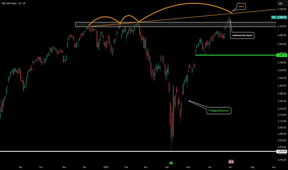
S&P 500 - Confirmed New All Time HighPlease refer to our last post:
The S&P could now be gearing up for the run towards our 1.618 extension around $7k.
We just had a confirmed daily candle breakout above our white box which we have been eyeing for so long. This is the first signal of a major ATH breakout rally for the S&P.
However there is only one thing that could potentially hinder this rally. That would be the orange trendline I have drawn. If price gets rejected somewhere along this orange trendline and price falls back below the white box that would signal a few warning signs. The first would be a failed breakout and the second would be a massive bearish divergence forming on the HTF. With higher highs in price but strength continuing to get weaker keep an eye out for that.
So far things just look great, but just wanted to point that out as a potential scenario.
US500/SPX500 Heist Plan: Grab the Index CFD Loot!Greetings, Profit Pirates! 🌟
Money chasers and market rogues, 🤑💸 let’s execute a daring heist on the US500/SPX500 Index CFD market using our 🔥Thief Trading Style🔥, powered by sharp technicals and deep fundamentals. Stick to the charted long-entry strategy, aiming to cash out near the high-risk Pink zone. Stay alert for overbought conditions, consolidation, or a trend reversal trap where bearish bandits dominate. 🏴☠️💪 Lock in your profits and treat yourself—you’ve earned it! 🎉
Entry 📈
The vault’s cracked open! 🏦 Snatch the bullish loot at the current price—the heist is on! For precision, place Buy Limit orders on a 15 or 30-minute timeframe for pullback entries, targeting a retest of the nearest high or low.
Stop Loss 🛑
📍 Set your Thief SL at the recent swing low (5640) on a 4H timeframe for day trades.📍 Adjust SL based on your risk appetite, lot size, and number of orders.
Target 🎯
Aim for 6160 or slip out early to secure your gains! 💰
Scalpers, Eyes Sharp! 👀
Focus on long-side scalps. Big capital? Dive in now! Smaller funds? Team up with swing traders for the robbery. Use a trailing SL to protect your loot. 🧲💵
US500/SPX500 Market Intel 📊
The Index CFD is riding a bullish surge, 🐂 fueled by key drivers. Dive into fundamentals, macroeconomics, COT reports, geopolitical news, sentiment, intermarket analysis, index-specific insights, positioning, and future trend targets for the full picture. 🔗check
⚠️ Trading Alert: News & Position Safety 📰
News can jolt the market! To safeguard your haul:
Avoid new trades during news releases.
Use trailing stops to lock in profits and limit losses. 🚫
Join the Heist! 💥
Back our robbery plan—hit the Boost Button! 🚀 Let’s stack cash effortlessly with the Thief Trading Style. 💪🤝 Stay ready for the next heist, bandits! 🤑🐱👤🎉

US500 Will Go Up! Long!
Take a look at our analysis for US500.
Time Frame: 1D
Current Trend: Bullish
Sentiment: Oversold (based on 7-period RSI)
Forecast: Bullish
The market is testing a major horizontal structure 6,165.52.
Taking into consideration the structure & trend analysis, I believe that the market will reach 6,451.04 level soon.
P.S
The term oversold refers to a condition where an asset has traded lower in price and has the potential for a price bounce.
Overbought refers to market scenarios where the instrument is traded considerably higher than its fair value. Overvaluation is caused by market sentiments when there is positive news.
Disclosure: I am part of Trade Nation's Influencer program and receive a monthly fee for using their TradingView charts in my analysis.
Like and subscribe and comment my ideas if you enjoy them!

V2. US S&P Zones - PMI Manuf, USINTR, Inflation, DXY & QEV2. US S&P Zones - PMI Manuf, USINTR, Inflation, DXY & QE
US S&P Zone Analysis -- Correlation with
1. Leading Economic Indicators (PMI Manufacturing Index, PMI Services Index, Building Permits)
2. US Interest Rates (MEAN 1.97 from Jan 2003)
3. US Inflation Rate YoY
4. Dollar Index (DXY)
5. Quantitative Easing Episodes
WHY CHANGE IN APPROACH?
As per Ammar Bhai, Red and other Zones for US and developed markets shall not follow only Interest Rates after 2000. Traditional single impact of Interest Rate is not Enough.
NOTE ABOUT INFLATION ABOVE 5%
It was also noticed that if inflation was about 5% that coincided with Red and Yellow zone and it must be avoided for stock trading.
NEW APPROACH
NEW GREEN ZONE
1. PMI Manuf Index is RISING or ABOVE 50
2. Interest Rates are FALLING or LEVELED or BELOW MEAN (Expansionary Policy in Effect)
3. Inflation is FALLING or AROUND TARGET
4. DXY is FALLING or SIDEWAYS
5. Stock Market RISING
NEW APPROACH for RED ZONE
1. PMI Manuf Index is FALLING or BELOW 50
2. Interest Rates are RISING or LEVELED or ABOVE MEAN (Contractionary Policy in Effect)
3. Inflation is RISING or SIDEWAYS. (Also Check if Inflation rate is above 5%)
4. DXY is RISING
5. Stock Market FALLING or SIDEWAYS
NEW YELLOW ZONE
1. PMI Manuf Index is RISING or ABOVE 50
2. Interest Rates are RISING or LEVELED
3. Inflation is RISING or SIDEWAYS (Also Check if Inflation rate is above 5%)
4. DXY is RISING or SIDEWAYS
5. Stock Market RISING or SIDEWAYS
NEW ORANGE ZONE
1. PMI Manuf Index is SIDEWAYS or BELOW 50
2. Interest Rates are FALLING or LEVELED or BELOW MEAN (Expansionary Policy in Effect)
3. Inflation is FALLING or SIDEWAYS (Also Check if Inflation rate is above 5%)
4. DXY is FALLING or SIDEWAYS
5. Stock Market RISING or SIDEWAYS
Historically whenever Interest Rates are dropping, US market goes down for some months:
US somehow try to control Inflation before bringing the interest rates down.
When Inflation is under control and Growth has not gone down much, then they decrease the interest rates
Because in past whenever Interest rates were decreased, growth also fell for some months and then improved.
Then FED does QE, which bring surplus cash in the market, Which drops Dollar rate, that helps the Stock Market grow.

Generally bullish sentiment heading into next weekWednesday's AUD CHF trade finally stopped out. I've been a little surprised by CHF resilience considering the 'risk on' environment. I have read an interesting article suggesting CHF and EUR strength can be attributed to holding relatively high amounts of gold reserves. I'm not sure how much long term credence I'd give that theory but it does make sense.
Meanwhile, the USD turned out to be the currency to short this week as the market starts to price in more rate cuts than thought a few weeks ago. It could be a tricky road ahead for the FED, as softening data, and now today's higher than forecast PCE data means the dreaded 'stagflation' word will be mentioned. But with the VIX well below 20 and the S&P touching all time highs, in the absence of Middle East re-escalation or fresh tariff concerns, I'll begin next week with a mind to continue looking for 'risk on' trades.
For today, I will let Friday's price action do what it's going to do and start fresh next week.

SPX going to all time highsThe quarterly on the SPX is a powerful bullish signal. Nothing stops this train, we are going to all time highs.

S&P. Has been struggling to keep a full bull/bear run.Setting todays fib circle I think it's going to balance out. especially with the fin levels.
Not just because of july.

SPX500 Macro Fibonacci Projection – Eyeing 7190+ 🗓️ Posted by Wavervanir International LLC | June 26, 2025
The S&P 500 continues to respect key Fibonacci zones on the macro scale. After a strong recovery from the recent correction near the 0.5–0.618 retracement region (4800–5100), price is now hovering near critical confluence at the 1.0 level (~6150).
We’re tracking a bullish extension path toward 1.382 and 1.618 Fibonacci levels, which gives us a primary upside target zone between 7,190 and 7,795 — aligning with the projected long-term wave expansion. This structure favors a continued institutional accumulation phase, supported by macroeconomic resilience and liquidity conditions.
🔶 Key Levels to Watch:
Major Support: 4838.28 (0.5 Fib Retest)
Immediate Resistance: 6170–6200
Target Range: 7190.71 → 7795.41
🧠 Bias remains bullish unless price breaks back below 5830 with volume.
This is not financial advice. Shared for educational and strategic insights.
Let me know your thoughts, traders!
—
#SPX500 #Fibonacci #WaverVanir #MacroTrends #StockMarket2025 #QuantitativeAnalysis

Your investor profileEach investor has unique characteristics:
The amount of their current investments and savings
Their capacity to generate future income and allocate it to savings
Their personal and financial circumstances that may condition their liquidity needs
Their motivations and objectives for saving
Their discipline
Their willingness to learn
The time available for monitoring
Their knowledge and experience
Their risk aversion
All these characteristics are called investor profile .
Unless all these characteristics of your profile change, you must stay true to your investor profile. Bullish market environments are a temptation to take on more risk than we should.
It is also important to keep in mind that your investor profile changes with your life cycle .
While it’s great to share experiences, your investor profile is unique . When making your decisions, take advice based on your individual characteristics.
It is very important that you seek advice from trusted platforms and professionals and pay special attention to ensure that there is no clear commercial bias that could lead you to certain products or operations that may not suit your investor profile.
It is not a wise decision to copy from others : friends or forums created by entities with an obvious commercial bias, because your investor profile is unique.
Did you like it? Share with your friends.
by HollyMontt

rePOST - SPX Weekly Technical Breakdown – Week of June 22, 2025
SPX
Weekly Technical Breakdown – Week of June 22, 2025
After consolidating in a tight range earlier this month,
SPX
printed a subtle but significant outside day on Friday — breaking Thursday’s high by just 0.01 and forming a broadening formation. Like
QQQ
, this pattern reflects indecision and a potential shift in structure as bulls and bears battle for control. The short-term range is wide, with support at 5963.21 and resistance near 6026.68. Holding above 5963 can keep buyers in and opens the door for a retest of the psychological 6000 level, followed by 6059.40 (all-time high). However, a close back below 5963.21 could open the path for a quick flush toward 5900. Key intraday levels to watch include 5929, 5940.03, 5954.06, 5974.86, 5989.43, 6002.32, 6012.94, 6026.68, 6044.56, and 6059.21.
Technical Summary
• Structure: Outside day Friday formed a broadening formation
• Event Note: Slight break of Thursday’s high by 0.01 confirms outside bar structure
• Daytrade Pivots: 5929, 5940.03, 5954.06, 5974.86, 5989.43, 6002.32, 6012.94, 6026.68
• Macro View: SPX improves technically above 6000; breakout confirmed over 6026.68
• Downside Risk: Failure to close above 5963.21 could trigger fast move toward 5900
• Momentum Bias: Neutral to bearish until 6000+ is reclaimed and defended
Key Levels to Watch
🟢 Upside Resistance: 5974.86, 5989.43, 6002.32, 6012.94, 6026.68, 6044.56, 6059.21, 6059.40 (ATH)
🔴 Downside Support: 5963.21 (must hold), 5954.06, 5940.03, 5929
Trade Plan
• Hold above 5963.21 keeps upside scenario intact — look for reclaim of 5974.86 and 6000+
• Close below 5963.21 flips structure and may accelerate toward 5929, possibly 5900
• Scalps remain viable near 5954–6002 using intraday reactions at key levels
Decision Map
🟩 IF SPX HOLDS ABOVE 5963.21 → reclaim 5974.86 → target 5989.43 → 6002.32 → breakout toward 6026.68 → 6059.40 (ATH)
🟥 IF SPX BREAKS BELOW 5963.21 → watch 5954.06 → 5940.03 → 5929 → 5900 possible flush
Primary Trade Zone: 5954–6002
Alert Levels
Set alerts above: 5974.86, 6002.32, 6026.68
Set alerts below: 5963.21, 5940.03, 5929
This Week’s Key Catalysts for
SPX
This week’s economic calendar is packed with market-moving data that will likely influence
SPX
and broader risk appetite.
• Tuesday, June 24: Fed Chair Powell testifies to the House Financial Services Committee. His tone and guidance on future policy will be a primary driver for market direction. The same day also includes Consumer Confidence (June) and Fed commentary from Cleveland Fed President Beth Hammack — both potentially impactful.
• Thursday, June 26: Heavy data day with initial jobless claims, durable goods orders (May), core goods data, and the second revision of Q1 GDP. These reports will offer insight into both the labor market and the broader health of the U.S. economy.
• Friday, June 27: The most important inflation data of the week arrives with the PCE index and Core PCE (May). These are the Fed’s preferred inflation gauges and could shape expectations for a rate cut later this summer.
Overall, market participants will be closely watching Powell’s tone, inflation data, and any sign of slowing growth. Combined with Friday’s outside day and broadening structure,
SPX
is positioned for a move — the catalyst will determine the direction.

S&P 500 - Pay Attention All the world events going on right now has put the S&P in a very interesting position. Even on the brink of war we have seen the SPX pushing towards all time highs. Right now it is entering the major supply zone (where we have seen many tops form) between $6,090 and $6,150. This supply zone has been forming since Dec 2024 and is very important to keep and eye on. Either price will create a macro double top/M pattern and lead us back towards the lows, or we will break above this supply zone a start the expansion phase towards our 1.618 which is currently just slightly below $7k.
The macro looks amazing as our lower white line represents of 2021 previous ATH and during the tariff collapse perfectly got flipped into a new level of support which we represent as our 2025 Macro Low.
The short term is also looking decent. We have identified price is about to enter major resistance so if we do see a pullback we want to target that $5,800 level as the level buyers need to hold to continue momentum. If buyers can push price to new highs in the short term we expect to see that move towards $7k by the end of the year.
