Treasury Yield 1 month.. US10Y, US20Y, US03MY, US01MYFunny things happen when you use a little reasoning...
don't need to explain more...but weird how the levels and the patterns just scream right at yah...
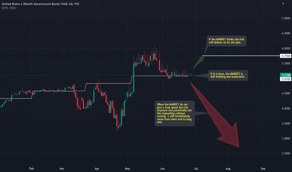
US01MY trade ideas

US01MY : An important chartThis chart is actually quite important. I take a look at it all the time.
It would be quite interesting when it starts to fall, ever so slightly at first, just below the EFFR.
We also need to understand which arrow is the BIGGER one. The green or the RED. This can easily answer which is the bigger POTENTIAL :)
Good luck.
P/S : DO not just believe what I say. Use your common sense.
If we look at the chart of most FX pairs, try not to look at the price action. Instead, look at the movement in volume. What I can see is that the MARKET is checking out if there are anymore BUYERs of risky assets. We can see it is running out of buyers, i.e. suckers. What lies ahead is easy to figure out.

Navigating The American Debt Ceiling DramaSome people create their own storms. And then get upset when it starts to rain. US Debt Ceiling drama is akin to a soap opera that never ends.
Debt ceiling issue is not new. Why bother now? Political polarisation in the US has got to unprecedented levels. The showmanship could tip over into a political nightmare. It could send economic shockwaves with impact deeply felt both within US and well beyond its shores.
Many politicians seemingly are so pulled away from reality that their fantasies aren’t working. Wishing away a problem out of its existence is not a solution.
The Debt Ceiling is here. US defaulting on its debt is highly unlikely. Scarily though, the probability of that occurrence is non-zero.
This paper looks at recent financial history surrounding prior debt ceiling episodes. Crucially, it delves into investor behaviour and their corresponding investment decisions across various asset classes.
When uncertainty looms large, straddles and spreads arguably deliver optimal hedging and investment outcomes.
A SHORT HISTORY OF DEBT CEILING. WHAT IS IT? HAS IT BEEN BREACHED BEFORE?
The US debt ceiling is a maximum cap set by the Congress on the debt level that can be issued by the US Treasury to fund US Government spending.
The ceiling was first introduced in 1917 to give US Treasury more flexibility to borrow money to fund first world war.
When the US government spends more money than it brings in through taxes and revenues, the US Treasury issues bonds to make up the deficit. The net treasury bond issuance is the US national debt.
Last year, the US Government spent USD 6.27 trillion while only collecting USD 4.9 trillion in revenue. This resulted in a deficit of “only” USD 1.38 trillion which had to be financed through US treasury bond issuance.
This deficit was not an exception. In fact, that’s the norm. The US Government can afford to and has been a profligate borrower. It has run a deficit each year since 2001. In fact, it has had budget surplus ONLY five (5) times in the last fifty (50) years.
If that wasn’t enough, the deficit ballooned drastically from under USD 1 trillion in 2019 to more than USD 3.1 trillion in 2020 and USD 2.7 trillion in 2021 thanks to massive pandemic stimulus programs and tax deferrals.
This pushed the total US national debt to a staggering USD 31.46 trillion, higher than the debt ceiling of USD 31.4 trillion.
The limit was breached! So, what happened when the ceiling was broken?
Not that much actually. When the ceiling is broken into, the US Congress must pass legislation to raise or suspend the ceiling. Congress has raised the ceiling not once but 78 times since 1970.
The decision is usually cross-partisan as the ceiling has been raised under both Republicans and Democrats. It was last raised in 2021 by USD 2.5 trillion to its current level.
Where consensus over raising the ceiling cannot be reached, Congress can also choose to suspend the ceiling as a temporary measure. This was last done from 2019 to 2021.
Since January, the Treasury has had to rely on the Treasury General Account and extraordinary measures to keep the country functioning.
Cash balance at the Treasury remains precariously low. Its operating balance stood close to nearly USD 1 trillion last April but now hovers around USD 200 billion.
Such reckless borrowing! Yet US continues to remain profligate. How?
Global investors have confidence in the US Government's ability to service its debt. Despite the increasing debt, the US Government continues to pay investors interest on its bonds without a miss.
Strong economic growth and its role as a global economic powerhouse assuages investor concerns over a potential default.
Additionally, where Treasury does not have adequate operating cash flow, it leans on a credit line from the Federal Reserve (“Fed”). The dollar’s strength and reserve status contribute to the US Government’s creditworthiness and vice-versa.
The Fed is also the largest holder of US government debt. It holds USD 6.1 trillion as of September 2022 (20% of the overall debt). The share of government debt held by the Fed surged to current levels from just above 10% during the pandemic due to massive purchases of treasury bills by the Fed as an emergency stimulus measure.
GROWING US DEBT IS BECOMING A SOURCE OF CONCERN
US debt has ballooned during the pandemic. It is deeply concerning for multiple reasons. Key among them is the risk of default. Although debt has increased significantly, GDP growth during this period has been tepid due to pandemic restrictions stifling economic activity.
As such the ratio of national debt to GDP, a measure of the US’s ability to pay back its loan has also skyrocketed. This increases the risk that the US Government may fail to service its debt.
A US Government default would lead to surging yields on treasury bonds and crashing stock prices. It would also call into question its creditworthiness limiting future borrowing potential.
A default will also have far-reaching economic consequences threatening dollar hegemony which is already being challenged on multiple fronts.
Another concern is the rising cost of servicing the debt. Servicing the debt is the single largest government expense. Interest payments on debt this year are expected to reach USD 357.1 billion or 6.8% of all government expenditure.
Additionally, with the Fed having raised interest rates with no stated intention of pivoting in 2023, the interest rate on US public debt, which is currently at historical lows, will also rise.
DEBT CEILING BREACH AGAIN. SO WHAT? LOOKING BACK IN TIME FOR ANSWERS.
There has been more than one occasion when political disagreements resulted in Congress delaying the raising of the debt limit.
In 2011, political disagreements pushed the government to the brink of default. The ceiling was raised just two (2) days before the estimated default deadline (the “X-date”).
Despite the raise, S&P lowered its credit rating for the United States from AAA to AA+ reflecting the effects that political disagreements were having on the country’s creditworthiness.
This played out again in 2013 due to same political disagreements. Thankfully, for investors, the effects of the 2013 crisis on financial markets were not as severe.
Flash back. Equity markets initially dropped after the debt ceiling was reached and investors worried that the disagreements would not be resolved in time. In July 2011, markets started to recover as both parties started to work on deficit reduction proposals.
Then on July 25th, just eight (8) days before the borrowing authority of the US would be exhausted, Credit Default Swaps on US debt spiked and the CDS curve inverted as participants feared that a deal would not be reached in time. This led equities sharply lower.
On August 2nd, a bill raising the ceiling was rushed through both the House and the Senate. Following this S&P lowered US credit rating from AAA to AA+ citing uncontrolled debt growth. Equity prices continued to drop even after the passage of the bill.
Commodities showed similar price behaviour heading into the passage of the bill. However, unlike stocks, gold and silver prices rallied after August 2nd.
The USD weakened against other currencies before the passing of the bill but recovered after August 2nd.
Treasury yields trended lower but spiked during key events during this period. Short-term treasury yields remained highly volatile. Following crisis resolution, yields plunged sharply.
US DEBT CEILING CRISIS AGAIN. WHAT NOW IN 2023?
The US reached its debt ceiling again in January 2023 and yet another debt crisis. 2013 is repeating itself again as lawmakers disagree over whether to raise the ceiling further or bring the budget under control.
The Congressional Budget Office (CBO), a non-partisan organization, has estimated that the US could be at a risk of default as early as June 1st.
Republicans disagree with the Biden administration. They seek budget cuts to reduce annual deficits while Democrats want the ceiling to be raised without any conditions tied to it.
This crisis is exacerbated by rising political polarisation in the US. Not just metamorphically, the Republicans and Democrats are at each other’s throat.
A study by the Carnegie Endowment for International Peace found that no established democracy in the recent past has been as polarised as the US is today. This raises the risk that Congress gets into a stalemate.
Moreover, the house is only in session for 12 days in May. After the law is passed in Congress it must also pass through the Senate and the President. The availability of all three overlap on just seven (7) days, the last of which is the 17th of May. This means that lawmakers have just 3 days (from May 12th) to reconcile their differences before the US is put at risk of default.
POSITIONING INVESTMENT PORTFOLIOS IN DEBT CRISIS WITH X-DATE IN SIGHT
What’s X-date? It refers to the date on which the US Government would have exhausted all its options except debt default.
The X-date could arrive as early as June 1st. There is a small chance that it could arrive in late July or early August. The US Government collects tax receipts in mid-June. If the US Treasury can stretch until then it will have enough cash to last another six weeks before knocking against the debt ceiling again.
The current crisis has been brewing. Equity markets remain sanguine. But near-term treasury yields have started panicking. Short term yields have spiked. The difference in yield on Treasury Bills that mature before the likely X-date (23/May) & after it (13/June) has shot up.
Muted equity markets create compelling opportunity for short sellers. In the same vein, it also presents buying opportunities when debt ceiling is eventually lifted.
When up or down is near impossible to predict, an astutely crafted straddle or time spread can save the day.
DISCLAIMER
This case study is for educational purposes only and does not constitute investment recommendations or advice. Nor are they used to promote any specific products, or services.
Trading or investment ideas cited here are for illustration only, as an integral part of a case study to demonstrate the fundamental concepts in risk management or trading under the market scenarios being discussed. Please read the FULL DISCLAIMER the link to which is provided in our profile description.

30day tbill above 5.5% next target 6 % as the forecast So this is the only place that is safe . As the cycles move from inflationary to deflationary

US01M - U.S. 1 Month Treasury - Long IdeaUS01M - U.S. 1 Month Treasury Bonds
Long Idea, With Potential Upside Targets On Chart.
Enjoy!
(If this plays out, expect Equities and Crypto to get rekt'ed in the next 2-3 weeks.)

How to improve your trading by looking at interest rates: Part 4Hey everyone! 👋
This month, we wanted to explore the topic of interest rates; what they are, why they are important, and how you can use interest rate information in your trading. This is a topic that new traders typically gloss over when starting out, so we hope this is a helpful and actionable series for new people looking to learn more about macroeconomics and fundamental analysis!
You can think of rates markets in three dimensions.
1.) Absolute
2.) Relative
3.) Through Time
In other words;
1.) How are rates traded on an absolute basis? AKA, do they offer an attractive risk/reward for investors?
2.) How are rates traded on a relative basis? AKA, what separates bond prices between different countries?
3.) How are rates traded through time? AKA, what is the "Yield Curve"?
In our first post , we took a look at how to find interest rate information on TradingView, and how rates fluctuate in the open market. In our second post , we took a look at some of the decision making that investors have to make when it comes to investing in bonds (rates) vs. other assets. In our third post , we took a look at rates on a relative basis between countries.
In today's final post, we'll be looking at how rates are traded through time - in other words, the Yield Curve. What information can you glean from looking at the Yield Curve? How can it help your trading plan? Let's jump in and find out!
For reference, let's first get a look at the Yield Curve:
This chart contains a couple different assets, so let's break them down quickly.
The white/blue area is the rate of interest you receive for 2 year bonds when you buy them
The orange line is the rate of interest you receive for 5 year government bonds when you buy them
The teal line is the rate of interest you receive for 7 year government bonds when you buy them
The yellow line is the rate of interest you receive for 10 year government bonds when you buy them
The purple line is the rate of interest you receive for 30 year government bonds when you buy them
As you can see, differing maturities for bonds pay different yields over time.
If you purchased a 2 year bond in early 2021, you'd be earning 0.15% yield PER YEAR.
At the same time, if you purchased a 30 year bond in early 2021, you'd be earning 1.85% yield PER YEAR.
The situation has changed since then. Currently:
If you purchase a 2 year bond, you're earning 3.56% yield PER YEAR.
if you purchase a 30 year bond, you're earning 3.45% yield PER YEAR.
In other words, the situation has completely flipped.
Why did this happen?
There are a few reasons, linked to many of the topics we discussed in the last few posts. Let's break them down.
1.) Central Bank Funds Rate risk
2.) Inflation Risk
3.) Credit Risk
4.) Market Risk
To start, from early 2021 to now, the central bank has raised the funds rate materially. This means that government bonds must see their yield increase. Why lend money to the government if you get more sticking your cash in a savings account?
Secondly, inflation has picked up. This has been a result of supply shocks across the globe for commodities & services. As shortages have cropped up and demand has been steady or increasing, increases in the price of everyday goods has led short term bonds to "Catch up" to the yields of longer maturity bonds.
Thirdly, as GDP has shrunk over the last two quarters, the risk that the U.S. government will be unable to pay back its debt through tax receipts and bond issuance rises.
Finally, as we said in the second post:
When stocks are outperforming bonds, institutional demand for stocks is higher, indicating that people are feeling good and want to take risk. When bonds are outperforming stocks, it can be indicative that people would prefer to hold 'risk free' interest payment vehicles as opposed to equity in companies with worsening economic prospects.
This demand for bonds plays out across the Yield Curve. Demand for 'risk free' assets increases as the economic outlook worsens, meaning that the Yield Curve is indicative of how market participants think the market situation will play out over a given period of time. If the yield for 2 year bonds is higher than 10 year bonds, then market participants through their purchases and sales are articulating that they expect the next two years to have more economic risk than the next ten. In other words, they expect some sort of economic slowdown.
This is extremely useful for multiple types of traders:
Equities are tied to the economy - if rates are saying something about economic prospects, then it's smart to pay attention, as it may inform your asset selection process / trading style
FX is intimately tied with rates - if rates are moving, FX is sure to be impacted.
Crypto has shown a high inverse correlation historically with the "ease of money" index. If rates are going up, then non-interest paying crypto becomes less attractive.
Anyway, that's all for our series on Interest Rates!
Thanks so much for reading and have a great rest of your weekend.
- Team TradingView ❤️

US Treasury yield curve with Fed Funds and RRP rateNo prediction. This is a study of the US Treasury yield curve in relation to the Fed Funds and RRP rate.

All the Treasury Yields Together (2002 - Present)US10Y - US02Y , "Ten minus two" yield curve is what everyone talks about but I think if you look at all the yields together it's a much clearer story.
Only have data going back to 2002 :(
Light Gray Areas Indicate Recessions
PS there are a few uncommonly used government yields that I've hidden to make the graph easier to read. You can unhide them if you want.

All the Treasury Yield Curves going back to 2002US10Y - US02Y, "Ten minus two" yield curve is what everyone talks about but I think if you look at all the yield curves together it's a much clearer story.
Only have data going back to 2002 :(
Light Gray Areas Indicate Recessions
PS there are a few uncommonly used government yields that I've hidden to make the graph easier to read. You can unhide them if you want.


US01MY rate cut tomorrow?Appears that not everyone is convinced Powell will cut rates tomorrow. 1 month yield depends entirely on tomorrow's decision.
3 month yield might not move if they signal a cut un October.
