Yield Spreads Warning About the Secular Bull MarketAre we in the final innings of the current secular bull market that emerged from the robust injection of liquidity in response to the 2008 Financial Crisis? Yield spreads are giving us a warning and one that should not be dismissed. Yield spreads show (shorter to longer in lighter blue to darker blue) a spread that has been shrinking, for quite some time. The yield curve has been inverted for a while too. As we tread these dangerous waters, one has to wonder, when and where will the next event to cause a credit contraction come from? Is it a bubble? Can it be AI, Credit, geopolitics, currency based? Something will distress the credit markets and, as long as the yield spread remains shrunken, this event will almost certainly cause a recession. TVC:US02Y PYTH:US10Y TVC:US30Y SP:SPX
US02Y trade ideas

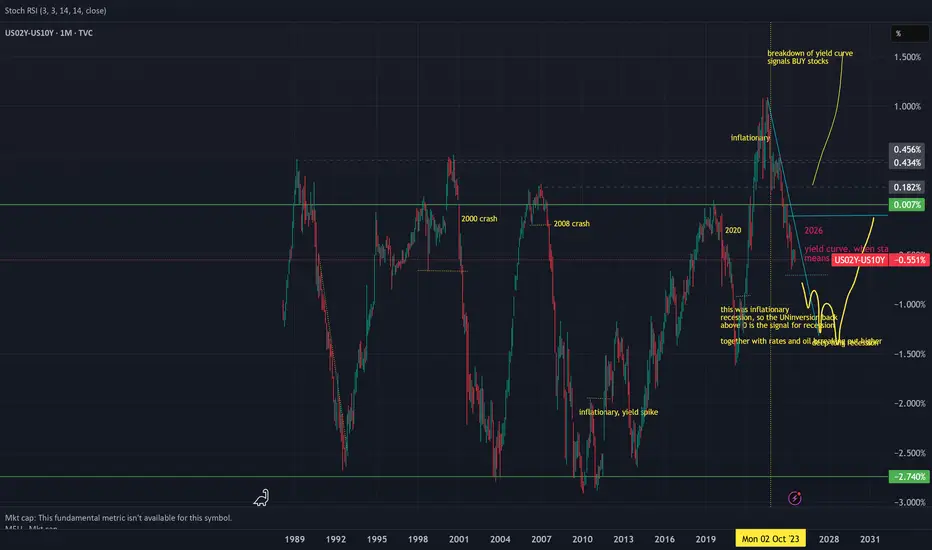
yield curve signalling recession when it turns down except 2025 in 2025 this broke as stocks roar while yield curve is crashing down
US02Y Bond ShortUS02Y bond is now net short on the regression break.
I am considering taking this trade.
US02Y Bond LongUS02Y is now net long on the regression break.
There appears to be a increase in hedging as the stock market push to new highs.

looks like a distributionThis is logaritmic chart from US2Y, commercials offloading their positions or the other part is closing their positions???
This is how I see the odds split for a recession.This is how I see the odds split for a recession.
Above the black line, recession less likely.
Below the red line, recession more likely.
The Fed fund rate tracks this over time.

A crash in the horizonAs I have been suspecting for a long time. Markets are getting closer to a crash. On the weekly the 2 years bond market confirmed the change in the trend to the downside. Once we dip bellow the blue ema we might be entering in a doomed phase. Cheers

Short Term YieldsA very short term outlook on the short end of the yield curve...
This is a KEY chart to understand where the risks reside (recession or not).
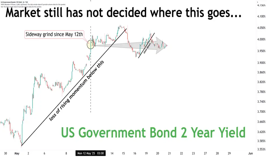
Where do you think this goes next?
RecessionsWatch what the aggregate of market participants are doing.
Above black= recession risk is lower
Below red = recession risk is higher
So no... the economy is not out of the woods yet.

Stock markets STILL not out of the woods.Stock markets STILL not out of the woods.
The setup is there for an EPIC fail.
But WHEN?

2-Year US Treasury Yield: The Market's Immediate Sentiment GaugeThe 2-year Yield currently trades at 3.805%, unfolding within a well-defined three-year falling wedge pattern. This formation follows an extraordinary surge from 0.105% in January 2021 to 5.283% in October 2023—reflecting rapid Fed rate hikes and inflation expectations. The 4.00% level, which aligns with the Fibonacci 23.6% retracement, has been tested multiple times, indicating it as the immediate battlefield for bulls and bears.
Warning Signs: If yields fail to stay above 4.00%, a decline toward 3.54% and 3.25% becomes probable, with further downside risk to 2.80%, 2.62%, 2.34%, and potentially 2.16%. A drop this deep would imply markets are aggressively pricing in future rate cuts or recession fears.
Breakout Scenario: A decisive break above 4.00% would violate the falling wedge ceiling, targeting 4.17% and 4.46% and possibly retesting the 5.00% highs. This would indicate renewed fears of sticky inflation or delayed Fed easing.
Fundamental Reflection: The 2-Year is the cleanest read on front-end Fed policy sentiment. Its sensitivity to Fed language, inflation trends, and geopolitical disruption (e.g., tariffs) means its technical posture is deeply rooted in macroeconomic fragility.

US02YThe differential between the US02Y (2-year U.S. Treasury yield) and EUR02Y (2-year Eurozone government bond yield) significantly influences the trade directional bias for the USD and EUR this month. Here's how:
Impact of Yield Differential on Currency Trade
Interest Rate Differentials: A widening yield spread between US02Y and EUR02Y, where U.S. yields rise more than Eurozone yields, typically supports the U.S. dollar (USD) against the euro (EUR). This is because higher yields in the U.S. attract more capital, increasing demand for the USD and causing it to appreciate relative to the EUR. Conversely, if Eurozone yields rise faster, the euro may strengthen against the dollar.
Monetary Policy Expectations: The yield differential also reflects expectations about future monetary policy actions by the Federal Reserve (Fed) and the European Central Bank (ECB). If the yield spread widens in favor of the U.S., it may indicate expectations of more aggressive rate hikes by the Fed compared to the ECB, supporting the USD. If the spread narrows or reverses, it could signal a more dovish Fed stance or a more hawkish ECB stance, potentially weakening the USD.
Risk Sentiment and Economic Outlook: Rising yields in either region can signal improving economic conditions and confidence, attracting investment and supporting the respective currency. However, if yields rise due to inflation concerns or economic uncertainty, the impact on currency strength can be more complex.
Trade Directional Bias This Month
USD Bias: If the US02Y yield remains higher than the EUR02Y yield, Long positions in the USD, expecting it to strengthen against the EUR due to higher returns and potentially more aggressive Fed rate hikes.
EUR Bias: Conversely, if the EUR02Y yield rises faster than the US02Y yield, long positions in the EUR, anticipating euro strength due to higher returns and possibly more hawkish ECB policy.
Key Factors to Watch
Monetary Policy Announcements: Any statements from the Fed or ECB about future rate decisions can significantly impact yield differentials and currency movements.
Economic Indicators: Data on inflation, GDP growth, and employment can influence yield spreads and currency trade.
Market Sentiment: Shifts in investor risk appetite and confidence in economic growth can also affect currency direction.
In summary, the yield differential between US02Y and EUR02Y is a crucial indicator for determining trade directional bias in the USD/EUR pair. A wider spread favoring the U.S. generally supports the USD, while a narrowing or reversal supports the EUR.

US02YAs of April 2025, China holds approximately $759 billion to $761 billion in U.S. Treasury securities, making it the second-largest foreign holder of U.S. debt after Japan. This is a significant reduction from its peak holdings of $1.316 trillion in November 2013.
Potential Effects if China Sells Its U.S. Treasury Holdings
If China decides to sell off its U.S. Treasury holdings, the potential effects could be substantial:
Spike in U.S. Interest Rates: A mass sell-off would flood the market with U.S. Treasuries, depressing their prices and causing yields (interest rates) to rise sharply. Higher borrowing costs for the U.S. government could exacerbate fiscal challenges.
Weakened U.S. Dollar: Selling large amounts of Treasuries would likely weaken the dollar as demand for dollar-denominated assets declines. This could lead to inflationary pressures within the U.S..
Global Financial Shock: The sudden liquidation of such a large asset pool could destabilize global financial markets, given the interconnectedness of economies and reliance on U.S. Treasuries as a safe-haven asset.
Economic Impact on China: Dumping Treasuries would also hurt China by reducing the value of its remaining holdings and potentially destabilizing its own economy due to reduced export competitiveness and financial ripple effects.
Likelihood of a Sell-Off
Despite these risks, such a move is considered unlikely for several reasons:
Mutual Economic Dependency: The U.S.-China economic relationship is deeply intertwined, with China relying on U.S. debt as a safe investment for its foreign exchange reserves and the U.S. benefiting from China's purchase of Treasuries to fund its deficit.
Self-Inflicted Damage: A sell-off would harm China’s own financial stability and trade relations, making it a risky strategy even during heightened tensions.
In conclusion, while the threat of China weaponizing its Treasury holdings exists, it remains a double-edged sword that would inflict significant damage on both economies and global markets

IT IS GETTING UGLY OUT THERE.IT IS GETTING UGLY OUT THERE.
Expect the Fed to cut rates real soon.
Then cut them again.
And again.
The weekly US02Y downtrend has started. As I have been expecting months ago, now the downtrend is been printed on the guppy emas. The trend is changing to red like in the past. This indicates that maybe a big correction might follow the SP500 in the coming months.

US2Y - BUY (SELL BOND) strategy 3 hourly chart - regression The 2Y US yield has move lower and broken important yield level of 3.9650 area. The GAP lower 3.8500 currently, is providing an extremely oversold reading and other time frames are oversold as well but not as severe.
Strategy SELL BONDS @ 3.78-3.8350 yield and take profit with a 15 basis points toughly benefit. It does also support some US$ strength in coming sessions, is my personal view.

The FED will cut rates.The FED will cut rates.
Then cut again.
Then cut some more.
Until there is nothing else left to cut.

US02Y hidden bearish divergence and RSI rejection from level 40
US02Y could be repeating a pattern from August 2024. Hidden bearish divergence (continuation of lower highs) and rejection of RSI from level 40. Following the rejection, the yields went lower.
US02Y going lower is bullish for risk assets.
In addition, US02Y could be on the verge of a fifth Elliott wave to the downside. The second wave overshot a little the textbook 0.618 fib level. The fourth wave retraced a little less than the textbook 0.386 fib level. Given the RSI analysis above, the fifth wave could be starting now leading US02Y lower. This would be bullish for risk assets such as stocks and crypto.

How we financing this¿Yields have been going down for 40 years while debt/gdp growing, how are we financing this hiking rates?

Rate Cuts Are NOT BullishRate cuts in the US have never been bullish for equity markets in macro cycles. The idea that rates coming down from 5% to 4% suddenly making people more creditworthy is a farce because rates never move in anything other than large timeframe tides. These tides reflect growth/inflation expectations, not borrowing costs.
Were Jerome Powell to suddenly become very dovish at the next FOMC meeting it would be a clear signal that the SHTF protocol is in full effect. Powell is more likely to talk away the negative GDP prints as demand shocks due to tariffs/trade deficit imbalances while waiting for more data to make a decision. Labor market has been declining as well but he doesn't want to make a panic decision and also probably feels no personal loyalty to help President Trump out.
Historical average for US inflation is about 3.2% with the 2% target meaning deflation is a possible problem incoming. Current US inflation rate is about 3% which is well inline with the historical average. Powell will never say it but so far his mission has been accomplished. He may cut rates at the back end of the year if necessary but as of this post he has no reason to.

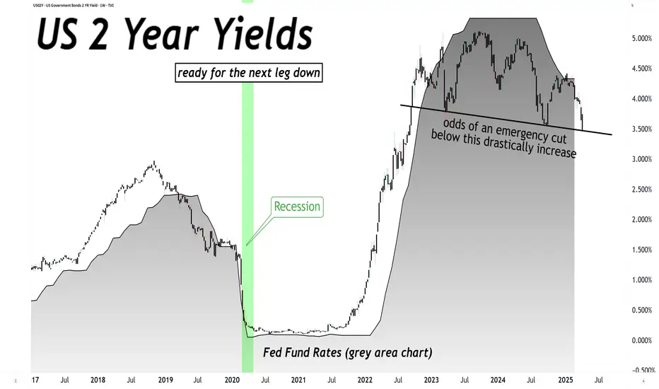
US 2 Year Yields Falling Back Below Key Pivot!US 2 Year Yields Falling Back Below Key Pivot!
Is the next leg down signaling a major market correction?
Expect the Fed Fund Rates to be cut sooner rather than later.
However, no need to front run this possibility, simply observe the charts. Stay safe.

US01Y Bond LongUS02Y Bond is now net-short with the 05Y and 10Y bond.
Is this a sign of things to come in the market?

The Most Effective way to fight Tariffs, is to Sell BondsIn an era when protectionist tariffs have become a go-to tool for DUNCE Political leaders such as President Voldemort, it is time for investors, institutions and nation states to take a stand—and not through traditional protest, but by wielding the formidable power of financial markets. Tariffs, by raising costs and distorting trade, can sap economic growth. Yet, as history and recent trade wars have shown, the real battleground is not just at the border but in the bond markets. The BIG FRAUD of created by American's "Buy, Borrow, Die" mental illness is already at a point where it could burst any moment and the best needle to poke this bubble is the 2 Year Bonds. If these bonds default, a recession will likely happen and it is unlikely a republican majority will be elected in the house and senate during the mid-term cycle.
Therefore, the most aggressive and effective countermeasure is to sell off short-dated (2‑year) bonds in favor of longer‑dated (5‑ and 10‑year) bonds, and to liquidate any and all U.S. bonds held by companies in politically “red” states. This would mean the debt they hold is being sold for pennies on the dollar, like Twitters loan already is...
Tariffs and Trade Wars: Lessons from Recent History
The recent imposition of tariffs by the Trump administration on imports from Mexico, Canada, and China has sparked a new wave of economic disruption. These tariffs—intended to protect domestic industries—have instead triggered retaliatory measures and rattled global markets. As reported by Reuters, the trade war initiated by these tariffs has not only led to rising costs for consumers but also to significant volatility in financial markets. Such aggressive trade policies reveal an underlying fiscal vulnerability that can be exploited through strategic bond trading.
REUTERS.COM
Historically, trade wars have often served as the catalyst for broader financial instability. When tariffs escalate, investors flock to safe-haven assets, yet the resulting market dynamics also open up opportunities for those who know where to look. Now is the moment to pivot—and the bond market is the perfect arena for this counteroffensive.
Historical Defaults: A Wake-Up Call
Contrary to the oft-repeated claim that “the U.S. has always paid its bills on time,” history tells a different story. There have been several notable instances—ranging from the demand note default during the Civil War to the overt default on gold bonds in 1933 and technical defaults such as the 1979 payment delays—that remind us of the inherent risks in our national fiscal practices. These episodes highlight that U.S. bonds, despite their reputation for safety, are not immune to default under fiscal duress.
THEHILL.COM
This historical perspective should not only unsettle complacent investors but also embolden them to leverage the bond market as a tool of economic resistance. By strategically repositioning bond portfolios, investors can exacerbate fiscal pressures on policymakers who rely on the illusion of unfailing debt service.
The Yield Curve: An Opportunity for Tactical Rebalancing
The current structure of the U.S. Treasury yield curve presents an unprecedented opportunity. Short‑term bonds—especially the ubiquitous 2‑year Treasuries—are trading at levels that no longer justify their risk, given the market’s expectation of a steepening curve as longer‑term yields are poised to rise. By aggressively selling off 2‑year bonds and using the proceeds to acquire 5‑ and 10‑year bonds, investors can capture the benefits of a steepening yield curve. This strategy not only enhances returns but also sends a powerful signal: the market is rejecting the financial underpinnings that allow tariffs to be financed cheaply.
This repositioning weakens the liquidity available for financing government policies that sustain tariffs, thereby indirectly undermining the protectionist agenda. As bond market dynamics come into sharper focus amid rising inflation fears and fiscal deficits, this tactical shift represents a proactive measure to tilt the scales back in favor of free trade.
REUTERS.COM
Targeting “Red State” Bonds: A Political and Financial Imperative
It is no secret that companies based in states with predominantly conservative (or “red”) leadership have often been the political bedfellows of tariff advocates. These companies not only benefit from protectionist rhetoric but also tend to issue bonds under fiscal conditions that make them particularly vulnerable when market sentiment shifts. Moreover, they also tend to be overvalued anyway so the likelihood of panic selling is more likely. The time has come to liquidate any and all U.S. bonds issued by red state companies. By divesting from these securities, investors can both shield themselves from potential losses and apply market discipline on a sector that has, for too long, been insulated from the harsh realities of global trade dynamics.
This aggressive divestiture sends a dual message: a rejection of protectionist policies and a call for a more balanced, market-oriented approach to national fiscal management. It is a bold stance that forces a rethinking of the relationship between politics and finance—a reminder that no company should be immune to the corrective forces of the market.
Conclusion
Tariffs are not just trade policy—they are fiscal weapons that rely on the ability to finance cheap debt. History has shown that even the most stalwart bond markets are susceptible to default under pressure, and recent trade wars have only amplified these vulnerabilities. The solution is clear and decisive: sell off 2‑year bonds and reinvest in 5‑ and 10‑year bonds, while liquidating U.S. bonds held by red state companies. This aggressive financial maneuver not only promises better returns in a steepening yield curve environment but also serves as an effective counterattack against protectionist tariffs.
By rebalancing portfolios in this manner, investors take an active role in challenging policies that restrict free trade and hinder economic growth. In the world of modern finance, sometimes the best way to fight back is to let your portfolio do the talking.
Disclaimer: This article reflects a strongly opinionated perspective and is intended for informational purposes only. It does not constitute financial advice. Investors should conduct their own research and consult with a professional advisor before making any investment decisions.
