RASA38
Example of a bearish wedge. The wedge slope is against the market trend.
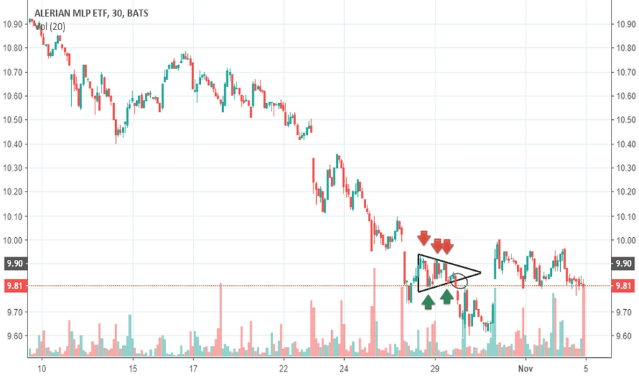
Alerian MLP ETF (AMLP) A symetrical triangle is shown, between 26 and 29 oct 2018. Is a continuation pattern; trend lines are touched by the chart two and three times (see arrows) . At two thirds of the triangle, a breakout ocurred, continuing the previous trend (bearish).
JP Morgan Chase Capital XVI ETF (AMJ) , temporality: 3M An uptrend channel is shown between 02 and18 jul 2018. A trend line is drawn touching the lows of the chart at support levels. Then a paralel lione is projected to the peaks, forming the channel with a positive (ascending) slope. Note that support levels doesn´t go bellow prios minimums as well as resistance...
During the bubble of price of BTCUSD at the end of 2017, the chart of BTCUSD went into an overbougt (above 70 on RSI). Same condition noticed in Jul 2018 (arrows pointing right). An oversold condition is shown by the oscillator on feb 2018 (slightly avove 30) and june 2018 (bellow 30). (Arrows pointing left).
ETHBTC, temporality 6M Symetrical Triangle pattern betweeen Aug and Sept 2018 is shown. With a previous downtrend, trend lines conforming the triangle are touched twice by the chart, At 3&4 of the triangle, the breakout occurs, in the direction of previous trent.
ETHBTC , Temporality >6M Example of an uptrend line between April and May 2018 is shown. The line is touched by the chart at multiple support levels.
In the chart a trading range is shown, with horizontal peaks and troughs. Inside the trading range you can see diferent levels of support (green arrows) and resistance (red arrows).
Example of a bearish wedge. Note that the wedge slope upward, against the prevailing downtrend. At the breakout point there is a increase in volume .
Example of an ascending triangle, following the uptrend. Trend lines conforming the triangle are touched by the chart in at least two points. Please note the increase in volume at breakout (red arrow).
Moving Average indicator is applied to the Agenus Inc. (AGEN) chart. We can see the indicator acting as support line (green arrows), confirming the uptrend of chart, and also acting as resistance line (red arrows), confirming downtrend. When the chart cross the MA line, there is a change in trend.
AGENUS INC. (AGEN), Temporality 1M An uptrend line is shown, followed by a double top, with two succesive peaks at the same resistence level (dotted short line), with a change in trend. A pullback is noticed after the pattern, but it doesn´t break the support level of pattern (large dotted line). Volume is lighter on second peak, with a disminution or decrease...
Enphase Energy Inc. (ENPH), Temporality 5D. Following a downtrend; on Oct 24 an inverse head and shoulders pattern is shown in the chart. despite the first shoulder has the same height as the head, a breaking of the neckline occurs, reversing the trend to an up trend. A rise of volume at the moment of the breaking, confirms the pattern.


