Trying to work on a new "Key Hidden Level" that might be useful for a reference in the stock market. What is a "Key Hidden Level"? A Key Hidden Level is a price level where something important happened and is a useful reference level for the market for quite some time after the event. Examples: Earnings Reports (or "quarterly updates" since these days not...
Overly simplistic - non-inflation adjusted returns, but so far they are remarkably similar. I lined up the bottoms of 1974 and 1987 to the 2009 low. Doing some "pattern analysis" to show that the magnitude of the current advance is similar when compared to previous booms. What do we have in this cycle compared to 1973-1987 and 1987-2000? Back then we had...
The stock index that we have all watched for the longest and still gets quoted far more often than the S&P500 Index is the good old Dow Jones Industrial Average. It's been around for a long time and it has on major problem, that it is a price-weighted index. Why is that a problem? The higher the stock price, the bigger the impact on the index. Low-priced stocks...
In 1987, 33 years ago, the $SPX500 peaked in August on the 25th of the month right as Alan Greenspan took over at the Federal Reserve from the then greatest Paul Volcker who had navigated the US financial markets through the desperate Jimmy Carter inflation of the late 1970's and spiked rates up to the sky to stop inflation into 1980. The stock market in 1987...
Here's a quick TREND ANALYSIS using a simple method I like to call "TIME AT MODE" in the current crude oil market. I'm using the April 2021 futures contract to do the daily analysis. FIRST, notice that the crude oil market has not made a new high in over 5-days. That observation makes me look for downside trades in crude oil by first finding the "mode" since...
The “TIME AT MODE” method of analyzing price consolidations and subsequent trends nailed the top in $TSLA in the latest peak. Very simply stated: We outlined the top based on the # of weeks at the last consolidation. Once a market “breaks away” from that consolidation by “range expanding” as shown with the yellow triangle, you can begin counting down time based...
Did anyone notice that the Covid19 Crash of 2020 fell to the level where Trump was elected back in November 2016? I thought it would be interesting to use the "bars pattern" tool to copy the US Presidential Election Year price action of the $DJI Dow Jones Industrials and paste it to the end of 2019 to see how we are doing compared to the last 4 elections. I'll...
A great way to monitor the stock market is to divide it it by gold. Since the Presidential election on Nov 8, 2016, the stock market advanced 46% against gold into the October 2018 high, but since then has tumbled back down to only a 15% gain over the past 3+ years. Violent setbacks are clearly evident on this chart and even reveals more of a triangle...
I stumbled on my "BEAR MARKET" chart from last year where the $QQQ fell 23.5% from the peak last summer into year-end.... and just want to point out that with stocks, you have to deal with 23% corrections in order to earn a 10% return, because that is all the market is up from the highs last summer. Yes, it FEELS like the market is up a lot more, but it isn't. It...
Will $AAPL fall all by itself? Likely. Will $AAPL fall relative to the $SPX500? Much more likely. Why? Apple has reached extended valuation levels at a time when portfolio managers and indexers are not likely to do anything to adjust their positions going into year end. Why sell now and pay capital gains taxes? Exactly, they wont sell now. They will sell...
I want to share the LOG-scale trendline for $BTCUSD using Bitstamp data. There is an "internal trendline" that has been useful and it is found using the highs of the bars instead of the lows. Notice how the breakdown in late 2018 occurred right from a break of the yellow "internal trendline". Also note that the market flushed out and then RETURNED to the...
I am looking at the divergence in performance of the two "WAL" retail stocks, Walmart and Walgreens. $WMT has rebounded sharply from the two selloffs in 2018 while $WBA has been in a sharp dive since late 2018. The two are about as far enough apart in performance to set up a trade to bring the two back together. $WBA reports earnings on the 27th in just 2 days,...
The internal trendline is broken in $TSLA shares and it is poised to return to old price levels at higher prices. The green lines with green triangles are the price range at the release of Earnings and represent KEY LEVELS where stocks have important support and/or resistance. The internal trendline is the line that connects the "highest low" of rallies and you...
I formerly had lined up the December 28, 2018 bottom to the launch up in January 1987 and then with the bottom in May/June this year to the bottom in May 1987. So far, so good. Tim
The point? Markets tend to chop around before Presidential Elections. George Bush Senior is probably the best performing Presidential stock market to not get re-elected. Clinton likely had the best performing stock market thanks to the internet, unbridled leverage in real estate due to tax-free capital gains of $500,000 every 2 years for couples in their...
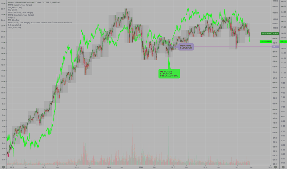
The pioneers in medicine ($IBB Biotech) vs the pioneer in automobile, battery and automated driving ($TSLA, Tesla). Notice the wave of investor recognition of the future of biotech from 2011 to 2015 matches quite well to the wave of investor recognition of the future of energy storage and EV vehicles in the stock price of Tesla. Biotechs returned to the US...
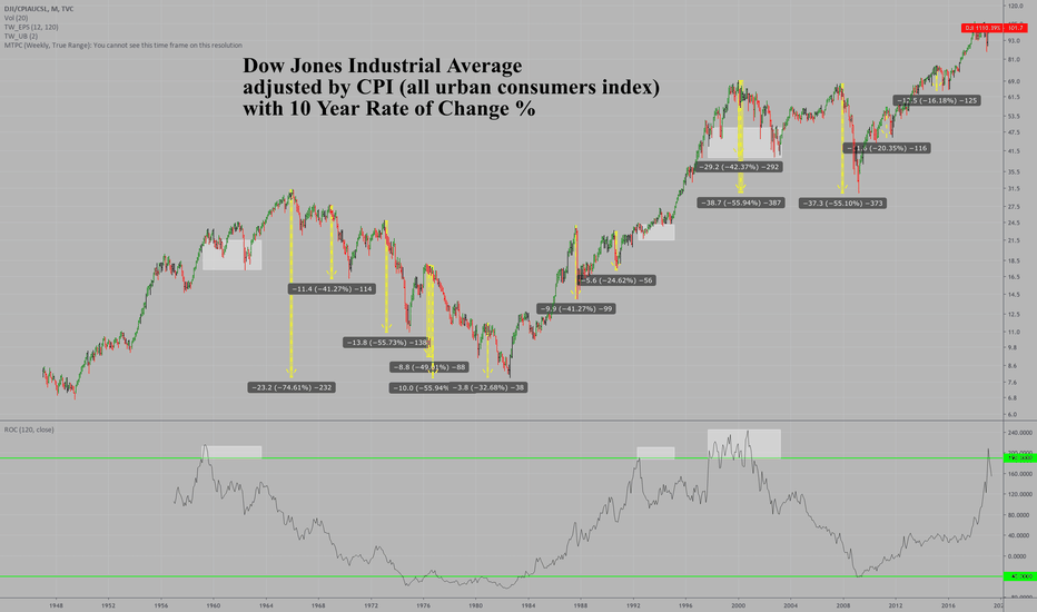
I am always finding interesting patterns and I post them to my Chat Room "Key Hidden Levels" here at TradingView.com where we point out trade setups using charts, news, earnings, and other tricks of the trading business. This chart is the $DJIA or Dow Jones Industrial Average going back to the 1940's to show the 10 year Rate of Change (%) but adjusted for...
Previous Fed Chair and Stock Market (divided by CPI, to make it "real"). You can see how there is turmoil typically at the beginning of a new Central Bankers term. Bernanke, not initially as he sat on top of a giant credit bubble that was set to pop. Greenspan had the worst initial stock market performance, but Bernanke had the worst performance with a close...


