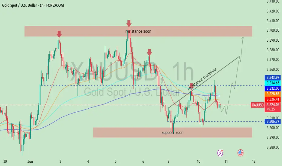
This chart represents a technical analysis of the price action for XAU/USD (Gold Spot vs. U.S. Dollar) on the 1-hour timeframe. Here’s a breakdown of the key elements and what they suggest:
🔍 Key Components of the Chart
🟥 Resistance Zone (Around 3,390 - 3,405)
Marked at the top with red arrows.
This area has historically seen price rejection, meaning gold struggled to go higher from here.
It indicates strong selling pressure.
🟦 Support Zone (Around 3,290 - 3,310)
Price bounced back from this level several times.
Shows buying interest and support.
📉 Resistance Trendline
Diagonal black line sloping downward.
Shows a pattern of lower highs – a bearish signal until broken.
Price is currently testing or near this trendline, and a breakout could indicate bullish reversal.
📊 Moving Averages (colored lines)
These are short to medium-term moving averages (likely 9, 21, 50, 100 EMA).
They help identify the trend direction and potential support/resistance levels.
Currently, price is ranging around the moving averages, showing indecision or consolidation.
🔮 Forecast Pathways (Possible Scenarios)
✅ Bullish Scenario (Outlined with arrow):
Price bounces off the support (around 3,310).
Breaks above the resistance trendline.
Heads back to test the resistance zone near 3,390–3,400.
❌ Bearish Risk:
If price fails to hold support at 3,310 or breaks lower,
It could retest the lower support zone near 3,290 or even lower.
📈 Conclusion
This chart suggests that gold is currently consolidating between support and resistance, and a breakout from the trendline will likely determine the next major move:
Above = bullish towards 3,390–3,400.
Below = bearish towards 3,290 or further.
Disclaimer
The information and publications are not meant to be, and do not constitute, financial, investment, trading, or other types of advice or recommendations supplied or endorsed by TradingView. Read more in the Terms of Use.
Disclaimer
The information and publications are not meant to be, and do not constitute, financial, investment, trading, or other types of advice or recommendations supplied or endorsed by TradingView. Read more in the Terms of Use.