HIGHER HIGH AND LOWER LOW STRATEGYHello, fellow forex traders! Today we are going to learn about a strategy called HIGHER HIGH AND LOWER LOW. It is quite possible that the strategy is known to you under a different name, as it belongs to the classic ones. The strategy is based on Price Action, i.e. on the price movement and no indicators are required. Nevertheless, indicators can be used for better clarity and to simplify the search for setups.
What is the essence of this strategy?
In any strategy there must be some basis on which it should work. When creating your own strategy, you also need such a foundation, for example, some inefficiency of the market, or its regularity, and on this basis, you can build points for entry-exit and correction of the position. First of all, let's remember the classical definition of a trend. An uptrend is a series of successively rising highs and rising lows. That is, each high (H) is higher than the previous one and each low (L) is higher than the previous one.
The opposite is true with a downtrend. In a downtrend, the highs consecutively decline and the lows also decline. Perhaps you have already guessed what kind of structure we will be looking for on the chart. That is, what is the very first sign that will allow us to understand when we should pay attention to the market and wait for a possible entry point.
Let's assume that we have an uptrend. We have point H, followed by a correction at point L. This is followed by a higher high, labeled in this strategy as HH (Higher High). Then, as soon as we see a break in the trend structure, i.e. a lower low LL (Lower Low), we get ready to look for a sell point.
Similarly, with the downtrend. First, we determine the low L, then the high on the correction H, the lower low LL and finally the higher high HH. This means that the structure of the downtrend is broken. We pay attention to this situation and wait for a possible entry point to buy.
Let's start by considering a sell entry. We enter on the pullback to point H. This structure works because there are big players in the market, and big players need liquidity. That is, in order to make a large sale they need a large number of buy orders to " dump" the currency. The zone between H and HH is a zone of high liquidity. Accordingly, there are many people willing to buy here, as they hope for the continuation of the uptrend. You can enter with a pending order; in which case the sequence is as follows. We wait for the formation of the LL point (trend break). Then set Sell Limit at level H.
As in the case of selling, in the reverse pattern we have a zone of increased liquidity between points L and LL. There are many people who want to sell here, those who hope for the continuation of the downtrend. Someone bought too early, someone panics and closes positions, also many people may have stop-losses in this zone. Accordingly, it is a good opportunity for a big player to buy, and we enter the market together with it. We are waiting for the formation of the HH point. Then set Buy Limit at the level of L.
Risk management
We place the stop loss behind the extreme point of the high liquidity zone. HH - in case of sells, LL - in case of buys. Stop-loss is placed at the points where we can say for sure that we are wrong. We have two targets. For sells, the first target is at the L level, the second at LL. For buying, on the contrary, we take the first profit from H, the second from HH. If the distance between the target 1 and 2 is too small, it makes sense to take only the first target. In other cases, you can take the average value between the two points to set take profit.
Some examples
Let's look at an example. Here we see the formation of a low, correction H and a lower low - LL. Then the price draws a zigzag without going beyond the boundaries of the points we have marked. For clarity, don't forget to draw levels. You can ignore the zigzags inside the levels.
When there is a higher maximum - HH, that is, the structure of the downtrend is broken, we start looking for buys. In this case, we need a pullback to the L point. After the formation of the HH point, we set Buy Limit at the L level and wait. In this case, the price reached our order and then went up.
The entry point can be quite far away from the set-up that was formed. In this case, we had an upward trend. First we mark the first high, then the low and the higher high - HH. Then, following the ZigZag clues, we find the lower low LL, which is quite far away. The entry point for selling will be located at the H level. At this level we are looking to sell. At first glance, the distance is large. Accordingly, the price subsequently bounces from the level marked by us. We place the stop-loss slightly above the extreme point - HH. In this case, the take/stop ratio is very good.
As you may have already guessed, this strategy combines the theory of support/resistance levels. Candlesticks with large shadows in the rebound zone show how the big players gained positions by destroying the buys. Accordingly, the price then went down, reaching our take profit.
Summary
Try not to look for setups in price chaos that are not there. Trade only the right setups with a good ratio of profit to risk. This method I find great for reversal at supply and demand zones. Also, this strategy can be used in combination with other strategies. In general, it is a good foundation for your development as a trader.
Forex-trading-signals

PRICE ACTION: PIN BARSThe pinbar setup is a popular candlestick pattern that is widely used by traders in the forex market. It consists of a single candlestick with a small body and a long shadow, which resembles a pin. This pattern often indicates a potential reversal or continuation of a trend. In this post, we will discuss the best methods to trade the pinbar setup at key levels, trendlines, moving averages, and Fibonacci levels, accompanied by examples for better understanding.
✴️ 1. Key Levels:
Key levels are certain prices at which strong support or resistance is expected. They can be used to determine entry and exit points for trades. For example, if the price reaches a support level and forms a pinbar, it can be a buy entry signal. On the other hand, if the price reaches a resistance level and forms a pinbar, it could be a signal to enter a sell trade. Psychological levels and open interest levels can also be used to identify key levels.
✴️ 2. Trend Lines:
Trend lines are used to determine the direction of a trend. They can be drawn by connecting two or more high or low points on a chart. An uptrend is characterized by consecutive high and low points, a downtrend is characterized by consecutive low and high points, and a sideways trend is characterized by horizontal lines. Pin bars can be used to confirm or deviate from trend lines. For example, if price reaches a trend line and forms a pinbar, this can be a signal to enter a trade in the direction of the trend.
✴️ 3. Moving averages:
Moving averages are used to determine trend direction and the smoothness of price movements. A simple moving average (SMA) is calculated by summing the prices for a certain period and dividing by the number of periods. An exponential moving average (EMA) pays more attention to more recent data. Pinbars can be used in conjunction with moving averages to confirm or deviate from a trend. For example, if price crosses a moving average from top to bottom and forms a pinbar, this can be a signal to enter a sell.
✴️ 4. Fibonacci Levels:
Fibonacci levels are horizontal lines that are used to determine support and resistance levels. They are calculated based on Fibonacci numerical sequences and can be used to identify possible price reversal points. For example, if the price reaches a Fibonacci level and forms a pinbar, this can be a signal to enter a trade. Different Fibonacci levels such as 38.2%, 50% and 61.8% can be used to identify possible support and resistance levels.
✴️ Conclusion
Pinbar forex trading using key levels, trendlines, moving averages and Fibonacci levels can be an effective method for identifying entry and exit points for trades. It is important to remember that no single indicator or strategy is a guarantee of success, so a strict approach to risk management and the use of additional tools and analysis to confirm pinbar signals is essential. I hope this post will help you develop your own strategy for trading pinbars in the Forex market.

ELLIOTT WAVE CORRECTIVE PATTERNS Elliott Wave corrective movements are deviations from the main trend and serve to correct errors or imperfections that occurred during the formation of an impulse movement. These corrective movements are defined by complex wave structures that can be repeated in different variations and combinations.
The wave structure consists of two types of movements - impulsive and corrective. An impulsive movement is directed in the main direction of the trend, while a corrective movement is the opposite of this direction. Correction waves are the inverse of impulse waves, and they are executed as three-type structures. Elliott described 21 correction patterns of ABC type. There are three main types of Elliott Wave corrective movements. All of them are quite simple and consist of only three patterns.
- Zig Zag
- Sideways or flat
- Triangles
1. Zigzag Corrections: This type of corrective movement consists of three waves, with the second wave diverging in the opposite direction from the trend in the first wave and the third wave returning to the main trend. Zigzag corrections can be either upward or downward.
2. Non-wave-like (Flat) Corrections: In this case, the corrective movement is a sideways movement in which the second wave deviates from the main trend and the third wave returns to it. Non-Waveform corrections can be flat or complex, depending on the structure and duration.
3. Triangular (Triangle) Corrections: In this case, the corrective movement is a triangle formation, which consists of five small waves connected to each other by triangle diagonals. Each wave of a triangle correction can be impulsive or corrective in nature.
Elliott Wave corrective movements can be combined and repeated in different ways to form complex and interesting wave structures. Studying and understanding these corrective movements allows traders and investors to predict future price movements and make appropriate market decisions. Corrective movements of Elliot waves are important for analyzing past, current and upcoming market cycles. They allow to determine possible entry and exit points of trades. However, it is worth remembering that financial markets are complex and subject to various factors, so the analysis should be done with caution and taking into account other factors and analysis tools.

IMPORTANCE OF COMBINING TIMEFRAMESA trader usually works on a strategy that is strictly tied to one timeframe. This timeframe is used to determine the trend direction and search for strategy signals. Alexander Elder proposed to perform additional analysis and confirm the trend movement on two more timeframes of higher order. This technique was first described in his work, called "Elder's Three Screens". Combining timeframes was designed to:
• Increase the winrate
• Improve the accuracy of entries
Alexander Elder suggested adding one more chart with a higher timeframe to the trading timeframe to get an overall picture of the trend and determine its direction. And to look for entry points into trades on the third screen with the smallest timeframe.
Theoretically, the trend matching on two higher timeframes increases the percentage of profitable trades. Moving the strategy algorithm to a smaller timeframe reduces the size of stop-loss and recorded losses.
For example, a trader analyzes the general trend on a daily chart and determines its direction. Let's assume that the currency pair is growing the price is above the moving average MA (200).
According to the rules of the strategy, it is necessary to go to the 4-hour chart and wait for the confirmation of the trend on this timeframe. The currency pair price should also rise above the MA (200).
After the combination of trends on D1 and H4, it is necessary to wait for a similar signal on M15 or M5. Then it will be possible to look for an entry point into a trade to buy according to the strategy.
The practical results of combining timeframes according to Elder's strategy are of little value. Even if the general trend on the daily chart is upward, different price movements can occur on a lower timeframe, for example, on a 15-minute or 5-minute chart.
Despite the global trend of the oldest American stock index, only 50% of days over the last 30 years closed above the closing price of the previous day. It turns out that the ever-growing Dow index has an even distribution of positive and negative days. In the Forex market, in general, we can also expect a roughly even distribution, especially if we take into account the range nature of the currency market, i.e. the accuracy of the Elder filter from the higher timeframes works 50/50. Therefore, relying only on the trend of the higher timeframe is not recommended for intraday traders (day traders). However, if this kind of signal filtering gives you psychological confidence, you can use this tactic. Psychology and emotional comfort are an important component of trading.
✴️ How To Reduce Stop-loss And Increase The Efficiency Of Trading Strategy By Combining Timeframes
There is another approach of combining timeframes in trading, which is found in the works of Tom Dante. This tactic is based on Dante's work and allows you to combine several timeframes using structural analysis of price movement. Instead of simply filtering signals, the trader looks for matching patterns on different timeframes, which can indicate more reliable entry points into the trade.
Increasing winrate and reducing stop-losses can be achieved by using a strategy that works equally well on different timeframes. For example, Price Action is ideal for these requirements. As in the classic Elder strategy, everything starts with analyzing the general trend on the D1 chart. Only the trader is busy looking for support/resistance levels, key candlestick formations and other Price Action signals.
In the example below, there is a level breakout on the D1 chart. If the trader decides to go short, the stop loss should be behind the candlestick high or at the nearest resistance level from the broken line.
Then you can move to the 4-hour chart and look for structural support or resistance levels that can confirm the overall trend. And on the H1 chart, you can look for confirmations to enter the trade in the form of candlestick formations or other technical indicators.
This way, you combine information from multiple timeframes to more accurately determine when to enter the market. It is not recommended to go below the hourly chart if D1 has become the starting point for combining timeframes. A trader can also simplify the combination strategy to two timeframes, for example, D1 and H1.
In the example above, the H1 chart shows a bounce from a broken level, which can be used as a signal to open a short. In this case, the stop loss will be just above the local maximum of the hour candles, which is much smaller than the stop loss on D1.
✴️ Combining the D1 timeframe with H1 enables the trader to:
• Reduce stop loss and increase the order lot;
• Increase profit by using take profit to close the position, which is set on the D1 chart.
Stop Loss on H1 allows you to increase the profit/risk ratio by times when trading on D1. Without combining timeframes, risk and profit would be 1 to 1 or at least 2 to 1.
✴️ Let's summarize the simple rules of structural analysis of the strategy of combined timeframes:
1. Find a pattern on the D1 timeframe
2. Move to H4/H1 and wait for a signal using the same strategy
3. Open a trade according to the rules of the strategy on H4/H1
4. Set Stop Loss on H4/H1
5. Set take profit on D1
✴️ Conclusion
It is worth noting that the proposed strategy will require additional Price Action skills. Searching for patterns requires great attention and patience to wait for confirming signals on each timeframe. However, this approach can improve the accuracy of entries and reduce the probability of false signals. Risk management is the most important aspect of timeframe combinations. When using lower timeframes, you can determine more accurate stop loss and take profit levels based on the higher timeframes. This helps to reduce risk and increase potential profits. Like every new strategy, the idea of combining structural market analysis requires practice on a demo account to find more appropriate trading systems and to practice correlating signals.

TRADING IN PRICE CHANNELSPrice spends most of its time in trading ranges. On the chart, this results in the formation of a horizontal, ascending or descending trading channel. Trading channels are one of the most common and important chart patterns. Indeed, in most cases, price tends to consolidate in a limited range, which is a manifestation of buying activity by market participants.
What is a Trading Channel?
A trading channel, whether upward or downward, is simply the range in which price moves. It creates areas of resistance and support in the market where buy and sell orders cause a rebound to the center of the range itself. Building a trading channel is very simple. Just draw a trend line, then project a parallel one. Once a trading channel is formed, you can enter the market whenever price touches one of the channel boundaries. This approach works best inside horizontal trading channels. If you are in an ascending or descending trading channel, I suggest you only trade in the direction of the main trend. How to use trading channels to determine the best entry points into the market? Let's discuss the subtleties of this trading style. We will talk about how to build a trading channel, what are the pros and cons of trading in these channels.
The Idea of Trading in Price Channels
The price of a pair on the currency market fluctuates within a certain corridor, which can be represented as a channel. Moving price in the channel is the main principle on which all channel trading strategies are built. Trading in the price channel brings profit in case of a clear definition of the channel in which the price moves. For this purpose, a certain timeframe is taken, and on it the levels, to which the price reached but did not cross them, are determined. These levels are the upper and lower boundaries of the corridor. And herein lies the main problem for many traders - the correct building of the price channel. In fact, a regular chart building is enough for trading, and a regular chart corridor is already the simplest trading strategy that does not require additional tools for confirmation. Nevertheless, many traders find it necessary to use a variety of ways to confirm the signal. These can be candlestick patterns, various level indicators, divergences, etc.
Two Situations Are Considered In Trading In Channels:
price has broken the channel border;
price did not break the channel border.
At the same time, each strategy has its own breakout criteria and its own rules for opening positions. In addition, the type of channel used for trading plays a very important role. The most common types of channels are ascending and descending channels.
The Advantages Of Including Channels In Your Trading Arsenal:
- low trading risks;
- simple rules, understanding of which will not be a problem for a beginner;
- high profitability.
However, like any other method, the trading in the channels requires clear adherence to the rules of opening positions and compliance with money management.
There Are A Number Of Key Points To Keep In Mind When Trading In Channels:
- the best timeframes for trading are M30 and higher;
- positions are opened at bounce from the borders inside the channel;
- the channel is built in the direction of the trend: upward - by two minimums and one maximum, downward - vice versa;
- a position is opened only after the price reaches the channel boundary;
- it is allowed to place a pending order outside the channel in case of its breakout.
In many cases, the effectiveness of trading signals in the trading channels depends on the stability of the channel. If there are signs of a trend change or the end of the channel, it is better not to trade. If the price breaks the channel border and goes outside of it, in most cases, the price movement will be approximately equal to the width of the previous corridor. This gives the trader an opportunity to plan and open a trade in time. The efficiency of trading in channels increases if you use oscillators, with the help of which you can determine price reversals. As well as the validity of the breakdown of the corridor boundaries.
Some examples:
One recent example is gold. Gold is in a descending channel. And it was possible to sell when the price reached the upper border of the descending channel. The upper border of the channel coincided with resistance, which was a double confirmation.
Let's also focus on the oil. The price has formed a beautiful channel. The price bounced from round levels and from the channel border. In the article about demand and supply I mentioned that the price is at the supply zone and it can bounce from the zone and the price did go down breaking the ascending channel which can be a sign of a trend reversal.
On the New Zealand dollar, we had two beautiful selling opportunities. Here too, as in gold, the channel border coincides with resistance, which gives additional confidence in the trade.

ORDER FLOW SIMPLIFIED✴️ What is Order flow in trading?
In brief, it is the flow of trades of a major player. Order flow is searched for after liquidity has been captured or if the price enters the area of interest. Price is fractal and therefore the same areas of interest can be applied to different timeframes. The Order Flow trading method allows you to enter a trade even if you missed the original entry into the position.
✴️ How order flow is applied in trading
A large market participant is able to create a zone of interest in any market, and when the price goes to this zone - it places a large flow of buy and sell orders to move the price in one or another desired direction.
When the price reaches the area of interest, the large participant will start putting pressure with orders. For example, if the price comes to the sell zone of interest, a large player may start spamming sell orders, which will rebalance the orders and force the price to move in the desired direction.
A trader who takes order flow into account is able to determine the direction in which the large player is pouring orders. This will allow you to enter trades in the direction of the current pressure of the large market participant, and reduce your risks. When the bearish order flow is working, the minimums are being reprinted. The situation is the opposite with a bullish order flow.
✴️ How the order flow works
- So, the order flow is a manipulation of a large market participant for a position set and price movement in the desired direction. That is, we distinguish the entire momentum without pullbacks as order flow.
- Very often a large player holds two trades simultaneously, one of which is a deceptive position in order to gather liquidity from the crowd.
- It is difficult to enter from Order Flow point by point; it is much more effective to find an order block.
- Price most often tests the Order Flow zone.
- The Order Flow zone works only for one touch, you should remember that! You should not trade Order Flow when re-entering it, the efficiency will be much lower.
- On higher timeframes, Order Flow looks like an order block.
✴️ How the order flow is formed
To find a sell order flow, you need to check the following signs:
- A structure has broken down, or there has been a liquidity grab
- Liquidity has been taken
- A new low has been formed, below the previous low.
Confirmation of bearish order flow comes when the price touches the sell zone of interest, confirming the interest of a major market participant.
Here's what to look out for to find bullish order flow:
- The downward structure has been broken
- Liquidity has been taken
- A higher price high has been formed.
In the case of a bearish confirmation, everything is exactly the same as with a bullish confirmation, only it is the other way around. When the price starts to come back after an unclosed trade of a big player and touches the bullish interest zone, leaving the order flow zone, this is the entry point.
✴️ Bearish Order Flow
When a bearish order flow of a major market participant is functioning the price falls below the previous lows. During the correction we will be able to catch the entry point to buy, at the moment of liquidity refresh, when the price will recover to the orders of a large player. The price follows liquidity.
Of course, it is possible that the structure will break and there will be no new lows, but statistically most often we will see movement in the past direction of the downtrend. Our goal with bearish order flow is to open smart short positions. Ideally, we should wait for a liquidity update and a test of the zone of interest.
Just don't put stops too close, because close stops are often a delicious target for large market players. It is more reasonable to put a stop where the whole downtrend pattern will be broken for sure. A stop that is too close is likely to be hit by the price and you will take a loss.
✴️ Bullish Order Flow
Bullish order flow occurs when asset prices rise and exceed previous highs. During correction periods, price will take liquidity off sellers. Our objective here is to catch the correction to the zone of interest to enter long positions as carefully as possible.
Our priority is long trades after the test of the zone of interest and taking out the sellers' liquidity. The main thing, as in the previous case, is not to put a stop too close. Remember that stops right behind the zone will be a target for big players. According to market mechanics, large market participants need liquidity to fill their positions to one side or the other. If you want to enter a trade very precisely - it is worth paying attention to the zone of interest itself, for example, an imbalance or a order block.
✴️ Conclusions
Order Flow is the traces of a major player on the price charts. When we retest from the money flow zone, we are waiting for a pullback from it in the direction of the major trend. It is more reasonable to enter pointwise from the order blocks because it is very difficult to put a short stop on the Order Flow zone and a long stop is not so favorable for us in the long term. Also, a good entry point can be an imbalance to buy or sell in imbalance points concentrated large aggregate demand or supply. The order flow in this situation will act as the main complementary indicator for entering a position.

DOUBLE BOTTOM FORMATIONThis model is a W-shaped pattern. It is formed at the "bottom" of the market. It serves as a reversal model. When identifying a double bottom formation, look for price patterns that occur when a price has reached a support level twice and failed to break through it. For example, consider a chart with two distinct lows, with a trough in between. The price may then make a sudden upward movement, which would be followed by two more lows. More on this below:
Set entry and exit points: Once the double bottom pattern has been identified, it's important to set entry and exit points. The entry point should be when the market breaks above the high between the two bottoms. The stop loss should be placed below the lower bottom and the take profit should be placed a few pips above the high between the two bottoms.
There are 3 methods of entry on it.
1. On the breakout of the neck level.
- The breaking candle should not be a candle of indecision, even if it closes above/below the neckline. The breakout candle should be without big spikes.
2. On a pullback to the broken neckline.
- Signals from price action like (Pinbar, Inside Bar, PPR, etc.) should appear. Without them, in fact, just on the bounce from the level, you should not enter, there is a big risk.
3. On the 2nd peak level (the riskiest method).
- Candlestick patterns or built-in price action formations should be formed. Built-in formations are the pattern that formed inside some more significant pattern.
That is, we have a W-shaped pattern. The price makes the second peak and another pattern can be formed on this second peak. It can be 1-2-3 formation or Head and Shoulders, etc.
Monitor the trade carefully. Monitor the trade closely and adjust the stop loss and take profits as necessary. If the double bottom pattern fails and the price breaks below the lower bottom, close the trade and re-evaluate the market. If the double bottom pattern fails, it is important to re-evaluate the market, because this could mean the end of the current trend.

IMPULSE AND CORRECTIVE MOVEMENT What is an impulsive price movement?
This is a situation when the market moves with great force in one or another direction, passing large distances in a short period of time.
What is a corrective price movement?
It is a price stop. After an impulsive movement, the price needs a rest. Unlike an impulsive movement, a corrective movement lasts long enough and is often just in consolidation (sideways movement). There are exceptions, when the price after a strong movement is not in a sideways, but rather in a microtrend against the main movement with a weak price impulse and goes a short distance up\down (depends on the trend direction).
On the chart you can see the descending price channel, I have marked the important places. Next, I will describe everything in order. First, I will tell you how to determine a true or false breakout of a level in the trend and how to work from these levels using impulses (these levels are called mirror levels (swing) that change their level from resistance to support).
A: there was a break of the support level with good momentum, up to this point there was a bullish movement and sideways movement. The break of level A broke the rising highs and we can already say that there was a trend reversal. Where we will proceed from the mirror levels of the trend.
A mirror level is a level that from support became resistance and vice versa.
After breaking the level, a corrective movement to the same broken level began. Do you remember what I was talking about in the beginning? About the fact that the price does not always go sideways after the breakout, it can also go against the general movement, but with less impulse. But in this case as you can see price went sideways after it broke through the level, then slowed down and started to roll back to the broken level, this is exactly the place where we can look for an entry into the trade.
B : As I said, there was an impulsive break of the level and then a corrective movement against the main downward movement, after which the price approached the broken support level and broke it again. Most likely, the breakout was due to some news, most often the price makes a reversal without such sharp movements.
This is the place where all candlesticks are filtered and decisions are made. Pay special attention to what candles are formed at such levels. Ideally, it should be like this: candles decrease in size and form dojis (i.e. candles of uncertainty). You can expect a pinbar or maribose in such places.
Now remember the 2 types of corrective movements:
- price moves against the main direction, but with less momentum
- price is in consolidation after the breakout
In this example the price is just in a sideways movement and does not make impulsive movements, it is simply resting after breaking another support level in place. In this case we also have 2 moments to enter.
1. When approaching the broken support level, which is now a resistance level.
We have all the right conditions for entry: the price has no momentum, respectively, it will most likely bounce off the resistance level and continue moving downwards; uncertainty candlesticks have appeared (in this case they were dojis); and the last criterion is the appeared Outside bar setup (B point).
2. In the second case, the entry is made on the breakout of the support C
Unlike the place where the price goes against the movement, in our case (sideways) the price after the breakout can go further without correction to the broken level, but there are also criteria for this: the candle that breaks through the C level should be without big spikes; the price must breakout with good momentum (notice how the price stopped out at the support level, so we should expect a true breakout with good momentum, as was the case in this example)
Next example when the price rolled back immediately after breaking out of a level without sideways move at the D point. Pay attention to how the price gives signals that it has no strength to move further. These are small candles that were then engulfed by one big red candle and the price made an impulsive movement downward.
Impulse and corrective moves: conclusions
Impulse movement
• Candlesticks have large bodies.
• Price moves a long distance in a short period of time.
• Each subsequent candle closes higher/below the previous one (a clear sign of a good impulse).
• Candlesticks have the same color and sentiment (In a bullish trend is green/blue candlesticks. In a bearish trend is red/black. Well, or any other colors that you use).
A corrective movement
• Candlesticks have small bodies.
• Candles of uncertainty are formed (dojis, haramis).
• Price moves small distances over a long period of time.
• Candlesticks have a combined color (different colors).
When the price approaches the support and resistance levels or trend line borders, you should pay attention to these factors and, if they are met, you can enter the trade.

HIGHEST OPEN / LOWEST OPEN TRADE✴️ Hello, ladies and gentlemen! Today we are going to talk about a popular strategy called Highest open Lowest open. This strategy was first published on forexfactory forum. The strategy is based on following the natural movements of the market, which you may consider unpredictable. Here, we will make money on those very movements. In this strategy, you will have to wait, you will have to be disciplined.
The idea behind this strategy is as follows: There are two assumptions. First, during the day there are always seemingly chaotic zigzag movements of the price. Secondly, any candle, be it bearish/bullish, will have tails. Third, someone needs to be taken out of the market. As we remember, there are bulls, bears and there are pigs as described in many famous trading books.
1) So, let's mark the High/Low points of the current day and the previous day on the chart.
2) After that, on the current day, let's mark the highest and lowest points of the H1 candle opening. It is the opening price of the candle that is meant. These opening points can and will shift during the day, and this is normal. The entries of the strategy are quite short, and such a shift of the markup during the day can occur. This (for the moment) is the end of our markup.
✴️ Strategy Rules
When do we buy or sell? So, we buy when the price goes below the lower line and comes back. That is, when the price is behind the line (for example, the lower line), we place a Buy Stop order on the line to enter on its breakout. To sell, we enter on the same principle: the price goes above the upper line, set an order on the border, inside the channel. It is not necessary to use a pending order for this, if you want, you can enter the market.
But, how can we understand that the price has really been below the lower level or above the upper level? After all, it may well be that the price will break the level by only one pip, which, of course, will not be a signal to enter. But, for this reason, we have the concept of "entry timeframe", which can be M5, M15 or M1.
So, when the M5 candle closes above the signal line and, accordingly, a new M5 candle opens we can enter to sell when the level is reached. The same is true for buying. M5 candle should close below the signal level, and at the opening of a new candle we set a pending order. Or, we wait until the level is reached and enter the market. At the same time, the opening price should not exceed the maximum and minimum of the day!
✴️ Trade details: TP and SL, Money Management
The start time of trading is 8 am New York time. But in general, you can trade practically at any time. Since everyone has different time zones, you can choose a trading time that suits you, and the strategy will still work. We set the stop loss for the daily high, or for the daily low.
The method of profit taking can be different. First, there is a basic rule: when the trade is in profit +5 pips, we move the stop to breakeven +1 pips of profit. Secondly, you can exit with a profit of 10 pips, or when a profit of 10 pips or more is reached, move the stop to breakeven +5 pips. Also, you can exit the position in partial portions, it is already from personal preferences. But it is better to follow the rule of putting the stop at breakeven.
So, why did we mark the High-Low of the previous day? If the high or low of the previous day is broken, it means that there was a breakout and you should be careful here. It is quite possible that the price will run far beyond the marked level after the breakout. Also, the situation with several entries within one hour is quite possible. If the price on M5 constantly breaks the level and returns, you can enter at every suitable signal.
Since the profit is small in most cases, it is better to use pairs with low spread in trading. This way you will be able to move the stop to breakeven faster. There can be a lot of entries on the strategy during the day. Especially if you use several pairs. Therefore, there is no sense to risk more than 1% of your capital per trade. Moreover, it is better to use 0.5%.
✴️ Examples
Now let's look at a few examples. On the H1 chart, we mark the highest opening point, and move to the M5 chart.
Here, we can see how the price closed beyond the level, below the high of the current day. On the breakout of the level, we enter to sell. We set the stop loss slightly above the maximum of the day. When the profit of 5 pips is reached, we turn on the trailing stop. In this trade we would have earned about 50 pips, with an initial stop of 10 pips.
We move the level again to the opening of the next candle, and wait for the crossing on M5. This, in fact, is the process of trading. Once again, we are talking about the current daily highs and lows. Thus, if the highest or lowest opening price changes, we move the line accordingly. Also, when setting a stop, we take into account the current High and Low. If there is a breakout of the previous day's High or Low, enter with caution, as the price may well rush towards the breakout.
✴️ Conclusion
This strategy requires attention, the ability to wait, discipline, calm and accurate calculation. Nevertheless, it is a powerful weapon in skillful hands. That proves the popularity of the strategy on the forexfactory forum. The strategy itself is quite simple.

SUPPLY AND DEMAND LEVELS How do we determine the levels of supply and demand on a chart?
To find supply, we will look at the highs of price movements, and to find demand, we will look at the lows. We need to note highs and lows with fast and strong price movements. Fast rises for demand and troughs for supply. The less the price stays at a level the better for us. The first thing we need to do, just like when marking support and resistance levels, is to look at the highs and lows on the charts. Note that the closest area to the current price has been tested on the chart below. And the lower one has not been tested yet. It has only been touched by price once, so this area is stronger than the one that has already been tested.
At the marked levels, we observe that the price was at them for a short time. It reversed almost immediately and went down with large candles. The important factor here is the time that the price "did not stay" at the level. The less time the price was on the level, the more significant this level is. And it is worth keeping in mind the size of the candles. The bigger these candles are, the stronger the reaction.
In addition, supply and demand levels become mirrored. Just like support and resistance. If we pay attention to the highlighted area on the UKOIL chart below, we can see that there was first supply and then a strong breakout. The price overcame the supply, took its remain orders and went higher. And now this area has become a demand area:
As you can see, there was a quick bounce from it here. Our goal is to determine the demand at the low levels and the supply at the peaks. We find strong and fast price movements on the chart. A rise for demand and a fall for supply. These should be big candles and the price should not crowd in one place for a very long time. There should not be a long retracement. The less the price spends on the level, the better.
In addition, pay attention to round levels. Such as 1,100; 1,500; 1,300 and so on....
Do not go back too far on the chart, because what happened on it earlier is not so important for the methodology of supply and demand levels. These are not support and resistance levels after all. And once again I want to repeat to you that the most important thing is that these levels should be visible not only to you, but also to other players. In order for them to work them out.
What happens at these levels and why do they work?
At these demand levels, large players place limit buy orders, and at supply levels they place sell orders. Why does this happen? Because at these levels it is easier for the large players to execute the order by collecting the positions of smaller players. Every time the price reaches the supply area, we have sell orders executed by the big players. They take the buy orders that other players open and use them to execute their sell orders. When the buy orders run out, the price falls again. When it rises to the same level again, many sell orders of the big players are executed again with the help of stops and buy orders of smaller traders. When the opposite orders run out, the price falls again.
The point is that a large position cannot be opened simply without a significant change in price. That is why big players, banks, market makers have to play around and set some kind of traps for other traders in order to open larger positions at their expense. Now let's look at this area of the supply:
It was a supply level, but on two occasions many sell orders of big players were executed on it. On the third time, as you can see, there were no big players left, so the price decided to break this level and went higher. From this we conclude that supply tends to run out, just like demand. Once it is over, there is nothing to stop the price from breaking this level and going higher.
Therefore, it is considered that for profitable trading the supply and demand levels are suitable only for the first time, when the price has just touched the level. Then we can sell or buy on the retest of the level. But when the price comes back to it again (for the third time), we should not enter the trade it, as the breakout is very likely.
I should note that a higher candlestick maximum does not always mean that a new supply area has been created. And a lower low does not mean that a new area of demand has been created. It can be just a spike, a trace from the execution of a large number of orders.
In this trade, it is worth paying attention to higher time frames. If you trade on H4, look at daily and weekly charts. So that your buying on H4 does not fall into the supply area on the weekly charts. Use multiple timeframes in your trading and don't forget to look at the level on the higher timeframes.

WHAT IS EXPECTATION IN TRADING✴️ What is expectation in trading?
Every trader should be familiar with the concept of mathematical expectation, we will briefly discuss this aspect again. Take a look at the figure above. In the end, the total net profit (or loss) comes from both the frequency of profitable and losing positions (however many there are) and their average size. The goal of any market analysis, any strategy, is to try to have more profitable trades (and therefore fewer losing trades). And while entry point analysis can have its advantages, at the end of the day, we can't predict the future.
The average size of profitable and losing positions, on the other hand, gives us much more information and, in fact, a very large degree of control. For if we take a risk in our position of, say, three percent, our average loss will not exceed minus three percent. And the only thing we have to do for that is to close positions when the risk gets to three percent or less. No forecasting or analysis is needed at all. Similarly, we can also increase the average size of our profitable positions by simply holding them (i.e., not closing them) and adding to them (i.e., opening more positions in that direction) as they bring us large profits. So, in the end, it's all about minimizing losses and maximizing profits. Going back to the figure above, this means we should focus on the mass of weights.
Being profitable in trading over the long term, comes down to minimizing losses and allowing profits to grow. It's not about whether you act right or wrong - it's about how you manage your profits and losses.
✴️ Problems with mathematical expectation
Mathematical expectation isn't hard to understand. And to help understand it, very simple analogies are often used, such as gambling: dice, roulette, or even the lottery. Thanks to expectation, it is easy to prove that all such games are ultimately losers if played for quite a long time.
And here we come to the heart of the problem. The concept, or you could say the myth of "expectation of one's system". A more popular term for traders is "edge". Legend has it that you should have positive expectations of your trading system. But this is a futile endeavor because, unlike gambling, the system may not have, and probably does not have, a consistent percentage of profitable positions. After all, markets do not move randomly. Thus, in financial markets, we only know our historical frequency of profitable and losing positions, unlike in a dice game where we also know the upcoming expectation.
The myth that we need to have positive expectations of our system before trusting it with our money has dire consequences. It feeds the belief that you need to have an edge (in terms of math expectation) to be profitable in the long run. It also feeds the unhelpful need for backtesting. Any system that has negative expectations and is naturally backed up by backtesting is discarded. Good systems are criticized because they may be out of sync with the markets for a while, i.e. not profitable for a while. And it comes down to adjusting the yield curve on historical data, i.e. over-optimization.
What do traders do in search of a system with positive expectations? The same thing: they do not take into account the probability distribution in the measurement domain. And if Nassim Nicholas Taleb's Black Swan has taught us anything, it's that we simply can't do that.
We can't apply measurements beyond the interval in which those measurements were made. And we certainly have to realize that we have to look at expectations as a whole. It is precisely not the probabilities that are killing us, it is the outcomes. And once again, even probabilities (and perhaps similar distributions) are not stable in financial markets. Markets are chaotic, fractal in nature, with exponentially changing behavior (and not always).
✴️ What can we do to improve our mathematical expectation?
The good news is that when a trader starts thinking with his head instead of relying on expectations, he/she doesn't have to do anything to his "system". Trading expectations (as opposed to expectations of one's system) is simply using the knowledge that we have much more control over the size of our profit/loss (average size of profitable and losing positions) than we have over probability (frequency of profitable and losing positions). And, because we don't focus on historical expectations, trading expectations can work for us. By keeping losses small and increasing our profits (and adding to profitable positions), we gain true advantages.
The following experiment was conducted: the simulator opened random positions, from which the expectation and net profit were calculated. This model averaged several million sets of 30 long positions during a bear market. The average net loss was -12 percent; only about one-third of all positions were profitable. Now, by simply opening the same positions, cutting the losses to minus three percent (using a stop loss) and at the same time adding to the profitable positions, we achieved an average net result for the same positions of 1.8 percent profit (on average in a falling market). So, by using expectations in our favor, we actually changed the values of expectations! Traders who believed that initially negative expectations were useless would never have been able to do this because they had abandoned the system from the start.
This doesn't mean that losses can be turned into profits exactly, but in the long run expectation works by closing out losing positions and adding to profitable positions. But when looking at the possible history of trades on the chart in the past, traders are often fooling themselves. Thus, none of the trading systems are either profitable or unprofitable, they look that way only in relation to the method of position size management and money management applied.
✴️ Conclusion
To summarize, it is one thing to see how a forex strategy has behaved in history, but to expect it to behave the same way in the future is another. Traders should focus less on testing on history and more on the current situation: to cut losses and even more on maximizing their profits and adding to profitable positions. Follow this rule long enough and you will experience the true power of mathematical expectation in Forex trading.

Signal Providers: Red Flags to Watch Out ForSignal providers are becoming increasingly popular among traders, offering automated trading recommendations or strategies to take advantage of forex. However, it is important to be aware of potential red flags that may indicate that a signal provider is not trustworthy. In this post, we will look at some of the most common "red flags" that signal providers can exhibit and how to recognize them. We'll discuss when to be suspicious, what to look out for, and how to avoid being scammed by signal providers.
Unrealistic returns
One of the most common red flags to look out for when researching signal providers is unrealistic claims about future returns. If they promise huge returns with no risk and little investment, it could be a sign that they are not being honest and realistic about the strategies they offer. Always do your own research to ensure that the results claimed by the signal provider are accurate and that you are getting a fair deal. These can be third party marketplaces that help verify trades.
Hidden charges
Be aware of any hidden costs or fees that the provider may charge. Many providers may advertise low rates or free services, but they may hide additional costs or fees that will be charged after a period of time. Be sure to read the terms and conditions carefully to understand what fees may be associated with the service. You should also contact customer service to see if there are any additional costs or fees that you have not considered.
Competing interests
Be wary of signal providers that have potential conflicts of interest, such as those that receive commissions from the trades they recommend. This can lead to biased recommendations and put your money at risk. Only use providers that have no conflict of interest and are unbiased.
Inadequate customer service
Signal providers with poor customer service should also be avoided. If a provider is unresponsive or unwilling to answer your questions, it could be a sign that they cannot be trusted. In addition, signal providers that do not provide adequate support to their customers can be a red flag. If you are being ignored for a long time, there is a high probability that you have been scammed for money.
Lack of personalization
If a signal provider does not offer any customization options for their strategies, it could be a sign that they do not provide personalized services. Always go for those providers who are willing to customize their strategies to suit your individual needs.
Insistent demand to deposit your money
Finally, look out for those providers who are pressuring you to fund your account immediately. These are big hints of unclean services. If they use aggressive sales tactics or make unrealistic promises, it could be a sign that they are not trustworthy. Always do your own research and make sure you understand all the risks and benefits of different investment options before depositing money. For example, you buy a subscription signal provider after a few days you are charged extra money for 100% utilization of the service.
By understanding the red flags that signal providers may show, you can be sure to protect yourself from potential scams and fraud. If you have any doubts or concerns, be sure to do your own research and only use providers that you trust. Be sure to watch out for warning signs that may indicate a possible fraud or scam. These include, but are not limited to: if the provider asks for your banking information, if the provider asks for your social security or credit card numbers, if the provider asks for your personal information or money in an unusual or too random way. Run away from such signal providers.

THE J-CURVE EFFECTHello traders. In today's post, we will look at such a concept as the J-curve. This curve is found in various fields and can visually represent various phenomena. However, today we will look at the J-curve as a phenomenon of trading. In the post, you will learn what a J-curve is and what its essence is.
According to Investopedia , the J-curve is a trendline that illustrates a sharp gain after an initial decline. This pattern of movement looks like a capital "J" on a chart. The J-curve is useful for displaying an event or action's impact over a certain amount of time. Frankly, it demonstrates that problems will worsen before they get better.
Let's remember how we started our journey into trading. We used to open trades with enthusiasm. The psychology of trading, oddly enough, was close to perfect. You start to get “good” at it. Sometimes the luck goes your way and you make money on a particularly good week. Things keep going. Until you blow your capital. And then another. And then another one. What seemed to be working somehow stops working. You decide to be smarter and win back by doubling the lot size each time. Or you open two trades, one up and one down. Sometimes it works, but at the end of the month your losses drained your account, and you lost substantial amount of money. The descent down the curve has begun.
Then you decide to find a "more profitable strategy" for trading and at this point you are at a drawdown. Maybe you have spent months on this, or maybe a week was enough to realize that it's not that simple. It seems that there is no way to do without studying. And if you want to make money on it steadily, and not to make money on gambling to immediately lose it again, you need to study something.
After several lost accounts, you never really got anywhere in the end. You are depressed. All that information, indicators, candlesticks, bars, patterns, books, courses, webinars, paid and free advice, trader chat rooms and YouTube channels, all this only led to the fact that you, a year later, lost even more money.
You often experience fear. You are scared to open the chart, scared to look at how the price is going, whether the prediction will come true or not. It is so scary that after opening a trade you sometimes close the browser or terminal window just to avoid looking at it. In some moments of despair absolutely you do not understand anything. All of this is some kind of mess, complete nonsense.
According to statistics, more than 60% of traders give up in the first 3 months and leave with an enormous hole in their wallet. After a year, another 30% will give up. Only 5-10% remain in the market after a year, and not all of them will get a stable profit in the following years.
This is the bottom of the J curve and at this point you are in crisis, which for most will be catastrophic. But still, something keeps you from giving up. You continue to waste time and money trying to learn. You lose a couple more accounts. It's a big hole in your pocket. But gradually the losses diminish until they stop completely. You are tired of losing money by haste, in a blind game with the market.
You learn to work with drawdowns. You know, it's because of trying to get back money that there were so many impulsive trades. So many trying to see a trend where there is no trend. You have too often gone into a trend time after time in the belief that it will continue. You constantly bet on a reversal of the price, and it never thought to turn.
You try hard to build your strategy and gradually come to a system consisting of several elements, which shows better results than other options. It still constantly gives unsuccessful trades, but you no longer want to break the monitor with your fist. Suddenly it becomes clear it's all about trader discipline and time management. It's about stability and consistency. The fact that you know how to behave not only in case of profit, but also in case of loss. You learn how to psychologically cope with failures. You realize that it is the uncontrollable desire to recover the numbers on the balance that most often led to disaster.
You have already bounced off the bottom of the J curve and are slowly climbing up. You are not a consistently profitable trader yet, but you are making much effort to become one. Sometimes there is nothing interesting on the chart for a week. Sometimes you work cautiously for a month or more, spending 90% of your time waiting for the right market conditions. The account is still standing still. Sometimes for months. You're increasing it, then you're back to the original amount. You realize things are going pretty well. You haven't lost any money at all in the past month. You at break even point on the J-curve.
At some point, you are surprised to notice that you are increasingly successful in profitable trades despite regular failures. Time is going by. The account begins to increase steadily. The first month was a small profit. Second. Third. You are at the highest point of the J-curve. Exponential growth.
So, what brings traders success? Trading is a business, and like any business or startup, things don't go smoothly at the beginning. That's why you have to survive before you thrive. The number-one key element is effort—trying to improve every day. Backtesting the strategy to make it suitable for you. Journaling your trades and emotions and all of these, of course, takes time. The more time you put into it, the faster you will get to the break-even point. You need to invest money in your trading education. Maybe it's a course or book. Or backtesting tool that will accelerate learning curve and improve your trading skills. The combination of these three elements creates success ( TIME + EFFORT + MONEY = SUCCESS ). If you take one of these out of the equation, the learning process may slow down. Some traders become profitable after 5–10 years, some after 12–18 months. All depend on balancing the equation.

PRICE ACTION: ENGULFING PATTERNIn this post we will analyze the Price Action engulfing pattern, one of the main candlestick patterns, which traders appreciate for its reliability and high percentage of success rate. Confirmed by other factors (key levels, indicator signals, fundamental preconditions), the engulfing pattern can become an effective tool for gaining profit.
✴️ What Does This Pattern Tell Us?
The engulfing pattern (outside bar) is mostly a reversal pattern (although in most cases it can also indicate a trend continuation). It looks like two candles, the first of which is small in size, and the second is a large candle with a body larger than the entire previous candle and directed in the opposite direction.
From the point of view of the crowd movement, this pattern means that the strength of the current trend is running out (as evidenced by the small size of the first candle being engulfed). The crowd does not know in what direction to move and, figuratively speaking, is treading on the spot. The appearance of a powerful candle, which absorbed the previous one and closed in the opposite direction, marks the beginning of a new, strong trend.
The example above shows that the bears, having failed to find support, stopped the downward movement, after which the bulls, having organized an impulse in the price growth, collected stop losses of traders who opened positions on the downside, when the price was still moving downward by inertia at the beginning of the reversal candle formation. After the reversal and knocking these traders out of the market, the bulls finally strengthen and a powerful uptrend is formed.
There are several mandatory conditions that a pattern must meet in order for its signal to provide the maximum probability of working out:
1. There must be a downtrend or uptrend in the market before the pattern itself. The movement can be small, but its presence is necessary.
2. The body of the second candle must be of a different color and direction (bearish after bullish and bullish after bearish). Shadows may not be engulfed, but then the signal is considered weaker.
3. The body of the second candle should have a contrasting color to the body of the first candle. The exception is when the body of the first candle is very small (doji).
In addition to the basic rules of determining the pattern of the outside bar, there are other important nuances, taking into account which traders are more likely to increase the efficiency of their trading. It is worth avoiding trading in flat conditions. In a sideways movement, engulfing patterns are quite common, and if you trade each of them, you can get a lot of losing trades. A reversal pattern implies the presence of a trend. If you open a position on the signal of the outside bar only after a clear movement, the number of false entries into the market will be significantly reduced, respectively, the overall percentage of profitability of trading will increase. It is necessary to take into consideration the overall market situation before opening a trade, it is necessary to evaluate what happened to the price of the asset earlier.
✴️ Trading Engulfing Pattern
If all conditions are met and the signal is strong enough, you can enter the market. Let's consider how exactly trading on the outside bar is conducted. It is better to enter a trade on the engulfing pattern by a pending stop order. It is placed a few points above the maximum of the bullish signal candle, or a few points below the minimum of the bearish candle. The breakout of the signal candle will confirm the market reversal and the validity of the open position.
✴️ Setting Stop Loss
There are two ways of placing stop losses when trading the pattern. At the extreme of the signal candle (a few pips above the high of a bearish candle or below the low of a bullish candle). On the ATR indicator (the indicator value is multiplied by 2 and the stop loss is placed on the received number of points from the pending order). Setting a stop on the ATR is considered optimal, although it often coincides with the extremum of the signal candle.
✴️ Take Profit
There are also several variants of take profit setting:
By the ratio of 3:1 or more to the stop loss;
By key levels. The ratio of 3:1 provides a positive mathematical expectation, but this method has no connection to the real market situation, and therefore is less effective. Taking a take profits at levels is optimal, because in this case the probability of price reaching the target and profit fixation increases. When placing a TP on a key level, a take/stop ratio of less than 3:1, but not less than 1:1 is acceptable.
✴️ Examples of Trading by Engulfing Pattern
For an example, let's consider a trade on the 4-hourly chart of USDCHF. After a bullish trend, engulfing pattern was formed at the confluence level: a bullish candle engulfed the last small bearish candle, and the signal bar itself was larger than the previous ones. On this signal a buy stop order was placed to buy above the maximum of the engulfing candle. Stop Loss was set by ATR indicator (parameter 0.0010) at 20 pips from the order, TP was set near the key level at 30 pips from the order (the R:R ratio is almost 2:1). The pending order was activated by the next candle, and the price went up. A few hours later the trade was closed at take profit.
The next trade was opened to buy EURUSD, also on 4-hourly. All conditions were met: we had bullish trend, a powerful full-body bullish candle that engulfed and closed above previous candles. A pending buy stop order was placed couple of pips above the candles high. Stop Loss was set the candle low, take profit at the nearest psychological level. The R:R ratio turned out to be 2:1, which is good.
✴️ Conclusions
There are several factors to consider when trading Price Action. Candlestick patterns provide a guide to action, but the main trend and price levels should not be overlooked. The pattern itself should always have a support point. Such a comprehensive assessment will help to avoid knowingly false entries, and the habit of a calculated approach is only for the better.

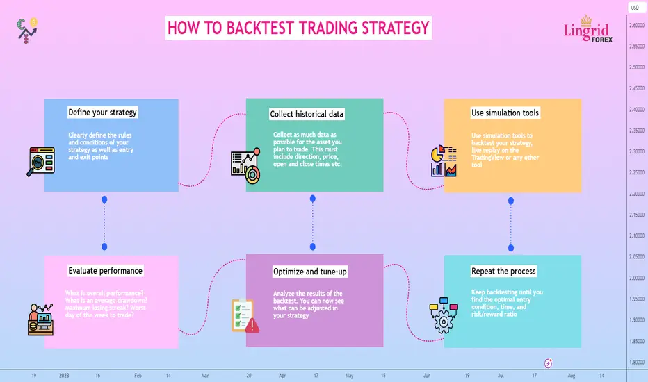
HOW TO EFFECTIVELY BACKTEST TRADING STRATEGYWhy Backtest Trading Strategies?
The idea of strategy backtesting is to view the performance of a trading strategy in past circumstances. This is an important point in building a profitable trading system. There are various techniques to change the performance of a strategy that affects the final results. A backtest shows the overall profitability of a trading method and compares different trading parameters to find out what may work better than others.
Backtesting on historical data increases trader's confidence and reduces emotional trading, because the series of losing and profitable trades is already known. If a trader has not backtested a strategy, he or she cannot know if the strategy is really profitable. It may be that the strategy used by the trader does not work in the new market conditions, thus destroying the trading psychology. Therefore, if the backtest gives unprofitable results, it is necessary to either change the settings or abandon the strategy.
Steps of Manual Backtesting:
1. Identify Your Trading Strategy: Clearly define the rules and conditions of your strategy as well as entry and exit points.
2. Historical Data: Collect as much data as possible for the asset you plan to trade. This must include direction, price, open and close times, stop losses, market conditions, etc.
3. Set Up Your Backtesting Tool: Once you have the data, you will need to set up the backtesting tool. Use simulation tools to backtest your strategy, like replay on the TradingView or any other tool.
4. Evaluate strategy performance. Evaluate your collected data. What is overall performance? What is an average drawdown? Maximum losing streak? Worst day of the week to trade? What session bring most profit or loss?
5. Optimize and tune up. Analyze the results of the backtest. You can now see what can be adjusted in your strategy. For example, it could be certain hours of the day that bring the most losses, and once you eliminate these hours, your strategy's performance will significantly improve.
6. Do it again. Keep backtesting until you find the optimal entry condition, time, and risk/reward ratio.
Tips For Testing Strategies
Be realistic, don't look only for profitable trades. On the contrary, look for as many bad trades as possible to get the reason for losses and to avoid them in the future.
Evaluate the result, taking into account a large number of trades.
The minimum number of trades is 100, or 5 years of data. What comes first.
Test your strategy under different market conditions. In trending market and a flat market.
Don't forget that after the backtest, you should switch to the forward test.
Conclusion
Backtesting is a key moment in trading. It is almost one of the main tools that helps traders with trading psychology. Most traders open impulsive trades that lead to capital loss because they do not know when and where to open trades. If you have a trading plan but it does not include a backtested strategy, this plan is basically worthless. In fact, most successful traders spend more time backtesting than trading the real markets. Once you have a backtested strategy, you can now build rules around it and create a solid trading plan. And you are one step closer to being a consistently profitable trader.
TRADING RULES FROM REAL MARKET GURUSAll beginner traders, having received their first losses in the market, start to scramble in search of "golden rules" of trading or proven solutions from recognized gurus of financial markets. Basically, having received basic knowledge of trading and having traded for a few days on a demo account, they open a real account and deposit, sometimes, quite large sums of money into it. In most cases, the money is either partially or completely lost in a short period of time. It should be understood that trading is a serious work. It requires not only desire, but also free time and emotional expenditures.
As in any job, young specialists turn to the experience of their professional colleagues, studying their experience and various effective techniques. Trading is no exception, where there are also plenty of professionals and real gurus whose experience should be studied. We will look at rules from world-famous traders.
Rule #1 from Warren Buffett
"The market is a device for transferring money from the impatient to the patient"
Great words, aren't they? In the market with profit remains the one who knows how to wait patiently. Before you open a trade, you need to do a thorough analysis. Study all the factors that influence the trading instrument at the current moment of time, what will influence in the short and medium term. Calculate the support and resistance levels, etc. Only after that, start searching for the most promising point of entry into a trade. Do not rush to open a trade if there is no signal to open a trade. Patience is also necessary when fixing profits. "Let profits grow" thee say.
Wait until the dynamics of movement does not begin to decrease, and the strategy does not begin to signal a change of trend. Only in this way you will be able to earn the maximum on each price movement. After making a profitable trade, take a break for rest. Those who rush in the market, sooner or later lose their capital.
Rule #2 from Larry Connors
"I get real, real concerned when I see trading strategies with too many rules"
Everything brilliant is simple! Each of us is probably familiar with this expression. It is also applicable to trading on financial markets. If, again, we pay attention to trading gurus, we can see an interesting fact - all of them mostly use very simple trading systems (TS). Some of them use their own author's TS, some of them use existing ones that have been tested for years. Take Alexander Elder, who is the author of the "Three Screens" strategy. His system is as simple as possible and uses several standard technical indicators built into any trading platform. Anyone can master Alexander Elder's system, and due to its effectiveness, the TS is used by tens of thousands of traders around the world.
Do not try to find or independently develop a mega-complex trading system. The more "elements", indicators, etc. in it, the more false signals it will produce. It will be quite difficult to find the only true signal among them. Your system should produce one or more signals, when they coincide, you open a trade. It is very important, as we pointed out in the first rule, to be patient and wait.
Rule #3 from Peter Lynch
“In this business if you’re good, you’re right six times out of ten. You’re never going to be right nine times out of ten.”
Peter Lynch, a world-famous American investor, was also a follower of simple trading and market analysis techniques. What did the guru wanted to emphasize in his statement? First of all, a large number of beginner traders stay in a delusion for a long time. They think that it is possible to achieve such a level of analysis that will allow them to make 100% forecasts all the time. The market is volatile. Sometimes there are trading situations when the market goes against technical and fundamental analysis. It is impossible to predict such market behavior. Secondly, because of this misconception newbies try to achieve only profitable trades on the market. So that there was not a single losing one in their account history. As a result, they try different strategies, read tons of books on market analysis, but still lose money. As a result, someone "gets an idea" and starts to understand what Lynch was talking about, and someone just quits the market.
Rule #4 from Henrique M. Simoes
"In trading, the impossible happens about twice a year"
In the fourth rule, we will focus on market volatility. These market "impossible" situations do occur periodically. For example, a trading instrument has been growing for a long time, and analyses signal us about the trend reversal. However, the instrument is still growing, breaking all levels. It happens that even some fundamental event, which 100% should lead to a trend reversal, on the contrary, accelerates the current trend even more. There are also more unpredictable situations, when the currency can rise in price twice within a few seconds.
An example is the situation with the Swiss franc, which at the beginning of 2015 strengthened against the U.S. dollar by almost 3000 points. On that day, not only a large number of traders around the world went bankrupt, but also several large Western brokers. Yes, such situations are very rare, once in 5-10 years, but they happen. How to protect against them? If we consider the example with the Swiss franc, a stop-loss would not have saved you, because the price changed at once. The only thing that could really help is to open trades with a small volume that can withstand such a strong movement.
Rule #5 from Jesse Livermore
“There is time to go long, time to go short and time to go fishing”
If you don't enjoy fishing, play a sport or make a field trip outdoors. You should definitely take a break from the market. Especially if you have a series of losing trades. Beginners are not ready for such psychological pressure, so regular breaks should be mandatory. The market will not go anywhere and will not run away, you can always return to it and continue trading. Large and experienced investors are well aware of this, so they do not forget to allocate enough time for rest. The situation is completely different for beginner traders. These two categories of traders mainly trade intraday or use scalping, so they have to constantly monitor the market sitting behind the monitor. As a result, psychological fatigue accumulates, the trader's eye gets tired and he starts to make mistakes that lead to losses. Be sure to rest, it is a guarantee not only of your health, but also of potential profit in the future.
It is extremely important to study the experience of professional traders who have achieved outstanding success in the financial markets. As you can see, many quotes hide not only the entire trading experience collected in one phrase, but sometimes the entire life of the author.

4 BUYING OPPORTUNITIES1. Impulse Move Buying Opportunity
Impulse move buying is a trading strategy that involves buying when the price makes an impulse move from the key level. Price makes a higher high, breaking through the previous high—a break of structure. The market pulls back to 1/3 of the impulse move, and then traders can look for signals. Usually, price action doesn't make a deep pullback after an impulsive movement. A stop-loss may be placed at the 61.8% Fibonacci level.
2. Golden Zone Buying Opportunity
Golden zone buying is a trading strategy that involves buying at a 61.8% Fibonacci level. The price pulls back to the key level and bounces off. Price action breaks the structure by making higher highs and higher closes above the previous high. The market can potentially cause a complex pullback towards the golden zone. The 61.8% golden zone must line up with a significant level, forming a confluence zone. The stop-loss may be placed at the 88.6% Fibonacci level, which is near the key level.
3. Institutional-Level Buying Opportunity
Institutional-level buying occurs when large market participants collect liquidity at the key structure level. The price movement of the institutions may be recognized when prices make large moves like engulfing candles or pinbars. This zone creates supply and demand levels. As a general rule, the market breaks through the structure and pullbacks to the 78.6% discount zone, and at this point we can look for buying opportunities. A stop loss can be placed at the 113% Fibonacci inversion level of the leg that breaks the structure, which is HH-HL.
4. Stop Hunt Level Buying Opportunity
Stop hunting level Buying is a trading strategy that involves buying a security at a price level that is attractive to large traders. This type of buying opportunity is typically used when a price reaches a level that is seen as attractive by large traders. The strategy is often used to capitalize on market inefficiencies and take advantage of the momentum created by large traders. The price action after the breaking structure usually returns to the key level by making a deep pullback. Many traders at this point have closed their positions, thinking the price might continue to move down. However, large institutions that pushed prices out of this zone protected the level, and prices continue to trend in the primary direction. The entry point is usually 88.6% Fibonacci, which gives the best R/R. A Stop loss below the level at the Fibonacci inversion level.

Understanding the Elliott Waves The market always moves in waves. It is not surprising that for decades traders have been trying to find special market patterns that would help to predict the development of the wave structure of the market. Various systems were created, where the waves were based on theoretical and practical basis. Perhaps the most popular theory on this subject is called Elliott Waves.
Ralph Nelson Elliott was actually a professional accountant. He obviously had a lot of time to analyze charts for several decades, so he put all his observations in a tiny book "The Wave Principle", which was published in 1938. According to Elliot, everything in human civilization is in some rhythmic order, so this rhythm, these wave amplitudes can be " drawn" into the future, which allows you to predict the financial markets.
Elliot's theory seemed interesting to few people during his lifetime. Elliott passed away in 1948 and was immediately forgotten. His theory was used by just a few stock experts. Only thanks to Chalz Collins these waves were remembered on Wall Street. Then they were popularized by Hamilton Bolton in 1950-1960, publishing a book with a detailed description and practice of use.
Certainly, Robert Prechter also has done the most job here. It was thanks to him, that Elliott waves became universally popular, almost 50 years after the accountant Elliott wrote a book on them. Many technical systems have a similar fate. They are forgotten, the authors are not appreciated during their lifetime, and then suddenly they become popular when they are promoted by a fanatical follower. Preckter is still considered the main expert on Elliott waves, and his site elliottwave.com is the world's main resource on the subject. There are a lot of cool forecasts there, for example, Prekter's experts predicted the 2008 crisis several years before it occurred. In fact, the modern Elliott is Prechter and his school.
Elliott Waves, in their essence, have a fractal basis, and the goal of practice is to break down the waves into understandable elements. It is them that we will try to explore now.
Fractals or Impulse Waves ✳️
The basic principle of Elliott Waves is that any wave consists of 2 parts; impulse and correction. Each of them, in turn, is made up of several elements, which also resemble waves, only smaller in size. Such a property, when a part resembles the whole object as a whole, is called fractality. For example, the ocean is made up of countless drops, and yet each drop is a "mini-ocean" because it repeats its properties and composition. Similarly, all living organisms are made up of cells.
The concept is based on the Elliott Wave Law, according to which market movement can be described by a simple and visual model as shown above. It reflects the main principle of market behavior: the price does not move in a straight line, but in a wave-like manner. An asset starts moving (for example, price growth), after which a correction (downward pullback) is observed. Any wave consists of 2 parts:
Correction is a pullback in the opposite direction. Each wave has an amplitude (difference between the 2 most distant points - upper and lower). At the same time, the impulse amplitude is always larger than the correction amplitude. To put it simply, the impulse is the main movement, while the correction is only a pullback in the opposite direction, which is always smaller in amplitude. That is why it is easy to distinguish them visually.
Both parts make up a cycle, after completion of which the market can go sideways (flat) or go in the opposite direction. The ability to see an organized wave in the "disorderly" movement of the chart allows us to correctly determine the current location and make a correct forecast for the near future. After the correction is over, we can re-enter the market (BUY trade) and profit again on the price increase. Since each moving wave is accompanied by a pullback in the opposite direction, the concept is sometimes also called the Elliott Wave Correction Theory.
Correction ✳️
The Elliott Wave Correction Theory predicts the end of the impulse after the formation of the last (fifth) wave. And after that there are 3 possible alternatives. The trend is reversed (a new fifth wave will follow). There comes a moment of uncertainty in the market, when the price will move in a narrow corridor for a long time (flat). The trend is maintained, but a short-term pullback occurs. This is a smaller in amplitude wave, consisting of 3 sections (so it is also called a triple). Elliott labeled each of them with the letters A, B and C: The A and B-C sections show a counter-trend correction as shown above.
Now, if we combine all the elements into one picture, we can make a simplified wave analysis on the example of an uptrend. So we can see 2 large sections the impulse 1-5 and the correction A-C. The five consists of 5 sections with 3 trend movements and 2 small pullbacks. A 3 consists of 3 plots with 1 trend movement and 2 pullbacks.
Example of Impulse and Correction ✳️

WHAT IS IMBALANCE AND HOW TO USE IT?Imbalance is a market phenomenon that can lead a trader to significant profits or losses. Imbalance (IMB) is a gap in fair value during moments of inefficient pricing. The trading volume is tilted towards the bid or ask side, but too quickly, so there are still unexecuted orders in the market.
Simply put, imbalance occurs when there are many orders of the same type (buy, sell, limit) and a lack of liquidity (counter orders) in the market. For example, if there are many more buyers of a currency or stock than sellers, the balance tilts in favor of buyers. On the chart, imbalance looks like a price gap, within which only a part of the volume has been traded. The flow of new orders can be seen by the directional movement of long candles of the same color.
Imbalance is indicated on a long candlestick as a gap between the wicks of neighboring candlesticks. Very often the gap occurs on the candlestick pattern "Marubozu" candlestick with a long body, without shadows or with short wicks.
The IMB gap between the wicks of neighboring candles acts as a price magnet. It means that as liquidity fills, the price will close the imbalance. The speed of gap filling depends on the market makers, large traders and market factors. Market makers are organizations that maintain market liquidity by buying and selling currencies, securities.
There is partial and full IMB fill in the market. A partial fill of up to 50% means that interested bidders were unable to push the price to fill.
Full IMB fill is a rebalancing to 100%. Full filling indicates that buyers and sellers are ready to trade actively at an effective price.
✴️ Why do market imbalances occur?
The emergence of persistent imbalances after long periods of stable pricing in one direction indicates that institutions are accumulating a position. These institutions can be funds, banks and other financial institutions (so-called "smart money").
The market is influenced not only by institutions, but also by market makers, investors, and traders with large capitals. For example, market makers place many orders and then modify or cancel them to bring the market back to equilibrium. Market makers, smart money and investors can both oppose each other and act in the same direction.
Imbalance in Forex can occur after the release of economic and geopolitical news. Imbalances are seen when some countries run surpluses in their trade accounts while others run large external deficits. Imbalance in a security's exchange rate usually follows a dramatic event or publication. The news changes the market perception of the stock and causes a shift in the equilibrium price. This can be news affecting a single company or the economy as a whole.
• Publication of financial statements. For example, a positive quarterly report can lead to an imbalance toward buyers.
• Corporate announcements of bankruptcy, management changes, takeovers, business purchases, etc.
• Government and regulatory actions. U.S. Federal Reserve rate hike contributes to the fall of indices and securities.
• Geopolitical problems, natural disasters, etc.
As the price moves from the old equilibrium level to the new equilibrium level, order imbalances can occur.
✴️ How to use imbalance to make trading decisions?
Imbalance is a type of trading opportunity for intraday and swing traders. In trading, Imbalance is used to identify zones of interest. The zone from which the imbalance originated is characterized by a higher level of probability. The zone is suitable for analyzing and identifying entry points. Entry points are selected with the help of technical analysis within the selected trading methodology. In this case IMB acts as an additional factor.
Most imbalances represent price inefficiencies. Therefore, there is a high probability that the market will come back to fill the IMB. For example, if a large bidder manipulated the market, a correction occurs afterward. Typically, price tends to mitigate the imbalance or the area from which it originated. Therefore, traders trade in the direction of the imbalance to profit from the price movement. However, sometimes price continues to push back against IMBs that are forming in the market. Here recent example of using imbalance on EURUSD
✴️ Conclusion
Imbalances create "fuel" for trend price movement. However, you should not mindlessly enter a trade in any imbalance zone. It is necessary to monitor the context (economic news, indicators, patterns) and make decisions based on it.

CURRENCY CORRELATIONSCorrelation is a popular method for using one asset as a beacon for predicting another. Virtually all assets are influenced in one way or another by commodities. You can see it yourself right now, when a stunning increase in the price of gold led to the growth of the AUD. Thereby demonstrating an almost 100% correlation between gold and the AUD.
Examples of Correlations ❇️
We'll look at some examples, which will help you better understand the influence of different assets on each other. Australia (AUD = Australian dollar) is the third largest gold producer in the world by volume. Australia sells several billion dollars’ worth of gold every year. As a result, gold and AUD/USD have a positive correlation. Gold appreciates, but the Australian dollar strengthens against the U.S. dollar. Gold falls, so does the AUD. According to statistics, the correlation between these two assets is over 80%.
Gold and AUD/USD
Let's talk now about the black gold a.k.a oil. This is nothing else than the blood of the economy, which flows through the veins of the world industry, being the main source of energy. One of the largest oil exporters in the world is Canada. Canada sells more than 4 million barrels per day only to the U.S. as its main supplier. As a result, if the U.S. increases its demand for Canadian oil, so does the demand for the Canadian dollar.
Canada is an export-oriented economy, where 85% of exports go to the US as a major trading partner. The USD/CAD is therefore entirely dependent on how consumers in the US respond to changes in oil prices. If the demand for goods in the U.S. rises, industrialists need more oil to ride on economic growth. If oil prices rise in the meantime, the USD/CAD exchange rate begins to fall (because the CAD is strengthening).
Conversely, if oil is not needed and the U.S. economy is slowing, demand for the CAD falls. In other words, oil has a negative correlation to USD/CAD, an appreciation of one asset causes the other asset to fall and vice versa.
UKOIL and USDCAD
Bond Spread ❇️
The bond spread is the difference between the interest rates on the bonds of two countries. It is on a similar spread that the carry trade strategy is based, which strongly influences many currencies. By tracking bond spreads and expectations of how key rates will change, you can get key fundamental signs that affect the exchange rate. As the interest spread between the currencies in a currency pair widens, the currency of the country that has the higher interest on government bonds strengthens against the one that has the lower interest.
BONDS and AUDJPY
The chart above on AUD/JPY shows us this perfectly. It shows the spread between 10-year U.S. and Australian government bonds from start of 2023. When the spread rose the AUD/JPY exchange rate rose nearly 12% from the low.
When the bond spread between Australian and Japanese bonds widens, institutional traders bet on the AUD/JPY going higher, why? Because that's how a carry trade works. But when the Reserve Bank of Australia began to increase key rates and the spread sharply widened, traders began to go "long" positions on AUD/JPY and the price, logically, began to rise.
Dollar Index ❇️
The dollar index gives a general idea about the strength or weakness of the dollar, for it can be regarded as a universal indicator. It's important to remember that the euro makes up more than 50% of the index, so EUR/USD is the main subject here. If you need to assess the dollar's condition in all dollar pairs the index is the best for that. How similar are they really? EURUSD up and DXY down. Many traders continually check the DXY, not only for its correlations but also for its divergence with the EUR/USD.
DXY and EURUSD
If the dollar is the base currency (first in a currency pair, say, USD/*), then the dollar index and the currency pair will go in the same direction;
If the dollar is the quoted currency (*/USD), then the index and the currency pair will go in different directions.
Correlation analysis is fascinating. Everything in the world is correlated, so currencies, various economic indicators, government bonds and commodities. The essence of bonds is simple: everyone needs money, the government constantly borrows against its securities, and the greater the demand for those securities, the more desirable the national currency. However, if this pattern shows a negative correlation, and the increased demand for bonds does not lead to an increase in the currency, then other factors come into play, such as the state of the global and national economies, the discrepancy in key rates between countries .
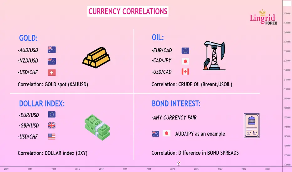
FIBONACCI CLUSTER IN TRADINGHello traders! Today, we'll look at the basic application of Fibonacci levels to build cluster. Even a new trader will be able to fully understand this approach because of how simple it is. We will discuss Fibonacci clusters, including their definition and trading implications. We'll make use of the common Fibonacci retracement tool which reactions frequently occur at 38.2%, 50%, 61.8%, or 78.6%.
✴️ Bottom line
A collection of Fibonacci lines that are relatively near to one another is referred to as a cluster. We compile all traders' estimates by drawing Fibonacci lines relative to various market swing highs and lows. As a result, the concentration of lines in one area indicates the most likely position of a key level or, more accurately, a critical zone.
✴️ What Is Fibonacci Confluence?
Fibonacci confluence is a method that uses Fibonacci retracement and extension levels to identify potential areas where the price may find support or resistance (Or entry and exit points). To use Fibonacci confluence, traders take Fibonacci retracement and extension levels from multiple time frames and look for areas where two or more Fibonacci levels line up, which is called “confluence”. Then we can look for trade setups in these converged levels like engulfing candle or pinbar.
✴️ Fibonacci Retracements Cluster
Fibonacci clusters can be an incredibly useful tool to identifying significant zones. Fibonacci clusters are a type of technical indicator that provides us with a way to identify potential support and resistance levels in the market. By applying these clusters, we can identify entry and exit points which can help them to maximize mathematical expectancy of the trades.
Once you understand how Fibonacci clusters work, you can then begin to apply them to your trading. The first step is to identify a chart with a clear trend. Look at the chart and identify the market structure. Next, draw a series of Fibonacci retracement levels on the chart. These levels will help you identify potential support and resistance levels in the market. Generally, we can look for entry signal at 38.2%, 50.0% and 61.8% levels. If the price rejects either of these lines, then it may be a sign that the price is about to move in that direction.
✴️ How to Apply Them in Trading
It is easier to trade levels if there is a clear unidirectional movement. This way we will know where the price is likely to go and we will be able to enter the "stream" at the most profitable opportunity. So, first of all, we determine the direction of the main trend. In this case, the AUD/JPY uptrend is obvious.
Next, we use fibo on the chart. Our task is to find the nearest strong support level and set a buy pending order slightly above it. That is, we assume that the correction will end near this level and the price will then continue its upward movement.
Stop loss is set slightly below the next Fibonacci cluster. This way we secure ourselves in case of incorrect forecasts. Take Profit is set equal to the stop or more.
There are situations when one supercluster is formed on the chart. In such case, if the price is above the cluster zone, we set an order to buy just above the strongest level. We place Stop Loss after the supercluster, through which the price will almost certainly not return. Take profit is equal to the stop or more.
✴️ A quick and efficient technique to use Fibonacci in trading is through clusters. The key benefit of the strategy is that the clusters speak for themselves; you don't need to know which Fibonacci level the price should rise from. Additionally, clusters can reveal entire zones of resistance and support, or zones of uncertainty, where it is better to avoid entering the market.

How to Trade Wolfe Wave PatternI will try to explain to you about the Wolf pattern. I myself prefer to call this formation a Wolf pattern rather than a wave, because it will not always remind of a wave and has nothing to do with the Elliott Wave Analysis.
Before I get to the practical part, I want to note that this pattern is very easy to learn and often allows you to get a fantastic ratio (R:R). The flip side of the pattern is the art of determining its completion.
Bill Wolf is the discoverer of this formation. He likes to call his trading a wave trading and for some reason explains the work of the pattern as a demonstration of Newton's law. His real achievement is the numerous study of the well-known wedge pattern, which he was so fond of, and the finding of patterns in it.
All we have from the author is a little book. And the website wolfewave.com, the design of which has been preserved since '98. Bill's friendship with trader Linda Raschke is well known. In her book, Linda describes the Wolf wave as a quite profitable formation.
It should be noted that especially skillful traders can detect Wolf waves practically in all price movements. Indeed, this characteristic formation of "spreading" can be found constantly, even if it does not have all the expressed qualities that are characteristic of an ideal wave. In traditional trading, the Wolf will often look like the famous and beloved wedge, but our task will be to enter and exit the trade more precisely.
Formation
1. We determine point 2 as the top of the uptrend (a significant top).
2. Point 3 is the next minimum after point 2.
3. Point 4 is the next high after point 3 and is located below point 2.
4. Point 1 is insignificant, ideally it is the minimum before point 2, but sometimes point 1 is very weakly expressed. In this case, Bill Wolf himself recommends to draw a horizontal line to the left of point 3 and take the first bar opposite it as point 1.
5. The point 5 is on the line 1-3, or it often breaks through it, going to the sweet zone. The sweet zone is constructed by parallel transferring the line 2-4 to point 3.
6. Point 6 (target) is on the line 1-4 (EPA - Estimate Price at Arrival) and is determined by the vertical from the point of intersection 2-4 and 1-3 (ETA - Estimate Time on Arrival).
How to Trade the Wolf with Trend
For the purposes of this article, we will be looking at Wolf waves primarily on trend. I strongly recommend trading them this way. In this way, the pattern will be a correction, the end of which we are trading. In addition, a couple of alternative examples will be given (Wolf as a trend reversal, Wolf in a sideways trend).
Let's take a good trend, in this case the uptrend on CADJPY, and highlight the correction. Then let's move to H1 and see if there are any Wolf waves among these corrections:
Example 1
In the first case we have a great Wolf wave. I pay attention to the clear arrival time of the target (ETA). R:R = 3.0.
Example 2.
In the second case, we don't have the prettiest formation. Many would argue that it is a Wolf wave, but I assure you that it is.
The ETA also clearly worked and we got R:R = 3.5.
Note
Wolf waves are quite frequent formation. Their best working out is trend trading, there are plenty of them. Even more of them are in the sideways. It can be said that a sidewall is a constant succession of Woolf waves in different directions. Perhaps, someone may apply this style to a flat, but a sideways trend can be traded more traditionally. An ideal wave is not always found. There are traders who prefer to wait for them without considering other Woolf waves as such.
Practice
Perhaps, we have come to the most interesting part of the article. Here I will just try to outline the best possible way to enter a trade and the best way to get out of it. The advice given in this section is a subjective result of trading and is provided for general guidance. I am convinced that a practicing trader will find the optimal TS settings by himself.
Examples
Any TS has its disadvantages and if the speculator gets along with them, he makes the TS "his", otherwise he has to look for another instrument, picking it up like a puzzle that suits him psychologically. The problem of the Wolf wave, on the other hand, is the search for the point 5.
Recent example
We use Fibonacci extension tool to identify optimal entry point. Fibonacci extension level such as 1.13, 1.272, 1.141 and 1.618.
Conclusion
In this article I have tried to set forth my view of the Wolf wave. As I see it, this pattern is well underestimated by the mass of suffering traders.

TREND CONTINUATION PATTERNSChart pattern construction is an important part of any market analysis. Charting patterns are powerful indicators of potential market movements. These patterns appear on a chart and are used to predict when a trend is likely to continue or reverse. The three most common patterns are triangles, wedges, and flags. They are all typically seen as signs of a trend continuing, but their specific meaning varies depending on the trend they are associated with. For example, a triangle can signal a continuation of a trend, while a flag can signal a potential reversal.
✴️ Triangles
Triangles are formed when two trend lines converge, forming a pattern that resembles a triangle. These can be either symmetrical or asymmetrical, and are usually seen as a sign of a bullish or bearish trend continuing. Symmetrical triangles can be seen as a sign of consolidation before a breakout in either direction. Asymmetrical triangles are usually seen as a sign of a continuation of the existing trend.
✴️ How to trade triangles
Trading triangles can be a very profitable endeavor, but it can also be risky. There are three main types of triangles: ascending, descending, and symmetrical. Ascending and descending triangles are bullish or bearish, while symmetrical triangles can be bullish or bearish, depending on the trend.
Once you have identified a triangle pattern, you need to wait for a breakout. A breakout is when the price breaks out of the triangle pattern and continues in the direction of the trend. When trading triangles, it is important to wait for a confirmed breakout. A confirmed breakout is when there is a clear break of the triangle pattern and the price has moved in the desired direction.
There are a number of different signals you can look for to help you determine when a breakout is happening. These include candlestick patterns, moving averages, and volume.
✴️ Wedges
Wedges are similar to triangles in that they are formed by two converging trend lines. However, the difference is that wedges form a pattern that resembles a wedge shape. Wedges can be either rising or falling, and are usually seen as a sign of continuation for the existing trend. Rising wedges are generally seen as bearish, while falling wedges are seen as bullish. Wedges can be a useful signal if used correctly, but they are not always clear-cut. It is important to understand whether a wedge is rising or falling, and whether it is being viewed as bearish or bullish, in order to get the most out of this pattern.
✴️ How to Trade wedges
When trading wedges in the forex market, there are two main approaches – the breakout approach and the reversal approach.
The breakout approach involves trading the breakout of a falling wedge pattern. This type of pattern is typically seen during an uptrend and is seen as a potential sign of a reversal. When trading a falling wedge, traders will look for prices to break out of the wedge by either going above the resistance trend line or below the support trend line. If prices break out above the resistance trend line, it is seen as a sign that the uptrend will continue and traders can look to buy. On the other hand, if prices break out below the support trend line, it is seen as a sign that the uptrend is over and traders can look to sell.
The reversal approach involves trading the reversal of a rising wedge pattern. This type of pattern is typically seen during a downtrend and is seen as a potential sign of a reversal. When trading a rising wedge, traders will look for prices to break out of the wedge by either going above the resistance trend line or below the support trend line. If prices break out above the resistance trend line, it is seen as a sign that the downtrend is over and traders can look to buy. On the other hand, if prices break out below the support trend line, it is seen as a sign that the downtrend will continue and traders can look to sell.
✴️ Flags
Flags are formed when two parallel trend lines form a pattern that resembles a flag. They are usually seen as a sign of a continuation of the existing trend, although they can also signal a reversal. Bullish flags are typically seen as a sign that the trend will continue higher, while bearish flags are seen as a sign that the trend will continue lower.
In light of the recent market volatility, it is important to remember that chart continuation patterns such as triangles, wedges and flags can be a powerful tool for predicting potential market movements. They are usually seen as a sign of a trend continuing, although their individual meaning can depend on the trend they are associated with. As such, it is important to be familiar with these patterns to be able to accurately predict potential market movements.
✴️ How to trade flags
When looking for a flag pattern to trade, you should be on the lookout for two distinct highs or lows that form a trend line. The trend line should then be connected to a parallel line that is a few pips below the lower peak. If you identify a valid flag pattern, then you can move on to the next step. Once you have identified a valid flag pattern, you should then calculate your risk and reward. Your stop loss should be placed just below the lower parallel line of the flag pattern, and your target price should be placed at the upper parallel line.
Good luck, and happy trading!
