Trading is SimpleSelect number of stocks based on your own fundamental criterias. After that you just need to identify the sentiment/trend of each stocks. The most basic and easy way to identify it is the 20ema/50ema situation in the Daily TF (you can zoom in or zoom out to different TF. Up to you).
When 20ema is above 50ema, then move to a smaller TF to time your entry, to find optimal entry point.
Multitimeframeanalysis

CURRENCY CORRELATION HEAT MAPCurrency correlation is important to understand in forex trading because it could impact your trading results often without you even knowing it.
In this post, I will share some information about correlations in forex trading and how you are able to use it to your advantage to avoid unnecessary losses. Throughout my journey as a beginner trader, I have bought or sold 2 different currency pairs many times without knowing they are negatively correlated just to let the gains be offset by
the other pair.
My aim in this short post is to bring awareness about the positive and negative correlations between the currencies, specifically the most traded major pairs in the forex market.
What is correlation in forex trading?
A foreign exchange correlation is the connection between 2 different currency pairs. There is a positive correlation when 2 pairs move in the same direction, a negative correlation when they move in opposite direction, and no correlation if the pairs move with no relationship. In order to understand the relationship between 2 currencies, you must know the correlation coefficient and how it relates.
What is correlation coefficient?
A correlation coefficient represents how strong or weak a correlation is between 2 forex pairs. They are expressed in values and range from -100 to 100 or -1 to 1, with the decimal representing the coefficient. The higher the value of the correlation coefficient will largely reflect the movement of the other pair.
See Figure 1. Correlation Heat Map
For example, If the reading is -70 and above 70, it is considered to have strong correlation between the two. Readings anywhere between -70 to 70 means that the pairs are less correlated. With coefficients near the 0 mark, means little or no relationship with one or another. As traders, implementing risk management in our trading plan also reflects to correlations as you may think its a good ides to buy 2 highly correlated pairs thinking you will double your profits when in reality you may lose double the money as both trades could end up in a loss as you're doubling your risk.
Figure 2 . Positive Correlation: EURUSD / AUDUSD
As we can see on this line chart between EURUSD / AUDUSD, both pairs have a strong correlation coefficient as they are moving in almost the same direction. The correlation coefficient is valued at 75 as noted on the heat map. For example, if you place a buy order EURUSD and place a sell order on AUDUSD, expect a win and a loss in most cases.
Figure 3. Negative Correlation: EURGBP / GBPUSD
On this line chart, we can see that both of these parts are moving in opposite directions which are showing a negative correction between the two which in fact is also known as an inverted correction. The correlation coefficient is valued at -90 on the heat map which means if you place a buy order on EURGBP and a place a sell order on GBPUSD you may double your profits, but again you're doubling your risk.
Figure 4. No Correlation: GBPJPY / USDJPY
This line chart shows that both of these pairs move in the same direction with a correlation coefficient of -9 which has almost no correlation. If you place a buy order on GBPJPY and place a sell order on USDJPY, one of these trades will most likely end up in a loss. The pairs that have no correlation usually have different and separate economic conditions therefore coefficient values tend to be lower.
In summary, understanding which pairs are correlated with one another will be able to help build your strategy and improve your trading results. Every trading strategy NEEDS to have Risk Management implemented in it as it is the key to sustainability for the long run.
Trading is a marathon NOT a sprint.
To learn more about forex correlations and their relationships, please see the following links.
References:
www.tradingview.com
ca.investing.com
If you felt this information was helpful, and hit the LIKE button and FOLLOW me for more educational
posts and analysis.
Feel free to leave a comment if you have any questions!
I appreciate all the feedback.
Thanks
Trade Safe

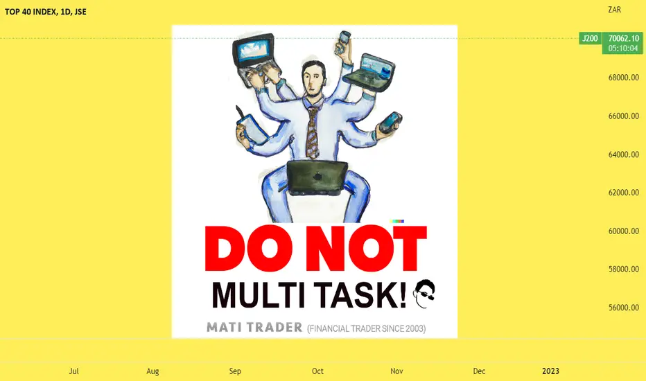
Why Multitasking is Dangerous for Traders – 6 REASONSWe have come to believe that juggling multiple tasks, will somehow reward us eventually.
But with trading, I can’t think of anything worse.
In fact, I think it’s counterproductive to multi-task when making financial decisions for your trading.
And no! Lying on the couch, or on the beach with your phone while talking to friends is ALSO a no go.
Here’s why I think multi-tasking is dangerous…
DANGER #1:
You miss crucial opportunities:
If you’re focused on watching TV, eating chips and watching TikToks at the same time, I guarantee – you will miss out on high probability trades.
You need to have full focus and pay attention to the markets, when you’re trading or it will affect the quality of your trading and setups.
Danger #2:
Delays in trading decision making
Multitasking can slow down your decision-making process and prevent you from acting in a timely manner.
Think about it… It’s one more video to watch, it’s 10 more minutes until the show ends. Let me just finish my beer first.
The market waits for NO ONE!
So act accordingly.
Danger #3:
Stress levels through the roof
You’re going to make impulsive, emotional decisions.
You have your heard earned money in an account ready to take on the local and global markets.
If you have sounds, food and other distractions in the background – it will affect your stress.
This will not only put you off trading but might also scare you out of it completely. These types of decisions can be costly in trading.
I mean, trading can be stressful enough on its own.
Add multitasking to the mix and your levels of stress and increase feelings of anxiety will sky rocket.
This can lead to burnout and negatively impact our overall performance.
Danger #4:
Drop in prod
You might feel that you can get more done by multi-tasking but it actually will decrease your productivity and efficiency.
When we try to do too many things at once, it takes us longer to complete each task and we may not do them as well as if we had focused on them individually.
Danger #5:
More mistakes
Trading needs to be laser focused!
If you multi-task you need to remember something. You are human and you are susceptible to making mistakes and errors.
You might miss a trade setup.
You might type in the wrong trading levels.
Or worse… Trading volume.
You might miss opportunities to lock in profits through adjustments.
Just take it one trade at a time and focus on the time in the markets…
Danger #6:
Ruin relationships
Ok this one is a bit of a stretch, but I think it relevant.
If you multi-task while trading, what about the rest of your life.
You most likely will multi-task while eating dinner, talking to friends, driving or even spending time with your children.
This can most definitely have a negative effect on not only your trading but your life, relationships and will lead to even more stress…
If you’re still reading this then I want you to do something for me.
I want you right now to take a DEEP breath in….
.
.
.
.
.
And out…..
Just slow down. Take it easy. Focus on one thing at a time and enjoy the process.
Be more present and you will find life will be a lot more easier in your everyday.
I am writing this because I want you to start your year on a calm, focused and powerful note.
You got this.
Trade well, live free and take it EASY!
Timon
MATI Trader
Multi-Timeframe-Structure ExplainedHello traders
- In this example, we will explain why focusing on the multi timeframe structure is important.
- It is crucial to observe the chart on multiple timeframes. If we consider several time frames and they match, we will be able to have more confirmation for entry.
- How can multi timeframe structure help us in our analysis?
-Multi-time frame analysis is simply utilizing both higher and lower time frames together. Lower time frames become higher time frames; for example, one 1D candle has 24-1H candles or 6-4H candles. When we are using LTF and HTF, we should focus on the major trend direction as it is very easy to get lost in the lower time frame.
-The following example will help you better understand the importance of multi timeframe structure.
- For example, follow the chart on the 1H timeframe. At that moment, you see a bullish trend, but if you look at the chart on the 1D timeframe you can see that we are in a bearish trend, and that the bullish trend on the 1H timeframe is actually a pullback to the supply zone on the 1D timeframe.
- That is why it is important to follow the multi timeframe structure in order to have more confirmations.
-We hope this post helped you to better understand multi timeframe structure, if you have any questions, you can ask below in the comment.

Multiple Timeframe AnalysisWhen traders ask "what was your light-bulb moment in trading", I often say 2 things:
1) stop worrying about what other traders are doing and focus on yourself making sure you are consistent with the trading strategy as that's how you will get consistent results.
2) understanding multiple timeframe analysis.
Once I started focusing on myself and was consistent with my trading, I was able to review my journaled trading results and noticed by best trade setups happened when price has multiple timeframe correlations with both my enter timeframe and higher timeframe.
The main purpose of the higher timeframe is to help me determine if I should be looking for buys, sells, or staying out of the market. The 2nd purpose of the higher timeframe is to determine the trend.
Multiple timeframe analysis can be used on all trading strategies whether you trade supply and demand, support and resistance, chart patterns, or use trading indicators.
All we are trying to do is determine whether we should be looking for buys, or sells as this will help us increase the probability of our trade.
See Chart For Analysis. I also have a full break-down on my youtube: Moneyball Austin

STRUCTURE - The key to success!STRUCTURING - The key to success! (Part 1)
That structuring and order is the key to success, most will have already heard and partially applied in their own lives.
- Chart analysis is no exception and after correct application the results are even monetarily noticeable.
- How this can be implemented specifically in "TradingView", I present to you in this article.
TABLE OF CONTENTS
1st Part = THE PROBLEM
2nd Part = THE SOLUTION
3rd Part = CONCLUSION
PART 1 = THE PROBLEM
"EVERYONE WILL KNOW THE EXPERIENCE,
TO HAVE SET A TRADE, TO BE SURE OF VICTORY,
ONLY TO BE MERCILESSLY STOPPED OUT."
In hindsight, you analyze your failed trade and realize that in another "Time Frame" an important support/resistance level was below/above your "Stop Loss" and the "Trade Idea" was already - BEFORE - INVALIDATED.
-> So one could have saved the "LOSS".
Most of us will analyze several "Time Frames" to know - which levels are strong/weak and relevant.
-> Regardless of the preferred "Time Frame", one will include the next larger/smaller "Time Frames" in one's analysis.
-> The more "Time Frames" you analyze and include in your final decision, the more confusing it gets.
-> The chart looks like a battlefield and the probability to make a profitable decision diminishes - significantly.
The time spent to put together the individual pieces of the puzzle to the big whole is no longer presentable.
= Headaches and a bad decision are pre-programmed.
To avoid this problem and to make the "Multi-Time-Frame" analysis as effective as possible. I have tested the possibilities provided by "TradingView" and worked out solutions that work for me.
-> I will present these in the following posts to inspire you and possibly provide a solution for an already existing problem.
The benefits of a working structure are:
"LONG-TERM TIME SAVINGS" + "SIGNIFICANTLY BETTER DECISIONS".
2. PART = THE SOLUTION
2.1. INTEGRATION OF THE OBJECT TREE
The platform provides an "element" overview - of all objects drawn in.
-> this option is an excellent way to structure all the objects located in the chart.
- If you haven't used this option before, you will probably belong to the majority.
- Unfortunately, this tool has not been sufficiently promoted by "TradingView", which is why it is unknown to many.
You can find the "Object tree" on the right side, at the very bottom. (Image 1)
If you have never used / structured the object tree before, it will look similar to our "UN-ORDERLY" example. (Image 2)
In the third image, you can see how it can be once you take the time to add order. (Image 3)
To get an overview, you can sort the drawn objects into groups and label them, depending on your own preference / structure.
- This works with a simple right click on the object (e.g. Fib-Retracement).
- There is then the selection "CREATE A GROUP OF DRAWINGS".
Once several groups have been created, you may need a placeholder.
Any is not provided by the program, but can be easily created yourself.
= Simply draw a point with the BRUSH tool.
-> switch off all Time Frames at Visibility
-> create own folder for this point with e.g. "- - - - - - -".
3. PART = CONCLUSION
With a little effort, order and structure can be provided here in the "much" edited charts.
How you want to set up this structure is entirely up to you. In case you need a little inspiration, you can take the one I created.
- - - - - - - - - - - - - - -
IDT - Supply&Demand
IDT - Fibonacci
IDT - Trendlines
IDT - Point of interest
IDT - Market Structure Break
- - - - - - - - - - - - - - -
HTF - Supply&Demand
HTF - Fibonacci
HTF - Trendlines
HTF - Point of interest
HTF - Market Structure Break
HTF – Volume level
- - - - - - - - - - - - - - -
LONG IDEA
SHORT IDEA
- - - - - - - - - - - - - - -
IDT = Intraday
HTF = Higher Time Frame
If this idea and explanation has added value to you, I would be very happy about a review of the idea.
Thank you and happy trading!

NAS100 TECNICAL ANALYSIS WITH UNCLNRBZ - PART 1This is a knowledge oriented video and I hope someone gains a bit of something from it.

S&P500 Index - Multi timeframe analysis with the Ichimoku CloudMulti timeframe analysis of the S&P500 Index using the Ichimoku Kinko Hyo with original 9,26,52,26 settings, i have also added Volume Profiles (VPVR) and (VPFR) onto the charts.
1 DAY CHART:
The Ichimoku Cloud Conversion Line (Tenkan Sen) is indicating that the Mid-Point of the Short-term momentum is upwards at the moment. This will possibly change to sideways or even downwards on the open of the next daily candle.
The Ichimoku Cloud Base Line (Kijun Sen) is indicating that the Mid-Point of the Mid-term momentum is sideways at the moment. Note that support at the Base Line (Kijun Sen) has failed on this 1 day timeframe.
The Ichinoku Cloud Lagging Span (Chikou Span) is indicating that momentum at the moment…… is downwards. Note that the Lagging Span (Chikou Span) is still under the price from 26 periods ago and is i the Bearish Zone under the Kumo (Cloud).
The Kumo (Cloud) is still red. Note that the Leading Span A (Senkou Span A) has started to move upwards but will swing back down if the price continues to drop.
Note that the Leading Span A (Senkou Span A) is still under the Leading Span B (Senkou Span B). Be on the lookout for if/when the Leading Span B (Senkou Span B) starts to move downwards on this 1 day timeframe indicating further strength to the downside.
Note that the price is still in the Bearish Zone under the Kumo (Cloud) on this 1 day timeframe.
Note that on this 1 day timeframe, the Price is under all of the Ichimoku Cloud indicators so let’s have a look at the 1 week timeframe and see if we have any Ichimoku support levels.
Volume Profiles:
Note that the Price is still under its Volume Profile Visible Range Point of Control (VPVR POC) for this charts visible range.
Not that the Price is still under its Volume Profile Fixed Range Point of Control (VPFR POC) for the fixed range of 14x daily candles i have selected.
1 WEEK CHART:
The Ichimoku Cloud Conversion Line (Tenkan Sen) is indicating that the Mid-Point of the Short-term momentum is downwards at the moment. Note that the price has found some resistance from the Conversion Line (Tenkan Sen) on this 1 week timframe.
The Ichimoku Cloud Base Line (Kijun Sen) is indicating that the Mid-Point of the Mid-term momentum is sideways at the moment.
Note that the Conversion Line (Tenkan Sen) is still under the Base Line (Kijun Sen) indicating strength for short term downwards momentum.
The Ichinoku Cloud Lagging Span (Chikou Span) is indicating that momentum at the moment…… is downwards. Note that the Lagging Span (Chikou Span) is still under the price from 26 periods ago. Note that the Lagging Span (Chikou Span) has dropped below the Leading Span A (Senkou Span A) and is now back in the Equilibrium Zone on this 1 week timeframe.
The Kumo (Cloud) is still red on this 1 week timeframe. Note that the Leading Span A (Senkou Span A) has started to move downwards and is still under the Leading Span B (Senkou Span B).
Note that the price is still in the Bearish Zone under the Kumo (Cloud) on this 1 week timeframe.
Note that on this 1 week timeframe, the Price is under all of the Ichimoku Cloud indicators so let’s have a look at the 2 week timeframe and see if we have any Ichimoku support levels.
Volume Profiles:
Note that the Price is still under its Volume Profile Visible Range Point of Control (VPVR POC) for this charts visible range.
Not that the Price is still under its Volume Profile Fixed Range Point of Control (VPFR POC) for the fixed range of 11x weekly candles i have selected.
2 WEEK CHART:
The Ichimoku Cloud Conversion Line (Tenkan Sen) is indicating that the Mid-Point of the Short-term momentum is sideways at the moment.
The Ichimoku Cloud Base Line (Kijun Sen) is indicating that the Mid-Point of the Mid-term momentum is sideways at the moment.
Note that the Conversion Line (Tenkan Sen) is still under the Base Line (Kijun Sen) indicating strength for short term downwards momentum.
The Ichimoku Cloud Lagging Span (Chikou Span) is indicating that momentum at the moment…… is downwards. Note that the Lagging Span (Chikou Span) is still under the price from 26 periods ago but is still in the Bullish Zone above the Kumo (Cloud).
The Kumo (Cloud) is still green. Note that the Leading Span A (Senko Span A) is still above the Leading Span B (Senkou Span B). Note that the Leading Span A (Senkou Span A) is moving sideways at the moment but the Leading Span B (Senkou Span B) is moving upwards, be on the lookout for if the Leading Span A (Senkou Span A) starts to move closer towards the Leading Span B (Senkou Span B).
Be on the lookout if the price drops below and closes below the Leading Span A (Senkou Span A) into the Equilibrium Zone on this 2 week timeframe.
Note that the price is still in the Bullish Zone above the Kumo (Cloud) on this 2 week timeframe.
Note that on this 2 week timeframe, the Price is under the Conversion Line (Tenkan Sen) and Base Line (Kijun Sen) but still has the Leading Span A (Senkou Span A) and Leading Span B (Senkou Span B) as potential support levels. Let’s have a look at the 1 month timeframe and see if we have anymore Ichimoku support levels.
Volume Profiles:
Note that the Price is still under its Volume Profile Visible Range Point of Control (VPVR POC) for this charts visible range.
Not that the Price is still under its Volume Profile Fixed Range Point of Control (VPFR POC) for the fixed range of 6x 2 weekly candles i have selected.
1 MONTH CHART:
The Ichimoku Cloud Conversion Line (Tenkan Sen) is indicating that the Mid-Point of the Short-term momentum is sideways at the moment.
The Ichimoku Cloud Base Line (Kijun Sen) is indicating that the Mid-Point of the Mid-term momentum is upwards at the moment.
Note that the Conversion Line (Tenkan Sen) is still above the Base Line (Kijun Sen) indicating strength for short term sideways momentum as the indicator is moving sideways at the moment.
The Ichinoku Cloud Lagging Span (Chikou Span) is indicating that momentum at the moment…… is downwards. Note that the Lagging Span (Chikou Span) is still above the price from 26 periods ago and is still in the Bullish Zone.
The Kumo (Cloud) is still green. Note that the Leading Span A (Senkou Span A) has started to move upwards but may swing back down if the price continues to drop on this 1 month timeframe. Note that the Leading Span A (Senko Span A) is still above the Leading Span B (Senkou Span B). Be on the lookout for if the Leading Span A (Senkou Span A) starts to move closer towards the Leading Span B (Senkou Span B).
Note that the price is still in the Bullish Zone above the Kumo (Cloud) on this 1 month timeframe.
Note that on this 1 month timeframe, the Price is under the Conversion Line (Tenkan Sen) but still has the Base Line (Kijun Sen) Leading Span A (Senkou Span A) and Leading Span B (Senkou Span B) as potential support levels.
Volume Profiles:
Note that the Price is still above its Volume Profile Visible Range Point of Control (VPVR POC) for this charts visible range.
Not that the Price is still under its Volume Profile Fixed Range Point of Control (VPFR POC) for the fixed range of 6x monthly candles i have selected.
Notes:
Please remember that the Conversion Line (Tenkan Sen) & Base Line (Kijun Sen) are not SMAs or EMAs they are X amount high/low period midpoints in whatever timeframe you are in, so they should not be used as SMA or EMAs.
Note that there are other aspects to the Ichimoku Cloud which make it a very complete system such as Price Theory, Wave Theory and Time Theory but I won’t go into those on this post.
Conversion Line (Tenkan Sen) = Highest High + Highest Low calculation over 9 Periods = Blue Line.
Base Line (Kijun Sen) = Highest High + Highest Low calculation over 26 Periods = Red Line.
Lagging Span (Chikou Span) = Today’s price displaced back 26 Periods = Green Line.
Leading Span A (Senkou Span A) = Tenkan Sen and Kijun Sen calculation value displaced ahead 26 Periods = Cloud Green Line.
Leading Span B (Senkou Span B) = Highest High + Highest Low over 52 Periods Value displaced ahead 26 Periods = Cloud Red Line.
Bullish Zone = Above the Cloud.
Equilibrium Zone = Inside the (Kumo) Cloud can be Green or Red.
Bearish Zone = Below the Cloud.
This was just a post to show how you can use the Ichimoku Kinko Hyo in multiple timeframes for support, resistance & momentum, so I hope this post has been helpful with your trading and understanding of the Ichimoku Cloud. So in which direction is the S&P500 Index going to go...... i leave up to you to make your own minds up ;-).

Trade MACD Multi Time FrameMaking a trade plane using MACD Multi Time Frame.
Chart & Indicator :
1. Heikin Aishi Candle
2. Current Chart MACD
3. Higher TF MACD
4. ADX
Steps :
1. Look at Higher TF MACD Direction
2. Check if lower TF MACD is aligned
3. Check if ADX / trend's strength
4. Set a limit position, wait for the price to break support.
5. Set SL in previous high. Set TP accordingly: using Fibonacci or previous zone as a target.
This is only for educational purposes. Do your own research accordingly.

THE ART OF MULTI-TIMEFRAME ANALYSIS AND MULTIPLE CONFLUENCESHey, wizards, hope you are all having a great week so far! We would like to welcome all of you on another educational post, the topic of which is Multi-Timeframe analysis and multiple confluneces involved.
As it can be inferred, the Monthly and Weekly timeframes are used to determine the direction of the market, the Daily timeframe is used to identify key areas and important zones, and finally, the 4-hourly timeframe is utilized for entering trades. Now, let’s dig deeper into it and analyze the situation that we have on EUR/USD.
MONTHLY: Observing the weekly timeframe graph, we can say that the price has been printing bearish candles for a few consecutive weeks. As one of the main trading principles says, after a strong impulsive move, a correction is needed. We can witness some bearish weakening signs and therefore we are looking for a short-term long position. Our possible target would be set at a previous level of support turned resistance, which aligns with the golden Fibonacci zone.
WEEKLY: Leveling down to the weekly timeframe chart, we can see that the price is consolidating, as it is unable to push lower. Technically, after long lasting consolidations, it is believed that the price will either fly like a rocket or drop like a needle. This gives us another confluence and backs up our plan.
DAILY: Moving down to the daily timeframe graphic, we can notice that the previous candle was super bullish and some kind of an ascending triangle is being formed. If the price breaks and retests the upper boundary of the formed triangle, we can see some nice bullish moves.
4H: Last but not least, the 4-hourly timeframe a.k.a. the timeframe of entries. After a massive bullish push to the upside yesterday, the price has started correcting before further bullish moves happen. Here, we are using two entry confluences: the area of previously broken structure that nicely aligns with the 61.8% fibonacci retracement level. Before entering the trade, we will carefully monitor the price action and wait for the price to bounce off the local zone.
We are hoping that this educational post will be of value for you and we are wishing you all a great day!
Regards,
Investroy Team

A breakdown of my EU entry showcasing how I analyse the market.I've annotated my charts for your convenience. Enjoy!

Filter opportunities if multiple setups are presenting entries
Risk Management: How to filter trading opportunities if multiple setups of the same currency pairs are presenting entries.
Hello everyone:
Today let’s take a look at how to filter trades if multiple opportunities shape up on the same currency pairs.
It's in our best interest to understand risk management. If there are trade setups shaping up for the JPY pairs for example, it's a good practice to choose the best ones to enter rather than most of them.
When the JPY gets strength or weakness, most of the JPY pairs will move together impulsively, so it's susaintable to filter out all the potential opportunities, and choose the best 1-2 pairs.
Taking multiple positions on different pairs of the same currency may potentially put your trading account at a greater risk.
Sure, on short term samples and examples, traders may find taking more positions can earn extra profits, but long term sustainability wise, it's not ideal to open up so many positions of the same currency.
When traders simultaneously take multiple losses, especially due to correlations, this usually “tilts” the traders, and all sorts of trading psychology effects happen.
They may go on to revenge trade, over trade and over leveraged to “win” back the losses they just took. Best to avoid such negative emotions.
When I am filtering out potential opportunities, few key areas I will focus on when I choose between multiple pairs:
Multi-Time Frame Analysis: Where is the price currently at, and is it in the beginning of the impulse phase on the HTF, or is it closer to the end ?
Risk:Reward: 3:1 RR or higher. Can I comfortably enter with proper Risk:Reward ? or is the price already approaching a previous swing lows/highs ? Which pairs may yield the best reward potentially ?
Price Action Development: Are we getting the confirmation price action structures/patterns on the lower time frames for entries ? Is there a better, more clear price development between the currency pairs ?
Compare the currency pairs with each other, and identify the best 1-2 pairs that fit all the above criteria. Then simply look to set your stop entry orders when applicable.
To wrap it up, understand you can always enter or scale in more positions, as the price continues to develop and in your bias favor. As long as our original positions’ SL are at BE or in profits.
This way you will never lose money from the original account, while potentially maximizing your profits.
Any questions, comments, or feedback welcome to let me know.
Below I will list out some of the other educational videos that tie in closely to what we talk about today:
Risk Management 101
Risk Management: 3 different entries on how to enter the impulsive phrase of price action
Risk Management: How to Enter and set SL and TP for an impulse move in the market
Multi-time frame analysis
Identify a correction in price action analysis
Continuation and Reversal Correction
Thank you :)

ETHUSD Weekly Overview 3/26ETHUSD WEEKLY OVERVIEW 3/21 - 3/26
In this video I go over my personal perspective on the opportunities Ethereum presented throughout this week. There were 2 amazing entries that were presented totaling over 350+ points! The first setup averages around 250 points and the second was around 100 points. My first entry was at the 1780 key level and the second was around the 1700 whole level. The entry was also given extra confirmation based off the Fibonacci key levels. My initial targets were fibonacci extensions leading all the way towards the -618, around the 1550 price point.
There are times where price presented hundreds of points and then pulled back before continuing the overall trend. It is important to always secure some type of profits on a trade when you are significantly ahead. Never leave any money on the table or turn a winning trade into a losing trade. Even if your entry gets stopped out, continue working that zone over and over until the analysis invalidates itself. The level must prove that it is valid before having real confirmation that it may continue.
My style of trading uses Market Structure, Price Action, Fibonacci, Wave Sequences, Moving Averages , and a mixture of Multi Time Frame Confluence . Most importantly the visual realization of emotions cycled into the chart.
As always THANK YOU and if you found this video helpful, please let me know by hitting that like button and/or leaving me a comment below.
Also, feel free to share your opinion on this setup or other setups that you have. The more ideas we can generate together, the more informative these ideas become for newer traders. STAY PATIENT & STAY BLESSED!
~T$

Fibonacci Retracement and Extensions Imagine a Box that's being fired everytime market makes a swing.
Multiples of boxes of bear/bull. That is what fib is 0 to 1.
Many people say "So its going to go up or So its going to go down?" well answer to that is BOTH.
They are always fighting and more often than naught one will break and other one will move on to its multiplier.
Pretty simple and powerful stuff.

Backtesting retest Break of Market Structure on Multi TimeframeStrategy
Create a zone from the order block which created break of market structure on 1D timeframe
Wait for it to be tested on 4H timezone => which will create new 4H order block
Trade the retest of that 4H order block
Color coding & icon use
Green boxes : 1D order block zone
Yellow boxes : 4H order block zone
Tick icon : Trade won on 4H
Cross icon : Trade lost on 4H
Circle with cross icon : Trade in breakeven
Win / loss assumptions
Win : 3R movement without breaking -1R
Loss : -1R movement
Breakeven : 1R movement, followed by -1R movement
Risk Management
50% TP @ 1R
25% TP @ 2R
25% TP / Trade closure @ 3R
RR achieved = 3R
Net R achieved = 1.75R
Strategy results
Testing duration : Jan 2020 - Jan 2021
Wins = 16
Loss = 7
Breakeven = 4
Non-losers = 74%
Absolute Winners = 59%
Net RR = 21
Avg R/Win = 1.31R
Avg R/Trade = 0.78R

Basic Concepts of Liquidity Truly understanding 'why' the market moves through basic concepts of Liquidity
This basic analytical overview is derived from the institutional methodology used at Phantom Trading.
We use this institutional methodology commonly known as 'smart money concepts' in conjunction with additional pieces of confluence to utilise Liquidity around the factualities of the market.
Within the graphic is 'reads a story of transitional money flow' in a clear, concise manner based on a 'vanilla / utopian / textbook' setup.
At the extremity we can see the absolute 'swing high' creating a BMS (Break of market structure) followed by an impulsive continuation to the downside showing 'Bearish' Intent, the market tapping into demand & buy side liquidity has then correctively navigated back towards the previous swing high, printing what is commonly known as a 'double top' where several 'trading styles / types / characteristics' come into play - Front running 'Breakout traders' , Double-top' traders and the more patient Trend continuation', 'Breakout & Retest' traders. Knowing and understand concepts of Supply / Sell side liquidity around these levels we classify these as EQH - equal Highs as Liquidity is manufactured in these specific regions filling bids & offers.
Once we have 'swept the liquidity' above the EQH it provides us with additional opportunities to Short the 'asset-class'

How to utilize Multi-time frame analysis in your trading
Hello everyone:
In this educational video, I will discuss how I utilize multi-time analysis in my trading.
-What multi-time frame analysis does is to help us to get more clarity on what the overall market is doing from a top down approach.
-Analysis should always start on the higher time frames such as Monthly/Weekly/Daily.
-Then, drop down to the lower time frames such as 4H/1H,30/15/5 Min to confirm the HTF move and look for possible entries.
Price action and structures work inter-related with multi-time frame analysis.
-In a HTF impulsive phrase, there will be many LTF impulses and corrections to push the price up/down.
-In a HTF correctional phrase, there will also be LTF impulses and corrections, but within the larger HTF correction.
The key to multi-time frame analysis is to properly identify the next HTF impulsive phrase, and capitalize it by entering on the LTF price action. This allows you to maximize your R:R greatly.
In addition, combining multi-time frame analysis with price action will also give you clues on where the price is likely to go, hence calculating your targets and anticipating the movement from the market.
As always any questions or feedback please let me know :)
Thank you

TAAT : Trading IPOsTAAT IPOed on the Canadian Stock exchange on the 24th of June this year. It had returned 39% over the past 3 months over some optimism on its E-cigarettes business. Vanguard Subscribers were asking how to trade this particular stock.
Multiple Time Frame Analysis show an UPTREND in all timeframes from the 4hr to the Monthly
Price trades above the Supertrend line on all time frames : UPTREND
Price is UPTREND above the Ichimoku Cloud SSSA/B lines
Technique : Aggressives buy when price retreats and bounces as close to the Supertrend line as possible and place stop loss on the SSSA line . Once price clears the Supertrend line comfortably, raise your stop loss to the Supertrend line.
Conservatives buy when price breaks through SSSB line and re-emerges from below to above the SSSA line. Buy on the first candlestick close ABOVE the SSSA line.
Target Price/EXIT : Sell only when your stop loss is hit = Supertrend is violated. If your initial trade had been successful, a raise of your stop loss from the SSSA line to your Supertrend Line would have given you a risk free trade covering your commission and cost of your trade.

USDCAD Trade Analysis, Review, and ManagementHello everyone:
In this quick video, I go over a trade I took on USDCAD.
I explained my trade analysis and management from a top down, multi-time frame approach, pairing with price action structures/patterns.
Thank you

How I trade Price Action Structures/PatternsHello traders:
In this video I talk about how I trade price action structures and patterns.
I explained my trading style and strategies, and how I also utilize multi-time frame analysis to my advantage.
Feel free to comment and ask questions, thank you.

EURGBP Multi-Time Frame Analysis and Management Hi everyone:
Here is my multi-time frame analysis and management on EURGBP.
I do my analysis from a top down approach, from higher time frame down to the lower time frame for extra confluences and clarity.
Thank you
