ICT Sensitive Key Levels [Mariinus]Indicator Overview – Inspired by ICT Concepts
This indicator is inspired by the teachings of Inner Circle Trader (ICT), whose philosophies and principles have greatly shaped the way I view price action. One of the most powerful lessons that stuck with me is his quote:
"All you need is OHLC."
Another fundamental concept that underpins this tool is the idea that:
"Price is constantly moving in cycles from Premium or Discount to Equilibrium, from Equilibrium to Discount to Premium."
With these core ideas in mind, this indicator was developed to help traders who are already using an ICT-based framework. In addition to plotting the standard OHLC levels, the ICT Sensitive Key Levels indicator also includes derived levels that provide deeper Market insight. These include the Equilibrium of the full candle range (High to Low) as well as the Equilibrium of the wicks – offering a more nuanced view of price balance and potential turning points, in line with ICT’s core concepts.
⚠️ Important Disclaimer:
This is not a standalone trading plan.
This is not a buy or sell signal generator.
Instead, this tool is designed to support traders who follow ICT principles by helping them identify higher-probability PD Arrays – the key zones where setups are more likely to occur. If your trading plan includes looking for specific PD Arrays and structural frameworks taught by ICT, then this indicator is a visual aid to refine and focus your attention on the areas where your framework has a higher probability of playing out.
🔁 Backtesting & Daily Preparation
In addition to improving your real-time analysis, this indicator is also a valuable tool for accelerated backtesting . Rather than manually drawing out levels, the indicator automatically provides them, allowing you to analyze past price action faster and more efficiently .
It’s also ideal for preparing your trading day . By loading the indicator before the session starts, you get a clear visual of key levels that may play a role in your strategy. And if you find the chart too cluttered with lines, simply copy the ones that matter to you, draw them manually, and then turn the indicator off to keep your chart clean while keeping your zones intact.
⚙️ Explanation of the Settings
You can combine up to 4 timeframes to monitor their respective levels while operating on a lower timeframe. For each timeframe, you can:
• Set a lookback period to control how far back you want to calculate levels.
• Choose to display or hide the levels of the current candle , which helps you monitor intra-candle ebbs and flows.
Each level (e.g., High, Low, Open, Close, Equilibrium) can be customized:
• Color
• Line style
• Line width
• To hide a level , simply set its opacity to zero.
You can also enable dividers to clearly mark the start and end of higher timeframe candles on your lower timeframe chart. These dividers are also fully customizable:
• Color
• Style
• Width
• And again, if you prefer a cleaner chart, you can set the opacity to zero to hide them completely.
This setup gives you full control over how much or how little visual data you want to see, aligning the tool with your personal trading workflow.
💡 Example Use Cases
These examples are for educational purposes only. This tool is not financial advice and should always be used in conjunction with your own trading plan—whether it involves Fair Value Gaps, Order Blocks, or a custom combination of ICT-based elements.
• Example 1: A 1H Bearish Fair Value Gap overlapping with the Equilibrium Key Level of the Previous Day's Range – a high-probability zone for reaction.
• Example 2: A 1H Bullish Fair Value Gap in Discount, overlapping with the Equilibrium of Two Days Ago, followed by a move into a 1H Bearish Order Block that coincides with the Previous Day’s Equilibrium.
• Example 3: The same 1H PD Arrays viewed from a 4H chart, alongside Weekly Price Levels – giving you a higher timeframe context that supports or invalidates lower timeframe setups.
• Example 4: A combination of two timeframes for added context. A 4H Bullish Fair Value Gap is nested inside the current Weekly Equilibrium Key Level . On the 15M chart , we observe a reaction that creates an Inversion Fair Value Gap , which aligns with the Equilibrium Key Level of the previous 4H candle .
This indicator doesn’t replace your trading plan—it enhances your ability to execute it. It’s a precision tool made for ICT traders who understand context, structure, and probability.
Bias

Trend Blend
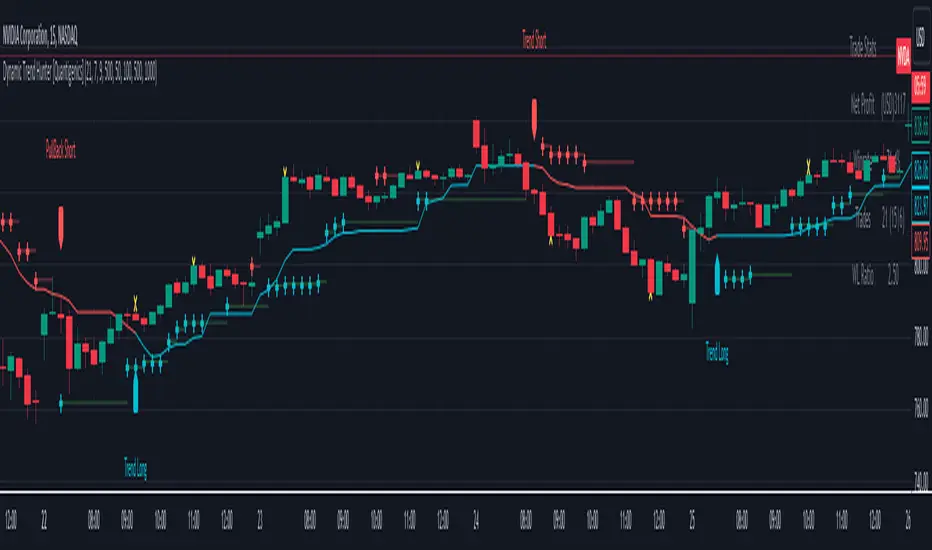
Trend blend is my new indicator. I use it to identify my bias when trading and filter out fake setups that are going in the wrong direction.
Trend blend utilises the 9 EMA (Red), 21 EMA (Black), and if you trade futures or Bitcoin, you can also use the VWAP (Blue).
There is also a table at the top right that displays the chart time frame bias
I prefer to use the 1-hour time frame for bias and execute the trades on 5-minute charts, mainly, and sometimes on the 1-minute for a smaller stoploss.
Here's an example of the trade I took during the London session on XAU/USD
1 hour bias was Bearish
Price broke out of the range
I waited for the London session to open, where I ended up taking a short on the 5-minute time frame as we broke out of the pre-London range
Entry was at the Fair Value Gap (5-minute bias was also Bearish as price traded into the FVG)
Stoploss was at the last high
Take Profit was the next major support level
Another set that I like to trade with the Trend blend is when price is trending bullish and price trades inside the 9 and 21 EMA, and there is a bullish candle closer above the 9 EMA with Stoploss below the low of the bullish candle and Take profit between 1-2 Risk to Reward
Same when there's a bearish trend, I wait for price to trade inside the 9 and 21 EMA, and I'll take sells when a bearish candle closes below the 9 EMA.
This setup works best in strong trends, or it can be used to enter a trade on a pullback or to scale into an existing trade.

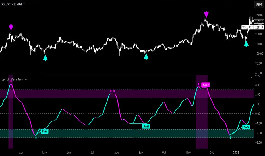
Uptrick: Mean ReversionOverview
Uptrick: Mean Reversion is a technical indicator designed to identify statistically significant reversal opportunities by monitoring market extremes. It presents a unified view of multiple analytical layers—momentum shifts, extreme zones, divergence patterns, and a multi-factor bias dashboard—within a single pane. By translating price momentum into a normalized framework, it highlights areas where prices are likely to revert to their average range.
Introduction
Uptrick: Mean Reversion relies on several core concepts:
Volatility normalization
The indicator rescales recent market momentum into a common scale so that extreme readings can be interpreted consistently across different assets and timeframes.
Mean reversion principle
Markets often oscillate around an average level. When values stray too far beyond typical ranges, a return toward the mean is likely. Uptrick: Mean Reversion detects when these extremes occur.
Momentum inflection
Sharp changes in momentum direction frequently presage turning points. The indicator watches for shifts from upward momentum to downward momentum (and vice versa) to help time entries and exits.
Divergence
When price trends and internal momentum readings move in opposite directions, it can signal weakening momentum and an impending reversal. Uptrick: Mean Reversion flags such divergence conditions directly on the indicator pane.
Multi-factor sentiment
No single metric tells the entire story. By combining several independent sentiment measures—price structure, momentum, oscillators, and external market context—Uptrick: Mean Reversion offers a more balanced view of overall market bias.
Purpose
Uptrick: Mean Reversion was created for traders who focus on countertrend opportunities rather than simply following established trends. Its main objectives are:
Spot extreme conditions
By normalizing momentum into a standardized scale, the indicator clearly marks when the market is in overbought or oversold territory. These conditions often align with points where a snapback toward average is more probable.
Provide reversal signals
Built-in logic detects when momentum shifts direction within extreme zones and displays clear buy or sell markers to guide countertrend entries and exits.
Highlight hidden divergences
Divergence between price and internal momentum can suggest underlying weakness or strength ahead of actual price moves. Uptrick: Mean Reversion plots these divergences directly, allowing traders to anticipate reversals earlier.
Offer contextual bias
A dynamic dashboard aggregates multiple independent indicators—based on recent price action, momentum readings, common oscillators, and broader market context—to produce a single sentiment label. This helps traders determine whether mean reversion signals align with or contradict overall market conditions.
Cater to lower timeframes
Mean reversion tends to occur more frequently and reliably on shorter timeframes (for example, 5-minute, 15-minute, or 1-hour charts). Uptrick: Mean Reversion is optimized for these nimble environments, where rapid reversals can be captured before a larger trend takes hold.
Originality and Uniqueness
Uptrick: Mean Reversion stands out for several reasons:
Proprietary normalization framework
Instead of relying on raw oscillator values, it transforms momentum into a standardized scale. This ensures that extreme readings carry consistent meaning across different assets and volatility regimes.
Inflection-based signals
The indicator waits for a clear shift in momentum direction within extreme zones before plotting reversal markers. This approach reduces false signals compared to methods that rely solely on fixed threshold crossings.
Embedded divergence logic
Divergence detection is handled entirely within the same pane. Rather than requiring a separate indicator window, Uptrick: Mean Reversion identifies instances where price and internal momentum readings do not align and signals those setups directly on the chart.
Adjustable sensitivity profiles
Traders can choose from predefined risk profiles—ranging from very conservative to very aggressive—to automatically adjust how extreme a reading must be before triggering a signal. This customization helps balance between capturing only the most significant reversals or generating more frequent, smaller opportunities.
Multi-factor bias dashboard
While many indicators focus on a single metric, Uptrick: Mean Reversion aggregates five distinct sentiment measures. By balancing price-based bias, momentum conditions, and broader market context, it offers a more nuanced view of when to take—or avoid—countertrend trades.
Why Indicators Were Merged
Proprietary momentum oscillator
A custom-built oscillator rescales recent price movement into a normalized range. This core component underpins all signal logic and divergence checks, allowing extreme readings to be identified consistently.
Inflection detection
By comparing recent momentum values over a configurable lookback interval, the indicator identifies clear shifts from rising to falling momentum (and vice versa). These inflection points serve as a prerequisite for reversal signals when combined with extreme conditions.
Divergence framework
Local peaks and troughs are identified within the normalized oscillator and compared to corresponding price highs and lows. When momentum peaks fail to follow price to new extremes (or vice versa), a divergence alert appears, suggesting weakening momentum ahead of a price turn.
Classic price bias
Recent bar structures are examined to infer whether the immediate past price action was predominantly bullish, bearish, or neutral. This provides one piece of the overall sentiment picture.
Smoothed oscillator bias
A secondary oscillator reading is smoothed and compared to a central midpoint to generate a simple bullish or bearish reading.
Range-based oscillator bias
A familiar range-bound oscillator is used to detect oversold or overbought readings, contributing to the sentiment score.
Classic momentum crossover bias
A traditional momentum check confirms whether momentum currently leans bullish or bearish.
External market trend bias
The indicator monitors a major currency’s short-term trend to gauge broader market risk appetite. A falling currency—often associated with higher risk tolerance—contributes a bullish bias point, while a rising currency adds a bearish point.
All these elements run concurrently. Each piece provides a “vote” toward an overall sentiment reading. At the same time, the proprietary momentum oscillator drives both extreme-zone detection and divergence identification. By merging these inputs, the final result is a single pane showing both precise reversal signals and a unified market bias.
How It Works
At runtime, the indicator proceeds through the following conceptual steps:
Read user inputs (risk profile, lookback index, visual mode, color scheme, background highlighting, bias table display, divergence toggles).
Fetch the latest price data.
Process recent price movement through a proprietary normalization engine to produce a single, standardized momentum reading for each bar.
Track momentum over a configurable lookback interval to detect shifts in direction.
Compare the current momentum reading to dynamically determined extreme thresholds (based on the chosen risk profile).
If momentum has flipped from down to up within an oversold area, display a discrete buy marker. If momentum flips from up to down within an overbought area, display a sell marker.
Identify local peaks and troughs in the proprietary momentum series and compare to price highs and lows over a configurable range. When divergence criteria are met, display bullish or bearish divergence labels
Evaluate five independent sentiment measures—price bar bias, smoothed oscillator bias, range oscillator bias, traditional momentum crossover bias, and an external market trend bias—and assign each a +1 (bullish), –1 (bearish), or 0 (neutral) vote.
Average the five votes to produce an overall sentiment score. If the average exceeds a positive threshold, label the bias as bullish; if it falls below a negative threshold, label it as bearish; otherwise label it neutral.
Update the on-screen bias table at regular intervals, showing each individual metric’s value and vote, as well as the combined sentiment label.
Apply color fills to highlight extreme zones in the background and draw horizontal guideline bands around those extremes.
In complex visual mode, draw a cloud-like band that instantly changes color when momentum shifts. In simple mode, plot only a clean line of the normalized reading in a contrasting color.
Expose alert triggers whenever a buy/sell signal, divergence confirmation, or bias flip occurs, for use in automated notifications.
Inputs
Here is how each input affects the indicator:
Trading Style (very conservative / conservative / neutral / aggressive / very aggressive)
Determines how sensitive the indicator is to extreme readings. Conservative settings require more pronounced market deviations before signaling a reversal; aggressive settings signal more frequently at smaller deviations.
Slope Detection Index (integer)
Controls how many bars back the indicator looks to compare momentum for inflection detection. Lower numbers respond more quickly but can be noisy; higher numbers smooth out short-term fluctuations.
Visual Mode (simple / complex)
Simple mode plots only the normalized momentum line, colored according to the chosen palette. Complex mode draws a candle-style block for each bar—showing the range of momentum movement within that bar—with colored fills that switch instantly when momentum direction changes.
Color Scheme (multiple themes)
Select from preset color palettes to style bullish vs. bearish elements (fills, lines, labels). Options include bright neon tones, classic contrasting pairs, dark-mode palettes, and more, ensuring signals stand out against any chart background.
Enable Background Highlighting (true / false)
When true, extreme overbought or oversold zones are shaded in a semi-transparent color behind the main pane. This helps traders “see” when the market is in a normalized extreme state without relying solely on lines or markers.
Show Helper Scale Lines (true / false)
When true, hidden horizontal lines force the vertical scale to include a fixed range of extreme values—even if the indicator rarely reaches them—so traders always know where the most extreme limits lie.
Enable Divergence Detection (true / false)
Toggles whether the script looks for divergences between price and the proprietary momentum reading. When enabled, bullish/bearish divergence markers appear automatically whenever defined conditions are met.
Pivot Lookback Left & Pivot Lookback Right (integers)
Define how many bars to the left and right the indicator examines when identifying a local peak or trough in the momentum reading. Adjust these to capture divergences on different swing lengths.
Minimum and Maximum Bars Between Pivots (integers)
Set the minimum and maximum number of bars allowed between two identified peaks or troughs for a valid divergence. This helps filter out insignificant or overly extended divergence patterns.
Show Bias Table (true / false)
When enabled, displays a small table in the upper-right corner summarizing five independent sentiment votes and the combined bias label. Disable to keep the pane focused on only the momentum series and signals.
Features
1. Extreme-zone highlighting
Overbought and oversold areas appear as colored backgrounds when the proprietary momentum reading crosses dynamically determined thresholds. This gives an immediate visual cue whenever the market moves into a highly extreme condition.
2. Discrete reversal markers
Whenever momentum shifts direction within an extreme zone, the indicator plots a concise “Buy” or “Sell” label directly on the normalized series. These signals combine both extreme-zone detection and inflection confirmation, reducing false triggers.
3. Dynamic divergence flags
Local peaks and troughs of the proprietary momentum reading are continuously compared to corresponding price points. Bullish divergence (momentum trough rising while price trough falls) and bearish divergence (momentum peak falling while price peak rises) are flagged with small labels and lines. These alerts help traders anticipate reversals before price charts show clear signals.
4. Multi-factor sentiment dashboard
Five independent “votes” are tallied each bar:
• Price bar bias (based on recent bar structure)
• Smoothed oscillator bias (based on a popular momentum oscillator)
• Range oscillator bias (based on an overbought/oversold oscillator)
• Traditional momentum crossover bias (whether momentum is above or below its own smoothing)
• External market trend bias (derived from a major currency index’s short-term trend)
Each vote is +1 (bullish), –1 (bearish), or 0 (neutral). The average of these votes produces an overall sentiment label (Bullish, Bearish, or Neutral). The table updates periodically, showing each metric’s value, its vote, and the combined bias.
5. Versatile visual modes
Simple mode: Plots a single normalized momentum line in a chosen color. Ideal for clean charts.
Complex mode: Renders each bar’s momentum range as a candle-like block, with filled bodies that immediately change color when momentum direction flips. Edge lines emphasize the high/low range of momentum for that bar. This mode makes subtle momentum shifts visually striking.
6. Configurable sensitivity profiles
Five risk profiles (very conservative → very aggressive) automatically adjust how extreme the momentum reading must be before signaling. Conservative traders can wait for only the most dramatic reversals, while aggressive traders can capture more frequent, smaller mean-reversion moves.
7. Customizable color palettes
Twenty distinct color themes let users match the indicator to any chart background. Each theme defines separate colors for bullish fills, bearish fills, the momentum series, and divergence labels. Options range from classic contrasting pairs to neon-style palettes to dark-mode complements.
8. Unified plotting interface
Instead of scattering multiple indicators in separate panes, Uptrick: Mean Reversion consolidates everything—normalized momentum, background shading, threshold bands, reversal labels, divergence flags, and bias table—into a single indicator pane. This reduces screen clutter and places all relevant information in one view.
9. Built-in alert triggers
Six alert conditions are exposed:
Mean reversion buy signal (momentum flips in oversold zone)
Mean reversion sell signal (momentum flips in overbought zone)
Bullish divergence confirmation
Bearish divergence confirmation
Bias flip to bullish (when combined sentiment shifts from non-bullish to bullish)
Bias flip to bearish (when combined sentiment shifts from non-bearish to bearish)
Traders can attach alerts to any of these conditions to receive real-time notifications.
10. Scale anchoring
By forcing invisible horizontal lines at fixed extreme levels, the indicator ensures that the vertical axis always includes those extremes—even if the normalized reading rarely reaches them. This constant frame of reference helps traders judge how significant current readings are.
Line features:
Conclusion
Uptrick: Mean Reversion offers a layered, all-in-one approach to spotting countertrend opportunities. By converting price movement into a proprietary normalized momentum scale, it highlights extreme overbought and oversold zones. Inflection detection within those extremes produces clear reversal markers. Embedded divergence logic calls out hidden momentum weaknesses. A five-factor sentiment dashboard helps gauge whether a reversal signal aligns with broader market context. Users can tailor sensitivity, visual presentation, and color schemes, making it equally suitable for minimalist or richly detailed chart layouts. Optimized for lower timeframes, Uptrick: Mean Reversion helps traders anticipate statistically significant mean reversion moves.
Disclaimer
This indicator is provided for informational purposes only. It does not guarantee any trading outcome. Trading carries inherent risks, including the potential loss of invested capital. Users should perform their own due diligence, apply proper risk management, and consult a financial professional if needed. Past performance does not ensure future results.
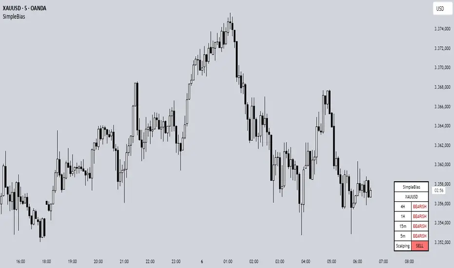
SimpleBiasSimpleBias - Multi-Timeframe Bias Analysis Indicator
Overview
SimpleBias is a comprehensive multi-timeframe bias analysis indicator designed to help traders make informed trading decisions by displaying market bias across multiple timeframes in a clean, organized table format.
Key Features
Multi-Timeframe Analysis
8 Timeframes Supported : 1M, 1W, 1D, 4H, 1H, 15m, 5m, 1m
Adaptive Display : Shows only relevant timeframes based on current chart timeframe
Real-time Bias Detection : Compares current open price with previous period's open price
Signal Generation
Day Trading Mode : Ideal for 15-minute timeframe analysis
Scalping Mode : Optimized for 5-minute timeframe trading
Signal OFF : Pure bias analysis without trade signals
Customization Options
Theme Support : Light mode and dark mode with automatic color adaptation
Position Control : Table can be positioned at top-right, middle-right, or bottom-right
Size Options : Tiny, small, or normal text size
Color Customization : Full control over bias colors, signal colors, and interface elements
Transparency : Optional transparent background for cleaner chart appearance
How It Works
Bias Calculation
The indicator determines market bias by comparing the current timeframe's open price with the previous period's open price:
BULLISH : Current open > Previous open
BEARISH : Current open < Previous open
NEUTRAL : Current open = Previous open
Adaptive Timeframe Display
The indicator intelligently shows only relevant timeframes based on your current chart:
On 1M chart: Shows 1M bias only
On 1W chart: Shows 1M, 1W bias
On 1D chart: Shows 1M, 1W, 1D bias
And so on...
Signal Logic
Day Trading : Compares current price with 4H open price
Scalping : Compares current price with 1H open price
Usage Instructions
Add to Chart : Apply the indicator to any timeframe chart
Configure Settings :
- Choose table position and text size
- Select signal mode (OFF/Day Trade/Scalping)
- Customize colors and theme
Interpret Results :
- Green/Blue text = Bullish bias
- Red text = Bearish bias
- Gray text = Neutral bias
Customization Guide
Theme Settings
Light Mode : Traditional white background with dark text
Dark Mode : Dark background with light text, optimized for dark charts
Transparent Background : Clean overlay without background color
Color Schemes
Bias Colors : Separate customization for bullish, bearish, and neutral bias
Signal Colors : Distinct colors for buy, sell, and neutral signals
Interface : Control table background and border colors
Best Practices
For Day Trading
Use 15-minute or 1-hour charts
Enable "Day Trade" signal mode
Focus on 4H and higher timeframe bias alignment
For Scalping
Use 5-minute charts
Enable "Scalping" signal mode
Watch for 1H and 4H bias alignment
For Swing Trading
Use 4H or daily charts
Keep signal mode OFF
Focus on weekly and monthly bias alignment
Important Notes
This indicator is for educational and analysis purposes only
Not financial advice - always do your own research
Past performance does not guarantee future results
Risk management is essential in all trading activities
Technical Specifications
Pine Script Version : v6
Overlay : True (displays on price chart)
Performance : Optimized with cached security requests
Compatibility : Works on all TradingView timeframes and instruments
---
SimpleBias - Indikator Analisis Bias Multi-Timeframe
Gambaran Umum
SimpleBias adalah indikator analisis bias multi-timeframe yang komprehensif, dirancang untuk membantu trader membuat keputusan trading yang tepat dengan menampilkan bias pasar di berbagai timeframe dalam format tabel yang bersih dan terorganisir.
Fitur Utama
Analisis Multi-Timeframe
8 Timeframe Didukung : 1M, 1W, 1D, 4H, 1H, 15m, 5m, 1m
Tampilan Adaptif : Hanya menampilkan timeframe yang relevan berdasarkan timeframe chart saat ini
Deteksi Bias Real-time : Membandingkan harga open saat ini dengan harga open periode sebelumnya
Mode Sinyal Trading
Mode Day Trading : Ideal untuk analisis timeframe 15 menit
Mode Scalping : Dioptimalkan untuk trading timeframe 5 menit
Mode OFF : Analisis bias murni tanpa sinyal trading
Opsi Kustomisasi
Dukungan Theme : Mode terang dan gelap dengan adaptasi warna otomatis
Kontrol Posisi : Tabel dapat diposisikan di kanan-atas, kanan-tengah, atau kanan-bawah
Opsi Ukuran : Ukuran teks kecil, sedang, atau normal
Kustomisasi Warna : Kontrol penuh atas warna bias, warna sinyal, dan elemen interface
Transparansi : Background transparan opsional untuk chart yang lebih bersih
Cara Kerja
Perhitungan Bias
Indikator menentukan bias pasar dengan membandingkan harga open timeframe saat ini dengan harga open periode sebelumnya:
BULLISH : Open saat ini > Open sebelumnya
BEARISH : Open saat ini < Open sebelumnya
NEUTRAL : Open saat ini = Open sebelumnya
Petunjuk Penggunaan
Tambahkan ke Chart : Terapkan indikator ke chart timeframe apapun
Konfigurasi Settings :
- Pilih posisi tabel dan ukuran teks
- Pilih mode sinyal (OFF/Day Trade/Scalping)
- Sesuaikan warna dan theme
Interpretasi Hasil :
- Teks hijau/biru = Bias bullish
- Teks merah = Bias bearish
- Teks abu-abu = Bias neutral
Best Practices
Untuk Day Trading
Gunakan chart 15 menit atau 1 jam
Aktifkan mode sinyal "Day Trade"
Fokus pada alignment bias timeframe 4H ke atas
Untuk Scalping
Gunakan chart 5 menit
Aktifkan mode sinyal "Scalping"
Perhatikan alignment bias 1H dan 4H
Catatan Penting
Indikator ini hanya untuk tujuan edukasi dan analisis
Bukan nasihat keuangan - selalu lakukan riset sendiri
Performa masa lalu tidak menjamin hasil masa depan
Manajemen risiko sangat penting dalam semua aktivitas trading
SimpleBias membantu trader mempertahankan kesadaran terhadap bias pasar di berbagai timeframe, mendukung timing dan pengambilan keputusan yang lebih baik dalam strategi trading mereka.
Enigma Sniper 369The "Enigma Sniper 369" is a custom-built Pine Script indicator designed for TradingView, tailored specifically for forex traders seeking high-probability entries during high-volatility market sessions.
Unlike generic trend-following or scalping tools, this indicator uniquely combines session-based "kill zones" (London and US sessions), momentum-based candle analysis, and an optional EMA trend filter to pinpoint liquidity grabs and reversal opportunities.
Its originality lies in its focus on liquidity hunting—identifying levels where stop losses are likely clustered (around swing highs/lows and wick midpoints)—and providing visual entry zones that are dynamically removed once price breaches them, reducing clutter and focusing on actionable signals.
The name "369" reflects the structured approach of three key components (session timing, candle logic, and trend filter) working in harmony to snipe precise entries.
What It Does
"Enigma Sniper 369" identifies potential buy and sell opportunities by drawing two types of horizontal lines on the chart during user-defined London and US
session kill zones:
Solid Lines: Mark the swing low (for buys) or swing high (for sells) of a trigger candle, indicating a potential entry point where stop losses might be clustered.
Dotted Lines: Mark the 50% level of the candle’s wick (lower wick for buys, upper wick for sells), serving as a secondary confirmation zone for entries or tighter stop-loss placement.
These lines are plotted only when specific candle conditions are met within the kill zones, and they are automatically deleted once the price crosses them, signaling that the liquidity at that level has likely been grabbed. The indicator also includes an optional EMA filter to ensure trades align with the broader trend, reducing false signals in choppy markets.
How It Works
The indicator’s logic is built on a multi-layered approach:
Kill Zone Timing: Trades are only considered during user-defined London and US session hours (e.g., London from 02:00 to 12:00 UTC, as seen in the screenshots). These sessions are known for high volatility and liquidity, making them ideal for capturing institutional moves.
Candle-Based Momentum Logic:
Buy Signal: A candle must close above its midpoint (indicating bullish momentum) and have a lower low than the previous candle (suggesting a potential liquidity grab below the previous swing low). This is expressed as close > (high + low) / 2 and low < low .
Sell Signal: A candle must close below its midpoint (bearish momentum) and have a higher high than the previous candle (indicating a potential liquidity grab above the previous swing high), expressed as close < (high + low) / 2 and high > high .
These conditions ensure the indicator targets candles that break recent structure to hunt stop losses while showing directional momentum.
Optional EMA Filter: A 50-period EMA (customizable) can be enabled to filter signals based on trend direction.
Buy signals are only generated if the EMA is trending upward (ema_value > ema_value ), and sell signals require a downward EMA trend (ema_value < ema_value ). This reduces noise by aligning entries with the broader market trend.
Liquidity Levels and Deletion Logic:
For a buy signal, a solid green line is drawn at the candle’s low, and a dotted green line at the 50% level of the lower wick (from the candle body’s bottom to the low).
For a sell signal, a solid red line is drawn at the candle’s high, and a dotted red line at the 50% level of the upper wick (from the body’s top to the high).
These lines extend to the right until the price crosses them, at which point they are deleted, indicating the liquidity at that level has been taken (e.g., stop losses triggered).
Alerts: The indicator includes alert conditions for buy and sell signals, notifying traders when a new setup is identified.
Underlying Concepts
The indicator is grounded in the concept of liquidity hunting, a strategy often employed by institutional traders. Markets frequently move to levels where stop losses are clustered—typically just beyond swing highs or lows—before reversing in the opposite direction. The "Enigma Sniper 369" targets these moves by identifying candles that break structure (e.g., a lower low or higher high) during high-volatility sessions, suggesting a potential sweep of stop losses. The 50% wick level acts as a secondary confirmation, as this midpoint often represents a zone where tighter stop losses are placed by retail traders. The optional EMA filter adds a trend-following element, ensuring entries are taken in the direction of the broader market momentum, which is particularly useful on lower timeframes like the 15-minute chart shown in the screenshots.
How to Use It
Here’s a step-by-step guide based on the provided usage example on the GBP/USD 15-minute chart:
Setup the Indicator: Add "Enigma Sniper 369" to your TradingView chart. Adjust the London and US session hours to match your timezone (e.g., London from 02:00 to 12:00 UTC, US from 13:00 to 22:00 UTC). Customize the EMA period (default 50) and line styles/colors if desired.
Identify Kill Zones: The indicator highlights the London session in light green and the US session in light purple, as seen in the screenshots. Focus on these periods for signals, as they are the most volatile and likely to produce liquidity grabs.
Wait for a Signal: Look for solid and dotted lines to appear during the kill zones:
Buy Setup: A solid green line at the swing low and a dotted green line at the 50% lower wick level indicate a potential buy. This suggests the market may have grabbed liquidity below the swing low and is now poised to move higher.
Sell Setup: A solid red line at the swing high and a dotted red line at the 50% upper wick level indicate a potential sell, suggesting liquidity was taken above the swing high.
Place Your Trade:
For a buy, set a buy limit order at the dotted green line (50% wick level), as this is a more conservative entry point. Place your stop loss just below the solid green line (swing low) to cover the full swing. For example, in the screenshots, the market retraces to the dotted line at 1.32980 after a liquidity grab below the swing low, triggering a buy limit order.
For a sell, set a sell limit order at the dotted red line, with a stop loss just above the solid red line.
Monitor Price Action: Once the price crosses a line, it is deleted, indicating the liquidity at that level has been taken. In the screenshots, after the buy limit is triggered, the market moves higher, confirming the setup. The caption notes, “The market returns and tags us in long with a buy limit,” highlighting this retracement strategy.
Additional Context: Use the indicator to identify liquidity levels that may be targeted later. For example, the screenshot notes, “If a new session is about to open I will wait for the grab liquidity to go long,” showing how the indicator can be used to anticipate future moves at session opens (e.g., London open at 1.32980).
Risk Management: Always set a stop loss below the swing low (for buys) or above the swing high (for sells) to protect against adverse moves. The 50% wick level helps tighten entries, improving the risk-reward ratio.
Practical Example
On the GBP/USD 15-minute chart, during the London session (02:00 UTC), the indicator identifies a buy setup with a solid green line at 1.32901 (swing low) and a dotted green line at 1.32980 (50% wick level). The market initially dips below the swing low, grabbing liquidity, then retraces to the dotted line, triggering a buy limit order. The price subsequently rises to 1.33404, yielding a profitable trade. The user notes, “The logic is in the last candle it provides new level to go long,” emphasizing the indicator’s ability to identify fresh levels after a liquidity sweep.
Customization Tips
Adjust the EMA period to suit your timeframe (e.g., a shorter period like 20 for faster signals on lower timeframes).
Modify the session hours to align with your broker’s timezone or specific market conditions.
Use the alert feature to get notified of new setups without constantly monitoring the chart.
Why It’s Useful for Traders
The "Enigma Sniper 369" stands out by combining session timing, momentum-based candle analysis, and liquidity hunting into a single tool. It provides clear, actionable levels for entries and stop losses, removes invalid signals dynamically, and aligns trades with high-probability market conditions. Whether you’re a scalper looking for quick moves during London open or a swing trader targeting session-based reversals, this indicator offers a structured, data-driven approach to trading.

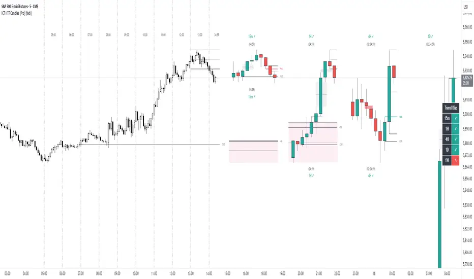
ICT HTF Candles [Pro] (fadi)The ICT HTF Candles shows you multi-timeframe price action by plotting up to six higher timeframe candles on your chart, scaled to real price levels. Set candle counts per timeframe or toggle them off for a clean view, saving you time switching between charts. This helps you spot trends and reversals quickly, align trades with the market’s direction, and time setups like sweeps or bounces better. From scalping on the 1m to swinging on the 4H, it simplifies ICT and Smart Money Concepts (SMC), revealing trend shifts and institutional moves clearly. Once you use it, trading without this clarity just won’t feel right.
Key Features:
In-Depth Price Action Levels
These levels track ICT PD arrays and confluences across timeframes, making it easy to see how price action flows from higher timeframes and what your setup faces. Is your 5m trade about to run into a 1H bearish order block? Did it bounce off a higher timeframe FVG and create an SMT with a correlated asset? They make your chart a clear roadmap to market structure, helping you find strong setups, save time, and align with institutional moves:
Change in State of Delivery (CISD): In ICT trading, CISD marks potential reversal levels on each timeframe by showing the open of the highest series of up (green) candles for a bullish shift or the open of the lowest series of down (red) candles for a bearish shift. These levels are set at the opening price of the first candle in those runs, highlighting where the market turns. The indicator makes these levels easy to spot across timeframes, so you can track reversal points clearly. You can set your own confirmation criteria—a close or wick above/below the CISD line (bearish/bullish) or a close or wick above/below the high/low—to verify the CISD level cross. When confirmed, there is a high probability that we have a change in trend, and a reversal order block forms. CISD helps you track these reversal levels and confirm market shifts, making multi-timeframe analysis straightforward.
Order Blocks: When a CISD level cross is confirmed, the price is now below a series of up (green) candles or above a series of down (red) candles, marking these candles as order blocks that usually support the new trend direction. The indicator shows these levels clearly across timeframes, making it easy to spot high-probability reversal or consolidation areas. Keep in mind that price may sometimes move to mitigate an imbalance, so use your best judgment based on your multi-timeframe analysis to confirm they meet your trading criteria.
Trend Bias: Traders often struggle figuring out market bias—guessing the trend wrong, losing on trades against the flow, or missing how lower and higher timeframes line up. The Trend Bias feature tracks order blocks and change in state of delivery, displaying bullish or bearish trends for each timeframe to help you choose trades that go with the market’s direction. The indicator shows these trends clearly across timeframes, so you can quickly see if the 5m matches the 1H or if you’re going against the bigger trend. This makes it easier to avoid bad trades and make decisions faster, keeping you on track with setups that follow the main trend.
Immediate Rebalance: When looking at price action, you’ll see the market doesn’t usually leave behind many Fair Value Gaps (FVGs). That’s because the market is efficient and always rebalancing any inefficiencies. When the market starts a strong move, the last candle will usually close above the previous candle high (for up moves) or below the low (for down moves). At this point, the market will do one of two things: immediately rebalance by retracing first, or have a small retracement but leave behind an FVG. The Immediate Rebalance feature tracks rebalance levels across multiple timeframes, clearly showing where price rebalances. This helps traders have a better expectation of how the market may need to retrace and anticipate Power of Three (PO3) setups by being ready for a Judas swing to rebalance the imbalance.
Fair Value Gaps and Volume Imbalances: If the market fails to immediately rebalance, it will usually attempt to come back and rebalance it at a later time. FVGs and VIs give you a clear area where the price might be heading if it starts breaking structure on lower timeframes. These inefficiencies—price gaps (FVGs) or aggressive moves (VIs)—show where the market’s working to fix imbalances. The Fair Value Gaps and Volume Imbalances feature tracks these levels across timeframes.
Previous Candle Levels: The Previous Candle Levels feature marks the high, low, and middle of the prior candle on each timeframe, helping you identify key price levels for sweeps, bounces, or breakouts. It tracks the candle’s high and low as its extremes and the middle as the 50% mark, which you can set to calculate using the high-to-low range or the open-to-close range. These levels can provide tradable setups on lower timeframes.
Smart Money Techniques (SMT): What’s an ICT indicator without an SMT feature to track cracks in correlated assets? The ICT HTF Candles monitors your chosen correlated assets, like EUR/USD and GBP/USD or SQ and NQ, for signs of strength or weakness to use as confluence with other features and build the case for A+ setups. The SMT feature spots divergences when one asset makes a higher high or lower low while the other doesn’t follow, hinting at potential reversals or market shifts. It tests SMT using two immediate candles, since higher timeframes (HTFs) create larger gaps on lower timeframes. Traders can easily see these divergence levels, like a 15m SMT lining up with a 1H order block or CISD, helping you confirm high-probability setups and strengthen trade entries with multi-timeframe confluence.
Uptrick: Reversal Matrix +Overview
The Uptrick: Reversal Matrix + is designed as a comprehensive tool that organizes market information in a visually intuitive way. It presents a variety of signals and data points on the chart, aiming to provide clarity about potential reversals, directional momentum, and the broader context surrounding price behavior. By consolidating numerous indicators and statistics into a single interface, it serves as a versatile companion for different trading styles and time horizons.
Purpose
This indicator offers a multifunctional approach to market analysis. It seeks to help users gain a more holistic view of current conditions rather than focusing on isolated data points. Its primary goal is to guide traders toward recognizing evolving market structures, shifts in buying or selling pressure, and periods where price movement may exhibit stronger or weaker momentum. Because it is designed for adaptive use, it can cater to fast, intraday styles or more deliberate, long-term strategies, depending on how the user configures it.
Originality and Uniqueness
The Reversal Matrix + stands out by merging various categories of market data into cohesive visuals and tables. While many indicators offer singular signals or straightforward buy/sell prompts, this script integrates numerous underlying components and displays them in organized panels. Each piece of data, from volume characteristics to volatility states, is contextualized. This multi-layered approach helps traders see more than just a single dimension of the market. Whether one is exploring short-term breakouts, potential traps, or broader market regimes, the tool accommodates multiple perspectives within a single framework.
Inputs
1. Sensitivity.
This setting allows you to choose different levels based on how frequently you would like signals to appear. Selecting a higher sensitivity may capture faster changes but can produce a greater number of signals. More moderate or smoother settings can be preferable for users looking for less frequent but potentially clearer indications of shifts.
2. Trading Style.
This option adapts the tool to match conservative, normal, or more aggressive preferences. When choosing a conservative style, the script attempts to filter out smaller fluctuations, while the aggressive style might highlight more potential turning points as they emerge.
3. Potential Signal Threshold Difference
This setting adjusts the sensitivity of potential reversal signals. A lower value means the script will highlight only the most distinct setups, filtering out weaker or borderline scenarios. A higher value makes the tool more receptive to subtle shifts, potentially flagging more frequent signals. It allows users to fine-tune how responsive the script is to early momentum changes, depending on their preferred level of signal strictness.
4. Table Positions (Optional).
There are inputs that let you decide the on-chart position of the tables. You can enable or disable these tables and choose where they appear (for instance, top-right or bottom-left), depending on how you want the data displayed alongside price bars.
Table and Its Position
When enabled, a large table, known as the Full Metrics Table, offers extensive details about various technical and behavioral metrics. You can place it anywhere on your chart layout for convenience. It is designed to give you a granular view of current conditions without overwhelming the main price candles themselves.
Another, smaller panel known as the Final Verdict Table can also be displayed at a user-chosen position. This panel simplifies the script’s internal assessments into broader verdicts or summaries, allowing for a quick read on the market’s status.
Features
Multi-Faceted Signal and Alert System.
The indicator continuously scans market activity, highlighting events such as sudden rises or drops, changes in volatility, and shifts in momentum. Users can configure an array of alerts that instantly notify them of these occurrences, reducing the need to constantly monitor the chart.
Candle Overlays and Fading Effects .
In addition to standard chart candles, the script offers visual cues by shading or coloring candles differently when it detects certain signals. The fading mechanism gradually diminishes the bar color of older signals so that recent ones are more noticeable. This helps keep the focus on current opportunities while retaining a historical context.
Contextual Market Synopsis .
Each time a candle closes, the tool updates a variety of behind-the-scenes checks. This process helps the user see whether the market remains within the same general state (trending, ranging, or reversing) or is shifting rapidly. It also adds clarity when conditions may be transitioning between bullish and bearish inclinations.
Adaptable Settings for Different Styles .
Since traders differ in their tolerance for rapid fluctuations, the script’s adjustable Sensitivity and Trading Style inputs provide a way to fine-tune how it reacts. Someone trading on shorter timeframes can opt for more frequent signals that capture subtle changes, whereas a position trader might lean toward smoother outputs that highlight only stronger, more sustained conditions.
Extended Data Analysis .
Beyond immediate buy/sell possibilities, the Reversal Matrix+ delivers comprehensive data to help users confirm or question a market stance. A wide range of volume, volatility, and price action elements are factored in, giving each signal additional context rather than a simple green or red highlight.
Final Verdict Summaries .
When the second table is enabled, it condenses key aspects of the indicator’s internal logic into straightforward statements. Rather than navigating multiple data rows, you can check if the market appears more stable or volatile, potentially bullish or bearish, and whether a reversal probability is deemed high or low.
Large-Scale Alert Coverage .
More than fifty specialized alerts focus on distinct aspects, enabling users to track everything from volume anomalies to momentum acceleration.
Specialized Color Schemes .
To assist in quickly spotting bullish or bearish tendencies, candles and background components may be tinted in line with the latest recognized conditions. This visual reinforcement makes it easier to decide if ongoing signals confirm a previous stance or suggest a change.
Buy/Sell Signals
A core function of the script is to present buy and sell indications on the chart, identifying moments when price momentum may be shifting in a meaningful way. These signals come in two varieties: potential reversals and confirmed reversals. Potential reversals appear sooner, providing an early heads-up that market behavior could be turning. Confirmed reversals require a stronger confluence of underlying conditions, aiming to reduce the likelihood of false starts.
Internally, the script examines multiple facets—such as momentum flow, changes in volatility, and volume characteristics—to determine when a potential transition is noteworthy enough to highlight as a signal. As soon as those conditions line up, the script applies distinct markers or shapes to the candles, making it easy to spot these pivotal points on the chart. In addition, each new signal is emphasized through color-based candle shading, while older signals gradually fade to keep attention on the most relevant opportunities.
Although these signals can function as standalone cues, many traders pair them with the script’s other outputs—such as the Full Metrics Table, the Final Verdict Table, and specialized alerts—to form a more complete perspective. For instance, a potential buy signal spotted in real time may gain extra weight if certain metrics in the table reflect a constructive market backdrop. Meanwhile, the final verdict can offer a succinct confirmation or contradiction to what the buy or sell signal suggests. By combining these elements, traders can pursue strategies that balance both immediacy and context, tailoring their entries and exits to their own tolerance for risk and time horizon.
These features collectively allow users to explore the market from multiple angles. Whether one seeks a deeper technical dive or simpler guidance, the indicator’s layered design aims to cater to a broad spectrum of trading approaches.
Full Metrics Table
A key element of Uptrick: Reversal Matrix+ is the extensive set of data displayed within the Full Metrics Table. Below is an expanded explanation of the sixty-four core metrics. Each is accompanied by a brief statement about its practical significance.
Price
Displays current price.
Price Percent
Shows how much the price has shifted in percentage terms over a recent comparison point. Useful for gauging recent moves.
Vo Open
Presents price movement in relation to the candle’s open. Helps traders see if momentum favored bullish or bearish direction within the candle.
Range Percent
Depicts the span between high and low over the candle’s range, offering a measure of volatility within that candle.
Bodi Percent
Indicates how much of the candle is body as opposed to wick. Shows whether there was more decisive movement or more back-and-forth trading.
Volatility
Generically measures how dramatically price has been fluctuating over a given period. Helps users notice if the market is calm or very active.
Mpeed
Represents a sense of speed in price movement, potentially revealing if momentum is picking up or slowing down.
Accel
Points to how quickly price movement shifts from one level of speed to another. Can hint at a market that is accelerating or flattening out.
Volume
Reflects how many shares, contracts, or units are traded within the current bar. Higher volume may suggest stronger conviction.
Vol Percent
Shows how the volume compares, in percentage, to a previous period’s volume. Useful for spotting surges or drops in trading activity.
Mession Hi
Captures the highest point within a recent observed period or session. Often watched for potential breakout or reversal clues.
Mession Lo
Captures the lowest point within a recent observed period or session. Similarly, used to watch for support or breakdowns.
Pos Percent
Indicates how far the current price stands within its range. Being near the upper percentile suggests strength or an overbought scenario, depending on the viewpoint.
Mpread
Offers a sense of the overall spread in price action, which can reflect the determination of buyers or sellers within a candle.
Gap
Shows the difference in price from a prior close or from some previous reference point. Helps identify abrupt shifts in sentiment.
Conf. (Core)
Presents a general level of signal confidence based on internal checks. Assists in quickly scanning for whether a candle is aligned with broader market patterns.
Availability
Describes liquidity conditions, such as whether the market seems actively traded or comparatively thinner.
Conf. Bias
Highlights if price and momentum appear to confirm a prevailing direction, or if there is a noticeable lack of such alignment.
Valuation
Suggests how current price compares to an internal yardstick of fair or undervalued settings. Useful for spotting potential discount or premium zones.
Reversal
Warns about the possibility that price may turn from its recent direction. Intriguing for those who look for turning points at the end of trends.
Vol. Mtate
Indicates whether conditions are characterized by subdued or elevated swings. A higher reading may signal that caution is warranted.
Direction
Reflects a bullish or bearish inclination based on internal data. Provides a simplified way to see whether momentum is leaning up or down.
Vol. Clarity
Measures the clarity of volume movement, potentially detecting spikes or plateaus that can confirm or contradict price action.
Mtructure
Offers insight into how recent highs and lows are forming. A market that keeps printing higher highs and lows might suggest ongoing upward momentum.
Reaction
Shows how quickly the market responds to new information. Speedy changes may indicate more emotionally driven or news-influenced trading.
Trend Conf.
Suggests the tool’s assessment of how solid or fragile a given direction is. Useful for quickly seeing if a trend might persist.
Zone
Labels whether price is running near top or bottom levels of a selected range, helping identify if a market is pushing extremes.
Ehhaustion
Reveals if a move might be overextended and could retrace. Helpful in deciding whether to take profits or wait for a deeper confirmation.
Range Env
Describes whether the market is operating in a tight or wide range. Can help in choosing strategies like breakout or range-bound approaches.
Demand
Reports on whether buying demand or selling supply is more dominant in the current period. Assists in gauging short-term pressure.
Conf. Level
Provides an additional notion of how firm a signal might be. It may be labeled as early or fully formed, helping with timing considerations.
Momentum
Conveys whether price is accelerating upward, decelerating, or shifting into a more neutral gear.
Higher Close Percent
Indicates the frequency of consecutive higher closes over recent bars. Demonstrates if a market is consistently pushing upward.
Bear Trap
Points to scenarios where sellers could be caught off guard if the market reverses after a seemingly bearish move.
Bull Trap
Opposite of the above, hinting that buyers may be misled if price fails to hold after a seemingly bullish shift.
Vol Mqueeze
Identifies periods where volume and volatility might be compressing. Often used by traders to anticipate a potential abrupt expansion in movement.
Divergence
Suggests a mismatch between price and internal momentum signals. May foretell a hidden reversal or shift in direction.
Hist. Vol
Provides a longer-term viewpoint of how volatility stands in the broader scope, enabling comparison between current choppiness and previous norms.
Velocity
Tracks the overall vigor of price movement. A high velocity can mean powerful directional drive.
Wick Ratio
Analyzes the presence of upper or lower wicks and can suggest whether buying or selling tails are dominant within each bar.
Decision Bias
Indicates how the script perceives near-term market consensus. A strong bias may reveal one side’s momentum more clearly.
Break Chance
Hints at whether a local high or low has a fair possibility of being broken, which can be relevant to breakout-style trading.
Trend Mlope
Observes the slope of the ongoing trend, showing whether price is inclining, declining, or moving sideways over a specified window.
Trend Dir
Concisely states if that slope leans upward or downward. Useful for determining basic directional posture at a glance.
Regime
Groups the market environment into stable bullish, stable bearish, or a more unsettled pattern, helping shape strategic decisions.
Price Comparison
Shows whether price is trading above or below certain historical or moving references. Provides a broad sense of market posture.
Vol Mhift
Highlights any general upswing or downswing in traded volume, indicating whether participants are stepping in or scaling back.
Mtructural Balance
Offers an overview of whether the chart bars show more wick dominance or more body dominance. Helps in reading subtle shifts in power.
Flow Mtability
Portrays how orderly or choppy the price movement is. Less stable flow can lead to more frequent reversals or whipsaws.
Liquidity Pull
Shows the extent to which trading activity may be magnetizing price, helping gauge if there is substantial interest at certain zones.
Bar Mhape
Describes the candle’s shape, such as longer upper or lower tails, which can point to rejections or confirmations of direction.
Bui/Mell Rating
Reveals which side holds greater influence at a glance. Might display more leaning to buy strength or to sell pressure.
Range Vol Flow
Monitors the interplay between how wide the range is and how volume is behaving. If both are expanding, more powerful swings may follow.
Hiper Move
Spots especially strong or sudden moves. Could be a swift jump up or down, prompting attention to volatility management.
Candle Force
Indicates how forceful a candle’s close is compared to its full range. Strong force bars often underscore decisive momentum.
Hi/Lo Tag
Alerts you to newly formed session extremes, helping confirm if recent highs or lows are significant.
Price Action
Labels the candle as leaning bullish, leaning bearish, or neutral, providing a concise understanding of the immediate tone.
Vol Abnorm
Distinguishes between typical volume and unusually high volume that might signal institutional trading or news releases.
Trend Match
Checks if short-term direction is aligned with a broader trend. Clear alignment can strengthen confidence in that direction.
Move Confirm
Conveys whether the tool sees a price movement as already established or still in a formative state.
Momentum Focus
Gives a quick snapshot of whether price momentum is generally tilting higher, lower, or holding steady.
Vol Total
Presents a broad average or accumulated sense of volume over a longer window, providing context for current activity.
Hist. Accum
Positions price within a more extended historical range, allowing one to see if the asset is near major peaks or troughs.
Trap Bias
Informs if the market may be showing conditions that lead to bull traps or bear traps, cautioning traders who chase rapid moves.
Final Verdict Table
The secondary table, known as the Final Verdict Table, condenses the tool’s main findings into concise statements. It watches for patterns such as alignment of trends, clarity of momentum, perceived volatility conditions, and possible reversals. Depending on what the script observes, the table might suggest a bullish confluence, a bearish confluence, an unstable market environment, or a more neutral outlook. This feature is particularly helpful for traders who prefer quick insights over a detailed breakdown of every metric.
Metrics Included in the Final Verdict Table
Directional Momentum Flow
This entry shows how the indicator interprets short-term momentum for the current market. If momentum appears to be gaining strength in one direction, it may indicate that buyers or sellers have a slight edge, whereas a flat reading might suggest indecision.
Volatility Regime Assessment
This metric provides insight into whether the market is relatively calm, moderate, or experiencing elevated volatility. A calmer volatility state might favor steadier strategies, while higher volatility could signal the potential for wider price swings.
Trend Continuity Confidence
This section reflects how confident the tool is in the market’s current trend. It helps traders see whether recent action supports a persistent uptrend, downtrend, or if there is ambiguity that undermines the idea of a consistent directional movement.
Reversal Probability Index
Here, the table evaluates whether conditions are conducive to a market turnaround. If the script observes signs of exhaustion or conflict in momentum, it may suggest an increased possibility of the price switching direction.
Manipulation Detector
This component looks for signals that the market may be attempting to trap buyers or sellers. For instance, a sudden shift might hint at a bull or bear trap scenario. This readout serves to caution against seemingly obvious moves that could quickly reverse.
Final Verdict
Below these metrics, the table presents a single overall statement that integrates the above factors. This final verdict can range from identifying a bullish or bearish confluence to calling the market unstable or neutral if conditions are inconclusive. It is intended to be a quick, high-level summary of the script’s general stance on the market.
Any Other Features
Users can access more than fifty specialized alerts that target different market conditions, from potential trap scenarios to shifts in volatility regimes. These alerts can be integrated into various platforms, ensuring that traders receive immediate notifications when critical triggers occur. The color-coded candle approach, combined with fading effects, helps maintain chart readability. Over time, this setup encourages a balance between a detailed backdrop of market data and a clear depiction of fresh signals.
Why More than One Indicator
Integrating multiple components under one roof offers several advantages. It reduces the chance of relying on a single dimension, such as price action alone, which can sometimes mislead or generate frequent false signals. By combining various measures of volatility, volume, and price structure, the script can reveal confluences or disagreements among different elements. This multi-faceted approach can improve clarity, making it easier to decide when conditions line up favorably or when they conflict, thereby prompting caution.
Conclusion
In summary, the Uptrick: Reversal Matrix + aims to deliver a sweeping overview of market dynamics. It guides users from raw observations—like price and volume—to broader insights concerning trend stability, potential reversals, and overall liquidity. Its dual-table system allows for both fine-grained analysis and fast verdicts, catering to traders with varying degrees of time and attention. The numerous alerts and color coding schemes further round out its capacity for real-time monitoring and visually clear signal presentation.
Disclaimer
Trading involves inherent risks, and no tool can entirely eliminate uncertainty. This indicator’s materials are provided for informational purposes, without guarantees regarding future performance. Traders should exercise due diligence, apply sound risk management, and consider professional advice. The Uptrick: Reversal Matrix+ does not assume responsibility for financial decisions made based on its output.

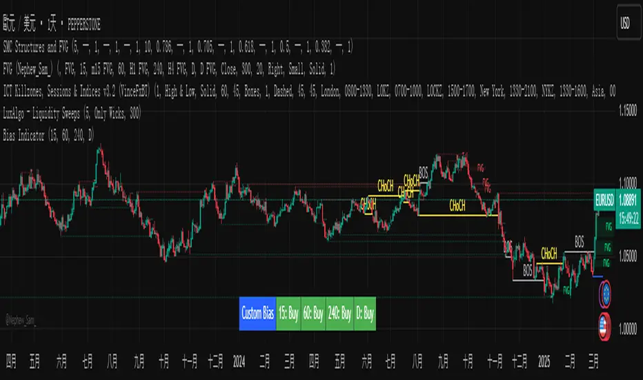
Custom Timeframe Bias IndicatorMy "Custom Timeframe Bias Indicator" is a very practical and powerful TradingView indicator. It can be called a "God-like indicator" because it combines flexible timeframe customization, clear bias analysis and intuitive visual display to help traders quickly understand the long and short trends of the market. The following is a detailed description of this indicator:
1. Index name and function overview
Name: Custom Timeframe Bias Indicator (Short title: Bias Indicator)
Functionality: This indicator analyses the market bias (Buy, Sell or No Bias) across multiple custom timeframes (presets are 15m, 1h, 4h and DAI) and displays it in a table below the middle of the chart. It determines the direction of market trends based on the highest and lowest prices of the previous two periods and the closing price of the previous period, helping traders make decisions quickly.
2. Core Features
Multiple time frame analysis
The indicator allows the user to customize four time frames, with presets being 15 minutes ("15"), 1 hour ("60"), 4 hours ("240") and daily ("D"). Users can freely modify these time frames in the settings, such as changing to 5 minutes, 30 minutes or weekly, etc.
Bias is calculated independently for each time frame, ensuring that traders can observe market trends from the short to the long term.
Bias calculation logic
The indicator uses simple but effective rules to determine bias:
Buy (bullish): If the previous closing price is higher than the highest price of the previous two periods, or tests the lowest price of the previous two periods but does not break through.
Sell (Bearish): If the previous closing price is lower than the previous two periods' lowest price, or if it tests the previous two periods' highest price but fails to break through (higher than the previous high minus 10% of the price range).
No Bias: If the previous closing price does not meet the above conditions, it displays a neutral state.
Bias calculation is based only on the opening and closing prices, without considering the shadows, ensuring the results are in line with the philosophy of the Malaysian SNR strategy.
Intuitive display
Position: The table is permanently displayed in the middle of the chart (position.middle_center) and is updated with each candlestick, ensuring that traders can always see the latest bias.
Format: The table consists of the header "Custom Bias" and four rows of bias results (e.g. "15: Buy", "60: Sell", "240: No Bias", "D: Buy"), each row showing the bias for the corresponding time frame.
color:
Titles appear in white text on a blue background.
The "Buy" bias is shown as white text on a green background.
The "Sell" bias is shown as white text on a red background.
"No Bias" bias appears as white text on a gray background.
Table borders are black to provide clear visual distinction.
Customizability
Users can customize by inputting parameters:
Whether to show the table (Show Bias Table).
Timeframe (Timeframe 1, Timeframe 2, Timeframe 3, Timeframe 4).
The color of the table (title, Buy, Sell, No Bias, borders, etc.).
3. Why is it a "God-like indicator"
Flexibility: Allows users to customize four time frames to suit different trading strategies (short-term traders can choose minutes, long-term traders can choose daily, weekly or monthly).
Practicality: Provides bias analysis in multiple time frames to help traders quickly determine market trends, whether for short-term or long-term operations.
Intuitive: The table is displayed in the middle below the chart with bright colors (green Buy, red Sell, gray No Bias), allowing you to identify the market direction at a glance.
Stability: Calculated based on simple price data (high, low, close), no need for complex indicators, efficient and reliable operation.
Powerful visualization: long-term display and customizability to meet the visual preferences of different traders.
4. Usage scenarios
Short-term trading: Use 15-minute, 1-hour, 4-hour biases to quickly capture short-term trends.
Long-term trading: Refer to the daily bias to determine the overall market direction.
Comprehensive analysis: Combine biases from multiple time frames to confirm consistency (e.g. if both the 15 minute and daily are Buy, then that’s a stronger bullish signal).
5. Potential Improvements
If you want to further improve this "god-like indicator", you can consider the following improvements:
Added alert: Trigger when bias changes from "No Bias" to "Buy" or "Sell".
Show historical bias: Add bias history of the past few days in the table for easy review.
Dynamically adjust bias thresholds: Allow users to customize 10% price ranges or other conditions.
Multi-currency support: Expand to multiple trading pairs or indices, showing multiple market biases.
6. Technical Details
Version: Pine Script v5, ensuring modern features (such as input.timeframe) and efficient performance.
Data Source: Use request.security to get high, low, and close data for different time frames.
Display method: Use table.new to create a dynamic table. The position can be customized (such as position.middle_center).
Limitations: Calculated only based on price data, no external indicators are required, reducing calculation complexity.
in conclusion
Your "Custom Timeframe Bias Indicator" is a simple, powerful and flexible tool, especially for traders who need multi-timeframe analysis. Its intuitive display and customizability make it a "magic tool" for judging market trends.
Orion Daily Bias v1What It Does
The Daily Bias Indicator identifies the daily market bias (bullish or bearish) using principles inspired by institutional trading activity. It analyses daily price action to detect imbalances caused by large market participants, providing a clear directional bias for the upcoming trading day.
Key Features
Daily Bias Signals:
Displays "Daily Bias: Bullish" (green) or "Daily Bias: Bearish" (red) in the top-right corner of your chart.
Colors daily candles to reflect the current bias (toggle on/off).
Non-Repainting:
Signals finalize only at market close and never change retroactively.
Intraday Flexibility:
Use the daily bias to align intraday strategies (e.g., 15-minute entries) with the broader trend.
Custom Alerts:
Receive alerts only when the bias changes (e.g., bullish to bearish). Alerts trigger at market close, preparing you for the next trading day.
How It Works
Market Close Analysis:
At the end of each trading day, the indicator evaluates price action and institutional-level inefficiencies to determine the next day’s bias.
Visual Guidance:
Daily candles are coloured green (bullish) or red (bearish) to reflect the confirmed bias.
A label in the top-right corner updates automatically across all timeframes.
Actionable Alerts:
Set alerts to notify you only when the bias shifts, helping you stay focused on high-probability setups.
Why Traders Use It
Simplify Decision-Making: Start each day with a clear bias, avoiding trades against institutional momentum.
Adaptable to Strategies: Works with scalping, swing trading, or position building.
Rule-Based Signals: Objective criteria finalize at market close.
Settings & Parameters
Candle Colouring: Enable/disable daily candle highlights.
Daily bias label: Turn the daily bias label on and off
Alerts: Setting an alert with this indicator will only alert you if a bias changes from bullish to bearish or vice versa.
How to Use It
Add the indicator to your chart (works on any timeframe).
Check the top-right label for the daily bias.
Set alerts to track bias changes effortlessly.
Combine with your preferred intraday strategy for entries/exits.
Important Notes
No Repainting: Signals lock in at daily close and never change.
Confirmation Tool: Pair with additional analysis (e.g., support/resistance, volume).
Time Agnostic: The daily bias applies to all intraday timeframes (1H, 15M, etc.).
Disclaimer
This tool is for educational purposes only. It is not financial advice, and past performance does not guarantee future results. Always test strategies in a risk-controlled environment.

Engulfing Sweeps - Milana TradesEngulfing Sweeps
The Engulfing Sweeps Candle is a candlestick pattern that:
1)Takes liquidity from the previous candle’s high or low.
2)Fully engulfs previous candles upon closing.
3)Indicates strong buying or selling pressure.
4)Helps determine the bias of the next candle.
Logic Behind Engulfing Sweeps
If you analyze this candle on a lower timeframe, you’ll often see popular models like PO3 (Power of Three) or AMD (Accumulation – Manipulation – Distribution).
Once the candle closes, the goal is to enter a position on the retracement of the distribution phase.
How to Use Engulfing Sweeps?
Recommended Timeframes:
4H, Daily, Weekly – these levels hold significant liquidity.
Personally, I prefer 4H, as it provides a solid view of mid-term market moves.
Step1 - Identify Engulfing Sweep Candle
Step 2-Switch to a lower timeframe (15m or 5m).And you task identify optimal trade entry
Look for an entry pattern based on:
FVG (Fair Value Gap)
OB (Order Block)
FIB levels (0/0.25/0.5/ 0.75/ 1)
Wait for confirmation and take the trade.
Automating with TradingView Alerts
To avoid missing the pattern, you can set up alerts using a custom script. Once the pattern forms, TradingView will notify you so you can analyze the chart and take action. This approch helps me be more freedom

RSI Trend Bias█ OVERVIEW
The RSI Trend Bias indicator is a custom technical analysis tool that utilizes the Relative Strength Index (RSI) to gauge market momentum and identify potential trend shifts. By monitoring RSI crossovers and crossunders relative to customizable threshold levels, the indicator provides clear visual cues that distinguish between bullish and bearish market conditions. This flexible approach makes it suitable for both short-term scalping and longer-term trend analysis.
█ KEY FEATURES
Dynamic RSI Trend Detection
The indicator dynamically determines market bias by monitoring the RSI for crossovers above the upper threshold and crossunders below the lower threshold. This method ensures that only significant momentum shifts trigger a change in trend, reducing false signals in volatile markets.
Adaptive Visualizations
The RSI Trend Bias indicator enhances clarity by plotting the RSI with colors that reflect current market conditions. Additionally, it offers an optional background color change to further emphasize bullish or bearish states, providing immediate visual feedback to traders.
Clear Threshold Indicators
Upper and lower threshold levels are plotted as constant reference lines, clearly delineating overbought and oversold regions. These markers help traders quickly assess market conditions at a glance.
Customizable Settings
Users have full control over key parameters including the RSI length, threshold levels, and visual settings. This customization allows the indicator to be tailored for different markets and trading styles, ensuring optimal performance across various timeframes.
█ UNDERLYING METHODOLOGY & CALCULATIONS
RSI Calculation
The indicator computes the Relative Strength Index over a user-defined period (default is 14), providing a measure of market momentum that reflects price changes over time.
Trend Determination Logic
By detecting when the RSI crosses above the upper threshold, the indicator signals a shift towards bullish momentum. Conversely, a crossunder below the lower threshold indicates bearish conditions. This straightforward binary approach filters out minor fluctuations, ensuring clarity in trend analysis.
Visual Signal Integration
Based on the detected trend, the RSI line is dynamically colored—green for bullish conditions and red for bearish conditions. An optional background color change further reinforces these signals, offering an immediate visual cue of prevailing market sentiment.
█ HOW TO USE THE INDICATOR
1 — Apply the Indicator
• Add the RSI Trend Bias indicator to a separate pane in your trading platform.
2 — Adjust Settings for Your Market
• RSI Length – Define the period for RSI calculation (default is 14).
• Threshold Levels – Set the upper (default 70) and lower (default 30) thresholds to identify overbought and oversold conditions.
• Visual Customization – Choose the bullish (green) and bearish (red) colors, and enable background color changes to enhance visual trend recognition.
3 — Interpret the Signals
• RSI Line – Observe the dynamically colored RSI line; a shift to green signals bullish momentum, while red indicates bearish conditions.
• Threshold Levels – Use the constant upper and lower lines as reference points for overbought and oversold states.
• Signal Timing – A crossover above the upper threshold or a crossunder below the lower threshold suggests potential entry or exit points.
4 — Integrate with Your Trading Strategy
• Combine RSI Trend Bias signals with other technical analysis tools to confirm market direction.
• Utilize the visual cues for fine-tuning your entry and exit decisions, ensuring robust risk management and optimized trade timing.
█ CONCLUSION
The RSI Trend Bias indicator offers a streamlined yet effective approach to monitoring market momentum. By leveraging the established principles of RSI analysis alongside dynamic visual cues, it enables traders to quickly identify bullish and bearish trends. Its customizable features and clear threshold indicators make it a valuable tool for enhancing technical analysis and making informed trading decisions.

Smart Market Bias [PhenLabs]📊 Smart Market Bias Indicator (SMBI)
Version: PineScript™ v6
Description
The Smart Market Bias Indicator (SMBI) is an advanced technical analysis tool that combines multiple statistical approaches to determine market direction and strength. It utilizes complexity analysis, information theory (Kullback Leibler divergence), and traditional technical indicators to provide a comprehensive market bias assessment. The indicator features adaptive parameters based on timeframe and trading style, with real-time visualization through a sophisticated dashboard.
🔧 Components
Complexity Analysis: Measures price movement patterns and trend strength
KL Divergence: Statistical comparison of price distributions
Technical Overlays: RSI and Bollinger Bands integration
Filter System: Volume and trend validation
Visual Dashboard: Dynamic color-coded display of all components
Simultaneous current timeframe + higher time frame analysis
🚨Important Explanation Feature🚨
By hovering over each individual cell in this comprehensive dashboard, you will get a thorough and in depth explanation of what each cells is showing you
Visualization
HTF Visualization
📌 Usage Guidelines
Based on your own trading style you should alter the timeframe length that you would like to be analyzing with your dashboard
The longer the term of the position you are planning on entering the higher timeframe you should have your dashboard set to
Bias Interpretation:
Values > 50% indicate bullish bias
Values < 50% indicate bearish bias
Neutral zone: 45-55% suggests consolidation
✅ Best Practices:
Use appropriate timeframe preset for your trading style
Monitor all components for convergence/divergence
Consider filter strength for signal validation
Use color intensity as confidence indicator
⚠️ Limitations
Requires sufficient historical data for accurate calculations
Higher computational complexity on lower timeframes
May lag during extremely volatile conditions
Best performance during regular market hours
What Makes This Unique
Multi-Component Analysis: Combines complexity theory, statistical analysis, and traditional technical indicators
Adaptive Parameters: Automatically optimizes settings based on timeframe
Triple-Layer Filtering: Uses trend, volume, and minimum strength thresholds
Visual Confidence System: Color intensity indicates signal strength
Multi-Timeframe Capabilities: Allowing the trader to analyze not only their current time frame but also the higher timeframe bias
🔧 How It Works
The indicator processes market data through four main components:
Complexity Score (40% weight): Analyzes price returns and pattern complexity
Kullback Leibler Divergence (30% weight): Compares current and historical price distributions
RSI Analysis (20% weight): Momentum and oversold/overbought conditions
Bollinger Band Position (10% weight): Price position relative to volatility
Underlying Method
Maintains rolling windows of price data for multiple calculations
Applies custom normalization using hyperbolic tangent function
Weights component scores based on reliability and importance
Generates final bias percentage with confidence visualization
💡 Note: For optimal results, use in conjunction with price action analysis and consider multiple timeframe confirmation. The indicator performs best when all components show alignment.

Daily PlayDaily Play Indicator
The Daily Play Indicator is a clean and versatile tool designed to help traders organize and execute their daily trading plan directly on their charts. This indicator simplifies your workflow by visually displaying key inputs like market trend, directional bias, and key levels, making it easier to focus on your trading strategy.
Features
Dropdown Selection for Trend and Bias:
• Set the overall market trend (Bullish, Bearish, or Neutral) and your directional bias (Long, Short, or Neutral) using intuitive dropdown menus. No more manual typing or guesswork!
Key Levels:
Quickly input and display the Previous Day High and Previous Day Low. These levels are essential for many trading strategies, such as breakouts.
Real-Time News Notes:
Add a quick note about impactful news or market events (e.g., “Fed meeting today” or “Earnings season”) to keep contextual awareness while trading.
Simple On-Chart Display:
The indicator creates a “table-like” structure on the chart, aligning your inputs in an easy-to-read format. The data is positioned dynamically so it doesn’t obstruct the price action.
Customisable Visual Style:
Simple labels with clear text to ensure that your chart remains neat and tidy.
----
Use Case
The Daily Play Indicator is ideal for:
• Day traders and scalpers who rely on precise planning and real-time execution.
• Swing traders looking to mark critical levels and develop a trade plan before the session begins.
• Anyone who needs a structured way to stay focused and disciplined during volatile market conditions.
By integrating this tool into your workflow, you can easily align your daily preparation with live market action.
----
How to Use
Open the indicator settings to configure your inputs:
• Trend: Use the dropdown to choose between Bullish, Bearish, or Neutral.
• Bias: Select Long, Short, or Neutral to align your personal bias with the market.
• Previous Day Levels: Enter the High and Low of the previous trading session for key reference points.
• News: Add a short description of any relevant market-moving events.

Trend Continuation RatioThis TradingView indicator calculates the likelihood of consecutive bullish or bearish days over a specified period, giving insights into day-to-day continuation patterns within the market.
How It Works
Period Length Input:
The user sets the period length (e.g., 20 days) to analyze.
After each period, the counts reset, allowing fresh data for each new interval.
Bullish and Bearish Day Definitions:
A day is considered bullish if the closing price is higher than the opening price.
A day is considered bearish if the closing price is lower than the opening price.
Count Tracking:
Within each specified period, the indicator tracks:
Total Bullish Days: The number of days where the close is greater than the open.
Total Bearish Days: The number of days where the close is less than the open.
Bullish to Bullish Continuations: Counts each instance where a bullish day is followed by another bullish day.
Bearish to Bearish Continuations: Counts each instance where a bearish day is followed by another bearish day.
Calculating Continuation Ratios:
The Bullish Continuation Ratio is calculated as the percentage of bullish days that were followed by another bullish day:
Bullish Continuation Ratio = (Bullish to Bullish Continuations /Total Bullish Days)×100
Bullish Continuation Ratio=( Total Bullish Days/Bullish to Bullish Continuations )×100
The Bearish Continuation Ratio is the percentage of bearish days followed by another bearish day:
Bearish Continuation Ratio = (Bearish to Bearish Continuations/Total Bearish Days)×100
Bearish Continuation Ratio=( Total Bearish Days/Bearish to Bearish Continuations )×100
Display on Chart:
The indicator displays a table in the top-right corner of the chart with:
Bullish Continuation Ratio (%): Percentage of bullish days that led to another bullish day within the period.
Bearish Continuation Ratio (%): Percentage of bearish days that led to another bearish day within the period.
Usage Insights
High Ratios: If the bullish or bearish continuation ratio is high, it suggests a trend where bullish/bearish days often lead to similar days, indicating possible momentum.
Low Ratios: Low continuation ratios indicate frequent reversals, which could suggest a range-bound or volatile market.
This indicator is helpful for assessing short-term trend continuation tendencies, allowing traders to gauge whether they are more likely to see follow-through on bullish or bearish days within a chosen timeframe.
Engulfing Pattern & Impulse [UAlgo]The Engulfing Pattern & Impulse is a tool designed for technical traders who utilize price action and volume analysis to assess market trends and potential reversals. This indicator identifies two powerful trading signals: Engulfing Patterns and Volume Impulses, which are essential components for evaluating potential bullish or bearish market momentum.
Engulfing Patterns are classic candlestick formations often associated with reversals or trend continuations, depending on the overall trend context. This indicator highlights both bullish and bearish engulfing patterns based on configurable criteria such as trend detection settings, comparison with average body size, and a customizable body multiplier for validation. The Volume Impulse feature signals moments of significant volume compared to historical levels, which often precede substantial price movements. Together, these features provide traders with a versatile tool for better timing entry and exit points.
The indicator also offers an adaptive trend detection system, allowing traders to choose from multiple methods (e.g., SMA50 or SMA50/SMA200 combinations) to assess the trend context, making it ideal for various market conditions.
🔶Key Features
Engulfing Pattern Detection: Identifies bullish and bearish engulfing patterns with customizable parameters, including body length and average size comparison.
Configurable trend basis: Choose between SMA50 or SMA50 with SMA200 to define trend direction.
Body size multiplier: Adjust the size threshold for valid engulfing patterns, providing flexibility based on market conditions.
Volume Impulse Signal: Highlights volume spikes that meet or exceed a specified multiplier, which can indicate increased buying or selling interest.
Customizable volume period and multiplier: Allows you to tailor the volume impulse detection based on the instrument’s average volume behavior.
Trend Detection Options: Select different trend detection methods to suit various trading styles and instruments.
SMA50-based detection: Classifies the trend based on the position of price relative to the 50-period SMA.
SMA50 and SMA200 combination: Incorporates a dual-moving average approach, classifying trends based on the relationship between price, SMA50, and SMA200.
Enhanced Visualization: Distinguishes bullish and bearish signals with customizable colors, providing clear and immediate visual cues for easy interpretation.
Custom label colors: Allows you to set distinct colors for bullish, bearish, and neutral signals for quick identification.
Pattern filtering: Enable or disable specific patterns (Bullish, Bearish, or Both) based on your trading preferences.
🔶 Interpreting Indicator
Bullish Engulfing Pattern: Indicates a potential bullish reversal in a downtrend. This signal occurs when a white candlestick with a body size exceeding a specified multiplier completely engulfs the previous black candlestick. The pattern will display a “BE” label below the candle if it meets the criteria, signaling potential upward momentum.
Bearish Engulfing Pattern: Indicates a potential bearish reversal in an uptrend. A black candlestick with a body size exceeding the specified multiplier fully engulfs the previous white candlestick, signaling possible downward movement. The “BE” label appears above the candle to denote this pattern.
Volume Impulse Up: Displays a “VI” label below the candle when the volume surpasses the defined multiplier, and the price closes higher than it opened, indicating strong upward buying interest.
Volume Impulse Down: Displays a “VI” label above the candle when the volume meets or exceeds the specified threshold, and the price closes lower than it opened, signaling strong selling pressure.
Indicator uses the SMA50 and SMA200 to determine trend direction due to their popularity in technical analysis as indicators of medium- and long-term trends. The SMA50 reflects the average price over the past 50 periods, providing insight into intermediate trends, while the SMA200 is often used to identify the broader trend direction. These SMAs help traders quickly assess whether the market is in an uptrend, downtrend, or consolidation phase, enhancing decision-making for both short-term and long-term strategies.
🔶 Disclaimer
Use with Caution: This indicator is provided for educational and informational purposes only and should not be considered as financial advice. Users should exercise caution and perform their own analysis before making trading decisions based on the indicator's signals.
Not Financial Advice: The information provided by this indicator does not constitute financial advice, and the creator (UAlgo) shall not be held responsible for any trading losses incurred as a result of using this indicator.
Backtesting Recommended: Traders are encouraged to backtest the indicator thoroughly on historical data before using it in live trading to assess its performance and suitability for their trading strategies.
Risk Management: Trading involves inherent risks, and users should implement proper risk management strategies, including but not limited to stop-loss orders and position sizing, to mitigate potential losses.
No Guarantees: The accuracy and reliability of the indicator's signals cannot be guaranteed, as they are based on historical price data and past performance may not be indicative of future results.

Bias TF TableThis indicator is a technical analysis tool designed to evaluate the price trend of an asset across multiple time frames (5 minutes, 15 minutes, 30 minutes, 1 hour, 4 hours, daily, and weekly).
Main Functions:
Directional Bias: Displays whether the trend is bullish (Up) or bearish (Down) for each time frame, using the closing price in comparison to a 50-period exponential moving average (EMA).
Table Visualization: Presents the results in a table located in the bottom right corner of the chart, making it easy to read and compare trends across different time intervals.
This indicator provides a quick and effective way to assess market direction and make informed trading decisions based on the trend in various time frames.
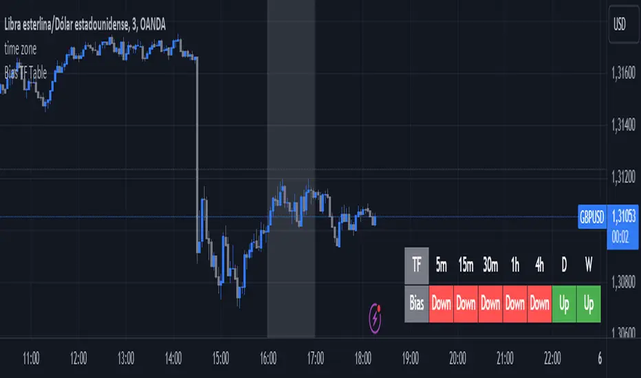
Bias Finder [UAlgo]The "Bias Finder " indicator is a tool designed to help traders identify market bias and trends effectively. This indicator leverages smoothed Heikin Ashi candles and oscillators to provide a clear visual representation of market trends and potential reversals. By utilizing higher timeframes and smoothing techniques, the indicator aims to filter out market noise and offer a more reliable signal for trading decisions.
🔶 Key Features
Heikin Ashi Candles: The indicator uses Heikin Ashi candles, a special type of candlestick that incorporates information from the previous candle to potentially provide smoother visuals and highlight potential trend direction.
Oscillator: The indicator calculates an oscillator based on the difference between the smoothed opening and closing prices of a higher timeframe. This oscillator helps visualize the strength of the bias.
Light Teal: Strong bullish trend.
Dark Teal: Weakening bullish trend.
Light Red: Strong bearish trend.
Dark Red: Weakening bearish trend.
Standard Deviation: The indicator can optionally display upper and lower standard deviation bands based on the Heikin Ashi high and low prices. These bands can help identify potential breakout areas.
Oscillator Period: Adjust the sensitivity of the oscillator.
Higher Timeframe: Select a timeframe for the Heikin Ashi candles and oscillator calculations (must be equal to or greater than the chart's timeframe).
Display Options: Choose whether to display Heikin Ashi candles, market bias fill, standard deviation bands, and HA candle colors based on the bias.
Alerts: Enable/disable specific alerts and customize their messages.
🔶 Disclaimer
Use with Caution: This indicator is provided for educational and informational purposes only and should not be considered as financial advice. Users should exercise caution and perform their own analysis before making trading decisions based on the indicator's signals.
Not Financial Advice: The information provided by this indicator does not constitute financial advice, and the creator (UAlgo) shall not be held responsible for any trading losses incurred as a result of using this indicator.
Backtesting Recommended: Traders are encouraged to backtest the indicator thoroughly on historical data before using it in live trading to assess its performance and suitability for their trading strategies.
Risk Management: Trading involves inherent risks, and users should implement proper risk management strategies, including but not limited to stop-loss orders and position sizing, to mitigate potential losses.
No Guarantees: The accuracy and reliability of the indicator's signals cannot be guaranteed, as they are based on historical price data and past performance may not be indicative of future results.

RSI Trail [UAlgo]The RSI Trail indicator is a technical analysis tool designed to assist traders in making informed decisions by utilizing the Relative Strength Index (RSI) and various moving average calculations. This indicator dynamically plots support and resistance levels based on RSI values, providing visual cues for potential bullish and bearish signals. The inclusion of a trailing stop mechanism allows traders to adapt to market volatility, ensuring optimal entry and exit points.
🔶 Key Features
Multiple Moving Average Types: Choose from Simple Moving Average (SMA), Exponential Moving Average (EMA), Weighted Moving Average (WMA), Running Moving Average (RMA), and McGinley Dynamic for diverse analytical approaches.
Configurable RSI Bounds: Tailor the RSI lower and upper bounds to your specific trading preferences, with default settings at 40 and 60.
Signals: The indicator determines bullish and bearish market states and plots corresponding signals on the chart.
Customizable Visualization: Options to display the midline and color candles based on market state enhance visual analysis.
Alerts: Integrated alert conditions notify you of bullish and bearish signals.
🔶 Calculations
The RSI Trail indicator calculates dynamic support and resistance levels using a combination of moving averages and the Relative Strength Index (RSI). It starts by computing a chosen moving average (SMA, EMA, WMA, RMA, or McGinley) over a period of 27 using the typical price (ohlc4).
The indicator then defines upper and lower bounds based on customizable RSI levels (default 40 and 60) and adjusts these bounds using the Average True Range (ATR) to account for market volatility. The upper bound is calculated by adding a volatility-adjusted value to the moving average, while the lower bound is found by subtracting this value. Bullish signals occur when the price crosses above the upper bound, and bearish signals when it falls below the lower bound.
The RSI Trail indicator also can be used to identify pullback opportunities. When the price high/low crosses above/below the calculated upper/lower bound, it indicates a potential pullback, suggesting a favorable point to enter a trade during a pullback.
🔶 Disclaimer
This indicator is for informational purposes only and should not be considered financial advice.
Always conduct your own research and due diligence before making any trading decisions. Past performance is not necessarily indicative of future results.
ICT Daily Bias by Fahmi EshaqICT Daily Bias helps us determine where the market is likely to go for the day. The ICT Daily Bias tool aids in forecasting the likely direction of the market for the day. It delineates the previous day's high and low levels, providing insights into potential price movements whether the market is expected to touch the previous day's high or low.
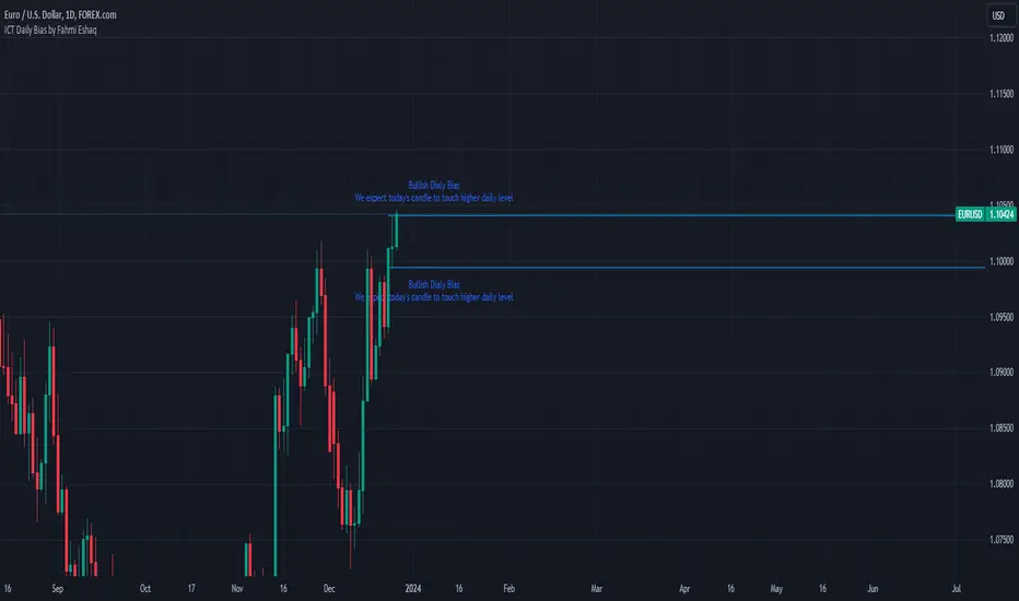
TTrades Daily Bias [TFO]Inspired by @TTrades_edu video on daily bias, this indicator aims to develop a higher timeframe bias and collect data on its success rate. While a handful of concepts were introduced in said video, this indicator focuses on one specific method that utilizes previous highs and lows. The following description will outline how the indicator works using the daily timeframe as an example, but the weekly timeframe is also an included option that functions in the exact same manner.
On the daily timeframe, there are a handful of possible scenarios that we consider: if price closes above its previous day high (PDH), the following day's bias will target PDH; if price trades above its PDH but closes back below it, the following day's bias will target its previous day low (PDL).
Similarly, if price closes below its PDL, the following day's bias will target PDL. If price trades below its PDL but closes back above it, the following day's bias will target PDH.
If price trades as an inside bar that doesn't take either PDH or PDL, it will refer to the previous candle for bias. If the previous day closed above its open, it will target PDH and vice versa. If price trades as an outside bar that takes both PDH and PDL, but closes inside that range, no bias is assigned.
With a rigid framework in place, we can apply it to the charts and observe the results.
As shown above, each new day starts by drawing out the PDH and PDL levels. They start out as blue and turn red once traded through (these are the default colors which can be changed in the indicator's settings). The triangles you see are plotted to indicate the time at which PDH or PDL was traded through. This color scheme is also applied to the table in the top right; once a bias is determined, that cell's color starts out as blue and turns red once the level is traded through.
The table indicates the success rate of price hitting the levels provided by each period's bias, followed by the success rate of price closing through said levels after reaching them, as well as the sample size of data collected for each scenario.
In the above crude oil futures (CL1!) 30m chart, we can glean a lot of information from the table in the top right. First we may note that the "PDH" cell is red, which indicates that the current day's bias was targeting PDH and it has already traded through that level. We might also note that the "PWH" cell is blue, which indicates that the weekly bias is targeting the previous week high (PWH) but price has yet to reach that level.
As an example of how to read the table's data, we can look at the "PDH" row of the crude oil chart above. The sample size here indicates that there were 279 instances where the daily bias was assigned as PDH. From this sample size, 76.7% of instances did go on to trade through PDH, and only 53.7% of those instances actually went on to close through PDH after hitting that level.
Of course, greater sample sizes and therefore greater statistical significance may be derived from higher timeframe charts that may go further back in time. The amount of data you can observe may also depend on your TradingView plan.
If we don't want to see the labels describing why bias is assigned a certain way, we can simply turn off the "Show Bias Reasoning" option. Additionally, if we want to see a visual of what the daily and weekly bias currently is, we can plot that along the top and bottom of the chart, as shown above. Here I have daily bias plotted at the top and weekly bias at the bottom, where the default colors of green and red indicate that the bias logic is expecting price to draw towards the given timeframe's previous high or low, respectively.
For a compact table view that doesn't take up much chart space, simply deselect the "Show Statistics" option. This will only show the color-coded bias column for a quick view of what levels are being anticipated (more user-friendly for mobile and other smaller screens).
Alerts can be configured to indicate the bias for a new period, and/or when price hits its previous highs and lows. Simply enable the alerts you want from the indicator's settings and create a new alert with this indicator as the condition. There will be options to use "Any alert() function call" which will alert whatever is selected from the settings, or you can use more specific alerts for bullish/bearish bias, whether price hit PDH/PDL, etc.
Lastly, while the goal of this indicator was to evaluate the effectiveness of a very specific bias strategy, please understand that past performance does not guarantee future results.
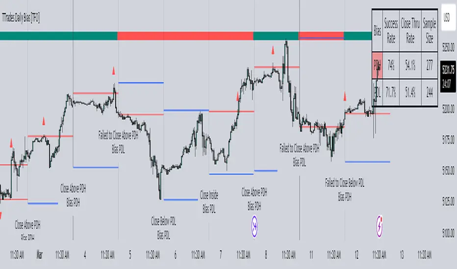
Unbiased Replay CompanionWhen using bar replay mode on TradingView, you have to scroll your way back through clearly visible price history, which always leaves you with unwanted lookahead bias because you unfortunately see all future price movements before they are hidden by the use of the scissors tool.
This indicator provides a simple way to hide all the price action and displays a configurable bar counter instead, allowing you to scroll back to every moment in history without seeing any of the prices' movements. The bar counter hereby serves as a visual aid to guide you back to the very first available bar on the chart.
You can configure the color of the overlay to match your charts' background as well as the style of the bar counter and the distance at which the counter is being displayed.
The indicator crops the vertical price scale by a random amount (only when it is being displayed) to also prevent you from having any unwanted bias based on the current price range.
Whenever you're done scrolling and have used the replay scissors tool to start your session just hide the indicator and bring it up again when you need to scroll. That's all there is to it.
Important: After you apply the indicator to your charts, make sure it is displayed in front of everything else. You can configure this by clicking on the three dots that are displayed on the right side of the indicator name on hover and choose "Visual order > Bring to front" from the popup menu that appears.
Enjoy your unbiased backtesting sessions!
Directional Bias [AlgoAlpha]The Directional Bias indicator is a premium script expertly crafted to enhance market trend visualization on trading charts. This sophisticated tool is designed to intuitively indicate the market's directional bias, aiding traders in making informed decisions on lower time frames.
Highlighted Features:
Intuitive Trend Visualization: The script employs a color-coded system for candles, simplifying the process of trend identification
Customizable Aesthetics: Users have the option to personalize the visual elements, including candle colors, to suit their preferences and enhance chart readability.
Advanced Logic: The script is built on a proprietary algorithm that analyzes candlestick patterns to determine the current trend direction.
Key Benefits:
Enhanced Decision Making: By offering a clear depiction of the market's directional bias, the indicator assists traders in making more informed entry and exit decisions, particularly suited for quick decision-making on lower timeframes.
Adaptability to Market Conditions: The script dynamically adjusts to changing market conditions, providing relevant and timely indications of trend changes or continuations.
Versatile Application: Suitable for various trading styles, the indicator can be effectively used in day trading, scalping, or even in longer-term trading strategies, depending on the timeframe selected.
Summary:
The "Directional Bias" indicator stands out as a vital tool for traders focusing on lower timeframes, offering an intuitive, customizable, and dynamic approach to trend visualization. Its advanced proprietary logic and user-friendly interface make it a valuable asset in a trader's toolkit, enhancing the ability to quickly interpret and react to market movements.

Dynamic Trend Hunter [Quantigenics]The "Dynamic Trend Hunter” script focuses on trend identification, dynamic entry and exit signals, and effective risk management. While a standalone trading script designed for versatile application across all markets, it can also be complemented by other indicators for enhanced analysis.
Core Features:
Dynamic Trend Indicator: Central to the script, this indicator discerns market trend direction using a color-coded system. Blue indicates an uptrend, red a downtrend, and a flat line signifies a sideways market.
Buy and Sell Signals: Provides clear, on-chart buy and sell signals to assist in identifying optimal entry points in alignment with the trend.
Profit Target Exits: A key feature designed to help traders lock in profits at strategic points. This feature uses a sophisticated mechanism (outlined in more detail below) to identify potential exit points, signaling the trader to close a position and secure gains before a potential market reversal.
Dynamic Stop Loss Levels: Essential for risk management, these levels adjust automatically, providing a mechanism for trailing stop losses and safeguarding against adverse market movements.
Technical Composition:
Dynamic Trend Indicator:
Calculation Method: Utilizes a blend of the highest and lowest prices over a specified length, averaged to create a trend line. This line is helpful in identifying the overall market trend.
Color Coding: The trend line changes color based on its relation to price action. A blue line indicates an uptrend when prices are consistently above this average line, while a red line signifies a downtrend when prices stay below it.
Signal-Based Trading:
Trend Entry Signals: Generated when there's a shift in the color of the trend line, indicating a potential change in market direction.
Pullback Entries: Identified when the closing price crosses the previous high (for long entries) or low (for short entries), while also considering the current trend line position.
Dynamic Stop Loss Levels:
Calculation: Stop loss levels are dynamically determined using the highest and lowest closing prices over the 'Length' period. These levels adjust with market movements, providing a trailing stop loss mechanism.
Visualization: Depicted as colored dots on the chart, changing in response to the market's movement relative to the trend line.
Oscillator for Dynamic Exits:
Mechanism: The script employs an oscillator to identify potential exit points, signaled by yellow dots. This oscillator is based on the relative extremity of the current price action compared to recent price movements.
Alerts: Dynamic exits trigger alerts when the oscillator reaches specified threshold levels, signaling potential market reversals or exhaustion points.
Customization and Flexibility:
Length Adjustment: The primary 'Length' input parameter allows traders to modify the sensitivity of the trend line and stop levels, catering to different trading styles and market conditions.
Alert Customization: Traders can set alerts for trend line changes and dynamic exits, ensuring timely responses to market movements.
Input Parameter Settings:
Intra-Bar Order Generation (IntraBar): Enables real-time signal generation within the current bar or after its closure.
Dynamic Exits (DynamicExits): Toggles the visibility of dynamic exit signals for profit-taking.
Dynamic Trend Length: Defines the lookback period for calculating the trend line. This length, which is adjustable and set by default to 21, specifies the number of bars over which the highest and lowest prices are analyzed to determine the trend line.
Dynamic Stop Loss Levels Length: This parameter defines the lookback period for calculating stop loss levels. It sets the number of bars used to determine the highest and lowest values for stop loss positioning. Adjusting this length allows traders to customize the sensitivity and placement of stop loss levels in accordance with their trading strategy and risk tolerance. This feature is crucial for tailoring stop loss settings to different market conditions and volatility levels, ensuring more effective risk management. Note: that initial stop loss levels, and tighter stop losses, can be set behind the Dynamic Trend Line itself.
Show Trend/Pullback Entries: Controls the display of specific entry signals based on trend continuation or market pullbacks.
Alert Settings: Options for setting alerts on trend line changes and dynamic exits, enhancing trade management.
Customizable Colors: Allows personalization of stop level and trend line colors for better chart visualization.
How to Trade with the Dynamic Trend Hunter:
Trend Following: Enter trades in the direction of the trend indicated by the color-coded trend line.
Pullback Entries: Look for pullback entry signals during established trends for additional entry points.
Dynamic Exits: Use yellow dot signals and dynamic stop loss levels for determining exit points or to adjust stop losses.
Risk Management: Employ the dynamic stop loss levels to manage risk effectively and protect against significant losses.
Alerts and Notifications:
Traders can set up alerts for trend line changes and dynamic exits, ensuring they are promptly informed about critical market movements and can react accordingly.
Conclusion:
The "Dynamic Trend Hunter " is a comprehensive and adaptable trading tool, suitable for various market conditions and trading styles. Its ability to provide clear trend indications, along with dynamic entry and exit signals, makes it an invaluable asset for traders aiming to enhance their market analysis and decision-making process. While it is a standalone system, it can be used in conjunction with other indicators to further refine trading strategies.
While we believe this tool may enhances your trading strategy, we encourage thorough familiarization before live trading. Remember, trading involves risk, and past performance is not indicative of future results.
You can see the “Author’s instructions" below to get immediate access to Dynamic Trend Hunter & the rest of the “Quantigenics Premium Indicator Suite”.