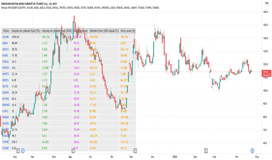
Niteya Multi Ticker Dollar-Based Pricing Ver 1.3The main purpose of the indicator is to make a future price estimation based on the highest dollar-based price of the stock in the past, especially for stocks that exceed their past prices in chart currency terms. There should be no expectation that this prediction will necessarily come true.
A table with six columns and 19 rows (excluding the header) is created on the graph, positioned bottom and left.
The first column contains the ticker code, the second column contains the highest historical price of the stock in currency, the third column contains the past high price of the stock in USD, the fourth column contains the closing price, the fifth column contains the value obtained by multiplying the past highest USD price of the stock by the daily dollar price, and the sixth column is includes the rate of increase.
Using the indicator interface, you can select the ticker value in the first row of the table from among 22 different values via a selection box, and for the 18 rows below, you can directly type the ticker name.
* The currency of the chart must be compatible with the dollar conversion currency. For example, if the conversion currency is "USDTRY", the currency of the chart should be "TRY".
All stocks in the indicator are randomly selected. Investment information, stock selections, comments and recommendations herein are not within the scope of investment consultancy. Investment consultancy service is provided within the framework of investment consultancy agreement to be signed between brokerage houses, portfolio management companies, non-deposit banks and the customer.
Türkçe açıklama
Göstergenin temel amacı, özellikle grafik para birimi (TRY) bazında geçmiş fiyatlarının üzerine çıkmış hisselerde, hissenin geçmişteki en yüksek dolar bazlı fiyatını esas alarak, geleceğe yönelik bir fiyat tahmininde bulunmaktır. Bu tahminin mutlaka gerçekleşeceği beklentisi olmamalıdır.
Grafik üzerinde, üste ve ortalanmış olarak, altı sütun ve başlık kısmı hariç 19 satırlık bir tablo oluşturulmaktadır.
İlk sütun hisse kodunu, ikinci sütun hissenin geçmiş en yüksek fiyatını TRY olarak, üçüncü sütun hissenin geçmiş en yüksek fiyatını USD olarak, dördüncü sütun kapanış fiyatını, beşinci sütun hissenin geçmiş en yüksek USD fiyatının günlük dolar kuru ile çarpılarak elde edilen değeri, altıncı sütun ise artış oranını içerir.
Gösterge arayüzünü kullanarak, tablonun ilk satırındaki ticker (hisse) değerini 22 farklı değer arasından (BIST 100 ve 21 şirket) bir seçim kutusu yoluyla, altta yer alan 18 satır için ise, doğrudan hisse adını yazabilirsiniz.
* Grafiğin para birimi dolar çevrim kuru ile uyumlu olmalıdır. Örneğin, çevrim kuru "USDTRY" ise, grafiğin para birimi "TRY" olmalıdır.
Gösterge içinde yer alan tüm hisseler rastgele seçilmiştir. Buradaki yatırım bilgileri, hisse seçimleri, yorum ve tavsiyeleri yatırım danışmanlığı kapsamında değildir. Yatırım danışmanlığı hizmeti, aracı kurumlar, portföy yönetim şirketleri, mevduat kabul etmeyen bankalar ile müşteri arasında imzalanacak yatırım danışmanlığı sözleşmesi çerçevesinde sunulmaktadır.
Portfolio management
Portfolio Laboratory [Kioseff Trading]Hello!
This script looks to experiment with historical portfolio performance. However, a hypothetical cash balance is not used; weighted percentage increases and decreases are used.
You can select up to 10 assets to include in the portfolio. Long and short positions are possible.
Show in the image are the portfolio's weight, the total return of the portfolio and the total return of the asset on the chart over the selected timeframe.
Shown in the image above are the constituents of the portfolio, which can include any asset, the weighted percentage gain/loss of the constituents in addition to 10 major indices and their respective total percentage gain/loss over the timeframe.
Shown in the image above are the dividend yield % of the portfolio and relevant portfolio metrics - ex-post calculations are applied and are predicated on simple returns.
Shown in the image above is a portfolio of all short positions; portfolio calculations adjusted to the modifications.
Also shown is a change in the index the portfolio is calculated against. I have been asked a few times to include NIFTY 50 in my scripts - I made sure this was achieved, lol!
Show in the image is a performance line of performance of percentage increases/decreases for the index calculated against, the asset on the chart, and the portfolio.
All lines start simultaneously on the selected start date at the close price of the session for the asset on your chart.
However, the right-hand scale, whether displaying price or percent, cannot be used to assess the performance of each line - they are useful for visualization only and can extend below zero on a low-priced asset. Calculations will not execute correctly when selecting a start date prior to any asset in the portfolio's first trading session; calculations do not begin on the first bar of the asset on your chart.
I decided to code the script this way so statistics remain fixed when moving from asset to asset!
To compensate for this limitation, I included a label plot and background color change at the first session in which all assets in the portfolio had at least one bar of price data. You can adjust the calculation start date to the date portrayed on the label to test al possible price data!
The statistics table, and the performance lines, can be hidden in the user input section.
I plan on putting a bit more work into this script. I have some ideas on what to include; however, any input is greatly appreciated! If there's something you would like me to include please let me know.
@scheplick mentioned me in a script he recently coded:
My inspiration came from his script! I thank him for that!

Daily MovesShow percent daily moves with a 5 period look back. This helps visualize recent performance.
positionsize calculatorHow to use:
Use the cursor to select the time, entry, stop loss, and target position. Enter the trading fee to calculate the reward/risk ratio and the actual reward/risk ratio (including the commission) according to the price you selected.
Known error:
Settings of this script can't be saved as default might due to the interactive price selection function. If anyone knows how to fix it, please let me know.
feature:
The visual Risk/Reward box, have three price labels on the right hand of the box.
Calculate the actual reward/risk ratio based on the trading fee.
The visual Risk/Reward box will extend automatically.
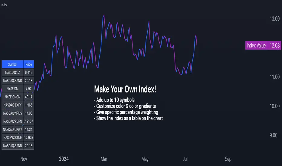
Make Your Own Index!Intro
For my first script, I have released Make Your Own Index version 1. It has a long way to go so please stay tuned. Scroll down to read all the updates and notes as they come in.
Why it matters
Making your index is important to quickly see an index of symbols that you want to chart. Having the ability to assign weightings gives you the opportunity to make the index equal weighted or custom weighted. As we all know, indexes like the S&P 500 are NOT equal weighted, but more heavily weighted toward the winners. Now, you can make your own of a basket of symbols and make them custom weighted or equal weighted. Have some fun exploring this.
Features
You select the symbols of your choice and then chart them as one line with a specific weighting. This can be done in the settings menu once the indicator is selected. Use the symbol search field to add a symbol. From what I have tested, it works for any symbol whether it's stocks, crypto, FX and more. The default is set to stocks.
The Weight field in the settings menu is where you can assign a specific weight to the symbol of your choice. This way you can make an equal weighted index or a custom weighted index. By default each symbol is set to 10 or 10%. There are 10 symbols in the menu, so at 10%, they are equally weighted! In the script I have made it so each weighting is in percentage terms. So type in the percentage and you're good to go.
The chart is currently displayed in a separate window and not as an overlay. This may change in the future. The line can also be changed slightly and the color of it. Stay tuned for more on this.
Send in feedback
I am a Pine rookie in all regards and I am surely looking for support, feedback, and/or ideas. I want to add a lot more to this. If you look at the settings you will see have some input fields that are in their first iteration and currently needing to be improved. Rather than waiting to make them perfect, I just want to get this out there and update as I go. Also, as mentioned, I will definitely need a little support at adding more features that I have in mind.
Credit where credit is due
I used a lot of Open Source indicators as inspiration to quickly get going so thank you to the following people and accounts who share open source scripts that you can use to learn, test, and get started instantly:
@TradingView
@LucF
@PineCoders
@KioseffTrading
@norok
@RedKTrader
@NeoButane
And many others. That's the beauty of open source!
Closing note
Publishing it open source so people can fact check my code and thinking. One thing I know for sure is that this can probably be created in a more efficient way. Nonetheless, please a take look and let me know what you think - I am excited to make some updates over the coming weeks.
Thanks for reading!
Binance CHOP Dashboard by KziHere is a Dashboard to find the opportunuty of bigs moves with 20 pairs.
The Dashboard is too big for the phone view. I thinks we can use it only on computer view.
How it's work ?
I look for the CHOP on Weekly and Daily time frame
The CHOP give the "tension" of the pair.
So i look for the biggest "tension" to take the "big mooves"
I look for the align tension between weekly and daily
The CHOP can be 0 to 100 , the result is:
(Weeky CHOP x Daily CHOP) = 0 to 10 000
To make the result easy to read, i divide so that the "note" is between 0 and 10.
If you have more than 3 /10 = RED => HOT Opporunity for big mooves
If you have less than 1/10 = BLUE => COLD opporunity
Thanks for your comment,
Kzi
The code is well.
But i think there is an opportunity to do it better with some for loop.
Is some of you do it, please let's me know.

Key Financials A simple table with up to 9 key financials on your chart.
Simple, easy and configurable.

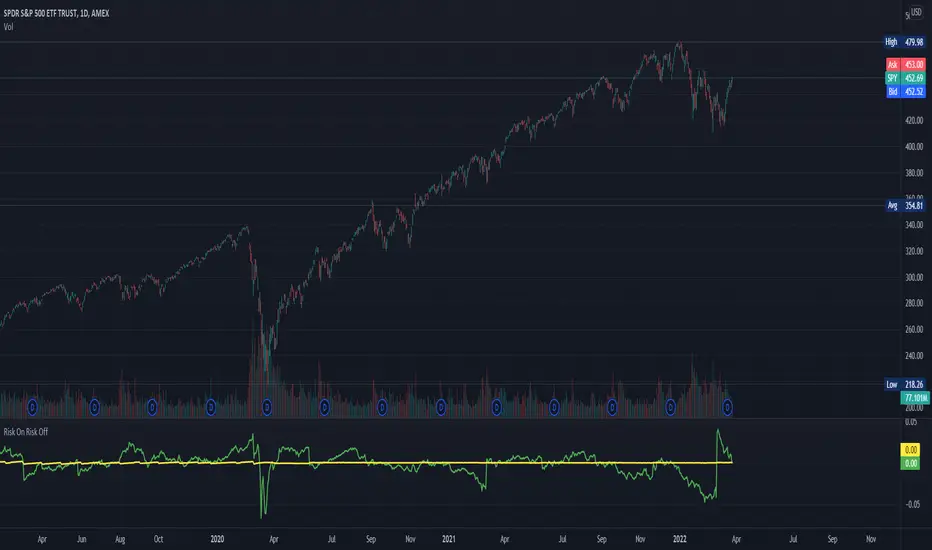
Risk On Risk OffA helpful indicator for those who follow a systematic long-term investment approach.
What it shows:
It shows the 60 Day Cumulative Return of $BND Vanguard Total Bond Market ETF against the 60 Day Cumulative Return of $BIL SPDR Bloomberg Barclays 1-3 Month T-Bill ETF.
Why:
This Indicator will provide you a sense of where the economic environment is at, if the indicator shows that the 60 Day Cumulative return of $BND is ABOVE $BIL, it means that it's a good idea to go Risk ON in the stock market; On the other hand, if the inverse is true, it means that is a good idea to go Risk OFF in the stock market.
Example Uses:
Warren Buffet often advice Investors to just buy a S&P500 index tracking ETF like $SPY consistently and you will likely to be making money in the long-term.
With this indicator you will be able to make the Buffet Strategy even simpler: when the indicator shows Risk ON, buy the $SPY; when the indicator shows Risk OFF, consider hedges like $IEF iShares 7-10 Year Treasury Bond ETF. AMEX:SPY
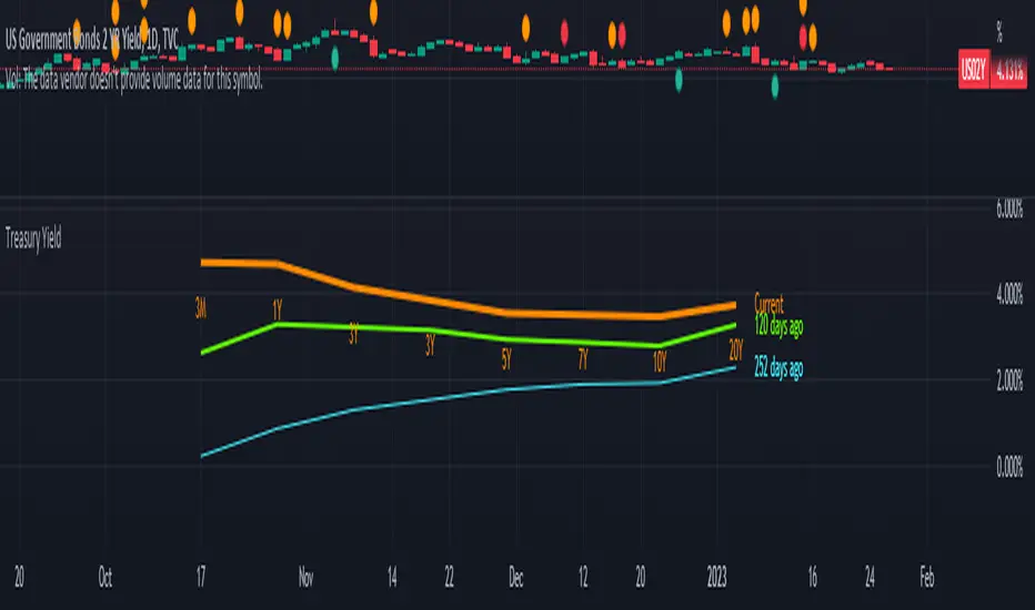
Bond Yeild CurveBond Yeild Curve
A bond yeild curve is a line that plot the interest rate of bonds of each maturity dates.
The slope of the curve give the future of economy cycle.
if the slope could be normal (positive), flat or even inverted.
This indicator aquired data of bond yeild provided by TradingView.
How to use it.
Select the country of the bond / another country to compare.
Select the maturity of bond (this indicator set 2Y, 5Y, 10Y and 20Y as default).
You can toggle to 3 different data set; Yeild, Spread (10Y-2Y) and Yeild Curve.
In case that you select the "Yeild Curve", you can customize the desired past period to compare.
How we can get the benefit.
- If the current spread is greater than 1.0, it suppose that the economy of that country probably is ok.
- if the current spread is between 0 - 1.0, it suppose to be flatted and probably turn to invert and the economy cound be in a recession soon.
- if the current spread is below 0, it suppose to be inverted and economy is in recession.
when knowing the state of economy, it would help us to manage our investment.
When you select "Yeild"
When you select "Spread"
When you select "Yeild Curve"
I'm new for this.
if any idea, correction and suggestion, i do appreciate it.
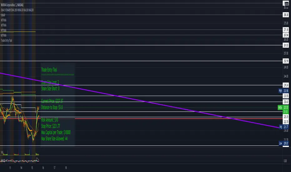
LCDT Trade Entry ToolLCDT Trade Entry Tool
Enter the Offset for the X Axis for the Entry Tool.
Enter the Offset for the Y Axis for the Entry Tool.
Enter the Price for your Stop Loss in $.
Enter your desired Risk Amount in $.
Enter the max amount of of Capital per Trade in $.
There are toggle buttons in the setup to reveal/remove more data in the label that pops up, as well as a toggle to make the text larger.
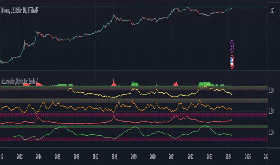
Accumulation/Distribution Bands & Signals (BTC, 1D, BITSTAMP) This is an accumulation/distribution indicator for BTC/USD (D) based on variations of 1400D and 120D moving averages and logarithmic regression. Yellow plot signals Long Term Accumulation, which is based on 1400D (200W) ALMA, orange plot signals Mid Term Accumulation and is based on 120D ALMA, and finally the red plot signals Long Term Distribution that's based on log regression. It should be noted that for red plot to work BTC 1D BITSTAMP graph must be used, because the function of the logarithmic regression was modified according to the x axis of the BITSTAMP data.
Signal bands have different coefficients; long term accumulation (yellow) and and the log regression (red) plots have the highest coefficients and mid term accumulation (orange) has the lowest coefficients. Coefficients are 6x, 3x and 1.5x for the red (sell) and yellow (buy) plots and 1x, 2x and 3x for the orange (buy) plot. Selling coefficient for the yellow and the orange plots are respectively 2x and 1x. Buy and sell signals are summed up accordingly and plotted at the top of the highest band.
Acknowledgement: Credits for the logarithmic regression function are due @memotyka9009 and Benjamin Cowen
Position & Lot Size CalculatorBuilt with love "Position & Lot Size Calculator"
This indiator will help you to calculate your position size for managing the risk
Features :
1. Click-able Price Entry & SL (Easier Interface)
How to use it :
1. After add the indicator, set the Entry & SL Price with click price line in the chart
2. Set the risk and another parameter
Regards,
Hanabil

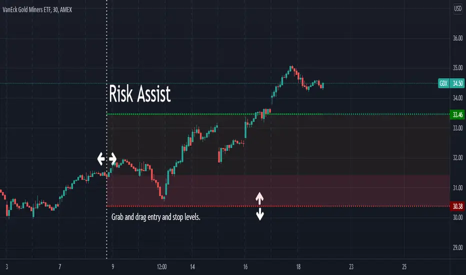
Risk AssistAs the profit level increases, the amount of profit taking required to avoid risk asymptotically reaches zero.
This indicator displays the % of the established position required to exit in order to ensure the trade is not a loss if the stop is hit.
Values in green (at or below 100%) indicate a winning position.
Values in red (above 100%) indicate a losing position.
Alert Examples:
If you are intent on "selling half" to avoid risk, you can set an alert on the value of this indicator for 50.
If you are intent on "selling a 3rd" to avoid risk, you can set an alert on the value of this indicator for 33.3.
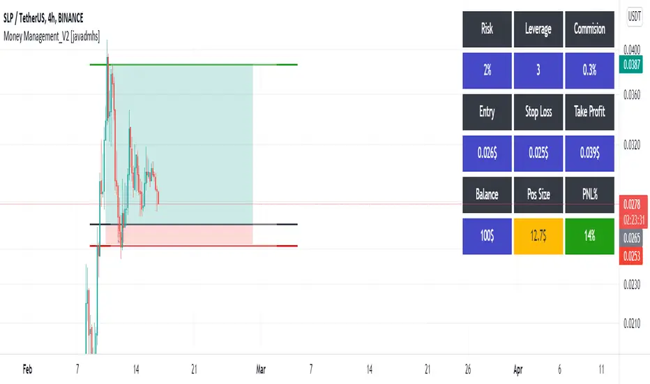
Money Management_V2 [javadmhs]Hi every one
you can use this indicator in your trades for money and risk management.
Very easy to use. Just enter the requested information of your trade and see the amount of money you need to enter into a transaction. Also you can see your pnl%.
Risk = The amount of money that if you lose, does not matter to you. This will be a percentage of your total capital.
Balance = your total capital.
Leverage = If you trade in future, you can use this. set it 1 in spot.
Commision = The amount of exchange fee.
Usable Cap = The amount of money you should enter into a transaction, depending on your risk.
PNL% = Amount of profit and loss.
You Can use this for Short and Long.
Let me know if you see a problem.
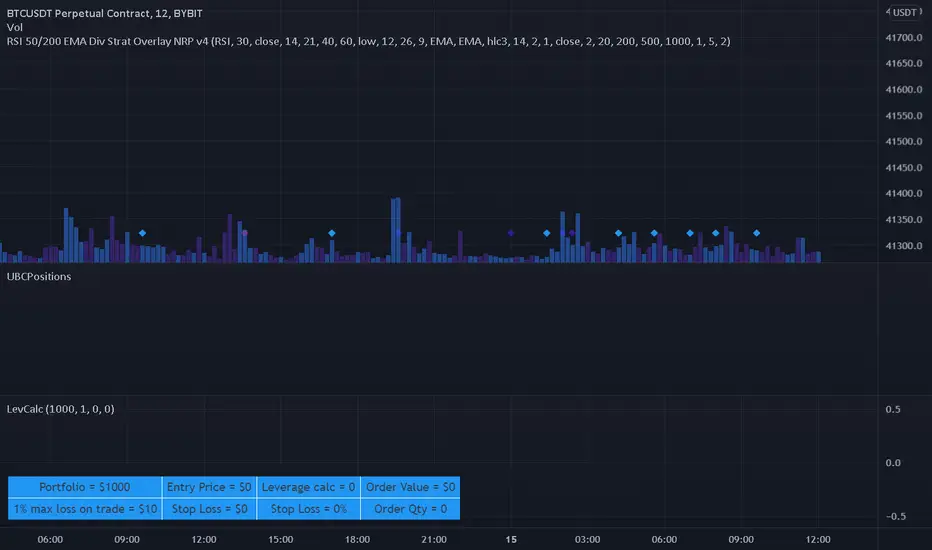
Leverage CalculatorThis script is intended to be used as a risk management calculator.
It will calculate the best leverage to use based on the maximum percentage of loss you are willing to incur on your trading portfolio.
Also calculates the order value and order qty based on your inputs.
Please note this calculator does not take into account any trading fees imposed by the exchange you are using.
*** Only risking 1% to 5% of your portfolio is considered good risk management ***
*** Not financial advice ***
------ Settings Inputs -----------------------------------------------------------------------------------------------------
"Portfolio Size" -- enter your portfolio balance
"% Willing to lose on this trade" -- enter the percent of your portfolio you are willing to lose if the stop loss is hit
"Entry Price" -- enter the price at which you will enter the trade
"Stop Loss Price" -- enter the price at which your stop loss will be set
----------------------------------------------------------------------------------------------------------------------------
------ Outputs -------------------------------------------------------------------------------------------------------------
"Portfolio" -- displays the portfolio balance entered in settings
"max loss on trade" -- displays the % loss entered in settings and the corresponding amount of your portfolio
"Entry Price" -- displays the entry price entered in settings
"Stop Loss Price" -- displays the stop loss price entered in settings
"Stop Loss %" -- displays the calculated percentage loss from the entry price
"Leverage calc" -- displays the calculated leverage based on your max loss and stop loss settings
"Order Value" -- displays the value of the order based on the calculated leverage
"Order Qty" -- displays the calculated order qty based on the calculated leverage
SHAD helperDisplays lines and labels for prices following the SHAD strategy.
SHAD strategy consists in selling half the position every time price doubles, thus this indicator displays values for x2, x4, x8 and x16 of current closing price.
You can also see "/2" (-50%) and "/4 " (-75%) values.
You can edit display colors and labels text size in the indicator's settings

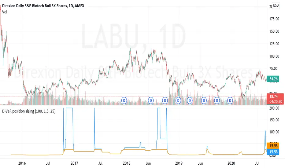
D-VaR position sizingThe D-VaR position sizing method was created by David Varadi. It's based on the concept of Value at Risk (VaR) - a widely used measure of the risk of loss in a portfolio based on the statistical analysis of historical price trends and volatilities. You can set the Percent Risk between 1 (lower) and 1.5 (higher); as well as, cap the % of Equity used in the position. The indicator plots the % of equity recommended based on the parameters you set.
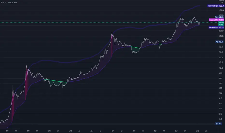
Abz BTC InvestorInvestor indicator:
This indicator is intended to be used on a chart showing Bitcoin's historical price action. By viewing years of Bitcoin's history, it's possible to better see Bitcoin's current price within a long term context of the price rage.
Purpose and possible usage:
I built the indicator to make it easier for me and for friends and family to make better informed decisions about our Bitcoin investments. The indicator shows the historic range of the asset and indicates where Bitcoin is oversold (below the bottom line) and overbought (above the top purple line):
- Above the top purple line, I'll look to take some profits or consider hedging to protect my long term position's growth
- Below the bottom purple line, I'll look to dollar cost average into a long term position
I think the idea for this came from idea listening to the YouTuber Birb talking about how well Bitcoin tracked between the 200 day moving average (bottom navy moving average) and 5x that value (top moving average).
Hope you find it useful.
Best wishes,
Abzorba
Period Dollar Cost Average BacktesterHere is a simple script to calculate the profits and other dollar cost average strategy statistics. This strategy was created to avoid asset price volatility, so the pump and dump scheme does not affect the portfolio. By dividing the investment amount into periods, the investor doesn’t need to analyze the market, fundamental analysis, or anything. The goal is to increase the asset holdings and avoid fast and robust price movements.
This indicator has some configurations.
Amount to buy: the amount to buy at each time
Broker fee %: the fee percentage that the broker has for spot trade
Frequency: the frequency of the investments. Example: 1 Day means that every day, it will buy an amount of the asset
Starting Date: when the indicator will start the investment simulation
Ending Date: when the indicator will end the investment simulation
InfoCell With/Height: it relates to the panel for view purposes. Change the values to fit better on your screen.
This indicator has three lines:
Total Invested (green): total amount invested at the end of the period
Total Net Profit (pink): total profit by converting the amount of the asset bought at the latest closing price
Holding Profits (yellow): the amount that would be in the portfolio if the investor had invested all the capital in a signal trade at the beginning of the period.
The statistics panel has some information to help you understand buying the asset in one or more trades. So, besides those three lines that were mentioned above, here are the other statistics:
Entry Price: The price of the asset when the first investment was made
Gross Profit: Total amount of profit, not excluding the losses
Gross Losses: Total amount of losses, not excluding the profits
Profit Factor: The Gross Profit divided by the Gross Loss. A value above 1 means it’s profitable.
Profit/Trades: Net profit per trade. This includes the broker fees.
Recovery Factor: The Net profit divided by the relative drawdown. The higher the recovery factor, the faster the recovery of a loss
Total Asset Bought: The amount of the asset that was bought at the end of the investment plan
Absolute Drawdown: The total amount of losses that made the account balance go below its initial value
Relative Drawdown: The max drawdown that occurred, no matter the account balance amount
Total Trades: number of times the investment was made in the selected period
Total Fee: total Fee that was spent on the total investment
Total Winning Trades: the total amount of winning trades. A trade is considered a winner if the net profit is up compared with the latest investment.
Total Losing Trades: the total amount of losing trades. A trade is considered a loser if the net profit is down compared to the latest investment.
Max consecutive wins: the max amount of consecutive winning trades
Max consecutive losses: the max amount of consecutive losing trades
The chart above uses the default configuration of the indicator. Placed on the BTCUSD market, taking the time range of January 1st, 2018 to January 1st, 2022, 4 years. Buying a BTC amount with 10 USDT every day in that period would generate a more than 500% profit. Compared to the profit amount by just holding the count, which was close to 350% profit, the dollar cost average by period would be much more profitable.

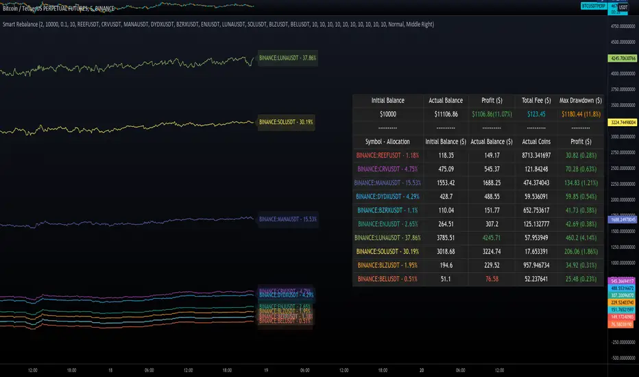
Smart RebalanceThis script is based on the portfolio rebalancing strategy. It's designed to work with cryptocurrencies, but it can work with any market.
How portfolio rebalance works?
Let's assume your initial capital is $1000, and you want to distribute it into 4 coins. This script takes the USDT as the stable coin for the initial money, so in case you want other currency, the pairs must be with that fiat as the quote.
Following our example, you would take BTC, ETH, BNB, and FTT. After selecting the coins, it's time to choose how much allocation is on each. Let's put 25% on each. This way, $250 of our capital on each coin.
After selecting the coins and their allocation, you choose the price change ratio for rebalancing. Let's use 1%. Next, you start to watch the markets. The first thing that happens, following our example, is the BTCUSDT price moving 1% up.
That amount hit the ratio of 1% for the rebalance. Hence, you sell 1% of BTC for USDT and redistribute to the other coins, buying 0.25% of each currency to rebalance the portfolio.
Next, ETHUSDT goes 1% down, time to rebalance again. This time, you need to take 0.33% of each other coin and buy ETH, so this way, it's all divided as the chosen allocation.
Why use rebalancing?
Looks easy, right? It is, but very time demanding. Demands even more if you raise the number of coins you want to distribute. Having a system to do that automatically is a must to work efficiently. Rebalancing spreads the risk among multiple currencies. This way, you earn small when it goes up, but you lose small when it goes down.
What this script helps with portfolio rebalance?
This indicator will not buy/sell for you but will help you choose the best markets for your rebalancing. Which coin will work best in that period? Do I need to have more than 8 coins? How much must be my ratio? Those questions you can answer using this indicator.
What this script has?
Start and End dates
The script will work for a certain period. All calculations will be done in that period.
Coin Ratio %
The amount of price movement of each asset that will be used to calculate the rebalancing
Initial Capital and Broker Fee
The amount of capital to be used on the rebalancing and the broker fee you want to use the strategy. The cost will be applied on every trade, buying or selling the coins.
Assets, allocations, and colors
It's possible to select from 2 to 10 assets to be used on the portfolio. Each purchase must have the allocation %. Suppose the sum of the allocations is different from 100%. In that case, a warning message will appear on the chart instead of the statistics.
Panel and tooltips
There is a panel with a summary of the results
Set allocations automatically
There is an option to make the indicator use the daily asset volume from the day before to determine the allocation percentage of each asset. This option is better if you are unsure how much allocation you want to use on each coin.
Use this indicator as a backtest for your rebalancing strategy. The selected market on the chart will not affect the calculation on this indicator, but the time frame will. The higher the time frame, the higher the coin ratio % must be.
About the code
The code is written to use arrays to store the values of each asset, making the calculations on each candle inside the time range. The for-loops are used to reduce the code length and make it easy to change the analysis of all assets. Finally, the script has some comments on the code.
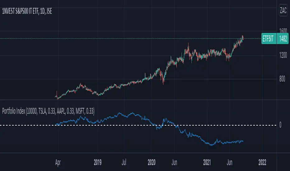
Portfolio IndexPortfolio Index Indicator
Compare a selected asset against a 3 assets portfolio.
Inputs :
- Equity : Default 10000, Initial capital for the portfolio
- %Holding : % of Holding for each Portfolio Element
- Asset in the chart as compared asset
Output :
- Delta between selected asset and portfolio
RedK Portfolio Tracker [Table Version]RedK Portfolio Tracker is a simple tool that enables a trader to monitor and track a portfolio of up to 10 holdings (+ free cash) in real time - directly on the chart
Now that we have tables in Pine, this is a table version of my previously published Portfolio Tracker
- The table works better in visualizing the various table elements (title row, column labels..etc), and is more flexible in allowing color coding of gain/loss. for many traders, myself included, these simple visual signals are valuable in helping timely trading decisions.
I'll come back and improve this script as i'm really enjoying the ability to track things this way - if you liked this and want to receive the updates, please flag / favorite it below and you'll get notified when i publish new versions.
Some new features for the table version:
- ability to change default color of various table elements (text, default background, title background, gain/loss color, border..etc)
- ability to change the text size to suit your monitor and visual preference
- ability to change table position
The "portfolio-specific" inputs are similar to the previous version - we get the ability to enter up to 10 positions, entry price and qty, then also add the free cash
- also a change from prior version, this table will plot by default on the price chart, but will have no scale - the portfolio ploy itself will also show (blue/orange stepping line) but the PnL plot will be hidden by default -- how we plot the portfolio & P/L is possibly one of the areas for improvements for next versions - also thinking of other adding valuable data i track in my own trading, like the quarterly dividends for the held positions .. we'll see - this is just a start
hope some will find this useful. feel free to comment.

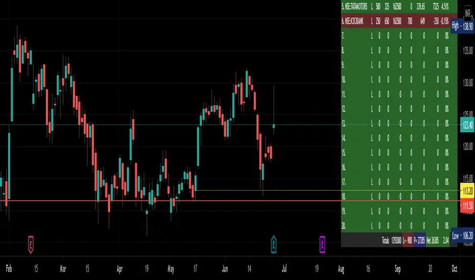
Tabular Portfolio by CJS V1This is a useful indicator that sits on top of the charts, in the right hand bottom corner and shows the current price, profit or loss in value and percent of upto 20 scrips fed in, in a Tabular form using tables feature.
Allows to mark a/c id also if you have multiple broker or individual accounts.
Colors are customisable.
Stocks get updated no matter what is your current selected scrip.
Gives total investment and total PnL also in percent.
Useful to monitor your portfolio status in once screen and while you are looking at charts.
Give feedback for improvement or issues, if any.
Credits to RedKTrader from where the idea was picked up.
Move visual order to front, if the charts and other indicators overlap the table view.