[LOKEN] Smart Money MCDX BULLISH studySmart Money MCDX BULLISH (PineScript v4)
- Built for Cryptocurrencies
- Best to use on shorter Time-Frames
WORK IN PROGRESS
Bullish Patterns

Angelfish Pattern - BullishWhen a triangle has a saturation of candle touches on its upper narrow side it usually breaks towards that side.
For example if one side has been touched by the candles twice as many times with higher density on the right narrow side, the price action tends to break out of the triangle on that side.
Success rate 80%+

Bullish Order FlowThis weeks price action was phenomenal on EURUSD. We had a clear bullish run respecting the order flow of the move.
After each break of structure, price was mitigated back to the order block that caused the breakout.
Over and over like clockwork.
If you can understand and grasp concepts like this, you can trade and stack positions when we have clear trending weeks.

Commodities In 2021 and a View for 2022It is official- Inflation is no longer “transitory,” according to the US central bank. After blaming rising prices on pandemic-inspired supply chain bottlenecks throughout 2021, the Federal Reserve swallowed its pride, admitting inflationary pressures are far more structural than “transitory.” Economist Mohamed El Erian called “transitory” the worst call in the Fed’s history.
What the Fed, US Treasury, and most mainstream economists have not said is that the blame lies at their feet. The liquidity tidal wave and stimulus tsunami lit the inflationary fuse in 2020 that continues to burn in early 2022.
The dollar index may have rallied by 6.34% in 2021, but its appreciation is little more than a mirage. The foreign exchange market conveniently measures one currency’s value against another. The dollar’s ascent may make the greenback the strongest fiat currency, but it is the best horse in the glue factor when it comes to value. All fiats have lost purchasing power since 2020, and the dollar is no exception. The stock market, real estate prices, cryptocurrencies, and commodities have all experienced substantial price appreciation, which is also a mirage. Fiat currency’s purchasing power continues to decline, and that trend remains firmly intact as we head into 2022.
Commodity prices began rallying after reaching bottoms in early 2020 as the pandemic swept across the world. The rally continued in 2021 and looks set to take prices to higher lows and higher highs in 2022.
2021 was a very bullish year in the commodities asset class
A composite of 29 of the leading and most liquid commodities futures and forwards that trade on the US and UK futures and forwards exchange moved 4.73% higher in Q4 2021 and 26.79% higher in 2021. In Q4, the leading sectors posted the following results:
Base metals moved 9.65% higher
Grains gained 9.31%
Animal proteins moved 4.73% higher
Soft commodities appreciated by 4.25%
Precious metals posted a 2.80% gain
Energy commodities fell 3.02%
In 2021, four of the five sectors posted double-digit percentage gains while only precious metals moved lower:
Energy was 54.13% higher
Base metals gained 38.09%
Soft commodities rallied 31.57%
Grains moved 29.71% to the upside
Animal proteins appreciated by 19.16%
Precious metals fell 11.91%
The overall performance was highly bullish as inflationary pressure, pandemic-inspired supply chain bottlenecks, and other factors pushed prices to multi-year, or in some cases, new all-time highs.
An interesting observation between a commodity composite and the S&P 500
In a sign that inflation pushed all asset prices higher, the performance of the leading stock market index and commodities asset class was virtually the same.
The long-term chart of the S&P 500, the most representative stock market index, reflects a 26.89% rise in 2021.
The commodity composite that includes the leading precious and base metals, energy, soft, gains, and animal protein markets was 26.79% higher. The results are uncanny but reflect inflation’s impact on prices.
Thirty-three winners and eight losers for the year
Winners outnumbered losers by better than four-to-one in the commodities asset class that includes 41 different markets.
Metals, foods, and energy commodities posted the most significant gains. Thirty-two of thirty-three markets that moved higher posted double-digit percentage gains, and thirteen markets were up over 50%.
Of the eight markets that moved lower in 2021, five were precious metals. The sector may have lost 11.91% in 2021, but it moved 27.85% higher in 2020. Gold reached a new all-time high in 2020 and palladium in 2021, before the shiny metals corrected. Iron ore, the worst-performing commodity in 2021, was nearly 73% higher in 2020. Soybean meal rose by over 43% in 2020. Cocoa posted a marginal gain in 2020 and a market loss in 2021.
Three reasons the bullish relay race will continue
The ascent of commodity prices since the 2020 lows has been nothing short of a bullish relay race, with one market handing the bullish baton to the next.
Three factors favor a continuation of bullish price action in 2022:
Inflation : The Fed may be talking a hawkish game in early 2022, but action speaks a lot louder than words. At the December FOMC meeting, the committee forecast a 0.60% Fed Funds rate in 2022 and a 1.90% short-term rate in 2023. Even if inflationary pressures recede, real interest rates will remain in negative territory, which is fuel for higher inflation. As fiat currencies’ purchasing power declines, commodity prices are likely to continue to make higher lows and higher highs.
The supply chain : Geopolitical issues and the pandemic’s legacy continue to create bottlenecks preventing commodities from moving from producers to consumers. Moreover, tensions between the US and Russia and the US and China develop roadblocks for commodities and distort prices, creating gluts in some regions and shortages in other areas.
Policy : The shift in US energy policy to address climate change changed the fundamental equation for fossil fuels. OPEC and Russia now control world petroleum pricing. Increased regulations on US drilling and fracking will weigh on supplies. Moreover, addressing climate change dramatically increases the demand for battery metals and other commodities that are critical inputs for greener energy via alternative and renewable sources. Energy is an essential input for all commodity production. As energy prices rise, it puts upside pressure on all commodities, including grains, animal proteins, and metals.
Inflation is a vicious cycle that is challenging to address once it gains speed. The US Fed and other world central banks are far behind the inflationary curve in early 2022.
Bull markets rarely move in straight lines
Bull markets can experience brutal corrections. In 2021, we saw copper drop from a new record high at nearly $4.90 per pound in May to below $4 in August. Lumber dropped from over $1700 per 1,000 board feet in May, a record high, to under $500 in August. Crude oil fell from its highest price since 2014 at $85.41 in October to below $63 in early December. Natural gas tanked from $6.466 per MMBtu in early October to below $4 in December and January. Many other commodities suffered equally ugly corrections. However, most found bottoms and have rallied from the higher lows than in 2020.
I expect a continuation of higher lows and higher highs in the commodities asset class in 2022. The trend is always your best friend, and it remains higher in the raw materials asset class since 2020.
2021 was a bullish year in commodities, and I expect that trend to continue in 2022, but the road to higher prices is likely to be very bumpy.
--
Trading advice given in this communication, if any, is based on information taken from trades and statistical services and other sources that we believe are reliable. The author does not guarantee that such information is accurate or complete and it should not be relied upon as such. Trading advice reflects the author’s good faith judgment at a specific time and is subject to change without notice. There is no guarantee that the advice the author provides will result in profitable trades. There is risk of loss in all futures and options trading. Any investment involves substantial risks, including, but not limited to, pricing volatility, inadequate liquidity, and the potential complete loss of principal. This article does not in any way constitute an offer or solicitation of an offer to buy or sell any investment, security, or commodity discussed herein, or any security in any jurisdiction in which such an offer would be unlawful under the securities laws of such jurisdiction.

Bullish trend phases1) Use higher timeframes to determine the trend. Look for the entry point on smaller timeframes.
3) "Zone shift" is a price movement designed to accumulate and preserve volumes.
In this phase, it is worth looking for entry points.
4) "Stop hunting" usually consists of three movements that occur in a short time.
The minimum of the day serves as a signal point about where the reversal will occur.
2) The second zone shift serves as a profit-taking point.
5) The penetration of each accumulation zone is a potential entry point.
6) "Market maker spread" - the maximum and minimum of the initial channel. Usually this value is 25-50 points.
-------------------------
Additionally:
The time of termination of consolidation depends on the volume of HOD/LOD captured during the hunt.
It's hard to determine. We don't know how long it will take a major player to take a position, and we don't know how much volume he needs.
A) From time to time, the movement will be without consolidation, since the accumulated volume is too large, so a V-shaped bottom may form.
B) The accumulation of volume always takes different time, so sometimes it will take more time to accumulate than usual.
C) Accumulation may take longer, which is why a wide zone is formed, after which movement to the second stop (accumulation zone) will begin

Why Are Psychological Levels So Vital In Trading ?WHAT ARE PSYCHOLOGICAL LEVELS AND HOW DO THEY WORK?
Psychological levels are market price levels which are often key levels in forex denoted by round numbers. These round numbers frequently act as levels of support and/or resistance.
Psychological support and resistance consistently work because of fundamental human disposition. Human beings value simplicity; from a trading perspective this means valuing whole numbers. Traders often use these numbers as entry, exit or stop levels. These stops and limits can alter order flow and price changes.
IDENTIFYING PSYCHOLOGICAL LEVELS ON FOREX CHARTS
Traders will often call these whole number intervals ‘double-zeros,’ as these prices are at even numbers such as 1.3000 in the EURUSD. See the chart below and observe how the price acts around these levels in the case of EURUSD M charts.
These levels works best on Higher timeframes especially on the Monthly charts. The link below reveals one of the example on how a trader can incorporate this particular element of trading in their analysis and setups
Cheers, I hope you found this educational material helpful

A fatal mistake to avoid making at this point with BitcoinA fatal mistake to avoid making at this point with Bitcoin
Twice during its daily volatility (i.e. daily highs and lows), Bitcoin tried not to fall below the $57,000 price (testing to hold the 57k support).
- But it failed and the price fell below 57K ((breaking the support and turning into resistance) and now the bitcoin price is heading to test maintaining the 50k support and maybe 48k.
Although the current situation looks tempting for weekly (swing) trading,
- However, there is no clear indication confirming the success of such trades.
What is the signal that if it occurs you can enter into this type of weekly trade.
Understanding the cryptocurrency market is the most important factor in making your decision to trade and enter deals.
Some argue for their reliance on technical analysis of Bitcoin on smaller time frames that the current price structure is bearish and that the potential for downside is stronger than upside.
- What confuses the weekly traders is that the price is now looking for a bottom or a support area; Since they use weekly oscillators that do not take into account the wider time frames.
- Yes, the small time frames indicate a bearishness, but when we expand the view to the larger time frames, which they often overlook, we will find that the price is looking for a bottom from which to go up.
Falling on short time frames is just a correction of price on big time frames.
- This means, that as soon as the price drops to the support or bottom it is looking for (eg 50k price), the currency's bullish activity begins.
But is this bullish activity safe for deals?
- Before reverting to the bullish activity following the recent bearish structure, more indicators should be taken into consideration before taking any risk.
- that is, for example, you can not enter a trade based on the hammer pattern only, the rise after the occurrence of this pattern is not strong in these times of market situation.
- You should wait for the price structure to achieve stability, such as a double bottom or a bigger bottom than a bottom after it successfully tested the expected support.
Many traders fall into the trap of being impatient, fearing that they will “miss the train”.
- Many in the previous period entered the market very early, and bought currencies based on the recommendations of non-professionals, and then the price continued to fall.
- Yes, the price will rise, but the entry area and when to enter the market is what we know from technical analysis, after confirming with several analyzes and indicators that the price finished the correction and succeeded in testing some support and established a strong footing on the support price.
Another mistake that you should avoid making is not to make your actions an immediate reaction to what is happening or what you see in price changes or surprising actions based on expectations, especially if this expectation contradicts the market analysis on the broader time frames.
Corrections in the financial markets are very confusing, especially if you do not follow a certain set of rules and have a clearly defined strategy.
Technical analysis provides methods for measuring risk, evaluating expectations and probabilities, and formulating a set of rules about market behaviour.
Earning money is not a strategy, it is an expected outcome that comes with associated risk.
My rules help me determine which possibilities are more likely and less risky in an objective way that helps reduce my thoughts and views.
- What I see now on the chart is that the price is looking for a bottom just below 5500K.

When to Change Bias in TradingHello Traders!
Do you ever wonder, "When is the trend ending?" or "When should I change my directional bias?"
Many traders find it hard to figure out not only how to choose a directional bias for the day, or how to change their bias if they are on the wrong side of the trade.
In this educational video tutorial, I provide simple confirmations to discern when to change your bias and how to look for your next entry!
Traders, we would love to hear your opinion and how you determine directional bias. Write in the comments and share with us!
Cheers,
- BKH

AJ Trade Pro Indicator example. BTC Long and ShortJust an example of how the indicator works for anyone using it or looking to use it. It has been smashing it. Had some nice big and small moves recently.
Waiting on a long signal now fingers crossed.

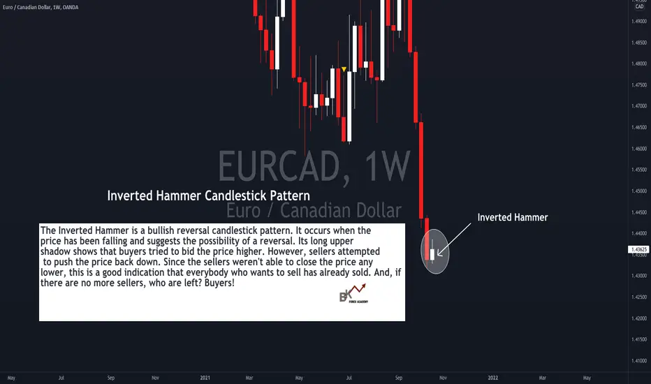
What Does the Inverted Hammer Candlestick Pattern Mean? Hello Traders!
Have you ever wondered when will a strong trend end? Do you struggle to spot candlestick patterns that potentially signal when the bulls or bears might take over?
Take a look at this example of EUR/CAD and let's see how the trade plays out! :)
About the Inverted Hammer Candlestick Pattern and Why It Forms:
The Inverted Hammer is a bullish reversal candlestick pattern. It occurs when the price has been falling and suggests the possibility of a reversal. Its long upper
shadow shows that buyers tried to bid the price higher. However, sellers attempted to push the price back down. Since the sellers weren't able to close the price any
lower, this is a good indication that everybody who wants to sell has already sold. And, if there are no more sellers, who are left? Buyers!
And just an important observation, the Inverted Hammer has a small real body, and has a large upper shadow with a small or no lower shadow (also known as "wick").
Would you like to receive more "live charting" tutorials like this?? Comment below and let us know! :)
Happy Trading!
Candlestick patterns every beginners should know . ( part 2 )Hi friends ,
today i'll share with you the most famous
candlestick pattern everyone should know. part2
bullich engulfing and bullish harami appear in the downtrend , It indicates the possibility of a price reversal ( long )
bearich engulfing and bearich harami appear in the uptrend , It indicates the possibility of a price reversal ( short)

Perma-bears are wrongHave you ever experienced a moment where someone is saying that a huge market crash is inevitable? Or maybe you have watched a video some expert with a legion of followers was declaring the same fact?
I've seen plenty small names and even big names who are just constantly doing that so I decided to have a brief overview why most of these statements are false and they are just created for marketing purposes to attract more followers, not to warn an investor.
Bearish bias and perma-bears are doing it for wrong reasons and investors shouldn't be too much into this apocalypse of the financial markets stuff. In fact the bearish bias in the market since 2008 is probably the costliest human bias in finance.
Yet many of the best-known Wall Street pundits are persistently pessimistic and many of them have been around for decades. These are all incredibly smart guys who do amazing analysis that mostly points to an imminent large-scale bear market. And yet the evidence shows these forecasts are almost always wrong. Why do we keep reading their stuff? Because it sounds really smart! The forecasting business has very little accountability and is mostly about marketing and sounding smart, not accuracy.
If you looked at the chart you instantly figure out that markets in a long run are always long. It seems a lot like perma-bull and none like perma-bear and charts speak for themselves.
Two graphs with two very different instruments - bitcoin, which only appeared 13 years ago and DOJI 120+ years. Nonetheless they look quite the same - curve which constantly goes up.
Obviously there are times where shorting is probably the only option, but is less often when you think.
Financial markets reflect in human progress and it is going faster and faster.
Smart investors set and forget or know what majority don't know, but most people who pretend that they can predict the crash and do it constantly without any any good reasons (markets are overextended most of the time and they form new higher price value zone again and again) just trying to do that for all the wrong reasons.
Don't fall into the category of naive believers. Do your own due diligence, trust statistics and what you see, not what you hear.
Good luck with investing and trading.

Different Chart Patterns for Trend AnalysisLet's look at different chart patterns which help the traders to analyze the market. Chart patterns are a way of viewing a series of price actions that occur during a trading period. It can be over any time frame – monthly, weekly, daily, and intra-day. The great thing about chart patterns is that they tend to repeat themselves over and over again. Let's look at a few of these.
➡️ Ascending Triangle is a bullish continuation pattern. It is also called a 'rising triangle'. It is formed by a rising lower trendline and a flat upper trendline that acts as support. This pattern indicates that the buyers are more aggressive than the sellers as the price continues to make higher lows. This pattern completes itself when price breaks out of the triangle in the direction of the overall trend.
➡️ Inverse Head & Shoulder is a similar pattern to the head & shoulder pattern, just inverted. This pattern generally indicates a bullish trend movement. This pattern is a trend reversal chart pattern. This pattern makes three peaks, the two outside peaks are about the same height, and the middle one is the lowest. It is a reversal pattern, from bearish to bullish. This pattern is comprised of three parts: After long bearish trends, the price falls to a trough and then rises to make a peak. Again, the price falls to form a second trough below the previous low and increases again. The price falls for the third time, but only to the level of the first trough, before rising once more and reversing the trend.
➡️ Falling Wedge is created when a market consolidates between two converging support and resistance lines. A falling wedge is considered a bullish pattern. This price action forms a cone that slopes down as the highs and lows converge. This pattern is widest at the top and becomes narrower as it moves downward. It leads to tighter price action. If the falling wedge shows up in a downtrend, it is seen as a reversal pattern.
➡️ Triple Top is a bearish pattern. It is formed when the price makes three similar highs and then rejects to make a downtrend. The formation of this pattern is completed when the prices move back to the support line after forming the third peak.
➡️ Head & Shoulder formation consists of a left shoulder, a head, and a right shoulder and a line drawn as the neckline. Volume is highest and often expands on the left shoulder as the uptrend continues and more and more investors want to get in, whereas it is lowest on the right shoulder as investors sense a trend reversal. This low volume is often considered a strong sign of reversal.
➡️ Rising Wedge is formed when the market begins making higher highs and higher lows. All of the highs must be in-line so that they can be connected by a trend line. The rising wedge is a bearish pattern. This chart pattern has a wide trading range at the bottom and contracts to a smaller trading range as prices trend up. The rising wedge pattern signals a possible selling opportunity either after an uptrend or during an existing downtrend. The entry (sell order) is placed either when the price breaks below the bottom side of the wedge or the price finds resistance at the lower trend line.
➡️ Bullish Rectangle pattern is formed during an uptrend, defining the horizontal levels of support and resistance. The price keeps moving between the support and resistance lines. It maintains its highs and lows forming a trading range making a kind of a rectangle. These support and resistance lines should be parallel to each other. It is always advised to wait for a breakout confirmation on the resistance level to take a trade setup.
➡️ Bullish Pennant occurs just after a sharp rise in price and resembles a triangular flag as the price moves sideways, making gradually lower highs and higher lows. The uptrend then continues with another similar-sized rise in price. A bullish pennant has a pole that is created when the price experiences a sharp rise and then a pennant attached to the pole. The price when breaks the flag, signals a continuation of an uptrend.
➡️ Triple Bottom signals a bullish reversal pattern. This pattern consists of three equal lows followed by a breakout above resistance. The three bottoms should be nearly equal in size and have sufficient space between them. The confirmation for this pattern is a close above the upper trendline with above-average volume. Traders should treat the triple bottom pattern as a neutral pattern until the breakout is confirmed. Once the upper resistance level is broken with a sharp increase in volume, the momentum will likely carry the price action higher.
Thanks for reading, and let us know what do you think about these chart patterns in the comment box below.
Happy Trading

Let's talk about Candlestick Chart PatternsThe candlestick chart patterns are used by traders to set up their trades, and predicting the future direction of the price movements. There are many candlestick chart patterns. I will be discussing a few of those.
✅ Morning Star is formed after a downtrend indicating a bullish reversal. Generally made of 3 candlesticks, first being a bearish candle, second a Doji, and third being a bullish candle. The first candle shows the continuation of the downtrend, the second being a Doji shows indecision in the market and the third bullish candle shows that bulls are back in action.
✅ Bullish Hammer is a single candlestick pattern, which is formed at the end of the downtrend and shows bullish reversal. The real body of this candle is small with a long lower wick which should be more than twice the real body. This candle is formed when the seller pushes the price downwards but at the same time buyers arrive and push the prices up.
✅ Bullish Engulfing is formed after a downtrend, indicating a bullish reversal. It is formed when a bearish candle is fully engulfed by a bullish candle which shows that the bulls are back in the market.
✅ Three White Soldiers is a multiple candlestick pattern that is formed after a downtrend indicating a bullish reversal. It is formed when three consecutive bullish candles appear one after the other. These three candles show a strong bullish trend.
✅ Hanging Man is generally formed at the end of an uptrend and signals bearish reversal. The real body of this candle is small and is located at the top with a lower shadow which should be more than twice the real body. This candlestick pattern has no or little upper shadow.
✅ Dark Cloud Cover is formed by two candles, the first candle being a bullish candle which indicates the continuation of the uptrend. The second candle is a bearish candle that opens the gap up but closes more than 50% of the real body of the previous candle which shows that the bears are back in the market and a bearish reversal is going to take place.
✅ Bearish Engulfing is formed by two candles, after an uptrend indicating a bearish reversal. It is formed by two candles, the second candlestick engulfing the first candlestick. The first candle being a bullish candle indicates the continuation of the uptrend. The second candlestick chart is a long bearish candle that completely engulfs the first candle and shows that the bears are back in the market.
✅ Evening Star is made of 3 candlesticks, first being a bullish candle, second a Doji, and third being a bearish candle. The first candle shows the continuation of the uptrend, the second candle being a doji indicates indecision in the market, and the third bearish candle shows that the bears are back in the market and reversal is going to take place.
Thanks for reading and hope you like it.
Please comment and let us know your thoughts on it.
Happy Trading

Chart Training with Jay Rhyder - MA SignalsHello and welcome to a small series I thought I would start to help people understand market charts. Enjoy and leave me a comment about what you liked or didn't like. Thank you for your support!
------------------------------------------------------------------------------------------------------------------------------------------------------------------
Take a look at this chart. It is a 1 hour Coinbase chart of Ethereum (ETH/USD).
One of the best ways to understand if the market is going to rally or go south is to pay attention to the MOVING AVERAGES, or MA lines. As you can see, the white line on this chart is the 50 day, the dark purple one is the 200 day and the pink one is the 150 day moving average, respectfully. When you see the 50 day moving up like in this chart, and the 200 day on top of the 150 day, it is a bullish signal.
The opposite is true for bearish markets. It is called a DEATH CROSS. It is when the 50 day is on the bottom of the 150 and 200 and the 200 day is on top of the 150 day moving average. When the 200 day crosses DOWN through the 150 day, it is called a DEATH CROSS and is a very, very bearish signal.
If you have any questions about this short and concise tutorial, please leave your question or comment below. I hope you learned something from this short tutorial. My name is Jay - have the best day!
:)

BASIC BULLISH MARKET STRUCTUREWhat is Market Structure?
Market Structure is the technical structure of any market that appears over time as one primary position holds the majority of the strength (buyers or sellers). Market structure is a key technical understanding to be able to identify what the market has been doing in the past and what it has the potential to do in the future.
Market Structure is the continuous series of higher highs and higher lows (bullish market structure) or the continuous series of lower highs and lower lows (bearish market structure). When market structure is non relevant and there are no higher highs or lower lows, this is a time of consolidation.
So, what is bullish market structure?
As stated above, bullish market structure is a series of higher highs and higher lows in the markets. We can identify this series by seeing 2 or more sets of higher highs and higher lows.
Of course market structure is not EXACT, which is why trading is so hard, there is no EXACT path that price will take EVERY time, but you must understand the overall concept and be able to adjust to market conditions.

How to use Candlestick Patterns ..Hello Traders , Have a nice weekend.
it's good to learn something even if you knew it before,Seriously some of you know all these patterns but don't know how to use them.
First we have to draw our support and resistance area in higher time frames , then we switch to lower time frames to see a candlestick pattern and now you can enter the trade after a little price rest to have a better RR ratio guys.
Good Luck on that , As easy as you see

MACD Divergence by MADO and how i use it to predict breakoutsFirst I want to give mad props to MADO for his/her Divergence MACD Indicator. I found this last night and this is what I have found while using it. Although it doesn't preplot every divergence I would like to see and there are a lot of other things I wish it did...maybe some programmer or Mado themselves would like to help put what I see all together into one indicator. That Said while using the indicator I found that not only can you predict when it will break out but also what it will do when it does, and how far it could go. I have only tested this on a few stocks as I just found this out and wanted to post it while I was discovering it. So its not polished and its not withheld in any way its exactly as I am discovering it. I will make a video again as the first 2 errored out due to my poor internet. lol
@MaDo if you are viewing this I want to give you mad props on this indicator. By far the best one I found and yes im using it not as intendid but thats how i use all indicators. If you are interested in helping me make a version of this with my twist to it I would gladly help you see it the way I see it so that you could. Feel free to reach out anytime.. That goes for any programmers that come across this. I see a lot of things most people dont due to my acquired savant syndrome and would like to share that with the world.
by iCantw84it
07.09.2021

[Trade Review]How I traded $SQ, $HD HUGE FUMBLE, $TLRY, $MSFT, $In this video I will reviewing trades I took on June 29, 2021 which were $SQ, $HD, $TLRY, $MSFT, $baba Along with an explanation of my plan as well showed you guys my TA for some possible set ups! Traded these tickers using my knowledge of technical Analysis , sharing my levels: Support & Resistance , my trendlines , Fibs, Waves, Price Action, Channels , Emma's, and prior experienced , while providing both bullish & bearish scenarios for you to be able to understand my analysis and wait for confirmation as always!
Want to see more content like this? Make sure to Like and Subscribe!

Continuation Chart Patterns - Let's ReadHello guys,
Now that the market is pushing down and we all know what's about to happen, I thought let's not talk about the obvious analysis and learn something.
Today I decided to teach you guys about four famous chart patterns so that maybe you can cheat a little on how to play with this market.
I have set out 4 patterns for you:
1. Bullish Flag Pattern
2. Bearish Flag Pattern
3. Bullish Pennant Pattern
4. Bearish Pennant Pattern
Bullish Flag Pattern:
Bullish flag formations are found in stocks with strong uptrends and are considered good continuation patterns. They are called bull flags because the pattern resembles a flag on a pole. The pole is the result of a vertical rise in a stock and the flag results from a period of consolidation.
Bearish Flag Pattern:
The bearish flag is a candlestick chart pattern that signals the extension of the downtrend once the temporary pause is finished. As a continuation pattern, the bear flag helps sellers to push the price action further lower.
Bullish Pennant Pattern:
A bullish pennant is a technical trading pattern that indicates the impending continuation of a strong upward price move. They're formed when a market makes an extensive move higher, then pauses and consolidates between converging support and resistance lines.
Bearish Pennant Pattern:
A bearish pennant is a technical trading pattern that indicates the impending continuation of a downward price move. They're essentially the opposite to bullish pennants: instead of consolidating after a move up, the market pauses on a significant move down.
When to use these patterns?
Well, It's known that using tricks like this requires wide time ranges. For example, you can't get good results using 15-min charts on these patterns. I always try to use 4H charts to get the best results.
There are other patterns too, which are helpful but I'll get to them in the upcoming published charts.
Now let's talk...
Have you used these patterns? What are your experiences?
Any tricks you got in mind so that we can improve reading charts based on it?
Comment below!

How to be careful from misleading Indicators | XRPUSD reversalAny feedback and suggestions would help in further improving the analysis! If you find the analysis useful, please like and share our ideas with the community. Keep supporting :)
Quick glance: In our previous analysis on XRPUSD , we discussed about Ripple losing a massive market cap. Right now, XRPUSD had a massive reversal. It has taken support from the lower Bollinger bands.
Market in the last 24hrs
The last 24 hours were quite a roller coaster. All major cryptos witnessed a huge selloff including ETH, BTC, DOT and others. Trading volumes also spiked up tremendously.
Today’s Trend analysis
XRPUSD seems to be having a massive reversal. At the end of the downtrend on the 4H chart, there appeared to be a 'Hammer' formation. However, the patter could not be confirmed as the 2 following candles were red, thereby negating the reversal after the 'Hammer'. Stop losses would have been triggered for traders taking long positions after the hammer. Therefore, it is always crucial to wait for the confirmation candle, even if it eats into some of the potential gains. It hedges against fake-outs!
The reversal happened after XRP took support from the lower band of the Bollinger Bands. The volume profile shows the demand zone at $0.8688, which is 40% higher than current levels.
Price volatility remained extremely high at approximately 24.53%, with the day's range between $0.5231 — $.6514.
Price at the time of publishing: $0.6315
XRP's market cap: $29.04 Billion
Out of 11 Oscillator indicators, 9 are neutral,1 is bearish, and 1 is bullish.
Out of 15 Moving average indicators, 11 are bearish , 3 are bullish and 1 is neutral .
Indicator summary is bearish for XRPUSD in the shorter timeframe.
Volumes have spiked up tremendously in the past 24 hours.
----------------------------------------------------------------------------------------
The analysis is based on signals from 26 technical indicators, out of which 15 are moving averages and the remaining 11 are oscillators. These indicator values are calculated using 4Hr candles.
Note: Above analysis would hold true if we do not encounter a sudden jump in trade volume .
----------------------------------------------------------------------------------------
Any feedback and suggestions would help in further improving the analysis! If you find the analysis useful, please like and share our ideas with the community. Keep supporting :)

[Trade Review] How I traded $HD, $U, $SPCE, $ROKU In this video I will reviewing trades I took on June 22 ,2021 which were $HD, $U, $SPCE, $ROKU these trades were taken from todays livestream were i explained my plan showed you guys my TA and updated my TA as we went on plus answered questions! Traded these tickers using my knowledge of technical Analysis , sharing my levels: Support & Resistance , my trendlines , Fibs, Waves, Price Action, Channels , Emma's, and prior experienced , while providing both bullish & bearish scenarios for you to be able to understand my analysis and wait for confirmation as always!

What is a Cup and Handle Pattern? GBP/USD Real ExampleGood morning, traders! Today we will make an educational post about a specific behavior in the market in certain circumstances, and we wanted to take advantage of the situation in GBP/USD that is currently happening.
The pattern we are talking about is the CUP AND HANDLE PATTERN . This pattern is widely used in stocks or indices since they are trend instruments by their essence, and it serves to catch a potential rise in price after a correction. The premise for this pattern to be valid is that the asset is in a CLEAR trend, either bullish or bearish, and has initiated a corrective process.
A cup and handle is a technical chart pattern that resembles a cup and handle where the cup is in the shape of a "u," and the handle has a slight downward drift.
There are three key things to consider when forming these patterns:
🔸Length: Generally, cups with longer and more "U" shaped bottoms provide a stronger signal (this case). Avoid cups with sharp "V" bottoms.
🔸Depth: Ideally, the cup should not be overly deep. Avoid overly deep handles, as handles should form in the top half of the cup pattern.
🔸Volume: Volume should decrease as prices decline and remain lower than average in the bowl base; it should then increase when the stock begins to make its move higher, back up to test the previous high.
🔸In addition, it is also an important factor that the handle is a clear corrective pattern and has some point of support or support. In this situation, we see that in the daily chart, the price is touching the uptrend line, and also in the published chart, we see how it is also testing the broken zone of the range. The current reversal point is solid.
