Anatomy of a Breakout: How to Spot It Before It Fakes You OutFew things in trading are as appealing as a breakout. The chart tightens, volume starts to stir, headlines align, your alerts start going off , and suddenly — boom! Price explodes above resistance. Your adrenaline spikes and you pop open that long.
But just as often, that breakout turns out to be nothing more than an expensive head fake. Price stalls. Sellers swoop in. Your stop gets clipped. And now you’re sitting there, blinking at your screen, “Welp… that was quick.”
Welcome to the bittersweet world of breakouts — where opportunity and deception dance like partners at a high-stakes poker table.
📢 What Is a Breakout, Really?
Let’s get the basics out of the way: A breakout happens when price pushes beyond a key support or resistance level that’s been holding for a while.
That level could be a previous high, a consolidation range, a trendline, or a psychological number that traders obsess over because humans love round numbers (did someone say Bitcoin BITSTAMP:BTCUSD at $120,000 ?).
The logic is simple: Once price clears a well-watched level, trapped shorts have to cover, new longs pile in, and momentum feeds on itself. That’s the dream scenario.
But markets aren’t always that generous. For every clean breakout, there are a few fakeouts lurking — luring in overeager traders with the promise of easy money before slamming the door shut.
⚠️ Why Breakouts May Fail
If breakouts were easy, we’d all be rich. The problem is that breakouts attract a special kind of crowd: late-to-the-party momentum chasers, breakout algorithm bots, and retail traders who read one blog post about technical analysis.
The moment price nudges above resistance, FOMO kicks in. Volume surges. But if the move isn’t backed by genuine institutional buying (you need lots of billions to move the needle nowadays), it quickly becomes what seasoned traders call a “liquidity vacuum” — thin air where the only participants are you, a few equally optimistic Reddit threads, and market makers more than happy to take the other side.
Sometimes breakouts fail because:
The move lacked volume confirmation.
Macro headlines shifted mid-breakout.
A key level was front-run, and the real buyers have already taken profit.
It was a deliberate trap set by larger players to hunt stops before reversing.
Or — more often — the market just needed an excuse to shake out weak hands before resuming the actual move later.
🍸 Volume: The Truth Serum
Let’s be very clear: Breakouts without volume are like dating profiles without photos — you should be suspicious.
When real breakouts occur, you’ll usually see strong accompanying volume. That’s your proof that big players — funds, institutions, serious money — are committing to the move. No volume? Maybe the summer vibes are already here .
Smart traders wait for confirmation:
Is volume above average relative to recent sessions?
Is price holding above the breakout level after the initial pop?
Are follow-through candles printing convincingly?
Are we seeing continuation across related sectors or instruments?
Without these signs, that breakout candle may just be a cruel joke.
🤯 Breakout Psychology
Breakouts prey on two of the most dangerous emotions in trading: greed and urgency. The market whispers, “If you don’t get in now, you’ll miss it.”
This is where breakout psychology becomes more dangerous than the chart itself. Once a breakout happens, most traders are no longer analyzing — they’re reacting. They buy late, set tight stops below the breakout level, and become easy prey for stop-hunting algorithms.
✨ Types of Breakouts
Not all breakouts are created equal. Here’s the lineup you should be watching for:
Clean Breakouts:
The rarest and most beautiful. Strong move, high volume, sustained momentum. You’ll know it when you see it — or after you’ve hesitated and missed it.
Fakeouts (a.k.a. False Breakouts):
Price nudges just past resistance, triggers breakout orders, then swiftly reverses. Designed to shake out breakout traders before resuming the original trend.
Break-and-Retest Setups:
Often the highest-probability trades. Price breaks out, then pulls back to retest the former resistance (now support). If buyers defend this retest, you’ve got confirmation.
News-Driven Breakouts:
Triggered by earnings, economic data, or political events. Volatile, fast, and often unsustainable unless backed by real fundamental shifts.
📈 The “Pre-Breakout Tell”: Reading the Tape
Good breakout traders aren’t just watching levels — they’re watching how price behaves near those levels in advance.
Tight consolidation? Lower volatility into resistance? Declining volume as price grinds higher? That often signals an impending breakout as supply dries up.
Conversely, choppy action with large wicks and erratic volume often signals indecision — ripe conditions for failed breakouts and fakeouts.
Tape-reading matters. The cleaner the structure before the breakout, the better your odds.
💰 Breakout Traders Need Thick Skin
Even with perfect analysis, breakout trading requires accepting that many will fail. That’s the game. Your job isn’t to nail every breakout — it’s to size your positions properly , keep losses small when faked out, and let the clean breakouts run when you catch one.
Stop-loss discipline is everything. Breakouts are binary events: you’re either right quickly, or you’re cutting the trade quickly. There’s no room for “maybe it’ll come back.”
The most painful breakouts are the ones that fake out, stop you, then continue in your original direction. Every breakout trader has lived that nightmare. Accept it. Build it into your risk plan.
👉 Takeaway: Prepare the Setup, Anticipate the Fakeout
Breakouts will always be part of every trader’s playbook. But they require discipline, experience, and an iron stomach. The market loves to tempt you with early signals — your job is to separate signal from noise.
Pro tip: Start your day by checking the Economic calendar and browsing the latest news — staying informed (and witty) helps you build better context for smarter decisions.
So before you chase that next breakout candle, ask yourself:
Is volume there?
Is the broader market supportive?
Have I managed my risk before clicking buy?
Because in trading, the only thing worse than missing a breakout… is getting faked out and blowing up your account chasing it.
Now over to you : Are you a breakout trader or a fakeout victim? Share your best (or worst) breakout stories — we’ve all been there.
Community ideas

How to Spot Head & Shoulders Patterns in TradingViewDiscover how to identify and validate Head & Shoulders patterns using TradingView's built-in pattern recognition tools in this detailed tutorial from Optimus Futures. Chart patterns are essential tools for many futures traders, and the Head & Shoulders formation is among the most recognized reversal patterns in technical analysis.
What You'll Learn:
• Understanding the Head & Shoulders pattern: a key reversal formation in technical analysis
• How to access and use TradingView's pattern drawing tools and objects
• Step-by-step process for identifying potential Head & Shoulders formations on any timeframe
• Techniques for spotting the "head" by locating the highest high or lowest low pivot points
• How to identify matching "shoulders" on either side of the head formation
• Validating your pattern identification using TradingView's drawing tools
• Real-world example using crude oil futures on an hourly chart from October 2024
• Key characteristics that distinguish bearish Head & Shoulders reversal patterns
• Best practices for using pivot points and swing analysis in pattern recognition
This tutorial may benefit futures traders, swing traders, and technical analysts who want to improve their chart pattern recognition skills in TradingView. The techniques demonstrated could help you identify potential reversal opportunities and make more informed trading decisions when these classic formations appear on your charts.
Keywords: Head and Shoulders pattern, TradingView tutorial, chart patterns, technical analysis, reversal patterns, futures trading, pivot points, swing analysis, pattern recognition, trading education
Visit Optimus Futures to learn more about trading futures with TradingView:
optimusfutures.com
Disclaimer:
There is a substantial risk of loss in futures trading. Past performance is not indicative of future results. Please trade only with risk capital. We are not responsible for any third-party links, comments, or content shared on TradingView. Any opinions, links, or messages posted by users on TradingView do not represent our views or recommendations. Please exercise your own judgment and due diligence when engaging with any external content or user commentary.
This video represents the opinion of Optimus Futures and is intended for educational purposes only. Chart interpretations are presented solely to illustrate objective technical concepts and should not be viewed as predictive of future market behavior. In our opinion, charts are analytical tools—not forecasting instruments. Market conditions are constantly evolving, and all trading decisions should be made independently, with careful consideration of individual risk tolerance and financial objectives.

A Step-by-step Guide to One of the Chart Analysis MethodHello Friends,
Welcome to RK_Chaarts,
Today we're going to learn step-by-step guide to one of the chart analysis Method by analyzing a chart of " Varun Beverages Ltd. (VBL) " to identify a trend change opportunity.(Educational Post).
Let's get started!
Applying Elliott Wave Theory
First, we can see that the bottom formed in March 2025 is likely a Wave ((4)) in Black as a bottom, marked as such on the chart. From there, Wave 5 should move upwards. Looking at the daily timeframe, we can see that price gone up in five sub-divisions of Wave (1) in Blue of Wave ((5)) in Black have completed, marked as Red 1-2-3-4-5, that means blue intermediate Wave (1) has ended, and Wave (2) has begun, which is unfolded in corrective nature marked as WXY in Red of Wave (2) in Blue.
According to the wave principle, Wave (2) should not retrace more than 100% of Wave (1), which started from the 419.65 bottom. Therefore, 419.65 becomes our invalidation level. If the price moves below this level, it would invalidate our Wave (2) principle.
Assuming our wave counts are correct, the upward movement is in the five sub-divisions, and the downward movement is in the three sub-divisions. Definitely, the conviction is increasing that we have correctly identified Waves (1) and (2). Shown in chart image below
Tweezers at Bottom
Now, we can see that Wave 2 has retraced more than 70% and has formed a Tweezer candlestick pattern at the bottom. A bearish candle was followed by a bullish candle, both with a Tweezer-like shape, with the second candle being green. This could indicate a potential reversal. Moreover, the latest candle has also taken out the high of the previous two candles, showing follow-through. The price has also shown follow-through on the upside after that. So, this can be considered as the first sign that Wave 2 might be ending, marked by a significant Tweezer pattern at the bottom with a follow-through candle. Shown in chart image below
Significant Breakout Pending Yet
Secondly, from the top where Wave 1 ended, we've been considering the decline from around 560.50 as a resistance. We drew a resistance trend line, and if the price breaks out above it, we can say that the resistance trend line has been broken, indicating a breakout above the last fall's trend line, Which is not Broken yet. Shown in chart image below
Dow Theory
The Dow Theory states that when the price moves up, it forms a Higher High, Higher Low pattern, and when it moves down, it forms a Lower High, Lower Low pattern. Somehow, the Dow Theory also needs to change, as the last swing was forming a Lower High, Lower Low pattern. The last swing high was at 479, which we marked with a green arrow. If the price crosses above it, we can say that the price is now forming a Higher High pattern. This indicates that the Dow Theory is changing from a falling trend to a rising trend. Shown in chart image below
Stop Loss
Once the Dow Theory also changes, we can use the last swing low at 446.15 as our stop loss. However, this stop loss will only be valid after the Dow Theory changes; otherwise, the invalidation level will remain at 419. Shown in chart image below
Projected Target of Wave (3)
So, friends, we've applied the Elliott Wave principle, and there's been a significant retracement, all within the valid range, without violating any rules or triggering invalidation. There's limited room left on the downside, and then we have the Tweezer candlestick pattern, which is a significant sign. We're expecting a reversal from there, and the price has followed up with an upward move.
What's left now is the breakout above the resistance trend line and a change in the Dow Theory. Once these two conditions are confirmed, all parameters will match, and we can add a position to our portfolio using the last swing low as our stop loss, instead of the invalidation level.
This is how chart analysis is done for investment purposes. We've seen many signs in our favor, and yet we still use a stop loss to prevent significant losses in case the stock or market moves unexpectedly. This is what stop loss is all about - minimizing potential losses.
We've also discussed the target projection based on Wave theory, 161.8% level, which we explained through an image. So, friends, I hope you've understood the entire conclusion and learned how to analyze charts using different methods, one of which we shared with you today.
I am not Sebi registered analyst.
My studies are for educational purpose only.
Please Consult your financial advisor before trading or investing.
I am not responsible for any kinds of your profits and your losses.
Most investors treat trading as a hobby because they have a full-time job doing something else.
However, If you treat trading like a business, it will pay you like a business.
If you treat like a hobby, hobbies don't pay, they cost you...!
Hope this post is helpful to community
Thanks
RK💕
Disclaimer and Risk Warning.
The analysis and discussion provided on in.tradingview.com is intended for educational purposes only and should not be relied upon for trading decisions. RK_Chaarts is not an investment adviser and the information provided here should not be taken as professional investment advice. Before buying or selling any investments, securities, or precious metals, it is recommended that you conduct your own due diligence. RK_Chaarts does not share in your profits and will not take responsibility for any losses you may incur. So Please Consult your financial advisor before trading or investing.

Mechanical rangesMany traders will talk about things like "Smart Money Concepts" (SMC) and think they have found something new.
The truth is, everything in trading stems back to Liquidity.
There is no "Algo" nobody is out to get you specifically. The market is always right, where you position yourself is your own choice.
I have written several posts on mechanical trading, recorded a number of streams. The more mechanical you can make the process, the less the emotions have a chance to kick your ass.
Let me give you a very simple method of being able to identify the ranges. Ignore the timeframes as this will work on any of them, on most instruments. (I say most, as some behave differently due to how it attracts liquidity). Lets assume high end crypto such as Bitcoin (BTC) and of course Forex in the general sense, stocks, commodities etc.
This is simple - only 2 rules.
You start by zooming out and giving yourself a general feel for the trend.
Let's say this looks to be an uptrend - we now need to understand the rules.
An opposing candle can simply be defined by a different colour. If the trend is up (Green) and we see a red candle - then it's an opposing candle.
The inverse is true, if we are down and the trend is Red. Then a Green candle would be opposing.
This is only half of the story. The second rule is a pullback candle or even a sequence of candles. This simply means either the very same opposing candle that doesn't make a new high or low (depending on the trend up not making fresh highs or down not taking new lows).
In this image, you can see we have in one candle both an opposing and pullback in one candle. This means we can now mark the high of the range. Working backwards to identify the swing range low.
This easy method means I can draw a range exactly the same and mechanically every single time.
Giving me a mechanical range.
We could then get a lot more technical by looking for liquidity, 50% of the range or places such as supply or demand areas.
But these are all for other posts.
For now, getting a range on the higher timeframes means you can work down and down into a timeframe you are likely to want to trade on.
These ranges will give clues to draws and runs of liquidity.
This will also help identify changes in the character and fresh breaks of structure.
Here's another post I posted on the mechanical structures and techniques.
More in the next post.
Have a great week!
Disclaimer
This idea does not constitute as financial advice. It is for educational purposes only, our principal trader has over 25 years' experience in stocks, ETF's, and Forex. Hence each trade setup might have different hold times, entry or exit conditions, and will vary from the post/idea shared here. You can use the information from this post to make your own trading plan for the instrument discussed. Trading carries a risk; a high percentage of retail traders lose money. Please keep this in mind when entering any trade. Stay safe.

The Midyear Mindset Reset: Reboot Your Trading Before Q3Because nothing says "trader growth" like admitting you’ve been winging it for six months.
👋 Welcome to Halftime — How’s Your P&L Looking?
June’s closing bell isn’t just a date on the calendar — it’s that awkward moment where traders stare into the middle distance, coffee in hand, and quietly whisper: “Well… that went differently than I expected.”
Whether you’ve been racking up wins, nursing drawdowns, or simply surviving market whiplash, midyear is nature’s way of handing you a clean slate. Before Q3 throws its inevitable curveballs, now’s your chance to pause, reset, and actually look at what the heck you’ve been doing. And, of course, prepare for the next batch of earnings reports .
Spoiler: if your trading strategy this year has involved equal parts hope and caffeine, you’re not alone.
🔥 The Year So Far: Markets Kept It… Interesting
Let’s quickly recap 2025 so far (because trauma processing is healthy).
The Magnificent Seven? More like the Magnificent Two-And-A-Half. Meta NASDAQ:META and Microsoft NASDAQ:MSFT ran victory laps while everyone else tripped over AI headlines or regulatory landmines.
Nvidia NASDAQ:NVDA moonwalked into trillion-dollar territory, then stumbled after export bans — but somehow still has every fund manager whispering “Blackwell” like it’s a secret password.
Bitcoin BITSTAMP:BTCUSD set new highs north of $110K (who needs fiat when you can have memes?).
The Fed teased cuts, inflation teased persistence, and Trump teased… well, everyone.
And summer trading arrived with its usual low-volume traps, giving us breakouts that break hearts and liquidity that disappears faster than your broker’s customer support.
In short: volatility? Check. Opportunity? Absolutely. Discipline? That depends on whether you’re still following your rules or trading on vibes.
By June, most traders have crafted elaborate narratives in their heads. You know the type: "This breakout is different," "The Fed has to cut next month," and "There’s no way Nvidia can keep running like this."
The problem is, markets don’t care about your narrative. They care about price, volume, sentiment — and sometimes, absolute chaos. That beautifully clean chart setup? It’s not asking for your prediction. It’s begging you to respond with discipline, not bravado.
The traders who thrived in the first half didn’t win by forecasting every twist in the macro plotline. They won by following the tape. The breakout happened? They took it. The stop-loss hit? They respected it. That’s not luck — that’s execution.
🫶🏻 Emotional Capital: The Real Balance You Should Be Watching
P&L tells one story. Emotional capital tells another.
By June, a lot of traders aren’t out of money — they’re out of discipline. They’ve been revenge trading after a string of losses, chasing AI headlines that already ran, and convincing themselves they can “make it all back” on the next oversized position.
Do you know that feeling?
Resetting your trading mindset at midyear means recalibrating that emotional bankroll. Start by reviewing your trading journal (yes, you’re supposed to have one ). Revisit the trades that made sense and the ones that make you cringe. Recognize your patterns — your strengths, but also your weaknesses. Success leaves clues and there are lessons in failures.
💭 Clean Up the Clutter
There’s a special type of fatigue that sets in after six months of consuming too much trading content. You start layering on indicators like toppings at a frozen yogurt bar — RSI, MACD, Stochastics, VWAP, Fibonacci, Elliott Waves, Gann fans... until your charts light up like the billboards in Times Square.
The truth is, the best traders heading into Q3 are simplifying. They’re not chasing complexity; they’re chasing clarity. They know their setups, they trust their process, and they wait for clean signals.
Summer trading especially demands this discipline. Liquidity gets thinner, breakouts fail more often , and the tape gets choppy.
Complex systems may amplify the noise. Strip it down. Focus on price structure. Simplify your strategy so you can execute when real opportunities appear — not when your 12th oscillator blinks green.
⚾ You Don’t Need a Home Run
At this stage of the year, many traders fall into what we’ll call the desperate hero phase. They feel behind. They want to make up for drawdowns. They want “the trade” that fixes everything. If you’ve missed making bank over the first half of the year, chances are, you want to catch up — and fast.
Here’s a secret: The best traders aren’t always looking for grand slams. They’re playing small ball too — consistent singles, tight risk, controlled losses, steady gains.
Q3 isn’t about doubling your account. It’s about staying alive long enough for your edge to show up and play out. The traders who make it to year-end consistently profitable aren’t the ones chasing massive wins. They’re the ones compounding quiet, boring, disciplined trades.
Midyear Reset: Your Q3 Trading Checklist
Here’s your brutally simple plan for the back half:
✅ Journal your biggest mistakes from H1
✅ Cut your watchlist in half
✅ Size smaller than feels exciting
✅ Trust clean setups over crowded trades
✅ Stay curious — but stay selective
✅ Leave the FOMO trades to the TikTok influencers
So the real question heading into Q3 isn’t whether markets will go up or down. It’s whether you will trade better or keep winging it.
Happy midyear reset. Trade smarter, not harder.

How to Find Day Trading Momentum Plays...In this video I show the screener I use in order to find my momentum day trading setup. If you have any questions feel free to ask. Hope you enjoy!!

The "True Close" Institutions Don't Talk About — But Trade On█ My Story from the Inside
I worked at a hedge fund in Europe, where I served as a Risk Advisor. One thing I never expected before joining the institutional side of the market was this:
They didn’t treat the current day’s close as the "true" close of the market.
Instead, they looked at the first hour of the next day — once all pending flows had settled, rebalancing was done, and execution dust had cleared — that was the true close in their eyes.
Here’s why that changed everything I knew about trading:
█ Institutional Reality vs Retail Fantasy
⚪ Retail traders are taught:
“The daily close is the most important price of the day.” But institutions operate under constraints that most retail traders are never exposed to:
Orders too large to fill before the bell
Internal compliance and execution delays
Batch algorithms and VWAP/TWAP systems that extend into the next session
So while the market might close on paper at 17:30 CET, the real trading — the stuff that matters to funds — might not wrap up until 09:30 or 10:00 the next morning.
Although the official “close” prints here, institutional volume ends quickly. It drops off sharply, almost immediately. Once the books are closed and final prints are done, big players exit — and what's left is thin, passive flow or noise.
The first hour of the New York session reveals structured flows, not random volatility. This is where institutions finalize yesterday’s unfinished business, which is why many consider this the “true” close.
And that’s the price risk managers, portfolio managers, and execution teams internally treat as the reference point.
█ Example: The Rebalance Spillover
Let’s say a fund needs to offload €100 million worth of tech stocks before month-end. They start into the close, but liquidity is thin. Slippage mounts. They pause execution. Next morning, their algo resumes — quietly but aggressively — in the first 30 minutes of trade.
You see a sharp spike. Then a reversal. Then another surge.
That’s not noise. That’s structure. It’s the result of unfinished business from yesterday.
█ Why the First Hour is a War Zone
You’ve probably seen it:
Prices whip back and forth at the open
Yesterday’s key levels are revisited, sometimes violently
Big moves happen without any overnight news
Here’s what’s happening under the hood:
Rebalancing spillovers from the day before
Late-position adjustments from inflows/outflows
Risk parity or vol-targeting models triggering trades based on overnight data
The market’s not reacting to fresh news — it’s completing its old to-do list.
█ What the Research Really Says About Morning Volatility
The idea that "the true close happens the next morning" isn’t just insider intuition — it’s backed by market microstructure research that highlights how institutional behaviors disrupt the clean narrative of the official close.
Here’s what the literature reveals:
█ Heston, Korajczyk & Sadka (2010)
Their study on intraday return patterns shows that returns continue at predictable 30-minute intervals, especially around the open.
The key driver? Institutional order flow imbalances.
When big funds can’t complete trades at the close, they spill into the next session, creating mechanical, non-informational momentum during the first hour. These delayed executions are visible as persistent price drifts after the open, not random volatility.
█ Wei Li & Steven Wang (SSRN 2010)
This paper dives into the asymmetric impact of institutional trades. It shows that when institutions are forced to adjust positions — often due to risk limits, inflows/outflows, or model-based triggers — the market reacts most violently in the early hours of the day.
When funds lag behind the clock, the next morning becomes a catch-up window, and price volatility spikes accordingly.
█ Lars Nordén (Doctoral Thesis, Swedish Stock Exchange)
In his microstructure research, Nordén found that the variance of returns is highest in the early part of the session, not at the close. This is especially true on days following macro events or at the end/start of reporting periods.
The data implies that institutions “price in” what they couldn’t execute the day before, making the next morning more informative than the actual close.
█ Bottom Line from the Research:
The first hour isn’t wild because it’s full of emotion.
It’s wild because it’s full of unfinished business.
These studies reinforce that price discovery is a rolling process, and for institutional flows, the official close is just a checkpoint, not a final destination.
█ How to Use This as a Trader
⚪ Don't assume the official close is final
Treat it as a temporary bookmark. Watch what happens in the first hour of the next day — that’s when intentions are revealed.
⚪ Volume in the first 30–60 minutes matters
It’s not noise — it’s flow completion. Often non-price-sensitive. Often mechanical.
⚪ Design strategies around “true close” logic
Test fade setups after the first hour’s range is established. That’s often the real “settled” level.
⚪ Use the first-hour VWAP or midpoint as a reference
Institutions may anchor to that — not the official close — for mean reversion or risk metrics.
█ Final Thought
The first hour is not the start of something new.
It’s the conclusion of yesterday’s market.
And unless you understand how institutions truly close their books — and how long that takes — you’ll always be a step behind.
So next time you see chaos at the open, stop calling it random.
👉 It’s just the market putting yesterday to bed — late.
-----------------
Disclaimer
The content provided in my scripts, indicators, ideas, algorithms, and systems is for educational and informational purposes only. It does not constitute financial advice, investment recommendations, or a solicitation to buy or sell any financial instruments. I will not accept liability for any loss or damage, including without limitation any loss of profit, which may arise directly or indirectly from the use of or reliance on such information.
All investments involve risk, and the past performance of a security, industry, sector, market, financial product, trading strategy, backtest, or individual's trading does not guarantee future results or returns. Investors are fully responsible for any investment decisions they make. Such decisions should be based solely on an evaluation of their financial circumstances, investment objectives, risk tolerance, and liquidity needs.

AMP Futures - Order types, and how to place a stop on the DOM.In this idea we will cover the different order types you can use in Tradingview, also explaining the placement of the different order types, and how to place a stop order on the DOM.

NO TRADE? THAT IS THE TRADEToday, I took no trades and I’ll be honest, it was really tempting to break that discipline.
I stared at the chart longer than I needed to. My cursor hovered around the Buy and Sell buttons. My brain tried to convince me that “maybe” this candle meant something. Even though there was no valid sweep, no BOS, and no clean entry into an FVG , the desire to just “be in a trade” was strong.
But I reminded myself:
📌 No Setup = No Trade
📌 Your edge is your lifeline
📌 Discipline is what pays you, not activity
What I felt today is something every trader battles, setup hoping . It’s that mental trap where silence feels wrong, and boredom feels dangerous. But the truth is, boredom is part of being a consistently profitable trader. There are days where your best trade is the one you don’t take.
And I’m proud to say I did nothing.
No revenge trade.
No gambling.
No deviation from plan.
Instead, I observed. I journaled my emotions. I stayed in control. That’s the work behind the scenes: the mental reps that build longevity in this business .
So if you had a quiet session today too, and you resisted the urge to jump in without reason, celebrate that. You're training your mind to trust your system, not your feelings.
Sometimes, the most powerful trade you’ll ever take… is the one you never place.

Position Sizing 101: How Not to Blow Up Your Account OvernightWelcome to the trading equivalent of wearing a seatbelt. Not really exciting but entirely recommended for its lifesaving properties. When the market crashes into your stop-loss at 3:47 a.m., you’ll wish you’d taken this lesson seriously.
Let’s talk position sizing — the least flashy but most essential tool in your trading kit. This is your friendly reminder that no matter how perfect your chart setup looks, if you’re risking 50% of your capital on a single trade, you’re not trading. You’re gambling. And also — if you lose 50% of your account, you have to gain 100% to get even.
✋ “Sir, This Isn’t a Casino”
Let’s start with a story.
New trader. Fresh demo account turned real. He sees a clean breakout. He YOLOs half his account into Tesla ( TSLA ). "This is it," he thinks, "the trade that changes everything."
News flash: it did change everything — his $10,000 account turned into $2,147 in 48 hours.
The lesson? Position sizing isn’t just about managing capital. It’s about managing ego. Because the market doesn’t care how convinced you are.
🌊 Risk of Ruin: The More You Know
There’s a lovely concept in trading called “risk of ruin.” Sounds dramatic — and it is. It refers to the likelihood of your account going to zero if you keep trading the way you do.
If you risk 10% of your account on every trade, you only need to be wrong a few times in a row to go from “pro trader” to “Hey, ChatGPT, is trading a scam?”
Risking 1–2% per trade, however? Now we’re talking sustainability. Now you can be wrong ten times in a row and still live to click another chart.
🎯 The Math That Saves You
Let’s illustrate the equation:
Position size = Account size × % risk / (Entry – Stop Loss)
Example: $10,000 account, risking 1%, with a 50-point stop loss on a futures trade.
$10,000 × 0.01 = $100
$100 / 50 = 2 contracts
That’s it. No Fibonacci razzle-dazzle or astrology needed. Just basic arithmetic and a willingness to not be a hero.
🤔 The Myth of Conviction
Every trader has a moment where they say: “I know this is going to work.”
Spoiler alert: You don’t. And the moment you convince yourself otherwise, you start increasing position size based on emotion, not logic. That’s where accounts go to die.
Even the greats keep it tight. Paul Tudor Jones, the legend himself, once said: “Don't focus on making money; focus on protecting what you have.” Translation: size down, cowboy.
🔔 Position Size ≠ Trade Size
A common mistake: confusing position size with trade size.
Trade size is how big your order is. Position size is how much of your total capital is being risked. You could be trading 10 lots — but if your stop loss is tight, your position size might still be conservative.
So yes, trade big. But only if your risk is small. You’ll do better at this once you figure out how asymmetric risk reward works.
🌦️ Losses Happen. Don’t Let Them Compound
Let’s say you lose 5% on a trade. No big deal, right? Until you try to “make it back” by doubling down on the next one. And then again. And suddenly, you’re caught in a death spiral of revenge trading .
This is not theoretical. It’s Tuesday morning for many traders.
Proper position sizing cushions the blow. It turns what would be a catastrophe into a lesson — maybe even a mildly annoying Tuesday.
🌳 It’s Not Just About Risk — It’s About Freedom
Smart sizing gives you flexibility (and a good night’s sleep).
Want to hold through some noise? You can. Want to scale in? You’re allowed. Want to sleep at night without hugging your laptop? Welcome to emotional freedom.
Jesse Livermore, arguably the most successful trader of all time, said it best: “If you can’t sleep at night because of your stock market position, then you have gone too far. If this is the case, then sell your position down to the sleeping level.”
⛳ What the Pros Actually Do
Here’s a dirty little secret: pros rarely go all-in without handling the risk part first (that is, calibrating the position size).
If they’re not allocating small portions of capital across uncorrelated trades, they’ll go big on a trade that has an insanely-well controlled risk level. That way, if the trade turns against them, they’ll only lose what they can afford to lose and stay in the game.
Another great one, Stanley Druckenmiller, who operated one of the best-returning hedge funds (now a family office) said: “I believe the best way to manage risk is to be bullish when you have a compelling risk/reward.”
🏖️ The Summer of FOMO
Let’s address the seasonal vibes.
Summer’s here. Volume’s thin. Liquidity’s weird. Breakouts don’t follow through. Every false move looks like the real deal until it isn’t. And every poolside Instagram story from your trader friend makes you want to hit that buy button harder.
This is where position sizing saves you from yourself. Small trades, wide stops, chill mindset. Or big trades, tight stops, a bit of excitement in your day.
No matter what you choose, make sure to get your dose of daily news every morning, keep your eye on the economic calendar , and stay sharp on any upcoming earnings reports (GameStop NYSE:GME is right around the corner, delivering Tuesday).
☝️ Final Thoughts: The Indicator You Control
In a world of lagging indicators, misleading news headlines, and “experts” selling you dreams, position sizing is one of the few things you have total control over.
And that makes it powerful.
So next time you feel the rush — the urge to go big — take a breath. Remember the math. Remember the odds. And remember: the fastest way to blow up isn’t a bad trade — it’s a good trade sized wrong.
Off to you: How are you handling your trading positions? Are you the type to go all-in and then think about the downside? Or you’re the one to think about the risk first and then the reward? Let us know in the comments!

Quick Lesson: Slow & Fast Flows (Study it & Benefit in Trading)It is always important to look not only at levels (supports/resistances), but how exactly price moves within them.
On the left side , we see a slow flow—a controlled and gradual decline. Sellers are patient, offloading positions over time into visible liquidity levels. Each dip is met with small bids, creating a staircase-like drop. This kind of move doesn’t trigger panic immediately, but it’s dangerous because it builds up pressure. Eventually, when buyers dry up, a larger breakdown happens.
On contrary, the right side shows a fast flow. Here, a large sell order slams into a thin order book, causing an immediate price spike down. There's little resistance, and multiple levels are skipped. This creates an inefficient move, often forming a sharp wick. These fast drops are typically caused by fear, liquidation, or aggressive exit orders. But what’s interesting is the recovery: because the move was so aggressive and liquidity was so thin, price can snap back up quickly. These are often V-shaped reversals with low resistance on the way back.
Try to look for such setups on the chart and learn how the price behaves . Studying such cases will help you identifying upcoming sell-offs/pumps and earn on them.

When Intuition Beats the Algorithm█ When Gut Feeling Beats the Bot: How Experience Can Improve Algorithmic Trading
In today’s world of fast, data-driven trading, we often hear that algorithms and rules-based systems are the future. But what happens when you mix that with a trader’s intuition, the kind that only comes from years of watching charts and reading price action?
A recent study has some surprising results: A seasoned discretionary trader (someone who trades based on what they see and feel, not just rules) was given a basic algorithmic strategy. The twist? He could override the signals and use his instincts. The result? He turned a losing system into a winning one, big time.
█ What Was the Experiment?
Researchers Zarattini and Stamatoudis (2024) wanted to test whether a skilled trader’s experience could boost a mechanical system. They took 9,794 stock “gap up” events from 2016 to 2023, where a stock opens much higher than the day before, and let the trader pick which ones looked promising.
⚪ To make it fair:
All charts were anonymized — no names, no news, no distractions.
The trader had only the price action to guide his choices.
He could also manage open trades — adjusting stop-losses, profit targets, and position sizing based on what the price was doing.
⚪ The Trading Setup
█ What Did They Find?
The trader only selected about 18% of all the gap-ups. But those trades performed far better than the full list. Here's what stood out:
Without stop-losses, the basic strategy lost money consistently (down -0.25R after just 8 days).
With the trader involved, profits rose fast, hitting +0.80R just 4 days after entry.
Risk was tightly managed: only 0.25% of capital was risked per trade.
⚪ So what made the difference? The trader could spot things the system missed:
Strong momentum early in a move
Clean breakouts from long sideways ranges
Patterns that had real follow-through, not just random gaps
He avoided weak setups and managed trades like a pro, cutting losers, letting winners run, and trailing positions with smart stop placements.
⚪ Example
An experienced trader can quickly identify a breakaway gap, when a stock gaps up above a clear resistance level. Unlike random gaps, this setup often signals the start of a strong move. While a system might treat all gaps the same, a skilled trader knows this one has real potential.
█ What Does This Mean for You?
This research shows that trading experience still matters — a lot.
If you’re a systematic trader, adding a discretionary filter (whether it’s your own review or someone else’s) could drastically improve your results. A clean chart read can help you avoid false signals and focus only on the best setups.
If you’re a discretionary trader, this study is proof that your skills can add measurable value. With the right tools and discipline, you don’t need to throw away your instincts, you can combine them with structure and still win.
█ Key Takeaways
⚪ Gut feeling isn’t just noise, trained instincts can spot what rules miss.
⚪ Trade selection matters more than just following every signal.
⚪ Managing risk and exits well is just as important as picking good entries.
⚪ Hybrid trading, rules plus judgment — might be the most powerful combo.
-----------------
Disclaimer
The content provided in my scripts, indicators, ideas, algorithms, and systems is for educational and informational purposes only. It does not constitute financial advice, investment recommendations, or a solicitation to buy or sell any financial instruments. I will not accept liability for any loss or damage, including without limitation any loss of profit, which may arise directly or indirectly from the use of or reliance on such information.
All investments involve risk, and the past performance of a security, industry, sector, market, financial product, trading strategy, backtest, or individual's trading does not guarantee future results or returns. Investors are fully responsible for any investment decisions they make. Such decisions should be based solely on an evaluation of their financial circumstances, investment objectives, risk tolerance, and liquidity needs.

VWMA : Example Volume weighted Moving Average
🔍 VWMA in Crypto Trading
Smarter than simple MAs. Powered by volume.
What is VWMA?
🎯 VWMA = Price + Volume Combined
Unlike SMA/EMA, VWMA gives more weight to high-volume candles.
✅ Shows where the real trading pressure is.
Why Use VWMA?
💥 Volume Confirms Price
Price movement + High Volume = Stronger Signal
VWMA adjusts faster when volume spikes
📊 More reliable in volatile crypto markets.
Some VWMA Settings
📊 Optimal VWMA Periods by Timeframe
🕒 15m – VWMA 20 → For scalping
🕞 30m – VWMA 20/30 → Intraday breakouts
🕐 1h – VWMA 30/50 → Trend filter + RSI combo
🕓 4h – VWMA 50/100 → Swing trading
📅 1D – VWMA 50/100/200 → Macro trend + S/R levels
Go through different settings to see what suits you best.
VWMA in Action
📈 Price Above VWMA = Bullish Strength
More confidence in uptrend
Especially valid during high volume surges
🟢 Great confluence with MA 7/9 in short-term setups
Dynamic Support/Resistance
🛡️ VWMA Reacts to Market Strength
Acts as dynamic support or resistance—especially when volume increases.
Useful in catching pullback entries or trailing SLs.
🚦 Filter Fakeouts with VWMA + MA
✅ Use in confluence for stronger edge.
Tips for VWMA
📌 Use shorter VWMA (20–30) for entries
📌 Use longer VWMA (50–200) for trend validation
🎯 Works best in trending, high-volume conditions
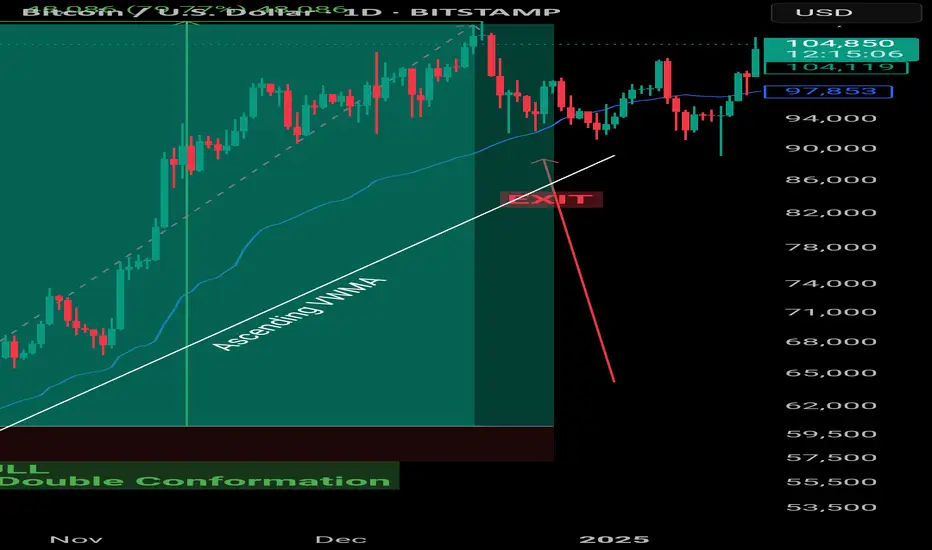
Volume Droughts and False Breakouts: Your Summer Trading TrapsThe market’s heating up — but is your breakout about to dry up? Here’s a word about the importance of summer trading success (helped by volume — the main character).
☀️ Welcome to the Liquidity Desert
Summer’s getting ready to slap the market with a whole flurry of different setups. Picture this — the beaches are full, your trading desk is half-abandoned, and the only thing more elusive than a decent breakout is your intention to actually read that big fat technical analysis book you bought last year.
And yet, here you are — eyes glued to the chart — watching a clean breakout above resistance that’s just begging for you to hit “buy.” Everything looks perfect. Price rips through the level like it’s made of butter. But there’s just one tiny problem: no volume. None. Nada. Niente.
Congratulations. You’ve just bought the world’s most attractive false breakout.
🏝️ Summer Markets: Where Good Setups Go to Die
Let’s set the scene.
It’s June. The big dogs on Wall Street are golfing in the Hamptons and sipping mezcal espresso martinis, interns are running the order flow, and every chart you love is doing just enough to get your hopes up before crushing them like a half-melted snow cone.
This isn’t your usual high-volatility playground. Summer markets — especially between June and August — are notorious for thin liquidity . That means fewer participants, smaller volume, and a much higher likelihood of being tricked by price action that looks strong… until it’s not.
And it’s not just stocks. Forex, crypto, commodities — even the bond boys — all face the same issue: when fewer people are trading, price becomes more fragile. And fragile price = bad decisions.
🚨 Why False Breakouts Love Quiet Markets
False breakouts happen when price appears to break above resistance (or below support), only to reverse sharply — often trapping late traders and triggering stop hunts.
But in summer? It’s a whole different beast. Here’s why:
No liquidity cushion : In normal markets, you need strong volume to fuel a breakout. Without that, the breakout doesn’t necessarily have the gas to keep going.
Market makers get bored : Thin markets mean it’s easier for a few big orders to push prices where they want. Welcome to manipulation season (there, we said what we said!).
Algos go wild : With fewer humans around, algorithms dominate. And they love playing games around key levels.
🧊 The Mirage Setup: A Cautionary Tale
Let’s say you’re watching GameStop NYSE:GME stock. Resistance at $30. Price hovers there for days, teasing a breakout. Then — boom — a sudden 6% pop above.
You buy. Everyone buys. The trading community goes nuts. “This is it bois!”
But there’s a problem. Look at the volume: a trickle. Not even half the average daily volume. Ten minutes later, NYSE:GME is back below $30, your stop loss is hit, and you’re left explaining to your cat why you’re emotionally invested in a ticker.
Moral of the story? Don’t trust breakouts when no one’s trading.
📉 Volume: Your Summer Lie Detector
Volume is more than just a histogram under your chart. It’s your truth serum. Your smoke alarm. Your buddy who tells you to think twice before jumping in that trade.
Here’s how to read it right when everyone else is checking out:
Confirm the move : If price breaks out, but volume doesn’t spike at least 20–30% above the average — be suspicious.
Look for acceleration : Healthy moves gather steam. You want to see volume growing into the breakout, not fizzling.
Watch for volume cliffs : A sudden volume drop right after a breakout often signals that the move is running on fumes.
Add Volume Profile Indicators : Just to be safe, you can always add Volume Profile Indicators to your chart — they analyze both price and volume and can highlight what your keen eye might miss.
Remember what happened last summer? And how we all learned the downside of something called "carry trade"? Those who were short the Japanese yen remember .
🧠 Context Over Candles: Be a Liquidity Detective
Let’s say you see a double top pattern — your favorite. Clean lines. Tight price action. Perfect setup.
But now zoom out.
It’s July 3. Pre-holiday half-day. No volume. And the S&P 500 SP:SPX has moved 0.04% all day. Still want in?
Technical analysis doesn’t work in a vacuum. Chart patterns lose their predictive power when the environment they live in is compromised. And thin liquidity is a compromised environment.
🐍 Snakes in the Sand: How Market Makers Bait Traps
Market makers (and large players) are like desert snakes — quiet, patient, and very good at making you move when you shouldn’t.
Here’s how they bait traders in illiquid markets:
Run stops above resistance to trigger breakout buyers.
Dump shares immediately after breakout to trap retail.
Ride the reversal as trapped longs scramble to exit.
They’re so powerful some say they run the game — and can stop it anytime it’s not going their way (remember the GameStop freeze? ) It’s a psychological game — and in the summer, it’s easier to do shenanigans because most players aren’t watching.
Don’t be the one jumping at shadows. Be the trader who expects the trap.
🛠️ How to Survive (and Thrive) in the Summer Slump
Not all is lost. You can still trade — smartly.
Here’s your Summer Survival Toolkit :
Wait for volume confirmation on every breakout.
Lower your position size . Less liquidity = more slippage risk.
Set wider stops , or better yet, sit out the chop.
Focus on trending names with relative strength and solid weight (think: tech titans, oil plays, or financials).
Use alerts instead of staring at charts . Don’t mistake boredom for opportunity.
And most importantly: Know when not to trade . Discipline is a position too.
🔚 Final Word: This Isn’t the Off-Season. It’s the Setup Season.
Summer might feel slow, but it’s not dead.
Smart traders know that the best trades of Q3 and Q4 often begin in July — as early trendlines form, consolidation patterns develop, and institutional footprints quietly appear in the tape.
So use this time wisely. Don’t force trades. Watch volume like a hawk. And never forget: the best breakouts don’t need hype — they bring their own thunder.
Stay cool, stay patient, and trade smart. The mirage may be tempting, but the oasis always belongs to the ones who go far enough and don’t give up.
Off to you : How are you navigating trading during the summer months? Staying poolside with one eye on the charts or actively seeking out opportunities while folks catch a break? Share your insights in the comments!

How to Choose Chart Types in TradingViewThis tutorial covers the 21 chart types available in TradingView, explaining what each one is, how to read it, as well as the advantages and drawbacks.
Learn more about trading futures with Optimus Futures using the TradingView platform here: www.optimusfutures.com
Disclaimer:
There is a substantial risk of loss in futures trading. Past performance is not indicative of future results. Please trade only with risk capital. We are not responsible for any third-party links, comments, or content shared on TradingView. Any opinions, links, or messages posted by users on TradingView do not represent our views or recommendations. Please exercise your own judgment and due diligence when engaging with any external content or user commentary.
This video represents the opinion of Optimus Futures and is intended for educational purposes only. Chart interpretations are presented solely to illustrate objective technical concepts and should not be viewed as predictive of future market behavior. In our opinion, charts are analytical tools—not forecasting instruments. Market conditions are constantly evolving, and all trading decisions should be made independently, with careful consideration of individual risk tolerance and financial objectives.

Is Bitcoin Crashing or Just a Psychological Trap Unfolding?Is this brutal Bitcoin drop really a trend shift—or just another psychological game?
Candles tell a story every day, but only a few traders read it right.
In this breakdown, we decode the emotional traps behind price action and show you how not to fall for them.
Hello✌
Spend 3 minutes ⏰ reading this educational material.
🎯 Analytical Insight on Bitcoin:
📈 Bitcoin is currently respecting a well-structured ascending channel, with price action aligning closely with a key Fibonacci retracement level and a major daily support zone—both acting as strong technical confluence. Given the strength of this setup, a potential short-term move of at least +10% seems likely, while the broader structure remains supportive of an extended bullish scenario toward the $116K target. 🚀
Now , let's dive into the educational section,
🧠 The Power of TradingView: Tools That Spot the Mind Games
When it comes to psychological traps in the market, a huge part of them can be spotted by just looking at the candles—with the right tools. TradingView offers several free indicators and features that, when combined wisely, can act like an early warning system against emotional decisions. Let’s walk through a few:
Volume Profile (Fixed Range)
Use the “Fixed Range Volume Profile” to see where real money is moving. If large red candles appear in low-volume zones, it often signals manipulation, not genuine sell pressure.
RSI Custom Alerts
Don’t just set RSI alerts at overbought/oversold levels. When RSI crashes but price barely moves, you’re watching fear being injected into the market—without actual sellers stepping in.
Divergence Detectors (Free Scripts)
Use public scripts to auto-detect bullish divergences. These often pop up right during panic drops and are gold mines of opportunity—if you’re calm enough to see them.
These tools are not just technical—they’re psychological weapons . Master them and you’ll read the market like a mind reader.
🔍 The Candle Lies Begin
One big red candle does not equal doom. It usually equals setup. Panic is a requirement before reversals.
💣 Collective Fear: The Whales' Favorite Weapon
When everyone on social media screams “sell,” guess who’s quietly buying? The whales. Fear is their liquidity provider.
🧩 Liquidity Zones: The Real Target
If you can’t see liquidity clusters on your chart, you're blind to half the game. Sudden crashes often aim at stop-loss and liquidation zones.
🔄 Quick Recovery = Fake Breakdown
If a strong red move is followed by a sharp V-shaped bounce within 24 hours—it was likely a trap. Quick recovery often means fake fear.
⚔️ Why Most Retail Traders Sell the Bottom
The brain reacts late. By the time retail decides it’s time to sell, the big players are already buying.
🧭 Real Decision Tools Over Emotion
Combine RSI, divergences, and volume metrics to make your decisions. Your gut is not a strategy—your tools are.
📉 Fake Candles: How to Spot Them
A candle with huge body but weak volume? Red flag. Especially on low timeframes. Always confirm with volume.
🔍 Timeframes Trick the Mind
M15 always looks scarier than H4. Zoom out. What feels like a meltdown might just be a hiccup on the daily chart.
🎯 Final Answer: Crash or Trap?
When you overlay psychology on top of price, traps become obvious. Don't trade the fear—trade the setup behind it.
🧨 Final Note: Summary & Suggestion
Most crashes are emotional plays, not structural failures. Use TradingView’s tools to decode the fear and flip it to your advantage. Add emotional analysis to your charting, and the market will start making sense.
always conduct your own research before making investment decisions. That being said, please take note of the disclaimer section at the bottom of each post for further details 📜✅.
Give me some energy !!
✨We invest countless hours researching opportunities and crafting valuable ideas. Your support means the world to us! If you have any questions, feel free to drop them in the comment box.
Cheers, Mad Whale. 🐋

What is a Bearish Breakaway and How To Spot One!This Educational Idea consists of:
- What a Bearish Breakaway Candlestick Pattern is
- How its Formed
- Added Confirmations
The example comes to us from EURGBP over the evening hours!
Since I was late to turn it into a Trade Idea, perfect opportunity for a Learning Curve!
Hope you enjoy and find value!

Understanding VWAP In TradingWhat is VWAP?
VWAP is a price benchmark that gives more importance to prices where higher trading volume occurs. Unlike simple moving averages, which treat each price point equally, VWAP provides a volume-weighted perspective, making it more representative of market activity.
Traders use VWAP to gauge market trends, confirm trade entries and exits, and measure the quality of executions relative to the market's liquidity.
How Institutional Traders Use VWAP
Large financial institutions and mutual funds execute large orders over time to minimize their market impact.
VWAP helps them:
Achieve better execution by ensuring their orders are filled at a price close to the session's average.
Reduce market impact by avoiding aggressive buying or selling at extreme price points.
Gauge liquidity and time their orders efficiently.
Role of VWAP in Algorithmic Trading
VWAP is integral to algorithmic trading strategies that automate order execution.
Algorithms use VWAP in:
VWAP Trading Strategies: Algorithms execute orders in line with VWAP to avoid moving the market.
Mean Reversion Trading: Traders look for deviations from VWAP, buying when the price is below and selling when it is above.
Liquidity-Based Order Execution: Algorithms track VWAP to execute trades more efficiently, particularly in high-frequency trading (HFT).
Why VWAP is a Critical Benchmark for Intraday Traders
For short-term traders, VWAP provides key insights into market behavior:
Trend Confirmation: If the price is above VWAP, it indicates bullish sentiment; below VWAP suggests bearish conditions.
Entry and Exit Points: Traders use VWAP as support/resistance for trade decisions.
Institutional Footprint: Retail traders track VWAP to understand where large orders might be executing.
Since VWAP resets daily, it remains a highly relevant indicator for gauging intraday momentum and trend strength.
Calculation
Where:
Price = (High + Low + Close) / 3 (Typical Price for each period)
Volume = The total number of shares/contracts traded in the period
Understanding How VWAP is Calculated:
Calculate the Typical Price (TP): TP=High+Low+Close/3
Multiply TP by Volume for each time period to get the Cumulative Price-Volume product.
Sum the Price-Volume values cumulatively throughout the day.
Divide by the cumulative volume up to that time.
Since VWAP is cumulative from the market open, it resets at the start of each trading day.
Difference Between VWAP and Moving Averages
VWAP
Volume-weighted
Resets daily
Determines fair value in a session
Reacts to volume spikes
Moving Averages (SMA/EMA)
Equal-weighted (SMA) or Exponentially weighted (EMA)
Continuous across multiple sessions
Identifies overall trend direction
Reacts to price changes
How to Interpret VWAP
When the price is above VWAP: It suggests that the market is in an uptrend, and VWAP may act as support if the price retraces.
When the price is below VWAP: It signals a downtrend, and VWAP may act as resistance if the price attempts to rise.
Reclaiming VWAP: If the price moves below VWAP but then breaks back above it, this could signal a bullish reversal. The opposite is true for a bearish scenario.
VWAP and Market Trend Identification
Uptrend: If the price remains consistently above VWAP and VWAP itself is sloping upward, the market is in an uptrend.
Downtrend: If the price stays below VWAP and VWAP is sloping downward, the market is in a downtrend.
Sideways Market: If the price oscillates around VWAP and VWAP remains flat, the market is range-bound.
VWAP Standard Deviations (Bands) and Their Significance
First Standard Deviation (VWAP ±1σ)
Represents a normal fluctuation around VWAP.
Prices bouncing within this range indicate balanced market activity.
Second Standard Deviation (VWAP ±2σ)
Suggests stronger price movement.
A move beyond this level may indicate an overbought (above VWAP) or oversold (below VWAP) condition.
Third Standard Deviation (VWAP ±3σ)
Extreme price movement; rarely sustained.
A reversion back toward VWAP is highly likely.
Misinterpreting VWAP Signals
Many traders assume that VWAP alone dictates market direction. However, simply being above or below VWAP does not automatically mean the market is bullish or bearish. Market structure, momentum, and external factors such as news events or institutional order flows must also be considered.
How to Avoid It?
Look for Confirmation: Use VWAP in combination with price action and other indicators, such as volume, market structure, and momentum oscillators (e.g., RSI or MACD).
Check the Trend of VWAP: If VWAP is sloping upward and price is above it, this signals strength. Conversely, a downward-sloping VWAP with price below it indicates weakness.
Observe Price Interaction with VWAP: If the price consistently bounces off VWAP and continues in the trend direction, it confirms its role as dynamic support or resistance. If the price frequently crosses VWAP back and forth without clear direction, it signals a choppy, range-bound market.
Strategies
VWAP Bounce
If the price pulls back to VWAP and holds, traders may look for a long entry (in an uptrend) or a short entry (in a downtrend).
Stop-loss orders are often placed slightly beyond VWAP in case of a trend reversal.
VWAP Breakout
If the price consolidates near VWAP and then breaks out strongly, traders may enter in the direction of the breakout.
A sustained break above VWAP signals strength, while a break below VWAP signals weakness.
VWAP as a Reversion Point
Traders monitor price deviations from VWAP. If the price moves too far from VWAP, a reversion trade back toward VWAP may be expected.
Key Takeaways
VWAP Represents Fair Value – It calculates the average price of a security, weighted by volume, giving traders insight into where most of the trading activity has occurred.
Intraday Benchmark – VWAP resets daily and is primarily used by intraday traders and institutions to assess whether prices are trading at a premium or discount.
Support and Resistance Tool – VWAP often acts as dynamic support in uptrends and resistance in downtrends, helping traders make entry and exit decisions.
Institutional Trading Guide – Large institutions use VWAP to execute orders efficiently, minimizing market impact and ensuring better fills.
VWAP vs. Moving Averages – Unlike moving averages, which continue across multiple sessions, VWAP is cumulative from the market open and resets each day.
Trend Confirmation – Price above a rising VWAP signals a strong uptrend, while price below a declining VWAP suggests a downtrend.
Avoid Over-Reliance – While useful, VWAP should be combined with volume analysis, price action, and other indicators to avoid false signals.
VWAP Bands for Overbought/Oversold Levels – Standard deviation bands around VWAP can help identify price extremes and potential mean reversion setups.
VWAP is more than just an average—it's the heartbeat of market sentiment, revealing where true liquidity and fair value align.
Stay sharp, stay ahead, and let’s make those moves. Until next time, happy trading!

HOW TO: The right way to use the MACDMany people mistakenly use the MACD histogram to enter trades without taking price action into context. In this video I'm going to show you how to interoperate the MACD Histogram, what it means and when its warning you.

Golden Cross vs. Death Cross: What Do They Really Tell Us?Hello, traders! 🤝🏻
It’s hard to scroll through a crypto newsfeed without spotting a headline screaming about a “Golden Cross” forming on Bitcoin or warning of an ominous “Death Cross” approaching. But what do these classic MA signals can really mean? Are they as prophetic as they sound, or is there more nuance to the story? Let’s break it down.
📈 The Basics: What Are Golden and Death Crosses?
At their core, both patterns are simple moving average crossovers. They occur when two moving averages — typically the 50-day and the 200-day — cross paths on a chart.
Golden Cross: When the 50-day MA crosses above the 200-day MA, signaling a potential shift from a bearish phase to a bullish trend. It's often seen as a sign of renewed strength and a long-term uptrend.
Death Cross: When the 50-day MA crosses below the 200-day MA, suggesting a possible transition from bullish to bearish, hinting at extended downside pressure.
📊 Why They Work (and When They Don't)
In theory, the idea is simple: The 50-day MA represents shorter-term sentiment, while the 200-day MA captures longer-term momentum. When short-term price action overtakes long-term averages, it’s seen as a bullish signal (golden cross). When it drops below, it’s bearish (death cross).
This highlights a key point: moving average crossover signals are inherently delayed. They’re based on historical data, so they can’t predict future price moves in real time.
🔹 October 2020: Golden Cross
On the weekly BTC/USDT chart, we can clearly see a Golden Cross forming in October 2020. The 50-week MA (short-term) crossed above the 200-week MA (long-term), marking the start of Bitcoin's explosive rally from around $11,000 to its then all-time high above $60,000 in 2021. This signal aligned with growing institutional interest and the post-halving narrative, reinforcing the bull case.
🔹 June 2021: Death Cross
Just months after Bitcoin’s peak, a Death Cross emerged around June 2021, near the $35,000 mark. However, this was more of a lagging signal: by the time it appeared, the sharp pullback from $60K+ had already taken place. Interestingly, the market stabilized not long after, with a recovery above $50K later that year, showing that Death Cross signals aren’t always the end of the story.
🔹 Mid-2022: Another Death Cross
In mid-2022, BTC formed another Death Cross during its prolonged bear market. This one aligned better with the broader trend, as price continued to slide towards $15,000, reflecting macro pressures like tightening monetary policies and the collapse of major players in the crypto space.
🔹 Early 2024: Golden Cross Comeback
The most recent Golden Cross appeared in early 2024, signaling renewed bullish momentum. This crossover preceded a significant rally, pushing Bitcoin above $100,000 by mid-2025, as seen in your chart. While macro factors (like ETF approvals or regulatory clarity) also played a role, this MA signal coincided with a notable shift in sentiment.
⚙️ Golden Cross ≠ Guaranteed Rally, Death Cross ≠ Doom
While these MA crossovers are clean and appealing, they’re not foolproof. Their lagging nature means they often confirm trends rather than predict them. For example, in June 2021, the Death Cross appeared after much of the selling pressure had already played out. Conversely, in October 2020 and early 2024, the Golden Crosses aligned with genuine upward shifts.
🔍 Why Care About These Signals?
Because they help us contextualize market sentiment. The golden cross and death cross reflect collective trader psychology — optimism and fear. But to truly understand them, we need to combine them with volume, market structure, and macro narratives.
So, are golden crosses and death crosses reliable signals, or just eye-catching headlines?
Your chart tells us both stories: sometimes they work, sometimes they mislead. What’s your take? Do you use these MA signals in your trading, or do you prefer other methods? Let’s discuss below!

Forex Trading Time Zones: Market Hours and OverlapsForex Trading Time Zones: Market Hours and Overlaps
In the world of forex trading, understanding the dynamics of different time zones is paramount. This article delves into the intricate web of currency trading time zones, exploring the 24-hour cycle, major trading hours, and the nuanced opportunities each presents.
The 24-Hour Cycle of Forex Market Time Zones
The forex market's distinctive feature of being open 24 hours a day, five days a week, is a testament to its unparalleled accessibility, dynamics, and decentralised nature. Unlike traditional financial markets constrained by fixed trading hours, the forex market operates continuously, commencing in Asia on Monday and concluding in North America on Friday.
Major financial centres in different time zones steer the dynamics of the forex market, acting as the primary drivers of market activity during their respective business hours. That complex interplay creates distinct trading periods, each characterised by unique market conditions and opportunities.
Key Forex Session Time Zones
Knowing the trading hours of the major forex trading hours is fundamental for any trader aiming to capitalise on the dynamic nature of the market.
Winter time:
- London Session: From 8:00 AM to 5:00 PM UTC
- New York Session: From 1:00 PM to 10:00 PM UTC
- Sydney Session: From 09:00 PM to 6:00 AM UTC
- Tokyo Session: From 11:00 PM to 8:00 AM UTC
Summer time:
- London Session: From 7:00 AM to 4:00 PM UTC
- New York Session: From 12:00 PM to 9:00 PM UTC
- Sydney Session: From 10:00 PM to 7:00 AM UTC
- Tokyo Session: From 11:00 PM to 8:00 AM UTC
Different Time Zones in Forex Trading Create Opportunities
The diverse forex trading time zones offer a rich tapestry of opportunities, each session presenting distinct characteristics that traders can strategically exploit.
London Session
The London session time provides opportunities for traders to engage in high-liquidity markets. Currency pairs involving the euro (EUR) or the British pound (GBP), such as EUR/USD and GBP/USD, tend to be particularly active during this period. The early morning volatility during the London session trading time can be harnessed for quick trades or trend-establishing moves.
New York Session
As the New York session time kicks in, currency pairs involving the US dollar (USD) or other currencies of countries in the same time zone take centre stage. Pairs like USD/MXN and USD/CAD experience heightened volatility and amplified market activity.
Sydney Session
While the Sydney session may exhibit lower volatility, it sets the stage for the day's trading. Currency pairs tied to the Australian dollar (AUD) and the New Zealand dollar (NZD), like AUD/USD and NZD/USD, can witness initial movements during this period, creating opportunities for strategic positioning.
Tokyo Session
The Tokyo session focuses on the Japanese yen (JPY) pairs, offering traders the chance to tap into the unique characteristics of this market. Currency pairs like USD/JPY and EUR/JPY may see increased activity, presenting opportunities for trend-following or counter-trend strategies.
Session Trading Strategies
The convergence of major financial hubs during specific currency trading time zones creates a unique environment that can be exploited strategically. Let’s examine three strategies for each major forex time zone.
London Session Breakout Strategy
The London Session Breakout strategy is based on the significant increase in trading volume and volatility when the London market opens, specifically between 7:00 AM and 10:00 AM UTC (summer time) or 8:00 AM and 11:00 AM UTC (winter time). However, most focus is often placed on the range between 8:00 AM and 9:00 AM summer time or 9:00 AM and 10:00 AM winter time. This surge during the London trading session often leads to notable price movements, particularly in forex pairs like GBP/USD and EUR/USD, making it an ideal time for breakout strategies.
Entry
- Traders monitor the early London trading hours. The idea is to look for a specific range with clear high and low boundaries during this time.
- They set buy stop orders slightly above the high of this range and sell stop orders slightly below the low, aiming to capture the breakout direction.
Stop Loss
- Stop losses are strategically placed slightly below the most recent swing low for buy positions and vice versa, offering potential protection against false breakouts.
Take Profit
- Some traders may prefer to close the position as the New York session begins, as reversals are common during this session overlap.
- Alternatively, trailing stops might be employed to take advantage of extended price movements if the trend continues strongly after the breakout.
New York Reversal Strategy
The New York Reversal strategy exploits the heightened volatility and liquidity that occur at the start of the New York session. While there isn’t a perfect correlation, it’s common to see the initial London trend extended early into the New York session before a reversal, usually between 12:30 PM and 2:00 PM UTC summer time and 1:30 PM and 2 PM UTC winter time. This strategy is particularly effective due to the influx of trading activity and market orders when the US markets open.
Entry
- Traders often monitor the market around the first couple of hours of the New York forex session time, looking for signs of reversal. This may be a divergence between a price and a momentum indicator, a reaction from a significant support or resistance level, a candlestick or chart pattern, and so on.
- Once the trader has confirmation that the London trend may be reversing, they enter a position.
Stop Loss
- Stop losses are generally placed just beyond the nearest swing high or low. This helps potentially protect against losses if the anticipated reversal does not occur.
Take Profit
- Traders frequently set profit targets at significant support or resistance levels established during the London session.
- Alternatively, traders might trail their stop loss to follow the market movement and maximise potential gains.
Tokyo Volatility Breakout Strategy
The Tokyo Volatility Breakout strategy leverages the increased trading activity and liquidity at the start of the Tokyo session time. This strategy is best suited to JPY pairs like USD/JPY, EUR/JPY, and GBP/JPY, which often see significant price movements due to the influx of market participants at Japan’s forex market open time.
Between 9:00 PM and 10:00 PM UTC summer time (8:00 PM and 9:00 PM UTC winter time), volume and liquidity dry up significantly as the New York session closes. 10:00 PM and 11:00 PM UTC summer time (9:00 PM and 10:00 PM winter time) sees some activity as Sydney session time begins, but the start of the Tokyo session forex time, between 11:00 PM and 12:00 AM, can kickstart a new trend and break out from the typical ranging conditions from the previous few hours.
Entry
- Traders often monitor the market and look for breakouts as the Tokyo session begins.
- Bollinger Bands can be used to identify these breakouts, typically characterised by the bands squeezing together before the price closes strongly outside the upper or lower band, potentially indicating the start of a trend.
Stop Loss
- Stop losses are generally placed beyond the nearest swing high or low or beyond the opposite side of the Bollinger Band. This helps potentially protect against losses if the breakout does not result in a sustained trend.
Take Profit
- Profit targets are often set at significant support or resistance levels established in previous sessions.
- Alternatively, positions might be closed at the start of the London session (around 7:00 AM - 8:00 AM UTC) to avoid potential reversals that occur with the increased liquidity and trading volume as European markets open.
Tailoring Your Trading Schedule to Forex Currency Time Zones
Crafting an effective trading schedule involves a personalised approach, taking into account a trader's individual location and trading style objectives.
Different Trading Styles: Maximising Opportunities
Forex time zones often determine specific forex rate behaviours. For day traders, the volatility and liquidity during overlapping activity can provide ideal conditions for executing rapid trades. The heightened volatility and liquidity are even more advantageous for scalpers seeking to capitalise on rapid price movements by executing trades with precision.
Overlapping sessions also often mark key points where trends may continue or reverse. Traders employing trend-following or breakout-based strategies can capitalise on that momentum.
Swing traders, on the other hand, who aim to capture trends over a slightly longer timeframe, may take advantage of the distinct characteristics of individual sessions, such as the so-called stability of the Sydney session or the high volatility of the London session.
Economic Events and News Releases
Traders also consider the timing of major data releases and align that with their specific geographic location. During the London session, major European economic indicators and policy announcements can set the tone. Then, the market may respond to data from the United States that can significantly influence USD pairs, followed by economic reports from the Asia-Pacific region. The interconnectedness of the world economy can have cascading effects on currency values across the globe.
Currency Market Correlations
Currency pair correlations exhibit dynamic shifts depending on the timing and may lead to specific patterns. For example, the correlation between USD/JPY and EUR/USD can shift throughout the trading day, starting from positive during the Tokyo session and then shifting into negative during European and New York trading hours. Traders can leverage correlation analysis as a powerful tool for making informed trading decisions.
Final Thoughts
Navigating the dynamic world of forex trading requires a multifaceted understanding of the market's 24-hour cycle, the overlapping of major trading sessions, and the intricate interplay of economic events and currency correlations.
FAQ
What Are the 4 Forex Sessions?
The forex market operates 24 hours a day, divided into four main sessions based on key financial centres: the Sydney session forex time (10:00 PM to 7:00 AM UTC in the summer and 9:00 PM to 6:00 AM UTC in the winter), the Tokyo session forex time (11:00 PM to 8:00 AM UTC in the summer and winter), the London session forex time (7:00 AM to 4:00 PM UTC in the summer and 8:00 AM to 5:00 PM UTC in the winter), and the New York session forex time (12:00 PM to 9:00 PM UTC in the summer and 1:00 PM to 10:00 PM UTC in the winter).
When Does the London Session Start?
The London session starts at 7:00 AM UTC during summer and at 8:00 AM UTC during winter due to daylight saving time adjustments. This session is crucial for its high liquidity and significant overlap with other major sessions.
What Time Is the New York-London Session Overlap?
The overlap between the New York trading session time and the London session occurs from 12:00 PM to 4:00 PM UTC in summer and from 1:00 PM to 5:00 PM UTC in winter.
Do Tokyo and London Sessions Overlap?
The Tokyo and London sessions do not overlap significantly. The Tokyo session ends at 8:00 AM UTC, while the London session starts at 7:00 AM UTC in the summer. The minimal overlap from 7:00 AM to 8:00 AM UTC sees limited trading activity. In winter, sessions don’t overlap.
This article represents the opinion of the Companies operating under the FXOpen brand only. It is not to be construed as an offer, solicitation, or recommendation with respect to products and services provided by the Companies operating under the FXOpen brand, nor is it to be considered financial advice.

Retro Editors' picks 2020As we move forward through time, we occasionally must look backward to evaluate our progress and address our shortcomings.
For years, PineCoders has voluntarily analyzed numerous published scripts, selecting the most exceptional among them as Editors' picks . To enhance our process and spotlight more high-quality work from our community, we've conducted a comprehensive review of script publications from the past five years. Through this effort, we've identified several additional scripts that deserve greater recognition than they initially received.
Below is a collection of additional scripts from 2020 that have earned a spot in our Editors' picks. These retrospective selections reflect our continued commitment to honoring outstanding contributions in our community, regardless of when they were published. To the authors of these highlighted scripts: our sincere thanks, on behalf of all TradingViewers. Congrats!
Support Resistance Channels - LonesomeTheBlue
BERLIN Candles - lejmer
Delta Volume Columns Pro - LucF
Range Filter - DonovanWall
Over the next four months, in the last week of each month, we will share retro Editors' picks for subsequent years:
June: retro EPs for 2021
July: retro EPs for 2022
August: retro EPs for 2023
September: retro EPs for 2024
They will be visible in the Editors' picks feed .
█ What are Editors' picks ?
The Editors' picks showcase the best open-source script publications selected by our PineCoders team. Many of these scripts are original and only available on TradingView. These picks are not recommendations to buy or sell anything or use a specific indicator. We aim to highlight the most interesting publications to encourage learning and sharing in our community.
Any open-source script publication in the Community Scripts can be picked if it is original, provides good potential value to traders, includes a helpful description, and complies with the House Rules.
— The PineCoders team

Best Practice: Prepare, Assess, Plan Then TradeTraders are often eager to jump straight into the next trading session but this may not always be the best option to chose. It can be more beneficial to follow a regular pre-trading routine to note down important scheduled events, establish current trends, as well as meaningful support and resistance price levels, and importantly this doesn’t have to be time consuming.
This is not meant to be that trading ‘holy grail’ but more of an addition to your existing trading process or plan. Having a regular routine to establish important levels, indicator set-ups and price trends to be aware of during your trading day may help you make trading decisions in a more effective way.
This pre trading routine can also be helpful for traders that take longer term positions, as it’s still important to consider the longer-term weekly perspectives as well.
This routine can be carried out at the weekend and then monitored and, where necessary, modified during the week as price action develops for the particular CFD(s) you are trading.
1. Keep Informed of Important Data Releases
If there are several CFD’s you regularly trade and tend to stick with, make sure you have as much information about those assets as possible before you start trading.
Consider utilising the Pepperstone trading calendar to help keep you informed of any economic releases/company earnings data that might impact the CFD you are trading before the week/session starts.
Once you know the scheduled events ahead, you can ask yourself,
Could these impact my trading?
Could the market reaction to this new information increase the volatility of the CFD I am about to trade or already have a position in?
How may this impact my risk?
Knowing what it is expected by the market before a particular important economic data release, such as US Non-farm Payrolls, can help you assess positioning going into the release, gauge market reaction to the data, and then be prepared for any potential price sentiment change and/or increased volatility.
2. Be Aware of Potential Support and Resistance Levels
Ahead of your trading day, consider running through the Pepperstone charts of the CFD’s you are considering trading and make a note of 3 support and resistance levels, that you identify as being meaningful. To help you we have set out an example Trading Template below.
Daily: Level: Reason: Current Trend: Current Thoughts:
Support
1st:
2nd:
3rd
Resistance
1st
2nd
3rd
Keep this next to your trading screen, so you are aware of particular levels that may act as support and resistance, if prices move in that direction. This can help you to improve trade entry or assist you with the placement of a stop loss or take profit order.
If these levels are broken at any time, you can update the template with any new support/resistance levels during the trading period.
3. Be Aware of the Daily Trends – Focus on Bollinger Bands
Using the direction of the daily Bollinger mid-average can be helpful to gauge the direction of the daily trend.
If the,
Mid-average is moving up = price uptrend
Mid-average is moving down = price downtrend
Mid-average is flat = possible price sideways range
The daily and weekly perspectives are the most important to be aware of, so it can be beneficial to analyse the charts from the longest timeframe into the shortest as this allows you to build a better understanding of the dominant trends.
You can also note these trends on the Trading Template, so it’s available to you when you are trading.
4. Follow the Same Process for All Other Timeframes - 4 Hour, 1 Hour, Even Shorter if it Suits Your Trading.
You can carry out the routine outlined in point 3, for any timeframes you are trading.
Things to note,
Are there any new trends suggested within a shorter term perspective by the Bollinger mid-average?
If the direction of a shorter term mid-average has changed, it may be an indication of either a change or resumption of a longer term price trend.
If this trend change also looks to be resuming within the longer term perspectives, this could be a more important signal, as the resumption of an existing longer term trend may mean a more extended move in that direction.
Be aware, confirmation of a price trend change within a longer term perspective might mean it could take longer and offer less trading opportunities, as initially price moves may be less aggressive in nature.
5. Where, Within the Various Timeframes is Price in Relation to the Bollinger Bands?
As we have highlighted in a previous commentary (please take a look our past posts), Bollinger Bands can highlight increasing price volatility within a trend.
Things to note regarding Bollinger Bands,
Are the upper or lower bands being touched by prices within any of the timeframes?
Within a sideways range (flat mid-average) this might suggest price has reached either a support or resistance level, with potential for a reversal.
While being touched, are the upper and lower bands starting to widen which indicates increasing price volatility, or contract, which indicates decreasing price volatility?
Remember - widening bands within a confirmed trend highlight increasing volatility, suggesting the current price move might continue for longer than you may anticipate, while contracting bands, point to decreasing volatility, which may lead to a reduction in a particular CFDs price movement.
Do the timeframes align?
If they do it may suggest a stronger trading opportunity is evident. CFDs within trending markets seeing increasing volatility tend to offer greater potential than those that aren’t.
In this scenario it maybe worthwhile considering only trading with the trend, not trying to pick bottoms or tops of markets, or if you do, consider a more cautious approach to your trading by reducing the size of your position and risk.
The material provided here has not been prepared in accordance with legal requirements designed to promote the independence of investment research and as such is considered to be a marketing communication. Whilst it is not subject to any prohibition on dealing ahead of the dissemination of investment research, we will not seek to take any advantage before providing it to our clients.
Pepperstone doesn’t represent that the material provided here is accurate, current or complete, and therefore shouldn’t be relied upon as such. The information, whether from a third party or not, isn’t to be considered as a recommendation; or an offer to buy or sell; or the solicitation of an offer to buy or sell any security, financial product or instrument; or to participate in any particular trading strategy. It does not take into account readers’ financial situation or investment objectives. We advise any readers of this content to seek their own advice. Without the approval of Pepperstone, reproduction or redistribution of this information isn’t permitted.
