Sharing the advanced Bollinger Bands strategyHere are the Bollinger Band trading tips: *
📌 If you break above the upper band and then drop back down through it, confirm a short signal!
📌 If you drop below the lower band and then move back up through it, confirm a long signal!
📌 If you continue to drop below the middle band, add to your short position; if you break above the middle band, add to your long position!
Pretty straightforward, right? This means you won’t be waiting for the middle band to signal before acting; you’ll be ahead of the game, capturing market turning points!
Let’s break it down with some examples:
1. When Bitcoin breaks above the upper Bollinger Band, it looks strong, but quickly drops back below:
➡️ That’s a “bull trap”—time to go short!
2. If Bitcoin crashes below the lower band and then pops back up:
➡️ Bears are running out of steam—time to go long and grab that rebound!
3. If the price keeps moving above the middle band:
➡️ Add to your long or short positions to ride the trend without being greedy or hesitant.
Why is this method powerful?
It combines “edge recognition + trend confirmation” for double protection:
1. Edge Recognition—spot the turning point and act early.
2. Trend Confirmation—wait for the middle band breakout and then confidently add positions!
You won’t be reacting after the fact; you’ll be ahead of the curve, increasing your positions in the trend’s middle and locking in profits at the end. This is the rhythm of professional traders and the core logic of systematic profits!
Who is this method for?
- You want precise entry and exit points.
- You’re tired of “chasing highs and cutting losses.”
- You want a clear, executable trading system.
- You want to go from “I see the chart but don’t act” to “I see the signal and take action.”
Follow for more. Make sure to like this if you found it useful.
Volatility

Best Free Volatility Indicator on TradingView for Gold Forex
This free technical indicator will help you easily measure the market volatility on Forex, Gold or any other market.
It will show you when the market is quiet , when it's active and when it's dangerous .
We will go through the settings of this indicator, and you will learn how to set it up on TradingView.
Historical Volatility Indicator
This technical indicator is called Historical Volatility.
It is absolutely free and available on TradingView, MetaTrader 4/5 and other popular trading terminals.
TradingView Setup
Let me show you how to find it on TradingView and add it to your price chart.
Open a technical price chart on TradingView and open the "Indicators" menu (you will find it at the top of the screen).
Search "Historical Volatility" and click on it.
It will automatically appear on your chart.
"Length" parameter will define how many candles the indicator will take for measuring the average volatility. (I recommend keeping the default number, but if you need longer/shorter-term volatility, you can play with that)
Timeframe drop-down list defines what time frame the indicator takes for measuring the volatility. (I recommend choosing a daily timeframe)
And keep the checkboxes unchanged .
How to Use the Indicator
Now, let me show you how to use it properly.
Wider the indicator and analyse its movement at least for the last 4 months.
Find the volatility range - its low levels will be based on the lower boundary of the range, high levels will be based on its upper boundary.
This is an example of such a range on USDCAD pair.
When the volatility stays within the range, it is your safe time to trade.
When volatility approaches its lows, it may indicate that the market might be slow .
Highs of the range imply that the market is very active
In-between will mean a healthy market.
The Extremes
The violation of a volatility range to the downside is the signal that the market is very slow . This would be the recommended period to not trade because of high chance of occurrence of fakeouts.
An upward breakout of a voliatlity range is the signal of the extreme volatility . It will signify that the market is unstable , and it will be better to let it calm down before placing any trade.
Volatility Analysis
That is how a complete volatility analysis should look.
At the moment, volatility reached extreme levels on CADJPY pair.
The best strategy will be to wait till it returns within the range.
Remember This
With the current geopolitical uncertainty and trade wars, market volatility reaches the extreme levels.
Such a volatility is very dangerous , especially for newbie traders.
Historical volatility technical indicator will help you to easily spot the best period for trading and the moment when it is better to stay away.
❤️Please, support my work with like, thank you!❤️
I am part of Trade Nation's Influencer program and receive a monthly fee for using their TradingView charts in my analysis.

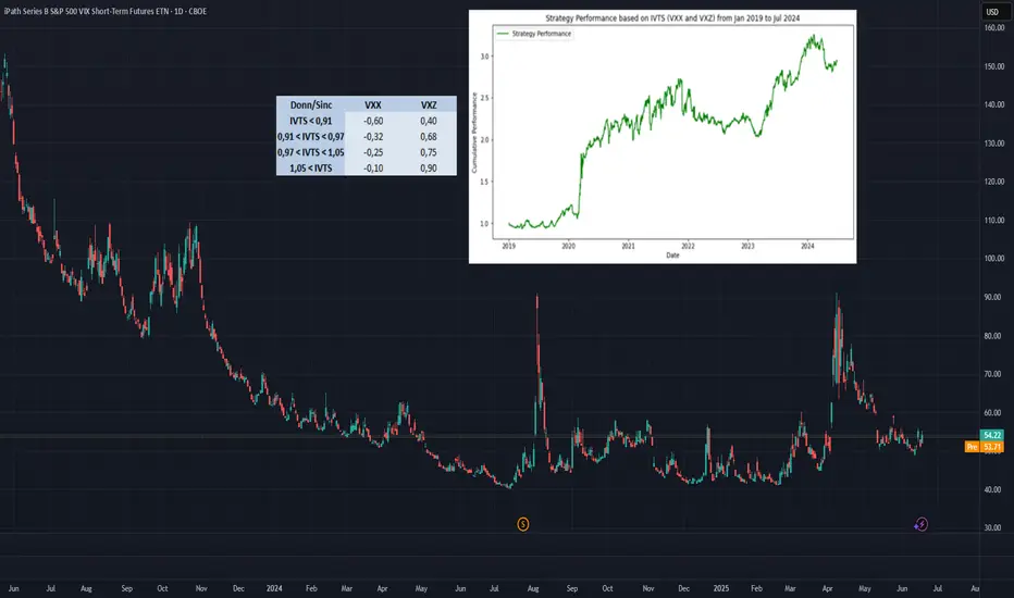
Trading the VIX – Part 2Trading the VIX – Part 2: VIX ETPs and Strategic Applications
In Part 1 of this series, we explored the structure of VIX Futures, focusing on the roll-down effect in a contango VIX futures curve—common in calm market conditions.
In Part 2, we turn our attention to VIX-related Exchange-Traded Products (ETPs)—specifically, the popular and liquid:
• VXX – unleveraged long VIX ETP
• UVXY – leveraged long VIX ETP
• SVXY – inverse VIX ETP
Each of these products is based on a specific VIX futures strategy, the “S&P500 VIX Short Term Futures Index” , which is maintained by S&P, Dow Jones (the “SPDJ-Index”). The Fact Sheet and Methodology can be obtained from the S&P Global website.
What is the SPDJ Index that these ETPs track?
The SPDJ-Index is a strategy index that maintains a rolling long position in the first- and second-month VIX futures to maintain a constant 30-day weighted average maturity.
Key Features of the SPDJ Index:
• Starts with 100% exposure to VX1 (the front-month future) when it’s 30 days from expiration.
• Gradually it rolls from VX1 to VX2 (next-month future) each day to maintain a 30-day average expiration.
• At all times, the index is long either one or both VX1 and VX2, with exposure shifting daily from VX1 to VX2.
• This roll mechanism causes value erosion in contango (normal markets) and gains in backwardation (during volatility spikes).
• Since contango is the dominant market state, the index loses value over time—with occasional short-lived gains during sharp volatility increases.
Importantly, the SPDJ Index does not represent the VIX or any other volatility level, it simply reflects the value of this futures-based rolling strategy.
________________________________________
Breakdown of the ETPs: VXX, UVXY, and SVXY
VXX – Long SPDJ Index (1x)
• Tracks the SPDJ Index directly
• Suffers from the roll-down drag in contango environments.
• Useful only for short-term exposure during expected volatility spikes.
• Timing for long positions is critical
UVXY – Leveraged Long (Currently +1.5x)
• Replicates a strategy that maintains a constant leverage of 1.5 to the SPDJ Index.
• Formerly +2x leverage; reduced in April 2024.
• Highly sensitive to VIX moves; underperforms long term due to both roll-down drag and leverage decay (see below). Timing for long positions is even more important than for the VXX.
SVXY – Inverse (-0.5x)
• Replicates a strategy that maintains a constant exposure of -0.5 to the SPDJ Index.
• Benefits from falling VIX levels as well as from contango in the front part of the VIX futures curve.
• Formerly -1x before the Feb 2018 volatility spike triggered massive losses (XIV, a competing ETP, collapsed at that time).
• Performs well in calm conditions but is vulnerable to sharp volatility spikes.
Leveraged & Inverse ETPs – Important Notes affecting the UVXY and SVXY (without going into details):
• Daily resetting for the replicating strategies to maintain constant exposure factors (different from 1x) are pro-cyclical and can cause compounding errors, specifically in turbulent markets (e.g. Feb 2018).
• The real volatility of the VIX futures itself acts as a drag on returns, independent of the index’s direction.
• Risk management is essential—especially with inverse products like SVXY.
All three of these ETPs track a VIX futures strategy, they are not levered or unlevered versions of the original VIX index. Each of these ETPs benefits from liquid option markets, enhancing the toolkit for volatility trading.
Trading Strategies Using VIX ETPs
Here are several practical approaches to trading these products:
VXX and UVXY
• Best used for short-term trades aiming to capture volatility spikes.
• Options strategies such as zero-cost collars, vertical and calendar spreads can help mitigate the challenge of precise timing.
• Avoid long-term holds due to erosion from roll-down and leverage decay (see historical performance!).
SVXY – The Carry Trade Proxy
• Ideal for profiting from prolonged calm periods and the contango structure.
• Acts like a carry trade, offering a positive drift—but must be paired with robust stop-loss rules or exit strategy to guard against sharp spikes in volatility.
Switching Strategies
• Tactically rotate in/out of SVXY based on short-term volatility indicators.
• One common signal: VIX9D crossing above or below VIX, i.e. long SVXY if VIX9D crosses under VIX, staying long while VIX9D < VIX, closing long SVXY position when VIX9D crosses over VIX. Some traders also use crossovers with VIX3M or the individual expirations of the VIX futures curve to manage entries.
• Switching between SVXY and VXX based on crossover triggers through the VIX futures curve is often advertised, but very hard to get working in practice due to the importance of timing the VXX entry and exit – signals from the VIX curve may not signal VXX entries and exits timely enough.
Term Structure-Based Combinations
• Combine short VXX with long VXZ (an ETP tracking longer-dated VIX futures, balancing the 4th to 7th VIX contracts to achieve a constant expiration of 60days).
• Weighting is determined by the Implied Volatility Term Structure (IVTS), calculated as VIX / VIX3M. This approach adjusts positions based on the shape of the VIX futures curve, indicated by the IVTS. For instance, when the VIX futures curve shifts from contango (where near-term futures are cheaper than longer-term ones) to backwardation (where near-term futures are more expensive), it involves reducing short positions in VXX and increasing long positions in VXZ.
• This approach mimics the spirit of a calendar spread strategy in VIX futures and reflects the “S&P 500 Dynamic VIX Futures Index” , with weightings backed by research from Donninger (2011) and Sinclair (2013) - see performance chart and weighting-matrix enclosed in the introductory chart).
________________________________________
VIX Curves as Market Indicators
Beyond trading, VIX instruments and their term structure are widely used as market sentiment gauges. For instance:
Signs of Market Calm:
• VIX9D < VIX
• VIX < VIX3M
• VIX < VX1
• VX1 < VX2
These relationships imply that short-term volatility is lower than longer-term expectations, indicating near-term calmness in markets, occasionally leading to market complacency.
Traders and institutions use these signals to:
• Adjust positioning in broad market indices
• Determine hedging requirements
• Evaluate suitability of selling naked options
________________________________________
Final Thoughts
VIX ETPs offer a powerful toolkit for traders seeking to profit from or hedge against volatility. But they come with structural decay, leverage dynamics, and curve risk. Timing, strategy, and risk control are key.
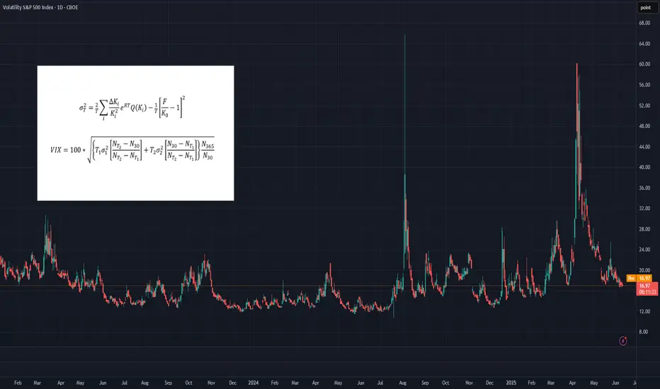
Trading the VIXOften dubbed the "fear index," the VIX gauges SPX options' implied volatility, typically rising during equity market declines and vice versa. It quantifies investor anxiety, demand for hedging, and market stress, crucial for traders and risk managers seeking to measure turbulence.
The VIX calculates a constant 30-day implied volatility using SPX options expiring over the next two months. Unlike simple weighted averages of equity indices, its methodology is more complex, involving implied variance calculation for the two nearest monthly expirations across all strikes. For detailed formulas, refer to the introductory chart or visit the CBOE’s official VIX Index page.
While the VIX Index itself isn’t tradable, exposure can be gained through VIX futures or exchange-traded products (ETPs) like VXX, UVXY, and SVXY. However, these instruments come with their own unique risks, pricing behaviors, and structural nuances, which can make directional VIX trading considerably more complex than it might initially appear.
What You Need to Know About Implied Volatilities
• In calm or uptrending markets, the volatility curve typically slopes upward (contango), indicating higher implied volatility with longer maturities.
• In declining or turbulent markets, the curve can invert, sloping downward (backwardation), as shorter-term implied volatilities rise sharply.
• This pattern can be observed, comparing VIX9D, VIX, and VIX3M against the SPX. In stable markets: VIX9D < VIX < VIX3M. In stressed markets, this relationship may reverse. The VIX9D and VIX3M are the 9-day respectively 3-month equivalent to the 30-day VIX.
What You Need to Know About VIX Futures
• When the volatility spot curve is in contango, the VIX futures curve will also slope upward.
• In backwardation, the futures curve slopes downward, reflecting heightened short-term volatility and short-term volatility spikes.
• While in contango, VIX futures "roll down the curve," meaning that—independent of changes in volatility—futures tend to decline in value over time.
• In backwardation, the opposite occurs: futures "roll up the curve," potentially rising in value over time even without volatility changes.
• VIX futures’ responsiveness to VIX Index movements – the beta of VIX futures against the VIX index - declines with longer expirations; front-month futures may react to 70-80% of VIX changes, compared to 40-60% for third or fourth-month futures.
Key Consequences for Traders
• Directional trading of VIX futures can be strongly influenced by the shape of the futures curve.
• Contango in low-VIX environments creates strong headwinds for long VIX futures positions, caused by the “roll-down-effect”.
• Conversely, backwardation in high-VIX environments creates headwinds for short positions.
• These effects are more pronounced in front-month contracts, making timing (entry and exit) for directional trades critical.
• There's a trade-off in directional strategies: front-month futures offer greater exposure to VIX movements but suffer more from negative roll effects.
How to Trade VIX Futures
• Due to these structural challenges, directional VIX futures trading is difficult and requires precision.
• A more effective approach is to trade changes in the shape of the futures curve using calendar spreads (e.g., long VX1, short VX2). This reduces the impact of roll effects on individual contracts.
• In low-VIX, contango conditions, a rising VIX typically leads to VX1 increasing faster than VX2, widening the VX1–VX2 spread—an opportunity for spread trading.
• While VX1 may initially suffer more from roll-down than VX2, this can reverse as the VIX rises and VX1 begins to “roll up,” especially when VIX > VX1 but VX1 < VX2.
• The opposite dynamic applies in high-VIX, backwardation environments.
• More broadly, changes in the shape of the futures curve across the first 6–8 months can be profitably traded using calendar spreads. Roll-effects and the declining beta-curve can also be efficiently traded.
How to capture the Roll-Down-Effect
One of the more popular VIX-trading strategies involves capturing the roll-down effect,, while the curve is in contango. It is a positive carry strategy that is best applied during calm or uptrending market conditions. Here’s a straightforward set of guidelines to implement the Roll-Down-Carry trade:
• Entry Condition: Initiate during calm market conditions, ideally when VIX9D-index is below VIX-index (though not guaranteed).
• Choosing Futures: Use VX1 and VX2 for calendar spreads if VX1 has more than 8-10 trading days left; otherwise, consider VX2 and VX3.
• Spread Analysis: Short VX1 and long VX2 if VX1–VIX spread is larger than VX2–VX1; otherwise, VX2 and VX3 may be suitable.
• Contango Effect: VX1’s roll-down effect typically outweighs VX2’s during contango.
• Relative Beta: VX1 shows higher reactivity to VIX changes compared to VX2, mimicking a slight short position on VIX.
• Exit Strategy: Use spread values, take-profit (TP), and stop-loss (SL); consider exiting if VIX9D crosses over VIX.
________________________________________
Conclusion
Directional trading of the VIX Index—typically through futures—demands precise timing and a good understanding of the volatility curve. This is because curve dynamics such as contango and backwardation can create significant headwinds or tailwinds, often working against a trader’s position regardless of the VIX’s actual movement. As a result, purely directional trades are not only difficult to time but also structurally disadvantaged in many market environments.
A more strategic and sustainable approach is to trade calendar spreads, which involves taking offsetting positions in VIX futures of different maturities. This method helps neutralize the impact of the curve's overall slope and focuses instead on relative changes between expirations. While it doesn’t eliminate all risk, calendar spread trading significantly reduces the drag from roll effects and still offers numerous opportunities to profit from shifts in market sentiment, volatility expectations, and changes in the shape of the futures curve.
What else can be done with VIX instruments
VIX indices across different maturities (VIX9D, VIX, VIX3M), along with VIX futures, offer valuable insights and potential entry signals for trading SPX or SPX options. In Part 2 of the Trading the VIX series, we’ll explore how to use these tools—along with VIX-based ETPs—for structured trading strategies.
Best Practice: Prepare, Assess, Plan Then TradeTraders are often eager to jump straight into the next trading session but this may not always be the best option to chose. It can be more beneficial to follow a regular pre-trading routine to note down important scheduled events, establish current trends, as well as meaningful support and resistance price levels, and importantly this doesn’t have to be time consuming.
This is not meant to be that trading ‘holy grail’ but more of an addition to your existing trading process or plan. Having a regular routine to establish important levels, indicator set-ups and price trends to be aware of during your trading day may help you make trading decisions in a more effective way.
This pre trading routine can also be helpful for traders that take longer term positions, as it’s still important to consider the longer-term weekly perspectives as well.
This routine can be carried out at the weekend and then monitored and, where necessary, modified during the week as price action develops for the particular CFD(s) you are trading.
1. Keep Informed of Important Data Releases
If there are several CFD’s you regularly trade and tend to stick with, make sure you have as much information about those assets as possible before you start trading.
Consider utilising the Pepperstone trading calendar to help keep you informed of any economic releases/company earnings data that might impact the CFD you are trading before the week/session starts.
Once you know the scheduled events ahead, you can ask yourself,
Could these impact my trading?
Could the market reaction to this new information increase the volatility of the CFD I am about to trade or already have a position in?
How may this impact my risk?
Knowing what it is expected by the market before a particular important economic data release, such as US Non-farm Payrolls, can help you assess positioning going into the release, gauge market reaction to the data, and then be prepared for any potential price sentiment change and/or increased volatility.
2. Be Aware of Potential Support and Resistance Levels
Ahead of your trading day, consider running through the Pepperstone charts of the CFD’s you are considering trading and make a note of 3 support and resistance levels, that you identify as being meaningful. To help you we have set out an example Trading Template below.
Daily: Level: Reason: Current Trend: Current Thoughts:
Support
1st:
2nd:
3rd
Resistance
1st
2nd
3rd
Keep this next to your trading screen, so you are aware of particular levels that may act as support and resistance, if prices move in that direction. This can help you to improve trade entry or assist you with the placement of a stop loss or take profit order.
If these levels are broken at any time, you can update the template with any new support/resistance levels during the trading period.
3. Be Aware of the Daily Trends – Focus on Bollinger Bands
Using the direction of the daily Bollinger mid-average can be helpful to gauge the direction of the daily trend.
If the,
Mid-average is moving up = price uptrend
Mid-average is moving down = price downtrend
Mid-average is flat = possible price sideways range
The daily and weekly perspectives are the most important to be aware of, so it can be beneficial to analyse the charts from the longest timeframe into the shortest as this allows you to build a better understanding of the dominant trends.
You can also note these trends on the Trading Template, so it’s available to you when you are trading.
4. Follow the Same Process for All Other Timeframes - 4 Hour, 1 Hour, Even Shorter if it Suits Your Trading.
You can carry out the routine outlined in point 3, for any timeframes you are trading.
Things to note,
Are there any new trends suggested within a shorter term perspective by the Bollinger mid-average?
If the direction of a shorter term mid-average has changed, it may be an indication of either a change or resumption of a longer term price trend.
If this trend change also looks to be resuming within the longer term perspectives, this could be a more important signal, as the resumption of an existing longer term trend may mean a more extended move in that direction.
Be aware, confirmation of a price trend change within a longer term perspective might mean it could take longer and offer less trading opportunities, as initially price moves may be less aggressive in nature.
5. Where, Within the Various Timeframes is Price in Relation to the Bollinger Bands?
As we have highlighted in a previous commentary (please take a look our past posts), Bollinger Bands can highlight increasing price volatility within a trend.
Things to note regarding Bollinger Bands,
Are the upper or lower bands being touched by prices within any of the timeframes?
Within a sideways range (flat mid-average) this might suggest price has reached either a support or resistance level, with potential for a reversal.
While being touched, are the upper and lower bands starting to widen which indicates increasing price volatility, or contract, which indicates decreasing price volatility?
Remember - widening bands within a confirmed trend highlight increasing volatility, suggesting the current price move might continue for longer than you may anticipate, while contracting bands, point to decreasing volatility, which may lead to a reduction in a particular CFDs price movement.
Do the timeframes align?
If they do it may suggest a stronger trading opportunity is evident. CFDs within trending markets seeing increasing volatility tend to offer greater potential than those that aren’t.
In this scenario it maybe worthwhile considering only trading with the trend, not trying to pick bottoms or tops of markets, or if you do, consider a more cautious approach to your trading by reducing the size of your position and risk.
The material provided here has not been prepared in accordance with legal requirements designed to promote the independence of investment research and as such is considered to be a marketing communication. Whilst it is not subject to any prohibition on dealing ahead of the dissemination of investment research, we will not seek to take any advantage before providing it to our clients.
Pepperstone doesn’t represent that the material provided here is accurate, current or complete, and therefore shouldn’t be relied upon as such. The information, whether from a third party or not, isn’t to be considered as a recommendation; or an offer to buy or sell; or the solicitation of an offer to buy or sell any security, financial product or instrument; or to participate in any particular trading strategy. It does not take into account readers’ financial situation or investment objectives. We advise any readers of this content to seek their own advice. Without the approval of Pepperstone, reproduction or redistribution of this information isn’t permitted.

Technical Analysis Indicators Cheat SheetHello, traders! 🦾
This cheat sheet provides a comprehensive overview of the most widely used technical analysis indicators. It is designed to support traders in analyzing trends, momentum, volatility, and volume.
Below, you’ll find a handy screenshot of this Cheat Sheet that you can save and peek at whenever you need a quick, friendly refresher on your trading indicators. ;)
1. Trend Indicators
These tools identify the direction and strength of price movements, critical for trend-following strategies.
Moving Averages (MA)
Simple Moving Average (SMA) and Exponential Moving Average (EMA) smooth price data to highlight trends. Crossovers (e.g., 50-day vs. 200-day MA) signal potential trend shifts.
MACD (Moving Average Convergence Divergence) – Tracks the difference between two EMAs, paired with a signal line to generate trade signals. A bullish crossover occurs when MACD rises above the signal line.
Parabolic SAR. Places dots above or below the price to indicate trend direction. Dots below the price suggest an uptrend; above, a downtrend.
ADX (Average Directional Index)
Measures trend strength (0–100). Values above 25 confirm a robust trend; below 20 indicate consolidation.
2. Momentum Indicators (Oscillators)
These indicators assess price movement speed and highlight overbought or oversold conditions.
RSI (Relative Strength Index)
Ranges from 0 to 100, with values above 70 indicating overbought conditions and below 30 indicating oversold. The divergence between the RSI and price can signal impending reversals.
Stochastic Oscillator –Compares closing price to the price range over a period (0–100). Above 80 is overbought; below 20, oversold. %K and %D line crossovers provide precise trade signals.
CCI (Commodity Channel Index) – Measures price deviation from its average. Readings above +100 indicate overbought; below -100, oversold.
Williams %R – Similar to Stochastic, it measures distance from the period’s high (0 to 100). Above -20 is overbought; below -80, oversold.
3. Volatility Indicators
These tools quantify price fluctuation ranges to optimize trade timing.
Bollinger Bands – Comprises a 20-day SMA and two bands (±2 standard deviations). Narrow bands reflect low volatility; wide bands indicate high volatility. A price touching the outer bands may signal a reversal or trend continuation, depending on the context.
ATR (Average True Range) – Calculates the average price range over a period to gauge volatility. Higher ATR values denote greater market movement.
4. Volume Indicators
Volume-based indicators validate price movements and highlight market participation.
OBV (On-Balance Volume) – Cumulates volume to confirm price trends. The rising OBV, alongside rising prices, supports an uptrend. OBV divergence from price may foreshadow reversals.
Volume Oscillator – Compares two volume moving averages to evaluate buying or selling pressure. Positive values suggest stronger buying. It typically confirms breakouts or assesses the sustainability of a trend.
Chaikin Money Flow (CMF) – It analyzes money flow based on price and volume. Positive CMF indicates buying pressure; negative, selling pressure.
5. Other Key Indicators. Advanced Tools for Deeper Market Analysis.
Ichimoku Cloud – Combines five lines and a “cloud” to assess trend, momentum, and support/resistance. Price above the cloud signals an uptrend; below, a downtrend. Cloud thickness reflects the strength of support or resistance levels.
Fibonacci Retracement – Maps potential support and resistance using Fibonacci ratios (23.6%, 38.2%, 50%, 61.8%).
Pivot Points – Derives support (S1, S2) and resistance (R1, R2) levels from the prior period’s high, low, and close.
Skills to Sharpen for Smarter Trading
Successful traders often find that combining indicators from different categories yields better results. For instance, pairing a trend-based EMA with a momentum indicator like RSI can help confirm signals more reliably — much like crafting the perfect coffee blend, where balance is everything.
Many also realize that stacking similar tools, such as using both RSI and Stochastic, tends to clutter the picture rather than clarify it. A focused set of indicators usually proves more effective.
Another common practice is backtesting setups on historical data to understand how strategies perform in specific markets and timeframes. It’s a way to rehearse before stepping onto the stage.
Ultimately, those who see consistent results tend to integrate indicators into a coherent strategy rather than reacting to every signal. That clarity often makes all the difference
Many of these indicators, from MACD to Bollinger Bands, are readily available on platforms like TradingView, making it easy to apply them to your charts.
Subscribe and let us know which of these indicators intrigues you the most so we can explore it further in our next post!
Good luck! 👏

HOW-TO: Optimizing FADS for Traders with Investment MindsetIn this tutorial, we’ll explore how the Fractional Accumulation/Distribution Strategy (FADS) can help traders especially with an investment mindset manage risk and build positions systematically. While FADS doesn’t provide the fundamentals of a company which remain the trader’s responsibility, it offers a robust framework for dividing risk, managing emotions, and scaling into positions strategically.
Importance of Dividing Risk by Period and Fractional Allocation
Periodic Positioning
FADS places entries over time rather than committing the entire position at once. This staggered approach reduces the impact of short-term volatility and minimizes the risk of overexposing the capital.
Fractional Allocation
Fractional allocation ensures that capital is allocated dynamically during building a position. This allows traders to scale into positions as the trade develops while spreading out the risk.
Using a high volatility setting, such as a Weekly with period of 12 , optimizes trend capture by filtering out minor fluctuations.
Increasing Accumulation Factor to 1.5 results in avoiding entries at high price levels, improving overall risk.
Increasing the Accumulation Spread to a higher value, such as 1.5 , expands the distance between buy orders. This leads to fewer trades and a more conservative accumulation strategy. In highly volatile markets, a larger distance between entry positions can significantly improve the average cost of trades and contribute to better capital conservation.
To compensate for the reduced number of trades, increasing the Averaging Power intensifies the position sizing proportionate to price action. This balances the overall risk profile by optimizing the average position cost.
This approach mimics the behavior of successful institutional investors, who rarely enter the market with full exposure in a single move. Instead, they build positions over time to reduce emotional decision-making and enhance long-term consistency.

Momentum Trading Strategies Across AssetsMomentum trading is a strategy that seeks to capitalize on the continuation of existing trends in asset prices. By identifying and following assets exhibiting strong recent performance—either upward or downward—traders aim to profit from the persistence of these price movements.
**Key Components of Momentum Trading:**
1. **Trend Identification:** The foundation of momentum trading lies in recognizing assets with significant recent price movements. This involves analyzing historical price data to detect upward or downward trends.
2. **Diversification:** Implementing momentum strategies across various asset classes—such as equities, commodities, currencies, and bonds—can enhance risk-adjusted returns. Diversification helps mitigate the impact of adverse movements in any single market segment.
3. **Risk Management:** Effective risk management is crucial in momentum trading. Techniques such as setting stop-loss orders, position sizing, and continuous monitoring of market conditions are employed to protect against significant losses.
4. **Backtesting:** Before deploying a momentum strategy, backtesting it against historical data is essential. This process helps assess the strategy's potential performance and identify possible weaknesses.
5. **Continuous Refinement:** Financial markets are dynamic, necessitating ongoing evaluation and adjustment of trading strategies. Regularly refining a momentum strategy ensures its continued effectiveness amid changing market conditions.
**Tools and Indicators:**
- **Relative Strength Index (RSI):** This momentum oscillator measures the speed and change of price movements, aiding traders in identifying overbought or oversold conditions.
- **Moving Averages:** Utilizing short-term and long-term moving averages helps in smoothing out price data, making it easier to spot trends and potential reversal points.
**Common Pitfalls to Avoid:**
- **Overtrading:** Excessive trading can lead to increased transaction costs and potential losses. It's vital to adhere to a well-defined strategy and avoid impulsive decisions.
- **Ignoring Market Conditions:** Momentum strategies may underperform during sideways or choppy markets. Recognizing the broader market environment is essential to adjust strategies accordingly.
By understanding and implementing these components, traders can develop robust momentum trading strategies tailored to various asset classes, thereby enhancing their potential for consistent returns.
Source: digitalninjasystems.wordpress.com
NVDA: FREMA Linear Extensions - Horizontal VS DirectionalFREMA bands offer a dynamic edge over traditional ATR-based volatility bands by adapting to real buying and selling pressure (bullish and bearish part of candles) rather than just price movement. Unlike ATR bands, which expand symmetrically based on historical volatility, FREMA bands widen asymmetrically — expanding more on the upside during strong buying pressure and on the downside when selling dominates. This makes them highly effective for identifying momentum early, spotting true breakouts, and distinguishing strong trends from choppy markets. By responding directly to market psychology, they provide superior trade entries and exits, minimizing noise in ranging conditions while highlighting areas of genuine demand and supply shifts. For traders seeking a more responsive, trend-sensitive tool, FREMA bands deliver a clearer picture of market dynamics compared to conventional volatility indicators.
RESEARCH
Testing how price behaves within 2 types of linear extensions:
Horizontal
While giving an impression of being static, they're actually based on FREMA which is dynamic.
Use Horizontal Levels when expecting price to respect historical support/resistance, especially in sideways or mean-reverting markets.
Directional
Gives an immediate clue of being adaptable to the general angle of trend.
Use Linear Extensions when trading with momentum or trend continuation, as they adapt to market directionality.
Will price respect the static balance of past support and resistance, or will momentum dictate its own path along the trajectory of directional expansion? By tracking price interactions with both projections, we’ll uncover which model best maps the market’s intentions, offering valuable insights for future setups.
Stay tuned as we register these behaviors in real-time because once the market chooses its guide, the next move could be crystal clear.

combined guide for both the **Regime Classifier** and **kNN Here’s the combined guide for both the **Regime Classifier** and **kNN (k-Nearest Neighbors)** indicators with emojis, tailored for your TradingView chart description:
---
### **🔑 Individual Lesson Steps**
#### **Lesson 1: What is a Regime Classifier?**
👽 **Defining Market Regimes**
- A **market regime** refers to distinct market conditions based on price behavior and volatility.
- **Types of Market Regimes:**
- 🚀 **Advance** (Uptrend)
- 📉 **Decline** (Downtrend)
- 🔄 **Accumulation** (Consolidation)
- ⬆️⬇️ **Distribution** (Topping/Bottoming Patterns)
👾 **Why it Matters:**
- Identifying market regimes helps traders tailor their strategies, manage risk, and make more accurate decisions.
---
#### **Lesson 2: Anatomy of the Regime Classifier Indicator**
👽 **Core Components**
- **Median Filtering:** Smooths out price data to capture significant trends.
- **Clustering Model:** Classifies price trends and volatility into distinct regimes.
- **Volatility Analysis:** Analyzes price volatility with rolling windows to detect high and low volatility phases.
👾 **Advanced Features:**
- **Dynamic Cycle Oscillator (DCO):** Tracks price momentum and cyclic behavior.
- **Regime Visualization:** Color-coded display of market conditions to make trends and patterns clearer.
---
#### **Lesson 3: Configuring the Regime Classifier Indicator**
👽 **Customization Settings**
- **Filter Window Size:** Adjusts sensitivity for detecting trends.
- **ATR Lookback Period:** Determines how far back the volatility is calculated.
- **Clustering Window & Refit Interval:** Fine-tunes how the indicator adapts to new market conditions.
- **Dynamic Cycle Oscillator Settings:** Tailors lookback periods and smoothing factors.
👾 **Why It’s Useful:**
- Customizing these settings helps traders optimize the indicator for different trading styles (e.g., scalping, swing trading, long-term investing).
---
#### **Lesson 4: Using the Indicator for Regime-Based Trading Strategies**
👽 **Adapt Strategies Based on Regimes**
- **Advance Regime:** Focus on long positions and trend-following strategies.
- **Decline Regime:** Prioritize short positions or hedging strategies.
- **Accumulation Regime:** Watch for breakout opportunities.
- **Distribution Regime:** Look for trend reversals or fading trends.
👾 **Using the Dynamic Cycle Oscillator for Confirmation:**
- 🌡️ **Overbought/Oversold Conditions:** Identify potential reversals.
- 🔄 **Trend Momentum:** Confirm if the trend is gaining or losing strength.
---
#### **Lesson 5: Combining Volatility and Price Trends for High-Confidence Trades**
👽 **Interpreting Volatility Clusters**
- 🔥 **High Volatility:** Indicates caution, risk management, or hedging opportunities.
- 🌿 **Low Volatility:** Suggests consolidation or trend continuation.
👾 **How Volatility Clusters Interact with Price Trends:**
- Combine trend direction with volatility analysis to refine trade entries and exits for more precise decisions.
---
#### **Lesson 6: Backtesting and Live Application**
👽 **Validate Using Historical Data**
- Guide traders on **backtesting** strategies using historical data to see how the indicator would have performed.
👾 **Real-Time Application:**
- Implement the Regime Classifier in **live markets** to monitor ongoing price conditions and gain actionable insights.
---
### **🔑 kNN (k-Nearest Neighbors) Indicator Lesson Steps**
#### **Lesson 1: What is kNN?**
👽 **Defining kNN**
- **k-Nearest Neighbors** is a machine learning algorithm that makes predictions based on the proximity of data points.
- It identifies the nearest neighbors of a data point and classifies it according to the majority class of those neighbors.
👾 **Why it Matters:**
- **kNN** helps traders forecast price movement, trends, and potential reversals by analyzing historical data.
---
#### **Lesson 2: Anatomy of the kNN Indicator**
👽 **Core Components**
- **Training Data:** Historical price data used to identify the neighbors of a point.
- **Distance Metric:** Determines the closeness of data points (e.g., Euclidean distance).
- **k Parameter:** The number of nearest neighbors to consider for predictions.
👾 **Advanced Features:**
- **Distance Calculation:** Helps assess how similar current price movement is to historical patterns.
- **Prediction:** The majority of the nearest neighbors determines the expected price movement (up or down).
---
#### **Lesson 3: Configuring the kNN Indicator**
👽 **Customization Settings**
- **k (Number of Neighbors):** Adjust to control how many historical data points influence predictions.
- **Distance Metric:** Choose from Euclidean, Manhattan, or other metrics based on data characteristics.
- **Window Size:** Defines how many data points (e.g., time periods) are used for analysis.
👾 **Why It’s Useful:**
- Tuning these settings allows traders to adjust the sensitivity and precision of predictions, optimizing for various trading styles.
---
#### **Lesson 4: Using the kNN Indicator for Predictive Trading Strategies**
👽 **Predicting Price Movements**
- Use **kNN** to identify trend directions and price reversals based on historical proximity.
- **Uptrend Prediction:** Identify moments where the nearest neighbors suggest a continuation of the trend.
- **Downtrend Prediction:** Signal when the majority of neighbors point toward price decline.
👾 **Using Predictions to Enhance Trade Entries:**
- Use **kNN** signals in conjunction with **Regime Classifier** regimes to validate and enhance entry and exit points.
---
#### **Lesson 5: Combining kNN Predictions with Regime Classifier for Precision**
👽 **Refining Trade Confidence**
- Cross-reference **kNN predictions** (uptrend/downtrend) with **Regime Classifier’s** regime identification for higher precision trades.
- **Example:** If **kNN** predicts an uptrend and the **Regime Classifier** signals an **Advance** regime, you can confidently go long.
---
#### **Lesson 6: Backtesting and Live Application**
👽 **Validate Predictions with Historical Data**
- Backtest using **kNN** on past price data to measure accuracy in predicting trends and reversals.
- **Real-Time Application:** Implement **kNN** in live markets alongside **Regime Classifier** for comprehensive decision-making.
---
### **🔄 Combined Lessons for Advanced Mastery**
#### **Combo 1: Regime Identification and kNN Predictions for Strategy Optimization**
💡 **Objective:** Combine market regime identification with kNN predictions to refine trading strategies.
- Merge **Lesson 1 (Understanding Regimes)** and **Lesson 1 (What is kNN?)**.
- **Practical Exercise:** Use both indicators to identify regimes and predict price trends in live charts.
---
#### **Combo 2: Customization, Practical Usage, and Enhanced Predictions**
💡 **Objective:** Equip traders to fine-tune both indicators for their unique strategies.
- Merge **Lesson 3 (Settings Configuration for Regime Classifier)** and **Lesson 3 (kNN Indicator Configuration)**.
- Walkthrough: Customize settings and combine both indicators to predict price trends and adjust strategies accordingly.
---
#### **Combo 3: Comprehensive Trading Strategy with Regime Classifier and kNN**
💡 **Objective:** Build a full-fledged trading system using both indicators for market regime analysis and predictive signals.
- Combine **all lessons** for a complete, systematic trading approach:
- 🔍 **Identify market regimes**
- 🔄 **Use kNN predictions** to assess potential price movements
- 📈 **Combine with Dynamic Cycle Oscillator** for entry/exit timing
- 💥 **Execute trades** with a comprehensive strategy
---
These lessons and combos provide traders with the essential tools to master both the **Regime Classifier** and **k-Nearest Neighbors** indicators, from understanding the fundamentals to implementing advanced strategies and refining predictions for more accurate market analysis.

HOW-TO: Optimize Risk in Volatile Markets on TradingViewThe Fractional Accumulation Distribution Strategy (FADS) is designed to dynamically optimize entry points and position sizing based on market conditions. It leverages volatility-based trend detection and adaptive scaling to identify high-probability demand and supply zones using ranges from higher timeframes.
In volatile markets, traders can improve capital allocation and optimize their personal risk preference in various ways when using FADS.
The settings used in this demonstration differ from the default script settings to highlight specific features or behaviors under unique market conditions. Users are encouraged to experiment with these parameters to suit their trading preferences.
USE CASES:
Adjust volatility setting to adapt to any timeframe
Traders with high risk tolerance can use lower volatility period to increase the frequency of accumulation and distribution phases which often results in entering at higher price levels.
To optimize for a better trend capture, the period can be increased to filter out minor fluctuations resulting in better entry and exit price levels.
Adjusting Volatility Input and Range for Higher Timeframes
Working with higher timeframes such as daily in a volatile market, reducing risk can be achieved by increasing the volatility input and reducing the period.
Adjusting Positions Spacing via Spreads Settings
The Accumulation and Distribution Spreads are one of the conditional components, defining how the strategy scales into positions during separate phases.
Accumulation Spread determines the distance between additional buy positions during the accumulation phase.
A trader with a lower risk tolerance can use larger value to increase the distance between buy orders, leading to fewer trades and a more conservative accumulation. In contrast, smaller values increase frequency of buy orders leading to a more aggressive accumulation.
In extreme volatile markets, a larger distance between entry positions can significantly improve average cost of trades and capital conservation.
Distribution Spread determines the distance between exits during the Distribution Phase.
Larger value increases the distance between sell orders, reducing sell frequency and leading to more deliberate distribution.
Smaller value decreases the distance, making the strategy more aggressive in taking profits or scaling out of positions.
Increased DS forces strategy to distribute at higher price levels which in its turn increases potential profits as well as risks! Keep in mind that markets are unpredictable so increase it considering y risk tolerance.
Cross-Functional Setup for FADS
Here’s how the setup impacts performance across two scenarios:
Default Setup for 15-Minute Timeframe:
Using the default setting on smaller timeframes like 15 minutes naturally reduces the number of trades. This is due to filtering out short-term fluctuations and focusing on extreme price levels influenced by weekly volatility metrics. This approach works well for traders seeking fewer but more strategic entries and exits.
Custom Setup for Higher Trade Frequency for 15-Minute Timeframe:
For traders using smaller timeframes and seeking to capture more frequent fluctuations, the following adjustment approaches can help balance increased trade frequency while reducing risk.
Adjust Volatility Factor
Reduce the volatility factor to 'Daily' from 'Weekly' to increase the number of trades by capturing more fluctuations.
Increase Period
Increase the period to smooth trends and compensate for higher volatility, which helps filter out minor fluctuations and reduces overall trade count.
Increase Accumulation Threshold
Raise the accumulation threshold to target lower price levels, which reduces trade frequency and lowers risk by focusing on more significant price drops.
Adjust Accumulation Spread
Increase the accumulation spread to leave larger gaps between entry points during the accumulation phase, reducing risk.
Additionally, uncheck the accumulation spread checkbox to increase frequency of trades at targeted zones.
Rationale:
By reducing the volatility factor to 'Daily,' the number of trades increases as smaller price fluctuations are captured. To offset the associated risks, adjustments to the accumulation threshold and spread help filter for better trade opportunities.

Using Trendlines on ATR for Trading Strategy:Average True Range:
Volatility Resistance: The ATR oscillating at a resistance line suggests that the market volatility has reached a point where it has been repeatedly unable to break through to higher levels. This can mean that despite attempts, the volatility hasn't sustained at higher levels, potentially indicating a stabilization or a ceiling on how volatile the market might get in the short term.
Market Sentiment: This oscillation can also reflect a market where there's a tug-of-war between buyers and sellers, leading to a stabilization of price movement range. When volatility hits a resistance level, it might indicate that the market is preparing for a significant move or a breakout, or conversely, that it might revert back to lower volatility after some consolidation.
Breakout Strategy:
Signal for Breakout: If the ATR breaks above the resistance line where it has been oscillating, it could signal an upcoming increase in volatility, potentially leading to a significant price movement. Traders might consider this a signal to prepare for a breakout trade, either buying or selling depending on the price trend.
Trade Entry: Following a breakout, traders could use this ATR trendline break as a cue to enter a trade in the direction of the breakout, expecting that increased volatility will lead to a more substantial price move.
Stop Loss and Profit Taking:
Stop Loss: The resistance line where ATR oscillates can be used to set dynamic stop losses. If the ATR moves above this line, indicating higher volatility, a trader might adjust their stop loss to be a multiple of the ATR away from the current price to account for the increased risk.
Profit Targets: Similarly, profit targets can be set based on ATR levels. For instance, if the ATR is oscillating near resistance, traders might aim for a profit target that's one or two ATRs away from the entry point, anticipating where volatility might push the price.
Trend Confirmation:
Confirming Trends: ATR's behavior at resistance can confirm trends. If the price is trending upward but the ATR fails to move above its resistance, it might indicate that the trend lacks strong momentum or that a reversal could be on the horizon.
Risk Management:
Adjusting Position Size: High ATR levels near resistance could suggest increasing market noise, prompting traders to reduce position sizes or adjust their risk management strategies to account for potential whipsaws or false breakouts.
Counter-Trend Strategy:
Reversal Signals: If the ATR repeatedly fails to break through resistance, it might signal that the market is overstretched, potentially leading to a decrease in volatility or even a trend reversal. Traders could look for bearish signals if this happens in an uptrend or bullish if in a downtrend.
Incorporating these strategies requires careful observation and should ideally be combined with other forms of technical analysis or indicators for confirmation. Remember, while ATR provides insights into volatility, it does not indicate the direction of price movement, so it should be part of a broader trading strategy.

Beta is not right indicator to pick high volatile stocksI have done extensive analysis on lot of stocks to see, which group of stocks gives more returns compared to market, index or any other household branded companies.
Before i get into alternative to beta, here i will try to get into the details of beta calculation to understand ourselves why beta may not represent true nature or momentum of a stock.
How is beta calculated?
Beta is multiplication of two numbers, Correlation and volatility. If any one number out of these two are less, the result will be a low beta number.
Correlation: If a stock moves in same +ve or -ve direction as that of market, it will have good correlation. On a given window of 48 prior days from now, how many days(or whatever timeframe) the stock matches up/down movement with respect to market, will give us correlation number. This value will be in the range +1 to -1. If price moves as per market direction, it will be 0 to +1. If price moves in opposite direction of market( that is stock goes up when market goes down or stock goes down when market goes up), the correlation will be 0 to -1.
Usually in practice, all stocks are mostly positively correlate with market, so they end up having values between 0 and +1. This means, stocks with close to +1 correlation will have high beta and low correlation( say 0.5) will result in low beta.
So correlation will play big role in beta value of a stock.
However there will be few stocks, which doesn't move exactly as that of market but still are high volatile. I will explain volatility in short. If one is filtering stocks based on beta, they will loose out gains on these high volatile stocks.
Instead of measuring an expected amount of return on a stock with respect to beta, we could simply use volatility to monitor a list of high volatile stocks to reap good returns over time.
Volatility: If market moves +0.5%, say stock x moves 1%, conversely if market moves -0.5%, stock x moves -1%, it is safe to say stock x is high volatile. In statistics/math terms, how much the stock is deviating from its mean compared to market, gives a relative value of volatility with respect to market. Standard deviation of stock versus market gives the volatility of the stock.
Higher the volatility, higher the gains or losses on the stock. Expecting returns on a stock based on the standard deviation is difficult. Instead, I will simply use a different calculation(explained below), that helps you easily see the expected returns in layman terms.
Say, if you buy a stock at the lowest price on a specific month, and sell at highest price in that same month, the profit can be measured in percentage wise. That same number averaged over 12 months gives a rough idea of how much profit one can expect if timed properly every month.
Selecting and timing on these high percentage profit returning stocks will amplify the returns over long time, compared to investing or trading in the low volatile stocks.
The indicator(free) of mine sangana beta table will list the stocks sector wise, how much percentage a stock moves low to high in a month.
It works for S&P500 and Nifty 500 stocks.
Happy trading !!!

Trading Timeframes: Measured Moves and ContextIn the previous post, we introduced the concept of measured moves, a structured framework for estimating future price behavior. This method is based on the observation that each swing move tends to be similar in size to the previous one, assuming average price volatility remains consistent. While not exact, this approach offers a practical way to approximate the potential extension of a swing move.
A common question that arises is: which timeframe should you use for measured moves, and how do you choose the correct swing move? These questions open up a completely different and important topic.
Imagine analyzing a chart across three timeframes: daily, weekly, and monthly. You’ve projected a viable measured move on each chart. Now, ask yourself: which projection is the correct one? Where is the move most likely to play out?
Daily
Weekly
Monthly
The reality is that there is no singular “correct” answer. The appropriate measurement depends entirely on your purpose as a trader, the timeframe you operate in, and trading style.
The Fractal Nature of Price Action
Price action is fractal by nature. Regardless of whether you’re observing a 30-minute chart, a daily chart, or a weekly chart, the price displayed is the same in real time. However, the purpose of charts is to provide context. Each timeframe offers a unique perspective on how price has developed. For example, a 5-minute chart may reveal details about intraday movements while a daily chart condenses those details into broader a broader structure and context.
These perspectives may align or contradict one another, they can confirm or challenge your biases. The key takeaway is that charts and timeframes are tools to contextualize price, not definitive answers.
Defining Your Trading Timeframe
To navigate the apparent contradictions between timeframes, start by defining your trading timeframe. This is where you analyze price structure, execute trades and define holding periods. This will answer the opening question: measured moves and other tools should in preference align with your trading timeframe.
In case one wants to consider context, for various reasons, then multiple timeframes can be utilized. These act as a complement, not replacement.
Here’s how different timeframes can be used for context.
Higher timeframe: Moving one timeframe up will compress the price data, providing a broader context, but at the expense of detail.
Lower Timeframe: Moving one timeframe down will reveal intricate details, but can introduce excessive noise.
The balance between these components should match your trading style. Without a clear and defined approach, there is a risk of confusion and contradictory biases.
The Concept of "Moving in Twos"
Another, more anecdotal observation in price movement is the idea of “moving in twos.” This concept suggests that price often moves in sequences of two swings: an impulse move, followed with a pullback, which then repeats.
There tends to be some price disruption after this has played out, but does not always imply that trend movement must stop after two moves. However, measured moves tend to align more reliably with these sequences.
While not a scientifically validated principle, this concept has been discussed by traders such as Al Brooks, Mack and more. It provides a practical heuristic for applying measured moves more consistently.
Practical Application
To apply these ideas, consider the following:
Define your trading timeframe. Use it as the primary basis for your measured move projections.
If needed, incorporate one higher or lower timeframe to balance context and detail. However, these additional perspectives should not overrule your primary focus.
Think in terms of “moving in twos.” Use this concept to locate sequences.
This post was about the relationship between timeframes and the fractal nature of price action. The focus is on our role as traders and how we decide to operate, rather than absolute answers. This might be clear to most, but if not, take some time to think about and define your trading style.

Measured Moves: A Guide to Finding TargetsMeasured Moves: A Guide to Finding Targets
Visualizing the boundaries of price movement helps anticipate potential swing points. The concept of measured moves offers a structured framework to estimate future price behavior, based on the observation that each swing move often mirrors the size of the previous one, assuming average price volatility remains consistent. While not exact, this approach provides a practical method to approximate the extension of a swing move.
Background
Determining profit targets across various methods and timeframes can be challenging. To address this, I reviewed the tactics of experienced traders and market research, noting key similarities and differences. Some traders relied more on discretion, while others used technical targets or predetermined risk-to-reward ratios. Levels of support and resistance (S/R) and the Fibonacci tool frequently appeared, though their application varied by trader.
Based on current evidence, levels appear most relevant when tied to the highest and lowest swing points within the current price structure, for example in a range-bound market. In contrast, sporadic or subtle levels from historical movements seem no more significant than random points. The Fibonacci tool can provide value since measurements are based on actual price range; however, the related values have limited evidence to support them.
To explore these ideas, I conducted measurements on over a thousand continuation setups to identify inherent or consistent patterns in swing moves. It’s important to emphasize that tools and indicators should never be used blindly. Trading requires self-leadership and critical thinking. The application of ideas without understanding their context or validity undermines the decision-making process and leads to inconsistent results. This concept formed the foundation for my analysis, ensuring that methods were tested rather than taken at face value.
Definitions
Trending price movement advances in steps, either upward or downward. This includes a stronger move followed by a weaker corrective move, also known as a retracement.
When the corrective move is done and prices seem to resume the prevailing trend, we can use the prior move to estimate targets; this is known as a projection.
For example, if a stock moves up by 10%, pauses, and subsequently makes another move, we can utilize that value to estimate the potential outcome. Well thats the idea..
Data
Through manual measurements across various timeframes, price structures, and stock categories, I have gathered data on retracements and projections. However, this information should not be considered precise due to market randomness and inherent volatility. In fact, deviations—such as a notable failure to reach a target or overextensions—can indicate a potential structural change.
As this study was conducted with a manual approach, there is a high risk of selection bias, which raises concerns about the methodology's reliability. However, it allows for a more discretionary perspective, enabling observations and discretion that might be overlooked in a purely automated analysis. To simplify the findings, the presented values below represent a combination of all the data.
Retracement Tool
In the context of price movements within a trend, specifically continuation setups, retracements typically fall between 20% and 50% of the prior move. While retracements beyond 50% are less common, this does not necessarily invalidate the setup.
From my observations, two distinct patterns emerge. First, a shallow retracement where the stock consolidates within a narrow range, typically pulling back no more than 10% to 20% before continuing its trend. Second, a deeper retracement, often around 50%, followed by a nested move higher before a continuation.
For those referencing commonly mentioned values (though not validated), levels such as 23.6%, 38.2%, 44.7%, and 50% align with this range. Additionally, 18% frequently appears as a notable breakout point. However, I strongly advise against relying on precise numbers with conviction due to the natural volatility and randomness inherent in the market. Instead, a more reliable approach is to maintain a broad perspective—for example, recognizing that retracements in the 20% to 50% range are common before a continuation. This approach allows flexibility and helps account for the variability in price action.
Projection Tool
When there is a swing move either upward or downward, we can utilize the preceding one of the same type for estimation. This approach can be used exclusively since it is applicable for retracements, projections, and range-bound markets as long as there has been a similar price event in recent time.
In terms of projection, the most common range is between 60% and 120% of the prior move, with 70% to 100% being more prevalent. It is uncommon for a stock to exceed 130% of the preceding move.
Frequently mentioned values in this context include 61.8% and 78.6% as one area, although these values are frequently surpassed. The next two commonly mentioned values are 88.6% and 100%, which are the most frequent and can be used effectively on their own. These values represent a complete measured move, as they closely mimic the magnitude of the prior move with some buffer. The last value, 127%, is also notable, but exceeding this level is less common.
Application
The simplest application of this information is to input the range of 80% to 100% into the projection tool. Then, measure a similar prior move to estimate the subsequent one. This is known as the measured move.
There are no strict rules to follow—it’s more of an art. The key is to measure the most similar move in recent times. If the levels appear unclear or overly complicated, they likely are. The process should remain simple and combined with a discretionary perspective.
Interestingly, using parallel channels follows the same principle, as they measure the range per swing and project average volatility. This can provide an alternative yet similar way to estimate price movement based on historical swings.
The advantage of this method is its universal and adaptable nature for setting estimates. However, it requires a prior swing move and is most effective in continuation setups. Challenges arise when applying it to the start of a new move, exhaustion points, or structural changes, as these can distort short-term price action. For instance, referencing a prior uptrend to project a downtrend is unlikely to be effective due to the opposing asymmetry in swing moves.
In some cases, measured moves from earlier periods can be referenced if the current range is similar. Additionally, higher timeframes take precedence over lower ones when determining projections.
This is nothing more than a tool and should be used with a discretionary perspective, as with all indicators and drawing tools. The true edge lies elsewhere.
Example Use
1. Structure: Identify an established trend or range and measure a clear swing move.
2. Measured Move: Apply the measurement to the subsequent move by duplicating the line to the next point or using a trend-based Fibonacci extension tool set to 100% of the prior swing.
The first two points define the swing move.
The third point is placed at the deepest part of the subsequent pullback or at the start of the new move.
3. Interpretation: While this is a simple tool, its effective use and contextual application require experience and practice. Remember, this process relies on approximation and discretionary judgment.

Breakout Signals via Asymmetrical AveragingSpecial Application of Average Bullish & Bearish Percentage Change Indicator
INDICATOR AVERAGES BULLISH AND BEARISH VOLATILITY SEPARATELY THROUGH THEIR NATIVE PAST CANDLE COUNT. NOT PERIODICALLY!
Asymmetrical averaging is a versatile technique that involves assigning different lengths for independent averaging of opposite market forces. This adaptability uncovers high-probability breakout signals by establishing a threshold that filters out irrelevant fluctuations.
Below, I illustrated 2 practical examples of the method applied to bullish and bearish breakout scenarios:
Bullish Breakout Example:
Set the bullish averaging to 30 and the bearish averaging to 1000.
If the bullish average consistently surpasses the bearish threshold, it indicates robust buying momentum and a potential breakout to the upside.
The extreme bearish average establishes a consistent baseline, filtering out short-term fluctuations and focusing on significant upward momentum to deliver reliable bullish breakout signals.
Bearish Breakout Example:
Set the bearish averaging to 30 and the bullish averaging to 1000.
If the bearish average rises above the bullish threshold, it signals growing selling pressure and a potential breakout to the downside.
The extreme bullish average provides a steady reference point, eliminating minor fluctuations and isolating significant downward momentum for dependable bearish breakout signals.
LINK TO THE INDICATOR:

Raw VS Percentage Volatility FormatA Quantitative Comparison of "Buying & Selling Pressure" and "Average Bullish & Bearish Percentage Change"
In market analysis, the choice of averaging method can profoundly influence the insights derived. The "Buying & Selling Pressure " and "Average Bullish & Bearish Percentage Change" indicators demonstrate the unique strengths of fixed-period and candle-count-based averaging approaches.
Key Differences Between Fixed-Period and Candle-Count Averaging
Fixed-Period Averaging in BSP:
➡︎ In "Buying & Selling Pressure", candle metrics are averaged over a defined period (e.g., 14 bars).
➡︎ This provides rapid insights into market sentiment changes, making it ideal for tracking incentive shifts and volatility in real time.
➡︎ However, because this method includes all candles in the averaging window, it may reflect short-term fluctuations, offering less stability compared to candle-count-based methods.
Candle-Count Averaging in ABBPC:
➡︎ "Average Bullish & Bearish Percentage Change"uses a predefined count of bullish or bearish candles for averaging percentage changes.
➡︎ This produces stable and reliable values, which are less sensitive to noise and better suited for risk and reward assessment.
➡︎ The focus on specific candle states ensures that only relevant market behaviors contribute to the averages.
Using Percentage Change for Risk Definition
One of the greatest strengths of the "Average Bullish & Bearish Percentage Change" indicator is its ability to assist in risk and reward calculations with much more market related figures instead of raw values of volatility:
Defining Risk
The average percentage change of bearish candles can serve as a dynamic stop-loss level.
For example, if the average bearish percentage change over the last 10 candles is 2%, a trader can set a stop-loss at 2% below their entry to account for typical market behavior.
Quantifying Reward:
The average bullish percentage change helps identify realistic profit targets.
If the average bullish percentage change over the last 10 candles is 3%, a trader can set a target at 3% above their entry to maintain a favorable risk-to-reward ratio.
Dynamic Adjustments:
As the market evolves, these average percentage changes update, allowing traders to adjust their risk and reward levels in real time for better precision.
Quantitative Advantages of Percentage Change Averaging
Normalization Across Price Levels:
Percentage changes enable consistent comparison across assets with vastly different price ranges.
Enhanced Stability for Risk Assessment:
Candle-count averaging smooths out noise, offering a reliable basis for setting risk parameters like stop-losses and profit targets.
Improved Predictability:
By isolating specific candle behaviors, percentage-based metrics provide clearer signals for trend-following or mean-reversion strategies.
Advantages of BSP’s Fixed-Period Averaging
Despite being less stable, "Buying & Selling Pressure " excels in areas requiring speed and adaptability:
Fast Incentive Tracking:
Period-based averaging adapts quickly to changing market conditions, providing timely insights into shifts in buying or selling pressure.
Broad Volatility Capture:
BSP includes all candles in the defined period, capturing overall market dynamics, including sudden spikes or reversals.
Real-Time Decision Making:
Its responsiveness makes it highly suitable for momentum or breakout trading strategies.
Bottomline:
Use "Average Bullish & Bearish Percentage Change" for stable, consistent data ideal for risk assessment, particularly when defining dynamic stop-loss levels or profit targets based on average percentage changes.
Use "Buying & Selling Pressure " for its speed and adaptability in tracking real-time shifts in market incentives and capturing volatility.

Why Trading Sessions Matter in Forex: Key OverlapsThe Forex market is open 24 hours a day during the weekdays, allowing traders flexibility to trade at any time. However, understanding the best times to trade is essential for effective trading. The market is divided into four main sessions: Sydney, Tokyo, London, and New York, each corresponding to peak activity in key financial centers. Using a Forex Market Time Zone Converter can help traders determine which sessions are active in their local time, making it easier to plan around high-liquidity periods.
Although the market is technically always open, not all trading times are equally profitable. Higher trading volume, which generally occurs during session overlaps, creates ideal conditions for traders. For example, the overlap of the London and New York sessions sees the highest volume, with more than 50% of daily trades occurring in these two centers. Trading at this time, especially with currency pairs like GBP/USD, can lead to tighter spreads and quicker order execution, reducing slippage and increasing the likelihood of profitable trades. Similarly, trading AUD/JPY during the Asian session, when the Tokyo market is active, is advantageous due to higher trading activity for these currencies.
Conversely, trading during times when only one session is active, such as during the Sydney session alone, can result in wider spreads and less market movement, making it harder to achieve profitable trades. Planning trades around high-activity sessions and overlaps is key to effective forex trading.

Quadruple Witching: What Retail Traders Should Know█ Quadruple Witching is Happening Today: What Retail Traders Should Know!
Today marks Quadruple Witching, a pivotal event in the financial markets that occurs four times a year—on the third Friday of March, June, September, and December. During Quadruple Witching, four types of derivative contracts expire simultaneously:
Stock Index Futures
Stock Index Options
Single Stock Futures
Single Stock Options
When all four of these contracts expire simultaneously, it can lead to increased trading volume and heightened volatility in the markets. The term "witching" is derived from the "Triple Witching" event, which involves the simultaneous expiration of three types of contracts (stock index futures, stock index options, and single stock options). Quadruple Witching adds the expiration of single stock futures to this mix.
This convergence leads to a surge in trading activity and heightened market volatility as traders and investors adjust or close their positions.
█ When Does Quadruple Witching Occur?
Quadruple Witching takes place on the third Friday of March, June, September, and December each year. These dates align with the end of each fiscal quarter, making them significant for various market participants.
█ What Retail Traders Should Be Aware Of
⚪ Increased Volatility
Price Swings: Expect more significant and rapid price movements in both individual stocks and broader market indices.
Unpredictable Trends: Sudden shifts can occur, making it challenging to anticipate market direction.
⚪ Higher Trading Volume
Liquidity Peaks : Trading volumes can spike by 30-40%, enhancing liquidity but also increasing competition for trade execution.
Potential for Slippage: High volumes may lead to slower order executions and potential slippage, where trades are executed at different prices than intended.
⚪ Potential for Market Manipulation
Large Institutional Trades: Institutions managing vast derivative positions can influence stock prices, creating opportunities and risks.
Short-Term Opportunities: Retail traders might find short-term trading opportunities but should exercise caution.
⚪ Emotional Discipline
Stress Management: The fast-paced and volatile environment can be emotionally taxing. Maintain a clear trading plan to avoid impulsive decisions.
Risk Management: Use stop-loss orders and position sizing to protect against unexpected market moves.
█ Historical Perspective and Market Behavior
Historically, Quadruple Witching days have been associated with noticeable market movements.
⚪ Price Trends
Some studies suggest that markets may trend in the direction of the prevailing market sentiment leading into the expiration day.
⚪ Volatility Patterns
Volatility tends to spike during Quadruple Witching, especially in the final hour of trading, as traders finalize their positions.
⚪ Volume Spikes
Trading volumes can increase by 30-40% compared to regular trading days, reflecting the high level of activity as contracts expire.
█ Tips for Navigating Quadruple Witching
⚪ Avoid Trading
Some traders prefer to stay out of the market to avoid unpredictable price movements and potential losses.
⚪ Stay Informed
Market News: Keep abreast of financial news and updates that may influence market sentiment.
Contract Expirations: Be aware of which contracts are expiring and their potential impact on specific stocks or indices.
⚪ Focus on Liquidity
Trade Liquid Stocks: Opt for highly liquid stocks and ETFs to ensure smoother trade executions and tighter bid-ask spreads.
Avoid Thinly Traded Assets: Steer clear of stocks with low trading volumes to minimize execution risks.
⚪ Use Limit Orders
Control Entry and Exit Points: Limit orders allow you to set specific prices for buying or selling, helping manage execution prices amidst volatility.
⚪ Monitor Key Levels
Support and Resistance: Keep an eye on critical technical levels that may act as barriers or catalysts for price movements.
Volume Indicators: Use volume-based indicators to gauge the strength of price movements.
⚪ Maintain Discipline
Stick to Your Plan: Adhere to your trading strategy and avoid making decisions based on fear or greed.
Manage Risk: Implement strict risk management practices, such as setting stop-loss levels and not overexposing your portfolio.
█ Key Takeaways
⚪ Frequency: Occurs four times a year on the third Friday of March, June, September, and December.
⚪ Impact: This leads to increased trading volume and volatility due to the expiration of four types of derivative contracts.
⚪ Strategies: Traders may choose to avoid trading, focus on liquid assets, implement strict risk management, or exploit short-term volatility.
⚪ Risks: These include unpredictable price movements, liquidity issues, execution challenges, and emotional stress.
█ Conclusion
Quadruple Witching can significantly impact market dynamics, presenting both opportunities and challenges for retail traders. By understanding the mechanics of this event and implementing strategic measures, traders can better navigate the heightened volatility and make informed decisions. Remember to stay disciplined, manage your risks effectively, and focus on liquid assets to optimize your trading performance during Quadruple Witching days.
-----------------
Disclaimer
This is an educational study for entertainment purposes only.
The information in my Scripts/Indicators/Ideas/Algos/Systems does not constitute financial advice or a solicitation to buy or sell securities. I will not accept liability for any loss or damage, including without limitation any loss of profit, which may arise directly or indirectly from the use of or reliance on such information.
All investments involve risk, and the past performance of a security, industry, sector, market, financial product, trading strategy, backtest, or individual's trading does not guarantee future results or returns. Investors are fully responsible for any investment decisions they make. Such decisions should be based solely on evaluating their financial circumstances, investment objectives, risk tolerance, and liquidity needs.
My Scripts/Indicators/Ideas/Algos/Systems are only for educational purposes!

Major earnings are times to hedge or BTDAs far more eloquent and technical writers have covered (spotgamma, etc) - it's very clear that the markets in general are driven by single name options on the largest market cap companies.
And to help visualize just how much volatility can happen around earnings on these single names, I wanted to be able to visualize those earnings dates and impacts against some of the major benchmark ETFs like SPY or QQQ.
So far, I hadn't seen a place that gives this a more clear presentation so here is my first attempt at visualizing just how large the ripples are from the "megacaps" (AAPL, MSFT, NVDA, TSLA, etc) in a very "glanceable" way.
Introducing this indicator here first!
Earnings Date Highlighter - from0_to_1
Easily see the earnings dates from top market movers or the top holdings of your favorite ETF!

Why WAITING on XAU Will pay BIG TIME The charts cover different timeframes of the XAU/USD (Gold/US Dollar) pair, and they reveal several key technical structures and patterns that are useful for trading analysis.
1. Flag Pattern and Breakout (5-Minute and 15-Minute Charts)
- On the 5-minute and 15-minute charts, there is a visible **flag pattern** following a strong upward move (bullish flag). This pattern typically indicates a continuation of the prevailing trend after a consolidation phase.
- The flag's lower trendline (support) and upper trendline (resistance) are marked in yellow. The price consolidated between these lines, and the breakout occurred upwards, confirming the bullish continuation. This breakout could be a potential entry point for a long position, with the stop loss below the flag's lower trendline and a target based on the flagpole's length (the initial strong upward move preceding the flag).
2. Descending Channel and Potential Reversal (1-Hour and 4-Hour Charts)
- The 1-hour and 4-hour charts display a **descending channel** (marked with yellow trendlines). The price recently touched the lower trendline and bounced back, showing signs of a potential reversal.
- If the price continues to break above the upper trendline of the descending channel, it could signal a bullish reversal, providing a possible entry for a long trade. The risk management strategy should include placing a stop loss below the recent low (or the channel's lower trendline) and targeting previous resistance levels or the channel's upper boundary.
3. Broadening Wedge Formation (4-Hour Chart)
- The broader view on the 4-hour chart shows a **broadening wedge pattern**, where the price has been making higher highs and lower lows. This pattern is generally considered a sign of increasing volatility and potential trend reversal.
- If the price breaks above the broadening wedge's upper trendline, this could further confirm a bullish reversal. Conversely, a break below the lower trendline would suggest further downside potential.
4. Support and Resistance Zones (Highlighted on All Charts)
- Several horizontal lines mark significant **support and resistance levels** around $2,507 and $2,532.144, respectively. These levels could serve as potential entry or exit points based on how the price reacts when approaching them.
- Observing how the price interacts with these levels can provide clues for future price action. For example, a sustained move above $2,507 could confirm a bullish sentiment, whereas a rejection or false breakout might suggest the continuation of the bearish trend.
Trading Strategy Recommendations:
1. Flag Pattern (Short-Term Bullish) If looking for short-term trades, consider entering a long position on a confirmed breakout of the flag pattern, with a stop loss below the flag's lower trendline. Target a move equal to the height of the flagpole added to the breakout point.
2. Descending Channel (Potential Reversal):If trading based on the descending channel, a break above the upper trendline could signal a reversal and a potential buying opportunity. In contrast, if the price rejects the upper trendline, consider shorting with a stop above the recent highs and target the lower boundary.
3. Broadening Wedge (Cautious Approach): For traders cautious about volatility, wait for a confirmed breakout from the broadening wedge to determine the trend direction. Enter long if it breaks upwards and short if it breaks downwards, setting stop losses just beyond the breakout points.
4. Support and Resistance Levels (Decision Zones): Use the marked support and resistance zones as decision points. Enter trades based on confirmation signals near these levels, and manage risk by adjusting stop-loss orders accordingly.
By combining these observations with confluence factors such as higher time frame trends, candlestick patterns, and multi-touch confirmations, you can refine your entry and exit points and enhance your trading strategy.

How to use Implied Volatility Index to analyze Bitcoin▮ Introduction
Bitcoin is known for its price volatility. Analyzing the price chart alone is often not enough to make buy and sell decisions.
Implied volatility indexes such as DERIBIT:DVOL and VOLMEX:BVIV can complement traditional technical analysis by providing insights into market sentiment and expectations.
▮ Understanding DVOL/BVIV
DVOL and BVIV measure the expected implied volatility of Bitcoin over the next 30 days, derived from real-time call and put options.
DVOL is calculated by Deribit, the world's largest Bitcoin and Ether options exchange.
BVIV is calculated by Volmex Finance; the data is extracted from exchanges (currently Deribit and OKX), and then combined into a single set.
* In addition to Bitcoin, it is possible to analyze Ethereum-specific instruments through the ticks DERIBIT:ETHDVOL and VOLMEX:EVIV, whose line of reasoning is the same.
▮ Interpreting the chart
🔶 High DVOL/BVIV values indicate that the market expects greater volatility in the next 30 days. This is usually associated with uncertainty, fear, or expected major events.
🔶 The index does not indicate the direction of the price, but rather whether volatility will increase or decrease.
🔶 Low values indicate an expectation of lower volatility and are usually associated with calmer and more optimistic markets.
🔶 To get an idea of the expected daily movement of Bitcoin, simply divide the DVOL value by 20. For example, a DVOL of 100 indicates an expected daily movement of 5%.
🔶 Divergences between the price of Bitcoin and DVOL/BVIV can signal inflection points.
🔶 Price rising with a drop in DVOL/BVIV may indicate exhaustion and a potential top.
🔶 Price falling with a drop in DVOL/BVIV may indicate exhaustion and a potential bottom.
▮ Example
The price of BTC here is at the top in white.
The DVOL and the RSI of DVOL are both in red.
The reason I put the RSI here is that it is easier to analyze DVOL, since the values are in a fixed range, therefore easier to interpret.
On March 25, 2022, the RSI shows a contracted value of 30, that is, low implied volatility. This foreshadows a period of calm that precedes a period of agitation.
In this case, the “agitation” soon materializes in a period of price decline.
When the RSI then reaches the upper limit range, at 83 (on May 12, 2022), a peak in volatility is characterized.
Then, after that, it begins to decrease. This decrease in volatility in DVOL corroborates the moment of Bitcoin’s lateralization within the orange box.
▮ Conclusion
Although DVOL and BVIV should not be used in isolation, they can be valuable tools for confirming price chart signals and anticipating major movements.
Incorporating implied volatility analysis into your strategy, can improve the timing of entries/exits and help manage risk.
⚠️ But remember:
Just because a strategy worked in the past does not mean it will work forever.
Past profitability is no guarantee of future profitability.
Do your own analysis and risk management.

Trend Strategy: Liquidity with DCF█ INTRODUCTION
This trading strategy is designed to maximize your chances of success by focusing on the most favorable currency pairs and aligning your trades with strong market trends.
Here’s a breakdown of how it works:
1. Identify the DCF (Daily Capital Flow) Index: Start by analyzing the overall flow of capital across various currencies. This involves identifying which currencies are gaining strength and which are weakening. By combining the strongest currencies against the weakest, you can select currency pairs that are more likely to move in your favor, taking advantage of minimal market resistance.
2. Wait for a trap play: A trap play is a market pattern where the price seems to move against the trend but then quickly reverses, trapping traders who took the bait. Look for this trap play to form in the direction of the identified capital flow. The key signal here is the price crossing the 10-period Exponential Moving Average (EMA), which acts as a trigger for entry into the trade.
3. Place your stop loss: To manage risk, place your stop loss just below the bar or candlestick that forms the trap play. This way, if the market moves against your position, your losses will be limited.
4. Stay in the trend: As long as the price remains above the 20-period Simple Moving Average (SMA) on a closing basis, you stay in the trade. This indicates that the trend is still strong, and there's no need to exit prematurely.
5. Take profit: Monitor the market for a trap play forming in the opposite direction of your trade. This suggests that liquidity is building up, and the market might reverse. This is your cue to take profit and close the trade.
6. Repeat: Once you've closed the trade, start the process again by identifying the DCF, finding new optimal pairs, and following the steps above.
By consistently applying this strategy, you can leverage market trends and manage risk effectively, potentially leading to consistent profits.
