Overfitting Will Break Your Strategy — Here’s Why█ Why Your Backtest Lies: A Quant’s Warning to Retail Traders
As a quant coder, I’ve seen it time and again: strategies that look flawless in backtests but fall apart in live markets.
Why? One word: overfitting.
Compare the signals in the images below. They’re from the same system, but one is overfitted, showing how misleading results can look when tuned too perfectly to the past.
⚪ Overfitting is what happens when you push a strategy to perform too well on historical data. You tweak it, optimize it, and tune every rule until it fits the past perfectly, including every random wiggle and fluke.
To retail traders, the result looks like genius. But to a quant, it’s a red flag .
█ Trading strategy developers have long known that “curve-fitting” a strategy to historical data (overfitting) creates an illusion of success that rarely holds up in live markets. Over-optimizing parameters to perfectly fit past price patterns may produce stellar backtest results, but it typically does not translate into real profits going forward.
In fact, extensive research and industry experience show that strategies tuned to past noise almost inevitably disappoint out-of-sample.
The bottom line: No one succeeds in markets by relying on a strategy that merely memorized the past — such “perfect” backtests are fool’s gold, not a future edge.
█ The Illusion of a Perfect Backtest
Overfitted strategies produce high Sharpe ratios, beautiful equity curves, and stellar win rates — in backtests. But they almost never hold up in the real world.
Because what you’ve really done is this:
You built a system that memorized the past, instead of learning anything meaningful about how markets work.
Live market data is messy, evolving, and unpredictable. An overfit system, tuned to every quirk of history, simply can’t adapt.
█ A Warning About Optimization Tools
There are many tools out there today — no-code platforms, signal builders, optimization dashboards — designed to help retail traders fine-tune and "optimize" their strategies.
⚪ But here’s the truth:
I can't stress this enough — do not rely on these tools to build or validate your strategy.
They make it easy to overfit.
They encourage curve-fitting.
They give false hope and lead to false expectations about how markets actually work.
⚪ The evidence is overwhelming:
Decades of academic research and real-world results confirm that over-optimized strategies fail in live trading. What looks good in backtests is often just noise, not edge.
This isn’t something I’ve made up or a personal theory.
It’s a well-documented, widely accepted fact in quantitative finance, supported by decades of peer-reviewed research and real-world results. The evidence is overwhelming. It’s not a controversial claim — it’s one of the most agreed-upon truths in the field.
█ Why Overfitting Fails
Let me explain it like I do to newer coders:
Random patterns don’t repeat: The patterns your strategy "learned" were noise. They won't show up again.
Overfitting kills the signal: Markets have a low signal-to-noise ratio. Fitting the noise means you've buried the signal.
Markets change: That strategy optimized for low-volatility or bull markets? It breaks in new regimes.
You tested too many ideas: Try enough combinations, and something will look good by accident. That doesn’t make it predictive.
█ The Research Backs It Up
Quantopian’s 888-strategy study:
Sharpe ratios from backtests had almost zero predictive power for live returns.
The more a quant optimized a strategy, the worse it performed live.
Bailey & López de Prado’s work:
After testing enough variations, you’re guaranteed to find something that performs well by chance, even if it has no edge.
█ My Advice to Retail Traders
If your strategy only looks great after a dozen tweaks… It’s probably overfit.
If you don’t validate on out-of-sample data… you’re fooling yourself.
If your equity curve is “too good” to be true… it probably is.
Real strategies don’t look perfect — they look robust. They perform decently across timeframes, markets, and conditions. They don’t rely on lucky parameter combos or obscure filters.
█ What to Do Instead
Use out-of-sample and walk-forward testing
Stick to simpler logic with fewer parameters
Ground your system in market rationale, not just stats
Risk management over performance maximization
Expect drawdowns and variability
Treat backtest performance as a rough guide, not a promise
Overfitting is one of the biggest traps in strategy development.
If you want your trading strategy to survive live markets, stop optimizing for the past. Start building for uncertainty. Because the market doesn’t care how well your model memorized history. It cares how well it adapts to reality.
-----------------
Disclaimer
The content provided in my scripts, indicators, ideas, algorithms, and systems is for educational and informational purposes only. It does not constitute financial advice, investment recommendations, or a solicitation to buy or sell any financial instruments. I will not accept liability for any loss or damage, including without limitation any loss of profit, which may arise directly or indirectly from the use of or reliance on such information.
All investments involve risk, and the past performance of a security, industry, sector, market, financial product, trading strategy, backtest, or individual's trading does not guarantee future results or returns. Investors are fully responsible for any investment decisions they make. Such decisions should be based solely on an evaluation of their financial circumstances, investment objectives, risk tolerance, and liquidity needs.
Tradingstrategy

Example of how to draw a trend line using the StochRSI indicator
Hello, traders.
If you "Follow", you can always get new information quickly.
Have a nice day today.
-------------------------------------
We use the StochRSI indicator to draw a trend line.
We draw a trend line by connecting the peaks of the StochRSI indicator, i.e. the K line, when they are created in the overbought area or when they are created in the overbought area.
That is, when the K line of the StochRSI indicator forms a peak in the overbought area, the trend line is drawn by connecting the Open values of the falling candles.
If the candle corresponding to the peak of the StochRSI indicator is a rising candle, move to the right and use the Open value of the first falling candle.
When drawing the first trend line, draw it from the latest candle.
Since the third trend line indicates a new trend, do not draw anything after the third trend line.
The currently drawn trend line corresponds to the high-point trend line.
-
Therefore, you should also draw the low-point trend line.
The low-point trend line is drawn by connecting the K line of the StochRSI indicator when the top is formed in the oversold zone.
The low-point trend line uses the low value of the candle when the K line of the StochRSI indicator forms the top in the oversold zone.
That is, it doesn't matter whether the candle is a bearish candle or a bullish candle.
The drawing method is the same as when drawing the high-point trend line, drawing from the latest candle.
The top of the best K line of the StochRSI indicator was not formed within the oversold zone.
(The top is indicated by the section marked with a circle.)
Since the trend line was not formed, the principle is not to draw it.
If you want to draw it and see it, it is better to display it differently from the existing trend line so that it is intuitively different from the existing trend line.
-
The chart below is a chart that displays the trend line drawn separately above as a whole.
It is also good to distinguish which trend line it is by changing the color of the high-point trend line and the low-point trend line.
The chart below is a chart that distinguishes the high-point trend line in blue (#5b9cf6) and the low-point trend line in light green (#00ff00).
The low-point trend line is a line drawn when the trend has changed, so it does not have much meaning, but it still provides good information for calculating the volatility period.
-
To calculate the volatility period, support and resistance points drawn on the 1M, 1W, and 1D charts are required.
However, since I am currently explaining how to draw a trend line, it is only drawn on the 1M chart.
-
I use the indicators used in my chart to indicate support and resistance points.
That is, I use the DOM(60), DOM(-60), HA-Low, HA-High, and OBV indicators to indicate support and resistance points.
Since the DOM(-60) and HA-Low indicators are not displayed on the 1M chart, I have shown the 1W chart as an example.
The indicators displayed up to the current candle correspond to the main support and resistance points.
Although it is not displayed up to the current candle, the point where the horizontal line is long is drawn as the sub-support and resistance point.
It is recommended to mark them separately to distinguish the main support and resistance point and the sub-support and resistance point.
The trend line drawn in this way and the support and resistance points are correlated on the 1D chart and the volatility period is calculated.
(For example, it was drawn on the 1M chart.)
The sections marked as circles are the points that serve as the basis for calculating the volatility period.
That is,
- The point where multiple trend lines intersect
- The point where the trend line and the support and resistance points intersect
Select the point that satisfies the above cases at the same time to display the volatility period.
When the point of calculating the volatility period is ambiguous, move to the left and select the first candle.
This is because it is meaningless to display it after the volatility period has passed.
If possible, the more points that are satisfied at the same time, the stronger the volatility period.
If the K-line peak of the StochRSI indicator is formed outside the overbought or oversold zone, it is better to exclude it when calculating the volatility period.
-
The chart below is a chart drawn on a 1D chart by summarizing the above contents.
The reason why there are so many lines is because of this reason.
For those who are not familiar with my charts, I have been simplifying the charts as much as possible these days.
However, when explaining, I have shown all the indicators to help you understand the explanation.
-
Thank you for reading to the end.
I hope you have a successful trade.
--------------------------------------------------

StochRSI indicator and support and resistance levels
Hello, traders.
If you "follow" me, you can always get the latest information quickly.
Have a nice day today.
-------------------------------------
The StochRSI indicator on the left chart is slightly different from the StochRSI indicator on the right.
The StochRSI indicator on the left chart is the StochRSI indicator provided by default in TradingView, and the StochRSI indicator on the right chart is an indicator with a modified formula.
The StochRSI indicator is a leading indicator that is reflected almost in real time.
Therefore, it reacts sensitively to price changes.
Although it is advantageous because it reacts sensitively, it also increases the possibility of being caught in a fake, so I thought that a slight delay(?) was necessary, and so I created the StochRSI indicator on the left chart.
If you look at the relationship between the K and D of the StochRSI indicators on the two charts, you can see that there is a big difference.
In the end, you can predict the movement by checking whether the movement of the K line has escaped the overbought or oversold section.
However, I think that you will receive information that can determine the sustainability of the trend depending on the positional relationship between K and D.
Therefore, it is important to distinguish the inflection points that occur in the StochRSI indicator.
This is because these inflection points provide important information for drawing trend lines.
Therefore, the StochRSI indicator on the left chart, which better expresses the inflection point, is being used to draw the trend line.
(Unfortunately, this indicator was not registered on TradingView because I did not explain it well.)
-
As a new candle was created, the StochRSI indicator on the left chart is showing an inflection point on the K line.
The StochRSI indicator on the right chart is showing a transition to a state where K < D.
We will have to check whether the inflection point was created only when today's candle closes, but I think that the fact that it is showing this pattern means that there is a high possibility of a change in the future trend.
Since the next volatility period is expected to start around July 2nd (July 1st-3rd), I think it has started to show meaningful movements.
-
It is true that you want to buy at the lowest price possible and sell at the highest price.
However, because of this greed, one mistake can lead to a loss that can overturn nine victories, so you should always be careful.
Therefore, if possible, it is better to check for support and respond.
In that sense, I think it is worth referring to the relationship between K and D of the StochRSI indicator on the left chart.
This is because the actual downtrend is likely to start when K < D.
-
In order to check for support, you definitely need support and resistance points drawn on the 1M, 1W, and 1D charts.
Ignoring this and checking for support at the drawn support and resistance points can result in not being able to apply the chart you drew to actual trading.
Therefore, you should draw support and resistance points first before starting a trade.
Otherwise, if you draw support and resistance points after starting a trade, you are more likely to set support and resistance points that reflect your subjective thoughts, so as I mentioned earlier, you are more likely to lose faith in the chart you drew.
If this phenomenon continues, it will eventually lead to leaving the investment market.
-
It is important to determine whether there is support by checking the correlation between the StochRSI indicator and other indicators at the support and resistance points drawn on the 1M, 1W, and 1D charts.
Even if the inflection point of the StochRSI indicator or other indicators occurs at a point other than the support and resistance points you drew, you should consider it as something that occurred beyond your ability to handle.
In other words, you should observe the price movement but not actually trade.
As I mentioned earlier, if you start to violate this, you will become less and less able to trust the chart you drew.
-
Accordingly, the basic trading strategy I suggest is to buy near the HA-Low indicator and sell near the HA-High indicator.
However, since the HA-Low and HA-High indicators are expressed as average values, they may move in the opposite direction to the basic trading strategy.
In other words, if the HA-Low indicator is resisted and falls, there is a possibility of a stepwise downward trend, and if the HA-High indicator is supported and rises, there is a possibility of a stepwise upward trend.
Therefore, the basic trading strategy mentioned above can be considered a trading strategy in the box section.
In the case of deviating from this box section, it is highly likely to occur before and after the volatility period indicated by the relationship between the trend line using the StochRSI indicator mentioned above and the support and resistance points drawn on the 1M, 1W, and 1D charts.
Therefore, special care is required when conducting new transactions during the volatility period.
This is because there is a high possibility of being caught in a fake when trading during the volatility period.
-
The DOM(60) and DOM(-60) indicators are good indicators to look at together with the HA-Low and HA-High indicators.
The DOM indicator is an indicator that comprehensively evaluates the DMI, OBV, and MOMENTUM indicators.
Therefore, the DOM(60) indicator is likely to be at the end of the high point range, and the DOM(060) indicator is likely to be at the end of the low point range.
In the explanation of the HA-Low and HA-High indicators,
- I said that if the HA-Low indicator receives resistance and falls, there is a possibility that a stepwise downtrend will begin,
- and if the HA-High indicator receives support and rises, there is a possibility that a stepwise uptrend will begin.
In order for an actual stepwise downtrend to begin, the price must fall below DOM(-60), and in order for a stepwise uptrend to begin, it must rise above DOM(60).
In other words, the DOM(-60) ~ HA-Low section and the HA-High ~ DOM(60) section can be seen as support and resistance sections.
-
If these correlations start to appear, I think you will be able to create a trading strategy that fits your investment style without being swayed by price volatility and proceed with trading.
The reason for analyzing charts is to trade.
Therefore, the shorter the time for chart analysis, the better, and you should increase the start of creating a trading strategy.
-
Thank you for reading to the end.
I hope you have a successful trade.
--------------------------------------------------

Skeptic | RSI Masterclass: Unlock Pro-Level Trading Secrets!Hey traders, it’s Skeptic ! 😎 Ready to transform your trading? 95% of you are using the Relative Strength Index wrong , and I’m here to fix that with a game-changing strategy I’ve backtested across 200+ trades. This isn’t a generic RSI tutorial—it’s packed with real-world setups, myth-busting insights, and precise rules to trade with confidence. Join me to master the art of RSI and trade with clarity, discipline, and reason. Big shoutout to TradingView for this epic free tool! 🙌 Let’s dive in! 🚖
What Is RSI? The Core Breakdown
The Relative Strength Index (RSI) , crafted by Welles Wilder, is a momentum oscillator that measures a market’s strength by comparing average gains to average losses over a set period. Here’s the formula:
G = average gains over n periods, L = average losses.
Relative Strength (RS) = | G / L |.
RSI = 100 - (100 / (1 + RS)).
Wilder used a 14-period lookback , and I stick with it—it’s smooth, filters noise, and gives a crystal-clear read on buyer or seller momentum. Let’s get to the good stuff—how I use RSI to stack profits! 📊
My RSI Strategy: Flipping the Script
Forget what you’ve read in books like The Handbook of Technical Analysis by Mark Andrew Lim— overbought (70) and oversold (30) aren’t just for shorting or buying. I go long when RSI hits overbought, and it’s been a goldmine. I’ve backtested over 200 trades with this approach, and it’s my go-to confirmation for daily setups. Why does it work? When RSI hits overbought on my 15-minute entry chart, it signals explosive buyer momentum. Here’s what you get:
Lightning-Fast R/R: I hit risk/reward targets in 30 minutes to 2 hours on 15-minute entries (longer for 1-hour entries, depending on your timeframe).
Massive R/R Potential: An overbought RSI on 15-minute can push 1-hour and 4-hour RSI into overbought, driving bigger moves. I hold for R/Rs of 5 or even 10, not bailing early. 🚀
Rock-Solid Confirmation: RSI confirms my entry trigger. Take BTC/USD:
BTC bounces off a key support at 76,000, sparking an uptrend.
It forms a 4-hour box range, but price tests the ceiling more than the floor, hinting at a breakout.
Trigger: Break above the box ceiling at 85,853.57.
On 15-minute, a powerful candle breaks the ceiling, and RSI hits overbought—that’s my green light. I open a long.
Soon, 1-hour and 4-hour RSI go overbought, signaling stronger momentum. I hold, and BTC pumps hard, hitting high R/R in a short window.
This keeps trades fast and efficient—quick wins or quick stops mean better capital management and less stress. Slow trades? They’re a mental grind, pushing you to close early for tiny R/Rs. 😴
Pro Rules for RSI Success
Here’s how to wield RSI like a trading weapon:
Stick to the Trend : Use RSI in the direction of the main trend (e.g., uptrend = focus on longs).
Confirmation Only: Never use RSI solo for buy/sell signals. Pair it with breakouts or support/resistance triggers.
Fresh Momentum: RSI is strongest when it just hits overbought/oversold. If the move’s already rolling, skip it—no FOMO, walk away!
Customize Zones: Overbought (70) and oversold (30) can shift—it might show reactions at 65 or 75. Adjust to your market’s behavior.
Backtesting RSI: Your Path to Mastery
To make RSI yours, backtest it across at least 30 trades in every market cycle— uptrend, downtrend, and range. Test in volatile markets for extra edge. 😏 Key takeaways:
Range Markets Kill RSI: Momentum oscillators like RSI (or SMA) are useless in ranges—no momentum, no signal. Switch to ROC (Rate of Change) for ranges—I use it, and it’s a beast. Want an ROC guide? Hit the comments!
Overextended RSI Zones: On your entry timeframe (e.g., 15-minute), check higher timeframes (e.g., 4-hour) for past RSI highs/lows. These are overextended zones—price often rejects or triggers a range. Use them to take profits.
Final Vibe Check
This RSI masterclass is your key to trading like a pro—fast R/Rs, big wins, and unshakable confidence . At Skeptic Lab, we live by No FOMO, no hype, just reason. Guard your capital— max 1% risk per trade, no excuses. Want an ROC masterclass or more tools? Drop a comment! If this fired you up, smash that boost—it means everything! 😊 Got a setup or question? Hit me in the comments. Stay sharp, fam! ✌️

Anatomy of a Breakout: How to Spot It Before It Fakes You OutFew things in trading are as appealing as a breakout. The chart tightens, volume starts to stir, headlines align, your alerts start going off , and suddenly — boom! Price explodes above resistance. Your adrenaline spikes and you pop open that long.
But just as often, that breakout turns out to be nothing more than an expensive head fake. Price stalls. Sellers swoop in. Your stop gets clipped. And now you’re sitting there, blinking at your screen, “Welp… that was quick.”
Welcome to the bittersweet world of breakouts — where opportunity and deception dance like partners at a high-stakes poker table.
📢 What Is a Breakout, Really?
Let’s get the basics out of the way: A breakout happens when price pushes beyond a key support or resistance level that’s been holding for a while.
That level could be a previous high, a consolidation range, a trendline, or a psychological number that traders obsess over because humans love round numbers (did someone say Bitcoin BITSTAMP:BTCUSD at $120,000 ?).
The logic is simple: Once price clears a well-watched level, trapped shorts have to cover, new longs pile in, and momentum feeds on itself. That’s the dream scenario.
But markets aren’t always that generous. For every clean breakout, there are a few fakeouts lurking — luring in overeager traders with the promise of easy money before slamming the door shut.
⚠️ Why Breakouts May Fail
If breakouts were easy, we’d all be rich. The problem is that breakouts attract a special kind of crowd: late-to-the-party momentum chasers, breakout algorithm bots, and retail traders who read one blog post about technical analysis.
The moment price nudges above resistance, FOMO kicks in. Volume surges. But if the move isn’t backed by genuine institutional buying (you need lots of billions to move the needle nowadays), it quickly becomes what seasoned traders call a “liquidity vacuum” — thin air where the only participants are you, a few equally optimistic Reddit threads, and market makers more than happy to take the other side.
Sometimes breakouts fail because:
The move lacked volume confirmation.
Macro headlines shifted mid-breakout.
A key level was front-run, and the real buyers have already taken profit.
It was a deliberate trap set by larger players to hunt stops before reversing.
Or — more often — the market just needed an excuse to shake out weak hands before resuming the actual move later.
🍸 Volume: The Truth Serum
Let’s be very clear: Breakouts without volume are like dating profiles without photos — you should be suspicious.
When real breakouts occur, you’ll usually see strong accompanying volume. That’s your proof that big players — funds, institutions, serious money — are committing to the move. No volume? Maybe the summer vibes are already here .
Smart traders wait for confirmation:
Is volume above average relative to recent sessions?
Is price holding above the breakout level after the initial pop?
Are follow-through candles printing convincingly?
Are we seeing continuation across related sectors or instruments?
Without these signs, that breakout candle may just be a cruel joke.
🤯 Breakout Psychology
Breakouts prey on two of the most dangerous emotions in trading: greed and urgency. The market whispers, “If you don’t get in now, you’ll miss it.”
This is where breakout psychology becomes more dangerous than the chart itself. Once a breakout happens, most traders are no longer analyzing — they’re reacting. They buy late, set tight stops below the breakout level, and become easy prey for stop-hunting algorithms.
✨ Types of Breakouts
Not all breakouts are created equal. Here’s the lineup you should be watching for:
Clean Breakouts:
The rarest and most beautiful. Strong move, high volume, sustained momentum. You’ll know it when you see it — or after you’ve hesitated and missed it.
Fakeouts (a.k.a. False Breakouts):
Price nudges just past resistance, triggers breakout orders, then swiftly reverses. Designed to shake out breakout traders before resuming the original trend.
Break-and-Retest Setups:
Often the highest-probability trades. Price breaks out, then pulls back to retest the former resistance (now support). If buyers defend this retest, you’ve got confirmation.
News-Driven Breakouts:
Triggered by earnings, economic data, or political events. Volatile, fast, and often unsustainable unless backed by real fundamental shifts.
📈 The “Pre-Breakout Tell”: Reading the Tape
Good breakout traders aren’t just watching levels — they’re watching how price behaves near those levels in advance.
Tight consolidation? Lower volatility into resistance? Declining volume as price grinds higher? That often signals an impending breakout as supply dries up.
Conversely, choppy action with large wicks and erratic volume often signals indecision — ripe conditions for failed breakouts and fakeouts.
Tape-reading matters. The cleaner the structure before the breakout, the better your odds.
💰 Breakout Traders Need Thick Skin
Even with perfect analysis, breakout trading requires accepting that many will fail. That’s the game. Your job isn’t to nail every breakout — it’s to size your positions properly , keep losses small when faked out, and let the clean breakouts run when you catch one.
Stop-loss discipline is everything. Breakouts are binary events: you’re either right quickly, or you’re cutting the trade quickly. There’s no room for “maybe it’ll come back.”
The most painful breakouts are the ones that fake out, stop you, then continue in your original direction. Every breakout trader has lived that nightmare. Accept it. Build it into your risk plan.
👉 Takeaway: Prepare the Setup, Anticipate the Fakeout
Breakouts will always be part of every trader’s playbook. But they require discipline, experience, and an iron stomach. The market loves to tempt you with early signals — your job is to separate signal from noise.
Pro tip: Start your day by checking the Economic calendar and browsing the latest news — staying informed (and witty) helps you build better context for smarter decisions.
So before you chase that next breakout candle, ask yourself:
Is volume there?
Is the broader market supportive?
Have I managed my risk before clicking buy?
Because in trading, the only thing worse than missing a breakout… is getting faked out and blowing up your account chasing it.
Now over to you : Are you a breakout trader or a fakeout victim? Share your best (or worst) breakout stories — we’ve all been there.

About the chart that shows a sideways movement...
Hello, traders.
If you "follow", you can always get new information quickly.
Have a nice day today.
-------------------------------------
When you study charts, you will realize how difficult it is to move sideways.
Therefore, depending on how long the sideways movement was before the big wave, the size of the wave is also predicted.
However, in the charts showing sideways movement, the price range and wave size are often known after the wave appears.
This shows that the location of the sideways movement and the size of the sideways wave are important.
-
Looking at the chart above, we can say that it is showing a sideways movement.
However, since the price is located at the lowest price range, it is better to exclude this chart.
The reason is that if it is showing a sideways movement at the lowest price range, it is likely that the trading volume has decreased significantly due to being excluded from the market.
This is because it is likely to take a long time to turn into an upward trend in this state.
-
Looking at the chart above, the price is showing a sideways movement while maintaining a certain interval after rising.
The sideways movement is about 31%, so it may be ambiguous to say that it is actually sideways.
However, if the price moves sideways while maintaining a certain interval after rising, it means that someone is trying to maintain the price.
Therefore, when it shows a movement that breaks through the sideways section, it should be considered that there is a possibility that a large wave will occur.
The wave can be either upward or downward.
Therefore, it is necessary to be careful not to jump into a purchase with the idea that it will definitely rise in the future just because it moves sideways.
A box section is set at both ends of the sideways section.
Therefore, it is recommended to proceed with a purchase in installments when it shows support after entering this box section.
In other words, it is important to check the support in the 1.5-1.9669 section or the 25641-2.6013 section.
You can see that the HA-Low indicator and the HA-High indicator are converging.
Therefore, if this convergence is broken, it is expected that a trend will be formed.
-
Like this, you should measure the price position of the sideways movement and the width of the sideways movement well and think in advance about whether to proceed with the transaction when it deviates from that range.
Otherwise, if you start trading after the wave has already started, you may end up giving up the transaction because you cannot overcome the wave.
Since it is not known when the movement will start once the sideways movement starts, individual investors easily get tired.
Therefore, when the coin (token) you want to trade shows a sideways movement, it is recommended to increase the number of coins (tokens) corresponding to the profit while conducting short-term trading (day trading).
If you do this, you will naturally be able to see how the sideways waves change, and you will be able to hold out until a big wave starts.
I think there are quite a few people who are not familiar with day trading and say they will buy at once when the wave starts.
If you can hold out well against the wave, you will get good results, but there is a possibility that the trade will fail 7-8 times out of 10, so if possible, it is good to get used to the feeling by day trading coins (tokens) that show this sideways pattern.
-
Thank you for reading to the end.
I hope you have a successful trade.
--------------------------------------------------

Differences Between Trading Stock Market and Coin Market
Hello, traders.
If you "Follow", you can always get new information quickly.
Have a nice day today.
-------------------------------------
Please read with a light heart.
-
Trading stock market and coin market seem similar, but they are very different.
In stock market, you have to buy and sell 1 share at a time, but in coin market, you can buy and sell in decimals.
This difference makes a big difference in buying and selling.
In the stock market, you should buy when the price is rising from a low price if possible.
The reason is that since you buy in units of 1 week, you have to invest more money when you sell and then buy to buy 1 week.
I think the same goes for the coin market, but since you can buy in decimal units, you have the advantage of being able to buy at a higher price than when you buy in the stock market.
For example, if you sell and then buy again at the same price, the number of coins (tokens) will decrease, but there will be no cases where you can't buy at all.
Therefore, the coin market is an investment market where you can trade at virtually any price range.
-
In terms of profit realization, the stock market can only be traded in a way that earns cash profits.
The reason is that, as I mentioned earlier, since you have to trade in units of 1 week, there are restrictions on trading.
However, in the coin market, in addition to the method of earning cash profits, you can also increase the number of coins (tokens) corresponding to the profits.
The biggest advantage of increasing the number of coins (tokens) corresponding to profit is that you can get a large profit in the long term, and the burden of the average purchase price when conducting a transaction is reduced.
When the price rises by purchase price, if you sell the purchase amount (+ including the transaction fee), the coins (tokens) corresponding to profit will remain.
Since these coins (tokens) have an average purchase price of 0, they always correspond to profit even if there is volatility.
In addition, even if the price falls and you buy again, the average purchase price is set low, so it plays a good role in finding the right time to buy and starting a transaction.
Of course, when the number of coins (tokens) corresponding to profit is small, it does not have a big effect on the average purchase price, but as the number increases, you will realize its true value.
You can also get some cash when you increase the number of coins (tokens) corresponding to profit.
When selling, if you add up the purchase price + transaction fee X 2~3, you can also get some cash profit.
If you get cash profit, the number of coins (tokens) remaining will decrease, so you can adjust it well according to the situation.
When the profit is large, increase the cash profit slightly, and when you think the profit is small, decrease the cash profit.
-
Therefore, when you first move from the stock market to the coin market and start trading, you will experience that the trading is not going well for some reason.
In the stock market, there are some restrictions on the rise and fall, but in the coin market, there are no restrictions, so it is not easy to respond.
However, as I mentioned earlier, the biggest problem is the difference in the transaction unit.
When trading in the stock market, you need to check various announcements and issues in addition to the chart and determine how this information affects the stock or theme you want to trade.
This is because trading is not conducted 24 hours a day, 365 days a year like the coin market.
This is because if an announcement or issue occurs during a non-trading period, the stock market may rise or fall significantly when trading begins.
-
When using my chart on a stock chart, the basic trading strategy is to buy near the HA-Low indicator and sell near the HA-High indicator.
However, if you want to buy more, you can buy more when the M-Signal of the 1D chart > M-Signal of the 1W chart, and it shows support near the M-Signal indicator of the 1W chart.
In the stock chart, it is recommended to trade when the M-Signal indicators of the 1D, 1W, and 1M charts are aligned.
The reason is that, as I mentioned earlier, trading must be done in 1-week units, so the timing of the purchase is important.
In the coin chart, you can actually trade when it shows support at the support and resistance points.
However, since trading is possible 24 hours a day, 365 days a year, even if it shows support at the support and resistance points, psychological anxiety due to volatility increases, so it is recommended to proceed with trading according to the basic trading strategy.
The creation of the HA-Low indicator means that it has risen from the low range, and the creation of the HA-High indicator means that it has fallen from the high range.
Therefore, if it shows support near the HA-Low indicator, it is likely to rise, and if it shows resistance near the HA-High indicator, it is likely to fall.
However, on the contrary, if it is supported and rises at the HA-High indicator, it is likely to show a stepwise rise, and if it is resisted and falls at the HA-Low indicator, it is likely to show a stepwise fall.
In order to confirm this movement, you need to invest a lot of time and check the situation in real time.
-
Thank you for reading to the end.
I hope you have a successful transaction.
--------------------------------------------------

An example of a new way to interpret the OBV indicator
Hello, traders.
If you "follow", you can always get new information quickly.
Have a nice day today.
-------------------------------------
I think the reason why there are difficulties in using auxiliary indicators and why they say not to use indicators is because they do not properly reflect the price flow.
Therefore, I think many people use indicators added to the price part because they reflect the price flow.
However, I think auxiliary indicators are not used that much.
Among them, indicators related to trading volume are ambiguous to use and interpret.
To compensate for this, the OBV indicator has been modified and added.
-
The ambiguous part in interpreting the OBV indicator is that the price flow is not reflected.
Therefore, even if it performs its role well as an auxiliary indicator, it can be difficult to interpret.
To compensate for this, the High Line and Low Line of the OBV auxiliary indicator have been made to be displayed in the price section.
That is, High Line = OBV High, Low Line = OBV Low
-
Then, let's interpret the OBV at the current price position.
The OBV of the auxiliary indicator is currently located near the OBV EMA.
That is, the current OBV is located within the Low Line ~ High Line section.
However, if you look at the OBV High and OBV Low indicators displayed in the price section, you can see that it has fallen below the OBV Low indicator.
In other words, you can see that the price has fallen below the Low Line of the OBV indicator.
You can see that the OBV position of the auxiliary indicator and the OBV position displayed in the price section are different.
Therefore, in order to normally interpret the OBV of the auxiliary indicator, the price must have risen above the OBV Low indicator in the price section.
If not, you should consider that the interpretation of the OBV of the auxiliary indicator may be incorrect information.
In other words, if it fails to rise above the OBV Low indicator, you should interpret it as a high possibility of eventually falling and think about a countermeasure for that.
Since time frame charts below the 1D chart show too fast volatility, it is recommended to use it on a 1D chart or larger if possible.
-
It is not good to analyze a chart with just one indicator.
Therefore, you should comprehensively evaluate by adding different indicators or indicators that you understand.
The indicators that I use are mainly StochRSI indicator, OBV indicator, and MACD indicator.
I use these indicators to create and use M-Signal indicator, StochRSI(20, 50, 80) indicator, and OBV(High, Low) indicator.
DOM(60, -60) indicator is an indicator that comprehensively evaluates DMI, OBV, and Momentum indicators to display high and low points.
And, there are HA-Low, HA-High indicators, which are my basic trading strategy indicators that I created for trading on Heikin-Ashi charts.
Among these indicators, the most important indicators are HA-Low, HA-High indicators.
The remaining indicators are auxiliary indicators that are necessary when creating trading strategies or detailed response strategies from HA-Low, HA-High indicators.
-
Thank you for reading to the end.
I hope you have a successful trade.
--------------------------------------------------

Multi-Time Frame Analysis (MTF) — Explained SimplyWant to level up your trading decisions? Mastering Multi-Time Frame Analysis helps you see the market more clearly and align your trades with the bigger picture.
Here’s how to break it down:
🔹 What is MTF Analysis?
It’s the process of analyzing a chart using different time frames to understand market direction and behavior more clearly.
👉 Example: You spot a trade setup on the 15m chart, but you confirm trend and structure using the 1H and Daily charts.
🔹 Why Use It?
✅ Avoids tunnel vision
✅ Aligns your trades with the larger trend
✅ Confirms or filters out weak setups
✅ Helps you find strong support/resistance zones across time frames
🔹 The 3-Level MTF Framework
Use this to structure your chart analysis effectively:
Higher Time Frame (HTF) → Trend Direction & Key Levels
📅 (e.g., Daily or Weekly)
Mid Time Frame (MTF) → Structure & Confirmation
🕐 (e.g., 4H or 1H)
Lower Time Frame (LTF) → Entry Timing
⏱ (e.g., 15m or 5m)
🚀 If you’re not using MTF analysis, you might be missing critical market signals. Start implementing it into your strategy and notice the clarity it brings.
💬 Drop a comment if you want to see live trade examples using this method!

Explanation of indicators indicating high points
Hello, traders.
If you "Follow", you can always get new information quickly.
Have a nice day today.
-------------------------------------
(BTCUSDT 1D chart)
If it falls below the finger point indicated by the OBV indicator, it can be interpreted that the channel consisting of the High Line ~ Low Line is likely to turn into a downward channel.
And, if it falls to the point indicated by the arrow, it is expected that the channel consisting of the High Line ~ Low Line will turn into a downward channel.
Therefore, if it is maintained above the point indicated by the finger, I think it is likely to show a movement to rise above the High Line.
In this situation, the price is located near the M-Signal indicator on the 1D chart, so its importance increases.
To say that it has turned into a short-term uptrend, the price must be maintained above the M-Signal indicator on the 1D chart.
In that sense, the 106133.74 point is an important support and resistance point.
(1W chart)
The HA-High indicator is showing signs of being created at the 99705.62 point.
The fact that the HA-High indicator has been created means that it has fallen from the high point range.
However, since the HA-High indicator receives the value of the Heikin-Ashi chart, it indicates the middle point.
In other words, the value of Heikin-Ashi's Close = (Open + High + Low + Close) / 4 is received.
Since the HA-High indicator has not been created yet, we will be able to know for sure whether it has been created next week.
In any case, it seems to be about to be created, and if it maintains the downward candle, the HA-High indicator will eventually be created anew.
Therefore, I think it is important to be able to maintain the price by rising above the right Fibonacci ratio 2 (106178.85).
Indicators that indicate high points include DOM (60), StochRSI 80, OBV High, and HA-High indicators.
Indicators that indicate these high points are likely to eventually play the role of resistance points.
Therefore,
1st high point range: 104463.99-104984.57
2nd high point range: 99705.62-100732.01
You should consider a response plan depending on whether there is support near the 1st and 2nd above.
The basic trading strategy is to buy at the HA-Low indicator and sell at the HA-High indicator.
However, if it is supported and rises in the HA-High indicator, it is likely to show a stepwise rise, and if it is resisted and falls in the HA-Low indicator, it is likely to show a stepwise decline.
Therefore, the basic trading method should utilize the split trading method.
Other indicators besides the HA-Low and HA-High indicators are auxiliary indicators.
Therefore, the trading strategy in the big picture should be created around the HA-Low and HA-High indicators, and the detailed response strategy can be carried out by referring to other indicators according to the price movement.
In that sense, if we interpret the current chart, it should be interpreted that it is likely to show a stepwise rise since it has risen above the HA-High indicator.
However, you can choose whether to respond depending on whether there is support from other indicators that indicate the high point.
On the other hand, indicators that indicate the low point include the DOM (-60), StochRSI 20, OBV Low, and HA-Low indicators.
These indicators pointing to lows are likely to eventually serve as support points.
I will explain this again when the point pointing to the lows has fallen.
-
Thank you for reading to the end.
I hope you have a successful trade.
--------------------------------------------------
- Here is an explanation of the big picture.
(3-year bull market, 1-year bear market pattern)
I will explain the details again when the bear market starts.
------------------------------------------------------

Correlation between USDT.D and BTC.D
Hello, traders.
If you "Follow", you can always get new information quickly.
Have a nice day today.
-------------------------------------
(USDT.D 1M chart)
If USDT dominance is maintained below 4.97 or continues to decline, the coin market is likely to be on the rise.
The maximum decline is expected to be around 2.84-3.42.
-
(BTC.D 1M chart)
However, in order for the altcoin bull market to begin, BTC dominance is expected to fall below 55.01 and remain there or show a downward trend.
Therefore, we need to see if it falls below the 55.01-62.47 range.
The maximum rise range is expected to be around 73.63-77.07.
-
In summary of the above, since funds are currently concentrated in BTC, it is likely that BTC will show an upward trend, and altcoins are likely to show a sideways or downward trend as they fail to follow the rise of BTC.
The major bear market in the coin market is expected to begin in 2026.
For the basis, please refer to the explanation of the big picture below.
-
Thank you for reading to the end.
I hope you have a successful transaction.
--------------------------------------------------
- This is an explanation of the big picture.
(3-year bull market, 1-year bear market pattern)
I will explain more details when the bear market starts.
------------------------------------------------------

Understanding Market StructureIn this video, I break down market structure in a simple and easy-to-digest way, helping you understand how to identify whether the market is in an uptrend or downtrend.
Recognizing market direction is a key skill for any trader, it allows you to trade in alignment with price action and make more confident, higher-probability decisions.
✅ If you're new to trading or want to sharpen your edge, this video will give you the insights needed to read market trends more clearly.
📈 Hope you find value in this breakdown!
👉 Don’t forget to like, comment, and subscribe to support the channel and stay tuned for more educational content.

The Biggest Turning Point Isn’t in the Market — It’s in YouHard truth:
No new strategy, indicator, or tool will work until you change how you operate.
Here’s why:
Strategy hopping is fear wearing a costume.
If you keep switching tools after every loss, you’re not refining — you’re running.
You don’t need more — you need fewer, better decisions.
Simplifying your process is harder than adding new ideas. But that’s where edge lives.
Belief is the multiplier.
Without conviction, you’ll quit before any system has time to work.
🚀 The shift?
For us, it was trusting what we built — TrendGo.
When we finally stopped tweaking and started trusting the system, everything changed: our mindset, our consistency, our results.
The best tool is worthless if you don’t believe in your process.
🧠 Start there.

Why Traders Chase — and Always LoseHard truth:
You don’t miss opportunities. You chase noise.
Let’s break down the real reason you keep “missing moves”:
1. FOMO is not urgency — it’s confusion.
When you enter because “everyone’s talking about it,” you’re not trading a setup. You’re reacting to social proof.
2. Volatility ≠ opportunity.
Big moves look attractive, but if they’re not in your plan — they’re distractions, not trades.
3. The market rewards patience, not activity.
Every click, every chart, every refresh feeds your dopamine — not your edge.
🚫 Solution?
Stop scanning. Start filtering.
Use tools that prioritize structure over noise. That’s why we built TrendGo — to give clarity in chaos and help you avoid traps masked as opportunity.
📌 Don’t chase. Build your edge.

The Yen’s Comeback Starts Here—and it Seems the COT Knew First1. Introduction: A Market Everyone Gave Up On
For a while, the Japanese Yen looked like a lost cause. After topping out in early 2021, Yen futures (6J1!) began an unrelenting slide, shedding value week after week like an old coat in spring. Traders stopped asking, “Where’s support?” and started asking, “How low can it go?”
The macro backdrop didn’t help. The Bank of Japan clung to ultra-loose monetary policy, even as the Fed hiked aggressively. Speculators piled on shorts. The Yen was a one-way ticket down, and no one seemed interested in punching the brakes.
But beneath that apathy, a quieter shift was underway. While price kept bleeding, trader positioning began to hint at something different—something the chart didn’t show yet. And if you were watching the Commitments of Traders (COT) report closely enough, you might’ve seen it.
2. The COT Trend That No One Was Watching
The COT report isn’t glamorous. It’s slow, lagging by a few days, and rarely makes headlines. But for those who track what the big players are doing—those large enough to be required to report their positions—it’s a treasure trove of subtle clues.
One of those clues is Total Reportable Positions. This metric tells us how active large market participants really are—regardless of whether they’re long or short. When that number is dropping, it suggests the “big dogs” are losing interest. When it starts climbing again? Someone’s gearing up to play.
From 2021 through most of 2024, Total Reportable Positions in 6J were in a steady decline—mirroring the slow death of the Yen's bullish case. But in late 2024, something changed. Using a simple linear regression channel on this COT data, a clear breakout emerged. Positioning was picking up again—for the first time in nearly three years.
And it wasn’t just a bounce. It was a structural shift.
3. Did Price Listen?
Yes—and no. Price didn't immediately explode higher. But the structure began to change. The market stopped making new lows. Weekly closes began to cluster above support. And importantly, a Zig Zag analysis started marking a pattern of higher lows—the first signs of accumulation.
Here’s where the chart really gets interesting: the timing of the COT breakout coincided almost perfectly with a key UFO support at 0.0065425—a price level that also marked the bottom in COT Traders Total Reportable Longs. This adds a powerful layer of confirmation: institutional orders weren’t just showing up in the data—they were leaving footprints on the chart.
And above? There’s a UFO resistance level at 0.0075395. If the Yen continues to climb, that could be a significant price level where early longs may choose to lighten up.
4. The Contract Behind the Story
Before we go deeper, let’s talk about what you’re actually trading when you pull the trigger on Yen Futures.
The CME Japanese Yen futures (6J) contract represents 12.5 million Japanese Yen, and each tick move—just 0.0000005 per JPY—is worth $6.25. It’s precise, it’s liquid, and for traders who like to build macro positions or take advantage of carry flows, it’s a staple.
As of May 2025, margin requirements hover around ~$3,800 (Always double-check with your broker or clearing firm—these numbers shift from time to time.)
But maybe you’re not managing seven-figure accounts. Maybe you just want to test this setup with more flexibility. That’s where the Micro JPY/USD Futures (MJY) come in.
Contract size: 1/10th the size of 6J
Tick move: 0.000001 per JPY increment = $1.25
Same market structure, tighter margin requirement around ~$380 per contract
Important note: The COT report aggregates positioning across the whole futures market—it doesn’t separate out micro traders from full-size. So yes, the data still applies. And yes, it still matters.
5. Lessons from the Shift
This isn’t about hindsight bias. The value in this setup isn’t that the Yen happened to bounce—it’s how Total Reportable Positions broke trend before price did.
Here are the real takeaways:
COT data may or may not be predictive—but it is insightful. When positioning starts expanding after a long contraction, it often signals renewed interest or risk-taking. That’s tradable information.
Technical support and resistance as well as highs and lows give context. Without them, COT breakouts can feel theoretical. With them, you have real, observable UFO levels where institutions may act—and where you can plan.
6. Watchlist Insights: Where This Might Work Again
You don’t have to wait for another yen setup to apply this framework. The same structure can help you scout for early positioning shifts across the CME product universe.
Here’s a simple filter to start building your own COT watchlist:
✅ Look for markets where:
Price has been in a long, clean downtrend (or uptrend)
Total Reportable Positions are falling—but starting to reverse
A breakout occurs in positioning trend (draw a regression channel and watch for a clean violation)
A key support or resistance lines up with recent extremes in COT positioning
Whether it's crude oil, corn, or euro FX, this template gives you a framework for exploration.
🎯 Want to See More Setups Like This?
We’re just getting started. If this breakdown opened your eyes to new ways of using COT reports, UFO levels, and multi-dimensional trade setups, keep watching this space.
When charting futures, the data provided could be delayed. Traders working with the ticker symbols discussed in this idea may prefer to use CME Group real-time data plan on TradingView: www.tradingview.com - This consideration is particularly important for shorter-term traders, whereas it may be less critical for those focused on longer-term trading strategies.
General Disclaimer:
The trade ideas presented herein are solely for illustrative purposes forming a part of a case study intended to demonstrate key principles in risk management within the context of the specific market scenarios discussed. These ideas are not to be interpreted as investment recommendations or financial advice. They do not endorse or promote any specific trading strategies, financial products, or services. The information provided is based on data believed to be reliable; however, its accuracy or completeness cannot be guaranteed. Trading in financial markets involves risks, including the potential loss of principal. Each individual should conduct their own research and consult with professional financial advisors before making any investment decisions. The author or publisher of this content bears no responsibility for any actions taken based on the information provided or for any resultant financial or other losses.

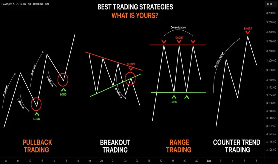
Learn the 4 Best Strategies to Maximize Your Profits in Trading
In the today's article, we will discuss 4 classic yet profitable forex and gold trading strategies.
1️⃣Pullback Trading
Pullback trading is a trend-following strategy where you open the positions after pullbacks.
If the market is trading in a bullish trend, your goal as a pullback trader is to wait for a completion of a bullish impulse and then let the market correct itself. Your entry should be the assumed completion point of a correctional movement. You expect a trend-following movement from there.
In a bearish trend, you wait for a completion of the bearish impulse, let the market retrace, and you look for short-entry after a completion of the retracement leg.
Here is the example of pullback trading.
On the left chart, we see the market that is trading in a bearish trend.
A pullback trader would short the market upon completion of the correctional moves.
On the right chart, I underlined the buy entry points of a pullback trader.
That strategy is considered to be one of the simplest and profitable and appropriate for newbie traders.
2️⃣Breakout Trading
Breakout trading implies buying or selling the breakout of a horizontal structure or a trend line.
If the price breaks a key support, it signifies a strong bearish pressure.
Such a violation will trigger a bearish continuation with a high probability.
Alternatively, a bullish breakout of a key resistance is a sign of strength of the buyers and indicates a highly probable bullish continuation.
Take a look, how the price broke a key daily resistance on a daily time frame. After a breakout, the market retested the broken structure that turned into a support. A strong bullish rally initiated from that.
With the breakout trading, the best entries are always on a retest of a broken structure.
3️⃣Range Trading
Range trading signifies trading the market that is consolidating .
Most of the time, the market consolidates within the horizontal ranges.
The boundaries of the range may provide safe points to buy and sell the market from.
The upper boundary of the range is usually a strong resistance and one may look for shorting opportunities from there,
while the lower boundary of the range is a safe place to buy the market from.
EURCAD pair is trading within a horizontal range on a daily.
The support of the range is a safe zone to buy the market from.
A bullish movement is anticipated to the resistance of the range from there.
Taking into considerations, that the financial instruments may consolidate for days, weeks and even months, range trading may provide substantial gains.
4️⃣Counter Trend Trading
Counter trend trading signifies trading against the trend.
No matter how strong is the trend, the markets always trade in zig-zags. After impulses follow the corrections , and after the corrections follow the impulses.
Counter trend traders looks for a completion of the bullish impulses in a bullish trend to short the market, and for a completion of bearish impulses in a downtrend to buy it.
Here is the example of a counter trend trade.
EURJPY is trading in a bullish trend. However, the last 3 bearish moves initiated from a rising trend line. For a trader, shorting the trend line was a perfect entry to catch a bearish move.
Such trading strategy is considered to be one of the most complicated , because one goes against the crowd and overall sentiment.
With the experience, traders may combine these strategies.
❤️Please, support my work with like, thank you!❤️
I am part of Trade Nation's Influencer program and receive a monthly fee for using their TradingView charts in my analysis.
Trading Strategy and CEX Screen
Hello, traders.
If you "Follow", you can always get new information quickly.
Please click "Boost" as well.
Have a nice day today.
-------------------------------------
CEX(Centralized Exchange): Centralized Exchange
DEX(Decentralized Exchange): Decentralized Exchange
As coin futures trading becomes active, I think they started classifying the coin futures charts of CEX exchanges.
-
Tradingview supports various screeners.
There are several screeners in the menu at the bottom, so check them out.
-
As the coin market grows, it is being classified into various themes.
I think this movement means that it is evolving into a form similar to the existing stock market.
If this classification continues to be segmented, it is likely that individual investors will eventually find it increasingly difficult to make profits.
Therefore, in order to adapt to these changes, your investment style, that is, your trading strategy, must be clear.
The trading strategy must be clear on 1. Investment period, 2. Investment size, 3. Trading method and profit realization method.
The above 1-3 must be clear.
You must classify the coin (token) you want to trade by investment period, and determine the investment size according to the investment period.
And, you must proceed with the transaction by determining the trading method and profit realization method accordingly.
-
To create a trading method, you must check whether there is support near the HA-Low and HA-High indicators and create a trading method accordingly.
Basically, when the HA-Low indicator rises, it is a buying period, and when the HA-High indicator is met, it is a selling period.
In most cases, trading occurs in the HA-Low ~ HA-High indicator range as above.
If it is supported by the HA-High indicator and rises, it will show a stepwise upward trend, and if it is resisted by the HA-Low indicator and falls, it will show a stepwise downward trend.
-
If you can trade in decimals like the coin market, you can set a different profit realization method.
Basically, you will sell the number of coins (tokens) you purchased and earn cash profits.
However, if you can trade in decimals, you can increase the number of coins (tokens) by selling the amount of the purchase principal.
In this way, you can increase the number of coins (tokens) corresponding to the profit and earn large profits in the mid- to long-term.
You can decide whether to earn cash profits right now or increase the number of coins (tokens) for the future depending on your investment style.
For example, I think it is a good idea to increase the number of coins (tokens) corresponding to the profit for coins (tokens) that can be held for the long term, such as BTC and ETH.
Therefore, you should think about which coin (token) to hold for the long term and decide on the profit realization method accordingly.
This method can reduce the pressure on funds even if the trading period is long because the investment money is rotated.
-
Thank you for reading to the end.
I hope you have a successful transaction.
--------------------------------------------------

Unlock Trading Success with Multi-Timeframe MasteryIn trading, particularly in the Forex market, a well-defined strategy is crucial for consistent profitability. One of the most effective techniques used by successful traders is multi-timeframe (MTF) analysis. By examining price action across different timeframes (e.g., daily, 4-hour, 1-hour), traders gain a clearer understanding of market structure, trend direction, and optimal entry/exit points. This article explores how MTF analysis works, its benefits, and practical steps to implement it in your trading.
🔍1. Analyzing a Pair Across Multiple Timeframes for Clearer Trend Direction
The foundation of MTF analysis lies in identifying the major and minor trends. By analyzing at least two timeframes, traders can align their strategies with the broader market direction while fine-tuning entries on shorter timeframes.
⚡The High Wave Cycle (HWC) Approach
To begin, determine your High Wave Cycle (HWC), which depends on your trading strategy and timeframe. For instance:
If you trade on the daily timeframe, your HWC might be the monthly chart.
If you trade on the 1-hour timeframe, your HWC could be the weekly chart.
The HWC helps you identify the major trend. For example, on the daily chart, you might analyze the trend using Dow Theory, pinpoint key support and resistance levels, and identify trendlines or patterns. This gives you a clear picture of the market’s broader direction.
Once the HWC is defined, give it significant weight when analyzing lower timeframes for trade setups. For instance, if the daily chart (HWC) shows a downtrend, you’d prioritize bearish setups on the 1-hour chart, even if a minor uptrend appears.
Example: SOLUSDT Trade Setup
Consider a scenario where the 1-hour chart shows a strong uptrend. The price breaks a key resistance level and a descending trendline, suggesting a potential long position.
However, checking the daily chart..
(HWC) reveals a clear downtrend. According to Dow Theory, a major trend reversal requires a confirmed break above the previous high (e.g., $150). Since this hasn’t occurred, the market remains bearish.
In this case, MTF analysis guides your strategy:
Reduce position size to lower risk, as you’re trading against the major trend.
Take profits early, as the price could reverse at any moment.
Avoid overtrading by limiting the number of positions until the trend change is confirmed.
This approach ensures your trades are aligned with the bigger picture, minimizing losses from false signals.
🎯2. Spotting Entries and Exits by Confirming Trends Across Timeframes
MTF analysis not only enhances risk management but also improves the precision of your entries and exits. By confirming signals across timeframes, you can filter out noise and focus on high-probability trades.
Example: Bitcoin (May 15, 2021)
Let’s rewind to May 15, 2021, during Bitcoin’s post-bull run correction. On the daily chart (HWC), the price formed lower highs and lows, breaking a key support level, signaling a bearish trend and a potential exit for long positions. This indicates that spot traders should sell, and swing traders on lower timeframes should focus exclusively on short positions.
On the 1-hour chart, you might spot a minor pullback, tempting a long trade. However, MTF analysis reminds you to align with the daily downtrend, so you’d only consider short setups. This disciplined approach prevents you from trading against the major trend, improving your win rate.
📊The Medium Wave Cycle (MWC) for Added Clarity
Between the HWC and lower timeframes lies the Medium Wave Cycle (MWC), which provides an intermediate perspective. For example, if your HWC is the daily chart, the MWC might be the 4-hour chart. The MWC helps confirm the major trend’s strength or detect early signs of reversals before zooming into lower timeframes for entries. By checking the MWC, you can filter out noise and ensure your trades align with both the major and intermediate trends.
💡Conclusion
Multi-timeframe analysis is a game-changer for traders seeking consistency and precision. By combining the major trend from your HWC, the intermediate perspective from your MWC, and minor trends on lower timeframes, you can make informed decisions, manage risk effectively, and time your trades with confidence.
Start by defining your HWC and MWC, analyzing the major trend, and aligning your entries and exits with multiple timeframes. Pick a pair, test this strategy on a demo account, and share your results in the comments below! With practice, MTF analysis will give you a tactical edge in navigating the markets.
🤍 btw im Skeptic :) & If you found this article helpful, don’t forget to like, share, and follow for more insights and trading strategies! <3

What to consider when trading...
Hello, traders.
If you "Follow", you can always get new information quickly.
Please click "Boost".
Have a nice day today.
-------------------------------------
This is my personal opinion, so it may differ from yours.
Please keep this in mind.
-
So, how should I proceed with day trading?
When trading day trading, the first thing to consider is the trading volume.
Coins (tokens) with low trading volume should be avoided because volatility can occur in an instant, making it difficult to respond quickly and likely to result in losses.
Therefore, if possible, it is recommended to choose coins (tokens) with high trading volume.
The next thing to consider is the price of the coin (token).
If the price of the coin (token) becomes too high or too low, even if you sell it for profit, you may incur a loss.
Therefore, when trading a coin (token) with a very high price, you should trade with a longer time frame.
In other words, the increase should be high.
When trading a coin (token) with a very low price, you need to be persistent.
This is because the amount you want to trade is large, so the rise or fall may be slow.
The next thing to consider is the size of your trading funds.
If your trading funds are too small, you may not be able to enjoy trading because you will earn too little profit compared to the stress of trading.
If you lose the fun of trading like this, you will have difficulty continuing to trade or you will likely leave the investment market, so you need to be careful.
If you set the trading fund size too high, you can suffer a big loss with one mistake, so you must set a stop loss point and keep it.
You can find out how much trading fund size is right for you by looking at your psychological state when you trade.
If you think you are trading too boldly, it is better to think that the trading fund size is small and increase it little by little.
If you feel extremely anxious when you trade and incur a loss, it is better to reduce the trading fund size little by little.
-
(BTCUSDT 30m chart)
Considering the above considerations (trading volume, price, trading fund size), you should continuously observe the selected coin (token) chart to check the movement at the support and resistance points.
To do this, you need to check whether there is support at the support and resistance points drawn on the 1M, 1W, and 1D charts when you meet the HA-Low and HA-High indicators, which can be the basis for starting a transaction, or when you have a trading strategy.
Usually, when the Trend Cloud indicator shows an upward trend while receiving support near the HA-Low indicator and rising, there is a high possibility of rising.
Therefore, you should consider whether to buy when the HA-Low indicator shows support.
And, when the HA-High indicator touches and falls, there is a high possibility of falling when the Trend Cloud indicator shows a downward trend.
Therefore, the area near the HA-High indicator corresponds to the first selling section.
In this way, you can conduct transactions within the sideways section trading within the HA-Low ~ HA-High section.
Then, when there is a movement that falls below the HA-Low indicator or rises above the HA-High indicator, you can conduct a transaction according to the trend.
Therefore, split trading is essential.
The basics of split trading are to sell half when you make a profit and set the stop loss at the principal price for the remaining half.
-
This is something everyone knows, but it is not easy to follow.
Also, there are times when it is difficult to decide what to use as the standard for trading.
In such cases, as I mentioned, I recommend that you choose a coin (token) considering the trading volume, price, and trading fund size and continuously check the movement of the chart.
Even if you are not familiar with chart analysis, if you continuously look at the chart, there is a possibility that you will see movement.
However, you need prior knowledge on how to set the stop loss point.
-
Thank you for reading to the end.
I hope you have a successful trade.
--------------------------------------------------

Crypto Risk Management: The Most Overlooked EdgeIn the thrilling yet unforgiving world of crypto, profit potential is massive—but so is the risk. Every trader or investor enters the space with dreams of 10x gains, but without a solid risk management strategy, many exit just as fast—with a trail of losses.
Risk management is the art of protecting your capital while giving yourself the best shot at long-term profitability. It’s not just a skill; it’s a survival strategy.
What Are the Risks in Crypto?
Crypto markets are unique—24/7, global, and driven by emotion, hype, and tech disruption. With that come several risk categories:
Market Risk – Volatile price swings can wipe out unprepared traders.
Liquidity Risk – Low-volume coins can be hard to exit during dumps.
Regulatory Risk – Government crackdowns or bans (e.g., Binance or XRP cases).
Security Risk – Hacks, rug pulls, phishing scams, and smart contract bugs.
Operational Risk – Mistakes like sending funds to the wrong address or using faulty bots.
These risks aren’t just theoretical—think of the LUNA/UST collapse or the FTX debacle. Billions were lost due to poor risk management at multiple levels.
🧠 Core Principles of Risk Management
To stay in the game long-term, you need to adopt some fundamental principles:
Preserve capital first, profit later.
Risk small, aim big.
Never risk more than you can afford to lose.
Think in probabilities, not certainties.
Be consistent, not lucky.
Even the best traders lose—but they survive because they manage their downside better than the rest.
🛠️ Tools & Techniques That Can Save Your Portfolio
1. ✅ Position Sizing
Don’t bet your whole stack on one trade. A common approach is to risk 1–2% of your portfolio per trade. That way, even a streak of bad trades won’t destroy your capital.
2. 🛑 Stop-Loss & Take-Profit
Always have predefined stop-loss levels to cut losses, and take-profit targets to lock in gains. Trading without a stop-loss is like driving without brakes.
3. 📊 Diversification
Spread your investments across different sectors (DeFi, AI, Layer 1s, etc.). Don’t rely on one narrative or one coin.
4. ⚖️ Leverage Control
Leverage can amplify gains—and losses. Avoid high leverage unless you’re an experienced trader with a tight plan.
5. 🔁 Portfolio Rebalancing
Adjust your allocations periodically. If one asset balloons in value, rebalance to lock in gains and manage exposure.
6. 💵 Using Stablecoins
Stablecoins like USDT, USDC, or DAI are great for hedging during volatility. Park profits or prepare dry powder for dips.
🧠 Psychological Risk: The Silent Killer
Many traders don’t lose due to bad analysis—they lose to emotions.
FOMO leads to buying tops.
Fear leads to panic selling bottoms.
Revenge trading after losses leads to bigger losses.
Greed blinds you from taking profits.
The key is discipline. Create a plan, follow it, and review your mistakes objectively.
🚫 Common Mistakes to Avoid
Going all-in on one trade or coin
Holding through massive drawdowns hoping for a recovery
Ignoring stop-losses
Overleveraging small positions to “win it all back”
Risk management is about avoiding unnecessary pain, not killing your gains.
🧭 Final Thoughts
The best traders in crypto aren't those who win big once—they're the ones who survive long enough to win over and over. Risk management is your edge in a market that respects no one.
Whether you’re a scalper, swing trader, or long-term HODLer, never forget: capital is your lifeline. Guard it with your strategy, protect it with your plan, and grow it with patience.
✍️ By Green Crypto
Empowering traders with analysis, tools, and education. Stay sharp. Stay profitable.

Breakout trading
(Title)
Breakout trading starts with finding support and resistance points
-------------------------------
Hello, traders.
If you "Follow", you can always get new information quickly.
Please click "Boost" as well.
Have a nice day today.
-------------------------------------
I will take the time to talk about breakout trading.
This is my opinion, so the content may be lacking.
The reason I did not explain what other people say with examples is because trading is a psychological battle.
Most of the content in books or on the Internet is explained with patterns.
However, it is not easy to find patterns when checking the movement of a real-time chart.
Therefore, I think it is more important to understand why such movements occur than to explain them with patterns.
Therefore, I think it is better to create a trading strategy by finding support and resistance points and checking whether or not they are supported by the support and resistance points rather than memorizing patterns.
Breakout trading refers to starting a transaction after checking whether there is support at a point or section when the price rises above a certain point or section, and there is a possibility of a larger rise.
If you do a breakout trade incorrectly, you may end up buying at a high point, which could result in a large loss, so it is recommended to always keep a stop loss point when trading.
In order to reduce the stop loss, you need to make an effort to lower the average purchase price by selling in installments when the price rises after purchasing and buying in installments when the price falls again.
Therefore, the stop loss point is when it is beyond the range you can handle.
-
Let's take the BTCUSDT 1D chart as an example.
It has fallen after renewing the ATH.
Looking at the current price position, it feels like it will fall further.
However, if the price rises to around the HA-Low indicator on the 1D chart, that is, around 89294.25, you will feel like it will turn into an uptrend.
Even if you think that you won't feel that way now, you will feel that way after it rises.
Therefore, the most important thing in breakout trading is to find important support and resistance points.
To find support and resistance points, you need to basically understand candles.
Any book or video about candles will do.
I recommend that you don't try to memorize the content in it, but read or watch it repeatedly several times.
In my case, after watching the video about candles about 3 times, my understanding of the chart became easier.
The reason for finding support and resistance points is to select a trading point.
What you need to find support and resistance is a horizontal line.
It is not easy to start trading with chart tools that are not horizontal lines but diagonal lines or curves.
The reason is that when you try to start a trade, you are more likely to miss the timing because your psychological state is added.
-
You can see that the uptrend started when it broke through the 73072.41 point.
Therefore, you can see that it is possible that the uptrend will start when it breaks through the 106133.74 point this time as well.
However, in this case, since it is rising while renewing the ATH, it is a point where it is thought to be difficult to actually start trading.
In other words, it is likely that you will be reluctant to trade because it is thought to be a high point.
Therefore, as I mentioned earlier, the actual breakout trade will be conducted when it breaks through the 89294.25 point.
Then, even if it rises to around the 106133.74 point, you will be more likely to respond stably without feeling much psychological anxiety.
-
However, there is one problem.
That is, the StochRSI indicator is currently in the overbought zone.
Therefore, when it rises near the 89294.25 point and confirms support, the StochRSI indicator should show a downward trend from the overbought zone.
Otherwise, the 89294.25 point is likely to act as a resistance point.
Even if the market is messy and difficult to predict, you should not be too busy finding support and resistance points.
After all, you need to have a standard for creating a trading strategy to start trading.
It is better to create a trading strategy and respond at the support and resistance points you have selected if possible.
Even if you suffer a loss, if you continue to trade, you will be able to better organize the support and resistance points.
For reference, the indicators that can create a trading strategy on my chart are the HA-Low and HA-High indicators.
-
Thank you for reading to the end.
I hope you have a successful trade.
--------------------------------------------------

Example of how to draw a trend line using the StochRSI indicator
Hello, traders.
If you "Follow", you can always get new information quickly.
Please click "Boost" as well.
Have a nice day today.
-------------------------------------
I have explained how to draw a trend line before, but I will take the time to explain it again so that it is easier to understand.
-
When drawing a trend line, it must be drawn on the 1M, 1W, and 1D charts.
However, since I focused on understanding the concept of drawing a trend line and the volatility period that can be seen with a trend line, I will explain it only with a trend line drawn on the 1D chart.
Please note that in order to calculate a somewhat accurate volatility period, support and resistance points drawn on the 1M, 1W, and 1D charts are required.
I hope this was helpful for understanding my thoughts on the concept of drawing trend lines and how to interpret them.
The main reason for drawing trend lines like this is so that anyone who sees it can immediately understand why such a trend line was drawn.
Then, there will be no unnecessary disagreements about the drawing, and each person will be able to share their opinions on the interpretation.
--------------------------
When drawing trend lines, the StochRSI indicator is used.
The reason is to secure objectivity.
When the StochRSI indicator touches the oversold zone and rises, the low corresponding to the peak is connected to draw a trend line between low points.
And, when the StochRSI indicator touches the overbought zone and falls, the Open of the downward candle corresponding to the peak is connected to draw a trend line between high points.
If the peak is not a downward candle, it moves to the right and is drawn with the Open of the first downward candle.
If you refer to the candlesticks of the arrows in the chart above, you will understand.
The trend line drawn as a dot is a high-point trend line, but it is a proper trend line because it does not touch the overbought zone between highs.
Therefore, you can draw a trend line corresponding to trend line 1.
Accordingly, around March 25-29, around April 8, and around April 14 correspond to the volatility period.
-
You can see how important the low-point trend line (2) is.
If the high-point trend line is properly created this time and the low-point trend line and the high-point trend line are displayed in the same direction, the trend is likely to continue along that channel.
If the StochRSI indicator rises and a peak is created in the overbought zone, you will draw a high-point trend line that connects to point A.
-
Thank you for reading to the end. I hope your transaction will be successful.
--------------------------------------------------

Real Reason Most Strategies Fail–“Overfitting” Explained Simply!Hello Traders!
Have you ever seen a strategy work amazingly on historical charts, but fail badly in live markets? You’re not alone. One of the biggest reasons this happens is due to something called Overfitting . Today, let’s understand this concept in the simplest way — so you can avoid falling into this trap and build smarter strategies.
What is Overfitting in Trading?
Overfitting means your strategy is too perfect for past data:
It works great on old charts, but only because it was made to match that exact data.
It fails in real-time because the market changes:
The strategy doesn’t adapt well to new price behavior — it’s not flexible.
Example:
A strategy with 10 indicators giving perfect backtest results may be too specific and only fits that period — not future ones.
Signs Your Strategy Might Be Overfitted
Too many rules or filters:
If your strategy has too many conditions just to improve past results, that’s a red flag.
Works only on one stock or timeframe:
A good strategy should work on different stocks and market conditions.
Great backtest, bad live performance:
If your real trades don’t match the backtest, it might be too customized to the past.
How to Avoid Overfitting in Trading
Keep it simple:
Use fewer indicators and rules. Focus on clean price action and proven setups.
Test on different stocks/timeframes:
See if your setup works across Nifty, Bank Nifty, stocks, or different timeframes.
Use forward testing:
Try the strategy on live charts (paper trade) before putting real money into it.
Rahul’s Tip
A perfect backtest doesn’t mean a perfect future. Build your strategy to be reliable — not just impressive on history.
Conclusion
Overfitting is like memorizing old exam answers and failing the new paper. Don’t build strategies that only look good on past data. Make them strong, simple, and adaptable to real market conditions.
Have you faced this issue before? Let’s discuss in the comments and help each other improve!
