Crossing AveragesWe averages are crossing, volume increases. This script aims to plot the price relative to the averages that are crossing. If price markers are below the average lines, that usually indicates weakness.
Multitimeframe

Fisher Transform Background StripesThe "Fisher Transform Background Stripes" indicator is an easy-to-use tool that helps traders identify extreme market conditions using the Fisher Transform, a technical indicator that normalizes price data to highlight potential reversals. It displays colored background stripes on your chart to show when the market is oversold or undersold, making it simple to spot trading opportunities.
How It Works:Fisher Transform Calculation: The indicator calculates the Fisher Transform based on a user-defined period (default: 9), using the average of high and low prices to measure market momentum and identify extreme price movements.
Oversold/Undersold Levels: It highlights when the Fisher Transform is above a user-set oversold level (default: 3.0) with red background stripes, or below an undersold level (default: -2.0) with green background stripes.
Visual Feedback: Red and green stripes appear on the chart to mark oversold or undersold conditions, helping you quickly understand market extremes.
Customization: You can adjust the Fisher Transform period, oversold/undersold levels, background colors, and transparency. You can also enable an optional Fisher Transform plot or display values on the chart for debugging.
Wait for Close Option: You can choose whether the indicator waits for the timeframe’s candle to close before showing stripes, ensuring more reliable signals.
Alerts: Optional alerts notify you when the Fisher Transform crosses into oversold or undersold zones (always using confirmed values for accuracy).
Who It’s For: This indicator is ideal for beginner and intermediate traders looking for a clear, visual way to track extreme market conditions and potential reversals using the Fisher Transform.
Key Features:Colored background stripes for oversold (red) and undersold (green) conditions.
Customizable settings for period, levels, colors, and transparency.
Option to wait for candle close for more accurate signals.
Optional Fisher Transform plot and value display for analysis.
Alerts to notify you of key Fisher Transform level crossings.
This indicator provides a straightforward way to monitor market extremes and make informed trading decisions.

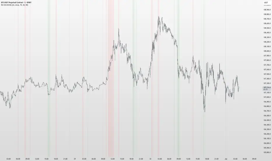
RSI OS/OB Background StripesThe "RSI OS/OB Background Stripes" indicator is a simple tool designed to help traders visualize overbought and oversold market conditions using the Relative Strength Index (RSI). It highlights these conditions by displaying colored background stripes directly on your chart, making it easy to spot potential trading opportunities.
How It Works:RSI Calculation: The indicator calculates the RSI, a popular momentum indicator that measures the speed and change of price movements, using a default period of 14 (customizable).
Overbought/Oversold Levels: It marks areas where the RSI is above a user-defined overbought level (default: 70) with red background stripes, and below an oversold level (default: 30) with green background stripes.
Visual Feedback: The colored stripes appear on the chart when the RSI enters overbought (red) or oversold (green) zones, helping you quickly identify market conditions.
Customization: You can adjust the RSI period, overbought/oversold levels, background colors, and transparency. You can also choose to show the RSI line in a separate panel or display RSI values on the chart for debugging.
Alerts: The indicator includes optional alerts that notify you when the RSI crosses into overbought or oversold territory.
Who It’s For: This indicator is perfect for beginner and intermediate traders who want a clear, visual way to track RSI-based overbought and oversold conditions without cluttering their charts.
Key Features:Easy-to-read background stripes for overbought (red) and oversold (green) conditions.
Fully customizable RSI settings, colors, and transparency.
Optional RSI plot and value display for deeper analysis.
Alerts to keep you informed of key RSI level crossings.
This indicator is a straightforward way to monitor market momentum and make informed trading decisions.
RSI Overbought ScannerRSI Overbought Scanner
Description
The RSI Overbought Scanner is a Pine Script indicator designed to identify potential overbought conditions across multiple timeframes (1-minute, 5-minute, and 15-minute) using the Relative Strength Index (RSI). This tool is ideal for traders looking to spot stocks or assets that may be overextended to the upside, potentially signaling a reversal or pullback opportunity.
Key Features
Multi-Timeframe Analysis: Evaluates RSI on 1m, 5m, and 15m timeframes to confirm overbought conditions (RSI > 70).
Visual Output: Plots a binary result (1 for overbought, 0 otherwise) for easy integration with TradingView's screener.
Debugging Table: Displays a table in the top-right corner showing RSI values and overbought status for each timeframe, with color-coded indicators (red for overbought, green for not overbought).
Alert Integration: Includes an alert condition that triggers when all three timeframes are overbought, providing a customizable message with the ticker symbol.
How It Works
RSI Calculation: Computes RSI with a default length of 14 for the 1m timeframe and retrieves RSI values for 5m and 15m timeframes using request.security.
Overbought Condition: Checks if RSI exceeds 70 on all three timeframes.
Output: Plots a value of 1 when all conditions are met, otherwise 0. A table updates on the last confirmed bar to show RSI values and overbought status.
Alerts: Triggers an alert when all timeframes are overbought, notifying users of potential trading opportunities.
Usage
Add the indicator to your chart and use it with TradingView's screener to filter assets meeting the overbought criteria.
Customize the RSI length or overbought level (default 70) in the indicator settings to suit your trading strategy.
Set up alerts to receive notifications when the overbought condition is met across all timeframes.
Notes
This script is written in Pine Script v6.
Best used in conjunction with other technical analysis tools to confirm signals.
The table is for debugging and visual confirmation, updating only on the last confirmed bar to avoid performance issues.

Base Finder ProFind bases easily with Base finder pro. For each bases, plots length and depth of the bases.

ORB NormanORB with adjustable times for up to 3 ORB's.
High and Low for each defined timeframe with adjustable lenghts for each day.

Order Blocks v2Order Blocks v2 – Smart OB Detection with Time & FVG Filters
Order Blocks v2 is an advanced tool designed to identify potential institutional footprints in the market by dynamically plotting bullish and bearish order blocks.
This indicator refines classic OB logic by combining:
Fractal-based break conditions
Time-level filtering (Power of 3)
Optional Fair Value Gap (FVG) confirmation
Real-time plotting and auto-invalidation
Perfect for traders using ICT, Smart Money, or algorithmic timing models like Hopplipka.
🧠 What the indicator does
Detects order blocks after break of bullish/bearish fractals
Supports 3-bar or 5-bar fractal structures
Allows OB detection based on close breaks or high/low breaks
Optionally confirms OBs only if followed by a Fair Value Gap within N candles
Filters OBs based on specific time levels (3, 7, 11, 14) — core anchors in many algorithmic models
Automatically deletes invalidated OBs once price closes through the zone
⚙️ How it works
The indicator:
Tracks local fractal highs/lows
Once a fractal is broken by price, it backtracks to identify the best OB candle (highest bullish or lowest bearish)
Validates the level by checking:
OB type logic (close or HL break)
Time stamp match with algorithmic time anchors (e.g. 3, 7, 11, 14 – known from the Power of 3 concept)
Optional FVG confirmation after OB
Plots OB zones as lines (body or wick-based) and removes them if invalidated by a candle close
This ensures traders see only valid, active levels — removing noise from broken or out-of-context zones.
🔧 Customization
Choose 3-bar or 5-bar fractals
OB detection type: close break or HL break
Enable/disable OBs only on times 3, 7, 11, 14 (Hopplipka style)
Optional: require nearby FVG for validation
Line style: solid, dashed, or dotted
Adjust OB length, width, color, and use body or wick for OB height
🚀 How to use it
Add the script to your chart
Choose your preferred OB detection mode and filters
Use plotted OB zones to:
Anticipate price rejections and reversals
Validate Smart Money or ICT-based entry zones
Align setups with algorithmic time sequences (3, 7, 11, 14)
Filter out invalid OBs automatically, keeping your chart clean
The tool is useful on any timeframe but performs best when combined with a liquidity-based or time-anchored trading model.
💡 What makes it original
Combines fractal logic with OB confirmation and time anchors
Implements time-based filtering inspired by Hopplipka’s interpretation of the "Power of 3"
Allows OB validation via optional FVG follow-up — rarely available in public indicators
Auto-cleans invalidated OBs to reduce clutter
Designed to reflect market structure logic used by institutions and algorithms
💬 Why it’s worth using
Order Blocks v2 simplifies one of the most nuanced parts of SMC: identifying clean and high-probability OBs.
It removes subjectivity, adds clear timing logic, and integrates optional confluence tools — like FVG.
For traders serious about algorithmic-level structure and clean setups, this tool delivers both logic and clarity.
⚠️ Important
This indicator:
Is not a signal generator or financial advice tool
Is intended for experienced traders using OB/SMC/time-based logic
Does not predict market direction — it provides visual structural levels only
MTF Dashboard 9 Timeframes + Signals📊 MTF Dashboard — Multi-Timeframe Market Signal Matrix
Overview
The MTF Dashboard is an open-source Pine Script tool that enables traders to monitor key trend and momentum indicators across nine timeframes simultaneously—ranging from 1 minute to monthly—within a single unified view. This script is designed to support both discretionary and rules-based traders by improving efficiency in multi-timeframe analysis.
✅ Key Features
🔄 Multi-Timeframe Coverage
1m, 5m, 15m, 30m, 1H, 4H, 1D, 1W, 1M supported
Toggle individual timeframes on/off as per your trading style
📈 Built-in Technical Indicators
Trend Detection: Based on moving average (EMA) crossovers
Momentum Evaluation: Using Relative Strength Index (RSI)
MACD Status: Displays histogram trend
Volume Confirmation: Compares current volume to average
Confluence Rating: Optional logic combining indicator signals
🎨 Custom Dashboard Appearance
Supports light/dark chart modes
Adjustable panel positioning (Top/Bottom/Center Left/Right)
Multiple text size options
Color settings for bullish, bearish, and neutral signals
🔔 Optional Alerts
Alert conditions for confluence setups or trend changes (user must configure manually)
Use Cases
Identify trend alignment across short, medium, and long timeframes
Confirm entry or exit signals with high-confidence confluence
Detect early shifts in trend direction using EMA, RSI, MACD divergence
Quickly assess overall market sentiment in one glance
Limitations:
This script does not provide financial advice or guaranteed signals
Not intended for automatic trading or strategy backtesting
Users should interpret dashboard signals in the context of price structure and risk management
How to Use:
Add the script to your chart from your favorites
Open the settings panel:
Enable only the timeframes you want to analyze
Customize colors, position, and table layout
Optionally, right-click the script to configure alerts based on confluence or indicator changes
Technical Notes
EMA settings can be adjusted to match your trading system
Designed for visual clarity and performance with multiple timeframes enabled
Credits
This tool was developed to help the TradingView community simplify MTF analysis. Inspired by institutional-grade dashboards and adapted for manual charting use by retail traders.
Tags
#multi-timeframe #EMA #RSI #MACD #volume #confluence #dashboard #trend #momentum #open-source #pine-script #tradingview
License
Published as open-source under the TradingView community sharing model. Users are encouraged to modify, improve, and credit respectfully.

Pivot Projection Levels (Hi1, Hi2, Lo1, Lo2)Pivot Avg “Fair value” or equilibrium price
Hi1 1st upside projection — potential resistance
Hi2 Further extension — aggressive target
Lo1/Lo2 Same logic to the downside

Steez's Timeframe TableSimple timeframe indicator which can assist with daily bias or draw on liquidity.
Shows all timeframes from 1 minute to 1 day.
Shows close time and if the candle is currently bearish or bullish.

IDKFAIDKFA - Advanced Order Blocks & Volume Profile with Market Structure Analysis
Why IDKFA?
Named after the legendary DOOM cheat code that gives players "all weapons and full ammo," IDKFA provides traders with a comprehensive arsenal of market analysis tools. Just as the cheat code arms players with everything needed for combat, this indicator equips traders with essential market structure tools: Order Blocks, Volume Profile, LVN/HVN areas, Fibonacci retracements, and intelligent buy/sell signals - all in one unified system.
Core Features
Order Blocks Detection
Automatically identifies institutional order blocks using pivot high/low analysis
Extends blocks dynamically until price interaction occurs
Bullish blocks (demand zones) and bearish blocks (supply zones)
Customizable opacity and extend functionality
Advanced Volume Profile
Real-time volume profile calculation for multiple session types
Point of Control (POC), Value Area High (VAH), and Value Area Low (VAL)
Mode 1: Side-by-side bull/bear volume display
Mode 2: Overlapped volume display with percentage analysis
Shows buying vs selling pressure at each price level
LVN/HVN Area Detection
Low Volume Nodes (LVN): Areas below VAL where price moves quickly
High Volume Nodes (HVN): Areas above VAH with strong resistance
NPOC (Naked Point of Control): Single print areas within Value Area
Volume-based gradient coloring shows relative activity levels
Smart Fibonacci Retracements
Auto-detects trend direction for proper fibonacci orientation
Dynamic color coding: Red levels in uptrends, Gold in downtrends
Special 88.6% level turns lime green in downtrends
Key levels: 23.6%, 38.2%, 50%, 61.8%, 65%, 78.6%, 88.6%
Intelligent Signal System
Works best on higher timeframes
Identifies high-probability reversal setups at key levels
Buy signals: Large bearish rejection followed by bullish reclaim
Sell signals: Large bullish rejection followed by bearish breakdown
Signals only trigger near significant support/resistance areas
Signal Analysis & Usage Guidelines
Buy Signal Mechanics
The buy signal triggers when:
Previous candle shows significant bearish movement (minimum ATR multiplier)
Current candle reclaims a configurable percentage of the previous candle's range
Price is near a key support level (order blocks, fibonacci, volume levels)
Sell Signal Mechanics
The sell signal triggers when:
Previous candle shows significant bullish movement (minimum ATR multiplier)
Current candle rejects below a configurable percentage of the previous candle's range
Price is near a key resistance level (order blocks, fibonacci, volume levels)
When to TAKE Signals
High Probability Buy Signals:
Signal appears AT or BELOW the VAL (Value Area Low)
Signal occurs at bullish order block confluence
Price is in LVN area below VAL (momentum acceleration zone)
Signal aligns with fibonacci 61.8% or 78.6% support
Multiple session POC levels provide support confluence
Previous session's VAL acting as current support
High Probability Sell Signals:
Signal appears AT or ABOVE the VAH (Value Area High)
Signal occurs at bearish order block confluence
Price is in HVN area above VAH (heavy resistance zone)
Signal aligns with fibonacci 61.8% or 78.6% resistance
Multiple session POC levels provide resistance confluence
Previous session's VAH acting as current resistance
When to AVOID Signals
Avoid Buy Signals When:
Signal appears ABOVE the VAH (buying into resistance)
Price is in HVN red zones (high volume resistance areas)
No clear support structure below current price
Volume profile shows heavy selling pressure (high bear percentages)
Signal occurs during low-volume periods between major sessions
Multiple bearish order blocks exist below current price
Avoid Sell Signals When:
Signal appears BELOW the VAL (selling into support)
Price is in LVN green zones (momentum could continue)
No clear resistance structure above current price
Volume profile shows heavy buying pressure (high bull percentages)
Signal occurs during Asian session ranges without clear direction
Multiple bullish order blocks exist above current price
Volume Profile Context for Signals
Understanding Bull/Bear Percentages:
70%+ Bull dominance at a level = Strong support expected
70%+ Bear dominance at a level = Strong resistance expected
50/50 Split = Neutral zone, less predictable
Use percentages to gauge conviction behind moves
POC (Point of Control) Interactions:
Signals above POC in uptrend = Higher probability
Signals below POC in downtrend = Higher probability
Signals against POC bias require extra confirmation
POC often acts as magnetic level for price return
Trading Strategies
Strategy 1: VAL/VAH Bounce Strategy
Wait for price to approach VAL (support) or VAH (resistance)
Look for signal confirmation at these critical levels
Enter with tight stops beyond the Value Area
Target opposite boundary or next session's levels
Strategy 2: Order Block + Volume Confluence
Identify order block alignment with VAL/VAH
Wait for signal within the confluence zone
Enter on signal with stop beyond order block
Use LVN areas as acceleration zones for targets
Strategy 3: LVN/HVN Strategy
LVN (Green) Areas: "Go Zones" - expect quick price movement through low volume
HVN (Red) Areas: "Stop Zones" - expect resistance and potential reversals
NPOC Areas: "Fill Zones" - price often returns to fill single print gaps
Strategy 4: Multi-Session Analysis
Use Daily/Weekly for major structure context
Use 4H for intermediate levels
Use 1H for precise entry timing
Ensure all timeframes align before taking signals
Strategy 5: Fibonacci + Volume Profile
Buy signals at 61.8% or 78.6% fibonacci near VAL
Sell signals at 61.8% or 78.6% fibonacci near VAH
Use 88.6% level as final support/resistance before major moves
50% level often aligns with POC for confluence
Signal Quality Assessment
Grade A Signals (Highest Probability):
Signal at VAL/VAH with order block confluence
Fibonacci level alignment (61.8%, 78.6%)
Volume profile shows 70%+ dominance in signal direction
Multiple timeframe structure alignment
Signal occurs during high-volume sessions (London/NY)
Grade B Signals (Moderate Probability):
Signal near POC with some confluence
Fibonacci 50% or 38.2% alignment
Mixed volume profile readings (50-70% dominance)
Some timeframe alignment present
Signal during overlap sessions
Grade C Signals (Lower Probability):
Signal with minimal confluence
Weak fibonacci alignment or none
Volume profile neutral or against signal
Conflicting timeframe signals
Signal during low-volume periods
Risk Management Guidelines
Position Sizing Based on Signal Quality:
Grade A: Standard position size
Grade B: Reduced position size (50-75%)
Grade C: Minimal position size (25%) or skip entirely
Stop Loss Placement:
Beyond order block boundaries
Outside Value Area (VAL/VAH)
Below/above fibonacci confluence levels
Account for session volatility ranges
Profit Targets:
First target: Opposite VAL/VAH boundary
Second target: Next session's key levels
Final target: Major order blocks or fibonacci extensions
Credits & Attribution
Original components derived from:
Market Sessions & Volume Profile by © Leviathan (Mozilla Public License 2.0)
Volume Profile elements inspired by @LonesomeTheBlue's volume profile script
Pivot Order Blocks by TradingWolf / © MensaTrader (Mozilla Public License 2.0)
Auto Fibonacci Retracement code (public domain)
Significant enhancements and modifications include:
Advanced LVN/HVN detection and visualization
Bull/Bear percentage analysis for Mode 2/3
Comprehensive alert system with market context
Integrated buy/sell signals at key levels
Performance optimizations and extended session support
Enhanced Mode 2/3 with percentage pressure analysis
Important Disclaimers
This indicator is a technical analysis tool designed for educational purposes. It does not provide financial advice, investment recommendations, or trading signals that guarantee profits. All trading involves substantial risk of loss, and past performance does not guarantee future results. Users should conduct their own research, understand the risks involved, and consider consulting with qualified financial advisors before making trading decisions. The signals and analysis provided are based on historical price patterns and volume data, which may not predict future market movements accurately.
Best Practices
Never trade signals blindly - always consider volume profile context
Wait for confluence between multiple tools before entering
Respect the Value Area - avoid buying above VAH or selling below VAL
Use session context - Asian ranges vs London/NY breakouts
Practice proper risk management - position size based on signal quality
Understand the bigger picture - use multiple timeframes for context
Remember: Like the IDKFA cheat code, having all the tools doesn't guarantee success. The key is learning to use them together effectively and understanding when NOT to take a signal is often more important than knowing when to take one.

Multi-Timeframe Horizontal LinesThis Pine Script indicator plots horizontal lines at the high and low prices of the most recent 1-hour and 15-minute candles. Users can customize the color and width of the lines for each timeframe. The lines are updated dynamically, with previous lines removed to keep the chart clean.

Bullish & Bearish Reversal Scanner_KSPBullish & Bearish Reversal Scanner_KSP
Bullish & Bearish Reversal Scanner_KSP
Bullish & Bearish Reversal Scanner_KSP

Mariam 5m Scalping Breakout StrategyPurpose
A 5-minute scalping breakout strategy designed to capture fast 3-5 pip moves with high probability, using premium/discount zone filters and market bias conditions. Developed for traders seeking consistent scalps with a proven win rate above 95–98% in optimal conditions.
How It Works
The script monitors price action in 5-minute intervals, forming a 15-minute high and low range by tracking the highs and lows of the first 3 consecutive 5-minute candles starting from a custom time. In the next 3 candles, it waits for a breakout above the 15m high or below the 15m low while confirming market bias using custom equilibrium zones.
Buy signals trigger when price breaks the 15m high while in a discount zone
Sell signals trigger when price breaks the 15m low while in a premium zone
The strategy simulates trades with fixed 3-5 pip take profit and stop loss values (configurable). All trades are recorded in a table with live trade results and an automatically updated win rate, typically achieving over 90–95% accuracy in favorable market conditions.
Features
Designed exclusively for the 5-minute timeframe
Custom 15-minute high/low breakout logic
Premium, Discount, and Equilibrium zone display
Built-in backtest tracker with live trade results, statistics, and win rate
Customizable start time, take profit, and stop loss settings
Real-time alerts on breakout signals
Visual markers for trade entries and failed trades
Consistent win rate exceeding 90–95% on average when following market conditions
Usage Tips
Use strictly on 5-minute charts for accurate signal performance. Avoid during high-impact news releases.
Important: Once a trade is opened, manually set your take profit at +3 to +5 pips immediately to secure the move, as these quick scalps often hit the target within a single candle. This prevents missed exits during rapid price action.

Trading Sessionsthis indicator labels asia, london, and new york sessions with accurate times for trading indexes like nq, es, or ym. It gives a range from the session lows to session highs which can be used to identify liquidity grabs and price action.

StratNinjaTableStratNinjaTable – Multi-Timeframe The Strat Candle Pattern Table
This Pine Script indicator provides traders with a dynamic table overlay on the chart that displays The Strat candle patterns across multiple selectable timeframes. The table includes:
The candle pattern according to The Strat method (1, 2UP, 2DOWN, 3) for each chosen timeframe
Direction arrows showing bullish (▲), bearish (▼), or neutral (■) candle direction
Real-time countdown timer showing remaining time until the current candle closes, adapting automatically to daily, weekly, monthly, and longer timeframes
User inputs for selecting which timeframes to display and positioning of the table on the chart
The current ticker symbol and chart timeframe displayed prominently
The script is developed using Pine Script version 6 and is inspired by the work of shayy110, who contributed foundational code for The Strat methodology in TradingView.

Naked DWM LevelsThis indicator shows naked Daily, Weekly, Monthly levels
The indicator will automatically delete levels where the same time frame candle close has crossed one of these levels, when it is no longer naked or tapped by a wick.
These are HTF S/R levels that are highly respected for reversals, or even break and retests.
Enjoy!

Doji Ashi v2.0 (with SL & TP levels)This is a version of @SassyStonks Doji Ashi v2.0 that includes ATR based SL levels with adjustable R:R TP levels.
What is Doji Ashi v2.0?
This indicator is designed for short-term intraday momentum trading, offering Buy and Sell signals based on a refined combination of filters including:
Trend alignment with daily SMAs
Momentum confirmation using EMA 3/8 cross
Relative volume to identify activity spikes
VWAP positioning to confirm trend consistency
Time filters to avoid unreliable early market chop
It adapts dynamically depending on whether you’re trading Stocks or Crypto, with appropriate filters toggled automatically.
...
How the Script Works
Core Logic:
A Buy signal appears when:
The price is in an uptrend (via SMAs)
VWAP and volume confirm momentum
EMA 3 crosses above EMA 8
Relative strength is strong (if enabled)
Market opens past first 30 mins
A Sell signal appears when:
The asset shows weakness across these same filters, in reverse
You’ll see green “BUY” or red “SELL” markers on your chart instantly when the full condition set is met. This script does not repaint.
Entry Logic Options:
Choose between:
"Cross" mode: Signals appear on 3/8 EMA crossover
"Above/Below" mode: Persistent signal while 3 EMA stays above/below 8 EMA
...
Strategy for Consistent Gains
This script works best on liquid stocks such as LUNR, ASTS and PLUG. It also works with Crypto. Make sure you choose the correct indicator setup type (Stocks or Crypto) in the setting before testing.
If you don't see any signals the default settings may be too strict for your chosen stock. Have a play with the settings to find the right balance for you. The default settings follow the strategy below for what I believe are currently the best results.
Alerts for buy/sell signals can be set from the alerts menu. For best results, make sure you set the alert to action on close of bar.
This indicator is most effective when:
Used with liquid stocks or crypto
Entries are confirmed with VWAP, not counter-trend
Signals are filtered by volume spikes and trend direction
Example strategy:
Buy a Call when you see a BUY signal with high volume, in an uptrend
Exit on a cross back to VWAP (the orange line) or a quick 1% profit
Do the opposite with PUTs on a SELL signal
This is ideal for quick day trades (scalps or trend moves), and avoids the choppy, uncertain zones at market open.
...
Optimizing via Settings
There are additional, stricter filters in the settings. Please adapt to your preference.
Presets:
Stocks (Default): Applies all filters but lets you disable them as needed
Crypto: Disables stock-specific filters (SPY comparison, RS, Daily trend)
Filters:
Daily Trend Filter: Helps align trades with higher timeframe direction (recommended ON for stocks)
Market Trend & RS: Filters based on SPY and relative performance (test enabling for SPY-following tickers)
VWAP Entry Filter: Keeps you from fighting the dominant intraday trend
Ignore First 30 Minutes: Avoids false signals at the open
Experiment with toggling filters ON/OFF to match your asset class and volatility conditions.
...
Finally
The best way to master this indicator is to understand the trading mindset it came from.
Read The Damn Wiki — it’s free, comprehensive, and packed with wisdom that this script distills into a usable tool.
If you would like to adapt this indicator you are very welcome to do so. All I ask in return is that you share your findings with the wider community.
...
Happy trading. May your entries be sharp and your exits cleaner.
~ @SassyStonks

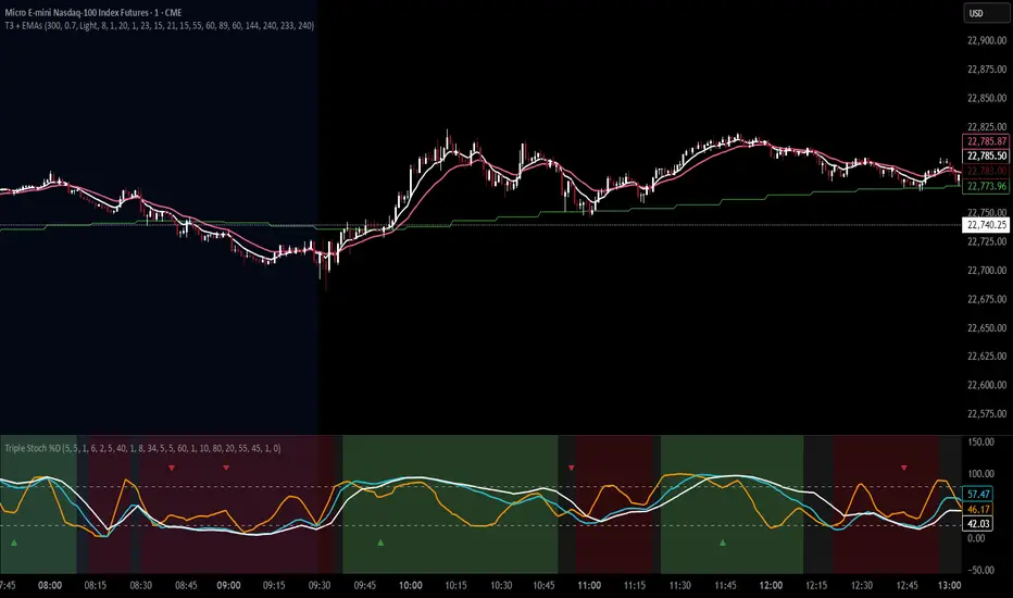
T3 Moving Average with Multiple EMAsT3 Moving Average with Multiple EMAs
Short Title: T3 + EMAs
Overview
The T3 Moving Average with Multiple EMAs is a versatile trend-following indicator that combines the smooth, adaptive T3 Moving Average with eight customizable multi-timeframe Exponential Moving Averages (EMAs). Designed for traders seeking clarity in trend direction and momentum, this indicator overlays on the price chart to highlight dynamic support/resistance levels and trend alignment across multiple timeframes.
Key Features
T3 Moving Average: A highly responsive, smoothed moving average (default: 9-period, 0.7 volume factor) that reduces lag while maintaining accuracy, ideal for identifying short-term trends and reversals.
Eight Multi-Timeframe EMAs: Plots eight EMAs (default lengths: 8, 13, 21, 34, 55, 89, 144, 233) sourced from user-defined timeframes (e.g., 1m, 5m, 15m, 1h, 4h), providing a comprehensive view of short-, medium-, and long-term trends.
Customizable Timeframes: Each EMA can be independently set to a specific timeframe, allowing traders to analyze cross-timeframe trend alignment.
Theme Support: Offers "Dark" and "Light" themes with optimized colors for visual clarity and chart compatibility.
Flexible Parameters: Adjust T3 length, volume factor, EMA lengths, and timeframes to suit various markets and trading styles (scalping, swing trading, or long-term investing).
How It Works
The T3 Moving Average is calculated using a multi-stage EMA formula weighted by a volume factor, offering smoother trend tracking than traditional EMAs. The eight EMAs, sourced from higher or lower timeframes using request.security, provide a layered perspective on price trends. Faster EMAs (e.g., 8, 13) react to short-term price movements, while slower EMAs (e.g., 144, 233) reflect longer-term trends. The indicator plots all lines on the price chart with distinct, theme-adjusted colors for easy identification.
Usage
Trend Identification: Use the T3 MA for short-term trend signals and the EMAs to confirm broader trend direction. A price above multiple EMAs suggests a bullish trend; below indicates bearish.
EMA Crossovers: Watch for crossovers between faster and slower EMAs (e.g., 8 crossing 21) for potential entry/exit signals.
Support/Resistance: Treat slower EMAs (e.g., 89, 144) as dynamic support/resistance levels, especially on higher timeframes.
Timeframe Alignment: Align trades with the trend direction of higher-timeframe EMAs for higher-probability setups.
Customization: Adjust T3 and EMA settings to match your trading style or asset volatility.
Settings
T3 Parameters:
Length (default: 9): Period for T3 calculation.
Volume Factor (default: 0.7): Controls T3 smoothness (0.1–1.0).
EMA Parameters:
Lengths (default: 8, 13, 21, 34, 55, 89, 144, 233): Period for each EMA.
Timeframes (default: 5m, 5m, 15m, 15m, 1h, 1h, 4h, 4h): Select from 1m, 5m, 15m, 30m, 1h, 4h, D, W, or M.
Theme: Choose "Dark" (vibrant colors) or "Light" (softer colors) for chart compatibility.
Notes
Combine with other tools (e.g., RSI, support/resistance, or volume) for confirmation.
Optimize settings for specific markets (e.g., crypto, forex, stocks) or timeframes.
The indicator is overlayed on the price chart for seamless integration with price action analysis.
Author’s Note
This indicator was designed to provide traders with a clear, multi-timeframe perspective on trends using the T3 MA and EMAs. Feedback is welcome to enhance this tool for the TradingView community!
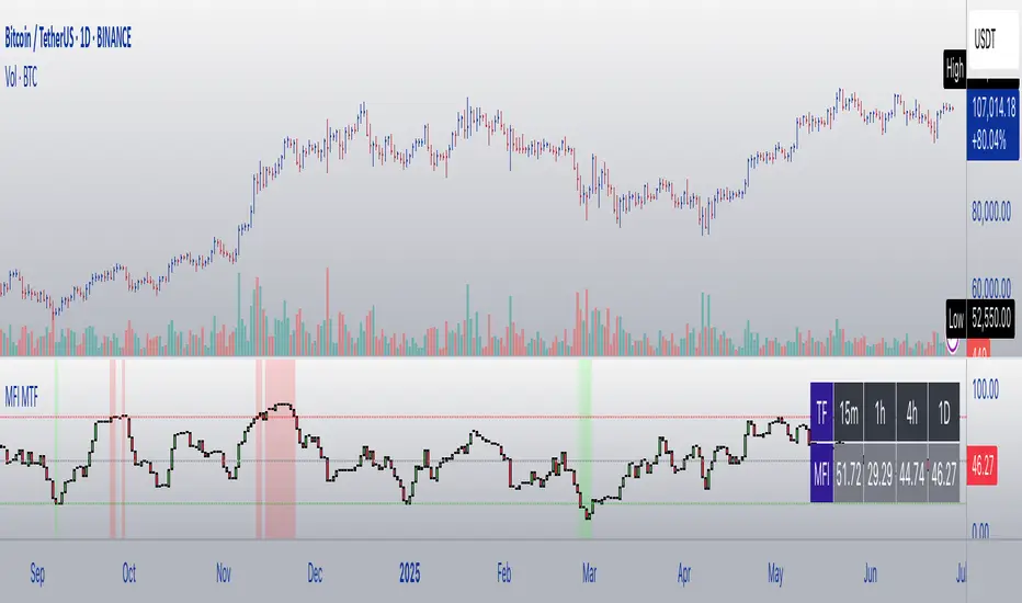
MFI Candles MTF TableMFI Candles + Multi-Timeframe Table | by julzALGO
This open-source script visualizes the Money Flow Index (MFI) in a new format — as candles instead of a traditional oscillator line. It provides a clean, volume-driven view of momentum and pressure, ideal for traders seeking more actionable and visual cues than a typical MFI plot.
What Makes It Unique:
• Plots "MFI Candles" — synthetic candles based on smoothed MFI values using a selected timeframe (default: 1D), giving a new way to read volume flow.
• Candles reflect momentum: green if MFI rises, red if it falls.
• Background turns red when MFI is overbought (≥ 80) or green when oversold (≤ 20).
Multi-Timeframe Strength Table:
• Displays MFI values from 15m, 1h, 4h, and 1D timeframes — all in one dashboard.
• Color-coded for quick recognition: 🔴 Overbought, 🟢 Oversold.
• Values are smoothed with linear regression for better clarity.
Custom Settings:
• MFI calculation length
• Smoothing factor
• Candle source timeframe
• Toggle table and OB/OS background
How to Use:
- Use MFI Candles to monitor momentum shifts based on money flow.
- Use the Multi-Timeframe Table to identify when multiple timeframes align — helpful for timing entries and exits.
- Watch the background for extreme conditions (OB/OS) that may signal upcoming reversals or pressure exhaustion.
Happy Trading!
ROGUE ICT PRORogue ICT PRO — Smart Money Confluence Tool
The Rogue ICT Buy/Sell indicator is a precision-built, multi-confirmation tool inspired by Inner Circle Trader (ICT) concepts. It identifies high-probability trade setups using market structure, fair value gaps, killzone sessions, and higher timeframe trend alignment.
✅ Core Features
🔹 Market Structure Shift (MSS)
Detects clean breaks of swing highs or lows, indicating potential trend continuation or reversal.
🔹 Fair Value Gap Detection (FVG)
Automatically highlights institutional imbalances — essential ICT confluence zones.
🔹 Smart Killzone Filtering
Signals only trigger during high-liquidity sessions:
Asian (19:00–22:00)
London (02:00–05:00)
New York (07:00–10:00)
Each session is color-highlighted on the chart.
🔹 HTF EMA Bias Filter
Only trades in the direction of the Higher Timeframe 50 EMA (e.g., 1H on 5M chart). This ensures entries align with institutional directional bias. I have default set to the Daily 9 EMA but can be changed to your preference.
🔹 ATR-Based Stop Loss & Take Profit Lines
SL is calculated using ATR × multiplier
TP is placed using a customizable Risk-Reward Ratio
Both levels are plotted on the chart with "SL" and "TP" labels.
🔹 Cooldown Logic
Prevents overtrading by requiring a minimum number of bars between each signal.

FutureObitz Bank LevelsFutureObitz Bank Levels - Daily Structure & Trading Zones
"The Obitz Bank Levels indicator is a powerful tool designed to help traders identify key daily structural price levels. It automatically extracts the 1 hour and 4 hour High and 1 hour and 4 hour Low. You may also use this indicator for lower timeframes aswell. Going lower than 15 min is not recommended.
What This Indicator Provides:
Dynamic Daily Levels: Calculates and plots the Daily High, Daily Low, Middle, Middle High, and Middle Low of the current trading day. These lines provide clear reference points for price action.
Defined Buy & Sell Zones: Visualizes potential accumulation (Buy Zone) and distribution (Sell Zone) areas. These zones are calculated as a customizable percentage (via inputs) above/below the 'Middle' of the daily range, helping to identify potential entry or exit points.
Multi-Timeframe Compatibility: Displays the exact same daily levels regardless of your active chart's timeframe, offering a consistent higher-timeframe perspective for intraday traders.
Visual Clarity: Includes filled zones for better visualization of the Buy and Sell areas.
Optional Labels: Provides clear labels for the latest daily levels (D. High, D. Low, D. Middle, D. Buy Zone, D. Sell Zone) on the last bar of your chart for quick reference.
This indicator serves as a robust framework for understanding daily market structure and can assist in identifying potential areas of support, resistance, and trading opportunities. It's an excellent tool for traders who rely on clear, higher-timeframe levels to inform their trading decisions.
-FutureObitz

Dual RSI IndicatorThis RSI indicator allows you to view an additional timeframe to help you spot better entries. For example when RSI is overbought/oversold on two timeframes may help give you additional confidence in placing the trade.
