Multi-Timeframe Close Alert with Toggleyou can create alerts with this indicator for when a time frame closes
Multitimeframe

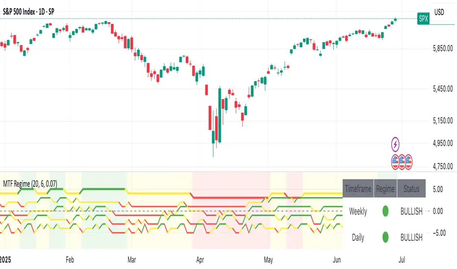
Multi-Timeframe Market Regime (Ehlers)This Pine Script indicator provides an Ehlers-inspired multi-timeframe market regime analysis directly on your TradingView chart. It aims to identify whether the market is currently "Trending Up" (green), "Trending Down" (red), or "Ranging" (yellow) across Weekly, Daily, 4-Hour, and 1-Hour timeframes.
It uses custom implementations of:
Ehlers' Fisher Transform to highlight market extremes and potential turning points.
An Adaptive Moving Average (inspired by MAMA/FAMA) that adjusts its speed based on volatility to reduce lag in trends and provide stability in ranges.
The indicator displays a dashboard as a label on your chart, showing the detected regime for each of these timeframes, and optionally colors the background of your current chart timeframe to reflect its dominant regime.
EMA Crossover + RSI Confirmation (Buy/Sell)Updated version for EMA crossover stategy with RSI confirmation

SMA Background & Table Indicator# SMA Background & Table Indicator - User Guide
## What is this Indicator?
The **SMA Background & Table Indicator** is a powerful TradingView Pine Script tool that provides instant visual feedback about a stock's position relative to key Simple Moving Averages (SMAs). Instead of cluttering your chart with multiple SMA lines, this indicator uses background colors and a clean table to show you everything you need to know at a glance. You can also set custom time frame for SMA (i.e. Daily chart for SMA calculation) while watching price action in 15 min chart. You will quickly know if SMA200 losses its level on a daily without you having a need to switch back and worth between time frames. A very cool feature.
## Key Features
### 🎨 Smart Background Colors
- **Green Background**: Price is above SMA200 - Bullish trend
- **Red Background**: Price is below SMA200 - Bearish trend
- **Orange Background**: Price is near SMA200 - Caution zone (within 1% threshold)
### 📊 Clean SMA Status Table
Located in the bottom-right corner, showing:
- **SMA5, SMA20, SMA50, SMA100, SMA200** values
- **Color-coded dots** for each SMA:
- 🟢 **Green**: Price is above this SMA (bullish)
- 🟠 **Orange**: Price is close to this SMA (within 0.5%)
- 🔴 **Red**: Price is below this SMA (bearish)
### ⏰ Flexible Timeframe Options
- **Chart Timeframe**: Calculate SMAs from your current chart timeframe
- **Custom Timeframe**: Choose any timeframe (1m, 5m, 1H, 1D, 1W, etc.) for SMA calculations
### 🎨 Full Customization
- **Table Text Size**: Tiny, Small, Normal, Large, or Huge
- **Table Background Color**: Any color you prefer
- **Table Font Color**: Customize text color to match your theme
- **Background Transparency**: Adjust from 0% (opaque) to 100% (transparent)
## How to Use
### Basic Usage
1. **Add the indicator** to any stock chart
2. **Watch the background color** for overall trend direction:
- Green = Bullish (above SMA200)
- Red = Bearish (below SMA200)
- Orange = Neutral/Transition zone
3. **Check the table** for detailed SMA analysis
### Advanced Usage
#### Timeframe Selection
1. Click on the indicator name in the chart
2. Click the **settings gear icon**
3. Enable **"Use Custom Timeframe for SMAs"**
4. Select your preferred **"Custom Timeframe"**
**Example**: You're trading on a 15-minute chart but want to see daily SMA levels:
- Set Custom Timeframe to "1D"
- Now you'll see how the current price relates to daily SMAs while still viewing 15-minute price action
#### Customizing Appearance
In the indicator settings:
- **Table Text Size**: Choose readability preference
- **Table Background Color**: Match your chart theme
- **Table Font Color**: Ensure good contrast
- **Background Transparency**: Balance visibility with chart clarity
## Trading Applications
### Trend Identification
- **Green background** = Look for long opportunities
- **Red background** = Look for short opportunities
- **Orange background** = Wait for clearer direction
### Support/Resistance Levels
- **Green dots** in table = SMAs acting as support
- **Red dots** in table = SMAs acting as resistance
- **Orange dots** = Key levels to watch for breakouts
### Multi-Timeframe Analysis
- Set custom timeframe to higher timeframe (e.g., daily)
- Trade on lower timeframe with higher timeframe SMA context
- Example: Day trading with daily SMA guidance
## Pro Tips
1. **Clean Charts**: This indicator eliminates the need for multiple SMA lines, keeping your chart clean while providing all essential information
2. **Quick Assessment**: One glance tells you the overall trend (background) and detailed SMA relationships (table)
3. **Multi-Timeframe Strategy**: Use daily SMAs on intraday charts for better trend context
4. **Customization**: Adjust colors and transparency to match your trading platform's theme for optimal visibility
5. **Threshold Understanding**:
- Background changes use 1% threshold (reduces noise)
- Table dots use 0.5% threshold (more sensitive)
This indicator transforms complex SMA analysis into simple, actionable visual information - perfect for both beginner and advanced traders!

📊 RSI Multi-Timeframe Dashboard by giua64)### Summary
This is an advanced dashboard that provides a comprehensive overview of market strength and momentum, based on the Relative Strength Index (RSI) analyzed across 6 different timeframes simultaneously (from 5 minutes to the daily chart).
The purpose of this script is to offer traders an immediate and easy-to-read summary of market conditions, helping to identify the prevailing trend direction, overbought/oversold levels, and potential reversals through divergence detection. All of this is available in a single panel, eliminating the need to switch timeframes on your main chart.
### Key Features
* **Multi-Timeframe Analysis:** Simultaneously monitors the 5m, 15m, 30m, 1H, 4H, and Daily timeframes.
* **Scoring System:** Each timeframe is assigned a score based on multiple RSI conditions (e.g., above/below 50, overbought/oversold status, direction) to quantify bullish or bearish strength.
* **Aggregated Signal:** The dashboard calculates a total percentage score and provides a clear summary signal: **LONG**, **SHORT**, or **WAIT**.
* **Divergence Detection:** Automatically identifies Bullish and Bearish divergences between price and RSI for each timeframe.
* **Non-Repainting Option:** In the settings, you can choose to base calculations on the close of the previous candle (`Use RSI on Closed Candle`). This ensures that past signals (like status and score) do not change, providing more reliable data for analysis.
* **Fully Customizable:** Users can modify the RSI period, overbought/oversold thresholds, divergence detection settings, and the appearance of the table.
### How to Read the Dashboard
The table consists of 6 columns, each providing specific information:
* **% (Total Score):**
* **Header:** Shows the overall strength as a percentage. A positive value indicates bullish momentum, while a negative value indicates bearish momentum. The background color changes based on intensity.
* **Rows:** Displays the numerical score for the individual timeframe.
* **RSI:**
* **Header:** The background color indicates the average of all RSI values. Green if the average is > 50, Red if < 50.
* **Rows:** Shows the real-time RSI value for that timeframe.
* **Signal (Status):**
* **Header:** This is the final operational signal. It turns **🟢 LONG** when bullish strength is high, **🔴 SHORT** when bearish strength is high, and **⚪ WAIT** in neutral conditions.
* **Rows:** Describes the RSI status for that timeframe (e.g., Bullish, Bearish, Overbought, Oversold).
* **Dir (Direction):**
* **Header:** Displays an arrow representing the majority direction across all timeframes.
* **Rows:** Shows the instantaneous direction of the RSI (↗️ for rising, ↘️ for falling).
* **Diverg (Divergence):**
* Indicates if a bullish (`🟢 Bull`) or bearish (`🔴 Bear`) divergence has been detected on that timeframe.
* **TF (Timeframe):**
* Indicates the reference timeframe for that row.
### Advantages and Practical Use
This tool was created to solve a common problem: the need to analyze multiple charts to understand the bigger picture. With this dashboard, you can:
1. **Confirm a Trend:** A predominance of green and a "LONG" signal provides strong confirmation of bullish sentiment.
2. **Identify Weakness:** Red signals on higher timeframes can warn of an impending loss of momentum.
3. **Spot Turning Points:** A divergence on a major timeframe can signal an excellent reversal opportunity.
### Originality and Acknowledgements
This script is an original work, written from scratch by giua64. The idea was to create a comprehensive and visually intuitive tool for RSI analysis.
Any feedback, comments, or suggestions to improve the script are welcome!
**Disclaimer:** This is a technical analysis tool and should not be considered financial advice. Always do your own research and backtest any tool before using it in a live trading environment.

cd_secret_candlestick_patterns_CxHi traders,
With this indicator, we aim to uncover secret candlestick formations that even advanced traders may miss—especially those that can't be detected by classic pattern indicators, unless you're a true master of candlestick patterns or candle math.
________________________________________
General Idea:
We'll try to identify candlestick patterns by regrouping candles into custom-sized segments that you define.
You might ask: “Why do I need this? I can just look at different timeframes and spot the structure anyway.” But it’s not the same.
For example, if you're using a 1-minute chart and add a higher-timeframe candle overlay (like 5-minute), the candles you see start at fixed timestamps like 0, 5, 10, etc.
However, in this indicator, we redraw new candles by grouping them from the current candle backward in batches of five.
These candles won't match the standard view—only when aligned with exact time multiples (e.g., 0 and 5 minutes) will they look the same.
In classic charts:
• You see 5-minute candles that begin every 0 and 5 minutes.
In this tool:
• You see a continuously updating set of 5 merged 1-minute candles redrawn every minute.
What about the structures forming in between those fixed timeframes?
That’s exactly what we’ll be able to detect—while also making the lower timeframe chart more readable.
________________________________________
Candle Merging:
Let’s continue with an example.
Assume we choose to merge 5 candles. Then the new candle will be formed using:
open = open
close = close
high = math.max(high , high , high , high , high)
low = math.min(low , low , low , low , low)
This logic continues backward on the chart, creating merged candles in groups of 5.
Since the selected patterns are made up of 3, 4, or 5 candles, we redraw 5 such merged candles to analyze.
________________________________________
Which Patterns Are Included?
A total of 18 bullish and bearish patterns are included.
You’ll find both widely known formations and a few personal ones I use, marked as (MeReT).
You can find the pattern list and visual reference here:
________________________________________
Entry and Filtering Suggestions:
Let me say this clearly:
Entering a trade every time a pattern forms will not make you profitable in the long run.
You need a clear trade plan and should only act when you can answer questions like:
• Where did the pattern appear?
• When and under what conditions?
It’s more effective to trade in the direction of the trend and look for setups around support/resistance, supply/demand zones, key levels, or areas confirmed by other indicators.
Whether you enter immediately after the pattern or wait for a retest is a personal choice—but risk management is non-negotiable.
One of the optional filters I’ve included is a Higher Timeframe (HTF) condition, which is my personal preference:
When enabled, the highest or lowest price among the pattern candles must match the high or low of the current HTF candle.
You can see in the image below the decrease in the number of detected patterns on the 1-minute chart when using no filter (blue labels) compared to when the 1-hour timeframe filter is applied (red labels).
Additionally, I’ve added a “protected” condition for engulfing patterns to help filter out weak classic engulf patterns.
________________________________________
Settings:
From the menu, you can configure:
• Number of candles for regrouping
• Distance between the last candle and newly drawn candles
• Show/hide options
• HTF filter toggle and timeframe selection
• Color, label placement, and text customization
• Pattern list (select which to display or trigger alerts for)
My preferred setup:
While trading on the 1-minute chart, I typically set the higher timeframe to 15m or 1H, and switch the candle count between 2 and 3 depending on the situation.
⚠️ Important note:
The “Show” and “Alert” options are controlled by a single command.
Alerts are automatically created for any pattern you choose to display.
________________________________________
What’s Next?
In future updates, I plan to add:
• Pattern success rate statistics
• Multi-broker confirmation for pattern validation
Lastly, keep in mind:
The more candles a pattern is based on, the more reliable it may be.
I'd love to hear your feedback and suggestions.
Cheerful trading! 🕊️📈

Fibo_Ma with Toggleable 200 EMA Filter Fibo_MA with Toggleable 200 EMA Filter
Description:
This multi-functional indicator blends Fibonacci-based moving averages with customizable filters and visual enhancements to support various trading strategies. It offers traders the flexibility to analyze trend dynamics and potential reversal zones using multiple tools in one script.
Key Features:
🔹 Fibonacci MA Framework
Leverage a range of Fibonacci numbers (from 1 to 233) to visualize trend-based EMA lines with optional smoothing. Users can choose the moving average method (SMA, EMA, RMA, WMA, VWMA, etc.) and adjust the smoothing length for fine-tuned analysis.
🔹 VWAP and Dynamic EMA Tools
Includes VWAP and a color-coded 200 EMA that updates based on trend slope. These help visualize key dynamic support and resistance levels.
🔹 Multi-Timeframe Support
Option to switch the data source to a higher timeframe for broader trend confirmation.
🔹 Signal Highlights
Bullish and bearish signal markers based on crossovers with optional filters.
Background highlights show whether the current price is above or below a smoothed EMA line.
🔹 Customizable Filters
Enable or disable filters like:
200 EMA Position Filter (only signal when price is above or below the 200 EMA)
ATR Filter (filter out low-volatility candles)
Volume Filter (signal only on sufficient volume)
🔹 Cross Alerts & Labels
Built-in alert conditions for crossovers and customizable signal display options—labels, shapes, and background highlights.
🔹 Advanced Options
Toggle forecast line visibility and offset
Fine-tune alerts using price action relative to the smooth trend line
Optional tail and cross label display for deeper chart customization
How to Use:
This tool can support trend-following, breakout, and pullback strategies. Customize the MA types, filters, and timeframe settings to match your trading style. The script is designed for visual clarity while offering rich configurability for discretionary and system-based traders.

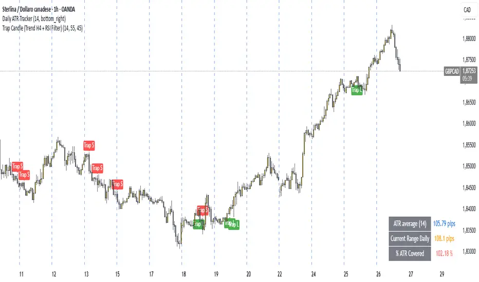
Trap Candle (Trend H4 + RSI Filter)🔍 Trap Candle (Trend H4 + RSI Filter)
Description:
The Trap Candle indicator is designed to identify a specific and powerful two-candle price action pattern that often signals a false breakout followed by a strong reversal. It combines pure price action with two objective filters to increase signal quality and trend alignment.
📊 Pattern Logic:
Bullish Trap: The current candle breaks the previous candle’s low, but closes above its high (and is bullish).
Bearish Trap: The current candle breaks the previous candle’s high, but closes below its low (and is bearish).
This pattern often reveals institutional traps or stop hunts before directional movement.
🧠 Trend Filter (H4):
Ensures long signals occur only when the H4 close is higher than the previous H4 close (uptrend).
Ensures short signals occur only in a H4 downtrend.
Designed to align intraday entries (M15, H1) with higher timeframe momentum.
💪 RSI Confirmation:
Includes a configurable RSI filter on the current timeframe.
Only long signals are shown when RSI is above a user-defined threshold (e.g. 55).
Only short signals are shown when RSI is below a user-defined threshold (e.g. 45).
⚙️ Key Features:
Full customization of RSI period and thresholds.
Clean, visual signal plotting on the chart (with “Trap L” or “Trap S” labels).
Built-in alerts for both long and short trap candle setups.
Perfect for traders who want to trade smart reversals with trend and momentum confirmation.
✅ Recommended Timeframes:
M15 and H1 (entry)
Uses H4 for trend bias
If you’re looking to filter out noise and spot only the highest quality reversal setups, the Trap Candle (Trend H4 + RSI Filter) is a solid tool for any price action-based strategy.
多時間框架MACD背離指標test test test test test test test test test test test test test test test test test test test

VT_RJ01_ALLTFIt's the rejection candle analysis
and using EMA to integrate and catogorize strong level of rejection

LTF Volume markerLTF Volume Marker
Overview:
The LTF Volume Marker highlights candles that contain volume spikes on a lower timeframe (LTF), even while you are viewing a higher timeframe chart. It is designed to help identify hidden volume activity that may not be visible when aggregating candles.
This indicator is conceptually similar to a volume profile — but instead of showing distribution across price levels, it visualizes volume clusters within the structure of a sloped trend or time-based aggregation.
Key Features:
✅ Automatically detects high-volume candles on a user-defined lower timeframe
✅ Marks the price level of volume spikes using weighted average price (VWAP) within higher timeframe bars
✅ Supports both manual threshold and auto mode (which highlights top X% of volume candles in a selected range)
✅ Fully adjustable timeframe and date range
✅ Displays either a point or an area at the spike location or together
How It Works:
You define a Lower Timeframe (e.g. 1-minute) and optionally a threshold or use the auto mode to dynamically calculate it from past data.
On higher timeframes (e.g. 5-min, 15-min), the indicator looks inside each bar, finds all volume spikes, and plots the volume-weighted average price of those spikes.
If you are on the same timeframe as the LTF, it simply highlights candles with volume exceeding the threshold.
Use Cases:
Spotting hidden volume clusters inside trending moves
Validating support/resistance levels with underlying volume
Filtering false breakouts using intra-bar volume
Enhancing scalping and intraday setups by visualizing internal structure
Notes:
The indicator ignores future-looking data (lookahead=off) and only processes completed bars.
If the chart’s timeframe is lower than the selected LTF, the indicator will automatically disable itself.
Works best with aggregated symbols, such as futures or cryptocurrencies with high resolution data.

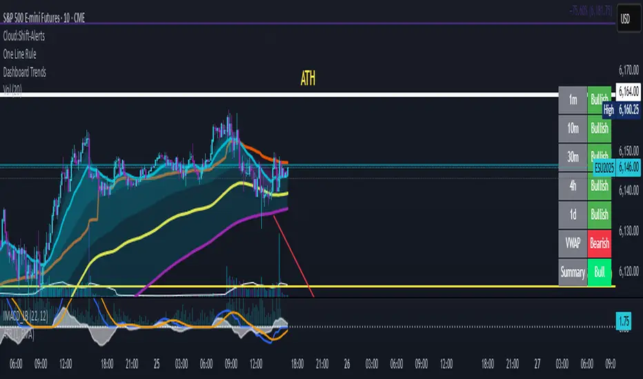
Dashboard Trends📊 Dashboard Trends (Neutral Bias + VWAP Zones)
This indicator displays a real-time trend dashboard across multiple timeframes, enhanced with neutral bias detection and a dynamically visualized VWAP strength zone.
🔍 Core Features
✅ Multi-Timeframe Trend Analysis
Tracks EMA(22) vs EMA(200) on:
1m, 10m, 30m, 4h, and 1D
Includes Neutral Bias Detection:
Uses customizable or ATR-based threshold
Classifies each timeframe as Bullish, Bearish, or Neutral
Neutral conditions are displayed in gray
✅ Anchored VWAP Trend Logic
Daily VWAP line with real-time updates
+1σ and -1σ bands define the price zone
VWAP section evaluates:
Bullish if price is in top 50% above VWAP
Bearish if price is in bottom 50% below VWAP
Neutral if price is within the central 50% zone
VWAP bias shown with color-coded cell and text
✅ Visual Dashboard Table
Clean display in the bottom-right of the chart
Timeframes labeled with Bullish, Bearish, or Neutral
Color-coded per status (green/red/gray)
⚙️ Customization Options
Toggle between fixed or dynamic neutral thresholds
Adjust VWAP standard deviation band size
Control visibility of VWAP line and bands
Fully configurable colors for each condition
This tool is ideal for traders who want a visual trend framework across timeframes, with intelligent bias filtering to avoid false signals during consolidation or indecision. It balances momentum insight with market neutrality awareness, making it powerful for scalpers, swing traders, and intraday setups alike.

Dashboard Trends📊 Dashboard Trends + Anchored Daily VWAP
This indicator provides a real-time multi-timeframe trend dashboard alongside a daily anchored VWAP system, helping you assess both macro and intraday market sentiment at a glance.
🔍 Key Features
✅ Multi-Timeframe Trend Analysis
Tracks whether EMA(22) is above EMA(200) across:
1m, 10m, 30m, 4h, 1D timeframes
Color-coded "Bullish"/"Bearish" status for each
Aggregated trend summary using 6 signals (including VWAP)
✅ Anchored Daily VWAP
Uses ta.vwap to provide a session-resetting daily VWAP
VWAP resets at the beginning of each trading day
Live update throughout the day
Supports pre-market and after-hours if chart includes ETH
✅ VWAP Bands (±1σ to ±3σ)
Optional bands show price deviation from VWAP
Fully customizable:
Enable/disable each band
Set deviation multiplier
Adjust color and visibility
✅ Visual Dashboard
Table display in the bottom-right corner
Shows trend status per timeframe + VWAP + Summary
Easy-to-read green/yellow/red color codes
⚙️ Customization
Toggle VWAP line on/off
Enable or disable any band level
Adjust standard deviation multiplier
Choose your VWAP and band colors
🧠 Summary Logic
Strong Bull: 6 bullish signals
Bull: 5 signals
Mixed: 3–4 signals
Bear: 2 signals
Strong Bear: 0–1 signals
This tool is perfect for traders looking to combine trend-following and intraday mean-reversion awareness, with all the critical data visualized in one compact dashboard.
OG TTM Histogram Elite © 2025🔥 Created by OG WEALTH, this elite-level TTM Squeeze Histogram is built for precision sniper entries and exits.
Master squeeze cycles like never before:
🟢 Green Dots = Squeeze Released (Entry Setup Forming)
⚫ Black Dots = Squeeze Building (High Potential Coiling)
🟥 / 🟠 Histogram = Momentum Losing Strength
🔺 / 🔻 Entry Arrows = Confirmed Reversal or Trend Initiation
🚀 Features:
✅ Advanced MTF Confirmation from higher timeframes
🔔 Built-in Alerts: Squeeze ON, Release, Bull/Bear Entry
🎯 Auto-labeled Squeeze Status Tag (Top-Right Corner)
🧠 Refined Momentum Color Logic to avoid false signals
🎛️ Clean UI for scalpers, intraday traders, and swing specialists

21 & 200 EMA with Star at Crossovers21-day EMA: Plotted in green
200-day EMA: Plotted in red
Crossover Markers:
A yellow star (★) appears on the chart at the 21 EMA price level when:
21 EMA crosses above the 200 EMA (bullish crossover)
21 EMA crosses below the 200 EMA (bearish crossover)
Stars have a black background to ensure high visibility


multi_tf_trendHere is a powerful trend indicator that uses data from 3 different time frames to analyze trend direction and direction switches. You can change the timeframes with the drop down menu. The index adds up all the bull signals and subtracts bear signals. The index can help gauge a trend's longevity and strength. For example, Index of +2 is strongly bullish while an Index of -2 is strongly bearish.

🕵️ Spy StepRange Hybrid v2.0NOW THATS I WANT! OH yaaaaaaaaaaaaaa aaaaaaaaaaaaaaaaaaaaaaaaaaaaaaa aaaaaaaaaaaaaaaaaaaaaaaaa

Liquidity Zones (JTS)Title: Liquidity Zones (JTS)
Description:
This script marks out key liquidity zones using pivot highs and lows. It includes:
Buy-Side Liquidity (Highs): Shown in red lines
Sell-Side Liquidity (Lows): Shown in green lines
Sweep Protection: Zones will only be removed after a defined number of bars AND a true sweep beyond the level
Toggle Controls: Enable/disable highs or lows individually
Adjustable Settings: Pivot length, sweep delay, max lines, and colors
Perfect for traders looking to track untapped or recently swept liquidity.
Created by JTS
For educational and strategic use

Multiple Custom Sessions - Highs/LowsMultiple Custom Sessions - Highs/Lows
This indicator allows you to track and visualize the high and low price ranges for up to 4 customizable sessions on your chart.
🔹 Set your own session times and UTC offsets
🔹 Customize colors for high/low lines and the session’s background box
🔹 Toggle each session’s visibility independently
🔹 Automatically updates highs and lows as the session progresses
🔹 Alerts for when each session starts and ends
Ideal for opening range breakout strategies, session-based scalping, or tracking key market windows like London, New York, Asia sessions.
💡 Fully adjustable for any asset or timeframe.
Credit to the original work by Zeiierman — upgraded to handle multiple concurrent sessions in one clean script.
Enjoy and trade smart!

Sell to Buy / Buy to SellSell to Buy / Buy to Sell — Momentum Shift Detector
The Sell to Buy / Buy to Sell indicator detects simple but powerful two-bar momentum shift patterns directly on your chart, offering early insights into potential reversals or strong breakout continuation.
🔎 How it works:
Sell to Buy (StB):
Previous candle (bar -1) is bearish
Current candle (bar 0) is bullish
The bullish candle closes above the high of the previous bearish candle
Confirmed only after bar close
Buy to Sell (BtS):
Previous candle (bar -1) is bullish
Current candle (bar 0) is bearish
The bearish candle closes below the low of the previous bullish candle
Confirmed only after bar close
🎯 Key Features:
✅ Pure price action logic — no indicators, no oscillators
✅ Immediate visual markers:
Green "StB" label for bullish momentum shifts
Red "BtS" label for bearish momentum shifts
✅ Full alert system to notify you in real-time when either pattern occurs
⚙ Who is this for?
Scalpers looking for short-term momentum shifts
Swing traders identifying potential reversals or breakout confirmations
Price action traders who want clean and objective setup detection
The Sell to Buy / Buy to Sell indicator is designed to give you clear and simple signals whenever the market shows decisive strength after a short-term opposite move — potentially marking the start of a new impulse.

LilSpecCodes1. Killzone Background Highlighting:
It highlights 4 key market sessions:
Killzone Time (EST) Color
Silver Bullet 9:30 AM – 12:00 PM Light Blue
London Killzone 2:00 AM – 5:00 AM Light Green
NY PM Killzone 1:30 PM – 4:00 PM Light Purple
Asia Open 7:00 PM – 11:00 PM Light Red
These are meant to help you focus during high-probability trading times.
__________________________________________________
2. Previous Day High/Low (PDH/PDL):
Plots green line = PDH
Plots red line = PDL
Tracks the current day’s session high/low and sets it as PDH/PDL on a new trading day
CHANGES WITH ETH/RTH
3. Inside Bar Marker:
Plots a small black triangle under bars where the high is lower than the previous bar’s high and the low is higher than the previous bar’s low (inside bars)
Useful for spotting potential breakout or continuation setups
4. Vertical Time Markers (White Dashed Lines)
Time (EST) Label
4:00 AM End of London Silver Bullet
9:30 AM NYSE Open
10:00 AM Start of NY Silver Bullet
11:00 AM End of NY Silver Bullet
11:30 AM (Customizable Input)
3:00 PM PM Killzone Ends
3:15 PM Futures Market Close
7:15 PM Asia Session Watch
