Step Channel Momentum Trend [ChartPrime]OVERVIEW
Step Channel Momentum Trend is a momentum-based price filtering system that adapts to market structure using pivot levels and ATR volatility. It builds a dynamic channel around a stepwise midline derived from swing highs and lows. The system colors price candles based on whether price remains inside this channel (low momentum) or breaks out (strong directional flow). This allows traders to clearly distinguish ranging conditions from trending ones and take action accordingly.
⯁ STRUCTURAL MIDLNE (STEP CHANNEL CORE)
The midline acts as the backbone of the trend system and is based on structure rather than smoothing.
Calculated as the average of the most recent confirmed Pivot High and Pivot Low.
The result is a step-like horizontal line that only updates when new pivot points are confirmed.
This design avoids lag and makes the line "snap" to recent structural shifts.
It reflects the equilibrium level between recent bullish and bearish control.
snapshot
This unique step logic creates clear regime shifts and prevents noise from distorting trend interpretation.
⯁ DYNAMIC VOLATILITY BANDS (ATR FILTERING)
To detect momentum strength, the script constructs upper and lower bands using the ATR (Average True Range):
The distance from the midline is determined by ATR × multiplier (default: 200-period ATR × 0.6).
These bands adjust dynamically to volatility, expanding in high-ATR environments and contracting in calm markets.
The area between upper and lower bands represents a neutral or ranging market state.
Breakouts outside the bands are treated as significant momentum shifts.
snapshot
This filtering approach ensures that only meaningful breakouts are visually emphasized — not every candle fluctuation.
⯁ MOMENTUM-BASED CANDLE COLORING
The system visually transforms price candles into momentum indicators:
When price (hl2) is above the upper band, candles are green → bullish momentum.
snapshot
When price is below the lower band, candles are red → bearish momentum.
snapshot
When price is between the bands, candles are orange → low or no momentum (range).
snapshot
The candle body, wick, and border are all colored uniformly for visual clarity.
This gives traders instant feedback on when momentum is expanding or fading — ideal for breakout, pullback, or trend-following strategies.
⯁ PIVOT-BASED SWING ANCHORS
Each confirmed pivot is plotted as a label ⬥ directly on the chart:
snapshot
They also serve as potential manual entry zones, SL/TP anchors, or confirmation points.
⯁ MOMENTUM STATE LABEL
To reinforce the current market mode, a live label is displayed at the most recent candle:
Displays either:
“Momentum Up” when price breaks above the upper band.
snapshot
“Momentum Down” when price breaks below the lower band.
snapshot
“Range” when price remains between the bands.
snapshot
Label color matches the candle color for quick identification.
Automatically updates on each bar close.
This helps discretionary traders filter trades based on market phase.
USAGE
Use the green/red zones to enter with momentum and ride trending moves.
Use the orange zone to stay out or fade ranges.
The step midline can act as a breakout base, pullback anchor, or bias reference.
Combine with other indicators (e.g., order blocks, divergences, or volume) to build high-confluence systems.
CONCLUSION
Step Channel Momentum Trend gives traders a clean, adaptive framework for identifying trend direction, volatility-based breakouts, and ranging environments — all from structural logic and ATR responsiveness. Its stepwise midline provides clarity, while its dynamic color-coded candles make momentum shifts impossible to miss. Whether you’re scalping intraday momentum or managing swing entries, this tool helps you trade with the market’s rhythm — not against it.
Volume

HalfTrend with Cross SignalsKey Features:
HalfTrend Calculation:
Uses amplitude value (default 100)
Calculates based on highest/lowest prices and smoothed moving averages
Includes volatility adjustment using ATR
Signal Detection:
Buy signals when price closes ABOVE HalfTrend line
Sell signals when price closes BELOW HalfTrend line
Uses actual candle close prices for reliable signals
Visual Elements:
Plots HalfTrend line in blue
Shows green "BUY" labels below bars
Shows red "SELL" labels above bars
Alerts created for both signal types
Input Customization:
Adjustable amplitude parameter
Min value constrained to 1
Usage:
Apply to any chart
Signals appear at the close of the candle that crosses the HalfTrend line
Alerts can be set for automated notifications

2 Day VWAP by ZippyThis script calculates a live, intraday-updating 2-Day Volume Weighted Average Price (VWAP).
It aggregates price × volume and volume from both the current and previous trading sessions,
providing a more stable and institutionally relevant VWAP benchmark. Optional standard deviation bands are included for visual context.

HedgeFi - 30 Min OpenTest script for Miyagi
Script maps the first 30minute candle high and low for London and NY sessions.
When price cleanly closes above the high or below the low, within the first 90 minutes of the session, a signal is generated.
Aligned to NY timezone.

Haruto Developing VWAP & Value AreaDescription:
This indicator provides a comprehensive look at market dynamics by calculating a developing Volume-Weighted Average Price (VWAP) and its corresponding standard deviation bands. Unlike a fixed VWAP that only appears at the end of a period, this "developing" version updates on each bar, offering real-time insight into the current session's average traded price.
This tool is designed for traders who use intraday data to analyze market sentiment and identify key levels of support and resistance as they form. The standard deviation bands create a "value area," helping you to quickly visualize where the majority of trading volume is concentrated relative to the weighted average price.
Key Features:
Developing VWAP: The core VWAP line is calculated cumulatively and updates with each new bar throughout the session.
Customizable Timeframe: Choose the session period that fits your trading style, including Daily, Weekly, Monthly, Quarterly, or Yearly VWAP.
Standard Deviation Bands: Automatically plots standard deviation bands above and below the VWAP, forming a dynamic "value area." You can customize the multiplier for these bands.
Previous Period Levels: For crucial context, the indicator can display the final VWAP and value area levels from the previous period. These historical levels often act as significant support or resistance in the current session.
Clean & Clear Visualization: Uses clean lines and subtle fills to make the current and previous period levels easy to distinguish without cluttering your chart.
How to Use:
Identify the Trend: Observe whether the price is trading above or below the developing VWAP to gauge the intraday trend bias (bullish or bearish).
Spot Value: The area between the standard deviation bands represents the session's "value area." Prices inside this zone are considered to be at a "fair" value, while prices outside may indicate overbought or oversold conditions.
Find Key Levels: Use the previous period's VWAP and band edges as potential targets or areas of support and resistance. A rejection from or acceptance around these levels can provide powerful trading signals.
This indicator is a powerful tool for volume and price analysis, helping traders stay aligned with the market's flow throughout any given session.

Rpaid Killzone Breakout v3.6Final Indicator Title: Rapid Killzone Break & HTF Levels
Overview
Welcome to the Rapid Killzone Break & HTF Levels, an all-in-one trading toolkit designed for precision and context. This indicator was built to solve a common problem for day traders: how to combine a precise, lower-timeframe (LTF) entry model with the essential context of higher-timeframe (HTF) levels.
This tool is founded on a session-based breakout strategy, leveraging the volatility and liquidity generated during specific market hours (the "Killzones"). It then layers critical HTF support and resistance levels onto your chart, allowing you to make more informed trading decisions without ever needing to switch timeframes.
Whether you trade Forex, Gold, or major Indices, this indicator provides a comprehensive framework for identifying high-probability breakout opportunities.
The Core Strategy
The methodology is a powerful three-step process based on session liquidity and qualified breakouts:
The Killzone Range: The indicator first identifies the high and low established during a specific, high-volatility trading session (e.g., the first hour of London or New York). This range acts as a pool of liquidity. The core idea is that the market will often seek to "sweep" or run the liquidity resting above the session high or below the session low.
The Qualified Breakout: This is not just any breakout strategy. A valid entry signal only appears when price closes decisively outside the Killzone range with significant momentum. To ensure the quality of the signal, the breakout must meet several user-defined criteria:
The Killzone must have a minimum pip range.
The breakout candle must have a strong body-to-wick ratio.
The breakout must be accompanied by a spike in volume.
Higher Timeframe Confluence: A breakout is more likely to succeed if it aligns with the HTF narrative. This indicator plots the previous higher-timeframe candle's high and low directly onto your chart. These levels act as powerful magnets for price or as formidable support/resistance zones. A breakout on the LTF that targets the HTF previous high is a much higher-probability setup than one trading directly into it.
Key Features
📊 DST-Aware Killzones: Automatically adjusting session boxes for London and New York. The timezones are fully configurable (e.g., Europe/London, America/New_York) and automatically handle Daylight Saving Time changes so you never have to manually adjust them.
📈 Killzone Pivots: Automatically draws the High, Low, and a dotted Midpoint from each Killzone session, acting as key intraday levels.
🏛️ Higher Timeframe (HTF) Levels: Plots the previous HTF candle's High and Low as dashed lines on your chart, providing critical context for support, resistance, and targets.
🕯️ HTF Mini-Candles: Displays a visual summary of the last three HTF candles on the right side of your chart, so you can see the HTF trend at a glance.
⏰ Custom Vertical Timestamps: Up to three configurable vertical lines with labels to mark key events like other session opens (e.g., "Sydney Open").
🎛️ Advanced Breakout Filters: Fine-tune your signals with filters for minimum Killzone range, minimum candle body percentage, and volume spikes. (Important: The volume filter requires a data feed that provides real volume, such as OANDA, FXCM, or futures/stock data).
✅ Dynamic Entry Advice Table: After a signal, a table provides a suggested entry technique (e.g., "50% retrace to signal candle") based on how far price has moved from the breakout level.
📋 Killzone Range Stats Table: A clean table shows the current and average pip range for both the London and New York sessions, helping you gauge current volatility.
🛠️ Fully Customizable: Nearly every visual element can be toggled on/off or have its color and style changed to suit your personal chart theme.
How to Use This Indicator
This tool is designed to provide a clear, step-by-step workflow for your trading sessions.
Setup: In the settings, choose your desired Reference Timeframe (e.g., 240 for 4-Hour). Configure your Killzone session times and colors.
Context is King: Before the session begins, take note of where price is in relation to the dashed HTF High/Low lines. Is price consolidating below the previous HTF low? A breakout might target it. Is price approaching the HTF high? This could be a take-profit area or a point of resistance.
Wait for the Range: Allow the London or New York Killzone (the colored box) to form completely.
Anticipate the Breakout: Once the session box is closed, the indicator is now hunting for a valid breakout.
Validate the Signal: When a "Long" or "Short" label appears, this is your entry signal. Check the Info-Box data (RSI, volume, candle body %) to confirm the strength of the move.
Manage the Trade: Use the Killzone pivots and the HTF High/Low lines as potential areas to manage your trade, take partial profits, or identify a final target. Check the Entry Advice table for ideas on refined entries if you miss the initial move.
Applicable Markets
This strategy is most effective on instruments known for their session-based volatility. It has been tested and works exceptionally well on:
Forex Majors: EUR/USD, GBP/USD, etc.
Gold: XAU/USD
Indices: NASDAQ 100 (NQ100), S&P 500 (SPX500)
It is best used on lower timeframes (such as the 5-minute or 15-minute chart) for trade execution.

Liquidity Sweep Strategy v2 - Fixed Close LabelsThe Liquidity Sweep Strategy v2 is designed to detect stop-loss hunting behavior, commonly seen in institutional trading. It capitalizes on false breakouts beyond recent swing highs or lows (liquidity zones), which are followed by sharp reversals.
This strategy is particularly effective during high-volume liquidity grabs when markets trigger stop-loss clusters and then reverse direction — a phenomenon often referred to as a liquidity sweep or stop hunt

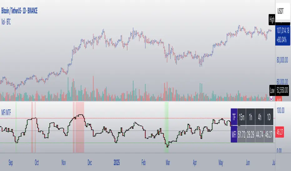
MFI Candles MTF TableMFI Candles + Multi-Timeframe Table | by julzALGO
This open-source script visualizes the Money Flow Index (MFI) in a new format — as candles instead of a traditional oscillator line. It provides a clean, volume-driven view of momentum and pressure, ideal for traders seeking more actionable and visual cues than a typical MFI plot.
What Makes It Unique:
• Plots "MFI Candles" — synthetic candles based on smoothed MFI values using a selected timeframe (default: 1D), giving a new way to read volume flow.
• Candles reflect momentum: green if MFI rises, red if it falls.
• Background turns red when MFI is overbought (≥ 80) or green when oversold (≤ 20).
Multi-Timeframe Strength Table:
• Displays MFI values from 15m, 1h, 4h, and 1D timeframes — all in one dashboard.
• Color-coded for quick recognition: 🔴 Overbought, 🟢 Oversold.
• Values are smoothed with linear regression for better clarity.
Custom Settings:
• MFI calculation length
• Smoothing factor
• Candle source timeframe
• Toggle table and OB/OS background
How to Use:
- Use MFI Candles to monitor momentum shifts based on money flow.
- Use the Multi-Timeframe Table to identify when multiple timeframes align — helpful for timing entries and exits.
- Watch the background for extreme conditions (OB/OS) that may signal upcoming reversals or pressure exhaustion.
Happy Trading!
Kill Zones (EST 24hr, Custom Colors + Legend)Asian,London, New York Sessions Indicator shows high volume time zones on every time frame for futures and forex

Gold Power Hours StrategyStrategy: XAUUSD Gold Power Hours
(ideal for Tuesday to Thursday, 8:00–11:30 am NY and 1:30–3:30 pm NY)
Strategy Rules
1️⃣ Timeframe
Trade on 15 min and 1 hour charts
Confirm with the 4 h chart (trend direction)
2️⃣ Entry Conditions
✅ Main trend (confirmation):
50-period Simple Moving Average (SMA50) on the 4h chart
price above = only look for longs
price below = only look for shorts
✅ Momentum (confirmation):
RSI(14) on the 15 min chart
above 55 = bullish strength
below 45 = bearish strength
✅ Volume (validation):
Increasing volume (bar higher than previous) during NY open (8–9 am) or at 1:30 pm
confirms institutional interest
3️⃣ Entry Setup
🟢 Longs (buys):
Price above 4h SMA50
15 min RSI > 55
break of previous resistance (e.g., last hour’s high)
rising volume on the entry candle
👉 Enter on breakout + 2 pips of margin
🔴 Shorts (sells):
Price below 4h SMA50
15 min RSI < 45
break of previous support
rising volume on the entry candle
👉 Enter on breakout – 2 pips of margin
4️⃣ Trade Exits / Management
✅ Take profit (TP):
2 × the risk taken (e.g., SL 20 pips → TP 40 pips)
or the next significant support/resistance on H1
✅ Stop loss (SL):
below the last impulse candle (for longs)
or above the last impulse candle (for shorts)
minimum 15–20 pips to avoid stop hunts
✅ Break-even
move SL to entry point once +15 pips profit is reached
5️⃣ Additional Filters
✅ Avoid trading during red news (NFP, FOMC) until the first spike finishes.
✅ Avoid trading outside these windows:
8:00–11:30 am NY
1:30–3:30 pm NY

Price Cross Over LcfxKey Features:
HalfTrend Calculation:
Uses amplitude value (default 100)
Calculates based on highest/lowest prices and smoothed moving averages
Includes volatility adjustment using ATR
Signal Detection:
Buy signals when price closes ABOVE HalfTrend line
Sell signals when price closes BELOW HalfTrend line
Uses actual candle close prices for reliable signals
Visual Elements:
Plots HalfTrend line in blue
Shows green "BUY" labels below bars
Shows red "SELL" labels above bars
Alerts created for both signal types
Input Customization:
Adjustable amplitude parameter
Min value constrained to 1
Usage:
Apply to any chart
Signals appear at the close of the candle that crosses the HalfTrend line
Alerts can be set for automated notifications

Position Trading Strategy - EMA + FVGMulti-Timeframe Momentum & Pattern Recognition System
This comprehensive trading indicator combines multiple technical analysis components to identify high-probability entry and exit signals for Bitcoin and other assets. The system utilizes:
LuxAlgo Fair Value Gap Detection - Identifies institutional order flow imbalances
Hull Suite & MACD Integration - Confirms trend direction and momentum shifts
Pyramid Scoring System - Ranks signal strength using multiple confluences
Smart Position Management - Provides clear long/short entry and exit alerts
Visual Market Structure - Displays key support/resistance levels and gap zones
The indicator generates scored signals based on the alignment of trend, momentum, and market structure, helping traders identify optimal entry points while managing risk through systematic exit conditions. Perfect for swing trading and scalping strategies on multiple timeframes.
Best Used For: BTC/USD, major forex pairs, and liquid cryptocurrency markets
Recommended Timeframes: 5M, 15M, 1H for optimal signal accuracy

Volume Pressure Analyzer)The Volume Pressure Analyzer is a clean, table-only TradingView indicator that helps traders visually assess buy/sell pressure based on simulated buyer and seller volume over a recent period.
It calculates the average buyer and seller volume over a user-defined number of candles and compares them to determine market pressure. The results are shown in a live-updating table (top right of the chart) — with no clutter on the price chart itself.

Gold Power Hours StrategyStrategy: XAUUSD Gold Power Hours
(ideal for Tuesday to Thursday, 8:00–11:30 am NY and 1:30–3:30 pm NY)
Strategy Rules
1️⃣ Timeframe
Trade on 15 min and 1 hour charts
Confirm with the 4 h chart (trend direction)
2️⃣ Entry Conditions
✅ Main trend (confirmation):
50-period Simple Moving Average (SMA50) on the 4h chart
price above = only look for longs
price below = only look for shorts
✅ Momentum (confirmation):
RSI(14) on the 15 min chart
above 55 = bullish strength
below 45 = bearish strength
✅ Volume (validation):
Increasing volume (bar higher than previous) during NY open (8–9 am) or at 1:30 pm
confirms institutional interest
3️⃣ Entry Setup
🟢 Longs (buys):
Price above 4h SMA50
15 min RSI > 55
break of previous resistance (e.g., last hour’s high)
rising volume on the entry candle
👉 Enter on breakout + 2 pips of margin
🔴 Shorts (sells):
Price below 4h SMA50
15 min RSI < 45
break of previous support
rising volume on the entry candle
👉 Enter on breakout – 2 pips of margin
4️⃣ Trade Exits / Management
✅ Take profit (TP):
2 × the risk taken (e.g., SL 20 pips → TP 40 pips)
or the next significant support/resistance on H1
✅ Stop loss (SL):
below the last impulse candle (for longs)
or above the last impulse candle (for shorts)
minimum 15–20 pips to avoid stop hunts
✅ Break-even
move SL to entry point once +15 pips profit is reached
5️⃣ Additional Filters
✅ Avoid trading during red news (NFP, FOMC) until the first spike finishes.
✅ Avoid trading outside these windows:
8:00–11:30 am NY
1:30–3:30 pm NY
-----------
Estrategia: XAUUSD Gold Power Hours
(ideal para martes a jueves, 8:00 – 11:30 am NY y 1:30 – 3:30 pm NY)
Reglas de la estrategia
1️⃣ Marco temporal
Operar en gráficos de 15 min y 1 hora
Confirmaciones con gráfico de 4 h (dirección de tendencia)
2️⃣ Condiciones de entrada
✅ Tendencia principal (confirmación):
Media Móvil Simple de 50 (SMA50) en gráfico 4h
precio por encima = solo buscar compras
precio por debajo = solo buscar ventas
✅ Momentum (confirmación):
RSI(14) en gráfico de 15 min
sobre 55 = fuerza alcista
debajo de 45 = fuerza bajista
✅ Volumen (validación):
Volumen creciente (barra más alta que la anterior) en la apertura NY (8–9 am) o a la 1:30 pm
confirma que hay interés institucional
3️⃣ Setup de entrada
🟢 Largos (compras):
Precio arriba de SMA50 4h
RSI 15 min > 55
rompimiento de resistencia previa (ej. alto de la última hora)
volumen creciente en la vela de entrada
👉 Entrada en rompimiento + 2 pips de margen
🔴 Cortos (ventas):
Precio debajo de SMA50 4h
RSI 15 min < 45
rompimiento de soporte previo
volumen creciente en la vela de entrada
👉 Entrada en rompimiento – 2 pips de margen
4️⃣ Salidas / gestión del trade
✅ Take profit (TP):
2 × riesgo asumido (por ejemplo, SL 20 pips → TP 40 pips)
o siguiente soporte/resistencia mayor en H1
✅ Stop loss (SL):
debajo de la última vela de impulso (para compras)
o encima de la última vela de impulso (para ventas)
mínimo 15–20 pips para evitar barridas
✅ Break-even
mover el SL a punto de entrada cuando se alcance +15 pips de ganancia
5️⃣ Filtros adicionales
✅ Evita operar durante noticias rojas (NFP, FOMC) hasta que el primer spike termine.
✅ Evita operar fuera de las ventanas:
8:00 – 11:30 am NY
1:30 – 3:30 pm NY

BskLAB - Money Flow X🧠 BskLAB – Money Flow X | Usage Guide & Description
BskLAB – Money Flow X is a two-mode volume visualization tool designed to help traders better understand market behavior through real-time momentum and divergence analysis. It is best used alongside the BskLAB Signal Assistant to confirm signal quality using volume-based conditions.
🔧 Preset Modes Overview
📊 Mode 1: Money Flow (WaveTrend + Divergence)
This mode leverages a customized WaveTrend oscillator to reflect changes in volume pressure and trend strength. A second smoothed line helps confirm trend shifts through crossovers.
🔹 Features:
Momentum shifts identified via WaveTrend crossover logic
Visual confirmation of overbought/oversold zones
Divergence detection (Classic & Hidden) auto-marked on the chart:
Green = Bullish Divergence
Red = Bearish Divergence
Blue/Orange = Hidden Divergences
🔹 Use Case:
Best suited for spotting early trend reversals and identifying exhaustion during high or low volume zones.
🚀 Mode 2: Volume Momentum (Dynamic Histogram)
This mode displays volume-driven momentum using a dynamic histogram that visually represents shifts in market pressure.
The histogram is calculated based on a customized interpretation of Bollinger Band behavior, which allows it to reflect how price reacts relative to recent volatility boundaries. This approach provides an indirect view of how buying or selling pressure emerges as price stretches away from its average range.
🔹 Features:
Expanding histogram bars reflect growing momentum or pressure buildup
Bar color dynamically adjusts to highlight whether buying or selling activity dominates
Helps detect conditions where price is preparing to break out or slow down
🔹 Use Case:
Useful for validating strong directional moves or recognizing when volume momentum is building up or fading—particularly when price starts reacting aggressively beyond its recent volatility range.
⚙️ Adjustable Parameters
Both modes include customizable settings:
Smoothing control for responsiveness
Divergence toggles (Classic / Hidden)
Adjustable volume period for fine-tuning responsiveness
🧩 Summary
Whether you’re trading trends or reversals, BskLAB – Money Flow X helps decode the story behind price action by:
Identifying volume pressure shifts
Highlighting trend momentum visually
Confirming signals with divergence-based cues
The result: clear, flexible insight into market strength—without relying solely on price candles.

TPO[Fixed Range, Anchored, Bars Back]TPO Bars Back, Fixed Range and Anchored
Overview
The TPO Profile (Time Price Opportunity Profile) is a powerful market profile indicator that displays the amount of time price spent at different levels during a specified period. Unlike traditional volume profile indicators that show volume distribution, TPO Profile shows time distribution , providing insights into where price has spent the most time and identifying key support and resistance levels.
Key Advantages Over TradingView's Built-in TPO
Simplified Composite Creation : Automatically creates TPO profiles for any time range without manual split/merge operations
Instant Value Area Calculation : Immediately shows Value Area, POC, VAH, and VAL for your selected period
No Manual Assembly Required : TradingView's native TPO requires you to manually split sessions and merge them to create composites - this indicator does it automatically
Flexible Time Ranges : Create composites for any custom time period (multiple days, weeks, specific events) with a few clicks
Real-time Composite Updates : Anchor mode creates live composites that update as new data arrives
Multiple Composite Analysis : Easily compare different time periods without the tedious manual process
Key Features
Core Functionality
Time-Based Analysis : Shows time spent at each price level rather than volume
Configurable Time Blocks : Use any timeframe for TPO counting (30min, 1H, 4H, etc.)
Multiple Price Levels : Adjustable from 5 to 200 levels for granular analysis
Point of Control (POC) : Automatically identifies the price level with highest time activity
Value Area Calculation : Shows the price range containing 70% (configurable) of time activity
Automatic Composite Generation : Creates multi-session composites without manual intervention
Three Operating Modes
1. Bars Back Mode
Analyzes the last N bars from the current bar
Perfect for recent market activity analysis
Range: 10-500 bars
Use Case : Intraday analysis, recent session review
2. Fixed Range Mode
Analyzes a specific time period between start and end times
Ideal for historical analysis of specific events
Creates perfect composites for multi-day periods
Use Case : Earnings periods, news events, specific trading sessions, weekly/monthly composites
3. Anchor Mode (NEW)
Starts from a specific time and extends to the current bar
Dynamically updates as new bars form
Perfect for building live composites from any starting point
Use Case : Live session monitoring, event-based analysis from a specific point, growing composites
Visual Elements
TPO Bars
Horizontal bars showing time distribution at each price level
Longer bars = more time spent at that level
Color-coded to distinguish Value Area from outlying levels
Point of Control (POC)
Red line marking the price level with highest time activity
Most significant support/resistance level
Configurable line style (Solid/Dashed/Dotted) and width
Value Area High/Low (VAH/VAL)
Green and Orange lines marking the boundaries of the Value Area
Shows the price range containing the specified percentage of time activity
Optional display with customizable line styles
Single Print Detection
Identifies price levels touched by only one time block
Display options: Lines or Boxes
Purple color highlighting these significant levels
Often act as strong support/resistance in future trading
Customization Options
Time Block Configuration
Block Time : Choose timeframe for TPO counting (30min, 1H, 4H, etc.)
Allows analysis at different time granularities
Higher timeframes = broader perspective, Lower timeframes = finer detail
Visual Styling
Line Styles : Solid, Dashed, or Dotted for all line elements
Line Widths : 1-5 pixels for POC, VAH, and VAL lines
Colors : Fully customizable colors for all elements
Transparency : Adjustable transparency for better chart readability
Label Management
Show/Hide Labels : Toggle POC, VAH, VAL labels
Font Sizes : Tiny, Small, Normal, Large, Huge
Label Positioning : 8 different position options relative to lines
Offset Controls : Fine-tune label positioning
Line Extension
Level Offset Right : Controls how far lines extend
Smart extension logic:
Value ≤ 0: Infinite extension (extend.right)
Value ≥ 1: Extends exactly N bars ahead
Trading Applications
Support & Resistance
POC often acts as strong support/resistance
Value Area boundaries provide key levels
Single prints frequently become significant levels
Market Structure Analysis
Identify areas of price acceptance (thick TPO bars)
Spot areas of price rejection (thin TPO bars)
Understand where market participants are comfortable trading
Composite Profile Analysis
Create multi-day, weekly, or monthly composites instantly
Compare different composite periods without manual work
Analyze longer-term price acceptance levels
Build composites around specific events or announcements
Session Analysis
Monitor intraday session development in real-time
Compare different sessions (London, New York, Asia)
Track how profiles change throughout the trading day
Build live composites across multiple sessions
Event Analysis
Use Fixed Range mode for earnings, news events
Use Anchor mode to track price development from specific events
Compare pre/post event price acceptance levels
Create event-based composites automatically
Input Parameters
Mode Selection
Mode : Bars Back | Fixed Range | Anchor
Bars Back : Number of bars to analyze (10-500)
Start Time : Beginning time for Fixed Range and Anchor modes
End Time : Ending time for Fixed Range mode only
Analysis Configuration
Block Time : Timeframe for TPO blocks (e.g., "30" for 30-minute blocks)
TPO Levels : Number of price levels (5-200)
Value Area % : Percentage for Value Area calculation (50-95%)
Display Options
Show POC : Display Point of Control line
Show Value Area : Display Value Area box
Show VAH/VAL Lines : Display Value Area boundary lines
Show Single Prints : Display single print detection
Single Print Style : Lines or Boxes
Styling Controls
Colors : TPO, POC, Value Area, VAH, VAL, Single Print colors
Line Styles : POC, VAH, VAL line styles
Line Widths : POC, VAH, VAL line widths
Labels : Show/hide, font size, position, offset controls
Technical Details
Calculation Method
Divides the price range into equal levels based on TPO Levels setting
For each time block, determines which price levels it crosses
Adds +1 count to each crossed level
Identifies POC as the level with highest count
Calculates Value Area by expanding from POC until target percentage is reached
Performance Considerations
Historical data limited to prevent buffer overflow errors
Smart bounds checking for different timeframes
Optimized cleanup routines to prevent drawing object accumulation
Pine Script Version
Built on Pine Script v6
Uses modern Pine Script best practices
Efficient array handling and drawing object management
Best Practices
Timeframe Selection
Block Time = Chart Timeframe : Traditional TPO approach
Block Time > Chart Timeframe : Smoother, broader perspective
Block Time < Chart Timeframe : More granular, detailed analysis
Level Count Guidelines
Low levels (10-20) : Better for swing trading, major levels
High levels (50-100) : Better for scalping, precise entries
Very high levels (100+) : For very detailed analysis
Mode Selection
Bars Back : Daily analysis, recent activity
Fixed Range : Historical events, specific periods, manual composites
Anchor : Live monitoring, event-based analysis, growing composites
Composite Creation Workflow
Select Fixed Range or Anchor mode
Set your desired start time (and end time for Fixed Range)
Adjust TPO Levels for desired granularity
Enable VAH/VAL lines to see Value Area boundaries
The composite profile generates automatically with all key levels
This indicator eliminates the tedious manual process of creating composite TPO profiles in TradingView. Instead of splitting sessions and manually merging them, you get instant composite analysis with automatic Value Area calculation, POC identification, and single print detection. The combination of time-based analysis, multiple operating modes, and extensive customization options makes it a powerful tool for understanding market structure and price acceptance levels across any time period.

VWAP Deviation Channels with Probability (Lite)VWAP Deviation Channels with Probability (Lite)
Version 1.2
Overview
This indicator is a powerful tool for intraday traders, designed to identify high-probability areas of support and resistance. It plots the Volume-Weighted Average Price (VWAP) as a central "value" line and then draws statistically-based deviation channels around it.
Its unique feature is a dynamic probability engine that analyzes thousands of historical price bars to calculate and display the real-time likelihood of the price touching each of these deviation levels. This provides a quantifiable edge for making trading decisions.
Core Concepts Explained
This indicator is built on three key concepts:
The VWAP (Volume-Weighted Average Price): The dotted midline of the channels is the session VWAP. Unlike a Simple Moving Average (SMA) which only considers price, the VWAP incorporates volume into its calculation. This makes it a much more significant benchmark, as it represents the true average price where the most business has been transacted during the day. It's heavily used by institutional traders, which is why price often reacts strongly to it.
Standard Deviation Channels: The channels above and below the VWAP are based on standard deviations. Standard deviation is a statistical measure of volatility.
- Wide Bands: When the channels are wide, it signifies high volatility.
- Narrow Bands: When the channels are tight and narrow, it signifies low volatility and
consolidation (a "squeeze").
The Conditional Probability Engine: This is the heart of the indicator. For every deviation level, the script displays a percentage. This percentage answers a very specific question:
"Based on thousands of previous bars, when the last candle had a certain momentum (bullish or bearish), what was the historical probability that the price would touch this specific level?"
The probabilities are calculated separately depending on whether the previous candle was green (bullish) or red (bearish). This provides a nuanced, momentum-based edge. The level with the highest probability is highlighted, acting as a "price magnet."
How to Use This Indicator
Recommended Timeframes:
This indicator is designed specifically for intraday trading. It works best on timeframes like the 1-minute, 5-minute, and 15-minute charts. It will not display correctly on daily or higher timeframes.
Recommended Trading Strategy: Mean Reversion
The primary strategy for this indicator is "Mean Reversion." The core idea is that as the price stretches to extreme levels far away from the VWAP (the "mean"), it is statistically more likely to "snap back" toward it.
Here is a step-by-step guide to trading this setup:
1. Identify the Extreme: Wait for the price to push into one of the outer deviation bands (e.g., the -2, -3, or -4 bands for a buy setup, or the +2, +3, or +4 bands for a sell setup).
2. Look for the High-Probability Zone: Pay close attention to the highlighted probability label. This is the level that has historically acted as the strongest magnet for price. A touch of this level represents a high-probability area for a potential reversal.
3. Wait for Confirmation: Do not enter a trade just because the price has touched a band. Wait for a confirmation candle that shows momentum is shifting.
- For a Buy: Look for a strong bullish candle (e.g., a green engulfing candle or a hammer/pin
bar) to form at the lower bands.
- For a Sell: Look for a strong bearish candle (e.g., a red engulfing candle or a shooting star)
to form at the upper bands.
Define Your Exit:
- Take Profit: A logical primary target for a mean reversion trade is the VWAP (midLine).
- Stop Loss: A logical place for a stop-loss is just outside the next deviation band. For
example, if you enter a long trade at the -3 band, your stop loss could be placed just
below the -4 band.
Disclaimer: This indicator is a tool for analysis and should not be considered a standalone trading system. Trading involves significant risk, and past performance is not indicative of future results. Always use this indicator in conjunction with other forms of analysis and sound risk management practices.
Normalized Open InterestNormalized Open Interest (nOI) — Indicator Overview
What it does
Normalized Open Interest (nOI) transforms raw futures open-interest data into a 0-to-100 oscillator, so you can see at a glance whether participation is unusually high or low—similar in spirit to an RSI but applied to open interest. The script positions today’s OI inside a rolling high–low range and paints it with contextual colours.
Core logic
Data source – Loads the built-in “_OI” symbol that TradingView provides for the current market.
Rolling range – Looks back a user-defined number of bars (default 500) to find the highest and lowest OI in that window.
Normalization – Calculates
nOI = (OI – lowest) / (highest – lowest) × 100
so 0 equals the minimum of the window and 100 equals the maximum.
Visual cues – Plots the oscillator plus fixed horizontal levels at 70 % and 30 % (or your own numbers). The line turns teal above the upper level, red below the lower, and neutral grey in between.
User inputs
Window Length (bars) – How many candles the indicator scans for the high–low range; larger numbers smooth the curve, smaller numbers make it more reactive.
Upper Threshold (%) – Default 70. Anything above this marks potentially crowded or overheated interest.
Lower Threshold (%) – Default 30. Anything below this marks low or capitulating interest.
Practical uses
Spot extremes – Values above the upper line can warn that the long side is crowded; values below the lower line suggest disinterest or short-side crowding.
Confirm breakouts – A price breakout backed by a sharp rise in nOI signals genuine engagement.
Look for divergences – If price makes a new high but nOI does not, participation might be fading.
Combine with volume or RSI – Layer nOI with other studies to filter false signals.
Tips
On intraday charts for non-crypto symbols the script automatically fetches daily OI data to avoid gaps.
Adjust the thresholds to 80/20 or 60/40 to fit your market and risk preferences.
Alerts, shading, or additional signal logic can be added easily because the oscillator is already normalised.

Iceberg DetectorThis Pine-script indicator helps you spot potential “iceberg” order activity by highlighting bars where volume spikes well above its average while price movement remains unusually muted. It’s purely a heuristic—no true bid/ask or futures order‐flow data is used—so treat every signal as an invitation to investigate, not as a standalone buy/sell trigger.
How It Works • Volume vs. Volume-SMA: The script compares each bar’s total volume to an N-bar simple moving average. • Price Movement vs. Movement-SMA: It measures the bar’s percent change (|close–open|/open×100) against its own N-bar SMA. • Sensitivity Slider: From 1 (loose filter) to 10 (strict filter), you control how extreme the volume spike (and muted move) must be to fire a signal. • Pivot-Style Extremes Filter: Short signals only appear when price is at or very near a recent local high, and long signals only when price is at or very near a recent local low. This dramatically cuts down “noise” on lower timeframes—script execution halts on intraday charts below 1 H.
How to Use
Apply to an hourly (or higher) chart.
Tweak “Length” parameters for your preferred look-back on volume and movement SMAs.
Adjust “Sensitivity” from 1 (more signals, weaker divergences) up to 10 (very rare, extreme divergences).
Watch for red triangles above bars (Iceberg-Short) and green triangles below (Iceberg-Long).
Important Disclaimers • This is NOT a genuine order-flow or footprint tool—it only approximates delta by bar direction. • Always contextualize Short signals near the lower end of a range or support zone, and Long signals near the upper end of a range or resistance zone. • Use additional confirmation (price patterns, larger-timeframe pivots, traditional volume/price analysis) before risking real capital.
By combining volume spikes with muted price action at range extremes, you gain a fresh lens on where hidden large orders might be lurking—without needing a dedicated order-flow feed. Use it as an idea‐generator, not as gospel

Liquidity Rush:VSMarkettrend Liquidity Rush (LR) Indicator – Market Move Detector
🔍 What is Liquidity Rush?
The Liquidity Rush (LR) indicator detects the flow of big money (institutional or high-volume traders) into a stock over a selected time frame. It visually represents the net liquidity inflow/outflow and compares it with the stock's total market capitalization (MC) to give you a contextual view of its significance.
📊 Indicator Output:
You’ll see a label like:
250.07 Cr / 0.23%MC
250.07 Cr → Liquidity change (buy/sell impact) in the selected timeframe.
0.23%MC → This liquidity is 0.23% of the stock’s market cap.
This helps you judge:
Whether the move is impactful or just noise.
If smart money is likely entering or exiting.
⚠️ Why % of Market Cap?
Volume or liquidity alone doesn't tell the full story. 100 Cr inflow in a 5,000 Cr company is significant (2%), but the same in a 50,000 Cr company is not impactful (0.2%). That’s why this indicator shows LR as a % of MC — to give you contextual importance.
🟢 When is it Powerful?
If LR % > 2% of market cap consistently → Strong entry signals likely from big players.
If LR jumps suddenly after a dull phase → Watch for breakout or reversal.
🎨 Color Coding (Based on Liquidity Amount):
<10 Cr → Low (likely retail-driven)
>10–20 Cr → Moderate (watchful)
>20–100 Cr → Heating up
>100 Cr → High liquidity activity (possible institutional move)
📅 Best Timeframes:
Use it on Daily, Weekly for quick flow detection.
Combine with price action or volume for confirmation.
Use Cases:
Identify breakouts with backing.
Filter fake moves with weak liquidity.
Spot smart money entry before price jumps.
Note : It does not means that stock with low LR are bad and not move, many stock move with low LR also, This indicator need not to be used in isolation.

Previous Day O H L C Calculation By Md//@version=6
indicator("Previous Day O H L C Calculation By Md", overlay=true)
// Check if the previous daily candle is green (bullish) or red (bearish)
previousCandleBullish = close > open
previousCandleBearish = close < open
// Calculate the difference for bullish candles: previous day's high minus previous day's open
bullishCalculation = high - open
// Calculate the difference for bearish candles: previous day's low minus previous day's close
bearishCalculation = low - close
// Show the result at the top of the current daily candle if the previous candle was bullish
if previousCandleBullish
label.new(bar_index, high, "Bullish Calc: " + str.tostring(bullishCalculation), color=color.green, textcolor=color.white, style=label.style_label_left, size=size.small)
// Show the result at the bottom of the current daily candle if the previous candle was bearish
if previousCandleBearish
label.new(bar_index, low, "Bearish Calc: " + str.tostring(bearishCalculation), color=color.red, textcolor=color.white, style=label.style_label_left, size=size.small)

COBRA X Mastermind – Ultimate Smart Panel 🐍 COBRA X Mastermind – Ultimate Smart Panel
The ultimate evolution of smart market analysis.
This indicator combines advanced trend filtering (EMA200 + VWAP), Price Action (BoS, Engulfing), Volume Spikes, Fair Value Gaps (FVG), Hidden Divergences, and breakout risk assessment — all displayed in a clean, professional panel.
✅ Real-time Buy/Sell signal with validity & strength
✅ Live risk metrics: TP%, SL%, and breakout alerts
✅ Full volume analysis: VWAP, POC, Spike Detection
✅ Fair Value Gap + Hidden Divergence Detection
✅ Clean screener panel for scalping or swing trading
🔐 Code is fully protected.
For access or licensing, contact: .

Hope Trend Trader v1🚀 Smart Decisions. Simple Signals. No Repainting.
The Hope Trend Trader v1 is a premium trading tool crafted for precision and consistency — built to serve both scalpers and swing traders who value clarity, confidence, and clean execution.
🔐 Invite-Only Script
Access is limited to protect the integrity of the strategy and support serious traders only.
🔍 Key Highlights:
✅ 100% Non-Repainting Signals – What you see is what you trade
✅ Accurate Buy/Sell labels at real-time turning points
✅ Built-in Multi-Timeframe Dashboard to guide your trend bias
✅ Volatility filter to help avoid choppy/noisy entries
✅ Optimized for Gold, Forex, Indices & Crypto
Unlike generic indicators, Hope Trend Trader v1 adapts to live market dynamics and does not repaint past signals — giving you the confidence to act without second-guessing.
💡 Perfect for traders who need reliable confirmations, clean visual guidance, and a strategy they can trust.
📩 Access By Request Only
DM us for access or reach out via Telegram 👉 @vineethruby
🔗 Join our premium trading circle today.
