Understanding SMT Divergence In Trading1. Definition and Importance
SMT (Smart Money Technique) Divergence refers to a trading concept that involves identifying discrepancies between the price movement of correlated markets or instruments.
These discrepancies can signal potential market reversals or price manipulation. Specifically, it focuses on the divergence between price movements and indicators (like volume, momentum, or oscillators) in markets that typically move in sync.
In SMT Divergence, traders look for situations where two or more correlated instruments (like
Forex pairs, indices, or bonds) are moving in opposite directions. This "divergence" signals that
there may be a shift in market sentiment, liquidity manipulation, or an opportunity for price
correction.
The importance of SMT Divergence lies in its ability to detect hidden market dynamics that are
often manipulated by institutional players. By understanding these divergences, traders can
gain insights into potential market moves and position themselves accordingly.
2. The Relationship Between Correlated Markets
Understanding these relationships is crucial for identifying SMT Divergence:
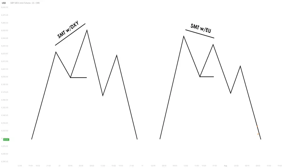
Forex Pairs : Many Forex pairs have direct correlations. For example, EUR/USD and USD/JPY are often correlated in the sense that when the USD strengthens, both pairs may exhibit price movement in the same direction (EUR/USD decreases, USD/JPY increases). SMT
Divergence occurs when these pairs move in opposite directions, indicating that something
unusual is happening in the market (e.g., liquidity manipulation or market anticipation).
Indices : Stock market indices (like the S&P 500 or Dow Jones) and related instruments like futures or ETFs can show correlation. A divergence in these indices might indicate potential
trends or reversals, signaling that institutions are positioning themselves for a move in one
direction, and the market is showing resistance.
Bonds : The relationship between bond yields and currency pairs, for instance, can also show correlations. When bond yields move in one direction, certain currency pairs should
generally follow suit. Divergence in this relationship can reveal clues about market
intentions, such as shifts in interest rates or macroeconomic sentiment.
Commodities and Stocks : Commodities like oil and gold can often correlate with indices or specific stocks. For example, if oil prices rise and an energy sector index doesn’t move in the
same direction, this could be a sign of market inefficiencies or institutional positioning.
3. SMT Types
3.1. Bullish SMT Divergence
Bullish SMT (Smart Money Technique) Divergence occurs when one correlated asset forms a
higher low while another makes a lower low. This indicates that one market is showing hidden
strength, suggesting a potential reversal to the upside.
How to Spot Higher Lows in One Asset While the Other Makes Lower Lows:
1. Identify Two Correlated Markets – Choose two assets that typically move together, such as EUR/USD and GBP/USD or NASDAQ and S&P 500.
2. Look for Divergence – Observe when one asset makes a new lower low, while the other fails to do so, instead of forming a higher low.
3. Volume & Price Action Confirmation – Institutions may absorb liquidity in the weaker asset while the stronger one holds its ground.
4. Validate with Market Context – Look at macroeconomic conditions, liquidity pools, and institutional activity to confirm the setup.
3.2. Bearish SMT Divergence
Bearish SMT Divergence occurs when one correlated asset forms a lower high while another
makes a higher high. This signals hidden weakness, indicating that the market may be setting
up for a bearish reversal.
How to Spot Lower Highs in One Asset While the Other Makes Higher Highs:
1. Find Two Correlated Markets – Common pairs include NASDAQ vs. S&P 500 or EUR/USD vs. GBP/USD.
2. Identify the Divergence – One asset makes a higher high, while the other fails to follow and forms a lower high instead.
3. Liquidity & Volume Analysis – Smart money may be using the stronger asset to attract buyers before reversing.
4. Confirm with Institutional Order Flow – Watch for liquidity grabs and imbalance zones.
3.3. Intermarket SMT
Definition : Divergence between assets from different markets, such as Forex vs. Commodities, Stocks vs. Bonds, or Indices vs. the U.S. Dollar.
Examples :
EUR/USD vs. DXY (U.S. Dollar Index) – If EUR/USD forms a higher low while DXY makes a
higher high, this suggests USD weakness and potential EUR/USD strength.
NASDAQ vs. S&P 500 – If NASDAQ makes a higher high but S&P 500 doesn’t, it can indicate
a weakening stock market rally.
Strength & Validity :
High validity because institutions hedge positions across different markets.
3.4. Intramarket SMT
Definition : Divergence within the same market (e.g., multiple Forex pairs or stock indices).
Examples :
EUR/USD vs. GBP/USD – If EUR/USD makes a lower low but GBP/USD doesn’t, it could
indicate bullish strength.
Dow Jones vs. S&P 500 vs. NASDAQ – If NASDAQ is making new highs while the Dow lags, it
may signal weakness in the broader stock market.
Strength & Validity :
Still valid but needs additional confirmation (liquidity sweeps, volume analysis).
4. SMT Divergence vs. RSI Divergence
Why SMT Is Superior to Traditional RSI Divergences
1. RSI Measures Momentum, Not Liquidity – RSI divergence is based on momentum shifts,
which institutions can easily manipulate with fake breakouts or engineered price moves.
2. SMT Focuses on Market Structure & Liquidity – SMT divergence detects institutional
positioning by comparing correlated assets, making it harder to manipulate.
3. RSI Can Remain Overbought/Oversold for Long Periods – Markets can continue trending
despite RSI divergence, while SMT divergence often provides stronger reversal signals.
How Smart Money Manipulates Classic Divergence Traders
Liquidity Sweeps – Institutions use RSI divergence to lure retail traders into premature
reversals before executing stop hunts.
False RSI Signals – In trending markets, RSI divergences often fail, while SMT divergence
provides a more contextual view of smart money positioning.
5. Using TradingView for SMT Analysis
To effectively analyze SMT divergence, traders should monitor at least two correlated assets
simultaneously.
TradingView makes this easy by allowing multiple chart layouts. Steps to Set Up Multiple Charts in TradingView:
a. Open TradingView and click on the “Select Layout” button.
b. Choose a two-chart or four-chart layout to compare correlated assets.
c. Sync timeframes across all charts for consistency.
d. Adjust scaling to ensure price action is easily comparable.
Best Pairs to Compare for SMT Analysis:
Forex : EUR/USD vs. GBP/USD, USD/JPY vs. DXY
Indices : NASDAQ vs. S&P 500, Dow Jones vs. S&P 500
Commodities & FX : Gold (XAU/USD) vs. USD/JPY
Bonds & Equities : 10-Year Treasury Yield vs. S&P 500
6. Key Takeaways
SMT divergence reveals institutional intent by showing liquidity accumulation or
distribution through correlated assets.
Bullish SMT occurs when one asset makes a lower low while the other does not, signaling a
potential reversal up.
Bearish SMT occurs when one asset makes a higher high while the other does not, signaling
a potential reversal down.
Best markets for SMT analysis include Forex pairs, indices, commodities, and bonds, where
correlations are strongest.
SMT is most effective near key liquidity levels, such as session highs/lows, order blocks, and
fair value gaps.
SMT is more reliable during high-impact news events, London & New York sessions, and
quarterly shifts, where institutional activity is highest.
SMT is superior to RSI divergence because it reflects real liquidity dynamics, whereas RSI
can produce false signals.
Combining SMT with market structure shifts like BOS and CHoCH increases trade accuracy
and reliability.
Risk management in SMT trading requires stop-loss placement beyond liquidity grabs and a
minimum 2:1 risk-reward ratio.
Mastering SMT helps traders avoid liquidity traps, improve precision, and align with smart
money moves.
SMT divergence is the footprint of smart money—where one market whispers the truth while the other follows the herd.
Pivot Points
How to Find Liquidity Zones/Clusters on Any Forex Pair (GOLD)
You need just 1 minute of your time to find significant liquidity zones on any Forex pair and Gold.
In this article, I will teach you how to identify supply and demand zones easily step by step.
Liquidity Basics
By a market liquidity, I mean market orders.
The orders are not equally distributed among all the price levels.
While some will concentrate the interest of the market participants,
some levels will be low on liquidity.
Price levels and the areas that will attract and amass trading orders will be called liquidity zones.
How to Find Supply Zones
To find the strongest liquidity clusters, we will need to analyze a daily time frame.
A liquidity zone that is above current prices will be called a supply zone.
High volumes of selling orders will be distributed within.
One of the proven techniques to find such zones is to analyze a historic price action. You should identify a price level that acted as a strong resistance in the past.
4 horizontal levels that I underlined on EURGBP influenced market behavior in the recent past.
The price retraced from these levels significantly.
Why It Happened?
A down movement could occur because of an excess of selling orders and a closure of long positions by the buyers.
These factors indicate a high concentration of a liquidity around these price levels.
How to Draw Supply Zone?
One more thing to note about all these horizontal levels is that they cluster and the distance between them is relatively small .
To find a significant liquidity supply zone, I advise merging them into a single zone.
To draw that properly, its high should be based on the highest high among these levels. Its low should be based on the highest candle close level.
Following this strategy, here are 2 more significant supply zones.
We will assume that selling interest will concentrate within these areas and selling orders will be spread across its price ranges.
How to Find Demand Zones
A liquidity zone that is below current spot price levels will be called a demand zone . We will assume that buying orders will accumulate within.
To find these zones, we will analyze historically important price levels that acted as strong supports in the past.
I found 3 key support levels.
After tests of these levels, buying pressure emerged.
Why It Happened?
A bullish movement could occur because of an excess of buying orders and a closure of short positions by the sellers. Such clues strongly indicate a concentration of liquidity.
How to Draw Demand Zones?
Because these levels are close to each other, we will unify them into a one liquidity demand zone.
To draw a demand zone, I suggest that its low should be the lowest low among these key levels and its high should be the lowest candle close.
Examine 2 more liquidity zones that I found following this method.
Please, note that Demand Zone 2 is based on one single key level.
It is not mandatory for a liquidity zone to be based on multiple significant levels, it can be just one.
We will assume that buying interest will concentrate within these areas and buying orders will be allocated within the hole range.
Broken Liquidity Zones
There is one more liquidity zone that I did not underline.
That is a broken supply zone. After a breakout and a candle close above, it turned into a demand zone. For that reason, I plotted that based on the rules of supply zone drawing.
Start Market Analysis From Liquidity
Liquidity zones are one of the core elements of forex trading.
Your ability to recognize them properly is the key in predicting accurate price reversals.
Identify liquidity zones for:
spotting safe entry points,
use these zones as targets,
set your stop losses taking them into consideration.
They will help you to better understand the psychology of the market participants and their behavior.
I hope that the today's tutorial demonstrated you that it is very easy to find them.
❤️Please, support my work with like, thank you!❤️
I am part of Trade Nation's Influencer program and receive a monthly fee for using their TradingView charts in my analysis.

How to Trade Liquidity Sweep in Forex Market (SMC Trading)
I will show you a real example of trading liquidity sweep with Smart Money Concepts.
You will learn the essential SMC liquidity basics, a simple and profitable strategy to identify and trade liquidity sweep.
I will share with you an accurate entry confirmation signal that works perfectly on any Forex pair.
Liquidity Basics
In order to trade liquidity sweeps profitably, you should learn to identify significant liquidity zones.
To spot them, analyze a historic price action and find clusters of important historic key levels.
Examine a price action on EURUSD on an hourly time frame.
I underlined multiple horizontal key levels.
The price respected each level, found support on them, and rebounded.
What is so specific about these levels is that they are lying close to each other, composing a liquidity cluster.
That fact that EURUSD strongly bounced from these levels suggests that buying interest and high buying volumes were concentrated around them.
We can unite these levels and treat them as a single demand zone that has just been broken and turned into a supply zone.
After we found a valid liquidity zone, we can look for a liquidity sweep.
First, we should let the price approach that area and look for a specific price behavior then.
That is a perfect example of a liquidity sweep.
You can see that the price formed a wide range candle with a long tail.
Its high went way beyond the underlined area, but its body closed within.
In order to understand, why a liquidity sweep occurred, let's zoom in our chart and try to understand a behavior of the market participants.
Our supply zone concentrated selling orders , we assume that sellers were placing their orders across its entire length.
Their stop losses were presumably lying above that area.
Smart Money know that and with a liquidity sweep they manipulate the market, making sellers close their positions in a loss (buying back their positions from the market) and providing a liquidity for big players.
After a formation of a such a candlestick, a reliable confirmation of a saturation of the Smart Money is a formation of a strong bearish candle - a clear sign of strength of the sellers.
A bearish engulfing candle above confirmed a completion of a liquidity sweep and indicates a highly probable bearish continuation.
Your perfect sell entry is immediately after a close of such a candlestick.
Stop loss should strictly lie above the high of a liquidity sweep.
Take profit is based on a local low.
Look, how quickly the price reached the goal.
Your strategy of trading liquidity sweeps of demand zones is absolutely the same.
Let the price test a demand zone, wait for a formation of wide range bearish candle with a tail going below its lows.
Wait for a bullish imbalance candle and buy immediately then.
Stop loss will be below the low of a liquidity sweep, take profit - a local high.
This SMC strategy works on any time frame and can be applied for trading any Forex pair, Gold, Silver, Crypto and commodities.
Try it by your own and let me know your results.
❤️Please, support my work with like, thank you!❤️
I am part of Trade Nation's Influencer program and receive a monthly fee for using their TradingView charts in my analysis.

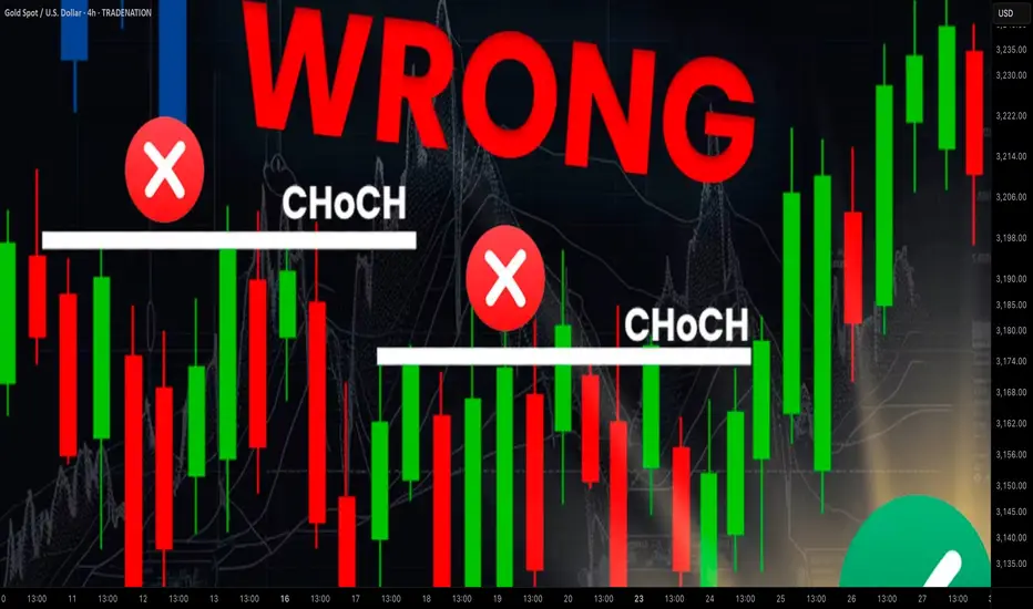
Learn Best Change of Character CHoCH Model in Trading with SMC
Most of the SMC traders get Change of Character CHoCH WRONG!
In this article, I will share with you Change of Character models that have a low accuracy and better to be avoided.
I will teach you the best CHoCH model for Forex Gold trading and show you how to identify it easily.
Let's start with the basic theory first and discuss what Change of Character signifies.
Change of Character in Bearish Trend
In a downtrend, Change of Character CHoCH is an important event that signifies a violation of a bearish trend.
CHoCH is confirmed when the price breaks and closes above the level of the last lower high.
Above, is a text book Change of Character model in a bearish trend.
For the newbie traders, such a price action provides a strong signal to buy while it fact it is NOT .
One crucial thing is missing in this model to confirm a bullish reversal.
According to basic trend analysis rules, we say that the market trend is bullish if the price forms a bullish impulse, retraces and sets a Higher Low HH , forms a new bullish impulse with a new Higher High HH.
Only then, we can say that the market is trading in up trend.
CHoCH model above confirms a bearish trend violation BUT it does not confirm a trend change.
Such a model may easily signify a deeper correction.
Look what happened with GBPNZD.
Though the price formed a confirmed bearish CHoCH, it was a false signal and just an extended correction.
That's a perfect bullish reversal model.
It combines CHoCH and conditions for a bullish trend.
Such a union is extremely accurate in predicting up movements.
Examine a price action on USDJPY.
Not only the price formed a confirmed CHoCH but also we see a start of a new bullish trend.
Change of Character in Bullish Trend
In an uptrend, Change of Character CHoCH is a significant event that signifies a violation of a bullish trend.
CHoCH is confirmed when the price breaks and closes below the level of the last higher low.
Above is a typical model of a bearish CHoCH.
For many traders, that is the signal to open short.
However, it is not that accurate and one important component is missing there.
According to basic price action rules, the market trend is bearish
if the price forms at least 2 bearish impulses with Lower Lows LL and a pullback between them with a Lower High LH.
Only when these 3 conditions are met, a bearish trend is confirmed .
Perfect bearish Change of Character model should include both CHoCH and a bearish trend price action. That will confirm a violation of a bullish trend and start of a new bearish trend.
EURCAD has a very strong potential to continue falling:
not only we see a valid bearish Change of Character but also
a start of a new bearish trend based on a price action.
Next time when you identify CHoCH on forex market, make sure that you check the preceding price action. It will help you to more accurate assess reversal probabilities and make a wiser trading decision.
❤️Please, support my work with like, thank you!❤️
I am part of Trade Nation's Influencer program and receive a monthly fee for using their TradingView charts in my analysis.
Macromics Group: Market Trends Overview (June 2025)Global Economic Landscape: What Has Changed?
June 2025 marks significant shifts in the global economy. After several years of instability caused by the pandemic, inflation, and geopolitical tensions, markets are gradually stabilizing. However, new challenges are emerging: rising risks in Asia, digital transformation in Europe, and strategy shifts in the U.S.
China and India continue to show strong growth rates—5.8% and 6.5% respectively. Europe, by contrast, is lagging behind due to slow recovery and persistent inflation. The U.S. maintains a steady course driven by consumer spending and innovation, reporting 2.1% GDP growth.
Macromics Group continues to deliver in-depth analytics and strategies for clients seeking to understand and capitalize on these changes. We analyze trends across more than 120 industries, helping companies adapt and thrive.
Macroeconomics and Monetary Policy: A Shift Toward Stabilization
Financial regulators have begun cautiously lowering interest rates after the peaks of 2024. The U.S. Federal Reserve has dropped its rate to 4.5%, while the ECB has reduced its rate to 3.75%. This is made possible by a decline in inflation: 2.7% in the U.S. and 3.1% in the EU.
Meanwhile, developing nations like Turkey and Argentina are still grappling with high inflation. These countries risk falling behind the global recovery unless decisive steps are taken.
Overall, the global course is toward soft stabilization: interest rates remain high but steady. This creates favorable conditions for investment and long-term planning.
Financial Markets: From Caution to Moderate Optimism
Stock markets in June 2025 show mixed performance. U.S. indexes such as the S&P 500 and Nasdaq hit new highs, thanks to the booming tech sector. Stocks of companies involved in AI, quantum computing, and cybersecurity are particularly strong.
European markets are less active but relatively stable. Growth is limited by high costs, demographic issues, and the transition to ESG standards. In Russia and CIS countries, markets are under pressure due to sanctions, currency restrictions, and reduced investment.
On the currency front, the U.S. dollar and Chinese yuan dominate. The ruble is volatile, the euro is stable, and the yen is strengthening as a safe haven asset.
Technology: The Engine of New Markets
The main trend in 2025 is AI and automation. Companies are deploying neural networks in logistics, marketing, finance, and HR to cut costs and boost efficiency. Demand for AI professionals and developers is surging.
5G infrastructure has matured in most developed countries, unlocking new potential in IoT, telemedicine, and remote work. At the same time, quantum computing is advancing rapidly, with commercial solutions expected by 2026.
Macromics Group invests in next-generation analytical platforms, enabling clients to access real-time insights and forecast trends before they go mainstream.
Energy and Sustainability: ESG and the “Green” Shift
Energy markets have stabilized after the turbulence of 2024. Oil prices remain between $70–$85 per barrel—comfortable for both producers and consumers. Meanwhile, renewable energy—solar, wind, and hydrogen—is seeing record investment.
Corporations are increasingly reporting according to ESG standards. It’s not just a trend, but a new business reality. Investors demand transparency, consumers prefer socially responsible brands, and regulators impose mandatory reporting.
Macromics Group supports clients in transitioning to sustainable models by developing ESG strategies, assessing risks, and offering financial solutions.
Conclusion: Outlook for the Second Half of 2025
The first half of 2025 showed that markets are learning to operate in a new reality. The global economy is no longer chasing rapid growth, but adapting to volatility. Key focus areas are technology, sustainability, and smart resource management.
For businesses, this means quick adaptation, innovative thinking, and reliance on data-driven decisions. In this context, Macromics Group serves not just as an analyst but as a strategic partner.
Our recommendation: act proactively. In times of uncertainty, those who plan years ahead and use quality data will win.

When and How to Use Weekly Time Frame in Gold Forex Trading
Ignoring weekly time frame chart analysis could cost you big losses in Forex, Gold trading!
Discover 3 specific cases when weekly time frame beats daily time frame analysis.
Learn the situations when weekly timeframe exposes what daily charts can’t, how to analyze it properly and when to check it.
1. Long-term historic levels
When the market trades in a strong bullish or bearish trend and goes beyond recent historic levels, quite often the daily time frame will not be sufficient for the identification of significant supports and resistances.
The proven way to identify the next meaningful levels will be to analyze a weekly time frame.
Examine a price action on EURAUD forex pair on a daily time frame chart. The market is trading in a strong bullish trend and just updated the high.
Checking the historic price action, we don't see any historic resistance on the left.
Switching to a weekly time frame chart, we can easily recognize a historic resistance that the price respected 5 years ago.
That's a perfect example when weekly t.f revealed a historic price action that a daily didn't.
2. Trend-lines
Weekly time frame analysis is important not only for a search of historic levels. It can help you find significant vertical structures - the trend lines.
We can easily find several meaningful historic resistances on EURUSD pair on a daily time frame.
Though, there are a lot of historic structures there, let's check if there are some hidden structures on a weekly.
Weekly time frame reveals 2 important trend lines, one being a vertical support and another being a vertical resistance.
With a daily time frame analysis, these trend lines would be missed .
3. More accurate breakout confirmations
Some false support and resistance breakouts that you see on a daily could be easily avoided with a weekly time frame analysis.
Quite regularly, a daily time frame support or resistance is in fact a weekly structure. And for its breakout, a weekly candle close will provide more accurate confirmation.
From a daily time frame perspective, we see a confirmed breakout - a daily candle close above a solid resistance zone.
It provides a strong bullish signal on AUDUSD forex pair.
However, the violation turned out to be false and dropped.
Such a false breakout , could be easily avoided, checking a weekly time frame chart.
The underlined resistance is in fact a weekly structure.
The price did not manage to close above, and perfectly respected that, starting to fall after its test.
Such a deeper analysis would completely change our bias from strong bullish (based solely on a daily) to strongly bearish (based on a daily AND weekly)
Remember This
Do not ignore and always check a weekly time frame.
It shows a unique perspective on the market and reveals a lot of hidden elements that you would not notice.
No matter whether you are a scalper, day trader or swing trader,
remember that weekly time frame structures are very impactful and accumulate large trading volumes.
❤️Please, support my work with like, thank you!❤️
I am part of Trade Nation's Influencer program and receive a monthly fee for using their TradingView charts in my analysis.

EUR/USD – The 20-Year Gameplan | How to Think Like a Macro TradWelcome to the most important EUR/USD chart you'll see this decade.
This isn't just technical analysis. This is a macro roadmap stretching from 2003 to 2045 — built for serious traders who think beyond the next candle.
@TradeWithMky #Miracle
📚 What This Chart Teaches You:
✅ Long-Term Channeling: How to map 40-year channels that actually hold.
✅ Key Reaction Zones: Learn where multi-year reversals are most likely.
✅ "Range of a Generation": Why EUR/USD could stay trapped for 5+ years.
✅ Two Futures – One Decision Point: Reclaiming the main channel = Ultra Bullish. Rejection = Controlled Descent.
🎯 Trade Plan Logic (Educational Focus)
📌 If price breaks above the range zone, target is a 50% Fibonacci expansion — with 1.36 and 1.55 as the macro resistances.
📌 If price rejects, the pair could drift within a multi-year compression channel targeting the 1.06–0.95 zone over the next decade.
📌 This model blends technical geometry, historical behavior, and trend integrity — skills every pro trader should master.
👁️ Why This Matters
This is not about predicting next week’s move.
This is about training your eyes to see structure where others see noise.
And if you can see the macro structure, you can outperform 99% of traders who zoom in too much, too soon.
⚡ Bonus Wisdom:
"Amateurs react. Professionals anticipate. Masters build maps."
– TradeWithMky
🔔 Follow me for more deep-dive macro education.
This is where Forex meets vision.
📌 TradeWithMky – where altcoins speak louder than Bitcoin... but Forex whispers the truth.

Two MAs, One Ribbon: A Smarter Way to Trade TrendsSome indicators aim to simplify. Others aim to clarify. The RedK Magic Ribbon does both, offering a clean, color-coded visualization of trend strength and agreement between two custom moving averages. Built by RedKTrader , this tool is ideal for traders who want to stay aligned with the trend and avoid the noise.
Let’s break down how it works, how we use it at Xuantify, and how it can enhance your trend-following setups.
🔍 What Is the RedK Magic Ribbon?
This indicator combines two custom moving averages:
CoRa Wave – A fast, Compound Ratio Weighted Average
RSS_WMA (LazyLine) – A slow, Smooth Weighted MA
When both lines agree on direction, the ribbon fills with:
Green – Bullish trend
Red – Bearish trend
Gray – No-trade zone (disagreement or consolidation)
Key Features:
Visual trend confirmation
No-trade zones clearly marked
Customizable smoothing and length
Works on any timeframe
🧠 How We Use It at Xuantify
We use the Magic Ribbon as a trend filter and visual guide .
1. Trend Confirmation
We only trade in the direction of the ribbon fill. Gray zones = no trades.
2. Entry Timing
We enter near the RSS_WMA (LazyLine) for optimal risk-reward. It also acts as a dynamic stop-loss guide.
🎨 Visual Cues That Matter
Green Fill – Trend is up, both MAs agree
Red Fill – Trend is down, both MAs agree
Gray Fill – No-trade zone, MAs disagree
This makes it easy to:
Avoid choppy markets
Stay aligned with the dominant trend
Spot early trend shifts
⚙️ Settings That Matter
Adjust CoRa Wave length and smoothness
Tune RSS_WMA to track price with minimal lag
Customize colors, line widths, and visibility
🧩 Best Combinations with This Indicator
We pair the Magic Ribbon with:
Structure Tools – BOS/CHOCH for context
MACD 4C – For momentum confirmation
Volume Profile – To validate breakout strength
Fair Value Gaps (FVGs) – For sniper entries
⚠️ What to Watch Out For
This is a confirmation tool , not a signal generator. Use it with structure and price action. Always backtest and adjust settings to your asset and timeframe.
🚀 Final Thoughts
If you want a clean, intuitive way to stay on the right side of the trend, the RedK Magic Ribbon is a powerful visual ally. It helps you avoid indecision and focus on high-probability setups.
What really sets the Magic Ribbon apart is the precision of its fast line—the CoRa Wave. It reacts swiftly to price action and often aligns almost perfectly with pivot reversals. This responsiveness allows traders to spot potential turning points early, giving them a valuable edge in timing entries or exits. Its accuracy in identifying momentum shifts makes it not just a trend filter, but a powerful tool for anticipating market moves with confidence.
Try it, tweak it, and let the ribbon guide your trades.

Decoding Momentum with Precision: Absolute Strength HistogramMomentum is more than just a buzzword—it’s the pulse of price action. The Absolute Strength Histogram v2 is a powerful open-source indicator that brings that pulse to life, helping traders visualize the ongoing tug-of-war between bulls and bears with clarity and precision.
In this post, we’ll explore how this tool works, how we use it at Xuantify, and how you can integrate it into your own trading strategy to sharpen your edge.
🔍 What Is the Absolute Strength Histogram ?
Originally developed by jiehonglim , this indicator is a refined version of the classic Absolute Strength Histogram. It measures the relative strength of buyers and sellers and plots it as a color-coded histogram.
Key Features:
Color-coded bars to reflect bullish or bearish dominance
Clear visual cues for trend strength and exhaustion
Helps identify trending vs. ranging market conditions
Open-source and customizable
Unlike traditional oscillators, this histogram doesn’t just show overbought or oversold—it shows who’s in control , and how strongly.
🧠 How We Use It at Xuantify
At Xuantify, we use the Absolute Strength Histogram as a momentum confirmation tool within our multi-layered trading models. Here’s how:
1. Trend Confirmation
We look for alignment between price structure and histogram color. For example, if price breaks structure to the upside and the histogram turns green and rising, that’s a strong confirmation of bullish momentum.
2. Divergence Detection
When price makes a new high but the histogram prints a lower high, it signals momentum divergence —a potential early warning of reversal.
3. Range Filtering
Flat or alternating histogram bars often indicate a ranging market . We avoid trend trades during these periods and instead look for mean-reversion setups.
🧩 New: Pivot High/Low Overlay for Reversal Clarity
To make the Absolute Strength Histogram even more actionable, we’ve added a custom Pivot High/Low indicator that visually marks key swing points on the chart. This addition helps traders clearly see how the histogram behaves before, during, and after reversals .
Below an example of HTF 4H used as stronger trade confirmation:
Why this matters:
It highlights where momentum shifts align with structural turning points
It helps validate divergence signals from the histogram
It makes backtesting and visual analysis much easier
How to use it:
Watch for histogram color or slope changes near pivot highs/lows
Look for divergence between price and histogram at these pivots
Use the pivot zones as potential entry or exit points when confirmed by momentum
🔄 Does It Repaint?
One of the most common concerns with momentum indicators is whether they repaint —meaning they change past values based on future price action. The Absolute Strength Histogram is designed to be non-repainting .
Once a histogram bar is printed, it remains fixed, making it suitable for real-time decision-making and reliable backtesting . This gives traders confidence that what they see on the chart is what actually happened in the moment—not a hindsight illusion.
⚙️ Settings That Matter
The indicator comes with several adjustable parameters, but one of the most impactful is the “Indicator Method” setting.
Our recommendation:
Set Indicator Method = STOCHASTIC for smoother, more responsive signals
This setting tends to reduce noise and better capture momentum shifts
It works especially well in combination with structure-based entries
Other useful settings include:
Length – Controls the sensitivity of the histogram
Smoothing – Helps reduce choppiness in volatile markets
Color thresholds – Customize visual cues for easier interpretation
⚙️ Best Combinations with This Indicator
To maximize its effectiveness, we combine the Absolute Strength Histogram v2 with:
Market Structure Tools – Like BOS/CHOCH from LuxAlgo Smart Money Concepts
Volume Profile – To confirm strength around key volume nodes
Fair Value Gaps (FVGs) – For precision entries when histogram confirms direction
RSI or Stochastic – For additional momentum or exhaustion confirmation
This layered approach helps us filter out noise and focus only on high-conviction trades .
⚠️ What to Watch Out For
No indicator is perfect. The Absolute Strength Histogram can sometimes lag slightly in fast-moving markets. It’s best used as a confirmation tool , not a standalone signal generator.
Also, in low-volume or choppy conditions, the histogram may give mixed signals. Always combine it with structure and context.
🚀 Final Thoughts
The Absolute Strength Histogram is a clean, intuitive, and powerful tool for traders who want to see momentum clearly . Whether you’re a trend trader, scalper, or swing strategist, this indicator can help you stay on the right side of the market.
At Xuantify, we’re all about combining simplicity with precision. This tool fits that philosophy perfectly.
Add it to your chart, test it, and see how it sharpens your edge.

Exposing Price Inefficiencies: The Role of Fair Value Gaps (FVG)In the ever-evolving landscape of price action trading, one concept has gained significant traction among institutional and retail traders alike: Fair Value Gaps (FVGs) . At Xuantify, we believe that understanding market inefficiencies is key to anticipating high-probability setups—and FVGs offer just that.
🔍 What Is a Fair Value Gap?
A Fair Value Gap is a price imbalance that occurs when the market moves too quickly in one direction, leaving behind a "gap" in liquidity. This typically happens during high volatility or news-driven events, where price skips over levels without sufficient buying or selling.
In technical terms, an FVG is identified when a candle’s low (in a bullish move) or high (in a bearish move) does not overlap with the previous or next candle. This creates a three-candle structure :
- Bullish FVG : Candle 1 (bearish), Candle 2 (strong bullish), Candle 3 (bullish or neutral)
- Bearish FVG : Candle 1 (bullish), Candle 2 (strong bearish), Candle 3 (bearish or neutral)
These gaps often act as magnets for price , as the market seeks to rebalance and fill the inefficiency.
🧠 Why Do FVGs Matter?
FVGs are not just visual anomalies—they represent institutional footprints . When large orders are executed, they often cause price to move rapidly, leaving behind unfilled orders. Smart money tends to revisit these zones to complete their positions.
Key Benefits of Trading FVGs:
- ✅ High-probability entries: Price often returns to fill the gap before continuing its trend.
- ✅ Clear invalidation levels: The edges of the gap provide natural stop-loss zones.
- ✅ Works across timeframes: From scalping on the 1-minute to swing trading on the daily.
🧩 Using the “Fair Value Gap ” Indicator
To simplify the process of identifying and trading FVGs, we recommend the Fair Value Gap indicator on TradingView. This tool automatically highlights bullish and bearish FVGs, tracks their mitigation, and even provides alerts when gaps are filled.
Key Features:
- Auto-detection of bullish and bearish FVGs
- Mitigation tracking: See which gaps are filled and which remain open
- Threshold filtering: Focus on significant gaps by adjusting the minimum size
- Dynamic mode: Monitor evolving FVGs in real time
- Alerts: Get notified when price fills a gap
💡 No Repainting, No Delays
One of the most reassuring aspects of this indicator is that it does not repaint . Once a fair value gap is printed, it stays on the chart—no disappearing zones, no misleading signals.
Even better, the indicator plots FVGs in real time . It uses a three-candle structure and confirms the gap immediately after the third candle closes . This means you’re seeing valid, actionable gaps as they form—not in hindsight.
This makes the LuxAlgo FVG tool a reliable companion for both live trading and backtesting , giving traders the confidence that what they see is what the market actually delivered.
How to Use It:
1. Add the indicator : Search for “Fair Value Gap ” in the TradingView Indicators tab.
2. Adjust settings :
- Use the “Threshold %” to filter out smaller, less relevant gaps.
- Enable “Mitigation Levels” to track filled gaps.
- Use “Auto Threshold” for adaptive filtering based on volatility.
3. Trade setups :
- Contrarian : Wait for price to fill a gap and look for reversal signals.
- Trend-following : Enter trades in the direction of the gap when it forms.
⚠️ FVGs Are Not Always Honored
While FVGs offer powerful insight into market inefficiencies, it's important to remember: they are not guaranteed reversal or continuation zones . Sometimes price will blow right through a gap without reacting—especially in trending or news-driven markets.
Why this happens:
The gap may have already been mitigated on a lower timeframe
Strong momentum or macroeconomic catalysts override technical zones
The FVG is too small or lacks confluence with other key levels
How to manage this:
Always combine FVGs with structure, liquidity, and volume
Use alerts and confirmations (e.g., candle patterns or BOS/CHOCH)
Avoid trading FVGs in isolation—context is everything
🧠 Best Indicator Combinations with FVG
To increase the accuracy of FVG-based setups, we recommend combining the LuxAlgo FVG indicator with the following tools:
1. Market Structure (LuxAlgo Smart Money Concepts)
Identify breaks of structure (BOS) or change of character (CHOCH) near FVGs. Use structure shifts to confirm whether the FVG is likely to hold or fail.
2. Volume Profile or Session Volume
Confirm FVGs with low-volume nodes or volume gaps . FVGs aligning with volume imbalances are more likely to be respected.
3. Order Blocks
Look for FVGs that overlap with bullish or bearish order blocks . This confluence often signals institutional accumulation or distribution.
4. Relative Strength Index (RSI) or Stochastic
Use momentum indicators to confirm exhaustion or continuation near FVGs. For example, a bullish FVG + oversold RSI = potential long setup.
5. Liquidity Zones (Equal Highs/Lows, Swing Points)
FVGs near liquidity pools are often targeted before reversal. Combine with sweep setups for sniper entries.
Here’s a new section you can add to your blog post, focusing on the power of **Multi-Timeframe (MTF) FVG Alignments**:
🧭 Multi-Timeframe FVG Alignments
One of the most powerful ways to increase the reliability of Fair Value Gaps is by using multi-timeframe confluence . When FVGs align across different timeframes—say, a 1H FVG inside a 4H FVG zone—it often signals a high-probability reaction area .
Why it works:
Higher timeframe FVGs represent broader institutional imbalances
Lower timeframe FVGs offer precise entries within those zones
Alignment confirms that multiple layers of market participants are active in the same area
How to use it:
Start with a higher timeframe (e.g., 4H or Daily) and mark key FVGs
Drop to a lower timeframe (e.g., 15M or 1H) and look for fresh FVGs forming inside the higher zone
Wait for structure shifts or liquidity sweeps within the lower timeframe FVG before entering
This technique is especially effective when combined with tools like LuxAlgo Smart Money Concepts and Volume Profile , helping you time entries with sniper-like precision while staying aligned with the broader market narrative.
📊 Backtest It Yourself
FVGs are best understood through chart time . Load up your favorite pair on TradingView, activate the LuxAlgo FVG indicator, and observe how price reacts. You’ll be surprised how often these zones act as support, resistance, or launchpads for major moves.
🚀 Final Thoughts
Fair Value Gaps are more than just a buzzword—they’re a window into how smart money operates. By incorporating FVGs and tools like the LuxAlgo indicator , you gain a deeper understanding of market dynamics and a sharper edge in execution.
At Xuantify, we’re committed to decoding institutional logic and bringing it to the retail trader. Stay tuned for more insights, and as always— trade smart, not hard .

Unlocking Market Cycles with the RSI Cyclic Smoothed IndicatorIntro
In the world of technical analysis, the Relative Strength Index (RSI) is established. However, the RSI Cyclic Smoothed indicator takes this classic tool to the next level by incorporating cyclic smoothing and dynamic bands. This post will explore the features, configuration, and practical applications of this powerful indicator.
What is the RSI Cyclic Smoothed Indicator ?
The RSI Cyclic Smoothed indicator is an advanced version of the traditional RSI. It enhances the classic RSI by adding cyclic smoothing and cyclic memory, allowing it to better adapt to market cycles and provide more accurate signals.
Dynamic Bands
One of the standout features of the RSI Cyclic Smoothed indicator is its dynamic bands. These bands adjust automatically to the asset’s cyclical levels, providing clearer signals in varying market conditions. The adaptive upper and lower bands help traders avoid whipsaw trades and identify overbought and oversold conditions more effectively.
What kind of indicator is it ?
The RSI Cyclic Smoothed indicator falls into the category of oscillators. Oscillators are technical analysis tools that vary over time within a banded range, typically used to identify overbought and oversold conditions.
Leading or Lagging ?
The RSI Cyclic Smoothed indicator is primarily a lagging indicator. It smooths the RSI data to reduce noise and provide more reliable signals, but it does not predict future price movements.
Key Features
Cyclic Smoothing: Reduces noise and enhances signal accuracy.
Dynamic Bands: Adaptive upper and lower bands that adjust to market cycles.
Cyclic Memory: Uses the dominant cycle length to optimize signal accuracy.
Benefits Compared to Normal RSI
Enhanced Signal Accuracy: The cyclic smoothing reduces noise and false signals, providing more reliable trading signals.
Adaptability to Market Cycles: The cyclic memory allows the indicator to adapt to the dominant market cycle, making it more responsive to cyclical changes.
Dynamic Bands: Unlike the fixed levels in normal RSI, the dynamic bands adjust to market conditions, offering better identification of overbought and oversold levels.
Reduced Whipsaw Trades: The smoothing process helps avoid the frequent false signals that can occur with the normal RSI, especially in volatile markets.
Indicator Configuration
Configuring the RSI Cyclic Smoothed indicator involves setting the dominant cycle length and adjusting the smoothing parameters. The key parameters include:
Dominant Cycle Length: Defines the duration of the dominant market cycle.
Smoothing Factor: Reduces fluctuations and noise.
Cyclic Memory: Stores the indicator’s history to calculate dynamic reference levels.
Ideal settings vary based on market conditions, but a common approach is to start with a dominant cycle length that matches the asset’s typical cycle and adjust the smoothing factor to balance responsiveness and noise reduction.
Enhancing Signal Accuracy with a Trend Indicator
To enhance the accuracy of signals generated by the RSI Cyclic Smoothed indicator, it can be used in conjunction with trend indicators. Examples of trend indicators include:
Moving Averages: Simple Moving Average (SMA) and Exponential Moving Average (EMA) are widely used to identify trend direction.
MACD: Moving Average Convergence Divergence helps reveal both direction and underlying momentum.
ADX: Average Directional Index measures the strength of a trend.
Combining these tools helps confirm signals and reduce false positives.
MTF Chart Setup
Below is an example chart showcasing the RSI Cyclic Smoothed indicator in action. The chart highlights trading signals where the signal line crosses above or below the adaptive bands, providing clear entry and exit points. Below are the 1H, 2H and 4H overbought aligned.
Alternatives
While the RSI Cyclic Smoothed indicator is powerful, there are other alternatives that also focus on overbought and oversold conditions:
Stochastic Oscillator: This indicator measures the level of the closing price relative to the range of prices over a certain period. It identifies overbought and oversold conditions with key levels below 20 (oversold) and above 80 (overbought).
Williams %R: Similar to the Stochastic Oscillator, Williams %R compares the closing price to the high-low range over a specified period. It indicates overbought conditions above -20 and oversold conditions below -80.
CCI (Commodity Channel Index): The CCI measures the deviation of the price from its average price over a given period. It identifies overbought conditions above +100 and oversold conditions below -100.
Bollinger Bands: While not an oscillator, Bollinger Bands can be used to identify overbought and oversold conditions when the price touches the upper or lower band.
Additional Insights
The RSI Cyclic Smoothed indicator is highly responsive to market moves and can be fine-tuned to match the dominant cycle of the asset being analysed. For more in-depth information, refer to Chapter 4 of "Decoding the Hidden Market Rhythm, Part 1".
Practical Tips
Combine with Trend Indicators: Use the RSI Cyclic Smoothed indicator alongside trend indicators to confirm signals.
Adjust Cyclic Parameters: Fine-tune the cyclic parameters to match the market conditions and dominant cycle.
Monitor Dynamic Bands: Pay close attention to the adaptive bands for overbought and oversold signals.
Backtest Thoroughly: Before using the indicator in live trading, backtest it on historical data to understand its performance and adjust settings accordingly.
Stay Updated: Market conditions change, so periodically review and adjust the indicator settings to ensure they remain optimal.
Which Securities Does This Apply For?
The RSI Cyclic Smoothed indicator can be applied to a wide range of securities, including: Stocks: Useful for identifying cyclical patterns and overbought/oversold conditions in individual stocks. ETFs: Effective for analyzing exchange-traded funds, especially those tracking cyclical sectors. Forex: Valuable for currency pairs, helping traders identify market cycles and potential reversals. Commodities: Applicable to commodities like gold, oil, and agricultural products, where cyclical movements are common. Cryptocurrencies: Can be used to analyze digital assets, providing insights into cyclical trends and volatility.
Conclusion
The RSI Cyclic Smoothed indicator is a powerful tool for traders looking to enhance their technical analysis. By incorporating cyclic smoothing and dynamic bands, it provides clearer and more accurate signals, helping traders navigate complex market cycles.

Best GOLD XAUUSD Psychological Levels Indicator on TradingView
There is one free technical indicator that will show you every significant psychological level on Gold XAUUSD chart.
It is available on TradingView and it is very easy to set.
Discover the best psychological support and resistance indicator for Gold trading , its settings and useful tips.
First, let's discuss the significance of psychological levels in GOLD XAUUSD analysis and trading.
The classic way of the search of significant supports and resistance is based on the analysis of a historic price action.
However, while Gold constantly sets new historic highs such a method does not work, because there are no historic resistances to rely on.
In such a situation, the only reliable strategy to find potentially strong resistances is to analyze psychological levels.
Psychological levels are the round numbers based price levels. Because of the common human psychological biases, these levels attract the interest of the market participants and the prices tend to react to them.
A great example of a psychological level in Gold trading is 3000 level.
It served as a resistance first and after a breakout turned into an important support.
And I found a free technical indicator that plots all the significant psychological levels efficiently.
One more thing to note is that I strictly recommend searching for psychological levels on a daily time frame, because it provides the most relevant perspective.
To use this indicator, search "round" in indicators wind ow.
It is called "Round numbers above and below".
Click on that and it will start working immediately.
You can see that the indicator plotted 3 significant psychological resistances above current prices and 3 supports below on Gold chat.
In the settings of the indicator, you can change the number of levels to identify and change the style of the horizontal lines.
Examine the reaction of the price to psychological supports that the indicator shows. These levels may remain significant in futures and applied for pullback/breakout trading.
With a crazy bullish rally that we contemplate on Gold this year, psychological levels will be the most reliable technical analysis tools for the identification of future bearish reversals and corrections.
This free technical indicator on TradingView will help you in search of the strongest ones.
❤️Please, support my work with like, thank you!❤️
I am part of Trade Nation's Influencer program and receive a monthly fee for using their TradingView charts in my analysis.

HOW-TO: Use the Camarilla Pivots & BBT Strategies indicatorThis how-to shows the Camarilla Pivot & BBT Strategies indicator in action, the 5-minute timeframe is ideal for this. It shows the price action reacting to the HA play (S3 to R3 traversal). The "H" means that the ticker is in a Higher range on this day, the "A" refers to the label on the strategy in the image. In fact, the price does past R3 (which is the exit point) and reaches R4, at which point it trigger the "E" play, which is an R4 extreme reversal. A great trade, if you took it!

USDT dominance. (USDC is similar). 03 2025Time frame 1 week. Crypto market dominance to % USDT. I showed this for the first time on 03 2022, nothing has changed since then, everything is the same and the logic is identical.
USDT dominance. USDT pumping indicator to the market 03 2022
USDT dominance. Indicator of USDT pumping to and from the market 05 2022
✔️Stablecoin dominance is falling — the market is growing.
✔️Stablecoin dominance is growing — the market is falling.
It cannot be otherwise (capital movement), until the time when ETFs with the US dollar are not massively introduced and popular, they will draw some of the liquidity to themselves. Which will slightly change the logic of this trend itself. Comparable, in terms of impact on the market, as before the introduction of trading pairs to alts/USDT instead of BTC/alts (everyone was like that). Until then, USDT was needed.
You need to understand that the main " transitional dollar for the people ", that is, USDT , - reflects the trend of all stablecoins. In particular, the main "competitor" - USDC, all the others (a temporary phenomenon) do not matter. Until USDT exists and can be used to track the direction of the money flow, that is, the direction of the cryptocurrency market.
In 2022 09, I also showed this game of liquidity flow into ideas with the combined dominance of USDC + USDT + BTC chart. But this is already a complication, everything is already visible and clear on the dominance of USDT.
Domination of USDT + USDC and lows/maxims of BTC. Correlation 2022 09
Remember, any stablecoin is an alt. The experience with UST (Moon Falling into an Urn) has taught many not to equate stablecoins to a real dollar.
The price stability of any stablecoin depends only on people's faith in its stability. This faith is projected by marketing activity, and first of all by the real capital that stands behind the creators. Everything conceived and implemented has a beginning and an end.
Bitcoin dominance to alts.
I will duplicate my latest idea on Bitcoin dominance here once again. I used it before (it was rational), before 2020 (I used to make a lot of ideas about local zones as triggers for market reversals). Now it doesn't do much. But I see people are fixated on this, not understanding the essence, and why it was so effective before and childishly clear when the market would be reversed (there were no pairs to USDT, but only alts to BTC).
Before 2018 (100% efficiency), before 2020 (partial), the dominance of Bitcoin to other alts was such an indicator of the pump/dump of the market. As it was the main direction of money flow. Almost all alts were traded only to Bitcoin.
Доминация BTC к альткоинам. Доминация стейблкоинов и памп рынка. 07 2022
Have a plan and understand what you are doing, observing money and risk management. As a result, you will be calm and satisfied with your profit from the market, if you are an adequate person.
Alt dominance.
And this is the idea of training/work (understanding the reversal zones of the crypto market of secondary trends) in 2023 on alts. That is, the dominance of alts without stablecoins, bitcoin and ether, which take away most of the market capitalization as a whole. The dominance is growing, naturally money is pouring into alta and vice versa. There are also similar ideas (look for publications in 2023) for certain groups of assets. That is, the point is to catch the hype, by groups of candy wrappers or, on the contrary, the threshold of stopping the flow of money into another hype.
BTC dominance to altcoins. Dominance of stablecoins and market pump . 07 2022
Without pain, there is no way for someone to gain benefits in the speculative market. Who will experience pain and who will gain benefits depends only on the qualities of the person who decided to engage in trading. That is, the totality of his positive/negative qualities that project his actions in the market. Everything is extremely simple and honest.
Dollar Index.
There are a series of interrelated ideas (three, detailed explanation), about the dollar index, that is, the larger cyclicality of the markets in general, and the crypto market as a small projection. Also, all publications of 2022-2023.
DXY Dollar Index USA. Recession and Pump/Dump Market Indicator 09 2022
DXY (Dollar Index) and Pump/Dump BTC. Market Cycles . 09 2022

SOLUSD: How to Draw Quarter's Theory LevelsApplying Quarter’s Theory to SOL/USD helps traders identify key psychological price levels where institutional players might step in. With Solana’s volatility, these quarter levels (25%, 50%, 75%, and full dollar increments) act as crucial areas for potential reversals or breakouts.
Current Market Outlook
SOL/USD is currently trading around a major quarter level, signaling a potential shift in momentum. If buyers push above $150, the next logical upside target is $175, while a breakdown could send prices back to $125—both key quarter points.
How to Trade It
Aggressive traders can enter at quarter levels with tight stops, aiming for quick price movements.
Conservative traders should wait for a breakout confirmation and a retest before executing trades.
Renko charts can help filter noise and confirm trend strength, making it easier to spot clean setups.
Is SOL/USD Gearing Up for a Big Move?
With SOL/USD sitting at a crucial level, the next move could be significant. Will we see a drop toward $125, or is a deeper pullback coming? What’s your take? Drop a comment below!

Best Fibonacci Retracement and Extension Levels for Trading
In this short article, you will learn the best Fibonacci extension and retracement levels for trading Forex and Gold.
I will share with you correct settings for Fibonacci tools and show you how to use & draw Fibonacci's properly on TradingView.
Best Fibonacci Retracement Levels
First, let's discuss Fibonacci retracement levels.
Here are the default settings for Fibonacci retracement tool on TradingView.
We will need to modify that a bit.
We should keep 0; 0,382; 0,5; 0,618; 0,786; 1 levels
0,382; 0,5; 0,618; 0,786 will be the best retracement levels for Forex & Gold trading.
How to Draw Fibonacci Retracement Levels Properly
In order to draw fib.retracement levels properly, you should correctly identify a price action leg.
You should underline that from its lowest low to its highest high, taking into consideration the wicks of the candlesticks.
Fibonacci Retracement of a bullish price action leg will be applied from its low to its high.
1.0 Fibonacci level should lie on the lowest lie, 0 - on the highest high.
Fibonacci Retracement of a bearish price action leg will be applied from its high to its low.
Best Fibonacci Extension Levels
Above, you can find default Fib.extension settings on TradingView.
We will need to remove all the retracement levels; 2,618; 3,618; 4,236 and add 1,272; 1,414 levels.
1,272; 1,414; 1,618 will be the best Fibonacci Extension levels for trading Gold and Forex.
How to Draw Fibonacci Extension Levels Properly
Start with correct identification of a price action leg.
Draw the Fib.Extension levels of a bearish price movement from its high to its low .
Draw the Fib.Extension levels of a bullish price movement from its low to its high.
I apply the fibonacci levels that we discussed for more than 9 years.
They proved its efficiency and strength in trading different financial markets. Learn to combine Fibonacci levels with other technical analysis tools to make nice money in trading.
❤️Please, support my work with like, thank you!❤️

Is Liquidity Zones The Hidden Battleground of Smart Money In every market move, liquidity zones are the battlefields between buyers and sellers. Understanding these zones is crucial for spotting reversals and breakouts before they happen.
What Are Liquidity Zones?
High Liquidity Areas, Where large orders are placed, typically around key support/resistance or round numbers.
Low Liquidity Areas. Where price moves quickly due to fewer orders, often creating price imbalances.
Why Liquidity Matters
Smart money (institutions) seeks liquidity to execute large orders without massive slippage. Their footprints appear as wicks, sudden volume spikes, or rapid price reversals.
Spotting Liquidity Traps
False Breakouts, Price pierces a key level, triggers stop losses, and reverses quickly.
Stop Hunts, Sudden price spikes beyond a key level, only to return inside the range.
rading Strategy Example
1. Use volume profile or heat maps to spot high-interest price areas.
2. Wait for Reaction, Enter only after confirmation (e.g., a sharp wick or order flow shift).
3.Risk Management, Place stops beyond liquidity zones to avoid getting trapped.
Master liquidity zones, and you'll start seeing the market through the eyes of institutional players.

Learn Supply and Demand Basics in Gold XAAUSD Trading
In this article, we will discuss the basic principles of Smart Money Concepts in Gold trading.
I will explain to you how Gold price relates to supply and demand on the market. What is a fair value and how to identify it.
We will discuss a relation between a fair value and supply and demand and why is it so important to learn to recognize the imbalance.
Gold Price
First, let's briefly discuss how the price of Gold is valued .
Gold price is determined by the basic economic principles of supply and demand.
Supply is defined by the actions of the sellers and selling volumes.
While a demand is defined by the activity of buyers and the volumes they wish to purchase.
When supply exceeds demand, it leads to a decline in prices.
Increased selling pressure leads to lower prices as sellers compete to attract buyers.
Above, you can see how the excess of demand pushes Gold prices up rapidly.
When demand exceeds supply, we see an increase in the price of the financial asset.
In the example above, you can see how the excess of supply leads to a depreciation of a Gold price.
Imbalance & Fair Value
The excess of supply or demand on the market is also called an imbalance in Smart Money Concept trading SMC.
The imbalance causes strong bullish or bearish movement on the market.
However, such moves do not last forever.
At some moment, reaching a particular price level, the market will stop growing or falling, and the market will find the equilibrium in supply and demand.
Such an equilibrium is also called a fair value in SMC trading.
On the chart above, Gold was growing rapidly. After reaching some price level, the growth stopped and the market found a fair value.
Supply finally absorbed the excess of demand.
Sideways Movement & Range
When the market finds a fair value, it usually starts trading in sideways . The sideways movement forms a horizontal range - a horizontal parallel channel.
Such ranges signify that the market participants agree about a current price of an asset.
Above, you can see that after a strong up movement, Gold found a fair value and a consolidation within a horizontal range started.
Fair Value Range
When you spotted the range, you should remember that the market may stay within that for a very long period of time.
The trigger that will make the market reassess the fair value is typically a some important fundamental factor, the surprising geopolitical or economic event that will create a new imbalance on the market.
A strong signal that the market strives to find a new fair value is the breakout of one of the boundaries of the range. It is a signal of a violation of a current fair value.
You can see that Gold found a fair value and was stuck for quite a long period within a wide horizontal range. Then, because of the release of significant US fundamental news, an imbalance occurred. Fair value range was violated, and the price found a new fair value higher.
Trading Tips
When the imbalance on the market occurs and it violates the fair value, the price tends to find a new fair value around significant liquidity zones.
That is why it is so critical to pay attention to them.
Also, the laws of supply and demand, imbalance and fair value work on any time frame and can be applied for any trading style.
Learn to perceive a price chart from a Supply and Demand perspective in order to master Smart Money Concept trading strategy.
❤️Please, support my work with like, thank you!❤️

A Trader’s Guide to Pivot Points What Are Pivot Points?
Pivot points are a popular technical indicator used by traders to help them predict significant areas in the market, such as potential support and resistance levels. These points are calculated by averaging the high, low, and closing prices of a previous period (which could be a day, a week, or a month) to establish possible trading zones for short-term traders. It’s important to remember that traders calculate pivot points in different ways depending on their strategic goals, but in this report, we will focus on a default calculation.
Understanding Pivot Points
When a market trades above its previous pivot point (P), it is considered a bullish signal. Conversely, trading below P is seen as bearish. Day traders often use pivot points to help them spot short-term trends. For example, if EUR/USD is trading above the previous day's P, traders might anticipate a continued climb and look to buy the pair before it reaches the next pivot point. This same style of trading can be applied on the bearish side as well, just in reverse.
Finding Support and Resistance with Pivot Points
Pivot points are not only used to gauge current price action, but also to identify potential upcoming support and resistance levels in a specific trading session. These levels are calculated as follows:
Support Levels: S1, S2, S3
Resistance Levels: R1, R2, R3
These levels appear on a chart as parallel lines to P with the corresponding number next to them, such as S1 or S2, and can serve as possible profit targets or areas to open new positions.
Calculating Pivot Points
While you don’t need to manually calculate pivot points, especially if you’re on TradingView and utilizing our data feeds (i.e. FOREXCOM: GBPUSD ), understanding the calculations can be beneficial to employing these core concepts as you get started.
To calculate P:
Find the high, low, and closing prices for the previous period. Add these prices together and divide them by three. Then, mark this level on your chart as P.
The calculations for S are more complex, but once again follow specific formulas that can be beneficial to understand:
S1 = (P x 2) - Previous High
S2 = P - (R1 - S1)
S3 = P - (R2 - S2)
Pivot Points Factsheet
Pivot points are a versatile tool that can help traders make informed decisions by identifying key levels in the market. Whether you're a day trader or a swing trader, incorporating pivot points into your strategy can help you prepare and visualize upcoming zones on an intraday chart.
Did you learn something new?
Our team of researchers and market specialists will be sharing more educational content, so be sure to follow our TradingView account for instant updates. Also, be sure to check out our latest ideas here .
Thanks for reading!
The FOREX.com team

How to Identify Significant Liquidity Zone in Gold Trading
A liquidity zone is a specific area on a price chart where the market orders concentrate.
In this article, I will teach you how to identify the most significant liquidity zones on Gold chart beyond historical levels.
Liquidity Zones
First, in brief, let's discuss where liquidity concentrates.
Market liquidity concentrates on:
1. Psychological levels
Above, you can see a clear concentration of liquidity around a 2500 psychological level on Gold price chart.
2. Fibonacci levels
In the example above, we can see how 382 retracement of a major bullish impulse attracts market liquidity on Gold XAUUSD daily time frame.
3. Horizontal support and resistance levels and trend lines.
In that case, an area based on a classic support/resistance level was a clear source of market liquidity on Gold.
Significant Liquidity Zone
A significant liquidity zone will be the area where psychological levels, Fibonacci levels, horizontal support and resistance levels and trend lines match .
Please, note that such an area may combine the indicators, or any other technical tools.
Such zones can be easily found even beyond the historic levels.
Look at a price chart on Gold on a daily.
Though the market has just updated the ATH, we can spot the next potentially significant liquidity zone with technical analysis.
We see a perfect intersection of a rising trend line, 2600 psychological level based on round numbers and a Fibonacci extension confluence of 2 recent bullish impulses.
These technical tools will compose a significant liquidity zone.
The idea is that Gold was rallying up because of the excess of demand on the market. We will assume that selling orders will be placed within that liquidity zone and the excess of demand will be absorbed by the supply.
It will make the price AT LEAST stop growing and potentially will trigger a correctional movement.
Learn to recognize such liquidity zones, it will help you a lot in predicting Gold price movements.
❤️Please, support my work with like, thank you!❤️

Understanding Market Forces and Liquidity CollectionMarkets move to areas where liquidity exists, so learning to spot these zones can help you identify where the "smart money" is likely to act.
Smart Money Trading focuses on understanding how institutional players (banks, hedge funds, and large financial institutions) operate in financial markets. These entities have the capital to influence price movements, often targeting areas of liquidity to fill their large orders. Liquidity collection refers to the process of gathering buy or sell orders at key levels, such as swing highs, swing lows, or consolidation zones, where retail traders typically place their stop losses.
For example, if you see price spiking briefly above a resistance level before reversing sharply, this is often an institution "collecting liquidity" by triggering stop orders placed by retail traders. Recognising these patterns allows smart traders to align their trades with institutional strategies instead of fighting against them.
Key takeaway: Markets move to areas where liquidity exists, so learning to spot these zones can help you identify where the "smart money" is likely to act.

Profitable Support and Resistance Strategy for Trading Forex
This support and resistance strategy works on any forex pair and gold.
It is simple and profitable and it is the best trading strategy for beginners.
In this article, I will share with you a step-by-step guide for trading this strategy. You will learn entry rules and important theory.
First and foremost, in order to profitably trade support and resistance levels, you need to know how to identify them. You should know how to distinguish a significant structure level.
I believe that you should look for a strong support or resistance strictly on a daily time frame.
That structure should be historically significant.
It means that it should be respected by the market at least 2 times, with a strong and clear reaction to that.
Here is the example of a key support on EURUSD.
The underlined key level was respected as the resistance, first,
then, after a breakout, it turned into support and a strong bullish reaction followed.
Above, you can see a perfect horizontal resistance level that was respected 2 time in a row in the recent past.
Support and resistance levels that I showed you are truly significant.
But, trading more than 9 years, I realized that the historic reaction of the market to a key level is not enough to make it reliable.
I found one more important condition that strengthen a key level - a market trend.
We will trade only supports that align with the market trend, meaning that we buy from such a support, if only the market is trading in a bullish trend.
In the example above, NZDUSD is trading in a clear bullish trend on a daily. If we buy the market from the underlined support level, we will take a trend-following trade.
That will be the best support level for buying the market from.
We will trade only the resistances that align with the market trend.
It means that we will sell from the resistance, only if the market is trading in a bearish trend.
Look at AUDUSD on a daily. The pair is trading in a bearish trend.
The resistance that I underlined will be valid for selling from, because shoring from that, we will trade with the trend.
Please, realize that if you sell the market that is in an uptrend from a resistance level, you will go AGAINST the trend. The probabilities of winning such a trade will always be lower.
You can see the EURNZD went through a resistance level, completely neglecting that, because the market trend was bullish.
Buying a key support in a bearish trend, we will take a trade against the trend. Such trades always have lower accuracy.
A key support on EURCAD was easily broken because the market was trading in a bearish trend.
Now, let's discuss th e entry point, stop loss placement and target selection.
Once you identified a key resistance in a bearish trend, set a sell limit order on that.
On EURGBP, the market is trading in a bearish trend on a daily.
We see a significant resistance that meets our criteria.
We should set a sell limit order on that.
Stop loss for the trade will be 0.5 ATR.
I simply take the default ATR settings with 14 Length.
In our example, ATR is 27 pips.
Our stop loss for the trade will be 14 pips above the entry level.
Take profit for the trade will be the closest support.
Here is the closest support that I spotted on EURGBP. It will be our TP level.
You can see that the market perfectly reached the target.
Once you identified a key support in a bullish trend, set a buy limit order on that.
I see a perfect daily key support on EURJPY pair.
The market is trading in a strong uptrend.
A buy limit order should be set on that level.
Stop loss for the trade will be 0.5 ATR.
ATR is 139 pips.
Our stop loss will be 70 pips.
Take Profit will be the closest daily resistance.
311 pips of profit were made.
Market trend is always your friend .
The rule to trade support and resistance levels only in the side of the trend is very simple, but many newbie trades neglect that, and lose a lot of money.
Try this support and resistance strategy, back test it on different forex pairs and let me know your results.
Thanks for reading!
❤️Please, support my work with like, thank you!❤️

*SMC* NYKZ spans 4 deviations of the Asian Session - And OftenSo Today was a day that Nasdaq Futures or most of Nasdaq charts decided to make a typical run that itusualy makes at least once or twice a week. And that run is the spance of 4 deviations of the original Asian Session.
As you can see I put the original Asian Session in the yellow box. Prior to the open I thought it would do this except I was 1 deviation off. I thought it was going to stop at one deviation below and run two deviations up.
However, after watching it closer, I could see that the 5:00 a.m. wouldn't be it's low point. There were other somewhat equal lows. And I could see that the price was going to continue dropping until it hit the Bullish Order block just below the second deviation of the Asian session.
After It dropped to the bottom of the Bullish Order Block, the time was 10:00 a.m. NY time, the ypical time it wil reverse. Pay attention to these times.
At that moment I put on a long and just wanited until It was either going to two deviations and then I was going to take 75% off my position and let move the stop loss to even and let the last of it run. And so I did. Infact, I actually let it run up to the third deviation because it had the high to beat.
This setup happens often. And I'm giving y'all a gem. Please use it to your advantage!!
Thank you!!
CME_MINI:NQ1!
