Geometry: Cycles, Angles, and SymmetryIn this chart, we see Bitcoin.
The harmonics of two are as such:
1, 2, 4, 8, 16, 32, 64
Cycles are merely sequences;
sequences can be arithmetic, geometry, or some other variation ( harmonic for example is 1/n).
is a sequence. If we are looking at the idea of cycles in terms of the time duration between highs, lows, highs to lows, or lows to highs, we could measure out the duration of a high to high using that as the base one unit.
is also a sequence; this is a geometric sequence with the factor being two; likewise as the above scenario, we could take the first measurement, and use it as a base unit.
Explore the different sequences, and explore the relationships of price and time: time from high to high; time from low to low; time from high to high to low to low to high; price from high to high; price from high to low; price from low to low.
Some sequences to start off are
1,2,3,5,8,13,21; n = (n-1) + (n-2)
1,1.414, 1.73, 2, 2.23; n = sqrt(n)
.236,.382,.618,1,1.618,2.618; n = 1.618n
In-exhaustive book list
Law of Vibration - Tony Plummer
Michael Jenkins - Geometry of Stock Market Profits, Chart Reading for Professional Traders, Complete Stock Market Forecasting Course
Scott M. Carney - The Harmonic Trader, Harmonic Trading Volume I, Harmonic Trading Volume II, Harmonic Trading Volume III
H.M. Gartley - Profits in the Stock Market
Bill Wiliams - Trading Chaos, New Trading Dimensions, Trading Chaos 2nd Edition
J.M. Hurst - The Profit Magic of Stock Transaction Timing, Cyclic Analysis: A Dynamic Approach
Disclaimer: Not financial advice, no warranties of merchantability, profitability, or probabilities.
Pivot Points

Understanding Market Structure In Under 10 MinutesUnderstanding Market Structure
In this I explain how to use TradingView tools to mark out the recent price structure so that you can know what side of the market to be on (Buy or Sell) very quickly and easily without the need to use any indicators.
You can apply this technique to any market, FX / Stocks / Crypto... it works on all markets.
By understanding which community of traders are currently in control (Buyers or Sellers) you can then use the trendline tool to spot areas that might be higher probability areas for your trade entries.
I have written the general process below to complement the video explanation.
Step 1
Roughly mark out the recent highs and lows of price action just focusing on the main turning points of the market.
Step 2
Once you have completed Step 1, use the "eye tool" / "hide button" by the chart label to remove all of the candles and the noise of the market so that you can easily focus on what is important.
Step 3
Analyse the turning points / pivot points that you have marked out & if you feel it helps label them as Higher Highs / Higher Lows / Lower Highs / Lower Lows so you are able to know who is in control of the market structure.
Step 4
Use the recent turning points that are relevant to your directional bias to spot levels that the market might turn around and continue the trend. Alternatively use candlestick analysis to spot potential turning points.
Step 5
Finally place your entry and define your risk management as it applies to your own strategy / risk tolerance.

New Upgrade to [MTF Order Block Finder]Thank you all for the support on my most recent indicator - MTF Order Block Finder
I'm happy to announce a new update with new default settings, added features requested by traders, and a new setting to make MTF Order Block analysis significantly less frustrating!
Check out the indicator page for more details if you've never used the tool :)
Release Notes: Settings changes, feature requests, and upgrades!
1. New default values for settings
- Min. Percent move for valid OB (0.25% -> 0.3%)
- Max Bullish Zones to show (2 -> 4)
- Max Bearish Zones to show (2 -> 4)
- Ignore Dojis at Start (disabled -> enabled)
2. Requested Features
- Bullish/Bearish Zone color - set your own color and transparency instead of choosing from presets
- Line Widths for High/Low and Avg- set your own line width when using the LINE drawing style
3. Upgrades
Order Block Draw Distance
Often times when using an Intraday chart and drawing MTF Order Blocks, you'll see
your candles shrink and compress - this can be very annoying, especially on TradingView mobile.
TradingView automatically resizes the chart to keep ALL drawings within view and unfortunately,
there are no chart settings to "ignore" drawings that aren't relevant to current price.
Now you can set a Draw Distance by percent (%) change to hide Order Blocks that are
very distant from current price.
Using this setting has several benefits:
- MTF Order Block zones plot much faster (less objects for TV to draw)
- Allows you to have many Order Blocks (more than the default of 4) and only show most relevant
- Overall less frustration! No need to take your chart off "Auto" and resize it manually

ETHUSDTLook at Black Lines on My Chart...
They are Support & Resistance for Moving Average thats Mean when MA Cross Above or Below this Lines,Price starting to Reaction...
Check when Moving Average in Daily & Weekly Time Frames Reach the Black Lines on the Chart and Watch the Price ...

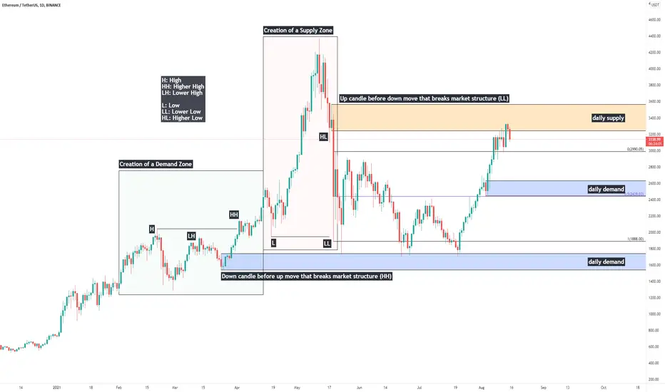
Price Action Study: Single Candle Supply & Demand ZonesHappy Sunday everybody, today I'll be providing a quick writeup on identification of single-candle Supply & Demand zones, otherwise known as "Orderblocks" (Credits to ICT for coining this phrase)
Supply & Demand are one of the most fundamental aspects of trading securities.
In price action - liquidity is believed to be the driving force behind market movements. The primary reason assets move is because of an imbalance between buyers and sellers - supply & demand.
If supply outweighs demand, price moves down.
If demand outweighs supply, price moves up.
If supply and demand are relatively the same - the market consolidates.
Supply and demand zones are created during consolidations - and today we are going to look at how to identify them. When prices is to return to these zones, we look for signs of accumulation to go long, or distribution to short.
Single candle supply and demand zones are also commonly referred to as "orderblocks" - here's how to identify them.
Demand/Bullish OB: A down candle before an up move that breaks market structure - a higher high.
Supply/Bearish OB: An up candle before a down move that breaks market structure - a lower low.
It is an important distinction - we need a structural break for the zone to be a meaningful region to watch if/when price is to return.
-Will, OptionsSwing Analyst
VIDEO | How to Know if Your Trade is Going to Fail Educational video on my "point of failure" concept. This is a must watch video for all trend followers.

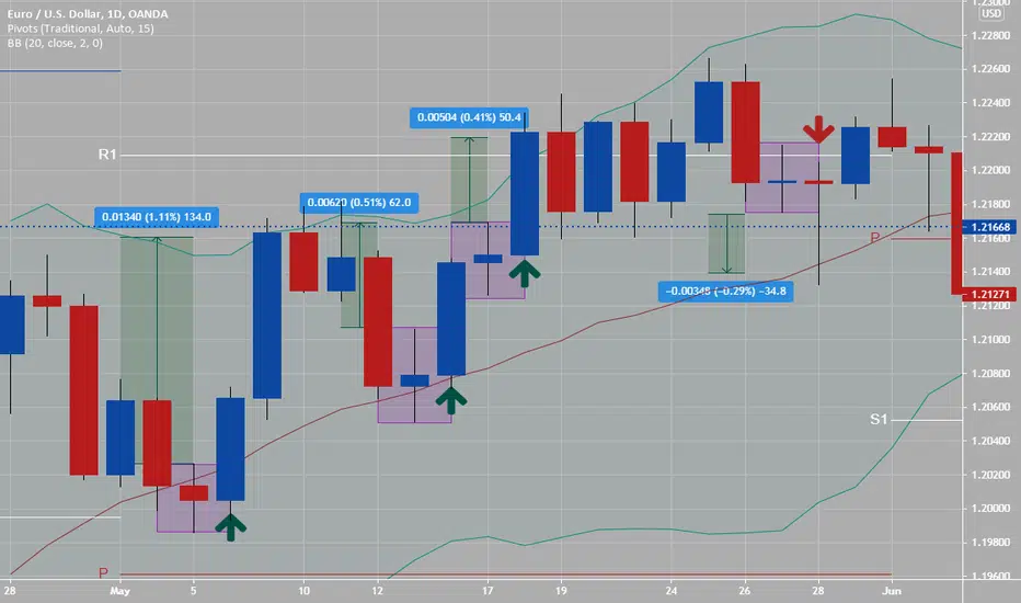
Pivot Point StrategyIf you are scalping or day trading and use time frames under 4 hour, 1 hour, 15 minutes- then try this all pivot point strategy for one week.
Example chart is on a one hour time frame of GBPCAD.
Add:
Daily pivot points (RED line on chart)
Weekly pivot points (WHITE line on chart)
& Monthly pivot points (BLUE line on chart)
on your charts only (three sets of pivot points).
You can add trend lines, Elliot waves, fib ret etc... as needed overlaying charts when you are trading.
You could have had an easy three trades (two sells and one buy) on Fridays price action related to this pivot point strategy. Rules: if price action has stopped by one of these pivot points, set up either a breakout trade, or reversal of trend trade if an Harami, Engulfing or Pinbar pattern presents its self. Trading the pivot point strategy is great in-between Tokyo end of session to London end of session (12 hours). If two pivot point lines are close: like daily and weekly this area is stronger and harder for price action to break thru, if a weekly and monthly are close together this area is very strong and hard for PA to get thru.
Look what happened on chart example with price action around daily, weekly and monthly pivot points--- you can trade only these when scalping or day trading, please do some back testing on this... you will be very surprised by the positive results.

Video | Identifying Key and Critical Support/Resistance Educational video on determining market structure (key vs critical support/resistance)

End Of Tokyo 2 End Of London (12 hours)During these 12 hours per day are the highest liquidity and volume during the day, trading Forex. Why? Encompassing Tokyo/London overlap session then only London session then finally London/NY session overlap.
If you are day trading or scalping, these 12 hours are best for doing both. Use highest ADR pairs with either Gbp or Eur pairs, you should be able to with right risk management and set ups make piece of pip pie (or make a profit), on one to five trades depending on your strategy and trading edge.
On attached 15 minute chart you see up to 70 pips in bullish move during this high liquidity and volume move. Times noted are PST/USA times so please convert to local times. Keeping trading simple with price action always #1, then using maybe daily pivot points, session indicator and alligator- will lead to success.
Yellow lines are 4 hour divide lines and peach lines are noting the 9 pm to 9 am (12 hour) period which has high of both liquidity and volume.
If you do day trade, think about trading from main daily pivot point or (PP) to either S1 or R1 every day only, this will give you a very high win rate %, please back check. (noted on chart is main (P) pivot point (RED line) to resistance R1 (WHITE line)- would give you a 1:3 or more risk reward set up with 20 pip stop vs 70 pip target... with right risk management on this one trade and with trailing stop.

Sydney-Tokyo Overlap Session Do you trade AUD pairs? If yes, look for trends to start during the overlapping session with Tokyo: around 6 hr overlap time.
What To Look For:
1) Look on hourly charts for trends with AUDxxx or xxxAUD pairs to start during Sydney-Tokyo overlapping session (slow but great risk/reward setups)
2) See AUDJPY 1 hour chart example- excellent Harami two candle pattern to set up a bullish trade with. (placed in purple box on chart)
3) 81.500 price level is a highly psychological price level for big banks and realtor traders ( both, love price numbers ending with 000,250,500 or 750)
4) On chart is three indicators (that I use either alone or together) to get confluence with to enter a new trade: Yes, price action only with naked charts work.
A- Ichimoku Cloud- price action is above gold line or conversion line (so bullish sign)
B- Pivot Points- price action is above weekly pivot point or red line (so bullish sign)
C- Bollinger Band- price action is on or above 20 ema or middle yellow line and BB squeeze is starting (so bullish sign)
Note: With Aud pairs- look for trends to start during the Sydney session and both Sydney-Tokyo overlapping session- this AUDJPY bullish trade on hourly chart on Friday could have let you ride it for most of the daily session. Do not be greedy when scalping or day trading- get your pip piece of pie and close trade.
With all trading price action and risk management are both #1 (set entry, stop and targets for all trades)-

Dow Theory, AppliedDow Theory is a foundational set of principles that underlies modern technical analysis. One of the main tenants of the theory involves trend confirmation by comparing similarities between equity indices' price behavior. Originally, the Dow Transportation Index was used to confirm trend direction in the Dow Industrial Index. Now things are a bit more complicated, with multiple indices covering a wide array of sectors and ever-evolving niche technologies.
To get a confluence of direction across the four major American indices (DJI, SPX, IXIC, RUT) to close the week has not been a simple task. I believe this is one of the reasons why a systemic selloff has been delayed in spite of the increasingly opaque economic picture. There are just too many cross-correlates that offset each other on the basis of what each sector "should" do in such-and-such situation. For example, the notion of fleeing to technology as a safety measure may have manifested as a "real" reaction in the middle of 2020, but it was the media's promulgation of such an idea that popularized it into today's common market wisdom. In any case, I would argue that fleeing into tech will work until it doesn't - and that day is looking closer by the hour. Literally.
Just take a look at the four charts displayed above - each of the four indices mentioned sports a bearish hourly candle to close the week. While this is subtle information, I was able to see the price action from a tape reader's point of view, and I will tell you that the price movement during this last hour was categorically different than any I have seen in months. This was real selling; institutional selling en masse. Each of the four underlying ETFs were seemingly stuck in quicksand for an hour and in order to confirm this back=end observation, I turned to the charts after the close.
The results depicted above depict consistent heavy selling across all four indices, in the form of nasty looking candles to close the session. Charles Dow and his then-clever, and now-accepted theory, would point to this as a prime example, were he still trying to convince the world of its validity.
While nothing is certain in markets, this is some pretty compelling data suggesting that, at the very least, there will be some serious volatility for the first time in a long time.
I'm short, but it's not so simple with the other side being a hysterical bubble and all. My suggestion is to get creative and take advantage of the four-way confirm.
-ConfirmPig
TVC:IXIC
CURRENCYCOM:US100
TVC:SPX
CURRENCYCOM:US500
TVC:DJI
CURRENCYCOM:US30
AMEX:IWM
TVC:RUT

Using past consolidation zones to determine key areas of S/RUsing past consolidation zones to determine key areas of support/resistance ("S/R")
In this chart, I'm using a script that I've published (called " Bollinger bands + RSI Strategy" ) to determine the key areas of S/R (refer to Note 1 (below) to briefly understand how the script behind works). For the purpose of this analysis, we will ignore the performance of backtested results. We will only rely on past entry/exit price points to plot horizontal lines and treat them as S/R going forward.
In the above Illustrated BTCUSD example :
Marked up in freehand (lime circles), you will see that the strategy has entered long at positions of prices at approx. 35.8k, 31.8k, 34.2k, and 31k, respectively, in chronological time order. For marketable securities (or crypto in this case) that are frequently traded in high volumes, these areas of S/R tend to get re-tested in the near future. (Maybe, can imagine, it is because humans (whales) tend to see them as having meanings, and may view them as targets). Take 35.8k in the example; it didn't hold at the very beginning, shortly gets re-tested, tanks again, and up to the the point-in-time of now when this idea is being published, "it may possibly" re-test 35.8k again.
--
Note1: The strategy in the underlying script simply enters into long position whenever indicators of BOLL + ATR suggest price volatility is decreasing, later exits the position when RSIs show overbought, or in alternative case when price touches the trailing-stop-loss limit. For details, you may read the summary of that strategy.
Disclaimer : The idea above is solely based my personal views. This post is not an investment advice. Viewers are suggested to consider the advantages & practical limitations of the idea/strategy on their own. If this post contradicts with other school of thoughts, then viewers will apply their own professional judgment to make the prevailing investment decisions.

How to use Pivot points Indicators to our advantage!Hi every one
A pivot point is a technical analysis indicator, or calculations, used to determine the overall trend of the market over different time frames. The pivot point itself is simply the average of the intraday high and low, and the closing price from the previous trading day. On the subsequent day, trading above the pivot point is thought to indicate ongoing bullish sentiment, while trading below the pivot point indicates bearish sentiment.
The pivot point is the basis for the indicator, but it also includes other support and resistance levels that are projected based on the pivot point calculation. All these levels help traders see where the price could experience support or resistance. Similarly, if the price moves through these levels it lets the trader know the price is trending in that direction
A pivot point is an intraday technical indicator to identify trends and reversals commonly used in equities, commodities, and forex markets.
Pivot points are calculated to determine levels in which the sentiment of the market could change from bullish to bearish, and vice-versa.
Day traders calculate pivot points to determine levels of entry, stops, and profit-taking by trying to determine where the majority of other traders may be doing the same
The pivot point indicator can be added to a chart, and the levels will automatically be calculated and shown. Here's how to calculate them yourself, keeping in mind that pivot points are predominantly used by day traders and are based on the high, low, and close from the prior trading day. If it is Wednesday morning, use the high, low, and close from Tuesday to create the pivot point levels for the Wednesday trading day.
After the market closes, or before it opens the next day, find the day's high and low, and the close from the most recent previous trading day.
Sum the high, low, and close and then divide by three.
Mark this price on the chart as P.
Once P is known, calculate S1, S2, R1, and R2. The high and low in these calculations are from the prior trading day.
What Do Pivot Points Tell You?
Pivot points are an intra-day indicator for trading futures, commodities, and stocks. Unlike moving averages or oscillators, they are static and remain at the same prices throughout the day. This means traders can use the levels to help plan out their trading in advance. For example, they know that, if the price falls below the pivot point, they will likely be shorting early in the session. If the price is above the pivot point, they will be buying. S1, S2, R1, and R2 can be used as target prices for such trades, as well as stop-loss levels.
We hope that you've learn something with this post .
Have a nice day and Good luck.

SPOTTING EARLY TREND REVERSAL | EURUSD
Hey traders,
As you know, I am very bearish biased on EURUSD.
On a daily, the price respected a major key level and also broke a rising wedge pattern to the downside.
On intraday time frames, with classic price action rules, we can easily spot a trend reversal :
The price was trading in a bullish trend .
The uptrend was confirmed by a sequence of higher highs and higher lows .
1.2267 is a local structure high .
After a retracement to a new higher low the price set a lower high (a very important bearish clue).
Then the price violates a previous higher low level to the downside setting a new lower low .
With a sequence of two lower lows and lower high, we can confirm a bullish trend violation and initiation of a new bearish trend on 8H chart.
Now we are waiting for the completion of a retracement leg in a zone between current spot prices and the level of a previous lower high
and a consequent bearish continuation.
❤️ Please, support this idea with a like and comment! ❤️
⬇️ Subscribe to my social networks! ⬇️

SPOTTING EARLY TREND REVERSAL | EURUSD
Hey traders,
As you know, I am very bearish biased on 🔻EURUSD.
On a daily, the price respected a major key level and also broke a rising wedge pattern to the downside.
On intraday time frames, with classic price action rules, we can easily spot a trend reversal:
1️⃣ The price was trading in a bullish trend.
2️⃣ The uptrend was confirmed by a sequence of higher highs and higher lows.
1.2267 is a local structure high.
3️⃣ After a retracement to a new higher low the price set a lower high (a very important bearish clue).
Then the price violates a previous higher low level to the downside setting a new lower low.
❗️With a sequence of two lower lows and lower high, we can confirm a bullish trend violation and initiation of a new bearish trend on 8H chart.
Now we are waiting for the completion of a retracement leg in a zone between current spot prices and the level of a previous lower high and a consequent bearish continuation.
❤️ Please, support this idea with a like and comment! ❤️
⬇️ Subscribe to my social networks! ⬇️

How To Trade Cradle PatternThe Cradle Pattern
Normally it should be a signal of reversal of the current Trend.
– It occurs during a Downtrend; confirmation is required by the candles that follow the Pattern.
– The Pattern starts with a long and black Candle, during a downtrend (Due to the Traders that are selling because they are worried by the downtrend).
– Then there is a phase of indecision in the Prices (There are Doji Candles, Spinning Tops, Hammer, Inverted Hammer), so the Prices remain in a precarious balance.
– At the end of the Pattern, starts a rise in the Prices with a long and white Candle (That shows the strength of the rise).

How To Trade Bullish Engulfing CandleA bullish engulfing candle occurs after a significant downtrend. Note that the engulfing candle must encompass the real body of the previous candle, but need not surround the shadow.
In order for the Bullish Engulfing signal to be valid, the following conditions must exist:
• The Forex pair must have been in a definite downtrend before this signal occurs. This can be visually seen on the chart.
• The second candle on hourly, 4 hour or daily candle of the signal should be a green (blue on my example) candle opening below the Close of the previous day and closing above the Open of the previous day’s black candle.
I just place enter order at start of next candle after engulfing candle concludes, with a stop loss at below of this candle or on example hourly chart of EURCAD related to ADR, place stop loss at 20 pips for day trade- exit when price action or target hits 40 pips. 1:2 risk reward setup.

How To Trade Daily Doji CandlesticksA doji represents an equilibrium between supply and demand, a tug of war that neither the bulls nor bears are winning. In the case of an uptrend, the bulls have by definition won previous battles because prices have moved higher. Now, the outcome of the latest skirmish is in doubt.
After a long downtrend, the opposite is true. The bears have been victorious in previous battles, forcing prices down. Now the bulls have found courage to buy, and the tide may be ready to turn.
How I trade daily doji's (rules):
1) Place a news buy (long) or sell (short) order next session or daily candle.
2) Place buy order 1 pip above highest price action of daily doji candle
3) Place sell order 1 pip below lowest price action of daily doji candle
4) Which ever one is hit by the next sessions price action- the other order is turned into a stop loss order.
5) Examples of three buy orders and one sell order on daily EURUSD example chart- with possible pip profits of 30 pips to 130 pips.
These dojis occur on every time charts, but I tend to put more weight into using these on 1 hour, 4 hour or higher charts.
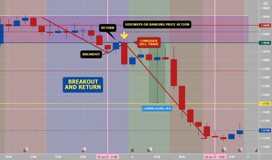
How To Trade Break Out & Return PatternAfter sideways price action, price action breaks out of range suddenly which you should let happen, then price action returns back into range- this is time that a trader should consider getting into a new trade (example: chart trade is sell break out and return trade).
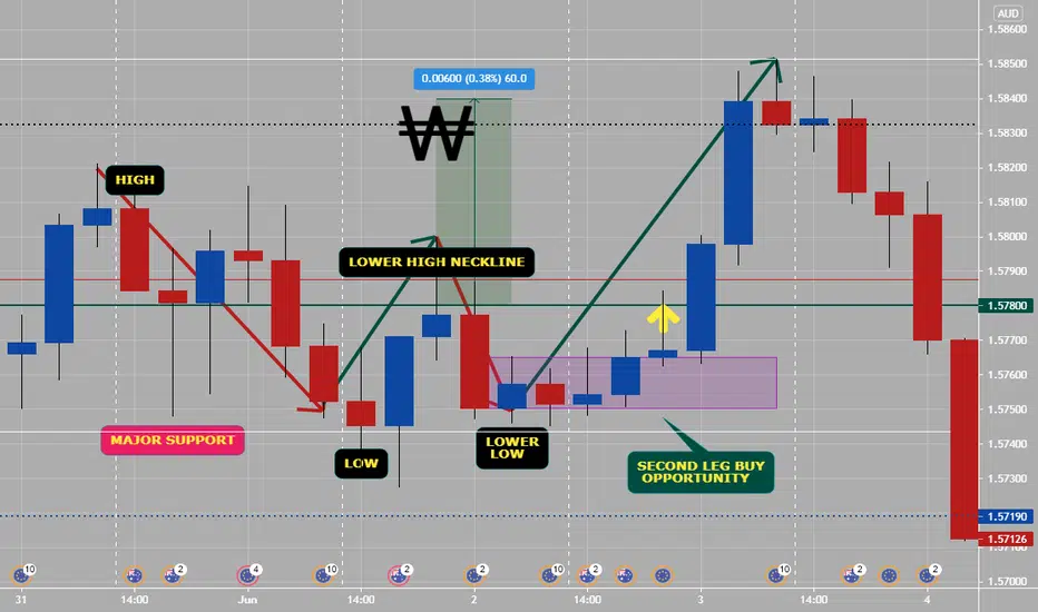
How To Trade "W" Pattern5 Tips to trade W reversal patterns:
1) Only trade W’s off the lows
2)Only trade W formations London & NY Session
3)Wait for the second leg stop hunt to the high/low of the day to confirm entry
4) Asian consolidation range should be very well defined
5) Always use proper risk management, if the Risk reward ratio is less than 1:3+ the trade is not worth taking
Each day there is a new high and low that is created.Trade the “W” formation reversal pattern at the lows.
This is a universal guide to trading W formations on any pair in Forex. This works on all time frames under the daily time frame. We recommend back testing everything we have highlighted in this post for greater clarity of the power you are tapping into!
The concept of trading M and W patterns
The retail trader masses may be dumb, but they are not that dumb. They will always continue to look for confirmation in order to validate their trades. So, we must understand the reverse psychology behind why the M and W pattern is such an effective reversal strategy. The confirmation the masses use to determine a trend is the creation of higher highs and higher lows in the case of an uptrend.
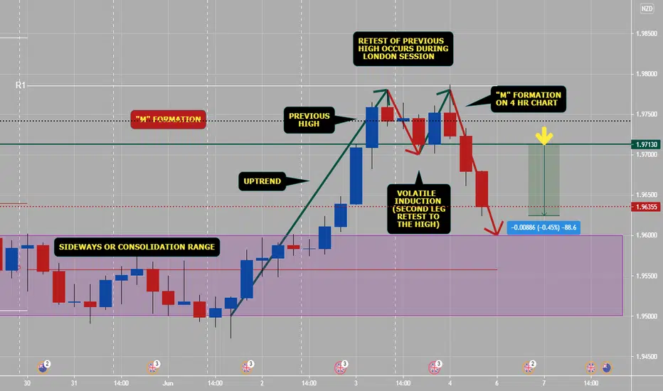
How To Trade "M" pattern (part 1)5 Tips to trade M reversal patterns:
1) Only trade M’s off the highs or overbought/supply areas.
2) Only trade M & W formations London & NY Session
3) Wait for the second leg stop hunt to the high/low of the day to confirm entry
4) Asian consolidation range should be very well defined
5. Always use proper risk management, if the Risk reward ratio is less than 1:3+ the trade is not worth taking.
These patterns occur on all scales and on all time frames. The time frame above is on the 4 hr, here we can clearly see the structure of the different sessions that occur on a daily basis.
The best sessions to trade are London Session and New York Session. These sessions will present the best reversal setups. Asian session should be avoided as there is very little movement.
Engage- Reversal Pattern -2 Extreme Reversal setupThe first Video on Education series - Engage - The Trade Setup
The first candlestick pattern that I will discuss is the wick reversal setup, which is a pattern that can spotlight some of the best reversal opportunities in the market.
studied from Book Secrets of a Pivot Boss: Revealing Proven Methods for Profiting in the Market
www.amazon.in
Happy learning.
( Education purpose for all )

Fibonacci 101Fibonacci retracements follow a mathematical principle set forth by Leonardo Fibonacci.
To put it simply - each level is a ratio between two other numbers, and there are countless examples of them being respected in the stock market, forex, crypto, commodities - you name it. For this reason, it's an essential tool in the technical trader's toolbox.
There are many uses for this tool:
Finding regions of support or resistance
Helping with stop loss placement
Establishing targets to take profit - especially during price discovery (no existing S/R levels)
Rules of Thumb
While placement of your anchor points is somewhat subjective - a rule of thumb is to stick with glaringly obvious swing points .
Simple is best with this tool - one of the reasons that it works is that other traders (or trading algorithms) are watching the same regions of price as you are. No need to overcomplicate it!
For a bullish retracement (+ targets) - begin your Fibonacci at a swing low, and end it at a swing high.
For a bearish retracement (+ targets) - begin your Fibonacci at a swing high, and end it at a swing low.
Personalizing Your Settings
The way I have my Fibonacci retracement tool configured, it includes some trend-based Fibonacci extensions in the calculations as well. This can be done by opening your Fibonacci settings and adjusting the inputs. The levels I have as inputs are as follows:
0 - This is your starting point
0.236 - The shallowest retracement
0.382 - Shallow retracement
0.5 - While not a Fibonacci number, this is the midpoint of your swing
0.618 - Commonly referred to as the "Golden Pocket" - this is generally a very important region of support/resistance.
0.705 - While not a Fibonacci number, this is the midpoint between the 0.618 and 0.786 - a level that tends to see lots of activity, and is thus included in my settings.
0.786 - This is the deepest retracement before a full retrace.
1 - This is your ending point
-0.27 - While not a Fibonacci number, a very commonly used extension target during price discovery - Target #1.
-0.414 - While not a Fibonacci number, a very commonly used extension target during price discovery - Target #2.
-0.618 - This is your golden ratio - Target #3 during price discovery.
-1 - This is a 100% extension of the distance between your starting & ending point.
etc, etc - you can extend as far as you like!
Where Fibonacci extensions really shine is during price discovery - areas where there are no previous levels of support or resistance (new ATH's).
You can see on this $SPY chart - using our Fib tool on the COVID crash gave us some very accurate upside targets for the subsequent rally into new ATH's.
I hope this introduction to the Fibonacci Retracement tool on TradingView helped you develop a basic understanding of it's applications - make sure to like if you learned something and follow us for more!
Will, OptionsSwing Analyst
