TSI Indicator with Trailing StopTSI Indicator with Advanced Risk Management & Tick-Based Position Tracking
This comprehensive TSI (True Strength Index) indicator combines momentum analysis with professional risk management features, designed for active traders who need precise entry/exit signals with built-in position management.
Key Features:
🔹 Enhanced TSI Calculation - Classic TSI with customizable periods and signal line for crossover detection
🔹 Smart Signal Filtering - Threshold-based entries with momentum confirmation to reduce false signals
🔹 Tick-Based Risk Management - Stop loss and take profit levels calculated in ticks for precise position sizing
🔹 Advanced Trailing Stop - Dynamic trailing stop that activates after minimum profit threshold
🔹 Position Tracking - Real-time P&L calculation and position status monitoring
🔹 Visual Dashboard - Clean information panels showing current signals, position status, and key metrics
🔹 Background Coloring - Instant visual feedback for active positions
🔹 Comprehensive Alerts - Entry signals, trailing stop activation, and position exit notifications
Customizable Settings:
TSI periods (Long/Short/Signal lengths)
Risk parameters (Stop Loss/Take Profit in ticks)
Trailing stop configuration
Signal thresholds for entry filtering
Display options for clean chart presentation
Perfect for: Day traders, scalpers, and swing traders who need precise entries with disciplined risk management. Works on any timeframe and instrument that supports tick-based calculations.
The indicator plots all levels directly on the chart with color-coded risk zones, making it easy to visualize your trade setup at a glance. Educational tool for understanding TSI momentum patterns combined with systematic risk management principles.
Note: This is an educational indicator for analysis purposes. Past performance does not guarantee future results.
Chart patterns

Buy High, Cry Later™ [v.1]🟢 Buy Signal Logic:
RSI > 200? Buy.
MACD crossing in the opposite direction? Buy harder.
A green candle appeared? That’s bullish af.
Elon tweeted something? YOLO all-in.
Signal confirmed by 2 pigeons landing on your window.
🔴 Sell Signal Logic:
Price down 0.1%? Panic sell.
Your neighbor just bought in? Dump it.
Wife walks in? Liquidate everything and pretend you're doing taxes.
Trade hit breakeven? Close immediately, you're not greedy.
💬 Alerts Include:
“Moon incoming 🚀🚀 (probably...)”
“Dump detected – but it might reverse. Or not. Who knows.”
“Just close the chart and go outside, man.”
🛠️ Features:
Ultra-premium “Repaint Mode” – only shows correct signals after they worked.
Martingale-enhanced entries: “Double down or cry trying.”
AI-enhanced backtest: 100% win rate on cherry-picked data from 2003.
⚠️ Disclaimer:
This tool may cause excessive optimism, overtrading, or spontaneous weeping. Not responsible for margin calls or emotional damage.


EdgeXplorer - Smart Candle Patterns + SwingsEdgeXplorer – Smart Candle Patterns & Swings
Smart Candle Patterns & Swings by EdgeXplorer is a dual-function visual analysis tool that intelligently detects major swing points and overlays them with recognized candle reversal patterns. This tool brings together classical candlestick analysis and market structure theory, helping traders identify high-probability zones where price action may shift.
The script not only marks swing highs/lows as HH, LH, HL, or LL, but also labels key candlestick patterns—from Hammers to Engulfings to Three Black Crows—providing real-time context for possible trend continuation or reversal setups.
⸻
🔍 What Does This Tool Do?
This indicator performs two primary functions:
1. Swing Structure Labeling – Marks each new pivot as a higher high (HH), lower high (LH), higher low (HL), or lower low (LL)
2. Smart Candle Pattern Detection – Identifies 14 of the most widely studied candlestick reversal patterns and displays them alongside the swing label
It’s a lightweight, unobtrusive way to bring structure and pattern recognition to your chart—no repainting, no noise, and no signal promises.
⸻
⚙️ How It Works – Technical Breakdown
1. Swing Highs and Lows
• The script uses a pivot detection window (Pivot Length) to find local swing highs and lows
• When a new pivot forms:
• It is classified as one of:
• HH – Higher High
• LH – Lower High
• HL – Higher Low
• LL – Lower Low
• These swing points act as visual guides for traders tracking structure
2. Candlestick Pattern Logic
At each confirmed pivot, the script evaluates the candle and its neighbors for a match from a built-in library of 14 classical reversal patterns:
Pattern Description
Hammer Small body, long lower wick – bullish signal after a downtrend
Inverted Hammer Long upper wick, signals failed bearish push
Bullish Engulfing Green candle fully engulfs red one
Bearish Engulfing Red candle fully engulfs green one
Hanging Man Long lower wick after uptrend, often bearish
Shooting Star Long upper wick after uptrend, bearish signal
Doji Small or zero body, signals indecision
Morning Star Three-candle bullish reversal pattern
Evening Star Three-candle bearish reversal pattern
Spinning Top Small body with upper/lower wicks, signals indecision
Bullish Marubozu Large green candle with no wicks
Bearish Marubozu Large red candle with no wicks
Three White Soldiers Three large bullish candles in a row
Three Black Crows Three large bearish candles in a row
Each pattern is detected using precise criteria based on body size, wick ratios, and relative position to previous candles.
⸻
📈 What You See on the Chart
Visual Meaning
Swing Label (e.g., HH, LL) Identifies structural pivot and its type
Pattern Name (e.g., Doji, Bullish Engulfing) Displayed alongside swing label if pattern is detected
Label Tooltip Shows a short description of the pattern’s meaning
Color
• Swing High = red (customizable)
• Swing Low = green (customizable)
⸻
📊 Inputs & Customization
Input Description
Pivot Length Number of bars to the left/right used to confirm swing highs/lows
Swing High Label Color Customize color of HH/LH labels
Swing Low Label Color Customize color of HL/LL labels
All labels are plotted using small visual markers to avoid cluttering the chart.
⸻
🧠 How to Interpret It in Live Markets
This indicator provides context, not confirmation. Use it to:
• Validate your manual swing structure tracking with automatic HH/LL labels
• Identify when a key candle pattern forms at a major swing (e.g., Shooting Star at a HH)
• Spot potential reversal zones or breakout failures
• Add confluence to Smart Money Concepts, price action setups, or other technical strategies
Example:
• A new LL forms with a Hammer → Potential reversal from bearish exhaustion
• A HH forms with a Shooting Star → Possible trap or overextension
⸻
🧪 Use Case Ideas
• 🔄 Reversal Confirmation – Combine swing structure with pattern match for early reversal entries
• 🧭 Structure Validation – Let the HH/LL labels validate your trend bias
• 📉 Exhaustion Signals – Watch for Doji/Spinning Top patterns at mature moves
• ⚠️ Avoid Choppy Conditions – Use absence of patterns to avoid entering low-conviction zones
This tool works across all asset classes: crypto, forex, stocks, indices, and even futures.


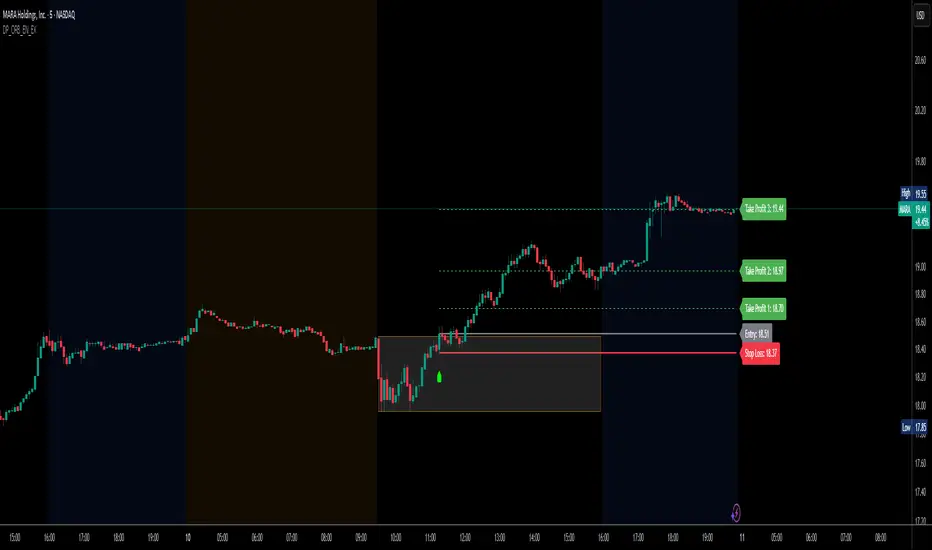
DP_ORB Entry & Exit IndicatorDisclaimer:
This indicator is for educational purposes only. It does not constitute financial advice. Always do your own research and manage your risk. Also, I cannot take full credit for 'ORB' as its a well known strategy amongst many traders, but I do need to give a special shout out to @TheBigDaddyMax for putting me on to this.
DP_ORB Entry & Exit Indicator
Description:
The DP_ORB Entry & Exit Indicator is a powerful tool designed for traders who utilize the Opening Range Breakout (ORB) strategy on the NYSE session. This indicator visually identifies the initial volatility window of the trading day, by marking the 15m High, and 15m Low into a ORB Box, & then tracks breakout opportunities, and provides clear, dynamic trade management levels—all directly on your chart.
Key Features:
Automatic Opening Range (ORB) Box:
Identifies and plots the high and low of the user-defined opening range (default 9:30–9:45 NYSE) for visual reference and strategy foundation.
Breakout Entry Signals:
Automatically detects and marks long or short breakout entries when price closes above or below the ORB range, with additional momentum confirmation.
Dynamic Stop Loss:
Stop loss is intelligently set to the previous bar’s low for long trades (or high for shorts), adapting to market structure at entry.
Take Profit Targets:
Up to three fully adjustable take-profit levels are plotted, calculated as percentages from entry, supporting progressive trade management.
Visual Trade Management:
Entry, stop loss, and take profit levels are displayed as extending dashed lines from entry point to the current bar, with labels always shown just to the right of price for clarity on all timeframes.
Automatic Reset and Cleanup:
Visuals and logic reset daily and upon exit, ensuring a clean, uncluttered chart experience.
How to Use:
Set your preferred opening range time and take profit levels in the settings.
Wait for a breakout and confirmation during the NYSE session.
Use the on-chart lines and labels to manage your trade according to your risk and strategy plan.
Best For:
Day traders and scalpers seeking a disciplined, visual, and fully-automated approach to opening range breakout trading.
Supply/Demand Zones with Midline (No Overlap Logic)Supply and demand formations based on inside bar breakouts. Automatically plots zones to buy and sell from. MTF analysis available.

[FREE] Multiple Indicators Screener [NASAlgoTrading] Multiple Indicators Screener indicator is designed to help traders quickly scan multiple cryptocurrencies across different timeframes using a combination of proven technical indicators. It provides a comprehensive, at-a-glance view of market conditions to help identify high-probability trading opportunities.
How It Helps Traders Maximize Profits
✅ Saves Time – No need to switch between charts; all key metrics are displayed in one place.
✅ Confirms Trends – Combines multiple indicators to filter high-probability setups.
✅ Multi-Timeframe Alignment – Finds trades where short-term and long-term trends agree.
✅ Overbought/Oversold Alerts – Helps spot potential reversals using RSI, Stochastic, and TSI.
✅ Trend Strength Validation – ADX and Supertrend confirm whether a trend is worth trading.
Why Use This Script?
✔ Completely Free – No hidden costs or premium upgrades.
✔ Easy to Use – No complex setup; works out of the box.
✔ Customizable – Adjust timeframes, indicators, and assets to fit your strategy.
Best For:
Swing Traders – Identify trends across multiple timeframes.
Day Traders – Quickly scan for intraday opportunities.
Crypto Traders – Optimized for popular cryptocurrency pairs.
Start using this powerful screener today to enhance your trading efficiency and spot the best setups with ease! 🚀

EdgeXplorer - Phantom FlowPhantom Flow by EdgeXplorer
Phantom Flow is a high-precision, visual market structure toolkit inspired by core ICT (Inner Circle Trader) concepts — including Order Blocks (OBs), Fair Value Gaps (FVGs), Market Structure Shifts (MSS), Liquidity Zones, Killzones, and Balance Price Ranges (BPRs). Designed for real-time clarity and SMC-aligned trading, this tool enhances raw ICT theory with practical execution features: extended zone logic, session filters, and pivot-sensitive rendering.
Whether you’re swing trading on HTF or scalping intraday moves in New York or London, Phantom Flow gives you a clean, structured lens through which to interpret price behavior — without clutter or noise.
⸻
🔍 What Does Phantom Flow Do?
This indicator maps out multiple price action phenomena in one system. It detects and plots:
• Order Blocks (OBs) — potential institutional footprints
• Fair Value Gaps (FVGs) — inefficiencies or imbalance zones
• Market Structure Shifts (MSS) — directional break points
• Liquidity Zones — buy-side and sell-side wick traps
• Balance Price Ranges (BPRs) — overlap zones from opposing FVGs
• Killzones (Sessions) — session-specific high-probability windows
Each element is toggleable, color-coded, and drawn directly on the chart, creating an intuitive visual environment to identify potential setups or confirm directional bias.
⸻
⚙️ How It Works – Technical Breakdown
1. Pivot Engine
Phantom Flow uses ta.pivothigh() and ta.pivotlow() with a configurable lookback period to establish reactive swing points for structure and liquidity logic.
2. Market Structure Shifts (MSS)
MSS logic checks for breaks above prior highs or below prior lows:
• If price closes above a previous pivot high, it flags a bullish MSS.
• If price closes below a previous pivot low, it flags a bearish MSS.
Each MSS is marked with a line and label at the structure break.
3. Order Blocks (OBs)
When a swing high or low is confirmed:
• A bearish OB is plotted between the open and high of the pivot bar.
• A bullish OB is plotted between the low and open of the pivot bar.
OB zones are drawn as transparent boxes that project forward several candles.
4. Fair Value Gaps (FVGs)
Imbalance zones are defined when:
• A bullish FVG occurs if the current low is above the high from two candles ago, and price closed bullish.
• A bearish FVG occurs if the current high is below the low from two candles ago, and price closed bearish.
These are visualized as boxes with “FVG” labels.
5. Balance Price Ranges (BPRs)
If both a bullish and bearish FVG overlap in the same bar:
• A gray BPR box is plotted to represent the zone where those inefficiencies cancel or compress into a range.
Useful for tracking potential accumulation or consolidation.
6. Liquidity Zones (Wick Detection)
Using ATR-based wick thresholds:
• Buy-side Liquidity is identified where long lower wicks form beneath pivot lows.
• Sell-side Liquidity is identified where long upper wicks form above pivot highs.
These zones indicate where stop hunts or liquidity grabs may occur.
7. Killzones (Sessions)
Two sessions are visualized using background colors:
• New York Killzone (default: 7:00–9:00 EST) — yellow background
• London Killzone (default: 2:00–5:00 GMT) — blue background
Sessions are dynamically aligned with your chart’s timeframe and location.
⸻
📈 What Each Visual Element Represents
Element Meaning
Green OB Box Bullish order block (potential demand zone)
Red OB Box Bearish order block (potential supply zone)
Teal FVG Box Bullish fair value gap (imbalance to the upside)
Maroon FVG Box Bearish fair value gap (imbalance to the downside)
Gray BPR Box Balance price range — compression of opposing gaps
Blue Liquidity Zone Buy-side liquidity below a swing low
Orange Liquidity Zone Sell-side liquidity above a swing high
Lime Line + Label Bullish Market Structure Shift (MSS ↑)
Fuchsia Line + Label Bearish Market Structure Shift (MSS ↓)
Yellow / Blue Background Killzone time blocks for NY or London
All shapes are bounded in time and logic — there are no arbitrary plots.
⸻
📊 Inputs & Settings Explained
Input Description
Execution Mode (Live / Backtest) Determines whether to run real-time or backtest-friendly calculations
Pivot Sensitivity (lookback) Controls how far back to look for pivots — higher values = stronger swing filters
Show MSS Toggle to display Market Structure Shift lines and labels
Show OB Toggle to display Order Block zones from swing points
Show FVG Toggle to visualize Fair Value Gaps as they appear
Show Liquidity Zones Displays wick-based buy/sell-side liquidity traps
Show BPR Zones Highlights overlapping bullish and bearish FVGs as compression zones
Show Killzones Enables session-based background highlighting for NY/London
Color Settings
Customize each visual element with transparency-controlled colors for OBs, FVGs, MSS lines, liquidity zones, and killzones.
⸻
🧠 How Traders Can Use Phantom Flow
Phantom Flow is not a signal generator. It’s a market narrative visualizer. Here’s how to integrate it into your approach:
• OB + FVG = Confluence: Look for fair value gaps forming around order blocks. These often suggest institutional entry zones.
• MSS + Liquidity = Trap Setup: Market structure shifts occurring after price taps liquidity often signal reversals or fakeouts.
• BPRs = Choke Points: If opposing FVGs compress, expect consolidation or expansion shortly after.
• Killzones = Context Windows: Use sessions to filter signal quality. For example, only trade FVGs during the London/NY overlap.
This tool works best when layered with:
• BOS/CHOCH detection
• Premium/Discount logic
• Risk-based execution models
⸻
🧪 Optional Use Case Ideas
• Intraday scalping based on NY/London killzone + MSS
• Swing trading off HTF OB + LQ zones
• Fade or trend-continuation setups using FVGs + BPR
• Combine with displacement candles or volume to validate zones

F2D Highlighter + FTFC + Volume Spike + Dashboard🧪 Why F2D Works
It traps short sellers who expect a breakdown
When it reclaims prior ranges, buyers flood back in
Paired with timeframe continuity (green on higher timeframes), it increases the edge
💸 F2D in Options Trading
Ideal for Calls when:
You're near a key level (VWAP, support, inside week/day)
Volume surges on reclaim
You catch a 2D that flips into a 2U (strong reversal)
🔧 Strike selection: ATM or 1–2 strikes OTM
⏰ Expiration: Same day or next day (if late in the day)
💥 Targets: 30–50% profit, then trail or scale out

HTF Candle Extremes Zigzag (Drawn on LTF)HTF Candle Extremes Zigzag (Drawn on LTF)
This indicator plots zigzag lines connecting the extremes (highs and lows) of Higher Timeframe (HTF) candles directly on your lower timeframe (LTF) chart. It visually highlights trend changes and HTF candle structure by drawing colored lines representing uptrends and downtrends based on HTF candle extremes.
"Key Features"
Higher Timeframe Tracking: Select any HTF to track candle extremes using the built-in security function.
Zigzag Lines: Connects HTF candle lows to highs in an intuitive zigzag pattern.
Trend Indication: Uptrend lines are green, downtrend lines are red (customizable colors).
Customizable Line Width: Adjust the thickness of the zigzag lines for better visibility.
Drawn on Lower Timeframe: All lines appear on your active lower timeframe chart, allowing easy visual correlation.
"How It Works"
The script fetches the open, high, low, close, and time data of the specified HTF candle. It detects new HTF bars and identifies trend direction changes by comparing the highs and lows of consecutive HTF candles.
- When an uptrend is detected, vertical lines are drawn from low to high of the HTF candle, connected to the previous extreme low.
- When a downtrend is detected, vertical lines are drawn from high to low, connected to the previous extreme high.
- Transitions between trends are highlighted by connecting the last extreme of the previous trend to the current extreme, creating a clean zigzag pattern.
Usage Notes:
Ideal for traders who want to visualize HTF market structure and trend changes while analyzing price action on lower timeframes.
---
© The_Forex_Steward
(mozilla.org)

EdgeXplorer - Dynamic Price ActionEdgeXplorer – Dynamic Price Action
Dynamic Price Action by EdgeXplorer is a high-precision structural framework that detects and maps market structure shifts, liquidity zones, and sweep events in real time. Built for traders who prioritize price behavior over indicators, this suite intelligently interprets swing pivots, volatility ranges, and institutional footprints to surface key decision-making zones on your chart.
Whether you trade Smart Money Concepts (SMC), classical price action, or hybrid strategies, Dynamic Price Action helps you visualize where price is reacting, where it’s hunting stops, and when structure is shifting — without the noise.
⸻
🔍 What Does Dynamic Price Action Do?
This indicator tracks three core elements:
1. Market Structure Shifts – Bullish and bearish swing breaks (BOS and MSS)
2. Liquidity Zones – Dynamic detection of potential buy-side and sell-side liquidity pools
3. Sweep Events – Real-time detection when liquidity is taken out (aka stop hunts or raids)
It also contains logic for Order Block detection, giving you a foundational structure for further Smart Money analysis (note: OB visuals are currently off by default but fully supported).
⸻
⚙️ How It Works – Technical Breakdown
1. Market Structure (BOS / MSS)
• Detects swing highs and lows using a 3-bar pivot system
• When a valid swing is confirmed:
• A BOS (Break of Structure) line is drawn for bullish shifts
• An MSS (Market Structure Shift) line is drawn for bearish transitions
• Lines are plotted with customizable styles and optional labels
2. Liquidity Detection
• Liquidity zones are marked based on:
• Recent confirmed swing highs or lows
• ATR-based range check (swing must exceed Liquidity Sensitivity threshold)
• Post-swing candle direction (bullish or bearish close)
• Sell-Side Liquidity = swing highs likely containing stop clusters
• Buy-Side Liquidity = swing lows likely containing stop clusters
• Each zone is tagged visually and stored for later sweep checks
3. Sweep Recognition
• If price breaches a previously tagged liquidity level:
• A “Sell Sweep” label appears above the former sell-side zone
• A “Buy Sweep” label appears below the former buy-side zone
• Zones are removed after being swept to reduce clutter
4. Order Block Logic (Optional)
• The script includes full logic to detect bullish/bearish order blocks based on:
• Body-based or wick-based structure (user preference)
• Candle volume criteria
• Visuals are turned off for now but can be easily re-enabled
⸻
📈 What You See on the Chart
Visual Element Meaning
Green BOS Line Bullish break of market structure (higher high)
Red MSS Line Bearish shift in structure (lower low)
“Sellside Liquidity” Label Area above a swing high likely to hold resting liquidity
“Buyside Liquidity” Label Area below a swing low likely to hold resting liquidity
“Sell Sweep” Label A stop hunt above a prior high
“Buy Sweep” Label A stop hunt below a prior low
All elements are dynamically drawn, adapting to price behavior with zero repainting.
⸻
📊 Inputs & Settings Explained
Market Structures
Setting Description
Enable Market Structures Toggle BOS/MSS logic
Detection Mode Conceptual filter: Short-Term, Mid-Term, Long-Term (doesn’t affect logic)
Show Labels Display BOS and MSS labels above/below structure
Line Style Choose between Solid, Dashed, or Dotted
Bullish/Bearish Colors Customize line and label appearance
Liquidity Zones
Setting Description
Liquidity Sensitivity How large a swing must be (ATR multiplier) to qualify as a liquidity point
Order Blocks
Setting Description
Use Candle Body If true, OB zones are based on open/close instead of high/low
⸻
🧠 How Traders Can Interpret Dynamic Price Action
Structure-Based Bias:
• BOS = bullish structure continuing → look for long setups
• MSS = bearish structure breaking down → caution for reversals
Liquidity Zones:
• Price nearing a Sellside Liquidity zone? Watch for sweep + rejection
• Price tapping Buyside Liquidity? Look for absorption or reversal
Sweep Events:
• A Buy Sweep can signal accumulation
• A Sell Sweep can mark distribution or a trap breakout
Use sweeps as confirmation, trap detection, or entry filters.
⸻
🧪 Strategy Use Cases
• 🔍 Smart Money Concepts (SMC): Combine BOS/MSS + sweeps for refined CHoCH entries
• 🔄 Reversal Traders: Wait for sweep + structure shift before entering against prior trend
• 📉 Trend Continuation: Use BOS + liquidity clears to confirm direction
• 🎯 Scalping: Sweep zones act as high-probability entry areas on LTFs

Multi Indicator Version 2This Pine Script combines multiple technical indicators into one TradingView overlay: two EMAs (High/Low), Supertrend, VWAP with flexible anchoring (e.g., Session, Week, Earnings), previous day’s high/low for intraday analysis, and RSI-based visual cues. The Supertrend dynamically shades the background based on trend direction and generates alerts on trend changes. VWAP visibility can be toggled and is hidden on daily or higher timeframes if desired. RSI stars indicate overbought (above 70) and oversold (below 30) conditions. This comprehensive tool aids traders in identifying market trends, momentum, and key support/resistance levels for better decision-making.

Supply and Demand ZonesSupply and Demand Zones.
Best settings to have is have multiplier by 3 and only turn on the 30 minute, the 1 hour, and the 4 hour.

Fair Value Gap & Liquidity Zones [Combined]mixed FVG and buyside and sellside liquidity
xxxxxxxxxxxxxxxxxxxxxxxxxxxxxxxxxxxxxxxxxxxxxxxxxxxxxxxxxxxxxxxxxxxxxxxxxxxxxxxxxx

Opening Print Line (Customizable)📈 Opening Print Line (Customizable) is a simple yet powerful intraday tool that plots the opening price of the regular trading session (RTH) and keeps it visible across the entire chart—including during pre-market and extended hours.
💡 Key Features:
🕒 Configurable time zone selector (choose from Pacific, Mountain, Central, or Eastern)
🎯 Automatically detects and plots the 9:30 AM local opening price
🎨 Customizable line color
🏷️ Optional on-chart label with editable text
This indicator is especially useful for:
Identifying opening breakout or fade setups
Anchoring support/resistance levels to the session open
Building opening range strategies or scalp setups
🔧 Built with Pine Script v6. Fully compatible with stocks, ETFs, futures, or any instrument that follows a regular session open time.
⚠️ Note: The script assumes the regular trading session starts at 9:30 AM in the selected time zone. You can modify the time if using it for futures, crypto, or other markets.

Estilo Pako Mejorado - Tendencia, Liquidez y ConfirmaciónThis indicator is designed to replicate the entry logic used in high-accuracy institutional-style trading, specifically inspired by strategies used on XAU/USD (gold) in 15-minute timeframes.
It generates high-probability trade signals based on the following key conditions:
Clear market trend: Identified using the 20 EMA and 50 EMA crossover (trend confirmation).
Liquidity sweep detection: Triggers when price takes out recent highs/lows (20-bar lookback), suggesting stop-hunt behavior.
Candle confirmation: Requires a bullish or bearish engulfing candle as price reverts after the sweep.
Optional visual features include:
Order Blocks (OB): Displays the last opposite candle before a strong market move.
Liquidity zones: Marks recent swing highs/lows where liquidity likely sits.
The indicator only plots entry signals when all three conditions are aligned, aiming to reduce false positives and improve trade precision.
Best used on:
XAU/USD or major FX pairs
15-minute timeframe
In trending markets with clean structure
You can combine this indicator with alerts or automation tools to build a semi-automated or fully automated trading system.

Multi-Coin Scanner (Part 4) · Bryce Style [BYBIT]ulls 15-minute OHLCV data for each symbol.
Flags bars that meet all of these conditions:
Price closes above the highest high of the previous len candles.
Current candle closes above its own open and above the previous candle’s high (bullish engulfing).
Volume ≥ 20-period SMA of volume (spike).
Candle body is at least bodyThreshold (30 %) of the candle’s total range.
When a bar qualifies, it places a red “💥” label and triggers an alert message (symbol breakout @ price).

First FVG📘 Indicator Description (English)
First FVG – NY Open is a TradingView indicator designed to automatically identify the first Fair Value Gap (FVG) that appears during the New York session, following the ICT (Inner Circle Trader) methodology.
It highlights institutional inefficiencies in price caused by imbalanced price action and helps traders spot high-probability entry zones, especially after the 9:30 AM EST (New York Open).
⚙️ How It Works
Session time: The indicator scans for FVGs starting at 9:32 AM (allowing 3 candles after the NY Open to form).
FVG Conditions:
Bullish FVG: When the high of 2 candles ago is lower than the low of the current candle and the middle candle is bullish.
Bearish FVG: When the low of 2 candles ago is higher than the high of the current candle and the middle candle is bearish.
Only the first FVG per session is drawn, as taught by ICT for setups like Judas Swing or NY Reversal models.
A colored box is drawn to represent the FVG zone.
A dotted horizontal line (CE) is drawn at the midpoint of the FVG box (Consequent Encroachment), a key level watched by smart money traders.
A dashed vertical line is drawn at 9:30 NY time to mark the open.
🧠 How to Use It
Wait for the NY Open (9:30 AM EST) – the indicator becomes active at 9:32 AM.
Watch for the first FVG box of the day. This is often a high-probability reaction zone.
Use the CE line (center of the FVG) as a reference for entries, rejections, or liquidity grabs.
Combine with market structure, PD Arrays, and liquidity concepts as taught by ICT for confluence.
The FVG box and CE line will extend forward for several candles for visual clarity.
🎛️ Customizable Settings
Session time (default: 09:32–16:00 NY)
FVG box color (up/down)
Text color
Max number of days to keep boxes on chart
Option to show or hide the 9:30 NY Open vertical line

RSI Pivot Markers + Breakout Alerts + Anchored VWAPMarks RSI high price with a dotted line and marks low Pivot and puts an anchored vwap to the last rsi low price.

CM SlingShot System (Customizable)//@version=5
indicator("CM SlingShot System (Customizable)", overlay=true, shorttitle="CM_SSS")
// ==== 📌 INPUT SETTINGS ====
group1 = "Entry Settings"
sae = input.bool(true, title="📍 Show Aggressive Entry (pullback)?", group=group1)
sce = input.bool(true, title="📍 Show Conservative Entry (confirmation)?", group=group1)
group2 = "Visual Settings"
st = input.bool(true, title="🔼 Show Trend Arrows (top/bottom)?", group=group2)
sl = input.bool(false, title="🅱🆂 Show 'B' & 'S' Letters Instead of Arrows", group=group2)
pa = input.bool(true, title="🡹🡻 Show Entry Arrows", group=group2)
group3 = "MA Settings"
fastLength = input.int(38, title="Fast EMA Period", group=group3)
slowLength = input.int(62, title="Slow EMA Period", group=group3)
timeframe = input.timeframe("D", title="Timeframe for EMAs", group=group3)
// ==== 📈 EMA CALCULATIONS ====
emaFast = request.security(syminfo.tickerid, timeframe, ta.ema(close, fastLength))
emaSlow = request.security(syminfo.tickerid, timeframe, ta.ema(close, slowLength))
col = emaFast > emaSlow ? color.lime : emaFast < emaSlow ? color.red : color.gray
// ==== ✅ SIGNAL CONDITIONS ====
pullbackUp = emaFast > emaSlow and close < emaFast
pullbackDn = emaFast < emaSlow and close > emaFast
entryUp = emaFast > emaSlow and close < emaFast and close > emaFast
entryDn = emaFast < emaSlow and close > emaFast and close < emaFast
// ==== 🌈 CHART PLOTS ====
plot(emaFast, title="Fast EMA", color=color.new(col, 0), linewidth=2)
plot(emaSlow, title="Slow EMA", color=color.new(col, 0), linewidth=4)
fill(plot(emaSlow, title="", color=color.new(col, 0)), plot(emaFast, title="", color=color.new(col, 0)), color=color.silver, transp=70)
// Highlight bars
barcolor(sae and (pullbackUp or pullbackDn) ? color.yellow : na)
barcolor(sce and (entryUp or entryDn) ? color.aqua : na)
// Trend arrows
upTrend = emaFast >= emaSlow
downTrend = emaFast < emaSlow
plotshape(st and upTrend, title="UpTrend", style=shape.triangleup, location=location.belowbar, color=color.green)
plotshape(st and downTrend, title="DownTrend", style=shape.triangledown, location=location.abovebar, color=color.red)
// Entry indicators
plotarrow(pa and entryUp ? 1 : na, colorup=color.green, offset=-1)
plotarrow(pa and entryDn ? -1 : na, colordown=color.red, offset=-1)
plotchar(sl and entryUp ? low - ta.tr : na, char="B", location=location.absolute, color=color.green)
plotchar(sl and entryDn ? high + ta.tr : na, char="S", location=location.absolute, color=color.red)

Candle Range Theory (CRT) indicator📌 Indicator Name: Candle Range Theory (CRT) indicator
This indicator detects potential bullish and bearish reversal setups based on specific candlestick price action behavior. It is designed to highlight moments when the market may be rejecting extremes and preparing to reverse direction — but only after confirmation with the closing price.
🔍 How It Works:
Bullish Setup (Long Signal):
The previous candle is bearish (closes lower than it opens).
The current candle makes a lower low than the previous one.
The current candle closes above the previous candle’s close.
Bearish Setup (Short Signal):
The previous candle is bullish (closes higher than it opens).
The current candle makes a higher high than the previous one.
The current candle closes below the previous candle’s close.
Signals are only triggered after the bar is fully closed, to avoid premature entries.
🔔 The script includes alert conditions for both long and short setups so you can receive notifications instantly.
🎥 Inspiration:
The idea for this indicator came from the excellent educational content presented in this video:
"How to Read Candlesticks Like a Pro"
We highly recommend watching it to better understand the price action principles behind this signal.
Institucional S&R + Acción de Precio 1M v2Especial para accion del precio, soportes y resistencias a un minuto
