EdgeXplorer - Momentum EngineMomentum Engine by EdgeXplorer
Momentum Engine is a precision-driven oscillator and trend framework engineered to track market momentum with adaptive clarity. Unlike traditional momentum indicators, this engine blends ATR-based envelope logic, multi-mode oscillator scaling, and real-time directional overlays—all in one responsive system.
Designed for intraday traders and swing strategists alike, Momentum Engine offers a streamlined way to visualize momentum direction, impulse strength, and volatility-adaptive trend zones—with minimal noise and maximum context.
⸻
🔍 What Does Momentum Engine Do?
Momentum Engine visualizes market energy through a volatility-aware oscillator and accompanying trend overlays. It adapts dynamically to price behavior and enables traders to:
• Detect momentum waves with real-time visual cues
• Confirm directional bias using trend overlays and impulse zones
• Switch between Regular and Normalized oscillator modes
• See heatmap-based signal confirmation for crossovers
• View optional info panels, labels, and trend bar colors for clarity
It’s a compact yet powerful system built for discretionary and systematic use.
⸻
⚙️ How It Works – Technical Breakdown
1. Trend Envelope Logic
At its core, Momentum Engine constructs a price envelope using:
• The average of the highest closes and highs (Baseline Length)
• The average of the lowest closes and lows
• A multiplied ATR to scale the distance between upper and lower bounds
These bounds determine trend bias:
• Price above the short side of the channel → Bullish
• Price below the long side → Bearish
• In-between → Neutral
A dynamic midline tracks the central channel axis.
2. Oscillator Wave Calculation
The momentum oscillator reacts to price positioning relative to the envelope:
• In Regular Mode, it shows raw price deviation from the trend channel
• In Normalized Mode, it maps price movement into a 0–100 scale with historical scaling logic
Both modes use smoothing (Smoothing) to reduce noise.
3. Overlay Channel (Optional)
• Displays trend floors (bull) and ceilings (bear) on the price chart
• Color-coded trend shifts appear as pulse circles
• Optionally, bars themselves can be recolored for instant trend recognition
4. Heatmap Signal Zones
The background dynamically changes based on oscillator crossovers:
• Bullish signal → Yellow heatmap
• Bearish signal → Blue heatmap
These zones signal momentum ignition, especially helpful for early entries.
⸻
📈 What You See on the Chart
Element Meaning
Green Momentum Wave Bullish pressure (oscillator > midline or >50)
Red Momentum Wave Bearish pressure (oscillator < midline or <50)
Zero Line Base reference in Regular mode
Gray Guide Lines (Normalized) Bands for Overbought (85), Oversold (15), and Neutral (33–50)
Channel Lines Trend bias boundaries (bull/bear zones)
Pulse Marker (Circle) Trend direction change
Bar Colors (Optional) Bull or bear bar overlays for added clarity
Background Heatmap Bullish or bearish impulse confirmation
Info Table (Optional) Real-time trend and oscillator data panel
Debug Labels (Optional) Inline oscillator readings per bar
⸻
📊 Inputs & Settings
Engine Settings
Input Description
Timeframe Optional custom timeframe override
Baseline Length Determines envelope size (larger = smoother trend)
Multiplier Factor Controls ATR-based range expansion
Momentum Wave Settings
Input Description
Mode Regular = raw wave, Normalized = 0–100 scaling
Bull/Bear Colors Wave color customization
Line Width & Smoothing Visual clarity adjustments
Overlay Channel
Input Description
Show Overlay Toggle trend ceilings/floors on chart
Channel Colors Separate bull/bear lines
Trend Bar Color Recolors candle bodies based on trend bias
Signal Heatmap
Input Description
Enable Heatmap Background impulse shading toggle
Bull / Bear Colors Adjust visual tone of crossover zones
Add-ons
Input Description
Show Debug Labels View oscillator values at each bar
Show Info Panel Display current trend, oscillator value, and mode
⸻
🧠 How to Use Momentum Engine
Regular Mode
• Oscillator above 0 = Bullish bias
• Oscillator below 0 = Bearish bias
• Use zero line as your confirmation threshold
Normalized Mode
• 85 → Overbought / exhaustion
• <15 → Oversold / reversal watch
• Crossing 50 → Momentum ignition
• 33–50 → Neutral zone / ranging phase
Visual Interpretation Tips
• Green wave + yellow heatmap = Bull momentum confirmation
• Red wave + blue heatmap = Bear momentum confirmation
• Pulse marker = New trend — evaluate strength with wave slope
• Trend bar coloring = Scan trend alignment at a glance
⸻
🧪 Use Cases & Strategy Ideas
• ⚡ Scalping Impulse Moves
Use oscillator + heatmap crossover to catch directional bursts
• 🔁 Pullback Continuation
Wait for momentum to reset near neutral zone, then re-enter trend
• 📉 Reversal Triggers
Look for divergence or Normalized wave flipping at extremes
• 🎯 Multi-timeframe Confirmation
Set custom timeframe and layer on top of a higher or lower TF structure
Chart patterns

Institucional S&R + Acción de Precio 1M v2Especial para accion del precio, soportes y resistencias a un minuto

Momentum Buy/Sell IndicatorMomentum indicator that needs to be followed and not relied upon completely

Dex Stoch RSI + WaveTrend Dots [Enhanced]Wave indicator with RSI and dots signaling. dots signals when its over bought or over sold but it also follows the rsi trend when bullish or bearish momentum is coming.

Trendline Breakouts With Targets [ Chartprime ]The Trendline Breakouts With Targets indicator is meticulously crafted to improve trading decision-making by pinpointing trendline breakouts and breakdowns through pivot point analysis.
Here's a comprehensive look at its primary functionalities:
Upon the occurrence of a breakout or breakdown, a signal is meticulously assessed against a false signal condition/filter, after which the indicator promptly generates a trading signal. Additionally, it conducts precise calculations to determine potential target levels and then exhibits them graphically on the price chart.

Bullish RSI Divergencebullish rsi divergence with a bullish pin bar. look for swing positions once alert goes off.

Binary Satisfaction20‑EMA Trend Filter: Only long above EMA(20), short below (EMA isn’t plotted).
Volume Filter: Bar’s volume > 10‑bar SMA × volMult.
RSI Filter: Requires RSI(14) > 50 for buys, < 50 for sells.
ATR Volatility Filter: Only trade when ATR(14) > its 20‑bar SMA (avoids low‑vol markets).
Breakout Confirmation: BUY only if current close > prior high; SELL only if < prior low.

FutureObitz Official Bank Levels// © 2025 FutureObitz - Custom version for private use
This Bank Levels indicator automatically calculates daily high, low, mid, and premium/discount zones using dynamic ranges.
Ideal for intraday traders using supply/demand, liquidity concepts, and institutional levels. Labels are cleanly aligned and update once per day for minimal chart clutter.
This version was customized for my personal trading style and refined for visual clarity.

GalihRidha ZoneX — Adaptive MTF S&R + Smart Money AreasWelcome to ZoneX: The new frontier of Support & Resistance for modern traders!
ZoneX is more than just S&R — it’s a hybrid price map that fuses classic pivots with institutional logic, visualizing the zones that really matter.
What Makes ZoneX Different?
Multi-Timeframe S&R:
Instantly spot the true key levels from higher timeframes, not just what everyone else sees on the current chart.
Smart Money Order Blocks:
Automatically highlights supply and demand zones where institutions accumulate or distribute — find the real “trap” areas and avoid getting faked out.
VWAP Bands:
See where the liquidity is thickest — these bands act as magnets for price, great for both reversals and breakouts.
Midline Channel:
Identify the market’s equilibrium — know when you’re in value and when you’re at the edge.
Previous High/Low:
Mark institutional magnets and classic stop-hunt zones, updated in real-time.
Ultra Customizable:
One-click to enable/disable any feature. Clean for minimalists, packed for pros.
How to Use ZoneX
Breakout?
Wait for price to clear a ZoneX band or order block with momentum — enter on the retest.
Reversal?
Fade wicks and exhaustion right in the highlighted zone — confirm with price action or volume.
Range/Balance?
Trade the ping-pong between ZoneX midline and outer bands — great for scalping and mean reversion.
Who’s It For?
Active traders who want an edge beyond standard S&R.
Institutional-mindset scalpers and swing traders.
Anyone who loves a clean chart but craves real market context.
Level up your chart, see what the big players see —
and never trade blind again. This is ZoneX.

Highlight Candles with Open-Close Difference ≥ 24momentum candle. price starts big move or continue momentum on either side.


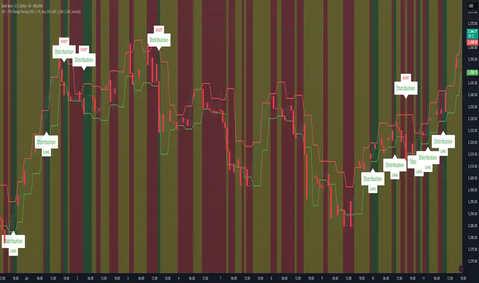
CRT + PO3 Range Theory Hey everyone, I’ve put together a little script for TradingView that tries to show the classic CRT + PO3 (Power of Three) pattern. It’s still a work in progress, so please use it on a demo account and let me know what you think!
What It Does
Accumulation Phase: On each higher‐timeframe bar (e.g. 2-hour), it draws a shaded zone where price is hanging out. That’s when we assume “big players” are quietly building positions.
Manipulation Phase: If price briefly pokes above or below that zone but then slips back inside, it marks that wick as a shake-out.
Distribution Phase: When price finally closes cleanly outside the zone, it draws another shaded area and drops a “Distribution” label plus a big LONG or SHORT arrow on that bar.
You can tweak it so it only shows signals when a bar closes (no more weird flashing mid-bar), or even allow “direct” Distribution on a clean breakout without waiting for a fake wick first.
How to Set It Up
Add the script from your Indicators list.
Pick your HTF (I like 2-hour or 4-hour).
Turn “Show Zone Labels” on or off—these are the little “Accumulation/Manipulation/Distribution” tags.
Turn “Show Entry Signals” on to get the big LONG/SHORT arrows.
If you hate flicker, check “Show signals only at bar close.”
If you want to catch a swift breakout (no fake-out needed), check “Allow direct Distribution on clean breakout.”
There are also sliders for zone colors, transparency, label size, and how far above/below the bars the labels sit.
Why It’s Still a Beta
I’m not a CRT/PO3 guru—this is more of a hobby project and a little facination for this strategy.
There might be edge cases where it misses a shake-out or flags a Distribution too early.
I take no responsibility for your trades—please only run it on a demo account until we’ve worked out the quirks.
Feedback Wanted!
If you try it out, I’d love to hear:
Did the Manipulation wicks line up where you expected?
Were the Distribution arrows on the right bars?
Any ideas for easier settings or extra alerts?
Thanks for testing and helping me turn this into something solid!
20/40/6020/40/60 candle separator. Three lines only on all timeframes. Range length and height included. Doesn't mess up the scaling. Togglable elements and movable lines.

DCA by Vuong Thai v2 %verview of "DCA by Vuong Thai %" – Upgraded Version
Main Function:
This script automatically detects optimal DCA (Dollar-Cost Averaging) buy points and smart profit-taking zones based on a combination of technical signals: EMA, candlestick patterns, volume, RSI, and price distance from EMA.
It helps you optimize capital allocation using a structured averaging-down strategy and exit trades when a target price range is reached.
✅ Buy Logic (Buy Signal)
A buy signal is triggered when all of the following conditions are met:
Strong bullish candlestick: Green candle with a longer lower wick than upper wick
Price is below the EMA → indicating a downtrend
Volume is above the moving average (if volume filtering is enabled)
Price is at least a certain percentage below the EMA (e.g., ≥ 1%)
RSI is below 30 → indicating an oversold condition
No repeat buys unless price makes a new low → helps avoid premature entries
👉 When a buy signal appears:
A DCA Zone (buy region) is drawn on the chart
A label with the corresponding DCA percentage is displayed automatically (e.g., "DCA 5%", "DCA 10%")

Silver Bull Flag Breakout AlertDescription:
This script detects a bullish breakout in Silver (XAGUSD) above $37.60, confirming a bull flag continuation pattern on the daily chart. It optionally plots a 21 EMA as a trailing stop and includes a customizable alert condition for trade execution or monitoring.
Features:
• Alerts on daily close above $37.60
• Optional trailing stop (21 EMA)
• Visual breakout marker
• Ideal for swing trades targeting $41–$45

Bank Nifty VWAP + RSI Alert//@version=5
indicator("Bank Nifty VWAP + RSI Alert", overlay=true)
// VWAP
vwapValue = ta.vwap
// RSI
rsiValue = ta.rsi(close, 14)
// Conditions
longCondition = close > vwapValue and rsiValue > 60
shortCondition = close < vwapValue and rsiValue < 40
// Plot signals on chart
plotshape(longCondition, style=shape.labelup, color=color.green, text="CALL")
plotshape(shortCondition, style=shape.labeldown, color=color.red, text="PUT")
// Alert conditions
alertcondition(longCondition, title="CALL Alert", message="Bank Nifty crossed above VWAP + RSI > 60 - Consider Call")
alertcondition(shortCondition, title="PUT Alert", message="Bank Nifty crossed below VWAP + RSI < 40 - Consider Put")

Customized ATR Trailing Stop with Fixed ATR DisplayCustomized ATR Trailing Stop with Fixed ATR Display

Mein Skript//@version=5
indicator("CAN SLIM Filter", overlay=true)
// Beispielhafte Kriterien
eps_growth = input.float(25, "EPS-Wachstum (%)")
rel_volume = input.float(1.5, "Relatives Volumen")
// Simulierte Beispieldaten
mock_eps_growth = ta.rma(close / close - 1, 90) * 100
mock_rel_volume = volume / ta.sma(volume, 50)
plotshape(mock_eps_growth > eps_growth and mock_rel_volume > rel_volume, title="CAN SLIM Match", location=location.belowbar, color=color.green, style=shape.labelup)

Volume in ₹ (Total Traded Value in Crores)vikram dayal volume indicator with absolute value in crore

OTC supply & demand Candleshi traders and OTC colleagues,
this simple indicator used to spot easly the (indecisive , decisive , explosive) candles
i suggest to keep the candle boarders from the chart setting (blue or green for bullish ) and (red for bearish) . this indicator simplify spotting the supply and demand zones and the most powerful explosive candles in eye plink based on Bernd Skorupinski
theory.
from indicator setting
colour 0 (indecisive)
colour 1 (decisive) bullish
colour 2 (decisive) bearish
colour 3 (explosive) bullish
colour 4 (explosive) bearish
you can change the colours as u wish.
have a good trading day

The Great Anchors: Dual AVWAP Powered by RSI
The Great Anchors
*Dual Anchored Volume Weighted Average Price Powered by RSI*
---
📌 Overview
The Great Anchors is a dual AVWAP-based indicator that resets dynamically using RSI extremes — either from the current asset or a master symbol (e.g., BTCUSDT). It identifies meaningful shifts in price structure and momentum using these "anchored" levels.
It’s designed to help traders spot trend continuations, momentum inflection points, and entry signals aligned with overbought/oversold conditions — but only when the market confirms through volume-weighted price direction.
---
🛠 Core Logic
• AVWAP 1 (favwap): Anchored when RSI reaches overbought levels (top anchor)
• AVWAP 2 (savwap): Anchored when RSI reaches oversold levels (bottom anchor)
• AVWAPs are recalculated each time a new OB/OS condition is triggered — acting like "fresh anchors" at key market turning points.
---
⚙️ Key Features
🔁 Auto or Manual RSI Thresholds
→ Automatically determines dynamic RSI OB/OS levels based on past peaks and troughs, or lets you set fixed levels.
🧠 Master Symbol Control
→ Use the RSI of a separate asset (like BTCUSDT, ETHUSDT, SOLUSDT, BNBUSDT, SUPRAUSDT) or indices (like TOTAL, TOTAL2, BFR) to control resets — ideal for tracking how BTC/major coins impacts altcoins/others.
🔍 Trend-Filtering Signal Logic
→ Signals are filtered for less noise and are triggered when:
- Both AVWAPs are rising (bullish) or falling (bearish)
- Price action confirms the structure
🎯 Visual Markers & Alerts
→ "💥" for bullish signals and "🔥" for bearish ones. Alerts included for automation or push notifications.
---
🎯 How to Use It
1. Add the indicator to your chart.
2. Choose whether to use RSI from the current symbol or a master symbol (e.g., BTC).
3. Select auto-adjusted or manual OB/OS levels.
4. Watch for:
- AVWAP(s) making a significant change (at this point it's one of the AVWAPs resetting)
- Check if price flip it upwards or downwards
- If price goes above both AVWAPs thats a likely bullish trend
- If price can't go above both AVWAPs up and fall bellow both that's a likely bearish trend
- Price retesting upper AVWAP and bounce
- likely bullish continuation
- Price retesting lower AVWAP and dip
- likely bearish continuation
- Signal icons on chart ("💥 - Bullish" or "🔥- Bearish")
Best suited for:
• Swing traders
• Momentum traders
• Traders timing altcoin entries using BTC/Major asset's RSI
---
🔔 Signal Explanation
💥 Bullish Signal =
• Both AVWAPs rising
• Higher lows in price structure
• Bullish candle close
• Triggered from overbought RSI reset
🔥 Bearish Signal =
• Both AVWAPs falling
• Lower highs in price structure
• Bearish candle close
• Triggered from oversold RSI reset
Signals reset by opposite signals to prevent noise or overfitting.
---
⚠️ Tips & Notes
• Use AVWAPs as dynamic support/resistance, even without signal triggers
• Pair with volume or divergence tools for stronger confirmation
---
🧩 Credits & Philosophy
This tool is built with a simple philosophy:
"Anchor your trades to meaningful moments in price — not arbitrary time."
The dual AVWAP concept helps you see how price reacts after momentum peaks, giving you a cleaner bias and more precise trade setups.
---

EdgeXplorer // Swing SequenceEdgeXplorer - Swing Sequence
Swing Sequence is an advanced structural mapping indicator designed to detect and visualize internal swing formations, sequence logic, and multi-leg transitions directly on the chart. This tool is particularly useful for traders applying Smart Money Concepts (SMC), Wyckoff theory, or Elliott-style structure recognition, where the accuracy of pivot timing, internal leg evaluation, and pattern tracking is mission-critical.
Instead of drawing arbitrary zig-zags, this indicator uses real market structure to extract and label potential bullish or bearish reversal sequences, including optional point 5 confirmations and internal double-top/double-bottom logic — all in real time.
⸻
🔍 What Does Swing Sequence Do?
Swing Sequence dynamically identifies structured pivot points and evaluates swing sequences composed of up to 6 labeled legs (A, B, 1, 2, 3, 4) and an optional 5th confirmation point. Once a valid bullish or bearish pattern is recognized based on defined structural rules, it plots:
• Pivot labels (A through 5)
• Swing zones or boxes outlining the full formation
• Optional pathlines to visualize swing flow
• Dotted projection lines for context
It also uses internal logic to detect double-point confirmations, creating a highly structured, rule-based method for visualizing potential reversals or continuations.
⸻
⚙️ How It Works – Technical Breakdown
1. Pivot Detection
The script calculates two sets of pivots:
• External Swings using Swing Pivot Length (len)
• Internal Swings using Internal Pivot Length (ilen)
Both use high/low extremities to determine directional bias (BULL or BEAR).
2. Sequence Evaluation
Once enough pivots are collected (at least six), the algorithm attempts to construct valid sequences:
• Bullish: A → B → 1 → 2 → 3 → 4 (+ optional 5)
• Bearish: A → B → 1 → 2 → 3 → 4 (+ optional 5)
Each candidate is evaluated using logical price containment, directional flow, and a unique “point 4 beyond point 2” condition (optional).
3. Double Point Logic
If enabled, the indicator looks for a second internal pivot that aligns in price proximity with point 4 (adjustable via Strict Double-Top/Bottom and ATR-based Threshold), allowing traders to require confirmation before considering a sequence valid.
4. Sequence Validation
Sequences are only plotted if:
• All structural rules are met
• There’s no overlap with a previously plotted sequence
• Optional filters (like show/hide point 5) are satisfied
⸻
📈 What You See on the Chart
Visual Purpose
Labels A–5 Marks each structural point in the sequence. Label 5 is optional.
Colored Box Encapsulates the swing structure:
• Green Box → Bullish sequence
• Red Box → Bearish sequence
Dotted Lines Horizontal projection from each swing point to end of sequence
Polyline (Path) (Optional) Connects all swing points to show flow
Auto-Coloring Box and line colors change based on bullish or bearish pattern, unless overridden
⸻
📊 Inputs & Settings Explained
Detection Settings
Input Description
Swing Pivot Length (len) Controls the lookback for external high/low pivots. Larger values = broader swings
Internal Pivot Length (ilen) Controls lookback for internal swing structure — used for validation and double-point logic
4 Beyond 2 Forces point 4 to go beyond point 2 for sequence to be valid
Show Point 5 Toggles whether point 5 is included in plotted sequences
Strict Double-Top/Bottom Enables stricter proximity matching between internal pivots (uses absolute levels vs. price containment)
Threshold Sets sensitivity of double-point matching, scaled by ATR(200) for dynamic precision
Display Settings
Input Description
Path Plots a polyline that connects all labeled points in a sequence
Boxes Toggles the shaded swing box zone
Line Color Default color for path and projection lines when auto-coloring is disabled
Auto-Color Automatically changes box and label colors based on trend direction
Show Lines Toggles horizontal dotted projection lines from each swing point
⸻
🧠 How to Read & Use Swing Sequence
Swing Sequence is a visual structural analyzer, not a signal tool. Here’s how to interpret what you see:
Bullish Sequence Example
A (high)
↓
B (low)
↓
1 → 2 → 3 → 4 (lower highs/lows)
↓
5 (double bottom)
Interpretation: Price is forming a potential reversal base. Confirmation at point 5 adds confluence for long setups.
Bearish Sequence Example
A (low)
↑
B (high)
↑
1 → 2 → 3 → 4 (higher highs/lows)
↑
5 (double top)
Interpretation: Market may be topping out. Point 5 adds structural symmetry and possible short confluence.
⸻
🧪 Use Cases & Strategy Integration
• 🔍 Smart Money Traders: Use the sequences to identify where price is structurally exhausting liquidity or forming distribution/accumulation
• 🔄 Reversal Traders: Use point 5 or sequence completion as part of your entry filter
• 🎯 Structure-Based Confirmation: Use Swing Sequence to validate bias after FVG, OB, or BOS breaks
• 📏 Target Zones: Swing boxes can define range-based targets, stop zones, or breaker levels

ONE: PEMA, EMA, SuperTrend, CPR, VIDYAThe ONE indicator is an all-in-one TradingView Pine Script that combines multiple popular trend, momentum, and volume tools into a single overlay. It is designed for senior traders and analysts who need a comprehensive yet lightweight solution to:
1. Identify dynamic price trends (PEMA & standard EMAs)
2. Capture volatility-driven reversals (SuperTrend)
3. Define key support/resistance (Central Pivot Range)
4. Measure adaptive momentum (VIDYA)
Key Advantages
Unified InterfaceNo more juggling separate scripts—activate/deactivate each component via simple inputs.
-PEMA (Price-Embedded MAs) with color-coded trend direction.
-Standard EMAs (5/13/26) for classic crossover strategies.
-SuperTrend for volatility-based stop-and-reverse signals.
-Central Pivot Range (daily & weekly) for intraday support/resistance.
-VIDYA (Variable Index Dynamic Average) for momentum that adapts to market conditions.
Adaptive Momentum Smoothing (VIDYA)Unlike fixed-length moving averages, VIDYA adjusts its sensitivity based on Chande Momentum Oscillator (CMO) or standard deviation.
- Fixed CMO option ensures consistent smoothing when you prefer a stable lookback.
- StDev option allows reactive smoothing in high-volatility environments.
- Customizable AlertsReal-time alertcondition on VIDYA color changes—ideal for automated trade entries/exits.
- Try pairing alerts with SuperTrend cross signals for high-probability setups.
Volume-Weighted Bar ColoringB ars are shaded based on volume spikes relative to an EMA of volume.
- Quickly spot institutional activity or accumulation/distribution phases.
Professional-Grade StylingClean, corporate color palette and line widths optimized for readability on both light and dark backgrounds.
Signal Interpretation
1. PEMA Green-to-Red Fill: Confirms multi-disciplinary trend reversals when the fast PEMA crosses the slow PEMA.
2. EMA Crossovers: Traditional 5/13/26 cross signals for momentum entry/exit.
3. SuperTrend Line: Trades above the line in uptrends; short when price closes below.
4. CPR Levels: Use daily CPR pivot (CP, BC, TC) for intraday range strategies; weekly pivot for broader support/resistance.
5. VIDYA Color Change: Blue to maroon or vice versa triggers alert for momentum shift.
6. Volume Coloring: Lime/red bars highlight high-volume moves; silver/gray for normal conditions.
Alert Setup
- Right-click on chart → Add Alert → Select ONE_VIDYA → Under Condition, choose VIDYA Color Alarm.
- Configure webhook/email/popup notifications for automated trading systems.
