Cycles

Wyckoff Smart Signals (Long + Short)- Wycoff Smart signals made by Melik
Using Wycoff fundamentals and volume confirmation to form a bias

Gold Trend Scalper [Strategy]The Gold Trend Scalper (GTS Pro) is a trend-following momentum-based strategy specifically optimized for trading XAUUSD (Gold) on the 1-minute timeframe. It combines volatility filters, breakout logic, trend confirmation, and risk management to identify high-probability entry points with dynamic exits.


Holy GrailThis is a long-only educational strategy that simulates what happens if you keep adding to a position during pullbacks and only exit when the asset hits a new All-Time High (ATH). It is intended for learning purposes only — not for live trading.
🧠 How it works:
The strategy identifies pullbacks using a simple moving average (MA).
When price dips below the MA, it begins monitoring for the first green candle (close > open).
That green candle signals a potential bottom, so it adds to the position.
If price goes lower, it waits for the next green candle and adds again.
The exit happens after ATH — it sells on each red candle (close < open) once a new ATH is reached.
You can adjust:
MA length (defines what’s considered a pullback)
Initial buy % (how much to pre-fill before signals start)
Buy % per signal (after pullback green candle)
Exit % per red candle after ATH
📊 Intended assets & timeframes:
This strategy is designed for broad market indices and long-term appreciating assets, such as:
SPY, NASDAQ, DAX, FTSE
Use it only on 1D or higher timeframes — it’s not meant for scalping or short-term trading.
⚠️ Important Limitations:
Long-only: The script does not short. It assumes the asset will eventually recover to a new ATH.
Not for all assets: It won't work on assets that may never recover (e.g., single stocks or speculative tokens).
Slow capital deployment: Entries happen gradually and may take a long time to close.
Not optimized for returns: Buy & hold can outperform this strategy.
No slippage, fees, or funding costs included.
This is not a performance strategy. It’s a teaching tool to show that:
High win rate ≠ high profitability
Patience can be deceiving
Many signals = long capital lock-in
🎓 Why it exists:
The purpose of this strategy is to demonstrate market psychology and risk overconfidence. Traders often chase strategies with high win rates without considering holding time, drawdowns, or opportunity cost.
This script helps visualize that phenomenon.

LEOLA LENS FOOTPRINT Reveal institutional intent with real-time price-based zones.
LEOLALENS™ Footprint tracks liquidity sweeps, high-probability entries, and smart money moves — built for traders who demand accuracy.
🔹 Institutional Sweep Detection
🔹 Non-Lagging Real-Time Zones
🔹 High-Probability Entry/Exit Points
🔹 Orange & Green LCB BOX Zones
🔹 Hidden Support/Resistance Detection
🔹 Psychological Price Levels
🔹 Momentum Shift Awareness Zones
🔹 Compatible across all asset classes: Crypto, Stocks, Forex, Commodities
Note: This is an invite-only script. Access is granted upon approval by the script author.

Alpha Trader University - London Continuation StrategyAlpha Trader University - London Continuation Strategy Indicator
OVERVIEW:
This educational indicator implements the London Continuation Strategy, a session-based trading methodology that capitalizes on price continuation patterns between the Asia and London trading sessions. Designed to teach traders about session timing, market structure, and continuation strategies.
STRATEGY METHODOLOGY:
The London Continuation Strategy is based on the market principle that directional movements established during the Asia session often continue during the early London session, creating high-probability trading opportunities.
SESSION ANALYSIS FRAMEWORK:
1. ASIA SESSION (4:00-9:00 Dubai Time):
- Establishes initial market direction and sentiment
- Creates key support and resistance levels
- Provides the foundation for continuation bias
- Blue box visualization with range tracking
2. PRE-LONDON SESSION (9:00-11:00 Dubai Time):
- Transition period between major sessions
- Setup and preparation phase for London entries
- Confirmation or negation of Asia session bias
- Teal box visualization for monitoring
3. LONDON SESSION (11:00-12:00 Dubai Time):
- Primary entry window for continuation trades
- Highest probability period for strategy execution
- Green box labeled "Entry Window" for clear identification
- Optimal timing for trade execution
EDUCATIONAL VALUE:
- Learn session-based trading concepts and timing
- Understand market flow between major trading centers
- Develop skills in identifying continuation patterns
- Practice using session ranges for risk management
- Build foundation for advanced session strategies
TRADING APPLICATIONS:
- Entry Timing: Use London session start for optimal entry points
- Direction Bias: Follow Asia session directional momentum
- Risk Management: Utilize session ranges for stop-loss placement
- Target Setting: Project targets based on session volatility patterns
- Market Structure: Respect key session levels and range breaks
UNIQUE FEATURES:
- Dubai timezone optimization for Middle East traders
- Three-session comprehensive analysis framework
- Real-time session range tracking and visualization
- Customizable visual elements and colors
- Educational labels and clear entry window identification
TECHNICAL IMPLEMENTATION:
- Accurate timezone conversion (UTC to Dubai time)
- Dynamic session detection and range calculation
- Real-time box and label updates during active sessions
- Clean visual design with professional color coding
- Efficient memory management for optimal performance
CUSTOMIZATION OPTIONS:
- Session colors for personal preference
- Box border width adjustment
- Label size customization
- Visual element toggle capabilities
RISK MANAGEMENT INTEGRATION:
- Session range-based stop-loss guidance
- Volatility assessment through range analysis
- Clear entry and exit timing signals
- Structure-based risk parameter definition
This indicator transforms complex session analysis into a systematic, visual trading approach, helping traders understand market timing and develop disciplined continuation strategies.
EDUCATIONAL DISCLAIMER: This indicator is designed for educational purposes and strategy development. It should be used as part of a comprehensive trading plan with proper risk management. Past performance of any strategy does not guarantee future results. Always practice proper risk management and consider market conditions before trading.

Renko MACD v2.0 (TradingFrog)Renko MACD (TradingFrog) – Professional Description with Code Explanations
Description:
The Renko MACD v2.0 (TradingFrog) merges the clarity of Renko charting with the power of the MACD indicator. This script SIMULATES RENKO BRICKS using price movement within any timeframe and calculates the MACD on these pseudo-Renko closes, resulting in clearer, noise-reduced trend signals.
Key Features & Code Insights
1. Pseudo-Renko Brick Calculation
price_diff = src - renko_close
abs_diff = math.abs(price_diff)
bricks_needed = math.floor(abs_diff / box_size)
Explanation:
This section computes how far the current price (src) has moved from the last Renko close. If the movement exceeds the predefined brick size, one or more new bricks will be created. This logic helps simulate Renko charts on any timeframe.
2. Brick Update Logic
if bricks_needed >= 1
direction = price_diff > 0 ? 1 : -1
brick_movement = direction * bricks_needed * box_size
new_renko_close = renko_close + brick_movement
renko_open := renko_close
renko_close := new_renko_close
renko_trend := direction
Explanation:
When the price moves enough to warrant at least one new brick, the script determines the direction (up or down), calculates the new Renko close, and updates all relevant Renko variables. This enables the indicator to track trend changes and reversals.
3. MACD Calculation on Renko Data
renko_macd = ta.ema(renko_close, fast_length) - ta.ema(renko_close, slow_length)
renko_signal = ta.ema(renko_macd, signal_length)
renko_histogram = renko_macd - renko_signal
Explanation:
Instead of using standard price closes, the MACD is calculated on the simulated Renko close prices. This reduces market noise and provides earlier, more reliable trend signals.
4. Alerts and Visual Markers
macd_cross_up = ta.crossover(renko_macd, renko_signal)
macd_cross_down = ta.crossunder(renko_macd, renko_signal)
Explanation:
These lines detect when the Renko MACD line crosses above or below its signal line. The script uses these events to trigger on-chart markers and TradingView alerts, making it easy to spot trading opportunities.
5. Debug & Display Table (Optional)
table.cell(myTable, 0, 0, "Renko Close: " + str.tostring(renko_close))
table.cell(myTable, 1, 0, "MACD: " + str.tostring(renko_macd))
Explanation:
An optional debug table displays real-time Renko and MACD values directly on the chart, supporting transparency and strategy development.
Advantages
Noise Reduction: By using Renko logic, the indicator filters out insignificant price moves.
Clarity: Trends and reversals become much easier to identify.
Flexibility: Works on all markets and timeframes, with customizable brick size and MACD settings.
Note:
This indicator simulates Renko bricks within standard timeframe charts. While not identical to true Renko charts, it offers highly valuable trend and signal analysis for all types of traders.
Recommended Usage:
Best suited for traders seeking clear, reliable trend signals. Combine with other strategies for optimal results.
Happy Trading!

👽 TIME PERIODS👽 TIME PERIODS v1.15
Visualize key time divisions and session levels on any chart:
• Timezone‐aware session shading
– Highlight active NY session (configurable HHMM–HHMM and days)
– Adjustable background opacity
• Weekly & Monthly Separators
– Toggle on/off
– Custom color, style (solid/dashed/dotted) & width
• Day-of-Week Labels
– Diamonds at session start for M–S
– Toggle on/off
• Session Open Line
– Horizontal line at each session’s open
– Configurable color, width & “distanceRight” in bars
– Always shows current session
• Midpoint Vertical Line
– Plots halfway between session open & close
– Custom color, style & width
– Toggle on/off
▶ All elements grouped for easy parameter tweaking
▶ Fully timezone-configurable (default America/New_York)
▶ Version 1.15 — added distanceRight feature & current session support
Use this to see exactly where your chosen session, weekly/monthly boundaries, and intraday pivot points fall—across any timeframe.

Cryptomath Position CalculatorThe CryptoMath Position Calculator
makes it easy to calculate your position size by simply entering a few basic inputs.
It helps you determine the optimal position size without overcomplicating things
quick, simple, and accurate.

CRYPTOMATH 8 EMA's Indicator for CryptoMath community
This Indicator helps us to takes trades follows our strategy


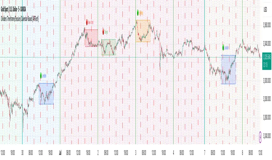
Dividers Timeframe/Session/Calendar-Based [ARTech]Dividers Timeframe/Session/Calendar-Based
This indicator provides customizable visual dividers for multiple timeframes, trading sessions, and calendar-based periods (daily, weekly, monthly). It helps traders visually separate chart areas by key time boundaries without cluttering the chart with price lines.
Key Features:
Multi-Timeframe Dividers: Select up to 4 timeframes (e.g., 60 min, 4 hours, daily, weekly) to display customizable lines marking the start of each timeframe’s candle.
Session Dividers: Define up to 4 trading sessions with user-defined time zones, colors, and active weekdays. The indicator highlights the session’s highest and lowest price range using a box, and compares the session’s opening and closing prices. Based on this comparison, it displays a green or red emoji to indicate bullish or bearish sessions, making it easy to identify session momentum visually.
Calendar-Based Dividers: Enable daily, weekly, or monthly background color zones, with individual toggles and color settings for each day, week, or month. Perfect for visually distinguishing trading periods.
Why use this indicator?
Divider Indicator helps keep your chart organized by visually segmenting timeframes, sessions, and calendar periods, aiding in better analysis of price action relative to important time boundaries.
How to Use
███████ Timezone ███████
A valid timezone name exactly as it appears in the chart’s lower-right corner (e.g. New York, London).
A valid UTC offset in ±H:MM or ±HH:MM format. Hours: 0–14 (zero-padded or not, e.g. +1:30, +01:30, -0:00). Minutes: Must be 00, 15, 30, or 45.
Examples;
UTC → ✅ Valid
Exchange → ✅ Valid
New York → ✅ Valid
London → ✅ Valid
Berlin → ✅ Valid
America/New York → ❌ Invalid. (Use "New York" instead)
+1:30 → ✅ Valid offset with single-digit hour
+01:30 → ✅ Valid offset with zero-padded hour
-05:00 → ✅ Valid negative offset
-0:00 → ✅ Valid zero offset
+1:1 → ❌ Invalid (minute must be 00, 15, 30, or 45)
+2:50 → ❌ Invalid (minute must be 00, 15, 30, or 45)
+15:00 → ❌ Invalid (hour must be 14 or below)
███████ Timeframe ███████
Use this section to display vertical divider lines at the opening of higher timeframe candles (e.g., 1H, 4H, Daily, Weekly). This helps visually separate price action according to larger market structures.
1. Enable a Timeframe:
Turn on one or more timeframes (e.g., 60, 240, D, W) by checking their respective toggle boxes.
2. Lines Mark Candle Opens:
Each active timeframe will draw a vertical line at the start of its candle , making it easier to align intraday moves with larger timeframe shifts.
3. Customize Line Style:
For each timeframe, you can individually set:
Line Style: Solid, dashed, or dotted.
Line Width: From 1 to 10 pixels.
Line Color: Pick any color to match your chart theme.
Opacity: Use transparent colors to avoid overwhelming the chart.
4. Use Multiple Timeframes Together:
You can enable multiple timeframe dividers simultaneously. To maintain clarity:
Use distinct colors for each timeframe.
Use thinner or dotted lines for lower timeframes and bolder lines for higher ones.
Match line style and color intensity to reflect timeframe importance. (e.g., a thick green solid line for Weekly, a thin gray dotted line for 1H)
5. Visual Tip:
These dividers are especially useful for identifying higher timeframe candle opens during intraday trading, spotting breaks above/below previous candle ranges, or aligning session-based strategies with higher timeframe trends.
███████ Session ███████
Use this section to visually highlight specific trading sessions (e.g., London, New York, Tokyo, Sydney) on your chart using time zones, session ranges, and optional weekday filters. This helps focus your analysis on active market hours.
1. Enable a Session:
Activate up to 4 separate trading sessions. Each session can be named (e.g., "London") and customized independently.
2. Set Session Time and Days:
Define session time using the hhmm-hhmm format. (e.g., 0800-1700)
Select which days of the week the session applies to (Sunday through Saturday)
Set your preferred time zone (UTC, Exchange, etc.) from the global settings.
3. Session Box Drawing:
For each active session, the indicator will:
Draw a background-colored box from the session’s start to end time.
Stretch the box to fit the highest and lowest price within that time window.
Draw an outline using customizable border style and width.
4. Session Labels and Directional Hints:
Optionally display the session’s name as a label.
The indicator compares the session’s opening and closing prices . Based on the result:
📈 Green emoji shows a bullish session (close >= open)
📉 Red emoji shows a bearish session (close < open)
5. Display Options:
Show all sessions, only the last session, or a specific number of previous sessions.
Customize label size, location (top/bottom), and whether it appears inside or outside the box.
Adjust background opacity to blend the sessions neatly into your chart.
6. Visual Tip:
Session boxes are particularly useful for:
Spotting repeated highs/lows during active trading hours.
Recognizing session-based breakouts or consolidations.
Comparing performance across different markets and time zones.
███████ Calendar-Based ███████
This section helps you visually segment your chart based on calendar periods: daily, weekly, and monthly. You can enable background color highlighting for individual days, weeks, or months to better track price movements within these time frames.
1. Enable Daily, Weekly, or Monthly Highlighting:
Toggle on the options for Daily, Weekly, and/or Monthly highlighting according to your needs.
2. Select Specific Days, Weeks, or Months:
For Daily, enable any combination of days (up to 7) to color-code.
For Weekly, enable up to 5 weeks per month to cover partial weeks.
For Monthly, enable up to 12 months with individual toggles and colors.
3. Customize Colors for Each Period:
Assign distinct colors to each day, week, or month for easy differentiation. Choose hues that stand out but avoid colors that are too close in tone for adjacent periods.
4. Background Opacity:
Adjust the opacity level of the background coloring to ensure it complements your chart without obscuring price data.
5. Handling Partial Weeks and Overlaps:
The weekly highlighting accounts for months that span 4 to 6 weeks by allowing toggles up to 5 weeks, including weeks that may partially overlap with previous or next months.
6. Visual Tip:
Calendar-based backgrounds are excellent for:
Quickly identifying price behavior within specific calendar units.
Comparing price action across days, weeks, or months.
Spotting seasonal trends or recurring patterns tied to calendar cycles.
Strict Trend Sweep - Buy/Sellscrict 5min trend following system.
Entering on the sweep of the previous high(downtrend) or Low (uptrend)
trend following

Week days colorsThe “Week Days Colors” indicator highlights each day of the week with a custom background color on the chart. You can assign a different color to each weekday (Monday to Sunday) using the input settings. This makes it easy to visually distinguish days on the chart, helping with pattern recognition, trading strategy timing, or simply improving chart readability.
Features:
• Custom background color for each day of the week
• Fully customizable through color inputs
• Works on any timeframe
• Helps visualize weekly patterns and cycles

Week days colorsThe “Week Days Colors” indicator highlights each day of the week with a custom background color on the chart. You can assign a different color to each weekday (Monday to Sunday) using the input settings. This makes it easy to visually distinguish days on the chart, helping with pattern recognition, trading strategy timing, or simply improving chart readability.

VEP - Volume Explosion Predictor💥 VEP - Volume Explosion Predictor
General Overview
The Volume Explosion Predictor (VEP) is an advanced indicator that analyzes volume peaks to predict when the next volume explosion might occur. Using statistical analysis on historical patterns, it provides accurate probabilities on moments of greater trading activity.
MAIN FEATURES
🎯 Intelligent volume peak detection
Automatically identifies significant volume peaks
Anti-consecutive filter to avoid redundant signals
Customizable threshold for detection sensitivity
📊 Advanced statistical analysis
Calculates the average distance between volume peaks
Monitors the number of sessions without peaks
Tracks the maximum historical range without activity
🔮 Predictive system
Dynamic probability: Calculates the probability of an imminent peak
Visual indicators: Background colors that change based on probability
Time forecasts: Estimates remaining sessions to the next peak
📈 Visual signals
Colored arrows: Green for bullish peaks, red for bearish peaks
Statistics table: Complete real-time overview
ALERT SYSTEM
🚨 Three Alert Levels
New Valid Volume Peak: New peak detected
Approaching Prediction: Increasing probability
High Peak Probability: High probability of explosion
HOW TO USE IT
📋 Recommended setup
Timeframe : Works on all timeframes but daily, weekly or monthly timeframe usage is recommended. In any case, it should always be used consistently with your time horizon
Markets : Stocks, crypto, forex, commodities
Threshold for volume peak realization : It's recommended to start with 2.0x (i.e., twice the volume average) for normal markets, 1.5x for more volatile markets. This parameter can be set in the settings as desired
🎨 Visual interpretation
Green Arrows : Peak during bullish candle
Red Arrows : Peak during bearish candle
Red Background : High probability (>90%) of new peak
Yellow Background : Medium probability (50-70%)
📊 STATISTICS TABLE
The table shows:
Total peaks analyzed
Average distance between peaks
Current sessions without peaks
Forecast remaining sessions
Percentage probability
Volume threshold needed for peak realization
STRATEGIC ADVANTAGES
🎯 For Day Traders
Anticipates moments of greater volatility for analysis, supporting the evaluation of trading setups and providing context on low volume periods
📈 For Swing Traders
Identifies high-probability volume patterns, supporting breakout analysis with volume and improving understanding of market timing
🔍 For Technical Analysts
Understands the stock's volume patterns.
Helps evaluate the historical market interest and supports quantitative research and analysis
OTHER THINGS TO KNOW...
A) Anti-Consecutive Algorithm : allows to avoid multiple and consecutive volume signals and peaks at close range
B) Statistical Validation : Uses standard deviation for accuracy
C) Memory Management : Limits historical data for optimal performance
D) Compatibility : Works with all TradingView chart types
⚠️ IMPORTANT DISCLAIMER
This indicator is exclusively a technical analysis tool for studying volume patterns. It does not provide investment advice, trading signals or entry/exit points. All trading decisions are at the complete discretion and responsibility of the user. Always use in combination with other technical and fundamental analysis and proper risk management.
DESCRIZIONE IN ITALIANO
💥 VEP - Volume Explosion Predictor
Panoramica Generale
Il Volume Explosion Predictor (VEP) è un indicatore avanzato che analizza i picchi di volume per prevedere quando potrebbe verificarsi la prossima esplosione di volume. Utilizzando analisi statistiche sui pattern storici, fornisce probabilità accurate sui momenti di maggiore attività di trading.
CARATTERISTICHE PRINCIPALI
🎯 Rilevamento intelligente dei picchi di volume
- Identifica automaticamente i picchi di volume significativi
- Filtro anti-consecutivo per evitare segnali ridondanti
- Soglia personalizzabile per la sensibilità del rilevamento
📊 Analisi statistica avanzata
Calcola la distanza media tra i picchi di volume
Monitora il numero di sessioni senza picchi
Traccia il range massimo storico senza attività
🔮 Sistema predittivo
Probabilità dinamica: Calcola la probabilità di un imminente picco
Indicatori visivi: Colori di sfondo che cambiano in base alla probabilità
Previsioni temporali: Stima delle sessioni rimanenti al prossimo picco
📈 Segnali visivi
1) Frecce colorate: Verdi per picchi rialzisti, rosse per ribassisti
2) Tabella statistiche: Panoramica completa in tempo reale
SISTEMA DI ALERT
🚨 Tre Livelli di Alert
1) New Valid Volume Peak: Nuovo picco rilevato
2) Approaching Prediction: Probabilità in aumento
3) High Peak Probability: Alta probabilità di esplosione
COME UTILIZZARLO
📋 Setup consigliato
- Timeframe : Funziona su tutti i timeframe ma è consigliabile un utilizzo su timeframe giornaliero, settimanale o mensile. In ogni caso va sempre utilizzato coerentemente con il proprio orizzonte temporale
- Mercati : Azioni, crypto, forex, commodities
- Limite affinché si realizzi il picco di volumi : Si consiglia di iniziare con 2.0x (ovvero due volte la media dei volumi) per mercati normali, 1.5x per mercati più volatili. Questo parametro può essere settato nelle impostazioni a proprio piacimento
🎨 Interpretazione visuale
Frecce Verdi : Picco durante candela rialzista
Frecce Rosse : Picco durante candela ribassista
Sfondo Rosso : Alta probabilità (>90%) di nuovo picco
Sfondo Giallo : Probabilità media (50-70%)
📊 TABELLA STATISTICHE
La tabella mostra:
1. Totale picchi analizzati
2. Distanza media tra picchi
3. Sessioni attuali senza picchi
4. Previsione sessioni rimanenti
5. Probabilità percentuale
6. Soglia volume necessaria affinché si realizzi il picco di volumi
VANTAGGI STRATEGICI
🎯 Per Day Traders
Anticipa i momenti di maggiore volatilità per analisi, supportando la valutazione dei setup di trading e fornendo al contempo un contesto sui periodi di basso volume
📈 Per Swing Traders
1. Identifica pattern di volume ad alta probabilità, supportando l'analisi dei breakout con volume e migliorando la comprensione dei tempi di mercato
🔍 Per Analisti Tecnici
Comprende i pattern di volume del titolo.
Aiuta a fare una valutazione dell'interesse storico del mercato ed è di supporto alla ricerca e analisi quantitativa
ALTRE COSE DA SAPERE...
A) Algoritmo Anti-Consecutivo : permette di evitare segnali e picchi di volume multipli e consecutivi multipli a distanza ravvicinata
B) Validazione Statistica : Utilizza deviazione standard per l'accuratezza
C) Gestione Memoria : Limita i dati storici per performance ottimali
D) Compatibilità : Funziona con tutti i tipi di grafico TradingView
⚠️ DISCLAIMER IMPORTANTE
Questo indicatore è esclusivamente uno strumento di analisi tecnica per lo studio dei pattern di volume. Non fornisce consigli di investimento, segnali di trading o punti di ingresso/uscita. Tutte le decisioni di trading sono a completa discrezione e responsabilità dell'utente. Utilizzare sempre in combinazione con altre analisi tecniche, fondamentali e una adeguata gestione del rischio.

GER40 Opening Range Breakout (Simple)✅ GER40 Opening Range Breakout Strategy — Trading Plan
🎯 Objective:
Capture early momentum after the Frankfurt open by trading breakouts of the initial 15-minute range.
📌 Rules Summary:
Instrument: GER40 (DAX40)
Timeframe: 5-minute or 15-minute chart
Session Focus: 08:00–10:00 CET
Opening Range: 08:00–08:15 CET
🛠 Entry Conditions:
Long entry: Price breaks above the 08:00–08:15 high with volume confirmation.
Short entry: Price breaks below the 08:00–08:15 low with volume confirmation.
Optional confirmation: RSI > 50 for long, RSI < 50 for short.

Omori Law Recovery PhasesWhat is the Omori Law?
Originally a seismological model, the Omori Law describes how earthquake aftershocks decay over time. It follows a power law relationship: the frequency of aftershocks decreases roughly proportionally to 1/(t+c)^p, where:
t = time since the main shock
c = time offset constant
p = power law exponent (typically around 1.0)
Application to the markets
Financial markets experience "aftershocks" similar to earthquakes:
Market Crashes as Main Shocks: Major market declines (crashes) represent the initial shock event.
Volatility Decay: After a crash, market volatility typically declines following a power law pattern rather than a linear or exponential one.
Behavioral Components: The decay pattern reflects collective market psychology - initial panic gives way to uncertainty, then stabilization, and finally normalization.
The Four Recovery Phases
The Omori decay pattern in markets can be divided into distinct phases:
Acute Phase: Immediately after the crash, characterized by extreme volatility, panic selling, and sharp reversals. Trading is hazardous.
Reaction Phase: Volatility begins decreasing, but markets test previous levels. False rallies and retests of lows are common.
Repair Phase: Structure returns to the market. Volatility approaches normal levels, and traditional technical analysis becomes more reliable.
Recovery Phase: The final stage where market behavior normalizes completely. The impact of the original shock has fully decayed.
Why It Matters for Traders
Understanding where the market stands in this recovery cycle provides valuable context:
Risk Management: Adjust position sizing based on the current phase
Strategy Selection: Different strategies work in different phases
Psychological Preparation: Know what to expect based on the phase
Time Horizon Guidance: Each phase suggests appropriate time frames for trading

My scriptThis custom script detects three types of market behavior based on price action and volume:
1. Accumulation Detection (Green triangle ⏶ below bar)
Signals that smart money might be buying quietly before a move up.
🔍 Criteria:
A volume spike (above average by a multiplier)
Flat price movement (small price change compared to candle range)
💡 Why it's useful:
Accumulation often happens before a breakout. This gives early signals of potential bullish moves.
2. Distribution Detection (Red triangle ⏷ above bar)
Signals that smart money might be unloading before a move down.
🔍 Criteria:
Price is moving up
Volume is below average
(Optionally) RSI is overbought — to increase signal reliability
💡 Why it's useful:
Distribution often happens at the top of a move. This helps identify potential reversals or fakeouts.
3. Manipulation Detection (Orange diamond ◆ above bar)
Flags potential stop-hunts, fakeouts, or "smart money traps".
🔍 Criteria:
A volume spike
A large wick (upper or lower) that exceeds your chosen wick ratio
💡 Why it's useful:
Large wicks with high volume often signal liquidity grabs — where the market takes out stop losses before reversing.
⚙️ Inputs / Customization
You can adjust:
Volume Spike Multiplier: Sensitivity of what’s considered high volume
Wick Ratio Threshold: How big a wick must be to count as manipulation
Price Stability Factor: Defines "flat price" for accumulation
RSI Filter: Optional filter to confirm distribution with RSI overbought
📢 Alerts
You can set alerts for:
Accumulation
Distribution
Manipulation
Just add the indicator to your chart and click "Create Alert", then choose the condition you want.
📈 How to Use It in Trading
Confluence: Use this indicator with support/resistance, trendlines, or order blocks
Confirm Entries

Trend vs Chop Detector - Stocky Mind ⚡️👉🏻 Fractal Efficiency Ratio – Stocky Mind ⚡
This indicator helps traders identify whether the market is trending or choppy using the Fractal Efficiency Ratio (FE) as described originally by Perry J. Kaufman in his book Trading Systems and Methods & by Pradeep Bonde.
👉🏻 What it does
Measures trend efficiency over a given period (length) by comparing net price change vs. cumulative absolute price change.
Higher FE values suggest linear (trending) price movement.
Lower FE values indicate choppiness or range-bound behaviour.
👉🏻 Key Features:
Fractal Efficiency Plot: Visualize trend clarity numerically.
Dynamic Background Zones:
Green: Strong linear trend (FE > threshold)
Red: Choppy market (FE < threshold)
Customizable thresholds for both trend and chop zones.
👉🏻 Use Case
Use this to filter stocks or confirm entries where price is moving smoothly.
Avoid low-efficiency (choppy) zones where breakout trades may fail.
👉🏻 Note
Best used in combination with price action and volume.
Higher timeframes may smooth out noisy behaviour.
Brought to you by Stocky Mind ⚡ – Simplifying setups with logic and clarity.

Monthly, Daily, 4H High Low (v2 Corrected)Multi-Timeframe Highs & Lows (M, D, 4H) with Alerts
Script Description:
Summary
This indicator is a powerful tool designed to streamline your technical analysis by plotting the most significant price levels from higher timeframes directly onto your chart. It automatically draws the previous Monthly, Daily, and 4-Hour High and Low levels, allowing you to identify key support and resistance zones without constantly switching between timeframes.
The clean, minimalist design ensures your chart remains uncluttered, while the built-in, customizable alert system notifies you instantly when the price interacts with these critical levels.
Key Features
Automatic High & Low Plotting: Visualizes the previous high and low for three key timeframes:
Monthly High & Low (Red lines)
Daily High & Low (Blue lines)
4-Hour High & Low (Orange lines)
Clear On-Chart Labels: Each line is accompanied by a small, non-intrusive label (e.g., "Monthly High") on the right side of the chart for easy identification.
Powerful Alert System: Never miss a key price reaction. The script includes a fully configurable alert system that triggers when the price crosses any of the plotted high or low levels.
Customizable Alerts: In the indicator settings, you can individually enable or disable alerts for each timeframe (Monthly, Daily, 4H), giving you full control over your notifications.
How to Use
The lines plotted by this indicator serve as powerful, objective levels of support and resistance.
Resistance: The high of a previous period (e.g., Daily High) often acts as a ceiling where price may struggle to break through.
Support: The low of a previous period (e.g., Daily Low) often acts as a floor where price may find buying interest.
Breakout/Breakdown Confirmation: A decisive close above a previous high or below a previous low can signal a potential continuation of the trend. Use the alerts to be notified of these events in real-time.
Liquidity Sweeps: Traders often watch for price to briefly "sweep" or "hunt" these levels before reversing. The alert system is perfect for catching these movements.
Setting Up Alerts
Add the indicator to your chart.
Click the Alert icon (clock symbol) in the TradingView toolbar.
In the "Condition" dropdown, select the indicator: "Multi-Timeframe Highs & Lows (v2 Corrected)".
A second dropdown will appear. Select the specific event you want to be notified about (e.g., "Cross Daily High" or "Cross 4H Low").
Choose your preferred alert settings (e.g., "Once Per Bar Close") and notification method.
Click "Create".
You can create multiple alerts for different levels as needed.
This tool was designed to be both simple and effective, helping traders make more informed decisions by keeping an eye on the bigger picture. Happy trading!
