Pivot Candles with MFI Opacity (No Plot)How to Use the Pivot Candles with MFI Opacity Indicator for Trade Entries and Position Management
Overview
This indicator is designed not only to display key pivot levels (support and resistance) and Money Flow Index (MFI) signals on your chart, but also to help you structure systematic order entries and position management. By combining pivot levels with dynamic MFI-based candle opacity, the indicator provides a visual framework that technical analysts and quants can use to time buy and sell stop orders as well as to pyramid positions or take profits.
Trade Entry with Pivot Levels
Buy Stop Orders Above R1:
Concept: In many technical setups, resistance levels such as R1 are viewed as potential breakout points. A buy stop order placed just above R1 allows you to enter a long position only when price decisively breaks the prior resistance, confirming bullish momentum.
How It Works:
The indicator calculates pivot levels based on the previous higher‑timeframe bar, so R1 is “locked in” for the current period.
When the current candle closes above R1, it may signal a breakout.
Technical analysts often place a buy stop order slightly above R1 (for example, a few ticks or pips above the level) to confirm the move.
Practical Application:
Quants and systematic traders can program their models to monitor when the current close exceeds R1.
Once this condition is met, a buy stop order is triggered to capture the breakout move, ensuring that you only participate if the price decisively moves upward.
Sell Stop Orders Below S1:
Concept: Conversely, S1 acts as a support level. A sell stop order placed just below S1 is designed to capture a breakdown. This order is activated when price closes below S1, indicating that selling pressure may be overwhelming.
How It Works:
With pivot levels fixed from the previous higher‑timeframe bar, S1 provides a reference for potential support.
A close below S1 can be interpreted as a sign of a bearish reversal or a continuation of a downtrend.
Practical Application:
Quants set up their systems to watch for a break below S1.
A sell stop order is positioned just below S1 to ensure that if the support level fails, the system can quickly initiate a short position to capture the downward move.
Using MFI for Position Management
Pyramiding and Profit Taking:
Dynamic Candle Opacity:
The Money Flow Index (MFI) in this indicator not only provides overbought/oversold alerts but also controls the opacity of your candlesticks. When MFI readings are high, the candles become more opaque, indicating strong buying pressure. Conversely, lower MFI values lead to more transparent candles, suggesting reduced momentum.
Pyramiding Long Positions:
Strategy:
In a strong trend, technical analysts might choose to add to a winning position gradually—a process known as pyramiding.
Implementation:
As long as the price remains above R1 and MFI readings are supportive (high and consistent), you may consider adding to your long position incrementally.
Each new buy stop order can be set above R1 with slightly adjusted trigger levels to capture further breakout strength.
Risk Management:
Quants use the MFI reading as a risk filter; if MFI begins to drop or the candles become significantly more transparent, it may be a cue to stop pyramiding or even begin taking profits.
Taking Profit Using MFI and Pivot Reversals:
Profit Targeting:
When price reaches higher resistance levels (e.g., R2 or R3) or shows signs of overextension in conjunction with extreme MFI levels (for instance, a sudden drop in MFI after a strong rally), you can begin taking partial profits.
Systematic Exit:
A systematic strategy might include scaling out of the position as the price approaches the next resistance level or when the MFI indicates that buying momentum is waning.
Similarly, for short positions entered below S1, profit targets might be set near subsequent support levels, with exits triggered if MFI suggests a reversal.
Summary
Entry Orders:
Place buy stop orders just above R1 to capture breakouts.
Place sell stop orders just below S1 to capture breakdowns.
Position Management with MFI:
Use MFI-based candle opacity as a visual indicator of momentum.
Pyramid positions in the direction of the trend when MFI confirms strength.
Consider partial exits if MFI readings start to reverse or if the price nears the next pivot level.
By following this systematic approach, technical analysts and quants can use the indicator not only as a visual tool but as an integral part of an automated or semi-automated trading system that emphasizes disciplined entries, pyramiding, and profit-taking.
Pivot points and levels

Half Candle RetraceThis custom indicator draws a horizontal line at the 50% retracement level of each candlestick on the chart. It calculates the midpoint between the high and low of each candle, which is often used by traders to identify potential entry, exit and take-profit levels. Once price action returns to an untouched level, the line will be removed, leaving only the levels where price action is still missing.
Key Features:
Timeframe: Works on all timeframes.
Line Color: Customize the line color to suit your charting preferences.
Line Width: Adjust the thickness of the retracement line for better visibility.
Line Style: Choose between solid, dotted, or dashed lines.
Up/Down Candle Selection: Option to only display retracement lines for up (bullish) candles, down (bearish) candles, or both.
Full Customization: Control the transparency (opacity) of the line for enhanced visual clarity.
Simple Setup: No complicated settings – simply choose your preferred color, line style, and visibility options.
This indicator is perfect for traders who prefer to use price action and retracement levels to identify potential trade opportunities.
How It Works:
The indicator automatically calculates the 50% level (midpoint) for each candlestick, drawing a line at this level. It will only draw lines for candles that match your chosen criteria (up or down candles), ensuring the chart remains clean and relevant to your trading strategy. Lines are automatically removed as soon as price crosses them.
50% Candle RetraceThis custom indicator draws a horizontal line at the 50% retracement level of each candlestick on the chart. It calculates the midpoint between the high and low of each candle, which is often used by traders to identify potential entry, exit and take-profit levels. Once price action returns to an untouched level, the line will be removed, leaving only the levels where price action is still missing.
Key Features:
Timeframe: Works on all timeframes.
Line Color: Customize the line color to suit your charting preferences.
Line Width: Adjust the thickness of the retracement line for better visibility.
Line Style: Choose between solid, dotted, or dashed lines.
Up/Down Candle Selection: Option to only display retracement lines for up (bullish) candles, down (bearish) candles, or both.
Full Customization: Control the transparency (opacity) of the line for enhanced visual clarity.
Simple Setup: No complicated settings – simply choose your preferred color, line style, and visibility options.
This indicator is perfect for traders who prefer to use price action and retracement levels to identify potential trade opportunities.
How It Works:
The indicator automatically calculates the 50% level (midpoint) for each candlestick, drawing a line at this level. It will only draw lines for candles that match your chosen criteria (up or down candles), ensuring the chart remains clean and relevant to your trading strategy. Lines are automatically removed as soon as price crosses them.
Static price-range projection by symbolThis indicator shows you a predefined range to the right of the last candle of your chart. This range is custom and can be changed for a handful of symbols that you can choose. This scale will help you determining if the market is providing a reasonable range before you enter a trade or if the market isn't actually moving as much as you might think. This is particularly useful if you are into scalping and have to consider commission or spread in your trades.
Since all symbols have different price ranges in which they move this indicator doesn't make sense to just have "a one size fits all" approach. That's why you can choose up to 6 symbols and set the range that you want to have shown for each when you pull it up on the chart. Using my default values that means for when the NQ (Nasdaq future) is on the chart you will see a range of 20 handles projected. When you change the the ES (S&P500 future) you will instead see 5 handles. While the number is different that is somewhat of an equal move in both symbols.
There also is an option to set a default price range for all other symbols that are not selected if it is needed. However the display of the scale on anything else than the 6 selected symbols can also be turned off.
There are options provided on how exactly you want to indicator to determine if the chart symbol matches one of the selected symbols.
You can enable it to make sure the exchange/broker is the exact same as selected.
It can check for only the symbol root to match the selection. Specifically for futures this means that while ES1! might be selected, anything ES (ES1!, ES2!, ESH2025, ESM2025, ESM2022, ...) will be a match to the selection)
On the painted scale it is possible to not just show this range extended into each direction once. Per default you will have 3 segments of it in each direction. This can be reduced to just 1 or increased.
If you chose a high number of segments or a large range make sure to use the "Scale price chart only" option on your chart scale to not have the symbols price candles squished together by the charts auto scaling.
And last but not least the indicator options provide some possibilities to change the appearance of the printed price range scale in case you disagree with my design.

Pre-Market High & LowIndicator: Pre-Market High & Low
This indicator tracks the high and low price levels of a stock during the pre-market session (4:00 AM - 9:30 AM EST), before the official market open. It dynamically updates during pre-market hours, identifying the highest and lowest prices reached. Once the pre-market session ends, these levels are saved and plotted on the chart as reference points for the regular market session.
Key Features:
Dynamic Updates: Continuously tracks the high and low during pre-market hours.
Visual Indicators: Plots horizontal lines representing the pre-market high (green) and low (red).
Post-Market Reference: Once pre-market ends, these levels remain visible for the regular market session as reference points for potential breakout or breakdown levels.
How to Use:
Use this indicator to identify potential breakout or breakdown levels that may happen at the market open.
The green line represents the highest price reached during pre-market, while the red line indicates the lowest price.
The indicator will stop updating once the pre-market session closes (9:30 AM EST) and will remain visible as reference levels throughout the trading day.
Ideal for:
Day traders looking for pre-market support and resistance levels.
Traders analyzing the initial market reaction based on pre-market price action.
Moving 50% Level TrackerIntroducing the Moving 50% Midpoint Indicator – A Game-Changer for Your Trading Strategy!
Are you looking for a simple yet powerful tool to enhance your trading? The Moving 50% Midpoint Indicator is designed to dynamically track the fair value of the market, giving you an edge in identifying key areas of support and resistance.
🔹 How It Works:
- This indicator calculates the midpoint between the daily high and low and only updates when a new high or low is formed.
- It resets at the start of each trading day, ensuring fresh and relevant levels.
- The line acts as a dynamic equilibrium, showing where buyers and sellers agree on price.
🔹 Why Use It?
Identify Premium & Discount Zones – When price is above the line, the market is in premium, indicating a potential sell zone. When price is below, it's in discount, signaling a potential buy zone.
Reliable Support & Resistance – The midpoint naturally serves as strong support/resistance, helping traders anticipate reversals and trend continuations.
Works in Any Market – Whether you trade stocks, forex, crypto, or futures, this indicator is a must-have for price action traders.
💡 Stop guessing where the market is balanced! Use the Moving 50% Midpoint Indicator to refine your entries, exits, and overall market bias.

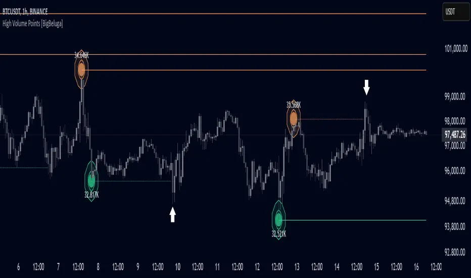
High Volume Points [BigBeluga]High Volume Points is a unique volume-based indicator designed to highlight key liquidity zones where significant market activity occurs. By visualizing high-volume pivots with dynamically sized markers and optional support/resistance levels, traders can easily identify areas of interest for potential breakouts, liquidity grabs, and trend reversals.
🔵 Key Features:
High Volume Points Visualization:
The indicator detects pivot highs and lows with exceptionally high trading volume.
Each high-volume point is displayed as a concentric circle, with its size dynamically increasing based on the volume magnitude.
The exact volume at the pivot is shown within the circle.
Dynamic Levels from Volume Pivots:
Horizontal levels are drawn from detected high-volume pivots to act as support or resistance.
Traders can use these levels to anticipate potential liquidity zones and market reactions.
Liquidity Grabs Detection:
If price crosses a high-volume level and grabs liquidity, the level automatically changes to a dashed line.
This feature helps traders track areas where institutional activity may have occurred.
Volume-Based Filtering:
Users can filter volume points by a customizable threshold from 0 to 6, allowing them to focus only on the most significant high-volume pivots.
Lower thresholds capture more volume points, while higher thresholds highlight only the most extreme liquidity events.
🔵 Usage:
Identify strong support/resistance zones based on high-volume pivots.
Track liquidity grabs when price crosses a high-volume level and converts it into a dashed line.
Filter volume points based on significance to remove noise and focus on key areas.
Use volume circles to gauge the intensity of market interest at specific price points.
High Volume Points is an essential tool for traders looking to track institutional activity, analyze liquidity zones, and refine their entries based on volume-driven market structure.
Smart Trend Tracker Name: Smart Trend Tracker
Description:
The Smart Trend Tracker indicator is designed to analyze market cycles and identify key trend reversal points. It automatically marks support and resistance levels based on price dynamics, helping traders better navigate market structure.
Application:
Trend Analysis: The indicator helps determine when a trend may be nearing a reversal, which is useful for making entry or exit decisions.
Support and Resistance Levels: Automatically marks key levels, simplifying chart analysis.
Reversal Signals: Provides visual signals for potential reversal points, which can be used for counter-trend trading strategies.
How It Works:
Candlestick Sequence Analysis: The indicator tracks the number of consecutive candles in one direction (up or down). If the price continues to move N bars in a row in one direction, the system records this as an impulse phase.
Trend Exhaustion Detection: After a series of directional bars, the market may reach an overbought or oversold point. If the price continues to move in the same direction but with weakening momentum, the indicator records a possible trend slowdown.
Chart Display: The indicator marks potential reversal points with numbers or special markers. It can also display support and resistance levels based on key cycle points.
Settings:
Cycle Length: The number of bars after which the possibility of a reversal is assessed.
Trend Sensitivity: A parameter that adjusts sensitivity to trend movements.
Dynamic Levels: Setting for displaying key levels.
Название: Smart Trend Tracker
Описание:
Индикатор Smart Trend Tracker предназначен для анализа рыночных циклов и выявления ключевых точек разворота тренда. Он автоматически размечает уровни поддержки и сопротивления, основываясь на динамике цены, что помогает трейдерам лучше ориентироваться в структуре рынка.
Применение:
Анализ трендов: Индикатор помогает определить моменты, когда тренд может быть близок к развороту, что полезно для принятия решений о входе или выходе из позиции.
Определение уровней поддержки и сопротивления: Автоматически размечает ключевые уровни, что упрощает анализ графика.
Сигналы разворота: Индикатор предоставляет визуальные сигналы о возможных точках разворота, что может быть использовано для стратегий, основанных на контртрендовой торговле.
Как работает:
Анализ последовательности свечей: Индикатор отслеживает количество последовательных свечей в одном направлении (вверх или вниз). Если цена продолжает движение N баров подряд в одном направлении, система фиксирует это как импульсную фазу.
Выявление истощения тренда: После серии направленных баров рынок может достичь точки перегрева. Если цена продолжает двигаться в том же направлении, но с ослаблением импульса, индикатор фиксирует возможное замедление тренда.
Отображение на графике: Индикатор отмечает точки потенциального разворота номерами или специальными маркерами. Также возможен вывод уровней поддержки и сопротивления, основанных на ключевых точках цикла.
Настройки:
Длина цикла (Cycle Length): Количество баров, после которых оценивается возможность разворота.
Фильтрация тренда (Trend Sensitivity): Параметр, регулирующий чувствительность к трендовым движениям.
Уровни поддержки/сопротивления (Dynamic Levels): Настройка для отображения ключевых уровней.

Harish algo for nifty and bankniftyHarish algo for nifty and banknifty
Overview
Harish Algo - Buy and Sell 11 is a powerful trading indicator designed for intraday traders, incorporating multiple technical analysis concepts to identify potential breakout and breakdown levels. It uses pivot points, exponential moving averages (EMAs), and volatility-based levels to generate buy and sell signals with visual markers for better decision-making.
Features & Functionality
✅ Pivot Points Calculation:
The indicator calculates daily pivot points along with resistance (R1) and support (S1) levels.
Helps in identifying potential reversal or breakout areas.
✅ EMA Trend Confirmation:
Uses three EMAs (21, 55, and 200) to confirm trend direction.
Ensures that buy signals align with uptrends and sell signals align with downtrends.
✅ 15-Minute Candle Analysis for Precision:
Captures the last three 15-minute closes of the previous day.
Computes an average and determines volatility-based price levels to anticipate price movements.
✅ Dynamic Buy & Sell Signals:
Bullish (Buy) Signals:
Price breaks above key resistance levels and EMAs confirm an uptrend.
Displayed as yellow (tiny) or green (small) upward triangles below candles.
Bearish (Sell) Signals:
Price drops below key support levels with EMA confirmation of a downtrend.
Displayed as fuchsia (tiny) or red (small) downward triangles above candles.
✅ Alerts for Trade Execution:
Get notified instantly with alerts when a buy or sell signal is triggered.
✅ Customizable Settings:
Modify EMA lengths and adjust parameters to fit different trading strategies.
Usage & Benefits
🔹 Helps traders identify potential entry and exit points with precision.
🔹 Reduces false signals by combining pivot points, EMAs, and price action.
🔹 Works best for intraday traders in the Indian stock markets, but can be applied to other markets as well.
🔹 Suitable for both beginners and experienced traders looking for a structured approach to trading.
How to Use
Add the indicator to your chart.
Observe the plotted pivot points, EMAs, and price levels.
Watch for triangle markers (buy/sell signals).
Use alerts to receive real-time notifications.
Combine with your own risk management strategy for best results.
🔹 Works on all timeframes but optimized for intraday trading.
Disclaimer
📢 This indicator is for educational purposes only and should not be considered financial advice. Always perform your own analysis before taking trades.

New Daily Low with Offset Alert FeatureThis indicator plots the current day’s low as a horizontal line on your chart and provides an optional offset line above it. It’s designed for traders who want to monitor when price is near or breaking below the daily low. You can set alerts based on the built-in alert conditions to be notified whenever the market approaches or crosses below these key levels.
How to Use With Alerts:
1. Add the indicator to your chart and choose a timeframe (e.g., 15 minutes).
2. In the script inputs, enable or adjust the daily low line and any offset percentage if desired.
3. Open the “Alerts” menu in TradingView and select the corresponding alert condition:
• Cross Below Daily Low to detect when price dips below the day’s low.
• Cross Below Daily Low + Offset if you prefer a small cushion above the actual low.
4. Configure the alert’s frequency and notifications to stay updated on potential breakdowns.
This setup helps you catch new lows or near-breakdowns quickly, making it useful for both intraday traders and swing traders watching key support levels.
Combo Gama Exposure + EMA + SMA 1.0Gamma Exposure (GEX) for the CBOE Volatility Index ( TVC:VIX ) is an estimate of how much option sellers need to hedge for every 1% change in the underlying asset's price. It's also known as Gamma Levels.
How is GEX calculated?
GEX is calculated based on a 1% move of the underlying security
It's calculated and updated throughout the day
It's based on market positioning and open interest
These regions are important because they show the regions where players can act more aggressively to defend their positions. When inserting the indicator on the chart, a popup will open requesting the GEX levels (Put wall, Vix Call Wall 0DTE, etc.)
In addition, 3 moving averages will be inserted into the chart. A 9-period exponential moving average, a 20-period arithmetic moving average, and a 200-period arithmetic moving average. These moving averages aim to indicate the possible trend of the asset, where pullbacks in these averages can signal a possible entry in favor of the trend.

Reversal Probability Zone & Levels [LuxAlgo]The Reversal Probability Zone & Levels tool allows traders to identify a zone starting from the last detected reversal to highlight the probability of where the next reversal would be from a price and time perspective.
Price and time levels within the zone are displayed for up to 4 percentiles defined by the user.
🔶 USAGE
By default, the tool displays a zone with the 25th, 50th, 75th and 90th percentiles on both the price and time axis, indicating where, when and how many of the past reversals have occurred.
Traders can select the length for swing detection and the maximum number of reversals for probability calculations. The tool considers both bullish and bearish reversals separately, which means that if the last reversal was a swing high, the zone would show the probabilities for the last defined Maximum reversals
The Maximum reversals value has a direct impact on the probabilities, the more data traders use the more significant the result, probabilities over 10 occurrences are far weak compared to probabilities over 1000 occurrences.
🔹 Percentiles
Traders can fine-tune the percentile parameters in the settings panel.
A given percentile means that the number of occurrences in the data set is less than or equal to the percentile.
In English, this means
Percentile 20th: 20% of the occurrences are less than or equal to this value, so 80% of the occurrences are greater than this value.
Percentile 50th: 50% of the occurrences are below and 50% are above this value.
Percentile 80th: 80% of occurrences are lower than or equal to this value, so 20% of occurrences are greater than this value.
🔹 Normalize data
The Normalize Data feature allows traders to make an apples to apples comparison when we have a lot of historical data on high timeframe charts, using returns between swings instead of raw price.
🔹 Display Style
By default, the tool has the No overlapping feature enabled to display a clean chart, traders can turn it off, but this can fill the chart with too much information and barely see the price.
Traders can enable/disable settings to show only the last zone and the swing markers on the chart.
🔶 SETTINGS
Swing Length: The maximum length in bars used to identify a swing
Maximum Reversals: Maximum number of reversals included in calculations
Normalize Data: Use returns between swings instead of raw price
Percentiles: Enable/disable each of the four percentiles and select the percentile number, line style, colors, and size
🔹 Style
No Overlapping Zones: Enable or disable the No overlap between zones feature
Show Only Last Zone: Enable/disable display of last zone only
Show Marks: Enable/disable reversal markers

X Levels [Pro+] (TradeX)Introduction:
The X-Levels Indicator is a cutting-edge trading tool to help identify key price levels around Premium / Discount Arrays (PD arrays) at Higher Timeframe Points of Interest. It aids the trader by automatically measuring dealing ranges across multiple Timeframes and highlighting the percentages within which define a Premium & Discount Range. These percentages, known as X-Levels, are where the trader seeks an entry around a relevant PD array. This approach allows a trader to optimize entry and exit points around X-Levels. Suitable for traders of all levels, X-Levels enhances analysts' trade location and framework, providing crucial insights into market movements.
What is an X-Level? A specific percentage within any given dealing range that defines a premium and discount. X Levels are defined as the following percents: 0,12,21,29.5,38,50,61.8,70.5,79,88,100. Percentages below 50% indicate a discount and above 50% indicate a premium.
Foundation: This methodology, developed by TradeX, defines a consistent way for defining dealing ranges and his key percentage levels. Built upon Inner Circle Trader (ICT)’s principles of price delivery, it recognizes that price moves between premium and discount levels, seeking liquidity and inefficiencies.
After extensive refinements, this tool now automates the identification of these dealing ranges across any Timeframe, whilst presenting the X-Levels in a clear and precise manner allowing traders to track price movements with precision and efficiency across multiple time frames.
As price moves between X-Levels, it is the trader’s role to analyze which PD Array offers the best entry opportunity around a given X-Level. The true value of this tool lies in its ability to automatically update Dealing Ranges in real Time, eliminating the need for manual measurement or adjustment. This not only saves Time but also allows analysts to focus on trading rather than manually drawing and updating dealing ranges, removing guess work from defining the correct X Levels dealing range.
When X-Levels are applied across multiple Timeframes, traders gain a comprehensive view of the current market conditions. A key principle of this approach is aligning with price at Higher Timeframe (HTF) Point of Interest. By tracking dealing ranges from HTF while operating in Lower Timeframes, analysts can maintain a granular view while keeping track of the HTF framework.
Explanation of Killzones
Killzones refer to the times when major financial markets are open and active, particularly the London and New York sessions. For example, the London Open Killzone typically runs from 2:00 AM to 4:00 AM Eastern Time, while the New York Killzone is often from 8:00 AM to 10:00 AM Eastern Time. During these times, traders can expect more significant price movements due to higher trading volumes and the overlap of market participants.
The X-Levels indicator includes customizable killzone delineations, allowing traders to tailor this setting to their preferred trading sessions.
Key Opening Prices
Finally, the X-Levels indicator also includes Opening Price Delineations in both Horizontal and Vertical delineation. The "opening price" in trading refers to the first price at which a security is traded when the market opens. This price is significant because it can set the tone for the day's trading and is often used as a reference point for analyzing market movements. We are tracking midnight open, 8:30am and 9:30am. This is due to Midnight Theory.
Midnight Theory:
This is following the principles of Power of 3 (PO3) where if a trader is seeking a bullish expansion on a daily candle he is looking to frame entries below the midnight opening price. The principle of midnight theory comes in the form of buying at a hypothetical discount. A trade entering below midnight would be considered a discount, below midnight and 9:30am on a bullish day would be considered a deep discount.
Settings Summary:
Dealing Ranges: Traders can choose which Timeframe to track and can choose up to a maximum of 3 per chart. The styles of which are fully customizable. Solid lines, dotted lines or dashed lines are all available options for presenting each X-Level on each Dealing Range.
Dealing Range Labels: Above and below each Dealing Range extreme, analysts can find a label marking what Timeframe it originates from to differentiate between multiple Dealing Ranges. The size of this label can be hidden, and if shown its size can be customized.
Customizable Colors: Each Dealing Range Discount, Fair Value, and Premium, can be customized at the choice of the trader to suit their preferences.
Manual Dealing Range: If a trader would like to manually set their own Dealing Range, they can do so by marking the beginning of the Dealing Range view window visually through a tailored Manual Dealing Range setting.
Table Presentation: A table that can be presented in different locations on the chart, showing the percentages in relation to where price is trading in any given active Dealing Range. This is an incredibly useful tool for those wanting to see where they sit across Timeframes quickly.
Killzone Delineations: Traders can customize the Times of their preferred Killzones, whether conventional sessions, or their own preference. Their individual colors can also be customized to the trader's liking and preference.
Opening Prices: Traders can customize the colours to suit preferences and change the line thickness, plus adjust and label size.
Conclusion
The X-Levels Indicator is a powerful tool designed to streamline and enhance a trader’s ability to identify key price levels, track Dealing Ranges automatically, and highlight opportunities around Premium and Discount. By automating the measurement of dealing ranges and dynamically updating X-Levels across multiple Timeframes, this indicator eliminates the need for manual calculations, saving Time and allowing traders to focus on narrative.
When combined with Killzone delineations and Opening Prices, the indicator provides a comprehensive framework for aligning trades within the broader market context.
Whether used by beginners or experienced traders, the X-Levels Indicator empowers market participants with a structured approach to price action, liquidity dynamics, and trade location.
Usage Guidance:
Add X Levels° (TradeX) to your TradingView chart.
Select your preferred Timeframes for Dealing Ranges, Killzones, and Opening Prices.
Automate your analysis process with X Levels° (TradeX) and leverage it into your existing strategies to fine-tune your view through automatic Dealing Range tracking and charting.
Terms and Conditions
Our charting tools are products provided for informational and educational purposes only and do not constitute financial, investment, or trading advice. Our charting tools are not designed to predict market movements or provide specific recommendations. Users should be aware that past performance is not indicative of future results and should not be relied upon for making financial decisions. By using our charting tools, the purchaser agrees that the seller and the creator are not responsible for any decisions made based on the information provided by these charting tools. The purchaser assumes full responsibility and liability for any actions taken and the consequences thereof, including any loss of money or investments that may occur as a result of using these products. Hence, by purchasing these charting tools, the customer accepts and acknowledges that the seller and the creator are not liable nor responsible for any unwanted outcome that arises from the development, the sale, or the use of these products. Finally, the purchaser indemnifies the seller from any and all liability. If the purchaser was invited through the Friends and Family Program, they acknowledge that the provided discount code only applies to the first initial purchase of the Toodegrees Premium Suite subscription. The purchaser is therefore responsible for cancelling – or requesting to cancel – their subscription in the event that they do not wish to continue using the product at full retail price. If the purchaser no longer wishes to use the products, they must unsubscribe from the membership service, if applicable. We hold no reimbursement, refund, or chargeback policy. Once these Terms and Conditions are accepted by the Customer, before purchase, no reimbursements, refunds or chargebacks will be provided under any circumstances.
By continuing to use these charting tools, the user acknowledges and agrees to the Terms and Conditions outlined in this legal disclaimer.

Midnight Opening Ranges[TDL]Midnight Opening Range Indicator for TradingView
Description:
The Midnight Opening Range Indicator as taught by Micheal J. Huddleston is a powerful tool designed for traders who want to analyze price action during the critical midnight to 00:30 timeframe. This indicator highlights the opening range for both the current day and previous days, providing valuable insights into market behavior during this specific period. It also calculates and displays deviations from the opening range, as well as allows for custom opening prices to be set, making it highly adaptable to your trading strategy.
Key Features:
Today's Opening Range (00:00 - 00:30):
The indicator plots the high and low of the price range between 00:00 and 00:30 for the current day.
This range is highlighted on the chart, making it easy to identify the initial market movement and potential support/resistance levels.
Previous Days' Opening Ranges:
The indicator also displays the opening ranges for previous days, allowing you to how price reacts off of previous days ranges not just todays.
This feature helps in identifying patterns or recurring behaviors in the market in which price uses this range and previous days ranges throughout the trading day.
Deviations from the Opening Range:
The indicator calculates and plots deviations from the opening range, both above and below the high and low of the range.
These deviations can be used to identify potential breakout or reversal points, giving you an edge in anticipating market moves.
Custom Opening Prices:
The indicator allows you to set custom opening prices, which can be useful if you want to analyze the market based on a specific reference point rather than the default midnight opening.
This feature is particularly useful for traders who follow alternative trading sessions or have specific entry criteria.
Customizable Visuals:
The indicator offers customizable colors and styles for the opening range, deviations, and custom opening prices, allowing you to tailor the visual representation to your preferences.
How to Use:
Identify Key Levels: Use the highlighted opening range to identify key support and resistance levels for the day.
Monitor Deviations: Watch for price movements beyond the opening range deviations to spot potential breakouts or reversals.
Previous Range Data: Use previous days to identify areas of potential AMD.
Set Custom Prices: Adjust the custom opening price to align with your trading strategy or session preferences.
Ideal For:
Day Traders: Perfect for traders who focus on the early hours of the market to capture initial momentum.
Swing Traders: Useful for identifying key levels that could influence price action over several days.
Algorithmic Traders: Can be integrated into automated trading systems to trigger trades based on the opening range and deviations.
Conclusion:
The Midnight Opening Range Indicator is an essential tool for any trader looking to gain an edge in the market by focusing on the critical midnight to 00:30 timeframe. With its ability to highlight opening ranges, calculate deviations, and accommodate custom opening prices, this indicator provides a comprehensive view of market behavior during this pivotal period. Whether you're a day trader, swing trader, or algorithmic trader, this indicator will help you make more informed trading decisions.

Bionic -- Expected Weekly Levels (Public)This script will draw lines for Expected Weekly Levels based upon Previous Friday Close, Implied Volatility (EOD Friday), and the square root of Days to Expire (always 7) / 365.
Script will draw 2 high and low levels:
*1st levels are 1 standard deviation from the Previous Friday Close.
* 2nd levels are 2 standard deviation from the Previous Friday Close.
There are also a 1/2 Low and 1/2 Low 1st level. These are 1/2 a standard deviation and act more as a point of interest level. 1/2 levels have 34% probability.
Configurations:
* All lines styles are individually configurable
* All lines can individually be turned on/off
* Text for all lines can be changed
* Global config allows for the
* Lines to show the price on the label
* Lines to have text in the label
* Hide or show all labels
* Lines offset from price is configurable
* Label size is configurable
Fibonacci Volume Profiles [AlgoAlpha]Unlock a deeper understanding of price action with the Fibonacci Volume Profiles indicator by AlgoAlpha! This powerful tool blends Fibonacci retracement levels with customizable volume profiles, helping traders identify high-probability areas of support, resistance, and accumulation. Designed for both continuous dynamic levels and custom time periods, this indicator is a must-have for traders seeking confluence in market structure analysis.
🔑 Key Features
📈 Dual Mode Selection : Choose between Continuous Fibonacci levels, which adapt dynamically to pivots, or a Custom Period mode, where you set your own start and end points.
📊 Integrated Volume Profile : Visualize volume distributions at key Fibonacci retracement levels, revealing areas of strong buying/selling interest.
🎨 Customizable Colors & Transparency : Adjust Fibonacci level colors, fill zones, and profile transparency for a visually clear experience.
🔍 Profile Resolution & Scaling : Control the number of price levels and width of the volume profile for detailed market insights.
🛠 Extendable Levels : Optionally extend Fibonacci levels to the right of the chart for better visualization of future price interaction.
📌 How to Use
Add the Indicator: Click on the star icon to add it to your favorites and apply it to your TradingView chart.
Analyze The Market: Observe how price interacts with Fibonacci levels alongside the volume profile to confirm support/resistance zones. Switch between custom range or continuous mode to align the tool with your trading style.
⚙️ How It Works
The indicator calculates pivot highs/lows dynamically (or uses user-defined time periods) to plot Fibonacci retracement levels. It then builds a volume profile by analyzing historical volume data, grouping it into price bins to highlight volume-heavy zones. The Point of Control (PoC) is identified as the level with the highest traded volume, acting as a key price magnet. The color-coded Fibonacci levels help traders spot retracement zones, while the volume profile confirms strength or weakness in those areas.

Daily Time TheoryDaily Time Theory Indicator
The Daily Time Theory indicator is a versatile tool designed exclusively for daily charts. It dynamically colors daily candles according to the day of the week using customizable colors, making it easy to visually distinguish between Monday through Friday. In addition, it provides the option to display horizontal lines for key price levels (Open, High, Low, and Close) for each day. These lines extend into the future for a user-defined number of weeks, giving traders a clear view of historical support and resistance levels.
Key Features:
Day-Based Candle Coloring:
Each weekday’s candles are automatically colored based on user-defined color settings (e.g. blue for Monday, green for Tuesday, etc.), enhancing chart clarity and enabling quick visual analysis of daily patterns.
Customizable Price Level Lines:
Traders can toggle on or off the display of the Open, High, Low, and Close price levels for each day. This allows you to focus on the specific data points that are most relevant to your trading strategy.
Extended Projections:
The indicator lets you extend the drawn price level lines for multiple weeks. This feature provides insight into historical price levels and helps identify potential support and resistance areas.
Tiny Labels for Clarity:
Each line drawn comes with a small, unobtrusive label at its far right that clearly indicates whether the line represents the Open, High, Low, or Close. This ensures that you always know which price level is being highlighted without cluttering the chart.
User-Friendly Input Grouping:
The inputs are neatly organized into groups by day, making it simple to adjust colors and toggle settings for each weekday independently.
How It Works:
The indicator automatically detects the current day on a daily chart and assigns a corresponding color to the candles.
It stores each day’s Open, High, Low, and Close values using persistent variables so that historical price levels remain visible.
When toggled on, horizontal lines representing the selected price levels are drawn across the chart. A tiny label is attached to the end of each line, indicating the type of price level.
The extended lines allow you to see how historical daily price levels may act as support or resistance in the future.
Usage Recommendations:
This indicator is best used on daily timeframes for markets with regular trading sessions. It is ideal for traders who wish to analyze intra-week price behavior, identify recurring support and resistance levels, and incorporate daily price structure into their trading strategy.
Position resetThe "Position Reset" indicator
The Position Reset indicator is a sophisticated technical analysis tool designed to identify possible entry points into short positions based on an analysis of market volatility and the behavior of various groups of bidders. The main purpose of this indicator is to provide traders with information about the current state of the market and help them decide whether to open short positions depending on the level of volatility and the mood of the main players.
The main components of the indicator:
1. Parameters for the RSI (Relative Strength Index):
The indicator uses two sets of parameters to calculate the RSI: one for bankers ("Banker"), the other for hot money ("Hot Money").
RSI for Bankers:
RSIBaseBanker: The baseline for calculating bankers' RSI. The default value is 50.
RSIPeriodBanker: The period for calculating the RSI for bankers. The default period is 14.
RSI for hot money:
RSIBaseHotMoney: The baseline for calculating the RSI of hot money. The default value is 30.
RSIPeriodHotMoney: The period for calculating the RSI for hot money. The default period is 21.
These parameters allow you to adjust the sensitivity of the indicator to the actions of different groups of market participants.
2. Sensitivity:
Sensitivity determines how strongly changes in the RSI will affect the final result of calculations. It is configured separately for bankers and hot money:
SensitivityBanker: Sensitivity for bankers' RSI. It is set to 2.0 by default.
SensitivityHotMoney: Sensitivity for hot money RSI. It is set to 1.0 by default.
Changing these parameters allows you to adapt the indicator to different market conditions and trader preferences.
3. Volatility Analysis:
Volatility is measured based on the length of the period, which is set by the volLength parameter. The default length is 30 candles. The indicator calculates the difference between the highest and lowest value for the specified period and divides this difference by the lowest value, thus obtaining the volatility coefficient.
Based on this coefficient, four levels of volatility are distinguished.:
Extreme volatility: The coefficient is greater than or equal to 0.25.
High volatility: The coefficient ranges from 0.125 to 0.2499.
Normal volatility: The coefficient ranges from 0.05 to 0.1249.
Low volatility: The coefficient is less than 0.0499.
Each level of volatility has its own significance for making decisions about entering a position.
4. Calculation functions:
The indicator uses several functions to process the RSI and volatility data.:
rsi_function: This function applies to every type of RSI (bankers and hot money). It adjusts the RSI value according to the set sensitivity and baseline, limiting the range of values from 0 to 20.
Moving Averages: Simple moving averages (SMA), exponential moving averages (EMA), and weighted moving averages (RMA) are used to smooth fluctuations. They are applied to different time intervals to obtain the average values of the RSI.
Thus, the indicator creates a comprehensive picture of market behavior, taking into account both short-term and long-term dynamics.
5. Bearish signals:
Bearish signals are considered situations when the RSI crosses certain levels simultaneously with a drop in indicators for both types of market participants (bankers and hot money).:
The bankers' RSI crossing is below the level of 8.5.
The current hot money RSI is less than 18.
The moving averages for banks and hot money are below their signal lines.
The RSI values for bankers are less than 5.
These conditions indicate a possible beginning of a downtrend.
6. Signal generation:
Depending on the current level of volatility and the presence of bearish signals, the indicator generates three types of signals:
Orange circle: Extremely high volatility and the presence of a bearish signal.
Yellow circle: High volatility and the presence of a bearish signal.
Green circle: Low volatility and the presence of a bearish signal.
These visual markers help the trader to quickly understand what level of risk accompanies each specific signal.
7. Notifications:
The indicator supports the function of sending notifications when one of the three types of signals occurs. The notification contains a brief description of the conditions under which the signal was generated, which allows the trader to respond promptly to a change in the market situation.
Advantages of using the "Position Reset" indicator:
Multi-level analysis: The indicator combines technical analysis (RSI) and volatility assessment, providing a comprehensive view of the current market situation.
Flexibility of settings: The ability to adjust the sensitivity parameters and the RSI baselines allows you to adapt the indicator to any market conditions and personal preferences of the trader.
Clear visualization: The use of colored labels on the chart simplifies the perception of information and helps to quickly identify key points for entering a trade.
Notification support: The notification sending feature makes it much easier to monitor the market, allowing you to respond to important events in time.

Fixed Gap Price LevelsIndicator Description:
The Fixed Gap Price Levels indicator draws horizontal price levels at user-defined intervals on the chart.
Users can select a starting price level (e.g., 71 or 2.1).
Lines are drawn at fixed gaps (e.g., if 71 is chosen, lines appear at 71, 142, 213, etc.).
An optional midpoint line can be enabled to appear halfway between the main levels.
Customizable colors for both main and midpoint lines.
Lines extend across the entire screen for easy visualization of price levels.
This tool helps traders quickly identify key price levels based on predefined spacing, aiding in technical analysis.

Unmitigated 50% of the RangeThis indicator is designed to display unmitigated 50% zones of price ranges within two swing (High and Low) points. The 50% level serves as a probable target for retracements before the price resumes its movement in the direction of the most recent swing. The underlying theory is that Price Action tends to correct unbalanced price zones by returning to 50% of the range.
The indicator identifies highs and lows utilizing the “Left Swing Sensitivity” setting, which detects the high/low points within the specified number of bars. It then ensures that the zone meets a minimum size requirement, configured via the “Minimum Leg Size” setting, to filter out smaller legs/zones that would not provide sufficient profit and loss opportunities for entries at 50% and take profit at the most recent swing point.
To prevent duplication of zones when the price is gradually moving up, an "Auto Adjust Levels" setting is available. Enabled by default, this feature automatically cleans up smaller zones, retaining only the primary zone between the most recent swing point and the outer swing.
Additionally, the indicator automatically removes mitigated zones where the price has returned to the 50% level, thus maintaining clean charts.
There are several visualization settings available, offering comprehensive control over what is displayed on the charts:
Control the color and style of the lines representing the 1, 0, and 50% levels.
Choose whether to display labels and if they should show the price at the rendered levels.
Optionally extend the lines/labels to the right for each level.
Killzones & Previous High-Low Liquidity [odnac]This indicator is designed for use in intraday trading to visualize key "Killzones" (specific time windows during different global market sessions) and highlight liquidity levels based on previous highs and lows from the previous day and week.
It helps traders identify potential market entry and exit points based on time-based trading zones and price action levels.
Key Features:
Killzone (Market Session Timeframes):
Asia (2000-0000 UTC): Displays a shaded box over the Asia trading session.
Europe (0200-0500 UTC): Highlights the European trading session.
New York AM (0830-1100 UTC): Represents the morning session of the NY market.
New York PM (1330-1600 UTC): Represents the afternoon session of the NY market.
Each of these timeframes can be customized in terms of session start and end times, and the shaded areas will help identify high liquidity periods when the market tends to be more active.
Previous High-Low Liquidity Zones:
Previous Week's High/Low: Displays lines at the high and low of the previous week.
These are important liquidity levels that can influence price action.
Previous Day's High/Low: Shows the high and low from the previous trading day.
These are also significant levels to watch for potential support and resistance.
Filters and Customization:
Position Filtering: The indicator allows users to filter out previous highs or lows if the current price doesn't align with those levels.
For example, it can filter out previous week highs if the current price is lower than that level.
Vertical Lines: Optional vertical lines to highlight key time points such as the start and end of the previous week and day.
How It Works:
The indicator visually draws "killzones" as shaded regions on the chart, indicating periods of increased market activity.
This can help traders align their strategies with the most liquid periods of the day.
The previous high and low lines (both for the previous week and the previous day) are drawn as solid lines and can be toggled on/off in the settings.
Labels are added to indicate the specific levels and periods.
The indicator provides clear visual cues, helping traders assess if the price is near important liquidity levels and whether the current market conditions align with those levels.
Customizable Settings:
You can control whether each Killzone and liquidity level is shown on the chart.
Color customization for the various zones and lines is also available.
The indicator also lets you decide whether to hide weekend data, set time-frame limits, and choose whether or not to show vertical lines at the beginning and end of each trading session.
This indicator is aimed at traders who want to trade based on high-liquidity periods and understand where key support and resistance levels are likely to emerge based on previous price action.

Volatility level'sThis indicator allows you to visualize and analyze critical levels based on the current market volatility. Using advanced measures such as standard deviations and daily variations, it plots dynamic probability levels (SD+1, SD+2, etc.), while adapting to your customized volatility settings.
Key Features:
Customized Volatility Adaptation :
- Adjust the volatility thresholds (Max Asset Volatility (5d) and Min Asset Volatility (5d)) for asset-specific analysis.
Advanced Visualization:
- Display up to 6 daily probability levels (from SD+3 to SD-3) with customizable lines and labels.
Real-Time Statistics :
- Detailed information table on the asset's positive and negative variations, including standard deviations.
Optimized Graphical Management :
- Option to add colored backgrounds to quickly visualize variations, and toggle vertical lines at day changes.
Precise Filters :
- Eliminate noise by filtering variations based on specific VIX (volatility index) conditions.
This tool is perfect for technical traders looking to integrate probabilistic analysis into their strategy. Add it to your charts and discover a new way to anticipate market movements!

CandelaCharts - Fib Retracement (OTE) 📝 Overview
The CandelaCharts Fib Retracement (OTE) indicator is a precision tool designed to help traders identify Optimal Trade Entry (OTE) levels based on Fibonacci retracement principles, as taught in ICT (Inner Circle Trader) methodology.
This indicator automatically plots Fibonacci retracement levels between a selected swing high and swing low, highlighting the key OTE zone between the 61.8% and 78.6% retracement levels—a prime area for potential reversals in trending markets.
📦 Features
Automatic & Custom lookback modes
Customizable fib levels
Dynamic coloring
Reverse & extend
⚙️ Settings
Lookback: Controls the number of bars to look back. You can choose between **Automatic** or **Custom** mode.
Line Style: Sets the line style for the Fibonacci levels.
Levels: 0, 0.236, 0.0.382, 0.500, 0.620, 0.705, 0.790, 0.886, 1.000. Allows you to toggle the visibility of Fibonacci levels.
Dynamic Coloring: Colors Fibonacci levels according to trend direction.
Show Labels: Shows the price value at each Fibonacci level.
Reverse: Flips the Fibonacci levels in the opposite direction.
Extend Left: Extends the Fibonacci levels to the left.
⚡️ Showcase
Dynamic Coloring
Manual Coloring
Fib Retracement
Extended
Custom Length
📒 Usage
Using the CandelaCharts Fib Retracement (OTE) is pretty straightforward—just follow these steps to spot high-probability trade setups and refine your entries.
Identify the Trend – Determine whether the market is in an uptrend or downtrend.
Select Swing Points – The indicator automatically plots from the most recent swing high to swing low (or vice versa).
Wait for Price to Enter OTE Zone – Look for price action confirmation within the optimal entry zone (61.8%-78.6%).
Enter the Trade – Consider longs in an uptrend at the OTE zone, and shorts in a downtrend.
Set Stop & Target – Place stops below/above the swing low/high and target extension levels (127.2%, 161.8%).
🎯 Key takeways
The CandelaCharts Fib Retracement (OTE) is a must-have tool for traders looking to refine their entries and maximize risk-reward potential with precision-based ICT trading strategies. 🚀
🚨 Alerts
The indicator does not provide any alerts!
⚠️ Disclaimer
Trading involves significant risk, and many participants may incur losses. The content on this site is not intended as financial advice and should not be interpreted as such. Decisions to buy, sell, hold, or trade securities, commodities, or other financial instruments carry inherent risks and are best made with guidance from qualified financial professionals. Past performance is not indicative of future results.
