DR-SK A B C SK A B C - Target and Stop Loss Indicator for Trading
The "SK A B C" script is an advanced technical analysis tool designed to identify price targets and stop loss levels based on three input points (A, B, C) on the chart. The script calculates four potential targets (E, N, V, NT) based on the movement between the points, allowing for customization to suit different trading strategies. It also supports various stop loss methods, including Fixed Percentage, ATR-Based, and Swing High/Low.
Key Features:
Target Calculation (E, N, V, NT): The script calculates and displays potential targets (E, N, V, NT) based on the price movement between the input points (A, B, C).
Stop Loss Options:
Fixed Stop Loss: Based on a percentage of the price.
ATR-Based Stop Loss: Uses the Average True Range (ATR) for calculating the stop loss level.
Swing High/Low Stop Loss: Based on the most recent swing high or low.
Display Targets with Labels: Displays targets clearly on the chart, with options for price labels and boxes around the targets.
Full Customization: Customize colors, lines, and labels to fit your personal preferences.
Real-Time Alerts: Set up alerts to notify you when the price hits a target or stop loss level.
Summary Results Display: A table that shows the targets along with their prices and percentage distance from the current price.
How to Use the Script:
Set Input Points: Select three points (A, B, C) on the chart. The script will calculate the targets based on these points.
Choose Stop Loss Method: Select your preferred stop loss method (Fixed, ATR-Based, Swing High/Low).
Customize the Display: Customize the chart’s appearance by adjusting colors and other options.
Set Alerts: Enable alerts to be notified when the price reaches the targets or stop loss levels.
Notes:
The script follows basic technical analysis principles and helps traders accurately determine potential price targets using input points.
It provides flexibility through customizable stop loss methods and target options, making it a versatile and user-friendly tool.
Pivot points and levels

Superfui - AintLenFuiSuperfui - AintLenFui: A Multi-Strategy Trading Framework
It can work as great as your brain can process and throw your creative on it.
The name tributed to my friends who always support me.
Thank you so much for others' code. I use them to build this.
// --- Credits ---
// @veryfid for ATR SL
// @TradesLuci1 for Breakouts
// @Dreadblitz for Follow Line Indicator - ORC Crypto FLI_AAFLI
// @Misu for Range Detector
The "Superfui - AintLenFui" is not a single strategy but a comprehensive and adaptive trading framework. It intelligently combines three distinct sub-strategies into one powerful system, designed to perform across various market conditions—whether the market is trending, ranging, or transitioning.
The core strength of this framework lies in its versatility, robust risk management, and its non-repainting signal logic, ensuring that backtest results are reliable and align with live trading performance.
The Three Core Strategies (The Three Pillars)
This framework automatically identifies the market condition and deploys the most suitable strategy.
1.Breakout Strategy (Trend Following)
Objective: To capture momentum and ride strong trends.
How it Works: It identifies key support/resistance levels using Pivot Highs and Lows. A trade is triggered when the price decisively breaks through these levels, signaling the start or continuation of a trend.
Ideal Market: Strong trending markets (Uptrends or Downtrends).
2.Mean Reversion Strategy (Range Trading)
Objective: To profit from price fluctuations within a defined range.
How it Works: When the built-in "Range Detector" identifies a sideways market (indicated by orange bands), this strategy activates. It looks for buy opportunities when the price dips to the lower band (in an oversold RSI condition) and sell opportunities when the price rises to the upper band (in an overbought RSI condition).
Ideal Market: Sideways, choppy, or non-trending markets.
3.RD Signal Strategy (Momentum Ignition)
Objective: To catch the very beginning of a new trend as it emerges from a range.
How it Works: This strategy triggers a trade based on the Range Detector's color change. A signal is generated when the market state shifts from "Range" (Orange) to "Uptrend" (Green) for a long trade, or to "Downtrend" (Red) for a short trade.
Ideal Market: Market transitions from a range-bound state to a trending state.
Additional Advanced Filtering & Confirmation
To improve signal quality and reduce false entries, the framework employs a suite of professional-grade filters (Most of them are for Breakout):
Volatility Filter: Ensures trades are taken only when market volatility is within an optimal range.
Volume Confirmation: Validates breakout signals with a surge in trading volume.
ADX Filter: Confirms that a trend has sufficient strength before entering a Breakout trade.
Multi-Timeframe (MTF) Analysis: Aligns trades with the dominant trend on higher timeframes for increased probability.
MA & RSI Filters: Provide additional layers of confirmation for trade direction and momentum.
Robust Risk Management
Capital protection is a cornerstone of this strategy.
Flexible Stop Loss: Options for ATR-based, Candle-based, or fixed Points stop loss.
Breakeven: Automatically moves the stop loss to the entry point after a certain profit is reached, protecting the trade from turning into a loss.
Trailing Stop: Locks in profits by moving the stop loss as the price moves favorably.
Max Daily Drawdown: A critical safety feature that halts all trading for the day if a predefined equity loss percentage is hit, preventing catastrophic losses.
Key Feature: Non-Repainting Logic
The strategy is specifically coded to be non-repainting. It makes all trading decisions based on data from confirmed, closed candles. This means the signals you see in a backtest are exactly what you would have seen in real-time, providing a high degree of confidence in the strategy's historical performance.

High/Low of Previous 3 Days & Daily Open (Frame-Independent)High/Low of Previous 3 Days & Daily Open
This indicator automatically plots:
The highest high and lowest low of the previous 3 trading days (excluding today),
Today’s daily open,
And shows a clear “Buy chủ đạo” (Strong Buy) label if price closes above the 3D-High,
Or a “Sell chủ đạo” (Strong Sell) label if price closes below the 3D-Low.
Key advantages:
Always calculates the true 3-day range on any timeframe (not just 3 bars),
Instantly highlights breakout zones for strong trend trading,
Simple, clean, and highly effective for both breakout and trend-following traders.
Just add it to your chart and watch for strong moves whenever price breaks out of the recent 3-day range!

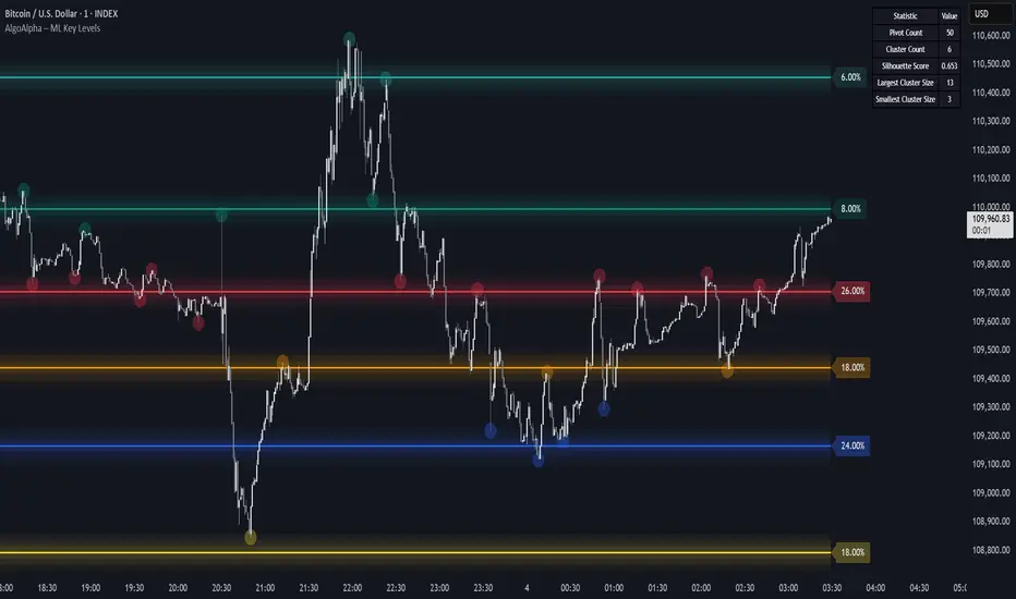
Machine Learning Key Levels [AlgoAlpha]🟠 OVERVIEW
This script plots Machine Learning Key Levels on your chart by detecting historical pivot points and grouping them using agglomerative clustering to highlight price levels with the most past reactions. It combines a pivot detection, hierarchical clustering logic, and an optional silhouette method to automatically select the optimal number of key levels, giving you an adaptive way to visualize price zones where activity concentrated over time.
🟠 CONCEPTS
Agglomerative clustering is a bottom-up method that starts by treating each pivot as its own cluster, then repeatedly merges the two closest clusters based on the average distance between their members until only the desired number of clusters remain. This process creates a hierarchy of groupings that can flexibly describe patterns in how price reacts around certain levels. This offers an advantage over K-means clustering, since the number of clusters does not need to be predefined. In this script, it uses an average linkage approach, where distance between clusters is computed as the average pairwise distance of all contained points.
The script finds pivot highs and lows over a set lookback period and saves them in a buffer controlled by the Pivot Memory setting. When there are at least two pivots, it groups them using agglomerative clustering: it starts with each pivot as its own group and keeps merging the closest pairs based on their average distance until the desired number of clusters is left. This number can be fixed or chosen automatically with the silhouette method, which checks how well each point fits in its cluster compared to others (higher scores mean cleaner separation). Once clustering finishes, the script takes the average price of each cluster to create key levels, sorts them, and draws horizontal lines with labels and colors showing their strength. A metrics table can also display details about the clusters to help you understand how the levels were calculated.
🟠 FEATURES
Agglomerative clustering engine with average linkage to merge pivots into level groups.
Dynamic lines showing each cluster’s price level for clarity.
Labels indicating level strength either as percent of all pivots or raw counts.
A metrics table displaying pivot count, cluster count, silhouette score, and cluster size data.
Optional silhouette-based auto-selection of cluster count to adaptively find the best fit.
🟠 USAGE
Add the indicator to any chart. Choose how far back to detect pivots using Pivot Length and set Pivot Memory to control how many are kept for clustering (more pivots give smoother levels but can slow performance). If you want the script to pick the number of levels automatically, enable Auto No. Levels ; otherwise, set Number of Levels . The colored horizontal lines represent the calculated key levels, and circles show where pivots occurred colored by which cluster they belong to. The labels beside each level indicate its strength, so you can see which levels are supported by more pivots. If Show Metrics Table is enabled, you will see statistics about the clustering in the corner you selected. Use this tool to spot areas where price often reacts and to plan entries or exits around levels that have been significant over time. Adjust settings to better match volatility and history depth of your instrument.
👽 TIME PERIODS👽 TIME PERIODS v1.15
Visualize key time divisions and session levels on any chart:
• Timezone‐aware session shading
– Highlight active NY session (configurable HHMM–HHMM and days)
– Adjustable background opacity
• Weekly & Monthly Separators
– Toggle on/off
– Custom color, style (solid/dashed/dotted) & width
• Day-of-Week Labels
– Diamonds at session start for M–S
– Toggle on/off
• Session Open Line
– Horizontal line at each session’s open
– Configurable color, width & “distanceRight” in bars
– Always shows current session
• Midpoint Vertical Line
– Plots halfway between session open & close
– Custom color, style & width
– Toggle on/off
▶ All elements grouped for easy parameter tweaking
▶ Fully timezone-configurable (default America/New_York)
▶ Version 1.15 — added distanceRight feature & current session support
Use this to see exactly where your chosen session, weekly/monthly boundaries, and intraday pivot points fall—across any timeframe.

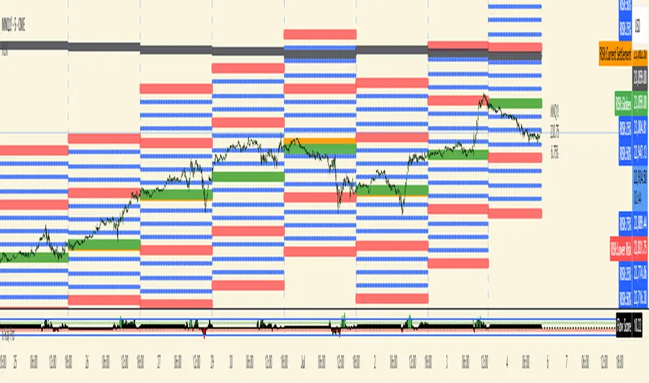
RISK## Main Purpose
The indicator calculates and displays risk levels based on margin requirements and daily settlement prices, helping traders visualize their potential risk exposure.
## Key Features
**Inputs:**
- **Margin for Calculation**: The CME long margin requirement for the asset
- **HTF Margin Line**: An anchor point for higher timeframe margin calculations
**Core Calculations:**
1. **Settlement Price Tracking**: Captures daily settlement prices during specific session times (6:58-6:59 PM ET for close, 6:00-6:01 PM ET for new day open)
2. **Risk Percentage**: Calculates `margin / (point value × settlement price)` - with special handling for Micro contracts (symbols starting with "M") that uses 10× point value
3. **Risk Intervals**: Determines price intervals representing one margin unit of risk
## Visual Display
The indicator plots multiple risk levels on the chart:
- **Settlement price** (orange circles)
- **Globex open** (green circles)
- **Upper/Lower Risk levels** (red circles) - one and two risk intervals away
- **Subdivision levels** (blue crosses) - 25%, 50%, and 75% of each risk interval
- **MHP+ level** (black crosses) - HTF anchor adjusted by risk percentage
- **HTF Anchor** (black crosses)
## Practical Use
This helps futures traders:
- Visualize how far price can move before hitting margin calls
- See risk levels relative to daily settlements
- Plan position sizing and risk management
- Understand exposure in terms of actual margin requirements
The indicator essentially transforms abstract margin numbers into concrete price levels on the chart, making risk management more visual and intuitive.
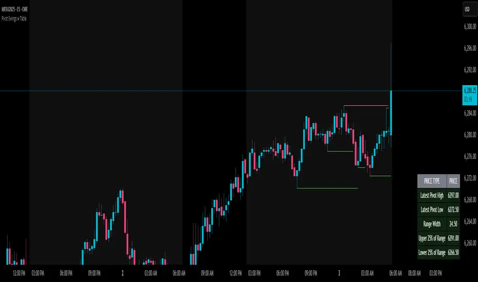
Pivot Swings w Table Pivot Swings w Table — Intraday Structure & Range Analyzer
This indicator identifies key pivot highs and lows on the chart and highlights market structure shifts using a real-time table display. It helps traders visually confirm potential trade setups by tracking unbroken swing points and measuring the range between the most recent pivots.
🔍 Features:
🔹 Automatic Pivot Detection using configurable left/right bar logic.
🔹 Unbroken Pivot Filtering — only pivots that haven't been invalidated by price are displayed.
🔹 Dynamic Range Table with:
Latest valid Pivot High and Pivot Low
Total Range Width
Upper & Lower 25% range thresholds (useful for value/imbalance analysis)
🔹 Trend-Based Color Coding — the table background changes based on which pivot (high or low) occurred more recently:
🟥 Red: Downward bias (last pivot was a lower high)
🟩 Green: Upward bias (last pivot was a higher low)
🔹 Optional extension of pivot levels to the right of the chart for support/resistance confluence.
⚙️ How to Use:
Adjust the Left Bars and Right Bars inputs to fine-tune how swings are defined.
Look for price reacting near the Upper or Lower 25% zones to anticipate mean reversion or breakout setups.
Use the trend color of the table to confirm directional bias, especially useful during consolidation or retracement periods.
💡 Best For:
Intraday or short-term swing traders
Traders who use market structure, support/resistance, or trend-based strategies
Those looking to avoid low-quality trades in tight ranges
✅ Built for overlay use on price charts
📈 Works on all symbols and timeframes
🧠 No repainting — pivots are confirmed with completed bars
Bullish Auto FibsBullish Auto Fibs Indicator
Description
The Bullish Auto Fibs indicator is a sophisticated tool designed for traders on the TradingView platform, specifically tailored for analyzing bullish price movements on XRP and other assets. It automatically plots Fibonacci retracement, B Wave, and extension levels based on a customizable ZigZag pattern, providing clear visual cues for potential support, resistance, and price targets. With a focus on the 15-minute timeframe, this indicator enhances technical analysis by dynamically updating Fibonacci levels as new pivot highs and lows are detected, ensuring traders stay aligned with evolving market trends.
Key Features:
Automatic Fibonacci Levels: Plots retracement (23.6%, 38.2%, 50%, 61.8%, 78.6%), B Wave (23.6% to 161.8%), and extension (100%, 161.8%, 261.8%) levels.
Dynamic ZigZag Detection: Identifies pivot highs and lows with an adjustable length (1–100 bars, default 20).
Real-Time Updates: Adjusts Fibonacci levels when new highs (for retracements) or lows (for B Wave and extensions) are detected, preserving key reference points like the B Wave pivot high.
Customizable Display: Toggle visibility for retracement, B Wave, and extension levels to suit your analysis needs.
Visual Clarity: Uses distinct colors (gray for retracements, yellow for B Wave, green for extensions) and labels for easy interpretation.
This indicator is ideal for traders employing Elliott Wave theory, Fibonacci-based strategies, or trend-following approaches, offering a robust framework for identifying key price levels in bullish markets.
User Manual
Configuration
The indicator’s settings can be adjusted via the “Settings” panel in TradingView:
Yellow ZigZag Length (default: 20, range: 1–100): Controls the sensitivity of pivot detection. Higher values detect more significant pivots; lower values increase sensitivity for shorter-term swings.
Show Retracement Fibs (default: true): Enable/disable retracement levels (low to high, 0% at high, 100% at low).
Show B Wave Fibs (default: true): Enable/disable B Wave levels (high to low, 100% at high, 0% at low, with extensions up to 161.8%).
Show Extension Fibs (default: true): Enable/disable extension levels (pivot low as 0%, projecting upward).
How It Works
ZigZag Pattern:
The indicator identifies pivot highs and lows using the ta.pivothigh and ta.pivotlow functions, with the specified yellowLength.
Pivots are marked with “H” (high) or “L” (low) labels in yellow.
Fibonacci Levels:
Retracement Fibs: Drawn from a pivot low (100%) to a pivot high (0%). Updates to a new high if detected, maintaining the original low.
B Wave Fibs: Drawn from a pivot high (100%) to a pivot low (0%), with extensions above 100%. Updates to a new low if detected, preserving the original high.
Extension Fibs: Drawn from a pivot low (0%) upward, based on the prior low-to-high wave length. Updates to a new low if detected.
Dynamic Updates:
Lines and labels extend to the current bar for active Fibonacci levels, ensuring real-time relevance.
When a new pivot is detected, previous levels are cleared, and new levels are drawn to reflect the latest price structure.
Usage Tips
Trend Confirmation: Use retracement levels to identify potential support zones during pullbacks in a bullish trend.
B Wave Analysis: Leverage B Wave levels for corrective wave targets, especially in Elliott Wave strategies.
Price Targets: Extension levels highlight potential bullish continuation zones.
Timeframe Flexibility: While optimized for 15-minute charts, adjust yellowLength for higher (e.g., 50–100) or lower (e.g., 5–10) timeframes.
Combine with Other Tools: Pair with trend indicators (e.g., moving averages) or oscillators (e.g., RSI) for enhanced decision-making.
Troubleshooting
No Levels Displayed: Ensure at least two pivots (high and low) are detected. Increase yellowLength if pivots are sparse.
Overlapping Labels: Reduce chart zoom or toggle off unnecessary Fibonacci types to declutter.
Performance Issues: The indicator limits arrays to 500 entries to prevent slowdowns. Older pivots are automatically removed.
Notes
The indicator is optimized for bullish markets but can be adapted for other assets by adjusting the ZigZag length.
For best results, test settings on historical data to align with your trading style.

RTH Standard Deviation+RTH Standard Deviation+ Indicator
Overview
The RTH Standard Deviation+ (RTH SD+) indicator is a versatile tool designed for traders to visualize key price levels based on the Regular Trading Hours (RTH) session.
It calculates and displays the high, low, equilibrium (midpoint), and standard deviation-based levels derived from the RTH session's price range.
This indicator is ideal for day traders and swing traders looking to identify potential support, resistance, and breakout zones.
Features
Customizable Session Window: Define the RTH session based on your preferred time window and timezone.
Key Price Levels: Displays high, low, equilibrium, 25%/75% quartile levels, and standard deviation levels (±0.5, ±1.0, ±1.33, ±1.66, ±2.0, and optional extended levels up to ±4.0).
Visual Elements: Includes horizontal lines, labels, boxes, and vertical lines to highlight key levels and session boundaries.
Flexible Styling: Customize line styles, colors, thicknesses, and visibility for all elements.
Extended Levels: Optional display of additional standard deviation levels (±2.25, ±2.33, ±2.5, ±2.66, ±2.75, ±3.0, ±3.25, ±3.33, ±3.5, ±3.66, ±3.75, ±4.0).
Deviation Boxes: Visualize specific standard deviation ranges (±0.1, ±1.33/1.66, ±2.33/2.66, ±3.33/3.66) with customizable colors.
Inputs
Session Window: Set the RTH session time (default: 06:00–09:00).
Timezone: Select the appropriate timezone (default: UTC-4).
Label Offset: Adjust the horizontal offset for price level labels (default: 5 bars).
Line Offset: Set the length of horizontal lines extending from the session end (default: 20 bars).
Show SD Levels: Toggle visibility of standard deviation lines (±0.5, ±1.0, ±1.33, ±1.66, ±2.0).
Show SD Labels: Enable or disable labels for standard deviation levels.
Show SD Boxes: Display shaded boxes for specific standard deviation ranges (e.g., ±1.33/1.66).
Show ±0.1 Dev Boxes: Highlight smaller deviation ranges (±0.1) with boxes.
Vertical Line: Toggle a vertical line at the session end, with customizable color, style, and thickness.
High/Low, Equilibrium, 25%/75%, ±0.1 Dev, ±1.33/1.66: Toggle visibility and customize colors, styles, and thicknesses for these levels.
Extended Levels: Enable additional standard deviation levels (e.g., ±2.25, ±2.5, etc.) for advanced analysis.
How It Works
Session Tracking: The indicator identifies the user-defined RTH session based on the specified time window and timezone.
It tracks the high, low, and equilibrium (midpoint) of the session's price action.
Price Range Calculation: At the session's end, the indicator calculates the price range (high - low) and uses it to compute standard deviation levels relative to the high, low, or equilibrium.
Level Visualization:
High/Low Lines: Display the session's high and low prices as horizontal lines, extended beyond the session end.
Equilibrium Line: Shows the midpoint of the session range.
Quartile Lines: Plots 25% and 75% levels within the session range.
Standard Deviation Lines: Displays levels at ±0.5, ±1.0, ±1.33, ±1.66, and ±2.0 standard deviations, with optional extended levels up to ±4.0.
Deviation Boxes: Shaded boxes highlight specific ranges (e.g., ±1.33/1.66) for quick reference.
±0.1 Deviation Lines/Boxes: Optional smaller deviation levels for precise analysis.
Dynamic Updates: During the session, high and low lines update in real-time. At session end, all levels are finalized and extended forward for post-session analysis.
Clearing Mechanism: When a new session begins, previous drawings are cleared to avoid clutter.
Usage
Add to Chart: Apply the indicator to your TradingView chart via the Pine Editor or Indicator menu.
Configure Settings:
Adjust the session window and timezone to match your market (e.g., 09:30–16:00 UTC-4 for US equities RTH).
Customize visibility, colors, styles, and thicknesses to suit your chart preferences.
Enable extended levels for deeper analysis or disable them for simplicity.
Interpret Levels:
High/Low: Act as potential support/resistance or breakout levels.
Equilibrium: Represents the session's midpoint, often a pivot point.
25%/75% Quartiles: Indicate intermediate levels within the session range.
Standard Deviation Levels: Highlight statistically significant price zones for potential reversals or breakouts.
Boxes: Emphasize key zones for quick visual reference.
Trading Application: Use levels to identify entry/exit points, set stop-losses, or gauge market volatility.
For example, ±1.0 standard deviation levels often act as strong support/resistance, while ±2.0 levels may indicate overextension.
Notes
Ensure the session window aligns with the market’s trading hours for accurate calculations.
The indicator is designed for intraday and post-session analysis but can be adapted for other timeframes.
Use in conjunction with other technical analysis tools for comprehensive decision-making.
Extended levels (±2.25 and beyond) are disabled by default to reduce chart clutter but can be enabled for specific strategies.
TradingView House Rules Compliance
This indicator contains no copyrighted material and adheres to TradingView’s Pine Script guidelines.
This indicator was approved and created with @TIMELESS1_

Liquidity Zone IndicatorLiquidity Zone Indicator
This PineScript indicator for TradingView identifies liquidity zones in the market where significant trading activity occurs, based on volume spikes and price levels. It highlights areas where large orders may be filled, useful for day traders and scalpers.
Features:
Detects bullish and bearish liquidity zones using a lookback period (default: 50 bars) and volume threshold (default: 1.5x average volume).
Displays zones as shaded boxes or diamond markers above/below bars, customizable by color.
Option to extend zones until price breaks through, with dynamic transparency for better visualization.
Includes an alert for when a liquidity zone is hit.
Settings:
Liquidity Lookback: Number of bars to analyze for high/low price levels.
Volume Threshold: Multiplier for detecting volume spikes.
Display as Zone: Toggle between zone boxes or markers.
Extend Zone: Keep zones active until price crosses them.
Zone Color: Customize the color of zones or markers.
Ideal for traders looking to spot potential reversal or breakout areas driven by liquidity.

Precision Candle & PSP 🔹 Precision Candle & PSP: Multi-Asset Confirmation Engine
The Precision Candle & PSP indicator is a dual-confirmation engine that detects two distinct price action setups — Precision Candles (PC) and Precision Swing Points (PSP) — using data from two comparison assets of your choice.
By incorporating confirmation from correlated or leading instruments, this tool provides a powerful way to filter out low-probability signals and focus on high-confluence reversal points.
⚙️ Key Features
Multi-Asset Confirmation Logic:
You can define two external symbols (e.g., correlated futures, ETFs, or indices). Signals are only displayed if one of those assets supports the signal seen on the current chart.
Precision Candle (PC) Detection:
This identifies potential reversal bars by checking for opposing candle sentiment between your chart and the comparison asset(s). For example, a bullish bar on the chart paired with a bearish bar on the comparison asset may indicate a rejection or divergence.
Precision Swing Point (PSP) Detection:
Detects swing highs and lows (mid-point structure) and filters them through confirmation from Asset 1 or 2, enabling highly refined structural reversal points.
Asset Priority System:
If both assets confirm, Asset 1 is prioritized. This gives traders control over which market they trust most as the lead signal.
Full Control Over Signal Types:
Toggle between PC, PSP, or both. You can also filter swing points by bullish-only, bearish-only, or both.
Timeframe Filtering:
Allows signals to show only on user-selected timeframes (1m to 1W), which helps align signals with your strategy.
Session-Based Filtering:
Enables session-based control — show signals only during specific time windows (e.g., New York Open, London Close, etc.).
🧠 How It Works
Precision Candle (PC):
Compares the current candle direction (bullish or bearish) on the main chart with the selected asset(s). A signal is generated if there’s candle divergence, indicating potential mispricing or reversal opportunity.
Precision Swing Point (PSP):
Detects classic swing structures (highs/lows) and applies the same multi-asset candle divergence logic, but using the middle bar of the swing. This provides more context and accuracy around turning points.
Visual Priority:
PSP color (from swing logic) takes priority if both PC and PSP trigger on the same bar.
🎯 Who This Indicator Is For
Reversal and structure traders who want early confirmation signals.
Multi-timeframe analysts who want to filter setups by session or timeframe.
Traders working with correlated markets, such as ES/NQ or DXY/Gold, where cross-confirmation adds an edge.
Discretionary traders who need context beyond price alone.
🔒 Why It’s Closed-Source
This script contains:
A custom-built multi-asset confirmation engine, including symbol prioritization and fallback logic.
Dual-layered filtering (timeframe + session) for hyper-specific signal control.
A proprietary blend of candle divergence + swing detection across separate assets — not publicly available in open-source scripts.
Due to the unique logic behind its signal detection and asset coordination framework, the script is protected to preserve its originality and edge.
⚠️ Important Notes
This tool does not generate buy/sell signals — it highlights price structure points that meet your selected confirmation criteria.
You must select valid trading symbols that are available in your data plan.
For best results, use this on correlated or leading markets (e.g., ES/NQ, YM/RTY, BTC.D/BTC, etc.).

Quarterly Theory Opening Prices🔹 Quarterly Theory Opening Prices (QTOP) Indicator
This indicator plots critical institutional price levels based on Quarterly Theory principles. It identifies and displays key opening prices from various timeframes — including Midnight Open, True Session Open (AM & PM), True Week Open, and True Month Open — all dynamically calculated and timezone-aligned.
These levels are widely used by professional traders to anticipate price reactions around session changes. The indicator is highly customizable, giving users visual and analytical access to these levels on any timeframe and market.
🔍 What This Indicator Does
Midnight Open (MO): The open of the new calendar day, often used in intraday trading for anchoring daily ranges.
True Session Open (TSO AM/PM): Reflects institutional trading session starts, designed to highlight liquidity injections during early U.S. market hours (07:30 and 13:30 EST).
True Week Open (TWO): Marks the institutional open for the trading week, beginning on Monday at 18:00 EST (Sunday 6 PM), used for weekly bias.
True Month Open (TMO): Accurately locates the first institutional trading Monday after NFP for monthly opening flow analysis — a rarely implemented but critical level for swing and macro traders.
🎯 Who It’s For
This indicator is designed for:
Intraday traders looking for early-session range anchors and reversal zones.
Swing traders using weekly/monthly opens as structural bias points.
Liquidity-based traders monitoring reactions around key institutional price levels.
🔒 Why It's Closed-Source
This script contains:
A custom-built session detection engine based on timestamp conditions instead of bar-based time filtering, ensuring more accurate plotting across timezones.
Dynamic label and line positioning logic that adapts based on timeframe and chart zoom, minimizing overlap and improving readability.
Proprietary open-level offset calculation logic to enhance visibility and prevent plotting distortion across devices and brokers.
Because these features go beyond existing open-source implementations, and required extensive backtesting and refinement, the source code has been protected.
⚙️ How to Use
Use on any chart and timeframe.
Adjust session settings via the UI panel.
Works best on instruments aligned with New York trading hours, but timezone support is included.
Use plotted levels to define trading ranges, support/resistance, or reference for breakout/reversal strategies.
📌 Note: This tool is not a buy/sell signal generator — it’s designed to provide reliable reference levels around which you can apply your own strategy.

Fair Value Z Gauge📊 Fair Value Z Gauge Indicator Description
- This indicator visually represents whether the price is relatively overvalued or undervalued compared to a specific moving average (MA) using a Z-score normalization approach.
- When the Z-score is around 0, it can be interpreted statistically as fair value or "fair price."
✅ Key Concept
- Price-to-MA ratio (p_ratio): Calculated by dividing the price by the MA and then subtracting 1, this shows the relative deviation from the moving average.
- Z-score normalization: p_ratio is divided by its 200-period standard deviation, making it easy to identify statistically significant overbought or oversold zones.
✅ Default & User Inputs
- Default MA period (100, DEMA by default)
- Selectable MA types: EMA, SMA, WMA, VWMA, RMA, DEMA, TEMA, ZLEMA, HMA
- Upper/lower threshold levels (h_level: 3, l_level: -1.5)
- Signal line period (default: 100) and line thickness
✅ Visualization
- Z-score line: Red gradient for overbought, aqua/green gradient for oversold zones
- Signal line: SMA of p_ratio for trend confirmation
- Upper/lower threshold lines: Clearly indicate risk and undervaluation zones
- Fill highlights: Visual emphasis when crossing thresholds
- Bar color: Automatically adjusts based on Z-score status
- Table: Displays real-time p_ratio value
✅ Swing Trading Strategy Interpretation & Usage
- Upper red peak: Overbought zone → Mandatory profit-taking or sell signal
- Lower blue bottom: Undervalued zone → Mandatory buy signal
- Line dropping toward 0: Ideal for gradual, phased entries (scaling in)
- Signal line: Helps confirm overall trend and entry/exit timing
💡 Usage Ideas
- Enables clear, quantified entry/exit strategies based on statistical overextension
- Allows for various MA combinations to define personalized "fair value" levels
- Ideal for scaling in/out and portfolio rebalancing strategies
copyright @invest_hedgeway
===========================================================================
📊 Fair Value Z Gauge 지표 설명
- 이 지표는 가격이 특정 이동평균(MA) 대비 상대적으로 고평가(Overvalued) 혹은 저평가(Undervalued) 되었는지를 Z-score 방식으로 정규화하여 시각적으로 보여줍니다.
- Z-Score가 0이라면 통계적으로 적정평가=공정가치라고 설명할 수 있습니다.
✅ 주요 개념
-가격 대비 이동평균 비율 (p_ratio) : 가격을 MA로 나눈 뒤 -1을 적용해 MA와의 상대적 괴리를 계산합니다.
- Z-score 기반 정규화: p_ratio를 200기간 표준편차로 나누어, 통계적으로 의미 있는 과열 구간과 저평가 구간을 쉽게 파악하도록 설계했습니다.
✅ 기본 입력 및 사용자 입력값
- 기본 MA 기간 (기본: 100, DEMA)
- MA 유형 선택 가능 : EMA, SMA, WMA, VWMA, RMA, DEMA, TEMA, ZLEMA, HMA
- 상단/하단 기준 경계선 (h_level: 3, l_level: -1.5)
- 시그널 라인 기간 (기본: 100) 및 굵기
✅ 시각화 구성
- Z-score 라인: 과열 시 빨간색, 과매도 시 청록색/녹색 그라디언트
- 시그널 라인: p_ratio의 SMA로 추세 보조
- 상단/하단 기준선: 위험 구간과 저점 구간 한눈에 확인
- fill 강조: 기준선 돌파 시 시각적 강조
- 바 색상: Z-score 상태에 따라 자동 채색
- 테이블: 현재 p_ratio 값 실시간 표시
✅ 스윙매매 간 전략적 해석 및 활용
- 상단 빨간 색상 최고·저점: 과열 구간 → 반드시 차익실현 또는 매도 신호
- 하단 파랑 색상 저점: 저평가 구간 → 반드시 매수 신호
- 선이 하락하며 0 인근 도달: 단계적 분할매수 시점
- 시그널 라인은 전체 흐름과 추가 타이밍 보조
💡 활용 아이디어
- 정량화된 과열·과매도 기준으로 단호한 진입·청산 전략 가능
- 다양한 MA 실험으로 자신만의 "공정 가치" 탐색
- 분할매수·매도, 포트폴리오 리밸런싱 전략에 최적
copyright @invest_hedgeway

Order + Breaker Blocks MTF - Vees Hidden LiquidityThis indicator is a Hidden Liquidity Script, being a much more refined and precise version of "Order Blocks" also known as "Supply and Demand" zones.
This script is more refined and precise as this script is the only script that displays the exact body part of blocks on multiple timeframes, showing potentially powerful price reversal zones for taking a long or short.
This is a PRICE ACTION indicator, demonstrating price action that can result in potential good support/resistance levels for taking a long or short trade.
This indicator only displays the body part of order blocks, instead of including wicks that all other indicators do. That makes this script a much more refined version of all other scripts out there.
Not only that, this script can collate multiple timeframes into one indicator, again something other scripts cannot do.
This script is also unique compared to other Hidden Liquidity style scripts in that you have full control over each Order Block so you can see each individual block on a chart, whilst other charts combine them into a zone instead. This refined version gives you precise potential entries and much further refinement as well as more thorough backtesting capabilities.
This script also can highlight order blocks that pass THROUGH a Fair Value Gap. These are known as 'Breaker Blocks'. These powerful blocks can be places of interest as support or resistance for a long or short trade. Note: This script shows the body part of a block only and not the wick.
Breaker Blocks, where significant displacement has occurred in price past a block can be more powerful. This script does not highlight Fair Value Gaps themselves, only order blocks (supply and demand) and breaker blocks through displacement in price (through an FVG). FVGs on their own can be weaker without order blocks behind them hence they are not highlighted.
The BODY of the order block, and the 0.5 of the order block are key regions for considering a trade, treating that level as either resistance or support.
Important: PLEASE NOTE: This indicator will only show timeframes that are higher than or the same as the current chart timeframe.
For Example, only blocks 3 Days or higher will show on a 3D chart. It will not show 12h blocks on a 3D chart. You would need to go to a 12 hour chart with the 12h blocks showing to see all Blocks that are 12h or higher drawn.
SETTINGS:
There is options to change the colours of the boxes and to differentiate between Order Blocks and stronger Breaker Blocks if desired.
If this is NOT desired, make all color options the same color,.
Shown below is blue Order Blocks (Supply and Demand
Shown below there is Pink Breaker Blocks.
There is options to weaken the colour of blocks that have been tapped by a wick and thus partially used up, also called partially "mitigated".These blocks can be considered weaker support/resistance.
Once a block has had a wick or body close over it entirely, the block can be considered fully "mitigated" and will disappear from the indicator once that candle has closed. This block level can now be considered too weak. You can also choose to not show these partially mitigated blocks at all.
The charts above shows pale Violet blocks as partially mitigated or "tapped" blocks.
The blocks in HOT BRIGHT Violet are untapped and potentially stronger levels for a Long or Short trade. See below the 7h.
Additional SETTINGS:
Further options include, if selected: Counting the number of fair value gaps an order block may pass through. More FVGs an order block (now a breaker block) passes through can strengthen the support of that block level, making a reversal more likely.
There is an option of showing old mitigated order blocks and changing the color of these on the chart. This can aid in backtesting of levels.
Further Settings include:
- an option to remove very thin blocks that may not be strong points.
- an option to denote with a character such as a * blocks that have their EQ 0.5 region wicked - these can be considered weaker.
- an option to denote with an additional * or another character blocks that are barely tapped by a small percent so you know they are still considered quite strong.
- an option to show how many candles form the order block.
Additional Options include:
- an option to show blocks only within a specific price range or percent range of the current price.
- an option to only look X number of bars back.
There is Options regarding labelling, and Border widths on boxes.
It is ESSENTIAL to do your own research and backtesting!
It is recommended to combine these levels with other concepts for added confluence.
Other indicators are NOT included in this script. This is purely a refined order block script for the BODY of a block only.
You can combine Order Blocks and stronger versions known as Breaker Blocks in this script with other indicators or concepts to form a Full Trading Strategy.
Other potential concepts to combine, not shown in this script can include Smart Money Concepts, Market Structure, Fibonnaccis, SMAs, EMAs or any other concept to give added confluence to the support / resistance levels identified in this script that may indicate that the level is stronger.
This indicator is not a trading strategy on its own. It is best used in combination with other concepts to improve the success.
Backtesting this indicator is highly recommended and incorporated into a full trading system of your own design. This only identifies possible key regions based on Price Action Strategies.
This indicator simply makes the identification of these hot levels easier and simpler to find, especially across multiple timeframes.
A strong bright zone on the indicator can be a stronger level than a weak partial block that is in light colours.
Again -Please do your own research and backtesting.
These indicators make finding these levels much much simpler and easier when combined with a full trading strategy.
Any feedback is welcome.

Multi-Timeframe OHLC Levels█ OVERVIEW
A fully customizable multi-timeframe indicator that independently plots levels based on the open, previous close, previous high, previous low, and previous mid-price.
This tool is ideal for traders who require a high level of tailoring and usability.
█ FEATURES
Multi-timeframe
Select the timeframe for each level separately. The indicator shows higher timeframe levels down to the 1-second chart.
Multi-source
Choose the source for each level individually from the current open, previous close, previous high, previous low, and previous mid-price.
Past levels
Manage the number of relevant levels displayed on historical bars for trading or backtesting.
Projections
Extend the levels to the current price action with clear and clean options.
Styling
Adjust the appearance according to your preferences and screen size using options for color, line style, line thickness, custom name, and text size.
█ NOTES
This is a PREMIUM indicator.
You may also find my free Daily Weekly Monthly Yearly Opens and Previous Day Week Highs & Lows indicators helpful.

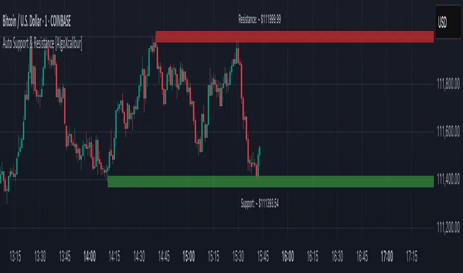
Auto Support & Resistance [AlgoXcalibur]Instantly visualize support and resistance levels with adaptive breakout prediction and zero chart clutter.
Combining reliable pivot level detection, relative volume, and price action confirmation, this tool delivers intelligent S/R zones that adapt to current market conditions. Whether you’re trading breakouts, navigating ranges, or using key levels to manage profits and risk — this indicator automatically identifies important levels for you, reducing your workload so you can better focus on your trades and decision-making.
🧠 Algorithm Logic
This ultra-refined Auto Support & Resistance indicator does more than just display reliable support and resistance levels — it applies a minimalist approach to display only the most relevant and actionable zones, while dynamically tracking their structural integrity in real time. The algorithm features unique Breakout Probability Detection — automatically switching lines from solid to dashed when volume and price action suggest a high probability that a breakout will occur. If a level is broken, the next relevant support or resistance level is immediately displayed on the chart, keeping the levels current and actionable so you do not miss critical insight. Optional Price Labels display the price of each level — practical if using these areas for setting take-profits or stop-losses. This algorithm keeps Support & Resistance what they are supposed to be — simple and useful — effortlessly providing a clean, adaptive view of evolving market structure.
⚙️ User-Selectable Features
• Breakout Probability Detection: When enabled, lines automatically switch from solid to dashed when volume and price action suggest a high breakout probability.
• Price Labels: When enabled, price labels display the price of the S/R for practical reference.
📊 Minimalistic Sophistication
Most automated support and resistance tools clutter the chart with dozens of static levels that do not react to price action. This tool displays only the single most relevant support and resistance level at a time, continuously monitoring for breaks and automatically updating when a level is invalidated. With breakout detection built in, it offers a modern, intuitive way to track structural integrity. This tool is designed to prioritize accuracy, adaptability, and visual simplicity — delivering a smart and refined tool for automatically identifying key levels with confidence.
🔐 To get access or learn more, visit the Author’s Instructions section.
Intraday Session Levels: Pre-Mkt, 5m, 15m (Replay/Toggle/Labels)Intraday Session Levels: Pre-Mkt, 5m, 15m (Replay/Toggle/Labels)
Version v1.0
Live session levels for every trader!
This indicator automatically tracks and draws the most actionable intraday levels as they develop—live in real-time and fully compatible with TradingView’s bar replay and backtesting.
How it works:
Pre-Market High & Low:
Levels appear and update live as soon as the pre-market session starts (4:00am ET), then “freeze” at the official open (9:30am ET) and remain visible for the rest of the day.
First 5-Minute Candle High/Low:
Drawn instantly after the first 5-minute candle (9:30–9:35am ET) completes.
First 15-Minute Candle High/Low:
Drawn right after the first 15-minute candle (9:30–9:45am ET) completes.
Labels on every line
Each level is clearly labeled on your chart (“PreMkt High”, “5m Low”, “15m High”, etc).
Perfect for backtesting:
All levels display exactly as they would have appeared in real time, making this indicator fully bar replay and historical test compatible.
Flexible ON/OFF toggles:
Instantly show or hide Pre-Mkt, 5m, and 15m levels via the settings panel.
Why use it?
Identify support/resistance and key reaction zones intraday
Fade or break the opening range with confidence
Backtest your strategies with accurate historical context
Reduce chart clutter with customizable, minimal visuals
Whether you’re a scalper, day trader, or backtest enthusiast, this tool keeps your charts focused and your edge sharp.
Developed by

Last 10 Sessions: High, Low, Pivot, GapLast 10 Sessions: High, Low, Pivot, Gap
This indicator highlights the most important price levels from the last 10 completed trading sessions to help intraday and swing traders quickly spot potential support, resistance, and price reaction zones.
Key Features:
Previous Highs and Lows : Visualize the high and low from each of the past 10 sessions. These are the most commonly tested breakout and reversal points for day trading.
Session Pivots: The classic pivot formula ((High + Low + Close) / 3) for each of the last 10 sessions, often acting as a market “equilibrium” or intraday magnet.
Gaps: Displays the difference between each day’s open and the previous session’s close (“gap”), showing sentiment shifts and possible gap fill targets.
Clean, Faded Visuals: All lines and labels are subtly faded so your chart remains clear and uncluttered, with each level labeled by how many sessions ago it occurred.
Full Customization: Instantly toggle any level type (High, Low, Pivot, Gap) ON/OFF in settings, extend lines to the right, and adjust their forward length.
Bulletproof Logic: Never throws runtime errors. Lines and labels only display when valid data is present.
How to Use:
Use recent highs/lows for breakout, breakdown, or mean reversion trades.
Spot where multiple levels from past sessions cluster together for high-probability reversal or breakout areas.
Watch pivots for intraday bias, and gaps for sentiment and possible fill plays.
Perfect for all intraday timeframes.
If you want a powerful yet minimal map of where price is most likely to react, this indicator is for you!
Developed by

Auto Trendlines [AlgoXcalibur]Effortlessly visualize trendlines.
This algorithm does more than just draw lines connecting structural swing points — it reveals dynamic support & resistance breakouts with clarity and precision while significantly reducing your workload compared to the hassle of manually drawing trendlines.
🧠 Algorithm Logic
This advanced Auto Trendlines indicator delivers clear market structure through an intelligent multi-fractal design, revealing useful swing structures in real time. For those seeking maximum awareness, the optional Micro Trendlines (Dotted) constantly monitors even the most recent and minor structural shifts — keeping you fully in tune with evolving market dynamics. A Break Detection Engine constantly monitors each trendline and provides instant visual feedback when structural integrity is lost: broken lines turn gray, stop extending, and remain visible to enhance clarity and situational awareness. The algorithm is carefully refined to prevent chart distortion commonly caused by forcing entire trendline structures into view — preserving a natural and accurate charting experience. To further ensure optimal readability, an integrated Clutter Control mechanism limits the number of visible trendlines — focusing attention only on the most relevant structures.
⚙️ User-Selectable Features
• Micro Trendlines (Dotted): Ultra-responsive short-term trendlines that react to even the smallest structural shifts — ideal for staying ahead of early trend changes.
• Broken Trendline Declutter: Enable to display only the most recent broken trendlines to simplify chart visuals and maintain clarity, or disable to analyze previous price action.
💡 Modern Innovation
Auto Trendline indicators are often inaccurate, clumsy, and rely on slow methods that fail to adapt. AlgoXcalibur’s Auto Trendline indicator takes a modern, refined approach — combining smart pivot logic for both speed and stability, dynamic break detection with clear visual cues, and displaying only the most relevant trendlines while prioritizing accuracy, preventing distortion, and reducing clutter — automatically.
🔐 To get access or learn more, visit the Author’s Instructions section.

Order + Breaker Blocks HTFThis indicator is a Hidden Liquidity Script, being a much more refined and precise version of "Order Blocks" also known as "Supply and Demand" zones.
This script is more refined and precise as this script is the only script that displays the exact body part of blocks on multiple timeframes, showing potentially powerful price reversal zones for taking a long or short.
This is a PRICE ACTION indicator, demonstrating price action that can result in potential good support/resistance levels for taking a long or short trade.
This indicator only displays the body part of order blocks, instead of including wicks that all other indicators do. That makes this script a much more refined version of all other scripts out there.
Not only that, this script can collate multiple timeframes into one indicator, again something other scripts cannot do.
This script is also unique compared to other Hidden Liquidity style scripts in that you have full control over each Order Block so you can see each individual block on a chart, whilst other charts combine them into a zone instead. This refined version gives you precise potential entries and much further refinement as well as more thorough backtesting capabilities.
This script also can highlight order blocks that pass THROUGH a Fair Value Gap. These are known as 'Breaker Blocks'. These powerful blocks can be places of interest as support or resistance for a long or short trade. Note: This script shows the body part of a block only and not the wick.
Breaker Blocks, where significant displacement has occurred in price past a block can be more powerful. This script does not highlight Fair Value Gaps themselves, only order blocks (supply and demand) and breaker blocks through displacement in price (through an FVG). FVGs on their own can be weaker without order blocks behind them hence they are not highlighted.
The BODY of the order block, and the 0.5 of the order block are key regions for considering a trade, treating that level as either resistance or support.
Important: PLEASE NOTE: This indicator will only show timeframes that are higher than or the same as the current chart timeframe.
For Example, only blocks 3 Days or higher will show on a 3D chart. It will not show 12h blocks on a 3D chart. You would need to go to a 12 hour chart with the 12h blocks showing to see all Blocks that are 12h or higher drawn.
SETTINGS:
There is options to change the colours of the boxes and to differentiate between Order Blocks and stronger Breaker Blocks if desired.
If this is NOT desired, make all color options the same color,.
Shown below is blue Order Blocks (Supply and Demand)
Shown below there is Pink Breaker Blocks.
There is options to weaken the colour of blocks that have been tapped by a wick and thus partially used up, also called partially "mitigated".These blocks can be considered weaker support/resistance.
Once a block has had a wick or body close over it entirely, the block can be considered fully "mitigated" and will disappear from the indicator once that candle has closed. This block level can now be considered too weak. You can also choose to not show these partially mitigated blocks at all.
The chart above shows pale Violet blocks as partially mitigated or "tapped" blocks.
The blocks in HOT BRIGHT Violet are untapped and potentially stronger levels for a Long or Short trade.
See below and example of a HOT PINK stronger level with a 1,2,3,4,5 Days of blocks in the one area.
See below an example of a weaker pink level. Still valid, but potentially riskier. There is a weaker 5D Block in pale pink and no other days in that same zone.
Additional SETTINGS:
Further options include, if selected: Counting the number of fair value gaps an order block may pass through. More FVGs an order block (now a breaker block) passes through can strengthen the support of that block level, making a reversal more likely.
There is an option of showing old mitigated order blocks and changing the color of these on the chart. This can aid in backtesting of levels.
Further Settings include:
- an option to remove very thin blocks that may not be strong points.
- an option to denote with a character such as a * blocks that have their EQ 0.5 region wicked - these can be considered weaker.
- an option to denote with an additional * or another character blocks that are barely tapped by a small percent so you know they are still considered quite strong.
- an option to show how many candles form the order block.
Additional Options include:
- an option to show blocks only within a specific price range or percent range of the current price.
- an option to only look X number of bars back.
There is Options regarding labelling, and Border widths on boxes.
It is ESSENTIAL to do your own research and backtesting!
It is recommended to combine these levels with other concepts for added confluence.
Other indicators are NOT included in this script. This is purely a refined order block script for the BODY of a block only.
You can combine Order Blocks and stronger versions known as Breaker Blocks in this script with other indicators or concepts to form a Full Trading Strategy.
Other potential concepts to combine, not shown in this script can include Smart Money Concepts, Market Structure, Fibonnaccis, SMAs, EMAs or any other concept to give added confluence to the support / resistance levels identified in this script that may indicate that the level is stronger.
This indicator is not a trading strategy on its own. It is best used in combination with other concepts to improve the success.
Backtesting this indicator is highly recommended and incorporated into a full trading system of your own design. This only identifies possible key regions based on Price Action Strategies.
This indicator simply makes the identification of these hot levels easier and simpler to find, especially across multiple timeframes.
A strong bright zone on the indicator can be a stronger level than a weak partial block that is in light colours.
Again -Please do your own research and backtesting.
These indicators make finding these levels much much simpler and easier when combined with a full trading strategy.
Any feedback is welcome.

Volumatic Support/Resistance Levels [BigBeluga]🔵 OVERVIEW
A smart volume-powered tool for identifying key support and resistance zones—enhanced with real-time volume histogram fills and high-volume markers.
Volumatic Support/Resistance Levels detects structural levels from swing highs and lows, and wraps them in dynamic histograms that reflect the relative volume strength around those zones. It highlights the strongest price levels not just by structure—but by the weight of market participation.
🔵 CONCEPTS
Price Zones: Support and resistance levels are drawn from recent price pivots, while volume is used to visually enhance these zones with filled histograms and highlight moments of peak activity using markers.
Histogram Fill = Activity Zone: The width and intensity of each filled zone adjusts to recent volume bursts.
High-Volume Alerts: Circle markers highlight moments of volume dominance directly on the levels—revealing pressure points of support/resistance.
Clean Visual Encoding: Red = resistance zones, green = support zones, orange = high-volume bars.
🔵 FEATURES
Detects pivot-based resistance (highs) and support (lows) using a customizable range length.
Wraps these levels in volume-weighted bands that expand/contract based on percentile volume.
Color fill intensity increases with rising volume pressure, creating a live histogram feel.
When volume > user-defined threshold , the indicator adds circle markers at the top and bottom of that price level zone.
Bar coloring highlights the candles that generated this high-volume behavior (orange by default).
Adjustable settings for all thresholds and colors, so traders can dial in volume sensitivity.
🔵 HOW TO USE
Identify volume-confirmed resistance and support zones for potential reversal or breakout setups.
Focus on levels with intense histogram fill and circle markers —they indicate strong participation.
Use bar coloring to track when key activity started and align it with broader market context.
Works well in combination with order blocks, trend indicators, or liquidity zones.
Ideal for day traders, scalpers, and volume-sensitive setups.
🔵 CONCLUSION
Volumatic Support/Resistance Levels elevates traditional support and resistance logic by anchoring it in volume context. Instead of relying solely on price action, it gives traders insight into where real conviction lies—by mapping how aggressively the market defended or rejected key levels. It's a visual, reactive, and volume-conscious upgrade to your structural toolkit.

Next Day Key Levels [Auto-Pivot Suite] RobustNext Day Key Levels
Automatically plot key levels (Floor Pivots) for the next U.S. trading day, with smart session detection.
What does this script do?
Automatically detects the most recent completed U.S. regular trading session (9:30 AM–4:00 PM Eastern) and plots all classic Floor Pivot levels for the next trading day.
Handles Mondays and holidays: Always uses the most recent session’s data, so Friday’s values are shown on Monday, and holidays are skipped seamlessly.
Works in both pre-market and after-hours—levels appear for the next session at the right time.
Levels plotted:
Previous Session High (H)
Previous Session Low (L)
Previous Session Close (C)
Pivot (P)
Resistance 1, 2, 3 (R1, R2, R3)
Support 1, 2, 3 (S1, S2, S3)
How it works
Monitors each bar and tracks session highs/lows/close only during regular market hours.
At the close of each session (4:00 PM ET), saves these values.
In pre-market (before 9:30 AM ET) and after-hours (after 4:00 PM ET), automatically plots levels based on the last completed session—always the correct session, even on Mondays and after holidays.
Why is it better?
No clutter: Only one set of levels per day, drawn cleanly.
Accurate pivots for every next U.S. session.
Zero manual setup: Add to any U.S. ticker, on any intraday timeframe.
Features
Works across all U.S. stocks and ETFs.
Plots and labels all levels with color coding for quick reference.
Designed for intraday and short-term trading strategies.
Handles time zone and market session edge cases automatically.
How to use
Add the indicator to any U.S. equity or ETF chart (15m–1h timeframes recommended).
Levels will appear automatically in pre-market or after the market closes, always for the next session.
Trade with confidence using automatic, accurate pivots and support/resistance levels.
Developed by .
For questions or feedback, leave a comment below!

Support, Resistance and Tests with Pivot Volume [SRLDA]Transform Your Technical Analysis with "Support, Resistance and Tests with Pivot Volume "
If you're looking for a professional indicator designed to take your trading to the next level, meet Support, Resistance and Tests with Pivot Volume , developed by Sardinha Risonha Lda (SRLDA).
Why is this indicator different?
Unlike standard tools that only draw static lines, this indicator automatically detects pivot highs and lows and evaluates their strength based on real volume. You get a dynamic, living analysis that evolves with the market.
How does it work?
Pivot detection: Identifies significant highs and lows using configurable bars to the left and right.
Volume capture: Records volume at each pivot to evaluate market conviction.
Volume analysis: Compares pivot volume to the 20-bar moving average volume (SMA). Levels are classified as WEAK, MEDIUM, or STRONG.
Dynamic styling: Line thickness and color adapt to strength. Labels show classification and formatted volume (K or M).
Retest feedback & trend change cues: When price retests a line, it changes style (e.g., dashed) and color to signal possible reversals or confirmations — perfect for spotting trend shifts in real time.
What do you get?
✅ Automatic support and resistance detection.✅ Strength classification for smarter decisions.✅ Visual cues with adaptive styles and colors.✅ Real-time updated labels with volume info.✅ Confirmation on trend changes through line style updates.
Who is it for?
Day traders and swing traders who want to avoid false breakouts.
Investors needing volume confirmation for entries.
Technical analysts who love clean, dynamic visuals.
100% customizable
✔️ Choose line style (solid, dashed, dotted).✔️ Adjust base thickness and max active lines.✔️ Toggle labels on/off easily.
Seamless with TradingView
Built with Pine Script v5 and fully optimized for TradingView. Start in seconds.
Take your edge further
Don’t just see levels — understand and react to them. With SRLDA, you know which zones truly matter and when a trend might shift.
⚡ Ready to trade smarter? Get it now and transform your market approach.
